Abstract
The gin stand power is measurable using common tools; however, such tools typically do not detect active ginning. Detecting active ginning is important when trying to separate out the energy going to the moving parts of the gin stand (i.e., the baseline energy) versus the active energy doing work to remove the cotton fibers from the seed. Studies have shown that the gin stand is the second largest consumer of electricity in the ginning operation, while electricity accounts for nearly 17% of the average expense per bale. If active energy differences exist between cotton cultivars, there may be room to optimize and lower these expenses. The goal of the current work is to provide a method (and software tool) to analyze typical power logger data, and extract periods of active ginning, along with the energy consumed and ginning times, in a semi-automated way. The new method presented allows multiple periods of active ginning in a single file, and can separate the total energy into the active and baseline components. Other metrics of interest that the software calculates include the ginning time, and average power. Software validation using a simulated test signal showed that a 2%-or-lower error is possible with a noisy signal.
1. Introduction
Electricity consumption represents a business expense when ginning cotton. As such, a body of research exists that considers gin stand energy consumption across many different scales of equipment [1,2,3]. On the commercial scale, the gin stand itself has been shown to be the second largest consumer of electricity, behind only material handling [3,4]. A survey of ginners found that the average electricity cost was USD 4.18 per bale, out of a total cost of USD 24.81 per bale [5].
Many variables may affect the energy consumption of a gin stand. Hand-feeding a small gin stand, such as a 10-saw unit with 25.4 cm (10 inch) saws, may introduce some operator effects. Some studies aim to limit operator effects, by limiting data collection to a single operator [2]. Unlike small gin stands, commercial scale equipment uses mechanical feeding to remove variability; one such example is an extractor feeder [6]. Extractor feeders can single-lock the cotton while feeding [7]. Other variables found to affect the energy include the cultivar [1], saw thickness [8], and seed cotton moisture at the feeder apron [9]. Best practices also exist, as a guideline for reducing energy consumption [10].
Energy consumption is a researchable topic in other areas of interest, including cotton production and machine tools. The energy consumption of cotton production has been successfully modeled [11]. Recent work has also compiled significant amounts of the literature related to the energy consumption of machine tools [12]. Other work has focused on the energy efficiency of machine tools that are used for cutting and shaping metals [13]. Additional research has explored the energy efficiency of machine tools in real time [14].
In the cotton ginning industry, there is a growing interest in energy measures, and the isolation of variables effecting those energy measures. A software program to aid in the consistent extraction of energy values from power data would be a valuable tool. Energy studies on gin stands typically involve recording the power, which requires interpretation to extract key metrics: the ginning times, energy consumed, average power, and other information. Furthermore, studies often report the energy as the total energy minus the energy used by the equipment while idling (i.e., they report the net energy) [1,2,15].
Despite the interest in energy measures for cotton ginning, there are no published methods for automatically extracting the energy data and ginning times from multiple runs of cotton included in a single continuous run of the gin stand. The methods outlined in previous works to extract the gin stand energy and ginning times have relied on human actions. One work measured energy, and separated the components, by extracting energy data from a single or discrete ginning session, where the operator powered off the motor at the end of each session [2]. When testing larger-scale equipment designed to run continuously, powering off the motor at the end is not ideal. Furthermore, for some types of gin stands, it can also be hard to judge when to stop the motor, due to the limited view of the seed roll. Other work has determined ginning times by observing the cotton, or by tracking the time for which the gin stand was engaged [1]. Manually timing or observing the cotton can lead to human-induced inconsistencies.
The new “Ginning Energy Extraction” method and software tool presented in this work calculates key ginning metrics with minimal human interaction. Allowing the software to calculate the ginning times removes the variation caused by human judgment. It is anticipated that applying a consistent method to automatically extracting energy from power will allow for better comparisons, by removing the differences caused by process variation. This work aims to provide users with a semi-automated software tool that a user can employ with their high-resolution (and high-sample-rate) power data. The ginning metrics calculated via the software include the ginning time, total energy, and average power. In addition, the software separates the total energy and the active energy (or net energy). The method can handle power data files that contain multiple ginning sessions with one continuous motor run. Furthermore, the software pipeline of the method can track metadata for each run, allowing the user to easily keep track of external variables that they find important, without the need for significant manual labor.
This new method will save significant effort and time, by automating processes. The new method will also make it easier to compare results across studies, by ensuring that data are treated in a consistent manner. The data output from the software tool is saved as a CSV file that can then be used to support the objectives of the user. This may take the form of studying the testing energy or ginning rate versus the cultivar (as others have done, using other means [1,2,15]), checking the baseline energy of the equipment, and much more.
2. Materials and Methods
2.1. Example Data and Software Pipeline
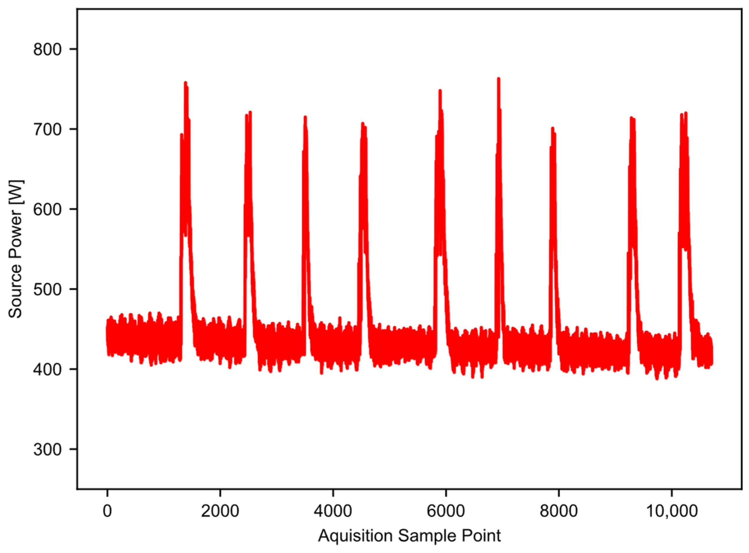
Figure 1 provides an example of high-resolution power data taken from a 10-saw gin stand with 25.4 cm (10 inch) saws. The vertical axis is the power recorded, and the horizontal axis is the time in 0.2 s increments. An AEMC model PEL 105 power logger (AEMC Instruments, Dover, NH, USA) captured the power data. The logger takes 128 samples per 60 Hz AC cycle, and saves an aggregate value to the user-accessible memory every 200 milliseconds [16]. In this way, aliasing is not a concern, and the data sample rate is high enough to work well for the example application. The gin stand took power from a 3-phase 240 V 60 Hz source. The power logger had both a current sensor and a voltage probe on each phase, which allowed it to calculate the wattage. The total run time shown in Figure 1 is nearly seven minutes, and there are nine separate temporal slices of higher power (approximately 700 watts) that represent periods of active ginning within the single file. Periods of time where the equipment was idling separate the periods of active ginning; these are the lower power states observed between the peaks. In this example, the majority of the datapoints represent idling equipment that is consuming some baseline level of energy. In addition, the baseline power level shifts with time. The baseline power level tends to decrease as the equipment warms up; this trend may not happen in all cases, but the software should be able to account for this, especially as the run time increases. This example dataset will serve to illustrate and validate the workings of the “Ginning Energy Extraction” method in future sections.
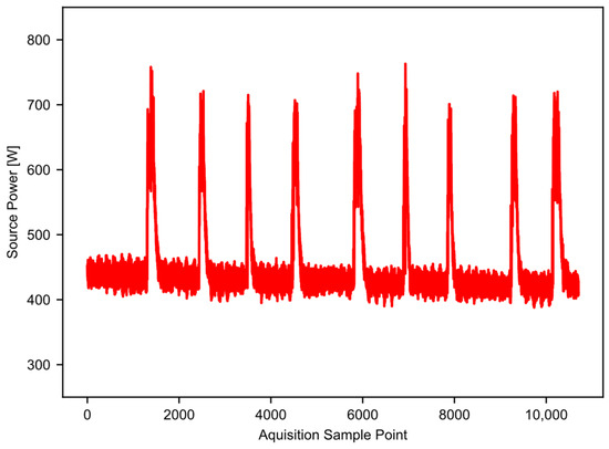
Figure 1.
Example raw power data, showing nine runs of cotton through the gin stand.
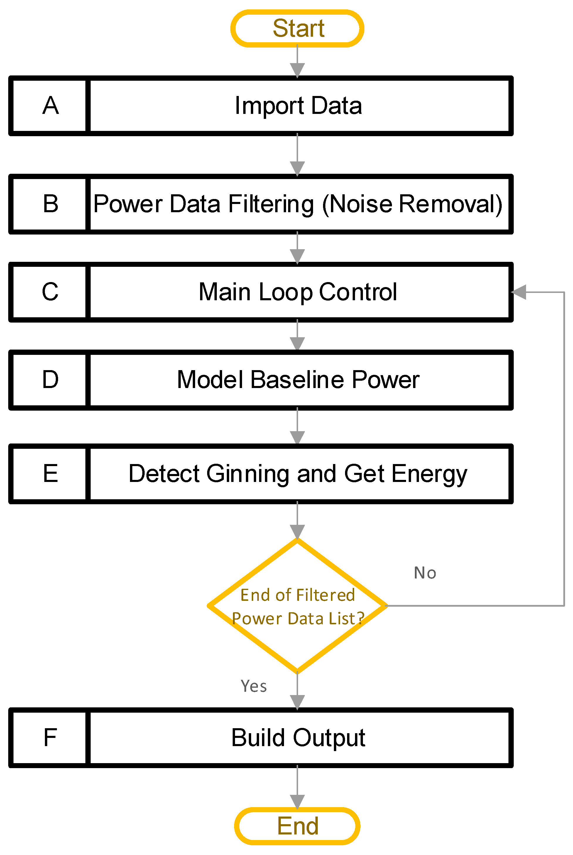
Figure 2 provides a high-level view of the software pipeline for the “Ginning Energy Extraction” method. The main steps are in boxes A–F, including: (A) import data, (B) power data filtering, (C) main loop control, (D) model baseline power, (E) detect ginning and get energy, and (F) build output. The overall goal of this pipeline is to detect periods of active ginning, and then calculate the total energy, along with the active energy, ginning times, and average power values. The high-level design is such that block A allows a user to import multiple CSV files, each containing high-resolution power data recordings. Power data from a cotton gin stand are typically noisy; therefore, the next step (block B) filters all the power data, to reduce the noise that is present. After that, a main loop begins with block C. The main loop allows the software to independently process the data contained in each CSV file loaded previously. Within the main loop, two major things happen. Firstly, block D models the baseline power consumed by the equipment. That is, it models the power consumed by the equipment while it is running but not actively ginning cotton. The software uses this result to determine when ginning is happening, and to separate the energy into active and baseline components. Secondly, block E detects periods of active ginning, and integrates these to obtain the active energy, total energy, baseline energy, ginning times, and average power levels. Finally, after the code has processed all the data, block E builds the outputs. In this way, the software can process all the datasets, and provide a single output file containing all the results.
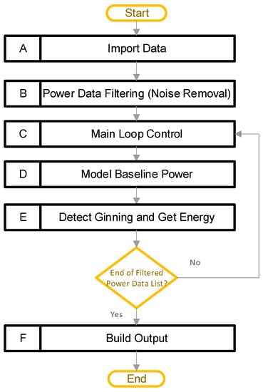
Figure 2.
Software processing pipeline (A–F) for the single power file, along with its metadata and user input.
The rest of Section 2 of this work will illustrate each of these steps, while working through an example. The title of each subsection is the same as the name shown in the flowchart. After this, Section 3 provides the results of the example, and details of the software validation performed. Several stages of the pipeline have user-tunable hyperparameters. These parameters are constant values that fine-tune how the algorithm works. A user may achieve a better result for their dataset by adjusting these values. Some examples that may warrant adjustment include user data that are noisier than the examples provided, or a power rise much larger or smaller than in the example data. The hyperparameters are pointed out, where appropriate, along with their default values used for the example data. Appendix A provides a list of the hyperparameters, along with default values for, and descriptions of, each. Appendix B.1 through B.3 provide the source code that will be discussed. All code written for this method is in the Python language [17] version 3.7.6, and it relies on pandas [18] version 1.2.0, numpy [19] version 1.19.2, and SciPy [20] version 1.5.2, as well as several others, as shown in the code.
2.2. Import Data
The main purpose of the import data stage is to move the data into the software in a format that is usable for completing the calculations. This stage operates as shown in the chart in Figure 3. At this point, the user provides the path to the folder containing the power data CSV files, and the name of the column containing the power data within the CSV file (this name will be ‘PT (W) (200 ms)’ in the example data provided). This folder can contain multiple files. Next, the user provides a “user input” file that contains three columns with one entry (row) for each power data CSV file that the user provided. The first column of the “user input” identifies the name of the CSV power file that the “user input” applies to. The second and third columns are the start and stop index for a user-identified continuous region, representing “typical idling”. Block A01 uses a pandas [18] DataFrame to hold these data, and Table 1 provides an example for a single CSV file. A discussion of how the code uses the user input comes later. Finally, the user can optionally provide a file containing any metadata, which the code reads into a DataFrame in block A02. A discussion of the metadata, and their format, comes later. Once the user has provided all the paths and files, block A03 checks the input folder, and acquires a list of all the files in the folder, after which block A04 imports any CSV files into a DataFrame. Appendix C provides the typical file structure used by the code.
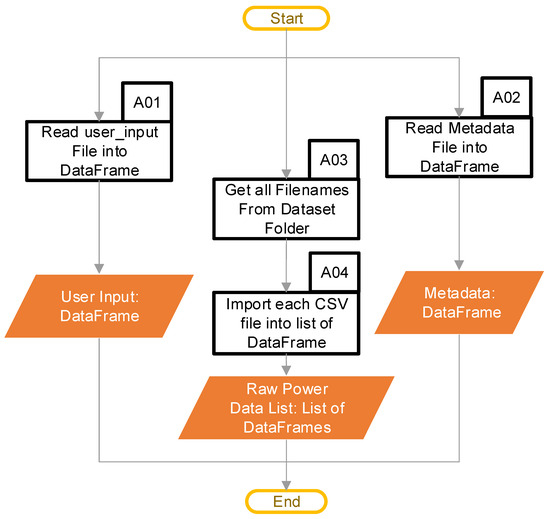
Figure 3.
Import data software pipeline (Blocks A01–A04 are the pipeline steps).

Table 1.
Example of a required user-inputted file.
The optional metadata that a user may elect to include can be very helpful if there are some important external variables, beyond the metrics that come from the power data. These types of variables may be important in subsequent analysis, such as statistical modeling. The metadata may include a wide variety of items, such as weather data, blocking factors, machine information, or any other variables that a user wants to track with each run of cotton. The metadata link to the power data through the filename. If a user provides metadata, they must contain a column for the filename, and the entries must match the names of the CSV files that contain the power data. There must also be 1 row in the metadata file for every period of active ginning in the power data file, and they must have the same order (i.e., for each file name, row 1 in the metadata must be power run 1, row 2 must be power run 2, and so on). The total number of points does not matter. Table 2 provides a minimal example; the first column is the file name the data refer to, and the second column is the run numbering (which must be in the same order as it is in the power file). A user can add any additional columns, as desired.

Table 2.
Optional metadata minimal example.
2.3. Power Data Filtering
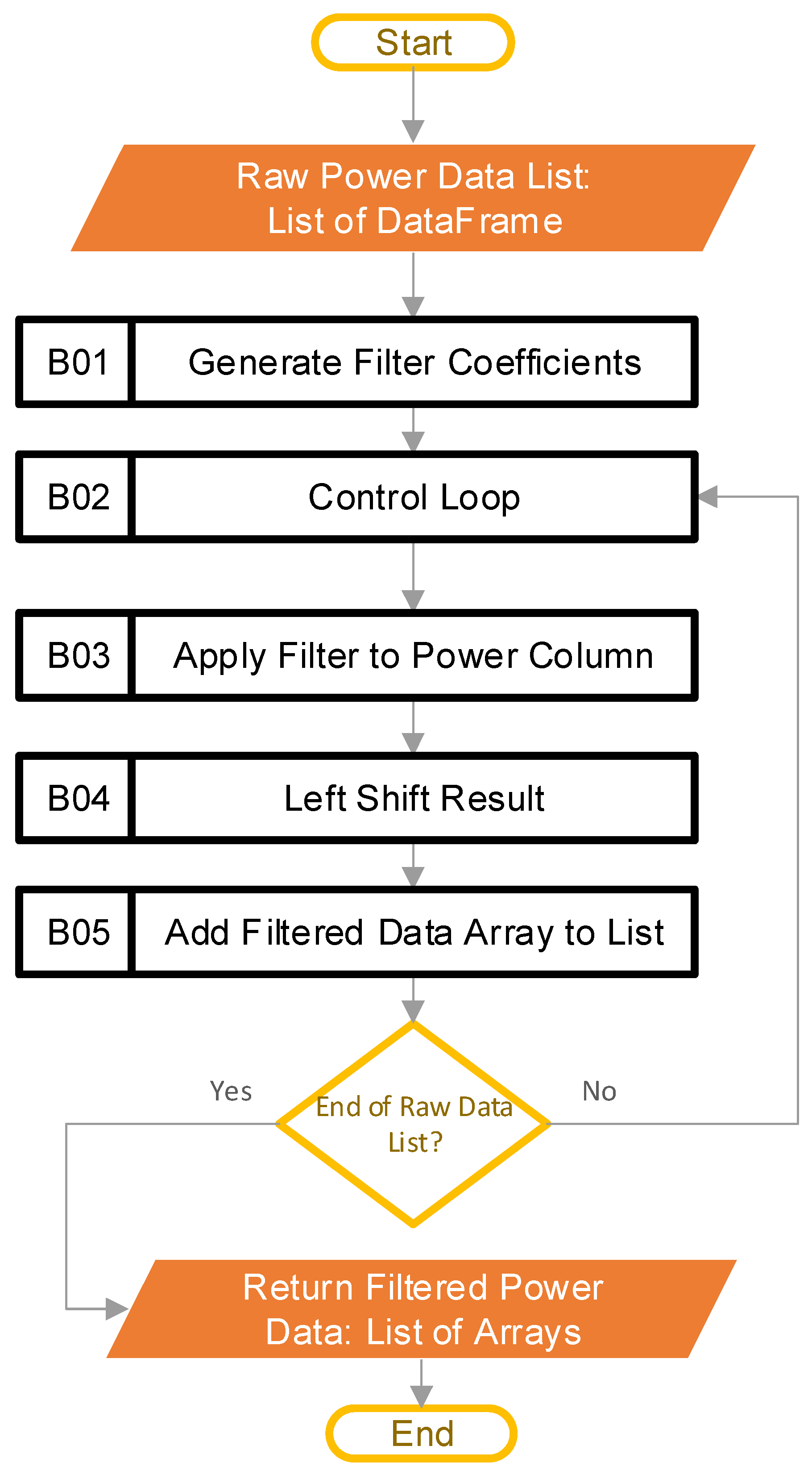
The goal at this stage in the pipeline is to reduce the noise found in the raw power data, to aid in the calculations performed later. Figure 4 shows the steps involved in this process.
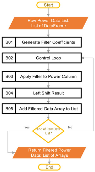
Figure 4.
Software steps to filter raw power data (Blocks B01–B05 are the pipeline steps).
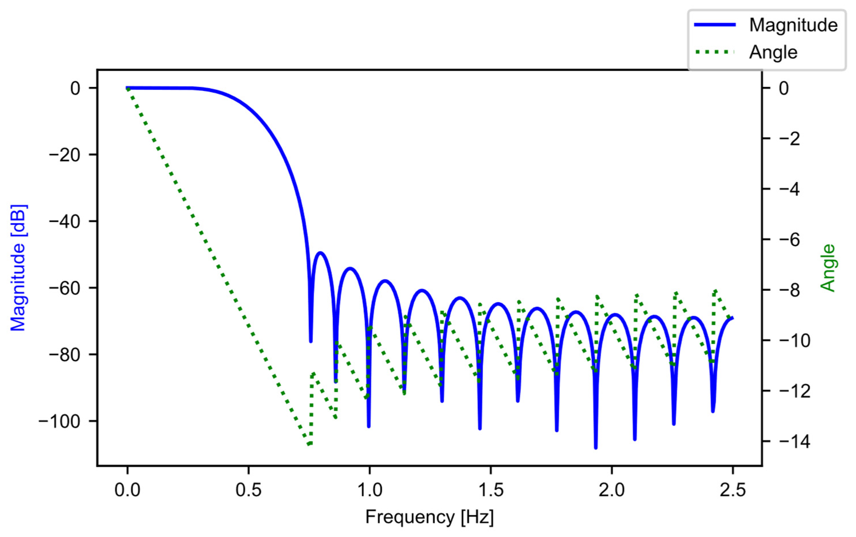
The input to this stage is the raw power data in the form of a list, where each list entry is a DataFrame that contains the data from the CSV file that the user inputted. The length of the input list is the number of CSV files that the user inputs. The first step in this stage of the pipeline is block B01, where the software constructs the filter coefficients. A finite impulse response (FIR) filter [21] is generated using SciPy [20], specifically through the “firwin” method, with the “Kaiser” window. The beta value is 4.53, and the filter is set up to be a low-pass filter, with 31 taps, and a cutoff frequency of 0.5 Hz. The “kaiserord” method in SciPy calculated the beta value and the number of taps, such that the transition window is 0.5 Hz, and the ripple is 50 dB (ensuring a less-than-1% ripple variation in the pass band). The transition window and ripple are hyperparameters that the user can adjust, depending on their data. The cutoff frequency (0.5 Hz) was well below the data aggregation period of the example data (5 Hz), and was chosen as there was not a lot of useful information beyond 0.5 Hz. For the example data, each period of active ginning had at least 150 samples; this is significantly more than the length of the filter, with 31 taps. Figure 5 provides the frequency response of the filter.
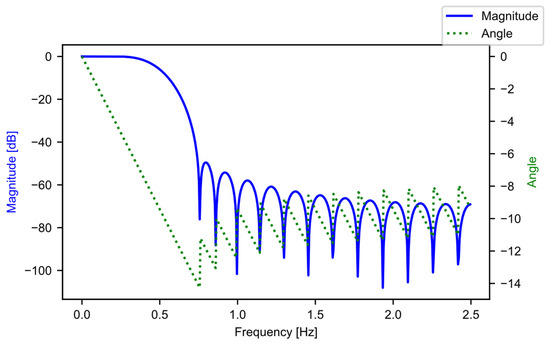
Figure 5.
The low-pass FIR filter frequency response.
After crafting the filter coefficients, the software goes into a loop in block B02. The purpose of this is to iterate through all the entries of the raw power data list one at a time. Each pass of the loop operates on the contents of a single CSV file, which the system loaded earlier (each file may contain multiple runs). Within the loop, block B03 uses the SciPy [20] “lfilter” method to apply the digital filter to the data column identified by the user as power data. Next, block B04 left-shifts the result, to compensate for the lag introduced by the filtering process, using knowledge of the number of taps in the filter. The lag correction is an optional step, but it does make it easier to plot any comparisons with the unfiltered data. The last step in the loop is block B05, where the software appends the data to a list of filtered power arrays. By the last run of the loop, the list of filtered power arrays has as many entries as there were CSV files in the user-supplied folder. All remaining calculations rely on the filtered data. Figure 6a shows the raw data before filtering, while Figure 6b provides the result after filtering.
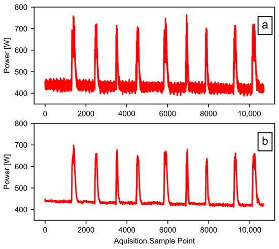
Figure 6.
The effect of data filtering: (a) the raw data; (b) the filtered data.
2.4. Main Loop Control
The goal of the main loop stage is to allow the code the flexibility of working on multiple datasets loaded at a single time. The reason for the loop is that the main processing stage (i.e., blocks D and E from Figure 2) are only designed to operate on a single dataset that may contain multiple runs. The main loop allows the code to process multiple datasets, by iterating through all the datasets, and presenting them one-by-one to the main processing stage, independently. The code appends the output of each loop to a list that holds the values until all the datasets finish processing. After this, the list passes on to the build output stage in block F from Figure 2. In this way, the results from all the datasets populate a single output file.
2.5. Model Baseline Power
The goal at this stage is to model the baseline power of an individual dataset. At this point, the control loop from block C has passed in the filtered power data that represent a single CSV file imported by the user. In addition to the specific filtered power data, this stage has access to the metadata DataFrame discussed during the import stage, and the user input DataFrame previously discussed. Figure 7 provides the steps involved at this stage.

Figure 7.
The software steps (Blocks D01–D05) involved in modeling the baseline power.
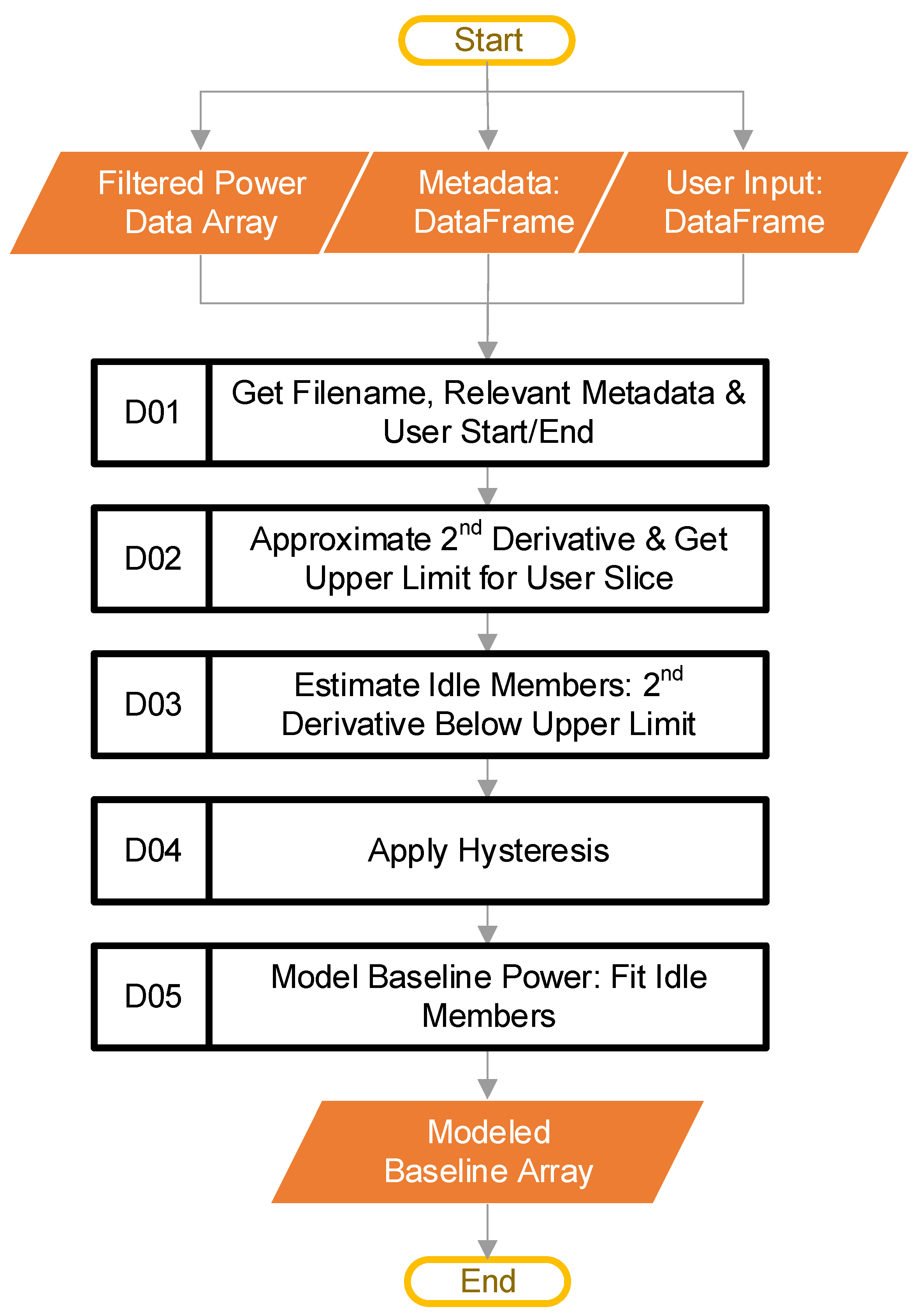
The first step of this stage is block D01. This step starts by retrieving the filename of the data that the main loop passed in. The code then uses the filename to look up the relevant metadata (if the user provided them), along with the UserStart and UserEnd values from the user-inputted file. Table 1 provided an example of the UserStart and UserEnd values. The metadata are not part of any calculations. The software only tracks them to ensure the ordering, and then inserts them into the final output compiled in block F, from Figure 2. We have mentioned that the UserStart and UserEnd terms define a range that the user considers to be “typical idling.” How the software uses the “typical idling” range will be explained later.
Next, block D02 calculates the approximate magnitude of the second derivative of the filtered power data, to get a sense of how quickly the slopes of the power data are changing (i.e., how jumpy the data are). The assumption made is that a gin stand will show less variation in the power signal when idling than while actively ginning. The approximate second derivative is calculated using numpy [19], through taking the absolute value of the second discrete difference using the “numpy.diff” method. After this, block D02 calculates the estimated maximum value of the second derivative expected for idling. This calculation is based on the user-supplied “typical idling” range. The code calculates the estimate using the pseudocode of Equation (1):
where is the mean of the approximated second derivative from index UserStart to UserEnd, SD is the standard deviation over the same range, and STDEV is a hyperparameter with a default value of 3. For the example data, UserStart is 8200, while UserEnd is 8800, as shown in Table 1.
Now that the system has the estimated maximum value of the approximated second derivative (i.e., ), block D03 compares β against the whole approximated second derivative array. In this way, the code identifies the indices where the value of the array is less than β (i.e., points beyond the user “typical idling” range that may also represent idling equipment). In other words, applying the above-stated assumption that an idling gin stand will show less variation in the power, this block is looking for the low-variation points. The output is a binary array where a value of one means that the code has estimated that the filtered power data at the same index location represents idling. The result obtained can be noisy, with rapid state changes. A hysteresis function applied to the binary array reduces this unwanted noise.
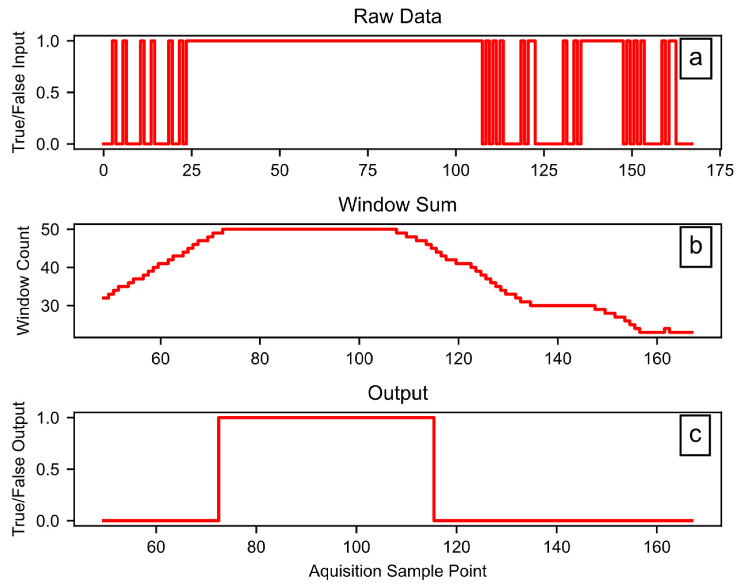
Block D04 applies the hysteresis function, which has three tunable hyperparameters: Window (W), Set (S), and Reset (R). The W term controls the size of the rolling window in counts; each count is 0.2 s for the example data. The size of each count may change for a user’s dataset, depending on the sample rate of the source data. The output of the hysteresis only goes high when the sum of the window data is at least equal to S counts. Once the output is high, the input must go low for enough counts to cause the sum of the window to be less than R, for the hysteresis output to go low. In any case, the R term must be equal to, or smaller than, the S term. In addition to smoothing, this introduces a lag that can remove startup effects by rejecting the first portion of the signal. The software code provides more details on the hysteresis function. Figure 8 shows the hysteresis function working on example data, using W = 50, S = 50, and R = 45. In Figure 8a, the raw data include some rapid state transitions before and after a more stable period, while Figure 8b provides the sum of the window data, and Figure 8c shows the final output.
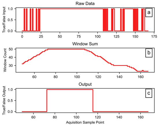
Figure 8.
Example hysteresis function workings: (a) the raw data input, (b) the sum of a 50-count window, (c) the binary output.
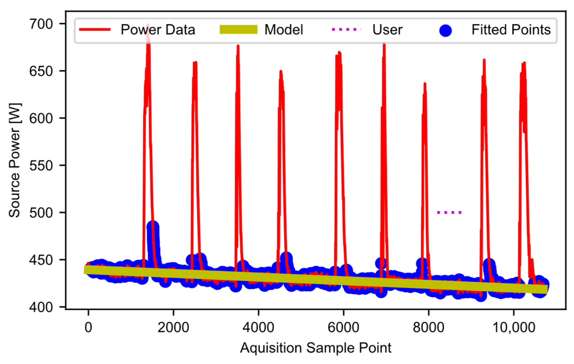
Once the estimated idling points are all found, block D05 fits a linear curve to these points. Figure 9 shows the user selection (i.e., the user-selected “typical idling” region) as the horizontal dotted line, the filtered power data as a solid red line, the datapoints included in the fit (blue dots), and the curve fit (yellow line), which models the baseline power. In cases where users determine that curves other than a linear fit are a better choice for their data, the code can be modified accordingly. In this example, the modeled baseline power decreases with time. This decrease matches the trend discussed when describing the raw data in Figure 1. In essence, as the gin stand warms up, the baseline power decreases. Potentially many factors contribute to the decrease (the properties of the lubrication, the dimensional stability of mechanical parts, friction, heat in the electronics and motors, etc.). Ideally, all equipment would have time to warm up before use. However, baseline modeling allows the software to handle the warmup effects if a warmup period is not feasible. The final output of this stage is an array-like object that contains the modeled baseline power curve.

Figure 9.
Estimated baseline power points and linear-modeled baseline power.
2.6. Detect Ginning and Obtain Energy
The goal of this stage in the pipeline is to detect periods where ginning is actively happening, and then extract useful energy and power metrics from it. This stage generates the results that the user ultimately reads. At this point, the code has access to the modeled baseline power array (the output from Figure 2, block D) as well as the filtered power array provided by the main control loop from block C, in Figure 2. Figure 10 provides the steps involved at this stage of the processing.
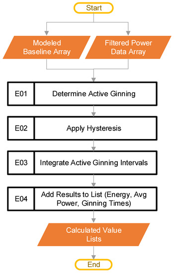
Figure 10.
The pipeline steps (Blocks E01–E04) used to determine active ginning and metrics.
The first step in this stage is to find periods where ginning is actively happening, as shown in block E01 of Figure 10. The code does this by comparing the filtered power data (from Figure 2, block C) with the modeled baseline power (from Figure 2, block D), to find points in the power that have a magnitude lower than some percentage over the baseline. The pseudocode of Equation (2) serves this purpose:
where is the filtered power data array that represents all the power data from a single CSV file the user inputs, is the modeled baseline power array that corresponds to the power data array, rise is a constant, and the output test is a binary array or True/False values. The default value of rise is 1.1, a hyperparameter. In the special case where there is some null value in the array, the code treats that point as if idling, for calculation purposes. The active ginning intervals are then simply the inverse of test. The inverse comes from flipping all the elements of test, such that every 0 (or False) turns to a 1 (or True), and every 1 (or True) becomes a 0 (or False).
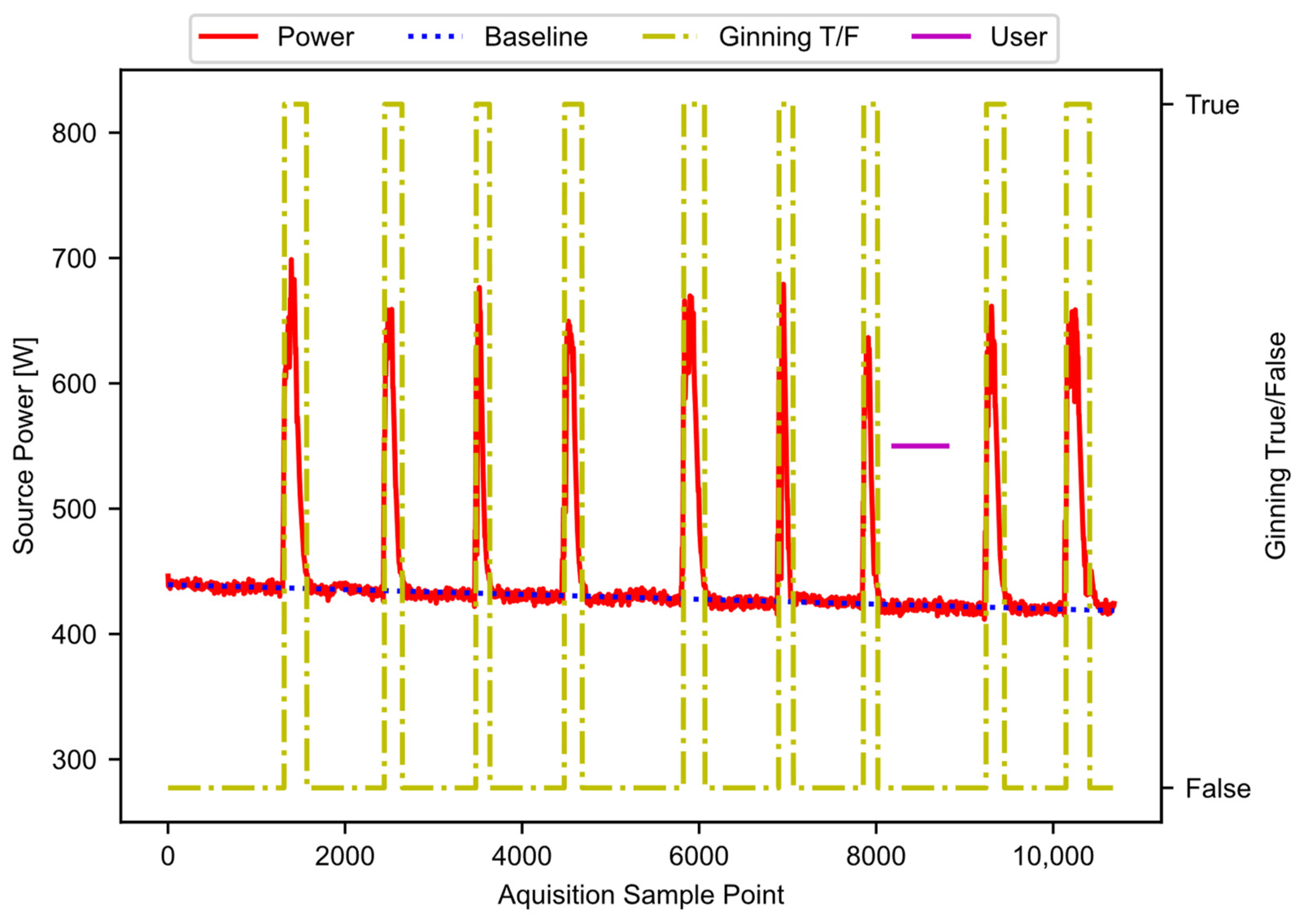
The result from block E01 is noisy. As before, a hysteresis function reduces the noise, as shown in block E02. The hysteresis function is the same as was described in Figure 7 block, D04, except that the parameters (W, S, R) have different values. The exact values are hyperparameters that may require tuning for application. The result of this step provides the periods of active ginning. Figure 11 shows the filtered power data, along with the baseline power curve fit, and the active ginning periods just discussed.
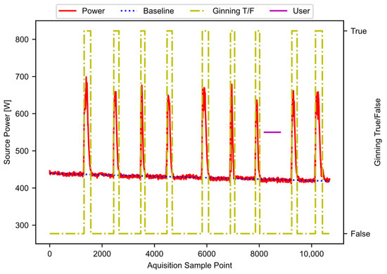
Figure 11.
The filtered power data, showing the baseline and active ginning periods.
Once active ginning periods have been established, these active regions are separated out in block E03. At this point, the code generates the ginning times for each active period, based on the sample rate and the number of points contained in the active regions. The software then integrates the individual active regions, to obtain the energy. In this case, SciPy [20] provides the “trapz” integration method. The software integrates both the total power and the baseline power for each period of active ginning. This results in the total energy and the baseline energy for each period of active ginning.
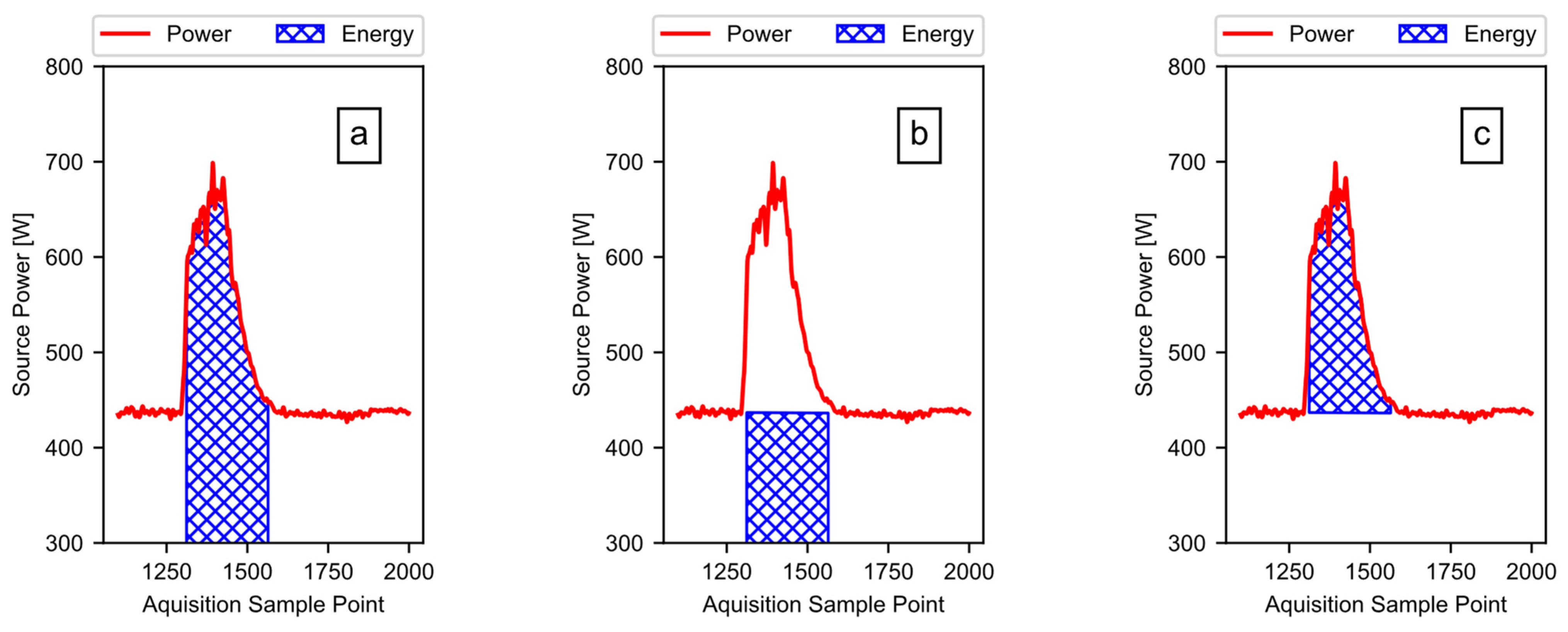
Using the total energy and the baseline energy, the software calculates the active ginning energy (i.e., the portion of the energy doing work on the cotton, plus any additional losses). To illustrate, Figure 12 shows the process using only the first run of the example data from Figure 1. The software subtracts the calculated baseline energy, as shown in Figure 12b, from the calculated total energy, as shown in Figure 12a, to acquire the active energy, as shown in Figure 12c. When the data include multiple runs, the software simply subtracts the first baseline energy value from the first total energy value, the second baseline energy value from the second total energy value, and so on.
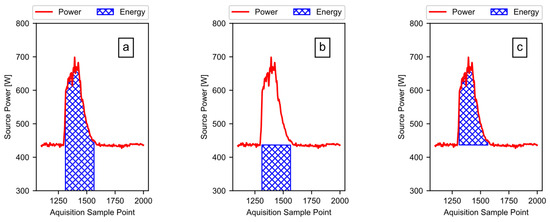
Figure 12.
The energy from power: (a) the total energy is the area under the power curve; (b) the baseline energy is the area under the modeled baseline power curve; (c) the active energy is the energy due to the power rise above the baseline, when actively ginning.
Block E03 also provides the average power levels for each period of active ginning. To obtain the average total power for each period of active ginning, the code divides the total energy of each active ginning period by its associated ginning time. To get the average baseline power for each period of active ginning, the code divides the baseline energy for each active ginning period by its associated ginning time. The total energy, active energy, average baseline power, average ginning power, and ginning times are all saved to lists, for use in the next step of the pipeline.
2.7. Build Output
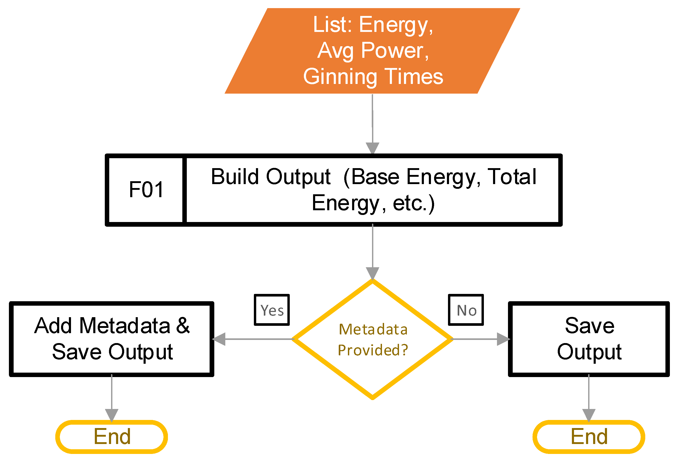
The goal of this stage is to build the output, and save it into a format that is useful to the user. This step begins after the main control loop from Figure 2, block C determines that there are no more filtered power data to process. Figure 13 provides the steps involved.

Figure 13.
The pipeline steps to build the output.
Block F01 transfers the calculated values from the lists that stored them into a DataFrame. Next, the software appends the metadata (if provided) to the DataFrame. Finally, the code saves the DataFrame to a CSV file. It should be noted that combining the metadata with the calculated metrics works only if the number of rows in the calculated values matches the number of rows in the metadata.
3. Results and Discussion
Up to this point, an example dataset that was introduced in Figure 1 has served to illustrate the steps involved in the new method presented. Now that all the processing is complete, and the software has created the output CSV file, the results can be inspected through opening the CSV file.
Table 3 provides the first five rows of the CSV file (i.e., the header plus the first four runs in the data). The first six columns of the output are the calculated parameters (i.e., the base energy, total energy, and active energy in watt-hours, followed by the ginning time in seconds and, finally, the base average power, and the total average power in watts). The remaining columns of the output data are the optional metadata that were included. In this case, the metadata shown comprise the minimum example in Table 2, along with the ambient temperature information for each run.

Table 3.
Example output results, as saved to the final CSV file.
The results found in the CSV file can now be used for scientific purposes, depending on the needs of the user. A common scientific purpose to which this method could be applied is in testing for correlations between cultivar and energy or ginning time, as seen in other studies using older methods [1,2,15]. Applying the new method presented in the current study would require simply providing the cultivars being tested and the sample sizes as metadata, along with the power files recorded at a high-enough sample rate. The newly presented method would eliminate the need for the operator to power off the motor, or for anyone to time the ginning periods. Allowing the software code to detect the start and stop times for periods of active ginning reduces the variation introduced by humans having to take action.
Software Validation
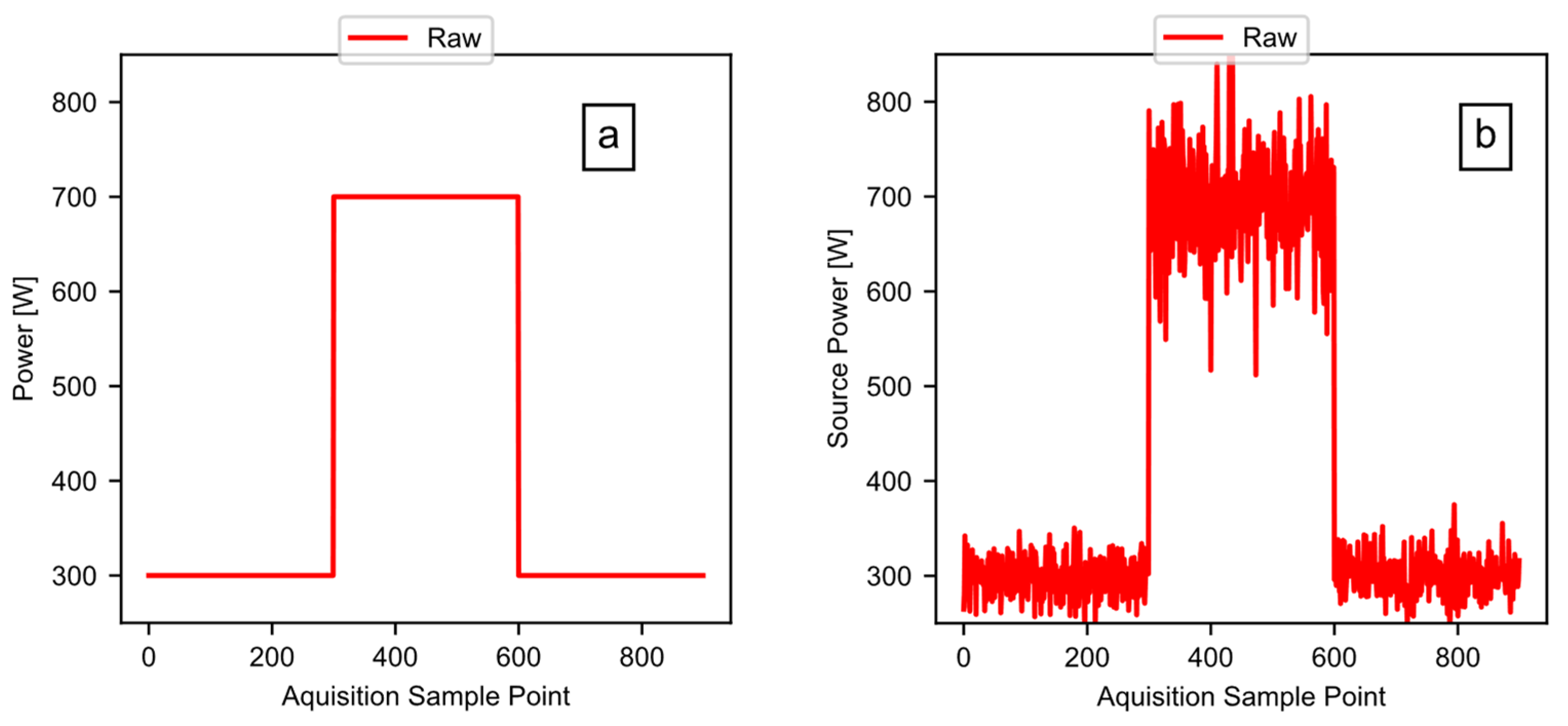
The previous sections focused on example data taken from a real-world test, to illustrate the method and the software pipeline. This section now focuses on a known simulated test signal, to validate the software. The validation works by feeding a test signal (of a known power, energy, and period) to the software, while comparing the calculated outputs to the known values. Figure 14a shows the clean test signal: a square wave with a baseline power of 300 watts, and a peak power of 700 watts. The overall length of the signal was 900 points, with a point generated every 0.2 s, and a high signal for 300 points. Figure 14b shows the signal after the addition of noise to the test signal. The test signal includes the random noise having a mean value of zero, with a larger standard deviation in the 700-watt region of the signal.
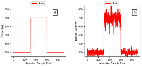
Figure 14.
The validation test signals: (a) the simulated square wave test signal; and (b) the simulated test signal with noise added.
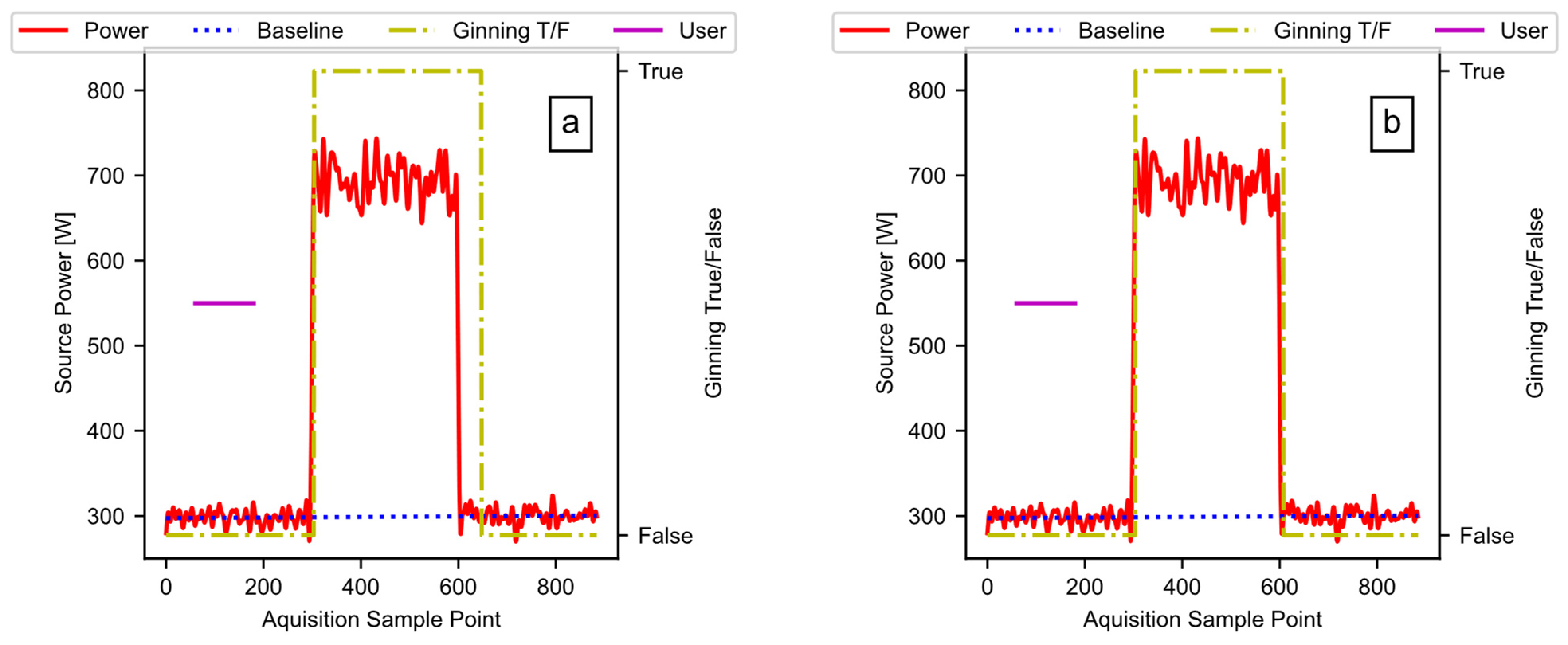
Figure 15 provides the results of running the noisey signal through the pipeline as described. The plots include the detected ginning period, the ideal power fit, and the user input (i.e., the data available after Figure 10, block E02). Figure 15a is the result when the hysteresis window in Figure 10, block E02 is set to 50 counts, and Figure 15b is the result when the window is set to 10 counts. Reducing the window size reduces the lag between the end of the test signal pulse and the end of the detected active ginning time. Unlike the sharp drop in the test signal, some lag may be beneficial when measuring real ginning data, because the power level slowly drops, as the cotton works through the gin stand. The window is a hyperparameter, which allows the user to fine-tune as necessary to the specific data in use.
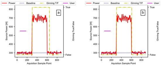
Figure 15.
The test signal output: (a) a window size of 50; (b) a window size of 10.
Table 4 shows the calculated outputs from the code pipeline, along with the theoretical values that come from the known test signal (i.e., the row titled ‘Real’). Looking at the window 50 and window 10 rows versus the “Real” row, we can see that the code is working, with the error decreasing for the square wave test input as the lag reduces. This result illustrates the effect of the window on the results, and the flexibility of the pipeline that allows user adjustments based on the type of data. The validation study confirms that the software functions as designed, and can produce accurate results that can fit the data, while factoring in user inputs.

Table 4.
The test signal validation test results.
4. Conclusions
Common tools can measure the gin stand power; however, such tools typically do not detect active ginning. Active ginning detection is important when separating the total energy calculated into the energy going to the moving parts of the machine, versus the active energy doing work on the cotton (plus any losses). Separating out the energy allows energy optimization work to target the machine design, or target the cotton cultivars. An automated tool to detect active ginning, and calculate common metrics, would be of value to the community, as it could ensure the consistent treatment of data across studies.
The goal of this work was to provide a semi-automated tool to analyze typical power data recorded using common tools that can detect ginning, and separate out the components of the energy. To that end, a software program was created to analyze power data utilizing open-source packages. The software takes in the raw power data, filters them, models the baseline energy consumption of the equipment under test, detects active ginning, and calculates the ginning metrics: the ginning times, energy consumed, and average power. The new method works on files containing multiple runs of cotton in a single file. The output from the software can be used to support the objectives of the user. This may take the form of testing energy or ginning rate versus cultivar, checking the baseline energy of the equipment, etc.
Software validation tests found that, using a simulated noisy signal, it is possible to control the error in the calculated energy, ginning time, and average power to 2% or less, versus the theoretical values for the signal with no noise. The new semi-automated method presented herein will save time, while also making it easier to compare results across studies, by ensuring the consistent treatment of data. It is anticipated that, by allowing the software to automatically extract ginning intervals, and calculate important metrics, human-induced variation can be reduced. This may also make it easier to compare results obtained by different groups, through applying common calculations across studies.
Author Contributions
Conceptualization, S.P.D. and J.W.T.; methodology, S.P.D.; software, S.P.D.; validation, S.P.D. and F.P.A.; investigation, S.P.D. and F.P.A.; resources, J.W.T.; data curation, S.P.D. and F.P.A.; writing—original draft preparation, S.P.D. and F.P.A.; writing—review and editing, S.P.D., F.P.A. and J.W.T.; visualization, S.P.D.; supervision, J.W.T. All authors have read and agreed to the published version of the manuscript.
Funding
This work was supported in part by Cotton Incorporated (Cary, NC, USA), grant number 21-014.
Data Availability Statement
The data presented in this study are available on request from the corresponding author. The data are not publicly available due to other ongoing studies.
Conflicts of Interest
The authors declare no conflict of interest. The funders had no role in the design of the study; in the collection, analyses, or interpretation of data; in the writing of the manuscript; or in the decision to publish the results.
Disclaimer
Mention of trade names or commercial products in this publication is solely for the purpose of providing specific information and does not imply recommendation or endorsement by the U.S. Department of Agriculture. USDA is an equal opportunity provider and employer. The software presented is an experimental system. The United States Department of Agriculture and the Agricultural Research Service accept no liability or responsibility of any kind to any user, other person, or entity as a result of operation of this software. The software is provided “AS-IS”, and you, its user, assume all risks when using it.
Appendix A
As discussed, there are several hyperparameters in the code that a user can modify, depending on the application. Table A1 summarizes the hyperparameters, along with their default values, and descriptions of what they do.

Table A1.
Hyperparameters to modify, depending on the application.
Table A1.
Hyperparameters to modify, depending on the application.
| Parameter | Default Value | Description |
|---|---|---|
| WINDOW_01 | 50 | The rolling window size used for the first application of the hysteresis function. A larger window size may have a stronger effect, but it will cause more lag in the filtering function. |
| SET_01 | 50 | The setpoint for the first application of the hysteresis function. The sum of the window values must be equal to, or greater than, this before the output goes high. Larger values typically work better for noisy data. |
| RESET_01 | 45 | The reset point for the first application of the hysteresis function; if the window value falls below this, the output goes low. Must be less than, or equal to, set. |
| WINDOW_02 | 50 | The rolling window size used for the second application of the hysteresis function. A larger window size may have a stronger effect, but it will cause more lag in the filtering function. |
| SET_02 | 8 | The setpoint for the second application of the hysteresis function. The sum of the window values must be equal to, or greater than, this before the output goes high. Larger values typically work better for noisy data. Larger values also help to exclude startup effects. |
| RESET_02 | 5 | The reset point for the second application of the hysteresis function; if the window value falls below this, the output goes low. Must be less than, or equal to, set. |
| MYFS | 5 | The sampling rate of the power data imported, in the number of samples per second. |
| NTAP | 50 | The number of taps used in the FIR filter; this controls the order of the filter. |
| WITDH | 0.5/2.5 | The FIR filter transition width in Hz over the Nyquist frequency. |
| RIPPLE | 50 | The FIR filter ripple specification. |
| E_RISE | 1.1 | The percentage power rise above the modeled baseline needed to count as active ginning. |
| INI | [0, 450] | The initial value used to fit the baseline power curve. |
| STDEV | 3 | The number of standard deviations to use when estimating the upper limit of the approximate second derivative magnitude from the user slice. |
Appendix B
Appendix B.1
“““
@author: Sean.Donohoe
This is the main code used to extract ginning energy data and times from
high resolution power data. Tested using power data that had a 5hz data
aggregation rate.
rate.
“““
import pandas as pd
import main_functions as mf #module containing needed functions
import viz_func as vf #module containing needed functions
#Including Metadata Flag
META_D = 1
#Hyperparamaters for algorithm (reset must be <= set)
WINDOW_01 = 50 #Each count is one time step for meter used
WINDOW_02 = 50 #Each count is one time step for meter used
SET_01, RESET_01 = 50, 45 #num counts of window for start and end
SET_02, RESET_02 = 8, 5 #num counts of window start and end (D: 8, 5)
MYFS = 5 #sample rate
E_RISE, INI = 1.1, [0, 450] #power rise over base, initial fit conditions (D: 1.1)
STDEV = 3
WIDTH, RIPPLE = 0.5/2.5, 50 #Filter parameters
#Folders containing data
INPUT_FOLDER = ‘./dataset/’
POW_COL = ‘PT (W) (200 ms)’ #name of power column in dataset
USER = pd.read_csv(‘./other/user_input.csv’) #(Figure 3: Block A01)
RUN_SHEET = pd.read_csv(‘./other/metadata.csv’) #(Figure 3: Block A02)
meta_dataFrame = pd.DataFrame() #dataframe to store metadata
#Lists used for temp storage
base_average_List, total_average_List = [], []
BaseEnergy_List, TotalEnergy_List = [], []
times_list, RMSE_list = [], []
#Import Data: CSV files in input_folder into pandas, return filenames (Figure 2: Block A)
filesList, raw_data = mf.import_data(INPUT_FOLDER)
#Power Data Filtering (Noise Removal): my_data is list of DataFrames (Figure 2: Block B)
filtered_power_data, coef = mf.filter_data(raw_data, my_fs = MYFS,
name = POW_COL, width =
WIDTH, ripple = RIPPLE)
vf.plot_filter_response(coef, MYFS) #visualize response
vf.filt_comp(raw_data[0][POW_COL], filtered_power_data[0], ‘test_0’) #filter effect [0] entry
#Main control loop
for i, data in enumerate(filtered_power_data): #(Figure 2: Block C)
#Get filename, relavant metadata, and user start/end (Figure 7: Block D01)
name = filesList[i].split(‘/’)[−1]
if META_D == 1:
test_meta_data = RUN_SHEET[RUN_SHEET[‘File’] = =name[:−4]]
meta_dataFrame = pd.concat([meta_dataFrame, test_meta_data])
ustart, uend = mf.get_user_start_end(USER, name[0:−4])
#Approximate 2nd Derivative & Get Upper Limit for User Slice (Figure 7: Block D02)
delta2_Sigma, ABS_Delta_Delta = mf.usr_calc(data, ustart[0], uend[0], STDEV)
#Estimate Idle Members: 2nd Derivative Below Upper Limit (Figure 7: Block D03)
LowVal = mf.low_val_test(ABS_Delta_Delta, delta2_Sigma)
#Apply hysteresis (Figure 7: Block D04)
w, intervals = mf.hyster_fun(WINDOW_01, SET_01, RESET_01, LowVal, start = 1)
#Model Baseline Power: Fit Idle Members (Figure 7: Block D05)
Base, me, se, myRMSE = mf.fit_base(data, intervals, INI)
#Determine Active Ginning (Figure 10: Block E01)
Ginpossible = mf.idel_or_gin(data, Base, E_RISE)
#Apply hysteresis: results form bounds of integration (Figure 10: Block E02)
w, Ginning = mf.hyster_fun(WINDOW_02, SET_02, RESET_02, Ginpossible)
#Integrate Active Ginning Intervals (seperate out regions first) (Figure 10: Block E03)
total_pow_lists = mf.breakout(Ginning, data)
base_lists = mf.breakout(Ginning, Base)
BEnergy_Whr, Times, base_avg = mf.integrate2(base_lists, 1/MYFS)
TEnergy_Whr, Times_02, total_avg = mf.integrate2(total_pow_lists, 1/MYFS)
#For DEBUG purposes display various plots
vf.fit_plot(data, intervals, Base, [0,len(data)],
[ustart[0], uend[0]], name[0:−4]) #Visualize the fit
vf.processed(data, Base, Ginning,
[ustart[0], uend[0]], name[0:−4], 000) #Power and Baseline
r_pow = raw_data[i][‘PT (W) (200 ms)’] #Unfiltered power data
#vf.compare_plot(data, r_pow, Base, Ginning, name[0:−4],[0, len(data)])
vf.single_plot(r_pow, name[0:−4], Ginning, [0,len(r_pow)], y_lim = [250,850]) #raw data
#The limits here are for plotting example data, other data may not work
#vf.visualizerC(data, name[0:−4], Ginning, [1100,2000]) #total energy fill
#vf.visualizerD(data, Base, name[0:−4], Ginning, [1100,2000]) #AE fill
#vf.base_E_plot(data, Base, name[0:−4], Ginning, [1100,2000]) #BE fill
#Print names and number of runs
print(‘File: ‘+name)
print(‘Runs Found: ‘+str(len(base_lists)))
#Add Results to List (Energy, Avg Power, Ginning Times) (Figure 10: Block E04)
RMSE_list.append(myRMSE)
BaseEnergy_List = BaseEnergy_List + BEnergy_Whr
TotalEnergy_List = TotalEnergy_List + TEnergy_Whr
times_list = times_list + Times
base_average_List = base_average_List + base_avg
total_average_List = total_average_List + total_avg
#Save RMSE to DataFrame
pd.DataFrame(RMSE_list, columns = [“RMSE”]).to_csv(‘RMSE_data.csv’)
#Build Output: Save energy data to DataFrame (Figure 13: Block F01)
energyDF = pd.DataFrame(BaseEnergy_List, columns = [“B_Energy_Whr”])
energyDF[“T_Energy_Whr”] = TotalEnergy_List
energyDF[“Act_Energy”] = energyDF[“T_Energy_Whr”]-energyDF[“B_Energy_Whr”]
energyDF[“Time”] = times_list
energyDF[“Base_Avg_W”] = base_average_List
energyDF[“Total_Avg_W”] = total_average_List
if META_D == 1:
#Concat with the metadata
if len(test_meta_data) != len(base_lists):
print(‘CAUTION: Possible Run Mismatch’)
meta_dataFrameA = meta_dataFrame.reset_index(drop = True) #reset index
energyDF = pd.concat([energyDF,meta_dataFrameA], axis = 1, sort = False)
energyDF.to_csv(‘./output/processed_results.csv’) #save
Appendix B.2
“““
@author: Sean.Donohoe
Contains methods needed to filter data, detect ginning, and seperate
total energy used vs. active energy going to ginning (plus losses).
This should be named main_functions
“““
import math
import statistics
from os import listdir
from scipy import optimize, signal, integrate
from sklearn.metrics import mean_squared_error
import numpy as np
import pandas as pd
def import_data(input_folder):
‘‘‘
Method to read in data from folder return list of filenames.
and a list where each element is a DataFrame of the CSV contents
input_folder = string of folder path
‘‘‘
files_list = []
my_data = []
for filename in listdir(input_folder): #Get all Filename (Block A03)
#Import each CSV file into list of DataFrame (Block A04)
if filename[−4:] == ‘.csv’:
name = input_folder + filename
files_list.append(name)
my_data.append(pd.read_csv(name))
return (files_list, my_data)
def filter_data(my_data, my_fs, name, width = 0.5/2.5, ripple = 50):
‘‘‘
Method to filter each element of a list.
my_data = list of DataFrames where
my_fs = sampling frequency used by equipment
name = name of power column in dataset
width = Desired transition width (Hz) over nyquest freq
Ripple = ripple used in kaiserord: default 50
--> Returns filter coefficients and filtered data
‘‘‘
#Generate Filter Coefficients (Block B01)
ntaps, beta = signal.kaiserord(ripple, width) #window paramters
coef = signal.firwin(ntaps, 0.5, fs = my_fs, window = (‘kaiser’, beta))
print(‘ntaps: ‘+str(ntaps))
print(‘beta: ‘+str(beta))
#Control Loop (Block B02)
filtered_power_data = []
for f in my_data:
#Apply Filter to Power Column (Block B03)
filter_output2 = lowpass_alt2(f[name], coef)
#Left Shift Result: Removes FIR delay (Block B04)
shift_ammount = int(0.5*(ntaps − 1)) #total FIR delay
filter_output2list = filter_output2.tolist() #convert array to list
del filter_output2list[0:shift_ammount] #remove first elements
filter_output2_array = np.array(filter_output2list) #convert to array
#Add Filtered Data Array to List (Block B05)
filtered_power_data.append(filter_output2_array)
return (filtered_power_data, coef)
def lowpass_alt2(data, coef):
‘‘‘
Method to apply filter using the initial steady state value.
data = data to filter
coef = filter coefficients
‘‘‘
#Generate filter
yini = signal.lfilter_zi(coef, 1) #get initial steady state
y_vals, _ = signal.lfilter(coef, 1, data, zi = yini*data[0]) #apply filter
return y_vals
def get_user_start_end(data, name):
‘‘‘
Method to get user stand and end values from the dataframe
data = the datafame that contains the values
name = name of the file
‘‘‘
ustart = data[data[‘File’]==name][‘UserStart’].values
uend = data[data[‘File’]==name][‘UserEnd’].values
return (ustart, uend)
def usr_calc(data, my_start, my_end, num_sd = 3):
‘‘‘
Method takes data and user slice (start/end), applies np.diff twice to
get difference of differences (i.e., approx 2nd derivative), and
calculate cutoff based on user slice.
my_data = input data
my_start = start point
my_end = ending point
num_sd = number of standard deviations
‘‘‘
#Double apply np.diff, adding zeros so lenth does not change
abs_dif2 = abs(np.diff(np.hstack(([data[0],data[0]], data)), n = 2))
testvals = abs_dif2[my_start:my_end] #User slice
delta2_mean = statistics.mean(testvals) #User slice mean
delta2_stdev = statistics.stdev(testvals) #User slice stdev
#Cutoff based on user slice
beta = delta2_mean + num_sd*delta2_stdev
return (beta, abs_dif2)
def low_val_test(myinput, cutoff):
‘‘‘
Method to test if myinput data is less than cuttoff value.
myinput = data_ABS_Delta_Delta [array]
cutoff = delta2_PlusN_Sigma
Determine if the ABS_Delta_Delta values are below cutoff value
‘‘‘
return 1*(myinput < cutoff)
def hyster_fun(test_window, setpoint, reset, mydata, start = 0):
‘‘‘
Method to apply hysteresis to the given data.
testwindow = size of test window
setpoint = setpoint where value goes high
reset = value of rolling window that resets value low
mydata = list like item containing the data
start = if equals 1 will pad with NaN
--> Return tuple of window sums and data with hysteresis applied
‘‘‘
#convert list to pandas so can use rolling window
data = pd.DataFrame()
data[‘lowval’] = mydata
was_in_zone = 0 #Initial value
my_window = data[‘lowval’].rolling(test_window).sum() #Sum rolling window
the_zone = [] #List to hold outputs
for i, value in enumerate(my_window):
#In startup condition dont apply logic, buffer with NaN
if start == 1 and i < test_window:
the_zone.append(np.NaN)
else:
#Not currently in zone, but thrshold meet for start
if (value >= setpoint and was_in_zone == 0):
the_zone.append(1)
was_in_zone = 1
#Currently in zone, value not yet fallen below threshold
elif (value >= reset and was_in_zone == 1):
the_zone.append(1)
was_in_zone = 1
#Value below threshold, fell out of the zone
else:
was_in_zone = 0
the_zone.append(0)
return (my_window, the_zone)
def fit_base(inputdata, interval, ini):
‘‘‘
Method to fit curve to given datapoints. Typically used to fit low value
intervals such that it can model the baseline power.
inputdata = power data [array]
interval = array of intervals where “smooth” [list]
ini = initial parameters used by the fit
-->Return baseline fit, RMSE, mean error, stdev of error
‘‘‘
#Get index locations where “my_data[‘LowValue_Interval’]” == 1
#Get power data matching index locations
interval = np.array(interval)
condition = interval == 1 #condtion to find
index_to_fit = condition.nonzero()[0] #indicies of interval elements == 1
y_to_fit = inputdata[index_to_fit] #data @ indicies
#Fit the data
p_opt, *e = optimize.curve_fit(linear_curve, index_to_fit, y_to_fit, ini)
#Using fit paramaters, generate values for curve
x_base = np.linspace(0, len(inputdata−1), len(inputdata))
#Get baseline curve (use unpacked p_opt)
baseline = linear_curve(x_base, *p_opt)
#Get model evaluated @ indexes where fit was done
modeled_values = linear_curve(index_to_fit, *p_opt)
#Get error information
errors = modeled_values − y_to_fit
errors_mean = statistics.mean(errors)
stdev_errors = statistics.stdev(errors)
my_rmse = math.sqrt(mean_squared_error(y_to_fit, modeled_values)) #RMSE
return (baseline, errors_mean, stdev_errors, my_rmse)
def linear_curve(x_val, k_1, k_2):
‘‘‘
Method to define linear curve.
x_val = x-axis inputs, possibly list
k_1 = slope
k_2 = offset
‘‘‘
return k_1*np.array(x_val) + k_2
def idel_or_gin(power_data, baseline, rise = 1.1):
‘‘‘
Method to determine if idle or ginning based on power rise above baseline.
powerData = data to check, usually filtered power data [array]
baseline = baseline power data [array]
rise = % over baseline to count as ginning, default = 1.1 (i.e., 10% over)
‘‘‘
#Find all locations where idle (less than estimate OR null)
test1 = power_data < (rise*baseline)
test2 = pd.isnull(power_data)
check_power = test1 | test2
#Get ginning locations (i.e., where not idle)
return 1*np.invert(check_power)
def breakout(intervals, power_data):
‘‘‘
Method separates the active ginning intervals from the single long array.
Intervals = array like containing ginning intervals where 1 = ginning
PowerData = array like containing power data to break up
--> Returns each interval as a list entry. Typically, this is power data,
this will be integrated to get energy.
‘‘‘
output = []
lastval = 0 #used to track last state
count = −1 #count of total intervals found
for i,val in enumerate(intervals):
#starting new interval
if val == 1 and lastval == 0:
count = count + 1 #new interval, add to total count
output.append([]) #add new entry into list of lists
#add power data to interval
output[count].append(power_data[i])
lastval = 1 #update last state
#continuing interval
elif val == 1 and lastval == 1:
#add power data to interval
output[count].append(power_data[i])
lastval = 1 #update last state
else:
lastval = 0 #not in interval
return output
def integrate2(data_list, sample_rate, decimals = 5):
‘‘‘
Method to integrate the data and also calculate the average value.
dataList = list containing lists such that dataList[0]
is the first item to integrate, dataList[1] is the second
and so forth.
decimals = how to round result
sample_rate = sample rate of data in seconds per sample
--> Returns energy values in watt-hours and average values in watts.
‘‘‘
energy_result = []
run_time = []
average_power = []
for data in data_list:
#Endpoint of Integral (also gin time in seconds)
endpoint = len(data)*sample_rate
run_time.append(endpoint)
#X index is in seconds... linespace(Start, Stop, Number To Use)
seconds_index = np.linspace(0, endpoint, len(data))
#Integrate data to get Watt-Seconds (since x axis is in seconds)
integral_result = integrate.trapz(data,seconds_index)
#Divide by 3600 and round to get Watt-Hours
energy_result.append(round(integral_result/3600,decimals))
#Average of power based on Average Value Theorem of Calculus
average_power.append(round(integral_result/endpoint,decimals))
return (energy_result, run_time, average_power)
Appendix B.3
“““
@author: Sean.Donohoe
Contains methods to visualize various various parts of the data
This should be named viz_func
“““
import matplotlib.pyplot as plt
import matplotlib.ticker as smf
import numpy as np
from scipy.signal import freqz
def string_formatted_10k(x, pos):
‘‘‘
Used to format large values with commas
‘‘‘
if (x >= 10,000):
out = f”{x:,.0f}”
else:
out = f”{x:.0f}”
return out
def processed(data, baseline, ginning, u_val, filename, sample_size):
‘‘‘
Method to plot data along with fitted baseline and ginning detection.
data = filtered power data
baseline = fitted baseline power
ginning = True/False active ginning
u_val = list[0] is user sleected start, list[1] is end
filename = data_file_name[0:−4] (i.e., no file extension)
sample_size = size of sample that the data represents
‘‘‘
fig0 = plt.figure(figsize = (5.5, 4)) #(3, 3.25) #(5.5,4)
ax_1 = fig0.add_subplot(111)
ax_2 = ax_1.twinx()
ax_1.plot(data, color = ‘r’, label = ‘Power’)
xmin, xmax = ax_1.get_xlim()
span = xmax − xmin
ax_1.plot(baseline, color = ‘b’, linestyle = ‘dotted’, label = ‘Baseline’)
ax_2.plot(ginning, color = ‘y’, linestyle = ‘dashdot’, label = ‘Ginning T/F’)
plt.yticks([1.0, 0.0], [“True”, “False”]) #Set ticks on seconday axis
#show user selection
ax_2.axhline(0.5, (u_val[0]-xmin)/span, (u_val[1]-xmin)/span, color = ‘m’,
label = ‘User’)
#plt.title(‘Filtered Data + Baseline: ‘+filename+’:’+str(sample_size) + ‘g’)
ax_1.set_ylim([250, 850]) #[400, 700] good fit for example data
ax_1.set_xlabel(‘Aquisition Sample Point’)
ax_1.set_ylabel(‘Source Power [W]’)
ax_2.set_ylabel(‘Ginning True/False’)
#ax_1.set_title(‘b’, x = 0.9, y = 0.8, size = 12,
# bbox = dict(facecolo none’, edgecolor = ‘black’))
#format
ax_1.xaxis.set_major_formatter(smf.FuncFormatter(string_formatted_10k))
fig0.legend(loc = ‘upper center’, bbox_to_anchor = (0.5, 0.95), ncol = 4)
fig0.savefig(‘./output/’ + filename + ‘_processed.svg’, bbox_inches = ‘tight’,
format = ‘svg’)
def filt_comp(data1, data2, filename):
‘‘‘
Used to comapre fiiltered and unfiltered data
‘‘‘
font = {‘family’: ‘Arial’, ‘weight’: ‘normal’, ‘size’: 8}
plt.rc(‘font’, **font)
fig0 = plt.figure(figsize = (4.5,4))
#Source data upper
ax_3 = fig0.add_subplot(211)
ax_3.plot(data1, color = ‘r’)
ax_3.set_ylim([350,800])
ax_3.set_ylabel(‘Power [W]’)
ax_3.set_title(‘a’, x = 0.96, y = 0.72, size = 12,
bbox = dict(facecolor = ‘none’, edgecolor = ‘black’))
#plt.title(‘Filtered Data + Baseline: ‘+filename)
#Processed data lower
ax_1 = fig0.add_subplot(212)
ax_1.plot(data2, color = ‘r’)
ax_1.set_ylim([350,800])
ax_1.set_ylabel(‘Power [W]’)
ax_1.set_xlabel(‘Aquisition Sample Point’)
ax_1.set_title(‘b’, x = 0.96, y = 0.72, size = 12,
bbox = dict(facecolor = ‘none’, edgecolor = ‘black’))
#Format
ax_3.xaxis.set_major_formatter(smf.FuncFormatter(string_formatted_10k))
ax_1.xaxis.set_major_formatter(smf.FuncFormatter(string_formatted_10k))
fig0.savefig(‘./output/’ + filename + ‘_filter_comp.svg’, format = ‘svg’,
bbox_inches = ‘tight’, transparent = True)
def compare_plot(data1, data2, base, ginning, filename, limits):
‘‘‘
Does the same as “processed” method but also plots raw data to compare.
data1 = filtered power data
data2 = unfiltered power data
base = fitted baseline power
ginning = True/False active ginning
filename = data_file_name[0:−4] (i.e., no file extension)
‘‘‘
font = {‘family’: ‘Arial’, ‘weight’: ‘normal’, ‘size’: 8}
plt.rc(‘font’, **font)
lower_lim = limits[0]
upper_lim = limits[1]
span = upper_lim − lower_lim
index = np.linspace(lower_lim, upper_lim, span, endpoint = False)
fig0 = plt.figure(figsize = (4,2))
#Source data upper
ax_3 = fig0.add_subplot(121)
ax_3.plot(index, data2[lower_lim:upper_lim], color = ‘r’)
ax_3.set_ylim([400,800])
ax_3.set_ylabel(‘Source Power [W]’)
#plt.title(‘Filtered Data + Baseline: ‘ + filename)
#Processed data lower
ax_1 = fig0.add_subplot(122)
ax_2 = ax_1.twinx()
ax_1.plot(index, data1[lower_lim:upper_lim], color = ‘r’)
ax_1.plot(index, base[lower_lim:upper_lim], color = ‘b’, linestyle = ‘dotted’,
linewidth = 5, label = ‘Baseline’)
ax_1.yaxis.set_tick_params(labelbottom = False)
ax_2.plot(index, ginning[lower_lim:upper_lim], color = ‘y’,
linestyle = ‘dashdot’, label = ‘GinInt’)
plt.yticks([1.0, 0.0], [“True”, “False”]) #Set ticks on seconday axis
#ax_1.set_ylabel(‘Source Power [W]’)
ax_1.set_ylim([400,800])
#ax_2.set_ylabel(‘Ginning True/False’)
#ax_1.set_xlabel(‘Aquisition Sample Point’)
fig0.savefig(‘./output/’ + filename + ‘.svg’, format = ‘svg’,
bbox_inches = ‘tight’, transparent = True)
def single_plot(data1, filename, ginning, limits, y_lim = [300,800]):
‘‘‘
Used to plot single input
r_pow = my_data [8][‘PT (W) (200 ms)’]
visualizerB(r_pow, ‘name’, [0,len(r_pow)])
‘‘‘
font = {‘family’: ‘Arial’, ‘weight’: ‘normal’, ‘size’: 8}
plt.rc(‘font’, **font)
lower_lim = limits[0]
upper_lim = limits[1]
span = upper_lim − lower_lim
index = np.linspace(lower_lim, upper_lim, span, endpoint = False)
fig0 = plt.figure(figsize = (5.5,4)) #(5.5,4) #(3.2,3)
ax_3 = fig0.add_subplot(111)
ax_3.plot(index, data1[lower_lim:upper_lim], color = ‘r’, label = ‘Raw’)
ax_3.set_ylim([y_lim[0],y_lim[1]])
ax_3.set_ylabel(‘Source Power [W]’)
ax_3.set_xlabel(‘Aquisition Sample Point’)
#ax_3.set_title(‘b’, x = 0.9, y = 0.8, size = 12,
# bbox = dict(facecolor = ‘none’, edgecolor = ‘black’))
fig0.legend(loc = ‘upper center’, bbox_to_anchor = (0.5, 0.95), ncol = 4)
#format
ax_3.xaxis.set_major_formatter(smf.FuncFormatter(string_formatted_10k))
fig0.savefig(‘./output/’ + filename + ‘.svg’, format = ‘svg’,
bbox_inches = ‘tight’, transparent = True)
def visualizerC(data1, filename, ginning, plt_limits, y_lim = [300,800]):
‘‘‘
Used to plot a single input while also shading the area under the curve
based on the ginning regions detected (total energy).
‘‘‘
#limits of interest
lower_lim = plt_limits[0]
upper_lim = plt_limits[1]
span = upper_lim − lower_lim
#get index where ginning starts/stops
c_index, crossing_count = zero_crossing(ginning[lower_lim:upper_lim])
#Start plotting
font = {‘family’: ‘Arial’, ‘weight’: ‘normal’, ‘size’: 8}
plt.rc(‘font’, **font)
index = np.linspace(lower_lim, upper_lim, span, endpoint = False)
fig0 = plt.figure(figsize = (2,3))
ax_3 = fig0.add_subplot(111)
ax_3.plot(index, data1[lower_lim:upper_lim], color = ‘r’, label = ‘Power’)
ax_3.set_ylim([y_lim[0],y_lim[1]])
ax_3.set_ylabel(‘Source Power [W]’)
ax_3.set_xlabel(‘Aquisition Sample Point’)
ax_3.set_title(‘a’, x = 0.8, y = 0.8, size = 12,
bbox = dict(facecolor = ‘none’, edgecolor = ‘black’))
#Setup fill under for energy
for i in range(0, crossing_count, 2):
span = c_index[i + 1] − c_index[i]
#offset by the lower limit since cross_index referenced to original data
index = np.linspace(c_index[i] + lower_lim + 1, c_index[i + 1] + lower_lim, span)
ax_3.fill_between(index, data1[c_index[i] + lower_lim:c_index[i + 1] + lower_lim]
, color = “none”, hatch=‘X’*4, edgecolor=“b”, label=‘Energy’)
fig0.legend(loc=‘upper center’, bbox_to_anchor=(0.5, 0.98), ncol=2)
fig0.savefig(‘./output/’ + filename + ‘_viz_totalE.svg’, format = ‘svg’,
bbox_inches = ‘tight’, transparent = True)
def visualizerD(data1, data2, filename, ginning, plt_limits, y_lim = [300,800]):
‘‘‘
Used to plot a single input while also shading the area between data1
and data2 based on the ginning regions detected (active energy).
‘‘‘
#limits of interest
lower_lim = plt_limits[0]
upper_lim = plt_limits[1]
span = upper_lim − lower_lim
#get index where ginning starts/stops
c_index, crossing_count = zero_crossing(ginning[lower_lim:upper_lim])
#Start plotting
font = {‘family’: ‘Arial’, ‘weight’: ‘normal’, ‘size’: 8}
plt.rc(‘font’, **font)
index = np.linspace(lower_lim, upper_lim, span, endpoint = False)
fig0 = plt.figure(figsize = (2,3))
ax_3 = fig0.add_subplot(111)
ax_3.plot(index, data1[lower_lim:upper_lim], color = ‘r’, label = ‘Power’)
ax_3.set_ylim([y_lim[0],y_lim[1]])
ax_3.set_ylabel(‘Source Power [W]’)
ax_3.set_xlabel(‘Aquisition Sample Point’)
ax_3.set_title(‘c’, x = 0.8, y = 0.8, size = 12,
bbox = dict(facecolor = ‘none’, edgecolor = ‘black’))
#Setup fill under for energy
for i in range(0, crossing_count, 2):
span = c_index[i + 1] − c_index[i]
#offset by the lower limit since cross_index referenced to original data
index = np.linspace(c_index[i] + lower_lim + 1, c_index[i + 1] + lower_lim, span)
ax_3.fill_between(index, data1[c_index[i] + lower_lim:c_index[i + 1] + lower_lim],
data2[c_index[i] + lower_lim:c_index[i + 1] + lower_lim],
color = “none”, hatch=‘X’*4, edgecolor=“b”, label=“Energy”)
fig0.legend(loc=‘upper center’, bbox_to_anchor=(0.5, 0.98), ncol=2)
fig0.savefig(‘./output/’ + filename + ‘_viz_activeE.svg’, format = ‘svg’,
bbox_inches = ‘tight’, transparent = True)
def fit_plot(data, interval, baseline, my_range, u_val, filename):
‘‘‘
Used to visualize the fitment of the baseline power
‘‘‘
l_lim = my_range[0]
u_lim = my_range[1]
u_span = u_lim-l_lim
#X-values
index = np.linspace(l_lim, u_lim, u_span, endpoint = False)
#Plot data
fig0 = plt.figure(figsize = (5,3))
ax_3 = fig0.add_subplot(111)
ax_3.plot(index, data[l_lim:u_lim], color = ‘r’, label = ‘Power Data’)
#Plot points used in fit and the fit itself
interval = np.array(interval)
condition = interval[l_lim:u_lim] == 1 #condtion to find
index_to_fit = condition.nonzero()[0] #indicies of interval elements == 1
y_to_fit = data[index_to_fit + l_lim] #data @ indicies
ax_3.scatter(index_to_fit + l_lim,y_to_fit, color = ‘b’, label = ‘Fitted Points’)
ax_3.plot(index, baseline[l_lim:u_lim], color = ‘y’, linewidth = ‘5’, label = ‘Model’)
#show user selection
xmin, xmax = ax_3.get_xlim()
span = xmax − xmin
ax_3.axhline(500, (u_val[0]-xmin)/span, (u_val[1]-xmin)/span,
linestyle = ‘dotted’, color = ‘m’, label = ‘User’)
#Add labels
ax_3.set_ylabel(‘Source Power [W]’)
ax_3.set_xlabel(‘Aquisition Sample Point’)
ax_3.legend(loc = ‘upper center’, bbox_to_anchor = (0.5, 1.00), ncol = 4)
#Format
ax_3.xaxis.set_major_formatter(smf.FuncFormatter(string_formatted_10k))
#Save output
fig0.savefig(‘./output/’ + filename + ‘_fitment.svg’, format = ‘svg’,
bbox_inches = ‘tight’, transparent = True)
def base_E_plot(data1, data2, filename, ginning, plt_limits, y_lim = [300,800]):
‘‘‘
Used to plot base energy
‘‘‘
#limits of interest
lower_lim = plt_limits[0]
upper_lim = plt_limits[1]
span = upper_lim − lower_lim
#get index where ginning starts/stops
c_index, crossing_count = zero_crossing(ginning[lower_lim:upper_lim])
#Start plotting
font = {‘family’: ‘Arial’, ‘weight’: ‘normal’, ‘size’: 8}
plt.rc(‘font’, **font)
index = np.linspace(lower_lim, upper_lim, span, endpoint = False)
fig0 = plt.figure(figsize = (2,3))
ax_3 = fig0.add_subplot(111)
ax_3.plot(index, data1[lower_lim:upper_lim], color = ‘r’, label = ‘Power’)
ax_3.set_ylim([y_lim[0],y_lim[1]])
ax_3.set_ylabel(‘Source Power [W]’)
ax_3.set_xlabel(‘Aquisition Sample Point’)
ax_3.set_title(‘b’, x = 0.8, y = 0.8, size = 12,
bbox = dict(facecolor = ‘none’, edgecolor = ‘black’))
#Setup fill under for energy
for i in range(0, crossing_count, 2):
span = c_index[i + 1] − c_index[i]
#offset by the lower limit since cross_index referenced to original data
index = np.linspace(c_index[i] + lower_lim + 1, c_index[i + 1] + lower_lim, span)
ax_3.fill_between(index, data2[c_index[i] + lower_lim:c_index[i + 1] + lower_lim],
color = “none”, hatch = ‘X’*4, edgecolor = “b”, label = “Energy”)
fig0.legend(loc = ‘upper center’, bbox_to_anchor = (0.5, 0.98), ncol = 2)
fig0.savefig(‘./output/’ + filename + ‘_viz_baseE.svg’, format = ‘svg’,
bbox_inches = ‘tight’, transparent = True)
def zero_crossing(data):
‘‘‘
Function to calculate change in state for digital data (i.e., going from
0 to 1) or a zero crossing for analog data.
See this:
‘‘‘
#Convert data to array
my_data = np.array(data)
#Get boolean values for what is positive and what is 0 or less
pos = my_data > 0
#Logically compare current value with next value, use XOR
test = np.logical_xor(pos[1:],pos[:−1])
crossing_index = np.nonzero(test)[0]
crossing_count = int(test.sum())
return (crossing_index, crossing_count)
def plot_filter_response(coeff2, my_fs):
‘‘‘
Used to plot the response of the filter for testing purposes
‘‘‘
w, h = freqz(coeff2, fs = my_fs, worN = 512) #frequency response of digital filter
#Start plotting
font = {‘family’: ‘Arial’, ‘weight’: ‘normal’, ‘size’: 8}
plt.rc(‘font’, **font)
fig = plt.figure(figsize = (5,3))
ax1 = fig.add_subplot(111)
ax1.set_xlabel(‘Frequency [Hz]’)
ax1.plot(w, 20*np.log10(np.abs(h)), color = ‘b’, label = ‘Magnitude’) #Magnitude data
ax1.set_ylabel(‘Magnitude [dB]’, color = ‘b’)
ax2 = ax1.twinx()
angles = np.unwrap(np.angle(h))
ax2.plot(w, angles, ‘g’, linestyle = ‘dotted’, label = ‘Angle’) #Phase data
ax2.set_ylabel(‘Angle’, color = ‘g’)
fig.legend()
#Save Output
fig.savefig(‘./output/bode.svg’, format = ‘svg’, bbox_inches = ‘tight’,
transparent = True)
Appendix C
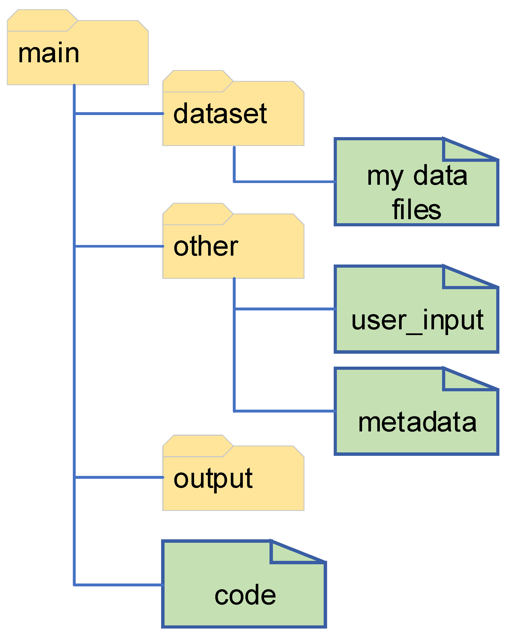
The code provided, and the example worked through, uses the file structure shown in Figure A1. The program as written does not create new folders when run, so it is important to make sure the folders already exist. For example, the output folder should exist so that the main outputs can be saved to it (items such as figures, and the final output CSV file with all the processed results). Other structures are possible to set up, if desired, with proper modifications to the file structure in the code.

Figure A1.
The file structure expected by the code.
Figure A1.
The file structure expected by the code.
References
- Boykin, J.C. Cultivar differences in gin stand energy utilization. Trans. ASABE 2007, 50, 733–743. [Google Scholar] [CrossRef]
- Bechere, E.; Fang, D.D.; Kebede, H.; Hardin IV, R.G.; Islam, M.S.; Li, P.; Scheffler, J. Quantitative trait loci analysis for net ginning energy requirements in upland cotton (Gossypium hirsutum L.). Euphytica 2017, 213, 160–171. [Google Scholar] [CrossRef]
- Hardin IV, R.G.; Funk, P. Electricity use patterns in cotton gins. Appl. Eng. Agric. 2012, 28, 841–849. [Google Scholar] [CrossRef]
- Funk, P.A.; Hardin IV, R.G.; Terrazas, A.A.; Yeater, K.M. Saving Energy In Cotton Gins. In Proceedings of the Beltwide Cotton Conferences, New Orleans, LA, USA, 8–10 January 2019. [Google Scholar]
- Holt, G.A.; Ashley, H.; Findley, D.; Green, J.; Isom, R.; Price, T.; Wanjura, J. The Cost of Ginning Cotton-2019 Survey Results. In Proceedings of the Beltwide Cotton Conferences, Virtual, 5–7 January 2021. [Google Scholar]
- Baker, R.; Anthony, W.; Sutton, R. Seed cotton cleaning and extracting. In Cotton Ginners Handbook; Anthony, W., Mayfield, W.D., Eds.; GPO Names Superintendent Of Documents: Washington, DC, USA, 1994; pp. 68–89. [Google Scholar]
- Negm, M.; Sanad, S. Cotton fibres, picking, ginning, spinning and weaving. In Handbook of Natural Fibres; Elsevier: Amsterdam, The Netherlands, 2020; pp. 3–48. [Google Scholar]
- Funk, P.A.; Thomas, J.W.; Yeater, K.M.; Armijo, C.B.; Whitelock, D.P.; Wanjura, J.D.; Delhom, C.D. Saw Thickness Impact on Cotton Gin Energy Consumption. Appl. Eng. Agric. 2021, 38, 15–21. [Google Scholar] [CrossRef]
- Boykin, J.C. The Effects of Dryer Temperature and Moisture Addition on Ginning Energy and Cotton Properties. J. Cotton Sci. 2005, 9, 155–165. [Google Scholar]
- Funk, P.A.; Hardin IV, R.G. Energy Utilization and Conservation in Cotton Gins. J. Cotton Sci. 2017, 21, 156–166. [Google Scholar] [CrossRef]
- Khalili-Damghani, K.; Tavana, M.; Santos-Arteaga, F.J.; Mohtasham, S. A dynamic multi-stage data envelopment analysis model with application to energy consumption in the cotton industry. Energy Econ. 2015, 51, 320–328. [Google Scholar] [CrossRef]
- Narciso, D.A.; Martins, F. Application of machine learning tools for energy efficiency in industry: A review. Energy Rep. 2020, 6, 1181–1199. [Google Scholar] [CrossRef]
- Denkena, B.; Abele, E.; Brecher, C.; Dittrich, M.-A.; Kara, S.; Mori, M. Energy efficient machine tools. CIRP Ann. 2020, 69, 646–667. [Google Scholar] [CrossRef]
- Liu, P.; Liu, F.; Qiu, H. A novel approach for acquiring the real-time energy efficiency of machine tools. Energy 2017, 121, 524–532. [Google Scholar] [CrossRef]
- Bechere, E.; Boykin, J.C.; Meredith, W.R. Evaluation of cotton genotypes for ginning energy and ginning rate. J. Cotton Sci. 2011, 15, 11–21. [Google Scholar]
- AEMC Instruments. Power & Energy Logger Model PEL 105: User Manual; AEMC Instruments: Dover, NH, USA, 2020. [Google Scholar]
- Von Rossum, G.; Drake, F.L. Python 3 Reference Manual; CreateSpace: Scotts Valley, CA, USA, 2009. [Google Scholar]
- McKinney, W. Data Structures for Statistical Computing in Python. In Proceedings of the 9th Python in Science Conference, Austin, TX, USA, 28 June–3 July 2010; pp. 56–61. [Google Scholar]
- Harris, C.R.; Millman, K.J.; Walt, S.J.v.d.; Gommers, R.; Virtanen, P.; Cournapeau, D.; Wieser, E.; Taylor, J.; Berg, S.; Smith, N.J.; et al. Array programming with {NumPy}. Nat. Methods 2020, 585, 357–362. [Google Scholar] [CrossRef] [PubMed]
- Virtanen, P.; Gommers, R.; Oliphant, T.E.; Haberland, M.; Reddy, T.; Cournapeau, D.; Burovski, E.; Peterson, P.; Weckesser, W.; Bright, J.; et al. SciPy 1.0: Fundamental Algorithms for Scientific Computing in Python. Nat. Methods 2020, 17, 261–272. [Google Scholar] [CrossRef] [PubMed]
- Oshana, R. Chapter 7: Overview of DSP Algorithms. In DSP for Embedded and Real-Time Systems; Elsevier: Amsterdam, The Netherlands, 2012. [Google Scholar]
Disclaimer/Publisher’s Note: The statements, opinions and data contained in all publications are solely those of the individual author(s) and contributor(s) and not of MDPI and/or the editor(s). MDPI and/or the editor(s) disclaim responsibility for any injury to people or property resulting from any ideas, methods, instructions or products referred to in the content. |
© 2023 by the authors. Licensee MDPI, Basel, Switzerland. This article is an open access article distributed under the terms and conditions of the Creative Commons Attribution (CC BY) license (https://creativecommons.org/licenses/by/4.0/).

