1. Introduction
For over three decades, the data visualization community has been innovating, crafting sophisticated and interactive methods to analyze and present data. Despite these advancements, simple visual representations such as bar, line, and pie charts remain indispensable. Their simplicity not only facilitates communication with a wide audience, but they can also be considered to be the most appropriate and effective visualizations of certain types of information.
Among these foundational visual tools is the
scatter plot, which is regarded as one of the most useful and popular statistical graphs [
1]. It depicts bivariate numerical data as points within a Cartesian coordinate system, presenting the data “as they are” (i.e., no information is lost through its visual encoding), allowing for the direct reading of values by projecting the points onto labeled axes. In this regard, scatter plots have numerous benefits and are the predominant technique for visualizing the data of two numerical variables simultaneously. They can be extended by incorporating additional layers, such as regression curves, confidence bands, modifications in point characteristics (shape, size, color, opacity), regions/areas of interest, histograms, density contours, correlation/dependence measures, winglets, glyphs, and so forth (see [
2,
3,
4,
5,
6,
7,
8,
9]). Moreover, scatter plots enable users to assess similarity between observations through distance, aiding in the detection of clusters, outliers, and class separation.
A scatter plot may be regarded as the quintessential graph for showing the relationship between two numerical variables. However, surprisingly perhaps, it has limitations when it comes to illustrating the statistical dependence between variables. In particular, it includes information about the marginal distributions of the variables, which is irrelevant to their dependence. This excess information can obscure the true relationship between the variables. To address this, we turn our focus to rank plots, i.e., scatter plots of data ranks, which omit information related to marginal distributions and rest on solid mathematical theory.
While previous approaches like scatterplot matrices, corrgrams, or scagnostics aid in multivariate visual exploration, they often fail to isolate dependence information from marginal influences. In contrast, our proposed d-plot integrates dependence-focused visual components—including rank plots and empirical copula diagnostics—into a compact ensemble that supports both exploratory analysis and interpretability grounded in copula theory.
The main contributions of this paper are the following: (1) explaining, through copula theory, the limitations of scatter plots for dependence visualization and the preference for measures like Spearman’s rank correlation over Pearson’s correlation; (2) advocating for rank plots as more suitable tools for analyzing statistical dependence; (3) providing interpretation guidelines for common patterns in rank plots; and (4) introducing a novel graphical ensemble that we call a d-plot for performing a comprehensive analysis of the relationship between two continuous random variables.
The remainder of this paper is structured as follows: A review of relevant literature is presented in
Section 2, followed by a discussion on how marginal distributions influence scatter plots under an identical dependence relationship in
Section 3. In
Section 4, we briefly delve into copula theory, while in
Section 5, we revisit key concepts of dependence, association measures, and graphical representations. In
Section 6, we introduce the concept of a d-plot, and in
Section 7, we show their utility through several examples employing real data. Finally,
Section 8 contains the main conclusions and a discussion.
2. Related Work
Statistical dependence is often quantified through computational methods, yet the value of visualization techniques should not be underestimated, as illustrated by Anscombe’s quartet [
10] and other synthetic datasets (see [
11]).
Scatter plots are the predominant method for visualizing the relationship between continuous random variables, with scatter plot matrices (SPLOM) extending this approach to pairwise analysis of several variables. For the latter, correlation matrices or
corrgrams [
12], which represent correlation measures through a color coding, are frequently employed. Although Pearson’s correlation coefficient is the default measure in many software packages, it is not always the most appropriate choice, particularly if the data does not follow a joint Gaussian distribution. We discuss preferable alternatives in
Section 5.2.
Several research works have been conducted on the perception of Pearson’s correlation coefficient in scatter plots. Pioneering work by Doherty et al. [
13] focused on absolute estimates, while other subsequent works have examined discriminative judgments by analyzing
just-noticeable differences (JNDs) between the correlations of two scatter plots presented simultaneously. Rensink and Baldridge [
14], as well as Harrison et al. [
15], have found that correlation adheres to Weber’s Law, suggesting a linear relationship between correlation and JNDs. Conversely, Kay and Heer [
16] proposed a log-linear model for this relationship. A critical limitation of these studies is their reliance on Gaussian-distributed data or data generated through linear regression models [
13]. In contrast, Sher et al. [
17] expanded the dataset variety by altering aspects like density, shape, and number of clusters, ultimately questioning the reliability of human estimates of Pearson correlation in diverse scatter plots and challenging their utility. Recently, Strain et al. [
18,
19] have studied the perception of correlation when varying aspects such as contrast and point size, proposing solutions to mitigate underestimating correlation judgements. The rank plots under study in this work could be used to visually assess the degree of association between continuous random variables. However, note that a complementary user study falls beyond the scope of this paper.
Wilkinson et al. [
20] developed a collection of graph-theoretic
scagnostics, which are measures related to scatter plots designed to aid in the exploration of large scatter plot matrices. Specifically, they considered the squared Spearman’s correlation coefficient to measure monotonicity, i.e., trends or degree of association (see [
21]). In this paper, we employ rank plots to visualize monotonic relationships, which offer greater insight into dependence than a single numerical value. Moreover, we use Spearman’s correlation coefficient (not squared) along with Schweizer–Wolff’s dependence measure [
22] due to their stronger theoretical foundation and advantages.
This paper relies on copula theory (to explore dependence between random variables), which has not been fully exploited in the visualization literature. Previous works by Hazarika et al. [
23,
24] applied copulas to visualize uncertainty and to analyze large-scale multivariate simulation data. However, our focus is on visualizations that specifically facilitate the assessment and interpretation of dependence through copulas and their transformations.
Lastly, for discrete or categorical variables, visual tools such as mosaic plots [
25] or graphical association displays [
26] have been used to assess dependence, though our study only concentrates on continuous random variables.
3. Effect of Marginal Distributions on Scatter Plots
Basic probability theory states that the relationship between two continuous random variables is encapsulated within their joint probability density or their joint cumulative distribution function, whereas marginals alone lack such dependency information. However, scatter plots inherently reflect data from marginal distributions. Consequently, distinct scatter plots may exhibit notable differences even when their associated variables adhere to the same dependency structure.
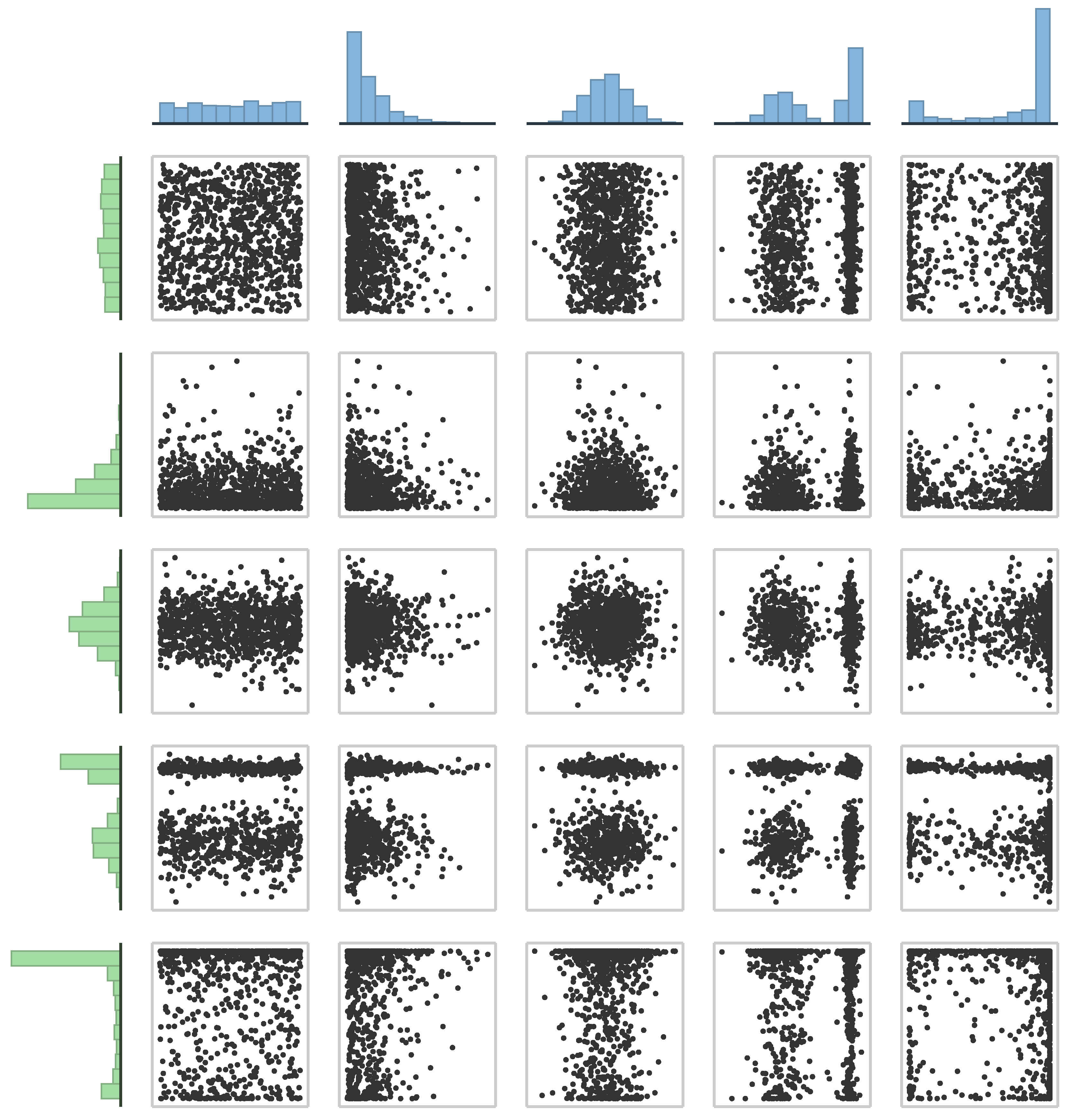
Figure 1 shows 25 different scatter plots for the simplest probabilistic relationship between two random variables: independence. Despite sharing the same dependence structure (in this case, independence), the scatter plots are quite diverse due to variations in the shapes of their corresponding marginal distributions. In this example, we have selected five types of marginal distributions (see Galtung’s classification of distributions [
27]): (1) uniform, (2) unimodal monotone (peak on the left), (3) unimodal non-monotone (peak in the middle), (4) bimodal, and (5) “skewed” bimodal.
This example suggests that traditional scatter plots may not be ideal for visualizing dependence, since they are not invariant under changes in marginal distributions. However, as we will elucidate in the subsequent sections, a unique type of scatter plot, known as a rank plot (i.e., a scatter plot of ranks), adequately represents dependence information while remaining invariant to marginal distributions. A key characteristic of rank plots is that their associated marginals are always uniform.
Note that the scatter plot in the top-left corner of
Figure 1 displays variables with uniform marginals, which closely resembles a rank plot. However, it is not a true rank plot based on ranks or empirical distribution functions. In this case, the uniform distribution of the plotted points over the unit square clearly indicates independence (roughly speaking, the values of one variable are unaffected by those of the other). Thus, in general, we can infer that traditional scatter plots distort the information contained in rank plots by incorporating details about marginal distributions, potentially leading to misinterpretations when assessing dependence. Subsequent sections will present the main copula theory results supporting the use of rank plots.
4. Bivariate Copulas
A key concept regarding statistical dependence between continuous random variables is
copulas, which was introduced in 1959 by Sklar [
28]. He proved that, for a given vector (
X,
Y) of two continuous random variables, there exists a unique function
such that
where
is the joint cumulative distribution function of (
X,
Y), and
and
define the marginal cumulative distribution functions of
X and
Y, respectively.
is called the copula of the random vector (
X,
Y) and represents the unique functional link between the joint distribution and its marginals. Since marginal distributions have no information about how each random variable interacts with others, all the information about the dependence between random variables is contained in their underlying copulas. Thus, Sklar’s theorem implies that any proposal to analyze, measure, or visualize dependence should be based only on the information that can be obtained from the underlying copula of the random variables.
Basic results and properties about copulas may be found in [
29,
30]. For example, the underlying copula of a random vector is invariant under continuous strictly increasing transformations of its random variables:
This last property implies that the random vector (X, Y) has exactly the same dependence structure as , even though they could have different marginals. Consequently, dependence measures and visualizations aimed at illustrating only dependence should be identical in both cases.
Furthermore, recall from basic probability theory that for any continuous random variable
X with cumulative probability distribution function
, the transformed random variable defined as
has a continuous uniform distribution over the closed interval
see [
31] for a detailed discussion on generalized inverses (since
might be non-decreasing). In addition, its cumulative distribution function is the identity function
for
These facts, combined with (
1) and (
2), have several important implications:
- (C1)
For any vector (U, V) of continuous uniform (0, 1) random variables, In other words, copulas may be regarded as joint distributions with uniform (0, 1) marginals.
- (C2)
The random vectors (
X,
Y) and
have the same underlying copula, due to (
2), and therefore exactly the same dependence relationship.
- (C3)
Even though (X, Y) and share the same copula (i.e., dependence structure), their scatter plots may look considerably different, since the latter has uniform (0, 1) marginals but (X, Y) typically will not.
Hence, scatter plots do not have a unique representation for the same type of dependence. Also, as a consequence of (C2) and (C3), we may consider the scatter plot of which has uniform marginals, as a canonical dependence representation of any other random vector with the same dependence relationship but with any other marginal distributions. Lastly, as a consequence of (C1), such canonical representation would be a scatter plot of a random vector with uniform marginals and joint cumulative distribution equal to the underlying copula. In other words, the joint cumulative distribution of would be the copula Thus, a scatter plot of observations from is a valid way to represent the information of a copula.
For example, consider the dependence structure associated with independence. Recall that two random variables
X and
Y are independent if and only if their joint distribution is equal to the product of its marginals, that is,
Therefore, as a consequence of Sklar’s theorem (
1), their unique underlying copula is given by
which is usually known as the independence or
product copula. For example, the independent datasets associated with the 25 scatter plots in
Figure 1 all have the same underlying copula
(despite having different marginals). Moreover, the canonical dependence scatter plot in this case would be the one in the upper left corner, which is a continuous uniform distribution over the unit square, where the marginals are uniform.
5. Dependence Types, Measures, and Plots
5.1. Quadrant Dependence
According to the results from
Section 4, if the observations from
appear uniformly distributed over the unit square, we may conjecture that the random variables are independent (or exhibit a very weak dependence). Departures from this scenario imply some kind of dependence relationship that requires assessment. E. Lehmann described a comprehensive catalog of general types of dependencies [
32], while R. Nelsen identified them in terms of copulas [
29]. The most general and simple type is known as
quadrant dependence, which may be positive (PQD) or negative (NQD):
Intuitively,
implies that the joint probability wherein values from
X and
Y are simultaneously small (or simultaneously large) is greater than or equal to the analogous probability if the variables were independent. As a consequence of (
1), the copulas of
X and
Y will be greater than or equal to the product copula. We can also interpret that small (large) values of
X tend to be more likely associated with small (large) values of
Y. Conversely,
implies that small (large) values of
X tend to be more likely associated with large (small) values of
Y (and the copulas of
X and
Y will be less than or equal to
). Thus, roughly speaking, the PQD and NQD are associated with increasing and decreasing trends, respectively. It is worthwhile to mention that there exist rank-based statistical tests of the PQD; see, for example, [
33].
Regression models that fall into the category of quadrant dependence are those of the form , where is a continuous and strictly monotone function (increasing or decreasing), and is a random noise variable centered around zero. Particularly, if is a linear function, we have the case of linear regression. In terms of observations from the PQD can be identified when they appear close to the graph of for (i.e., the “main” diagonal). Alternatively, for the NQD, the points will lie close to the “secondary” diagonal corresponding to .
Another significant aspect concerning copulas is the ability to ascertain the proximity to the PQD, NQD, and independence. As we have seen, a uniform distribution on
of observations from
indicates independence. Therefore, a departure from uniformity indicates some type of dependence. The maximum deviation from independence can be established by applying Sklar’s theorem (
1) to the Fréchet–Hoeffding bounds [
34,
35] for bivariate joint distributions:
where
and
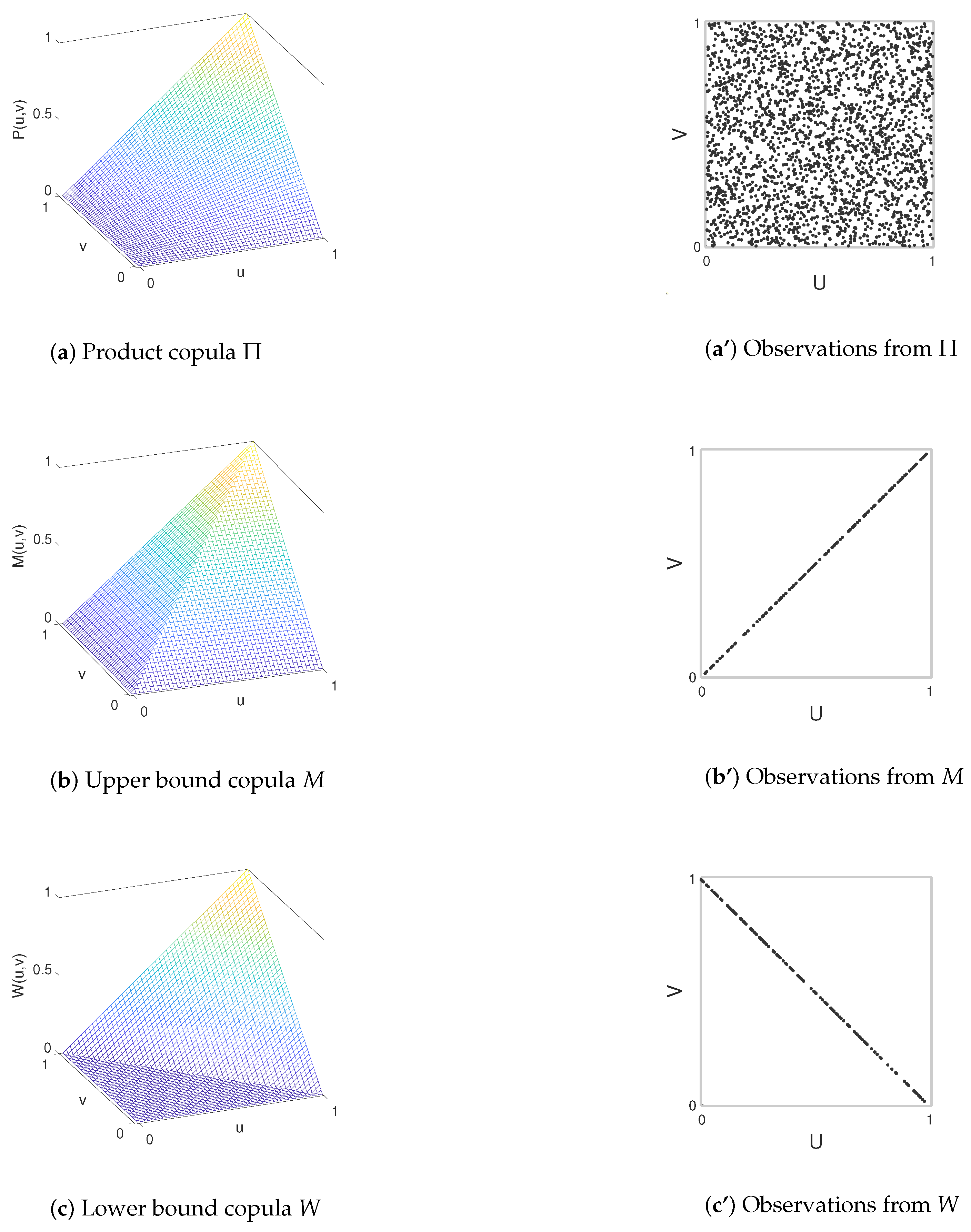
are also copulas, see
Figure 2. It is straightforward to prove that if
, where
is a continuous strictly increasing function, then
, indicating a PQD. In such instances, the observations from
align precisely along the main diagonal
v =
u. Conversely, if
is a continuous strictly decreasing function, then
, signifying an NQD. In that case, the scatter plot of observations from
would exclusively contain points along the secondary diagonal
(see
Figure 2).
For a general regression model
with
continuous and strictly monotone, the smaller the variability of
, the closer the underlying copula gets to one of the Fréchet–Hoeffding bounds (
6), and the closer a scatter plot of observations from
gets to one of the diagonal lines
v =
u or
. Furthermore, as the variability of
increases, the underlying copula will increasingly resemble the independence copula
, and observations from
will more closely resemble a uniform distribution across the unit square.
5.2. Dependence Versus Concordance
According to Sklar’s theorem (
1), since all the information about the dependence relationship between a pair of continuous random variables (
X,
Y) is in their underlying unique copula
, any attempt to measure dependence must be copula-based only, considering how far
is from the independence copula
. Schweizer and Wolff (see [
22]) proposed a measure
based on the
distance between the graphs of
and
defined as follows:
It can be shown that
satisfies the properties of a
measure of dependence, as defined in [
29]. In particular, the double integral is multiplied by 12 in order to provide a normalized measure between 0 and 1. Note that the farthest a copula can be from
is one of the Fréchet–Hoeffding bounds (
6), and the
distance between
M and
, and between
and
W, is 1/12.
Furthermore, observe that only depends on the copula (e.g., it does not depend on marginal distributions). Also, if and only if , which occurs if and only if X and Y are independent. Note that this desirable unique characterization of independence is not provided by the popular Pearson’s correlation coefficient, for which a zero value does not necessarily imply independence.
Embrechts et al. [
36] analyzed in detail additional pitfalls of Pearson’s correlation coefficient
in terms of measuring dependence. If
with
g strictly monotone, then in general,
fails to achieve any of its extreme values
, for example, if
X is uniform (0, 1) and
for any
In general,
, even though the copula of (
X,
Y) and
is exactly the same, as a consequence of (
2). Moreover,
does not exist for every pair of random variables, since it depends on the existence of the marginal variances. Thus, it is not even a general linearity measure; for example, if
X is Cauchy distributed and
, then even though there is a clear linear relationship between
X and
Y,
does not even exist.
The pitfalls of Pearson’s correlation have their root in its link to marginal characteristics that have no information about dependence of random variables, since
Pearson’s correlation coefficient blends information from the dependence (given by the underlying copula ) with marginal information that has nothing to do with dependence.
We could improve this correlation coefficient to make it marginal-free by considering
. Since
and
are continuous uniform (0, 1) distributions, their variances always exist and are equal to
. Furthermore, the dependence information from the random vector
is the same as for
, as a consequence of (
2). In fact,
is Spearman’s correlation [
37], also known as Spearman’s concordance measure, and (
8) becomes
It can be shown that
satisfies the properties of a
measure of concordance, as defined in [
29]. The only difference between
in (
7) and
is that the integrand in (
9) is not in absolute value. Therefore,
does not necessarily imply independence, and it cannot be considered a dependence measure.
From (
4), (
5), (
7), and (
9), we have the following relationships:
- (B1)
- (B2)
implies , but not vice versa;
- (B3)
if and only if
- (B4)
if and only if
- (B5)
X and Y are neither PQD nor NQD if and only if
The pair of values provides valuable insights into the relationship between two continuous random variables. By understanding these two values, we can promptly discern their independence and, if dependent, classify whether the relationship is PQD, NQD, or neither of these.
Another widely used concordance measure is Kendall’s
see, for example, [
38]. It is also based solely on the copula and has a well-defined interpretation as the probability of concordance minus the probability of discordance. Unfortunately, this concordance measure does not have a closely related dependence measure counterpart, as Spearman’s concordance does with Schweizer–Wolff’s measure.
5.3. Non-Quadrant Dependence
If
, then
X and
Y are not quadrant dependent. This implies, as inferred from Equations (
4) and (
5), that within certain subsets of the unit square,
exceeds
, while in complementary regions
falls below
. Equivalently, within certain areas of the support of (
X,
Y) the relationship between
X and
Y is a PQD, while in other regions it is an NQD. In subsequent subsections, we analyze two primary approaches for achieving this behavior (other alternatives exist).
5.3.1. Convex Linear Combinations
If
and
are two copulas and
, then as proven in [
29], any convex linear combination of them is also a copula:
If, for example, we choose as
a PQD copula and as
a NQD one, then (
10) would be a non-quadrant dependence copula, and by (
1) we can build a joint cumulative distribution function for a vector (
X,
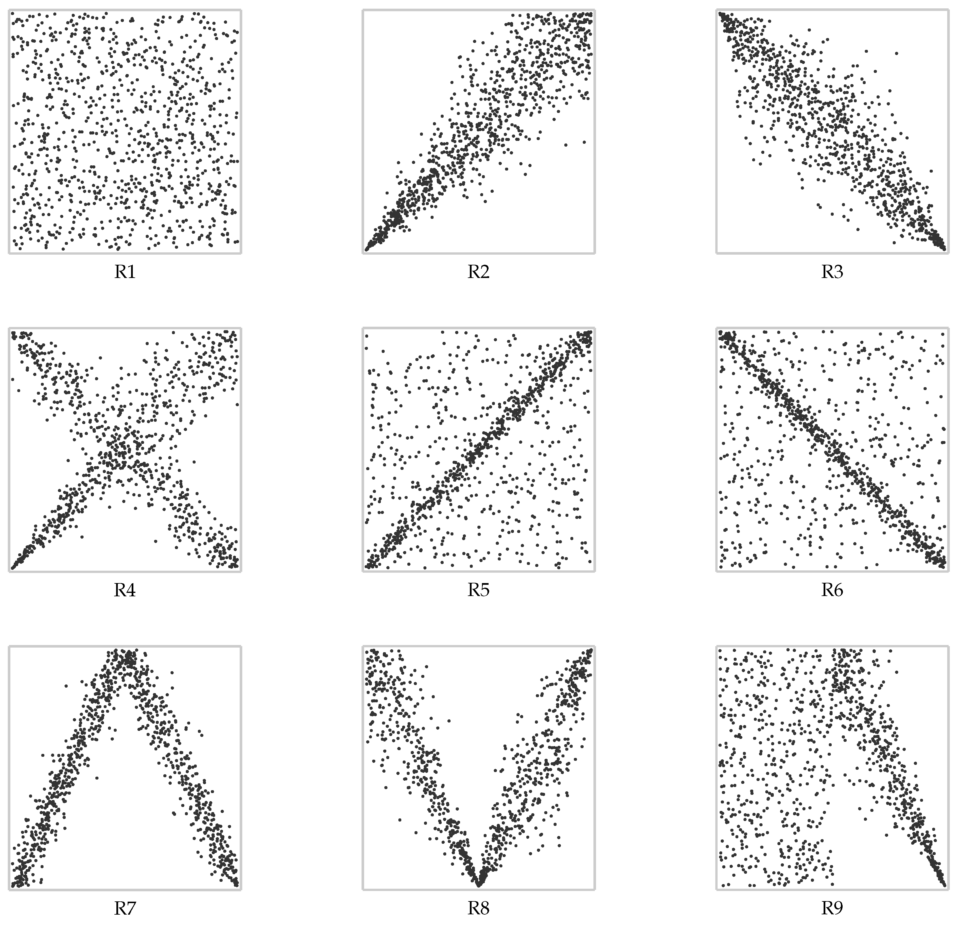
Y) of continuous random variables with such copula and any given continuous marginals; see, for example, case R4 in
Figure 3.
5.3.2. Gluing Copulas
It is possible to combine two copulas through a copula construction technique known as “gluing copulas” [
39]. Given two copulas
and
and a fixed value
called a gluing point, we scale and glue them (intuitively, “concatenate” them) horizontally according to a vertical partition of the unit square. In particular,
is scaled to
and
to
Finally, they are glued into a single copula:
If we choose as
a PQD copula and as
an NQD copula, then (
11) would be a non-quadrant dependence copula. By (
1), we can build a joint cumulative distribution function for a vector (
X,
Y) of continuous random variables by
, where
if
but
if
(see case R7 in
Figure 3). The gluing copula technique is particularly useful for piecewise regression [
40].
5.4. Rank Plots and Empirical Estimation
The use of rank plots and pseudo-observations in dependence and copula modeling is well established in the literature (see, e.g., [
38,
41]). These plots are widely used for visualizing empirical copulas and assessing the structure of dependence between continuous random variables.
In practice, we usually have a random sample of paired observed values
from a random vector
with an unknown joint probability distribution and also unknown marginal distributions. In this case, a natural replacement for observed values of
would be the set of pairs
which constitutes a consistent empirical approximation of the vector
and
are unbiased and consistent estimates of the marginal distributions
and
respectively, which are known as empirical distribution functions [
42]. Moreover, the empirical copula
defined in (
12) is a consistent estimator of the true copula
C, and its asymptotic behavior has been studied in depth. In particular, the process
converges weakly under broad conditions; see [
43] for continuous margins and [
44] for more general distributions.
For continuous random variables, there are no repeated values, and therefore,
that is, the total number of observations from
X that are equal to or less than
Thus, a scatter plot of
values is a bivariate plot of observed ranks scaled to lie in the unit square, which we will call a
rank plot (some authors call it a plot of pseudo-observations [
41]), and constitutes an empirical approximation of a scatter plot from the unknown underlying copula.
According to what has been already discussed in the previous sections, rank plots appropriately illustrate the dependence between the data variables.
Table 1 and
Figure 3 show a categorization of dependence types that can be used as a set of guidelines for interpreting rank plots. In practice, the described patterns might be quite clear but sometimes are not. To help in this empirical dependence assessment, in addition to ranking plots, we propose analyzing empirical estimations for Schweizer–Wolff’s dependence measure (
7) and Spearman’s concordance (
9) to take advantage of their combined interpretation, as explained in
Section 5.2.
The empirical estimation of the underlying bivariate copula is given by a function
, with domain the grid
, which is defined as follows:
where
denotes the
i-th order statistic, and
. The function
is usually referred to as the
empirical copula, though originally it was introduced as empirical dependence function by [
45]. In addition, the empirical estimation of (
9) is [
29]
while for (
7), its empirical estimation
is obtained by replacing the differences in the sums in (
13) with the absolute value of the differences.
5.5. Diagonal Sections
Besides
and
, there are other characteristics of the copula that help in interpreting a rank plot. For example, it is useful to determine whether the copula is above or below
or how close it is to
M or
W. Even though we could visualize
either by a 3D surface plot (as in
Figure 2) or a contour plot, it would be difficult to grasp the nuances that allow us to interpret the dependence structure in these visualizations. Alternatively, we propose visualizing the graphs of the main and secondary diagonal sections of the copula. These simplifications can be useful for detecting departures from independence, PQD, NQD, and especially for identifying cases exhibiting both PQD and NQD, which may be analyzed through gluing copulas (see [
40,
46]).
The main diagonal section of a copula
C is given by
and the secondary diagonal by
As an immediate consequence of (
6) we have
and
for
, where
and
represent the main and secondary diagonal sections of
W, respectively. Similarly,
and
are diagonal sections of
M.
Figure 4 shows these bounds, together with the diagonal sections from the independence copula, which are
and
. In cases of PQD (
X,
Y), we have
and
Likewise, for NQD
, we have
and
If there is a crossing between
and
and/or between
and
, then there would not be a PQD or an NQD, and the crossing point
could be a gluing point of two copulas, as described in (
11).
6. D-plots
In order to comprehensively analyze bivariate data and effectively visualize the dependency structure between the variables (as discussed in the previous sections), along with characteristics depicted in traditional scatter plots, we advocate for the simultaneous visualization of the following:
- (a)
The regular scatter plot to visualize characteristics such as concrete data values, clusters, or outliers.
- (b)
The
rank plot to analyze the dependence between the variables without the distortion of the marginal distributions and to identify it according to the categorization in
Table 1 and
Figure 3.
- (c)
Marginal
histograms to visualize the marginal behavior of the probability density functions (pdfs) in cases where it could be hard to extract from the scatter plot (e.g., due to occlusion caused by a large number of displayed points) and understand their combined influence in the shape of the scatter plot (as in
Figure 1).
- (d)
Marginal box plots to identify the presence and amount of outliers for understanding the scales of the axes of the scatter plot.
- (e)
Empirical copula diagonals to visualize presence/absence of quadrant dependence and possibly the need to partition the data (applying the gluing copula technique) to decompose the dependence into simpler quadrant dependencies.
- (f)
A bar chart showing the absolute value of the empirical Spearman’s concordance and the Schweizer–Wolff’s dependence measure (if the bar colors are different, then the sign of is negative). The combination of these two values is helpful for quantifying the degree of quadrant dependence and for finding gluing points when applying the gluing copula technique.
In this paper, we have organized these components into a
grid, as shown in
Figure 5, and other examples (although other configurations would also be valid), which we call a
dependence plot (d-plot). In the remainder of this section, we will introduce two theoretical cases, while
Section 7 will contain examples with real data.
6.1. Example 1: Non-Quadrant Dependence
Consider a vector of two continuous random variables (X, Y) with the following characteristics:
X is bimodal (Kumaraswamy distribution with parameters 0.25 and 0.15);
Y is non-monotone unimodal (t-Student with location parameter 3.0, scale parameter 1.5, and 2.5 degrees of freedom);
If
X is below its median, then there is NQD (
X,
Y), while otherwise, there is PQD (
X,
Y). In both cases, we have used the parametric Frank family of copulas (see [
29]) with parameters −30.0 and 30.0, respectively.
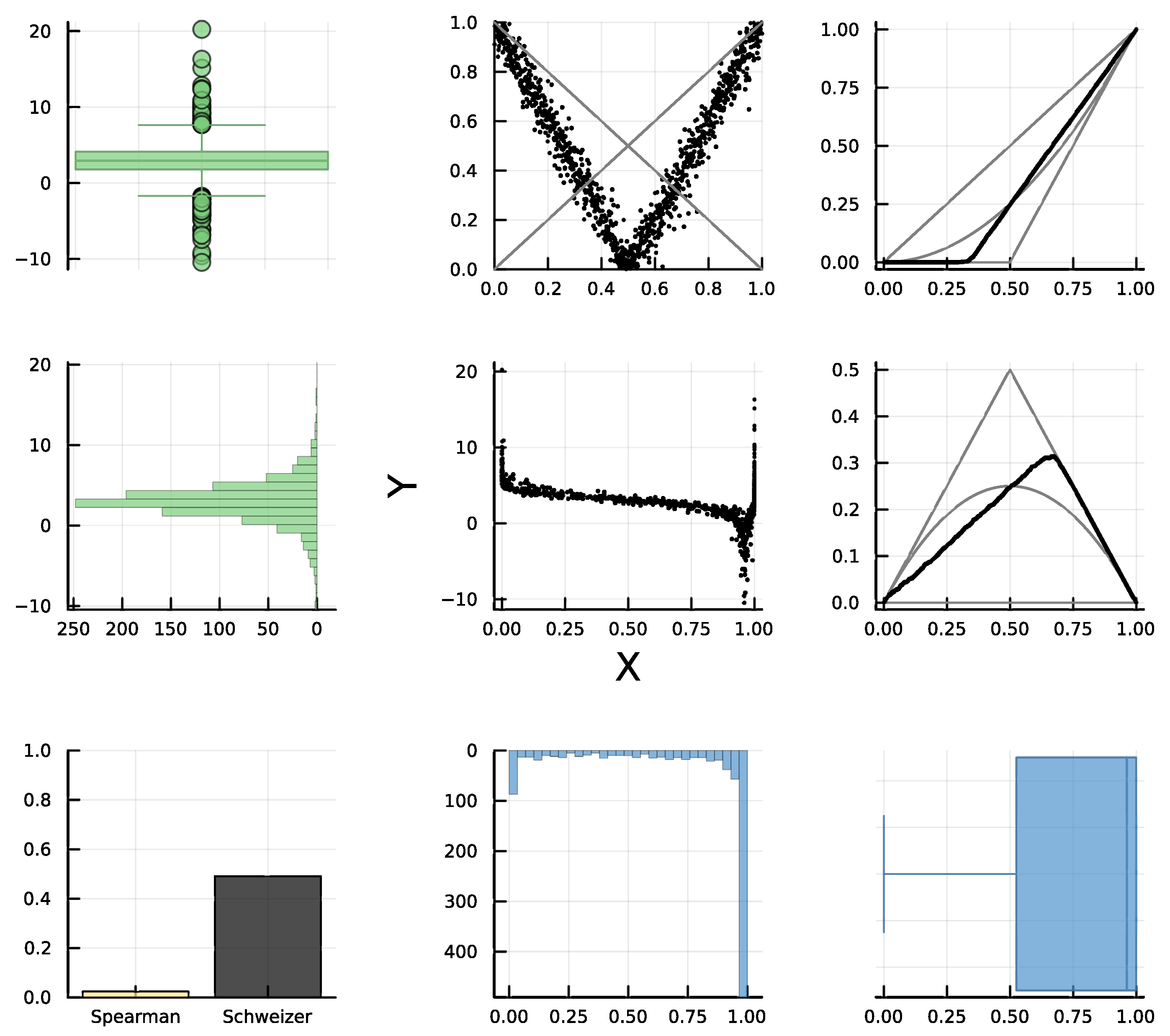
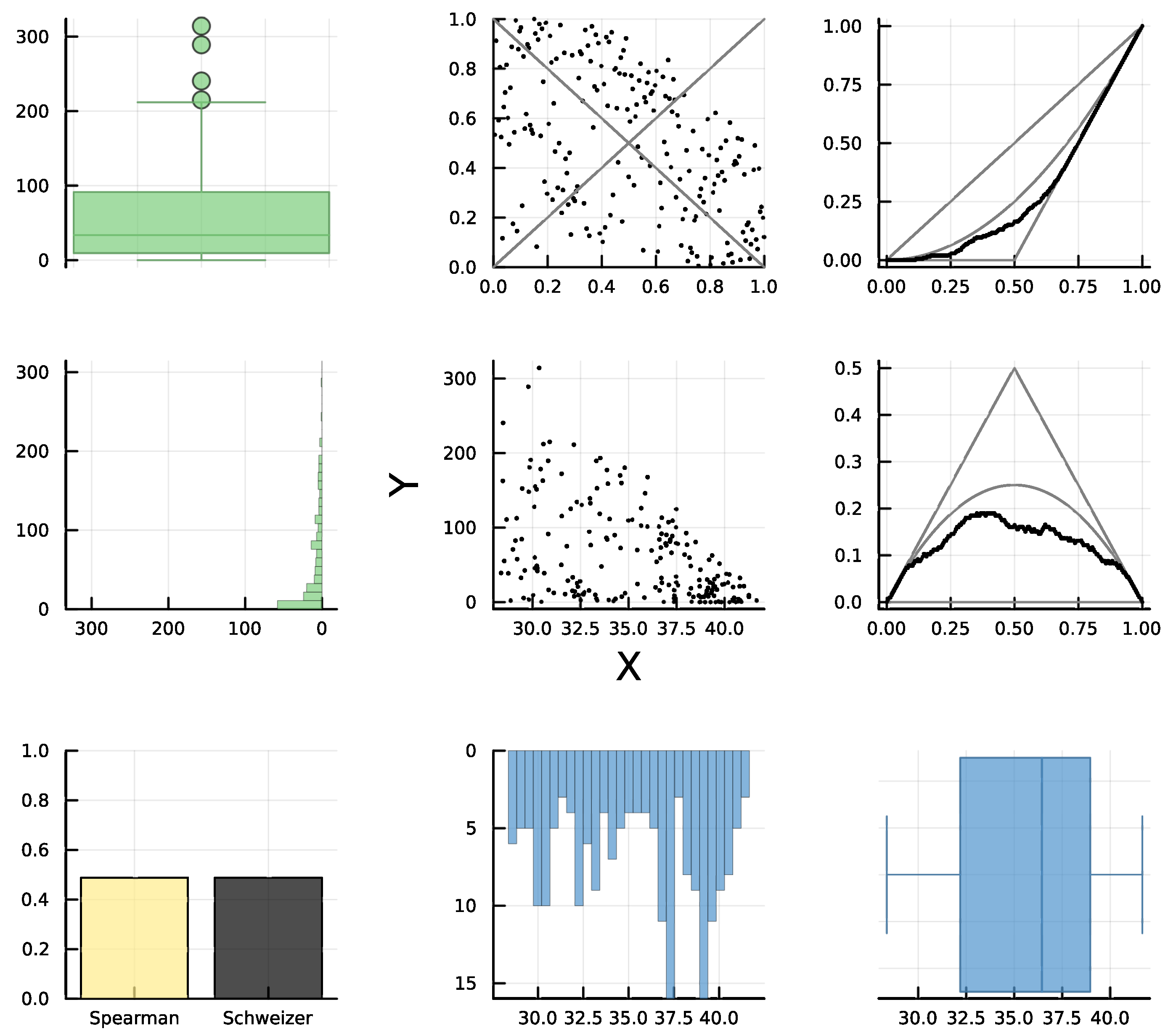
This example falls into category R8 of
Table 1, and its corresponding d-plot is shown in
Figure 5. In the center, we have the usual scatter plot of (
X,
Y). The associated rank plot is immediately above, and it clearly exhibits a gluing of an NQD copula with a PQD one, with
as the gluing point. This can be confirmed by analyzing the graphs associated with the diagonal sections of the empirical copula with the independence copula
(top-right and center-right). Note that the empirical diagonals cross the
diagonals at 0.5. Also, the empirical diagonals start being below
(which confirms NQD) but end up above
after
u = 0.5.
In the bar chart in the lower left corner, we represent the absolute value of Spearman’s empirical concordance, together with Schweizer–Wolff’s (since it is useful to compare these magnitudes). Also, we indicate the sign of through color. For negative values we use a light color (in this case, yellow), and for positive values, we use black (which we also use for the bar associated with ). In this case, the bar chart shows a clear numerical difference (by construction of the example, the theoretical value of Spearman’s concordance is exactly equal to zero). This confirms that the dependence between X and Y is neither PQD nor NQD all the time, as expected.
The remainder of the graphs are related to marginal characteristics of the variables. There are no observed outliers for X, but there are several for Y. Also, the pdf for X is considerably left-skewed. These are the main reasons why the dependency structure is hard to visualize in the scatter plot, but it is apparent in the marginal-free rank plot. Furthermore, users might erroneously perceive an overall decreasing trend, since the points show a slight decreasing trend when . Moreover, the empirical Pearson’s correlation coefficient in this case is which is quite misleading.
6.2. Example 2: Positive Quadrant Dependence with Noise
Consider a random vector (
X,
Y), where
X is a Pareto (2, 10) random variable,
a random noise distributed normal (0, 0.03),
Z is another Pareto (2, 10) random variable independent from
X, and
B a Bernoulli (0.4) random variable. If we define a random variable
Y as
We have a probabilistic model for (
X,
Y) where, with probability 0.6, they exhibit a strong linear relationship, but with probability 0.4, they behave as independent random variables.
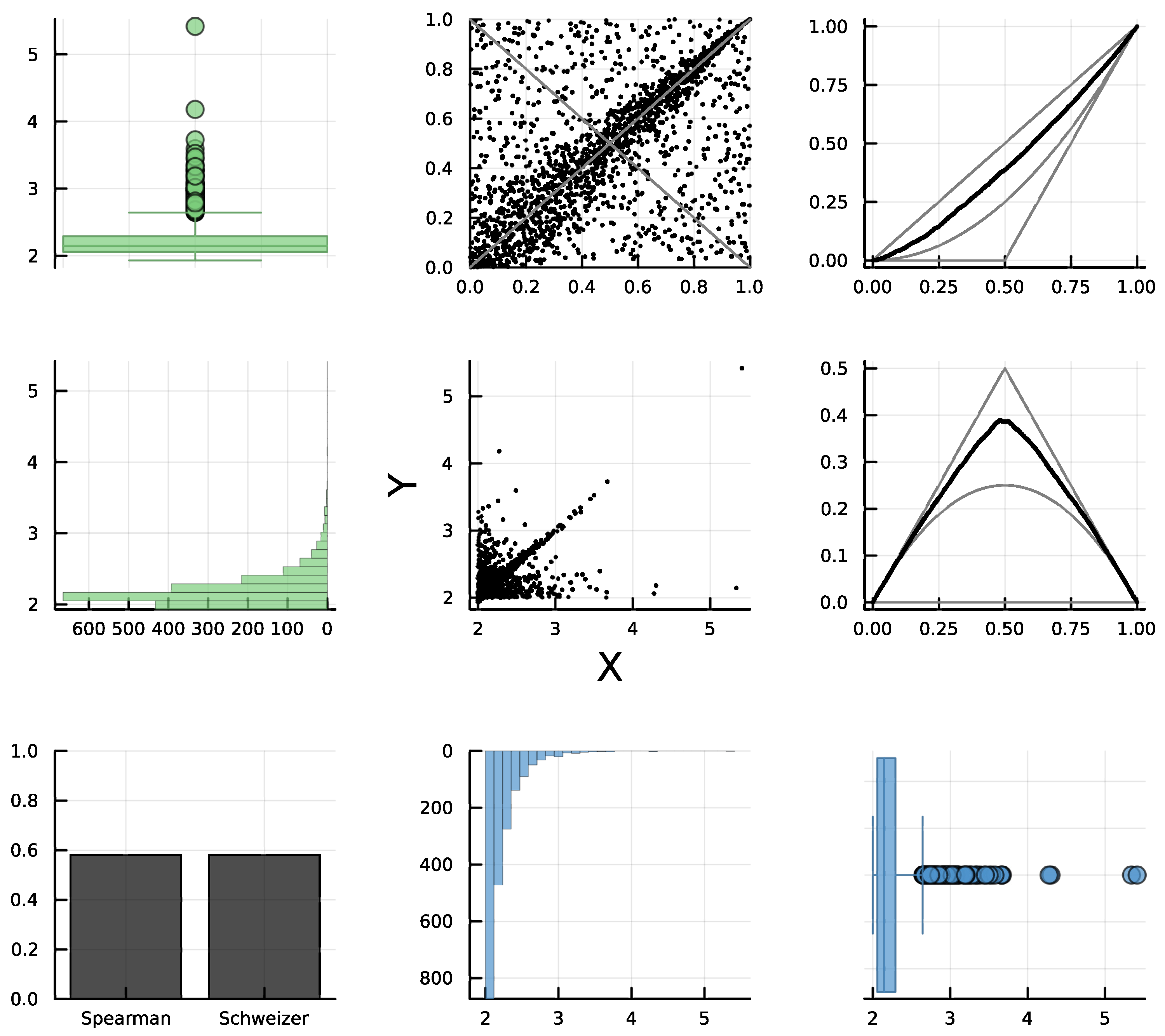
Figure 6 shows the corresponding d-plot, where the rank plot is of type R5 (see
Table 1 and
Figure 3). Note that it can be interpreted as a (convex) combination of R1 (independence) and R2 (PQD, due to the positive linear relationship). In this example, Schweizer–Wolff’s dependence is
, which is equal in magnitude and sign to the empirical Spearman’s concordance, which implies PQD (see property B3 in
Section 5.2). In this example, the diagonal sections also distinctly confirm PQD, as the empirical copula consistently exceeds the independence copula
. Lastly, while discerning the linear relationship in the scatter plot is relatively straightforward, the independence relation is less apparent. Conversely, both relationships are clearly evident in the rank plot.
7. Real Data Examples
In this section we illustrate the previous ideas and proposals with real data available from public sources.
7.1. Example 3: NQD with Outliers
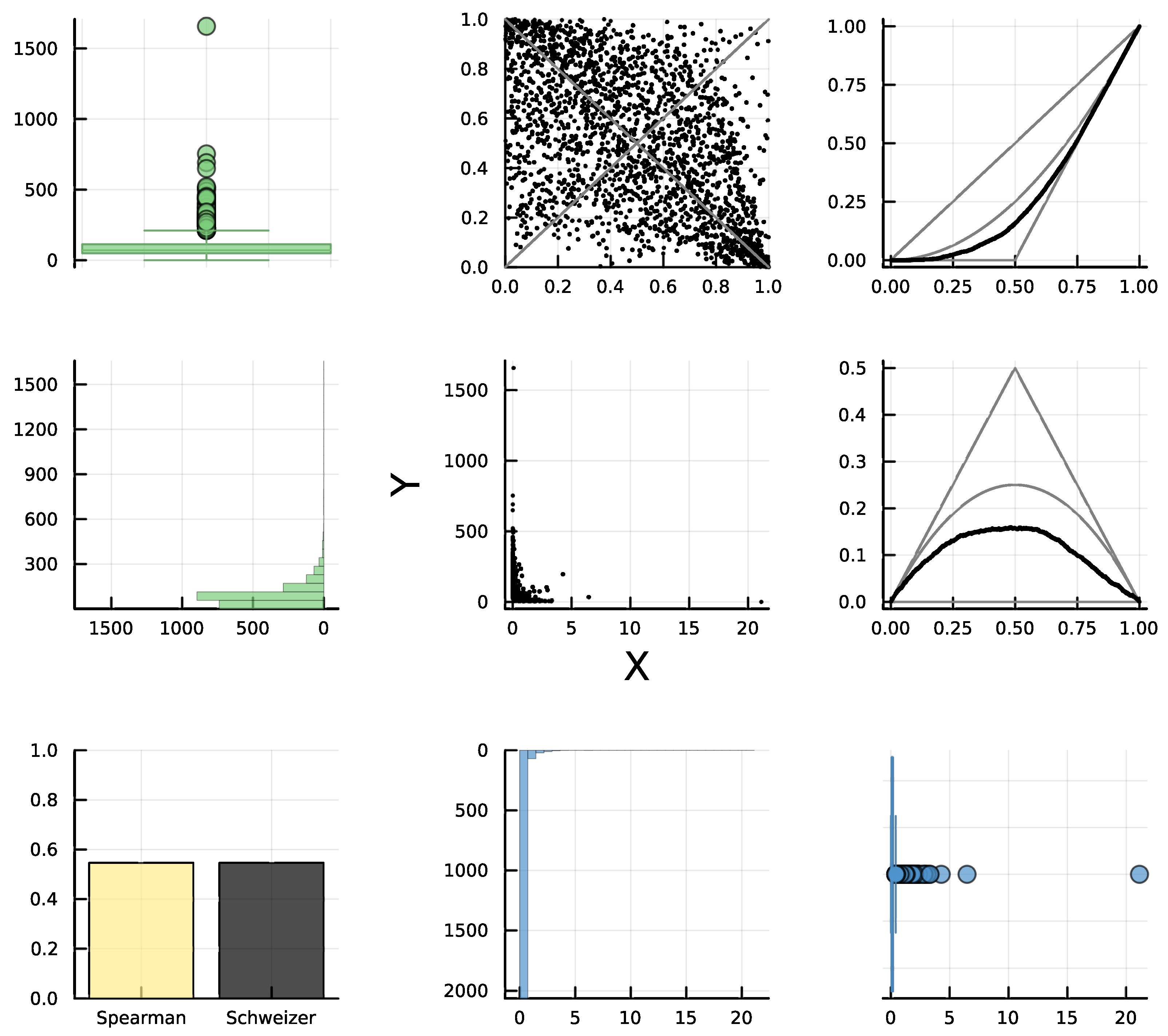
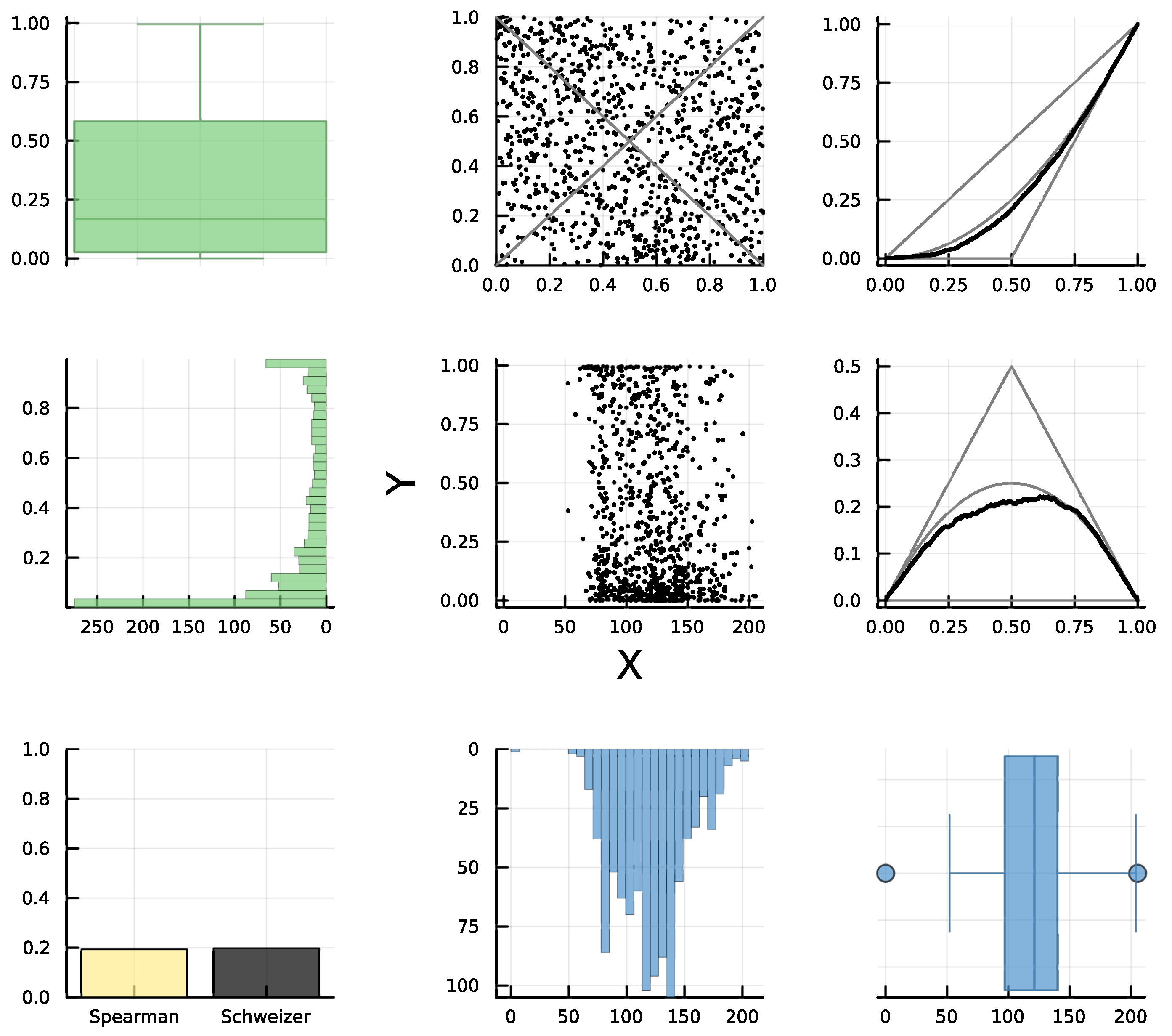
In this example, we used the dataset “CEO vs Worker Pay in Top 3000 US Companies [2023]” (see [
47]) to analyze the dependence between the “pay ratio” (
X = CEO/worker salary) versus “median worker pay” (
Y); see
Figure 7. Firstly, it is difficult to analyze the relationship through the scatter plot, mainly due to the presence of outliers, which are clearly shown in the box plots. In this case, the rank plot falls into the R3 category (since the distribution of points is not uniform we can discard independence). Other components of the d-plot also confirm a negative quadrant dependence. The equal height of the bars for Schweizer–Wolff’s dependence and the absolute value of Spearman’s concordance, where the latter is negative (yellow bar), along with the empirical diagonals that in both cases are below the independence diagonals, clearly indicate NQD. Numerically,
and
which are in contrast to Pearson’s correlation
which is far from the concordance value, since it is affected by the presence of outliers.
7.2. Example 4: Gluing PQD and NQD
For the next example, we used the “Cloud” dataset [
48] with features about images related to climate. Specifically, we analyzed the dependence between “infrared minimum value (ir-min)“ (
X) and “contrast” (
Y) through the d-plot in
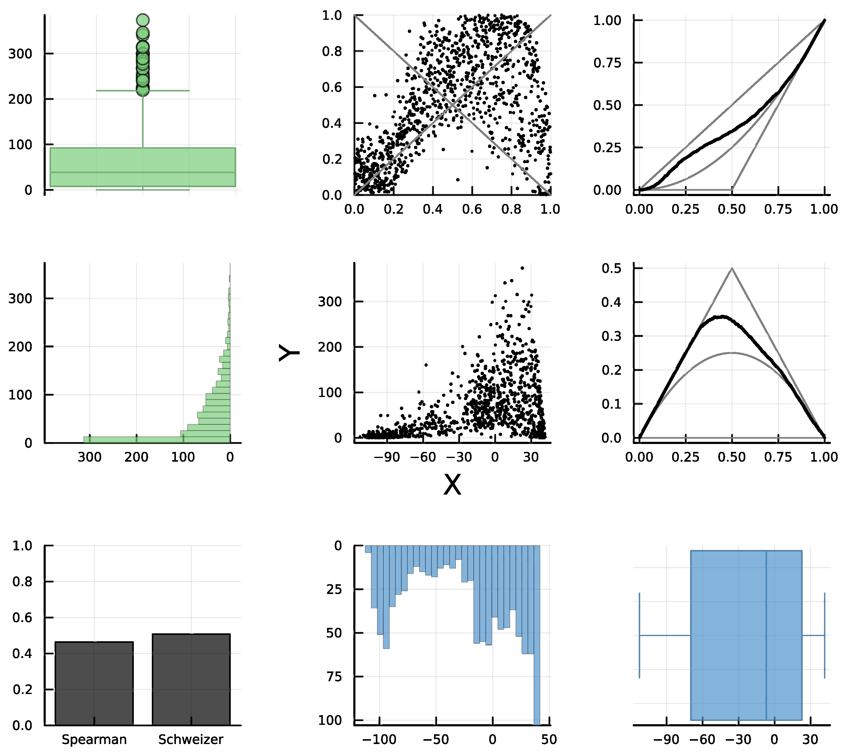
Figure 8. The scatter plot appears to show a strictly increasing trend for
Y in terms of
X plus some random noise. However, the rank plot is suggesting something slightly different: an increasing trend for most parts of the data but that is decreasing for larger values of
X. This would explain the difference between Spearman’s concordance
and Schweizer–Wolff’s dependence
which suggests the presence of both PQD and NQD. The empirical diagonals also indicate both PQD and NQD, since they cross the independent copula
at about
u = 0.8, passing from being above
to lying slightly below it (in this case, it may be necessary to zoom in).
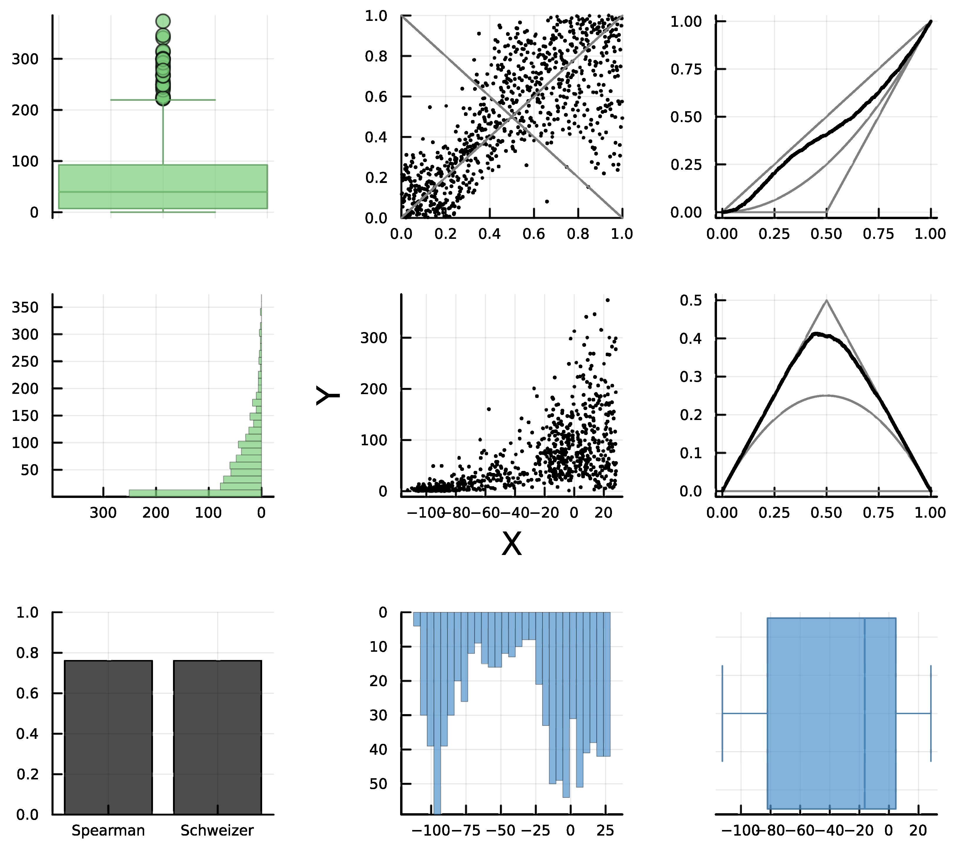
The analysis of the d-plot suggests a gluing of a PQD copula followed by an NQD copula. If we order the bivariate observations in terms of the observed values of
X and split them into two subsets, the first 80% as data subset 1 and the rest as subset 2, the corresponding d-plots (see
Figure 9 and
Figure 10) reveal that subset 1 is PQD and subset 2 is NQD, which confirms that using
as gluing point is a good choice. It is worth noticing that the best gluing point is the one such that in each subset the absolute value of Spearman’s concordance equals that of Schweizer–Wolff’s dependence. Specifically, for subset 1, we have
, and for subset 2, we have
and
Finally, this would be an example of type R7 dependence, with gluing point u = 0.8 of PQD followed by NQD. In terms of the original variables, it is equivalent to splitting the observed data for by conditioning for PQD and for NQD. However, note that it is not easy to determine when the relationship between the variables begins to decrease in the scatter plot.
Jointly, or separately in subsets 1 and 2, the marginal density for
Y seems to be monotone unimodal, while
X appears to be multimodal, especially in
Figure 8 and
Figure 9, which produces the slight impression in the scatter plot of two clusters divided approximately by the vertical line
Thus, the scenario is similar to the one in the graph in row 2, column 4, of
Figure 1. The appearance of clusters is due to the bimodal marginal distribution of
X and not to the statistical dependence between the variables.
7.3. Example 5: Apparently Independent Variables
In this example, we used a random subsample of size 1,000 from the “Song Features Dataset - Regressing Popularity” (Spotify Song features) dataset in [
49], comparing tempo (
X) and acousticness (
Y), through the d-plot in
Figure 11. This is an example where from both the scatter plot and even the rank plot we may probably be tempted to assess independence at a first glance. For example, the scatter plot appears to be similar to the one in row 5, column 3, of
Figure 1. However, note a slight shift to the left of the points in the upper part of the scatter plot compared to the points on the lower part. Also, in the rank plot, there is slightly less density of points on the bottom-left and upper-right corners compared to the density in the upper-left and bottom-right counterparts. Thus, the plots suggest a weak decreasing relationship. This is confirmed by examining the bar chart and diagonal sections. Specifically, not only does Schweizer–Wolff’s dependence measure
indicate some dependence (albeit a weak one), in this case,
, with
, which clearly indicates NQD. Furthermore, the empirical diagonals also suggest NQD, since they lie (slightly) are below their independence counterparts. As a conclusion, this would be an example of weak dependence of type R3 according to
Table 1, where by “weak” we mean not to far from R1 but not as clear as the R3 type in
Figure 7.
8. Conclusions and Discussion
This work presents several contributions related to the visual assessment of dependence between two continuous random variables. Firstly, it reviews essential theory regarding copulas, which is necessary for understanding why rank plots should be chosen over traditional scatter plots for assessing dependence. In contrast to scatter plots, rank plots do not include uninformative, and possibly misleading, information about marginal distributions that are unrelated to dependence. The paper also provides guidelines (see
Table 1 and
Figure 3) for using and interpreting rank plots, identifying nine categories related to broad types of dependencies and combinations of these.
Regarding association measures, we have highlighted the superior reliability of dependence measures, such as Schweizer–Wolff’s (
7), and concordance measures like Spearman’s (
9) over Pearson’s correlation coefficient. Similar to the comparison between rank plots and scatter plots, the key characteristic of Schweizer–Wolff’s dependence and Spearman’s concordance is that they derive solely from the copula and are therefore unaffected by marginal distributions. Instead, Pearson’s correlation combines information from the copula with marginal characteristics and can therefore be misleading, as we have shown in several examples. We believe this is relevant for the entire scientific community, since Pearson’s correlation is arguably the most popular association measure used in practice and the default option in many software packages, despite previous efforts to communicate its limitations (see [
36]). It is also relevant for the visualization community, since Pearson’s correlation has been studied intensively in relation to scatter plots. Moreover, some authors may view scatter plots as tools for communicating Pearson correlation [
18,
19].
The paper coalesces around the idea of the dependence plot (d-plot), an ensemble of nine graphs that encapsulates both the scatter plot and marginal distributions, together with visualizations that focus solely on aspects of dependence. The former are useful for detecting clusters, outliers, and examining the specific data values, among other tasks. Regarding the latter, rank plots provide a faithful description of the dependence between the variables, while Spearman’s concordance and Schweizer–Wolff’s dependence are appropriate association summaries, since they depend exclusively on the copula. In addition, the visualizations related to diagonal sections of the copula can help users decompose complex dependence patterns into simpler quadrant-dependent scenarios by conditioning on one variable. This idea is related to gluing copulas (i.e., describing the dependence through several copulas). Although we have addressed the gluing of two copulas, extending this concept to multiple copulas and/or conditioning in both variables is straightforward.
The ideas put forward in the paper can be useful for using or developing other visualization techniques in which it may be appropriate to visualize the dependency between two continuous random variables. For example, the theory clearly advocates for replacing data values with ranks (note that it would be straightforward to incorporate ranks in methods like parallel coordinates [
50], table lens [
51], and many others). Naturally, researchers should also consider replacing or complementing Pearson’s correlation with Spearman’s rank correlation or Schweizer–Wolff’s dependence in their visualizations.
The general approach of this paper is non-parametric, as no model assumptions are made regarding the bivariate data under analysis. Nevertheless, the guidelines provided in
Table 1 for interpreting rank plots are useful in making decisions about fitting specific parametric families of copulas. For instance, if it is evident from the data that negative quadrant dependence (NQD) is present, then only parametric families of copulas accommodating NQD should be considered for goodness-of-fit testing. Similarly, if the rank plot of the data resembles, for example, case R8, the data should first be divided using the gluing copula technique. Subsequently, we may try fitting a parametric family of copulas with NQD to one subset and a parametric family with positive quadrant dependence (PQD) to the other subset.
The current formulation of d-plots is designed for continuous variables due to the reliance on rank-based transformations and copula theory. However, extending this framework to ordinal or mixed-type data is a natural next step; see, for example, [
52,
53]. In such cases,
subcopulas and discrete-specific dependence measures may be employed (e.g., as discussed in [
54]. Adapting rank plots to handle tied data and incorporating appropriate estimation techniques remains an open and promising research direction.
Finally, we also envision carrying out perceptual studies of Spearman’s rank correlation and Schweizer–Wolff’s dependence measure on rank plots, given their superiority over Pearson’s correlation and scatter plots for assessing dependence.
