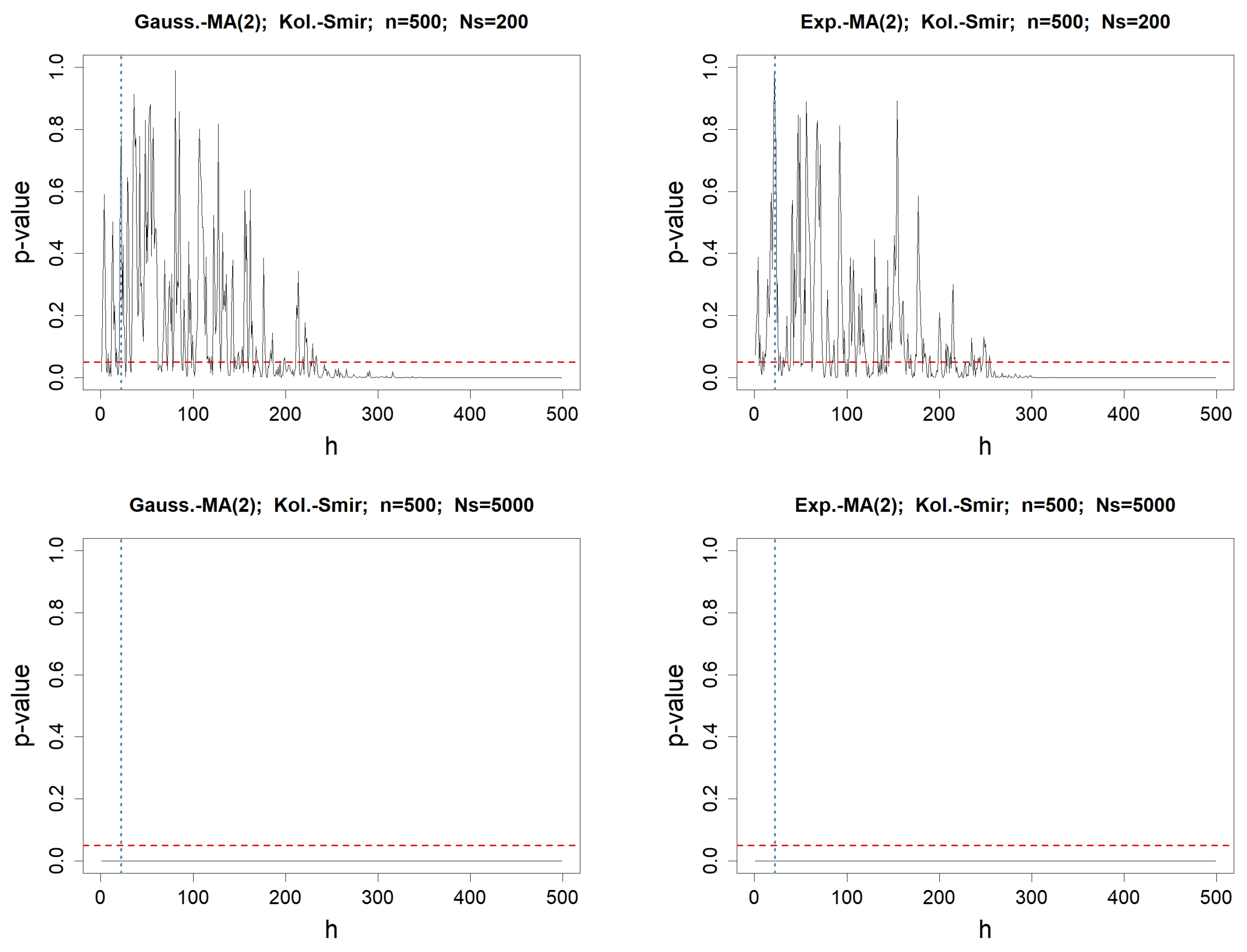
Figure 1.
p-values when testing for the adequacy of the values of with , for any fixed lag h varying from 1 to . The involved normality test is Kolmogorov–Smirnov’s. The left column concerns MA(2) driven by a Gaussian WN, whereas the right one deals with the Exponential WN process. The length of the simulated WN process is . In the top figures, the number of simulated MA(2) processes is , whereas it is in the bottom. The red-dotted horizontal line represents , while the blue-dotted vertical line represents .
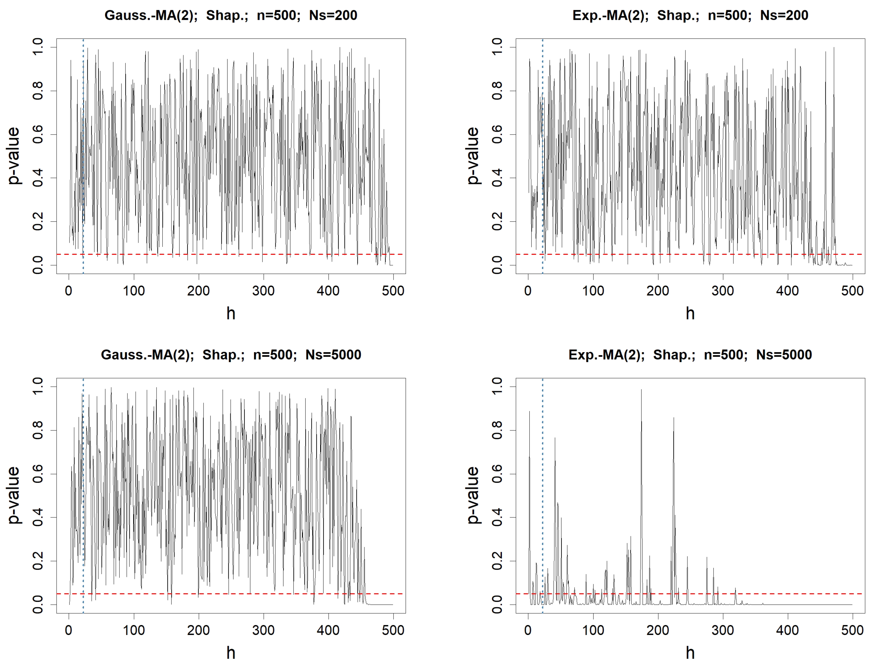
Figure 2.
p-values when testing for the normality of the values of , for any fixed lag h varying from 1 to . The involved normality test is Shapiro–Wilk’s. The left column concerns MA(2) driven by a Gaussian WN, whereas the right one deals with the Exponential WN process. The length of the simulated WN process is . In the top figures, the number of simulated MA(2) processes is , whereas it is in the bottom. The red-dotted horizontal line represents , while the blue-dotted vertical line represents .
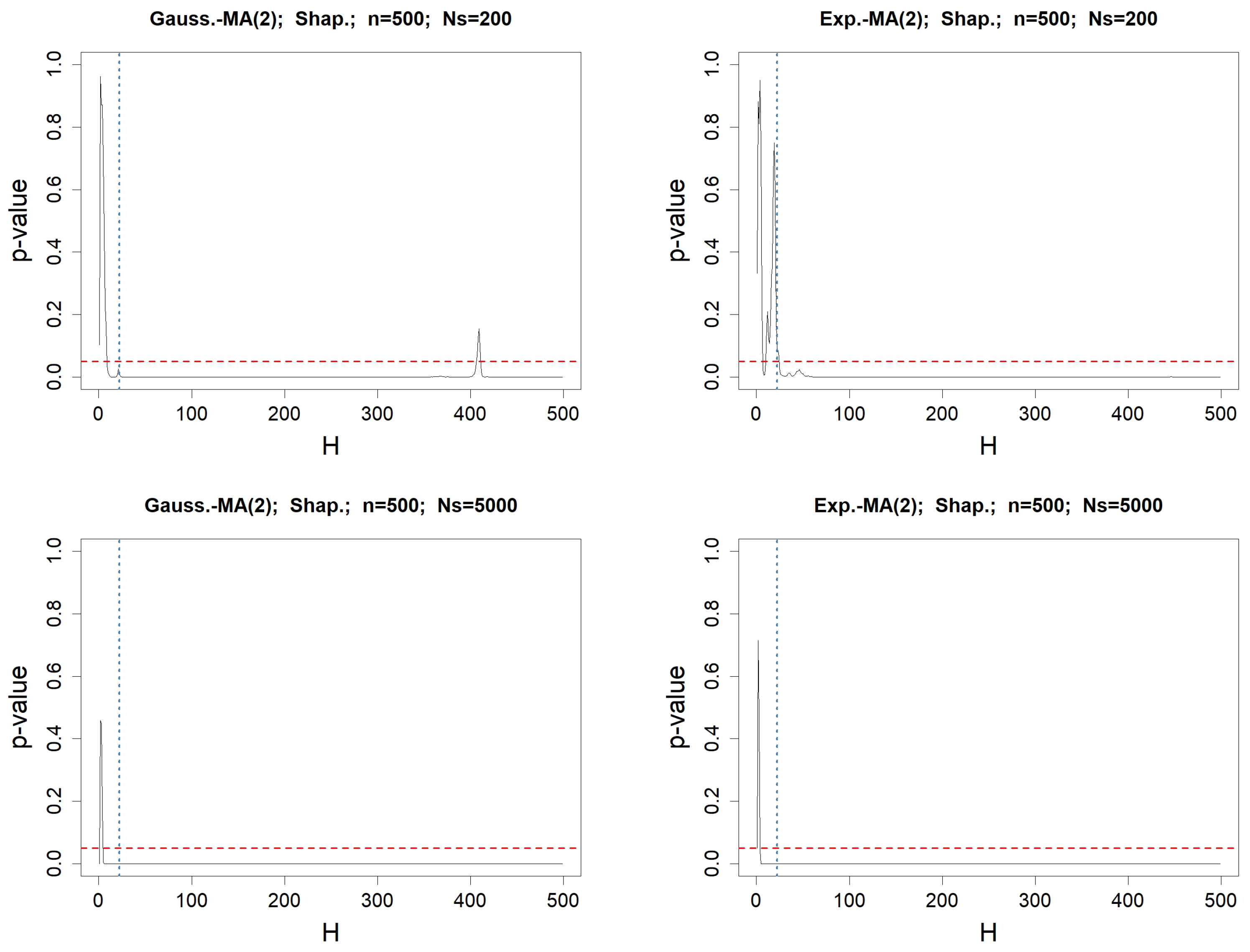
Figure 3.
p-values when testing for the normality of the values of , for any fixed lag H varying from 1 to . The involved normality test is Shapiro–Wilk’s. The left column concerns MA(2) driven by a Gaussian WN, whereas the right one deals with the Exponential WN process. The length of the simulated WN process is . In the top figures, the number of simulated MA(2) processes is , whereas it is in the bottom. The red-dotted horizontal line represents , while the blue-dotted vertical line represents .
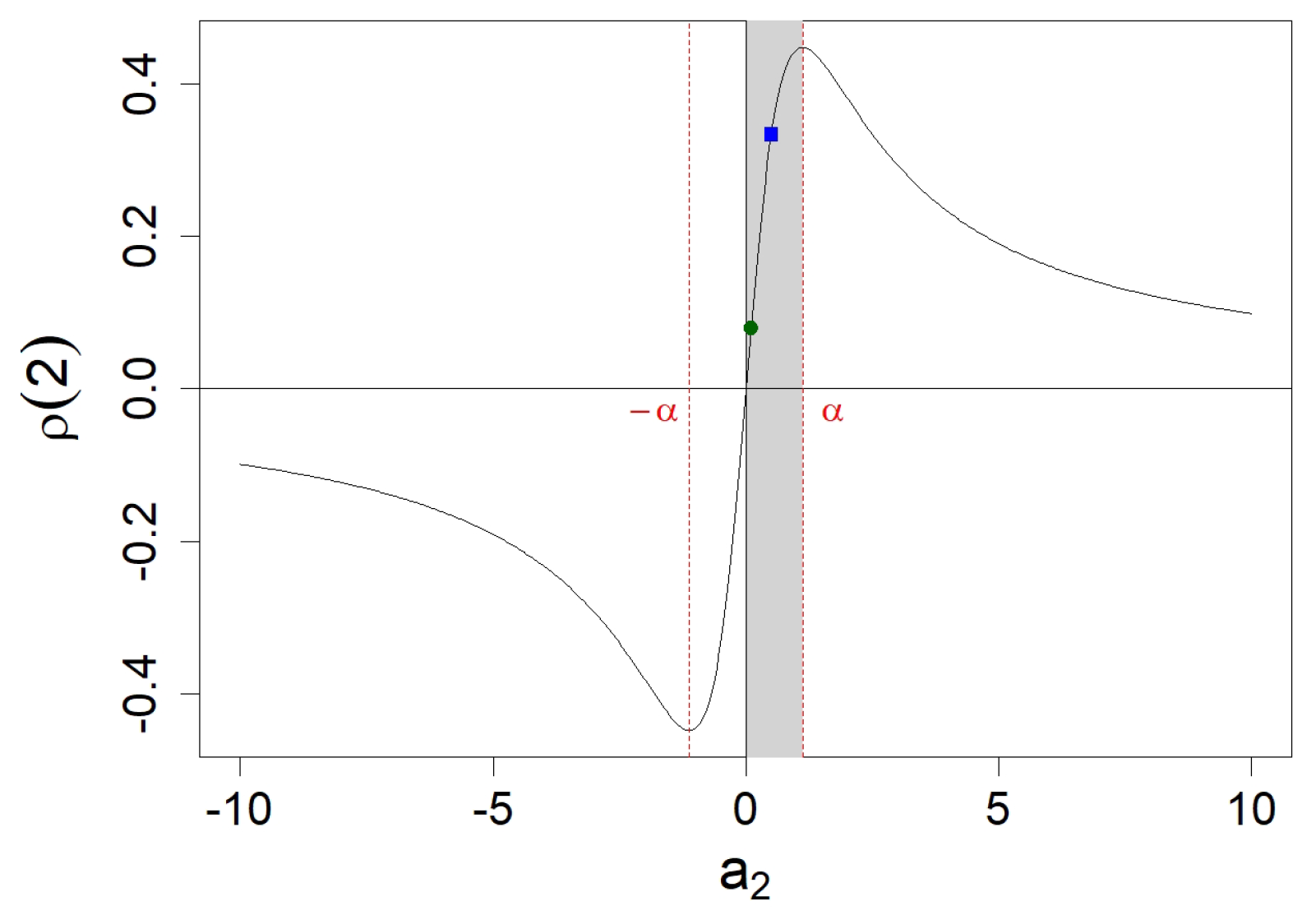
Figure 4.
Percentage of simulations with
out of interval
and with
inside interval
as described in Proposition 3, among
simulations of MA(2) processes. Coefficient
varies from 0 to
as defined in
Appendix A.2. The left column concerns simulated MA(2) processes with an underlying Gaussian WN, whereas the right one deals with Exponential WN. In the top figures, we simulate MA(2) processes with length
, and with
in the bottom. The green circle points for
, whereas the blue square points for
.
Figure 5.
Frequency of , the last lag h such that lies out of interval , as described in Proposition 3, for simulations of MA(2) processes of length . The left column concerns simulated MA(2) processes with an underlying Gaussian WN, whereas the right one deals with Exponential WN. In the top figures, we simulate MA(2) processes with , whereas we use in the bottom. The magenta-colored bar highlights the theoretical convenient order .
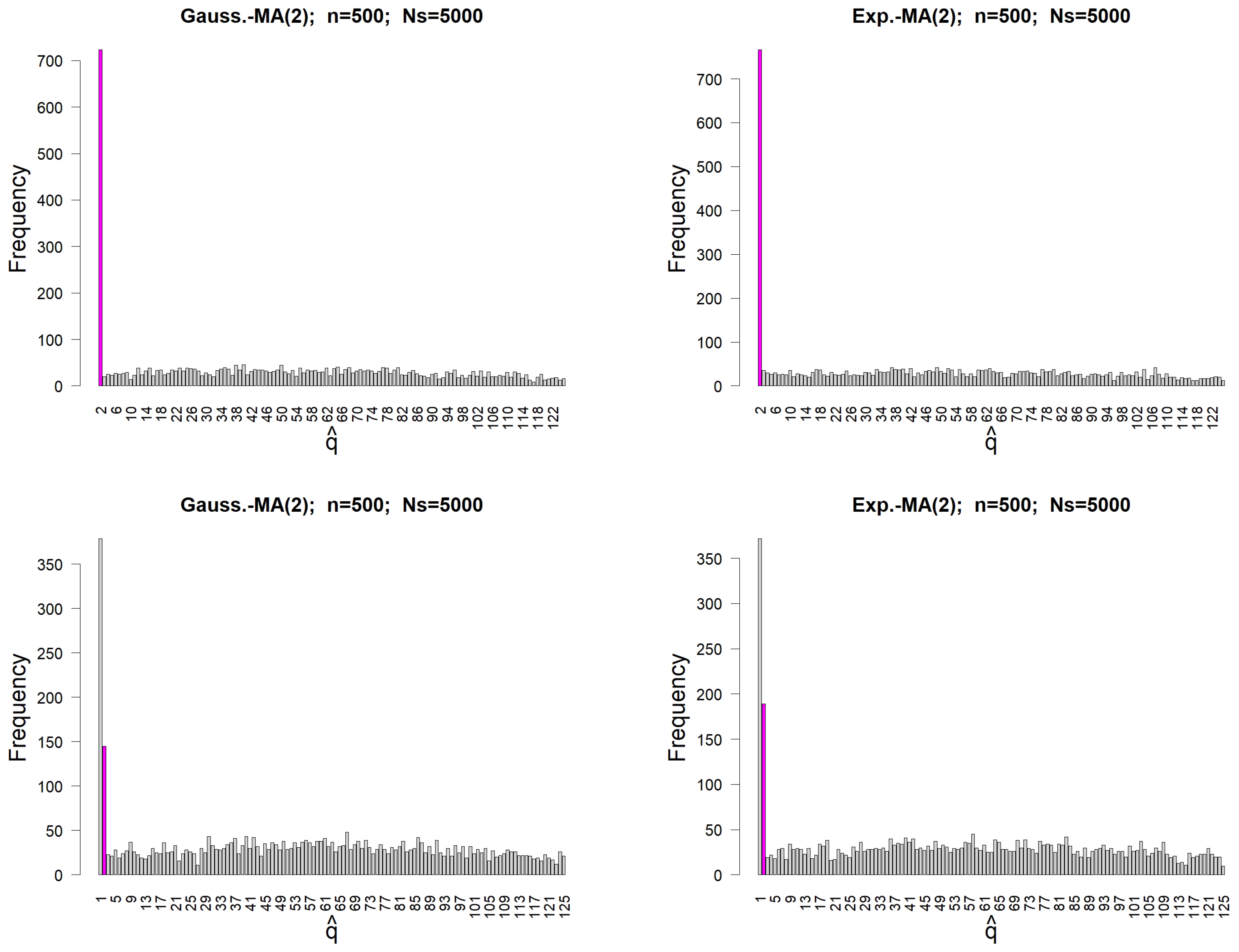
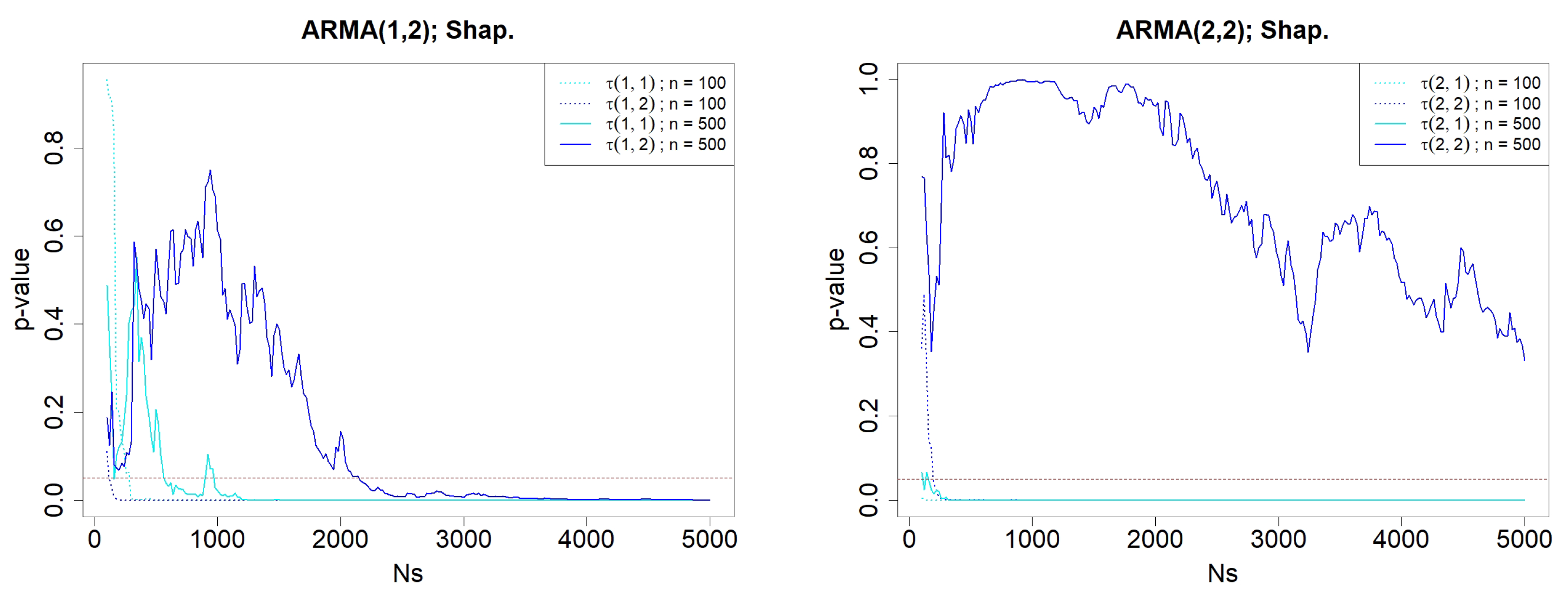
Figure 6.
p-values when testing for the normality of and , for simulated ARMA(p,2) processes, where varies from 100 to 5000. The involved normality test is Shapiro’s. The left graphic concerns ARMA(1,2) simulations, whereas the right one deals with ARMA(2,2). The length of the simulated ARMA() processes are either (dotted lines) or (solid lines). The red-dotted horizontal line represents .
Figure 7.
Percentage of occurrences of orders , identified as the vertex corresponding to the largest triangle of “o” among simulations. The darker the box, the higher the occurrence. Each row corresponds to a fixed value of , ranging from 0 to 5, while each column corresponds to a fixed value of q, ranging from 0 to 10. The top panels represent simulations of ARMA(1,2) models, while the bottom panels correspond to ARMA(2,2) models. The lengths of the simulated ARMA() processes are either (left panels) or (right panels).
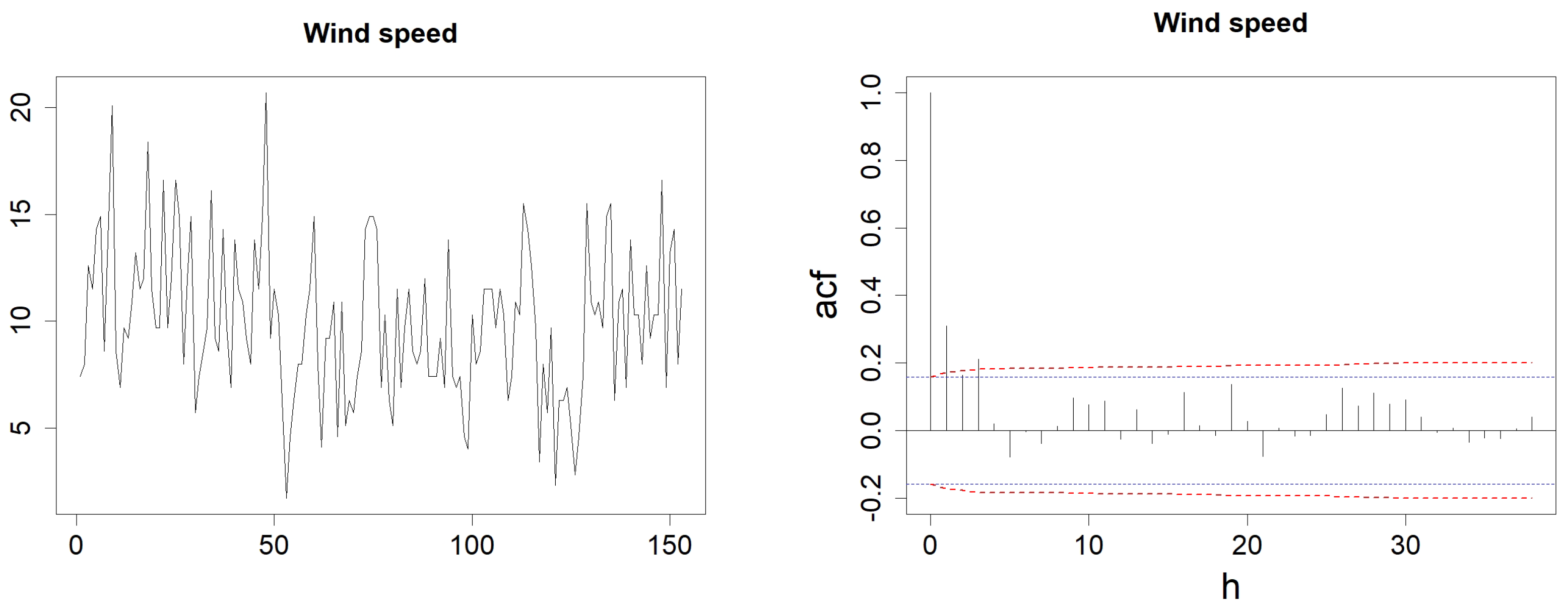
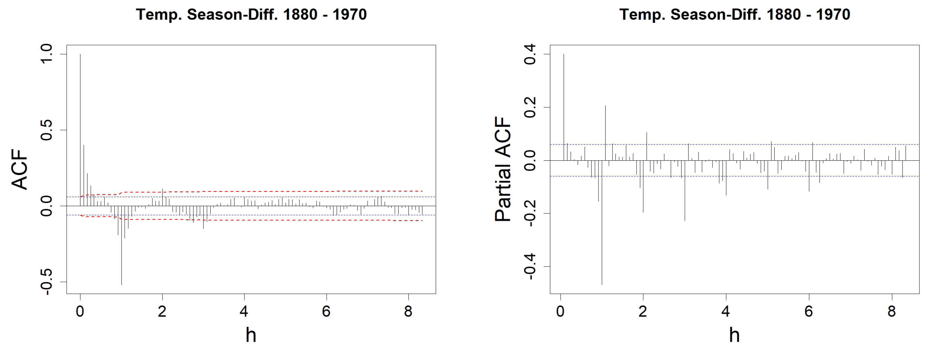
Figure 8.
Wind speed evolution (left) and ACF with h varying from 1 to (right). In the left figure, the blue-dotted horizontal lines represent the classical thresholds and , whereas the red dashed-line represents the corrected thresholds of , dedicated to identifying an MA(q) model, as detailed in Proposition 3.
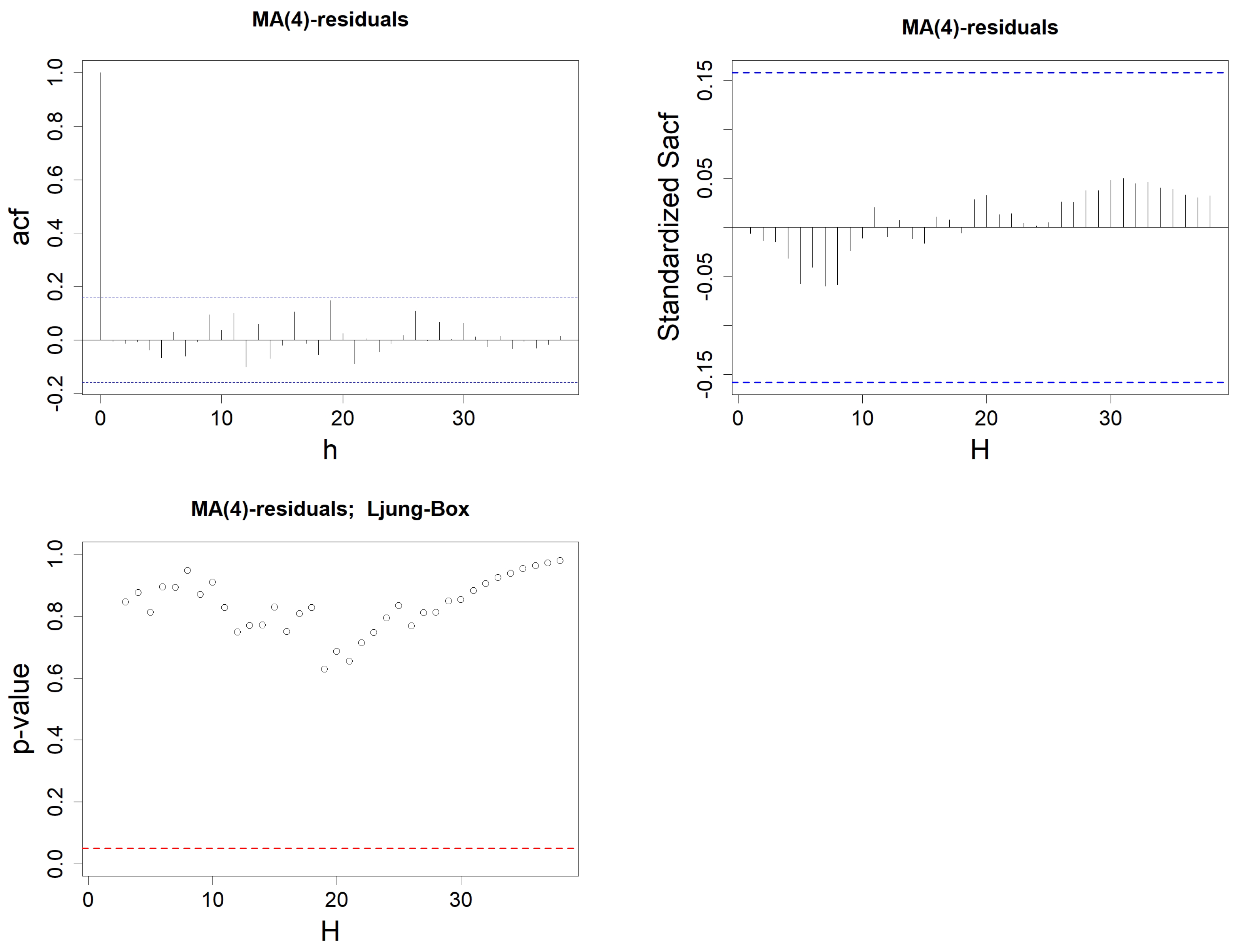
Figure 9.
Sample ACF of the residuals from the MA(q) model constructed on wind speed data, with h varying from 1 to . Order q is either equal to 0 (top left), 1 (top right), 2 (bottom left), or 3 (bottom right). The blue-dotted horizontal lines represent the thresholds and .
Figure 9.
Sample ACF of the residuals from the MA(q) model constructed on wind speed data, with h varying from 1 to . Order q is either equal to 0 (top left), 1 (top right), 2 (bottom left), or 3 (bottom right). The blue-dotted horizontal lines represent the thresholds and .
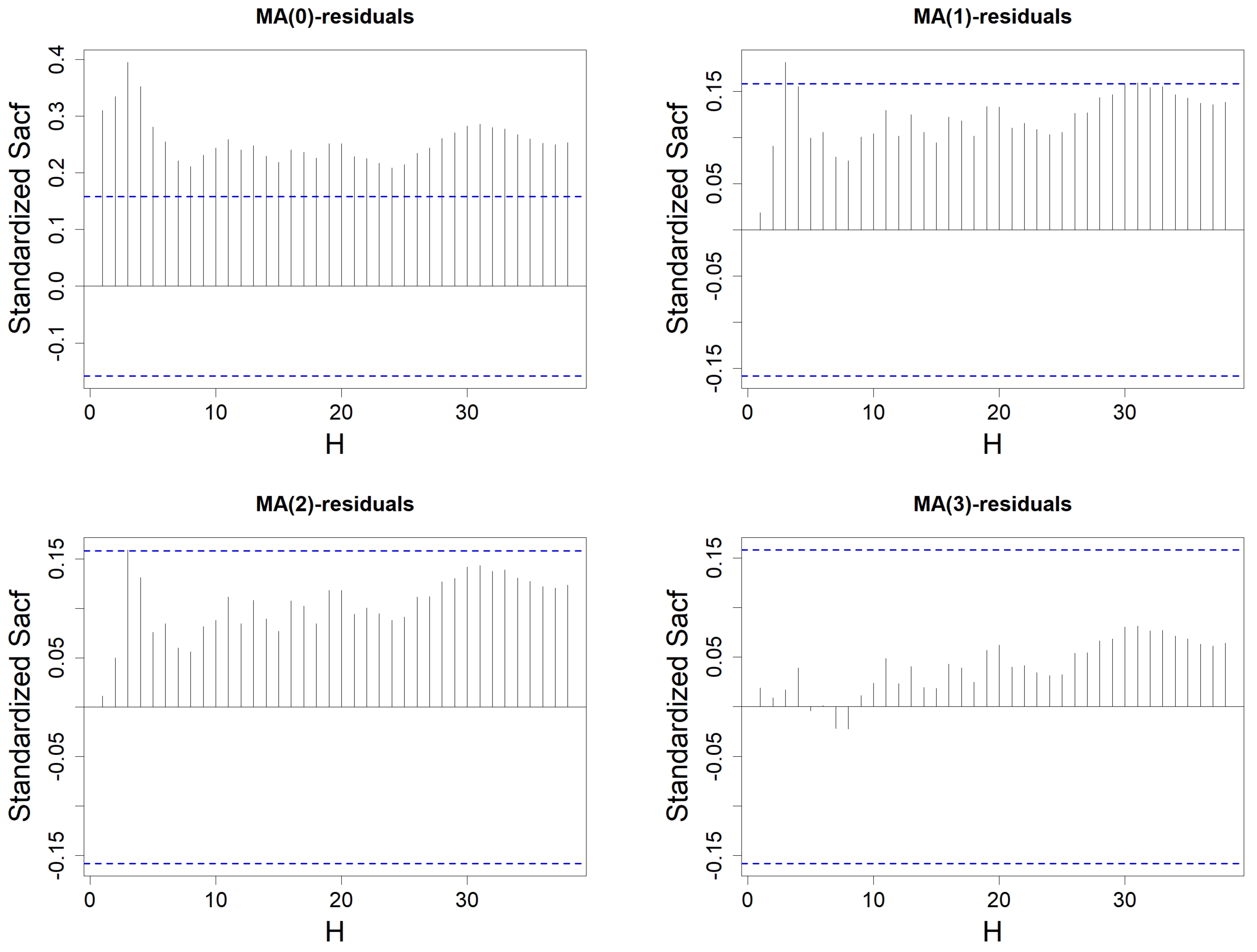
Figure 10.
Standardized SACF of the residuals from the MA(q) model constructed on wind speed data, with H varying from 1 to . Order q is either equal to 0 (top left), 1 (top right), 2 (bottom left), or 3 (bottom right). The blue-dotted horizontal lines represent the thresholds and .
Figure 10.
Standardized SACF of the residuals from the MA(q) model constructed on wind speed data, with H varying from 1 to . Order q is either equal to 0 (top left), 1 (top right), 2 (bottom left), or 3 (bottom right). The blue-dotted horizontal lines represent the thresholds and .
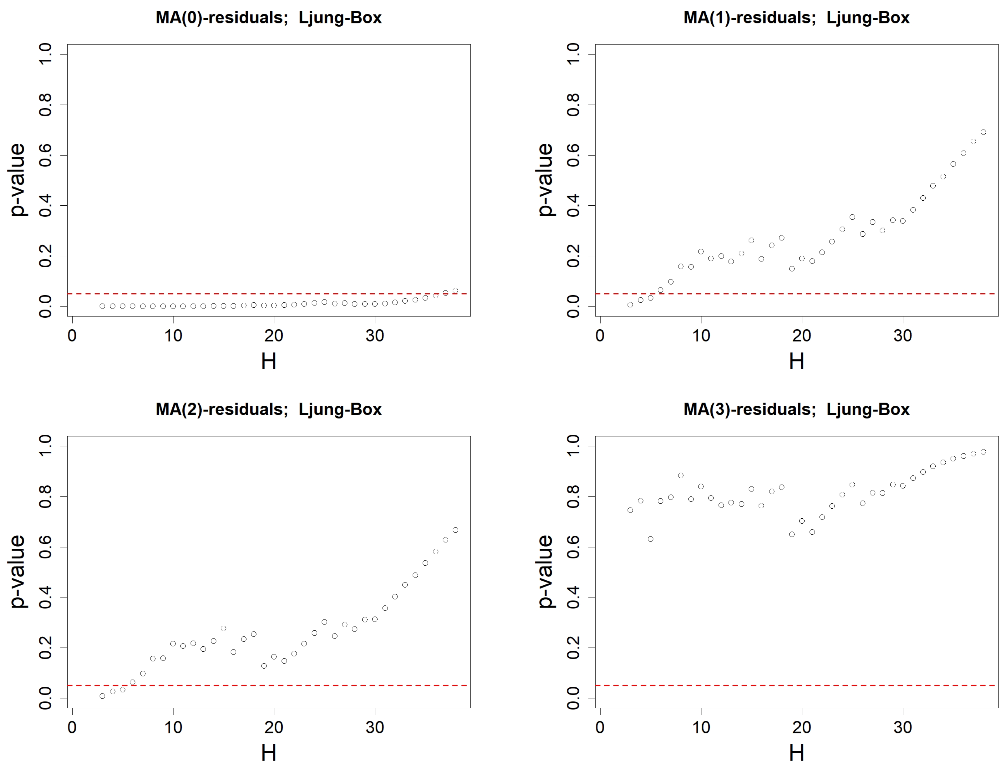
Figure 11.
p-values when using Ljung–Box’s test on the residuals associated to an MA(q) model. Order q is either equal to 0 (top left), 1 (top right), 2 (bottom left) or 3 (bottom right). Ljung–Box’s test is computed successively for all lags , with degree of freedom . The red-dotted horizontal line represents .
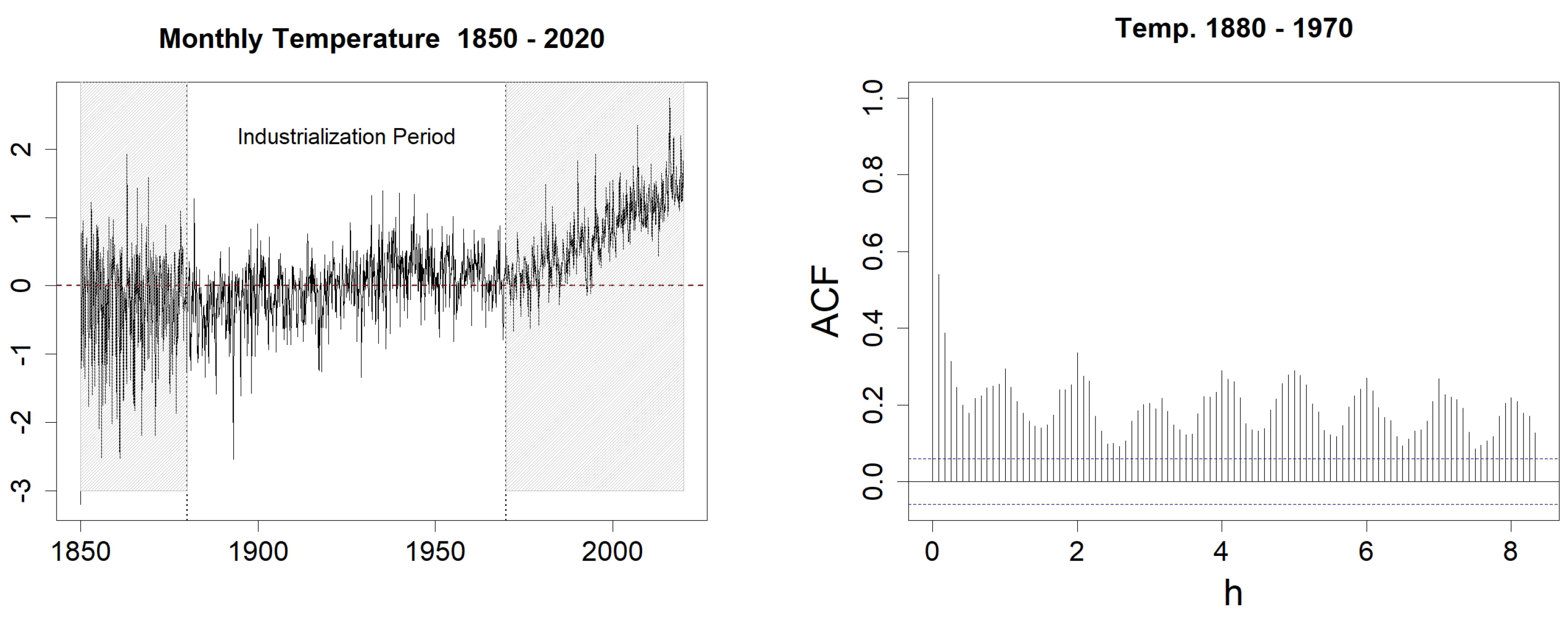
Figure 12.
Sea Surface Temperature anomalies (left) and sample ACF with h varying from 1 to 100 (right). In the left figure, the blue-dotted horizontal lines represent the classical thresholds and .
Figure 12.
Sea Surface Temperature anomalies (left) and sample ACF with h varying from 1 to 100 (right). In the left figure, the blue-dotted horizontal lines represent the classical thresholds and .
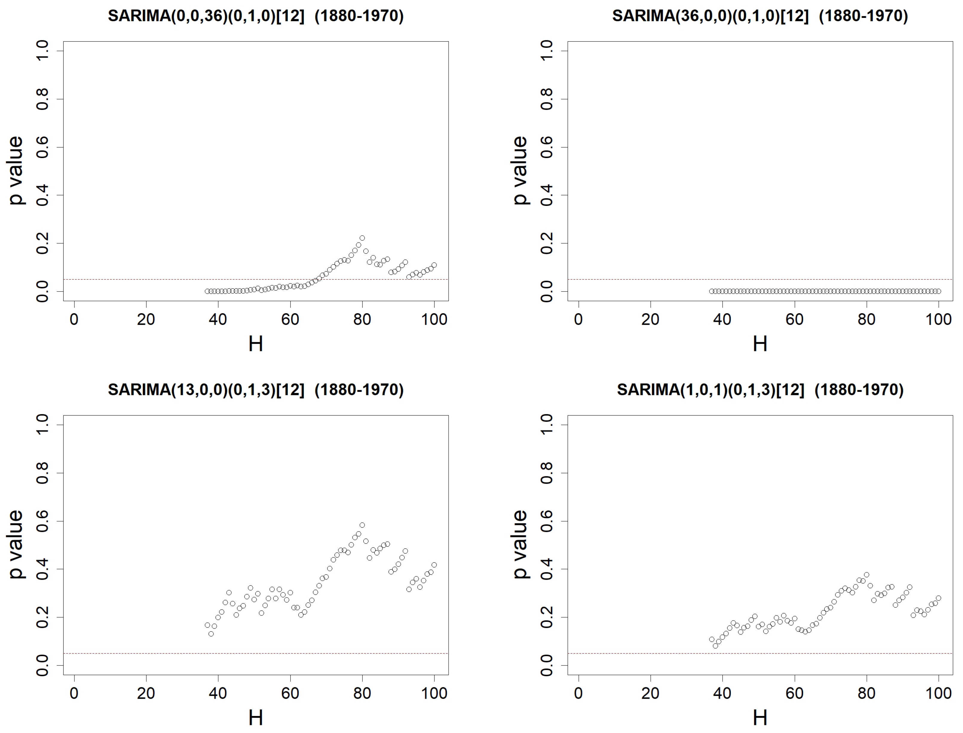
Figure 14.
p-values when using Ljung–Box’s test on the residuals from SARIMA()(0,1,Q)[12] models identified on SST anomalies data, with H varying from to 100. Orders are either equal to (top left), (top right), (bottom left) or (bottom right). The red-dotted horizontal line represents .
Figure 14.
p-values when using Ljung–Box’s test on the residuals from SARIMA()(0,1,Q)[12] models identified on SST anomalies data, with H varying from to 100. Orders are either equal to (top left), (top right), (bottom left) or (bottom right). The red-dotted horizontal line represents .
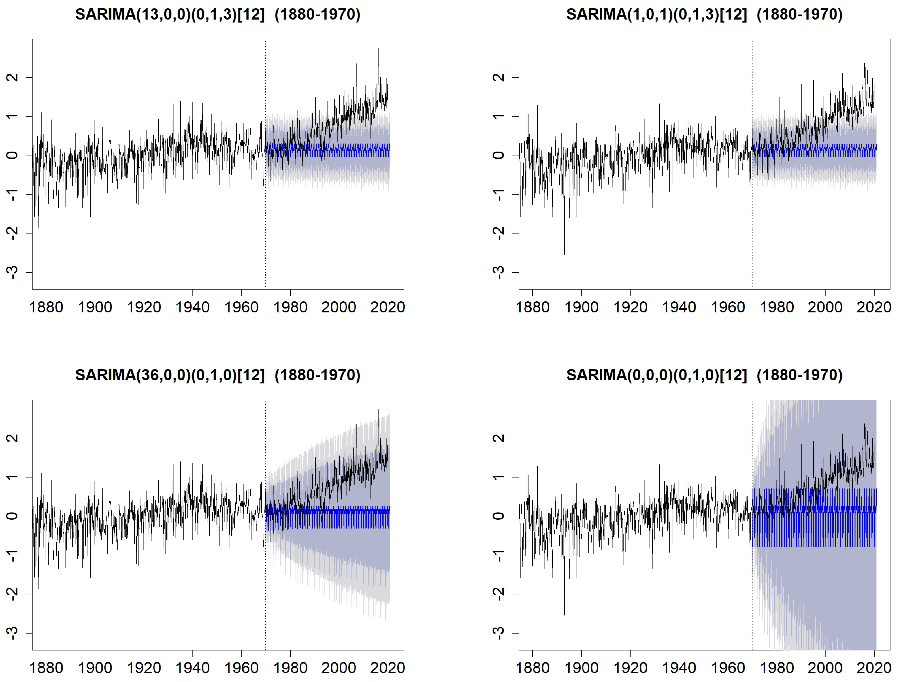
Figure 15.
Forecasts on the period 1970–2020, with prediction intervals at levels (grey) and (lightgrey), compared with the observed data. Forecasts are computed with the SARIMA(13,0,0)(0,1,3)[12] model (top-left), with the SARIMA(1,0,1)(0,1,3)[12] model (top-right), with the SARIMA(36,0,0)(0,1,0)[12] model (bottom-left) and with the SARIMA(0,0,0)(0,1,0)[12] model (bottom-right).
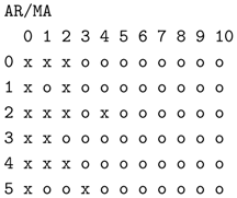
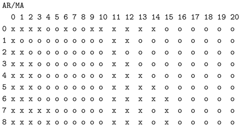
Table 1.
Expected EACF for an ARMA(1,1) process.
Table 1.
Expected EACF for an ARMA(1,1) process.
| | MA | 0 |
1 |
2 |
3 |
4 |
5 |
|---|
|
AR
| |
|---|
| 0 | x | x | x | x | x | x |
| 1 | x | o | o | o | o | o |
| 2 | x | x | o | o | o | o |
| 3 | x | x | x | o | o | o |
| 4 | x | x | x | x | o | o |
| 5 | x | x | x | x | x | o |
Table 2.
Percentage of true diagnosis among simulations of an MA(2) process, when checking Steps 1 to 3. The associated WN is Gaussian and the coefficient is either (left column) or (right column).
Table 2.
Percentage of true diagnosis among simulations of an MA(2) process, when checking Steps 1 to 3. The associated WN is Gaussian and the coefficient is either (left column) or (right column).
| | | | | | |
|---|
| |
n
|
100
|
500
|
100
|
500
|
|---|
| Step 1 | | | | | |
| Step 2 | | | | | |
| Step 3 | | | | | |
Table 3.
Number of simulations, among simulations of an MA(2) process, where the procedure suggests either or . The percentage of valid models, validated with the Ljung–Box test, is added in brackets. When no MA(1) model has been suggested by the procedure, a “-” symbol has been placed between the brackets. The associated WN is Gaussian and coefficient is either (left column) or (right column).
| | | | | | |
|---|
| |
n
|
100
|
500
|
100
|
500
|
|---|
| nb of (% valid.) | | 836 () | 0 (–) | 3243 () | 339 () |
| nb of (% valid.) | | 2967 () | 709 () | 176 () | 150 () |
Table 4.
Percentage of true diagnosis among simulations of a ARMA(p,2) process, when checking Steps 1 to 3. We have in the left columns and in the right one. The associated WN is Gaussian.
Table 4.
Percentage of true diagnosis among simulations of a ARMA(p,2) process, when checking Steps 1 to 3. We have in the left columns and in the right one. The associated WN is Gaussian.
| | | ARMA(1,2) | | ARMA(2,2) | |
|---|
| |
n
|
100
|
500
|
100
|
500
|
|---|
| Step 1 | | | | | |
| Step 2 | | | | | |
| Step 3 | | | | | |
Table 5.
Comparison of models quality between the suggested MA(3) model, and other models MA(0), i.e., WN, MA(1), MA(2), and MA(4). For each criterion, we have bolded the value corresponding to the best model, i.e., the MA(3) for almost all the criteria.
Table 5.
Comparison of models quality between the suggested MA(3) model, and other models MA(0), i.e., WN, MA(1), MA(2), and MA(4). For each criterion, we have bolded the value corresponding to the best model, i.e., the MA(3) for almost all the criteria.
| | MA(1) | MA(2) | MA(3) | MA(4) |
|---|
| RMSE | | | | |
| MAPE | | | | |
| AIC | | | | |
| AICc | | | | |
| BIC | | | | |
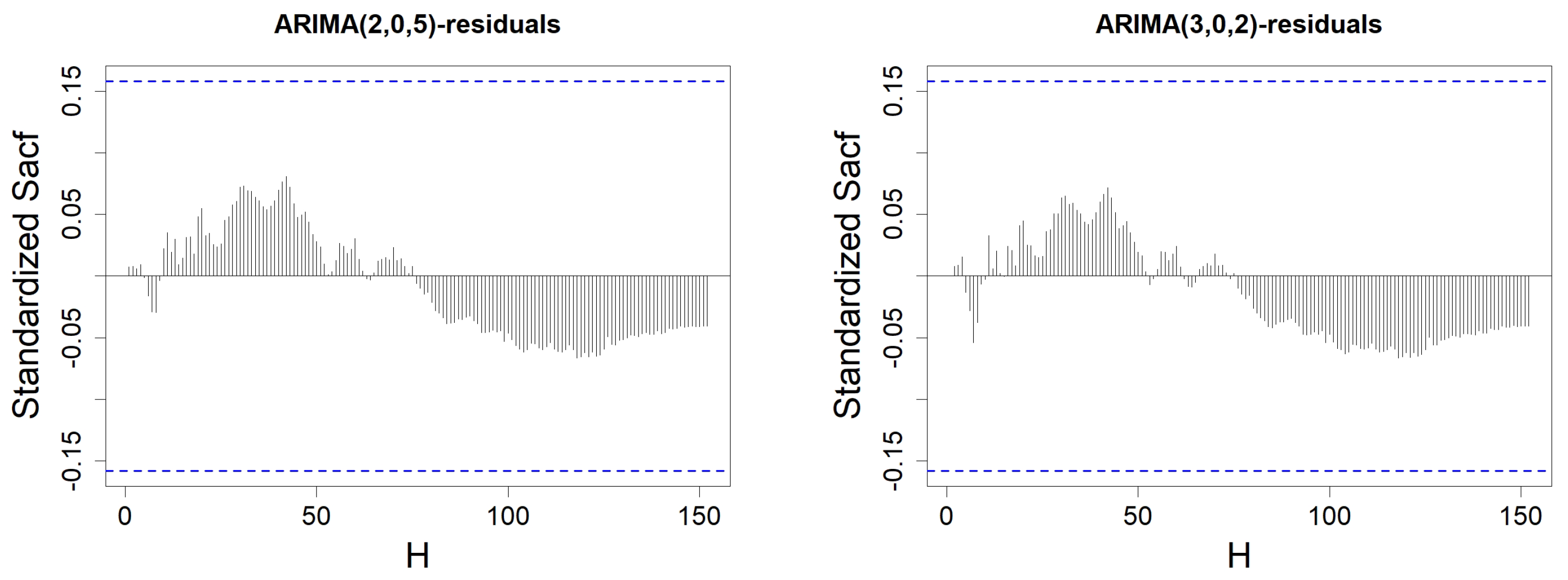
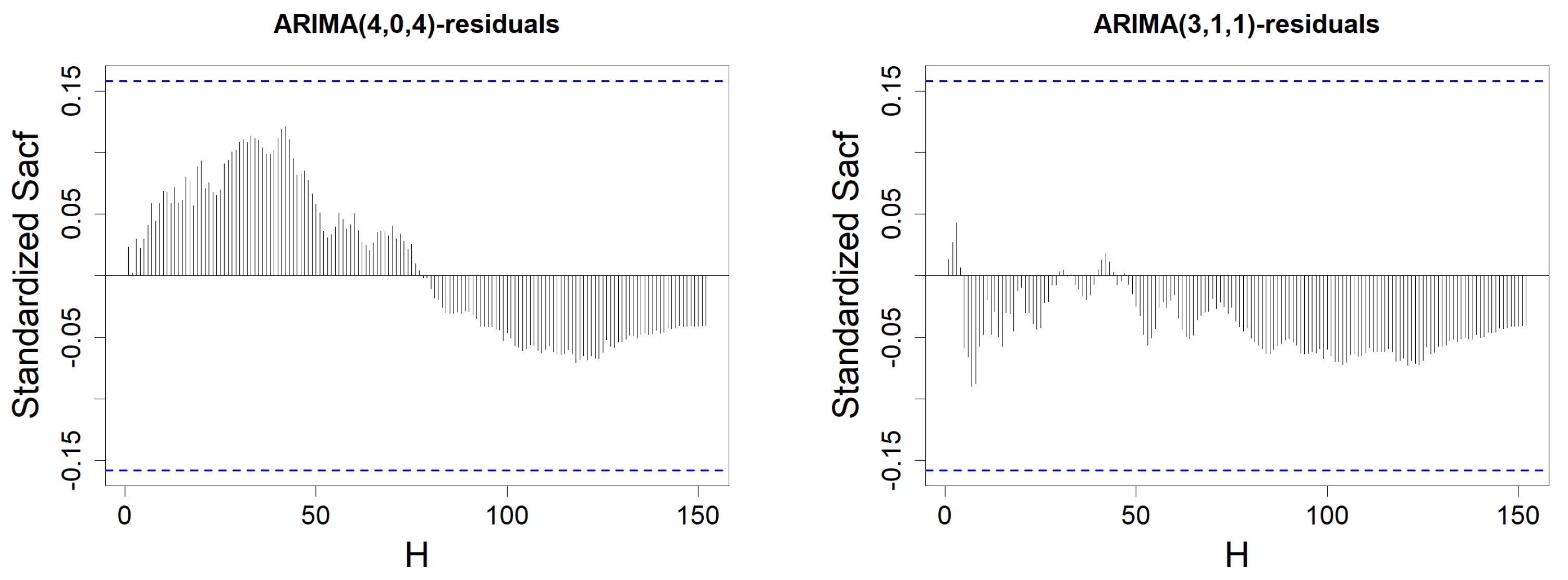
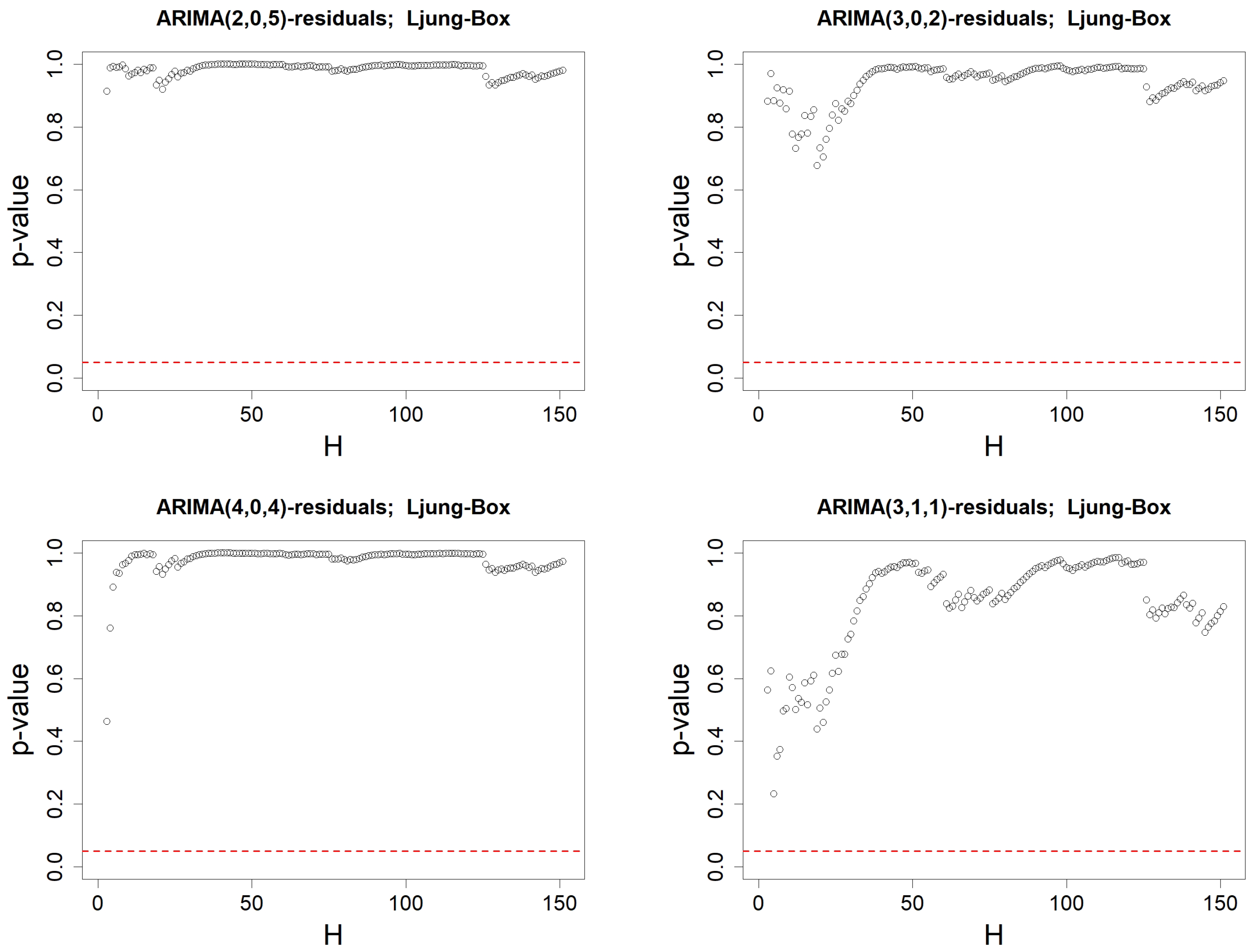
Table 6.
Comparison of models quality between the models ARMA(2,5), ARMA(3,2), ARMA(4,4), suggested by our procedure described in Proposition 4, based on the EACF matrix; an ARIMA(3,1,1) model, suggested by an automated procedure; and the MA(3) model, suggested by the ACF procedure, defined in Proposition 3. For each criterion, we have bolded the value corresponding to the best model.
| | EACF | | | AUTOMATED | ACF |
|---|
| | ARMA(2,5) | ARMA(3,2) | ARMA(4,4) | ARIMA(3,1,1) | MA(3) |
| RMSE | | | | | |
| MAPE | | | | | |
| AIC | | | | | |
| AICc | | | | | |
| BIC | | | | | |
Table 7.
SARIMA()(0,1,Q)[12] models identified on SST anomalies data by our procedures, with other models. SARIMA()(0,1,Q)[12] models are denoted by ()(Q). For each criterion, we have bolded the value corresponding to the best models.
Table 7.
SARIMA()(0,1,Q)[12] models identified on SST anomalies data by our procedures, with other models. SARIMA()(0,1,Q)[12] models are denoted by ()(Q). For each criterion, we have bolded the value corresponding to the best models.
| | ACF | ACF & PACF | EACF | Others | |
|---|
| | (0,36)(0) | (13,0)(3) | (1,1)(3) | (0,0)(0) | (36,0)(0) |
| RMSE | | | | | |
| MAPE | | | | | |
| AIC | | | | | |
| AICc | | | | | |
| BIC | | | | | |


