Proceeding Paper

Visual Design as the Key Factor for Effective Environmental Analytics Dashboard †

by
Zada Zainuddin
1,
Farashazillah Yahya
1,* and
Ahmad Fareez Yahya
2
1
Faculty of Computing and Informatics, Universiti Malaysia Sabah, Kota Kinabalu 88400, Malaysia
2
Faculty of Hotel and Tourism Management, Universiti Teknologi MARA Sabah Branch, Kota Kinabalu Campus, Kota Kinabalu 88997, Malaysia
*
Author to whom correspondence should be addressed.
Presented at the International Academic Symposium of Social Science 2022, Kota Bharu, Malaysia, 3 July 2022.
Proceedings 2022, 82(1), 21; https://doi.org/10.3390/proceedings2022082021
Published: 9 September 2022
(This article belongs to the Proceedings of International Academic Symposium of Social Science 2022)

Abstract

:
This paper proposes visual design as the key factor for an effective environmental analytics dashboard. Organisations found it challenging to organise data before emerging visualisation techniques such as using dashboards and analytics. Environmental analytics dashboards support analysis of performance and progress of a task/situation for some time, i.e., weekly, monthly or yearly. However, there is a dilemma in choosing a suitable visual design for the data, especially for the environmental domain. The objective of the papers is to conduct a mini-review on the visual design factor and subfactors in the context of environmental dashboards. These factors can be the initial focal point when producing an effective dashboard framework. The methodology chosen for this review is a systematic literature review (SLR). Based on the SLR, 23 papers were reviewed, and visual design was deemed the key factor. Two subfactors, highlighted regions and values, and different visualisation techniques mainly support the key factor. Additionally, the current research shows increased research for effective dashboards from 2006 until 2022 that focuses on visual designs. The listed subfactors can be used as guidance later to build an effective environmental analytics dashboard.

1. Introduction

Data analytics is growing in every field as it becomes critical to analyse all data. The dashboard is one of the tools that can help process the data. Dashboards have concise, precise, intuitive display mechanisms to fit on a single screen and the information in the dashboards is customisable, following the users’ requirements. The additional characteristics that the users can consider are metrics or key performance indicators (KPIs) of an individual or organisation, real-time data display, and the availability to view on the web browser or other platforms. Dashboard content may be in the form of tables, graphics, or visual key performance indicators (KPIs) [1]. Some of the types of dashboards include strategic, operational, and analytical. The strategic dashboard monitors the key performance indicators. The operational dashboard displays the days-to-days immediate performance, and the analytical dashboard analyses a large amount of data to find trends and insights. Analytical information that employs visual information can draw user attention to critical situations, trends, and exceptions [2]. Analytical dashboard in the environmental sector mainly uses real-time data, acts as a decision-making tool, and monitors progress [3]. Then, an effective dashboard is helpful to the user where it combines the appropriate data with the proper visualisation technique [4] and interactions depending on their situational utility [1]. In the meantime, analytics analyses data and statistics in a computational mode. Nadj et al. [5] state that an analytical dashboard allows users to use an interactive dashboard with analytical features. The visual design emphasises the appeal of text, colour, and images to get users to engage with the platform. However, sometimes, it is used interchangeably with visualisation [4] or data visualisation [6,7,8]. Some researchers have used visualisation and then used data visualisation or visual design. However, there must be an audience and goals to figure out what makes data visualisations effective [1], as mentioned by Few [8]; a dashboard is a visual representation of the most relevant information needed to achieve one or more objectives. The data is integrated and organised on a single screen to monitor the information at a glance. The core of the dashboards is to be effective first [9,10], it should consist primarily of high-level summaries as it can quickly give an overview of activities to the users. Hence, this paper aims to discuss the key factor of visual design for an effective environmental analytics dashboard.

2. Methodology

Concurrently, design is abstract and does not seem rigid to a specific regulation, however, it can impact how people think and make a decision. That is why the role of choosing the right visual design in building a dashboard is important. It can manipulate the users based on the use of colours, size, type of chart, and others [1]. It is crucial to better understand these factors so that it is simple and straightforward to use for non-technical users [11,12]. Next, a dashboard’s main value is that it reduces the number of metrics to a single visual display [13], which means synchronising between the space and the visual design. There were 23 papers shortlisted using a systematic literature review (SLR) and four stages in the Preferred Reporting Items for Systematic Reviews and Meta-Analysis (PRISMA): identification, screening, eligibility, and inclusion, to extract the subfactors. The entire stages taken with the PRISMA approach are depicted in Figure 1. When looking for the papers, the following keywords were used: dashboard design, effective dashboard, visual design factors, and analytics dashboard.

3. Visual Design as the Key Factor

The effectiveness of dashboards can be measured based on user customisation, knowledge discovery, security, information delivery, alerting, visual design, integration, and system connectivity [14]. Designing effective dashboards includes choosing an accurate data visualisation to display clear and concise information on a task. The accomplishment of the task can be used to support decision-making or monitoring. The visualisation should be easy to interpret without an explanation, so only important text (like graph titles, category labels, or data values) should be on the dashboard. In terms of visual features and interactivity, the dashboard also allows users to change the presentation of data in terms of construction, composition, and multipage by using a tab layout and interactive interface that allows the selection of the relevant items for views or analysis.
Seven factors use the concepts of effective dashboards introduced by Karami et al. [14]; the existing literature is synthesised into factors, subfactors and/or indicators. Nevertheless, the most mentioned factor by the researchers is visual design, or visualisation, as a vital part of a dashboard. There are 11 subfactors from [14] except for the last; the different visualisation techniques are from personal observations, as shown in Table 1. Visual design or visualisation intends to convey messages using aesthetic visual display techniques. The usability of a dashboard can be improved by highlighting areas and values [1,7,14,15,16,17,18,19,20,21,22,23,24,25,26,27,28,29,30,31,32] and displaying the table or graphs on the same page without scrolling [1,14,16,18,19,20,21,28]. Among other indicators are switching back and forth between tabular and chart views [1,14,15,16,18,19,20,24,30] and functionalities such as resizing, zooming in and out, and re-ordering zones [1,14,19]. Customisation flexibility, such as allowing different dashboard layouts, is also deemed significant based on existing research [1,14,15,18,19,20,21,24,28,30]. Too much data overloads a dashboard; prioritising important data through metrics can help display organisational performance measurements. The subfactors included for metrics includes linking metrics together [1,7,14,15,18,21,22,30], linking objectives with metrics [1,8,14] and displaying the metrics calculations [14]. Then, metadata and guidance, displaying instructions and user guide on the dashboards [14]. The last subfactors use different visualisation techniques such as bar charts, graphs, heatmaps and others [1,7,14,15,16,17,18,19,20,21,22,23,24,25,26,27,28,29,30,31,32].
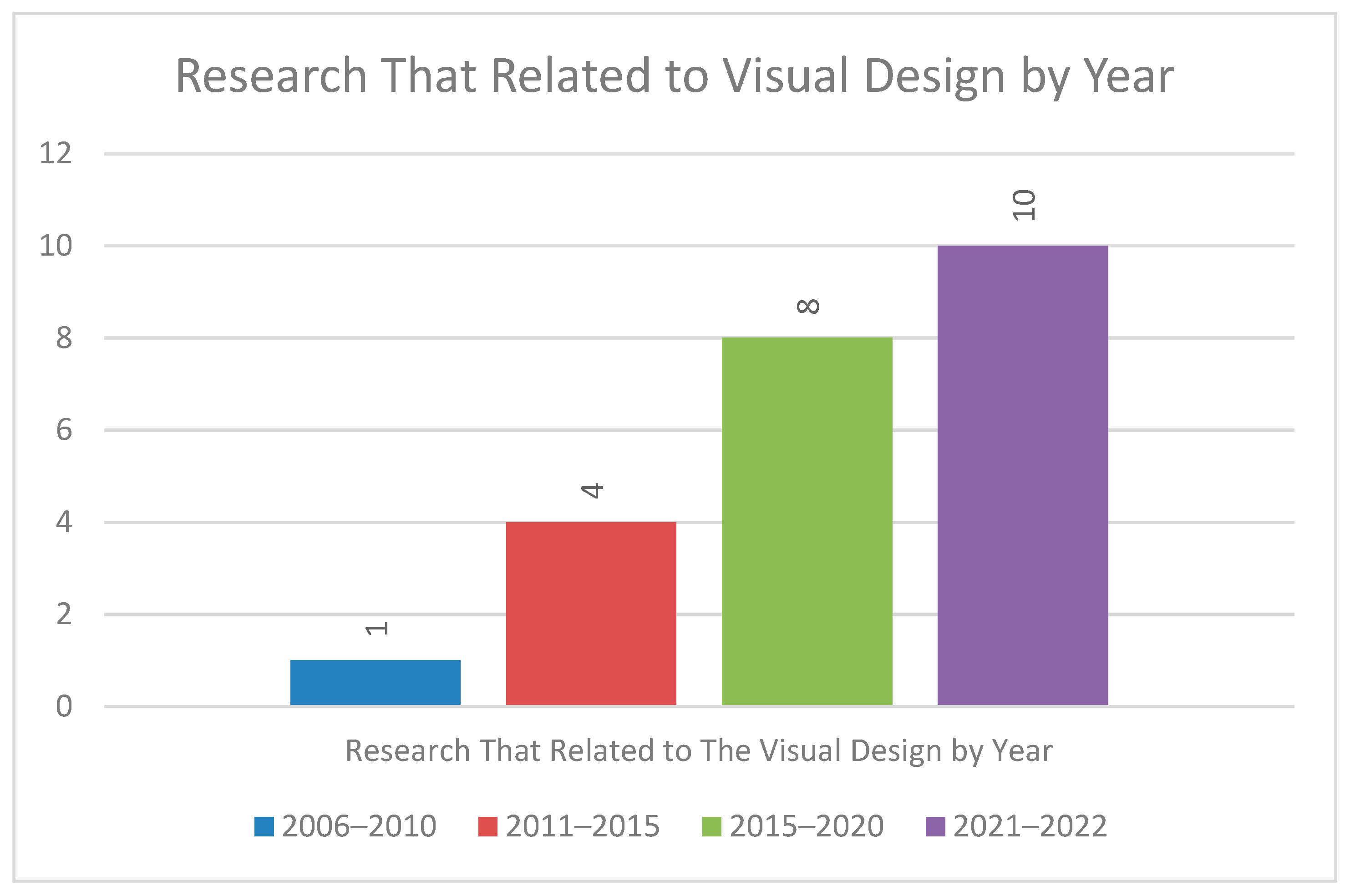
Figure 2 shows the research pattern related to the visual design by year. Four phases are divided into five years, except the last phase, which is only for two years. From this graph, it can be seen that the topic has risen over the years. Only one researcher, [7], started the process in the first phase. Then, it increased to four, whereas there was one paper for each year except in 2015. In 2011; [1], 2012; [16], 2013; [4], and in 2014; [17]. After that, it increased to eight since in 2017; [14,18], 2018; [7,19], 2019; [15,20,28,29]. In the last phase, although only two years, there were ten papers, whereas 2021 had five; [21,22,23,30,31] and five in 2022; [24,25,26,27,32]. A total of 23 papers have discussed this key factor directly or indirectly.
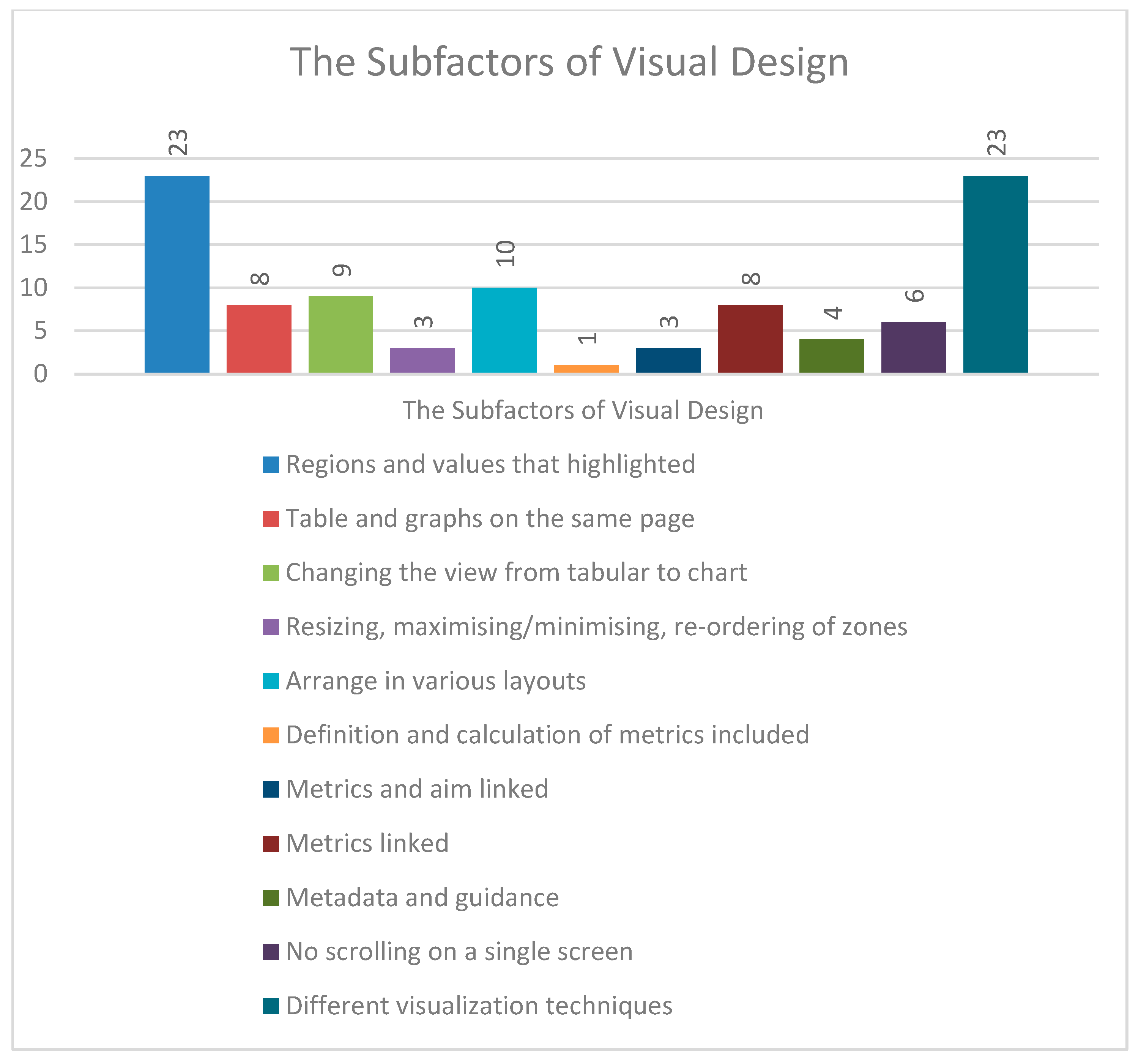
Eleven subfactors influence visual design key factors for effective dashboards: regions and values that are highlighted, table and graphs on the same page, changing the view from tabular to chart, resizing, maximising/minimising, re-ordering of zones, arranged in various layouts, definition, and calculation of metrics including, metrics and aim linked, metrics linked, metadata and guidance, no scrolling on a single screen and using different visualisation technique as shown in Figure 3. Regions and highlighted values are the most highlighted subfactor by the researchers, followed by different visualisation techniques, while the definition and calculation of metrics included are the least. Regions and values are the most highlighted as it is the basis in the dashboard for showing the data, with the capacity to highlight the key regions and numbers on a dashboard in response to a user’s cursor movement [14]. Arranged in various layouts is the second most mentioned by the researchers. The dashboard should be properly visual without overwhelming the users, allowing them to adjust the information layout.
Figure 4 shows the division of subfactors by year. In 2021–2022, the research topic mainly focused on highlighted regions and values and different visualisation techniques. Next, in 2016–2020, the research harmoniously highlighted regions and values, different visualisation techniques, various layouts arranged, and tables and graphs on the same screen; it also changed the view from tabular to chart. There are only a few studies in both early phases, of 2006–2010 and 2011–2015.

4. Discussion

According to [28], from the result of a fair model kit, it is shown that the attraction of the visual design of the dashboard can change the user’s understanding and behaviour. However, the case studies have not disproven that it can change the behaviours; instead, only the usability of the dashboard conveys the information. The dashboard becomes effective when it is frequently checked [24]. It is in synch with the top subfactors, highlighted regions and values and different visualisation techniques applied to build the effective dashboard. Regions and highlighted values are where the information is emphasised by the colour, font, or style intended to catch the reader’s attention within the platform. It requires a good balance between information utility and visual complexity [22] to convey a story, eliminate noise from data, and emphasise essential details [31]. Then, different visualisation techniques mean a chart, graph, map, or mathematical visual. A suitable visualisation must be configured to deliver the right message due to multiple data types. For example, a bar chart represents categories on a two-way axis, and it would be convenient to show data on water usage by month. At the same time, the heatmap used a hue saturation for the area and was relevant to show water quality data in certain areas. Thus, minimalist and aesthetic design [19,26] can also be related to these subfactors. The second top subfactor is arranged in various as analytics dashboards need flexibility. As a result, users do not get bored quickly seeing it every day as the display is varied, and the information is clear and concise. However, past researchers discuss these factors in transportation; [30,32] and health [14,33]. There is less research on the environmental but limited such as [29]. Visual design has been discussed generally by past researchers in [1,4,15,27]. The researchers have indicated how to design different types of the dashboard with multiple types of visualisation, choose the right visualisation, fit all the data into the dashboard, and last, no matter the design pattern, each has its strength and weakness. Definition and metrics calculation are the least mentioned, since anyone who uses the dashboard already knows about them. Hence, it is not relevant to be an indicator for measuring the effectiveness of the dashboard. The trend from 2006 until now supports that visual design is essential when building a dashboard, as the total number of papers published has increased from year on year. Returning to the definition by Few [8]—that dashboards merge all the data and can be readable at a glance— he supports that key factor of visual design as effective to the dashboard.

5. Conclusions and Future Work

Nowadays, data analytics are crucial since much data needs control. Environmental operations generate data that needs to be visualised well in the dashboard for people to understand what is happening. For the time being, the analytics dashboard offers a package with guidelines to let the users build an effective environmental dashboard. This research emphasises eleven visual design subfactors for an effective environmental analytics dashboard, such as the need for visualisation to be arranged in various layouts, allowing the viewer to change the display and so on. However, researchers most mention highlighted regions and values, and different visualisation techniques. Both of the subfactors supported the visual design to be the key factor. Visual design is vital when managing the data into the layout, so no data are left alone without reason. In summary, the rise in visual design research shows a tendency for more technological research. Finally, since there are many subfactors, future work can explore and divide them into groups, followed by urgency level, and facilitate the development of an effective dashboard framework in the environmental domain.

Author Contributions

Conceptualisation, Z.Z. and F.Y.; methodology, Z.Z.; validation, Z.Z. and F.Y.; formal analysis, Z.Z. and F.Y.; investigation, Z.Z. and F.Y.; resources, Z.Z. and F.Y.; writing—original draft preparation, Z.Z. and F.Y.; writing—review and editing, F.Y. and A.F.Y.; visualisation, Z.Z. and F.Y.; supervision, F.Y. All authors have read and agreed to the published version of the manuscript.

Funding

This research was funded by the Ministry of Higher Education Malaysia, Grant No: RAC-ER/1/2019/ICT04/UMS//1. The article processing charge was funded by Universiti Malaysia Sabah.

Institutional Review Board Statement

Not applicable.

Informed Consent Statement

Not applicable.

Data Availability Statement

Not applicable.

Conflicts of Interest

The authors declare no conflict of interest.

References

  1. Pappas, L.; Whitman, L. Riding the Technology Wave: Effective Dashboard Data Visualization. In Human Interface and the Management of Information. Interacting with Information; Springer: Berlin/Heidelberg, Germany, 2011; pp. 249–258. [Google Scholar] [CrossRef]
  2. Negash, S.; Gray, P. Business Intelligence. Handbook on Decision Support Systems. Int. Handbooks Inf. Syst. 2008, 2, 19–29. [Google Scholar]
  3. Yahya, F.; Zaki, A.F.A.; Moung, E.G.; Sallehudin, H.; Bakar, N.A.A.; Utomo, R.G. An IoT-Based Coastal Recreational Suitability System Using Effective Messaging Protocol. Int. J. Adv. Comput. Sci. Appl. 2021, 12, 558–567. [Google Scholar] [CrossRef]
  4. Janes, A.; Sillitti, A.; Succi, G. Effective Dashboard Design. Cut. IT J. 2013, 26, 17–24. [Google Scholar]
  5. Nadj, M.; Maedche, A.; Schieder, C. The Effect of Interactive Analytical Dashboard Features on Situation Awareness and Task Performance. Decis. Support Syst. 2020, 135, 113322. [Google Scholar] [CrossRef]
  6. Raheem, N. Big Data Visualization. In Big DataA Tutorial-Based Approach; Chapman and Hall/CRC: Boca Raton, FL, USA, 2019; pp. 75–102. [Google Scholar] [CrossRef]
  7. Bikakis, N. Big Data Visualization Tools. arXiv 2018, arXiv:1801.08336. [Google Scholar]
  8. Few, S. Information Dashboard Design; Eff. Vis. Commun. Data; O’Reilly Media, Inc.: Sebastopol, CA, USA, 2006; p. 37. [Google Scholar]
  9. Few, S. Dashboard Confusion. Available online: https://www.perceptualedge.com/articles/ie/dashboard_confusion.pdf (accessed on 21 June 2021).
  10. Baharum, A.; Wan, L.Y.; Yahya, F.; Nazlan, N.H.; Nor, N.A.M.; Ismail, I.; Noor, N.A.M. Mobile Learning Application: Flipped Classroom. Indones. J. Electr. Eng. Comput. Sci. 2020, 17, 1084–1090. [Google Scholar] [CrossRef]
  11. Natalia, F.; Eko, Y.; Ferdinand, F.V.; Murwantara, I.M.; Ko, C.S. Interactive Dashboard of Flood Patterns Using Clustering Algorithms. ICIC Express Lett. Part B Appl. 2019, 10, 413–418. [Google Scholar] [CrossRef]
  12. Lee, D.; Felix, J.R.A.; He, S.; Offenhuber, D.; Ratti, C. CityEye: Real-Time Visual Dashboard for Managing Urban Services and Citizen Feedback Loops. In Proceedings of the 14th International Conference on Computing in Urban Planning and Urban Management (CUPUM), Cambridge, MA, USA, 7–10 July 2015. [Google Scholar]
  13. Malik, S.; Sharma, P. Dashboard Necessary in Every Field. Int. J. Comput. Sci. Inf. Technol. 2014, 5, 3511–3513. [Google Scholar]
  14. Karami, M.; Langarizadeh, M.; Fatehi, M. Evaluation of Effective Dashboards: Key Concepts and Criteria. Open Med. Inform. J. 2017, 11, 52–57. [Google Scholar] [CrossRef]
  15. Sarikaya, A.; Correll, M.; Bartram, L.; Tory, M.; Fisher, D. What Do We Talk about When We Talk about Dashboards? IEEE Trans. Vis. Comput. Graph. 2019, 25, 682–692. [Google Scholar] [CrossRef]
  16. Lempinen, H. Constructing a Design Framework for Performance Dashboards. In Nordic Contributions in IS Research; Springer: Berlin/Heidelberg, Germany, 2012; pp. 109–130. [Google Scholar]
  17. Abd-Elfattah, M.; Alghamdi, T.; Amer, E. Dashboard Technology Based Solution To Decision Making. Int. J. Comput. Sci. Eng. Inf. Technol. Res. 2014, 4, 59–70. [Google Scholar]
  18. Mayer, B.; Weinreich, R. A Dashboard for Microservice Monitoring and Management. In Proceedings of the 2017 IEEE International Conference on Software Architecture Workshops (ICSAW), Gothenburg, Sweden, 5–7 April 2017; pp. 66–69. [Google Scholar] [CrossRef]
  19. Dowding, D.; Merrill, J.A. The Development of Heuristics for Evaluation of Dashboard Visualizations. Appl. Clin. Inform. 2018, 9, 511–518. [Google Scholar] [CrossRef] [Green Version]
  20. Kamulegeya, G.; Mugwanya, R.; Hebig, R. Requirements for Measurement Dashboards and Their Benefits: A Study of Start-Ups in an Emerging Ecosystem. In Proceedings of the 2019 45th Euromicro Conference on Software Engineering and Advanced Applications (SEAA), Kallithea, Greece, 28–30 August 2019; pp. 300–308. [Google Scholar] [CrossRef]
  21. Harding, C. A User Analysis of the Environmental Finance Center’s Water and Wastewater Dashboard Tool. Master’s Thesis, University of North Carolina at Chapel Hill, Chapel Hill, NC, USA, 2021; 48p. [Google Scholar]
  22. Hehman, E.; Xie, S.Y. Doing Better Data Visualization. Adv. Methods Pract. Psychol. Sci. 2021, 4, 1–18. [Google Scholar] [CrossRef]
  23. Zhwan, M.; Khalid, S.R.M.Z. Big Data Analysis for Data Visualization: A Review. Int. J. Sci. Bus. 2021, 5, 64–75. [Google Scholar] [CrossRef]
  24. Bloemen, S. Designing a Dashboard Development Methodology for Heterogeneous Stakeholders in Dutch Nursing Homes. Master’s Thesis, University of Twente, Enschede, The Netherlands, 2022; pp. 1–40. [Google Scholar]
  25. Antonini, A.S.; Ganuza, M.L.; Castro, S.M. VISUEL—A Web Dynamic Dashboard for Data Visualization. J. Comput. Sci. Technol. 2022, 22, 42–57. [Google Scholar] [CrossRef]
  26. Khanbhai, M.; Symons, J.; Flott, K.; Harrison-White, S.; Spofforth, J.; Klaber, R.; Manton, D.; Darzi, A.; Mayer, E. Enriching the Value of Patient Experience Feedback: Web-Based Dashboard Development Using Co-Design and Heuristic Evaluation. JMIR Hum. Factors 2022, 9, 1–14. [Google Scholar] [CrossRef]
  27. Bach, B.; Freeman, E.; Abdul-Rahman, A.; Turkay, C.; Khan, S.; Fan, Y.; Chen, M. Dashboard Design Patterns. arXiv 2022, arXiv:2205.00757. [Google Scholar]
  28. Park, Y.; Jo, I.H. Factors That Affect the Success of Learning Analytics Dashboards. Educ. Technol. Res. Dev. 2019, 67, 1547–1571. [Google Scholar] [CrossRef]
  29. Jing, C.; Du, M.; Li, S.; Liu, S. Geospatial Dashboards for Monitoring Smart City Performance. Sustainability 2019, 11, 5648. [Google Scholar] [CrossRef]
  30. Deee, G.; Pack, M.L.; Young, S.; Ph, D.; Franz, M.L.; Pack, M.L.; Young, S. Transportation Energy Analytics Dashboard (TEAD). (No. DEEE0008465); 2021. Available online: https://www.osti.gov/biblio/1784082 (accessed on 21 June 2021).
  31. Wagh, S.J.; Bhende, M.S.; Thakare, A.D. Data Visualization Using Tableau. In Fundamentals of Data Science; Chapman and Hall/CRC: Boca Raton, FL, USA, 2021; pp. 249–267. [Google Scholar] [CrossRef]
  32. Bachechi, C.; Po, L.; Rollo, F. Big Data Analytics and Visualization in Traffic Monitoring. Big Data Res. 2022, 27, 100292. [Google Scholar] [CrossRef]
  33. Wimba, P.M.; Bazeboso, J.A.; Katchunga, P.B.; Tshilolo, L.; Longo-Mbenza, B.; Rabilloud, M.; Vanhems, P.; Iwaz, J.; Étard, J.F.; Écochard, R. A Dashboard for Monitoring Preventive Measures in Response to COVID-19 Outbreak in the Democratic Republic of Congo. Trop. Med. Health 2020, 48, 74. [Google Scholar] [CrossRef] [PubMed]
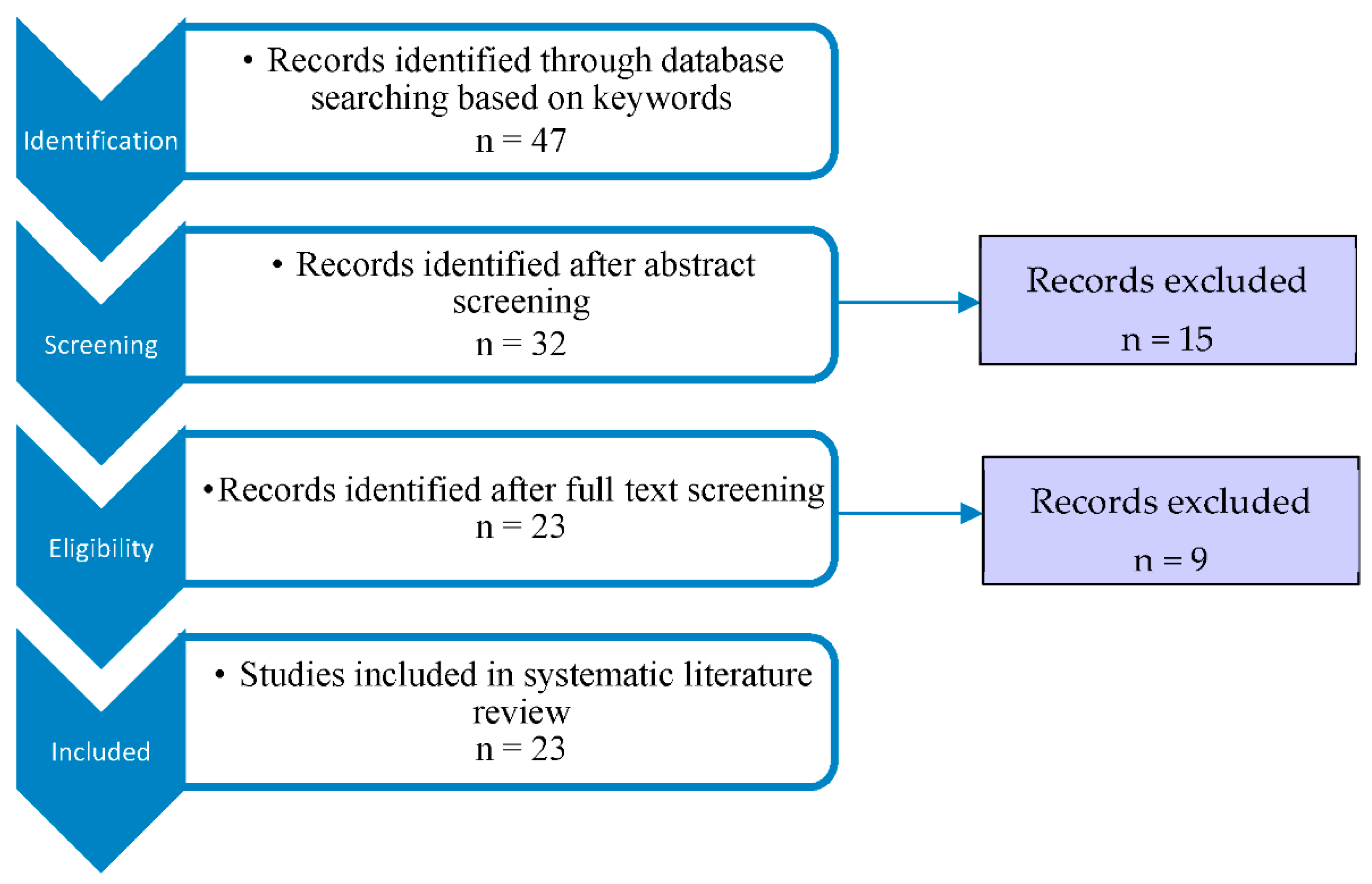
Figure 1. Systematic literature review flow diagram.
Proceedings 82 00021 g001
Figure 2. Research that related to visual design by year.
Proceedings 82 00021 g002
Figure 3. The Subfactors of Visual Design.
Proceedings 82 00021 g003
Figure 4. Division of Subfactors by Year.
Proceedings 82 00021 g004
Table 1. Factor and subfactors/indicators for a dashboard.
FactorsSubfactors/IndicatorsSources/References
Visual designRegions and values that highlighted[1,4,7,8,14,15,16,17,18,19,20,21,22,23,24,25,26,27,28,29,30,31,32]
Table and graphs on the same page[1,14,16,18,19,20,21,28]
Changing the view from tabular to chart[1,14,15,16,18,19,20,24,30]
Resizing, maximising/minimising, re-ordering of zones[1,14,19]
Arrange in various layouts[1,14,15,18,19,20,21,24,28,30]
Definition and calculation of metrics included[14]
Metrics and aim linked[1,8,14]
Metrics linked[1,7,14,15,18,21,22,30]
Metadata and guidance[4,14,21,28]
No scrolling on a single screen[1,8,14,16,18,28]
Different visualisation techniques[1,4,7,8,14,15,16,17,18,19,20,21,22,23,24,25,26,27,28,29,30,31,32]
Publisher’s Note: MDPI stays neutral with regard to jurisdictional claims in published maps and institutional affiliations.