1. Introduction
What kind of images are data visualizations? Are they mere abstract transformations of numerical data? Should they reduce the phenomenal world into a set of pre-codified shapes? Or can they represent natural phenomena through figurative strategies? Where does the boundary lie between useless decoration, narrative illustration and helpful visual metaphors? Since the theoretical work and practical implementation of Otto Neurath [
1,
2], much has been argued about the necessary balance between scientific accuracy and communicational efficiency in data visualization. Since then, how to translate quantitative information into readable graphs has been the terrain for debate between the advocates of dryness and objectivity [
3,
4,
5] and the defenders of a more playful and inventive approach [
6,
7]. The recent triumph of emotional design [
8] and the success of the ‘Information is beautiful’ approach [
9] are now apparently pushing in a direction that accepts decorative and figurative elements in data visualization to better appeal to readers and leave something memorable in their minds. Does this figurative turn affect the scientific quality of the graphs?
This paper aims to demonstrate how the dispute between a minimalistic and pop-figurative approach in data visualization has centred mainly on the question of whether or not it is opportune to use images, sometimes rekindling an old issue that belonged to the realm of visual arts: what kind of art is more readable, universal, and popular between abstraction and figuration? It also puts this theoretical background to the test of real production, introducing case-studies that have been conceived within the framework of the research into Visual Journalism conducted at the University of Bolzano. The authors of this paper contributed to the design of Europa Dreaming, an online visual project on the crisis of European principles and the return of internal borders, caused by the migrant crisis of 2015. This project is a multimedia online inquiry, where verbal language mixes with photo-reportages; video interviews with interactive timelines. Of the different visual languages used in the project, data visualization is one of the most experimental and innovative. Together with a strategic use of other kinds of images, it constructs a narrative that helps to provide an alternative vision to the mainstream rhetoric of invasion and the stereotype of the masses pressing at the gates of Europe. This project had been preceded by an earlier one, People’s Republic of Bolzano (2015), in which the use of stereotypes and humour in data visualization, together with in-depth interviews highlighting the people behind the data, sought to tear down more diffused stereotypes such as the Chinese invasion of Italian towns. We will see how these visualization strategies can help to construct meaning in a context of cultural and social bias.
2. Visualizing Numbers, Communicating Topics
Data visualizations are probably enjoying a “second golden age” [
10] (p. 7), due to the advent of digital data design and the public availability of a large number of datasets. Moreover, the renewed interest in information design corresponds to an increased demand in data visualizations. The first “golden age of statistical graphics” (as it was called by Michael Friendly [
11]) dates back to the first half of the XIX century. Among the best scientists working with the graphical visualization of information at that time were William Playfair, an engineer and political economist, who lived in the UK between 1759 and 1823; Charles Minard, also a civil engineer, living in France between 1781 and 1870, and John Snow, a young doctor, living in London from 1813 to 1858. Though none of these people were designers or statisticians, they invented and designed the most common charts we know today. Playfair is widely considered the inventor of the line and bar chart, as well as of the pie chart and the circle graph [
12]. Minard, on the other hand, invented the early mosaic plot, the Sankey diagram as well as the flow chart. His visualization of Napoleon’s March is considered “the best graphic ever drawn” by Edward Tufte [
3] and, according to Etienne Jules Marey [
13], “defied the pen of the historian in its brutal eloquence” [
13]. For this reason, we can also consider Minard to be the inventor of thematic cartography as a narrative means for storytelling.
Most of the graphics of this golden era were in any case focused on economic and financial data, and were more analytical than informative, adopting graphical means to inspect and explore numerical datasets that might otherwise be difficult to analyse, to support governors and institution on important decisions. They did so by making patterns, trends, constancy and variation emerge, spotlighting issues that were usually buried in the raw numerical data. Sometimes graphical means were used for scientific discovery: this was the case of Sir Francis Galton, whose discoveries were based on strong statistical insight and graphic methods to analyse the data [
11] (p. 14). Discovery arising from data mapping could often save lives, as in the case of John Snow’s famous distribution map: the cause of the Cholera epidemic that occurred in Great Britain in 1831 was unknown until John Snow revealed that the deaths were concentrated around a possible source of contamination, a water pump in central London (1855). His map-based visualization immediately clarified the relation between the location and water quality of specific pumps, and the deaths from Cholera. Even though there are evident narrative elements and a certain interest in social and living conditions, figures such as Snow, Minard and Playfair, who defined the canon of data visualization and whose work lay the foundations for modern data design as we know it today, were targeting a specialized and educated audience and their aim was analytical.
From a visual point of view, they contributed to the invention of a visual language based on the translation of quantitative data into visual attributes such as length, angle, thickness, position, size. Playfair, for example, made the circular section of a pie chart a signifier for the relationship between a part and the whole; the diameter or the area of a circle a signifier for a quantity. The result of this new “vocabulary” is a set of abstract forms such as rectangles, bar and lines, that can be read by learning the code of the
legenda (and soon absorbed as common knowledge: nowadays, who needs to learn how to read a timeline?). In the following decades, the communication of statistics was assigned to the scientists themselves, who cared more about the accuracy and exactitude of the data communicated than about its readability and understandability. For Friendly [
11], the first half of the XX century can be called “the modern dark age” of statistics and data visualization, when theoretical and applied statistics moved from graphic displays back to numbers and tables and quantification supplanted visualization. Otto Neurath would have agreed with this label, since he was asking himself and the public of his Social and Economic Museum “When will the Middle Ages be at an end?” [
2], indicating that there was an evident gap between the knowledge of the few speaking the language of science and the ignorance of the many, illiterate and passive to governmental decisions.
Otto Neurath, living in Vienna after the First World War, felt the urgency to change this trend. In a country that was reacting to the heavy losses of the war, it was important to communicate social and economic progress to the citizens, in a comprehensible and memorable way, rather than by fighting for a decimal. Highlighting the novelty of his approach in comparison to the state of statistics in his times, he stated: “Since it is part of the job (of the statisticians, n.d.r.) to count and measure everything as accurately as possible, they demand that everybody appreciate the trouble they have taken and remember the exact figures they provide. The Vienna school, on the other hand, postulates: to remember simplified pictures is better than to forget accurate figures” [
2] (p. 220). As a philosopher of science, sociologist and political economist, he founded the “Social and Economic Museum” in Vienna, a place where facts and figures about the material conditions of the citizens could be presented in clear and effective displays of graphs and billboards. Neurath thus transformed the function of infographics, shifting their focus from analytical to informative and educational purposes [
14]. Thus, the audience for the visualizations shifted from a small group of specialized and educated people to a wider uneducated community. Through his “Vienna Method of pictorial statistics” and “of visual education”, later called ISOTYPE [
1] (p. 215) and [
2] (p. 221), he replaced abstract charts with sets of pictographs. The aim of Isotype (International System of Typographic Picture Education), was to create an international visual language, based on standardized graphic symbols, which could bridge the gap between social classes and nationalities [
15]. Its aim was to inform and educate an often-illiterate public about the most important data and facts that affected society and everyday life, to provide a wider audience with basic cultural and social information. For Neurath, “the method of visual education has an important contribution to make to general education: to give fundamental, strictly scientific information for social understanding, even to the less educated, without depressing him in the way learned books and statistical tables do. Charts condense information without confusing. Visual education can even introduce illiterates to wide fields of knowledge and understanding without any previous education” [
1] (p. 217). Neurath, as a solid social scientist, knew that only quantitative facts were socially significant, but he also knew that most people were frightened by rows of figures and felt diagrams to be patronizing: pictures they could recognize were much more friendly [
2] (p. 222).
Otto Neurath strongly believed that, to be universally comprehensible, his visual language had to be based on recognizable representations of objects from the real world. Based on empiricism and an optimistic vision of the highly successful at the time medium of photography, its visual characteristics were considered objective and neutral: “reduced conventionalized schemes of direct experience”, stylizations of frontal photographs, “a neutral mode of expression” [
16] (p. 148). Those “iconic” forms of representation were supposed to resemble natural objects, thus summarizing the phenomenon under observation and the subject of the chart, so that the reader could instantly understand what the diagram was about, before even considering the numbers. In reality, there are evident cultural and historically-bound references in the design of the pictographs themselves [
17] and it is difficult to imagine an iconic alphabet that could bypass the process of interpretation through the supposed immediate response of perception. Neurath, however, never claims to have invented an “iconic” language, but always refers to isotype pictographs as symbols to be learned, thus demonstrating his awareness of the conventional relationship between the characters and their meaning.
Neurath himself was not a designer but his closest collaborators were a designer (Marie Reidermeister, later Neurath) and a socialist artist (Gerd Arntz). He considered the role of the designer as a “transformer”, a person entrusted with the delicate role of “inventing figurative formations, schemes, appropriate iconic units and metaphors that are pertinent to the content” [
18] (p. 62). What was different from his earlier approach was that the elements to be “transformed” (expressed or ‘translated’, we would say, in semiotic terms) were no longer just data and numbers, but qualitative and semantic elements as well.
In previous data visualizations, the topic was introduced through verbal language (mainly the title or the caption of the diagram) while the semantics of the diagram were restricted to the change of a quantity or the distribution of a phenomenon in a data map. With Isotype, the topic is immediately visible in the figurative shape of the repeated iconic unit composing the diagram.
A bar chart, a sparkline or a pie chart will always appear similar, whatever it refers to. It will slightly change depending on the data it represents. An Isotype chart always has the same style and respects fixed standards, but its units change depending on the topic covered. Bars, sparklines and pies (despite the latter’s evocative name) are abstract geometrical translations of numerical relationships. Icons are recognizable as figures of the world. The figurative element suddenly introduces a social and cultural context.
3. Images as a Battlefield: Tufte vs. Holmes
After Neurath’s death (1945), his system of pictographs and their use for statistical charts was used sporadically. Otl Aicher was following the style of Gerd Arntz rather than Otto Neurath’s legacy when he designed the system of pictographs for the 1972 Olympic Games. Even if the graphic design was conceived for public utility as a universal graphic language, it had nothing to do with communicating numbers, proportions and trends. Furthermore Frutiger, a master in pictographic communication, dealt more with the graphic history of symbolic representation than with information design [
19,
20] (p. 37). In what McLuhan would have called the “electric age”, it is strange that Neurath did not have a stronger impact, given that a picture language such as Isotype, as stated by Frank Hartmann [
14] (p. 283) would have enabled “our culture to return to the inclusive form of the icon” [
21] (p. 12) in a form of post-typographical “debabelization”.
It was not until the Eighties that Nigel Holmes, graphic designer and later director for Time magazine (and many other newspapers and magazines), discovered Neurath through Modley’s Handbook of pictorial symbols and was struck by the simplicity and popularity of his design. After this discovery, he always declared Neurath’s influence on his work and thinking [
6,
7] (p. 12) and aspired to a style that was as “approachable and human” as Neurath’s [
7] (p. 12). Holmes used humour and fun to instill affection for numbers and charts in readers, through “charm and direct appeal” [
22] (p. 72). Nevertheless, because Holmes was a strong user of caricatures and stereotypes, we are not sure that Neurath would have appreciated Holmes’ work, given his preference for “simple, careful, symbolic representation” rather than "expressionistic play with strong effective colours, to sentimental naturalism and also to the jokes of caricature” [
1] (p. 215).
The most influential theorist and practitioner of data visualization in the Eighties and Nineties was someone with a completely different approach, the previously-mentioned Edward Tufte. Tufte upheld a minimalistic style in quantitative displays, considering any sort of illustration as useless decoration. He mentions Neurath only to revile his contemporary followers in graphic design, whose data visualization displays “a triumph of decoration over information”, based on the “decorative clichés of info-graphics (the language is as ghastly as the charts)” complete with “celebrity factoids, over-compressed data, and Isotype styling” ([
5] (p. 37), also quoted in [
23] (p. 236)). He was not the first to deprecate Neurath’s style, having notorious forerunners in Adorno and Horkheimer who disdained his picture language as a further typical simplification of modern culture that treats the public as a mass of idiots ([
24], also quoted in [
25,
26]).
Tufte was indeed the advocate for a theory he called “data-ink ratio” based on the idea that the efficiency of a visualization is inversely proportional to the amount of ink used to print it [
3] (p. 93–96). Any illustration or decoration was banned: data had to appear with utmost clarity and precision. Tufte’s models were the earlier graphics by Minard and Playfair rather than what happened in the XX century. These were his references when he invented sparklines and their clustering in grids called small multiples. “Sparklines are small, intense, word-sized graphics with typographic resolution (…). Sparklines (…) consist entirely of data, with no non-data at all. Thus sparklines have no frames, tic marks, and non-data paraphernalia” [
27]. We can frame this contribution as the extremization of the data-ink ratio theory, devoted to the removal of any element that is not functional to the data visualization. Sparklines, largely adopted in the financial pages of newspapers on and offline, are now an established visualization that facilitates the comparison of trends using the smallest space possible and including no image at all. He characterized any visualization that makes ample use of illustration as chartjunk, a kind of graphic style that distracts the viewer’s attention from the data to less central elements.
Nigel Holmes is a target for Tufte. In “Envisioning Information” [
4], without even mentioning him, he refers to a chart by Holmes published in Time magazine in the Eighties as a meaningful example of chartjunk. For Tufte, indeed, “Chartjunk promoters imagine that numbers and details are boring, dull, and tedious, requiring ornament to enliven. Cosmetic decoration, which frequently distorts the data, will never salvage an underlying lack of content. If the numbers are boring, then you’ve got the wrong numbers. Credibility vanishes in clouds of chartjunk; who would trust a chart that looks like a video game?” [
4] (p. 34).
Tufte’s aesthetics, founded on minimalism and sober elegance, apply Loos’ credo that ornament is a crime to diagrams. His data—ink ratio theory has been the basis for most designers who embrace a rationalist and minimalistic approach (see, for example [
28]). For him, the case of Nigel Holmes is comparable to the postmodern approach to building in Las Vegas [
29], giving birth to what can be called “ducks of infographics”. If, for Venturi, “it is alright to decorate construction but never construct decoration!” [
29] (p. 163), Holmes’ approach is to design figurative diagrams in which the numbers are hidden within a profusion of decorative paraphernalia. His infographics not only use decoration; they ARE decorations. The battlefield for this struggle between Tufte and Holmes is, evidently, the use of images. Nevertheless, as Alberto Cairo intelligently claims [
22] (66), the clash is not about efficiency and functionality, but rather about visual style.
Holmes’ work embeds a layer of storytelling that usually inspires the illustrations. In the above-mentioned visualization regarding dropping diamond prices, the title “Diamonds were a girl’s best friends” connects the economic data to a wider imaginary completely disconnected from the topic of the visualization. The title, then, served as the ground to build up the decorative part in the illustration of a showgirl, in which her leg depicts the dropping price line of diamonds and the background chart grid is used to visually mimic the fishnet stocking. A male chauvinist stereotype, which does not help read the data, according to Tufte.
While appreciating Tufte’s respect for data and readers’ intelligence and agreeing on the necessity of banning bad taste, Alberto Cairo [
22] (pp. 64–67) mentions several academic papers in which this infamous diamond chart has been put to the test, demonstrating that, even though the tastefulness of the illustration is doubtful, the chart is far more memorable than its minimalistic version. One of the academic papers Cairo refers to, is an article by Bateman et al. [
30] maintaining through scientific evidence that charts with strong visual imagery help the viewer recall more information, especially after a period of time. Besides, for Holmes, “A good approach to information graphics includes an appeal to the reader, immediately followed by a true accounting of the story, whether it is statistical, geographic or diagrammatic. This is the difference between Tufte’s approach and mine: his pure science versus my mix of science and culture. I want to make room for enjoyment, delight, aesthetic appreciation and wit, and a friendly ‘you can understand this’ approach” [
7] (p. 78).
4. Europa Dreaming and the Crisis of Data
The choice of the style of representation in the data visualizations contained in the online project
Europa Dreaming follows this reasoning about how to be accurate and scientific without losing appeal and popularity and can be considered as a test on the use of images in communicating delicate social issues. In our experience of designing online visual journalism projects, the use of images in data visualizations plays an important role, especially online, where users have a short attention span due to information overload [
31]. A good design affects concerned users on serious contents. Indeed, according to online analytics, the project has been visualized 26.366 times since its publication date (22 April 2016), with a peak of 760 a day, and an average visit duration of 06:17 min.
It represents a long time span for an online project, if we consider that the average time spent on online newspapers is about 2:45 [
32]. Thanks to the long text that is published on a single page in a format called “longform”, users are also engaged by interactive contents, video interviews and animated data visualization that contributed to increasing the amount of time the users remained on the website [
33]. The analytics also revealed that 39.8% of the viewers scrolled the website up to the data visualizations, which are positioned in the second half of the project.
The visualizations make use of a specific visual language, that is the result of a series of reflections on the role of images, animation and data in a visualization. In a previous project,
People’s Republic of Bolzano [
34], an illustrative approach had been used with the aim of challenging the commonplace about a presumed Chinese invasion of the city of Bolzano. The design project has the peculiarity of fighting stereotypes by using stereotypes. This paradox generates a humorous effect. The website opens with the smiling faces side-by-side of two young persons, one of whom looks typically northern European, and the other typically Asian. A caption declares that in Bolzano, only 0.6% of the population is Chinese. Practically, as the image shows, no more than one eyebrow out of a South-Tyrolian’s face is Asian (
Figure 1). As a graph visualizing data, the image is not at all accurate (it is indeed very difficult to measure the area of a human face!), but it instantly introduces the topic of the website with a touch of humour, constructing an analogy between the city and human identity; urban complexity and DNA.
Against the commonplace that “the Chinese are buying all the Italian shops”, another graph represents the proportion of cafés owned by Chinese people among all the bars of Bolzano, by using an espresso cup and a typical Chinese decorated dish; likewise, the proportion of Chinese restaurants among all the restaurants in Bolzano is expressed with an animated fork that covers a Chinese chopstick (
Figure 2). Again, stereotypes about cultures (Italians and their obsession with coffee; Chinese and their strange habits of not using forks) are used to fight the urban myth of their progressive conquest of every kind of trade.
A different style was chosen for Europa Dreaming. The aim was, again, to fight the prejudices and fears about migration that are shaking all of Europe. Even though the design was conceived to affect and attract users, and to entertain them with serious data (and, in this, drawing inspiration from the spirit of Nigel Holmes), the visual style is very far from an openly illustrative visual language and oriented towards a more abstract and minimal look.
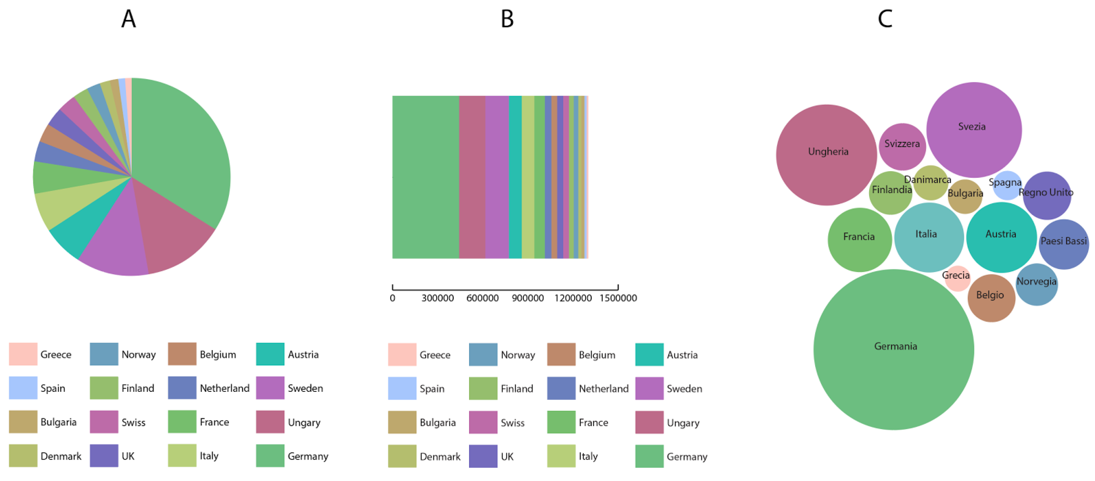
One of the core visualizations of the project connects two different datasets in order to show the human passages across Europe. The first visualization shows the countries of arrival of the migrants, while the second one presents the destination countries requested by first-time asylum applications. Hypothetically relying on a more conventional visualization, the data could have been represented by two separate charts. Landings could have been represented with a pie chart (
Figure 3A), a stacked bar chart (
Figure 3B) or a bubble chart (
Figure 3C), but this form of anonymous, acontextual visualization would have been independent of the issue under consideration. In other words, it could have referred to anything.
The destination countries requested by first-time asylum applicants could have been represented in the same way (
Figure 4). But because there are many more of them than the countries of landing, some optical problems would have emerged if the previously listed forms of visualization were to be used. The larger amount of data to be represented would have required an excessively diversified colour palette, and the legend risked taking more space than the visualization it referred to. In any case, of the three variations, the most approachable was definitely the bubble chart (
Figure 4C).
However, the use of a traditional bubble chart would have been disconnected from the context that it visualizes and appear rather cold and boring, lacking user engagement, or better, forcing users to read a further caption explaining what the bubbles referred to.
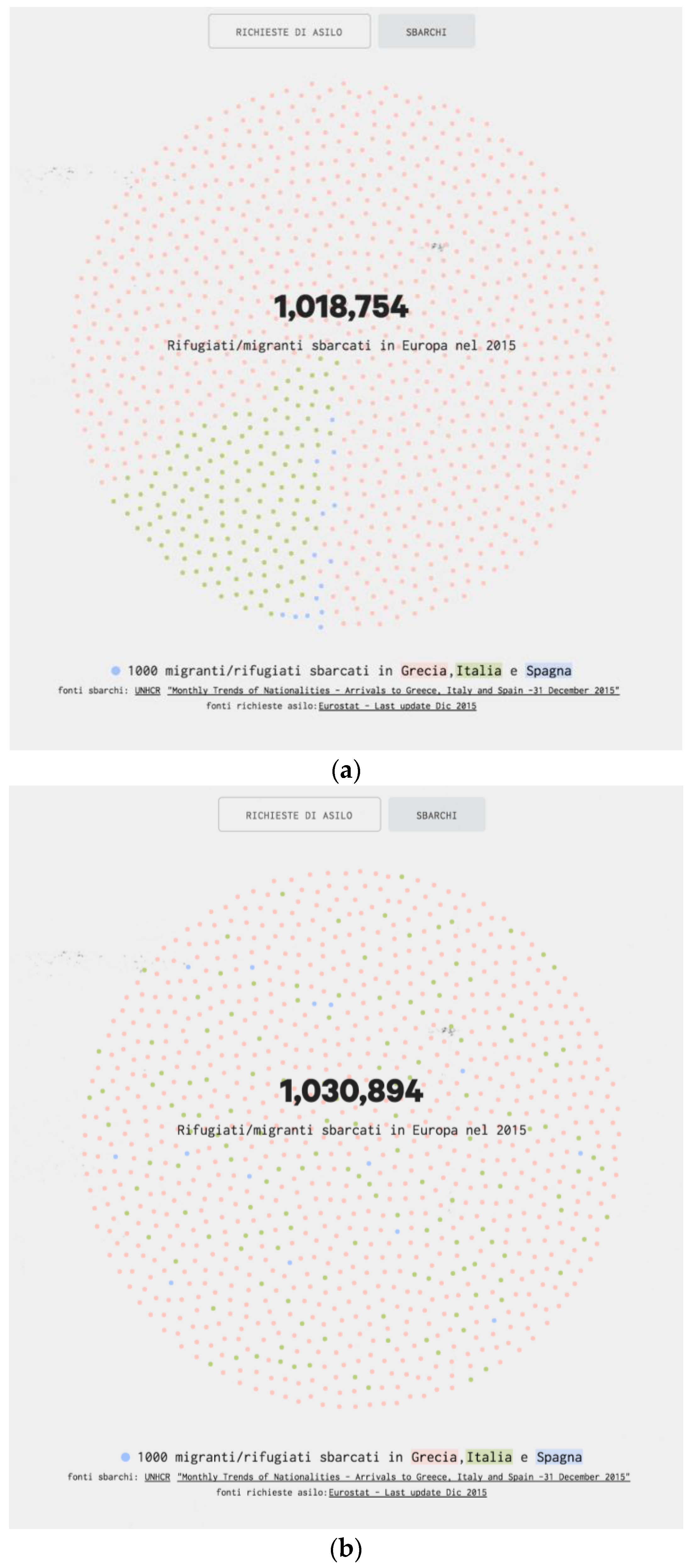
In order to engage the user with the data and to suggest a context for reading the numbers, the design team opted for a different visual solution which managed to connect the datasets about landings and asylum countries in a single visual discourse. As soon as the user scrolls to the data visualization, the dots appear and converge at the centre of the screen forming a bigger circular shape in which they are clustered by colour, giving shape to circular sectors that form a dot-based pie chart. It is a hybrid visualization that relies on the misuse of a traditional pie chart. 1030 small dots are clustered together depicting the 1,030,894 refugees who landed on the European coasts in 2015. Each dot stands for 1000 landings: like in Neurath’s Isotype, a single figure stands for a specific quantity, but, differently from the Isotype approach, the dots make up an abstract conglomeration, not a series of recognizable icons. The colour of the dots refers to the country of landing (
Figure 5a).
Suddenly, the circular sectors that make up the dot-based pie charts (
Figure 5a) break up, and the cloud turns quickly into a disorderly agglomerate of randomly-moving coloured dots (
Figure 5b).
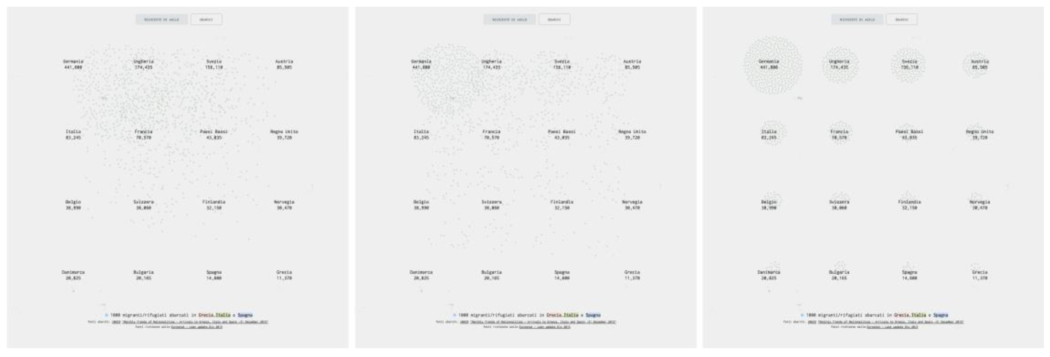
To connect the landings to the asylum applications, a transition was designed to merge them into a single visualization shifting from one shape to another. Through the top buttons, the dots forming the million-refugees cloud relocate on a grid, forming a series 16 sub-clouds (
Figure 6a,b) and generating the visualization of the main asylum application countries (
Figure 6c). The smaller bubble charts are based on the same principles as the previous one. The transition transforms two different visualizations into a single animated chart that switches between two statuses, depending on the user’s choice.
In other words, this animated transition connects the first visualization to the second one, creating a continuity between the moment in which migrants disembark and the future they have in mind.
Conceptually speaking, the design process shifted from the visualization of the mere numbers (landings and asylum applications) to the visualization of the people (who landed and applied). The transition from one graphic to the other reinforces the idea that it is the same persons who disembark and ask for asylum. People are represented as a human swarm driven by a strong intentionality (the movement with which they pass from the first agglomerate to the desired countries is very direct), which is nevertheless left to roam slowly and randomly about in a limbo that is called “first country of arrival” by the Dublin regulation.
The use of dots, though remaining strictly abstract, manages to stand for people in movement, much more than the bubbles or sectors usually adopted to represent numerical quantities. Animating these dots, indeed, embodied a further metaphorical meaning: all the dots move constantly, evoking a living, organic agglomerate, like a nervous crowd observed from above, moving incessantly within a limited circular area. A visual reference for this was the work of Israeli artist Michal Rovner. In
Data Zone (2003), she embedded in long tables round illuminated screens (in Petri dishes, typical of laboratory cultures) in which silent clusters of abstracted figures, seen from above, moved constantly. This design intervention gives rise to the first visual metaphor, recalling the migrant movements constrained by the EU borders that they tried to break through in every possible way. Moreover, the randomness that was introduced in the initial dot-based pie-chart (
Figure 3b) had the aim of demonstrating the difficulties in managing data about migration: not only it is difficult to evaluate the quantities of migrants who landed in each country (they were sometimes counted twice, or not counted at all, [
35]), it is also difficult if not impossible to follow their paths across EU borders once they leave or escape from the first reception centre they were committed to.
The choice of a disrupted pie-chart and then of a series of bubble-charts was conscious of the fact that bubbles are fashionable, attractive and decorative, though not at all accurate. Bubble charts are indeed controversial forms of visualization. Tufte refers to them introducing the concept of lie-factor, a distortion in data design in which the representation of numbers through graphic means in visualization is not proportional to the data. This leads to an incorrect interpretation of the data. “Changes in physical area on the surface of a graphic do not reliably produce appropriately proportional changes in perceived areas” [
3] (p. 71). The lie-factor theory is connected to the bubbles, as bubbles in data visualization can have different numerical interpretations (some consider their area; some their diameter; some even their rays). Cairo supports Tufte’s position so strongly that he even speaks about a “bubble plague” [
22] (pp. 39–44). But they do not work, as “the human brain is not able to calculate surface sizes” (p. 40). Even though Cairo states that bubbles are misleading, he sees a possible use for other purposes than comparisons, for example in distribution maps.
Using a bubble chart could express not only the quantity, but also the sensation of being lost and without a direction. Moreover, when the initial mass of disembarked people breaks into smaller clouds, the impression is that the phenomenon is much more contained and controllable. In this sense, a chart can make a political statement: it is only by regulating fluxes and sharing responsibility that Europe can find a way to manage an apparently unrestrainable process.
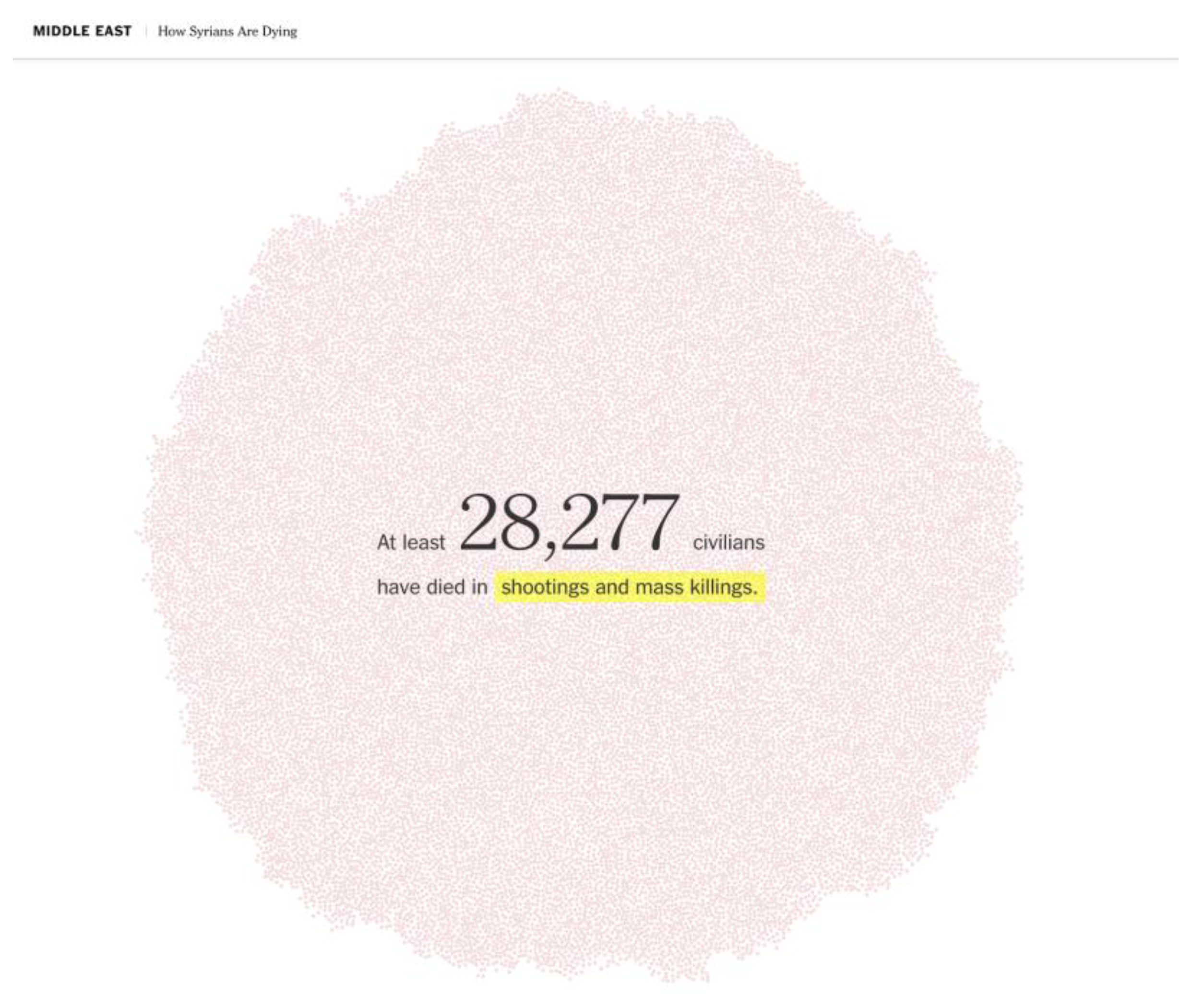
The use of visual metaphors in data visualization with the aim to raise awareness and to both touch and inform users in the context of visual journalism, is an emerging trend. In its project ‘How Syrians are dying’, the New York Times depicted the victims of the Syrian war as individual dots, generating large clouds that assume a more qualitative than quantitative value. They fill the screen with thousands of dots, in some cases even 220,000, making it impossible to understand the number precisely or compare it with other data. They impress the users with the huge number of victims caused by the war, since each dot stands for a single victim, giving rise to a 1:1 visual transposition (
Figure 7).
5. Conclusions
The increasing adoption of data visualizations by the mainstream media or its use in the interfaces we interact with everyday, are the result of its popularisation. Furthermore, the democratization of design tools that often facilitate the production of standardized and well-designed visualizations has contributed deeply to spreading the culture of data to a broader audience, giving rise to the prosumerism phenomenon as well [
36]. Finally, ever since visual journalism entered in the universities of design, a new generation of information/data designers has been bred. They are challenging the status quo of data visualization with new media and technologies, opening up new spaces to extend and design new forms of visualization, contributing to the second golden age of data visualization we talked about at the beginning of this essay.
Nevertheless, a designer cannot ignore the history of data visualization and those who made this history, who play an important role in the teaching and design of data visualization, finding their application in many areas of design, from science to journalism. What we experienced in designing data visualizations for visual journalism projects, is the importance of images in affecting, stimulating curiosity and engaging a broader audience, as well as evoking emotions through new forms of expression. This is how they manage to be more memorable.
The lesson we have learned through the design and the post-design reflections on Europa Dreaming is that the use or the avoidance of images in data visualization always depends on the context. A position also shared by Cairo who doubts “that always reducing charts to their barest bones facilitates comprehension and memorability. It depends on the audience’s nature, knowledge, tastes, and expectations” [
22] (p. 68). Furthermore, there are technological, cultural, and social factors to consider, delineating a complex scenario in which data visualization design results as a balance between the communicational goal and the informational contents.
The experience of Neurath and then Holmes was fundamental in this sense, in demonstrating how the immediate comprehension of a context by means of decorative elements could conquer an illiterate reader at first glance, excite his curiosity and, by adding a narrative and figurative layer to the mere display of data, increase memorability in the long term.
On the other hand, Tufte’s rigour and accuracy in communicating correct data leads as a direct consequence to an “obligation to be truthful” [
37] towards data, seeking to avoid an overdecorative dérive that kills every attempt at scientific accuracy.
A designer must always know where to position himself when he makes stylistic (and thus semantic) choices. Awareness and knowledge of the history of data visualization thus play an important role in developing a more conscious and less naif design approach.
“Embellishment” is thus a possibility, not a must, and should only be used, when properly chosen and designed, to meaningfully support the display of information [
38]. What emerges is the importance of design education in the data visualization design process, which can frame the role of the decoration within a wider scope, as facets of a greater field that is increasing and constantly changing together along with society and technology. Thus, there are no winners in the battle, except a design approach and education that would reflect on the role of images, before during and after the data visualization design process.
