Proceeding Paper

The Project “Interactive Topography of Dante’s Inferno”. Transfer of Knowledge and Design of Didactic Tools †

1
Alpaca Società Cooperativa, via Giuseppe Garibaldi, 5, 44121 Ferrara FE, Italy
2
Dipartimento di studi umanistici, Università degli studi di Urbino, Via Bramante, 17, 61029 Urbino PU, Italy
*
Author to whom correspondence should be addressed.
Presented at the International and Interdisciplinary Conference IMMAGINI? Image and Imagination between Representation, Communication, Education and Psychology, Brixen, Italy, 27–28 November 2017.
Proceedings 2017, 1(9), 875; https://doi.org/10.3390/proceedings1090875
Published: 29 November 2017

Abstract

:
The project “topography of Dante’s inferno” is an experiment on alternative mode of access to a complex text relying on an evident topographical structure. The artifact (a website) is designed with the aim of introducing young students (11–14 years old) to a text usually read and studied by older students (16–19 years old). The design of the artifact was based on the theories of Sinsemía applied to interaction design, and the testing focused on (1) usability and (2) on the understanding of the topography of the poem as a precondition for understanding the text.

1. Introduction

1.1. The Purpose of the Interactive Topography of Dante’s Inferno

The project “topography of Dante’s inferno” is an experiment on alternative mode of access to a complex text relying on an evident topographical structure. It is designed with the aim of introducing young students (11–14 years old) to a text usually read and studied by older students (16–19 years old). The project consists of an interactive map (a website) and on a poster.
The design of the artifacts was based on the theories of sinsemía (synsemia) applied to interaction design, and the testing focused on usability and on the understanding of the topography of the poem as a precondition for understanding the text.
The project has the following objectives:
  • To contribute to the popularization of the Dante’s literature, with particular attention to the 11–14 years old students;
  • To contribute to the development of an alternative access and fruition mode of the literary work;
  • To provoke a reflection upon the usage of the visual communication in a didactic context, as a mean to build mental models which can be useful for the learning process.
  • To promote the reading of the Divine Comedy even outside Italy (for this reason an English version of the website has been created, based on the translation by H. W. Longfellow).

1.2. The Definition of Sinsemía

The artifact under investigation has been designed following the principles of sinsemía. Here it follows a brief description of the theory:
Definition
Giovanni Lussu and Antonio Perri introduced a word to describe the visual organization of the writing in the space [1] in their opinion the locution “visual syntax” suggested by Yuri Engelhardt [2] (pp. 13–20) brings with it the risk of applying to images an approach based on linguistic background.
Luciano Perondi and Leonardo Romei wrote this definition of sinsemía:
“Sinsemía means the deliberate and conscious disposition of elements of writing in the space in order to communicate in a reasonably unambiguous way and in a regular manner, through the space articulation and the other visual variables. These regularities [3] (p. 280) can be valid only for a specific text (but consistent, rigorous and interpreted without the aid of the author), or defined by specific patterns and consolidated habits of use” [4].
In a synsemic perspective there is not a sharp distinction between “writing”, “image” and “notation” [5] (pp. 85–89).
Regularity
“Regularity” or “graphic consistency” is the foundation of every written process. Through regularity the reader triggers the inductive process that allows him to disambiguate the elements composing the text [6].
“Regularity” is the consistent use of visual variables, distinctive features, reference frames in order to denote the elements in a text.
After all these premises, we assume that every text is synsemic, even the most seemingly linear [7].

1.3. The Two Modalities of Experimentation

Since the parallel experimentation carried out by conducting focus groups, with a more explorative and unstructured approach aimed at receiving spontaneous feedback, the usability testing followed an assessment and summative approach [8] (p. 34).
The usability testing consist of a series of ten tasks which the users need to accomplish on the website.
The two experimentations are discussed separately in this paper.

1.4. Website under Investigation

The artifact under investigation consists of a website, which acts as digital map of the topography of Dante’s Inferno. The digital map allows the users to access to the the descriptions of the main characters, the verses of the poem, the sins and the places in the Inferno. The website is freely available at (www.alpacaprojects.com/inferno/), and it has been developed by drawing SVG graphics and animating them by using the Javascript programming language (and the D3 library (d3js.org)).

2. Investigation on Usability

2.1. Background

The website navigation has been developed in order to provide multiple access to various types of information, which are cross-referenced and which consist of the main characters (appearing on the map), the verses of the poem, the typology of sin, the position in the topography of Inferno and the hyperlinks to Wikipedia descriptions.
In our perspective, we consider the whole artifact (including the drawings and the interface elements) as an actual written text [9,10,11]. This written text is organized and ordered starting from the topographical scheme, which acts as main reference frame.

2.1.1. Basic Elements for the Construction of a Synsemic Text

Table 1 provides a summary of the basic actions used for designing the synsemic text:
Top-down and Bottom-up models can also be interpreted as a set of regularities or rules of formulation.
Accidentally, the descriptions provided by Rosenfeld et al. [12] (pp. 83–88) of top-down and bottom-up information architecture overlap widely to the one discussed by Perondi [10] (pp. 57, 76–78), even though the two disciplinary fields are different. However, the definitions the authors respectively provide are opposite.
The website is designed to support two of the four information needs defined by Rosenfeld et al. [12] (pp. 42–45): exploratory seeking and known-item seeking.
In exploratory seeking the readers try to get a sense of a topic and to learn something from the process of searching, while in known-item seeking the readers have already learnt the contents and want to use the website as reference.
Considering the theoretical background, the team analyzed and segmented the Cantica (Inferno) in accordance with the description of each character, so that a verse may appear more than once, but each character is connected to a complete anthology of the verses referred to him/her.
The topographical structure has been designed through the analysis of the cantica and with the support of several texts and comment, among whom Due lezioni all’Accademia Fiorentina circa la figura, sito e grandezza dell’Inferno di Dante by Galileo Galilei and the historical and medical notes by Donatella Lippi [13].
It is worth noticing that, within education in Italy, the Divine Comedy is often presented as a topographical schematization which is also subject of study.
In a synsemic and an information architecture perspective, the higher hierarchical level has been assigned to the topographical map, in which the characters depictions lie at the immediate lower level and act as access key to the text information. According to Norman [14] (pp. 13–19) the characters depictions can be considered as “signifiers”.
The depictions of the topography and of the characters are not to be considered a visual translation of the original text, rather they are a proper rewriting, being the pictorial feature of the elements part of the writing as much as letters and numbers.
We hypothesize that the synsemic composition of the text can enhance the learning outcome, acknowledging that the benefits of visual didactics are evident [15], even though they are described more as images or schematization and they are not considered in a holistic perspective as notation-writing-image [5,16] (pp. 85–89).
Since the whole website is built around the topographical representation, the topography acts as a constant reference frame and the navigation is not broken down into several webpages. The overall result looks like an online map system, where the user can drag and zoom all over the representation.

2.1.2. Interaction Design

By analyzing the whole text in light of its synsemic structure, the user faces multiple choices in order to find an information. This complies to the assumptions behind the explorative and manipulative interaction types [17] (pp. 52–54) in a 2D environment, which impose the users to physically move and wander inside the virtual environment, grab and move objects and understand their arrangement and their relationship without reading text or issuing commands.
The hints provided to the users about where to click become evident only once the users start exploring the artifact. The only exception is the the glowing highlight on the Dante character, which serves as possible starting point for the narration.
The users can also choose between two different navigation approaches. Due to the graphical features of a topography and to the web implementation of the drag and zoom functions, the users have freedom of movement while navigating the representation. On the other hand, the menus (for places, Cantos, characters and sins) provide the users with a guided navigation towards the required information. This choice between free and guided navigation, together with the deliberately low number of available functions, are the mechanics chosen to support the artifact’s discovery process [18] (p. 105).

2.1.3. Research Questions

The aims of the usability testing (Table 2) were to understand:
Therefore, the following research questions are enlisted in the Table 3.
It is important to notice that even though quantitative metrics have been collected, the overall testing follow a qualitative approach with the purpose of allowing the research team to interpret the users’ performance and to inform the following website modifications.

2.2. Methods

2.2.1. Qualitative Preliminary Investigation

Before starting with the structured user testing, an informal explorative qualitative experimentation have been carried out in three classroom environments (Bracciano, Treviso and Trento), using the website on an interactive whiteboard, during school hours. However, this part of the experimentation is less significant and we do not report about it.

2.2.2. Usability Testing

Motivations

Usability testing will not assure the effectiveness of the website as a tool for implementing alternative didactic approaches. The overall approach is not rigid as a full-scale laboratory experiment, rather it is more informal since the experiment aims not to benchmark the users’ performance. The performance data are intended to be used as indicators of underlying interface and synsemic model problems.

Reference Sample

The identified user profile for the website consist of children (both male and female), age group 10 to 14 and attending the first three years of the Secondary Education or approaching to start them. The biasing factors which can alter their performance during the testing have been identified as their computer skills, the domain knowledge (if they already know the Divine Comedy), the presence of specific learning disabilities, school achievements, and the education level of their parents. The biasing factors have been assessed in the pre- and post-test interviews, apart from the specific learning disabilities, the parent’s education level and the progress at school.
This has been done because asking the parents about their level of education or the school achievements of their children, in this kind of informal setting, would have instilled the suspect of being somewhat evaluated, which would have compromised an already limited participation. Regarding the specific learning disabilities, trying to assess them in this context would have been impossible, since they are due to a high number of factors, which could not be assessed in this context [19].
A further source of technical bias could be the computer operating system (Windows 10™, which the users might not be used to it) and the use of the mouse.
This user profile has been identified complying with the theories from Bruner [20,21], Damiano [22], Clark & Lyons [23].
Bruner [20,21] describes the progression through which the mediators evolve: actives, iconic and symbolic (based on the modes of expression defined by Peirce (See Peirce’s Collected Papers, vols. I–VI edited by Charles Hartshorne and Paul Weiss (1932), vols. VII–VIII edited by Arthur W. Burks (1958), Cambridge, MA, USA, Harvard University Press). The children, in this phase of their education, have surely acquired the capability to understand the symbolic mediators, however we are considering a text which is too complex for their school level. Therefore we designed an artifact with dominance of iconic mediators, which can be used as propaedeutic tool for learning through the symbolic mode at high school. The choice of using an illustrated artifact is therefore not justified by the child development, but from the sequence of the didactic mediators.
The participants were handed an informed consent form, which was signed by their parents or legal representatives, prior to the experimentation.

Environment

The usability testing was carried out on field using a portable test lab setup [8,24] (pp. 100–101, 288). The facility was a parish recreation centre, during summer time, the testing room was isolated from other children but it was not soundproof, there was very high temperature (around 40 °C) and the testing was done on in parallel to other recreational/educational activities (not gaming ones).
The user sat in front of a school desk with only the laptop computer and its mouse device on it. The computer displayed an empty browser webpage. The first researcher sat up the video camera on the right side, over the shoulder of the participant, framing only the participant’s hands, the computer screen and the mouse. Then he left the room. The second researcher were acting as moderator, he took place on the participant’s left side without interfering with the participant’s vision on the interface. The moderator were sitting nearby the participant throughout the whole experiment.

Materials

The website under investigation was prepared in order to not show any instruction or guide when the participants opened it. Since the usability testing was an assessment, the help provided to the user as documentation or prompting from the moderator was reduced to the minimum extent. This way, any usability problem would have emerged clearly, even though the participants’ performance could have been much worse than a real situation, where they would be supported by the teacher and their fellow students in a classroom environment.
The website was displayed on a portable computer (15 inches, Windows 10TM operating system, mouse plugged, Google Chrome web browser v.5.9, website hosted locally using WampServer).
In order to describe the various parts of the website, we provide a series of shortcodes in Table 4 and a visual representation of them in Figure 1:

Pre-Test

Before starting with the experiment tasks, the researchers read an orientation script to the participants, which (1) described the reasons of the experiment; (2) described the research team and (3) reassured the participants that the objective of the testing was the website and not their performance. No Think Aloud protocol was set up, since the aim of the study was to understand if the website could support the users’ mental model and lead them to achieve their tasks without further prompting [24] (p. 273). For this reason the researcher avoided to interrupt the users’ task time. Prior to proceeding with the tasks, the researchers read to the participants a pre-test questionnaire, asking only about their age and their school class. All the questions about their devices usage were left after the tasks completion. This was done in order to avoid to bias the users toward thinking that the research was about their performance.

Testing

After the pre-test questionnaire the users were read a task scenario (Supplementary 1, Table A1), which depicted the situation in which the participants would have to imagine to find themselves into.
After reading the task scenario, the participants were asked to complete the task list on the website (Supplementary 1, Table A2).
After the last task completion, the participants were asked to answer orally to a post-test questionnaire (Supplementary 1, Table A3).
At the end of the testing session, the video recordings have been analyzed for the quantitative data collection, which was done by filling a data collection form for each participant. The results were collected in a spreadsheet.

2.3. Results

The testing was carried out on a sample of 4 children within the user profile, (all females, between 11 and 12 years old), and a younger child (male, 8 years old).
The results of the usability testing are fully reported in Supplementary 2. The results of the post-testing interviews are fully reported in Supplementary 3. We refer to these results in the Discussion Section 2.4.

2.4. Discussion

The setting in which the users carried out the usability testing was intentionally unsupportive: no helps were provided by the system nor by the researchers, no documentation were shown prior to the testing, a noticeable amount of noise was coming in from the nearby rooms where recreational activities were held. The main purpose of the recreational center was letting the children to relax and have fun before starting the school, and the climatic conditions were adverse with high temperature and humidity rate. For these reasons, the environment setting resulted to be more stressful than a classroom setting. The research team think this kind of environment actively helped to uncover the highest amount of usability issues. In fact, every imperfection in the information architecture and interaction design emerged strongly, allowing to locate the wrong assumptions made and to inform the next development cycle.
Drawing (D)
The priority of the iconic mediator over the symbolic one seems to be confirmed: the visual variables used placed the drawing (D) on a higher hierarchical level, but we did not expect to have such a remarkable effect.
It seems that the users did not face particular challenges in identifying the characters starting from a basic description mostly based on visual features (“a big dog”, “one [character] with a long beard”, “an angel”), therefore we are confident to say that the iconographic style might be effective for the target user group.
We noticed that inactive characters attract misclicks. Some users expected to be able to look up for information regarding any of the depicted characters, therefore they spent time to locate the actual active ones. The inactive characters have been drawn in order to provide more context in the drawing (D) and to offer more opportunities for the exploration of the artifact. However, the trade-off between context richness and misleading cues needs to be investigated more.
The drawing seem to offer an effective frame reference for the contents: it’s orientation, stratification and meaningful space seem to offer the right cues for navigating it.
Menus (M1, M2, M3)
Almost all the users ignored the Menus. Our hypothesis is that (1) the presence of a neuter and high contrast background; (2) the current position of the menus in the upper part of the page, contiguous to the upper border of the browser window and opposed to the cyan background of the drawing (D); (3) the visual consistency of the elements may suggest to the users that the menu bar is out of the Narration Frame (NF), possibly because the iconic mediators are stronger attention attractors at this point of the cognitive development [20]. In order to allow the users to interact with the system without any further support, we should reconsider the position, visual variables and visibility of the menus.
Sins Floating Menu (FM)
Only P5 managed to interact effectively with the FM. Even though this menu is always visible, its contents are almost always ignored. Another weak point seems to be the accordion layout, which prevents the users to see a complete overview of the sins structure. This becomes particularly evident when the users are exploring a specific sin group. It is not enough clear how to navigate the sins menu nor what information are stored in it, and this jeopardizes the users’ interaction with it.
It is interesting to notice that P3 interacted with FM while searching for an information placed at the second level of the hierarchy (the “Fraudulent” group), however she completely overlooked the third level of the hierarchy (the sub-sin of the “Sorcerers and Fortune tellers”) by shifting her interest on the drawing (D), preferring the iconic mediator over the symbolic one.
InfoBox (IB)
The InfoBox (IB) is always visible when the user selects an element in the writing, however it is ignored frequently by the users. We suspect that this behavior is due to the lack of active mediators [20,21], or indexical in C. S. Peirce perspective, between IB and the selected element. IB also lacks of a labeling system for the information it provides, preventing the users to understand the bottom-up information architecture of the poem (according to Rosenfeld et al. [12] (pp. 85–86)) or frame reference top-down (according to Perondi [10]). Consequently, there is a need to redefine the visual variables of IB, above all for some pieces of typographical information. This will help to differentiate the information within the InfoBox and between the InfoBox and the other navigation systems.
Schematization (S)
Overall, the schematization (S) seems to not attract the users’ attention enough when they need it. The topographical information (Circles and Cantos) and the sins information overlap inside the same meaningful space and they are not different enough in terms of visual variables. Consequently, there is not a meta-distinction between the two different types of information. Moreover, the complete information is never fully visible (preventing the users to understand the information architecture) and it seems to be not clear to the users how to activate or deactivate its visibility.
Navigation arrows
The navigation arrows offer to the users a good cue about the sequential navigation pattern. We suppose that these buttons are effective because they provide a regular (usual) and sequential navigation pattern, which does not let the user jump between different levels of the hierarchy. In particular, P4 used exclusively this navigation function. For these reasons, we suppose the users are not confident enough to try other navigation functions.
Zoom buttons
The positioning of the zoom buttons seems to be too marginal inside the Narration Frame (NF). The users seem to pay more attention to the navigation arrows.
The symbols used for the zoom buttons are conventional for online maps system on desktop browsers. Not all the subjects uses online maps regularly, therefore we suppose that they have not learnt how to interpret such a regular pattern yet.
Drag & Zoom functions
The feature seems not to be straightforward for the majority of the users. This navigation pattern is nearer to web maps systems for desktop browsers than to mobile ones. Our hypothesis is that the action to click and drag might not be familiar enough for children who acquired their computer literacy mostly on handheld devices.
The rendering performance on the local machine seems to impact on the perception of the movement of the drawing (D). If the drag function is not supported by a smooth movement of the drawing, the users might struggle to develop their sense of direction. A technical optimization is needed.
Discussion about active/iconic/symbolic mediators
From the testing carried out by P1 (who was 8 years old), it can be observed that the usage of the symbolic mediators is neglected up to the point that the alphanumeric text becomes somewhat invisible [20,21]. When we asked him to search for the Canto number 6 (task 2), the alphanumeric text visible on the screen was completely ignored.
On the contrary, even though P2–P5 can already understand the symbolic mediators, they primarly used the iconic mediators–as we hypothesized–since the symbolic were too complex for their school level.
These findings seems to confirm the hypothesis by Bruner [20,21] on the progression of the mediators, even when it is applied on a specific subject.
It is interesting to notice that P4 thought that the “writings” (which is the alphabetic text) should have been bigger in size.
The font size ranges from 16 px to 33 px (therefore on the monitor we used—1366 × 768 px, 15 inches—the x-height measures about 2 mm), which are bigger sizes than the ones reported in literature as critical for reading [25,26], even considering the users’ self underestimation of the critical threshold for the optimal reading performance [25].
It is worth considering that, during the design process, the alphanumeric text size was set to be not noticeably smaller than the characters’ size, taking into account that the alphanumeric text is placed on a high contrast background while the character depictions are not.
Conclusions
P5 performance might suggest that currently the website supports better the part of the user group who has been already introduced to the literary topic and evidently possess good skills of navigation in desktop environments.
Even though the users reported that the website was fun and easy to use, evident usability issues emerged. This highlights how the users might have been biased toward giving positive answers regarding their feelings towards the website, since they probably unconsciously wanted to gratify the researchers.
In conclusion, using a depiction (iconic mediator) as reference frame seems to be an effective way to organize the fruition of the contents and the access to the data. The iconic frame reference shows to be an effective attention grabber. It needs to be verified if this kind of reference frame could help to make the contents more memorable, and therefore aiding the iterative study-reading-searching process. On the contrary, while using an iconic mediator, the alphanumeric information seems to become marginal.
In the following Section 3 it is discussed how the system also supports didactic contexts where the users are assisted by educators.

3. Investigation on Didactics

3.1. Background

3.1.1. Theoretical Framework

Like any other artifact, the website Topography of Dante’s Inferno is a didactic mediation tool for teaching and learning of knowledge [27]. The didactic mediation plays an essential teaching role. As we all know, knowledge is not just determined by the internal structures of the subject and the characteristics of the object, but by their interaction [28]. Didactic mediation operates on the object of knowledge and on interaction object-subject. It occurs both on the object through by carrying out a Didactic Transposition [29,30] of knowledge (in our case the Dante’s cantica); and on the learning subject through the choice of didactic mediators with which the subject will have to act.
The Didactic Transposition concerns the relationship between the savoir savant (the scientific knowledge) and savoir à enseigner (the knowledge to teach), and it consists in the adaptation of knowledge to ensure the effectivity of the learning process.
The didactic mediators relate to the representation of reality through signs (concepts, models, theories, etc.) that are analogous to the reality itself, and acts on the three poles of the didactic system teacher-pupil-know [31], which is an inseparable study unit [32]. In this sense, teaching and learning can be thought respectively as the mediation and the acquisition of signs [22].
Didactic mediation, however, may be more extensive than teaching. We must consider indeed the role of educational tools [27]. Educational artifacts, prepared by the teacher or IT design teams, act as teaching agents, allowing the student to teach himself, through interaction. The presence of the “tools” pole within the system generates, in turn, the system artifacts-pupil-know, in which the teacher pole continues to exist, but remains latent. The didactic mediation could be therefore conceived as the union of these two systems; i.e. the whole set of relationships between tools-teacher-student-knowledge (Figure 2).
In this framework, the didactic analysis aims to investigate the fundamental features of the didactic mediation process, how it is perceived by the teachers and his effects on the students.

3.1.2. Research Questions

The survey involves both teachers and students, each according to their role. Teachers, as experts, participate in the process of analysis in a direct way; students, as users, participate in the process of analysis indirectly by observing and examining their behavior in the use of the website. We therefore distinguish research questions (Table 5) relating to the work done with teachers and those concerning the work done with students.

3.2. Methods

3.2.1. Reference Sample

The didactic analysis, consistently with the theoretical framework, involved both the actors of the didactic system: teachers and students. Overall, three groups of people participated:
  • a group of 12 graduate students in the Primary Education Sciences of the University of Urbino (teachers in training).
  • a group of 12 teacher-tutors at the university (teachers in service).
  • a group of 12 11-year-old students (first year of first-grade secondary schooling)
Both groups of teachers possessed a good level of didactic competence. The students never directly addressed the Divine Comedy at school, though half of them had heard of it.

3.2.2. Methods Used for Teachers

Regarding the work with teachers (in training and in service), we conducted two explorative focus groups. The meetings have taken place at the University and in presence of a moderator. This methodology seemed us the most suitable for spontaneously generating a broad spectrum of considerations about an unknown artifact. The focus groups aimed to bring out the opinions and reflections about the artifacts, by experienced education subjects.
Both focus groups were divided into three phases:
  • brief explanation to the participants about the meeting aims and its organization;
  • presentation of Topography of Dante’s inferno website, using a LIM and a computer;
  • discussion from one or more stimulus questions.
During the debate, it was possible to access the website individually through a computer.
In the case of teachers in training, the stimulus question is: You have seen the website in each of its parts. We now want to discuss his didactic features and how to use it at school.
In the case of teachers in service, the stimulus question is: You have seen the website in each of its parts. We now ask you to express your opinions and your reflections about some specific aspects:
  • the purposes of the artifact;
  • the possible didactic use of the website.
  • the use and role of educational mediators.
Meetings, about 40 (training teachers) and 30 min (in-service teachers) long, were recorded, and audio recording was then transcribed. From transcription, speech redundancies and non-relevant phrases were deleted. Hence relevant speeches were selected in the light of the purpose of the focus. For each focus, a working protocol was created (see Supplementaries 4 and 5) and organized in time segments, corresponding to distinct conversational units. Each conversational unit was subdivided into sub-units. Units and sub-units have been numbered to allow an easy recall in the text.

3.2.3. Method Used for Students

The work with students was done in an extracurricular context (out-of-school). We video-recorded the student-artefacts interaction, in presence of two researchers. The students interacted with the artifact through a computer in small groups (3–4 pupils). However, the whole group was free to participate in the discussion. Our aim was to observe the behavior of the students in the face of the artifact, in a tout venant context.
We selected the video search method [33] as it allows to interpret each student’s behavior as the result of his interaction with other elements of the system (the other students, the teacher and the artifact).
From video recording, the speech and the gestures of the students were transcribed. Therefore, a synopsis in which the didactic events (discourses and gestures of students) are classified according to the following aspects was built:
  • structure of the work
  • verbal text
  • illustrations
  • contents (characters and places).
The synopsis is divided into time units. Each unit is subdivided into sub-units, corresponding to distinct verbal and non-verbal behaviors. Units and sub-units have been numbered to allow an agile recall in the text (see Supplementary 6, Table F1).

3.3. Results and Discussion

A focus group with the teachers in training and another one with teachers in service. Since the available space is limited, in this paper we only show the results of video search.
Before starting with the structured user testing, an informal explorative qualitative experimentation have been carried out in three classroom environments (Bracciano, Treviso and Trento), using the website on an interactive whiteboard, during school hours. However, this part of the experimentation is less significant and we do not report about it.

Video Research Results

The synopsis goal is to highlight the behavior of students regarding:
  • structure of the work
  • verbal text (informational and poetic)
  • images
  • content.
We aimed answering following questions: would the students be able to understand the architecture of Dante’s Inferno? what role would the text play? and the pictures?
From data analysis, emerges that students try to understand the structure of Dante’s Inferno mainly using images (1.1–1.7, 3.11, 4.2). At first students wonder if the screen image is a specific part of Inferno or the whole; or if what they see is the way to reach it. One student assumes that the “funnel shape” serves to indicate a progression in the quantity (rather than the severity) of the sins committed (4.2).
Students show a further uncertainty in understanding when they identify the “Mura infuocate di Dite”. The line of fire is interpreted as the boundary beyond which there is Inferno (3.11). In this case, the influence of the popular image of Inferno as a place permeated by flames is evident.
The inclination of students to base their understanding on images is also confirmed in the case of understanding the characters and punishments. The same students recognize that images are understandable (4.10). Depending on the taxonomy of Clark & Lyons [23], we can say that students use images in representative function: they describe the image to capture clues about situations, characters, punishments (1.9; 2.2; 2.3; 2.4; 3.6; 3.9); organizational: draw from the image the clues about the relationship between elements (4.2); interpretative: from the image formulate ideas and hypotheses (2.6–2.10, 3.11, 4.2). We also observe that the management of spatial variables in the text also plays an organizational role. In writing the topography “as a stairway”, students recognize the analogy with the structure of Inferno represented in the starting image (10.10).
We see an increase in content understanding when students learn that they can use text (both informational and poetic) and images at the same time. At first, the use of menus is not spontaneous and the researcher is forced to solicit their use (4.11; 5.1; 5.6). Then, when the students discover that menus provide valuable information to understand images, their navigation becomes more autonomous and more focused (4.14–4.19; 5.2–5.4; 5.7). This is evident when they find out who the Centaur Caco or Griffolino is (8.6–8.8; 9.10–9.14). The poetic text clearly supports understanding in the case of the identification of sinners. E.g., when students observe the images of the V Circle, they understand that the damned are traitors condemned to being trapped in the ice, by reading a few lines in the menu on the left of the screen (4.14–4.19).
Finally, in order to highlight the relationship between didactic aspects of the art and student behavior, we selected the items that are insightful of the processes of understanding, interpretation, intuition, and those related to the motivational and affective dispositions of the students (see Supplementary 6, Table F1).
The table (Supplementary 6, Table F1) shows that in most cases the students activate the behaviors of understanding and interpretation of what they see on the screen. However, understanding and interpretation from the images alone is in many cases not adequate (2.2; 2.9; 2.10; 9.2–9.4): the students’ interpretations made only on the basis of the images are mainly aimed at “rebuilding a plausible narrative” and this mislead them. Understanding and interpretation are much more appropriate when students use text (informational or poetic) and images simultaneously (1.9; 4.16–4.19; 8.6–8.8; 9.10–9.15). Regarding motivational and affective aspects, students demonstrate a general enthusiasm for the contents of the work. Many times, they make an effort to give narrative meaning to what they see, as if they were in front of a story (units 2–3; sub-units 3.1; 4.15). At times, the contents raise “existential” questions about the human nature of sinners and the destinies of those who commit sins (3.12; 5.2–5.4).
In summary, the data show that the students are able to understand the structure of Dante’s Inferno through the interaction with the artifact. They activate cognitive behaviors of understanding, interpretation, intuition, and discovery. Such behaviors are spontaneously based on reading images, but when students learn to use textual parts, their comprehension becomes faster and more effective.

Supplementary Materials

The following are available online, Supplementary 1: Usability testing scripts https://goo.gl/wHDpyM, Supplementary 2: Complete results of the Usability testing https://goo.gl/bBXnFr, Supplementary 3: Complete results of the post-test interviews https://goo.gl/doW8YQ, Supplementary 4: Focus group—Teachers in training https://goo.gl/GfUJWd, Supplementary 5: Focus group—Teachers in service https://goo.gl/NADgED, Supplementary 6: Synopsis Video recording https://goo.gl/WroNZw.

Author Contributions

Giulia Bonora, Daniele De Rosa, Giampiero Dalai, Adelaide Imperato and Luciano Perondi designed the artifact. Giampiero Dalai, Berta Martini and Luciano Perondi conceived and designed the experiments; Giampiero Dalai, Berta Martini and Luciano Perondi and Rossella D’ugo performed the experiments; Giampiero Dalai, Berta Martini and Luciano Perondi analyzed the data; Giampiero Dalai, Berta Martini and Luciano Perondi wrote the paper.

Conflicts of Interest

The authors declare no conflict of interest.

References

  1. Bonini Lessing, E. Notazioni sinsemiche di processi interattivi. In Il Verri. 43 Newbasic; Edizioni del verri: Milano, Italy, 2010. [Google Scholar]
  2. Von Engelhardt, J. The Language of Graphics. A framework for the Analysis of Syntax and Meaning in Maps, Charts and Diagrams. Ph.D. Thesis, University of Amsterdam, Amsterdam, The Netherlands, 2002. [Google Scholar]
  3. Greimas, A.J.; Courtés, J. Ricorrimento. In Dizionario Ragionato Della Teoria del Linguaggio; Fabbri, P., Fabbri, A., Giovannoli, R., Pezzini, I., Eds.; Bruno Mondadori: Milano, Italy, 2007. [Google Scholar]
  4. Perondi, L.; Romei, L. Le forme di Scrittura Penalizzate Dalla Stampa Risorgeranno Nei Tablet. In Nòva24. Il Sole 24 Ore. 28 October 2010. Available online: http://www.ilsole24ore.com/art/tecnologie/2010-11-16/letture-recuperare-164729.shtml (accessed on 15 September 2017).
  5. Elkins, J. The Domain of Images; Cornell University Press: Ithaca, NY, USA, 1999. [Google Scholar]
  6. Perri, A. Il Codex Mendoza e le Due Paleografie; Clueb: Bologna, Italy, 1994. [Google Scholar]
  7. Lussu, G. Altri Fiumi, Altre Valli, Altre Campagne e Altre Storie di Grafica; Nuovi Equilibri: Viterbo, Italy, 2014. [Google Scholar]
  8. Rubin, J.; Chisnell, D. Handbook of Usability Testing. How to Plan, Design, and Conduct Effective Tests; Wiley Publishing, Inc.: Indianapolis, IN, USA, 2008. [Google Scholar]
  9. Bertin, J. Semiology of Graphics: Diagrams, Networks, Maps; Esri Press: Redlands, CA, 2011. [Google Scholar]
  10. Perondi, L. Sinsemie, Scrittura Nello Spazio; Nuovi Equilibri: Viterbo, Italy, 2012. [Google Scholar]
  11. Perondi, L. Sinsemie 2, Altre scritture nello spazio; Nuovi Equilibri: Viterbo, Italy. (in press)
  12. Rosenfeld, L.; Morville, P.; Arango, J. Information Architecture: For the Web and Beyond; O’Reilly Media: Sebastopol, CA, USA, 2015. [Google Scholar]
  13. Lippi, D. Note Storico Mediche in Dante Alighieri, La Divina Commedia. Inferno. Con Note Storico-Mediche; Mattioli: Fidenza, Italy, 1885. [Google Scholar]
  14. Norman, D. The Design of Everyday Things: Revised and Expanded Edition; Basic Books: New York, NY, USA, 2013. [Google Scholar]
  15. Calvani, A. Principi di Comunicazione Visiva e Multimediale. Fare Didattica con le Immagini; Carocci: Roma, Italy, 2011. [Google Scholar]
  16. Goodman, N. I Linguaggi Dell’arte; Il Saggiatore: Milano, Italy, 1976. [Google Scholar]
  17. Preece, J.; Sharp, H.; Rogers, Y. Interaction Design: Beyond Human-Computer Interaction; John Wiley & Sons: Chichester, UK, 2015. [Google Scholar]
  18. Johnson, J. Designing with the Mind in Mind: Simple Guide to Understanding User Interface Design Guidelines; Elsevier Science: Waltham, MA, USA, 2014. [Google Scholar]
  19. Kendeou, P.; Van Den Broek, P.; Helder, A.; Karlsson, J. A Cognitive View of Reading Comprehension: Implications for Reading Difficulties. Learn. Disabil. Res. Pract. 2014, 29, 10–16. [Google Scholar] [CrossRef]
  20. Bruner, J.S. Verso una Teoria Dell’istruzione; Armando: Roma, Italy, 1967. [Google Scholar]
  21. Bruner, J.S. Alla Ricerca Della Mente. Autobiografia Intellettuale; Armando: Roma, Italy, 1984. [Google Scholar]
  22. Damiano, E. La Mediazione Didattica. Per una Teoria Dell’insegnamento; Franco Angeli: Milano, Italy, 2013. [Google Scholar]
  23. Clark, R.C.; Lyons, C. Graphics for Learning: Proven Guidelines for Planning, Designing and Evaluating Visual in Training Materials; Pfeiffer: San Francisco, CA, USA, 2010. [Google Scholar]
  24. Lazar, J.; Feng, J.H.; Hochheiser, H. Research Methods in Human-Computer Interaction; John Wiley & Sons: Chirchester, UK, 2010. [Google Scholar]
  25. Legge, G.E.; Bigelow, C.A. Does print size matter for reading? A review of findings from vision science and typography. J. Vision 2011, 11, 1–22. [Google Scholar] [CrossRef]
  26. O’Brien, B.A.; Mansfield, J.S.; Legge, G.E. The effect of print size on reading speed in dyslexia. J. Res. Read. 2005, 28, 332–349. [Google Scholar] [CrossRef] [PubMed]
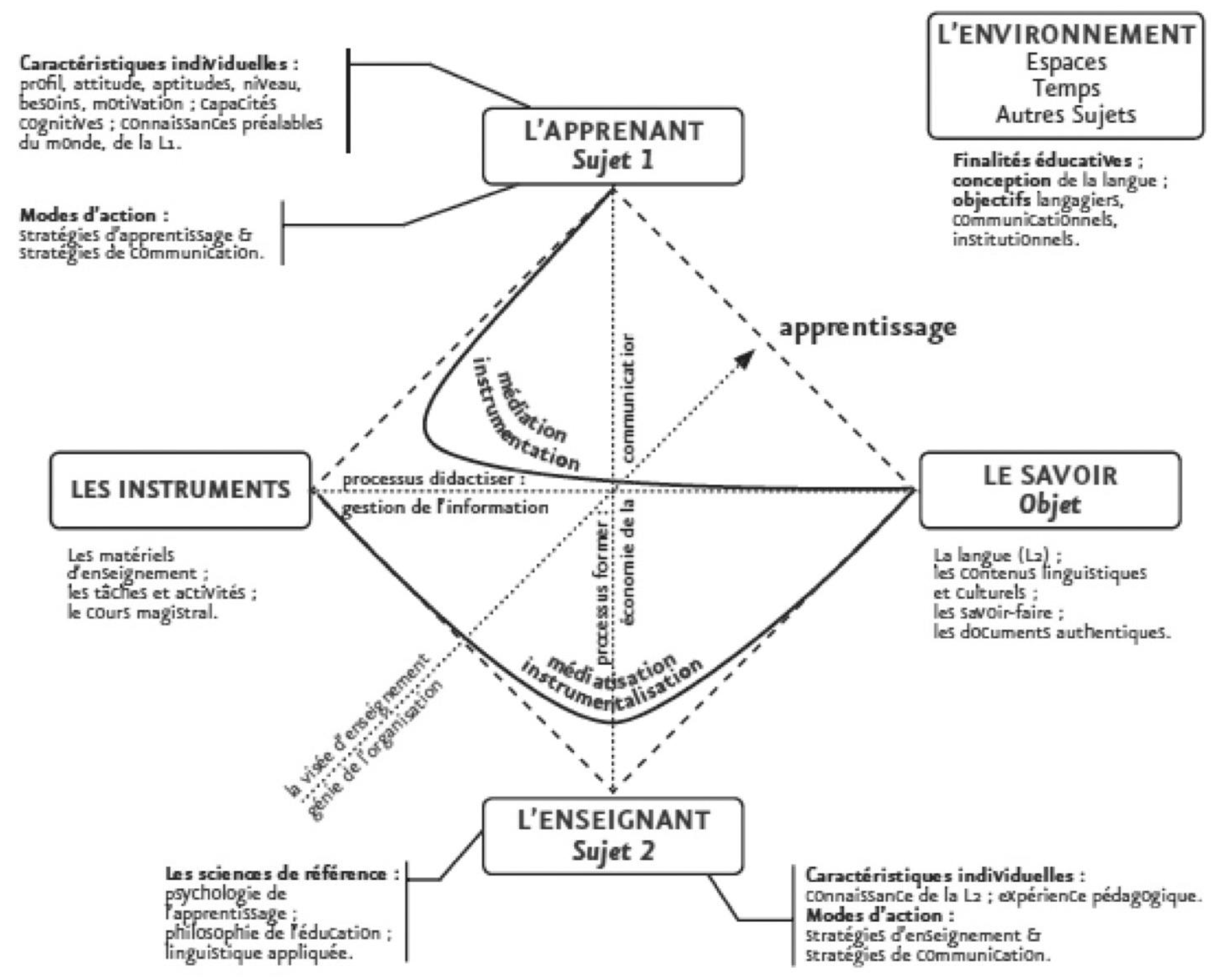
  27. Rézeau, J. Médiation, médiatisation et instruments d’enseignement: du triangle au «carré pédagogique». ASP 2002, 35–36, 183–200. [Google Scholar] [CrossRef]
  28. Piaget, J. Introduction à L’épistémologie Génétique; PUF: Paris, France, 1950. [Google Scholar]
  29. Chevallard, Y. La Transposition Didactique du Savoir Savant au Savoir Enseigné; La Pensée Sauvage: Grenoble, France, 1991. [Google Scholar]
  30. Martini, B. Didattiche Disciplinari; Pitagora: Bologna, Italy, 2000. [Google Scholar]
  31. Houssaye, J. Le Triangle Pédagogique; Peter Lang: Bern, Switzerland, 1988. [Google Scholar]
  32. Develay, M. De L’apprentissage à L’enseignement; ESF: Paris, France, 1992. [Google Scholar]
  33. Goldman, R.; Pea, R.; Barron, B.; Derry, S.J. Videoricerca nei Contesti di Apprendimento. Teorie e Metodi; Raffaello Cortina Editore: Milano, Italy, 2007. [Google Scholar]
Figure 1. Parts of the website and their layout.
Proceedings 01 00875 g001
Figure 2. The cadrage pédagogique by Rézeau [27].
Proceedings 01 00875 g002
Table 1. Basic actions for designing synsemic texts.
Elements and aggregatesThe single “atoms” of the text and their articulations in more complex structures. Each set of visual variables match a semantic group, as it happens in CSS stylesheet.
The visual variablesWe assume the visual variables as presented in Semiologie Graphique by Bertin [9]. We chose Bertin among other theories (see Engelhardt [2], pp. 25–29) of visual variables because it allows a systematic and almost algorithmic application and therefore functional to a design process aiming at regularity.
Hierarchy and hierarchical distanceThe visual hierarchy and hierarchical distance are controlled by selectivity, associativity and dissociativity of variables as presented by Bertin [9].
Reference framesThe frame is the context in which all the graphical elements of a text acquire a value [10,11].This frame can be described by bottom-up or top-down models:Top-down: The elements acquire meaning on the ground of a reference frame which determines their value ex ante;Bottom-up: The elements are organized by following a system of rules, and the elements create a structure of spatial relationships ex post.
Table 2. Aims of the Usability testing.
1to what extent the topographical representation allows the users to understand different kinds of non explicit information (number of the Circles and Cantos, name of the characters and sins);
2if the menus aid efficiently and effectively the search of specific information (listed before);
3if the depiction of the characters used as signifiers are enough evident, attractive and memorable in order to stimulate the free exploration of the topography;
4if the drag and zoom functions are clear and usable enough (in terms of micro and macro interactions).
Table 3. Usability testing research questions.
Research QuestionMetrics–Collected Data
1Do the navigation menus support the search for information efficiently and effectively?Quant.EfficiencyTime to complete a task;
Quant.EfficiencyNumber of errors* made while completing a task (*errors = Selecting objects and/or activating functions which are not part of the set of objects/functions related to the task under investigation);
2Does the explorative and manipulative interaction type support the search for information efficiently and effectively?Qual.EfficiencyHow easily the user completed the task;
Quant.EffectivenessPercentage of tasks successfully completed;
Quant.EffectivenessPercentage of users successfully completing tasks.
3Is the overall users’ satisfaction enough to let them reuse the website again?Qual.SatisfactionContent analysis on post-test interviews;
Quant.SatisfactionRate of voluntary reuse (after system is implemented).
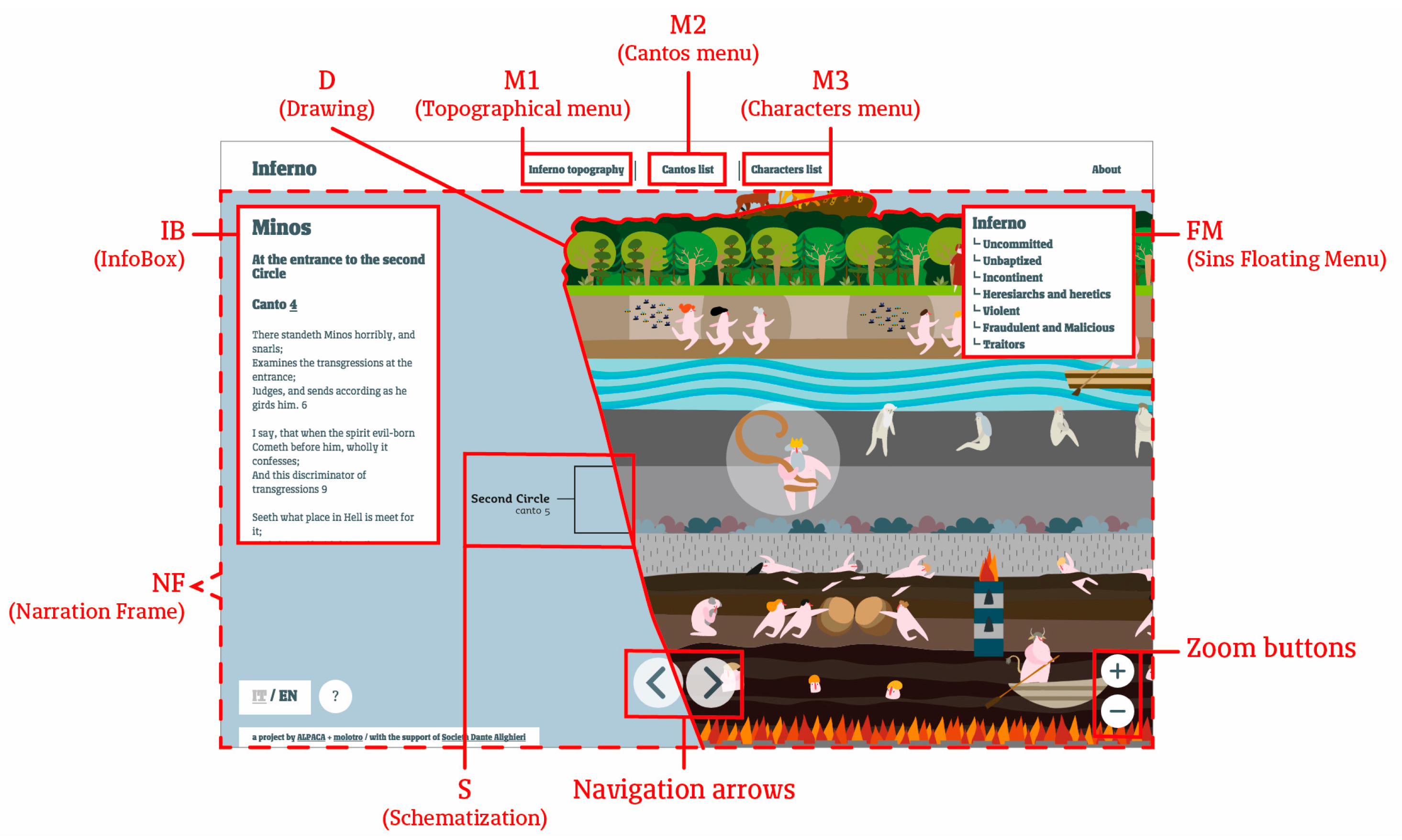
The metrics follow the guidelines provided by the ISO 9241-11:1998 standard.
Table 4. Shortcodes which describe the various parts of the website.
M1Topographical menu;
M2Cantos menu;
M3Characters menu;
FMSins Floating Menu;
IBThe InfoBox floats on the drawing, it is filled with information retrieved dynamically from the database regarding to characters, cantos, places or sins;
SSchematization of the structure of the Inferno, it is placed on the left side of the Drawing;
DDrawing, as also referred as the iconic mediator;
NFThe Narration Frame is the active area in which the users can navigate through contents;
Zoom buttonsButtons for zooming, they are placed in the right-bottom of the page;
Navigation arrowsButtons for the sequential navigation of the character depictions.
Table 5. Research questions for the investigation on didactics.
Regarding the Teachers (in Training and in Service)
1what kind of didactic transposition has been done on knowledge?
2how do the didactic mediators act?
3what do teachers think about the didactic use of the artifact?
Regarding the students
4what are the students’ behaviors while using the site?
5what are the major cognitive processes involved in interaction with the artifact?
6how do students understand? do they use text or images? or both?

