Abstract
Graphic representation is one of the main systems of signs designed by man with the aim of preserving, understanding, and communicating information deemed essential. As a language for eyes, graphic representation benefits from the properties of visual perception. The effectiveness of graphic language has been recognized and studied by many theorists and communication professionals. The contribution represents in the form of notes some initial explorations in the field of infographic and graphic visualization as knowledge processing tools for analyzing and present data as information. There are some remarkable references, definitions and examples, of researchers and information professionals, from which there are extensive considerations that attempt to bring the principles of visual communication to the science of representation and to the drawing discipline for engineers and architects.
1. Introduction
Data processing requires clear objectives and overall vision, communication of results requires simplification. British mathematician James Joseph Sylvester, on the first American mathematical journal he founded, introduced in 1878 the term “graph” to define a diagram that correlated two variables, thus simplifying and making the relationship mutually visible.
Representation by means of graphics or, more broadly, so-called graphic representation is one of the cognitive systems based on symbols, signs and relationships—something that refers to something else—conceived to store, understand, and communicate essential information. As a language for eyes, it benefits from the ubiquitous properties of visual perception, the ability to create and understand, with different degrees of abstraction, elements that encode data, concepts, connections, and positions in geometric space.
Infographic and visual images are now recognized as effective tools for capturing essential aspects of data sets, but also to allow exploring complex aspects of knowledge. The display of information is now considered not only as an end for the presentation of results but as a means, as well as data and their analysis, to understand and shape articulated realities.
The graphic representation gives shape to the concept of “data analysis”, which is more accessible in its visual component, much less in analytical. The graphical result of the process highlights the reliability of a study only when the processing process is transparent, rigorous and based on proper data storage and management within table or relational structures.
Several reaserchers have been concerned with the graphical representation of data, from what is considered to be the first to introduce its application in the statistical field (1786), William Playfair, although not achieving the formulation of specific theories and methods, Jacques Bertin, cartographer and theoretician of the information display, who is believed to have provided in his Semiology (1967, updated several times) a first grammar for graphics; more recently, Edward R. Tufte, theoretic of information design (how to express concepts in visual form), Alberto Cairo, journalist and designer, teacher of infographic and visualization, Manuel Lima, designer and researcher who has dealt with visual complexity, often applied to the transformation of data into visual art.
Starting from these illustrative references, it is possible to trace a path, a methodological process that formalizes the graphic representation systems invariants to define their rules and good practices. These theorists have been concerned primarily with codifying and making certain phenomena of social and economic life accessible by facilitating visual acuity in all their applications: as no one can confuse language with beautiful writing (the reduction of thought in calligraphy), so the various theoretical formulations of this discipline have been concerned with distinguishing the image from its information quality through revealing parameters and indicators (even in the Anglo-Saxon dichotomy given by the two figures, data artists and visualizers or data-visualization designers).
What happens when we try to carry out formalized paradigms in the information graphics within geographic information systems for urban and territorial drawings? These are the systems that require increasingly detailed data—sometimes even from so extensive collections of volume, speed, and variety that require specific value-added analytical techniques and methods—and often produce as many of them. The project’s support for the vast area scale is becoming less and less paper-based, organized within increasingly interoperable IT applications with the telematics network and web protocols, where containers and content substantially coincide.
2. Considerations by Means of Case Study
In his Atlas of 1786, William Playfair wrote of the growing complexity of reality he observed in the form of data. He highlighted how when life was simpler and the data was less abundant, understanding an economic structure was at the same time more difficult to formulate and less important for success. At the end of the eighteenth century, the statement was no longer found. Statistical offices were founded to collect a wide variety of data from which political and economic leaders could make decisions. The complexity of these data precluded their easy access to people not sufficiently diligent. The genius of Playfair was to overcome that difficulty through the invention of graphs and statistical charts. In the explanation of his invention he warned the reader [1]: “In studying each of these diagrams carefully, a sufficiently distinct impression will be made, to remain abandoned for a considerable time, and the idea that remains will be simple and complete, enclosing together time duration and dimension. People can only focus on the general vision; the information will be read without effort or problems studying the details of which it is constituted”.
Two disciplines help us to define new speculative approach to knowledge, both play with information by means of graphic.
2.1. Infographic and Graphic Visualization for the Wisdom
Infographic and Information display have a common nature. Some academics have defined the distinction between the two disciplines: infographic presents information through graphs, maps, and statistical diagrams, while graphic visualization provides visual tools that users can use to explore and analyze data sets.
So while the infographic tells stories outlined by communicators, visualization helps readers discover them on their own. They exist in a continuum, the first one for presentation and the second one for exploration.
In the 1970s, before Internet access became universal, Richard Saul Wurman, professor of architecture, predicted that the imminent explosion of information would require the intervention of a new type of trained practitioners to organize data and deduce a sense. According to Wurman, the most difficult challenge our species was facing was to learn how to juggle between the crests of the imminent bend wave rising on the horizon. Wurman called these people information architects. Their disciple was then defined by others as the structural design of shared information environments, the combination of organization, labeling, research and navigation systems within web-deployed environments, art and science to shaping products and information experiences to foster usability and accessibility, emerging discipline and a community of practice aimed at bringing the principles of design and architecture into the digital landscape.
Finally, Wurman claims that one of the main purposes of the information architecture is to help users avoid “the black hole between data and knowledge” [2]: “People still have anxiety about how to assimilate a quantity of knowledge that expands nanosecond in nanoseconds. Information anxiety is the product of the ever-wider gap between what we understand and what we think we need to understand”.
This gap was represented by Alberto Cairo in the following diagram [3]; it shows the steps that separate the two extremes of Wurman’s maxim. It is based on several models known as DIKW hierarchies (Data, Information, Knowledge, Wisdom). Although these models have been criticized as being simplistic and imprecise [4], they are useful in explaining graphic and infographic views.
In the diagram (Figure 1), unstructured information means relationship, the outside world with its complexity. Any phenomenon that can be perceived or measured can be described as information.
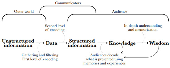
Figure 1.
Data-Information-Knowledge-Wisdom diagram.
The data is documentation of observations. The data can be encoded in symbols (numbers and words) that describe and represent the relic. Between unstructured information and data, there is a first level of decoding.
The second level brings us from data to structured information. This happens when a scholar represents eloquently the data, using texts, images, or other means. We can also say that the communicator has shaped the data, the relevant themes become visible.
Information consumption can lead to greater public awareness if its members are able to perceive the relevant issues or the meaning of the data. It is not a passive process; our minds are not fixed digital memory disks that record acritically. When we see, read, or listen, we assimilate content by associating it with our memories and experiences.
We reach wisdom when we come to an in-depth understanding of acquired knowledge when we not only “understand” but when new information merges with past experience so full to improve our ability to know what to do in other situations, vaguely linked to the information from which our original knowledge came from. Just as not all the information that we absorb leads to knowledge, not all the knowledge we acquire leads to wisdom.
Each step in the diagram implies a higher order. When we see the world, we unconsciously impose an organization on unstructured information that our eyes gather and transmit to the brain. We create hierarchies. We do not perceive all that we have at the same time.
2.2. Rational Approach vs. Emotional Aesthetic Aspects
Viewing data can produce information. Some specialists prefer a rational and scientific approach, which emphasizes functionality, some other give more emphasis to emotional and aesthetic aspects.
There is certainly a middle ground between the two groups and the border is not always so good. The former have technical training (statistics, cartography, computer science and engineering sciences), the latter usually come from graphic, art and journalism studies.
Alberto Cairo has tried to define two visualization wheels about each single specialist can address the problem of graphical data expression [4,5] (Figure 2). Edward R. Tufte is probably the most influential theorist in the field of information design and graphic visualization, his books are an indispensable reference. He openly despises the decorative ideology that often accompanies infographic processing, by combining the term chartjunk and defining information consumers often more prepared and available to handle available information than those who manufacture decoration of data [6].
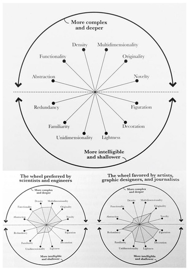
Figure 2.
The visualization wheel.
See and understand are two concatenated processes. We understand why we see. This relationship of cause is also true in the opposite sense. Vision precedes understanding, and this understanding precedes a better and deeper vision of what we will face in the future.
Terrence W. Deacon defines us as a species not only visual, but also symbolic [7]. All the information gathered from our senses is transformed, in the depths of our minds, into simple and manageable representations, or symbols. Some of these symbols are verbal or textual, encoded in one of the thousands of existing languages and dialects.
Not all symbols are verbal, the brain does not simply process the information that comes from the eyes. It also creates mental images that allow us to reason and plan actions.
2.3. Visual Variables, Flow Maps and Spatio-Temporal Structures
Jacques Bertin is considered to be the first to have proposed a theory of graphical representation of data for use in maps, diagrams, and networks, published in his seminal book of Semiology of graphichs in 1967 in France, with the first English edition in 1983. He introduce the term visual variables. His theory is based on semiology and associates the basic graphic elements with visual variables and types of phenomena. Although Bertin’s system has been widely adopted by cartographers and designers when selecting the appropriate type of marks for encoding data, it also has been expanded to include other variables not considered initially. One finds in the literature various proposals for expansions that are geared toward different purposes and the needs of specific fields. For example, most proposals have added the variable of colour saturation to the other color variable of hue and value. Other propose include tactual elements in maps for visually impaired users and dynamic variables for maps changing over time [8].
Charles Joseph Minard (1781–1870) was a prolific cartographer and produced fifty-one thematic maps mostly focusing on economic geography, of which the majority were flow maps. In Minard there is a boom in flow and network maps due to the amount of spatio-temporal data available.
Two major challenges of designing flow maps are obfuscating the base map with the bands and avoiding too many overlaps and thus visual clutter. Minard met both challenges when he created flow maps in the nineteenth century. The two series of flow maps depict the approximate amount of cotton imported by Europe (Figure 3).
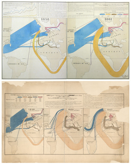
Figure 3.
The map on the top, “Carte figurative et approximative des quantités de coton en laine emportées en Europe en 1858 et en 1861.” was published in 1862 and portrays data for 1858 and 1861. The map at the bottom, “Carte figurative et approximative des quantités de coton brut importées en Europe en 1858, en 1864 et en 1865.” was published in 1866 and depicts data for three year, 1858, 1864, and 1865.
The reason for reproducing these maps is to underline how Minard distorted the base maps in favor of the flows of goods, which is the objective of the maps. If we compare the series of maps, we will see how, with increasing flow of goods over the years, depict a more distorted geography, though distortion happens in the former as well. Minard was such more concerned with portraying the basic structure of the distribution than he was with maintaining strict positional accuracy of geographical base.
Another feature still in current practice and worth stressing is how Minard bundled flows with shared destinations so as to avoid visual clutter.
In the maps each millimeter corresponds to 5.000 tons of cotton. In addition to the visual representation provided by the width of bands, Minard included the absolute numbers next to each band. Color encodes the countries from which cotton is imported. The notes, as usual, present commentary on findings and questions. For example, Minard discusses how the American Civil War affected the commerce of cotton and the countries that were producers.
An Esri map is a faithful interactive reproduction of this lesser known Minard flow map. The webGIS “English Coal Exports 1864” shows the countries where Britain exported coal to and the quantities exported to each country. The width of the lines on the map represent the quantities of coal exports for each part of the trade-route (Figure 4).
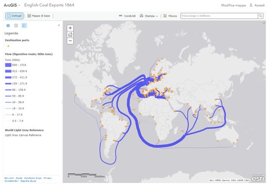
Figure 4.
A webGIS of Minard’s flow maps (www.arcgis.com/home/webmap/viewer.html?webmap=9d48ce9b6837492e982e980402d3ed11).
An especially effective device for enhancing the explanatory power of time-series displays is to add spatial dimensions to the design of the graphic; so that the data are moving over space (in two or three dimensions) as well as over time. Excellent space-time-story graphics illustrate here how multivariate complexity can be subtly integrated into graphical architecture, integrated so gently and unobtrusively that viewers are hardly aware that they are looking into a world of four or five dimensions. Occasionally graphics are belligerently multivariate, advertising the technique rather than the data. The classic of Charles Joseph Minard (1781–1870), the French engineer, which shows the terrible fate of Napoleon’s army in Russia. This combination of data map and time-series, drawn in 1869, portrays a sequence of devastating losses suffered in Napoleon’s Russian campaign of 1812. The famous Minard’s 1869 “Napoleon March to and from Russia, 1812–1813” display combines statistical data with a timeline, and spatio-temporal information about the French army. In the multivariate display, the line width represents the number of soldiers marching to and from Russia, with each millimeter standing for 10.000 men. Considering that one visual system is unable to perceive absolute quantities from areas, Minard provide absolute quantities of soldiers along the two lines. Minard remove most cartographic information and kept only geographical landmarks, such as main cities and rivers. The line graph at the bottom represents the temperatures faced by the army on the way back to Poland, which are associated to the line standing for the return trip. Connections between temperature and the march offer new levels of information.
Six variables are plotted: the size of the army, its location on a two-dimensional surface, direction of the army’s movement, and temperature on various dates during the retreat from Moscow. “Graphical elegance is often found in simplicity of design and complexity of data” [9].
There is a Stamen Design project that propose, on OpenStreetMap data, an interesting interactive attempt at replicating Minard’s flow map on a real atlas. Absolute quantities are given moving the cursor on circles on the lines. It allows us to more clearly see the geography of Napoleon’s march. Unfortunately this map lacks Minard’s temperature chart which visualized the freezing temperatures faced by Napoleon’s army as they pushed eastwards (Figure 5).
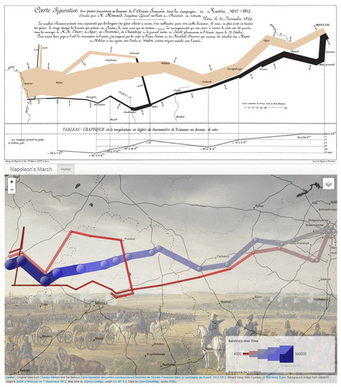
Figure 5.
The famous Minard’s 1869 “Napoleon March to and from Russia, 1812–1813”, at the top, and an interactive map based on OpenStreetMap data by Stamen Design (humangeo.github.io/leaflet-dvf/examples/html/minard.html).
Menno-Jan Kraak at the International Institute of Geoinformation Sciences and Earth Observation, Netherlands, created a geovisualization of Minard’s map itself to demonstrate how alternative graphic representation can stimulate the visual process. The interactive visualization is a space-time cube in which in the x- and y-axes represent the geography and the z-axis represents time. One can navigate in time by moving the cursor in the vertical direction [10] (Figure 6).
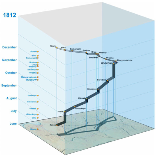
Figure 6.
Menno-Jan Kraak at the International Institute of Geoinformation Sciences and Earth Observation, Netherlands (www.itc.nl/personal/kraak/1812/3dnap.swf).
3. Conclusions
Data maps have a curious history. It was not until the seventeenth century that the combination of cartographic and statistical skills required to construct the data map come together, fully 5.000 years after the first geographic maps were drawn on clay tablets. And many highly sophisticated geographic maps were produced century before the first map containing any statistical material was drawn.
In the words of Kevin Kelly, a famous philosopher of technology, from his book What Technology wants [11]: “Minds are evolved ways of structuring the fragments of information that form the reality. This is what we mean when we say that a mind understands: it generates order.”
So, without a conscious spill, the brain always tries to reduce the distance between observed phenomena and knowledge or wisdom. This is the meaning of cognition. The role of a researcher who cares about organizing data for information is to anticipate this process and generate order before the brain of people does it alone [12].
Through some examples of case studies, it was intended to provide a first synoptic comparison of the various processing possibilities permitted today by the fact that both territorial and urban planning (including the strategic one) is increasingly structured within the components that support it (scholars, professionals and carriers of interest, procedures, tools) in widespread and shared management of data. The extraction of the information is no longer returned in static form, but the single user can, by himself, appropriately guided, extract his knowledge assets.
Geographic information systems incorporate information synthesis (matrix and vector geometric data, associated alphanumeric parameters, topological relationships) synthesis data. In the examples that were given, the representation for territorial and urban areas incorporates and is amplified by the possibilities of graphic representation as described above (in the form of infographic and communication); the visualization of the information will be associated with the technical representation of the aspects of planning that concern sharing and participation, highlighting in visible form the connotations that can open to discussion, reasoning, and comprehension (see also [13,14,15] for further examples).
Conflicts of Interest
The author declare no conflict of interest.
References
- Playfair, W. Playfair’s Commercial and Political Atlas and Statistical Breviary, 1st ed.; Cambridge University Press: Cambridge, UK, 2005. [Google Scholar]
- Wurman, R.S. Information Anxiety 2; Que: New York, NY, USA, 2000. [Google Scholar]
- Cairo, A. L’arte del Vero: Dati, Grafici e Mappe per la Comunicazione; Pearson Italia, Milano-Torino; 2016. [Google Scholar]
- Cairo, A. L’arte Funzionale: Infografica e Visualizzazine delle Informazioni; Pearson Italia, Milano-Torino; 2013. [Google Scholar]
- Weinberg, D. The Problem with the Data-Information-Knowledge-Wisdom Hierarchy; Harvard Business Review: Harvard, MA, USA, 2010. [Google Scholar]
- Tufte, E.R. The Visual Display of Quantitative Information, 2nd ed.; Graphics Press: Cheshire, CT, USA, 2001. [Google Scholar]
- Deacon, T.W. The Symbolic Species: The Co-Evolution of Language and the Brain; W.W. Norton & Company: New York, NY, USA, 1997. [Google Scholar]
- Bertin, J. Semiology of Graphics: Diagrams, Networks, Maps; Esri Press: Redlands, CA, USA, 2010. [Google Scholar]
- Tufte, E.R. Visual Explanations: Images and Quantities, Evidence and Narrative; Graphics Press: Cheshire, CT, USA, 1997. [Google Scholar]
- Meirelles, I. Design for Information; Rockport Publishers: Beverly, MA, USA, 2013. [Google Scholar]
- Kelly, K. What Technology Wants; Viking: New York, NY, USA, 2010. [Google Scholar]
- Moles, A. Teoria dell’Informazione e Percezione Estetica; Lerici Editore S. p. A.: Roma, Italy, 1969. [Google Scholar]
- Internet Site with Exemplifications on Data Elaboration and Informative Results. Available online: http://www.periscopic.com/ (accessed on 20 October 2017).
- Internet Site of the Artist Chris Harrison. Available online: http://www.chrisharrison.net/index.php (accessed on 20 October 2017).
- Trendalyzer, or Gapminder, is a Software to Visualizate Information by Means of Creation and Animation of Statistical Data (Gapminder Foundation by Hans Rosling, Sweden, since March 2007 by Google Inc.). Available online: https://www.gapminder.org/ (accessed on 20 October 2017).
© 2017 by the author. Licensee MDPI, Basel, Switzerland. This article is an open access article distributed under the terms and conditions of the Creative Commons Attribution (CC BY) license (https://creativecommons.org/licenses/by/4.0/).