1. Introduction
Enhanced Vision System (EVS) is a typical Augmented Reality (AR) technology based on Video See-Through (VST). By integrating computer vision, graphic imaging, and optical techniques, EVS overlays digitally enhanced information onto the real-world view [
1,
2,
3]. Currently, EVS finds broader applications in aviation, where it has replaced conventional head-up displays (HUDs) and undergone testing on multiple supersonic aircraft [
4,
5]. Beyond aviation, EVS demonstrates its advantages in enhanced information perception and real-time visualization across domains such as AR-based drone operation, vehicle panoramic imaging, remote surgery, and remote equipment maintenance. Compared to traditional devices, it excels in overlaying augmented information onto real-world scenes, thereby increasing cognitive efficiency. This capability not only meets the demands for efficient information interaction in complex scenarios but also highlights EVS’s potential to become a core function of mainstream mobile devices in the future.
However, with the rapid development of EVS in aviation, the challenge of information overload has become increasingly apparent: monochromatic, high-density visual elements frequently exceed the limits of human recognition, while large volumes of equally prioritized information distract attention and undermine operators’ ability to rapidly identify and process high-priority data, thereby negatively impacting decision-making efficiency. Moreover, the dense presence of lower-priority elements further disperses operators’ attention and diminishes overall recognizability. This issue will also need to be addressed in future EVS and other AR mobile devices. To address this problem, color-coding has been proven as an effective hierarchical strategy that leverages carefully chosen colors to strengthen bottom-up attention, making high-priority information more salient [
6,
7,
8,
9,
10]. However, existing research on HUD color-coding has largely focused on alert information rather than on basic information. Most findings note that adding magenta [
11] or red/yellow [
12] to the green base color can effectively increase the priority of alerts. It is worth emphasizing that basic information itself is not homogeneous; it can be further divided into high-priority Primary Information (PI) and lower-priority Secondary Information (SI). For instance, current flight altitude is substantially more important than altitude scale markings. Although HUD-EVS expands possibilities for color design, the existing overload of high-density, monochromatic basic information continues to hinder operators’ attention allocation: low-priority SI distracts from the prompt and accurate recognition of high-priority PI. Consequently, further empirical research is needed to explore how to optimize color-coding for basic information, minimizing SI interference and ensuring the prominence of PI.
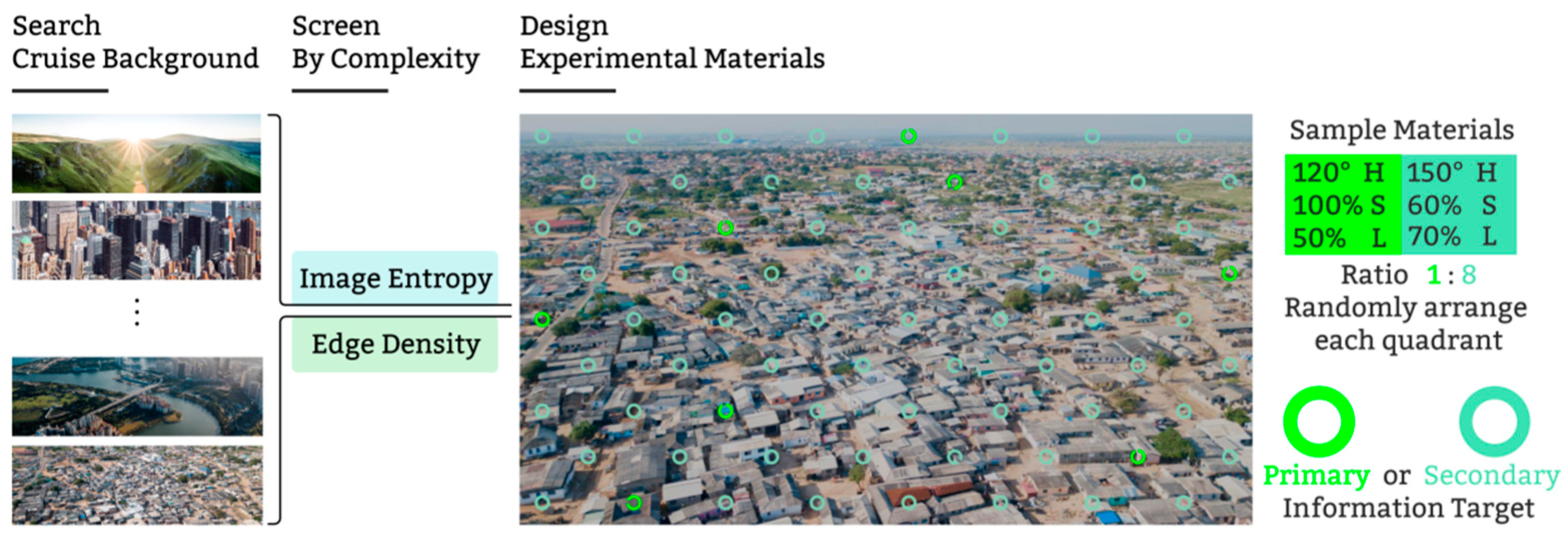
On the other hand, reducing the visual priority of SI does not mean sacrificing its recognizability. When designing the color-coding of basic information, it is also necessary to ensure that SI retains sufficient recognizability against complex backgrounds. As with AR technology, the complexity of the background layer influences visual elements [
13,
14], particularly in complex cruising environments characterized by numerous adjacent buildings, diverse terrains, narrow roads, and irregular vegetation arrangements. These conditions increase the operator’s sense of visual confusion. Previous studies [
15,
16] have demonstrated that as background complexity rises, the readability and cognitive efficiency of foreground information, including both PI and SI, decrease. Therefore, in designing the color-coding methods for basic information, it is essential not only to ensure the prominence of PI but also to maintain sufficient recognizability for SI against complex backgrounds.
Adjusting the hue of visual elements is a common approach to altering their recognizability. It is recommended that conventional information symbols in enhanced display systems use green within the wavelength range of 500 to 560 nm [
17]. Current aviation HUD-EVS employ green at approximately 555 nm. According to the human eye’s luminous efficiency function, light at 555 nm represents the peak of perceived brightness [
18], reflecting the eye’s subjective response to light intensity. Hues corresponding to wavelengths above or below 555 nm exhibit gradually decreasing perceived brightness. This brightness advantage, based on hue, makes it more likely to capture the user’s visual attention, thus gaining a competitive edge in attention allocation [
7]. However, whether an effective dual color-coding hierarchy can be achieved within the 500 to 560 nm range requires further experimental investigation.
Saturation and lightness are two key factors influencing the recognizability of visual elements, and both values are based on the HSL (hue, saturation, lightness) color model. Colors with lower saturation appear closer to gray and tend to have lower recognizability. In contrast, higher saturation and lightness enhance the perceived depth and attract more attention [
19]. Conversely, lower saturation and lightness lead to lower levels of recognizability [
20]. However, this general trend does not provide clear guidance for balancing the use of dual color-coding for basic information, and further experimental investigation under more specific conditions is required.
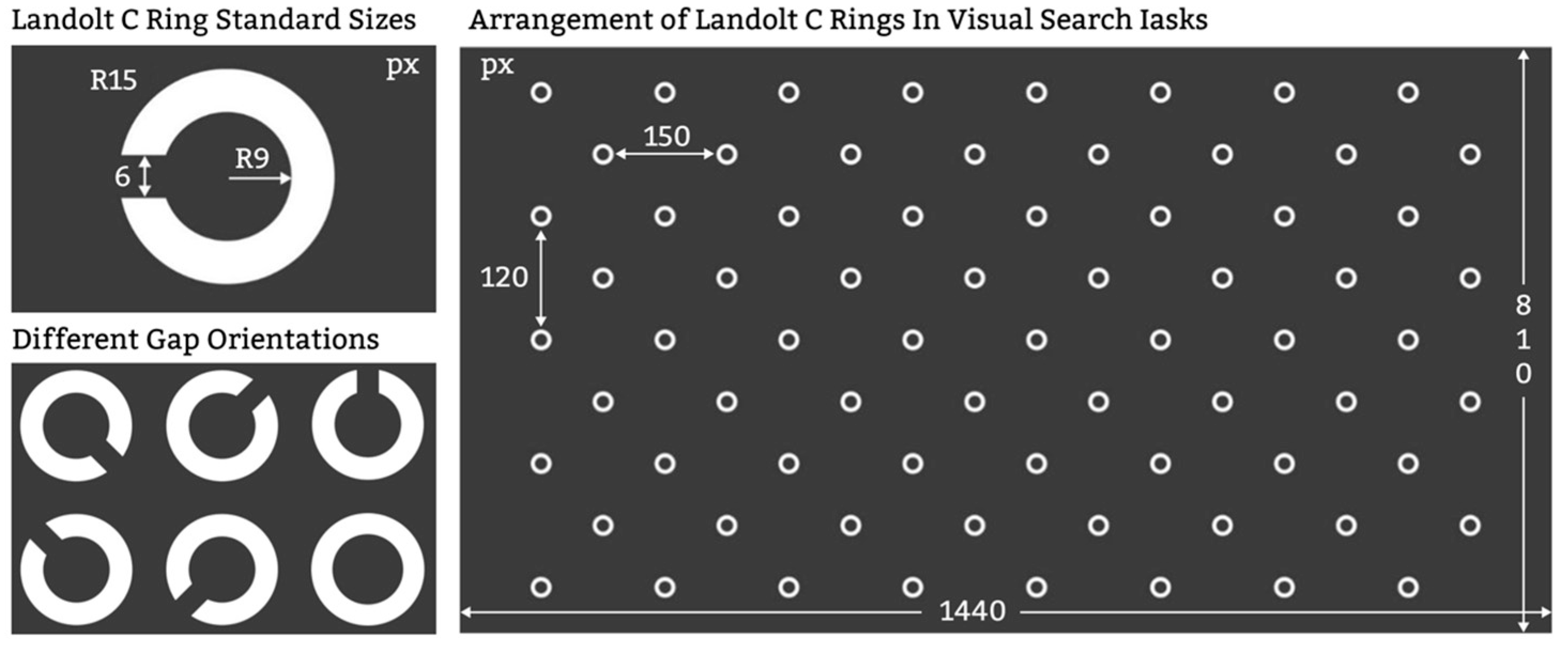
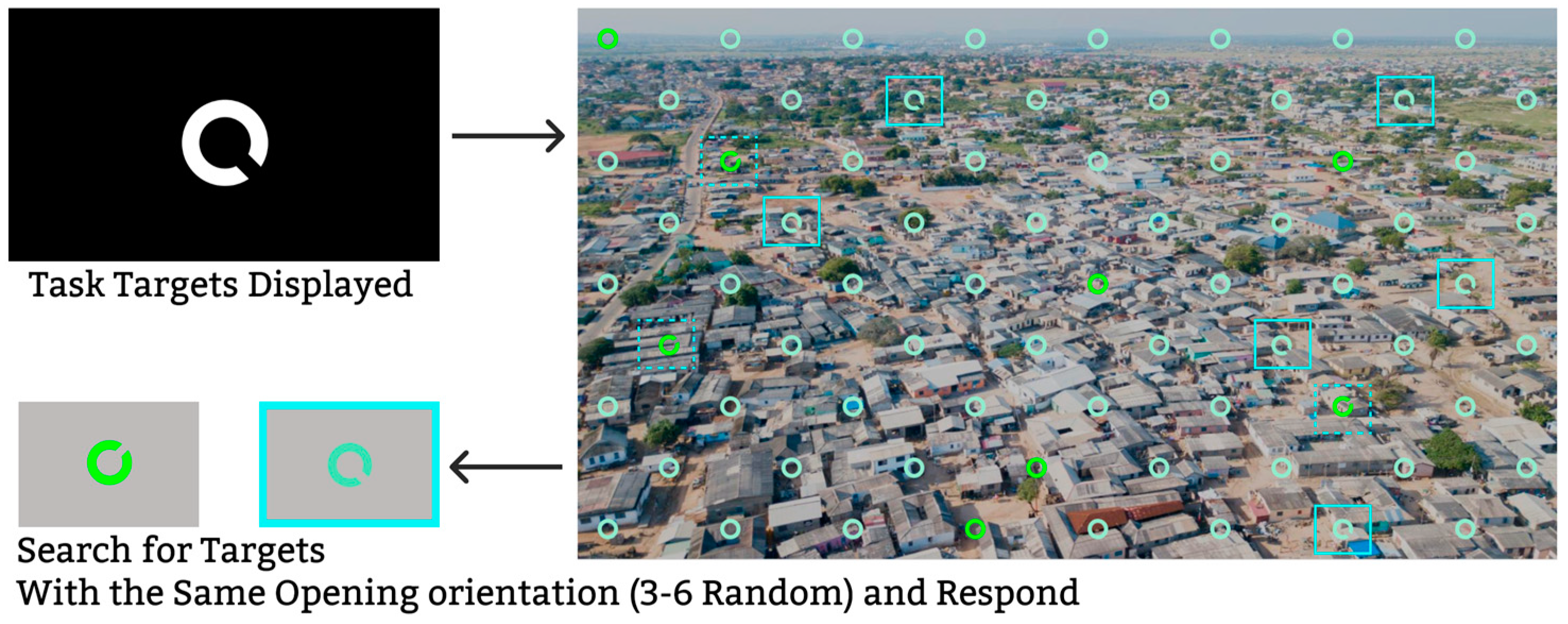
In previous studies, the Landolt C paradigm has been widely recognized as an experimental framework for investigating how color-coding affects the recognizability of visual elements [
21,
22]. Within this paradigm, participants are required to locate a Landolt C target with a specific gap orientation among a series of visual fields. The core task involves feature discrimination and target selection, closely resembling actual target recognition and search processes. Thus, the Landolt C paradigm serves as a feasible surrogate for examining factors that influence visual search performance. By measuring accuracy and reaction time in the Landolt C paradigm, researchers can evaluate the recognizability of visual elements, providing a controlled approach for color-coding design research.
For HUD-EVS, the complex nature of the background and the prevalence of information overload underscore the need to optimize color-coding strategies to ensure the prominence of Primary Information (PI) while maintaining adequate recognizability of Secondary Information (SI). Therefore, the purpose of this study is to investigate a dual color-coding strategy for HUD-EVS basic information against complex backgrounds, aiming to address the challenge of balancing PI’s recognizability advantage with sufficient SI recognizability.
The specific objectives of this study were to: (1) examine the effects of SI hue, saturation, and lightness on the recognizability advantage of PI’s visual elements when PI’s color is predetermined; (2) explore how the hue, saturation, and lightness of SI affect the recognizability of its visual elements against complex ground-based backgrounds.
This study provides a systematic exploration of dual color-coding design for HUD-EVS basic information. The findings offer practical guidance for improving HUD-EVS interface color design in increasingly complex operational contexts. Furthermore, the results may serve as a reference for developing future dual color-coding standards, thus supporting the robustness of EVS applications across diverse scenarios and mobile platforms.
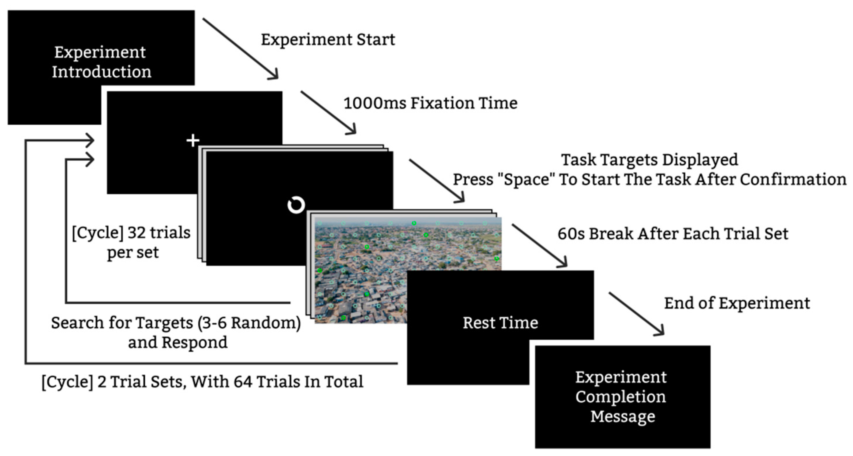
3. Results
The following section presents the effects of SI hue, saturation, and lightness on four dependent variables (accuracy and reaction time in both the PI Search Task and the SI Search Task), as well as the interactions among these three factors.
3.1. PI Search Task Performance
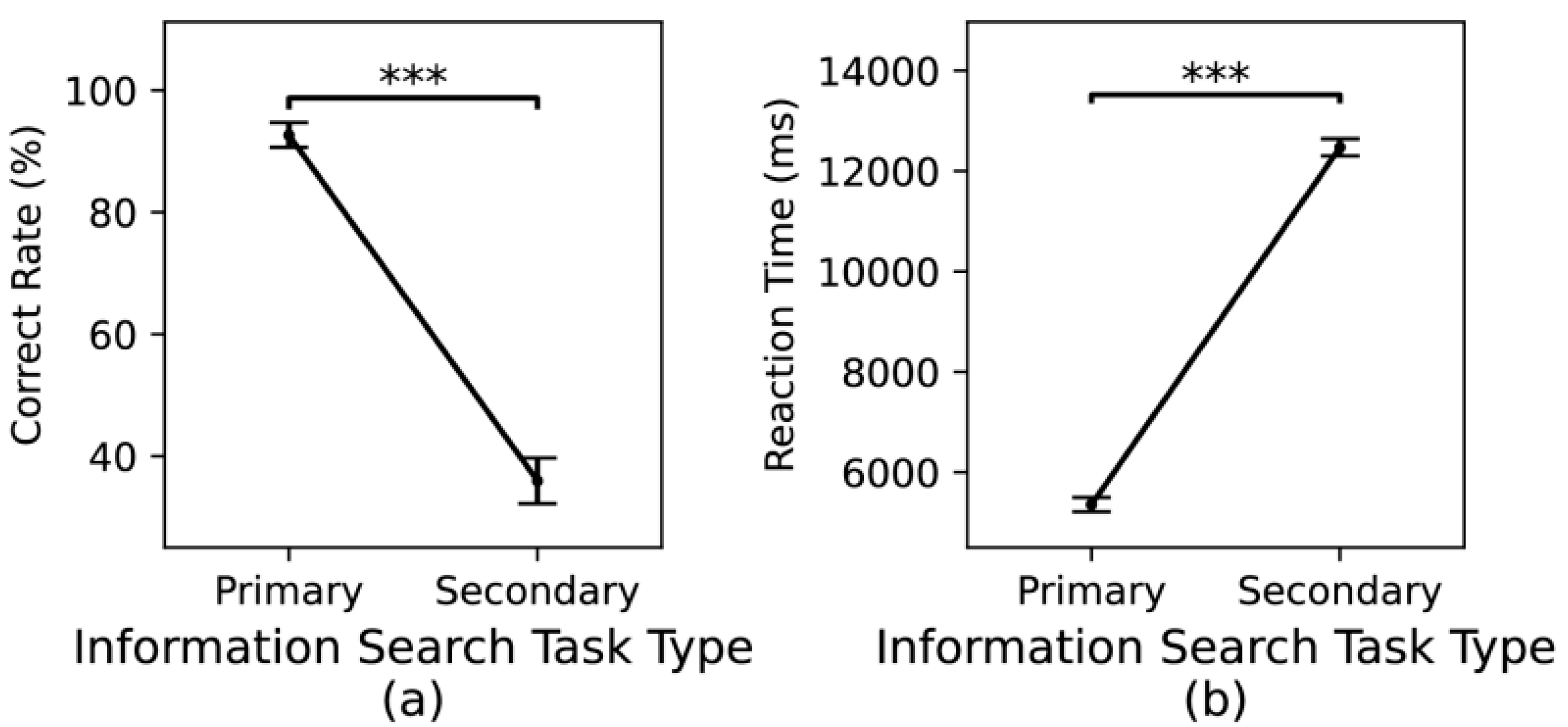
Results indicated that participants’ accuracy in the PI Search Task was significantly higher than in the SI Search Task (F (1, 1278) = 689.2,
p < 0.001), and their reaction times were significantly shorter (F (1, 1278) = 2909.4,
p < 0.001),as shown in
Figure 7. Pairwise comparisons of dual-task performance across 32 different color combinations revealed no evidence that the SI Search Task performed significantly worse than the PI Search Task (i.e., no significantly lower accuracy or longer reaction times under any specific color combination).
Descriptive results indicated that the mean correct rate for the PI Search Task was 92.65% (
n = 640). This high accuracy suggests the presence of a ceiling effect, where all participants achieved very high accuracy, potentially reducing data variability [
30,
31]. Consequently, this study places greater emphasis on differences in reaction times for the PI Search Task.
The results of the Spearman correlation analysis are presented in
Table 1.
The ANOVA results for the dependent variables (correct rate and reaction time) in the PI Search Task are shown in
Table 2. The findings indicate that for reaction time, both the Hue × Saturation and Saturation × Lightness interactions are statistically significant.
To further examine the significant interaction effect, a simple-effect analysis was conducted. The key results are summarized in
Table 3.
In the PI Search Task, under various hue, saturation, and lightness conditions for SI, the results indicated that with 60% saturation, the reaction time at 180° hue was significantly lower than at 150° hue; with 20% saturation, the reaction time at 60% lightness was significantly lower than at 90% lightness; and with 60% lightness, the reaction times at 20% and 40% saturation were significantly lower than at 80% saturation.
3.2. SI Search Task Performance
The ANOVA results for the dependent variables (accuracy and reaction time) in the SI Search Task are presented in
Table 4. The findings indicate that for accuracy, significant interaction effects were observed for both the Hue × Saturation and Hue × Lightness interactions. In terms of reaction time, hue, saturation, and lightness each exhibited significant main effects, but no significant interactions were detected among these three factors.
The results of the Spearman correlation analysis are presented in
Table 5.
To further examine the significant interaction effects, a simple-effect analysis was conducted. The results are summarized in
Table 6.
Under the 60% saturation condition, a hue of 150° produced higher accuracy than a hue of 180°, but also resulted in longer reaction times.
Post-hoc comparisons for saturation revealed that at 20% saturation, reaction time was significantly higher than at other saturation levels. At 60% lightness, using 80% saturation yielded significantly higher accuracy compared to 20% and 40% saturation.
Post-hoc comparisons for lightness indicated that at 80% and 90% lightness, reaction times were significantly longer than at 60% and 70%. Furthermore, under the 20% saturation condition, increasing lightness to 90% led to significantly higher accuracy compared to 60% lightness.
4. Discussion
Although the Landolt C paradigm used in this experiment cannot fully replicate the unique visual information search processes in actual HUD-EVS scenarios, the fundamental nature of visual search—rapidly locating a specific target in a complex environment—remains consistent between Landolt C targets and EVS visual elements. This paradigm is sufficient for evaluating how color-coding affects participants’ attention allocation and the recognizability of visual elements under specific conditions, as supported by previous studies [
32,
33].
Human information searching typically involves a combination of top-down and bottom-up processing [
34]. With limited attentional resources, top-down memory of the target guides accelerates the search, whereas bottom-up target stimuli introduce interference, thereby increasing search time. In this experiment, the independent variables—the HSL (hue, saturation, lightness) attributes of SI—represent varying degrees of bottom-up interference. Given the same top-down memory guidance, participants’ accuracy and reaction time effectively reflect the extent to which these variables influence the recognizability of the visual elements. This is precisely the focus of the present study.
4.1. The Recognizability Advantage of PI
This study shows that participants achieved higher correct rate and shorter reaction times for PI compared to SI, indicating that the selected SI color settings did not compromise the PI’s recognizability advantage. Although the total number of PI targets was lower than that of SI, potentially affecting correct rate and response speed, there was no evidence that any SI color combination undermined PI’s performance. This confirms the effectiveness of the chosen color scheme in emphasizing fewer, higher-priority PI elements in terms of recognizability.
Turning to the effect of hue, although the main effect of hue was significant, a shorter reaction time for 180° hue compared to 150° hue emerged only when SI was presented at 60% saturation. This result suggests that at 180° hue, SI introduced greater attentional interference than at 150°, consistent with the standard luminosity function in human vision [
18]. This effect may be attributed to the fact that hues near 555 nm fall within the range of maximum visual sensitivity, leading to relatively stronger perceptual salience even when saturation and lightness levels are held constant, thereby attracting attention more effectively. However, at other saturation or lightness levels, the 150° hue did not show a significant disadvantage, in line with the weak negative correlation (
p < 0.3) between hue and reaction time. One explanation is that lightness and saturation exert a stronger influence on cognitive speed and visual preference, thereby reducing the role of hue in determining reaction time [
35].
Regarding saturation, its influence on PI recognizability was modulated by the interaction between saturation and lightness. Only at 60% lightness did the 20% and 40% saturation conditions yield significantly shorter reaction times than the 80% saturation condition. Among the tested levels, SI with 80% saturation and 60% lightness resembled PI (with 100% saturation and 50% lightness) the most, reducing color contrast and making the two colors overly similar. This likely hindered PI recognition.
Similarly, the effect of lightness on PI recognizability depended on saturation changes. Only at 20% saturation did the reaction time for 60% lightness prove significantly lower than for 90% lightness. Because 20% saturation differs greatly from PI’s 100% saturation, the influence of lightness becomes more pronounced. The higher reaction time at 90% lightness may stem from increased attentional interference due to a much brighter SI, prolonging visual search and judgment for PI [
36]. Since saturation exhibited a significant main effect on Primary Information (PI) reaction time (
p < 0.001) with a weak positive correlation, whereas lightness did not show any significant main effect (
p = 0.629) or correlation, this study recommends avoiding high saturation levels (e.g., 80%) for Secondary Information (SI). Lower saturation levels appear more conducive to maintaining PI’s recognizability advantage. Regarding the influence of lightness on PI recognizability, we adopt a cautious stance given its non-significant statistical outcome.
4.2. Recognizability of SI
This study indicates that under the 60% saturation condition, SI using a 150° hue achieved higher accuracy than that using 180°, but required longer reaction times. This outcome aligns with the previous section’s analysis, where the 150° hue demonstrated greater attentional interference compared to 180° at 60% saturation. The perceived brightness advantage of the 150° hue may explain its higher accuracy against complex backgrounds, but its hue similarity to the PI color could lead participants to spend more time on searching and identifying the target, a hypothesis that requires further investigation.
This study also underscores the impact of saturation on SI recognizability, with post-hoc comparisons showing that at 20% saturation, reaction time was significantly higher than at other levels. Moreover, only under 60% lightness did 80% saturation yield significantly higher accuracy compared to 20% and 40%, emphasizing the interplay between lightness and saturation. Consistent with previous studies, relatively lower lightness and saturation increased the difficulty of element recognition [
20]. At 20% saturation, SI became harder to identify, resulting in longer reaction times. With 60% lightness, the lightness advantage was limited, making the effect of saturation on recognizability more pronounced. Thus, to avoid impairing SI recognizability, it is advisable not to use 20% saturation under 60% lightness.
Regarding the influence of lightness on SI recognizability, the results revealed that at 80% and 90% lightness, reaction times were significantly lower than at 60% and 70%. Under 20% saturation, post-hoc comparisons further indicated that using 90% lightness resulted in significantly higher accuracy than at 60%. This pattern is similar to the effect observed for saturation: lower lightness levels (60% and 70%) made elements harder to identify, leading to longer reaction times. Additionally, 60% and 70% lightness are closest to the 50% lightness used for PI, and this similarity in visual hierarchy may influence reaction times. The disadvantage of 60% lightness was further manifested in accuracy under the lowest (20%) saturation level. Therefore, to avoid compromising SI recognizability, this study recommends not using 60% lightness.
Finally, these results show that, unlike with PI, the influence of saturation and lightness on SI recognizability did not yield a significant three-way interaction, though the overall trend aligns with previous findings. Higher saturation and lightness generally contribute to improved element recognizability [
37], yet the anticipated increase in target similarity [
38] was not observed for SI’s own recognizability. Despite the 80% saturation value being closest to that of PI, participants still performed significantly better under this condition. This may be due to unexamined color differences among PI, SI, and the background. As SI saturation increases, the reduction in color contrast between PI and SI may be less than the increase in contrast between SI and the background. Future research will explore how color differences among PI, SI, and the background influence recognizability.
4.3. Recommendations for Two-Color Encoding Design of HUD-EVS Basic Information
Further simple-effect analysis revealed no consistent significant patterns for SI hue, possibly due to the influence of the background. Consequently, this study places greater emphasis on the effects of SI saturation and lightness, synthesizing dual color-coding strategies for EVS basic information. These strategies can serve as design references not only for EVS but also for similar AR mobile devices across various domains. The recommendations are summarized in
Table 7 as follows:
Overall, under a predefined PI color scheme, using lightness above 60% and a saturation range between 20% and 80% for SI is recommended. Specifically, higher lightness enhances SI elements’ visibility against various textures and color interferences, ensuring they do not fade into the background. Meanwhile, maintaining a saturation range of 20–80% helps avoid two extremes: oversaturation that narrows the color gap between SI and PI, and undersaturation that fails to sufficiently distinguish SI from the background. Consequently, adhering to these guidelines helps preserve PI’s recognizability advantage while maintaining adequate discernibility for SI elements, even against a complex background. This approach not only ensures SI’s recognizability in the face of complex background textures and colors but also maintains the recognizability advantage of PI.
4.4. Limitations
This study focuses on a particular EVS complex background, offering targeted insights for that specific context. The experiment employed a static interface without incorporating dynamic interface conditions. In practical applications, visual elements in dynamic interfaces may be influenced by motion, variation, and interaction, potentially altering the recognizability of PI and SI, and thus yielding different color contrast outcomes compared to static interfaces.
Furthermore, the chosen complex background did not encompass a wider range of more diverse or highly complex backgrounds. Consequently, the current findings primarily reflect the effects of color contrast within one specific context. In real-world scenarios, the diversity of backgrounds, as well as variations in color and lightness, may influence the perception of color contrast in different ways.
Lastly, this study adopted the Landolt C paradigm rather than simulating an actual HUD-EVS interface. Because HUD-EVS interfaces involve unique layouts, dynamic updates, and interactive features, information recognizability and visual search performance may be affected in ways not captured by this experiment. Therefore, these findings are most applicable to the tested conditions, and further research is needed to validate them across more diverse real EVS scenarios.


