Promoting Sustainable Energy Consumption Behavior through Interactive Data Visualizations


Abstract
:1. Introduction
- Phenotype: This dimension concerns the phenotypic attributes of a visualization. Along this dimension we distinguish whether a visualization is, for instance, a pictorial representation of data, or uses an abstract design to convey some information. This dimension is used to categorize visualizations (e.g., into a graph or an eco-visualization). We will discuss these differences in Section 4.
- Temporal: This dimension concerns the temporal aspect of how a visualization is used. Along this dimension we distinguish between visualizations that are static (i.e., they do not change over time), dynamic (i.e., users must observe them over a time period to notice meaningful changes), and interactive (i.e., users can interact with them to cause changes, for example by manipulating some visualization parameters). We will discuss these in Section 4.
- Discourse: This dimension concerns the application use context, in which visualizations may be deployed to achieve specific discourse purposes with their users. Along this dimension we distinguish between visualizations that serve primarily informational purposes (e.g., showing consumption data to evoke emotional responses in the users, for instance to motivate them). The discourse purpose of a visualization relates to the superordinate objective of the application that deploys the visualization. We will discuss these objectives in Section 2.
2. Motivations and Objectives for Saving Energy
- Avoid wasting energy: If there is a choice between two equally performing devices or services, and , then the less energy-consuming or more energy-efficient service, say , should be preferred. Examples of such choices include replacing devices that use a lot more energy than their similar alternatives, such as replacing incandescent light bulbs with fluorescent or LED lights. One could go even further and suggest that LED lights should be chosen over fluorescent lights, not only because of their lower energy consumption but also due to other concerns such as environmental factors related to their manufacturing.
- Conserve energy where possible: Energy-consuming services which are not necessary for a user’s essential needs or well-being should not be used. Examples of these include turning off lights when leaving a room or switching off the standby function found in consumer electronic devices, such as TVs, coffee machines and so forth.
- Help to ease energy management: This objective accounts for the fact that users’ energy consumption profiles have a net effect on the power supply system to which they are connected. Therefore, better coordinating energy use by everyone connected to the same power supply system can have positive net effects, such as peak demand reduction. This would in turn allow power grid operators to reduce their maximum grid capacity provisions. Measures to meet this objective are also subsumed by the term Demand Side Management [3]. This objective becomes increasingly important in cases where a high percentage of renewable, but fluctuating, energy resources such as wind and solar energy are used for power generation.
- Rely on renewable energy resources as much as possible: The rationale behind this objective is to save as much of the earth’s remaining fossil-fuel energy resources as possible for future generations and to avoid negative impacts on the environment and climate.
- Raise awareness of the consumers: The idea behind this objective is that, to have any considerable impact, a large percentage of the user population needs to save energy. Educational objectives, for instance, attempt to raise people’s interest in general knowledge about the environmental issues related to energy consumption.
- Promote commercial and business interests: It is also understandable that generating and supplying energy is a commercial undertaking and as such, business interests of energy companies need to be considered. For example, there is a growing number of companies and public authorities that make use of energy visualizations to pursue promotional objectives, for instance, to demonstrate their commitment to sustainability and the environment to their clients.
3. Providing Feedback to Change Behavior
- Motivation: Strengthen users’ motivation to conserve and use energy more effectively and keep them motivated about sustainability. Activities related to the motivation factor comprise measures to create and increase users’ awareness of energy consumption and usage patterns, as well as measures that relate their own individual energy consumption to a larger context.
- Trigger: Identify opportunities at which the user should perform actions that contribute to efficient energy use and provide appropriate notifications as triggers.
- Ability: Set-up usable services and technical infrastructures as enabling means for the execution of actions as easily as possible.
4. Interactive Energy Visualizations
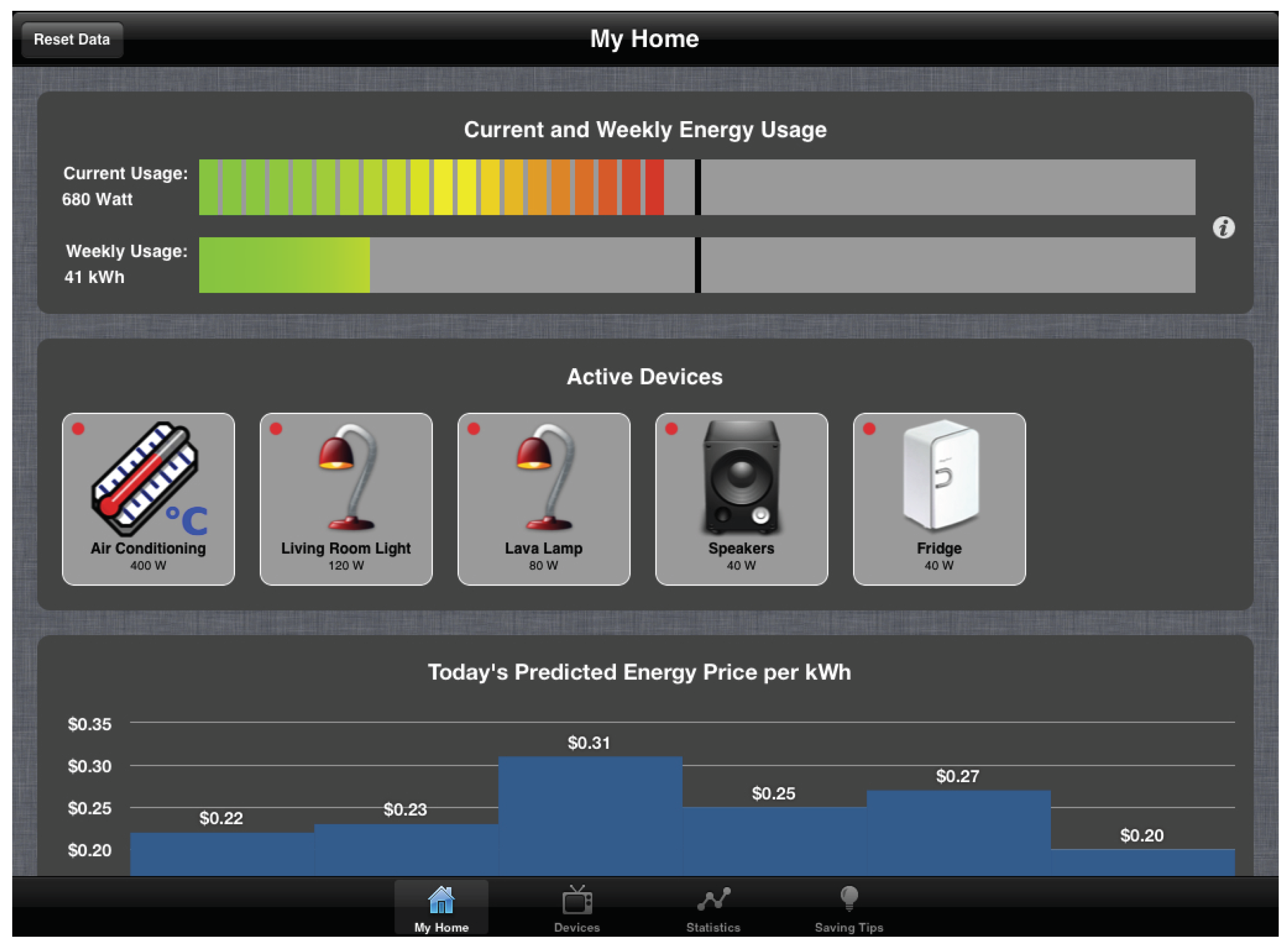
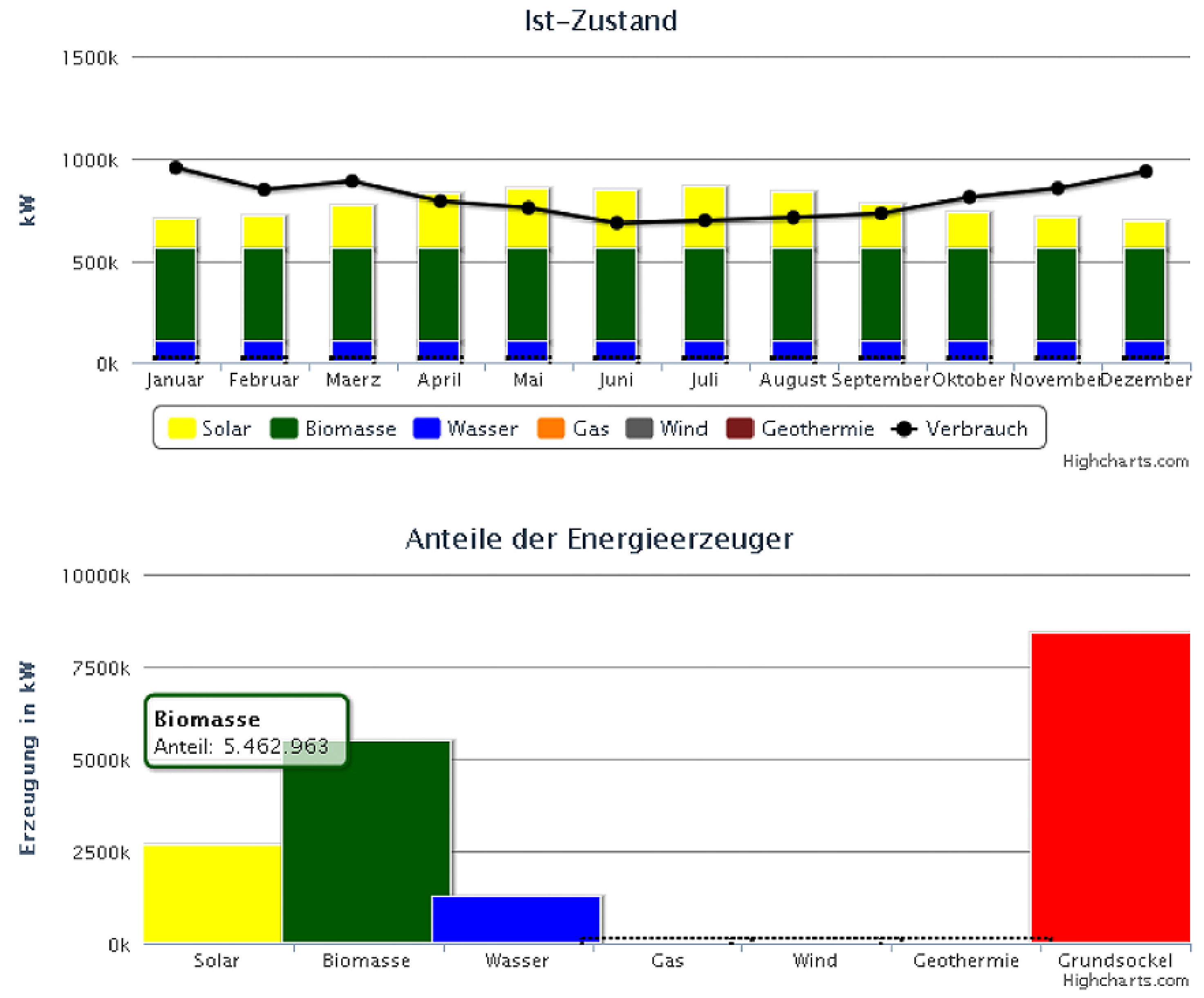
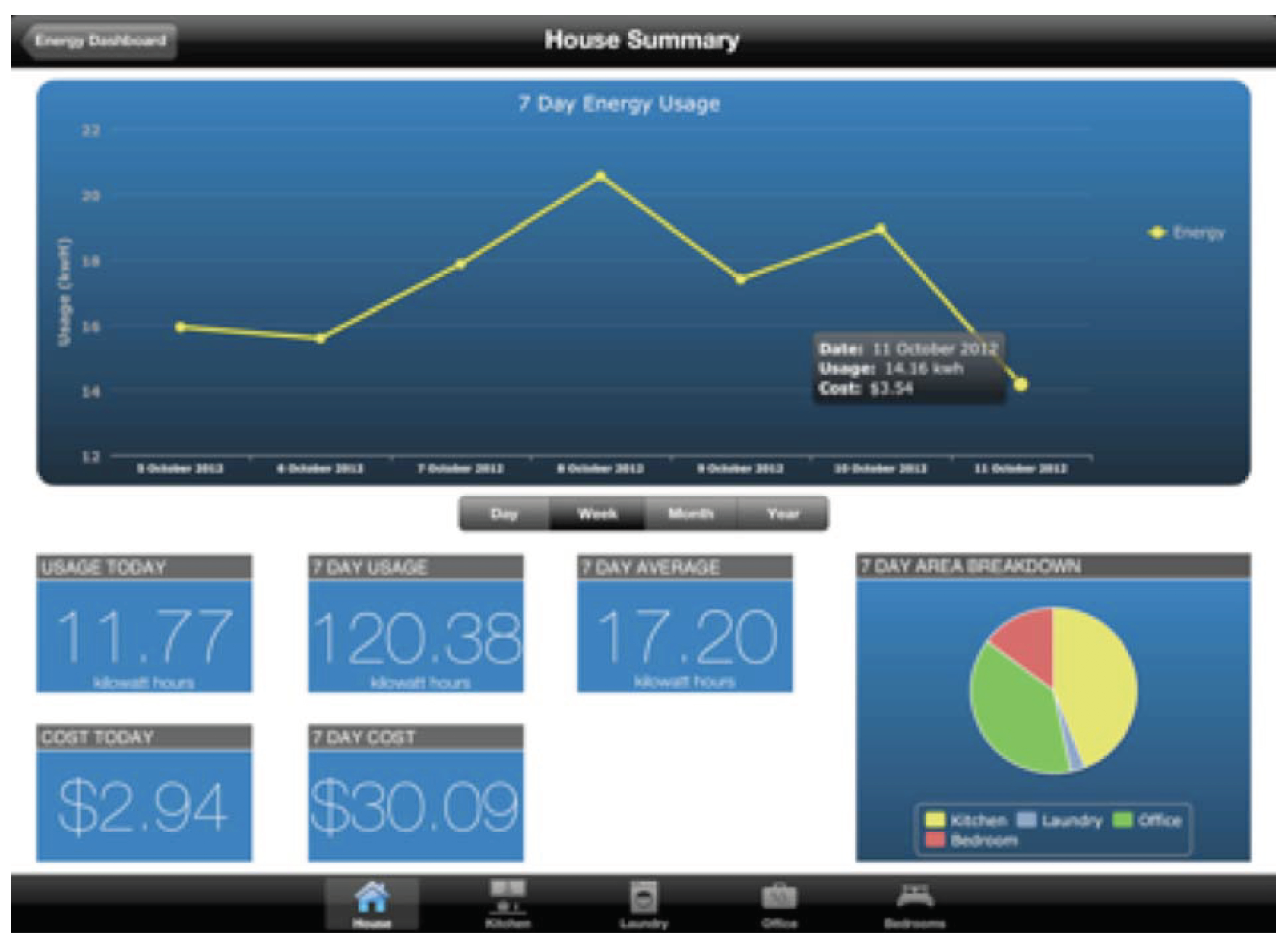
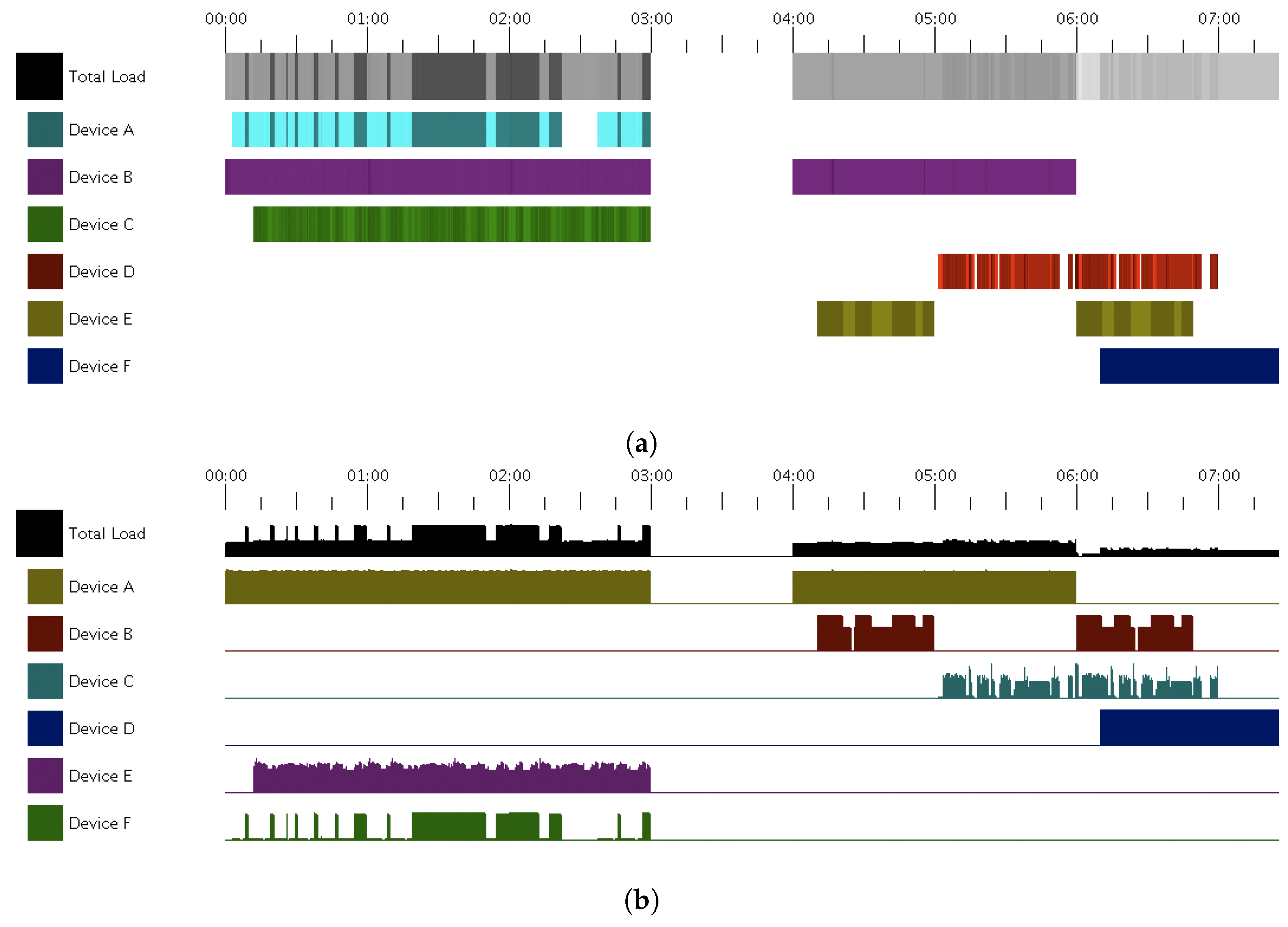
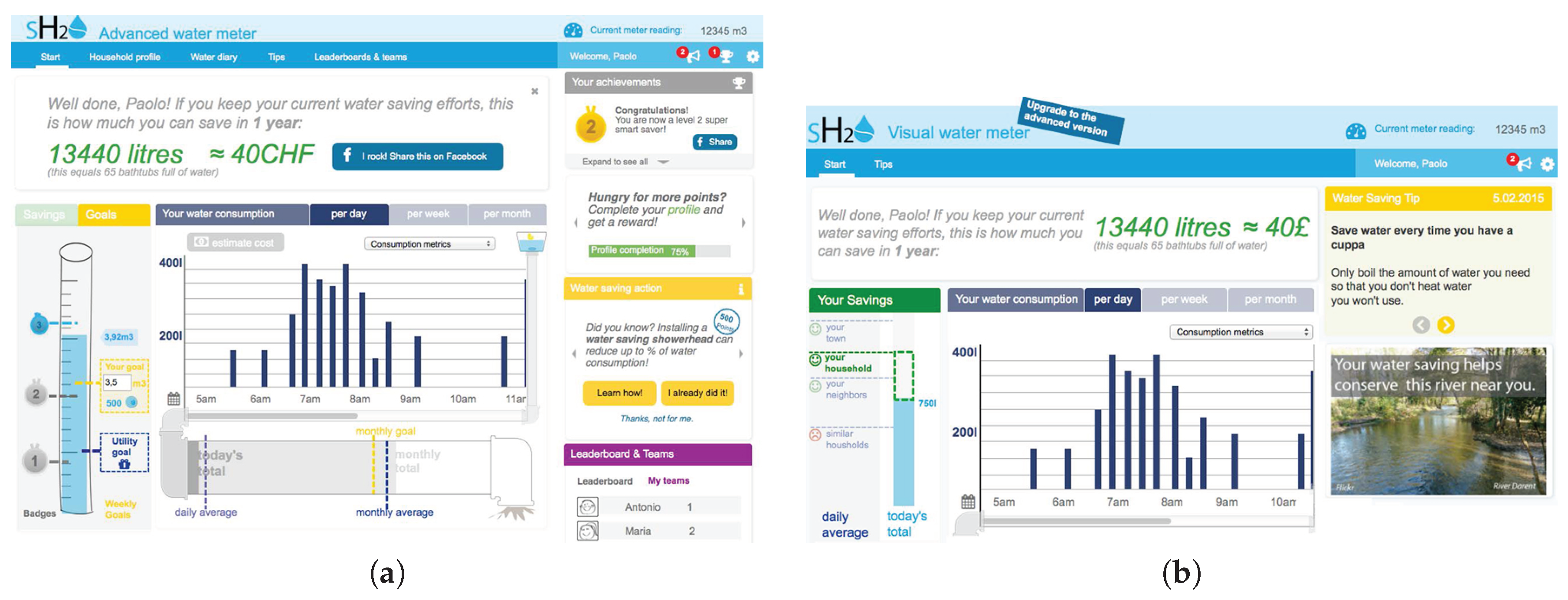
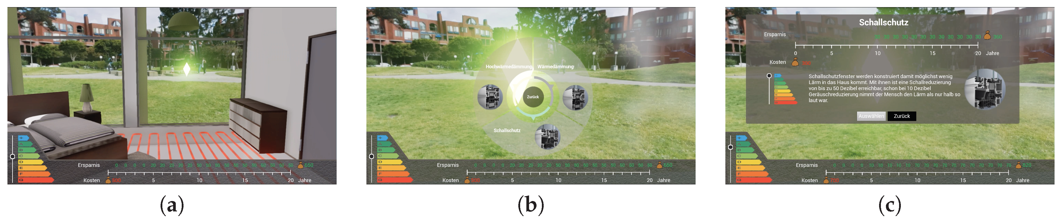
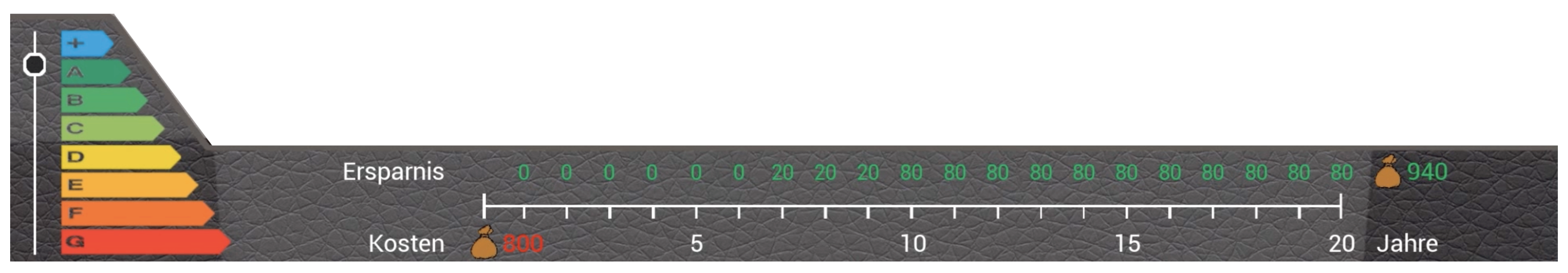
4.1. Charts and Graphs
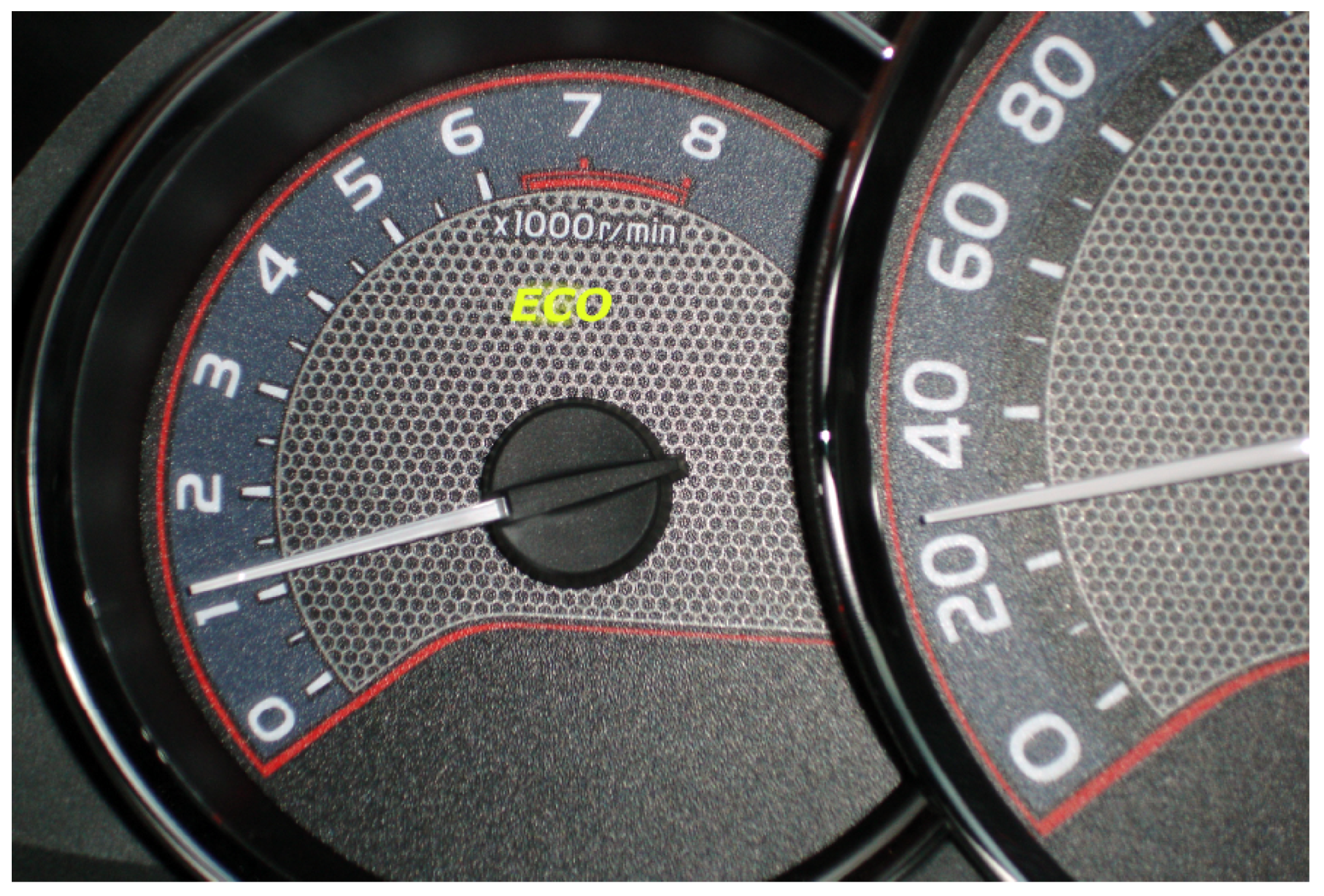
4.2. Energy Gauges
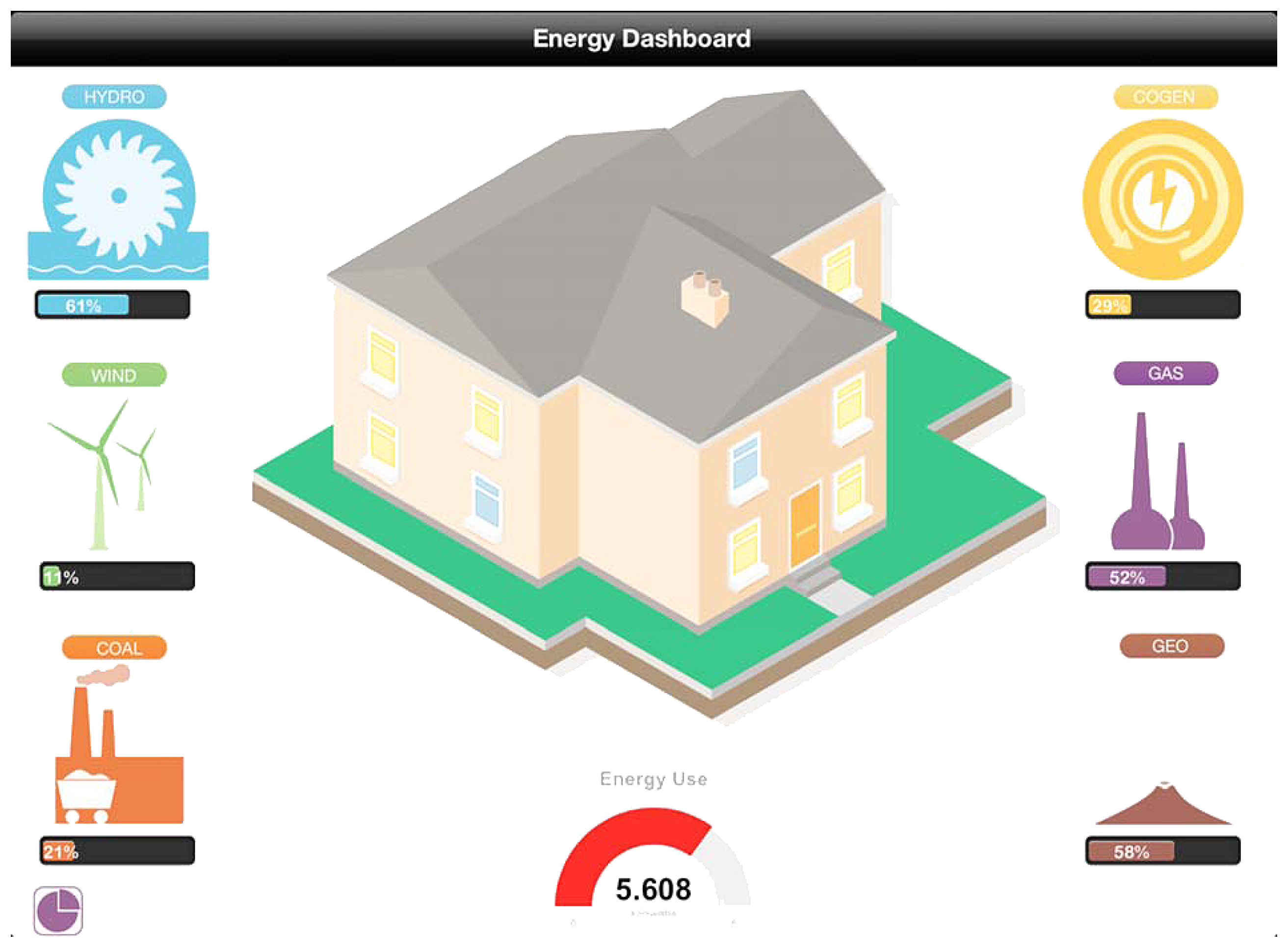
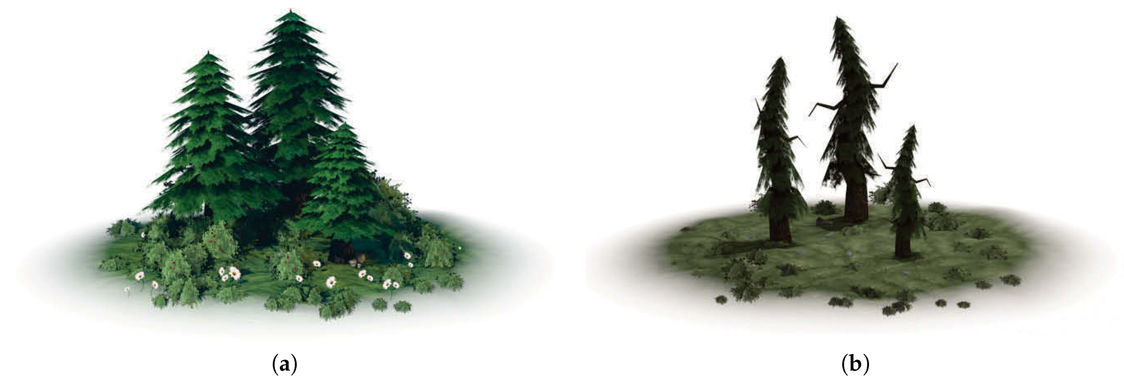
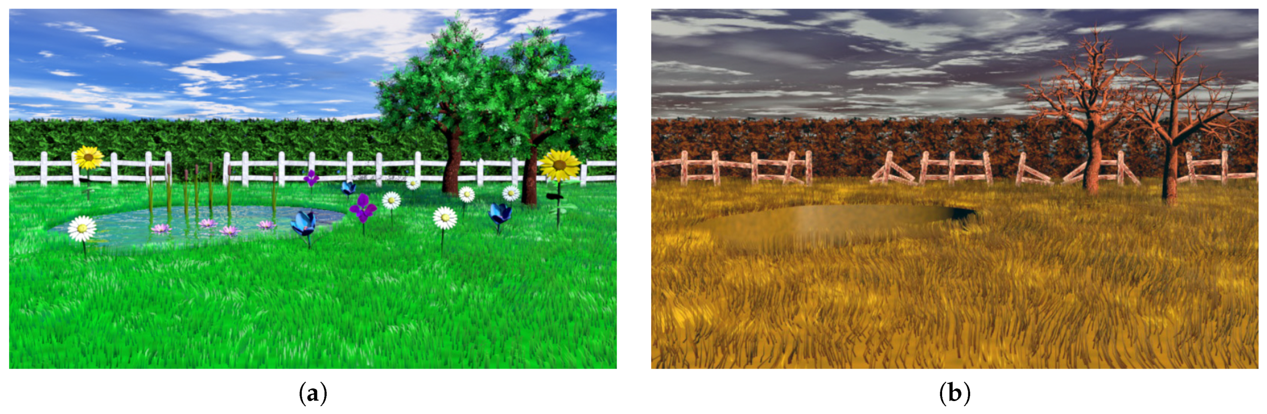
4.3. Eco-Visualizations
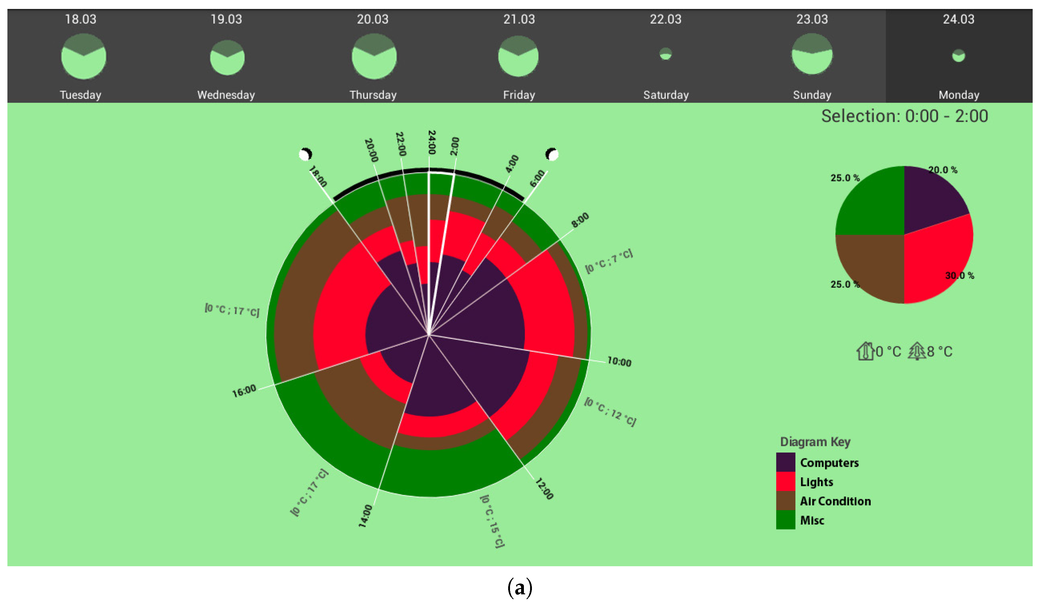
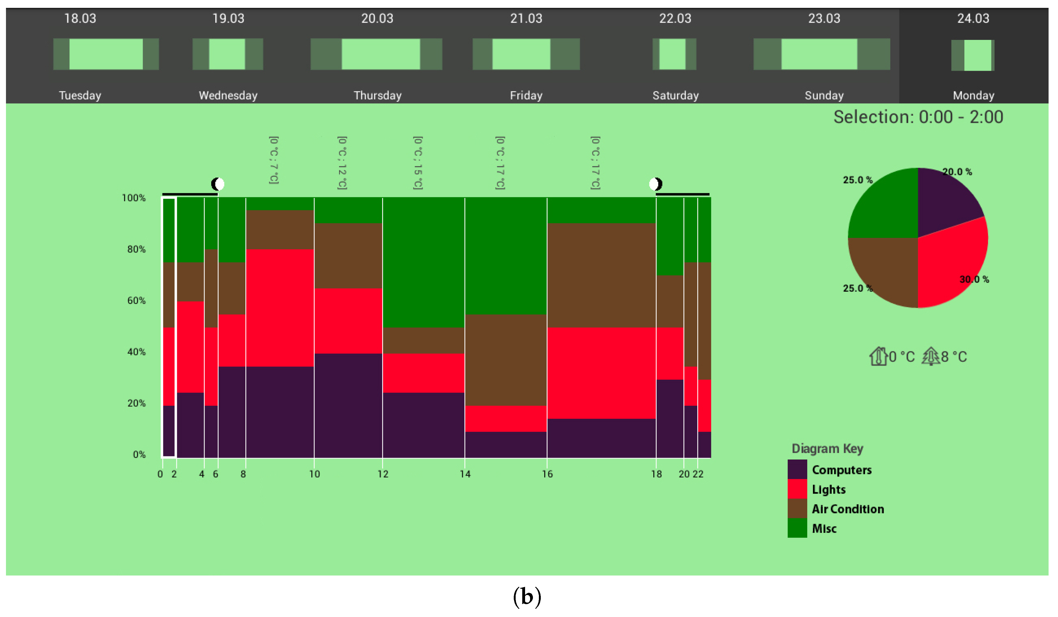
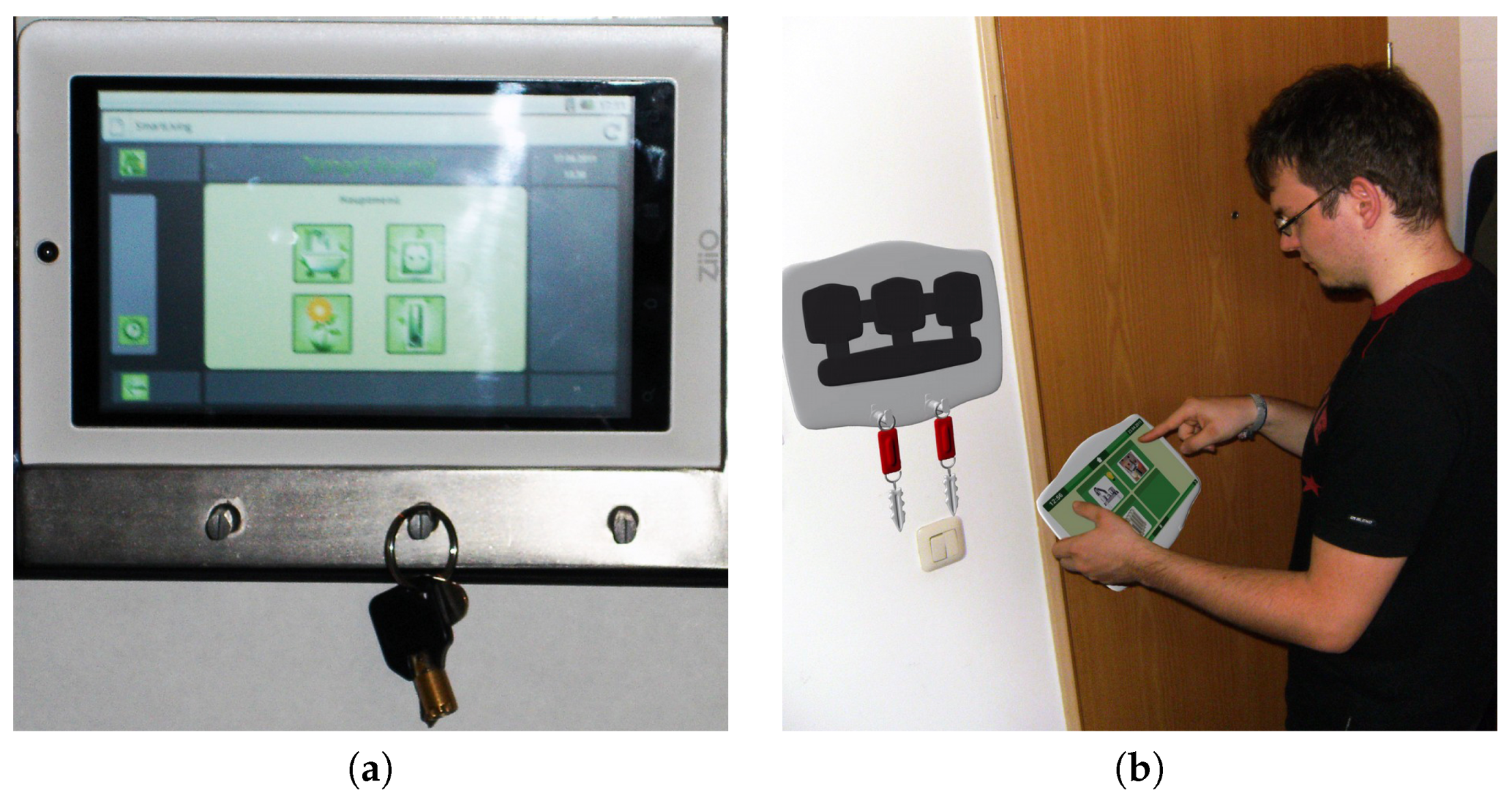
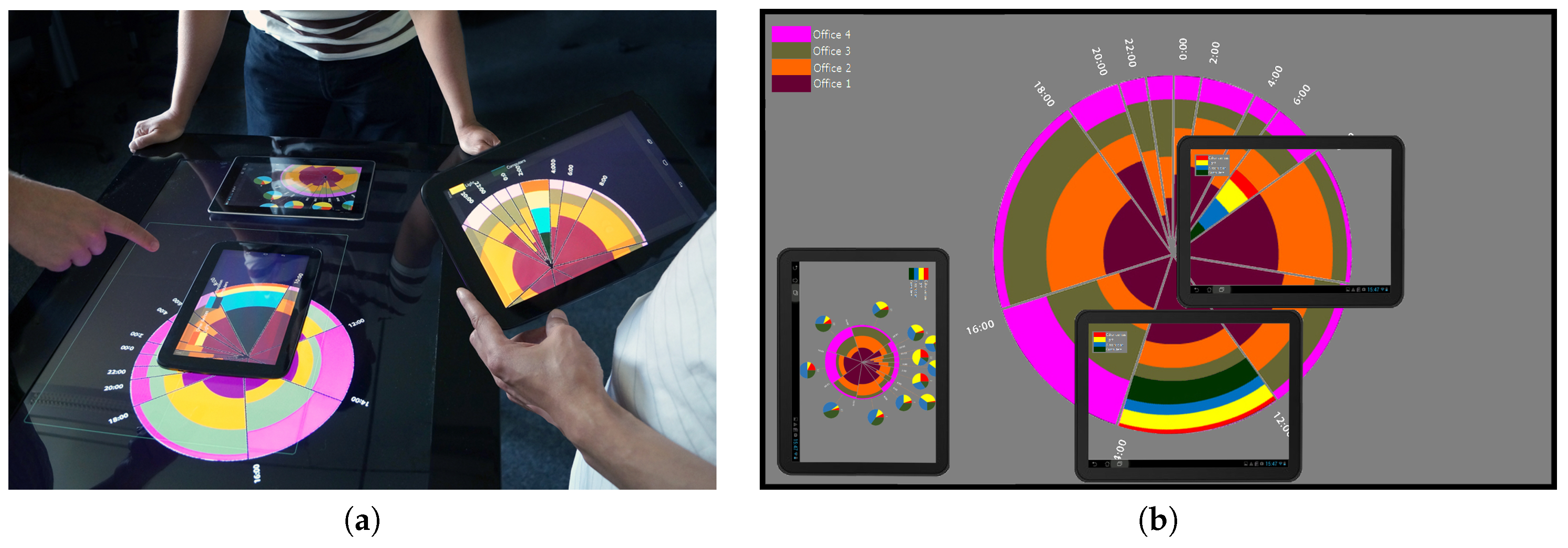
4.4. Visualizations for Analytics
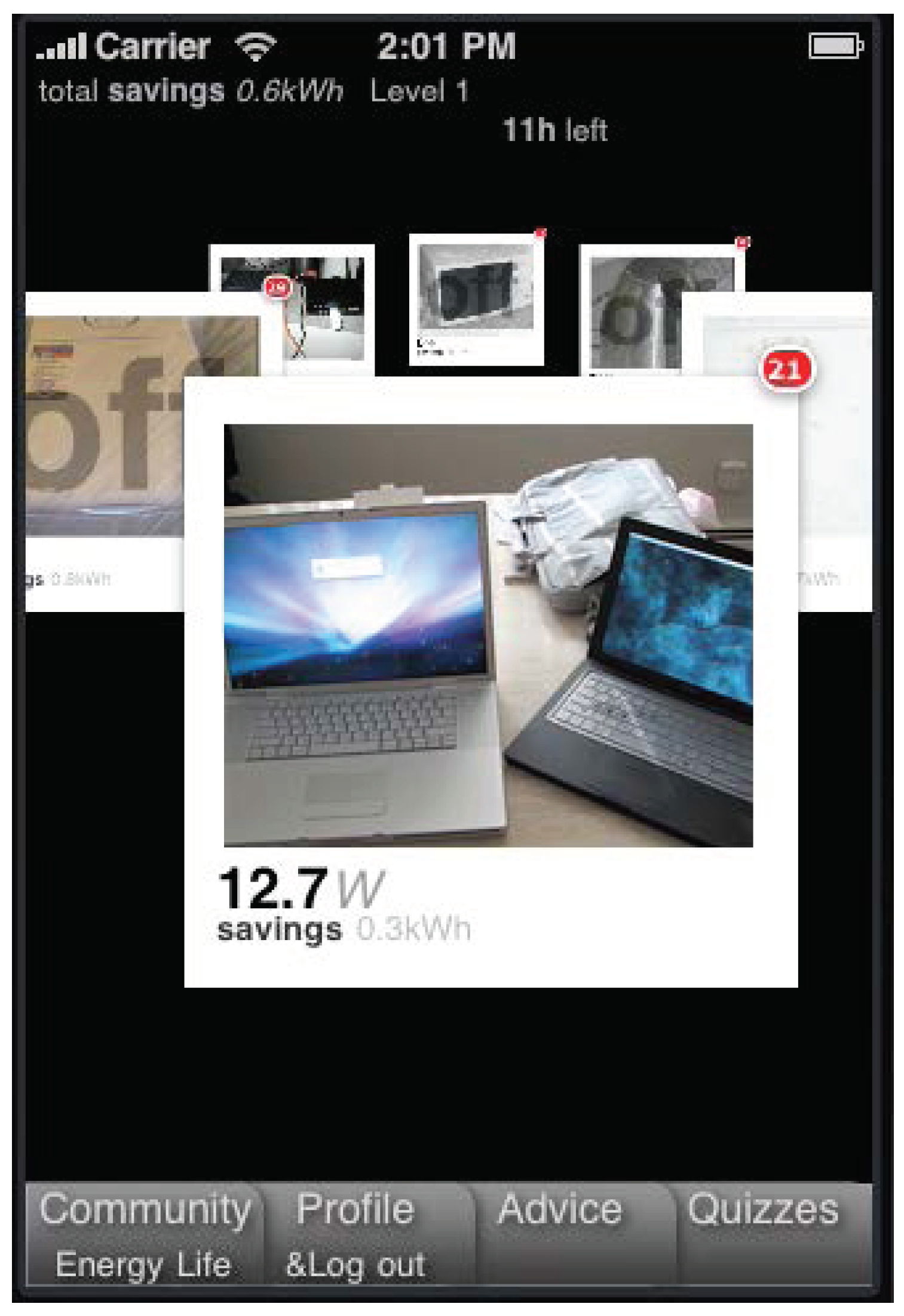
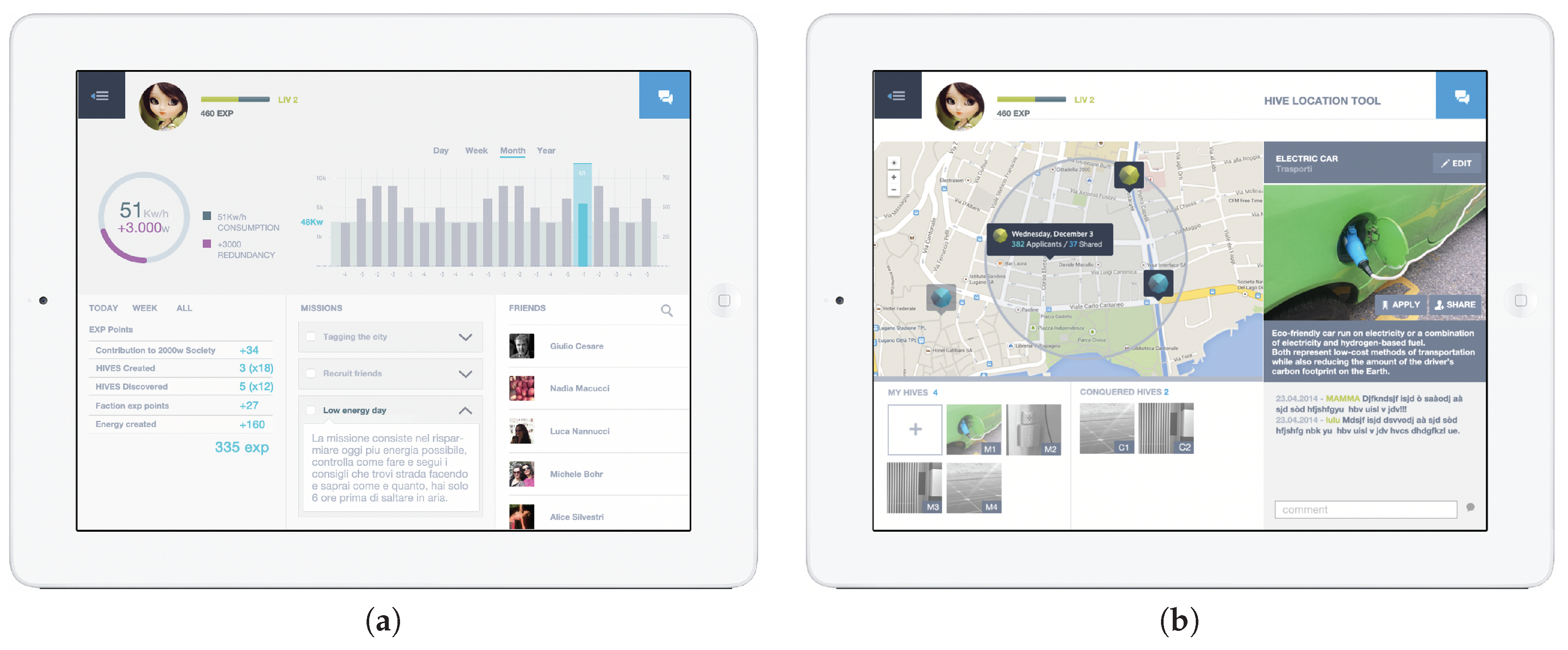
4.5. Gamified and Serious Game Visualizations
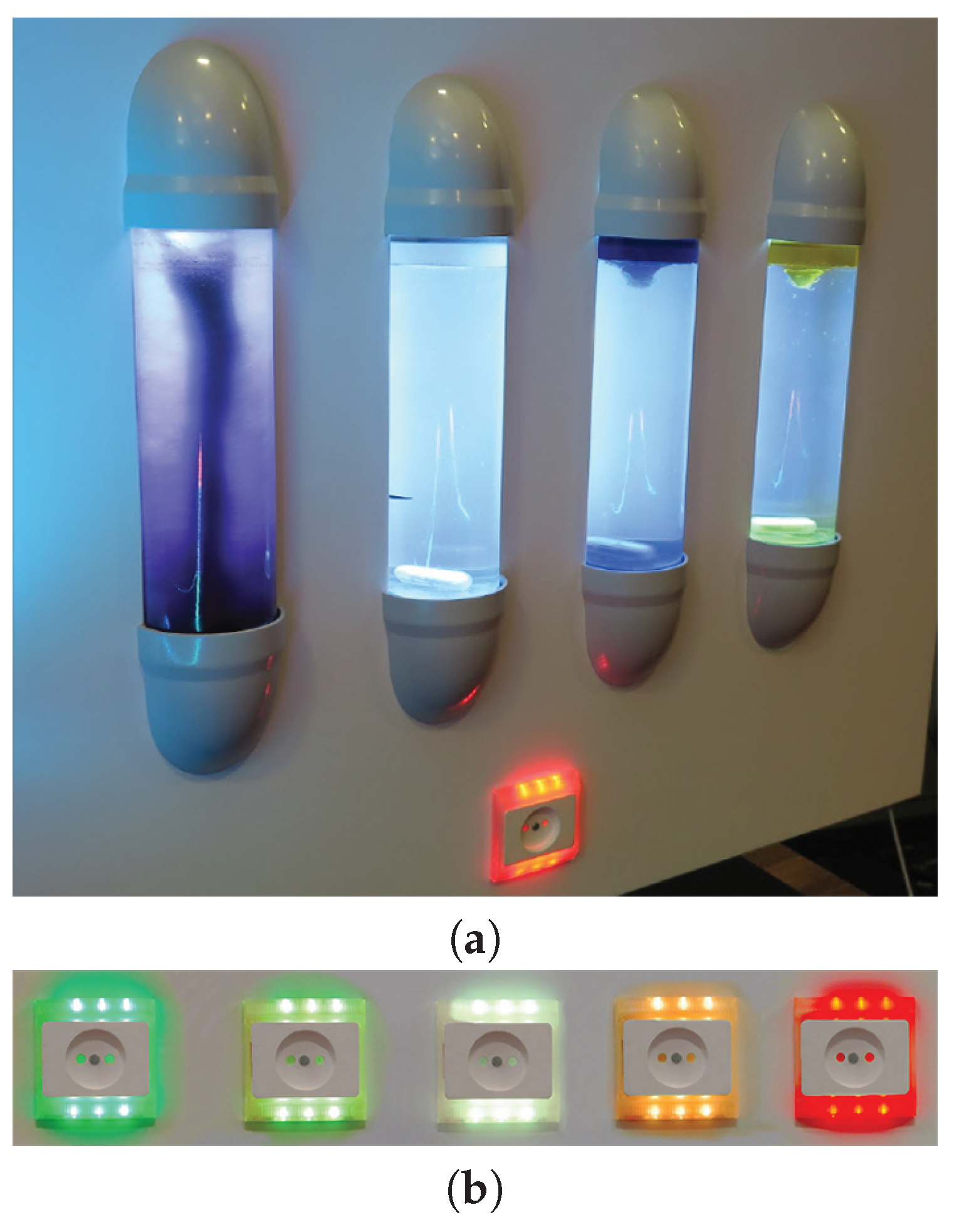
4.6. Ambient and Physical Visualizations
5. Discussion
6. Conclusions
Author Contributions
Funding
Conflicts of Interest
References
- Broms, L.; Katzeff, C.; Bång, M.; Nyblom, A.; Hjelm, S.I.; Ehrnberger, K. Coffee Maker Patterns and the Design of Energy Feedback Artefacts. In Proceedings of the 8th ACM Conference on Designing Interactive Systems (DIS ’10), Aarhus, Denmark, 16–20 August 2010; ACM: New York, NY, USA, 2010; pp. 93–102. [Google Scholar] [CrossRef]
- IT4SE. IT for Smart Renewable Energy Generation and Use. 2016. Available online: http://it4se.hs-augsburg.de/ (accessed on 3 July 2019).
- International Energy Agency. IEA Demand Side Management Programme. 2019. Available online: http://www.ieadsm.org/ (accessed on 3 July 2019).
- Herrmann, M.R.; Brumby, D.P.; Oreszczyn, T.; Gilbert, X.M.P. Does data visualization affect users’ understanding of electricity consumption. Build. Res. Inf. 2018, 46, 238–250. [Google Scholar] [CrossRef]
- Abrahamse, W.; Steg, L.; Vlek, C.; Rothengatter, T. A review of intervention studies aimed at household energy conservation. J. Environ. Psychol. 2005, 25, 273–291. [Google Scholar] [CrossRef]
- Abrahamse, W.; Steg, L.; Vlek, C.; Rothengatter, T. The effect of tailored information, goal setting, and tailored feedback on household energy use, energy-related behaviors, and behavioral antecedents. J. Environ. Psychol. 2007, 27, 265–276. [Google Scholar] [CrossRef]
- Darby, S. The Effectiveness of Feedback on Energy Consumption. 2006. Available online: https://www.eci.ox.ac.uk/research/energy/downloads/smart-metering-report.pdf (accessed on 3 July 2019).
- Fischer, C. Feedback on household electricity consumption: A tool for saving energy? Energy Eff. 2008, 1, 79–104. [Google Scholar] [CrossRef]
- Fitzpatrick, G.; Smith, G. Technology-Enabled Feedback on Domestic Energy Consumption: Articulating a Set of Design Concerns. IEEE Pervasive Comput. 2009, 8, 37–44. [Google Scholar] [CrossRef]
- Holmes, T.G. Eco-visualization: Combining Art and Technology to Reduce Energy Consumption. In Proceedings of the 6th ACM SIGCHI Conference on Creativity & Cognition (C&C ’07), Washington, DC, USA, 13–15 June 2007; ACM: New York, NY, USA, 2007; pp. 153–162. [Google Scholar] [CrossRef]
- Vine, D.; Buys, L.; Morris, P. The effectiveness of energy feedback for conservation and peak demand: A literature review. Open J. Energy Eff. 2013, 2, 7–15. [Google Scholar] [CrossRef]
- Froehlich, J.; Findlater, L.; Landay, J. The Design of Eco-feedback Technology. In Proceedings of the SIGCHI Conference on Human Factors in Computing Systems (CHI ’10), Atlanta, GA, USA, 10–15 April 2010; ACM: New York, NY, USA, 2010; pp. 1999–2008. [Google Scholar] [CrossRef]
- Masoodian, M.; André, E.; Kugler, M.; Reinhart, F.; Rogers, B.; Schlieper, K. USEM: A Ubiquitous Smart Energy Management System for Residential Homes. Int. J. Adv. Intell. Syst. 2014, 7, 519–532. [Google Scholar]
- Spence, A.; Goulden, M.; Leygue, C.; Banks, N.; Bedwell, B.; Jewell, M.; Yang, R.; Ferguson, E. Digital energy visualizations in the workplace: The e-Genie tool. Build. Res. Inf. 2018, 46, 272–283. [Google Scholar] [CrossRef]
- Kim, T.; Hong, H.; Magerko, B. Design requirements for ambient display that supports sustainable lifestyle. In Proceedings of the 8th ACM Conference on Designing Interactive Systems (DIS ’10), Aarhus, Denmark, 16–20 August 2010; ACM: New York, NY, USA, 2010; pp. 103–112. [Google Scholar] [CrossRef]
- Hargreaves, T.; Nye, M.; Burgess, J. Making energy visible: A qualitative field study of how householders interact with feedback from smart energy monitors. Energy Policy 2010, 38, 6111–6119. [Google Scholar] [CrossRef]
- Costanza, E.; Ramchurn, S.D.; Jennings, N.R. Understanding Domestic Energy Consumption Through Interactive Visualisation: A Field Study. In In Proceedings of the 2012 ACM Conference on Ubiquitous Computing (UbiComp ’12), Pittsburgh, PA, USA, 5–8 September 2012; ACM: New York, NY, USA, 2012; pp. 216–225. [Google Scholar] [CrossRef]
- Groenewegen, A. BJ Fogg Model Explained. 2018. Available online: https://suebehaviouraldesign.com/bj-fogg-model/ (accessed on 3 July 2019).
- Fogg, B.J.; Cueller, G.; Danielson, D. Motivating, Influencing, and Persuading Users: An Introduction to Captology. In The Human-Computer Interaction Handbook: Fundamentals, Evolving Technologies and Emerging Applications, 2nd ed.; Sears, A., Jacko, J.A., Eds.; CRC Press: Boca Raton, FL, USA, 2007; Chapter 7; pp. 133–147. [Google Scholar]
- Matthies, E. Wie können PsychologInnen ihr Wissen besser an die PraktikerIn bringen? Vorschlag eines neuen integratives Einflussschemas umweltbewussten Alltagshandelns. Umweltpsychologie 2005, 9, 62–81. [Google Scholar]
- Schwartz, S.H.; Howard, J.A. A Normative Decision-Making Model of Altruism. In Altruism and Helping Behavior: Social, Personality, and Developmental Perspectives; Rushton, P.J., Sorrentino, R.M., Eds.; Lawrence Erlbaum: Hillsdale, MI, USA, 1981; pp. 189–211. [Google Scholar]
- Google. PowerMeter Partner Resources. 2019. Available online: https://sites.google.com/site/powermeterpartners/Overview (accessed on 3 July 2019).
- Dawson-Haggerty, S.; Ortiz, J.; Jiang, X.; Hsu, J.; Shankar, S.; Culler, D. Enabling Green Building Applications. In Proceedings of the 6th Workshop on Hot Topics in Embedded Networked Sensors (HotEmNets ’10), Killarney, Ireland, 28–29 June 2010; ACM: New York, NY, USA, 2010; pp. 4:1–4:5. [Google Scholar] [CrossRef]
- Fehrenbacher, K. 5 Reasons Google PowerMeter Didn’T Take Off. 2011. Available online: https://gigaom.com/2011/06/26/5-reasons-google-powermeter-didnt-take-off/ (accessed on 3 July 2019).
- Google. Google-O-Meter Charts. 2012. Available online: https://developers.google.com/chart/image/docs/gallery/googleometer_chart (accessed on 3 July 2019).
- Google. Visualization: Gauge. 2019. Available online: https://developers.google.com/chart/interactive/docs/gallery/gauge (accessed on 3 July 2019).
- Murugesan, L.; Hoda, R.; Salcic, Z.; Verma, P. Policy Recommendations to Induce Behavioural Changes through Interactive Energy Visualisation. In Proceedings of the IEEE Innovative Smart Grid Technologies (ISGT Asia ’18), Singapore, 22–25 May 2018; pp. 1091–1096. [Google Scholar] [CrossRef]
- Reinhart, F.; Schlieper, K.; Kugler, M.; André, E.; Masoodian, M.; Rogers, B. Fostering Energy Awareness in Residential Homes Using Mobile Devices. In Proceedings of the 4th International Conference on Smart Grids, Green Communications and IT Energy-aware Technologies (ENERGY 2014), Chamonix, France, 20–24 April 2014; pp. 35–43. [Google Scholar]
- Apperley, M.; Kalyan, J. A Mobile Personal Residential Electricity Dashboard. In Proceedings of the 19th International Conference on Information Visualisation (IV ’15), Barcelona, Spain, 21–24 July 2015; pp. 195–199. [Google Scholar] [CrossRef]
- Sequeira, H.; Carreira, P.; Goldschmidt, T.; Vorst, P. Energy Cloud: Real-Time Cloud-Native Energy Management System to Monitor and Analyze Energy Consumption in Multiple Industrial Sites. In Proceedings of the 7th IEEE/ACM International Conference on Utility and Cloud Computing, London, UK, 8–11 December 2014; pp. 529–534. [Google Scholar] [CrossRef]
- Rodgers, J.; Bartram, L. Exploring Ambient and Artistic Visualization for Residential Energy Use Feedback. IEEE Trans. Vis. Comput. Graph. 2011, 17, 2489–2497. [Google Scholar] [CrossRef] [PubMed]
- Bartram, L. Design Challenges and Opportunities for Eco-Feedback in the Home. IEEE Comput. Graph. Appl. 2015, 35, 52–62. [Google Scholar] [CrossRef]
- FlowingData. 21 (Eco)Visualizations for Energy Consumption Awareness. 2008. Available online: https://flowingdata.com/2008/04/03/21-ecovisualizations-for-energy-consumption-awareness/ (accessed on 3 July 2019).
- Bühling, R. Ästhetisch Motivierte Gestaltung Als Persuasives Element in Interaktiven Medien. Ph.D. Thesis, Augsburg University, Augsburg, Germany, 2015. [Google Scholar]
- Rist, T. Towards a More Responsible Use of Energy through Visualization of Energy Data. In Proceedings of the Workshop on Fostering Smart Energy Applications through Advanced Visual Interfaces (FSEA ’14), Como, Italy, 27 May 2014; pp. 9–14. [Google Scholar]
- Tiefenbeck, V.; Goette, L.; Degen, K.; Tasic, V.; Fleisch, E.; Lalive, R.; Staake, T. Overcoming Salience Bias: How Real-Time Feedback Fosters Resource Conservation. Manag. Sci. 2018, 64, 1458–1476. [Google Scholar] [CrossRef] [Green Version]
- Olsen, C.S. Visualization of energy consumption: Motivating for a sustainable behaviour through social media. In Proceedings of the International Conference on Collaboration Technologies and Systems (CTS ’14), Minneapolis, MN, USA, 19–23 May 2014; pp. 641–646. [Google Scholar] [CrossRef]
- Masoodian, M.; Endrass, B.; Bühling, R.; Ermolin, P.; André, E. Time-Pie visualization: Providing Contextual Information for Energy Consumption Data. In Proceedings of the 17th International Conference on Information Visualisation (IV ’13), London, UK, 16–18 July 2013; pp. 102–107. [Google Scholar] [CrossRef]
- Masoodian, M.; Endrass, B.; Bühling, R.; Ermolin, P.; André, E. Visualization Support for Comparing Energy Consumption Data. In Proceedings of the 19th International Conference on Information Visualisation (IV ’15), Barcelona, Spain, 21–24 July 2015; pp. 28–34. [Google Scholar] [CrossRef]
- Itoh, T.; Kawano, M.; Kutsuna, S.; Watanabe, T. A Visualization Tool for Building Energy Management System. In Proceedings of the 19th International Conference on Information Visualisation (IV ’15), Barcelona, Spain, 21–24 July 2015; pp. 15–20. [Google Scholar] [CrossRef]
- Masoodian, M.; Buchwald, I.; Luz, S.; André, E. Temporal Visualization of Energy Consumption Loads Using Time-Tone. In Proceedings of the 21st International Conference Information Visualisation (IV ’17), London, UK, 11–14 July 2017; pp. 146–151. [Google Scholar] [CrossRef]
- Sato, I.; Diptarama; Shinohara, A. Visualization and Analysis of Electrical Energy Consumption in Laboratories. In Proceedings of the 5th IIAI International Congress on Advanced Applied Informatics (IIAI-AAI ’16), Kumamoto, Japan, 10–14 July 2016; pp. 509–512. [Google Scholar] [CrossRef]
- Costanza, E.; Ramchurn, S.D.; Jennings, N.R. FigureEnergy. 2012. Available online: https://vimeo.com/42328926 (accessed on 3 July 2019).
- Luz, S.; Masoodian, M.; Cesario, R.R.; Cesario, M. Using a serious game to promote community-based awareness and prevention of neglected tropical diseases. Entertain. Comput. 2016, 15, 43–55. [Google Scholar] [CrossRef] [Green Version]
- Seaborn, K.; Fels, D.I. Gamification in theory and action: A survey. Int. J. Hum.-Comput. Stud. 2015, 74, 14–31. [Google Scholar] [CrossRef]
- Paladin Studios. EnerCities. 2018. Available online: https://paladinstudios.com/enercities/ (accessed on 3 July 2019).
- 2020 Energy. Serious Games. 2019. Available online: http://www.2020energy.eu/en/serious-game (accessed on 3 July 2019).
- Siemens. Power Your World—Siemens Energy Introduces the New Browser Game Power Matrix. 2013. Available online: https://www.siemens.com/press/en/feature/2013/energy/2013-06-power-matrix.php (accessed on 3 July 2019).
- Jacucci, G.; Spagnolli, A.; Gamberini, L.; Chalambalakis, A.; Björkskog, C.; Bertoncini, M.; Torstensson, C.; Monti, P. Designing Effective Feedback of Electricity Consumption for Mobile User Interfaces. PsychNology J. 2009, 7, 265–289. [Google Scholar]
- Gustafsson, A.; Bång, M.; Svahn, M. Power explorer: A casual game style for encouraging long term behavior change among teenagers. In Proceedings of the International Conference on Advances in Computer Enterntainment Technology (ACE ’09), Athens, Greece, 29–31 October 2009; pp. 182–189. [Google Scholar] [CrossRef]
- De Luca, V.; Castri, R. The Social Power Game: A smart application for sharing energy-saving behaviours in the city. In Proceedings of the Workshop on Fostering Smart Energy Applications through Advanced Visual Interfaces (FSEA ’14), Como, Italy, 27 May 2014; pp. 27–30. [Google Scholar]
- Hedin, B.; Lundström, A.; Westlund, M.; Markström, E. The Energy Piggy Bank—A serious game for energy conservation. In Proceedings of the Sustainable Internet and ICT for Sustainability (SustainIT ’17), Funchal, Portugal, 6–7 December 2017; pp. 1–6. [Google Scholar] [CrossRef]
- Garcia-Garcia, C.; Terroso-Saenz, F.; Gonzalez-Burgos, F.; Skarmeta, A.F. Integration of serious games and IoT data management platforms to motivate behavioural change for energy efficient lifestyles. In Proceedings of the Global Internet of Things Summit (GIoTS ’17), Geneva, Switzerland, 6–9 June 2017; pp. 1–6. [Google Scholar] [CrossRef]
- Casals, M.; Gangolells, M.; Macarulla, M.; Fuertes, A.; Vimont, V.; Pinho, L.M. A serious game enhancing social tenants’ behavioral change towards energy efficiency. In Proceedings of the Global Internet of Things Summit (GIoTS ’17), Geneva, Switzerland, 6–9 June 2017; pp. 1–6. [Google Scholar] [CrossRef]
- Dimitriou, N.; Garbi, A.; Vasilakis, K.; Schoofs, A.; Taha, A.; Nikiforakis, M.; Kotsilitis, S. ChArGED: Implementing a framework for improving energy efficiency in public buildings through IoTenabled energy disaggregation and serious games. In Proceedings of the 2018 IEEE International Conference on Pervasive Computing and Communications Workshops (PerCom Workshops), Athens, Greece, 19–23 March 2018; pp. 65–70. [Google Scholar] [CrossRef]
- Anagnostopoulou, E.; Bothos, E.; Magoutas, B.; Schrammel, J.; Mentzas, G. Persuasive Technologies for Sustainable Mobility: State of the and Emerging Trends. Sustainability 2018, 10, 2128. [Google Scholar] [CrossRef]
- Cellina, F.; Bucher, D.; Veiga Simão, J.; Rudel, R.; Raubal, M. Beyond Limitations of Current Behaviour Change Apps for Sustainable Mobility: Insights from a User-Centered Design and Evaluation Process. Sustainability 2019, 11, 2281. [Google Scholar] [CrossRef]
- Micheel, I.; Novak, J.; Fraternali, P.; Baroffio, G.; Castelletti, A.; Rizzoli, A.E. Visualizing & Gamifying Water & Energy Consumption for Behavior Change. In Proceedings of the 15th IFIP TC.13 International Conference on Human-Computer Interaction (INTERACT 2015), Bamberg, Germany, 15 September 2015; pp. 555–564. [Google Scholar]
- Klebow, B.; Purvins, A.; Piira, K.; Lappalainen, V.; Judex, F. EEPOS automation and energy management system for neighbourhoods with high penetration of distributed renewable energy sources: A concept. In Proceedings of the IEEE International Workshop on Intelligent Energy Systems (IWIES), Vienna, Austria, 14 November 2013; pp. 89–94. [Google Scholar] [CrossRef]
- EEPOS Project. EEPOS Virtual Demonstrator Langenfeld Is Now Operational. 2015. Available online: http://eepos-project.eu/news/ (accessed on 3 July 2019).
- Rist, T.; Willam, M.; Herpich, M.; Masoodian, M. Illustrating Energy Related Properties of Buildings Using an Interactive 3D-InfoKit. In Proceedings of the 8th International Conference on Sustainability in Energy and Buildings (SEB 2016), Turin, Italy, 11–13 September 2016. KES Series in Smart Innovation, Systems and Technologies. [Google Scholar]
- Broms, L. Storyforming: Experiments in Creating Discursive Engagements between People, Things and Environments. Ph.D. Thesis, KTH, Product and Service Design, Green Leap, Stockholm, Sweden, 2014. [Google Scholar]
- Quintal, F.; Jorge, C.; Nisi, V.; Nunes, N.J. Watt-I-See: A Tangible Visualization of Energy. In Proceedings of the International Working Conference on Advanced Visual Interfaces (AVI ’16), Bari, Italy, 7–10 June 2016; pp. 120–127. [Google Scholar] [CrossRef]
- Quintal, F.; Barreto, M.; Jorge, C.; Nisi, V.; Nunes, N.J. Watt-I-See: Design and Evaluation of an Interactive Installation Using Eco-feedforward Strategies. Interact. Comput. 2018, 30, 31–45. [Google Scholar] [CrossRef]
- Jorge, C.; Quintal, F.; Nunes, N.J.; Nisi, V. Watt-I-See: Probing Future Distributed Energy Scenarios. In Proceedings of the 15th IFIP TC13 Conference on Human-Computer Interaction (FSEA ’15), 2015, Bamberg, Germany, 15 September 2015; INTERACT Workshop on Fostering Smart Energy Applications through Advanced Visual Interfaces. pp. 605–612. [Google Scholar]
- Rist, T.; Wendzel, S.; Masoodian, M.; André, E. Next-Generation Home Automation Systems. In Usability Day X; Intelligent Wohnen: Dornbirn, Austria, 1 June 2012; pp. 80–87. [Google Scholar]
- Dang, C.T.; Masoodian, M.; André, E. Private Focus Portals to Shared Energy Visualizations. In Proceedings of the 15th IFIP TC13 Conference on Human-Computer Interaction (FSEA ’15), INTERACT Workshop on Fostering Smart Energy Applications through Advanced Visual Interfaces, Bamberg, Germany, 15 September 2015; pp. 585–594. [Google Scholar]
- Hargreaves, T. Beyond energy feedback. Build. Res. Inf. 2018, 46, 332–342. [Google Scholar] [CrossRef]
- Wittenburg, K.; Laughman, C.; Nikovski, D.; Sahinoglu, Z. Advanced Visual Interfaces for Smart Energy: Focusing Where it Matters Most. In Proceedings of the Workshop on Fostering Smart Energy Applications through Advanced Visual Interfaces (FSEA ’14), Como, Italy, 27 May 2014; pp. 31–34. [Google Scholar]


| Visualization Category | Surveyed Visualizations | Behavior Change Factors | ||
|---|---|---|---|---|
| Motivation | Trigger | Ability | ||
| Charts and Graphs † | [22,23,30] | √ | ||
| [28] | √ | √ | √ | |
| Energy Gauges † | [25,26,27,29] | √ | ||
| [30] | √ | √ | ||
| [28] | √ | √ | √ | |
| Eco-Visualizations | [10,34,35,37,55] | √ | ||
| [15,36] | √ | √ | ||
| Visualizations for Analytics | [17,29,35,38,39,40,41,42,43] | √ | √ | |
| Gamified and Serious Game Visualizations | [50,51,58,59,60] | √ | ||
| [46,47,49,52,53,54,61] ‡ | √ | √ | ||
| [55,57] | √ | √ | √ | |
| Ambient and Physical Visualizations | [62,66,67] | √ | ||
| [63,64,65] | √ | √ | √ | |
© 2019 by the authors. Licensee MDPI, Basel, Switzerland. This article is an open access article distributed under the terms and conditions of the Creative Commons Attribution (CC BY) license (http://creativecommons.org/licenses/by/4.0/).
Share and Cite
Rist, T.; Masoodian, M. Promoting Sustainable Energy Consumption Behavior through Interactive Data Visualizations. Multimodal Technol. Interact. 2019, 3, 56. https://doi.org/10.3390/mti3030056
Rist T, Masoodian M. Promoting Sustainable Energy Consumption Behavior through Interactive Data Visualizations. Multimodal Technologies and Interaction. 2019; 3(3):56. https://doi.org/10.3390/mti3030056
Chicago/Turabian StyleRist, Thomas, and Masood Masoodian. 2019. "Promoting Sustainable Energy Consumption Behavior through Interactive Data Visualizations" Multimodal Technologies and Interaction 3, no. 3: 56. https://doi.org/10.3390/mti3030056
APA StyleRist, T., & Masoodian, M. (2019). Promoting Sustainable Energy Consumption Behavior through Interactive Data Visualizations. Multimodal Technologies and Interaction, 3(3), 56. https://doi.org/10.3390/mti3030056