Article

A Comparative Study of Skeuomorphic and Flat Design from a UX Perspective

by
Konstantinos Spiliotopoulos
1,
Maria Rigou
2,* and
Spiros Sirmakessis
3
1
School of Science and Technology, Hellenic Open University, Parodos Aristotelous 18, 26335 Patra, Greece
2
Department of Computer Engineering and Informatics, University of Patras, 26504 Patras, Greece
3
Computer and Informatics Engineering Department, Western Greece University of Applied Sciences (TEI of Western Greece), Meg. Alexandrou 1, 26334 Patra, Greece
*
Author to whom correspondence should be addressed.
Multimodal Technol. Interact. 2018, 2(2), 31; https://doi.org/10.3390/mti2020031
Submission received: 30 April 2018 / Revised: 22 May 2018 / Accepted: 30 May 2018 / Published: 4 June 2018
(This article belongs to the Special Issue Interactive Web)

Abstract

:
A key factor influencing the effectiveness of a user interface is the usability resulting from its design, and the overall experience generated while using it, through any kind of device. The two main design trends that prevail in the field of user interface design is skeuomorphism and flat design. Skeuomorphism was used in UI design long before flat design and it is built upon the notion of metaphors and affordances. Flat design is the main design trend used in most UIs today and, unlike skeuomorphic design, it is considered as a way to explore the digital medium without trying to reproduce the appearance of the physical world. This paper investigates how users perceive the two design approaches at the level of icon design (in terms of icon recognizability, recall and effectiveness) based on series of experiments and on data collected via a Tobii eye tracker. Moreover, the paper poses the question whether users perceive an overall flat design as more aesthetically attractive or more usable than a skeuomorphic equivalent. All tested hypotheses regarding potential effect of design approach on icon recognizability, task completion time, or number of errors were rejected but users perceived flat design as more usable. The last issue considered was how users respond to functionally equivalent flat and skeuomorphic variations of websites when given specific tasks to execute. Most tested hypotheses that website design affects task completion durations, user expected and experienced difficulty, or SUS (System Usability Scale) and meCUE questionnaires scores were rejected but there was a correlation between skeuomorphic design and increased experienced difficulty, as well as design type and SUS scores but not in both websites examined.

1. Introduction

A key factor influencing the effectiveness of a user interface (UI) is the usability resulting from its design, and the overall experience generated while using it, referring to a desktop, or a web or mobile application. In the last years there has been a silent “battle” between the two main interface design philosophies, flat design and skeuomorphic, with flat design currently featuring as the prevailing trend. Flat design is a design methodology that highlights simplicity by concentrating on bright colors, clean lines and 2D illustration techniques [1], while skeuomorphism comes from the notion of the skeuomorph, which is “a derivative object that retains ornamental design cues from structures that were necessary in the original” ([2], p. 107). In UI design, skeuomorphism uses metaphors of real life and deploys gradients, shadows, ornate details and textures to mimic the real-world object represented. Skeuomorphic designs are intended to help users understand how to use a new interface by allowing them to apply their prior knowledge about the real-world objects it contains.

1.1. Skeuomorphism

The Oxford dictionary [3] provides a generic definition alongside with the origins of the word, which seems to go back in the 19th century: “…from Greek skeuos container, implement + morphē form”. It describes an object or feature that imitates the design of a similar artefact made from another material. In the computing domain (again according to the Oxford dictionary) a skeuomorphic element is defined as “an element of a graphical user interface which mimics a physical object”. For example, note-taking apps that mimic post-it notes to recreate the affordances of the real world.
Skeuomorphism was used in UI design long before flat design and it is commonly used not only when creating UIs but in many design fields including architecture, ceramics and interior design [4]. When it comes to a UI, skeuomorphism is generally aimed at creating a three-dimensional effect on a flat surface. This could be a button, which attempts to mimic the effect of depth from the physical world and appears to be raised until the moment that the user will tap on it and it will then lower as if it was pressed in the real world. Further, a skeuomorphic approach could include a page-turning movement or the sound of a camera shutter when capturing a picture [5].
Skeuomorphism is built upon the notion of metaphors and along with them comes the notion of affordances. An affordance is a situation where an object’s sensory characteristics intuitively imply its functionality and use [6]. Borowska [7] argued that skeuomorphism is not only a visual imitation of an object but the functionality of an object as well. For instance, a navigation bar that uses a metal texture, shadows and further extensive details is not skeuomorphic design. Affordance has been defined and approached in numerous ways in the related literature. Even though there seems to be no clear agreement, Gibson’s [8] suggestion focuses on the idea that an object either comes with specific affordances or not, and prior knowledge or cognitive ability is irrelevant to it. The main difference between Gibson and Norman [9] is that Norman believed affordances can be based on prior knowledge and cognitive ability. Later, he revisited the definition and used the term of perceived affordance.
Tracing back the history of skeuomorphism in UI design, one of the most well-known examples is the desktop metaphor introduced by Alan Kay in 1970. However, according to Thomas Brand [10], one should go even further back than that, to the introduction of the Macintosh, as “before the Mac there was no skeuomorphism, because there was no graphical user interface”. It is evident that interfaces such as the Classic Calculator, Apple CD Audio Player and the famous iTunes prove that this design trend has been around for a long time even though it has evolved according to user needs.
More recently, it was Apple again that revived skeuomorphism when they introduced the original iPhone in 2007. Skeuomorphism, which had been previously used in visual design, was adopted in interaction design to help users that were not familiar with touch screens. Designers used metaphors of real life to make sure users would understand how to use the applications and the UI elements (e.g., speed dials, a bookshelf icon for the Newsstand app) [11].

1.2. Flat Design

The term flat design is used to describe the style in which the elements lose their stylistic characters such as shadows, textures, gradients and anything which would create the sense of depth on the interface. The characteristics that classify an interface design as flat comprise [12]:
  • No added effects: The main element which distinguishes flat design is the lack of effects which would give the sense of a third dimension. Basically, flat design dictates two-dimensional shapes with a clear sense of hierarchy.
  • Simple elements: The philosophy behind flat design is the simplicity of it, and this also applies for the partial elements that the interface consists of: buttons and icons are placed in circular or square shapes, in a very simplistic manner and without a lot of in-design explanation. In contrast, the colors used are usually bold, to make interactive elements stand out.
  • Focus on typography: The fact that flat design is simple makes typography one of the key elements when it comes to interactivity. The selected tone of typefaces should be able to match the selected design scheme. In a way, typography should direct and guide users on how to use the interface.
  • Focus on color: Color plays a catalytic role in flat design. Color palettes used are brighter and more colorful, containing many more hues, with retro colors being part of the trend.
  • Minimalistic approach: Flat design provides simplicity and minimalism to the overall design and the user experience. It reduces the number of extra elements and prioritizes keeping everything as simple as possible, without additional visuals (but allowing simple photography).
According to Turner [13], almost anything displayed on the web has basically been inspired from print and art ancestries. Flat design is believed to have been influenced by the Swiss style, which focused on the use of grid, clean content hierarchy and typography. Although the Swiss style was the dominant design back in the 1940s and 1950s, it was also found in Germany in the 1920s.
In the digital world, the first case of flat design applied was the release of Zune by Microsoft in late 2006, in an effort to compete with Apple’s iPod. Later, in 2010, Windows Phone 7 also inherited the style of large, bright, grid-like shapes and soon called it “Metro” design. Microsoft’s design documentation referred to its new style as “authentically digital”, a phrase that neatly captures the appeal of flat design for many designers. A similar design was also adapted by Apple in 2013, when they released iOS 7, leaving behind skeuomorphism for a “flatter” design approach.
Flat design is the main design trend used in most UIs today. Unlike skeuomorphic design, flat design was seen as a way to explore the digital medium without trying to reproduce the appearance of the physical world. The flattening of Apple’s homepage provides a useful benchmark for the growth of the trend’s popularity. Skeuomorphism and realism had long been trademarks of Apple design, and its homepage resisted the flat trend until 2013 [14].
It is interesting, however, that flat design has been gaining momentum recently considering that it is only in the past few years that 3D has become simple to emulate on the web, with browser support for shadows and gradients becoming standard and uniform. While flat design has been rising, researchers have been trying to identify how it performs against skeuomorphism, which had taken over UIs for ages. Oswald and Kolb [15] focused on the effects on learnability and image attributions each approach has in digital product interfaces. Page [16] studied the future directions in mobile device UI design education, answering whether skeuomorphism still has a place in UI design. Lindh [17] investigated whether the dominating skeuomorphic paradigm in designing software music synthesizers offers usability, accessibility and intuitiveness, when compared to a flat design equivalent. Hou and Ho [18] concluded that, contrary to initial expectations of researchers, in their study on app icon design, Taiwanese users preferred skeuomorphic icons over flat ones in 75:25 proportion. The choice between flat design and skeuomorphism has raised many contradictions in the web design and usability domain and, despite the current trend towards flat design, there is strong opposition. Bradley [19] argued that the Web is not Print; it does not come with the fixed dimension of print; and it can offer more than a flat piece of paper. The flat design approach should be based on rational design decisions and not rely exclusively on the luck of depth. Debus [20] claimed that iOS 7’s and Windows 8’s versions of flat design often sacrifice usability and well-established design best practices for flatness. Gross et al. [21] examined skeuomorphs from the scope of tangible interaction design and argued that skeuomorphs are far from being limited to mere sensual metaphors and they can revolutionize design by contributing to materiality, user experience and style. The study conducted by Li et al. [22] concluded that flat icons scored higher on semantic scales such as “timeliness” and “simplicity”, but they fared worse than realistic icons in “identity”, “interest” and “familiarity” aspects. Stickel et al. [23] investigated the implications of skeuomorphic vs. flat design for interface design and their findings suggest that flat design must tackle the problem of missing information due to simplification and should put careful focus on the semantics of the used elements. In addition, Burmistrov et al. [24] stated that, according to their study, flat design means higher cognitive load, longer performance times and more errors and should be reconsidered using research findings and practice of HCI and usability engineering. More recently, Meyer [25], in an eye tracking experiment comparing different kinds of clickability clues, argued that flat UI elements attract less attention and cause uncertainty due to weak signifiers that required more user effort. Zhang et al. [26] concluded that, in their experimental study, skeuomorphic icons had higher identification accuracy and faster efficiency than flat icons. The cognition validity of flat icons was lower than skeuomorphic ones and users liked both forms of icons, but skeuomorphic icons seemed advantageous.
This paper investigates how users perceive the two design approaches (i.e., flat versus skeuomorphic) in icon design in terms of icon recognizability, recall and effectiveness and whether the aesthetics of the two design approaches affect their perceived and experienced usability as well as task execution durations by testing UI alternatives (i.e., flat and skeuomorphic) offering the exact same functional options. The rest of the paper is organized as follows: Section 2 presents the methodological approach adapted for conducting the tests describing participants’ profiles, the eye tracking equipment used and the design of the experimental process for all three experiments. Section 3 presents the collected data along with their analysis and findings. Section 4 summarizes and discusses the findings, and concludes.

2. Materials and Methods

The choice and the number of participants in the experimental process play a catalytic role in the findings, their analysis and interpretation and the ability to measure metrics such as learning time, efficiency, subjective satisfaction, error rates or recall. Concerning the number of participants, it must be at least twenty [27] and this is also supported by Faulkner [28], who noted that in studies designed to discover errors five participants identified on average 85.55% of existing errors while twenty participants identified 98.4%. It is worth noting that, for comparative studies of alternative UI designs, there are numerous approaches by researchers to determine the necessary number of participants that allow for statistically significant results. The range proposed is between eight and twenty-five participants, with most researchers suggesting that ten to twelve participants constitute a reliable test user population [29]. In this study, the total number of participants is twenty, comprising ten male and ten female users to have a balanced sample. Furthermore, participant ages ranged from 20 to 41 years with the average age of 29 years.
Through the participation form we collected information related to prior experience with computers and the internet in general, as well as users’ educational background. More specifically, 15% of participants were high school graduates, 40% had a university degree, 30% also had a master’s degree, and 15% held a PhD. Participants also stated whether they considered themselves experienced or novice computer users. The user sample consisted of ten (50%) experienced users and ten novices (50%).

2.1. Equipment

The tests were conducted in an adequately arranged usability lab using the Tobii T120 eye tracker with the supporting Tobii Studio software (version 3.2.0). Users were seated in the testing room and used the computer that ran the Tobii Studio Logger, while the test moderator used the Live Viewer software on a PC in a room attached to the testing room that allowed him to talk to users and respond to questions and remarks (inspection room).
The eye tracker is a commonly used device in studies about usability. By detecting eye movements, it records the detailed visual path comprising sequences of fixation points and saccades and provides statistical data, such as how many times, or for how long the user focused in a specific area of the screen. Information can be visualized as:
  • A visual path (or gazeplot) depicts the actual eye movements in the form of fixation points followed by saccades. The point of eye focus (fixation point) is represented by a circle placed on the current screen contents. The diameter of the circle is analogous to the focus duration.
  • A heat map colors areas of eye focus in different color according to the number of fixations in it and their duration (results are presented as a thermal map with areas of high visual interest in red, areas of intermediate interest in yellow and areas of low interest in green).
  • A video can playback the complete screen recording of user interaction annotated in real time with red circles marking fixation points and red lines depicting saccades.

2.2. Experimental Process

In the beginning of each user session, the moderator informed the user about the process, the general purpose of the experiment and the notion of skeuomorphism and flat design. It was clearly stressed that it was the two design approaches and not the user behavior that would be under assessment, thus there were no correct or incorrect actions on the user side. After the user signed a consent form, the moderator provided a short description of the eye tracker equipment and the user was given two printed questionnaires and two paper sheets with scenario instructions and questions, one for each experiment. Upon successful completion of the calibration process, the user followed step-by-step guidelines as listed in the scenario and presented on the screen and was asked to write down specific pieces of information related to the activities just completed. The data collected on paper served as a measure of successful task completion. Users were asked to think aloud and freely express their questions or opinions during the recording and the moderator encouraged users to share their opinion regarding the interfaces they used.

2.3. Experiment 1: Icon Recognizability, Recall and Effectiveness

Icon design plays a crucial role in graphical UIs. The purpose of this experiment was to examine the recognizability, memorability (recall) and effectiveness of skeuomorphic icons versus flat icons. To conduct the experiment, a series of eight designs were constructed, most of them in both skeuomorphic and flat versions. Each user was shown only one version throughout the experiment, being either skeuomorphic or flat for the first five steps. Thus, users were separated into two groups based on the design they would use. Each group consisted of 50% experienced and 50% novice computer users.
  • Step 1. Users were shown a mobile phone screen with 15 icons arranged in 5 lines of 3 (Figure 1) and were asked to locate and click on the icon with the headphones. Tobii Studio recorded how long it took each user to click and whether the correct icon had been identified.
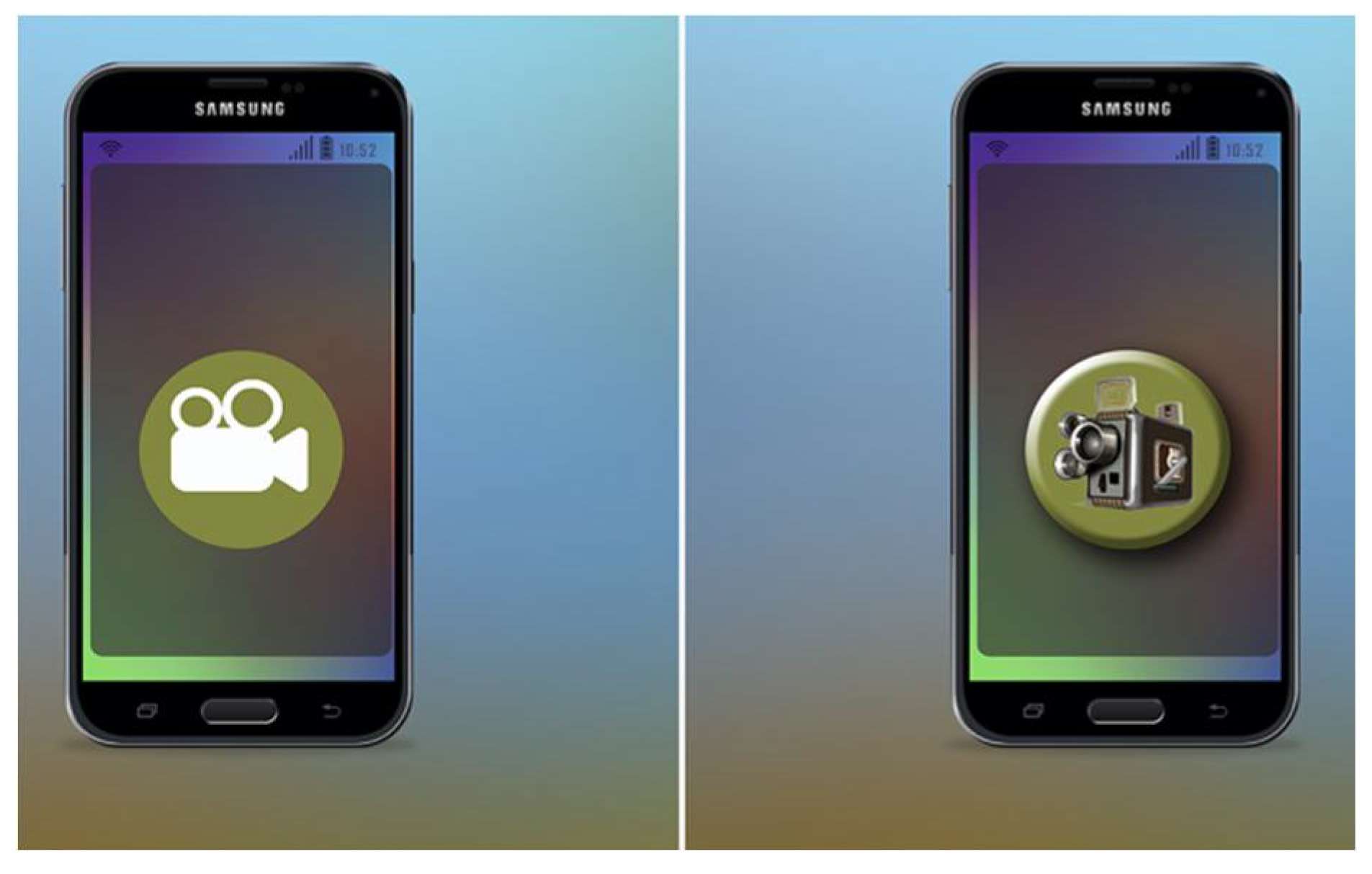
  • Step 2. Users were shown a specific icon on a mobile phone screen (Figure 2) for 1 s and were asked to recall what they saw (identify the correct description on the printed questions sheet).
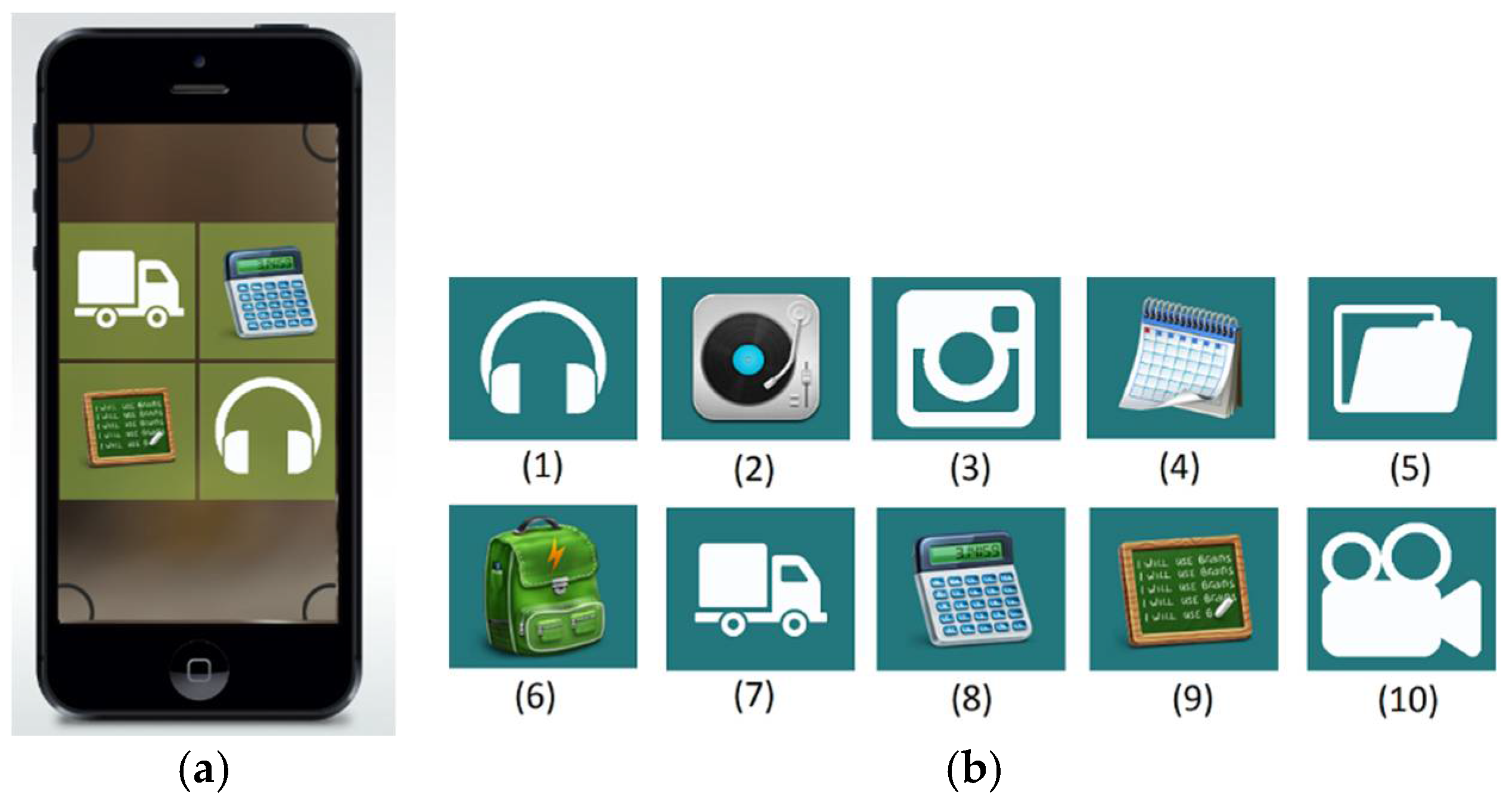
  • Step 3. The same as Step 2 but now 3 icons (Figure 3) were shown for 2 s. On the questions sheet, users had to recognize the 3 icons they saw among 7 icons printed.
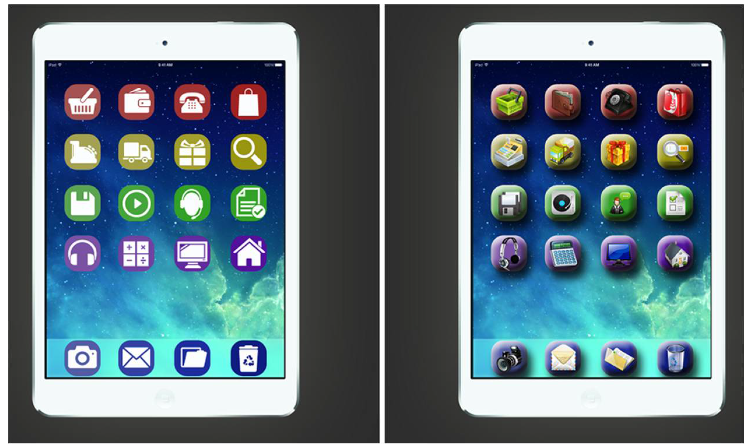
  • Step 4. Users were shown a tablet screen with 24 icons as depicted in Figure 4 and were asked to click on the icon for customer support. This task also investigated how well an icon represents its function.
  • Step 5. Users were shown a series of 5 icons (Figure 5) and were asked to recall as many as possible after observing them for 2 s. They were asked to identify the icons they had seen among 15 icons on the printed sheet.
The next three steps of the experiment scenario were identical for all users regardless of the type of design they were assigned to work with previously. During these steps, users were shown on the same screen both skeuomorphic and flat icons.
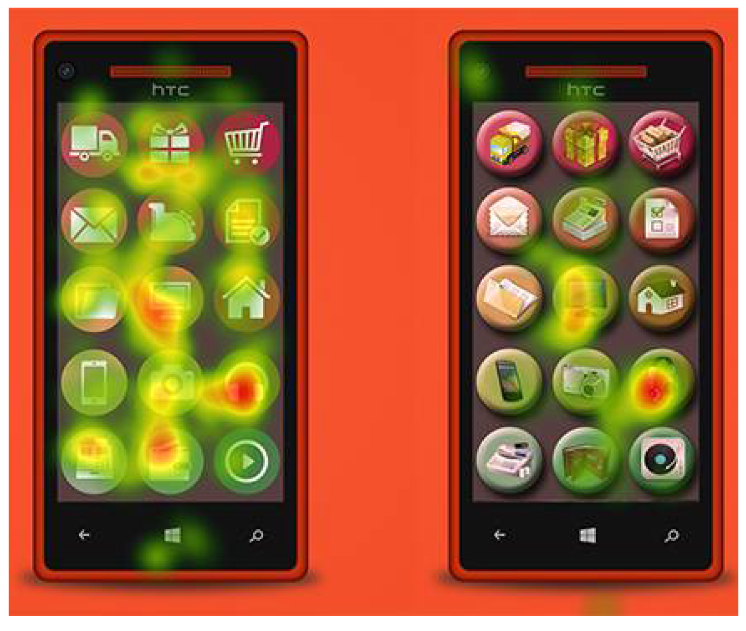
  • Step 6. Users were shown a computer monitor with 20 icons in 4 rows and 5 columns (Figure 6) and were asked to click on the calendar icon. This icon was the only one that appeared twice on the screen, as a skeuomorphic and as a flat icon. The rest of the icons appeared once, with 9 of them designed in a skeuomorphic fashion and the remaining 9 as flat icons. Flat and skeuomorphic icons were arranged in a balanced way and the two icons users searched for were in relatively neutral places to minimize the effect of placement on locating one icon more easily than the other (the flat icon at line 3, column 2 and the skeuomorphic icon at line 1, column 4).
  • Step 7. Same as Step 6, but users were shown 36 smaller-size icons (Figure 7) and were asked to click on the clock icon, which also appeared in two versions, one skeuomorphic and one flat. Considering the previous step, here the positioning of the icons has been reversed and the flat icon is placed at line 2 column 4, while the skeuomorphic is at line 3 column 2 to eliminate the potential effect of positioning.
  • Step 8. Users were asked to recall the 4 icons displayed to them for 2 s. Two of the icons were skeuomorphic and two were flat. Users had to select the icons they had seen on the printed sheet that contained the icons depicted in Figure 8.

2.4. Experiment 2: Aesthetics and Perceived Usability

In the early 1990s, the idea that aesthetics matter in information technology sounded heretic to HCI scholars and practitioners [30]. Two decades later, in the late 2010s, this thought has conquered a solid place in both academia and industry.
In this experiment, the objective was to examine whether users perceive a flat or a skeuomorphic design as more aesthetically pleasing (beautiful) or more usable. As opposed to other related studies [31,32], the aim was not to compare an aesthetically sound design to a non-sound variation, but rather to compare two designs that comply to two different approaches (i.e., flat and skeuomorphic) while offering the exact same functional options. Users were asked to observe (but not make any kind of interaction with) two functionally equivalent UI instances for 5 s each (depicted in Figure 9). Afterwards, users were asked to specify which UI design they considered the most beautiful and which one would be the easiest to use. Users were informed that both UIs served the same functionality. The same process was also applied for a second set of two alternative designs (a flat and a skeuomorphic) of equivalent functionality depicted in Figure 10. The skeuomorphic designs used in the experiment were actual awarded websites for their realistic skeuomorphism, while their flat design equivalents were constructed according to the flat design principles [12,13,14] for the needs of the experiment. Both constructed flat designs (offer all options at similar relative positioning) available in their skeuomorphic variations.

2.5. Experiment 3: Scenario Based Assessment of Flat and Skeuomorphic Design Variations

Users, after viewing the alternative designs of Experiment 2 and providing feedback on their comparative beauty and ease of use, were asked to use these designs while executing specific step-wise scenarios that were provided in print (the functional flat equivalents were constructed in UXPin). More specifically, in the case of the Skeuomorphism website and its flat variation (Figure 9) users were asked to write down two skeuomorphic types in web design, locate and write down one example of skeuomorphic UI, locate the definition of term “Skeuomorph”, write down an advantage and a disadvantage of this design approach, find links for online sources concerning wood textures and write down the three specific numbers quoted. Similarly, at the Ideator website and its flat-design equivalent (Figure 10) users were asked to select the “household products” category, go to settings and insert the word “month”, click on “Generate”, change the sequence of words, inspect saved ideas of other users, go to the second results page and write down the second suggestion. For writing down their answers, users were given formatted printed sheets to complete all required information. Answers were used for assessing successful task completion.
In this third experiment, users were given three different types of questionnaires; before the test and according to the guidelines of Tullis and Albert [33], users were given the scenario descriptions and were asked how easy/difficult they believe it would be to execute it (expectation based estimation) in a scale from 1 (very difficult) to 7 (very easy). The same question was asked after having completed the scenario to record their experience based assessment (i.e., “How easy/difficult was the task you just completed?”). Moreover, at the end of the scenario, users were asked to fill-in a SUS questionnaire regarding the website variation they had just interacted with. Fifty percent of the participants also answered a meCUE questionnaire [32].

3. Results

3.1. Experiment 1 Collected Data and Analysis

Participants were video recorded (face expressions and voice). In addition, the eye tracking hardware and software allowed detailed recording of eye fixations and movements, synchronized with screen contents and all user activities (mouse positioning, clicks and keyboard input), thus providing a rich source of interaction data.
Step 1: click on the requested icon (among 15 icons). Step 1 aimed at investigating whether the computer skills of a user and the design type of icons influence the results (how fast the user located the icon). To this end, we first measured the time until the first fixation on the requested icon. Table 1 presents the data collected.
Since user samples are independent (experienced and novices), data was analyzed for each design type with the Mann–Whitney method (95% confidence). The result showed that there was no statistical significance either for novices (MDflat = 1.85/MDskeuo = 1.29) or for experienced users (MDflat = 1.31/MDskeuo = 0.85) regarding time to first fixation on the requested icon (p = 0.83 > 0.05 for both flat and skeuomorphic design).
When we applied the Wilcox signed-rank test on the complete user sample to compare skeuomorphic and flat design in terms of time to first fixation, the result (p = 0.074 > 0.05) showed that there is also no statistical significance that supports the assumptions that the type of icon design affects the time to first fixation.
Nevertheless, when examining the thermal maps of the two designs (Figure 11), it is evident that flat icons made user focus more dispersed. Fixations and eye movements covered almost the complete screen area, whereas skeuomorphic design demonstrates a much more concentrated pattern (users focused on two of the 15 icons).
Another metric used was the time from the first user fixation on the requested icon to clicking on it. Collected time durations are presented in Table 2.
Assuming that it is a homogeneous sample and sex is not an influential factor, we applied the Mann–Whitney test and discovered no statistical significance between time from first fixation to click and user experience level (p = 0.917 > 0.05). Moreover, the Wilcoxon signed-rank test also indicated that there is no statistical significance between time from first fixation to click and design type (flat or skeuomorphic, p = 0.51 > 0.05).
Step 2: Recall the icon briefly displayed. All users recognized correctly the two video camera icons displayed to them for 1 s and were able to identify them among other icons regardless of their level of experience with computers or the design type of the icon (flat or skeuomorphic).
Step 3: Recall the three icons briefly displayed. Flat design icons were recognized and recalled correctly by 5 of the 10 users that participated in the trial. Three users managed to identify correctly two out of three icons and two users identified correctly just one of the icons. In the case of the skeuomorphic icons, 7 of the 10 users that saw and tried to recall the icons managed to identify all three icons correctly. The other three users identified correctly two of the three displayed icons. At first glance, this observation gives precedence to skeuomorphic design. When we applied the chi-square test and considered as correct only the answers that correctly identified all three icons, the test for statistical significance was negative referring both to design type (p = 0.563 > 0.05) and user experience level (p = 0.414 > 0.05).
Step 4: Identify a specific icon among 24 icons. In this case, we measured the time to first fixation (Table 3), the duration of the first fixation (Table 4), and the time from the first fixation to clicking on the requested icon (Table 5). It was observed that, even though users located the flat version of the requested icon faster, they took more time to click on it (compared to the measured time from the first fixation to clicking on the requested icon for the skeuomorphic design). The average durations of first fixation are similar, namely 0.24 s for the flat design and 0.27 s for the skeuomorphic.
The time durations examined by this step of the experiment were tested regarding their statistical significance in the two design variations using the Wilcoxon signed-rank test. All three demonstrate no statistical significance referring to the effect of design variation. More specifically, for time to first fixation p = 0.074 > 0.05, for duration of the first fixation p = 0.95 > 0.05 and for time from the first fixation to clicking p = 0.21 > 0.05.
Step 5: Recall 5 icons and identify them among 15 icons. In this step, the recorded data comprised the number of successful answers (how many icons were recognized correctly), the number of wrong answers (how many icons were selected but were not the ones displayed) and the number of no answers (icons that were displayed but were not identified). It is worth mentioning that in neither design variation (flat nor skeuomorphic) did users manage to provide a perfectly correct answer (identify correctly all five displayed icons), as can be observed in Table 6 and Table 7.
Since the sampling distribution of the mean approaches the normal distribution, the t-test was applied for both flat (M = 0.5, SD = 0.21) and skeuomorphic design (M = 0.5, SD = 0.21) and showed no statistical significance between design variations regarding the number of correct, wrong or no answers (p-value = 1).
Step 6: Identify a specific icon appearing twice (in flat and skeuomorphic variation) among 20 mixed design icons (flat and skeuomorphic). Users were asked to click on the calendar icon which appeared twice in the set of 20 available icons, once in flat design and once in skeuomorphic. From the 10 novice users, four selected the flat version and six the skeuomorphic and findings are reversed for the case of experienced users (four clicked on the skeuomorphic icon and six the flat icon). As expected, the chi-square test showed that there is no statistical significance (p-value = 0.52) between user experience level and icon design selection (flat or skeuomorphic).
Except for examining the icon users clicked on, we also measured the number of each user’s fixations in the area of each calendar icon (Table 8). When testing the hypothesis that the number of fixations has an effect on the user final icon choice, the chi-square test was positive (p-value = 0.0047 < 0.05), meaning that users tend to finally click on the icon they fixate more times on.
Step 7. Identify a specific icon appearing twice (in flat and skeuomorphic variation) among 36 mixed design icons (flat and skeuomorphic). This step is similar to the previous one but the requested icon is the clock icon and the set of icons appearing on the screen is increased to a total of 36. From the 10 novice users, six selected the flat version and four the skeuomorphic, while, in the case of experienced users, three clicked on the skeuomorphic icon and seven the flat icon. The chi-square test came back negative showing that there is no statistical significance between user experience level and icon design selection (p-value = 0.78 for flat and p-value = 0.70 for skeuomorphic).
We also examined whether the number of user fixations on one clock icon versus the other can be used to predict the final user selection (click). Collected data are depicted in Table 9. In this case, the chi-square test was also positive (p-value = 0.0076 < 0.05), thus users tend to click on the icon they fixated more times on (an observation that verifies the finding of step 6).
Step 8. Recall the 4 mixed design icons (flat and skeuomorphic) briefly displayed and identify them among 10 mixed design icons. Experienced users on average managed to successfully identify 70% of the flat design icons and 90% of the skeuomorphic icons. Novice users managed to successfully identify 65% of the flat design icons and 85% of the skeuomorphic icons. While trying to identify a correlation between user experience level and icon design with the ability to recall icons, we conducted a chi-square test for a confidence interval of 95%. The original hypothesis was rejected since the resulted p-value was 0.29 > 0.05.

3.2. Experiment 2 Collected Data and Analysis

When given the first set of equivalent designs, seven users (three novices and four advanced) stated that the flat design version was the more beautiful, while 13 users (seven novices and six advanced) preferred the skeuomorphic version. Nevertheless, the chi-square test on determining a potential correlation between UI design and what users consider as more beautiful was negative (p = 0.17 > 0.05). The answers to the second question provided a much clearer picture as 18 users (8 novices and 10 advanced) stated that the flat design would be easier to use while only two novice users stated that the skeuomorphic design would be the easier to use. In this case the chi-square test came back positive (p = 0.0003 < 0.05), thus the design of an interface has a significant effect on its perceived usability, with the flat design being the approach that ensures higher perceived usability.
Similar observations apply for the second set of equivalent design variations. Seven users (two novices and five advanced) considered the flat design as aesthetically superior, as opposed to 13 users (eight novices and five advanced) that preferred the skeuomorphic. When asked about which UI would be easier to use, 15 users (eight novices and seven advanced) said that this would be the flat one and five users (two novices and three advanced) selected the skeuomorphic. The chi-test on identifying statistical significance in correlating UI design and perceived beauty the result is negative (p = 0.17 > 0.05). The same test for correlating UI design and perceived usability was positive (p = 0.02 < 0.05).
An interesting observation is that overall the prevalence of the skeuomorphic design over the flat one in terms of their aesthetic result is due to the preferences of novice users. Advanced users seem to be rather divided between the two design approaches but novice users demonstrate a clear preference for the skeuomorphic version as regards to beauty. This can be justified and may be due to the strong connection of skeuomorphism with real life metaphors and affordances that create a sense of familiarity to novice users. What is interesting though is that novice users seem to be affected by this only on an aesthetical level and not in terms of usability.

3.3. Experiment 3 Collected Data and Analysis

3.3.1. Skeuomorphism Website Variations

The first hypothesis tested was whether scenario completion time is affected by the type of design (flat or skeuomorphic). The hypothesis has been rejected by the Wilcoxon signed-rank test (p-value = 0.114 > a, W = 12.00 and z-score = 1.580).
When testing the hypothesis that there is a correlation between user skills level (novice or experienced) and task completion duration for each design type, the hypothesis was rejected for the skeuomorphic design (Table 10) but not for the flat, thus experienced users completed their tasks faster than novices when they all use the flat design variation (Table 11).
Concerning expectation and experience ratings on scenario execution difficulty, Table 12 summarizes responses. Analysis of the responses indicates that in flat design users expected that the assigned scenario would be difficult to execute but after the test they reconsidered and rated it as an easy scenario. To the contrary, users that were given the skeuomorphic design, before the test estimated that it would be easy to execute the scenario but after the test considered it as a difficult task. To validate this observation in terms of statistical significance, a t-test was performed concerning user pre-test estimation on task difficulty for the skeuomorphic variation (M = 4.5, SD = 1.27) and the flat (MD = 3.9, SD = 1.37) for t(9) = 0.91. p value (p = 0.38 > 0.05) indicates that there is no correlation between the type of design and users’ expectations about task difficulty. When the same test is applied to post-test responses in the case of skeuomorphic (MD = 3.8, SD = 1.75) and flat design (MD = 5.9, SD = 0.74) for t(9) = −3.11, the p value indicates statistical significance (p = 0.012 < 0.05). In terms of user experience, this is interpreted as a requirement to proceed with design changes in the skeuomorphic variation so that the distance between expectation and experience is decreased.
Data collected by the SUS questionnaire are summarized in Table 13. According to Tullis and Albert [33], a SUS score below 60 indicates a poor design while a design that scores above 80 is considered as very good. SUS score for the flat design variation is significantly higher than the score of skeuomorphic design. When testing the hypothesis that the type of design affects the SUS score and thus overall user experience quality, the t-test with confidence level at 95% and t(9) = 2.48 gave a positive result (p = 0.035 < 0.05), thus design type is correlated with SUS score.
Finally, observing the data collected by the meCUE questionnaire (Table 14), flat design has a clear lead over its skeuomorphic equivalent on all assessed modules. When testing statically the hypothesis that the type of design has an effect on meCUE scoring, the results do not show a statistical significance either on any specific module of the questionnaire or the overall score (Table 15).

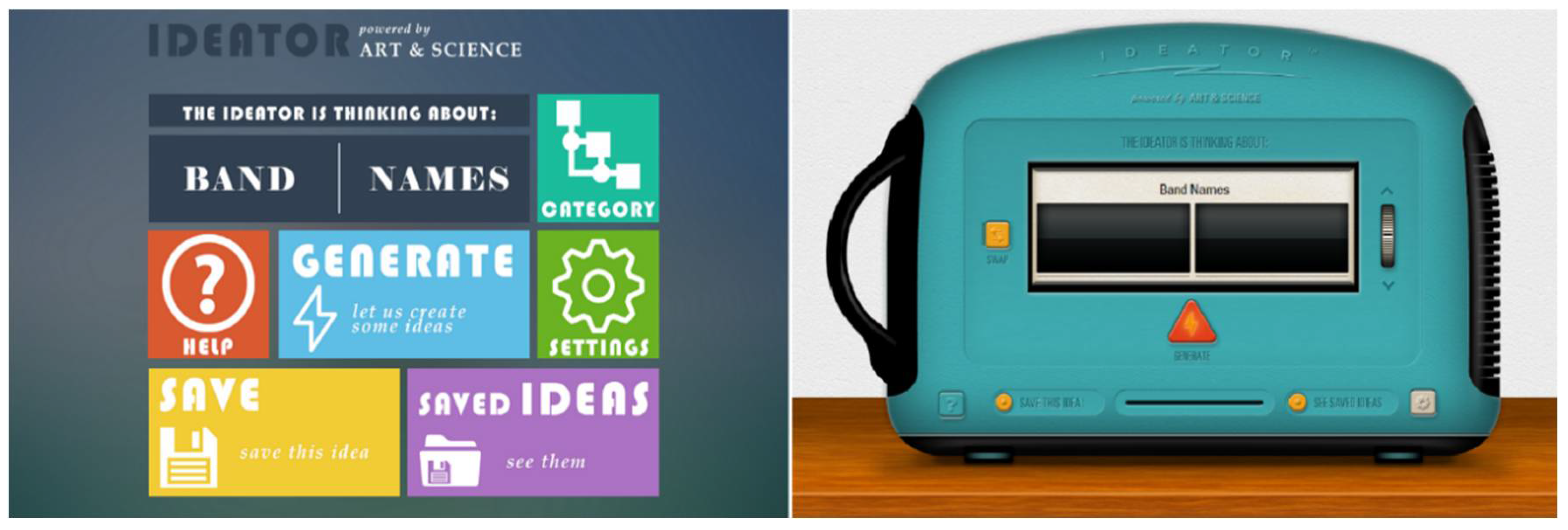
3.3.2. Ideator Website Variations

Following the same methodology as in the Skeuomorphism website variations, the first tested hypothesis is whether the scenario execution duration is affected by the design variation. Based on the results of the Wilcoxon signed-rank test for flat design (MD = 2.86, SD = 0.78) and skeuomorphic (MD = 3.60, SD = 2.54) for confidence level 95%, the hypothesis has been rejected (p-value = 0.721 > a, where W = 24,000). The next hypothesis that was tested was whether there is a correlation between user skills level (novice or experienced) and task completion duration (for each design type separately), and this hypothesis was not rejected (Table 16 and Table 17).
Regarding the estimation of users on scenario execution difficulty before and after executing it, Table 18 summarizes responses and the overall observation is that users considered the scenario easy and this estimation did not change after they had executed it. According to Tullis and Albert [33], this indicates that both tested designs are acceptable and do not require changes.
Data collected by the SUS questionnaire are summarized in Table 19. The hypothesis that the type of design affects the SUS score and thus overall user experience quality, the Wilcoxon signed-rank with confidence level at 95% gave a negative result (p = 0.535 > 0.05 with W = 21.50).
Analyzing the data collected by the meCUE questionnaire (Table 20) flat design has been given higher scores. When testing statically the hypothesis that the type of design has an effect on the meCUE score the results do not show a statistical significance either on any specific module of the questionnaire or the overall score (Table 21).

4. Discussion

The two main design trends that prevail in the field of user interface design is skeuomorphism and flat design. This paper investigated how users perceive the two design approaches in the case of icon design (in terms of icon recognizability, recall and effectiveness) and also whether users perceive a flat or a skeuomorphic design as more aesthetically pleasing (beautiful) or more usable. All tested hypotheses regarding potential effects of these design approaches on icon recognizability, recall, task completion time, and number of errors were rejected by the collected data and the only findings of Experiment 1 was that there seems to be a statistically significant effect of the number of user fixations on an icon and the final choice he/she makes. This observation applies for both design approaches and is independent of user experience level. Experiment 2 did not discover a significant effect of design approach on the perceived aesthetic result but collected data indicated that users, both novices and experienced, perceive flat design as more usable. In Experiment 3, in both scenarios (Skeuomorphism and Ideator websites), the hypothesis that task execution duration is affected by design type has been rejected. When the tested hypothesis was whether participant skill level is correlated with task duration flat design demonstrates with statistical significance that it allows expert users to execute their task faster. Skeuomorphic design on the other hand rejected this hypothesis in the case of the Skeuomorphism website. This can be interpreted as a relative inefficiency of skeuomorphism to foster productivity of experienced users due to metaphors that are not easily perceivable, or interface design that visually distracts users from intended targets, or misguides them. The restricted number of tested websites does not allow for generalizations and more tests are required to support this argument.
The pre-test inquiry about expected task difficulty for the Ideator website for both variations has verified that the given scenario was considered and actually proved to be easy. The Skeuomorphism website though, gave to users the initial impression of ease but proved to be difficult. The opposite applies to its flat variation. This finding can again be attributed to the initial familiarity skeuomorphism communicates and the problems that may be caused by inadequate support of physical world metaphors to the electronic medium, an argument supported by various studies [34,35]. What stands out is that flat design in all tested cases has been assessed as easy to use (even when this was not the initial expectation of users).
The SUS questionnaire, which assesses the usability and design quality provided by an application, awarded flat design a much higher score than skeuomorphic in both website variations. The correlation between SUS score and design type (statistically significant for the Skeuomorphism website) relates flat design to higher user-perceived usability (which has also been supported by Experiment 2). The higher scores of flat design variations versus their skeuomorphic variations also holds for the meCUE questionnaire in both websites even though this is not a statistically significant assumption.
The conclusions reached indicate that statistically there is no clear winning approach. The designs used in the first experiment approached skeuomorphic and flat design as “purely” as possible. Skeuomorphic icons have depth, shadowing and 3D attributes, resembling real world objects with easily recognizable affordances while flat icons are minimalistic, abstract and homogeneous. Icon recognizability examined at the level of heat maps and gazeplots is quite interesting, as, despite the statistical insignificance, observations indicate that in flat icon sets scan paths are longer and fixations more scattered, which may be attributed to the decreased differentiation of flat icons that makes them visually too similar to search.
In Experiment 2, the designs used are also skeuomorphic and flat to a maximum degree, respectively, yet there seems to be no clear preference, just precedence of flat design in terms of perceived usability. This might be attributed to the simplicity of flat design and to users being overwhelmed with the amount of non-functional ornaments in the skeuomorphic representation of a bookcase (Figure 9) or the fact that most users might not have understood the real-world function of the Ideator (Figure 10). It is important though to stress that in terms of beauty users seemed to like the skeuomorphic designs and more experiments might back this observation with statistical significance.
Experiment 3 has revealed some issues concerning the skeuomorphic variation of the Skeuomorphism website that seemed to prevent experienced users from completing their tasks faster than novices. It was considered difficult to use for executing the given task and scored quite lower that its flat variation in both SUS and meCUE. In the Ideator variations, the situation is more balanced but still flat design has been evaluated with better SUS and meCUE scores.
Age and familiarity with web technology and devices might be an important factor affecting preference of skeuomorphism or flat design, as older people that have not been using computers and mobile devices all their life are more positive towards skeuomorphism due to the intuitiveness of supported affordances. Nevertheless, the trend towards flat design is strong and seems that it will manage to prevail in the forthcoming years. The current opposition that keeps skeuomorphism alive is that in many cases flat designs lack visual clues that could help communicate easily their function and distinguish between them. Flat designs should ensure that they maintain expressive characteristics and support intuitiveness in interaction by complying to well-established usability principles. Flatness (and minimalism) should not be considered as a cause on its own, but as a means to foster easier and aesthetically satisfying interaction.
New experiments are under way to investigate how users respond to skeuomorphic and flat full-functioning UI designs in the framework of realistic scenarios. In addition, as already mentioned, it is necessary to test more users from larger age groups and enrich collected observations to confirm our findings and be able to support statistically more interesting correlations.

Author Contributions

K.S. designed the UI alternatives, moderated the experiments, did the statistical analysis of the collected data and edited the article. M.R. supervised the design of the experiments and the scenarios, contributed to the analysis of collected data, conducted the literature review and edited the article. S.S. supervised the experiments and the equipment, and reviewed the statistical analysis and the article (he is the supervisor of K.S.).

Conflicts of Interest

The authors declare no conflict of interest.

References

  1. Johnson, S. The rise of flat design. Target Mark. 2013, 36, 8–9. [Google Scholar]
  2. Basalla, G. The Evolution of Technology; Cambridge University Press: Cambridge, UK, 1988. [Google Scholar]
  3. Oxford Dictionary. Skeuomorph—Definition of Skeuomorph. Available online: https://en.oxforddictionaries.com/definition/skeuomorph (accessed on 14 November 2014).
  4. Rose, P. Skeuomorphism as an Affordance: A principle for interaction and user interface design. In BSc Dissertation Digital Art and Technology; School of Art & Media, University of Plymouth: Plymouth, UK, 2013. [Google Scholar]
  5. WHATIS Definition: Skeuomorphim. Available online: http://whatis.techtarget.com/definition/skeuomorphism (accessed on 24 November 2017).
  6. Usability First. Usability Glossary. Available online: http://www.usabilityfirst.com/glossary/affordance (accessed on 17 December 2016).
  7. Designmodo. Skeuomorphism in User Interface Design, What Is It? Available online: http://designmodo.com/skeuomorphism-ui-design/ (accessed on 19 November 2016).
  8. Gibson, J. The Ecological Approach to Visual Perception; Houghton Mifflin: Boston, MA, USA, 1979. [Google Scholar]
  9. Affordances and Design. Available online: https://www.jnd.org/dn.mss/affordances_and.html (accessed on 2 February 2016).
  10. Apple’s History of Skeuomorphism. Available online: http://eggfreckles.net/favorite/skeuomorphism/ (accessed on 15 December 2017).
  11. XD Essentials: The Importance and Evolution of Icon Design. Available online: https://blogs.adobe.com/creativecloud/xd-essentials-the-importance-and-evolution-of-icon-design (accessed on 2 November 2016).
  12. Designmodo. Principles of Flat Design. Available online: http://designmodo.com/flat-design-principles/ (accessed on 12 January 2017).
  13. Turner, A.L. The History of Flat Design: Efficiency, Minimalism, Trendiness. Available online: http://thenextweb.com/dd/2014/03/19/history-flat-design-efficiency-minimalism-made-digital-world-flat/ (accessed on 20 November 2016).
  14. Nielsen Norman Group. Flat Design: Its Origins, Its Problems, and Why Flat 2.0 Is Better for Users. Available online: https://www.nngroup.com/articles/flat-design (accessed on 22 November 2016).
  15. Oswald, D.; Kolb, S. Flat design vs. skeuomorphism—Effects on learnability and image attribution in digital product interfaces. In Proceedings of the E&PDE 16th International Conference on Engineering and Product Design Education, Enschede, The Netherlands, 4–5 September 2014. [Google Scholar]
  16. Page, T. Skeuomorphism or flat design: Future directions in mobile device user interface (UI) design education. Int. J. Mob. Learn. Organ. 2014, 8, 130–142. [Google Scholar] [CrossRef]
  17. Lindh, M. Beyond a Skeuomorphic Representation of Subtractive Synthesis. In Proceedings of the MILC’18, Tokyo, Japan, 7–11 March 2018. [Google Scholar]
  18. Hou, K.-C.; Ho, C.-H. A preliminary study on aesthetic of apps icon design. In Proceedings of the 5th International Congress of the International Association of Societies of Design Research (IASDR Congress 2013), Tokyo, Japan, 26–30 August 2013. [Google Scholar]
  19. Flat Design Done Wrong. Available online: http://vanseodesign.com/web-design/flat-design-done-wrong/ (accessed on 20 February 2018).
  20. When Flat Design Falls Flat. Available online: https://www.webpagefx.com/blog/web-design/when-flat-design-falls-flat/ (accessed on 12 January 2016).
  21. Gross, S.; Bardzell, J.; Bardzell, S. Skeu the evolution: Skeuomorphs, style, and the material of tangible interactions. In Proceedings of the 8th International Conference on Tangible, Embedded and Embodied Interaction (TEI 2014), Munich, Germany, 16–19 February 2014. [Google Scholar]
  22. Li, C.; Shi, H.; Huang, J.; Chen, L. Two typical symbols in human-machine interactive interface. Appl. Mech. Mater. 2014, 635–637, 1659–1665. [Google Scholar] [CrossRef]
  23. Stickel, C.; Pohl, H.-M.; Milde, J.-T. Cutting edge design or a beginner’s mistake?—A semiotic inspection of iOS7 icon design changes. In Design, User Experience, and Usability: Theories, Methods, and Tools for Designing the User Experience: Third International Conference, DUXU 2014, Held as Part of HCI International 2014 (Heraklion, Crete, Greece, 22–27 June 2014); Marcus, A., Ed.; Springer: Cham, Switzerland, 2014. [Google Scholar]
  24. Burmistrov, I.; Zlokazova, T.; Izmalkova, A.; Leonova, A. Flat design vs. traditional design: Comparative experimental study. In Human-Computer Interaction—INTERACT 2015, Proceedings of the 15th IFIP TC 13 International Conference, Bamberg, Germany, 14–18 September 2015; Abascal, J., Barbosa, S., Fetter, M., Gross, T., Palanque, P., Winckler, M., Eds.; Part II (Lecture Notes in Computer Science, 9297); Springer: Cham, Switzerland, 2015. [Google Scholar]
  25. Nielsen Norman Group. Flat UI Elements Attract Less Attention and Cause Uncertainty. 2017. Available online: https://www.nngroup.com/articles/flat-ui-less-attention-cause-uncertainty/ (accessed on 4 January 2018).
  26. Zhang, X.; Wang, Q.; Shi, Y. Contrastive analysis on emotional cognition of skeuomorphic and flat icon. In Advanced Graphic Communications and Media Technologies; Zhao, P., Ouyang, Y., Xu, M., Eds.; Springer: Singapore, 2017. [Google Scholar]
  27. Nielsen, J. Quantitative Studies: How Many Users to Test? 2004. Available online: http://www.nngroup.com/articles/quantitative-studies-how-many-users (accessed on 15 February 2016).
  28. Faulkner, L. Beyond the five-user assumption: Benefits of increased sample sizes in usability testing. Behav. Res. Methods Instrum. Comput. 2003, 35, 379–383. [Google Scholar] [CrossRef] [PubMed] [Green Version]
  29. Macefield, R. How to specify the participant group size for usability studies: A practitioner’s guide. J. Usability Stud. 2009, 5, 34–45. [Google Scholar]
  30. Tractinsky, N. Visual Aesthetics. The Encyclopedia of Human-Computer Interaction, 2nd ed. Available online: https://www.interaction-design.org/literature/book/the-encyclopedia-of-human-computer-interaction-2nd-ed/visual-aesthetics (accessed on 20 February 2016).
  31. Norman, D. Is Perceived Usability/Aesthetics More Important than Real. 2004. Available online: https://www.jnd.org/dn.mss/is_perceived_usabili.html (accessed on 20 February 2016).
  32. Thüring, M.; Mahlke, S. Usability, aesthetics and emotions in human–technology interaction. Int. J. Psychol. 2007, 42, 253–264. [Google Scholar] [CrossRef]
  33. Tullis, T.; Albert, W. Self-reported metrics. In Measuring the User Experience: Collecting, Analyzing, and Presenting Usability Metrics; Morgan Kaufmann: Burlington, MA, USA, 2013. [Google Scholar]
  34. Coelho, T.; De Oliveira, R.; Cardoso, T.; Rosas, J.; Rybarczyk, Y. Body ownership of virtual avatars: An affordance approach of telepresence. In Innovative and Creative Developments in Multimodal Interaction Systems; Rybarczyk, Y., Cardoso, T., Rosas, J., Camarinha-Matos, L., Eds.; Springer: Heidelberg, Germany, 2014. [Google Scholar]
  35. Rybarczyk, Y.; Coelho, T.; Cardoso, T.; De Oliveira, R. Effect of avatars and viewpoints on performance in virtual world: Efficiency vs. telepresence. EAI Endorsed Trans. Creative Technol. 2014. [Google Scholar] [CrossRef]
Figure 1. Screens displayed to users in Step 1 (click on the icon with the headphones).
Mti 02 00031 g001
Figure 2. Screens displayed to users in Step 2 (recall the icon).
Mti 02 00031 g002
Figure 3. Screens displayed to users in Step 3 (recall the icons).
Mti 02 00031 g003
Figure 4. Screens displayed to users in Step 4 (click on the icon for customer support).
Mti 02 00031 g004
Figure 5. Icon sets displayed to users in Step 5 (recall as many as possible).
Mti 02 00031 g005
Figure 6. Screen displayed to users in Step 6 (click on the calendar icon).
Mti 02 00031 g006
Figure 7. Screen displayed to users in Step 7 (click on the clock icon).
Mti 02 00031 g007
Figure 8. (a) Screen displayed to users in Step 8 (recall the icons); and (b) icons to choose from the one displayed.
Mti 02 00031 g008
Figure 9. Flat and skeuomorphic variations of the Skeuomorphism website.
Mti 02 00031 g009
Figure 10. Flat and skeuomorphic variations of the Ideator website.
Mti 02 00031 g010
Figure 11. Generated heat map of the two designs.
Mti 02 00031 g011
Table 1. Time to first fixation (in seconds).
Experienced Users
Flat 13.171.151.310.953.97
Skeuomorphic1.464.240.750.790.85
Novice Users
Flat 2.421.854.140.951.84
Skeuomorphic1.720.941.41.290.75
Table 2. First fixation to click times (in seconds).
Experienced Users
Flat10.11.980.711.330.70
Skeuomorphic1.741.980.440.690.44
Novice Users
Flat0.391.640.073.271.05
Skeuomorphic0.871.020.630.530.81
Table 3. Time to first fixation.
Descriptive ValuesFlat DesignSkeuomorphic Design
Mean1.844.71
Standard error0.622.18
Median 0.881.84
Standard deviation1.856.54
Sample variance3.4442.74
Minimum 0.040.56
Maximum4.4920.54
Table 4. First fixation duration.
Descriptive ValuesFlat DesignSkeuomorphic Design
Mean0.240.27
Standard error0.040.07
Median 0.240.21
Standard deviation0.120.21
Sample variance0.010.04
Minimum 0.030.07
Maximum0.400.76
Table 5. Time from first fixation to click.
Descriptive ValuesFlat DesignSkeuomorphic Design
Mean5.664.24
Standard error1.131.85
Median 6.412.46
Standard deviation3.385.56
Sample variance11.4030.95
Minimum 1.430.76
Maximum11.4218.66
Table 6. Successful answer, no answer and unsuccessful answer ratios in flat design.
Users
Successful20%80%60%80%60%40%60%20%40%40%
No answer60%20%20%20%40%60%0%60%40%40%
Unsuccessful20%0%20%0%0%0%40%20%20%20%
Table 7. Successful answer, no answer and unsuccessful answer ratios in skeuomorphic design.
Users
Successful40%60%0%60%40%60%40%60%60%80%
No answer20%20%80%40%40%40%0%40%0%20%
Unsuccessful40%20%20%0%20%0%60%0%40%0%
Table 8. Number of fixations on the two icon versions (flat or skeuomorphic) and final choice (F/S) for each user 1.
Number of Fixations for Each User (Scenario: Identify a Specific Icon Appearing in a Flat and a Skeuomorphic Variation, among 20 Mixed Design Icons)
Flat10243001101183210421
Skeuomorphic 520021253022301112
Final choice (click)FFFFSSSFSFFSSFSSSS
1 Two users failed to click on the calendar icons (and also did not fixate on either version).
Table 9. Number of fixations on the two icon versions (flat or skeuomorphic) and final choice (F/S) for each user 2.
Number of Fixations for Each User (Scenario: Identify a Specific Icon Appearing in a Flat and a Skeuomorphic Variation, among 36 Mixed Design Icons)
Flat503552015317433210
Skeuomorphic04000330316031321
Final choice (click)FSFFFSSFSFFFSFSFS
2 Three users failed to click on the calendar icons (and also did not fixate on either version).
Table 10. Test for correlation between user skills level and task duration in skeuomorphic design.
FlatNMeanStd ErrorStdMedian
Experienced54.820.791.774.61
Novice56.740.420.957.29
TestWz-scorep
Wilcoxon rank-sum20.00−1.5670.117
Uz-scorep
Mann–Whitney5.00−1.5670.117
Table 11. Test for correlation between user skills level and task duration in flat design.
FlatNMeanStd ErrorStdMedian
Experienced53.600.340.763.63
Novice55.760.541.215.3
TestWz-scorep
Wilcoxon rank-sum15.00−2.6110.009
Uz-scorep
Mann–Whitney0.00−2.6110.009
Table 12. Expectation (pre-test) and experience (post-test) ratings on scenario execution difficulty.
MeanStandard ErrorMedianStandard DeviationSample VarianceC.L. (95%)
Skeuo (pre-test)4.50.404.001.271.610.91
Skeuo (post-test)3.800.553.501.753.071.25
Flat (pre-test)3.900.434.001.371.880.98
Flat (post-test)5.900.236.000.740.540.53
Table 13. SUS score descriptive statistics.
Descriptive ValuesFlat DesignSkeuomorphic Design
Mean81.0061.00
Standard error3.986.53
Median81.2560.00
Standard deviation12.5920.66
C.L. (95%)9.0114.78
Table 14. meCUE scores for flat and skeuomorphic design.
Module IFlat DesignSkeuomorphic Design
Usefulness4.533.73
Usability5.873.73
Visual aesthetics4.874.67
Status3.203.27
Commitment2.872.27
Module II
Positive emotions3.572.83
Negative emotions2.474.30
Module III
Intention to use3.473.13
Product loyalty3.873.40
Module IV
Overall evaluation2.90.1
Table 15. Test for correlation between design type and meCUE scores.
Wz-Scorep-Value
Usefulness4.500.8130.416
Usability3.001.2140.225
Visual aesthetics7.000.1350.893
Status6.000.3650.715
Commitment2.000.5350.593
Positive emotions5.000.6740.500
Negative emotions14.001.7530.080
Intention to use5.000.6770.498
Product loyalty2.500.9210.357
Overall1.501.6250.104
Table 16. Test for correlation between user skills level and task duration in flat design.
FlatNMeanStd ErrorStdMedian
Experienced52.370.300.672.38
Novice53.350.260.593.38
TestWz-scorep
Wilcoxon rank-sum18.000−1.980.047
Uz-scorep
Mann–Whitney3.000−1.9840.047
Table 17. Test for correlation between user skills level and task duration in skeuomorphic design.
FlatNMeanStd ErrorStdMedian
Experienced52.340.190.442.27
Novice54.861.443.213.48
TestWz-scorep
Wilcoxon rank-sum17.000−2.1930.028
Uz-scorep
Mann–Whitney2.000−2.1930.028
Table 18. Expectation (pre-test) and experience (post-test) ratings on scenario execution difficulty.
MeanStandard ErrorMedianStandard DeviationSample VarianceC.L. (95%)
Skeuo (pre-test)5.100.505.501.602.541.14
Skeuo (post-test)5.300.726.502.265.121.62
Flat (pre-test)4.900.414.501.291.660.92
Flat (post-test)5.900.416.001.291.660.92
Table 19. SUS score descriptive statistics.
Descriptive ValuesFlat DesignSkeuomorphic Design
Mean83.5075.75
Standard error3.545.86
Median 85.0082.50
Standard deviation11.1918.52
C.L. (95%)8.0113.25
Table 20. meCUE scores for flat and skeuomorphic design.
Module IFlat DesignSkeuomorphic Design
Usefulness4.533.67
Usability5.934.80
Visual aesthetics4.534.53
Status3.202.60
Commitment2.402.00
Module II
Positive emotions3.973.00
Negative emotions2.904.07
Module III
Intention to use2.933.33
Product loyalty2.603.47
Module IV
Overall evaluation2.01.9
Table 21. Test for correlation between design type and meCUE scores.
Wz-Scorep-Value
Usefulness4.500.8130.416
Usability4.000.9440.345
Visual aesthetics8.000.1350.893
Status4.000.9440.345
Commitment2.000.5350.593
Positive emotions1.501.2890.197
Negative emotions12.001.2140.225
Intention to use7.000.7300.465
Product loyalty12.001.2190.223
Overall4.500.1840.854

