Commentary

Striving for Modernity: Layout and Abstracts in the Biomedical Literature

by
Carlo Galli
1,*,
Maria Teresa Colangelo
2 and
Stefano Guizzardi
2
1
Department of Medicine and Surgery, University of Parma, Via Volturno 39, 43126 Parma, Italy
2
Department of Medicine and Surgery, Histology and Embryology Lab, University of Parma, Via Volturno 39, 43126 Parma, Italy
*
Author to whom correspondence should be addressed.
Publications 2020, 8(3), 38; https://doi.org/10.3390/publications8030038
Submission received: 2 June 2020 / Revised: 25 June 2020 / Accepted: 6 July 2020 / Published: 11 July 2020

Abstract

:
Most academic journals have a fairly consistent look: they are structured similarly, their text is divided into similar sections; for example, they have an abstract at the beginning of the manuscript, and their text is usually organized in two columns. There may be different reasons for this similarity, ranging from the need to contain publication costs by using less page space to conforming to an internationally well-accepted format that may be perceived as the hallmark of academic articles. We surveyed 35 medical journals founded before 1960 and looked for their change in format over time and how this was experienced by and explained to readers. We then discussed what recent research has shown about the effects of layout on reading, looking for further explanations as to why this format was so successful.

1. Introduction

The layout⁠—the juxtaposition of text within a document⁠—plays an important and yet often overlooked role in communication [1]. The choice of layout dictates how information is distributed across a page and can guide the reader through the text with visual cues, bring related information together and thereby create cohesion. Layout can be so closely associated with certain kinds of genres and certain ways of delivering information that readers can immediately recognize a newspaper, a textbook, a novel, or a web page just by looking at how lines of text are ordered in the page. Scientific articles in academic journals are no exceptions to this, as they are characterized by a consistent structure and look, both in their printed form and their, more recent, online versions. It has been shown that the choice of typeface and typographic layout affects the visual rhetorical impression of readers, and a consistent, uniform look is mostly associated with “academic”, “informative”, “professional” descriptors in experimental settings [2]. Indeed, the purpose of scientific articles is mostly to inform, to transfer knowledge and do that in a balanced, objective way, while avoiding linguistic or iconographic frills that may distract readers from this primary purpose. However, reducing the role of layout to the mere negative quality of absence of distraction would be diminishing. Although the layout can indeed serve a noise-reduction function, together with text segmentation, it also creates meaning. Academic articles are consistently structured in a pre-defined and well-known sequence of paragraphs. When it comes to the life science area, the adoption of a standardized structure, which is mostly represented by the familiar Abstract, Introduction, Materials, Results and Discussion sequence [3] helps readers navigate through the article and quickly find relevant pieces of information, as readers are able to anticipate what kind of content to expect in each section. A specific layout has also become a consistent mainstay of biomedical articles. Although most journals differ in the details of their style choices, e.g., the font used, the way paragraphs are marked, the citation style, any brief survey of publications in the life science area shows that the majority of journals have adopted a familiar two-column layout for their printed pages (This article, as will be discussed below, is an exception). This does not hold true for other areas, however, where a lot of variability exists B Table A1). In the humanities, economics or law area, a single column layout seems to be prevalent, while other fields, such as chemistry are more consistent with the life science area.
A close look at life science journals, starting from their initial issues to the recent years, reveals changing patterns in their format choices. The prestigious multidisciplinary Proceedings of the National Academy of Science of the USA (PNAS), founded in 1914, underwent a radical evolution of format over time. It was first published as a one-column journal, with a fluid internal structure until the end of the 60s. PNAS articles lacked abstracts at the beginning of the text until 1969, although exceptions existed [4], and switched to a two-column layout only in 1971, when it acquired its definitive layout that is still maintained today. In contrast, some academic journals, such as Science, opted for a two-column layout right from the first issue. Interestingly, a survey of their early articles [5] reveals that pages were divided by a thick black line across the middle, as if this were ideally outlining the end of the page, a feature that however quickly disappeared from the format [6].
Academic journals, which were previously available only as printed issues, are nowadays available online as well, though many journals have still maintained a printed presence, and these two modalities usually adopt different layouts. When considering printed articles, a two-column layout readily distinguishes academic papers from other genres, for instance, narrative books or even most textbooks (Figure 1). According to a broadly mentioned common knowledge, the main advantage of two-column layouts is the possibility to cram more text into a smaller page space by decreasing font size and shortening lines, with narrower margins, while keeping an adequate font size/line length ratio to make reading unimpeded [7]; this choice has been functional to offset the costs of printed academic journals, which have faced a steep increase in the amount of scientific articles to publish in the last 40 years [8]. Unsurprisingly, the online format usually conforms to a single-column layout, as is common with most web pages. Virtually all online journals also offer a printer-friendly version of the same article, usually a PDF file that may replicate the layout of the printed page.
This commentary intends to question the interpretation that two-column layouts were adopted just to save space on printed pages, and investigate whether there may be additional reasons for the adoption of a different page format, because the layout of the page may also affect the way data are presented and even handled by the readers. In particular, the aim of this commentary is to investigate whether the common transition to a two-column format in medical journals may be associated with a change in perspective or attitude toward the scientific literature. This commentary will also consider how the change in layout relates to the introduction of abstracts in the medical literature, one of the hallmarks of scientific articles being geared towards mass indexing and searching [9].
To answer this question, the present article will examine a set of biomedical journals from their beginning to today’s issues, noting their pivoting in style in their printed versions and whether the motivations for such a change were provided.

2. Materials and Methods

The biomedical literature has always been rich in specialty journals, which focused on specific areas and specifically targeted physicians or researchers. We considered a cohort of 55 peer-reviewed journals in the medical field that were available online, were indexed in MEDLINE and were founded before 1960 (Table A2). This date was arbitrarily chosen because a preliminary search of the literature showed that journals were more likely to have a one-column layout before the 1960s–1970s. We then browsed the available issues starting from the first published issue and included those journals (n=37) which were first published in a one-column format and had been digitalized for the dates of interest. The list of included journals can be found in Table 1. We decided also to include the date the journal acquired an abstract, which is an independent feature that developed over time in all journals, as the need for faster data retrieval became more prominent, to assess a possible relation between the two of them. Data were analyzed and plotted using the Pandas, Numpy and Seaborn libraries for Python 3.

3. Results

As we mentioned, it is well known that the two-column format was adopted by some journals right from the beginning. It is for instance the, perhaps unsurprising, case of Clinical Pharmacology & Therapeutics or Circulation, which were first published in 1960 and in 1950, respectively (Table A2), with features typical of later articles, such as a two-column layout and the presence of an abstract at the beginning of the text. By comparison, the almost contemporary journal Diabetes appeared in a two-column format in 1952 but was equipped with an abstract only in January 1964. This observation holds true not only for journals established in the 1960s, as a two-column layout can also be found in earlier biomedical journals. Chest, the organ of the American College of Chest Physicians, was first published in 1935 in a two-column format, though again abstracts appeared only in July 1968. The pages of the famous British Medical Journal had a two-column layout starting from their initial issue in 1840 and, similarly to Science, were divided in two halves by a vertical black border until January 1937, when the journal underwent a revision, as explained by the editor [10]. In their commentary, the journal’s editorial team thoroughly explained the small but extensive changes that were made to the format of the journal, using improved fonts with higher readability and more suitable for the faster rotary presses that were being introduced into production, and a better use of the available paper space, plus a number of changes in format including the adoption of the Harvard reference system for citations.
Other journals, which constitute the core of this report (Table 1), however, started off with a one-column format, and, in some cases, this lasted a considerable amount of time (Figure 2). The average transition from one to two columns occurred around 1969 (Figure 3A), though with much variability (the standard deviation is 20.8 years). By comparison, abstracts were adopted on average around the year 1973±8.2 (Figure 3B), thus with lower variability, as is well visible also from Figure 2. Interestingly, it took longer for older journals to switch to a two-column format (Figure 3C). If only journals founded before the turn of the century are considered, they all took more than 60 years to adopt a two-column layout (mean= 100.2 years), and a clear trend toward earlier adoption is observed with younger journals (Pearson’s correlation coefficient = −0.78). Several explanations could be brought forth for this phenomenon, and apparently, if Journal of Experimental Medicine can be taken as an example, tradition played a role in this.
Journal of Experimental Medicine, whose formatting we briefly analyzed in a previous report [11], was founded in 1896 and maintained a one-column layout until July 1990, when a two-column format was adopted, together with an abstract at the beginning of the article. A commentary by the editor M. McCarty illustrated the reasons behind the choice as being dictated, as expected, by the need to accommodate a growing number of articles within the limits of the printed journal [12].
“It may seem like an extreme degree of conservatism to continue for so long a period without substantial changes. However, it was simply a matter of preserving what appeared to be a fully satisfactory style: the Editors were comfortable with it, and as far as we could determine, so were the contributors and the readers. There was little motivation for radical change. As a matter of fact, the new format was not primarily dictated by growing dissatisfaction with the old or by a strongly felt need to "modernize," but rather by the pressure to provide additional space for the rapidly increasing number of manuscripts submitted to the Journal…
…After maintaining a stable level for the first five years, there has been a steady and precipitous increase in submissions since 1985. The larger page size and double column format will allow the publication of more papers, thus alleviating the pressure resulting from this increase, and at the same time will improve the display of certain types of data. Changes other than those dictated by page size and double column format have been kept to a minimum.”
[12]
The editor, therefore, actually denied that this change was to be accounted for by the need to “modernize” the journal, whose outlook had been maintained for over 90 years and still appeared satisfactory to both the editorial team and its readers. It has been stated that readers are actually very conservative [1], grow accustomed to a format and like knowing what to expect within the frame of the sensorial experience provided by reading, which also includes visual elements. McCarty, however, conceded that this new format could more easily accommodate “certain types of data”. Two main observations can be made here. The first and foremost is that, at a certain point in time, at least by 1990, a two-column format was perceived as more modern, possibly because by that time, most journals had already acquired or were transitioning to this format that had become mainstream. The second observation is that, by 1990, more flexibility in inserting extra-textual content, e.g., tables or figures, was needed by the editors. It is known that older studies had a more limited iconography, due to the obvious technical restraints that authors had to endure [13]. However, the appearance and diffusion of personal computers made creating graphs and figures an easier task for researchers and scientific studies were progressively adorned with richer sets of figures, hence the need to find them a place on the page.
The Journal of Experimental Medicine was not alone in its format choice, but was actually preceded by several others. The American Journal of Public Health, which first appeared in 1911, changed its format in 1933, preceded by the Canadian Medical Association Journal, which switched to a new layout in 1920. Its editors did not thoroughly explain the reasons for this change, beside hoping that the “more attractive form” [14] would be welcomed by its readers. This comment, while brief, again suggests that even by that time this new layout would somewhat affect the attitudes of readers. It is difficult not to assume there was a need to have a renewed graphical look mirror the extensive innovation the Canadian Medical Association was undergoing at the time. These changes are well described in the same issue of the journal, which was a central tool in the management of this professional association [14]. This was not the only instance that a change in typographic format occurred at a time of management change for the journal or the underlying association. Academic Medicine adopted a two-column format in 1952, when A.C. Bachmeyer was elected president of the Association of American Medical Colleges [15]. Similarly, the British Journal of Cancer changed format in 1971, when the editorial board was renewed [16]. Interestingly, the journal had just undergone a pivotal, albeit almost unnoticed, change in format in March 1970, when Summaries were moved from the end of articles to the beginning. These new Summaries were now written in bold fonts, to underline a new role for this important section of the study. The new change in layout was also accompanied in 1972 by a change in the types of accepted publications, which now included short communications and letters to the editor, together with small adjustments aiming at making the journal ready to face a surge in publications,
“This will be more necessary than before, in view of the large American effort planned for the seventies, which will undoubtedly result in a greatly increased flow of information”,
[16]
while remaining a palatable, yet central forum for its readers. Similarly, Anaesthesia, the organ of the Association of Anaesthetists of Great Britain & Ireland, transitioned to a two-column layout in 1980, when the association was renewed and Dr. Philip Helliwell was elected president [17]. By that time, this journal was already facing a big increase in the number of published studies:
“Readers will also notice changes in the printing and format of Anaesthesia. These are designed to provide more space, more economically, with the objective of aiding the Editors in their impossible task of accommodating a quart (1140 ml) in a pint (570 ml) pot!”
The journal had been, however, undergoing a period of profound changes for some years, which culminated in 1980 when the editors decided to revise the whole journal, making it fully compliant with the Uniform Requirements for Manuscripts Submitted to Biomedical Journals [18], which also included having abstracts at the beginning of the article.
The Angle Orthodontist published its first issue in 1931, using a single-column layout, which then changed in July 1950, two issues before its 20th anniversary, as noted by the editor [19]. Interestingly, abstracts at the beginning of articles were introduced in 1981, again on an anniversary—the 50th anniversary—of this journal. The editor commented on the choice of two columns:
“The new type is 10 point Baskerville, an attractive face and a somewhat more readable one than the condensed face formerly used. The practical effect of this change will be to reduce the number of characters in a given line, but this will be achieved in a more direct fashion by establishing two columns where one was used before. With this format, the reader’s eyes will have a shorter ‘swing’ from the end of one line to the beginning of the next. Two columns will also allow more flexibility in the arrangement of illustrative material with the text.”
[19]
This crucial observation thus highlights that the layout was meant to improve the journal’s readability, by reducing the readers’ efforts to follow through a now shorter text in shorter columns (we will come back to this issue later in this commentary). The editor also hinted at an increased flexibility in arranging figures, just like with Journal of Experimental Medicine. Similar considerations can be found in the editorial on Acta Pediatrica, when in 1991, 70 years after its foundation, the editors decided to move to a two-column format. This new layout
“conforms with most comparable international journals….will enhance the technical standard of tables and illustrations and provide more scope for their presentation”.
[20]
It must be pointed out that having the right figures on the page is not just an editorial necessity but may be very important to readers as well. According to the spatial contiguity principle [21], the close proximity of text and images facilitates their interpretation, especially in the presence of visual cues in the text that orient the reader to check the images for the desired content, without requiring split attention to go and look for figures on other pages [22]. In this respect, the new layout could really be considered more modern, as it was indeed accomodating to modern needs of scientific papers, i.e., a richer iconography. As articles became more and more complex [23], it also became important to assist readers through the text, to improve their understanding. Actually, it is now more important than ever, given the huge amount of available literature in the biomedical field.

4. A Useful Choice?

Several reasons seem therefore to underlie most of the format changes that we have mentioned. The first reason why this format was so broadly adopted is confirmed to be mainly one of pure practicality: as journals had to bear the significant costs of printing their articles, they tried to increase efficiency by reducing more articles within fewer printed pages. This required smaller fonts and two columns became necessary to avoid having too many characters per line of text and thus maintain its readability. Lonsdale has actually shown that a shorter single column is significantly easier to read than a one-column text with longer lines in an academic context, for tasks such as retrieving relevant information by skimming through the text [24]. However, it is reasonable to wonder whether cost reduction alone may fully explain the success of this format.
Several studies have investigated whether a two-column layout could prove advantageous over a simpler one-column format, although the results have been so far controversial [25]. Some studies have reported that single-column texts allow for faster reading, both on paper and online [26], although they acknowledge that one-column layouts may prove more challenging because they require better orientation to keep track of the beginning of new lines. This can be particularly difficult while reading on-screen texts, where aids such as using a pen or a finger are harder to use. In line with this observation is a study by Al Samarraie and Price who shows that a two-column layout required a reduced cognitive load, as revealed at EEG [27]. Reading long straight lines could then impair the ability to search for information and leap to the next idea [28]. In particular, a two-column layout would be better suited for repeated reading, where it could help the reader locate information more effectively, offering more visual cues that could guide and direct the attention of the reader to relevant parts of the text [29]. In other words, a multicolumn text would make it easier for readers to skip through lines to parts of the text that are more directly relevant for the reader, i.e., the beginning and end of the line would be used as a visual sign to bookmark important sentences or passages. This could actually be crucial when considering the attitude and purpose of readers when approaching a scientific text, as opposed to other genres such as a narrative text, e.g., a novel. A novel is supposed to be read from the start to the very end, with a continuous, uninterrupted reading flow and immersion into the universe of the story [30], with all its parts constituting a linear continuum that equally contributes to the story, within the limits of the structure of the story itself. This kind of reading is sometimes referred to as receptive reading or linear reading [1].
However, this is by far not the only way to read a text. A scientific text, such as an academic article, is mostly referential in nature and is read strategically, with the purpose of extracting relevant information [31]. Its sub-parts have functions that are not all necessarily activated in a sequence, or during the same reading session [32]. The text can be browsed, scanned, skimmed, read repeatedly, in a circular or concentric way, and some parts can even be skipped [1]. A scientific text is not approached linearly and is not approached passively. An interactive process is established between the reader and the text, and such process includes both a flow of information that is extracted from the text and a flow of information that is added by the reader to the text, most often through underlining, highlighting, adding cues, jotting down sidenotes, to create a cognitive niche that helps the reader to better understand and retain knowledge [33]. The reader takes information from the text and actively builds knowledge, using the text itself, the paper, the pencil, almost as an extension of their own mind in the learning process [34]. In this context, the layout stops being just a way to order sentences within a page but becomes an access structure to the text [1].
As the amount of publications available to scholars increased, filtering relevant information became of the utmost importance. Unsurprisigly, an important tool in article selection, the abstract, was systematically introduced quite consistently around the 1970s in the set of journals we examined in this commentary. Although, retrospectively, the presence of an abstract at the beginning of each article may seem a major revolution in the structure of the text, few editors have actually commented on it. The editors of Diabetes only stated that the summary had been moved to the front page, so that it could be “photographed… for separate indexing” purposes [35]. K. S. Smith, the editor of Heart was, however, more open on what he thought about this new format he introduced shortly before he retired from that position [36]:
“The Journal has adopted, not without misgiving, the synoptic preface. Readers may, and editors certainly do, notice that the summary has often been the weakest part of a paper: as if the authors, exhausted by labours of composition, could not bring themselves to recrystallize their thoughts. They will now need to show special skill to summarize their aims and achievement in a space shorter than the erstwhile terminal summary.”
[37]
The adoption of abstracts was apparently a controversial move, the scope of which was not yet completely self-explanatory to everyone, let alone readers. The Summary was a section of which the purpose—i.e., summarizing a whole study at the end of it, to better understand and appreciate it—was clear to editors and readers. However, summaries were visibly underperforming due to fact that they were placed at the end of the text, and therefore were relegated to a part of the text where little attention was commonly devoted to them. They were now being replaced by a section that was in the spotlight. In those cases where a two-column layout was introduced before the abstract, the summary was part of those two columns. However, in most cases of a two-column format, the abstract at the beginning of the text graphically overarches the two columns, ideally embracing the whole text. It is both typographically and functionally supraordinate to the rest of the text. It is the first part of the text that readers encounter just after the title. But why would readers waste time with a shorter version of an article that they are just about to read anyway? Abstracts may have even seemed as a librarian’s tool, rather than an instrument directed at readers themselves, and this was probably true until the Internet era. In the aforementioned editorial, M. McCarty, editor of Journal of Experimental Medicine, commented:
“A touch of modernization has been added by having the summary appear at the beginning of each article, where readers are now accustomed to look for it in most publications”,
[12]
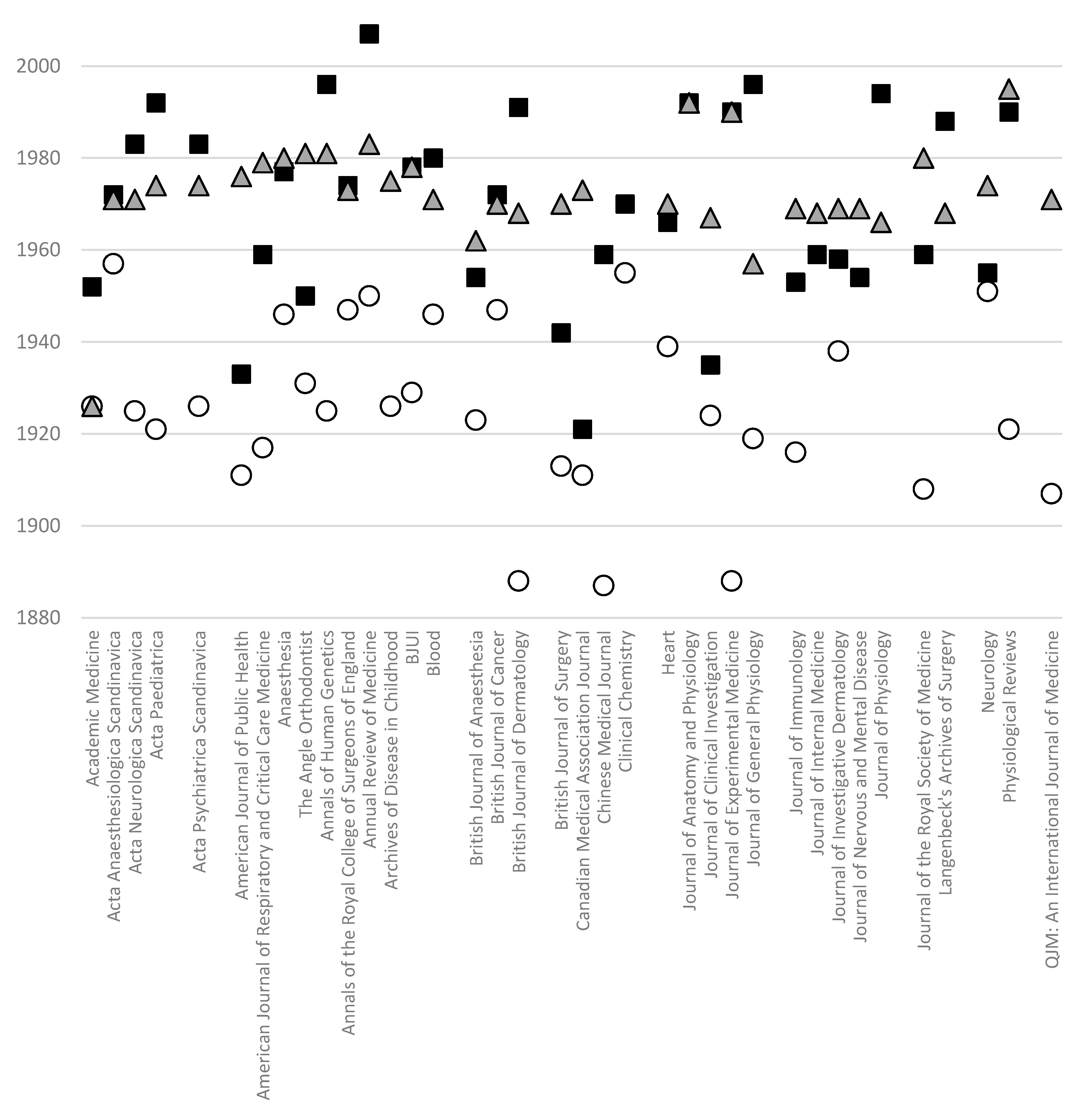
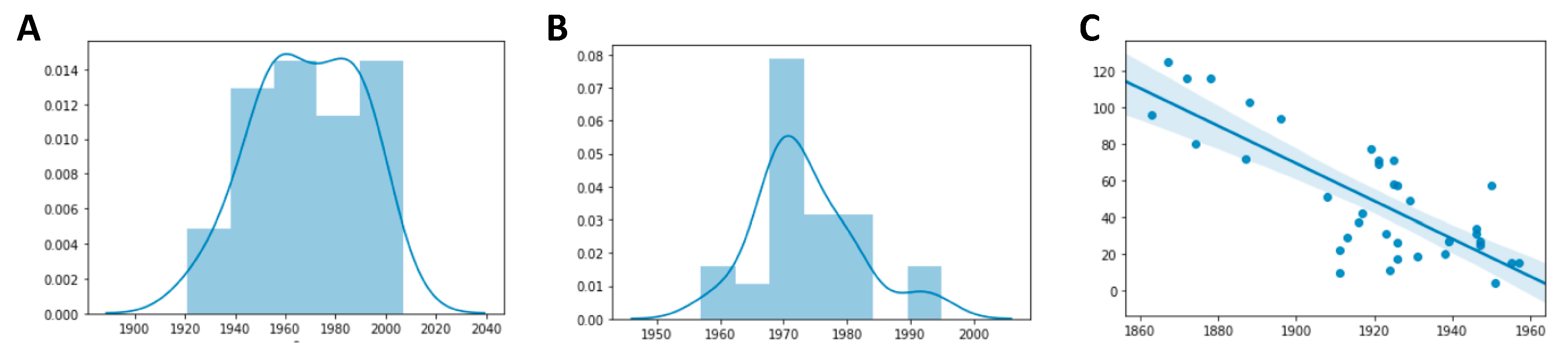
which would suggest again that the importance of having that section was not fully grasped at the time. If we look at Table 1, we notice that while the change in column layout usually occurred with the beginning of a solar year, and thus with a new volume, abstracts often appeared mid-year, as if they represented a minor adjustment for internal purposes, almost to be unnoticed by authors. Yet abstracts are now the emblem of the strategic approach to literature that was mentioned above. An abstract serves the purpose of quick identification of the content of a text, which is particularly useful during a literature search, where dozens or hundreds of articles are browsed and only a few pertinent works must be retained [38], and it is thus at the heart of that strategy of information retrieval that is necessary vis-à-vis the current biomedical literature.

5. Taking the Alternative Path?

The development of the World Wide Web was a game changer and the revolutionary effects of digital media on reading and publishing cannot be overstated. Texts can be read on a computer screen, on a tablet, on a mobile phone or on an e-ink reader [39]. These last devices are probably less relevant for academic publishing than for novels, because they cannot render color images such as photographs or graphs with a great resolution, but more importantly because they are not really fit for non-strategic reading [1].
As previously mentioned, biomedical journals are now available also in digital edition, and a growing awareness for waste consumption and ecological concerns may possibly promote the use of on-screen reading over paper printing. More and more researchers resort to reading the scientific literature—or rather browsing through the literature—on their computer screens rather than printing it. This phenomenon has been made even compulsory by the sheer volume of literature that scholars must search in their routine research activity or just to keep up to date in their field, but it has also been aided by the possibilities of hypertexting offered by digital media, which proves very useful during literature searches [40,41]. The effectiveness of digital reading compared to paper reading has been nontheless questioned, as many readers report that they still prefer reading texts on paper [42], and some studies suggest that readers may perform more poorly and have lower metacognitive awareness while reading on-screen, especially for expository texts [43,44,45,46], though possibly no differences exist in reading speed [42,45]. Optimizing articles to make them easier to read may therefore be an important goal for scientific literature. It has been investigated whether two-column formats perform equally effectively for digital reading [47]. Given the peculiar way that most computer interfaces work, scrolling is a much faster way to read than moving around the page, which, however, touchscreens have made a less cumbersome operation than on regular mouse-operated computers. Text optimization for screen viewing has been shown to reduce mental workload [48]. This is actually the reason why most publishers, as we mentioned, still offer the choice between a PDF file with standard, printer-friendly two-column formatting and an html-encoded version for digital reading. As responsive PDF viewers are not available [47], these full-text versions optimized for screen viewing usually consist of a one column of text, where font size can be easily adjusted by the reader, within a frame of header, footer, even sidebars containing additional information, hyperlinks and providing context to the main text. Some studies suggest that reading one-column texts may be significantly slower on screens than on paper [26], although caveats are necessary to note regarding the difference between speed and text comprehension in light of the purpose of the actual text, as new metrics should be evaluated [49,50].
It must be, however, noted that economic factors may also compound, when the adoption of specific layouts is considered. The digital age has dramatically decreased publication costs and the introduction of new, hitherto unthinkable, business models (e.g., open access journals), together with the need of authors to have more and more articles published, has facilitated the appearance of new big editorial groups. The policy of these publishers is often to make uniform the journal layout and appearance for easier management of the publishing operations. Such is, for instance, the case with MDPI, a relatively young publishing company that has consistently adopted a one-column format for both the html and PDF versions of its articles. Unlike many publishers, and definitely unlike what was habitually done in the past [51], its journals almost completely delegate manuscript preparation to authors. Most word processors that are commonly used by researchers worldwide are very apt at handling one column of text, and this layout format is arguably easier to manage than two-column layouts. A further explanation of this choice of layout is that it may be reasonable to provide articles in a format that is optimized for screen reading, as texts are not printed as often than they used to. This publisher may be therefore betting that readers will eventually make the transition and move to a fully digital reading experience (getting over the cognitively more gratifying experience of paper), and that the predominant part of the strategic reading of an article will be to scroll the text for very select pieces of information.

6. Where To?

Any survey at how this important—and yet so often overlooked—feature of scientific texts has changed over time leads to the conclusion that biomedical journals have mostly migrated from a one-column layout, which was popular at end of the 19th and beginning of the 20th century, to a two-column format in a period of time that in most examined cases was between 1960 and 1980. This change was mostly fueled by the need to save printed paper and by the higher flexibility of two-column layouts to accommodate graphical elements. However, most editors acknowledged that the new layout was somewhat more modern, or pleasant, or legible, thus confirming the relevance of this aspect of text composition in providing access to the content of the journal and its articles. More recently, the introduction of digital media has revived one-column texts again, and these may see a surge in popularity, as computer screens are the routine way to approach scientific texts. In spite of the long experience of the importance of layout in textbook understanding, relatively little attention has been devoted to using the layout as a way to facilitate information finding in the academic biomedical literature. This may be at least in part due to a prejudice, i.e., that scientific literature should be foreign to the frills of leisure publishing and that its readers should not be enticed by graphics or design but should rather solely focus on content. Yet page design is just another way to make content more accessible, and the importance of quickly identifying relevant data in an age of literature overload cannot be overstated. Further research should therefore be conducted to better delineate optimal layouts for the need of the readers of biomedical literature, to optimize the readers’ experience even in this regard, as reading retains and will retain its rightful place at the heart of the whole academic publishing industry.

Author Contributions

Conceptualization, C.G and S.G.; methodology, C.G. and M.T.C.; writing—original draft preparation, C.G.; writing—review and editing, C.G. and S.G.; supervision, S.G. All authors have read and agreed to the published version of the manuscript.

Funding

This research received no external funding.

Acknowledgments

The authors would like to thank Lorenzo Magnani and Selene Arfini (Computational Philosophy Lab, University of Pavia) for their insights on cognitive niche construction.

Conflicts of Interest

The authors declare no conflict of interest.

Appendix A

Table A1. List of randomly sampled journals from different fields. Their current layout and the presence of abstracts are indicated.
NameSpecialtyPublisher1 Column2 ColumnsAbstract
Journal of Archaeological ScienceArchaeologyElsevier XX
Oxford Journal of ArchaeologyArchaeologyWileyX X
Journal of Archaeological ResearchArchaeologySpringerX X
Journal of Asian StudiesMultidisciplinaryCambridge University PressX X
Classical PhilologyLiteratureUniversity of Chicago PressX -
EnglishLiteratureOxford University PressX -
Studies in MicroeconomicsEconomicsSAGE PublicationsX X
Journal of MacroeconomicsEconomicsElsevierX X
Journal of Law and SocietyLawWileyX X
International Journal of Law, Crime and JusticeLawElsevierX X
International Journal of Law in ContextLawCambridge University PressX X
Journal of PhysicsPhysicsIOPX
Journal of Computational PhysicsPhysicsElsevierX X
Molecular AstrophysicsPhysicsElsevier XX
Journal of ChemistryChemistryHindawi XX
Computational and Theoretical ChemistryChemistryElsevier XX
Analytical Chemistry ResearchChemistryElsevier XX
International Journal of Engineering ScienceEngineeringElsevierX X
International Journal of EngineeringEngineeringMaterials and Energy Research Center XX
Journal of Engineering EducationEngineeringWileyX X
Journal of Information ScienceITSAGE PublicationsX X
Journal of Information Security and ApplicationsITElsevier XX
Journal of Information TechnologyITSpringer XX

Appendix B

Table A2. Complete list of the screened journals. Reasons for exclusion are provided. If no reason for exclusion is listed, the journal was included in the present survey.
NameSpecialtyPublisherfirst IssueReason for Exclusion
Academic MedicineAcademic medicineAssociation of American Medical Colleges1926-
Acta Anaesthesiologica ScandinavicaAnaesthesiologyScandinavian Society of Anaesthesiology and Intensive Care Medicine1957-
Acta Neurologica ScandinavicaNeurologyWiley-Blackwell1925-
Acta PaediatricaPediatricsWiley-Blackwell1921-
Acta Psychiatrica ScandinavicaPsychiatryWiley-Blackwell1926-
American Journal of GastroenterologyGastroenterologyNature Publishing Group1934Available online issues starting from 1998
American Journal of the Medical SciencesMultidisciplinaryLippincott Williams & Wilkins1820Available online issues starting from 1995
American Journal of Public HealthPublic healthAmerican Public Health Association1911-
American Journal of Respiratory and Critical Care MedicineCritical careAmerican Thoracic Society1917-
AnaesthesiaAnaesthesiologyWiley-Blackwell1946-
The Angle OrthodontistOrthodonticsTaylor and Francis Group1931-
Annals of Human GeneticsHuman geneticsJohn Wiley & Sons1925-
Annals of the Royal College of Surgeons of EnglandSurgeryThe Royal College of Surgeons of England1947-
Annual Review of MedicineMultidisciplinaryAnnual Reviews1950-
Archives of Disease in ChildhoodPediatricsBMJ Group1926-
British Dental JournalDentistryNature Publishing Group1904Available online issues starting from 1970
BJUIUrologyWiley-Blackwell1929-
BloodHematologyAmerican Society of Hematology1946-
BMJMultidisciplinaryBMJ1840Started with a two-column layout
British Journal of AnaesthesiaAnaesthesiologyOxford University Press1923-
British Journal of CancerOncologyNature Publishing Group1947-
British Journal of DermatologyDermatologyWiley-Blackwell1888-
British Journal of OphthalmologyOphthalmologyBMJ Publishing Group1917Available online issues starting from 2010
British Journal of SurgerySurgeryJohn Wiley & Sons1913-
CA – A Cancer Journal for CliniciansOncologyWiley-Blackwell1950Started with a 2-column layout
Canadian Medical Association JournalMultidisciplinaryCanadian Medical Association1911-
ChestCardiology, respiratory healthAmerican College of Chest Physicians1935Started with a two-column layout
Chinese Medical JournalMultidisciplinaryChinese Medical Association, Wolters Kluwer Medknow1887-
CirculationCardiologyLippincott Williams & Wilkins1950Started with a two-column layout
Clinical ChemistryMedicinal chemistryAmerican Association for Clinical Chemistry1955-
Clinical Pharmacology & TherapeuticsPharmacologyWiley-Blackwell1960Started with a two-column layout
Deutsche Medizinische WochenschriftMultidisciplinaryThieme Medical Publishers1875Started with a two-column layout
DiabetesDiabetesAmerican Diabetes Association1952Started with a two-column layout
HeartCardiologyBMJ Group1939-
International Journal of PsychoanalysisPsychologyWiley-Blackwell1920Available online issues starting from 2001
Journal of Anatomy and PhysiologyPhysiologyCambridge University Press1867-
Journal of Clinical InvestigationMultidisciplinaryAmerican Society for Clinical Investigation1924-
Journal of Experimental MedicineMultidisciplinaryRockefeller University Press1896-
Journal of General PhysiologyPhysiologyRockefeller University Press1919-
Journal of ImmunologyImmunologyThe American Association of Immunologists1916-
Journal of Internal MedicineMultidisciplinaryWiley-Blackwell1863-
Journal of Investigative DermatologyDermatologyNature Publishing Group1938-
Journal of Nervous and Mental DiseasePsychiatryLippincott Williams & Wilkins1874-
Journal of Occupational and Environmental MedicineOccupational medicineLippincott Williams & Wilkins1959Started with a two-column layout
Journal of PhysiologyPhysiologyWiley-Blackwell1878-
Journal of the Royal Society of MedicineMultidisciplinarySAGE Publications1809-
Langenbeck’s Archives of SurgerySurgerySpring Science+Business Media1860-
The Medical Journal of AustraliaMultidisciplinaryAustralasian Medical Publishing Company1914Available online issues starting from 1996
The Medical Letter on Drugs and TherapeuticsPharmacologyThe Medical letter, Inc.1959Available online issues starting from 1988
NeurologyNeurologyLippincott Williams & Wilkins1951-
Obstetrics and GynecologyObstetrics, gynecologyLippincott Williams & Wilkins1953Started with a two-column layout
Postgraduate MedicineMultidisciplinaryTaylor and Francis1947Started with a two-column layout
Physiological reviewsPhysiologyAmerican Physiological Society1921-
Psychosomatic MedicinePsychologyLippincott Williams & Wilkins1939Started with a two-column layout
QJM: An International Journal of MedicineMultidisciplinaryOxford University Press1907-

References

  1. Waller, R. Graphic Literacies for a Digital Age: The Survival of Layout. Inf. Soc. 2012, 28, 236–252. [Google Scholar] [CrossRef]
  2. Moys, J.L. Typographic layout and first impressions: Testing how changes in text layout influence reader’s judgments of documents. Visible Lang. 2014, 48, 40–67. [Google Scholar]
  3. Sollaci, L.B.; Pereira, M.G. The introduction, methods, results, and discussion (IMRAD) structure: A fifty-year survey. J. Med. Libr. Assoc. 2004, 92, 364–367. [Google Scholar]
  4. Yamamoto, N. Genetic evolution of bacteriophage, I. Hybrids between unrelated bacteriphages P22 and fels 2*. Proc. Natl. Acad. Sci. USA 1968, 62, 63–69. [Google Scholar] [CrossRef] [Green Version]
  5. Upton, F.P. Electricity as power. Science 1880, 1, 5. [Google Scholar] [CrossRef] [Green Version]
  6. True, F.W. Movement of the arms in walking. Science 1883, 1, 11. [Google Scholar] [CrossRef] [PubMed] [Green Version]
  7. Southall, R. First principle of typographic design for document production. TUGboat 1984, 5, 79–90. [Google Scholar]
  8. Landhuis, E. Scientific literature: Information overload. Nature 2016, 535, 457–458. [Google Scholar] [CrossRef] [Green Version]
  9. Haynes, R.B.; Mulrow, C.D.; Huth, E.J.; Altman, D.G.; Gardner, M.J. More informative abstracts revisited. Ann. Intern. Med. 1990, 113, 69–76. [Google Scholar] [CrossRef] [PubMed]
  10. Morison, S. New Typography of the Journal. BMJ 1937, 1, 32–33. [Google Scholar]
  11. Galli, C.; Sala, R.; Colangelo, M.T.; Guizzardi, S. Between Innovation and Standardization, Is There Still a Room for Scientific Reports? The Rise of a Formatting Tradition in Periodontal Research. Publications. 2019, 7, 67. [Google Scholar] [CrossRef] [Green Version]
  12. McCarty, M. The Journal Prepares for its Second Century. J. Exp. Med. 1990, 172, 1–6. [Google Scholar] [CrossRef] [Green Version]
  13. Galli, C.; Guizzardi, S. Change in Format, Register and Narration Style in the Biomedical Literature: A 1948 Example. Publications 2020, 8, 10. [Google Scholar] [CrossRef] [Green Version]
  14. Foreword (Editorial). Can. Med. Assoc. J. 1921, 11, 1–2.
  15. Bachmeyer, A.C. Retrospect and prospect. J. Med. Educ. 1952, 27, 1–9. [Google Scholar] [CrossRef] [PubMed]
  16. Editorial. Br. J. Cancer. 1972, 26, 1–2. [CrossRef] [Green Version]
  17. Editorial. Anaesthesia. 1977, 32, 1–2. [CrossRef]
  18. Chesterton, G.K.; Boulton, T.B. Editorial. Anaesthesia 1980, 35, 1–2. [Google Scholar] [CrossRef]
  19. The New Format (Editorial). Angle Orthod. 1950, 20, 180.
  20. Zetterström, R. Acta Paediatrica Scandinavica–now just Acta Paediatrica. Acta Paediatr. 1992, 81, 95. [Google Scholar] [CrossRef]
  21. Moreno, R.; Mayer, R.E. Cognitive principles of multimedia learning: The role of modality and contiguity. J. Educ. Psychol. 1999, 91, 358–368. [Google Scholar] [CrossRef]
  22. Holsanova, J.; Holmberg, N.; Holmqvist, K. Reading information graphics: The role of spatial contiguity and dual attentional guidance. Appl. Cogn. Psychol. 2009, 23, 1215–1226. [Google Scholar] [CrossRef]
  23. Cordero, R.J.B.; de León-Rodriguez, C.M.; Alvarado-Torres, J.K.; Rodriguez, A.R.; Casadevall, A. Life Science’s Average Publishable Unit (APU) Has Increased over the Past Two Decades. PLoS ONE 2016, 11, e0156983. [Google Scholar] [CrossRef]
  24. Lonsdale, M.D.S. Typographic features of text and their contribution to the legibility of academic reading materials: An empirical study—White Rose Research Online. Visible Lang. 2016, 50, 79–111. [Google Scholar]
  25. Tarasov, D.A.; Sergeev, A.P.; Filimonov, V.V. Legibility of Textbooks: A Literature Review. Procedia—Soc. Behav. Sci. 2015, 174, 1300–1308. [Google Scholar] [CrossRef] [Green Version]
  26. Zaphiris, P.; Kurniawan, H. Effects of Information Layout on Reading Speed: Differences between Paper and Monitor Presentation. Proc. Hum. Factors Ergon. Soc. Annu. Meet. 2001, 45, 1210–1214. [Google Scholar] [CrossRef] [Green Version]
  27. Al-Samarraie, H.; Price, M.L. How reading in single-and multiple-column types influence our cognitive load: An EEG study. Electron. Libr. 2019, 37, 4. [Google Scholar] [CrossRef]
  28. Venig, S.B.; Solovyova, V.A. Eye-tracking: Regularities of educational information searching. Int. Annu. Ed. Appl. Psychol. Theory. 2016, 3, 97–111. [Google Scholar]
  29. Al-Samarraie, H.; Sarsam, S.M.; Umar, I.N. Visual perception of multi-column-layout text: Insight from repeated and non-repeated reading. Behav. Inf. Technol. 2016, 36, 1–10. [Google Scholar] [CrossRef]
  30. Speer, N.K.; Reynolds, J.R.; Swallow, K.M.; Zacks, J.M. Reading stories activates neural representations of visual and motor experiences. Psychol. Sci. 2009, 20, 989–999. [Google Scholar] [CrossRef] [Green Version]
  31. Tenopir, C.; King, D.W.; Christian, L.; Volentine, R. Scholarly article seeking, reading, and use: A continuing evolution from print to electronic in the sciences and social sciences. Learn. Publ. 2015, 28, 93–105. [Google Scholar] [CrossRef] [Green Version]
  32. Burrough-Boenisch, J. International Reading Strategies for IMRD Articles. Writ. Commun. 1999, 16, 296–316. [Google Scholar] [CrossRef]
  33. Clark, A. Language, embodiment, and the cognitive niche. Trends Cogn. Sci. 2006, 10, 370–374. [Google Scholar] [CrossRef] [Green Version]
  34. Clark, A. Supersizing the Mind; Oxford University Press (OUP): Oxford, UK, 2008. [Google Scholar]
  35. New Title Page Inaugurated (Editorial). Diabetes 1964, 13, 95. [CrossRef] [Green Version]
  36. Somerville, W. Retirement of K. Shirley Smith as Editor. Heart 1973, 35, 1. [Google Scholar] [CrossRef] [Green Version]
  37. Smith, K.S. The British Heart Journal Redesigned. Br. Heart J. 1970, 32, 1. [Google Scholar] [CrossRef] [PubMed] [Green Version]
  38. Atanassova, I.; Bertin, M.; Larivière, V. On the composition of scientific abstracts. J. Doc. 2016, 72, 636–647. [Google Scholar] [CrossRef]
  39. Balling, G.; Begnum, A.C.; Kuzmičová, A.; Schilhab, T. The young read in new places, the older read on new devices: A survey of digital reading practices among librarians and Information Science students in Denmark. Participations 2019, 16, 197–236. [Google Scholar]
  40. Balcytiene, A. Exploring individual processes of knowledge construction with hypertext. Instr. Sci. 1999, 27, 303–328. [Google Scholar] [CrossRef]
  41. Charney, D. Comprehending non-linear text. In Proceeding of the ACM Conference on Hypertext HYPERTEXT ’87; Association for Computing Machinery (ACM): New York, NY, USA, 1987; pp. 109–120. [Google Scholar]
  42. Holzinger, A.; Baernthaler, M.; Pammer, W.; Katz, H.; Bjelic-Radisic, V.; Ziefle, M. Investigating paper vs. screen in real-life hospital workflows: Performance contradicts perceived superiority of paper in the user experience. Int. J. Hum. Comput. Stud. 2011, 69, 563–570. [Google Scholar] [CrossRef]
  43. Clinton, V. Reading from paper compared to screens: A systematic review and meta-analysis. J. Res. Read. 2019, 42, 288–325. [Google Scholar] [CrossRef]
  44. Sidi, Y.; Shpigelman, M.; Zalmanov, H.; Ackerman, R. Understanding metacognitive inferiority on screen by exposing cues for depth of processing. Learn. Instr. 2017, 51, 61–73. [Google Scholar] [CrossRef]
  45. Kong, Y.; Seo, Y.S.; Zhai, L. Comparison of reading performance on screen and on paper: A meta-analysis. Comput. Educ. 2018, 123, 138–149. [Google Scholar] [CrossRef]
  46. Mangen, A.; Walgermo, B.R.; Brønnick, K. Reading linear texts on paper versus computer screen: Effects on reading comprehension. Int. J. Educ. Res. 2013, 58, 61–68. [Google Scholar] [CrossRef]
  47. Moustafa, K. Improving PDF readability of scientific papers on computer screens. Behav. Inf. Technol. 2016, 35, 319–323. [Google Scholar] [CrossRef] [Green Version]
  48. Wästlund, E.; Norlander, T.; Archer, T. The effect of page layout on mental workload: A dual-task experiment. Comput. Human Behav. 2008, 24, 1229–1245. [Google Scholar] [CrossRef]
  49. Dyson, M.C.; Kipping, G.J. Exploring the Effect of Layout on Reading from Screen. Lecture Notes in Computer Science (Including Subseries Lecture Notes in Artificial Intelligence and Lecture Notes in Bioinformatics); Springer: Berlin/Heidelberg, Germany, 1998; pp. 294–304. [Google Scholar]
  50. Coiro, J. Toward a Multifaceted Heuristic of Digital Reading to Inform Assessment, Research, Practice, and Policy. Read. Res. Q. 2020, rrq.302. [Google Scholar] [CrossRef] [Green Version]
  51. Ravenel, M.P. Work for the editor. Am. J. Public Health 1936, 26, 636–637. [Google Scholar]
Figure 1. Comparison between two mock-up texts as they would appear in (A) a one-column layout or (B) a two-column layout. Most academic journals adopted either one of these two formats for their articles.
Publications 08 00038 g001
Figure 2. This graph summarizes the introduction of a two-column layout and abstract in the printed edition for each of the journals that were considered in the present commentary. White circles indicate the date the journal was first published, black squares—the year they switched to a two-column format, and the grey triangles—the year abstracts at the beginning of articles were introduced. The figure does not include the introduction of digital editions.
Publications 08 00038 g002
Figure 3. (A) Frequency distribution of the transition from one- to two-column layouts in the present sample of journals. The year the change in format occurred is reported on the x axis. (B) Frequency distribution of adoption of abstracts in the present sample. The year the change in format occurred is reported on the x axis. (C) Correlation plot between the journal foundation (x axis) and the time span to the adoption of a two-column layout (y axis). There is a clear correlation trend: younger journals were also faster to switch to a new layout (Pearson’s correlation coefficient = −0.78).
Publications 08 00038 g003
Table 1. This is the list of the included journals, their publishers, the date the journal opted for a single-column or double-column layout and the appearance of abstracts.
NamePublisherOne ColumnTwo ColumnsAbstract
Academic MedicineAssociation of American Medical Colleges1926–19511952–1975
Acta Anaesthesiologica ScandinavicaScandinavian Society of Anaesthesiology and Intensive Care Medicine1957–1971 1972–1971
Acta Neurologica ScandinavicaWiley-Blackwell1925–1982 1983–1971
Acta PaediatricaWiley-Blackwell1921–19911992– Mar 1974
Acta Psychiatrica ScandinavicaWiley-Blackwell1926–19821983–Feb 1974
American Journal of Public HealthAmerican Public Health Association1911– Feb 1933Mar 1933– Jan 1976
American Journal of Respiratory and Critical Care MedicineAmerican Thoracic Society1917–19581959–1979
AnaesthesiaWiley-Blackwell1946–19761977– Jan 1980
The Angle OrthodontistTaylor and Francis Group1931–1950 1950–1981
Annals of Human GeneticsJohn Wiley & Sons1925–1995 1996–Jan 1981
Annals of the Royal College of Surgeons of EnglandThe Royal College of Surgeons of England1947–1973 1974–1973
Annual Review of MedicineAnnual Reviews1950–2006 2007–1983
Archives of Disease in ChildhoodBMJ Group1926–19421943- 1975
BJUIWiley-Blackwell1929–19771978– 1978
BloodAmerican Society of Hematology1946- 19791980– Jul 1971
British Journal of AnaesthesiaOxford University Press1923–19531954–Jun 1962
British Journal of CancerNature Publishing Group1947–1971 1972-–Mar 1970
British Journal of DermatologyWiley-Blackwell1888–19901991–Jan 1968
British Journal of SurgeryJohn Wiley & Sons1913–19411942–Jan 1970
Canadian Medical Association JournalCanadian Medical Association1911–19201921–Jan 1973
Chinese Medical JournalChinese Medical Association, Wolters Kluwer Medknow1887–19491959–
Clinical ChemistryAmerican Association for Clinical Chemistry1955–19691970Jan 1961
HeartBMJ Group1939–19651966–Jan 1970
Journal of Anatomy and PhysiologyCambridge University Press1867–19911992–1992
Journal of Clinical InvestigationAmerican Society for Clinical Investigation1924–19341935– Jan 1967
Journal of Experimental MedicineRockefeller University Press1896–19891990Jul 1990
Journal of General PhysiologyRockefeller University Press1919–19951996–Sep 1957
Journal of ImmunologyThe American Association of Immunologists1916–Jan 1953Feb 1953– Jul 1969
Journal of Internal MedicineWiley-Blackwell1863 –1959 1959– Jan 1968
Journal of Investigative DermatologyNature Publishing Group1938–19571958- May 1969
Journal of Nervous and Mental DiseaseLippincott Williams & Wilkins1874–Jun 1954Jul 1954–Jan 1969
Journal of PhysiologyWiley-Blackwell1878–19931994–Jan 1966
Journal of the Royal Society of MedicineSAGE Publications1908–19581959–Jan 1980
Langenbeck’s Archives of SurgerySpring Science+Business Media1872–19871988Dec 1968
NeurologyLippincott Williams & Wilkins1951–19541955–Jan 1974
Physiological ReviewsAmerican Physiological Society1921–1989 1990–Jul 1995
QJM: An International Journal of MedicineOxford University Press1907– Jan 1971

