1. Introduction
The Brazilian Digital Library of Theses and Dissertations (BDTD) <
http://bdtd.ibict.br> is a network of repositories of theses and dissertations. It aggregates records of more than a hundred and ten Brazilian institutions that contribute with an amount of almost 670.000 documents [
1]. This national consortium is the second largest presented in the Networked Digital Library of Theses and Dissertations (NDLTD) [
2]. The network itself is also a source for the Brazilian node in the LA Referencia network <
http://www.lareferencia.info>, the Brazilian Portal of Open Access Publications (oasisbr) <
http://oasisbr.ibict.br>.
BDTD was created in 2002 with a small set of brazilian institutions. The foundations of this consortium included the development of a technological tool for the implementation of local libraries of theses and dissertations, named System of Electronic Publications of Theses and Dissertations (TEDE) [
3], and a national metadata standard for description of theses and dissertations, named MTD-BR, based on the international Electronic Theses and Dissertations Metadata Standard (ETD-MS) [
4]. Additionally, a harvester system and a meta-searcher portal were developed using the Open Access Initiative Protocol Metadata Harvesting (OAI-PMH) for the interoperability between the local libraries and the central node.
Between 2015 and 2017, all the technological infrastructure of BDTD was updated. A new package tool for building local digital libraries of theses and dissertations was developed on the top of the DSpace platform [
5,
6]. Additionally, the metadata standard, the harvester system and the meta-searcher portal of the network were changed. A modern description of TDs based on Qualified Dublin Core was developed. It adopted the use of the LA Referencia Software [
7] as metadata harvester (transformer and validator) and the Vufind meta-searcher software [
8] as the national BDTD portal.
Over this infrastructure, data support, analysis and visualization techniques are given through plenty of tools, since visual representation of data has strong importance in decision making, it improves the collaboration between users and increases the return of governmental investments in research [
9]. The most common techniques are based on static methods of visualization; however, new functionalities allow the user to dynamically change a visualization by adjusting parameters in some controlled variables by the use of buttons, selection lists or direct clicks on the generated plot. Within dynamic visualization, some elements are considered relevant, such as selection, filtering, sorting, linking and brushing [
10].
The language R configures a suitable open source interface for dynamic visualization. R is an environment for statistical computing and graphics, supports multiple data formats and it has a strong community [
11]. It works mostly using packages (collections of functions) developed by the community. The packages improve existing base R funcionalities, or add new ones. Two of the most popular packages are
dplyr and
data.table, used for data manipulation.
For dynamic data visualization, R provides a package that is called
Shiny, which makes it easy to build interactive web applications straight from R. This also allows to implement standalone apps on a webpage or embed graphs into R Markdown documents. The main functionality of
Shiny is to build visualization dashboards [
12].
2. Content
The most important procedures of cleaning and data treatment are done by the harvester system used by BDTD, that is, the LA Referencia Software, later on indexed on the Apache-Solr server and exposed via its API. Additionally, in order to keep the consistency of the data, other small validations are done, such as the verification of missing data and the correction of character encoding problems.
The treatment part inside R is related mostly to the procedures of visualization and transforming lists into a dataframe format. For instance, to generate the graphs, it is needed to create dataframes for nodes and links, which also comes in a list format, and needs to be converted. Another example is regarding the map visualization, because it is needed to add the georeferenced information of the institutions into the dataframe, since it is not available inside the Solr records.
To make the open scientific information more shareable and interactive, the app
bdtd-shiny was built into a R-Shiny app. This app reads the information through an Apache-Solr server via its API, downloading the information in the JSON format. The solr query language was adapted inside R, as a function, so when the data is imported to R it’s exactly what the solr base returned, with all of its parameters. A specific search on the Apache-Solr index is converted to an R data-frame, via R JSON importing tools. This is a one time process and the user can perform queries inside the dashboard. After that, it is needed to add the filters and options available inside the R-Shiny package. One can learn about the package and watch tutorials about it at
https://shiny.rstudio.com/tutorial.
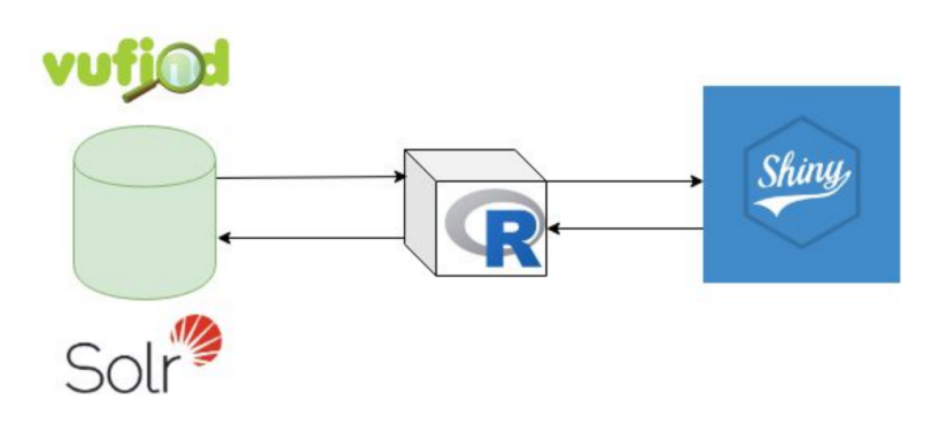
Figure 1 shows the flowchart of the conections between the R kernel, the solr search engine and the R-shiny aplication. The dashboard is built on the top of Solr queries, so most computation stress is delegated to the backend of the search engine, in a way that multiple users can access the dashboard without provoking an DoS failure.
2.1. Visualizations
The data is displayed in the interface. The user can interact with the sidebar panel to adjust the desired filters.
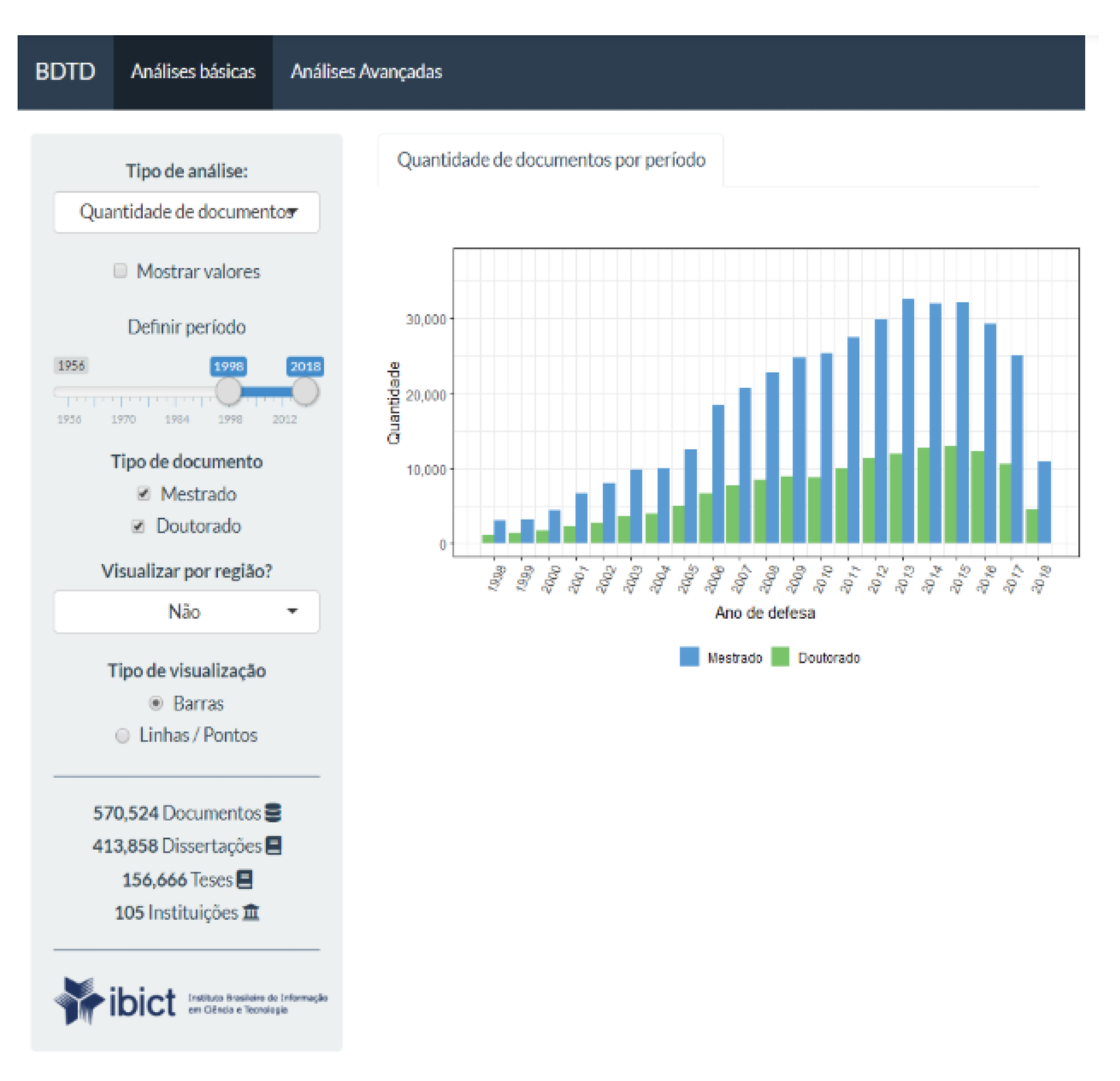
Figure 2 shows the distribution per year and by type of the BDTD digital repository information according to the definitions in the sidebar panel. At the left, on the bottom of the
Figure 2, it is displayed a summary of the whole database.
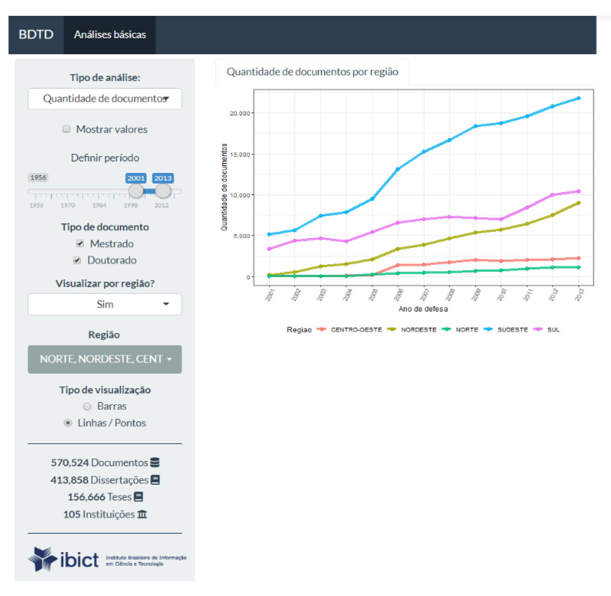
All the items on the sidebar panel are responsive, so, if the user changes it, the app updates the plot automatically. Also, in
Figure 3, it is presented an example of how the app allows the visualization of the number of documents by Brazilian geographic groups.
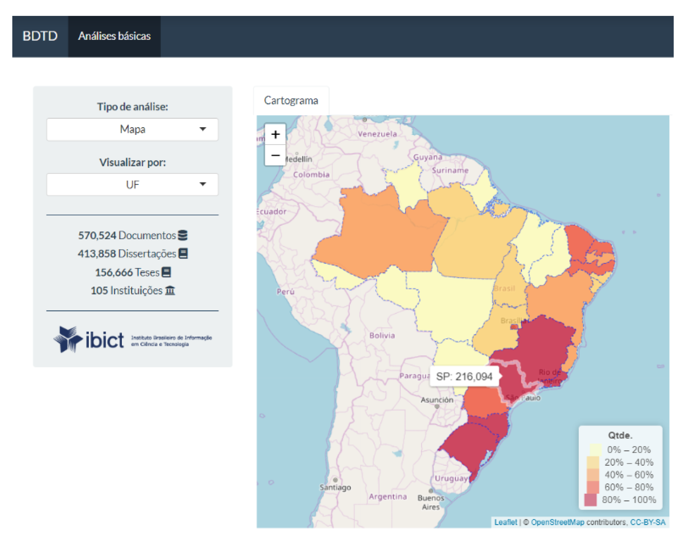
Data can also be displayed through a cartogram, according to the density of publications by geographic distribution. The user can choose between region and a Brazilian state (see
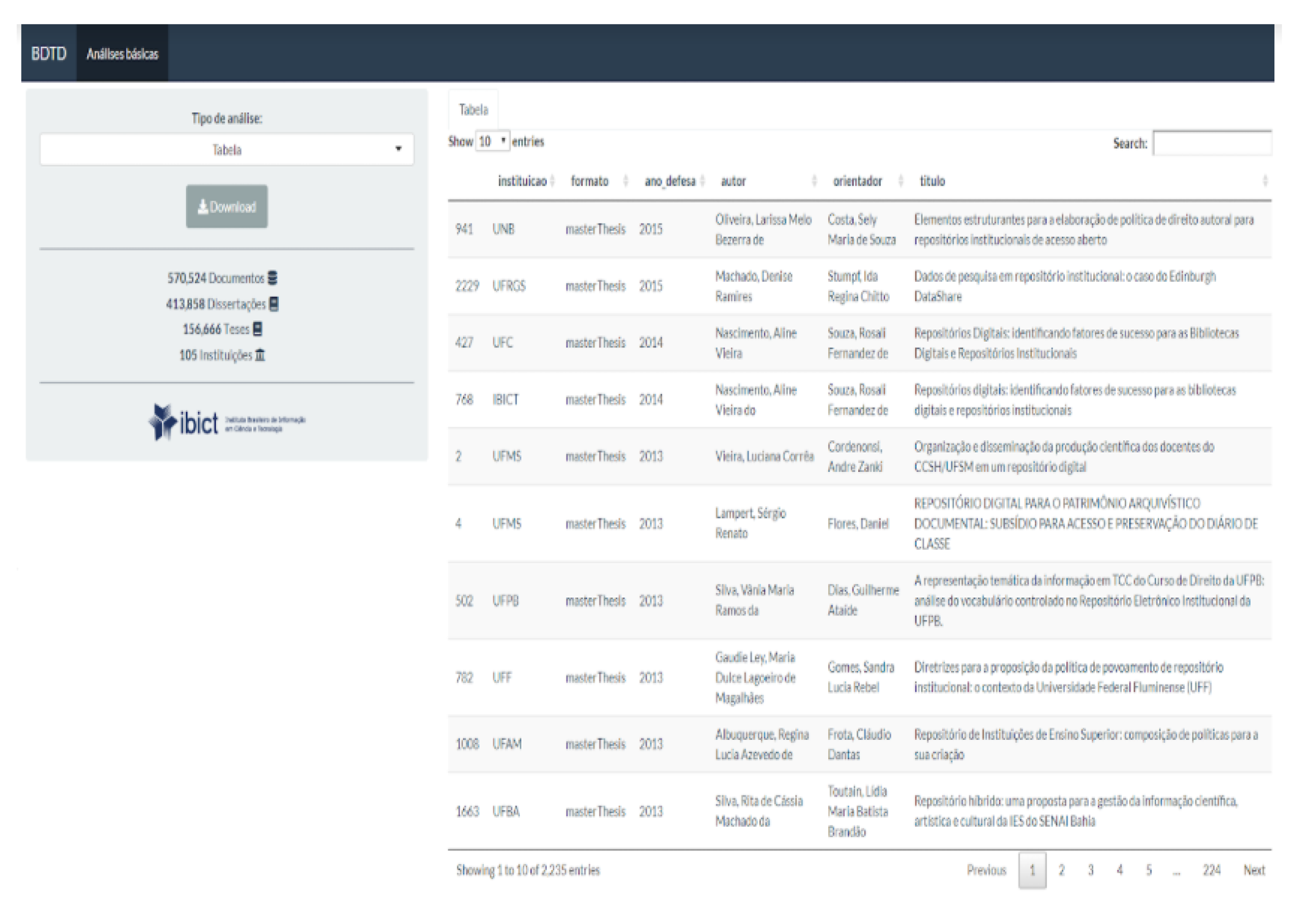
Figure 4). Also, the user can export the analyzed data into the CSV format accessing an export tab on the Shiny app (see
Figure 5) and use it to perform its own local analysis over the downloaded data.
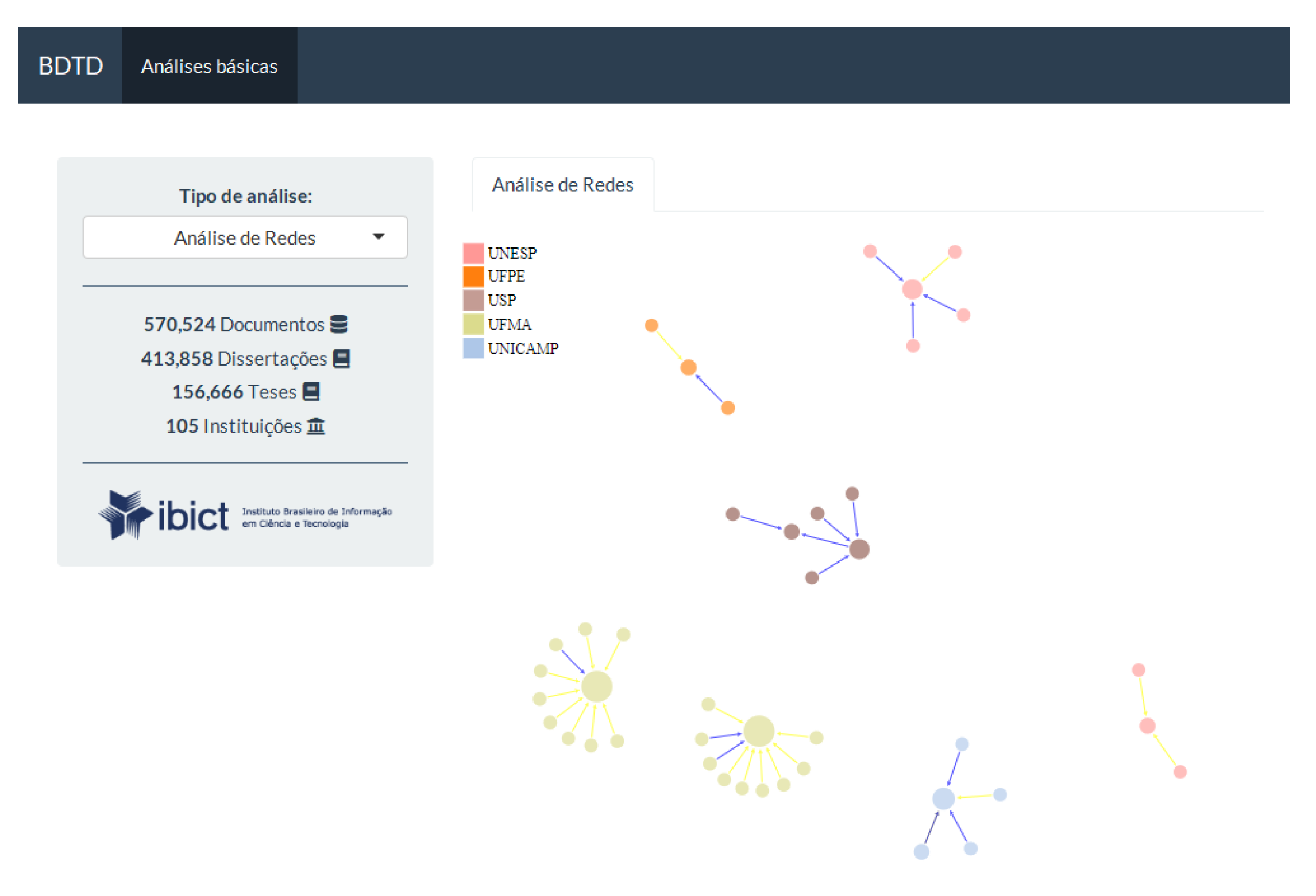
Another option of visualization is the network of the collaboriation between authors and contributors, which is specifically provided by the package
networkD3 (see
Figure 6). In the presented graph the arrows indicate supervisoring: the blue for master thesis and the yellow for doctoral thesis supervision. The size of the nodes represent how many supervisions one did. The graph is also responsive, so, if the user clicks on a node it will open the authors or advisor information. The information displayed is shown by the Lattes Research Profile Platform, wich has over 6 million records, supported by the National Council of Scientific and Technological Development (CNPq). This platform contains 99% of the researchers profile in Brazil.
Other visualizations are available, such as the wordcloud (see
Figure 7) with subjects related to the user’s query. The size of the words are related to it’s frequency inside the query. It is also an interesting way to see other terms related to the search. The wordcloud also allows the user to click the subjects shown inside it and the app updates the query automatically on the interface.
2.2. Usage Statistics
For collecting the usage statistics of Google Analytics, it was adopted the sample provided by Google in [
13] and the resulting Python script is available in [
14]. This resulted in a data frame with 24 K lines, and columns month-year, record_id and number_of_views. This data frame was later imported into the R environment for manipulation and analyses. The related topics of each record where extracted by analyzing the fields that contained key-words, in most cases this information is stored in the dc.subject field, in the corresponding record indexed in an Apache-Solr base. The subject field comes in a “list” format, so there was a need to manipulate it to unlist and count how many times that subject appeared.
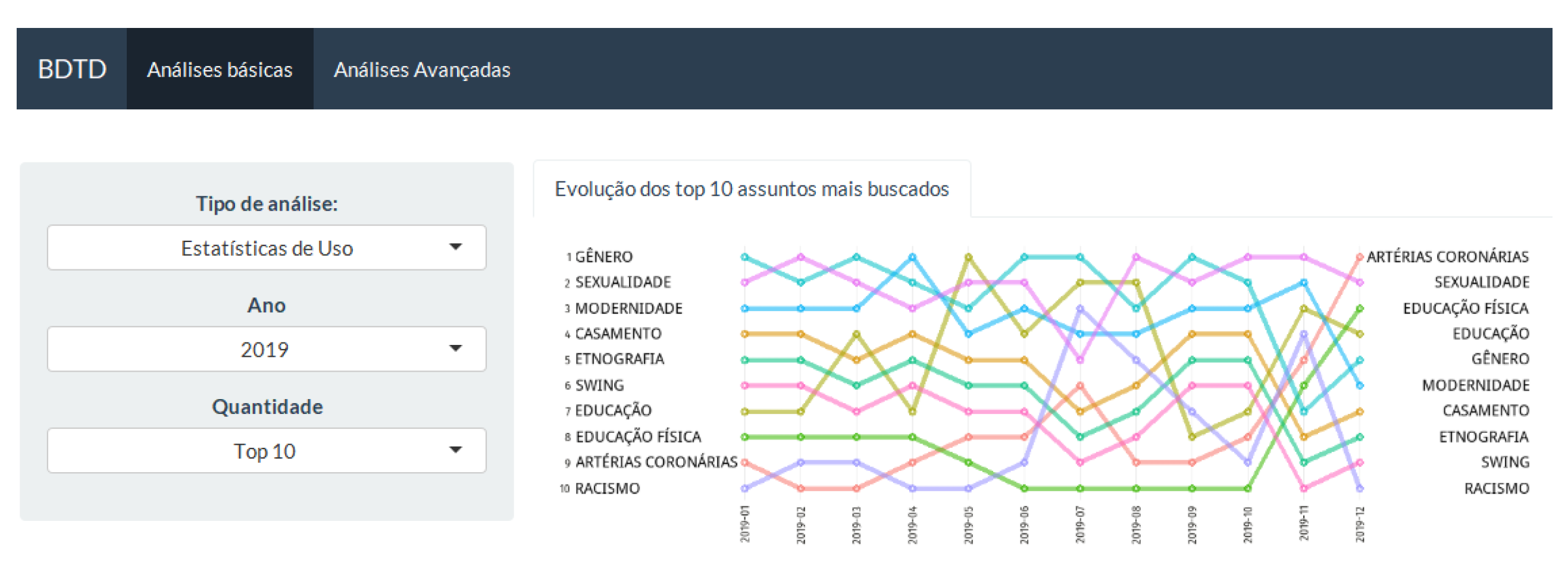
The next thing to do was to summarise the data by the most accessed subjects by month, ranking them. For example, if a record has related subjects: food, agriculture and education, and it was viewed 100 times in January of 2018, the ranking scores 100 points to food, agriculture and education in this month-year. A bump chart is used to represent the evolution of the top ten most viewed subjects. This plot is used to explore the changes in rank over time, usually focused on comparing the position or performance of multiple observations with respect to each other, instead of only observing an actual value.
On
Figure 8, translated into English, the top ten trending topics in 2019 are: gender, sexuality, modernity, marriage, ethnography, swing, education, physical education, coronary arteries, and racism. It allows seeing that some topics are between the top five in all the observed period: gender and sexuality, and others had a great increase in interest such as coronary arteries and physical education. This analysis suggests some topics that are constantly of interest and others that are related to some historical context. There are also options of filters such as the year of interest and the amount of subjects do display (top 10, top 25 or top 50).
2.3. Saturation Curve
Finally, we have the the saturation’s curve analysis (see
Figure 9) for a specific set of therms queried on the database. The process starts with the selection of the terms, built via a thesaurus, previously defined by an information specialist. For example, here it is presented the delimitation of records that are related to ‘assistive technology’. After that, the terms are imported into R, the statistical environment. Search expressions are built, in specific textual fields, such as title, description and subject with boolean connectives.
The generic query expression is as follows: query:title:”keyword1” OR description:”keyword1” OR subject:”keyword1” OR title: ”keyword2” OR description:”keyword2” OR subject:”keyword2” … title:”keyword-n” OR description:”keyword-n” OR subject:”keyword-n”.
After cleaning the recovered set of records by offsetting most generic and most specific terms, one can export a CSV file with these documents, in a way that it can be batch imported into a DSpace instance. In some cases, it is also needed to adapt the queries using wildcards or a more complex combination of boolean expressions to optimize the specificity of the recovered objects.
3. Results
The use of modern tools for data visualization and data sharing helps the user to see a better picture of what it is looking at. Also, it could encourage other institutions to join the open access movement and make their documentation easier to be found and to be explored, without losing mid/long term crucial information. Due to the fact that R is a free software and has an open source code, the app could be shared and improved by users who wish to do so.
This dashboard is not in production yet, but tests were done with a similar approach on a searching specialists interface provided by the developing of a proof of concept portal [
15]. Since this is still at the final phase of launching, only feedback from coworkers was received, but it is also in mind that it can be improved or adapted due to the ease of use of the Shiny application. Furthermore, the app will be customized later on, with the help of web designers, to obtain a better user experience.
Moreover, we should remark that taking into account the analysis options, R-Shiny is very suitable for this purpose. The huge community of R provides a plenty of well-established packages that facilitates the creation of R-Shiny interfaces. For example, Bibliometrix and its user interface Biblioshiny stand out since they incorporate a great variety of different analyses. In practice, since it is recent, most of the analysis developed by the previous software tools have been incorporated in Bibliometrix/Biblioshiny [
16]. Also, the program deals with a lot of file formats, which could be exported for further visualizations in other tools, such as Ghephi, Bibitex or IRAMUTEQ. This case will also be extended to the osasisbr portal.
