Abstract
Assessment of process stability is a key to ensuring the high quality of any product, service, activity, etc. The main tool for doing this is a Shewhart control chart. However, it becomes difficult to analyze hundreds or thousands of control charts at a time for some up-to-date complex processes. In order to solve this problem, various indicators of process stability have been recently proposed with the Stability Index (SI) being the latest one, and, in many opinions, the best one. We have thoroughly analyzed different suggestions and found many of them ambiguous and sometimes even harmful to practitioners. Some examples of possible problems with the SI are provided below. It is argued that abnormal values of the SI can be caused not only by process instability, but by non-homogeneity, non-randomness, nonnormality, and autocorrelation as well. It is proved that the SI can be helpful for practitioners as an index to attract primary attention to the process. A proposal to rename the SI and widen significantly its application is given. Finally, some ways that practitioners could use this index more effectively are discussed.
1. Introduction
“Sapere aude”
“No amount of experimentation can ever prove me right;
a single experiment can prove me wrong”
Albert Einstein
Quantitative metrics estimating process stability emerged more than twenty years ago in the works of Podolski [1] and Cruthis and Rigdon [2]. Ramirez and Runger [3], Gauri [4], Wooluru et al. [5], Britt et al. [6], and Sall [7] continued the search for an optimal measure and the best way of its application. At last, most recent publications include two papers by Jensen et al. [8,9], White et al. [10], and Kim Jeong-bae et al. [11]. It is worth noting that over time the emphasis of expert attention moved from stability estimation to the process health evaluation where the process health is considered to be “the actual process performance compared to specifications, process stability, process location, potential process capability to meet specifications, and the adequacy of the measurement system.” [10]. All authors are aware of the limitations of any attempts to characterize a process with a single index. That is why they suggest using such metrics to find out processes having some kinds of problems. Unfortunately, they consider the SI to be an indicator only of stability issues while it can point out many other problems, as it is shown below. Thus, we think that the SI can sometimes be a useful measure of Explanatory Data Analysis (EDA) but its values cannot be construed as directly and single-valued as many authors suggest. Following the famous G. Box maxim, “All models are wrong, but some are useful”, it is necessary to establish more clear restrictions on SI interpretation. This is the purpose of our paper. We explain the main concepts of the SI from a much wider perspective than all previous works, explicating their limited look and creating the basis for a more useful application of this index. The main results of the previous works are briefly discussed in the Section 2. Problems with SI explanations are presented in the Section 3. The relation between abnormal values of the SI and process health is considered in the Section 4. Conclusions are given in the Section 5.
2. Brief Survey of the Previous Results
The goal of G. Podolski [1] was “to make the critical distinction between the two methods of calculating” the values of standard deviation (SD):
where n is the total number of observations, mR—moving range, xi—the value of i-th observation, —the mean of n total results, d2 = 1.128. For simplicity of notation, we will denote as SDmR and AMR (average moving range) below. SDmR “is used in conjunction with control charting and process capability. This method of calculation eliminates most of the variation in a data set that is contributed by special causes or an unstable process (identified on a control chart by runs, shifts, trends, patterns, and outliers)” [1]. SDn−1 “does not eliminate any of the effects of special cause variation in the data. It is a measure of the total variation present in a data set… If a process is in statistical control, SDn−1 and SDmR will be approximately equal. If a process is not in statistical control, then SDn−1 will be larger than SDmR (except when special cause variation is occurring in a sawtooth pattern)” (ibid, except for our changes in the notations, Shper et al.). At the end of his paper, Podolski proposed a tool to determine if a process is stable: F-test of the ratio (SDn−1)2/(SDmR)2. It is worth noting that the example used by Podolski in his work is based on obviously nonhomogenous data. It is clear from Figure 3 in [1] and this point is essential for the following discussion.
Cruthis and Rigdon [2] pointed out that the ratio (SDn−1)2/(SDmR)2 did not follow F-distribution and simulated the distribution function (DF) of this ratio for some variants of control charts. They presented the tables for the 90th, 95th, 99th, and 99.9th percentiles, and outlined: “A value greater than one of these upper percentiles indicates that the process was not in control over the time period that the data were collected” [2]. According to their viewpoint, the cause for the large values of the ratio may be a shift in the mean or in the process variability, or positive autocorrelation. The authors have not mentioned at all what DF they used for simulation. By default, one can imply the normal distribution. We checked this out by repeating Cruthis and Rigdon’s simulation for x-chart and for n = 10. Our results coincided with Table 1 in [2] with an accuracy of 1%. Thus, the limits for the ratio of (SDn−1)2/(SDmR)2 are based on independent variables taken from the normal distribution.
Ramirez and Runger [3] proposed three measures to evaluate process stability quantitatively: the ratio (SDn−1)2/(SDmR)2 (they called it stability ratio, SR), the ANOVA approach to compare “within” to “between” subgroup variation, and the instability ratio (INSR)—the metric calculated by counting the number of subgroups having one or more violations of Western Electric rules. They have not mentioned the works of Podolski, and Cruthis and Runger, but wrote, with a reference to Wheeler [12] that comparison between SDn−1 and SDmR has been used extensively in quality control applications. As Gauri [4] pointed out later—and we agree with him—the problem with SR is that the exact DF is unknown and using a standard F-test can be justified only for large sample sizes. The ANOVA method is difficult for practitioners, and the INSR test for small numbers of samples like 50–100 subgroups leads to a high value of a type I error [4]. Furthermore, as it was noted by Jensen et al. [8] the INSR is dependent on the choice of additional rules used, and the ANOVA approach for individual data is based on artificial grouping of data.
Gauri [4] proposed an interesting measure called process stability indicator (PSI). This index combines the analysis of run rules and the regression analysis of data segmented into some pieces. This technique has “a considerable amount of complexity in both …the calculation… and the interpretation… [8] and will hardly be ever used by practitioners”.
The authors of the paper Wooluru et al. [5] took one set of real data (with a sample size equal to 32) and compared the conclusions about this specific process stability for the following approaches: regression analysis; SR method; INSR method; run test; ANOVA method; Levene’s test. The idea of their work was to find the approach that would be optimal when “stability cannot be monitored using control charts due to lack of data and time for establishing control limits” [5]. The process turned out to be stable by all criteria and they came to the conclusion that running a chart using MINITAB gives the best result for assessing process stability. In fact, this assertion has not been proved by any objective evidence. In our view, such a broad generalization cannot be based on one small set of obviously stable data.
Britt et al. [6] performed a great amount of simulation and compared the performance of control chart visual analysis with the SR and ANOVA methods for sample sizes of n = 30, 40, …, 100 taken from normal distribution. They came to the conclusion that the SR and ANOVA approach gave better results than the traditional use of the Shewhart control chart. We beg to differ on this. First, the authors of [6] studied if the past data in a sample chosen fell within control chart limits. However, it is not the goal of Shewhart charts which are focused not on the product already made: “the action limits… provide a means of directing action toward the process with a view to the elimination of assignable causes of variation so that the quality of the product not yet made may be less variable on the average” [13] (italic by Shewhart). In other words, the work of Britt et al. [6] compared the ability of the three abovementioned techniques to analyze the stability of past data within phase I of the control chart application. This procedure is equivalent to checking if the past data are homogenous (consistent) or not (see [14]). However, it is not equivalent to answering if a new measured point is a point of common or assignable cause of variation. Second, the the authors of [6] dealt with random independent normally distributed data that is almost never taking place in real practice. We will discuss this facet of the problem below.
Sall [7] proposed the technique for “monitoring thousands of process measures that are to be analyzed retrospectively”. He considered the SR as an adequate measure of process stability and without any basis (see [7], right column) chose the value SR = 1.5 as the bound between stable and unstable processes. He used a process performance two-dimensional graph to visualize the process health (Figure 19 in [7]) with a horizontal axis—the stability ratio and a vertical axis—the capability index, Ppk. According to Sall’s data, 84.3% of processes shown in this figure were stable and capable, 5.2%—capable and unstable, 7.5%—stable and incapable, and 3.0%—unstable and incapable. We will come back to these suggestions below.
Jensen et al. performed a detailed comparative analysis of the previous works on the basis of five criteria proposed in [8]: “ease of use, interpretability, applicability, connection to capability, and statistical performance”. As a result, they suggested the SI that is a square root of the SR:
Then, they proposed a boundary for the SI equal to 1.25 and discussed carefully all the pros and cons of their approach. We agree with their comparative estimates of all of the above mentioned methods. However, we cannot agree with their main recommendation to use the SI as a best practice for assessing process stability [8]. Furthermore, we think that it is much better and more useful for practitioners not to combine stability and capability measures into one common picture, and not to indicate any cut-off values for the indices such as 1.25 and 1.33. Our arguments for this reasoning will be presented in Section 2. The second paper by the same group of authors [9] is merely the more popular version published in Quality Progress.
The authors of White et al. [10] tried to expand the narrow limits of assessing process quality with a recommendation to use “a set of indices for evaluating process health that captures a holistic view of process performance”. Recommended in this article integral set of indices includes different types of well-known capability and performance indices (Cp, Cpk, Ppk), the SI (3), the Target Index (TI), (defined as , where T—target), the Intraclass Correlation Coefficient (ICC), the Precision to Tolerance Ratio (P/T), the Measurement System Index (%MS) plus two two-dimensional graphs: Ppk—SI and Cp—%MS. In our view, all suggestions by White et al. [10] are limited by their primary assumptions of uncorrelated measurements and normality. Moreover, the proposed algorithm of process analysis is based on the following assertion: “Our experience has shown that even in the case of unstable processes, the indices that we discuss are still informative in identifying problematic processes that warrant more investigation” (ibid). However, our experience firmly supports the viewpoint of D. Wheeler: “An unpredictable (i.e., unstable) process does not have a well-defined capability” [12]. A real example demonstrating the purposelessness of estimating both capability indices and the SI for the unstable process is presented below. These are not all our questions in the paper of [10] so we will return to the discussion with it in the following section.
Kim Jeong-bae et al. [11] investigated the statistical properties of the SI analytically by using approximations for F-distribution. They analyzed cases when control charts for averages and ranges/standard deviations were being used, and when process mean and SDs were either constant or changed stepwise. The results obtained by this group are close to previous works, and they also use a two-dimensional plane to distinguish good processes from bad ones. The critical points for the SI turned out to be dependent on chart type, the number of subgroups, and their size. Thus, Kim Jeong-bae et al. [11] outlined that there was no single measure to assess process stability, and we agree with this.
3. Problems with Stability Indices
Many authors pointed out problems with stability indices. Most often, the lack of normality and autocorrelation were mentioned. The lack of homogeneity was referred to not frequently and tacitly, and data nonrandomness was discussed only partly. Some practitioners not deeply experienced in statistical details think that nonrandomness and correlation are the same things, but they are not. Nonrandomness is a much more general notion and correlation is a special case of nonrandomness based on a simple math model. We will try to consider all these problems in detail, going through them according to their importance in practice. Before this, we will discuss two examples of real processes from the practice of the authors. All calculations and figures in our paper were made in Excel, and all original data can be presented to any reader upon request. As opposed to many abovementioned works, only the chart for individuals and moving range (x-mR) is being considered by us below. Our reason for doing this is that all our arguments about the inadequacies of the SI do not depend on the type of chart, and the x-mR chart is the most appropriate for discussing specific examples.
3.1. Examples from Practice
In Figure 1, one can see the results of the measurement of the hole diameter obtained on the shop floor during a one-year period of time. The solid red line is the nominal value of 40.87, and the upper and lower dotted lines are Upper and Lower Specification Limits (USL, LSL). There are 135 points in Figure 1. The x-mR chart for these data is shown in Figure 2. The SI for this process calculated by all data is equal to 1.23 and the value of Ppk is equal to 0.86. According to the criteria of works by Sall [7] and by Jensen et al. [8,9], the process should be stable (the SI < 1.25) and incapable (Ppk < 1.00). In fact, the process is unstable—this is clear visually and from the x-mR chart in Figure 2—and totally capable, because there are no details beyond the specification limits at all. So those criteria do not work. However, there is more than that in this case. If one takes part of the data, it is possible to acquire different combinations of criteria values and, correspondingly, different variants of conclusions. For example, for data from 22 February to 30 March (35 points) the SI = 1.33 and Ppk = 1.87. According to the above mentioned critical values, the process turns out to be unstable and highly capable. However, it is stable if one calculates the limits by using just these pieces of data, and is capable. However, look at the jaw-dropping difference between the performance index of 0.86 (5618 ppm) and 1.87 (0.01 ppm) though both values are obtained from one unstable (!) process. It is worth noting, that neither technology, equipment, workers, or suppliers have been changing during the period of data collecting. Another example with data taken from the work of Shper and Adler [15] is shown in Figure 3. This is again the real data from the quality control team. Here, we have SI = 1.62 (>>1.25) and a stable process. There is a clear contradiction to the criteria supposed earlier. The number of similar examples that totally refute all the above mentioned cut-off values can be multiplied unlimitedly.
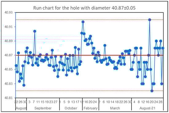
Figure 1.
The inner hole diameter (in mm) of a detail for the tractor.
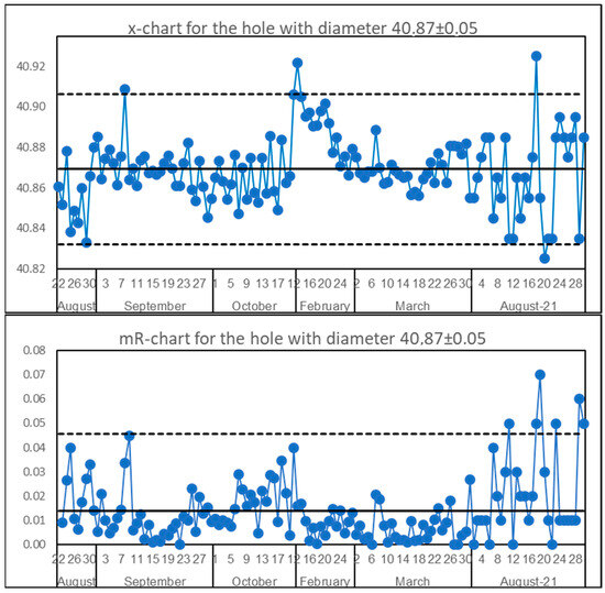
Figure 2.
x-mR chart for hole diameter. The SI = 1.23. Dotted are control liimits.
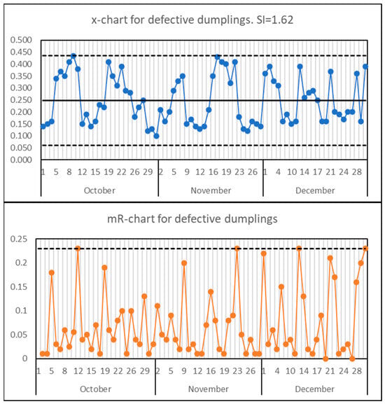
Figure 3.
x-mR chart for defective dumplings. Dotted lines are control limits.
3.2. What Is the SI from the Viewpoint of Control Charting
All authors of all works mentioned in Section 1 use the relation
because they consider the so-called correction factor d2 being a constant equal to 1.128 in the case of the chart for individual values. In general (see §7.3 and §7.9 in [16] or §2.3 in [12]) d2 (or dn) by definition is equal to
More generally it should be written instead of AMR, but in this paper we work only with individual values.
Substituting Equation (4) into Equation (3) and taking into account Equation (5), one obtains the equation
If d2 were a constant, then Equation (6) would turn into SI = 1. However, it is not. The opinion that d2 is a constant has a long history, starting from the fundamental works of prominent statisticians in the late twenties and early fifties of the last century and from the well-known paper by I. Burr [17]. In the conclusion to his paper, Burr wrote: “Thus we can use the ordinary normal curve control chart constants unless the population is markedly non-normal. When it is, the tables provide guidance on what constant to use”. We have analyzed this issue in Shper, Sheremetyeva [18] and provided a detailed answer to what is ‘markedly non-normal’ and when and how those constants should be used. It was shown there that in many cases of notably asymmetrical DFs, the correction factor d2 can deviate significantly from its traditional value of 1.128. For example, the average value of d2 is equal to 0.868 instead of 1.128 for Weibull distribution with the shape parameter 0.7 (the decrease of 23%); or 0.827 (−26.7%) for log-normal distribution with median = 1 and SD = 1 (see Table 2 in [18]). The corresponding average values of the SI for these DFs calculated from Equation (6) will be 1.30 and 1.36 (instead of 1.0). Consequently, it is clear from Equation (6) that SI depends on all factors which can influence d2 values. So, we need to dive into the question:
3.3. What Can Influence the Values of d2 or SI?
3.3.1. The SI and Data Nonrandomness
As outlined by Shper and Adler (2017) the problem of data nonrandomness has been underestimated for many years, though it was of primary importance to Shewhart (see, e.g., ch.1 in Shewhart’s book of 1939). As pointed out in that paper, the moving range tends to be sensitive to the departures from randomness due to its consequent structure, so it was proposed to use the ratio of AMR to SDn−1 (i.e., d2) as a measure of process nonrandomness. Figure 4 (copy of Figure 6 in [15]) shows that just by rearranging the points, one can obtain the values of the SI from 0.66 up to 17.3. It follows from Figure 2 that an unstable process can have a value of the SI less than the critical value of 1.25, so that wrong decision about process stability can be made. It follows from Figure 3 that a stable process can have an SI much bigger than 1.25—and this again can lead to a wrong decision about the process state. At last, from Figure 4 one can see that both big and small values of the SI can indicate the presence of different types of nonrandomness (patterns as in Figure 4a,d, trend as in Figure 4c), and nonrandomness is not equal to instability—these two are different features of a process. It is worth noting that the process in the upper left panel of Figure 3 and Figure 4 is the same, except that additional points from December were added in Figure 3. These data are nonrandom, they have an obvious pattern, and this pattern has a clear explanation here: two different shifts worked rotating every week. The variability within each shift (team) was evidently much less than between shifts and the moving range “feels” it, so the high value of the SI emerges. Therefore, we can say with confidence that abnormal values of the SI (far from unity in both directions) can indicate the nonrandomness of the process under consideration (one must have in mind that process randomness is a more general notion than process stability, though sometimes they can coincide or overlap). This means that the interpretation of the SI cannot be as straight-lined as most authors consider.
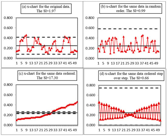
Figure 4.
Original data (from food manufacturer)—the amount of nonconforming meat dumplings. The dotted lines are control limits.
3.3.2. Data Homogeneity
According to Jensen et al. (2019, p. 291), White charted four different types of processes that are shown in Figure 5 (copy of Figure 1 in [8]). The upper left drawing presents a nonhomogenous process with two groups of data having different means. These data came from different systems, and within each group, the process looks quite stable. Of course, the transition from one state to another was caused by either some assignable cause, which can be known or unknown, or by some sort of adjustment made by process personnel. Similarly, the lower left drawing indicates a changing system and as a result—a downward trend. This process is unstable as a whole and stable if the trend can be excluded. It is evident, that while calculating the SI for the processes shown in the left part of Figure 5, one inevitably uses nonhomogeneous data. Is it reasonable to estimate any parameters and to calculate any descriptive statistics for nonhomogenous data? The answer is well known: “when the data are not homogeneous…—descriptive statistics no longer describe; process parameters are no longer constant; and as a result, statistical inferences go astray. No computation, regardless of how sophisticated it may be, can ever overcome the problems created by a lack of homogeneity” [19]. A lack of homogeneity means that data came from different systems (conditions)—therefore they should be analyzed separately from each other. On the other hand, similar examples of applying the SI to nonhomogeneous data were given by Podolski [1], Ramirez and Runger [3], Gauri [4], Britt et al. [6], Sall [7], Jensen et al. [8,9], White et al. [10], and Kim Jeong-bae et al. [11]. All the authors are completely right: the SI feels that the process is ill. In other words, though the statistical meaning of SDn−1 for nonhomogeneous data is vague, the SI may be useful as an indicator of process peculiarity or, maybe, illness. However, this peculiarity is not called the lack of stability—it should be called differently; in this specific case—the lack of homogeneity. Is this difference worth being noticed and discussed? We think, yes, because homogeneity and stability are different properties of any process. Homogeneity is a more general notion, and its presence or absence should be revealed before starting to calculate something and before constructing the control chart. This means that process stability must be analyzed after answering if the process is homogeneous or not.
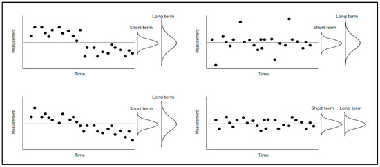
Figure 5.
Four possible types of process.
In order to look at the impact of system changes on SI values, we made a simple simulation of stepwise changes. The results are shown in Figure 6, where the empirical DFs for the values of SI on the normal probability paper are presented. The left blue curve shows the empirical DF (EDF) for the SI when original data are homogeneous and normal (the 95% limits are equal to 0.94 and 1.06). The next yellow curve shows the EDF for data when the first 200 points were from gau{0,1} (We use here the wide-spread system of notation: gau{μ,σ} denotes normal distribution with mean = μ and SD = σ), then 50 points were from gau{1,1}, and the last 150 points were from gau{0,1} again. The orange curve describes data when the mean shift covered 100 points, and the gray curve relates to data when 200 points were shifted. The light blue curve at the right shows the EDF when the first 200 points were from gau{0,1}, and the next 200 points were from gau{2,1}. The latter curve has the 95% limits of 1.31 and 1.53. As one could expect the values of the SI turned out to be dependent on the size of the shift.
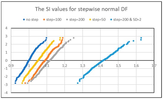
Figure 6.
The results of the simulation in Excel. A total of 400 sets of normally iid data from normal DF gau{μ,Ϭ} were generated with 400 points in each set.
As follows from Figure 6, for the mean shift equal to two SD, all span of SI values exceeds 1.25 (Jensen et al., 2019 criterion) while for the mean shift of one SD, all interval is less than 1.25. Thus, the big values of the SI can indicate the presence of a mean shift or the change in the system where this process is running. Or, equivalently, this can be a sign of using non-homogeneous data. At the same time, it follows from the technique of our simulation, the process before and after the jump was absolutely stable.
3.3.3. Data Non-Normality
We have already discussed this problem partly in Section 3.2. Here, we would like to attract the attention of the readers to the simple fact: when correction factor d2 decreases because of non-normality, not only the SI increases. Simultaneously, the coefficients of control charts (A2, D4, etc.) grow. This means that control limits are moving away from the central line. Therefore, the decisions about process stability will be changing, in turn. So, when relatively big values of the SI indicate that our data are not normal additional question arises: if the corresponding limits of the control chart were correctly estimated. This implies that the limits should be calculated with the corrected values of d2 when such a correction is necessary (see Shper, Sheremetyeva 2022).
3.3.4. Data Autocorrelation
As it was expected the autocorrelation impacts the values of d2 or the SI. In Figure 7 one can see two examples of the processes with autocorrelations. In both processes, 20 points were highly autocorrelated while all others were independently and normally distributed. The values of the SI are close to unity in both cases (0.95 and 1.01) so both processes should be stable according to the criteria of Jensen et al. (2019, 2020). However, one of the processes turned out to be stable while another one was quite the contrary. That is the exact quantitative value does not work in the second case. Then we made the simulation of 400 sets with each set consisting of 150 points out of standard normal distribution, 200 highly correlated points with ρ = −0.9, and 50 points again from standard normal distribution (400 sets of data let us build the EDF with an accuracy of 0.25% what is quite enough for practice). This simulation showed that the average value of the SI is equal to 0.84 with 95% limits of 0.80 and 0.89. At the same time, the instability of these processes is out of any question (see one of such sets of data in Figure 8). These examples support a simple idea: both small and big values of the SI can speak that something is wrong with the process under consideration but, the possible problem may be either linked with the process stability or linked with some other process properties.
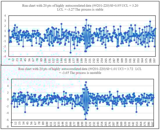
Figure 7.
Two processes with 20 points of highly correlated data (ρ = −0.9).

Figure 8.
An example of a process with high autocorrelation.
4. Discussion
When the SI Can Be Useful and What for?
The results and data presented above show that abnormal values of the SI (notably deviating from unity) inform the researcher about many different possibilities:
- (1)
- usual instability;
- (2)
- non-homogeneity of the process;
- (3)
- nonrandomness of the process;
- (4)
- non-normality of process features;
- (5)
- the presence of correlated data;
- (6)
- combination of any above-listed cases.
The name “Stability Index” refers only to a small part of different possibilities—that is why the SI cannot be interpreted as simply and as somewhat single-valued as it was suggested in the most of earlier works. This is the main reason why we are sure that this name is not appropriate and should be changed. Do all issues of (1)–(6) mean the lack of process health? Surely, no! The processes behave in accordance with the system created by people. The lack of process stability can be interpreted as process illness. However, the nonrandomness or non-normality, etc., reflects the state of the system where the process is going. So, the big or small value of the SI does not necessarily mean the lack of process health—this means the process differs from the expectations of statistical handbooks. However, no process must satisfy these expectations. The processes must satisfy their customers. So, we propose to name the ratio of SDn−1 to SDmR simply the process state index (PStI). We added the letter “t” in order to differentiate this abbreviation from the PSI supposed in [4].
Can the PStI be useful for practice?
We think yes.
But, when and how should it be used?
We are sure that taking into consideration the numerous variants of significant deviations of the PStI from unity any attempts to establish any limits for the PStI values are senseless and counterproductive—from time to time they will inevitably push the practitioners to the false decisions. However, due to the simplicity of the calculation and when a practitioner deals with hundreds or thousands of processes simultaneously, the abnormal values of the PStI can help her/him to reveal the processes requiring primary attention. However, he/she must keep in mind that these abnormal values do not indicate the lack of process health as well and they do not indicate the lack of stability. All they indicate is some specificity of the process. Similarly, the normal values of the PStI do not indicate the process is healthy. The real life is much more diverse and interesting than any models of scientists.
However, what do the words “notably deviating from unity” really mean for practitioners? What the operational definition of such a deviation should be? As we wrote above, establishing some specific value for all processes seems impossible. However, this does not mean that the PStI cannot be used to reveal the process to be focused primarily. We propose the following very simple procedure to the practitioners. If one has hundreds or thousands of processes, she/he can calculate the value of PStI for each one and then construct an x-mR chart out of these points. Any points lying outside the control limits indicate the processes that require primary attention.
And what should one do further?
Each abnormal point of the PStI values on the x-mR chart corresponds to the process requiring careful analysis. Such analysis may be conducted according to the following algorithm:
- (1)
- Whether the data are homogenous? The tool to do this is a visual analysis of the process run chart. If data are nonhomogenous—data stratification and analysis of transition points are necessary;
- (2)
- Whether the data are random? The tool—the same as in (1). If data are not random—look for the causes;
- (3)
- Whether the data are normally distributed? The tool—a histogram or box-and-whisker plot. If data are skewed, a change of chart coefficients may be needed (see [18]);
- (4)
- Whether the data are correlated? The tool—visual analysis of process run chart. If “Yes”—look for the causes;
- (5)
- If none of the above mentioned are present, construct a traditional ShCC then analyze it.
There is still one complicated question that should be answered: why do we object to all proposals to use some summary metrics [8] or multiple sets of rules [10]? Our reply is as follows. When one plots a point on a two-dimensional graph, for example, the SI and capability index Cpk, she/he automatically equalizes their significance, and a practitioner will not even think about the priority of data homogeneity/randomness/normality. However, if data are non-homogeneous, nonrandom, or non-normal, the capability indices are senseless, and there is no need to pay attention to them. The same can be said about other combinations except for ICC (Though we agree with the proposal of White et al. [10] to use ICC as the main metric of measurement system quality, there is a problem with the right application of this indicator. However, this problem is out of the scope of this paper) or any other measure of data quality. Obviously, the suitability of the measurement system must be verified first of all. Again, this must be conducted before combining these values into one picture, because if the measurement system is not appropriate, any values are not meaningful. The procedure of different tool applications seems to be of great importance because it prevents inconsiderate mechanical use of SPC tools. As it has already been known for many years, the Shewhart control chart is technically a very simple tool but it cannot be useful without deep knowledge of process matter and SPC basics.
5. Conclusions
In this article, we presented a number of arguments that using the SI without a good understanding of its nature and properties could lead not to process improvement but to process worsening instead. Factually, the quality of business decisions may become low because of management errors. These errors may be caused by misunderstanding of what small or big values of the SI really mean or by misinterpretation of what follow-ups should be carried out. They can lead to unneeded distraction, wasted time and effort, and increased process variability. Furthermore, they can lead to disappointment in SPC methods in general and ShCCs in particular. Rephrasing the well-known phrase of R. Descartes, the right use of the right words can make the number of misconceptions half as much. The SI is an unsuccessful term, as we tried to prove in this work. So, what are we to do to improve the situation?
First, this indicator should be renamed in order to focus the practitioner’s attention in the right direction. The name “stability index” makes the practitioner focus on process stability only, limiting her/his look on the process and distorting in some cases the analysis of the process state.
Second, the values of the ratio (3) should be correctly interpreted, and the new name—the PStI—can help to assess if the process has some peculiarities that require comprehensive examination first. These findings, if found, can help better understand the set of processes and improve both process and business decisions.
Third, a lot of new research is necessary. The statistical community needs to deepen the notion of process stability in order to distinguish between ephemeral events (as Dr. Deming defined the assignable cause of variation) and system change (as for non-homogenous processes). Similarly, the impact of data nonrandomness on process behavior remains insufficiently investigated. That is, the properties of the PStI should be analyzed by other researchers from different viewpoints and in various conditions.
At last, it seems very favorable that there is no need to invent any new metrics when there is one appropriate. This answers Occam’s razor principle.
The data that support the findings of this study are available on request from the corresponding author, [SV]. The data are not publicly available due to privacy restrictions.
Author Contributions
Methodology, V.S. (Vladimir Shper), V.S. (Vladimir Smelov) and A.G.; Software, S.S.; Validation, S.S., I.S. and E.K.; Formal analysis, V.S. (Vladimir Shper) and E.K.; Investigation, S.S., I.S., E.K. and Y.K.; Resources, V.S. (Vladimir Shper), V.S. (Vladimir Smelov) and A.G.; Data curation, V.S. (Vladimir Shper), Y.K. and A.G.; Writing—original draft, V.S. (Vladimir Shper) and V.S. (Vladimir Smelov); Writing—review & editing, Y.K.; Visualization, V.S. (Vladimir Smelov). All authors have read and agreed to the published version of the manuscript.
Funding
This study was performed as a part of the project entitled “Study of statistical patterns of ice loads on engineering structures and development of a new method for their stochastic modeling (FSEG-2020-0021)”, No. 0784-2020-0021, supported by the Ministry: 0784-2020-0021.
Data Availability Statement
The data are available to everybody on request to the corresponding author.
Conflicts of Interest
The authors declare no conflict of interests.
References
- Podolski, G. Standard deviation: Root mean square versus range conversion. Qual. Eng. 1989, 2, 155–161. [Google Scholar] [CrossRef]
- Cruthis, E.N.; Rigdon, S.E. Comparing two estimates of the variance to determine the stability of a process. Qual. Eng. 1992, 5, 67–74. [Google Scholar] [CrossRef]
- Ramirez, B.; Runger, G. Quantitative Techniques to Evaluate Process Stability. Qual. Eng. 2006, 18, 53–68. [Google Scholar] [CrossRef]
- Gauri, S.K. A Quantitative Approach for Detection of Unstable Processes Using a Run Chart. Qual. Technol. Quant. Manag. 2010, 7, 231–247. [Google Scholar] [CrossRef]
- Wooluru, Y.; Swamy, D.R.; Nagesh, P. Approaches for Detection of Unstable Processes: A Comparative Study. J. Mod. Appl. Stat. Methods 2015, 14, 219–235. [Google Scholar] [CrossRef]
- Britt, B.A.; Ramirez, B.; Mistretta, T. Process monitoring using statistical stability metrics: Application to biopharmaceutical processes. Qual. Eng. 2016, 28, 193–211. [Google Scholar] [CrossRef]
- Sall, J. Scaling-up process characterization. Qual. Eng. 2018, 30, 62–78. [Google Scholar] [CrossRef]
- Jensen, W.A.; Szarka, J., III; White, K. Stability assessment with the stability index. Qual. Eng. 2019, 31, 289–301. [Google Scholar] [CrossRef]
- Jensen, W.A.; Szarka, J., III; White, K. A Better Picture. Qual. Prog. 2020, 53, 41–49. [Google Scholar]
- White, K.; Szarka, J., III; Childress, A.; Jensen, W. A recommended set of indices for evaluating process health. Qual. Eng. 2021, 33, 1–12. [Google Scholar] [CrossRef]
- Kim, J.; Yun, W.Y.; Seo, S.K. Development of new metric indices for process stability evaluation. J. Korean Soc. Qual. Manag. 2022, 50, 473–490. [Google Scholar]
- Wheeler, D. Advanced Topics in Statistical Process Control. The Power of Shewhart’s Charts, 2nd ed.; SPC Press: Knoxville, TN, USA, 2004. [Google Scholar]
- Shewhart, W. Statistical Methods from the Viewpoint of Quality Control; Dover Publications, Inc.: Mineola, NY, USA, 1986. [Google Scholar]
- Wheeler, D.J.; Beagle, J., III. ANOX: The Analysis of Individual Values. A New Test for Homogeneity. 2017. Available online: https://www.qualitydigest.com/inside/statistics-column/anox-analysis-individual-values-090517.html (accessed on 26 November 2022).
- Shper, V.; Adler, Y. The Importance of Time Order with Shewhart Control Charts. Qual. Reliab. Eng. Int. 2017, 33, 1169–1177. [Google Scholar] [CrossRef]
- David, H.A. Order Statistics; John Wiley & Sons, Inc.: Hoboken, NJ, USA, 1970. [Google Scholar]
- Burr, I.W. The Effect of Non-Normality on Constants of and R Charts. Ind. Qual. Control 1967, 563, 566–569. [Google Scholar]
- Shper, V.L.; Sheremetyeva, S.A. The Impact of Non-Normality on the Control Limits of Shewhart’s Charts. Tyazheloe Mashinostroenie 2022, 1–2, 16–29. [Google Scholar]
- Wheeler, D.J. The Secret of Data Analysis. 2022. Available online: https://www.qualitydigest.com/inside/statistics-column/secret-data-analysis-120522.html (accessed on 8 December 2022).
Disclaimer/Publisher’s Note: The statements, opinions and data contained in all publications are solely those of the individual author(s) and contributor(s) and not of MDPI and/or the editor(s). MDPI and/or the editor(s) disclaim responsibility for any injury to people or property resulting from any ideas, methods, instructions or products referred to in the content. |
© 2023 by the authors. Licensee MDPI, Basel, Switzerland. This article is an open access article distributed under the terms and conditions of the Creative Commons Attribution (CC BY) license (https://creativecommons.org/licenses/by/4.0/).