
End-User Needs of Fragmented Databases in Higher Education Data Analysis and Decision Making


Abstract
:1. Introduction
2. Background and Related Work
2.1. Human-Computer Interaction
2.2. Working with Data
2.3. Infrastructure, Work Habits and Data Decision Making
2.4. Information Design and Data Visualization
3. Methodology
3.1. Participants
3.2. Survey
3.3. Semi-Structured Interviews
3.4. Analysis
4. Results
4.1. Access
4.1.1. Data Source
“There doesn’t seem to be an agreed upon consistency of where the data should come from when we’re making consistent decisions.”[P9]
“At times trying to get clarification as to what type of information is needed in order to decide which system to use to retrieve data.”[S2]
“Some offices rely on internal databases (Excel) and have not trained on the campus-wide resources. That could mean we see wildly different information. It’s better when all parties pull from a consistent place.”[S1]
“A lot of the information that we get isn’t in any kind of database at all to speak of. We have a number of different surveys that we administer to faculty, staff and students and people like that. We will take that information and integrate it with information that we extract from SIS.”[P1]
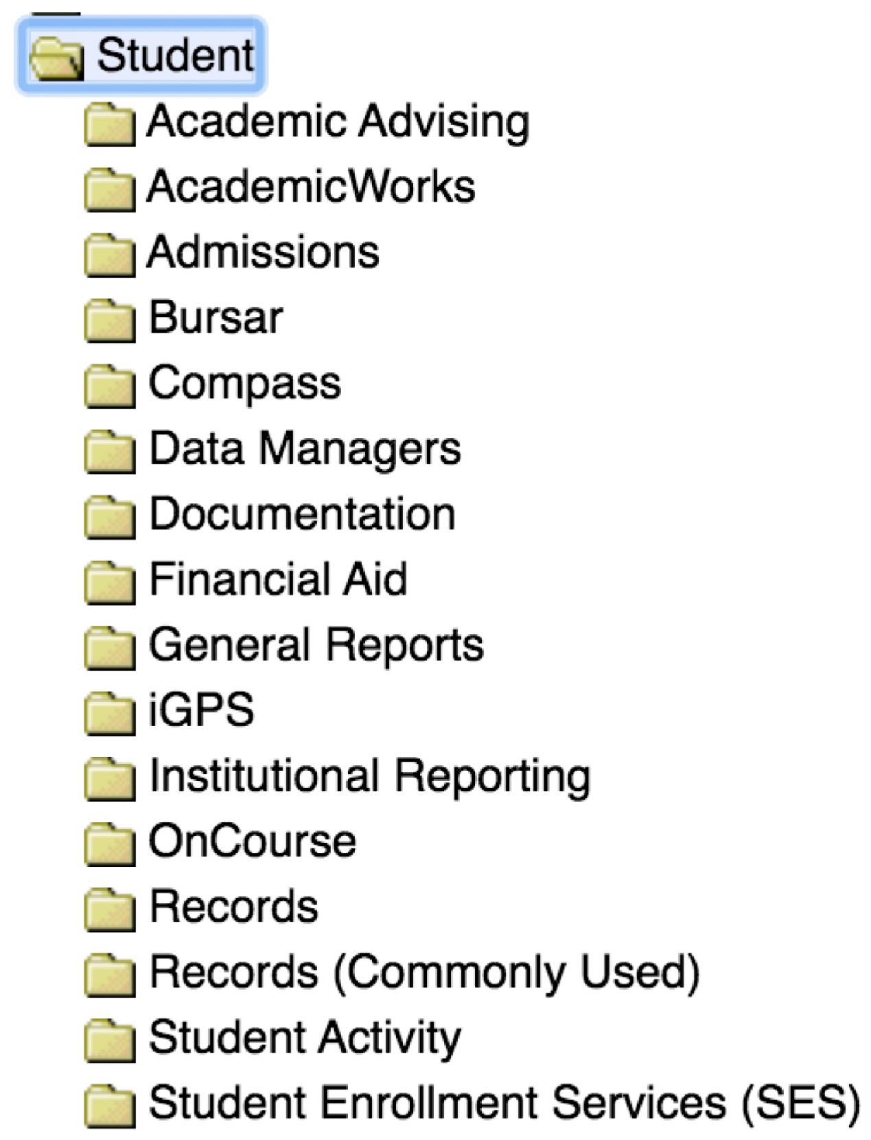
“It seems like a lot of schools on campus have a ‘shadow database.’ A lot of it may be replicated in places like AdRx, but these databases match their needs a little better than what the university provides.”[P10]
4.1.2. Talking to Other Systems
“We could improve upon leveraging all the different data sources that are available on campus, like incorporating things coming from vendors like Academic Analytics and EAB.”[P5]
“I know the university wants us to use Salesforce, but it doesn’t communicate with other things. Sometimes it’s quicker to say this is going into Excel.”[P10]
4.2. Understandability
4.2.1. Asking the Right Question
“And you don’t know if it’s going to be the right report when you get it, you know. There’s some questionable stuff, it’s just a trial in there.”[P6]
“You have to understand people’s questions in order to know what data to use and when to use it and things like that. Well, part of that is kind of understanding the zeitgeist of the university.”[P1]
“I would never have anticipated that the dean of business was asking me if our students are transferring to another institution to take accounting courses. That’s just not something I would ever dreamed up in my wildest dream, you know what I mean?”[P5]
4.2.2. Data Definitions/Coding
“Not everyone has the same access to and understanding of the reports.”[S13]
“So there’s a lot of institutional knowledge that if you don’t have, you’re totally at a disadvantage when you try to begin pulling reports.”[P9]
“I think building in a few more roadblocks to help with the validity of what we’re using these datasets for, that would really take it to the next level.”[P9]
“People can sort of operate from a vernacular definition of what ‘enrolled’ means, for example, or what ‘first generation’ means. But without being able to ask specifically what it means for the data owner, or the steward, can influence how it is interpreted at the back end when it is queried.”[P4]
“If we are working with someone in another department the terminology, and reporting procedures can cause confusion.”[S16]
4.2.3. Experience
“It’s just users using the systems and becoming experts over time because they’ve used the systems. And not because they’re brought in and given a clean training.”[P9]
“Familiarity with the system and functionality. Most users only use the very basic functions.”[S16]
“There’s definitely error that comes with learning. That’s the danger of not having that formal option available. And I get that the training is difficult, because everyone wants to do different things with the data. But there’s the validity questions that come up when we’re all just kind of wild westing this experience of pulling information.”[P9]
“When I was in financial aid, I had taken a few of the free entry-level workshops from UITS like SQL, data retrieval, stuff like that. So, no formal [training] outside of a couple of workshops.”[P6]
“A lot of what you need to know to navigate these systems is dependent on whom you know. … And it’s very easy for people to assume they know what they’re doing when they don’t actually. This is one of the reasons that numbers sometimes get mixed up and people are pulling wrong information. Well-meaning people who go in who look at some code and oh, yeah, that’s what you need. And it’s not what you need.”[P1]
4.3. Use
4.3.1. Relationship Building
“If somebody were to ask me, ‘Hey, how many prospectives contacted you this month?’ I’m able to go back and look at my notes. … I can see how many students applied and I can see maybe the interactions I’ve had, too.”[P7]
“I think that building the relationship helps us understand context more, and it also helps us in terms of building kind of that, for lack of a better term, kind of credibility to which we’re all in this journey together.”[P5]
4.3.2. Reporting/Analysis
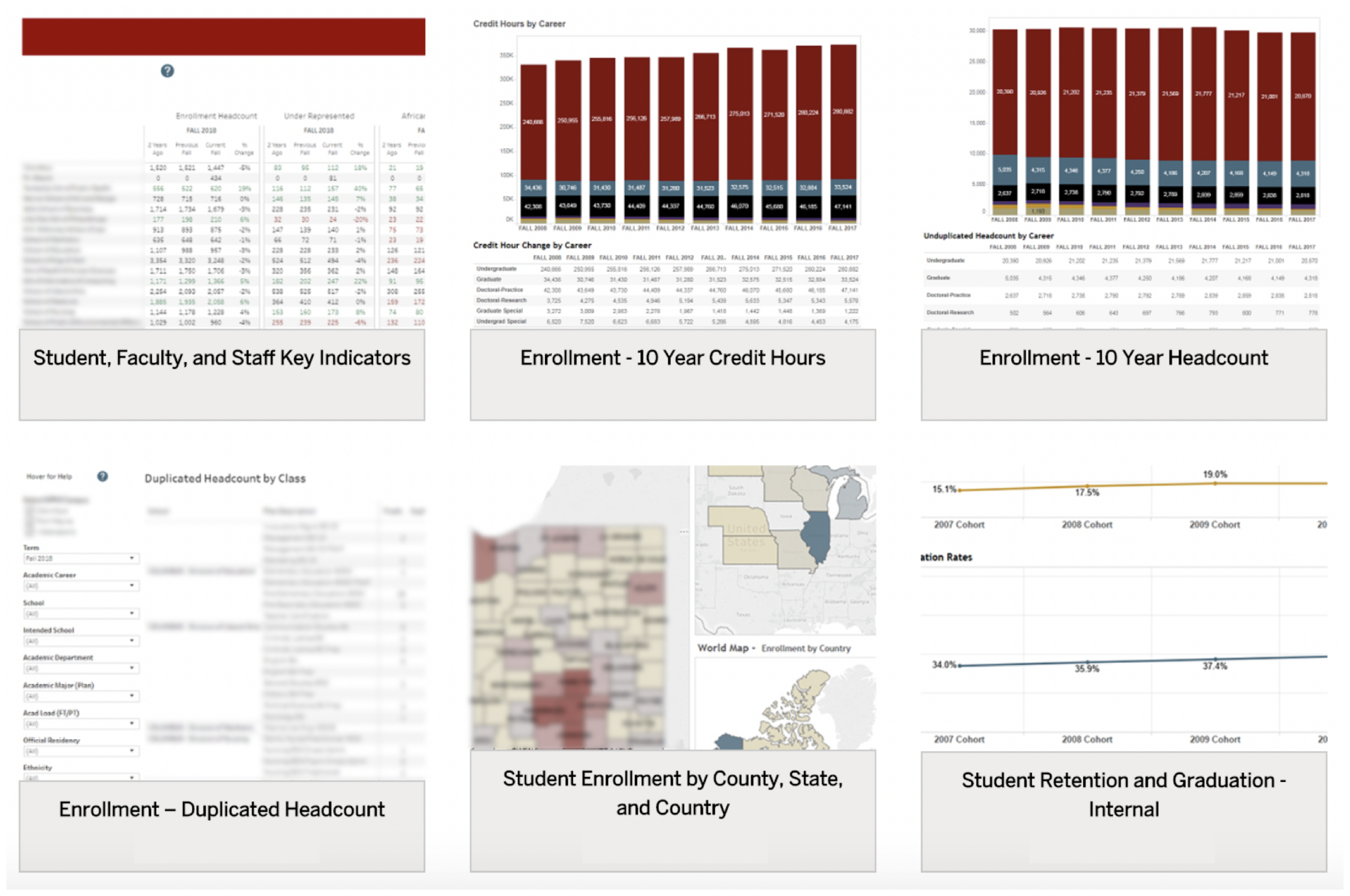
“I customize my reports, make notes to them. I share these on a weekly basis, which include enrollment data, to school leadership.”[P10]
“Some is a merging of the different data elements/parameters that are not available in just one system and organizing to tell the story of our findings.”[S6]
“Mostly to track our admissions and our applicants, make sure we’re on par for at least trying to come close to or beat the last few years of admissions and headcount.”[P6]
“We’re sharing what we’re doing every day out there. We have all kinds of stuff on our website, you know, all kinds of, you know, white papers and research briefs and things like that.”[P1]
4.3.3. Decision Making
“We’re usually looking at trend data in terms of, is it worth it?”[P9]
“We use that data when we speak with the faculty directors and co-directors about how the program is shaped, what we’re seeing as far as trends and enrollment. … But, you know, sometimes I think it’s probably more of the independent meetings with the qualitative information that gets through easier than the quantitative information.”[P6]
4.3.4. Time
“What should be like, ‘Oh yeah, I can just get you that number,’ becomes like, well, maybe in a day or two, after I stare at things for hours, I can get that answer to you.”[P9]
“People want things now, you know, and that’s not always possible, give how complicated data is.”[P1]
5. Discussion
5.1. Design Recommendations
Access
5.2. Understandability
Use
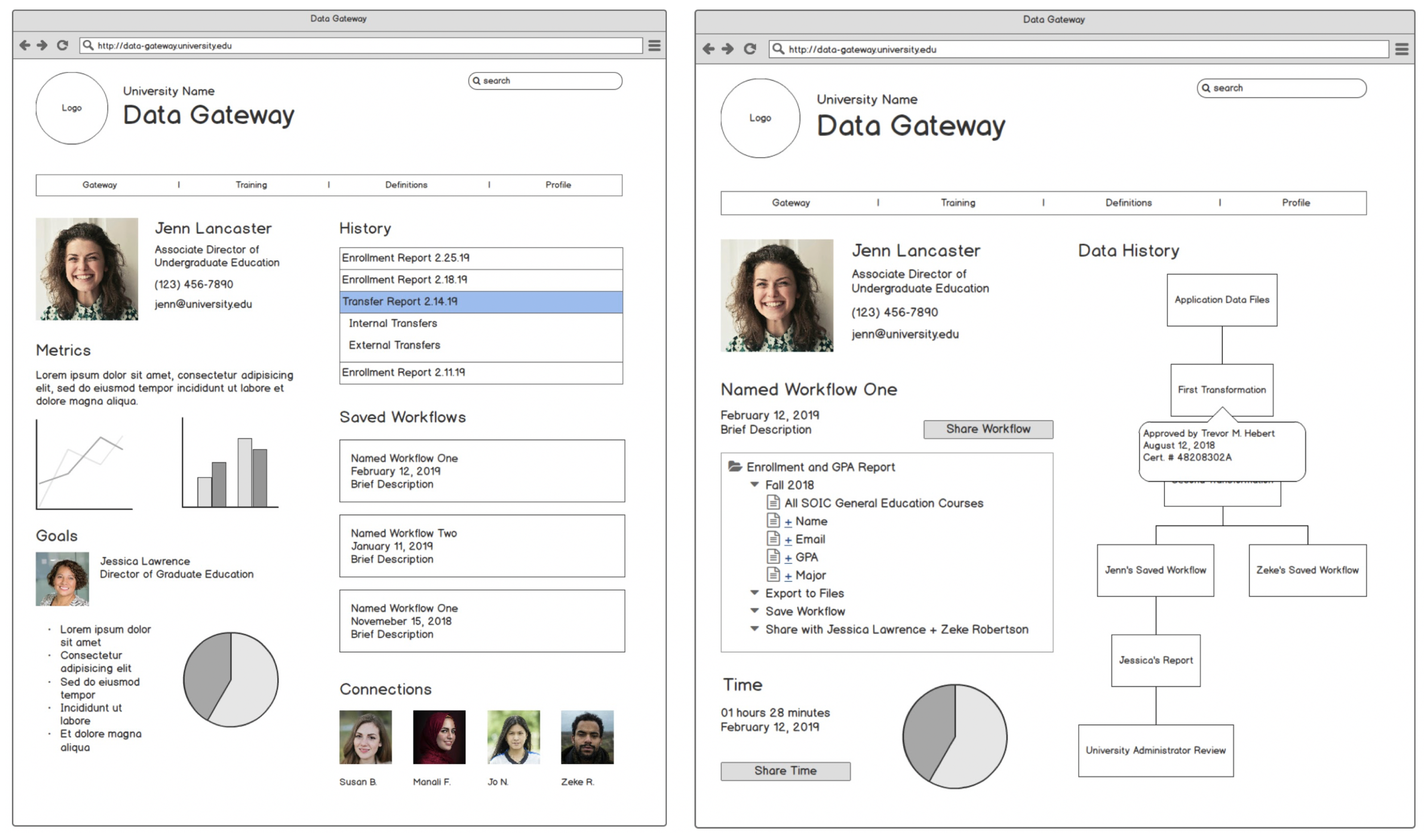
5.3. Design Functionalities for Data Gateways
5.3.1. Highlighting Multiple Sources and Data Visualization
5.3.2. Training
5.3.3. Collaboration
5.3.4. Tracking
5.3.5. Definitions/Roadblocks
5.3.6. History, Workflows, and Visualizing Time
5.4. Limitations
6. Conclusions
Author Contributions
Funding
Institutional Review Board Statement
Informed Consent Statement
Conflicts of Interest
References
- Keim, D.A.; Mansmann, F.; Schneidewind, J.; Ziegler, H. Challenges in visual data analysis. In Proceedings of theTenth International Conference on Information Visualisation (IV’06), London, UK, 5–7 July 2006; pp. 9–16. [Google Scholar]
- Daniel, B.K. Big data in higher education: The big picture. In Big Data and Learning Analytics in Higher Education; Springer: Berlin/Heidelberg, Germany, 2017; pp. 19–28. [Google Scholar]
- Khan, S.I.; Hoque, A.S.M.L. Towards development of national health data warehouse for knowledge discovery. In Intelligent Systems Technologies and Applications; Springer: Berlin/Heidelberg, Germany, 2016; pp. 413–421. [Google Scholar]
- Rattenbury, T.; Hellerstein, J.M.; Heer, J.; Kandel, S.; Carreras, C. Principles of Data Wrangling: Practical Techniques for Data Preparation; O’Reilly Media, Inc.: Sebastopol, CA, USA, 2017. [Google Scholar]
- Fisher, D.; DeLine, R.; Czerwinski, M.; Drucker, S. Interactions with big data analytics. Interactions 2012, 19, 50–59. [Google Scholar] [CrossRef]
- Voida, A.; Harmon, E.; Al-Ani, B. Homebrew databases: Complexities of everyday information management in nonprofit organizations. In Proceedings of the SIGCHI Conference on Human Factors in Computing Systems, Vancouver, BC, Canada, 7–12 May 2011; pp. 915–924. [Google Scholar]
- Green, K. The Babel problem with big data in higher ed. Retrieved March 2018, 11, 2019. [Google Scholar]
- Carroll, J.M. Human computer interaction-brief intro. In The Encyclopedia of Human-Computer Interaction, 2nd ed.; 2013; Available online: https://www.interaction-design.org/literature/book/the-encyclopedia-of-human-computer-interaction-2nd-ed (accessed on 23 June 2021).
- Shneiderman, B.; Plaisant, C.; Cohen, M.S.; Jacobs, S.; Elmqvist, N.; Diakopoulos, N. Designing the User Interface: Strategies for Effective Human-Computer Interaction; Pearson: London, UK, 2016. [Google Scholar]
- Carneiro, D.; Pimenta, A.; Gonçalves, S.; Neves, J.; Novais, P. Monitoring and improving performance in human–computer interaction. Concurr. Comput. Pract. Exp. 2016, 28, 1291–1309. [Google Scholar] [CrossRef]
- Zdziebko, T.; Sulikowski, P. Monitoring human website interactions for online stores. In New Contributions in Information Systems and Technologies; Springer: Berlin/Heidelberg, Germany, 2015; pp. 375–384. [Google Scholar]
- Blandford, A.; Furniss, D.; Makri, S. Qualitative HCI research: Going behind the scenes. Synth. Lect. Hum. Centered Inform. 2016, 9, 1–115. [Google Scholar] [CrossRef] [Green Version]
- Victorelli, E.Z.; Dos Reis, J.C.; Hornung, H.; Prado, A.B. Understanding human-data interaction: Literature review and recommendations for design. Int. J. Hum. Comput. Stud. 2020, 134, 13–32. [Google Scholar] [CrossRef]
- Mortier, R.; Haddadi, H.; Henderson, T.; McAuley, D.; Crowcroft, J. Human-Data Interaction: The Human Face of the Data-Driven Society. 2014. Available online: https://arxiv.org/abs/1412.6159 (accessed on 23 June 2021).
- Trajkova, M.; Alhakamy, A.; Cafaro, F.; Mallappa, R.; Kankara, S.R. Move your body: Engaging museum visitors with human-data interaction. In Proceedings of the 2020 CHI Conference on Human Factors in Computing Systems, Honolulu, Hawaii, 25–30 April 2020; pp. 1–13. [Google Scholar]
- Elmqvist, N. Embodied human-data interaction. In Proceedings of the ACM CHI 2011 Workshop Embodied Interaction: Theory and Practice in HCI, Vancouver, BC, Canada, 7–12 May 2011; Volume 1, pp. 104–107. [Google Scholar]
- Boyd, D.; Crawford, K. Critical questions for big data: Provocations for a cultural, technological, and scholarly phenomenon. Inform. Commun. Soc. 2012, 15, 662–679. [Google Scholar] [CrossRef]
- LaValle, S.; Lesser, E.; Shockley, R.; Hopkins, M.S.; Kruschwitz, N. Big data, analytics and the path from insights to value. MIT Sloan Manag. Rev. 2011, 52, 21–32. [Google Scholar]
- Luan, J. Data Mining and Its Applications in Higher Education. New Dir. Inst. Res. 2002, 113, 17–36. [Google Scholar] [CrossRef]
- Picciano, A.G. The evolution of big data and learning analytics in American higher education. J. Asynchronous Learn. Netw. 2012, 16, 9–20. [Google Scholar] [CrossRef] [Green Version]
- Zhu, C.; Zhu, H.; Xiong, H.; Ding, P.; Xie, F. Recruitment market trend analysis with sequential latent variable models. In Proceedings of the 22nd ACM SIGKDD International Conference on Knowledge Discovery and Data Mining, San Francisco, CA, USA, 13–17 August 2016; pp. 383–392. [Google Scholar]
- Bergman, O.; Beyth-Marom, R.; Nachmias, R. The project fragmentation problem in personal information management. In Proceedings of the SIGCHI Conference on Human Factors in Computing Systems, Montreal, QC, Canada, 24–27 April 2006; pp. 271–274. [Google Scholar]
- Bopp, C.; Harmon, E.; Voida, A. Disempowered by data: Nonprofits, social enterprises, and the consequences of data-driven work. In Proceedings of the 2017 CHI Conference on Human Factors in Computing Systems, Denver, CO, USA, 6–11 May 2017; pp. 3608–3619. [Google Scholar]
- Pine, K.; Mazmanian, M. Emerging Insights on Building Infrastructure for Data-Driven Transparency and Accountability of Organizations. iConf. 2015 Proc. 2015. Available online: https://www.ideals.illinois.edu/handle/2142/73454 (accessed on 23 June 2021).
- Le Dantec, C.A.; Edwards, W.K. Across boundaries of influence and accountability: The multiple scales of public sector information systems. In Proceedings of the SIGCHI Conference on Human Factors in Computing Systems, Atlanta, GA, USA, 10–15 April 2010; pp. 113–122. [Google Scholar]
- Benjamin, L.M.; Voida, A.; Bopp, C. Policy fields, data systems, and the performance of nonprofit human service organizations. Hum. Serv. Organ. Manag. Leadersh. Gov. 2018, 42, 185–204. [Google Scholar] [CrossRef]
- Verma, N.; Voida, A. On being actionable: Mythologies of business intelligence and disconnects in drill downs. In Proceedings of the 19th International Conference on Supporting Group Work, San Francisco, CA, USA, 27 February–2 March 2016; pp. 325–334. [Google Scholar]
- Williamson, B. Digital education governance: Data visualization, predictive analytics, and ‘real-time’policy instruments. J. Educ. Policy 2016, 31, 123–141. [Google Scholar] [CrossRef]
- Kandel, S.; Paepcke, A.; Hellerstein, J.M.; Heer, J. Enterprise data analysis and visualization: An interview study. IEEE Trans. Vis. Comput. Graph. 2012, 18, 2917–2926. [Google Scholar] [CrossRef] [Green Version]
- Dur, B.I.U. Data visualization and infographics in visual communication design education at the age of information. J. Arts Humanit. 2014, 3, 39–50. [Google Scholar]
- Few, S. Information Dashboard Design: The Effective Visual Communication of Data; O’reilly: Sebastopol, CA, USA, 2006; Volume 2. [Google Scholar]
- Chul Kwon, B.; Fisher, B.; Yi, J.S. Visual analytic roadblocks for novice investigators. In Proceedings of the 2011 IEEE Conference on Visual Analytics Science and Technology (VAST), Providence, RI, USA, 23–28 October 2011; pp. 3–11. [Google Scholar]
- Sedlmair, M.; Isenberg, P.; Baur, D.; Butz, A. Evaluating information visualization in large companies: Challenges, experiences and recommendations. In Proceedings of the 3rd BELIV’10 Workshop: BEyond Time and Errors: Novel Evaluation Methods for Information Visualization, Atlanta, GA, USA, 10–11 April 2010; pp. 79–86. [Google Scholar]
- Kandel, S.; Heer, J.; Plaisant, C.; Kennedy, J.; Van Ham, F.; Riche, N.H.; Weaver, C.; Lee, B.; Brodbeck, D.; Buono, P. Research directions in data wrangling: Visualizations and transformations for usable and credible data. Inf. Vis. 2011, 10, 271–288. [Google Scholar] [CrossRef] [Green Version]
- Roggema, R. Research by Design: Proposition for a Methodological Approach. Urban Sci. 2017, 1, 2. [Google Scholar] [CrossRef]
- Fiesler, C.; Brubaker, J.R.; Forte, A.; Guha, S.; McDonald, N.; Muller, M. Qualitative Methods for CSCW: Challenges and Opportunities. In Proceedings of the Conference Companion Publication of the 2019 on Computer Supported Cooperative Work and Social Computing, Austin, TX, USA, 3–13 November 2019; Association for Computing Machinery: New York, NY, USA, 2019; pp. 455–460. [Google Scholar] [CrossRef]
- Anderson, R.C.; Reynolds, R.E.; Schallert, D.L.; Goetz, E.T. Frameworks for comprehending discourse. Am. Educ. Res. J. 1977, 14, 367–381. [Google Scholar] [CrossRef]
- Braun, V.; Clarke, V. Using thematic analysis in psychology. Qual. Res. Psychol. 2006, 3, 77–101. [Google Scholar] [CrossRef] [Green Version]
- Sandelowski, M. Sample size in qualitative research. Res. Nurs. Health 1995, 18, 179–183. [Google Scholar] [CrossRef]
- Roberts, R.D.; Beh, H.C.; Stankov, L. Hick’s law, competing-task performance, and intelligence. Intelligence 1988, 12, 111–130. [Google Scholar] [CrossRef]
- Pickett, R.A.; Hamre, W.B. Building portals for higher education. New Dir. Inst. Res. 2002, 2002, 37–56. [Google Scholar] [CrossRef]
- Parkinson, C.N.; Osborn, R.C. Parkinson’s Law, and Other Studies in Administration; Houghton Mifflin: Boston, MA, USA, 1957; Volume 24. [Google Scholar]
- Hochschild, A.R. Invisible Labor: Hidden Work in the Contemporary World; University of California Press: Berkeley, CA, USA, 2016. [Google Scholar]
- Beauregard, R.; Corriveau, P. User experience quality: A conceptual framework for goal setting and measurement. In Proceedings of the International Conference on Digital Human Modeling, Beijing, China, 22–27 July 2007; Springer: Berlin/Heidelberg, Germany, 2007; pp. 325–332. [Google Scholar]


| Macro-Theme | Design Theme | Description of Users’ Needs/Challenges |
|---|---|---|
| Access | Data Source | Perception that data is not standardized across different systems |
| Talking to Other Systems | The need for data systems to be better integrated | |
| Understandability | Asking the Right Question | Not understanding where to obtain specific data needed for decision making |
| Data definitions/coding | How the terminology surrounding commonly used data is defined | |
| Experience | The disparate level of experience between end users and database administrators | |
| Use | Relationship building | Building relationships to facilitate collaboration |
| Reporting/analysis | Report creation for decision making purposes | |
| Decision making | Aiding unit leadership in determining which decisions are worth investing resources | |
| Time | The time it takes to find data can be frustrating |
Publisher’s Note: MDPI stays neutral with regard to jurisdictional claims in published maps and institutional affiliations. |
© 2021 by the authors. Licensee MDPI, Basel, Switzerland. This article is an open access article distributed under the terms and conditions of the Creative Commons Attribution (CC BY) license (https://creativecommons.org/licenses/by/4.0/).
Share and Cite
Briggs, A.; Cafaro, F. End-User Needs of Fragmented Databases in Higher Education Data Analysis and Decision Making. Informatics 2021, 8, 42. https://doi.org/10.3390/informatics8030042
Briggs A, Cafaro F. End-User Needs of Fragmented Databases in Higher Education Data Analysis and Decision Making. Informatics. 2021; 8(3):42. https://doi.org/10.3390/informatics8030042
Chicago/Turabian StyleBriggs, Amanda, and Francesco Cafaro. 2021. "End-User Needs of Fragmented Databases in Higher Education Data Analysis and Decision Making" Informatics 8, no. 3: 42. https://doi.org/10.3390/informatics8030042
APA StyleBriggs, A., & Cafaro, F. (2021). End-User Needs of Fragmented Databases in Higher Education Data Analysis and Decision Making. Informatics, 8(3), 42. https://doi.org/10.3390/informatics8030042