Analyzing Spatiotemporal Anomalies through Interactive Visualization

Abstract
:1. Introduction

2. Related Work
3. Spatiotemporal Data Analysis and Visualization
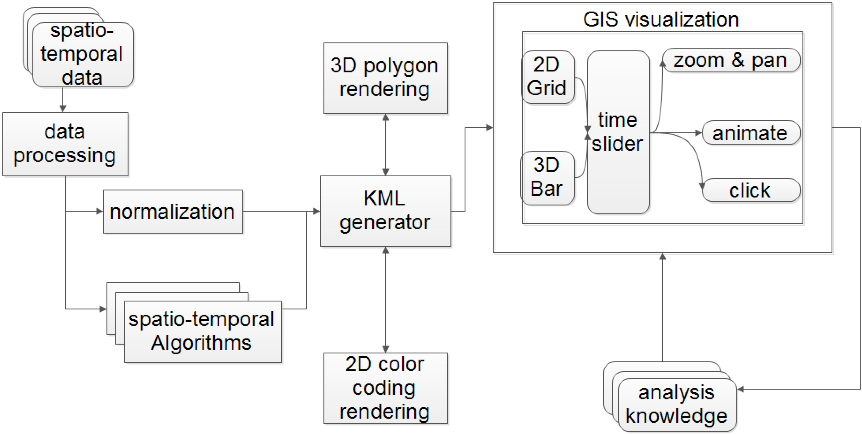
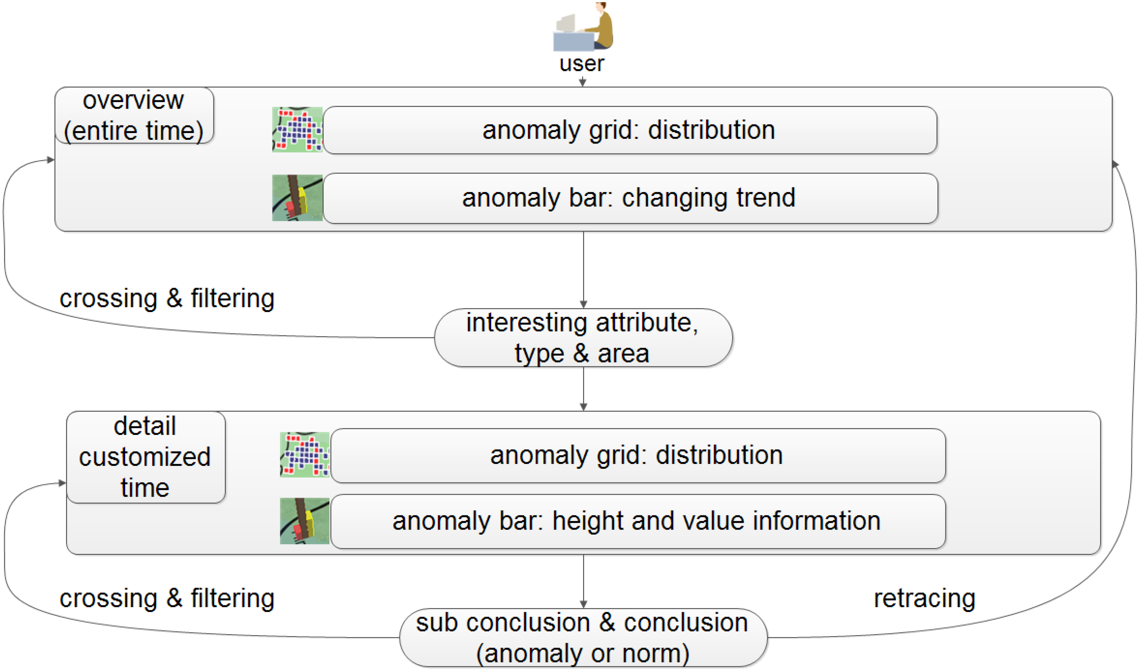
3.1. System Overview
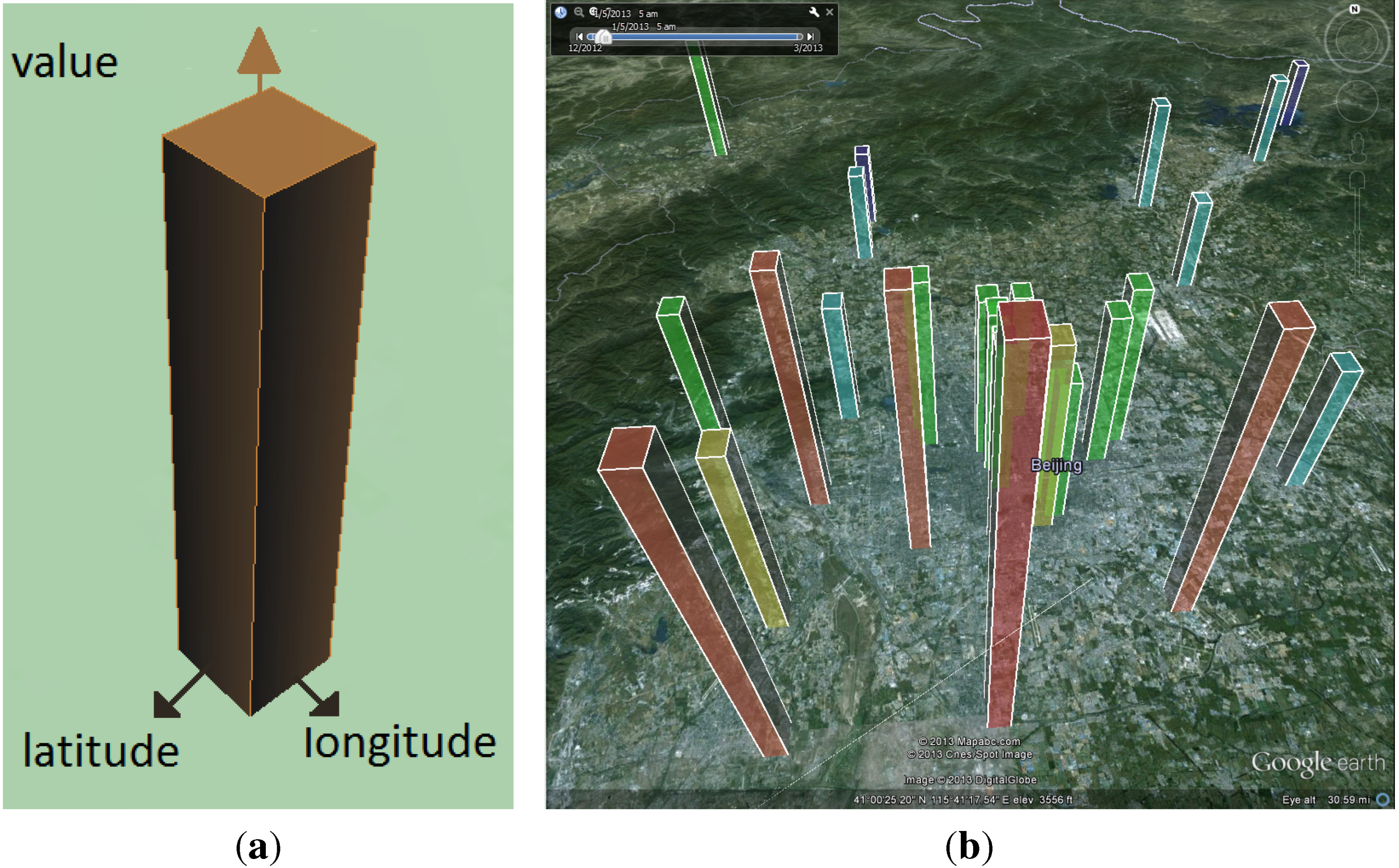
3.2. Anomaly Bars Visualization
3.3. Normalization of Bar Heights
| Algorithm 1 Bar height normalization using min-max (L). |
| Require: : list of raw data records; includes longitudes, latitudes and values |
| Ensure: : list of normalized bar heights. |
| (L) |
| for do |
| if then |
| × |
| else |
| × |
| end if |
| end for |
| return N |
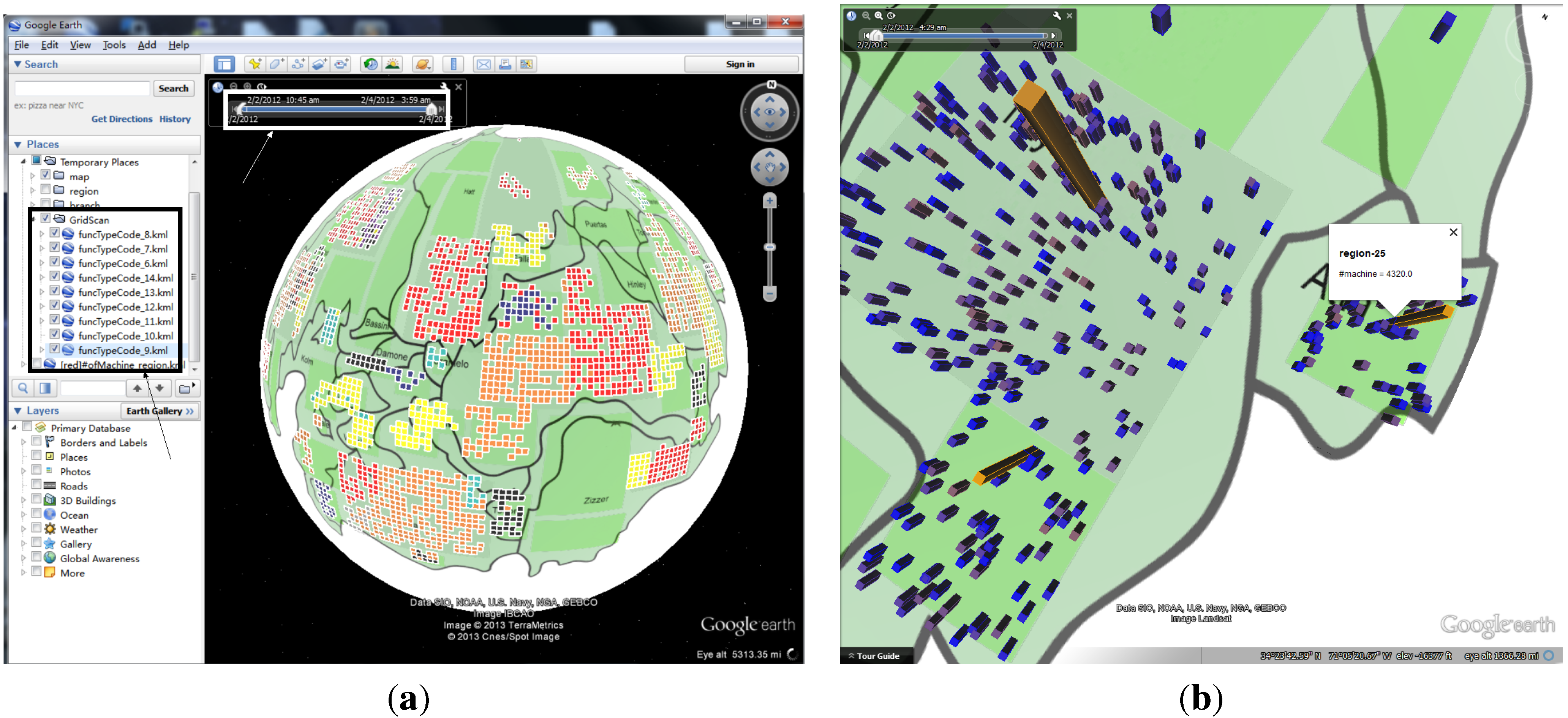
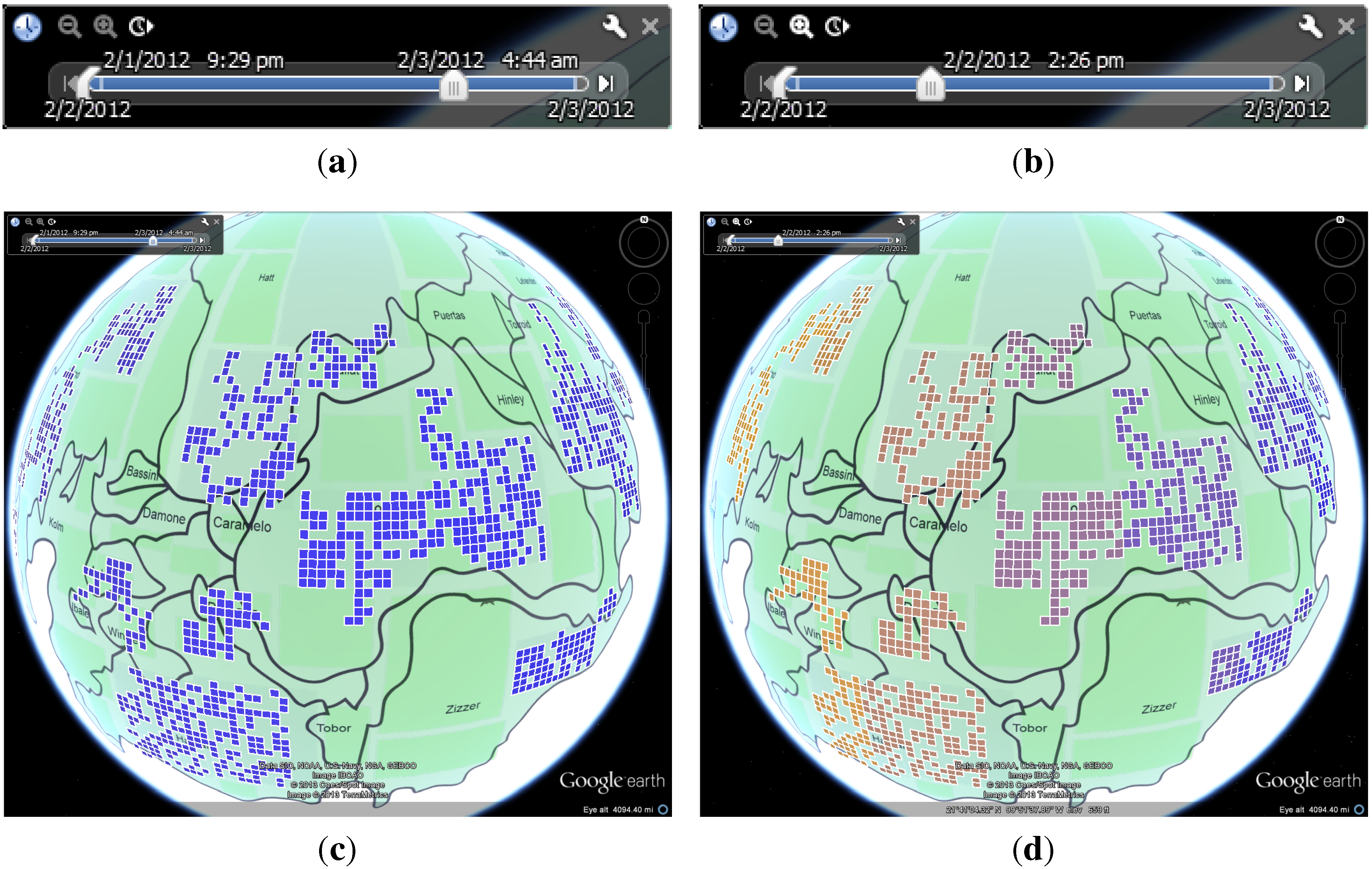
3.4. GridScan
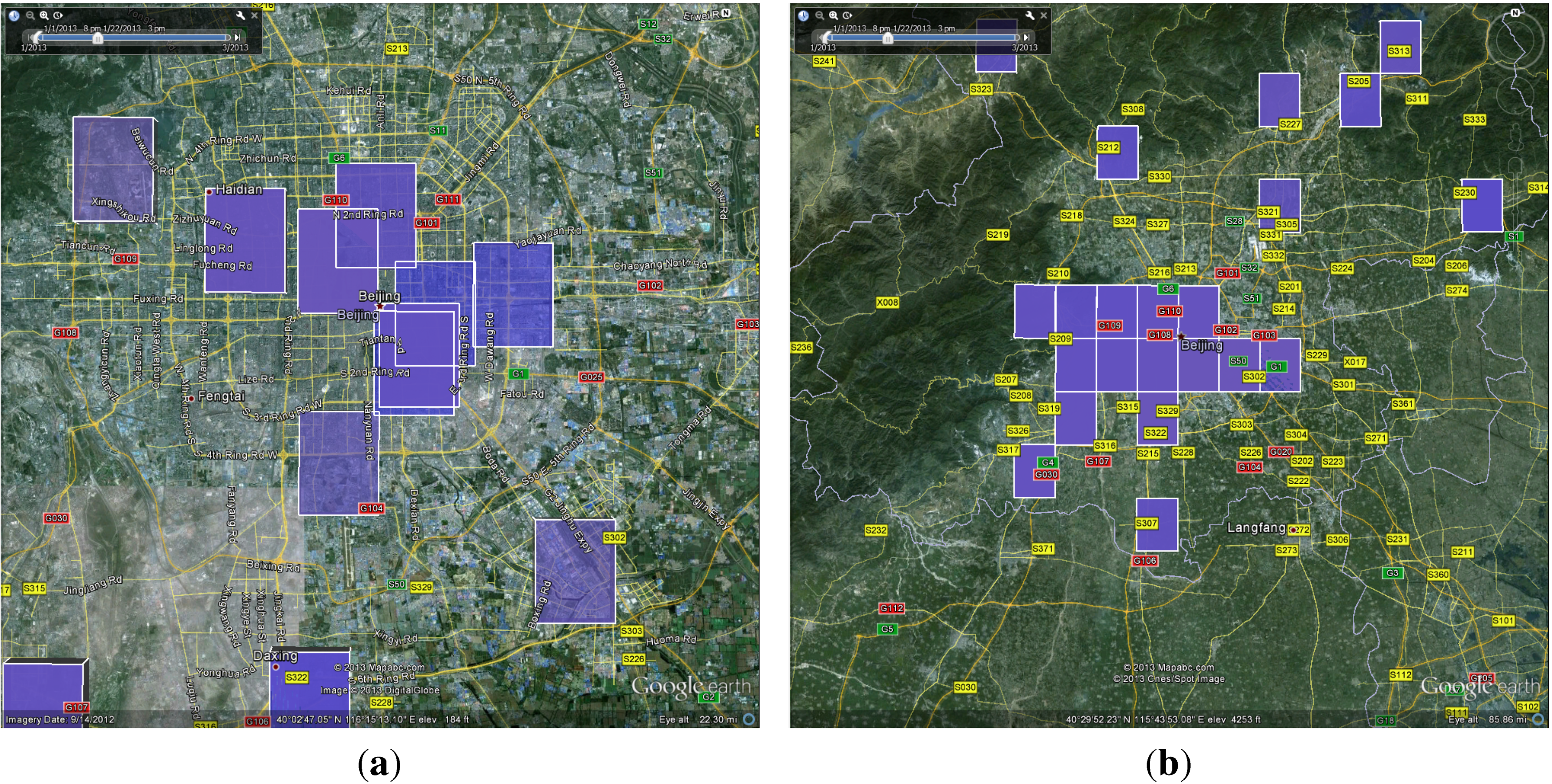
3.5. Anomaly Grids Visualization
3.6. Interaction and Trend Presentation
3.7. Color Encoding Model

3.8. Spatiotemporal Anomaly Analysis

4. Evaluation
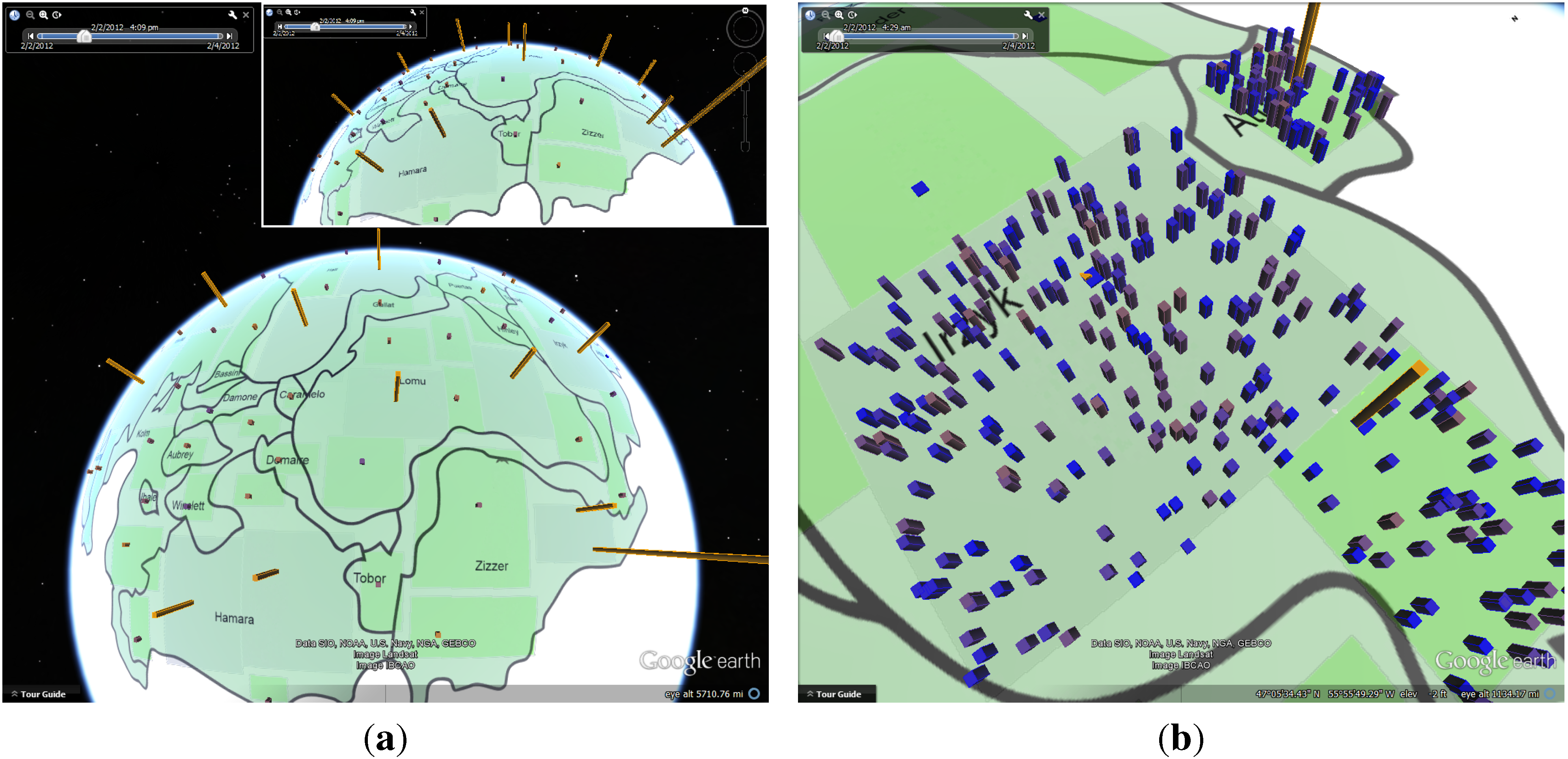
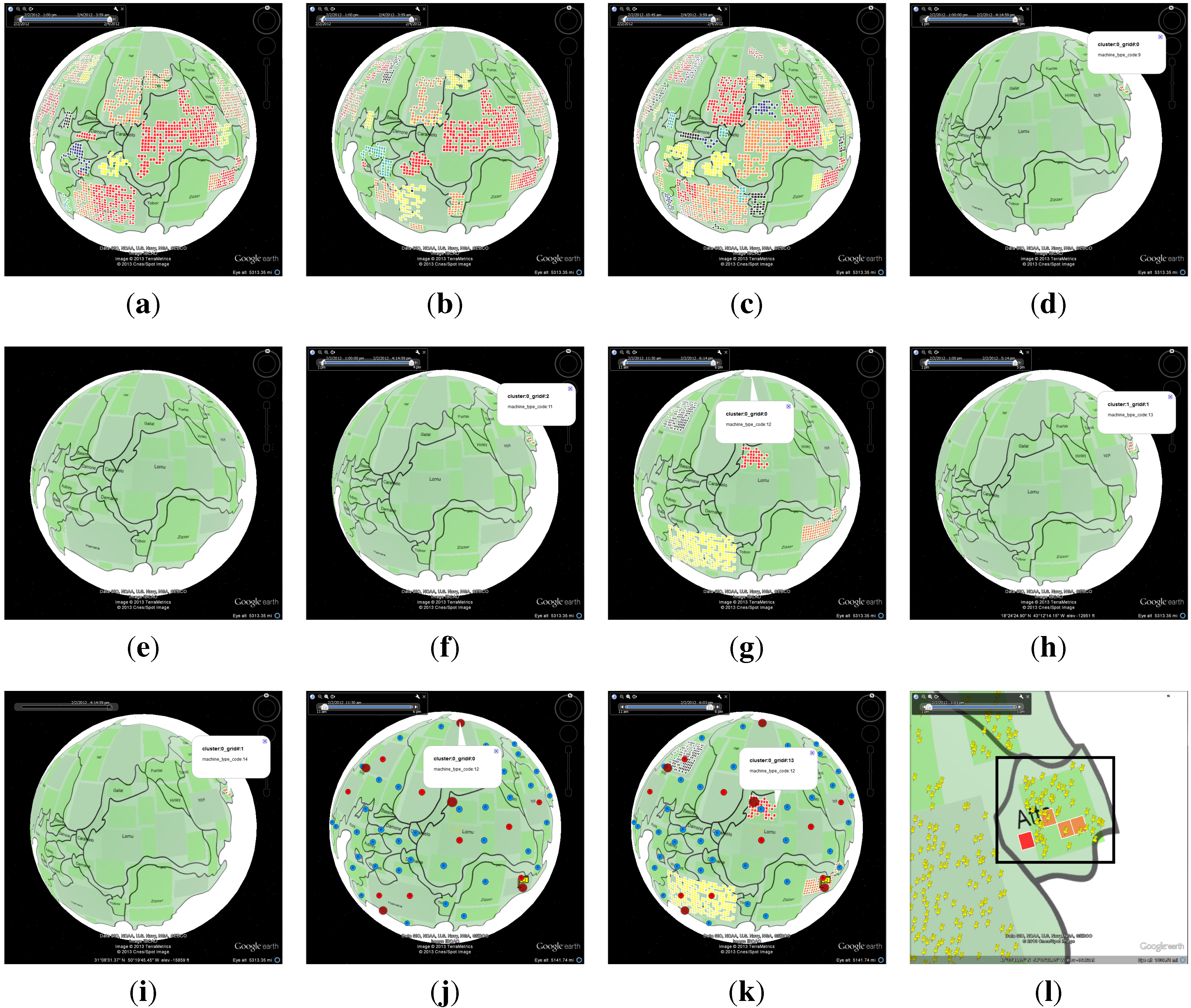
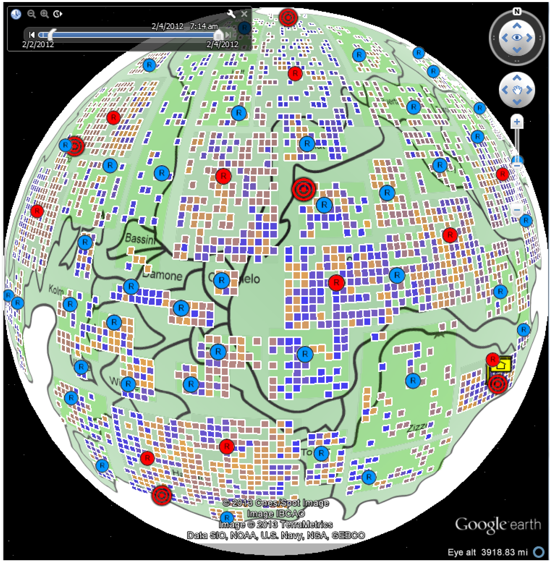
4.1. Case Study: Corporate Computer Networks
4.1.1. Data Process and Analysis
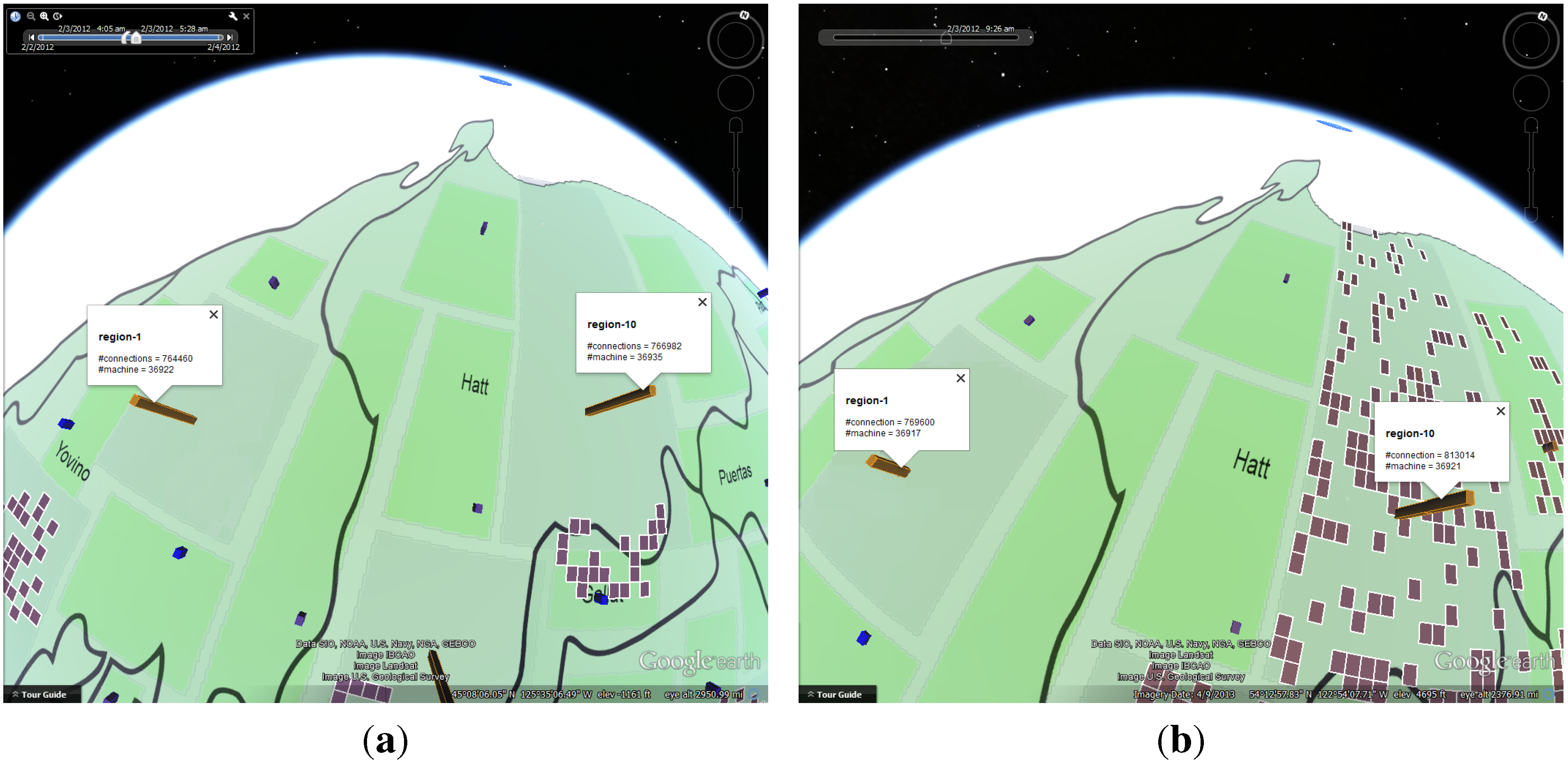
4.1.2. Number of Online Machines


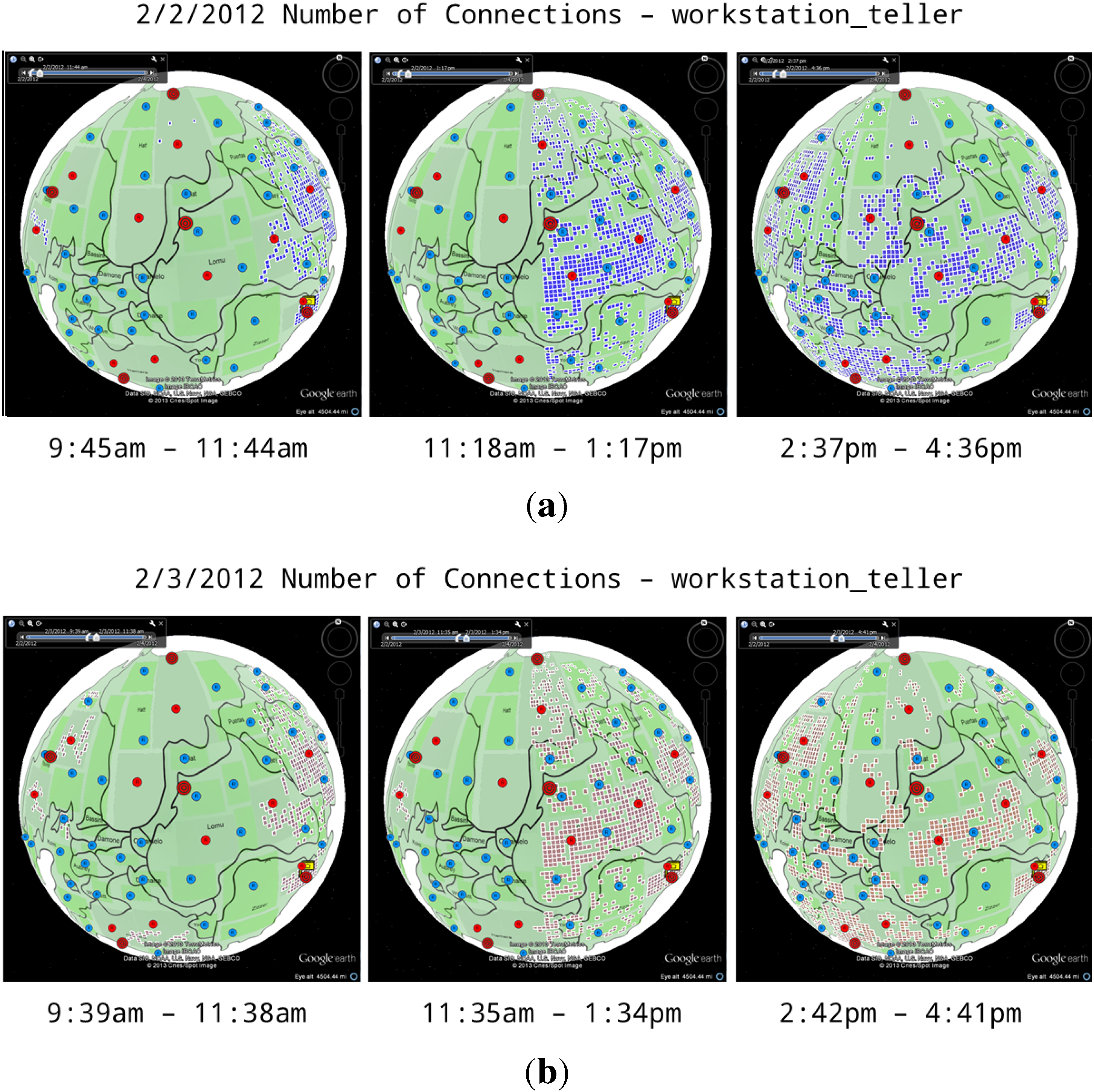
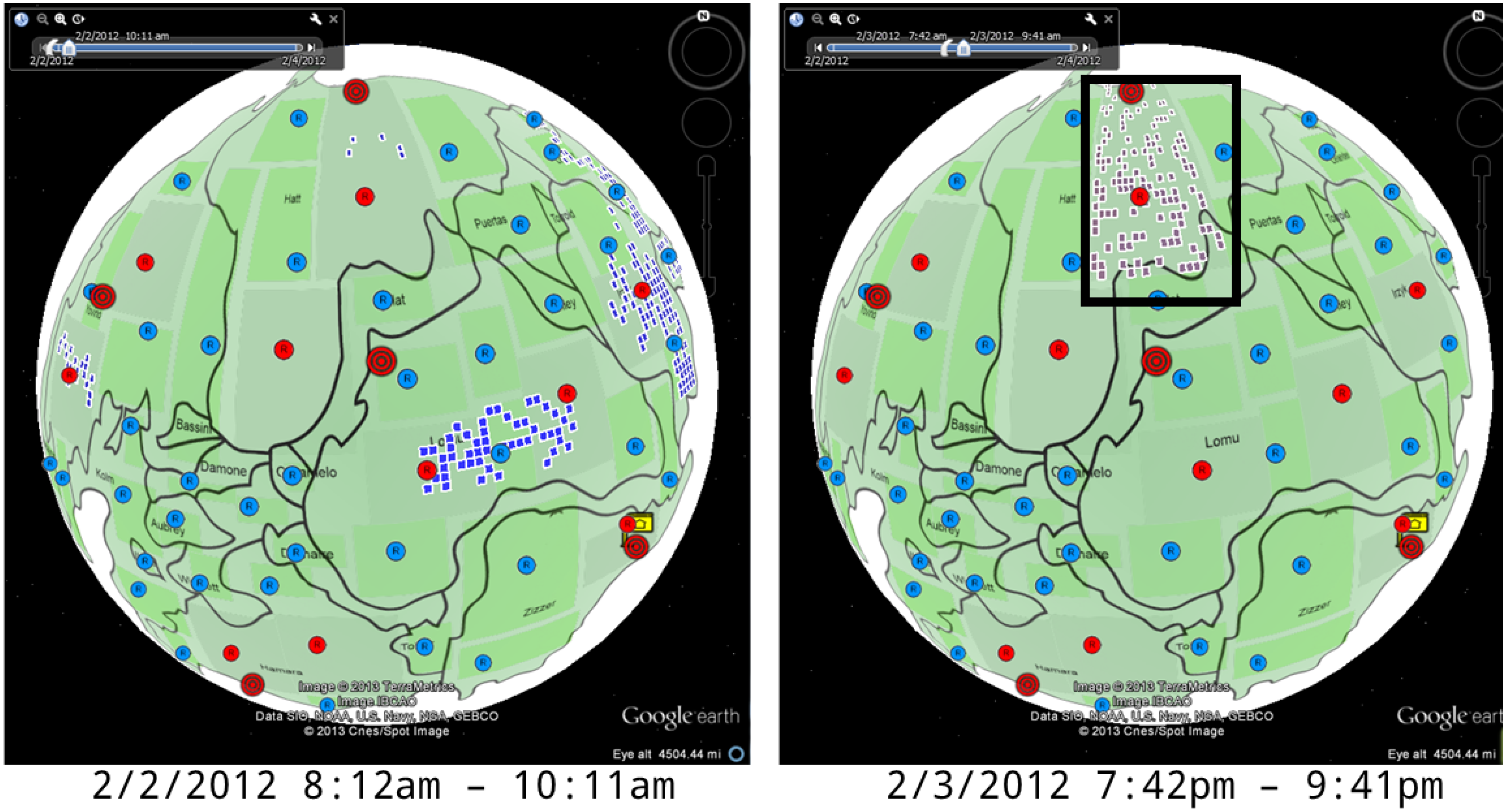
4.1.3. Number of Connections


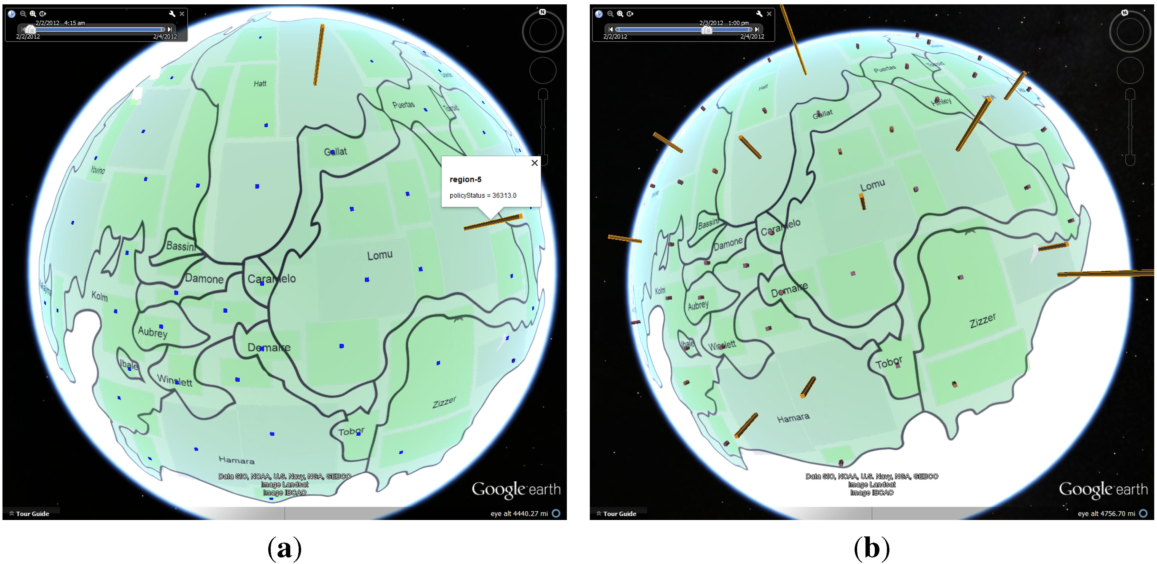
4.1.4. Policy Status

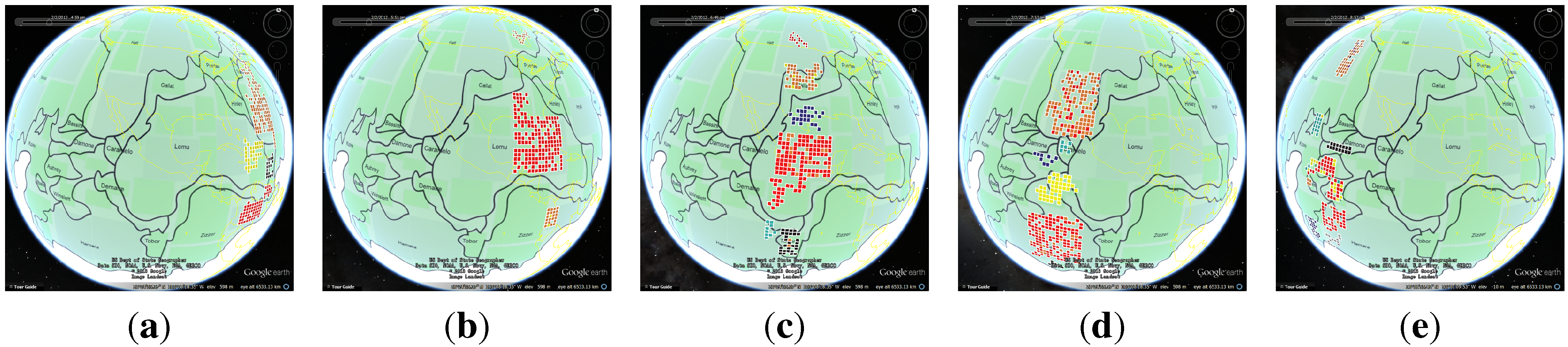
4.2. Case Study: Environmental Quality
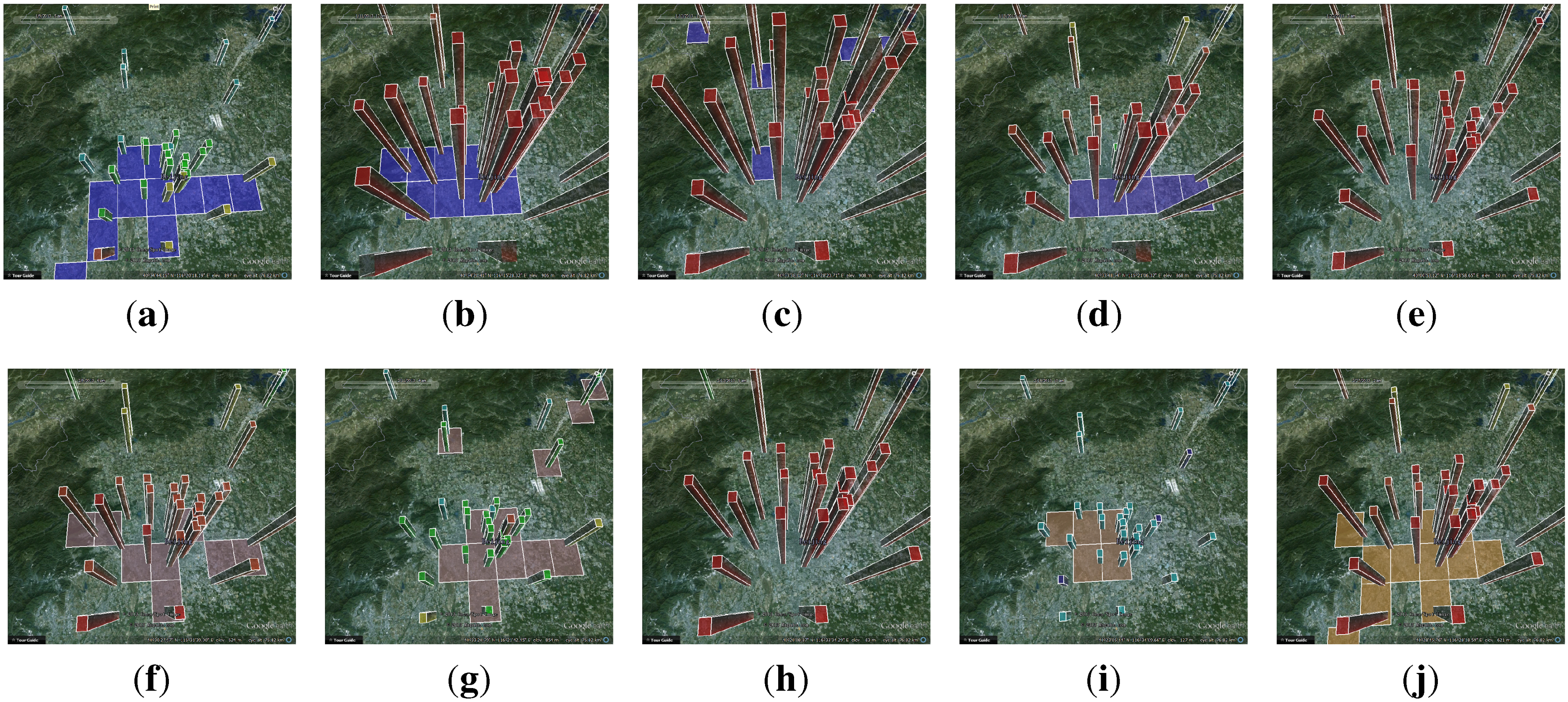
4.2.1. Data Process and Visualization

| PM 2.5 (China) μg/m 24 h Average | Level Description | Bar Color |
|---|---|---|
| 0–35 | Excellent | Dark blue |
| 35–75 | Good | Blue |
| 75–115 | Slightly polluted | Green |
| 115–150 | Lightly Polluted | Yellow |
| 150–250 | Moderately polluted | Orange |
| 250+ | Heavily polluted | Red |
4.2.2. Analysis

5. Conclusions and Further Work
Acknowledgements
Author Contributions
Conflicts of Interest
References
- Von Landesberger, T.; Bremm, S.; Andrienko, N.; Andrienko, G.; Tekusova, M. Visual analytics methods for categoric spatio-temporal data. In Proceedings of the IEEE Conference on Visual Analytics Science and Technology (VAST), Seattle, WA, USA, 14–19 October, 2012; pp. 183–192.
- Roddick, J.F.; Spiliopoulou, M. A bibliography of temporal, spatial and spatio-temporal data mining research. SIGKDD Explor. Newsl. 1999, 1, 34–38. [Google Scholar] [CrossRef]
- Rao, K.; Govardhan, A.; Rao, K. Spatiotemporal data mining: Issues, tasks and applications. Int. J. Comput. Sci. Eng. Surv. 2012, 3, 39–52. [Google Scholar]
- Tsoukatos, I.; Gunopulos, D. Efficient mining of spatiotemporal patterns. In Proceedings of the 7th International Symposium on Advances in Spatial and Temporal Databases (SSTD ’01), Redondo Beach, CA, USA, 12–15 July, 2001; pp. 425–442.
- Mamoulis, N.; Cao, H.; Kollios, G.; Hadjieleftheriou, M.; Tao, Y.; Cheung, D.W. Mining, indexing, and querying historical spatiotemporal data. In Proceedings of the Tenth ACM SIGKDD International Conference on Knowledge Discovery and Data Mining (KDD ’04), Seattle, WA, USA, 22–25 August, 2004; pp. 236–245.
- Mennis, J.; Liu, J.W. Mining association rules in spatio-temporal data. In Proceedings of the Seventh International Conference on GeoComputation, Southampton, UK, 8–10 September, 2003.
- Compieta, P.; Martino, S.D.; Bertolotto, M.; Ferrucci, F.; Kechadi, T. Exploratory spatio-temporal data mining and visualization. J. Vis. Lang. Comput. 2007, 18, 255–279. [Google Scholar] [CrossRef]
- Nöllenburg, M. Geographic visualization. In Human-Centered Visualization Environments; Springer: Berlin/Heidelberg, Germany, 2006; pp. 257–294. [Google Scholar] [CrossRef]
- Andrienko, N.; Andrienko, G.; Gatalsky, P. Exploratory spatio-temporal visualization: An analytical review. J. Vis. Lang. Comput. 2003, 14, 503–541. [Google Scholar] [CrossRef]
- Oliveira, M.; Baptista, C.; Falcao, A. A Web-Based Environment for Analysis and Visualization of Spatio-Temporal Data Provided by OGC Services. In Proceedings of the Fourth International Conference on Advanced Geographic Information Systems, Applications, and Services, Valencia, Spain, 30 January–4 February, 2012; pp. 183–189.
- Cao, N.; Lin, Y.R.; Sun, X.; Lazer, D.; Liu, S.; Qu, H. Whisper: Tracing the spatiotemporal process of information diffusion in real time. IEEE Trans. Vis. Comput. Graph. 2012, 18, 2649–2658. [Google Scholar]
- Dang, T.N.; Wilkinson, L.; Anand, A. Stacking graphic elements to avoid over-plotting. IEEE Trans. Vis. Comput. Graph. 2010, 16, 1044–1052. [Google Scholar] [CrossRef] [PubMed]
- Tominski, C.; Schulze-Wollgast, P.; Schumann, H. 3D Information Visualization for Time Dependent Data on Maps. In Proceedings of the Ninth International Conference on Information Visualisation, London, UK, 6–8 July 2005; pp. 175–181.
- Dong, W.; Zhang, X.; Li, L.; Sun, C.; Shi, L.; Sun, W. Detecting Irregularly Shaped Significant Spatial and Spatio-Temporal Clusters; SDM. SIAM/Omnipress: Anaheim, CA, USA, 26–28 April 2002; pp. 732–743. [Google Scholar]
- Keim, D.A. Information visualization and visual data mining. IEEE Trans. Vis. Comput. Graph. 2002, 8, 1–8. [Google Scholar] [CrossRef]
- Gahegan, M.; Wachowicz, M.; Harrower, M.; Rhyne, T.M. The integration of geographic visualization with knowledge discovery in databases and geocomputation. Cartogr. Geogr. Inf. Sci. 2001, 28, 29–44. [Google Scholar] [CrossRef]
- Andrienko, N.; Andrienko, G.; Gatalsky, P. Towards Exploratory Visualization of Spatio-Temporal Data. In Proceedings of the 3rd AGILE Conference on Geographic Information Science, Helsinki/Espoo, Finland, 25–27 May, 2000; Volume 2, pp. 137–142.
- Weiskopf, D.; Schramm, F.; Erlebacher, G.; Ertl, T. Particle and Texture Based Spatiotemporal Visualization of Time-Dependent Vector Fields. In Proceedings of IEEE Visualization (VIS 05), Minneapolis, MN, USA, 23–28 October, 2005; pp. 639–646.
- Plumejeaud, C.; Vincent, J.M.; Grasland, C.; Bimonte, S.; Mathian, H.; Guelton, S.; Boulier, J.; Gensel, J. HyperSmooth: A system for interactive spatial analysis via potential maps. Web Wirel. Geogr. Inf. Syst. 2008, 5373, 4–16. [Google Scholar]
- Chae, J.; Thom, D.; Bosch, H.; Jang, Y.; Maciejewski, R.; Ebert, D.S.; Ertl, T. Spatiotemporal Social Media Analytics for Abnormal Event Detection and Examination using Seasonal-Trend Decomposition. In Proceedings of the IEEE Conference on Visual Analytics Science and Technology (VAST), Seattle, WA, USA, 14–19 October, 2012; pp. 143–152.
- Andrienko, G.L.; Andrienko, N.V.; Rinzivillo, S.; Nanni, M.; Pedreschi, D.; Fosca, G. Interactive Visual Clustering of Large Collections of Trajectories. In Proceedings of the IEEE Conference on Visual Analytics Science and Technology (VAST), Atlantic City, NJ, USA, 11–16 October, 2009; pp. 3–10.
- Tominski, C.; Schumann, H.; Andrienko, G.; Andrienko, N. Stacking-based visualization of trajectory attribute data. IEEE Trans. Vis. Comput. Graph. 2012, 18, 2565–2574. [Google Scholar] [CrossRef]
- Kapler, T.; Wright, W. GeoTime Information Visualization. In Proceedings of the IEEE Symposium on Information Visualization ( INFOVIS ’04), Austin, TX, USA, 10–12 October, 2004; pp. 25–32.
- Smallman, H.S.; John, M.S.; Oonk, H.M.; Cowen, M.B. Information availability in 2D and 3D displays. IEEE Comput. Graph. Appl. 2001, 21, 51–57. [Google Scholar] [CrossRef]
- Shepherd, I.D.H. Travails in the Third Dimension: A Critical Evaluation of Three-Dimensional Geographical Visualization. In Geographic Visualization: Concepts, Tools and Applications; John Wiley & Sons: Chichester, England, 2008; Chapter 10; ISBN 9780470515112. [Google Scholar]
- Cox, K.C.; Eick, S.G.; He, T. 3D geographic network displays. ACM Sigmod Record 1996, 25, 50–54. [Google Scholar] [CrossRef]
- Moore, J.H.; Lari, R.C.; Hill, D.; Hibberd, P.L.; Madan, J.C. Human microbiome visualization using 3D technology. Pac. Symp. Biocomput. 2011, 154–164. [Google Scholar]
- Kristensson, P.O.; Dahlbäck, N.; Anundi, D.; Björnstad, M.; Gillberg, H.; Haraldsson, J.; Mårtensson, I.; Nordvall, M.; Ståhl, J. An evaluation of space time cube representation of spatiotemporal patterns. IEEE Trans. Vis. Comput. Graph. 2009, 15, 696–702. [Google Scholar] [CrossRef] [PubMed]
- Choudhury, S.; Kodagoda, N.; Nguyen, P.; Rooney, C.; Attfield, S.; Xu, K.; Zheng, Y.; Wong, B.; Chen, R.; Slabbert, G.M.; et al. M-Sieve: A Visualisation Tool for Supporting Network Security Analysts: VAST 2012 Mini Challenge 1 Award: “Subject Matter Expert’s Award”. In Proceedings of the IEEE Conference on Visual Analytics Science and Technology (VAST 2012) Challenge Workshop (VisWeek’12), Seattle, WA, USA, 14–19 October, 2012; pp. 265–266.
- Kachkaev, A.; Dillingham, I.; Beecham, R.; Goodwin, S.; Ahmed, N.; Slingsby, A. Monitoring the Health of Computer Networks with Visualization: VAST 2012 Mini Challenge 1 Award: “Efficient use of Visualization”. In Proceedings of the IEEE Conference on Visual Analytics Science and Technology (VAST 2012) Challenge Workshop (VisWeek’12), Seattle, WA, USA, 14–19 October, 2012; pp. 269–270.
- Zhang, T.; Liao, Q.; Shi, L. 3D Anomaly Bar Visualization for Large-scale Network: VAST 2012 Mini Challenge 1. In Proceedings of the IEEE Conference on Visual Analytics Science and Technology (VAST 2012) Challenge Workshop (VisWeek’12), Seattle, WA, USA, 14–19 October, 2012; pp. 291–292.
- Kalnis, P.; Mamoulis, N.; Bakiras, S. On Discovering Moving Clusters in Spatio-Temporal Data. In Proceedings of the 9th international conference on Advances in Spatial and Temporal Databases (SSTD’05), Angra dos Reis, Brazil, 22–24 August, 2005; pp. 364–381.
- Andrienko, G.; Andrienko, N.; Hurter, C.; Rinzivillo, S.; Wrobel, S. From Movement Tracks through Events to Places: Extracting and Characterizing Significant Places from Mobility Data. In Proceedings of the IEEE Conference on Visual Analytics Science and Technology (VAST), Providence, RI, USA, 23–28, October, 2011; pp. 161–170.
- Crnovrsanin, T.; Muelder, C.; Correa, C.; Ma, K.L. Proximity-based Visualization of Movement Trace Data. In Proceedings of the IEEE Conference on Visual Analytics Science and Technology (VAST), Atlantic City, NJ, USA, 11–16 October, 2009; pp. 11–18.
- Kulldoff, M. A spatial scan statistic. Commun. Stat.-Theory Methods 1997, 26, 1481–1496. [Google Scholar] [CrossRef]
- Mohammadi, S.H.; Janeja, P.V.; Gangopadhyay, A. Discretized Spatio-Temporal Scan Window. In Proceedings of the Ninth SIAM International Conference on Data Mining, Sparks, NV, USA, 30 April–2 May, 2009; pp. 1197–1208.
- Kulldorff, M.; Athas, W.; Feuer, E.; Miller, B.; Key, C. A space-time scan statistic and brain cancer in Los Alamos. Am. J. Public Health 1998, 88, 1377–1380. [Google Scholar] [CrossRef] [PubMed]
© 2014 by the authors; licensee MDPI, Basel, Switzerland. This article is an open access article distributed under the terms and conditions of the Creative Commons Attribution license (http://creativecommons.org/licenses/by/3.0/).
Share and Cite
Zhang, T.; Liao, Q.; Shi, L.; Dong, W. Analyzing Spatiotemporal Anomalies through Interactive Visualization. Informatics 2014, 1, 100-125. https://doi.org/10.3390/informatics1010100
Zhang T, Liao Q, Shi L, Dong W. Analyzing Spatiotemporal Anomalies through Interactive Visualization. Informatics. 2014; 1(1):100-125. https://doi.org/10.3390/informatics1010100
Chicago/Turabian StyleZhang, Tao, Qi Liao, Lei Shi, and Weishan Dong. 2014. "Analyzing Spatiotemporal Anomalies through Interactive Visualization" Informatics 1, no. 1: 100-125. https://doi.org/10.3390/informatics1010100
APA StyleZhang, T., Liao, Q., Shi, L., & Dong, W. (2014). Analyzing Spatiotemporal Anomalies through Interactive Visualization. Informatics, 1(1), 100-125. https://doi.org/10.3390/informatics1010100