1. Introduction
The concept of visualization refers to the interactive graphical representation of data and information. It aims to convey the summary of data and information, which can be in unclear formats to its audience, in a visually intuitive way that can be explored and lead into new insights [
1,
2,
3]. Information visualization has been emerged from the multidisciplinary scientific fields, such as human–computer interaction, psychology, computer engineering, and computer graphics. This composition allows users to intuitively see, explore, and understand large set of data and information. These abilities have been attractive characteristics for diverse range of domains in science and industry, such as scientific research, data mining, drug discovery etc., having visualization tools as a critical component [
1,
4]. Furthermore, data visualization is often considered to be a sub-domain of visual presentation of datasets [
5]. This scope of presentation pursues end-users to receive the desired concept and significance of data through the visual context as well as possible.
Analyzing the Relational-Many-Dimension data sets is a fundamental aspect of future planing and decision making for all industries and fields. The proposed tool and strategy in this article aims at all categories of problems with relational and many-dimension data sets. Combination of Multi-Criteria Decision Making methods and Visualization techniques [
2,
6,
7,
8,
9,
10,
11,
12] provide a robust Visual and Qualitative analyzing platform in order to analyze and rank the instants of different entities in a database. In the past decades, the complexity and dependency of the entities have been increased dramatically in the produced data sets throughout of science and industry. Therefore, the demand of meaningful, readable, reliable illustration and analyzing has been increasing simultaneously [
13,
14,
15,
16,
17]. In the other word, this platform is capable of providing this kind of analyzing in Robotic, Society, Archiving, Publication, Economic fields, and area [
18,
19]. The only need that should be done is collecting data and modelling them in the relational dataset.
According to these aspects, the relevance of visual layer on the top of processing layer is evident. In fact, in order to convey the message and meaning of a data-set with a huge amount of records, one generally needs three different layers. These three layers are data layer, processing layer, and presentation layer. This study has proposed a combination of decision making and creative data visualization tool in order to ranking the records and alternatives based on diverse criteria. As a data layer, this study considers the research dataset as a case study, in order to evaluate the contained entities, such as authors, publications, journals, and keywords. In this article, the publishing field has been chosen as a sample to show the capacity and feature of the proposed visualization and analyzing tool.
Publishing is a fundamental aspect of undertaking science, representing not only a method for scientific communication, but also an important output of the research activity. In the past decade, the number of research papers and scientific journals has increased dramatically throughout the world. Bibliometric analyses have recently become an important dimension and tool for evaluating the impact and performance of researchers, laboratories, departments and universities elsewhere, see for instance [
20]. Nevertheless, it is very difficult to make a representative selection and to find metrics for determining journal or paper quality. Much research has been conducted to propose methods for different types of analysis of research papers and journals [
21,
22,
23,
24,
25]. Ref. [
26] claimed that analyzing research papers in different tourism journals could be a new way of improving tourism careers. To do so, he investigates Bibliometric analysis for the assessment of journal and paper quality. Another work concerning the examination of journals is carried out based on the journal readership frequencies, scientific and practical relevance, overall reputations, and the importance of being published in the journals to the academic careers of the respondents [
27]. In other studies, [
28] proposed a method that deduces journal rankings from the ratings that were awarded in research assessments. Another method is to evaluate research paper performance using expert panels that were appointed by governments, universities, or other institutions. Expert panels also utilize a combination of existing ranking lists to arrive at their own rankings [
29]. However, almost all of the above methods use traditional tools, such as tables, bar charts, and plots, which are found to be poorly suitable and ineffective in the examination of research papers. The use of more creative tools seems to be helpful for the development of new research papers metrics. In another direction, Ref. [
30] tried to assess and analyze universities according to different criteria. In order to accomplish this goal, they used MCDM methods to rank the universities. In this study, because there are numerous indices and alternatives, AHP and VIKOR were employed as a hybrid ranking method. Specifically, AHP is used to obtain the weights of criteria and VIKOR tries to rank the alternatives based on the indices and their corresponding weights. MCDM have also been used in [
31] to present a critical view of Shanghai ranking of world universities. It is important to mention that this visualization tool can be combined and applied on several MCDM methods, such as TOPSIS, GRA, Fuzzy-TOPSIS, etc., since all of these methods are very useful for several applications [
32,
33].
To overcome the above challenges, this study provides a visualization tool that includes two phase tasks, analysis, and visualization. Additionally, the visualization tool can be integrated with MCDM tools. The first phase task is assessing and analyzing the items and entities based on the criteria, and the second phase task, which can be launched in parallel with the first one, is visualizing this assessment. As mentioned before, bibliometrics are has been chosen as a sample case study in order to choose the capabilities of the proposed framework. In this case, there are several papers that have employed visualization methods in bibliometric analysis, see [
34,
35,
36,
37]. In [
34], the authors use knowledge visualization methodologies to investigate geographic publication trends. Ref. [
35] studied international research on anticancer therapies with visualization analysis. Ref. [
36] employed Kohonen self-organizing maps to analyze co-citation patterns in the humanities [
37].
In the proposed method, the authors have tried to use suitable ranking methods in the first phase. As will be explained later, there are many decision methods that are able to analyze and rank the instants of entities (alternatives) [
30,
38,
39,
40]. VIKOR is one of them [
41,
42,
43], which has good performance in ranking the alternatives. In addition to this ability, it will be shown that these methods do not make sense for users when the number of alternatives is increasing, and the assessment would need to change the focus of the criterion. This means that, when the user needs to analyze and change the weights of criteria, these changes cause the ranking table to become chaotic. Because of this problem, we decided to propose a new tool, different from traditional tools, such as charts and tables, to reveal powerful meanings through visual information.
In parallel with the first phase, the visualization phase should be planned to show the meaning of the assessments and measurements with different levels and tools. Thus, this phase contains two other phases, which are called Overview and Detail, based on the Shneiderman Mantra [
44,
45,
46]. The general concepts, such as “analyzing the performance of a specific journal”, “number of papers that a specific author published”, and “which subject is hot topic” are obtained in the Overview step, while further details regarding the Overview step are demonstrated in the Details step. There are important factors that support the use of the proposed tool. The first factor is dimension independence, which helps to increase the number of dependent entity categories. The other factor is that the available items are graded in three structures, increasing the achievement performance of the visualization application.
According to the above text, this paper presents a new visualization method in order to present a qualitative and quantitative analysis for relational entity based data sets. In the other word, this tool has strong flexibility for the number of entity and the number of instants (alternative) of each entity. The logical relation between entities in the target systems and data set is the important concept that must be considered.
The remainder of the paper is organized, as follows.
Section 2 presents a definition of the problem. Also,
Section 3 presents a case study that is used to illustrate the capacity of the proposed tool. In
Section 4 the proposed method and visualization tool have been explained and demonstrated and in the following, the results and utilization of the tool can be seen in
Section 5.
Section 6 presents and discusses the simulation results on the benchmark problem. Finally,
Section 7 draws conclusions.
2. Problem Definition
This section extends the category of problems that can be considered as a target problem space for the proposed framework. At first, we are going to explain a generic definition, and then we will map this definition to the chosen case study.
Generally, considering a problem space with N entities that each entity contains K instances (alternatives) and each entity is evaluated by Z criteria. The proposed framework aims to analyze, assess, and rank the alternatives in regard to the weighted criteria. In fact, the criteria and their weights should be defined and determined by experts of the problem area. This could be done through several methodologies, such as statistical methods, which is out of this study field and discussion.
In a more formal word, suppose be a collection of ’s for where, is a set of instances (alternatives). Additionally, let be a collection of ’s, where for is a set of criteria. Assume that every is evaluated by for all . The proposed framework aims to analyze, assess, and rank the instances in regard to the weighted criteria.
In this problem space, the entities have logical relationships with each others. For example, in order to find popular banks, Customer and Bank are two entities and each person is an instance(alternative) of Customer, which could have an account in one or more banks and each bank is an instance of Bank. Therefore, there is a relationship between Customer and Bank (each customer has an account in one or more banks). According to the mentioned general definition, there is a sample case study definition in the following.
3. Case Study
As a case study, having a comprehensive overview and assessment of a group of researchers, a department, or university has become a sizeable challenge. The main items that this work aims to investigate are sets of papers, journals, authors, and keywords. The paper benchmark contains two different data sets with lots of records. One data set contains a list of papers, and the other is a list of available important journals around the world that have been confirmed and ranked. The first data set contains the 100 alternatives (items) as the papers with ID, Journal and Conference names, Authors, Years of publication, Titles of papers, Keywords, Citations, and Year of publication as the properties of the entities. The second data set is a list of journals with Abbreviations, Names, H-Index and Levels as the properties, which have been categorized. Now, we emphasize that this case study is just an example and the criteria have been chosen as a sample, and this article does not aim to analyze the articles and authors in reality. It is obvious that, in the real problem space, the criteria must be determined by experts.
As mentioned earlier, due to the importance of analyzing the available papers in any field of science and the huge number of published papers, having a comprehensive overview and assessment of a group of researchers, a department, or university has become a sizable challenge. The main items that this work aims to investigate are sets of papers, journals, authors, and keywords. The paper benchmark contains two different data sets with lots of records. One data set contains a list of papers, and the other is a list of available important journals around the world that have been confirmed and ranked. The first data set contains the 100 alternatives (items) as the papers with ID, Journal and Conference names, Authors, Years of publication, Titles of papers, Keywords, Citations, and Year of publication as the properties of the entities. The second data set is a list of journals with Abbreviations, Names, H-Index, and Levels as the properties, which have been categorized.
According to problem definition concept, the entities and alternatives can be considered as following:
, which, for instance, is . , , which is that means is . Following this pattern , and finally for , there is no any criteria since we didn’t want to analyze keywords. Based on the mentioned definition, several case studies can be applied on the proposed method and approach and the authors chose the case study based on the given Data Set and the requirement by UFMG university.
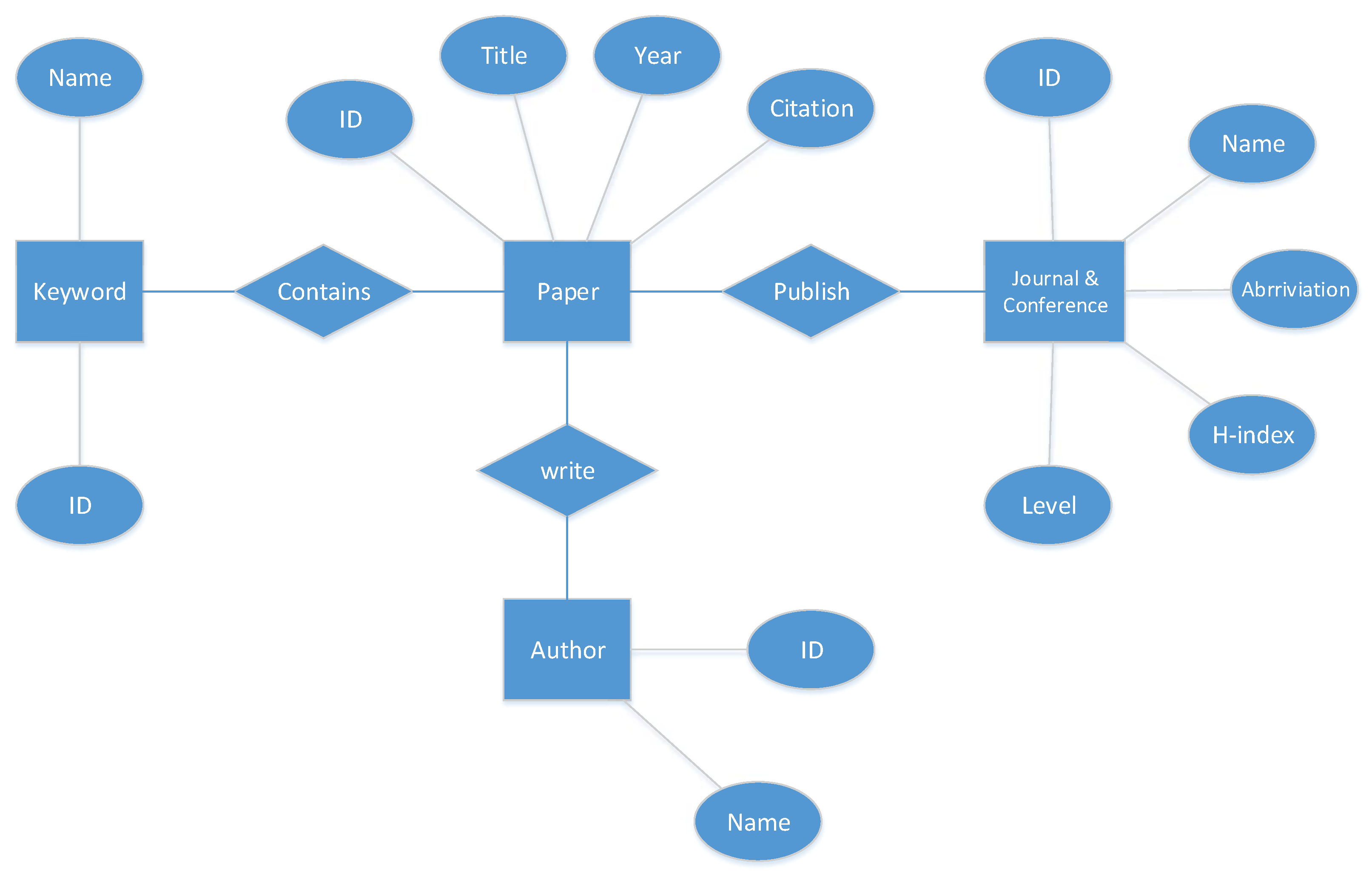
From a database viewpoint,
Figure 1 presents the Entity–Relationship (ER) model of the database that is considered in application execution. There are four entities (Keyword, Paper, Journal & Conference, Author) that control the application to create Dependency Nested Rings (NDR), as has been shown in the ER diagram. It is important to say this E-R diagram is a normalized for raw data that are obtained from two datasets. The first one is a list of 105 papers, including title, journal, authors, year, month, publisher, keywords, citations, age, and IF, and the second one is the list of journals that contain the name of journal, H-index, and quality or level of journals that listed more than 3000 journals. These datasets were released by CNPq in Brazil. Be aware that this tool just illustrates the journals that have published the papers listed in our dataset.
It is quite clear that using traditional tools, such as tables, to analyze the quality and grade of each entity in these data sets is difficult and will not be user-friendly. The goal of this study is to design an application that is a creative combination of three visualization tools in order to create a visual analysis to answer the following questions:
Which journals have the biggest contributions and the most papers?
Which journals are more interesting to the authors?
Specifying the supported field of each journal?
What is the grade of each journal?
The ability to compare journals with each other.
Showing the contribution of each paper. (the scope of each paper, obtained through the keywords)
Having the overview of the number of authors of each paper.
Grade and rank the papers to compare.
Overview of the amount of papers which have been written by authors.
Overview of the scopes which have been used by each author.
Grade and rank the authors.
Overview of the interesting scopes and fields.
Search ability for entities.
4. Proposed Method
Based on what we discussed before, the proposed tool and method must be able to extract and analyze the data and sequentially present the information visually, which enables users to obtain answers to the above questions. To reach this goal, there are two main qualities that are required for the proposed tool. The first is ability to analyze and the second is capacity to present information. The new proposed visualization tool respects the Schneiderman Mantra as a design critic. This principle contains overview, filter, and details on demand as the three steps to reach details. In addition to this tool, there are two other tools that play a supplementary role for the main tool. In other words, the proposed application contains three different tools, and each one has a special role to represent information in the form of an overview and details. These three tools are Dependency nested rings, Radar graph, and Scatter graph. On the other hand, in order to analyze and rank items, this tool set needs one or more algorithms and approaches to grade and rank items. Multi Criteria Decision Making (MCDM) is a powerful operational and applicable tool and approach for grading and ranking the items of
set in a radar graph, which are explained in
Section 4.2 and
Section 4.3.
The Dependency nested rings have been designed by the authors using creative characteristics, and they produce the overview of the entire dataset in a single view and one shot.
Figure 2 illustrates a generic overview of two main tools to analyze a set of alternatives based on weighted criteria.
Figure 2a is a set of rings to present the overview of sets
and their collections. In other words, each ring presents
, where each
is a collection of alternatives (instances of entities) that have been shown by set of
. For example, the first rings present
entity and this entity contains
, where
here.
Radar Graph is the second significant tool to meet the Schneiderman mantras. This tool aims to have a detailed evaluation for each target instance based on a weighted criteria. As it can be seen in
Figure 2b a radar graph represents a grade of each alternative based on a set of criteria which is defined as
. Axis
presents a weighted criterion of
which is a criteria set for alternative
of entity set of
. Likewise, each entity can has separated criteria set. There will be more details in the following of this article.
This means that users can extract general information regarding the utilization and impact of each entity. After that, the Radar Graph qualifies and grades the utilization of each entity, and the scatter graph finally ranks and places the entity among the entire considered category of noticed entities.
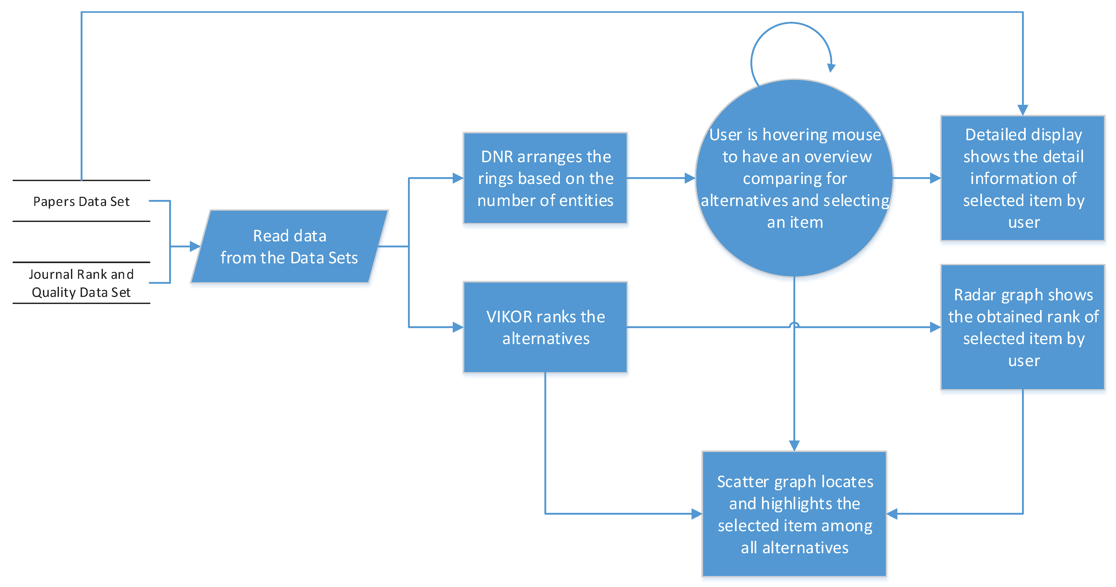
Figure 3 shows the relation between different components of the application. After a compact overview of the tool combination, each tool will be discussed separately.
The previous paragraphs explained the visualization components and the relation between them, but there is another component, named VIKOR. This component has a background role, processing and grading all alternatives.
In fact,
Figure 3 shows that, after starting the application, all of the alternatives should simultaneously transfer to the VIKOR and DNR components. In this part of the application, the DNR tries to create general visual information to provide an overview for the user. VIKOR produces a table containing the sorted list of alternatives based on the criteria. Therefore, the Radar graph illustrates the user’s entity in DNR based on the grade that was obtained through the VIKOR procedure. It sent it to the scatter graph to place the item with all other items placed according to it to the published year and obtained a grade.
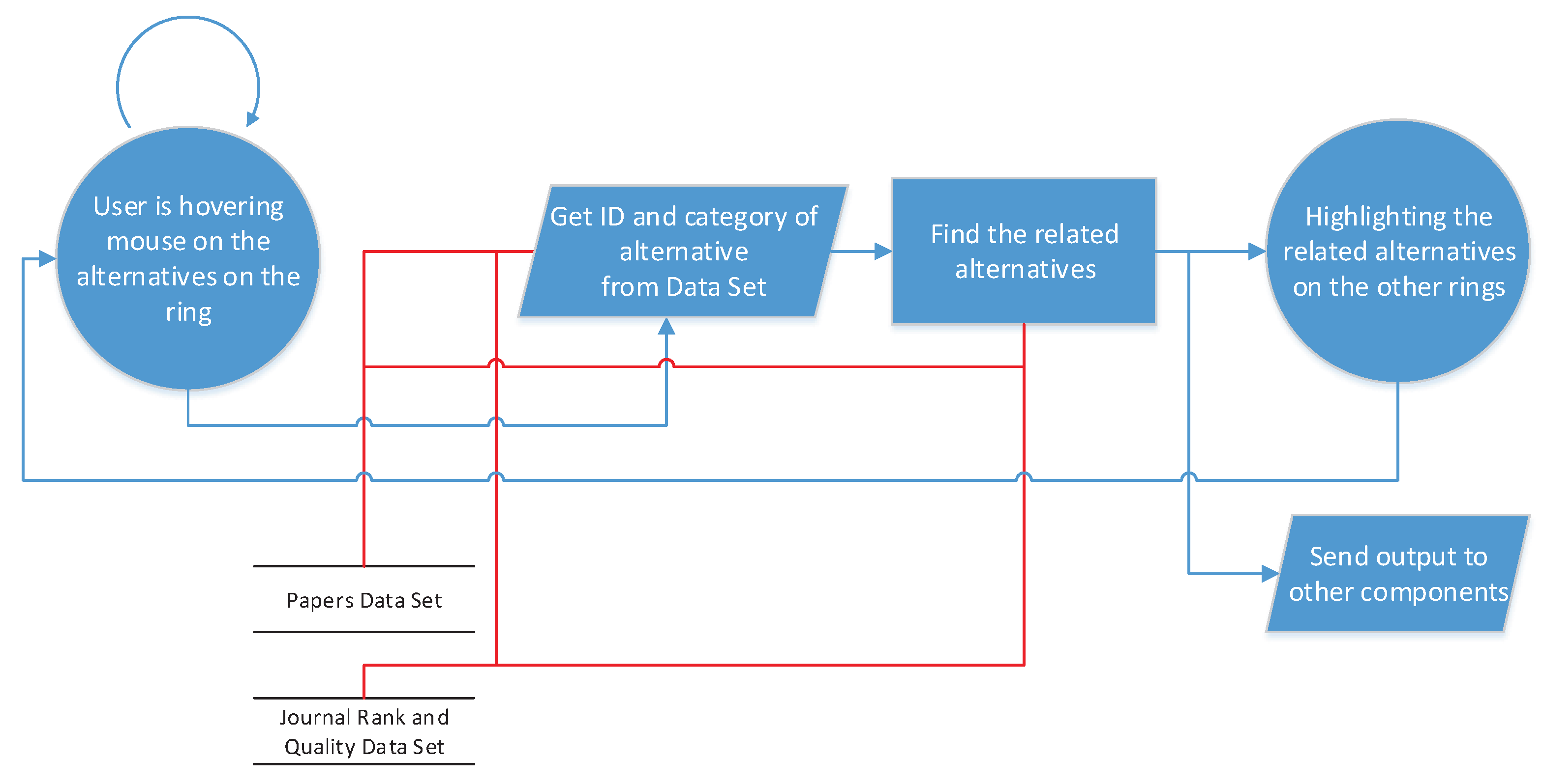
Figure 4 presents the data flow and process at level 0 when the user starts the application. First, the list of papers and journals should be obtained from the server or files. After that, the application creates the data structure based on the illustrated ER. Subsequently, the arranged data in the new data structure are simultaneously sent to the DNR and VIKOR components. In this step, the data should be sieved to the required structure for the VIKOR, which contains the alternatives and criteria. Now, the data are ready in the specified structure, and the DNR component has to make the rings. The number of entities has been shown in the ER. After this step, the application is ready to receive the order from the user, and the user should hover the mouse over the presented and arranged alternatives in the DNR. In each state of hovering over items, an alternative is highlighted, which means that the alternative has been chosen as an item to be sent for the analysis.
In parallel with the DNR, the VIKOR table contains the graded alternatives, and the output of this component is produced using a radar graph and a scatter graph. The radar graph input is an alternative that has been selected by the user and has then been graded by VIKOR. The output of the radar graph is an improved visualization for interpretation by the user. On the other side, the table of ranked alternatives is transmitted to the scatter graph, to be placed according to the grade and year as added criteria. Finally, the output of the radar graph is highlighted in the scatter graph to show the location and rank of the items among the entire set.
In conclusion, in spite of the intended application of the proposed tool, this tool has been designed to be as flexible as possible for use in other applications with the same concepts. In other words, the designers believe that this tool enables the visualization of other datasets in the same category.
In conclusion, this tool has a novel approach in visual ranking and evaluation. Visual evaluation helps the end user and decision maker to analyze and evaluate the results from the complext relational data sets. NDR provides an effective, efficient, and comparative analyzing just in one shot in every instance selection (Mouse hovering on the alternatives), as will be illustrated in the next sections. Subsequently, the radar graph and scatter graph presents the detailed information and comparison between that alternative and the other instances.
4.1. Dependency Nested Rings (DNR)
The first step of the design application is the overview level, according to the above-mentioned design principle. This level enables users to obtain general information regarding the available data. The user must be able to realize and extract the general statuses and conditions of entities. The obtained information contains the entities’ statuses and the relations between them, which is provided in one view and one frame without the need for scrolling on the page.
However, because the data sets contain too many entities, it is clear that, at the overview level, readability is less important than other criteria for the designer. Therefore, the designer has tried to embed the entire dataset inside a ring-like pattern.
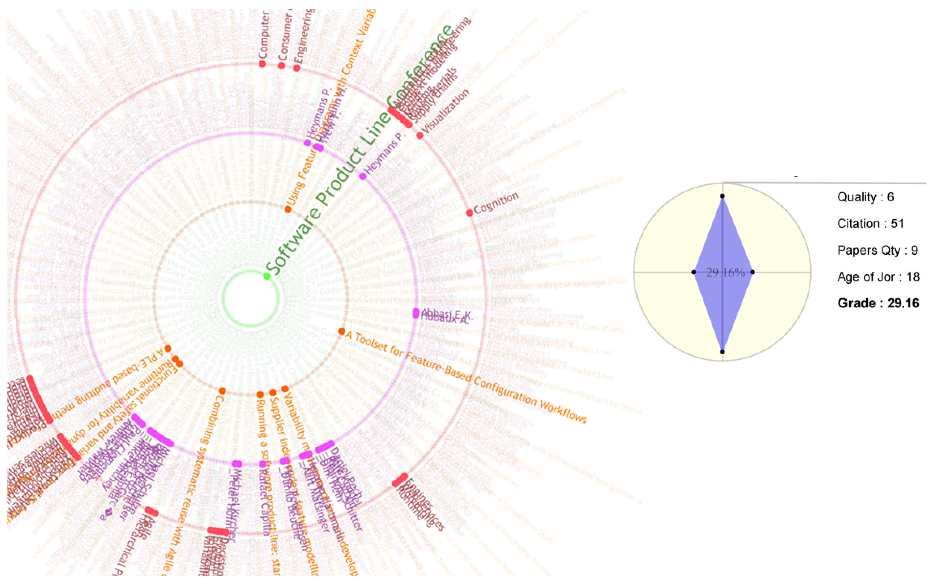
Figure 5 presents the DNR without any actions. In fact, DNR is a visualization tool that has been created using the nested rings. Each ring contains a category of data in the dataset. For instance, in our dataset, there are four entities:
Journals, Papers, Authors, Keywords. Each ring contains entity instances. In this case, the first ring, starting from the inside, is the journal ring that all journals listed there (for example: knowledge-based system journal is an instance from the journal entity). The second ring corresponds to the papers entity (for example: “Software product line approach for E-commerce system” is a paper title that is an instance for paper entity). Respectively, the third ring corresponds to the list of authors (authors entity), and finally the outer ring is the keyword entities (for example “data visualization” is a keyword of a paper which is an instance for keyword entity). provides more information about the data structure and data sets. The advantages of this design structure are flexibility and adaptability to the dimension of the environment. In other words, this type of ring structure helps to support the multiple data categories and, if the use case contains five or more categories of entities, the tool can contain five or more rings. Moreover, the ring shape of the components of the tool causes entities to participate in the tool, regardless of their relationship. This flexibility help to cover a wide range of data sets in different scopes and fields. On the other hand, the large capacity increases the number of participant items, which decreases the readability. However, in exchange for the increased capacity and flexibility, this is negligible. In addition, when using large data sets, this type of decreased readability in the overview step is common. That is why, in the
Schneiderman Mantra principle, multi-step design has been considered to reach the details that are discussed in this study.
The next criterion that specifies the performance of tool is the ability to show the relations between entities in the same viewport. This ability plays a large role in providing a useful and efficient overview, as presented below.
Figure 6 presents the overview of the data and entities when the user needs to realize and analyze an alternative of the entity. Therefore, when hovering the mouse over an alternative from a category (entity), the related items in other categories are highlighted and, through the highlighting technique, the relations between items in each category (relations between entities) are implemented. For instance, in
Figure 6, a journal has been selected by the user for an overview of the published papers in the journal, the authors of those papers, and the keywords that specify the field of that journal. With this overview, the user obtains a visual assessment of the status of that journal, and of other comparable journals. As another example,
Figure 7 presents two other view ports of the overview frame. In
Figure 7a, a paper has been selected and, thereupon, its publisher, authors, and keywords have been highlighted. Through these highlighted items, the general information has been extracted. For example, the covered scopes and fields are clear and comparable with a number of highlighted keywords.
Figure 7b provides the same view port in terms of the author as a selected entity, which produces an overview of information regarding the author’s performance, based on the amount of highlighted papers, journals, or keywords.
As a result, this overview satisfies the main user needs as an overview of extractions. Therefore, the user is able to have an estimate of each entity and its relations, which enables the user to have a comparison view in one shot.
As an overview,
Figure 8 demonstrates and simplifies processing steps and user actions to provide the results and analysis for end users. A user can see the DNR with all information and by hovering mouse on the items in DNR the tool highlights the selected item (which can be, for example, a journal), then the tool fetch its ID and related instances (items) from the datasets to highlight its related items in the other rings that would be published papers in that journal, their authors, and their keywords. Additionally, it passes the obtained information to the other components, such as scatter plots and radar graph, to show the analysis that will be explained in the following sections. The blue lines shows the system process flow and the red lines correspond to the data set connection to the processing modules.
Finally, to clarify the capabilities of our technique, we explain the following visual objects of this application:
- 1.
Highlighting When the user selects any node according to interest, the related links to selected nodes stand out without causing all other data to disappear.
- 2.
Exploratory Dependency rings let the user know when something that seems interesting is noticed and questioned. By focusing on that data, the application proceeds in a directed fashion to find an answer to that question.
- 3.
Aggregation We aggregate data to view it at a high level of summarization. In other words, all the data are aggregated in the same view, allowing the user to compare and survey the whole data set together.
In spite of existence of several type of similar tools, there are some significant differences and advantages for NDR. Sunburst partition [
47,
48] is one of the most similar types of visualization to NDR.
Figure 9a illustrates that Sunburst Partition, naturally, has been designed for the relational continues sets and it does not work for the sets with discrete instances. Holton introduced the Radial Hierarchical structure [
49] in order to visualize the hierarchical data sets. This type of design limits capacity of tool in item locations for each level. It means that each item should be located under the parent’s location. It causes a big limitation for the number of alternatives and makes a mess tree in the relation detection of instances, which is shown in
Figure 9a. Meanwhile, NDR provides an efficient independence in regards to the item location location.
Figure 9c also has been inspired from hierarchical structure that uses the lines for presenting the hierarchical relationships between instances or alternatives. As it could be seen, mapping an ER diagram to these tools is hard. While NDR enables the users to work and read the data according to the Entity–Relationship (ER) diagram, the current visualizing tool does not have this important capability in addition to the other shortcomings.
According to the above text, we can categorize the advantages of the NDR as following:
E-R concept base
Item location independence
Supporting the Discreet Sets
Capability in the number of entities and instances
4.2. Radar Graph
Based on the design principle, after providing the overview, the application must be able to present information in detail. In the interim, the whole goal of the application is to qualify and evaluate the entities (Journals, Papers, Authors, Keywords). Therefore, the explanation of the different tools is mostly an evaluation.
In
Section 4.1, the proposed tool produced overview information. Now, the application should provide that information in greater detail. In terms of evaluating the grade of each entity, a radar graph (polar chart) is a suitable choice. Flexibility, readability, and ease of understanding are the characteristics of this tool that have convinced the designer to use it for the calculations.
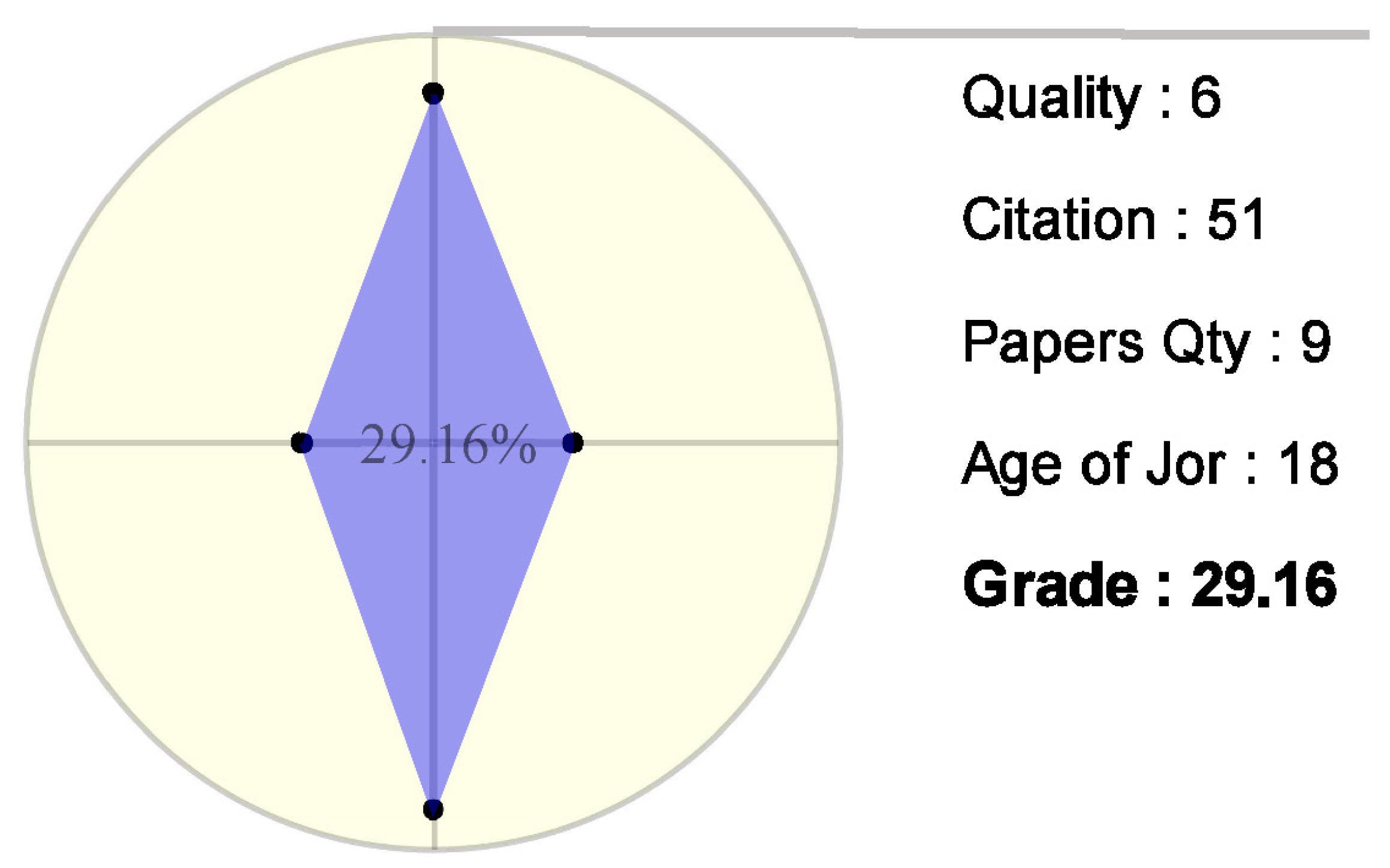
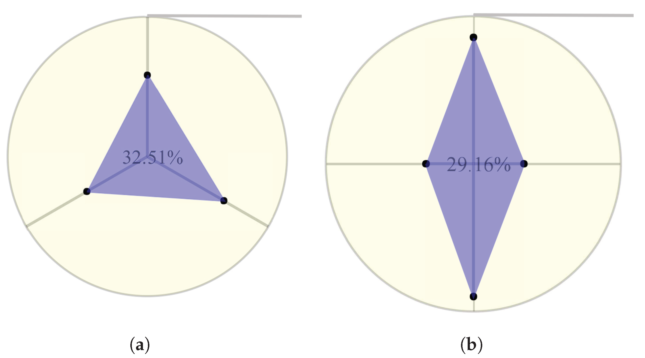
Figure 10 shows two radar graphs for the case in which selected entities have different criteria numbers. Each axis has been assigned to a criterion that is used to evaluate and grade the entities. Of course, when one needs to consider other criteria for assessing journals or papers, it is just a matter of adding them to the application.
Figure 11 illustrates the concept of grade calculation in this radar graph, which is based on the area that is covered by the blue shape. To calculate the grade of the entities, the application uses the VIKOR method, which is explained in
Section 4.3. On the other hand, the terminal points of the axes create an area that represents the maximum grade of the criteria.
The qualified grade of the entity is obtained using Equation (
1), and the number that is printed in the center of the chart is the grade of the considered entity.
After the above-mentioned processes, the final result will be shown, as in
Figure 12, in which a sample author is graded using the quality and number of citations of his published papers. The number of papers is ordered clockwise on the axes of the radar graph.
Finally, it can be seen that the radar graph could satisfy the requirement of presenting the details of the overview. In other words, in the overview step, the user had generally estimated the number of items that are related to the considered entity and, by adding the result of the radar chart, that estimation has become a detailed measurement.
4.3. VIKOR Method
The VIKOR method, or Multi-criteria Optimization and Compromise Solution, is a compromise MADM method, which was presented for the first time by [
50]. The framework of the VIKOR method is based on the compromise programming of MCDM by comparing the measure of closeness to the ideal alternative.
Assuming that each alternative is evaluated by each criterion function, we can represent this as a matrix
, with
,
, where there are
m alternatives evaluated with
n criteria.
represents the value of
ith criterion for the alternative
j. Like other decision-making methods, the first step of the algorithm is normalization to equalize the values in different kinds of criteria. The first step in the method is the normalization of the data, which leads to the normalized decision matrix:
Determine the best
and worst
values of all criterion functions:
Compute the values
and
for each alternative:
where
are the weights expressing the relative importance of the criteria. Compute the values
for each alternative:
where:
The parameter
is a compromise weight between the maximum group utility (majority rule) and the minimum individual regret (veto rule). Usually,
is adopted. In other words, increasing
enables the method to consider a majority vote point more than a minimum regret point (veto). In
Section 5, we will show the effects of the combination.
Once the , , and values are obtained, we can rank the alternatives. Rank the alternatives by sorting Q in ascending ordersuch that the best alternative has the minimum value of Q.
4.4. Scatter Graph
The steps of the design principle involve passing through the overview and detail information to evaluate the papers, authors, and journals, as written in the previous sections. Although grading the entities enables users to evaluate and qualify them, grading does not provide enough information to make decisions, such as choosing the best one. Moreover, grading is a way of ranking, and ranking is a final step towards making decisions.
Ranking the items can be performed in different ways based on different criteria, but, in this case, there are two important criteria that affect ranking. This is why the desired tool should support different dimensions of space, which are grade and time in our case.
Therefore, a scatter plot is a suitable tool to present and support time and grade as the criteria, and plot the items based on these criteria.
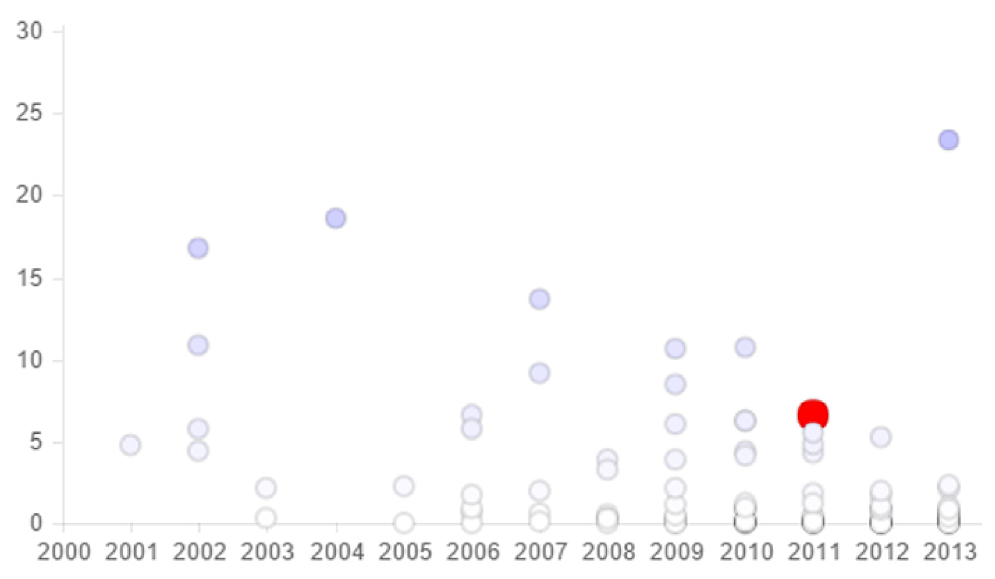
Figure 13 presents a plot showing the paper that had been selected in the overview and graded, and then presented in the radar graph, among all of the available papers. This means that this paper was published in 2004 and its grade is a little bit less than 20. Meanwhile, the plot points of the majority of the other papers are completely clear, which indicated that most of them were published between 2009–2013 and their grades are less than 10.
In addition, another property of this tool is the use of color as an attribute to show the quality of paper: the color of the point becomes more dense as the grade increases. The scatter graph is a complementary tool for DNR and radar graphs, providing more detailed information and rankings of the entities.
5. Experimental Result
In this section, the application and utilization of the tool combination has been studied to show the performance and effects of this combination on information extraction by users. To present the results, screen shots and some zoom sections of the application will be shown, with a selected item, in order to demonstrate the utilization of the application and the form of the extractions. After that, the use of the application for comparison using different selections will be presented. Moreover, in the data samples used here, only the papers have been considered; however, journals, authors, and keywords could also be considered.
Figure 14 is the first screen shot of the application that, for improved image readability, contains some zoomed sections from the several parts of the page. This figure was captured at the moment the user selected a paper for evaluation. In fact, the user has two ways of selecting the items: hovering the mouse over the selected items or using the search box to search and choose the item that satisfies question 13, as shown in the red box in
Figure 14. As mentioned before, an evaluation of the paper is based on the quality of the publisher, citations per year, and total citations. Moreover, the number of authors and the number of keywords can also be used in the evaluation. Finally, the rank and position of the paper relative the others is the final extracted information that helps users to evaluate and make a decision. In addition, based on the evaluation items mentioned, the application should be able to achieve the goals and answer the questions proposed in
Section 2.
In
Figure 14, the first section is the whole screen shot, and the selection of the user is the orange paper in the DNR, which has been zoomed in on in box 5. After the selection, DNR has found and highlighted the publisher in the green ring, the authors in the purple ring, and the keywords in the red ring. The user can see the number of authors and contributed scopes from the abundance of highlighted items, corresponding to answers to questions 6 and 7. Box 2 shows the detailed and readable information that has been used in DNR-highlighted items. After the overview, and based on the extracted data from DNR, the radar chart tries to grade the selected paper, as shown magnified in Box 3. The blue triangle in radar graph gives a visualization of the grade, which is efficient for visual comparison with the other papers. The grade that was calculated in this step will be sent to the next part to find the position and rank of the paper relative to the others. Finally, Box 4 is a magnified section of the scatter graph. The red point gives the location of the paper based on the year of publication and the grade obtained using the radar chart.
After a general study of the application, the next figures show the ability of the method in evaluating and comparing the other types of items. This assessment tries to present the combination of DNR and radar graphs in the zoomed boxes because the detail dock and scatter plot utilization are simple and clear.
Figure 15 and
Figure 16 were captured when the user selected a journal as a considered item. As an overview, DNR shows the abundance of highlighted items and entities in the different categories. For instance, in the fires view, the user sees that the journal that is selected in
Figure 15 contains more papers and authors and contributed scopes, which are the answers to questions proposed in
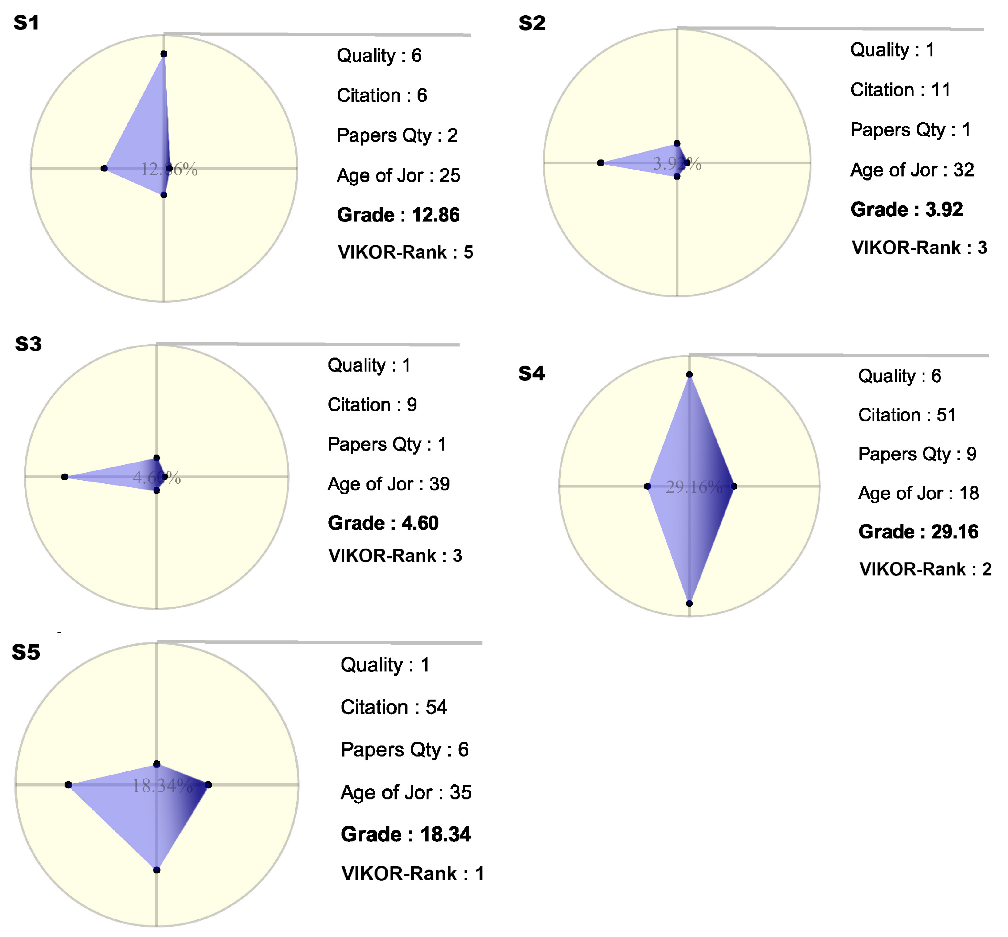
Section 2. After overview evaluations, the detail scores and grades are needed. Therefore, the radar graph grades the selected journal entities based on the highlighted items in DNR. According to the evaluation factors of journals, the radar graph should be able to support four criteria (for the papers, there were three criteria). These criteria are Quality, Citation, Paper Quantity, and Age of the journal. The data that are required for the first criterion have been obtained from a different data set that contains the grades of journals and it is mentioned in the problem definition section. The other criteria require information from the main data set. It is clear that the blue-colored polygons are much more clear and visually significant, in comparison to the table of numbers. The polygon shows that the blue areas are very close together, but the main differences are in the 3rd and 4th axes, which represent paper quantity and journal age. Finally, the radar chart calculates the grade of a journal and then sends this information to the scatter graph, where these data points are plotted among all of the others.
The strategy for evaluation is the same for every entity. Additionally, the process evaluated here is similar to the studied processes. Therefore, the application enables the user to compare and assess different entities that are categorized.
After assessing the combination of the different tools of application, we will now illustrate the usages and effects of VIKOR and visualization.
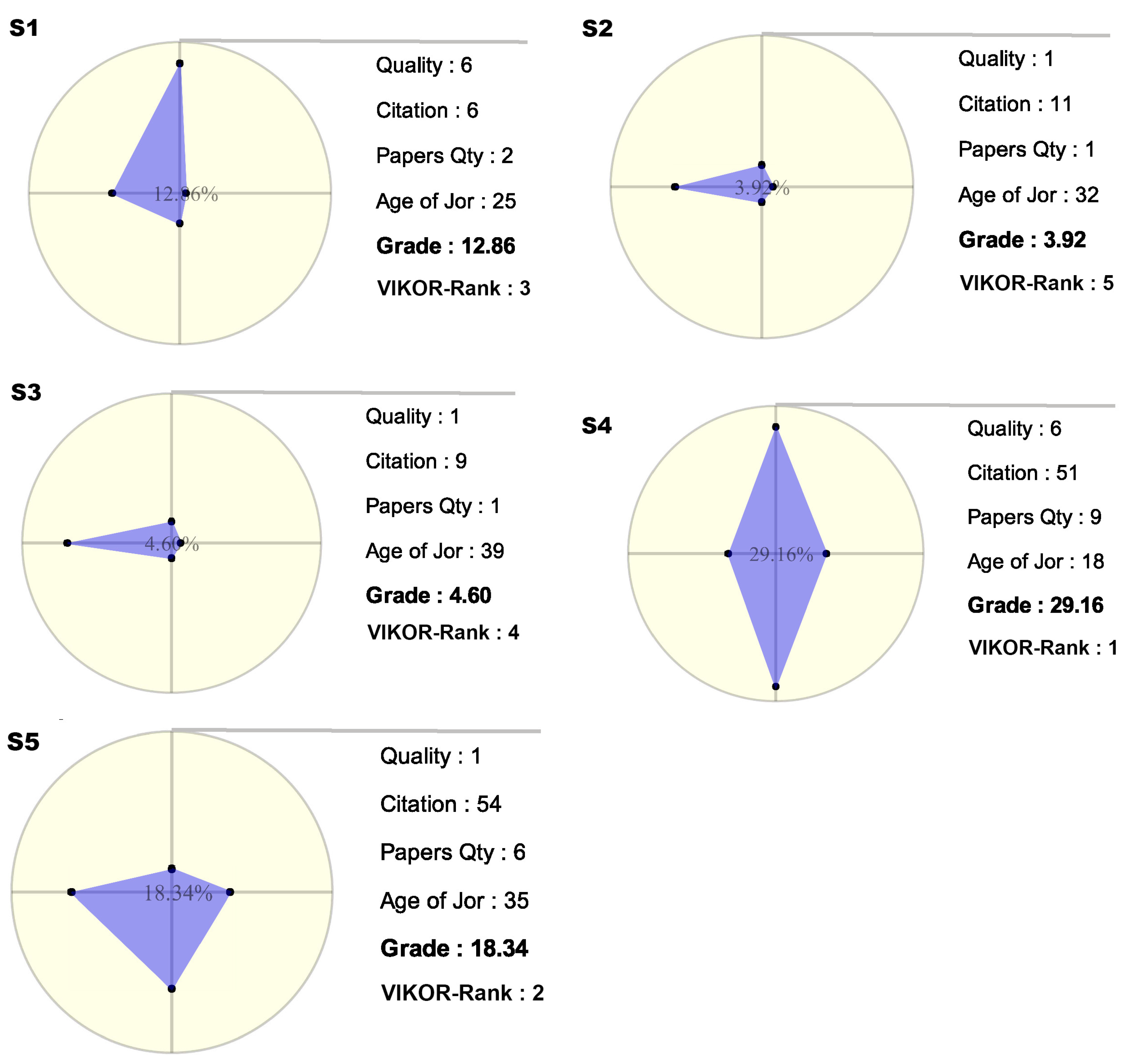
Table 1 shows the important calculations of the VIKOR process on just five samples of journals with just four criteria with the same weights. It is clear that, depending on the situation, the user can change the weights of the criteria based on the needs and goal. Although this table is very simple and small, obviously with an increasing the number of alternatives, it will be confusing for the user with decreased readability and user understanding. Thus, that radar graph helps to visually present the information to the user.
Figure 11 illustrates the radar graph of the alternatives that are considered in
Table 1. The graphs are able to provide greater meaning for the user. They are shown when the user hovers the mouse over the alternatives, which are stored in DNR component. In this way, the user is able to compare the items without any limitation. Meanwhile, if the user wants to perform the comparison using the table, then this will clearly become increasingly difficult as the number of items increases. Additionally, the numbers have less meaning for user in comparison with the visual shapes and colors.
VIKOR is used to calculate the rank point, which is then sent to the radar graph for visualization, providing the user with a better view than just a table of the pure numbers. The grade obtained from the blue area has additional meaning for users when the weights are equal for all criteria. However, whenever the weights are different, the grade that is obtained from the blue area loses its meaning, and the application just considers the VIKOR result. The priority of VIKOR is higher than the others, and the radar graphs consider VIKOR information for visualization.
There are two different methods for determining grade and rank, as shown in
Figure 17. The first is the calculation of the grade as explained earlier, and the second method determines the rank and is based on VIKOR method. The authors believe that the rank from the VIKOR method is more valuable than the Grade. This is supported by two different viewpoints: VIKOR is the more robust decision-making method intrinsically; and, VIKOR allows for the use of different weights for the different criteria.
Table 2 shows the same alternatives that are used in
Table 1, with different weights on different criteria. As mentioned before, the previous test had equal weights on all criteria (0.25 for each). However, this test tries to demonstrate the abilities of VIKOR for ranking in the case where criteria have the different priorities, and the ability of the application to visualize these data. The weights assigned to the four criteria are 0.05, 0.8, 0.05, 0.1, which cause alternatives to stay in different places, unlike in
Table 1. In this case, it has been seen that, based on the weight of the Citation criterion, which is 0.8, the alternative S5 reaches first place using the VIKOR ranking method. This can be an important advantage of decision making methods.
Moreover, the goal of the method that is presented in this text is to obtain a visualization of the information obtained from the data and the processes.
Figure 18 shows the weights as a new attribute for visualization. The color gradient has been chosen as an attribute for displaying the weights.
In this strategy, the gradient has darker area for the axis or axes that have more weight than the others. Additionally, the darkness level is specified based on the weights. For example, in this test, because the weight of the second criterion is 0.8, which is much larger than the other weights, this axis is very dark.
Finally, the authors believe that this tool can accommodate the specifications for the different methods and properties, and that this combination can make sense of the information for the end users. On the other hand, in spite of the advantages, which have been mentioned in previous sections of the text, there are limitations concerning the usage and functionality of the tool. In this case, a growing the number of items for each entity causes the application to increase the circumference of the rings, which creates a significant problem for the specified space of the DNR. Therefore, there should be a limitation on the size of the input dataset. This means that this is not a tool for assessing all of the published papers or authors in a country. Another limitation of the tool is the form of the item names. As can be seen in the overview tool, because the names of the items are long, this causes an involute status of rings, although this problem can be avoided by shortening the names or identifications on the item. Because of this limitation, the scale of the dataset should should be restricted to a subset of one major or one scope.
In addition, this tool is able to handle different scopes containing related entities, along with the items that are needed for the assessment. For example, this tool can evaluate universities or departments in addition to the existing entities. This is a result of the flexible design of the DNR, although the ordering of entities into circles is important due to the restrictions in size. For example, the entities with lower numbers of items (Records) should be assigned to the inner rings and the entities with higher numbers of items should be assigned to the outer rings, which, due to their larger perimeter, have higher capacities.
Therefore, it can be concluded that the design concept of DNR has a limitation on the number of items for each entity, but the number of entities is unlimited. Moreover, this tool can be used to analyze different entities in the environment and it is not specifically designed for journal papers.
6. Discussion
Mapping the dimension of data concepts on presentation layer can be a challenge in diverse fields of science. The whole strategy of this paper was aimed to convey information from multi-dimensional and relational data concept to a form that can be better understood by users. This transition has been done through a three layer software architecture that has been illustrated in
Figure 19. The data layer contains a dataset that is a bibliometric data as a sample case study. MCDM layer is a processing tier that used the VIKOR decision-making method as a type of multi-criteria decision making methods, and, finally, the user interface tier is the visualization layer that enables users to retrieve meaningful insights from the data set.
Based on this model, the MCDM layer can be replaced with every type of decision making algorithms that could meet required specifications of the decision maker analyzing goal. In addition, as mentioned before, this model can be useful and helpful for different areas, such as society, economy, environment, and health fields. For example, in societal crime, we can analyze relations between the location, crime type, weapon type, an age range together, and provide the rank of instances of each entity in the case study. In other words, we can provide this information that in which city, what kind of crime is more popular, and order the weapon types based on the usage on that crime and according to the age range.
As it is illustrated in
Figure 20, low readability characteristic of the overview section is one of the first challenging feedbacks that can be received from the experts. Whereas, the main purpose of the overview step is presenting the general idea about the whole of considered set of data. Moreover, there is no need to read every detail in overview section, because there is another section to make detailed and readable information that is related to the selected entity in overview. On the other hand, the overview part enables users to compare diverse entities together generally by just assessing the highlighted items. In addition, by examining the several visualization tools that are dealing with this amount of data, you can figure out that all of them contain the readability issue in the overview section [
16,
51], etc.
Therefore, this tool provides an independent space in order to present the details plainly. This combination satisfies the lack of readability for those who need details, even in the overview.
Meanwhile, the other parts of this application visualize the obtained ranking through the VIKOR method. Hence, end users are able to have different aspects of evaluation. In fact, the DNR illustrates the general information by an abundance of highlighted items, while the radar graph and scatter graph demonstrate the obtained result from the MCDM. DNR renders and gives this information from different aspects and the graphs are evaluated based on different criteria.
Finally, the proposed method has been able to provide and present the required information to the user when considering the different aspects and criteria. Notice that, in the result, the criteria weights have been set just as a sample and the user is able to set according to different conditions.
7. Conclusions
The application shows how a combination of tools can be helpful for analyzing data and information. The mix of Dependency Nested Rings, Qualifier Radar Charts, and Scatter Graphs can provide useful information about a set of entities. In addition, when the radar graph was used along with the VIKOR method, the combined method yielded more reliable information for the end users.
Another application of these rings in the assessment is that the densities of highlighted items in each ring indicate the most important items in DNR. This means that, when the user selects the paper, its authors, journals, or conferences who published it, and keywords are be highlighted. Therefore, the user can determine the impact of that paper during a first overview using the abundance of highlighted entities. On the other hand, when you look at the performance and impact of the paper along with other properties, such as citations on the radar graph, the grade of the paper can be analytically evaluated (based on above text), and the scatter graph can show the place of this paper among all papers in the data set.
In addition, the authors of this text believe that this application can satisfy the goals of the Data Visualization concepts in both visual views and analytical viewpoints, which have been used in the evaluation of academic papers. However, there is good potential to improve this tool, which can be seen as a future work. Capacity improvement, and using some othe ranking methods, such as Fuzzy MCDM and Machine Learning methodologies, are interesting candidates for ranking the data that can be embedded in this dashboard.
Finally, in spite of the limitation on the number of items in each entity, the combination of tools with the MCDM method provides meaningful information for the analysis by the user of different related entities in the specified scope and environment. Thus, the authors believe that the DNR has enough advantages at the overview level of the application. On the other hand, based on the different visualization tools, one can see that the overview level is not designed to provide detailed information. Therefore, the designers believe that the presented application meets the proposed goals of this research.


 ,
, 


