Figure 1.
Parallel subsystem-type nonlinear system.
Figure 1.
Parallel subsystem-type nonlinear system.
Figure 2.
Identification calculation flowchart.
Figure 2.
Identification calculation flowchart.
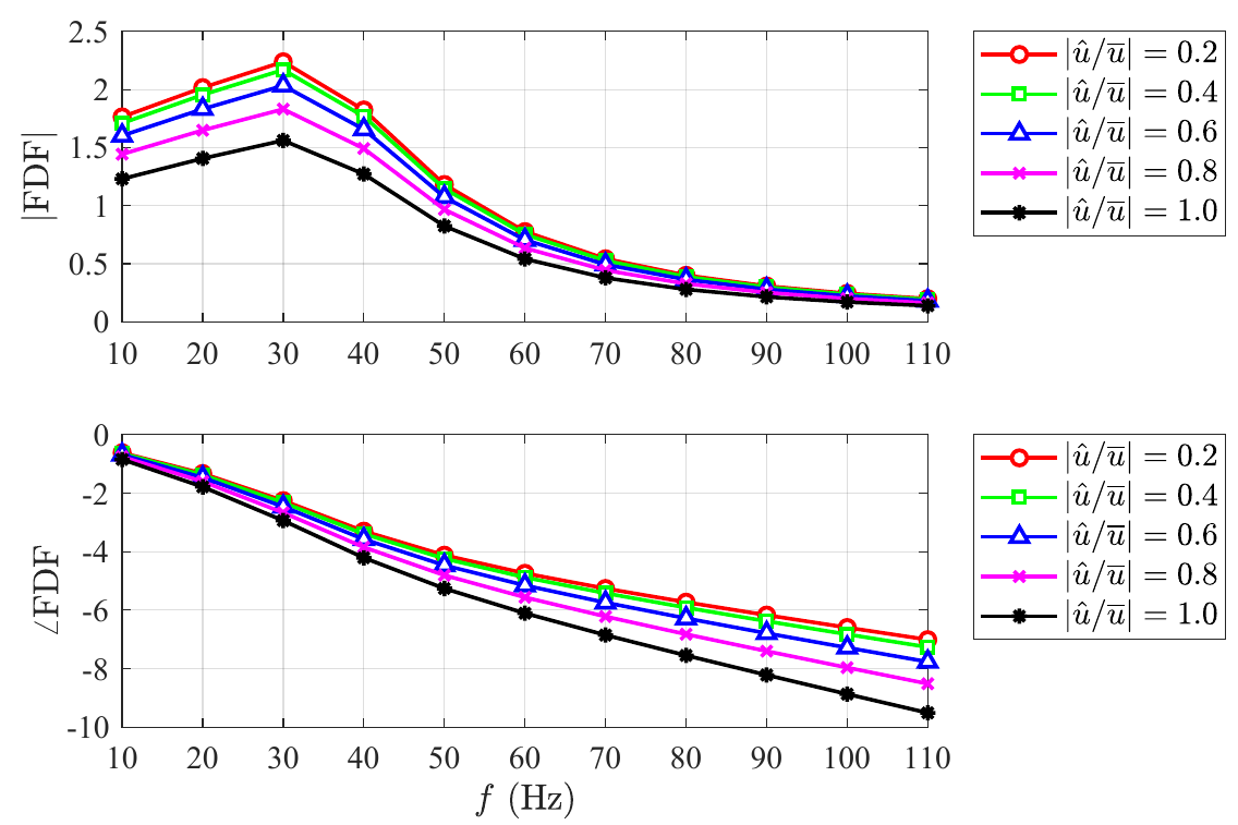
Figure 3.
FDF frequency response for five different input amplitudes. The linear model is a second-order delay model, and the nonlinear model is a polynomial model.
Figure 3.
FDF frequency response for five different input amplitudes. The linear model is a second-order delay model, and the nonlinear model is a polynomial model.
Figure 4.
Comparison between the separated nonlinear gain data of frequency range , velocity perturbation range and the identified nonlinear polynomial gain model (, , ). The scatter points represent the simulation data, and the solid line represents the identified nonlinear gain model.
Figure 4.
Comparison between the separated nonlinear gain data of frequency range , velocity perturbation range and the identified nonlinear polynomial gain model (, , ). The scatter points represent the simulation data, and the solid line represents the identified nonlinear gain model.
Figure 5.
Comparison between the separated nonlinear phase data of frequency range , velocity perturbation range and the identified nonlinear polynomial phase model (, , ). The scatter points represent the simulation data, and the solid line represents the identified nonlinear phase model.
Figure 5.
Comparison between the separated nonlinear phase data of frequency range , velocity perturbation range and the identified nonlinear polynomial phase model (, , ). The scatter points represent the simulation data, and the solid line represents the identified nonlinear phase model.
Figure 6.
Comparison between the separated linear data of frequency range , velocity perturbation range and the identified linear second-order delay model (, , , ). The scatter points represent the simulation data, and the solid line represents the identified linear model.
Figure 6.
Comparison between the separated linear data of frequency range , velocity perturbation range and the identified linear second-order delay model (, , , ). The scatter points represent the simulation data, and the solid line represents the identified linear model.
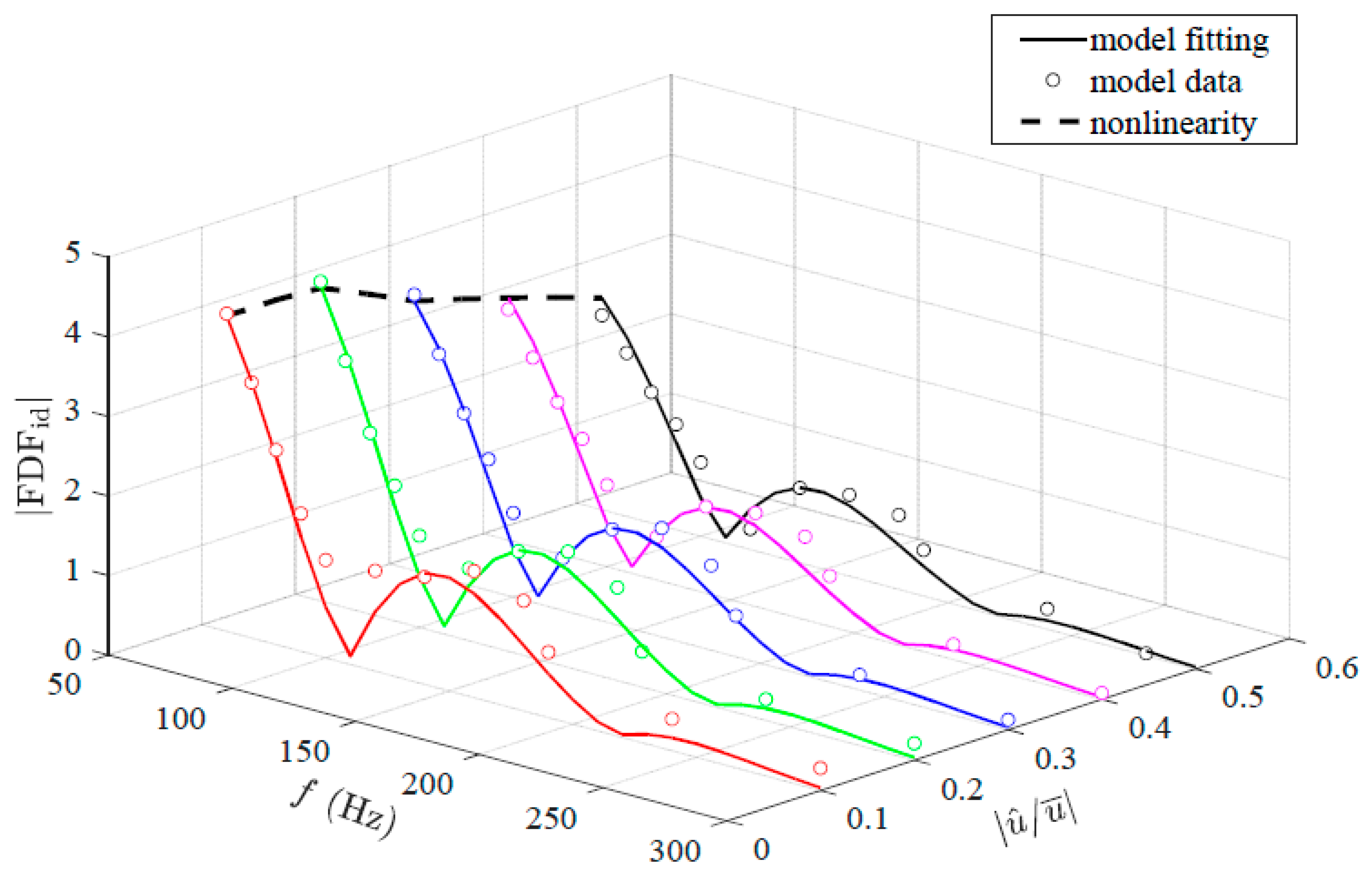
Figure 7.
Comparison between the FDF phase data of frequency range , velocity perturbation range and the identified model. The scatter points represent the simulation data, the solid lines represent the identified FDF model (: red, : green, : blue, : magenta, : black, : cyan), and the dashed line represents the identified nonlinear model.
Figure 8.
Experimental platform for the FDF identification. (a) The experimental setup used to determine various describing functions. (b) The flame image captured by the high-speed camera for the steady flow injection condition. , m/s.
Figure 8.
Experimental platform for the FDF identification. (a) The experimental setup used to determine various describing functions. (b) The flame image captured by the high-speed camera for the steady flow injection condition. , m/s.
Figure 9.
Structure of the swirler. (a) The front view of the swirler. (b) The top view of the swirler. The swirler has eight straight blades, and each blade contains two holes with diameters of 1 mm for gas ejection. The inner radius is 3.2 mm, and the outer radius is 8 mm. The corresponding hub ratio z is 0.4. The swirl angle is 40°, and the swirl number is 0.62.
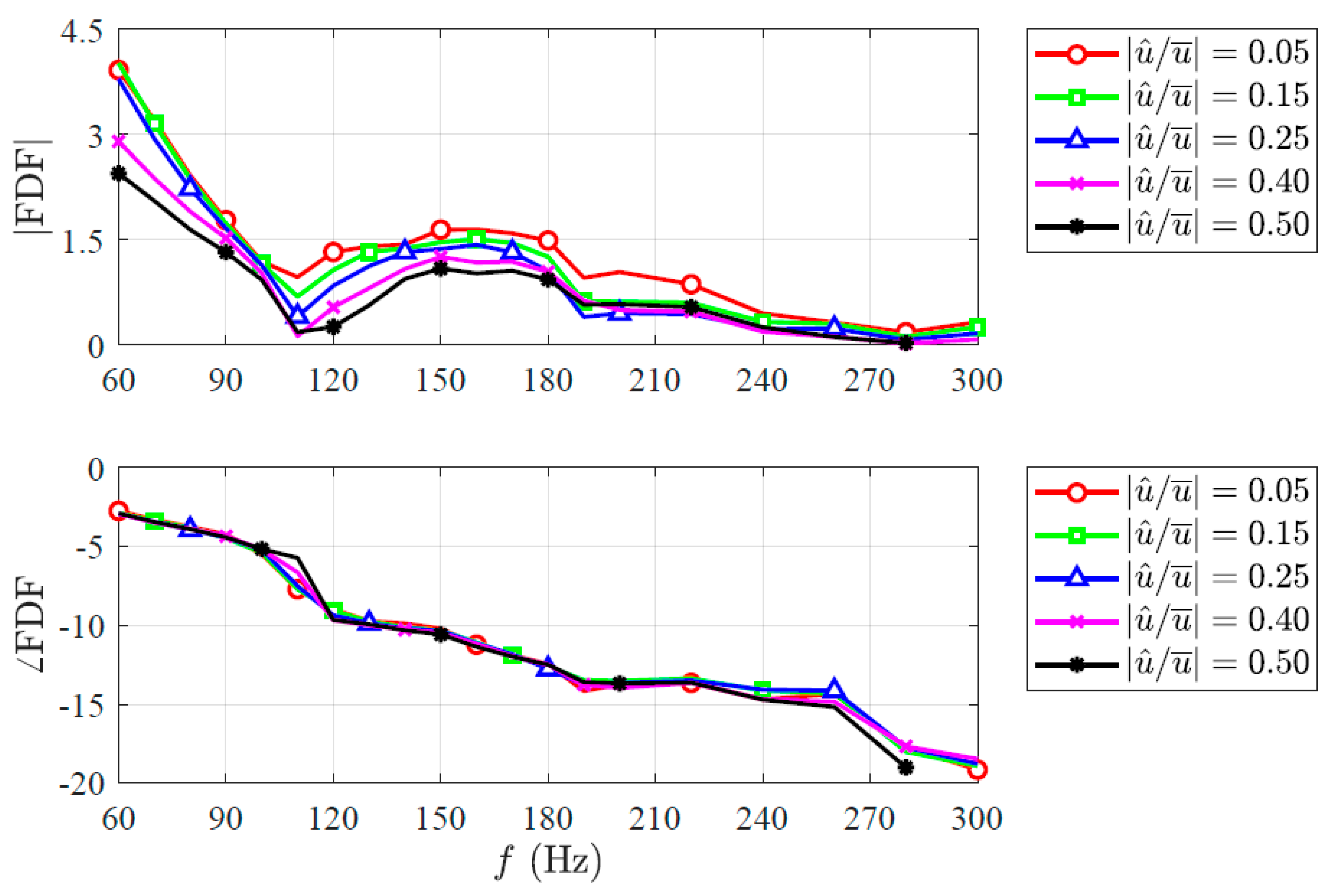
Figure 10.
Experimental FDF frequency response for five different input amplitudes. The frequency range is and the velocity perturbation range is .
Figure 10.
Experimental FDF frequency response for five different input amplitudes. The frequency range is and the velocity perturbation range is .
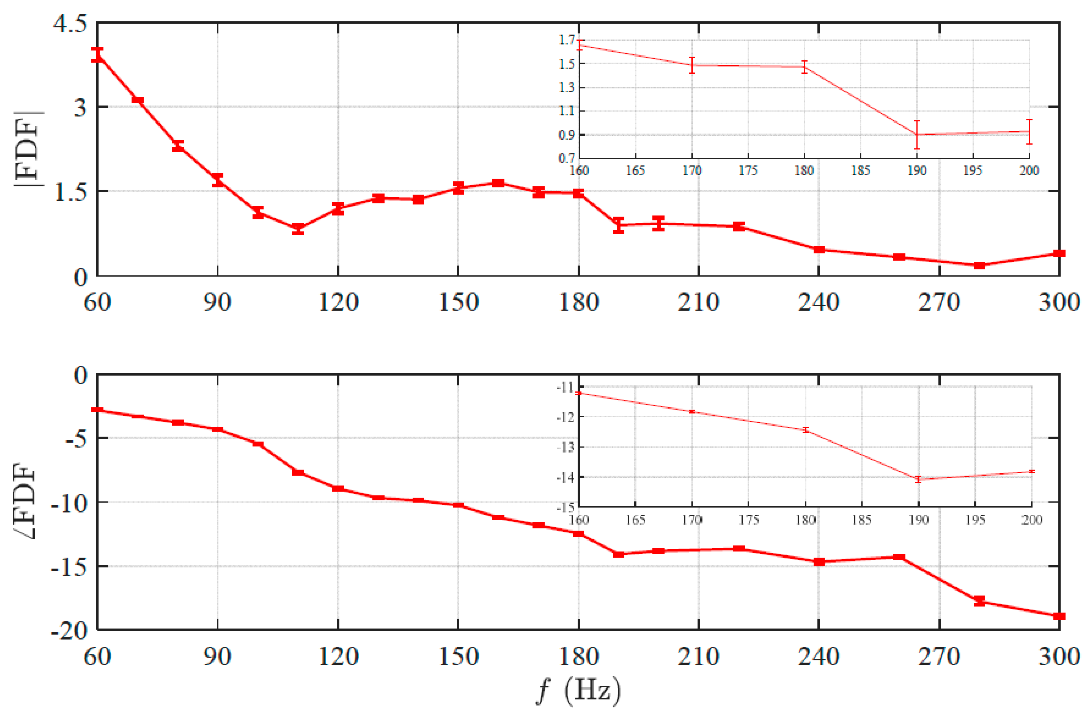
Figure 11.
Experimental FDF frequency response with error bars for velocity perturbation and frequency range .
Figure 11.
Experimental FDF frequency response with error bars for velocity perturbation and frequency range .
Figure 12.
Changes in the flame intensity within two periods at 60 Hz. (a) is a flame intensity color bar ranging from 0 to 1. The upper parts of (b–e) represent the changes with time in the flame intensity integrated along the axial direction and divided by the maximum value. The white arrow dashed lines represent the movement of the mass flow in the axial direction, with a slope corresponding to the value of the velocity perturbation. The lower parts of (b–e) represent the changes with time in the overall flame intensity integrated along the axial direction and then along the radial direction and divided by the maximum value. The velocity perturbations corresponding to (b–e) are , , , , respectively.
Figure 13.
Changes in the flame intensity within two periods at 110 Hz. The flame intensity color bar is the same as
Figure 12a. The upper parts of (
a–
d) represent the changes with time in the flame intensity integrated along the axial direction and divided by the maximum value. The white arrow dashed lines represent the movement of the mass flow in the axial direction, with a slope corresponding to the value of the velocity perturbation. The lower parts of (
a–
d) represent the changes with time in the overall flame intensity integrated along the axial direction and then along the radial direction and divided by the maximum value. The velocity perturbations corresponding to (
a–
d) are
,
,
,
, respectively.
Figure 14.
Flame surface structure obtained by Abel transformation within one period under different velocity perturbations. (a) Corresponds to the case of 60 Hz. (b) Corresponds to the case of 110 Hz. The vertical axis direction from top to bottom is the phase of 0, , , and , respectively. The horizontal axis direction from left to right is the velocity perturbations of 0.10, 0.20, 0.35, and 0.50.
Figure 15.
Comparison between heat release rate perturbation and velocity perturbation of frequency range and velocity perturbation range . The nonlinearity is barely excited.
Figure 15.
Comparison between heat release rate perturbation and velocity perturbation of frequency range and velocity perturbation range . The nonlinearity is barely excited.
Figure 16.
Comparison between the experimental separated gain data when the nonlinearity is barely excited. The frequency range is and velocity perturbation range is . The slope of the identified nonlinear gain model is 4.11. The scatter points represent the experimental data, and the solid line represents the identified nonlinear gain model .
Figure 17.
Comparison between heat release rate perturbation and velocity perturbation when the nonlinearity is excited. (a) The case of frequency range and velocity perturbation range . (b) The case of frequency range and velocity perturbation range .
Figure 17.
Comparison between heat release rate perturbation and velocity perturbation when the nonlinearity is excited. (a) The case of frequency range and velocity perturbation range . (b) The case of frequency range and velocity perturbation range .
Figure 18.
Comparison between the experimental separated gain data when the nonlinearity is excited. The corresponding cases are frequency range , velocity perturbation range and frequency range , velocity perturbation range . The parameters of the identified nonlinear gain model is , , and . The parameters of the identified saturation model are and . The scatter points represent the experimental data, the solid line represents the identified nonlinear gain model , and the dashed line represents the identified saturation model .
Figure 19.
Frequency response of heat release rate perturbation after removing the influence of the velocity perturbation amplitude. The corresponding cases are frequency and velocity perturbation .
Figure 19.
Frequency response of heat release rate perturbation after removing the influence of the velocity perturbation amplitude. The corresponding cases are frequency and velocity perturbation .
Figure 20.
Comparison between the experimental separated linear data of frequency range , velocity perturbation range and the identified linear Gaussian distribution model (, , , , , , , ). The scatter points represent the simulation data, and the solid line represents the identified linear model.
Figure 20.
Comparison between the experimental separated linear data of frequency range , velocity perturbation range and the identified linear Gaussian distribution model (, , , , , , , ). The scatter points represent the simulation data, and the solid line represents the identified linear model.
Figure 21.
Comparison between the experimental FDF gain data of frequency range , velocity perturbation range and the identified model. The scatter points represent the experimental data, the solid lines represent the identified FDF model (: red, : green, : blue, : magenta, : black), and the dashed line represents the identified nonlinear model.
Table 1.
Parameters of the linear second-order delay model and the nonlinear polynomial model.
Table 1.
Parameters of the linear second-order delay model and the nonlinear polynomial model.
| k | | | | | | | |
|---|
| | | | 1 | | | |
Table 2.
Identified parameters of the linear Gaussian distribution model.
Table 2.
Identified parameters of the linear Gaussian distribution model.
| | | | | | | |
|---|
| | | | | | | |


