
Research Progress of Tumor Big Data Visualization

Abstract
:1. Introduction
2. Tumor Big Data
2.1. Sources of Tumor Big Data
2.1.1. Tumor Clinical Data
2.1.2. Biomedical Data
2.1.3. Network Tumor Data
2.2. Characteristics and Applications of Tumor Big Data
3. Research Progress of Tumor Big Data Visualization
3.1. Overview of Tumor Big Data Visualization Research
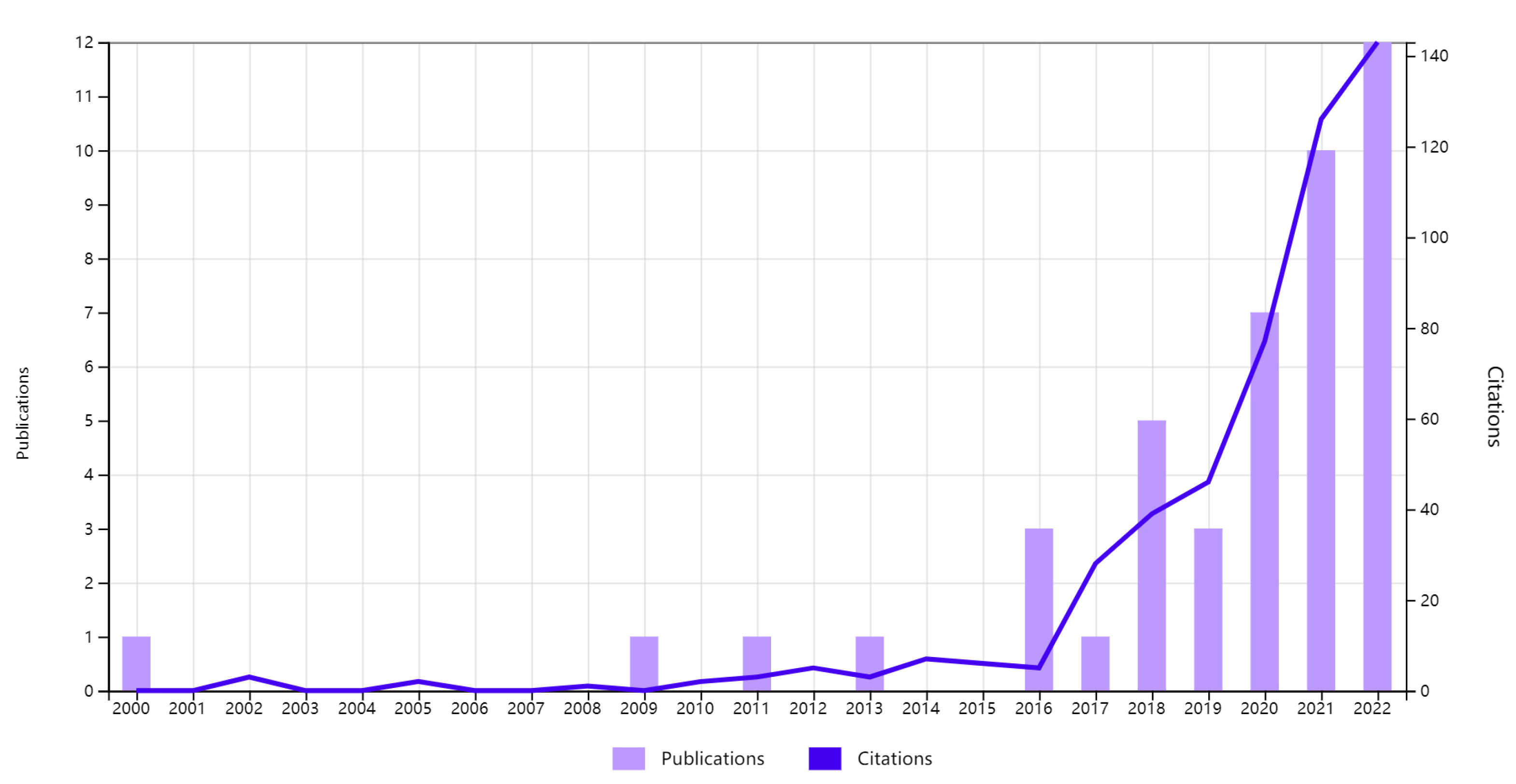
3.2. Research Status of Abroad Tumor Big Data Visualization
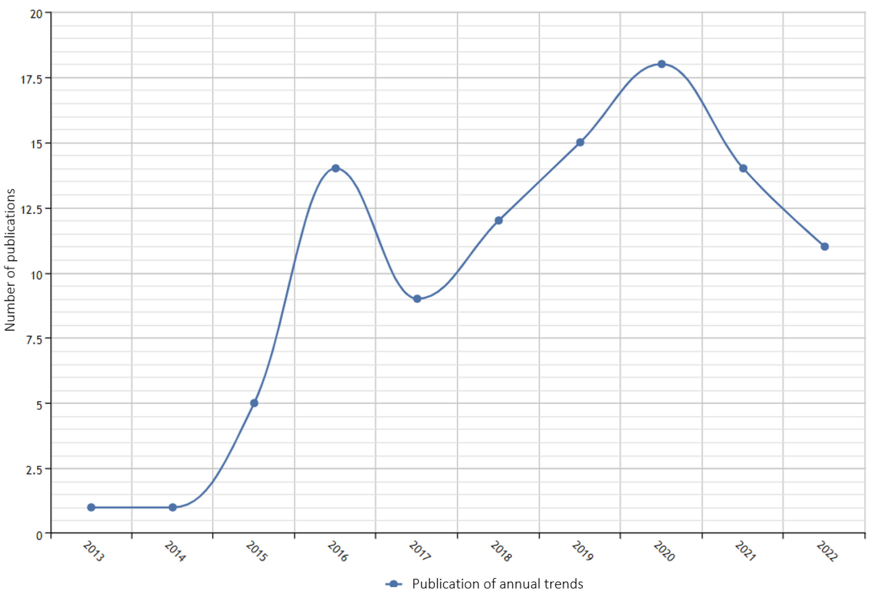
3.3. Research Status of Tumor Big Data Visualization in China
4. Tumor Big Data Visualization Methods
4.1. Visualization of Tumor Spatiotemporal Data
4.1.1. Visualization of Tumor Time Series Data
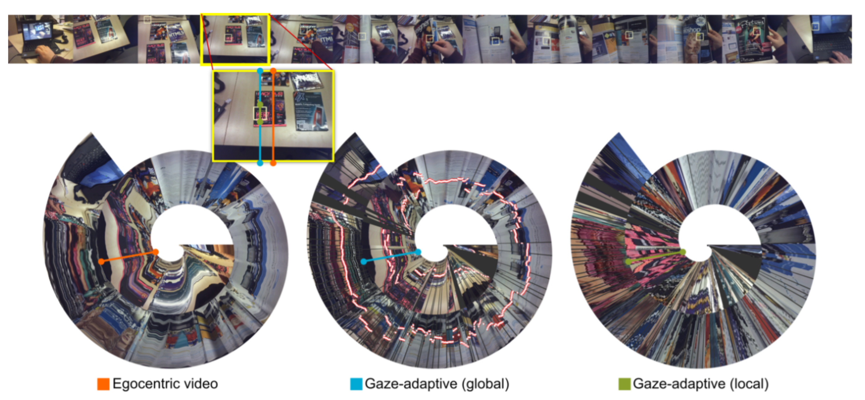
- Spiral diagram: A spiral diagram is suitable for displaying change trends and periodic data over a long period of time or a large volume of data. Hubschmann [25] used spiral diagrams to show the subtype classification of central nervous system tumors, distinguishing and identifying a large number of subtypes. Kurzhals [26] proposed a visualization of gaze spirals for moving-eye tracking that allows users to compare the long-term recordings of common scenes without manual annotation (Figure 4). This method can be used for the prevention and therapy of cancer and can be used to record the living environment and habits of the user and compare them with the correct situation to judge whether the user has bad habits.
- Calendar view: In reality, time is divided according to the year, month, day, hour, etc. In time series representation, time attributes can be displayed by frequency, which can be called calendar view [24]. Van [27] first proposed clustering similar daily data and visualizing the average of corresponding dates on the calendar. This method can be used to analyze information such as the daily number of visits and waiting time of the oncology department, which is helpful in reasonably arranging the schedule of daily medical therapy and improving the efficiency of medical therapy. Bartram [28] developed a calendar visualization tool to help identify periodic patterns and outliers to better monitor the health of users. This method can be used to help users to detect physical abnormalities and receive therapy as early as possible to prevent the deterioration of tumors.
4.1.2. Visualization of Tumor Spatial Dimension Data
- One-dimensional scalar field visualization: One-dimensional scalar field visualization [29] is the scalar field data obtained by sampling along a certain path, and the distribution of the data is presented in the form of a line graph. In the test sheet, blood item values are visualized using a one-dimensional scalar field (Figure 5). This method is suitable for the display of various biological test results, such as red blood cells (RBCs), white blood cells, platelet count (PLT), and other blood items in routine blood tests. The quantitative changes and morphological distribution of routine blood tests were observed to evaluate disease symptoms and assist doctors to diagnose the disease.
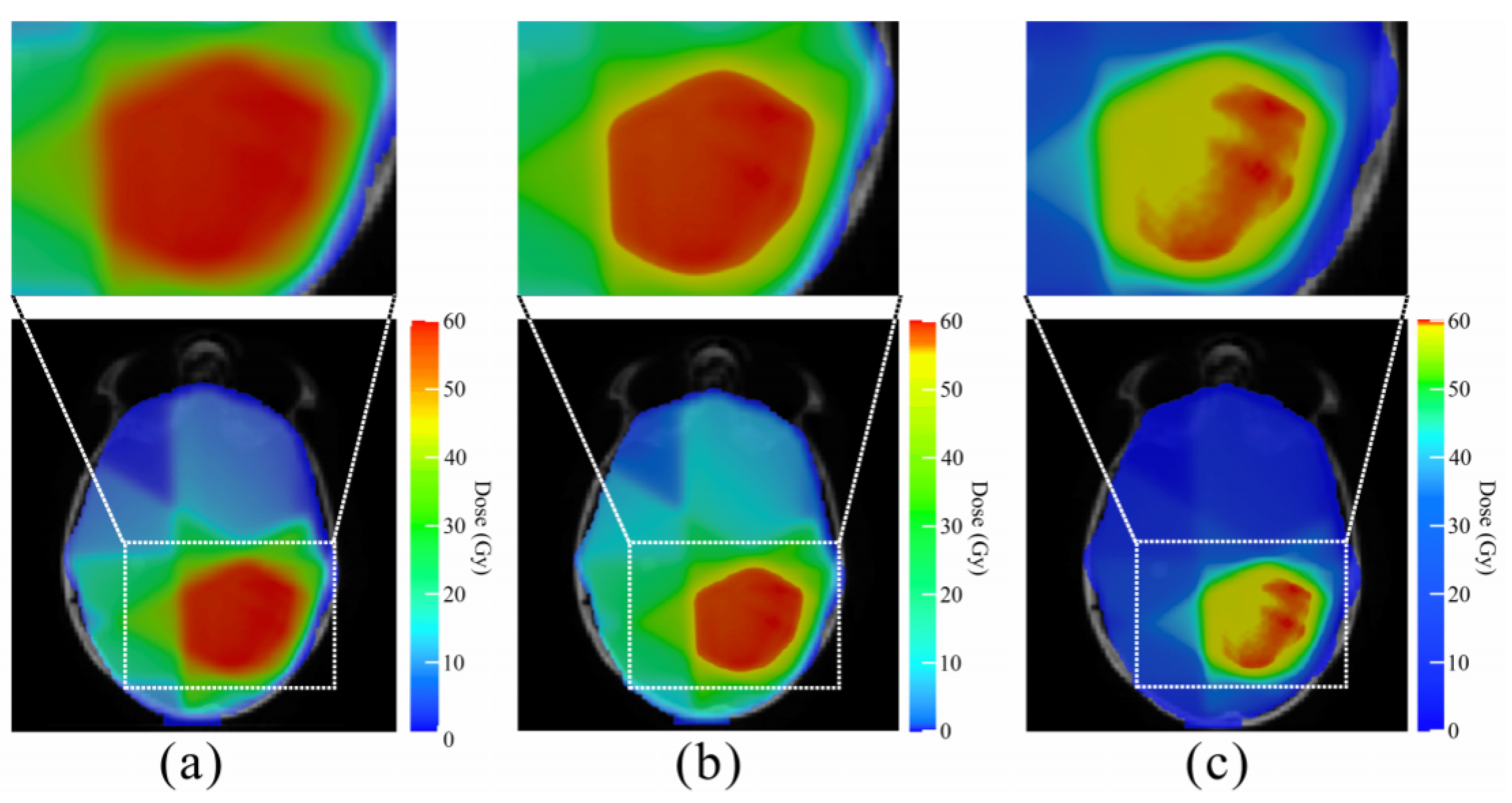
- Two-dimensional (2D) scalar field visualization: Two-dimensional scalar field visualization [30] is represented by the distribution characteristics of scalar data on a two-dimensional surface. Zhang [31] optimized the color map adjustment formula in color mapping, proposed a data-driven 2D color map optimization method for scalar field visualization, and used it in the visualization of radiotherapy dose data of head cancer patients (Figure 6). This method is suitable for CT images. According to the different colors and the location of the colors, CT images can help doctors to better assess the location of the tumor and identify the internal characteristics of the tumor.
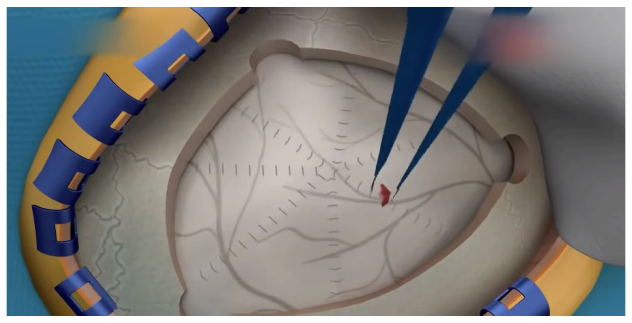
- Three-dimensional (3D) scalar field visualization: Two-dimensional scalar fields are arranged in a certain order to form three-dimensional scalar fields. Three-dimensional scalar field visualization is to present the distribution characteristics of scalar data in three-dimensional space. Marolt [32] proposed the integration of virtual reality (VR) into a web-based medical visualization framework to support the visualization of volume data. Figure 7 shows a screenshot of the 3D surgery animation. This method can be helpful for the reconstruction of CT images, MRI images, etc., and help doctors make decisions. In addition, 3D scalar field visualization can also be used in medical teaching and surgical simulation to save personnel training costs and reduce surgical risks.
4.1.3. Visualization of Tumor Geographic Information
- Point data visualization: Location information is the basic attribute of geographic information data, which refers to the specific location of behaviors and events. In the research of geographic information data visualization, the distribution and location information of entity attribute data are usually described by the design of points [34].
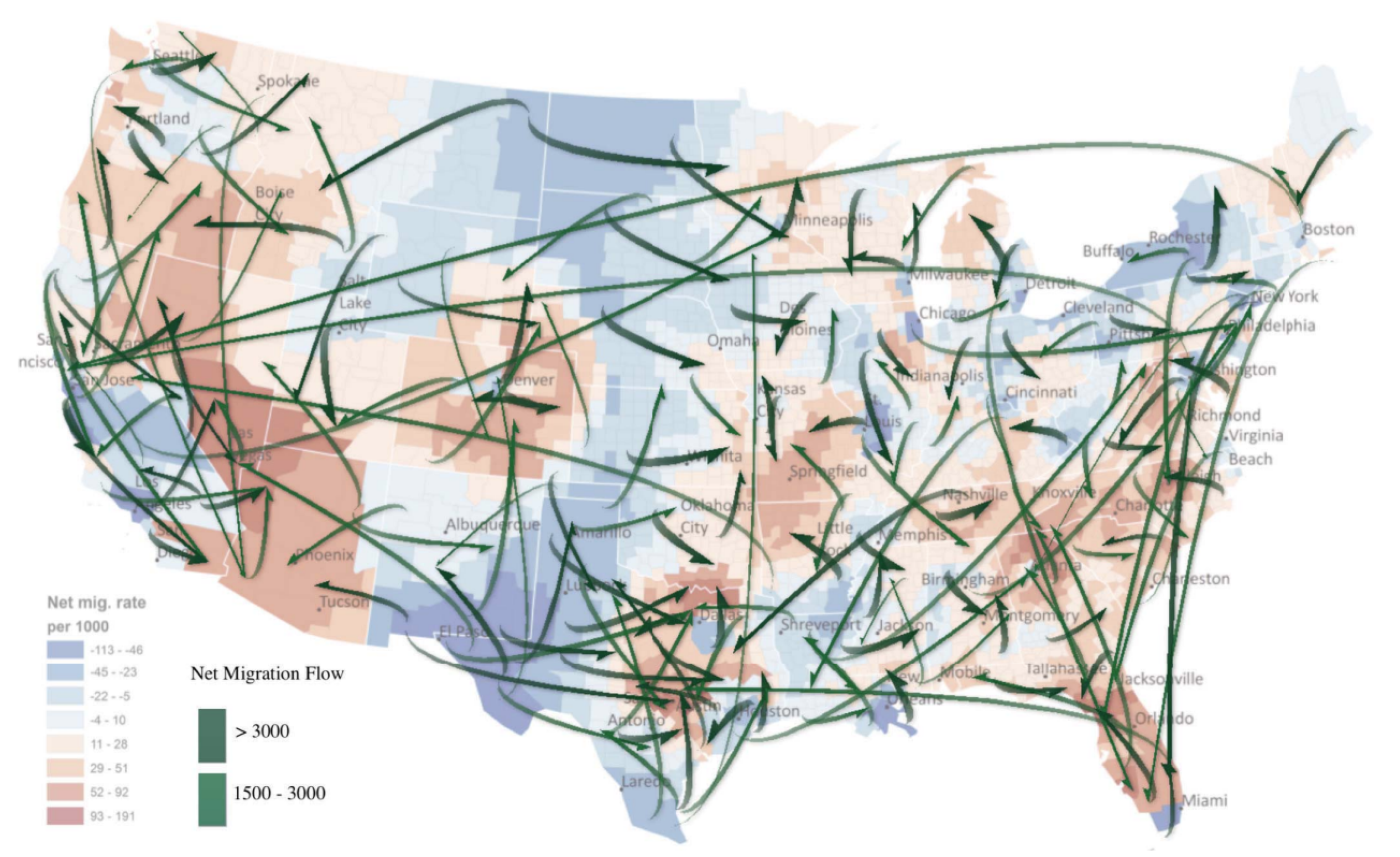
- Line data visualization: Lines are visualization methods that connect points, usually representing relationships between two or more visual elements. A lot of valuable information in geographic information data can be described by line visualization, such as path, flow, trend, etc. [34]. Zhu [36] proposed a flow mapping method to extract typical data flows from large-scale geographic mobility data and constructed a line data visualization method to understand complex population mobility trends in the United States (Figure 9). This method can be used to analyze the source and spread trend of tumors and diseases, which is helpful in collecting information timely and accurately, making efficient response plans, understanding the possible causes of tumor diseases, and preventing the occurrence of tumors and diseases from the source.
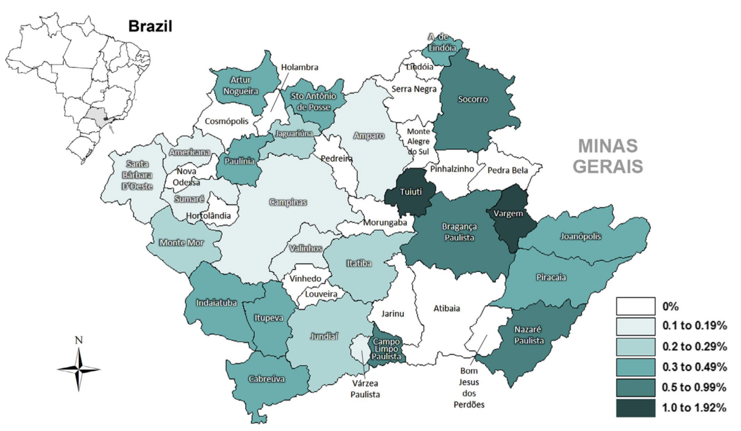
- Regional data visualization: A region is a geographical range with adjacent spatial locations or similar attributes in geographic information data [34]. Mastellaro [37] found that the geographical distribution of carriers of the genetic TP53-R337H mutation was associated with the occurrence of adrenocortical tumors in the Brazilian population (Figure 10), shown as the frequency of TP53-R337H in newborns from 42 municipalities in the Seventh Regional Health Board of Sao Paulo State. This method can be used to analyze and predict regional tumor data by combining geographical location and other factors, monitor neonatal mortality or the incidence of tumors, and determine whether there is a regional genetic tumor.
4.2. Visualization of Tumor Spatiotemporal Data
4.2.1. Visualization of Tumor Hierarchical Data
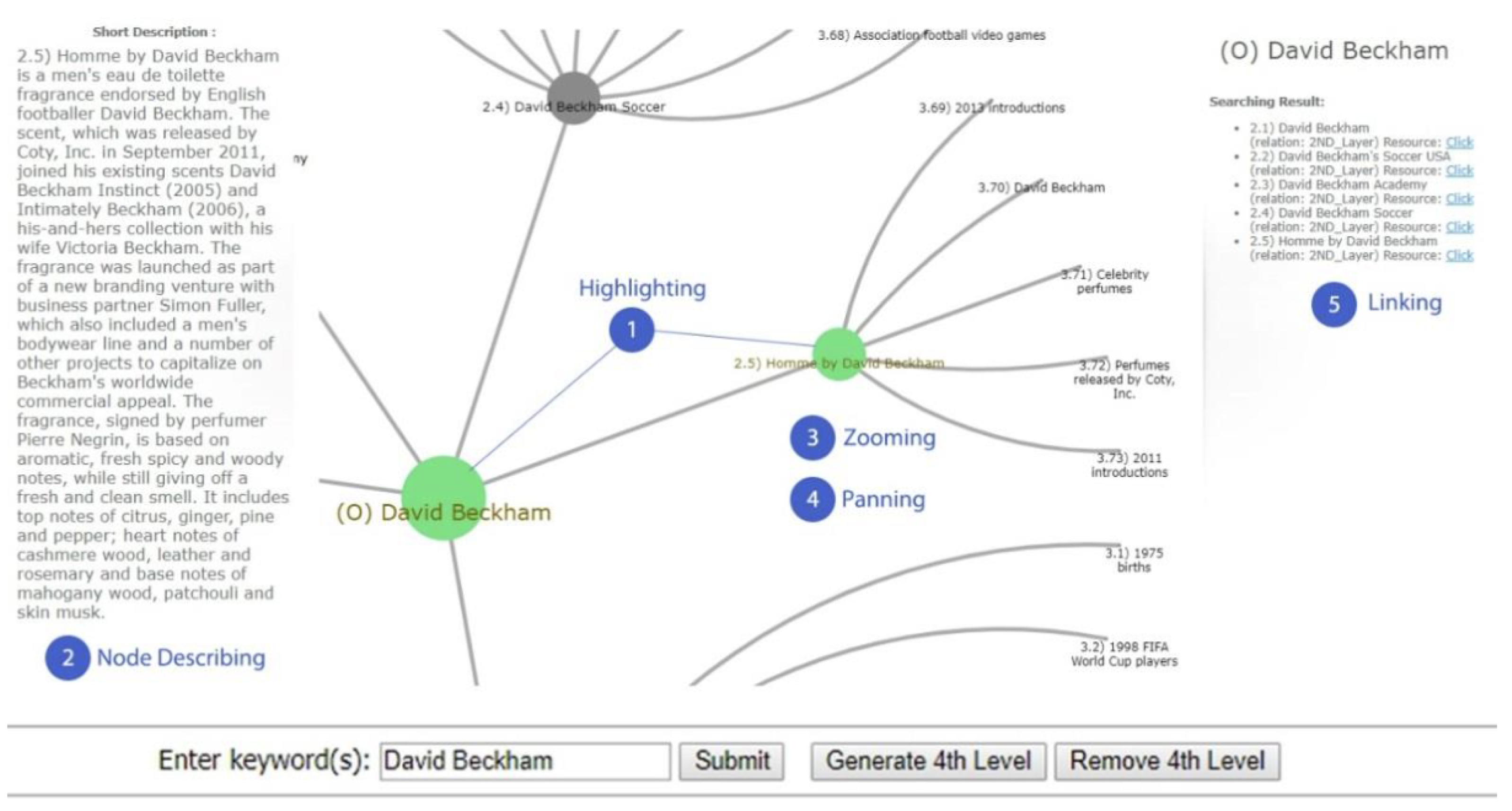
- Node link: Node connection is a kind of hierarchical visualization technology that uses different shapes of nodes to represent data and lines between nodes to represent the relationship between the data. It can be divided into two categories: 2D node links and 3D node links. The representative technologies of 2D node links mainly include space trees [40], hyperbolic trees [41,42], and radial trees [43]. The representative technologies for 3D node links mainly include cone trees [44], magic eye views [45] and collapsible cylindrical trees [46]. For the application of the node-link method, the most concerned method is the 2D node-link method. Techawut [42] used a data visualization framework based on a hyperbolic tree model to visually represent encyclopedia-like results, which facilitates knowledge exploration for users (Figure 11). This method can be used for keyword knowledge exploration based on the field of tumors and can also be used for association analysis between various tumors and genome-wide association analysis. Yamada [43] designed an application called FuncTree2, which can transform hierarchical categorical data into an interactive and highly customizable radial tree, shown as a radial trees for classifying biological items. This approach can be used for the classification analysis of various tumor diseases.
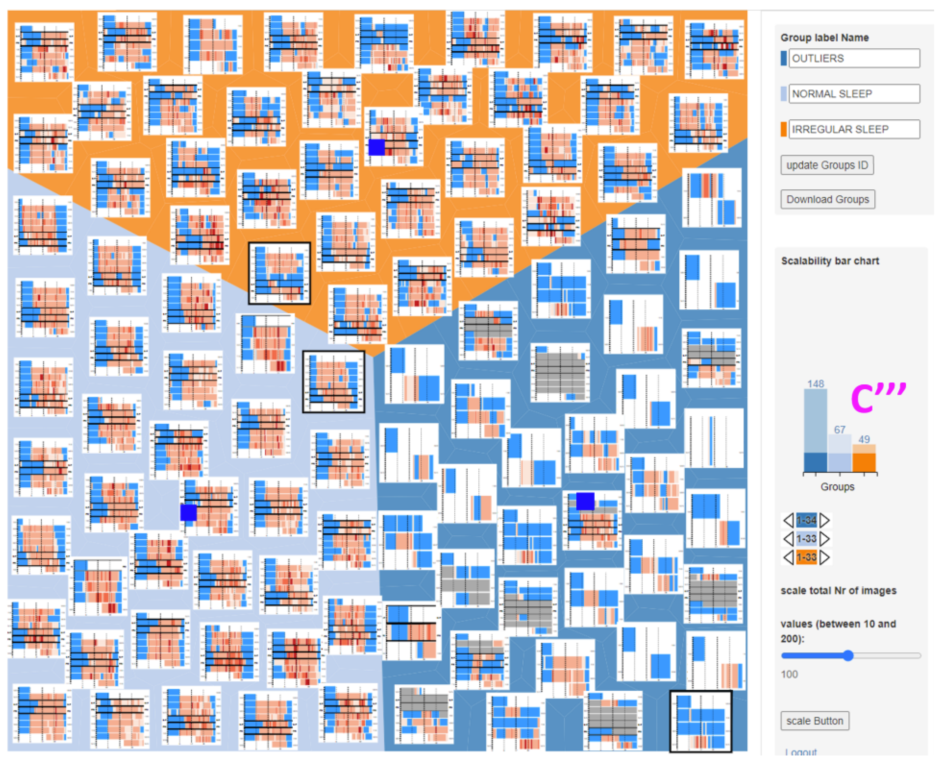
- Space filling: The space-filling method is a kind of hierarchical visualization technology that uses various shapes of bounding boxes to represent the nodes of the hierarchy and the bounding relationship between the upper nodes and the lower nodes to represent the relationship between data. It can be divided into two categories: the representative technologies of the 2D space-filling method mainly include treemaps [47,48], circle packing [49], and radial filling [50]. The representative technologies for the 3D space-filling method mainly include information pyramids [51] and information cubes [52]. At present, there are few studies on the space-filling method, which mainly focus on the research and application of treemaps. Aupetit [48] explored a grouping interactive intelligent treemap, aiming to help doctors intelligently group and arrange the sleep conditions of wearers (Figure 12). This method is suitable for decision support, which can help doctors group and arrange tumor data and reduce the workload.
- Hybrid: Hybrid methods are hierarchical visualization techniques that combine several visualization techniques and ideas to integrate their advantages, so as to make cognitive behavior more efficient. The representative techniques include elastic hierarchies [53], space-optimized trees [54], and hierarchical nets [55]. At present, the research on hybrid methods is mainly on hierarchical nets. For example, Verrastro [56] used a hierarchical network to show the visualization results of the statistical analysis of 30 non-alcoholic fatty liver disease activity scores and highlighted the relationship between the studied therapy. This method is suitable for association analysis and visualization between various tumor diseases or various test indicators.
4.2.2. Visualization of Tumor Network Data
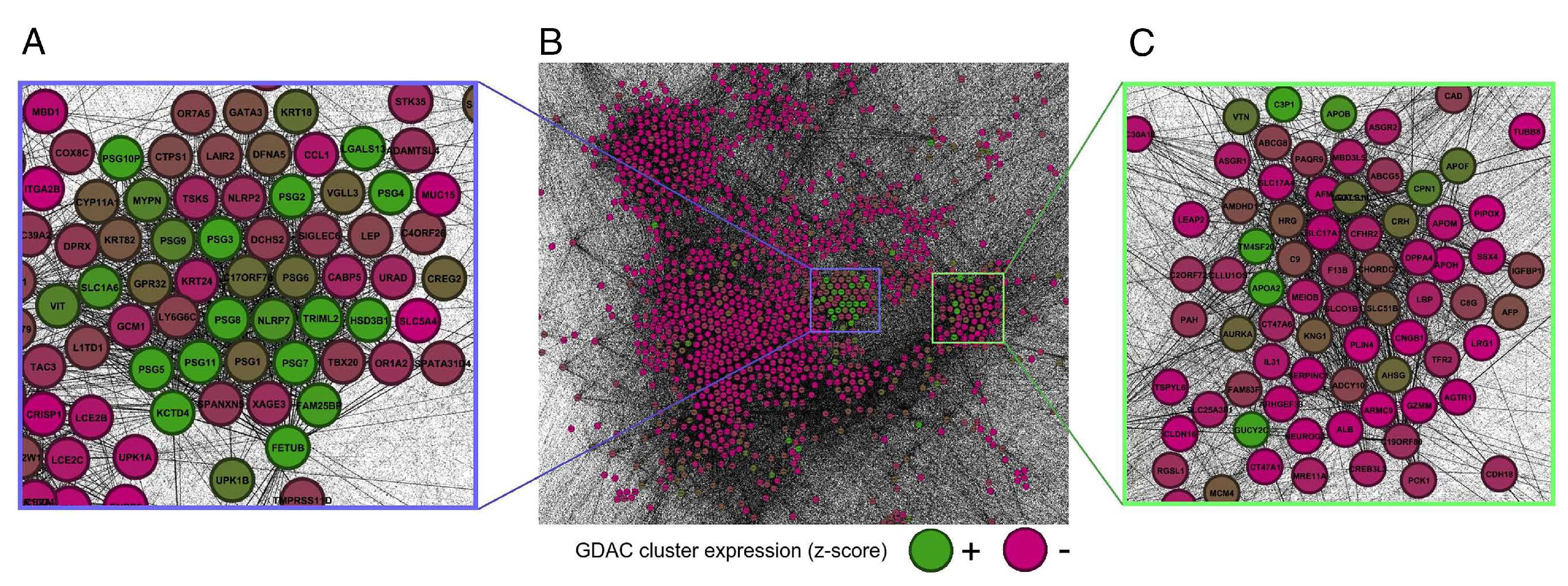
- Force-directed layout: In a force-directed layout [58], the forces are calculated based on the relative position of nodes and lines. Pouryahya [59] found a specific role for pregnancy-specific glycoproteins in cancer through network structure analysis with a force-directed layout (Figure 13). This approach can be used to identify the root cause of the disease through genomic association analysis.
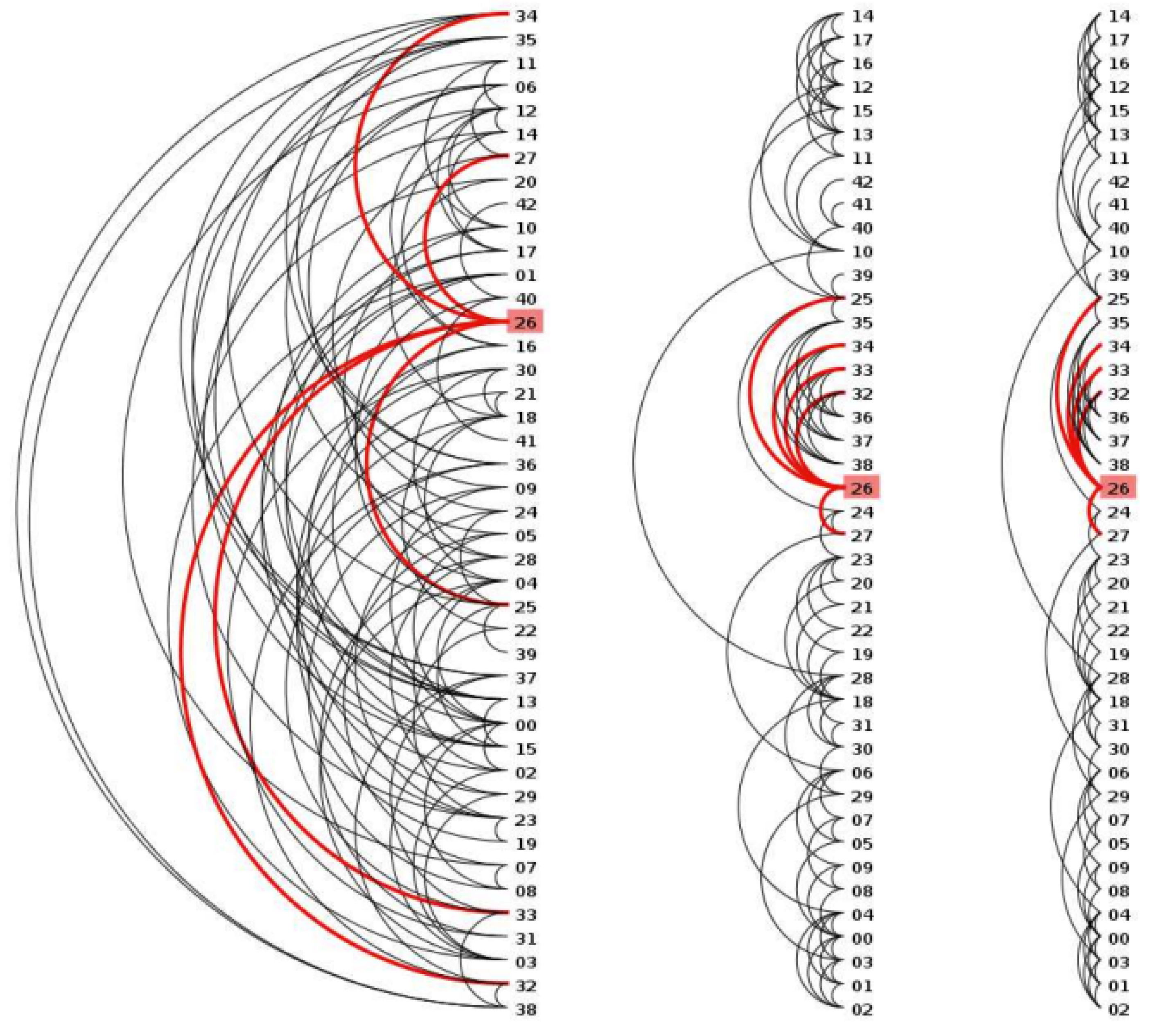
- Arc layout: An arc layout includes a circular arc layout and a circular layout [60] (Figure 14 and Figure 15). Its nodes are arranged along a linear axis or ring, and the lines indicate that there is a link relationship between nodes. This method is suitable for the analysis of medication and daily condition monitoring and can assist in detecting whether there is the possibility of lesions and whether other diseases will occur.
4.3. Visualization of Tumor Text Data
4.3.1. Visualization of Tumor Text Content
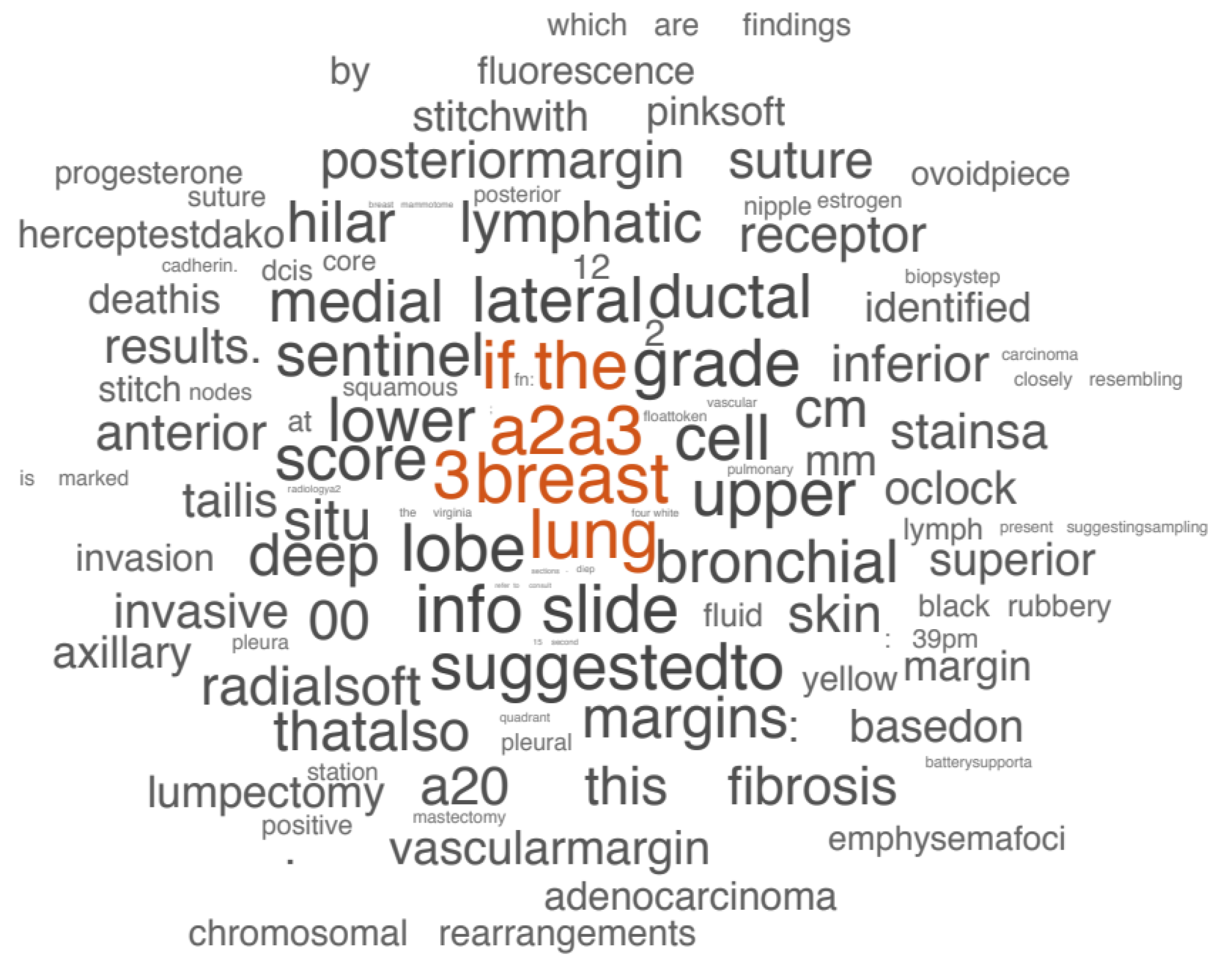
- Visualization of tumor text data based on word frequency: Visualization based on word frequency regards tumor medical text as a collection of words, uses word frequency to express text features, and mainly displays visually through word cloud (also known as label cloud). Gaidano [62] used word cloud maps to show the mutated genes in chronic lymphocytic leukemia, where font size is proportional to molecular lesion frequency. Christian [63] used word clouds to show which words were most associated with cancer in the selection algorithm (Figure 16). This method is suitable for the visualization of all textual information in the field of oncology, such as case information, clinical medical records, drug lists, gene analysis, etc. Through the visualization of word cloud maps, high-frequency words in the field of cancer are found to help users to screen important information and assist in decision making.
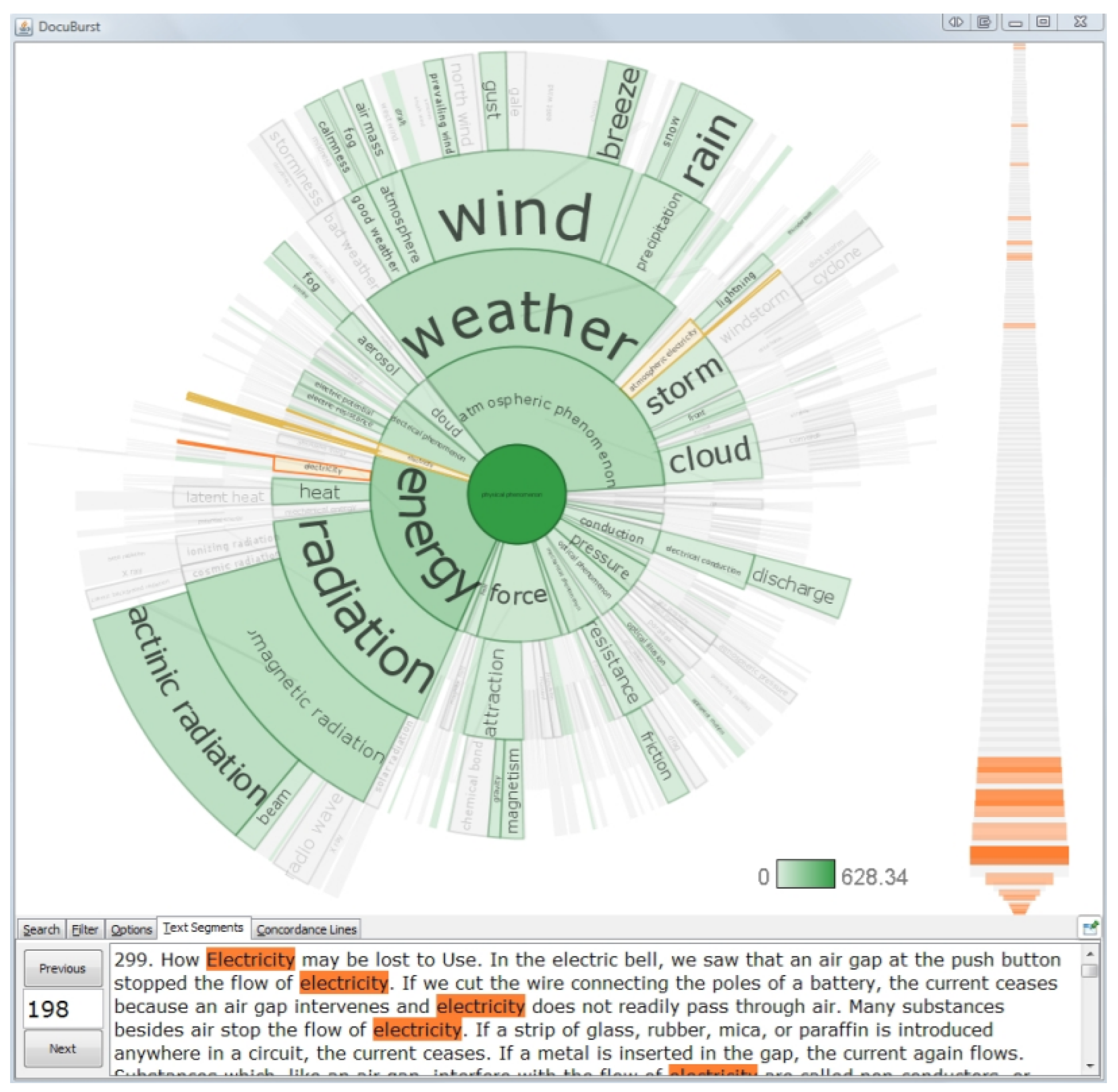
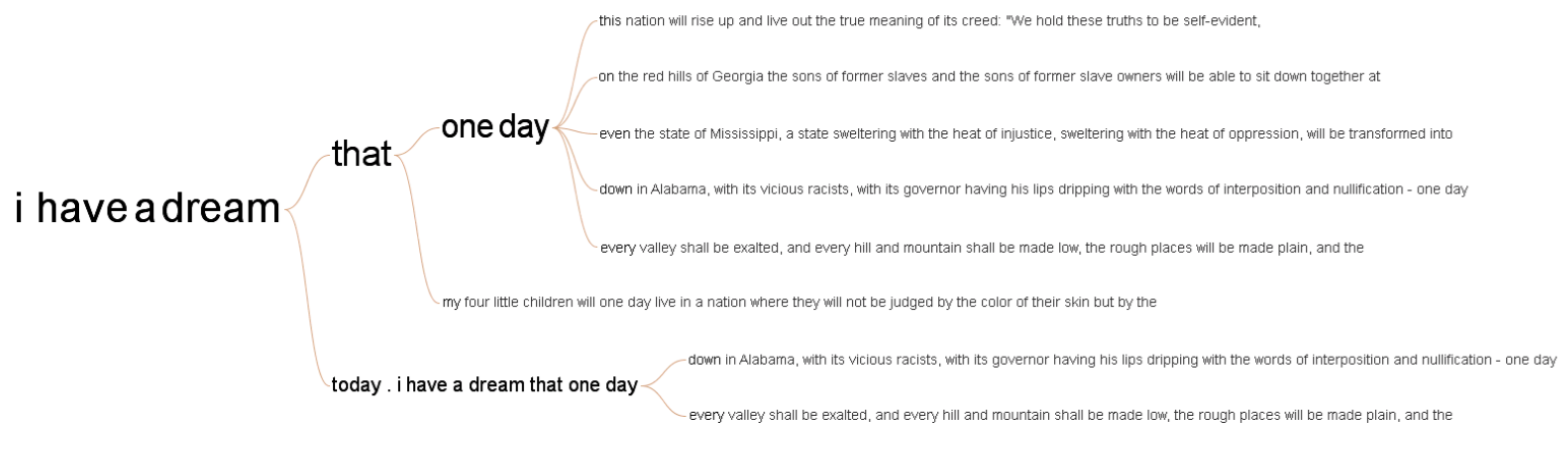
- Visualization of tumor text data based on semantics: Semantic-based visualization takes the tumor medical text as a set of words, reflects the semantic hierarchy relationship in the text through the layout of keywords, and is mainly visualized through the document scatter (also known as the rising sun diagram). Collins [64] used a document scatter to show the structure of the text content, which also embodies the semantic hierarchy of words through a radial layout, with the innermost layer being the most important overview of the article content (Figure 17). This method is suitable for the self-detection of diseases and for sharing their own cases and medical records through social networks. Based on big data processing technology, patients can measure the development degree of their own disease, prevent the deterioration of the tumor, and refer to the medication records of patients with the same disease to determine their own medication therapy plan.
4.3.2. Visualization of Tumor Text Relationship
4.4. Visualization of Multidimensional Tumor Data
Visualization of Multidimensional Tumor Data Based on Geometry
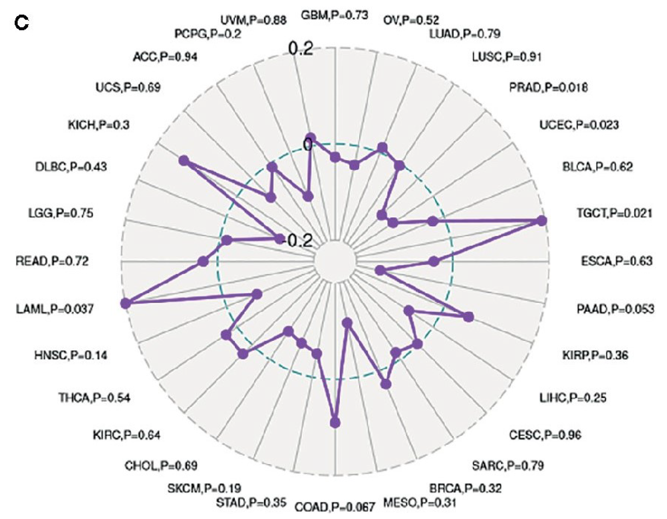
- Parallel coordinate system: The basic idea of the parallel coordinate system technology [68] is to represent the n-dimensional attributes of multidimensional data in the form of n-parallel coordinate axes with equal vertical spacing, and each parallel axis corresponds to an attribute dimension. Dinh [69] used the parallel coordinate method to visualize the internal characteristics of tumors to help doctors better diagnose and patients better target therapy. This method can be used for dimensionality reduction visualization of tumor multidimensional data to help statistical analysis and correlation analysis. Hua [70] used the radar chart in the circular coordinate system to represent the correlation between the expression of innate immune protein LCN2 and immunity in tumors (Figure 19). The top chart is the radar chart of the correlation between LCN2 expression and TMB, and the bottom chart is the radar chart of the correlation between LCN2 expression and MSI. This method can be used to visualize the many-to-one tumor data relationship, the number of tumor patients, and physical examination indicators. It can also help doctors to analyze the health status of the physical examination population and determine the association between their health indicators and formulate a suitable tumor prevention and therapy plan for the population.
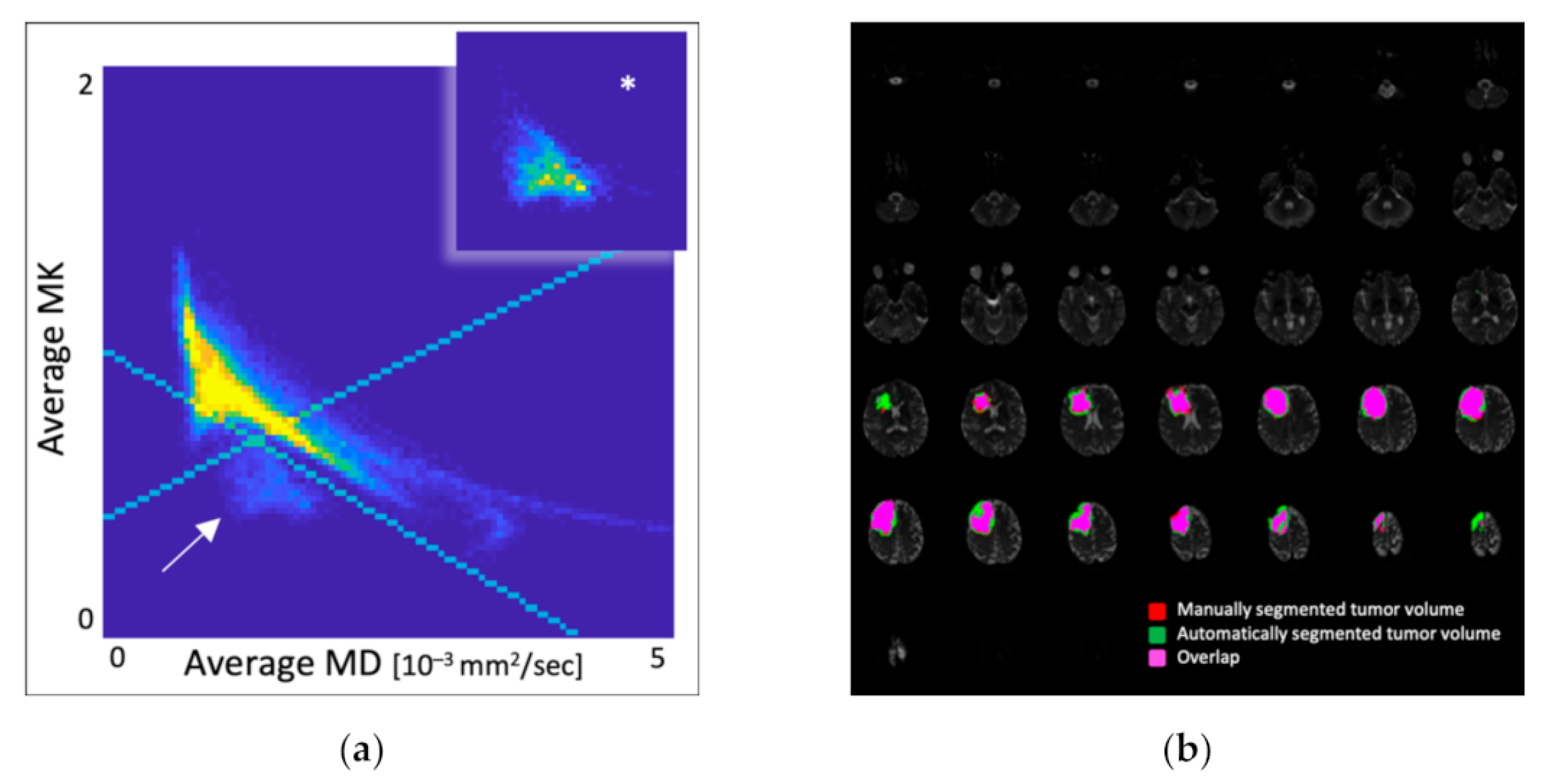
- Scatter plot: A scatter plot is a visual method to describe the relationship between two variables in multidimensional data [67]. Hempel [71] concluded that the marker voxels from MK and MD were located only in tumor tissue and were not associated with specific molecular glioma features through scatter plots (Figure 20). This method is suitable for the scatter plot visualization of multidimensional data and facilitates correlation analysis.
5. Tumor Big Data Visualization Application Example
5.1. Tableau
5.2. Echarts
5.3. Matlab
5.4. GraphPad Prism
5.5. 3DMAX
6. Problems in the Development of Tumor Big Data Visualization
6.1. Information Security and Privacy Protection
6.2. Lack of Compound Talents
6.3. Theoretical Research and Practical Application
6.4. Breakthroughs in Key Technologies
7. Summary
7.1. Conclusions
7.2. Outlook
Author Contributions
Funding
Conflicts of Interest
References
- Sung, H.; Ferlay, J.; Siegel, R.L. Global cancer statistics 2020: Globocan estimates of incidence and mortality worldwide for 36 cancers in 185 countries. CA Cancer J. Clin. 2021, 71, 209–249. [Google Scholar] [CrossRef] [PubMed]
- Wild, C.; Weiderpass, E.; Stewart, B.W. World Cancer Report: Cancer Research for Cancer Prevention; IARC Press: Lyon, France, 2020. [Google Scholar]
- Manyika, J.; Chui, M.; Brown, B. Big Data: The Next Frontier for Innovation, Competition, and Productivity; McKinsey Global Institute: Washington, DC, USA, 2011. [Google Scholar]
- Ning, L.; Min, C. Applying themes and related data sources research of healthcare big data. China Digit. Med. 2016, 11, 6–9. [Google Scholar]
- Bo, S.; Yanli, Y.; Yunxia, F. Review of medical bigdata research. Transl. Med. J. 2016, 5, 298–300. [Google Scholar]
- Yufei, S. Thinking on the development and application of Big Data in health care. Wirel. Internet Technol. 2021, 18, 94–95. [Google Scholar]
- Yi, W.; Shuxia, R. Survey on visualization of medical big data. J. Front. Comput. Sci. Technol. 2017, 11, 681–699. [Google Scholar]
- Song, B.; Tiantian, Z.; Xu, Y. Research on the Application of Medical Big Data in Tumor Diseases. China Digit. Med. 2017, 12, 35–37+64. [Google Scholar]
- Lingling, T.; Li, L. Research and application of big data and artificial intelligence in gynecological malignant tumors. Chin. J. Pract. Gynecol. Obstet. 2019, 35, 720–723. [Google Scholar]
- Bin, L.; Zengjie, L.; Yu, L. Review of data visualization research. J. Hebei Univ. Sci. Technol. 2021, 42, 643–654. [Google Scholar]
- Li, Y.; Ge, D.; Lu, C. The SMART App: An interactive web application for comprehensive DNA methylation analysis and visualization. Epigenet. Chromatin 2019, 12, 1–9. [Google Scholar] [CrossRef]
- Galetsi, P.; Katsaliaki, K. A review of the literature on big data analytics in healthcare. J. Oper. Res. Soc. 2020, 71, 1511–1529. [Google Scholar] [CrossRef]
- Wang, X.; Guo, J.; Gu, D. Tracking knowledge evolution, hotspots and future directions of emerging technologies in cancers research: A bibliometrics review. J. Cancer 2019, 10, 2643. [Google Scholar] [CrossRef]
- Bi, J.; Tong, Y.; Qiu, Z. ClickGene: An open cloud-based platform for big pan-cancer data genome-wide association study, visualization and exploration. Mining 2019, 12, 1–15. [Google Scholar] [CrossRef]
- Singh, U.; Hur, M.; Dorman, K. MetaOmGraph: A workbench for interactive exploratory data analysis of large expression datasets. Nucleic Acids Res. 2020, 48, e23. [Google Scholar] [CrossRef] [PubMed]
- Xiaolin, H.; Qing, Q.; Ze, Z. Visualization-based analysis of tumor epidemical data. Chin. J. Med. Libr. Inf. Sci. 2016, 25, 73–80. [Google Scholar]
- Xiaxia, H.; Chengying, S.; Bai, C. Investigation big data and visualized relationship between cancer and diabetes. J. Xinjiang Med. Univ. 2017, 40, 229–232. [Google Scholar]
- Xiangyang, Z.; Ling, C.; Man, Z. Application of big data mining and analytics to healthcare. Med. J. Air Force 2017, 33, 359–361. [Google Scholar]
- Maahi, A.K.; Shivajirao, M.J.; Iyer, B.R. Brain Tumor Segmentation and Identification Using Particle Imperialist Deep Convolutional Neural Network in MRI Images. Int. J. Interact. Multimed. Artif. Intell. 2022, 7. [Google Scholar] [CrossRef]
- Manuel, M.M.; Alfonso, J.L.R.; Vidal, A.; Marcelo, V.; Antonio, F. A Clustering Algorithm Based on an Ensemble of Dissimilarities: An Application in the Bioinformatics Domain. Int. J. Interact. Multimed. Artif. Intell. 2022, 7. [Google Scholar] [CrossRef]
- Satheshkumar, K.; Arvid, L.; Alexander, S.L. Pulmonary Nodule Classification in Lung Cancer from 3D Thoracic CT Scans Using fastai and MONAI. Int. J. Interact. Multimed. Artif. Intell. 2021, 7. [Google Scholar] [CrossRef]
- Loay, H.; Adel, S.; Mohamed, A.N.; Osama, A.O.; Domenec, P. Promising Deep Semantic Nuclei Segmentation Models for Multi-Institutional Histopathology Images of Different Organs. Int. J. Interact. Multimed. Artif. Intell. 2020, 7. [Google Scholar] [CrossRef]
- Wang, J.; Wu, F.; Guo, J. Challenges and opportunities of spatio-temporal big data. Sci. Surv. Mapp. 2017, 42, 1–7. [Google Scholar]
- Fang, Y.; Xu, H.; Jiang, J. A survey of time series data visualization research. IOP Conf. Ser. Mater. Sci. Eng. 2020, 782, 022013. [Google Scholar] [CrossRef]
- Gu, Z.; Hübschmann, D. spiralize: An R package for visualizing data on spirals. Bioinformatics 2022, 38, 1434–1436. [Google Scholar] [CrossRef] [PubMed]
- Koch, M.; Weiskopf, D.; Kurzhals, K. A Spiral into the Mind: Gaze Spiral Visualization for Mobile Eye Tracking. arXiv 2022, arXiv:2204.13494. [Google Scholar]
- Van-Wijk, J.J.; Van-Selow, E.R. Cluster and calendar based visualization of time series data. In Proceedings of the 1999 IEEE Symposium on Information Visualization, San Francisco, CA, USA, 24–29 October 1999; pp. 4–9. [Google Scholar]
- Huang, D.; Tory, M.; Bartram, L. A field study of on-calendar visualizations. arXiv 2017, arXiv:1706.01123. [Google Scholar]
- Wei, Z. Data Visualization Technology and Its Application Software; Northwestern Polytechnical University: Xi’an, China, 1998. [Google Scholar]
- Yi, L.; Lei, Y.; Wei, G. Advanced combinatorial algorithm for 2D navigator scalar field modeling. J. Basic Sci. Eng. 2008, 16, 472–477. [Google Scholar]
- Zeng, Q.; Wang, Y.; Zhang, J. Data-driven colormap optimization for 2d scalar field visualization. In Proceedings of the 2019 IEEE Visualization Conference (VIS), Vancouver, BC, Canada, 20–25 October 2019; pp. 266–270. [Google Scholar]
- Kokelj, Ž.; Bohak, C.; Marolt, M. A web-based virtual reality environment for medical visualization. In Proceedings of the 2018 41st International Convention on Information and Communication Technology, Electronics and Microelectronics (MIPRO), Opatija, Croatia, 21–25 May 2018; pp. 299–302. [Google Scholar]
- Chen, W.; Guo, F.; Wang, F. A survey of traffic data visualization. IEEE Trans. Intell. Transp. Syst. 2015, 16, 2970–2984. [Google Scholar] [CrossRef]
- Zhou, Z.; Shi, C.; Shi, L. A Survey on the Visual Analytics of Geospatial Data. J. Comput. Aided Des. Comput. Graph. 2018, 30, 747–763. [Google Scholar]
- Sahar, L.; Foster, S.L.; Sherman, R.L. GIScience and cancer: State of the art and trends for cancer surveillance and epidemiology. Cancer 2019, 125, 2544–2560. [Google Scholar] [CrossRef]
- Guo, D.; Zhu, X. Origin-destination flow data smoothing and mapping. IEEE Trans. Vis. Comput. Graph. 2014, 20, 2043–2052. [Google Scholar] [CrossRef]
- Seidinger, A.L.; Caminha, I.P.; Mastellaro, M.J. TP53 p. Arg337His geographic distribution correlates with adrenocortical tumor occurrence. Mol. Genet. Genom. Med. 2020, 8, e1168. [Google Scholar]
- Herman, I.; Melancon, G.; Marshall, M.S. Graph visualization and navigation in information visualization: A survey. IEEE Trans. Vis. Comput. Graph. 2000, 6, 24–43. [Google Scholar] [CrossRef]
- Weidong, X.; Yang, S.; Xiang, Z.; Cheng, Z.; Xiaosheng, F. Survey on the Research of Hierarchy Information Visualization. J. Chin. Comput. Syst. 2011, 32, 137–146. [Google Scholar]
- Düster, A.; Allix, O. Selective enrichment of moment fitting and application to cut finite elements and cells. Comput. Mech. 2020, 65, 429–450. [Google Scholar] [CrossRef]
- Bou, B. Treebolic2 Webpage. Available online: http://treebolic.sourceforge.net/treebolic2/en/index.html (accessed on 6 June 2021).
- Kanjanakuha, N.; Janecek, P.; Techawut, C. The comprehensibility assessment of visualization of semantic data representation (vsdr) reflecting user capability of knowledge exploration and discovery. In Proceedings of the 2019 7th International Conference on Computer and Communications Management, Bangkok, Thailand, 27–29 July 2019; pp. 195–199. [Google Scholar]
- Darzi, Y.; Yamate, Y.; Yamada, T. FuncTree2: An interactive radial tree for functional hierarchies and omics data visualization. Bioinformatics 2019, 35, 4519–4521. [Google Scholar] [CrossRef]
- Robertson, G.G.; Mackinlay, J.D.; Card, S.K. Cone trees: Animated 3D visualizations of hierarchical information. In Proceedings of the SIGCHI Conference on Human Factors in Computing Systems, New Orleans, LA, USA, 27 April–2 May 1991; pp. 189–194. [Google Scholar]
- Kreuseler, M.; López, N.; Schumann, H. A scalable framework for information visualization. In Proceedings of the IEEE Symposium on Information Visualization 2000, Salt Lake City, UT, USA, 9–10 October 2000; pp. 27–36. [Google Scholar]
- Dachselt, R.; Ebert, J. Collapsible cylindrical trees: A fast hierarchical navigation technique. In Proceedings of the Information Visualization, IEEE Symposium on Information Visualization, San Diego, CA, USA, 22–23 October 2001; p. 79. [Google Scholar]
- Scheibel, W.; Weyand, C.; Döllner, J. EvoCells-A Treemap Layout Algorithm for Evolving Tree Data. In VISIGRAPP (3: IVAPP); University of Potsdam: Potsdam, Germany, 2018; pp. 273–280. [Google Scholar]
- Abuthawabeh, A.; Baggag, A.; Aupetit, M. Augmented Intelligence with Interactive Voronoi Treemap for Scalable Grouping: A Usage Scenario with Wearable Data. Eurograph. Assoc. 2022, 43–47. [Google Scholar]
- Weixin, W.; Chunying, M.; Hong-an, W. Visualization of hierarchical information based on venn diagrams. Chin. J. Comput. 2007, 30, 1632–1636. [Google Scholar]
- Andrewsk, H. Information slices: Visualising and exploring large hierarchies using cascading semi-circular discs. In Proceedings of the IEEE Symposium on Information Visualization, Research Triangle Park, NC, USA, 19–20 October 1998. [Google Scholar]
- Andrews, K.; Wolte, J.; Pichler, M. Information PyramidsTM: A new approach to visualizing large hierarchies. IEEE Vis. 1997, 97, 49–52. [Google Scholar]
- Rekimoto, J.; Green, M. The information cube: Using transparency in 3d information visualization. In Proceedings of the Third Annual Workshop on Information Technologies & Systems (WITS’93), Orlando, FL, USA, 5 December 1993; Volume 13, pp. 125–132. [Google Scholar]
- Zhao, S.; McGuffin, M.J.; Chignell, M.H. Elastic hierarchies: Combining treemaps and node-link diagrams. In Proceedings of the IEEE Symposium on Information Visualization, Minneapolis, MN, USA, 23–25 October 2005; pp. 57–64. [Google Scholar]
- Nguyen, Q.V.; Huang, M.L. A space-optimized tree visualization. In Proceedings of the IEEE Symposium on Information Visualization 2002, Boston, MA, USA, 28–29 October 2002; pp. 85–92. [Google Scholar]
- Balzer, M.; Deussen, O. Hierarchy based 3D visualization of large software structures. In Proceedings of the IEEE Visualization 2004, Austin, TX, USA, 10–15 October 2004; p. 4. [Google Scholar]
- Panunzi, S.; Maltese, S.; Verrastro, O. Pioglitazone and bariatric surgery are the most effective therapys for non-alcoholic steatohepatitis: A hierarchical network meta-analysis. Diabetes Obes. Metab. 2021, 23, 980–990. [Google Scholar] [CrossRef] [PubMed]
- Yafeng, Z.; Yaning, Z.; Xue, B. Survey of big data visualization in education. J. Front. Comput. Sci. Technol. 2021, 15, 403. [Google Scholar]
- Fruchterman, T.M.J.; Reingold, E.M. Graph drawing by force directed placement. Softw. Pract. Exp. 1991, 21, 1129–1164. [Google Scholar] [CrossRef]
- Mathews, J.C.; Nadeem, S.; Pouryahya, M. Functional network analysis reveals an immune tolerance mechanism in cancer. Proc. Natl. Acad. Sci. USA 2020, 117, 16339–16345. [Google Scholar] [CrossRef] [PubMed]
- McGuffin, M.J. Simple algorithms for network visualization: A tutorial. Tsinghua Sci. Technol. 2012, 17, 383–398. [Google Scholar] [CrossRef]
- Jiayu, T.; Zhiyuan, L.; Maosong, S. A Survey of Text Visualization. J.-Comput.-Aided Des. Comput. Graph. 2013, 25, 273–285. [Google Scholar]
- Gaidano, G.; Rossi, D. The Mutational Landscape of Chronic Lymphocytic Leukemia and Its Impact on Prognosis and Treatment Hematol. Soc. Hematol Educ Program 2017, 2017, 329–337. [Google Scholar] [CrossRef]
- Dubey, A.K.; Hinkle, J.; Christian, J.B. Extraction of tumor site from cancer pathology reports using deep filters. In Proceedings of the 10th ACM International Conference on Bioinformatics, Computational Biology and Health Informatics, Niagara Falls, NY, USA, 7–10 September 2019; pp. 320–327. [Google Scholar]
- Collins, C.; Carpendale, S.; Penn, G. Docuburst: Visualizing Document Content Using Language Structure. In Computer Graphics Forum; Blackwell Publishing Ltd.: Oxford, UK, 2009. [Google Scholar]
- Wattenberg, M.; Viégas, F.B. The word tree, an interactive visual concordance. IEEE Trans. Vis. Comput. Graph. 2008, 14, 1221–1228. [Google Scholar] [CrossRef]
- Qi, S.; Du, J.; Qian, S. Research overview of multidimensional data visualization technology. Softw. Guide 2015, 14, 15–17. [Google Scholar]
- Sun, Y.; Feng, X.; Tang, J. Survey on the Research of Multidimensional and Multivariate Data Visualization. Comput. Sci. 2008, 35, 1–7. [Google Scholar]
- Inselberg, A. The plane with parallel coordinates. Vis. Comput. 1985, 1, 69–91. [Google Scholar] [CrossRef]
- Raidou, R.G.; van-der-Heide, U.A.; Dinh, C.V. Visual analytics for the exploration of tumor tissue characterization. Comput. Graph. Forum 2015, 34, 11–20. [Google Scholar] [CrossRef]
- Xu, W.; Zhang, J.; Hua, Y. An integrative pan-cancer analysis revealing LCN2 as an oncogenic immune protein in tumor microenvironment. Front. Oncol. 2020, 10, 605097. [Google Scholar] [CrossRef]
- Hempel, J.-M.; Brendle, C.; Adib, S.D.; Behling, F.; Tabatabai, G.; Castaneda Vega, S.; Schittenhelm, J.; Ernemann, U.; Klose, U. Glioma-Specific Diffusion Signature in Diffusion Kurtosis Imaging. J. Clin. Med. 2021, 10, 2325. [Google Scholar] [CrossRef] [PubMed]
- Linjing, S.; Tingting, S. Development and prospect of health medical big data application. Wirel. Internet Technol. 2018, 15, 143–144. [Google Scholar]


| Tableau | Echarts | Matlab | GraphPad Prism | 3DMAX | ||
|---|---|---|---|---|---|---|
| 1 | spiral diagram | × | × | × | × | × |
| 2 | calendar view | ✓ | ✓ | × | × | × |
| 3 | 3D model | × | × | × | × | ✓ |
| 4 | map | ✓ | ✓ | ✓ | × | × |
| 5 | tree map | ✓ | ✓ | × | × | × |
| 6 | force-directed layout | × | ✓ | × | × | × |
| 7 | arc layout | ✓ | ✓ | × | × | × |
| 8 | word cloud map | ✓ | ✓ | ✓ | × | × |
| 9 | document scatter | ✓ | ✓ | × | × | × |
| 10 | word tree | × | ✓ | × | × | × |
| 11 | parallel | ✓ | ✓ | ✓ | × | × |
| 12 | radar chart | ✓ | ✓ | ✓ | ✓ | × |
| 13 | scatter plot | ✓ | ✓ | ✓ | ✓ | × |
| 14 | 3D graph | ✓ | ✓ | ✓ | ✓ | × |
| Classification | Method of Visualization | Features | Application Scenarios | References |
|---|---|---|---|---|
| 1* | Visualization of tumor time series data | Spiral diagram: It is used in long time or large amount of data change trend and periodic data. Calendar view: It displays the data in chronological order in the form of a calendar chart. | Spiral diagram: It is used in the prevention and therapy of cancer. Calendar view: It helps users to detect physical abnormalities. | [24,25,26,27,28] |
| Visualization of tumor spatial dimension data | One-dimensional scalar field visualization: It uses line graph to show the distribution of the data. 2D scalar field visualization: The distribution is represented on a 2D surface. 3D scalar field visualization: It presents the distribution characteristics of scalar data in 3D space. | One-dimensional scalar field visualization: It is used to aid in crude disease judgment. 2D scalar field visualization: This method is suitable for CT images. 3D scalar field visualization: This method can be helpful for the reconstruction of CT images etc. and also be used in medical teaching and surgical simulation. | [29,30,31,32] | |
| Visualization of tumor geographic information | Point data visualization: It can display more information in a limited geographical space, but the overlap between points will affect the reading. Line data visualization: It can represent the flow of geographic data with directionality. Regional data visualization: It represents geographic area data consisting of length and width. | Point data visualization: It is used to accurately represent the distribution of data in the map. Line data visualization: This method can be used to analyze the source and spread trend of tumor. Regional data visualization: It is used to show the overall tumor data in an area. | [33,34,35,36,37] | |
| 2* | Visualization of tumor hierarchy data | Node link: It uses different shapes of nodes to represent data and lines between nodes to represent the relationship between data. Space filling: It represents the relationship between data in the form of an enclosing box. The level logic is clear and the specific gravity is obvious. Hybrid: It combines the advantages of many methods and discards the disadvantages. | Node link: This approach can be used for the classification analysis of various tumor diseases. Space filling: This method is suitable for decision support. Hybrid: This method is suitable for association analysis. | [38,39,40,41,42,43,44,45,46,47,48,49,50,51,52,53,54,55] |
| Visualization of tumor network data | Force-directed layout: Forces are calculated based on the relative position of nodes and lines. Arc layout: Its nodes are arranged along a linear axis or ring, and the lines indicate that there is a link relationship between nodes. | Force-directed layout: It can be used for gene association analysis. Arc layout: This method is suitable for the analysis of medication and daily condition monitoring. | [56,57,58,59] | |
| 3* | Visualization of tumor text content | Word cloud map: It uses word frequency to express text features. Document scatter: It reflects the semantic hierarchy relationship in the text through the layout of keywords. | Word cloud map: This method is applicable to the visualization of high-frequency words of all text information in the tumor field. Document scatter: This method is suitable for self-detection of diseases. | [61,62,63] |
| Visualization of tumor text relationship | Word tree: It focuses on the connotation relationship of the text | Word tree: This method is suitable for retrieving valuable fields from a large number of electronic medical records. | [64] | |
| 4* | Parallel coordinate system | It reduces the dimension of multidimensional data to a coordinate representation on a two-dimensional plane. | This method can be used to visualize the many-to-one tumor data relationship, the number of tumor patients, and physical examination indicators. | [67,68,69] |
| Scatter plot | It describes the relationship between two variables in a multidimensional data set. | It facilitates correlation analysis. | [66,70] |
Disclaimer/Publisher’s Note: The statements, opinions and data contained in all publications are solely those of the individual author(s) and contributor(s) and not of MDPI and/or the editor(s). MDPI and/or the editor(s) disclaim responsibility for any injury to people or property resulting from any ideas, methods, instructions or products referred to in the content. |
© 2023 by the authors. Licensee MDPI, Basel, Switzerland. This article is an open access article distributed under the terms and conditions of the Creative Commons Attribution (CC BY) license (https://creativecommons.org/licenses/by/4.0/).
Share and Cite
Chen, X.; Liu, B. Research Progress of Tumor Big Data Visualization. Electronics 2023, 12, 743. https://doi.org/10.3390/electronics12030743
Chen X, Liu B. Research Progress of Tumor Big Data Visualization. Electronics. 2023; 12(3):743. https://doi.org/10.3390/electronics12030743
Chicago/Turabian StyleChen, Xingyu, and Bin Liu. 2023. "Research Progress of Tumor Big Data Visualization" Electronics 12, no. 3: 743. https://doi.org/10.3390/electronics12030743
APA StyleChen, X., & Liu, B. (2023). Research Progress of Tumor Big Data Visualization. Electronics, 12(3), 743. https://doi.org/10.3390/electronics12030743