Article

Analyzing Transit Systems Using General Transit Feed Specification (GTFS) by Generating Spatiotemporal Transit Networks

1
Department of Civil and Environmental Engineering, University of Tennessee, Knoxville, TN 37996, USA
2
School of Traffic & Transportation Engineering, Changsha University of Science & Technology, Changsha 410114, China
*
Author to whom correspondence should be addressed.
Current address: Department of Civil and Environmental Engineering, George Washington University, Washington, DC 20052, USA.
Information 2025, 16(1), 24; https://doi.org/10.3390/info16010024
Submission received: 17 November 2024 / Revised: 29 December 2024 / Accepted: 3 January 2025 / Published: 5 January 2025

Abstract

:
The General Transit Feed Specification (GTFS) is an open standard format for recording transit information, utilized by thousands of transit agencies worldwide. In this study, a new tool named GTFS2STN for converting GTFS data into the spatiotemporal networks is introduced. To analyze the travel time variability, it is important to transform a transit network to a spatiotemporal network to enable a comprehensive analysis of transit system accessibility. GTFS2STN is a new tool that converts General Transit Feed Specification (GTFS) data into spatiotemporal networks, addressing the lack of open-source solutions for transit analysis. The tool includes a web application that generates isochrone maps and calculates travel time variability between locations. Validation against Google Maps APIs shows that journey time (i.e., the summation of the transit time, walking time, and waiting time) differences in the Mean Absolute Percentage Error are typically within 12%. A before–after analysis shows that for the transit journey time in 2024 in Nashville, Tennessee, 8 out of 10 pivotal bus stops showed a significantly decreased journey time compared with the case of 2019. A further set of before–after analyses shows that although journey time between transit sites significantly dropped on May 2020 during COVID-19 emergencies, the journey time almost totally recovered to the before-COVID-19 level by November 2020. By supporting any valid GTFS schedule, GTFS2STN enables the analysis of historical and planned transit systems, making it valuable for long-term accessibility assessment and travel time variability studies.

1. Introduction

Transit accessibility and travel time have attracted particular attention from both policymakers and planners. Due to the spatial allocations of transit stations and temporal route schedules, the transit accessibility and travel time have spatiotemporal dynamics. Therefore, visualizing the transit performance in a real-time manner becomes critical to transit operation and management. However, transit operational data (e.g., stop and boarding activities with reference to time and location) are typically collected by a range of information and communication technologies (ICTs), including Automated Vehicle Location (AVL), Automated Passenger Counting (APC), and Automated Fare Collection (AFC) systems [1,2]. Many transportation agencies transform those transit data into General Transit Feed Specification (GTFS) according to the Transit Feed Specification uniformed by the Google company. GTFS been widely adopted by transit agencies since the early 2010s to share transit schedules with the public via the internet [3]. With historical GTFS feeds archived on platforms, GTFS has emerged as a invaluable research resource for transit analysis [4,5]. This historical data enable researchers to compare past versions with current data feeds, providing insights into how transit agencies have evolved their services over time.
Each GTFS feed is represented using multiple tables as a dataset, which encapsulates the complete transit service of an agency for a specific date range. The feed consists of several mandatory and optional tables, structured similarly to a typical SQL database with primary and foreign keys. Figure 1 illustrates the relationships between these tables through an Entity Relationship Diagram (ERD). This diagram only encompasses the required tables and their relationships related to accessibility analysis (e.g., “agency”, “trips”, “stops”, and “routes”). The other GTFS tables are not shown (i.e., “shapes”, “frequencies”, “transfers”, “fare rules” and “attributes”). Each table represents a distinct aspect of the transit system, with primary and foreign keys establishing connections between different tables. The “trips” table is the center stage of the dataset. Traditionally, a trip typically refers to section of a vehicle traveling from the first/origin stop to the last/terminal stop. Thus, any trip has a unique “route id”. Similarly, each trip belongs to a specific “service id”. The detailed information of each bus stop is further recorded in the “stop times” table. Collectively, these interconnected tables construct a comprehensive representation of the entire transit plans.
Understanding the GTFS data structure facilitates the development of various applications, including route planning (e.g., Open Route Service [6] and Mapnificent [7]), public service information provision (e.g., Google Maps [8] and Open Trip Planner [9]), system visualization and analysis, etc. Nearly all these applications rely on the construction of a spatiotemporal network. Furthermore, there are also some commercial tools for transit planning (e.g., Remix [10] and Conveyal [11]). To further understand the differences between these existing tools, Table 1 summarizes the performance results of the aforementioned services. All the aforementioned tools lack some flexibilities. Some do not allow uploading a special version of GTFS, and some services do not fully disclose the code and algorithms. Many services are mostly tailored for user interactions through graphic interfaces. Most importantly, in general, there is a lack of the ability to let users to download the spatiotemporal network to perform customized analysis using their own code. Thus, to address this fundamental need for a free, open-source product converting GTFS to its spatiotemporal network, we propose GTFS2STN, a standardized tool designed to generate spatiotemporal transit networks as the foundation for comprehensive transit analysis.
The remainder of this paper is structured as follows: Section 2 reviews the previous GTFS-based studies, focusing on three key aspects: transit accessibility, transit data visualization, and travel time variability. Section 3 details the process of constructing spatiotemporal networks and outlines the algorithms used to generate outcomes. Section 4 presents the case studies and demonstrates the basic functionalities of the GTFS2STN application. Section 5 concludes the paper by summarizing the new findings, limitations, potentials, etc.

2. Literature Review

2.1. Transit Data Sources

The General Transit Feed Specification (GTFS) is recognized as a vital dataset for the analysis and modeling of public transport systems, particularly in the context of cities in the United States and Europe [12]. This standard format facilitates the publication of transit schedules, routes, and related geographical information, enabling researchers and developers to create applications and conduct analyses based on comprehensive public transport data. Numerous studies have successfully employed GTFS data to assess public transit accessibility, operational efficiency, and to establish multimodal transport models. For instance, research utilizing GTFS has enabled detailed assessments of public transport services, incorporated into geospatial analysis frameworks that enhance our understanding of urban mobility patterns [13]. In this context, the integration of GTFS with Geographic Information System (GIS) tools has become a common practice for conducting accessibility analyses, identifying areas needing service improvements [14,15].
In addition to GTFS, various other data sources, such as smart card data, have been employed in public transport studies to enrich the transit data analysis. For example, smart card data have been used to evaluate the transfer efficiency between bus and subway systems [16] and assess transit competitiveness based on actual travel times [17]. Furthermore, methodologies for estimating transit accessibility have also been developed using smart card data [18].
Despite the availability of these alternative datasets, our study predominantly focuses on GTFS data for several reasons. Firstly, GTFS is publicly available and widely adopted by transit agencies, making it accessible for researchers and developers across various regions. Secondly, its standardization fosters consistency in data analysis, which is critical for comparative studies and modeling efforts. Lastly, prior studies have been conducted to exploit GTFS data for visualizing public transit systems [1,19,20,21,22], and for measuring the transit operational performance [23,24,25,26], which further consolidates its role as the foundational dataset for our research objectives.

2.2. Spatiotemporal Public Transport Networks

Spatiotemporal public transport networks represent a critical area of study, focusing on the dynamics of how public transportation systems function over both spatial (geographic) and temporal (temporal) dimensions. Understanding these networks is pivotal for enhancing urban mobility, improving accessibility, and developing effective transportation policies. The integration of spatial and temporal factors into public transport analysis is essential, as it allows researchers and planners to investigate the complexities of commuter behaviors and service patterns. For instance, the study of spatiotemporal patterns helps in identifying peak travel times and routes that experience variable demand, which is particularly important in densely populated urban environments [27].
Recent works in the literature highlight the importance of such analyses in enhancing operational efficiency. For example, Park et al. emphasized the role of real-time data in understanding the intricate operational dynamics of public transit systems [28]. Their findings asserted that incorporating Geographic Information Systems (GISs) with temporal data can optimize route planning and scheduling, ultimately leading to better service provision and user satisfaction.
Moreover, spatiotemporal analyses contribute significantly to understanding accessibility within public transport systems. Farber et al. explored the spatial dimensions of public health access through public transit by examining how accessibility varies across different neighborhoods at different times of the day [29]. By identifying areas that lack adequate transport options, policymakers can target improvements more effectively, thereby enhancing overall service equity.
In conclusion, the literature on spatiotemporal public transport networks underscores their crucial role in informing transport policy, improving accessibility, increasing the efficiency of services, and responding to the needs of urban populations. By acknowledging both spatial and temporal dimensions, researchers and practitioners can obtain a comprehensive understanding of public transport dynamics, ultimately leading to improved urban mobility solutions and enhanced quality of life for city dwellers.

2.3. Transit System Performance and Accessibility

Evaluating transit system performance is crucial for effective urban planning and mobility management. Numerous studies have positioned transit accessibility as a significant metric for understanding the overall effectiveness and efficiency of transit systems. One of the most extensively studied topics is the measurement of transit system accessibility across time and space using GTFS data. For instance, Farber et al. examined the temporal variability of transit-based accessibility to supermarkets [29]. Their study analyzed how accessibility from census blocks to the nearest supermarkets fluctuates over time. They identified “food deserts”—areas lacking adequate access through public transport and within walking distance—by considering variations throughout the day as well as mean travel times. Furthermore, by incorporating demographic information from census blocks, the study analyzed gender and racial equity in terms of food access.
While Farber et al. employed shortest path algorithms for their analysis [29], which is a common approach in accessibility studies, other researchers have explored alternative methodologies. One method is to perform a real-time accessibility analysis. For example, Liu et al. [30] proposed a method to look at the impacts on accessibility using the GTFS real-time dataset, especially during and after public events (e.g., football matches). Another example explored the accessibility near three hospitals in Spain during COVID-19 using GTFS real-time data [31]. Without real-time GTFS, it is also possible to combine with other real-time transit information. Wessel and Widner conducted a comparative analysis between static GTFS data and real-time vehicle location data from NextBus [32]. Their study identified times and locations with a higher likelihood of delays, suggesting areas where schedule padding might be necessary. Furthermore, a later study tried to compare the gap of variability measures between GTFS data and the automatic vehicle location (AVL) data [33]. They used GTFS and AVL data to regenerate the travel network. The variation in actual operation causes some remote places to have a worse level of accessibility. It is found that travel fluctuations contribute to estimating traveling time. In another approach, Goliszek and Połom combined GTFS data with OpenStreetMap network information to create minute-based isochrones [34]. Recognizing the importance of considering both supply and demand in transit system analysis, Fayyaz et al. proposed an analytical framework to measure transit accessibility while accounting for temporal fluctuations [35]. Their method incorporates indicators to identify causes of poor accessibility, providing a more comprehensive understanding of transit system performance. Polzin et al. proposed a framework combining the demand and supply of the transit system to measure time variability [36].
Besides combining the GTFS dataset with other datasets, it is also possible to analyze accessibility changes by comparing various GTFS data feeds of the same system across different time periods. Kukuliač et al. [37] used GTFS data feeds to compare against the accessibility change before and after the COVID-19 period in the suburban regions of two Czech cities. In another study, Singh et al. used GTFS to compare the “extra benefits” of the openings of a new bus line, a rapid transit system, in Winnipeg, Canada [38]. Another study by Kar et al. went through the transit system of 22 major cities during and after the COVID-19 period. They found that during COVID-19, there is a decreased accessibility for the social vulnerabilities in accessing food, non-urgent healthcare, and urgent healthcare [39].
Moreover, it is crucial to recognize that accessibility is just one of several measures that reflect the level of service in public transport systems. Other factors such as efficiency, equity, connectivity, reliability, and sustainability also play vital roles. For example, Lee et al. evaluated the transfer efficiency between different transit systems to provide a more competitive transit service [16]. Equity is another significant dimension in transit evaluations. Guo and Brakewood evaluated the transit equity by clustering the areas with high transit-dependent demand and low transit accessibility to different essential services [14]. Connectivity is crucial for effective transit service. Sharma et al. used GTFS data to compute multimodal transit connectivity and equity [40]. Reliability is a foundational aspect of service quality in transit systems. Kim and Song proposed a measurement that integrated accessibility and reliability to evaluate a network’s performance and vulnerability [41]. Sustainability in transit systems has gained increased attention in recent years. Miller et al. introduced sustainability metrics into transit planning, advocating for strategies that minimize environmental impact while informing decision making and planning efforts [25].
In summary, while our study focuses on accessibility, incorporating these additional factors—efficiency, equity, connectivity, reliability, and sustainability—can provide a more comprehensive understanding of transit system performance. Future research should consider these dimensions collectively to enhance the evaluation frameworks used in public transportation studies, thus advancing the field toward more integrated and effective solutions.

2.4. Transit Data Visualization and Analysis

Visualizing transit systems offers an effective method to further exploit and understand GTFS data. Prommaharaj et al. explored several techniques for visualizing public transit systems using GTFS data [1]. Six different visualization modules (i.e., mobility, speed, flow, density, headway, and analysis) were introduced. The researchers utilized various diagrams to visualize headway patterns throughout the day. Additionally, they implemented a top list feature to identify extreme data points, such as the busiest stations or those with the longest waiting times. This approach enables transit planners and researchers to quickly identify areas of concern or exceptional performance within the system.
Beyond visualization, GTFS data can be leveraged to analyze more technical metrics of transit systems. Wong demonstrated how GTFS data could be used to measure the Level of Service (LOS) as defined in the Transit Capacity and Quality of Service Manual (TCQSM) for transit agencies [42]. Their study examined metrics such as average headway, stop spacing, and other relevant indicators. Furthermore, Wong recognized the need to evaluate LOS separately for different transit modes including bus, light rail, subway, and commuter rail [42].
While most studies have processed and visualized GTFS data on local machines, some researchers have endeavored to engineer online or real-time visualization solutions. One of the most ambitious applications in this domain is the real-time transit data visualization system proposed by Bast et al. [43]. This innovative system creates a worldwide live map that demonstrates the real-time information of transit systems across the globe. To achieve this ambitious goal, Bast et al. employed several sophisticated techniques, including time–space queries, interpolated schedule, and spatial–temporal bounding boxes [43]. These methods are utilized to significantly reduce response times on the client side, ensuring a smooth and responsive user experience despite the vast amount of data being processed. Notably, the system uses GTFS data as a fallback when real-time positional data are unavailable, demonstrating the continued importance of GTFS even in advanced, real-time applications.
Despite the abundance of transit service analyses based on GTFS data, there is a notable absence of an open-source tool specifically designed to generate spatiotemporal networks for transit analysis. The development of such a tool is both necessary and important, as it would provide a standardized method for expanding GTFS data into a spatiotemporal network—essentially creating the skeletal structure for comprehensive transit analysis.
This identified gap in the existing literature and toolset serves as the primary motivation for our current study. By developing a tool that can consistently and efficiently transform GTFS data into spatiotemporal networks, we aim to facilitate more advanced, standardized, and comparable transit analyses across different systems and studies. We anticipate fostering a more comprehensive and nuanced understanding of transit systems, ultimately contributing to improved public transportation planning and operations.

3. Methodology

The methodology for this study comprises three main components: (1) a basic example of a spatiotemporal network; (1) the generation of a spatiotemporal network; and (2) path searching algorithms.

3.1. A Basic Example of Spatiotemporal Network

Traditional static networks are insufficient for comprehensive travel time analysis, as transit services vary throughout the day. To address this limitation, we expand the network across the time dimension, creating a spatiotemporal network. Figure 2 illustrates the process of converting bus routes into a three-dimensional spatiotemporal transit network. The left sub-figure in Figure 2 depicts three distinct traffic routes overlaid on a map. The right sub-figure introduces an additional dimension—a time axis representing the time of day. This example showcases three buses traveling back and forth along three routes. Specifically, in the three-dimensional spatiotemporal network (right sub-figure), the vertical lines represent passengers’ ability to wait at transit stops over time. Although not explicitly shown in Figure 2, passengers can walk between different transit stops to access other routes. Each node in the network corresponds to a specific location at a particular time. This comprehensive approach allows for a more nuanced and realistic representation of transit systems, capturing the dynamic nature of public transit schedules throughout the day.

3.2. Generate Spatiotemporal Network

The process of generating the spatiotemporal traffic network involves several interconnected steps. The first step is to create duplicated stop nodes across the time dimension, effectively representing each stop at various times throughout the day. This forms the foundation of our temporal expansion. For example, Figure 3a shows the skeleton network of a segment of a bus route. The x-axis shows the distances of consecutive stations, whereas the y-axis shows the time dimension. One bus stop node represents the status of one node at a given time.
After generating the skeleton nodes, the second step adds more bus nodes and links based on the bus time schedule as represented in Figure 3b. The blue links with dotted lines represent a transit vehicle traveling from one stop to another. Besides the skeleton nodes in Figure 3a, more nodes are added based on the transit time schedule.
Besides traveling buses, one needs to consider the walking distance to access bus stops or transfer between close bus stops. To account for pedestrian movement between stops, we define a maximum walking distance buffer (e.g., 0.25 miles). For each bus stop node, we then add walking edges to all neighboring nodes that fall within this buffer distance. For example, the purple links in Figure 3c shows the transfer links from skeleton bus stop nodes to another bus route.
Finally, after adding all the transit traveling links and walking links, we can finally connect all the links representing the same bus stop in time order along the time direction. These links are called stop or waiting links representing the possibility of a traveler waiting at a transit stop. As a demonstration, the red solid lines in Figure 3b,c represent the stop/waiting links.
In summary, the waiting links, the transit links, and the walking links together form all the links of the transit travel network. Combined with the stop nodes at both ends of the network’s links, a transit travel network is fully generated. Table 2 summarizes the components of the basic spatiotemporal network. Besides the four basic types mentioned in Figure 3, the destination node is necessary to denote the arrival at each bus stop. Links are created connecting all stop/transit nodes to the destination node with costs of zero to construct the Directed Acyclic Graph (DAG). Thus, with DAG created connecting places following the time arrow, it is possible to query the shortest path between any two stop nodes at specific times.
To facilitate more comprehensive analysis, we introduce an additional layer of abstraction. For each transit stop, we generate a single origin node and a single destination node. These nodes connect to all temporal instances of their respective stop. This enhancement allows for more flexible querying. For instance, analysts can request the shortest path to a specific stop without specifying an arrival time because all links are pointed towards the corresponding destination node of the link.
Note that the steps in Figure 3 conceptualize the idea of a spatiotemporal graph focusing on three consecutive bus stops along a transit route. A more comprehensive example is provided in Figure 4 by visualizing a small segment of the spatiotemporal network in downtown Nashville, Tennessee. The bottom map shows the corresponding topologies by longitudes and latitudes. The vertical dimension shows the time of the day. The red and grey links are traversed by transit vehicles and by walking, respectively. The black links are the stop/waiting links. Each green dot represents the node of a bus stop as a given time. Building such a network can help query the shortest travel time between two places.

3.3. Path Searching Algorithms

Once the spatiotemporal network is generated, it becomes possible to search for travel times between different locations using the shortest path searching algorithms. In this study, we employ Dijkstra’s algorithm for path searching due to its efficiency and reliability in finding the shortest path in a weighted graph.
The flexibility of our approach allows for searching the shortest paths given either a set of origins or a set of destinations. For example, Figure 5 illustrates this concept by displaying the sub-network that can be traversed at different times of the day from a given origin in Nashville, Tennessee.
The generated spatiotemporal diagram offers significant potential for addressing various transit-related problems. By modifying the network’s topology, many flexible queries become available. For instance, by reversing all the links in the network, we can generate isochrone plots to specific destinations, providing insights into the inbound accessibility. Furthermore, by introducing a hyper destination node connected to several destination stop nodes, we can analyze the isochrone plots for multiple origins or destinations simultaneously. This approach proves particularly useful when studying accessibility to a group of locations, such as healthcare facilities or employment centers. Finally, it is possible to query the shortest traveling time between several origins and several destinations by adding hyper nodes.
In summary, the method of generating spatiotemporal diagrams is crucial for analysis. The applications of the method can extend beyond the aforementioned examples. For instance, the spatiotemporal network can be adapted to analyze temporal variations in service frequency, identify optimal transfer points, or evaluate the impact of service disruptions on overall network accessibility. By providing a comprehensive framework for representing both the spatial and temporal aspects of transit systems, our approach opens up new avenues for the in-depth analysis and optimization of public transportation networks.

4. Examples and Usages

To demonstrate the versatility and applicability of our GTFS2STN tool, we conducted a series of experiments using the WeGo transit system in Nashville, Tennessee. While the tool is designed to work with any standard GTFS data feed, we chose to focus on a single transit system for consistency throughout this paper. Our analysis explores various scenarios to gain insights into the system’s performance and accessibility. To validate our results, we compared them with outputs from Mapnificent, another tool that generates real-time isochrone maps using GTFS data inputs.

4.1. A Step-by-Step Guide of Using the (Online) Application Version of the GTFS2STN

The GTFS2STN application comprises five major steps for network analysis as illustrated in Figure 6 taking the New York’s MTA (Metropolitan Transit Agency) as an example. The process begins with the first step of data selection. Users can either select an existing file or upload their own GTFS document. After loading the data, users confirm their selection to proceed to the next stage. In this example, the New York’s MTA GTFS data feed is selected.
In the second step, users can visually explore the records for each table in the dataset. For tables containing geographical information, such as “stops.txt” or “shapes.txt”, the application offers an interactive map view. Users can explore the system by hovering over and clicking on various points of interest.
The third step involves building the network. Users select the specific date of interest for analysis. Service IDs that correspond to the date information of the “calendar.txt” are identified to build up the operation scope. Additionally, the maximum allowable walking distance and speed to establish the walking links are specified. The spatiotemporal network is then generated, and users have the option to download it for further analysis. Users have the option of downloading the spatiotemporal graph for further analysis on their own.
The fourth step focuses on accessibility analysis. Users select an origin transit stop, departure time, and maximum allowable journey time (cutoff time). Based on these parameters, the application generates isochrone maps to visualize accessibility. In Figure 6, the isochrone map originating from the subway stop at the intersection of 116th street and Columbia University is drawn, given the departure time at 8 AM.
The final (fifth) step analyzes the travel times between specified origins and destinations. Users can either click on the map to select stops or manually input coordinates. Upon initiating the analysis, the application visualizes the journey time, breaking it down into three components: walking time (in blue), waiting time (in orange), and transit time (in green). A red line at the top represents the total journey time, summing up these three segments. In Figure 6, the journey time between the intersection of the 116th street and Columbia University and the transit stop of “Coney island—Stillwell Avenue” is plotted.
This step-by-step approach allows for a comprehensive analysis of the transit system, providing insights into the accessibility, travel times, and network efficiency. By offering both visual and quantitative outputs, GTFS2STN enables users to gain a nuanced understanding of the transit system’s performance across various scenarios and parameters. Besides the website, code is provided for further analysis using Jupyter Notebooks.

4.2. Evaluating GTFS2STN by Comparing Travel Time Results with Google Map APIs’ Groundtruth

Besides basic code testing, an experiment is run to evaluate the accuracy of the proposed tool by comparing the results with the ground truth results from Google Maps API. The experiment is run on four different cities. For each city, 10 transit stations are randomly chosen as either the origin or the destination. In other words, among the selected stations, 45 unique origin–destination combinations are evaluated. To measure the performance, three metrics are used: Mean Absolute Error (MAE), Root Mean Square Error (RMSE), and Mean Absolute Percentage Error (MAPE). The shortest transit paths are queried for either 10 AM or 4 PM on 16 November 2024. The results are summarized in Table 3. By observation, the difference is caused by different metrics in measuring walking distance and speed. Google Map APIs, the ground truth data, may have a better estimate of the walking time within a transit station, and it allows for a longer walking distance (e.g., 2 miles) to access the transit system. However, an open-source tool is still necessary to analyze the transit system specialized for transit studies. Most importantly, Google Map API does not store historic information, not to mention the GTFS plans in the planning phase.

4.3. Case Study 1: Accessibility to Walmart Markets in Nashville, Tennessee

The flexibility of our GTFS2STN tool, as outlined in the methodology section, allows for diverse and insightful analyses through the addition of hyper nodes and links. To illustrate this capability, we conduct an accessibility analysis focusing on Walmart markets in Nashville, Tennessee.
Figure 7 identifies three Walmart locations within the city. We generate an isochrone plot with a 60-min travel time threshold to visualize the accessibility of these markets via public transit. The results reveal that these Walmart locations, collectively, are accessible to a substantial portion of the city, primarily along major arterial routes. This analysis demonstrates the tool’s ability to assess accessibility to multiple destinations simultaneously, which can be particularly valuable for urban planning and retail strategy development.

4.4. Case Study 2: Temporal Variations in Accessibility

To further showcase the tool’s capabilities in capturing temporal dynamics of transit systems, we conduct a case study examining accessibility levels at different times of the day. For this analysis, we focus on trips originating from and terminating at the Nashville International Airport, as shown in Figure 8. Each subplot is an isochrone plot. The first row of subplots shows the accessibility originating from Nashville International Airport (BNA) airport starting from different times of the day, whereas the second row of subplots shows the accessibility destination to the BNA airport with a different latest arrival time.
By comparing different isochrone plots in Figure 8, the study reveals significant variations in service levels throughout the day. Most notably, we observe that transit accessibility is considerably limited at 9 PM. This stark contrast in service availability highlights the importance of considering temporal factors in transit planning and analysis. Such temporal accessibility analyses can provide crucial insights for various stakeholders: (1) transit planners can identify periods of limited service, informing decisions about route modifications or service frequency adjustments; (2) airport authorities can better understand how public transit availability might affect passenger experiences at different arrival or departure times; and (3) city officials can assess the airport’s connectivity to the broader urban area across different times, which may influence economic development strategies.

4.5. Analyzing the Change of the Transit System over a 5-Year Period

To further demonstrate the analytical capabilities of our tool, we conduct a comparative case study using data from the WeGo public transit in Nashville, Tennessee. This study aims to contrast transit patterns changes over the last 5 years, offering insights into public transportation services and usage. This case study explores the schedules of two distinct periods in different years, including (1) Thursday, 14 November 2019 (before the COVID-19 pandemic) and (2) Thursday, 14 November 2024 (5 years later).
To evaluate the network changes, 10 different coordinates are manually chosen, as shown in the left sub-figure of Figure 9. Those 10 locations cover the most important sites points of the network. The objective is to generate the journey time matrix between these 10 sites. Moreover, considering the temporal differences, separate travel time matrices are generated from six different trip departure times (i.e., 8 AM, 10 AM, 12 PM, 2 PM, 4 PM, and 6 PM). In summary, among 10 different sites, there are 90 different combinations of origin–destination pairs. Considering 6 different originate times and 2 networks to evaluate, there are 2 × 6 × 90 = 1080 OD queries to evaluate. This before–after study ensures that every factor is the same except there is exactly a 5-year difference in time.
The right sub-figure of Figure 9 illustrates the changes in journey time in minutes. The x-axis and y-axis correspond to the journey time of the 2019 network and 2024 network, respectively. As mentioned, there are 540 data pairs of journey time to compare against. One can decompose the data pairs into different subgroups by originate time, origin location, or destination location. For example, the red points represent the case of trips starting from a bus stop near Vanderbilt University, whereas the green points show the opposite case of trips that terminate at the same bus stop. By observation, it appears that the journey time to the station overall drops since most points in green lie at the right-hand side of the 45-degree line representing no changes in journey time. To further analyze the changes in the network, statistical methods of paired t-test and Wilcoxon signed-rank test are applied over all data points as well as each subset by origin, destination, and time of the day. The results are summarized in Table 4 and Table 5 below. Based on the results of Table 4, under a significance level of 0.0001, we conclude with the alternative hypothesis that the travel time in November 2019 is greater than the travel time in November 2024. For 10 pivotal transit sites, Table 5 shows that for 8 out of 10 sites, under a significance level of 0.05, we conclude with the alternative hypothesis. Overall, the travel time has dropped against the case of 5 years ago. Similar to Table 5, Table 6 evaluates the journey time changes for each site as trip destinations. By observation, under a significance level of 0.05, for 9 out of 10 sites, we conclude with the alternative hypothesis.

4.6. Analyzing the Journey Time Shifts During the COVID-19 Pandemic

To further validate the analysis tool, we extend the analysis in the previous section to compare between more scenarios using the before–after comparative analysis approach. Specifically, in this section, three different days are considered for analysis: (1) Thursday, 14 November 2019 (before the COVID-19 pandemic); (2) Thursday, 14 May 2020 (during the COVID-19 pandemic, right after the Phase 1 reopening plan); and (3) Thursday, 13 November 2020. The timeline of the operation phases for Nashville WeGO can be found by referencing another transit ridership study [44]. Thus, this study tries to validate those mentioned changes in transit operations during the COVID-19 phase using historical records of GTFS datasets.
Except for the after study cases, the study approach and the experiment plans are same as that of Section 4.5. Using the previous study case, the scatter plots of the before–after journey time results are visualized in Figure 10 below. By observation, comparing against the late 2019 baseline, the journey time is increased in May, but the pattern is not obvious for the case of late 2020. For quantitative analysis, the results are summarized in Table 7 and Table 8. Based on the results in Table 7, the null hypothesis is rejected under a significance level of 0.01 all the time. However, for the results in Table 8, comparing November cases in 2019 and 2020, there exist travel time shifts only for 2 cases out of 6 different departure times, where the corresponding p-values are under 0.1 for the paired t-test and Wilcoxon signed-ranked test.

4.7. Comparative Analysis: GTFS2STN vs. Existing Tool

To validate the effectiveness of our GTFS2STN tool, we conduct a comparative analysis with similar existing tools, particularly focusing on Mapnificent. This comparison provides insights into the accuracy and unique features of our proposed tool.
Figure 11 illustrates the results of a query originating from the airport, generated by both GTFS2STN and Mapnificent. While the overall patterns of accessibility are similar, there are notable differences in the presentation and depth of information provided by each tool.
Mapnificent’s query is constrained to a 60 min time bound, presenting a single isochrone boundary. In contrast, GTFS2STN offers a more granular visualization, displaying isochrones ranging from 20 to 120 min using a color gradient. This extended range and detailed breakdown allow for a more comprehensive understanding of the transit accessibility at various time thresholds.
Upon close examination, we observe that the isochrone generated by GTFS2STN appears slightly smaller than that of Mapnificent. This discrepancy can be attributed to the more realistic modeling of bus waiting times of GTFS2STN. By incorporating this additional factor, our tool provides a more conservative, yet potentially more accurate, representation of transit accessibility. Despite this minor difference, the overall accessibility patterns revealed by both tools are remarkably similar. This consistency across different methodologies lends credibility to our results and suggests that GTFS2STN is performing in line with the established tools in the field.
The comparative analysis highlights several key strengths of GTFS2STN: (1) enhanced temporal resolution, allowing for more nuanced accessibility analysis; (2) more realistic modeling of transit experiences by including waiting times; and (3) flexibility in visualizing a wider range of travel times, enabling both broad overview and detailed examination of accessibility patterns.

5. Discussion

GTFS data are widely used by researchers and transit operators for smart public transportation systems. In this study, we developed a GTFS data visualization tool, namely GTFS2TN, which simplifies the visualization of transit service accessibility in a space and time diagram. A use scenario is analyzed and the functionalities of GTFS2TN are well explained. By comparing with existing tools, i.e., Google Map, GTFS2TN can offer a relatively accurate representation of the transit accessibility and travel time. Meanwhile, we demonstrate two real-word cases to showcase its core functions. In the first case, we showcase its capability to assess the transit accessibility to multiple destinations simultaneously by travel time isochrones, which is a unique function to the authors’ best knowledge. In the second case, we showcase the temporal variations in transit accessibility due to the varying travel demands across the day. The temporal variation chart assists transit operators in identifying periods of limited service and helps other modes of transportation better coordinate departure and arrival times to ensure smooth transfers. Lastly, GTFS2TN can also be applied to analyze the change in transit systems over the years. This function is particular helpful in the case that transit planners evaluate the transit operational performance in response to transit enhancement projects. For example, by adding a new transit line, we can analyze the changes in the accessibility of the transit system in a quantitative way.
Meanwhile, we acknowledge several limitations in its current iteration. Firstly, the walking buffer is currently implemented as a simple circular area, rather than a more realistic network-based buffer that accounts for actual road traversal. Secondly, the tool faces challenges in integrating multiple GTFS feeds simultaneously. For now, users need to manually download and merge GTFS datasets from different agencies before starting the analysis. This limitation is particularly relevant for large metropolitan areas served by multiple transit agencies, where analyzing a single agency’s network may not fully capture the realistic transit scenario. Thirdly, the expansion of the network into a three-dimensional spatiotemporal structure, implemented in Python, can be memory intensive and time-consuming for large-scale analyses. Finally, the model cannot incorporate the customer’s demand side since there are too many subjective decisions and different data sources before establishing a suitable analysis pipeline.
To address these limitations and enhance the tool’s capabilities, our future research directions will include (1) incorporating a more realistic walking network (e.g., from the Open Street Map) based on actual road geometries; (2) enhancing the tool’s accuracy across various transit agencies; (3) optimizing memory usage to improve performance for large-scale analyses; and (4) developing functionality to integrate multiple GTFS feeds for comprehensive analysis across multiple transit agencies within one metropolitan region. Despite these limitations, GTFS2STN demonstrates significant potential as a valuable resource for transit planners, researchers, and city planners. Its ability to evaluate transit system performance across various temporal and spatial scales provides crucial insights for improving public transportation networks.

6. Conclusions

Public transportation is a vital service, particularly in large cities where rising vehicular traffic poses a significant challenge for daily travel reliability. For one thing, transit accessibility is attracting considerable attention among researchers in transport planning, urban geography and sustainable development. For another thing, travel time is always a concern and major factor influencing the user’s travel mode choice. This study developed GTFS2STN, a novel and interactive application designed to visualize transit accessibility and travel time across both time and space. By allowing users to upload any GTFS network, the tool offers remarkable flexibility for researchers and urban planners to evaluate historical or projected transit scenarios in terms of accessibility and travel time variability. Our comparative analysis demonstrates that GTFS2STN performs comparably to existing tools like Google Maps API. Moreover, as a research tool, our tool has the flexibility of loading any planned or historical GTFS networks for comparative analysis (see Section 4).
As an open-source research tool, GTFS2STN provides a user-friendly interface for interactive data exploration, isochrone plot generation from fixed locations, and journey time analysis between origin–destination pairs. Furthermore, the application enables users to download the generated spatiotemporal transit network, further facilitating in-depth analyses beyond the tool’s built-in capabilities. This study makes analysis of the accessibility of different interested locations possible given the spatiotemporal diagram.
Overall, by offering a comprehensive, flexible, and user-friendly platform for transit performance analysis, GTFS2STN contributes to the growing toolkit available to transportation professionals. As urban areas continue to grapple with issues of mobility and accessibility, GTFS2STN will play a critical role in shaping efficient, equitable, and sustainable transit systems in the future.

Author Contributions

Conceptualization, L.D.H., C.B. and D.L.; methodology, D.L.; software, D.L.; validation, C.B., Y.G. and C.B.; formal analysis, D.L.; investigation, J.G.; resources, C.B.; data curation, D.L. and J.G.; writing—original draft preparation, D.L. and C.B.; writing—review and editing, D.L., M.K.; visualization, D.L.; supervision, L.D.H. and C.B.; project administration, C.B. All authors have read and agreed to the published version of the manuscript.

Funding

This research received no external funding.

Data Availability Statement

Code and some data sets in the study are available at: https://github.com/thefriedbee/GTFS2STN. More data are available upon request.

Conflicts of Interest

The authors declare no conflicts of interest.

Abbreviations

The following abbreviations are used in this manuscript:
ODorigin–destination pair
GTFSGeneral Transit Feed Specification
GTFS2STNThe proposed method to convert GTFS data specification to a spatiotemporal network
ERDEntity Relationship Diagram
DAGDirected Acyclic Graph
TCQSMTransit Capacity and Quality of Service Manual
BNANashville International Airport

References

  1. Prommaharaj, P.; Phithakkitnukoon, S.; Demissie, M.G.; Kattan, L.; Ratti, C. Visualizing public transit system operation with GTFS data: A case study of Calgary, Canada. Heliyon 2020, 6, e03729. [Google Scholar] [CrossRef]
  2. Ma, X.; Wang, Y. Development of a data-driven platform for transit performance measures using smart card and GPS data. J. Transp. Eng. 2014, 140, 04014063. [Google Scholar] [CrossRef]
  3. Google. GTFS. 2024. Available online: https://www.gtfs.org/ (accessed on 16 November 2024).
  4. TransitLand. 2024. Available online: https://www.transit.land/ (accessed on 16 November 2024).
  5. Mobility Database. 2024. Available online: https://mobilitydatabase.org/ (accessed on 16 November 2024).
  6. Open Route Service. 2024. Available online: https://openrouteservice.org/ (accessed on 3 May 2024).
  7. Mapnificent. 2024. Available online: https://www.mapnificent.net/ (accessed on 3 May 2024).
  8. Google. Google Maps API. 2024. Available online: https://developers.google.com/maps/documentation/routes (accessed on 16 November 2024).
  9. Open Trip Planner. 2024. Available online: https://www.opentripplanner.org/ (accessed on 16 November 2024).
  10. Remix Transit Planning. 2024. Available online: https://ridewithvia.com/solutions/remix/transit (accessed on 16 November 2024).
  11. Conveyal. 2024. Available online: https://conveyal.com/ (accessed on 16 November 2024).
  12. Mahajan, V.; Kuehnel, N.; Intzevidou, A.; Cantelmo, G.; Moeckel, R.; Antoniou, C. Data to the people: A review of public and proprietary data for transport models. Transp. Rev. 2022, 42, 415–440. [Google Scholar] [CrossRef]
  13. Sobral, T.; Galvão, T.; Borges, J. Visualization of urban mobility data from intelligent transportation systems. Sensors 2019, 19, 332. [Google Scholar] [CrossRef]
  14. Guo, J.; Brakewood, C. Analysis of spatiotemporal transit accessibility and transit inequity of essential services in low-density cities, a case study of Nashville, TN. Transp. Res. Part Policy Pract. 2024, 179, 103931. [Google Scholar] [CrossRef]
  15. Guo, J.; Mishra, S.; Brakewood, C. Analyzing gender and age differences in travel patterns and accessibility for demand response transit in small urban areas: A case study of Tennessee. J. Transp. Land Use 2024, 17, 675–706. [Google Scholar] [CrossRef]
  16. Lee, E.H.; Lee, H.; Kho, S.Y.; Kim, D.K. Evaluation of transfer efficiency between bus and subway based on data envelopment analysis using smart card data. Ksce J. Civ. Eng. 2019, 23, 788–799. [Google Scholar] [CrossRef]
  17. Lee, H.; Park, H.C.; Kho, S.Y.; Kim, D.K. Assessing transit competitiveness in Seoul considering actual transit travel times based on smart card data. J. Transp. Geogr. 2019, 80, 102546. [Google Scholar] [CrossRef]
  18. Yun, H.; Lee, E.H.; Kim, D.K.; Cho, S.H. Development of estimating methodology for transit accessibility using smart card data. Transp. Res. Rec. 2021, 2675, 159–171. [Google Scholar] [CrossRef]
  19. Antrim, A.; Barbeau, S.J. The Many Uses of GTFS Data–Opening the Door to Transit and Multimodal Applications; Location-Aware Information Systems Laboratory at the University of South Florida: Tampa, FL, USA, 2013; Volume 4. [Google Scholar]
  20. Para, S.; Wirotsasithon, T.; Jundee, T.; Demissie, M.G.; Sekimoto, Y.; Biljecki, F.; Phithakkitnukoon, S. G2Viz: An online tool for visualizing and analyzing a public transit system from GTFS data. Public Transp. 2024, 16, 893–928. [Google Scholar] [CrossRef]
  21. Lock, O.; Bednarz, T.; Pettit, C. The visual analytics of big, open public transport data–a framework and pipeline for monitoring system performance in Greater Sydney. Big Earth Data 2021, 5, 134–159. [Google Scholar] [CrossRef]
  22. Caros, N.S. Leveraging Spatial Relationships and Visualization to Improve Public Transit Performance Analysis. Ph.D. Thesis, Massachusetts Institute of Technology, Cambridge, MA, USA, 2021. [Google Scholar]
  23. Liu, L.; Porr, A.; Miller, H.J. Realizable accessibility: Evaluating the reliability of public transit accessibility using high-resolution real-time data. J. Geogr. Syst. 2023, 25, 429–451. [Google Scholar] [CrossRef] [PubMed]
  24. Klar, B.; Lee, J.; Long, J.A.; Diab, E. The impacts of accessibility measure choice on public transit project evaluation: A comparative study of cumulative, gravity-based, and hybrid approaches. J. Transp. Geogr. 2023, 106, 103508. [Google Scholar] [CrossRef]
  25. Miller, P.; de Barros, A.G.; Kattan, L.; Wirasinghe, S. Analyzing the sustainability performance of public transit. Transp. Res. Part Transp. Environ. 2016, 44, 177–198. [Google Scholar] [CrossRef]
  26. Aemmer, Z.; Ranjbari, A.; MacKenzie, D. Measurement and classification of transit delays using GTFS-RT data. Public Transp. 2022, 14, 263–285. [Google Scholar] [CrossRef]
  27. Luo, X.; Dong, L.; Dou, Y.; Zhang, N.; Ren, J.; Li, Y.; Sun, L.; Yao, S. Analysis on spatial-temporal features of taxis’ emissions from big data informed travel patterns: A case of Shanghai, China. J. Clean. Prod. 2017, 142, 926–935. [Google Scholar] [CrossRef]
  28. Park, Y.; Mount, J.; Liu, L.; Xiao, N.; Miller, H.J. Assessing public transit performance using real-time data: Spatiotemporal patterns of bus operation delays in Columbus, Ohio, USA. Int. J. Geogr. Inf. Sci.e 2020, 34, 367–392. [Google Scholar] [CrossRef]
  29. Farber, S.; Morang, M.Z.; Widener, M.J. Temporal variability in transit-based accessibility to supermarkets. Appl. Geogr. 2014, 53, 149–159. [Google Scholar] [CrossRef]
  30. Liu, L.; Porr, A.; Miller, H.J. Measuring the impacts of disruptions on public transit accessibility and reliability. J. Transp. Geogr. 2024, 114, 103769. [Google Scholar] [CrossRef]
  31. Martinazzo, L.; Falavigna, C. Public transport accessibility to hospitals in the city of Córdoba: A comparative analysis in times of a pandemic (2019–2021). Rev. Produção e Desenvolv. 2022, 8, e589. [Google Scholar] [CrossRef]
  32. Wessel, N.; Widener, M.J. Discovering the space–time dimensions of schedule padding and delay from GTFS and real-time transit data. J. Geogr. Syst. 2017, 19, 93–107. [Google Scholar] [CrossRef]
  33. Wessel, N.; Farber, S. On the accuracy of schedule-based GTFS for measuring accessibility. J. Transp. Land Use 2019, 12, 475–500. [Google Scholar] [CrossRef]
  34. Goliszek, S.; Połom, M. The use of general transit feed specification (GTFS) application to identify deviations in the operation of public transport at morning peak hours on the example of Szczecin. Eur. XXI 2016, 31, 51–60. [Google Scholar] [CrossRef]
  35. Fayyaz, S.K.; Liu, X.C.; Porter, R.J. Dynamic transit accessibility and transit gap causality analysis. J. Transp. Geogr. 2017, 59, 27–39. [Google Scholar] [CrossRef]
  36. Polzin, S.E.; Pendyala, R.M.; Navari, S. Development of time-of-day–based transit accessibility analysis tool. Transp. Res. Rec. 2002, 1799, 35–41. [Google Scholar] [CrossRef]
  37. Kukuliač, P.; Horák, J.; Fojtík, D.; Ivan, I.; Kolodziej, O.; Orlíková, L.; Marešová, P. Post COVID-19 public transport accessibility changes: Case study of Ostrava and Hradec Králové regions. Geogr. Cassoviensis 2023, 17. [Google Scholar] [CrossRef]
  38. Singh, S.S.; Javanmard, R.; Lee, J.; Kim, J.; Diab, E. Evaluating the accessibility benefits of the new BRT system during the COVID-19 pandemic in Winnipeg, Canada. J. Urban Mobil. 2022, 2, 100016. [Google Scholar] [CrossRef]
  39. Kar, A.; Carrel, A.L.; Miller, H.J.; Le, H.T. Public transit cuts during COVID-19 compound social vulnerability in 22 US cities. Transp. Res. Part D Transp. Environ. 2022, 110, 103435. [Google Scholar] [CrossRef]
  40. Sharma, I.; Mishra, S.; Golias, M.M.; Welch, T.F.; Cherry, C.R. Equity of transit connectivity in Tennessee cities. J. Transp. Geogr. 2020, 86, 102750. [Google Scholar] [CrossRef]
  41. Kim, H.; Song, Y. An integrated measure of accessibility and reliability of mass transit systems. Transportation 2018, 45, 1075–1100. [Google Scholar] [CrossRef]
  42. Wong, J. Leveraging the general transit feed specification for efficient transit analysis. Transp. Res. Rec. 2013, 2338, 11–19. [Google Scholar] [CrossRef]
  43. Bast, H.; Brosi, P.; Storandt, S. Real-time movement visualization of public transit data. In Proceedings of the 22nd ACM SIGSPATIAL International Conference on Advances in Geographic Information Systems, Fort Worth, TX, USA, 4–7 November 2014; pp. 331–340. [Google Scholar]
  44. Wilbur, M.; Ayman, A.; Sivagnanam, A.; Ouyang, A.; Poon, V.; Kabir, R.; Vadali, A.; Pugliese, P.; Freudberg, D.; Laszka, A.; et al. Impact of COVID-19 on public transit accessibility and ridership. Transp. Res. Rec. 2023, 2677, 531–546. [Google Scholar] [CrossRef] [PubMed]
Figure 1. The relationship of the GTFS tables to the spatiotemporal network generation.
Information 16 00024 g001
Figure 2. A simple demonstration of converting a transit network to a spatiotemporal transit network.
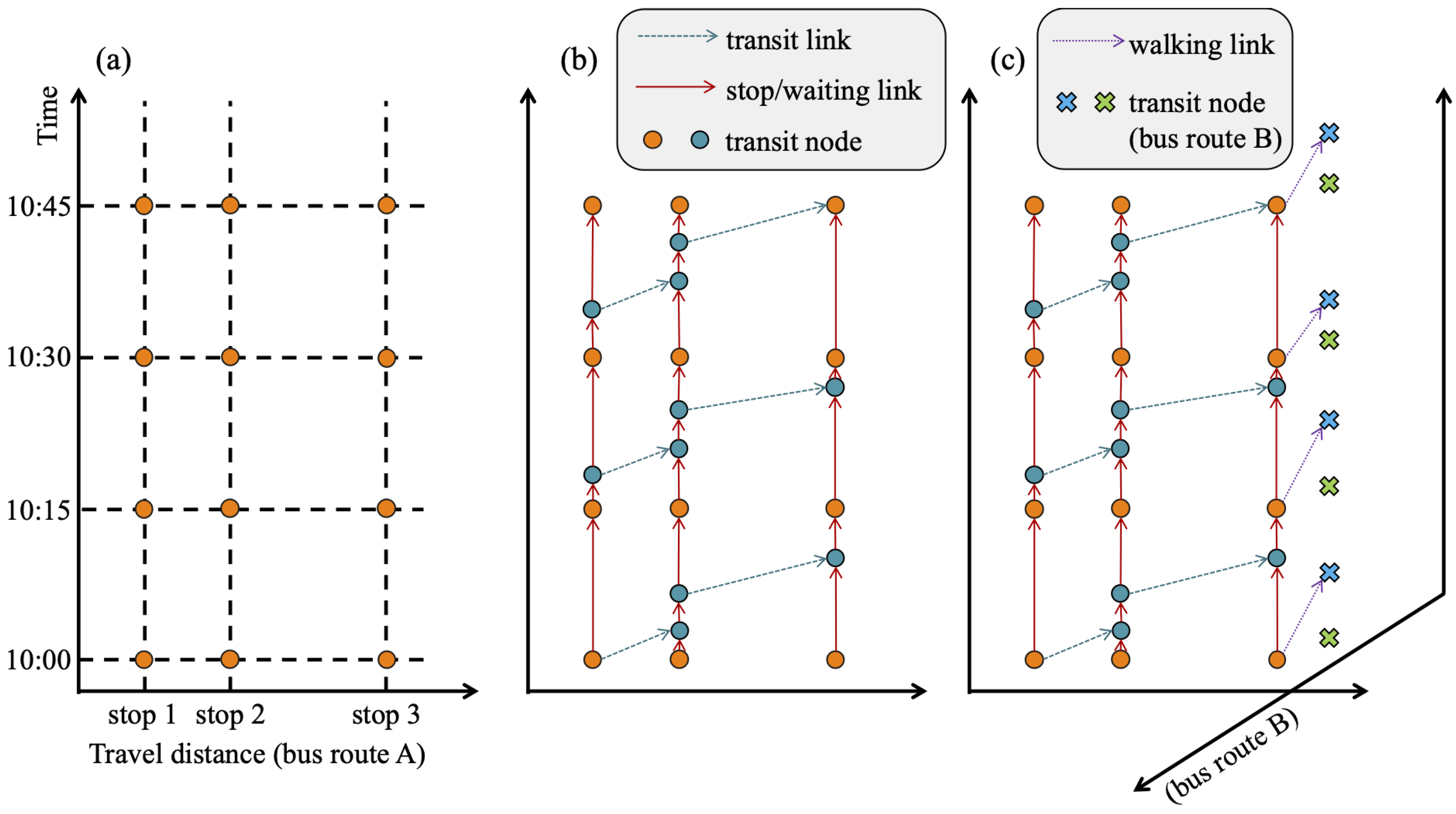
Information 16 00024 g002
Figure 3. A simplified example of generating a spatiotemporal network for three consecutive stops of a transit route.
Information 16 00024 g003
Figure 4. A spatiotemporal network generated in downtown Nashville, TN (a small segment of the network).
Information 16 00024 g004
Figure 5. A shortest paths starting from a bus stop in Nashville, TN.
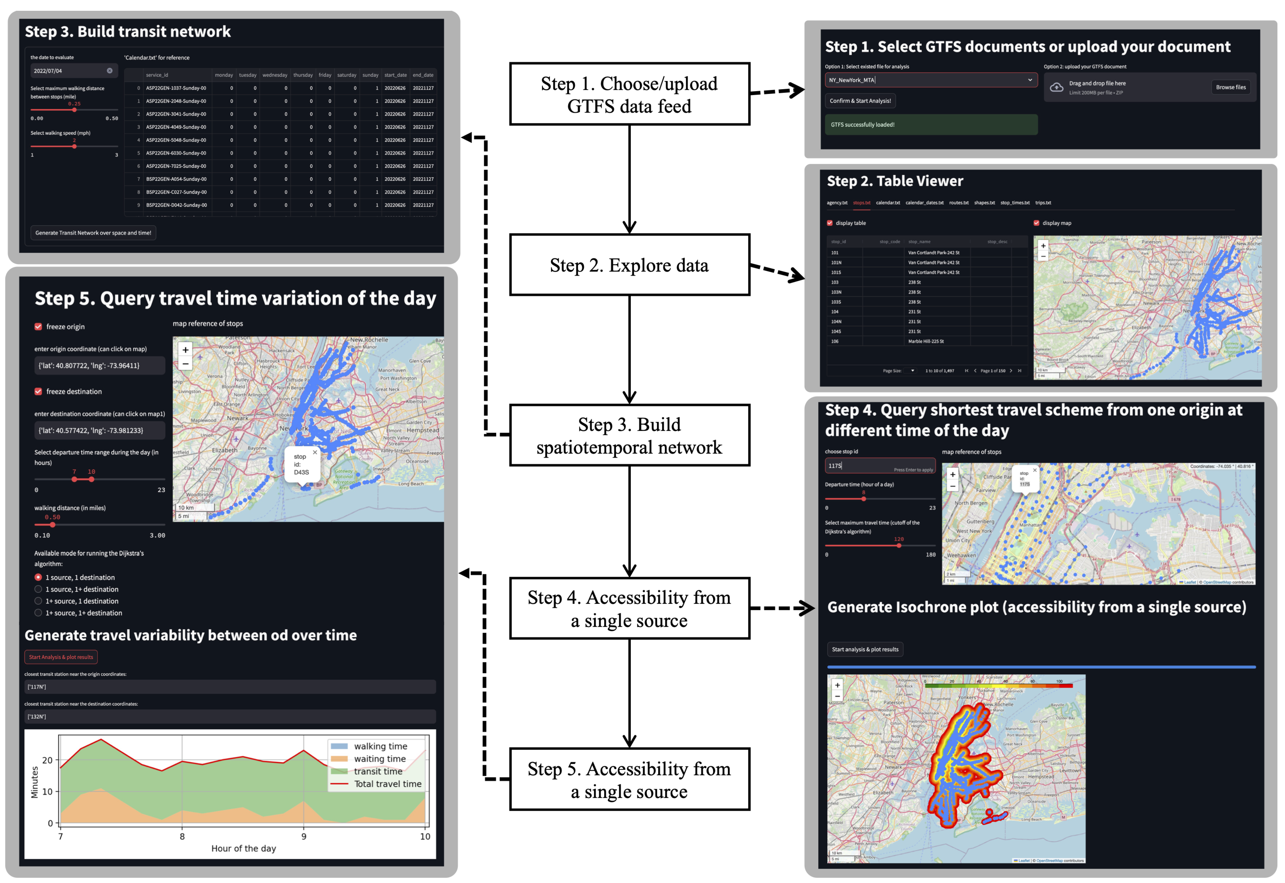
Information 16 00024 g005
Figure 6. The 5 major steps of using the GTFS2STN application.
Information 16 00024 g006
Figure 7. The isochrone map to access any of the three Walmart markets in Nashville, Tennessee.
Information 16 00024 g007
Figure 8. Accessibility from/to the Nashville International Airport (BNA) using WeGo transit services in Nashville, Tennessee (all isochrone legends are same as the one in Figure 7).
Information 16 00024 g008
Figure 9. Analyzing journey time changes of a network by comparing between 2019 and 2024 over 10 different bus stops across the network.
Information 16 00024 g009
Figure 10. Analyzing journey time changes of a networks. (a) A journey time scatter plot comparing between 14 November 2019 and 14 May 2020; (b) a journey time scatter plot comparing between 14 November 2019 and 13 November 2020.
Information 16 00024 g010
Figure 11. A comparison of the isochrone plot between GTFS2STN and Mapnificent using similar query conditions (isochrone legends on the left subplot are same as the one in Figure 7).
Information 16 00024 g011
Table 1. A comparison between the different tools/services analyzing GTFS for transit planning.
Service NamePriceUpload GTFSSource CodeMassive AnalysisDownload Spatiotemporal Network
Google Maps API [8]LowNoNoYesNo
Open Route Service [6]FreeNoYesNoNo
Open Trip Planner [9]FreeNoYesNoNo
Mapnificent [7]FreeNoYesNoNo
Open Trip Planner [9]FreeNoYesNoNo
Remix [10]HighNoNoYesNo
Conveyal [11]HighYesNoYesNo
GTFS2STNFreeYesYesYesYes
Table 2. Basic elements of spatiotemporal network.
NameDescription
stop/transit nodetraffic nodes of network (i.e., a bus stop at a give time)
destination nodefor each stop, there is a destination node to denote the arrival
stop/waiting linkvertical links connecting the same stop over time
transit linklinks connecting different bus stops traversed by buses
walking linklinks connecting different bus stops traversed by walking
arrival linkconnecting from stop node to the destination node
Table 3. Evaluating travel time results between GTFS2STN model and Google Maps APIs (ground truth).
City NameTransit AgencyMAE (Min)RMSE (Min)MAPE
New York, NYMTA5.57.110.4%
San Francisco, CABART1.85.12.6%
Washington, DCWMATA6.98.612.6%
Austin, TXCapMetro12.017.410.5%
Table 4. Evaluating journey time changes between 2019 and 2024 over different departure times. The null hypothesis H 0 : journey time in November 2019 is equal or smaller than that of May 2020. Alternative hypothesis: H a : Journey time in November 2019 is greater than that of November 2024.
Departure TimePaired t-TestWilcoxon Signed-Ranked Test
Statisticsp-ValueStatisticsp-Value
Overall11.41<0.0001112,830<0.0001
8 AM5.73<0.00013376<0.0001
10 AM4.48<0.00013045<0.0001
12 PM4.19<0.00013030<0.0001
14 PM4.29<0.00013034<0.0001
16 PM3.90<0.00013194<0.0001
18 PM7.20<0.00013575<0.0001
Table 5. Evaluating journey time changes between 2019 and 2024 over different origin sites. Null hypothesis H 0 : Journey time in November 2019 is equal to or smaller than that of May 2020. Alternative hypothesis: H a : Journey time in November 2019 is greater than that of November 2024.
Paired t-TestWilcoxon Signed-Ranked Test
SiteCoordinatesStatisticsp-ValueStatisticsp-Value
Site 1(36.143989, −86.799031)2.990.002011050.0009
Site 2(36.104841, −86.814243)2.230.014910270.0071
Site 3(36.130815, −86.666128)3.640.000311050.0009
Site 4(36.089632, −86.733373)4.37<0.00011222<0.0001
Site 5(36.167145, −86.826597)−2.100.98015200.9723
Site 6(36.228731, −86.725305)9.87<0.00011484<0.0001
Site 7(36.221122, −86.805488)14.18<0.00011475<0.0001
Site 8(36.100465, −86.871159)−5.220.99992300.9999
Site 9(36.051442, −86.714537)12.04<0.00011476<0.0001
Site 10(36.167234, −86.660707)8.47<0.00011432<0.0001
Table 6. Evaluating journey time changes between 2019 and 2024 over different destination sites. Null hypothesis H 0 : Journey time in November 2019 is equal or smaller than that of May 2020. Alternative hypothesis: H a : Journey time in November 2019 is greater than that of November 2024.
Paired t-TestWilcoxon Signed-Ranked Test
SiteCoordinatesStatisticsp-ValueStatisticsp-Value
Site 1(36.143989, −86.799031)2.770.003710340.0060
Site 2(36.104841, −86.814243)5.49<0.00011264<0.0001
Site 3(36.130815, −86.666128)0.520.30028830.1131
Site 4(36.089632, −86.733373)2.870.002910510.0039
Site 5(36.167145, −86.826597)4.15<0.000111730.0001
Site 6(36.228731, −86.725305)5.27<0.00011248<0.0001
Site 7(36.221122, −86.805488)5.86<0.00011324<0.0001
Site 8(36.100465, −86.871159)2.820.003310670.0026
Site 9(36.051442, −86.714537)5.97<0.00011261<0.0001
Site 10(36.167234, −86.660707)2.730.00421203<0.0001
Table 7. Evaluating journey time changes between November 2019 and May 2020 over different departure times. Null hypothesis H 0 : Journey time in November 2019 is equal or greater than that of May 2020. Alternative hypothesis: H a : Journey time in November 2019 is smaller than that of May 2020.
Departure TimePaired t-TestWilcoxon Signed-Ranked Test
Statisticsp-ValueStatisticsp-Value
Overall−11.53<0.000130,300<0.0001
8 AM−8.91<0.0001230<0.0001
10 AM−4.58<0.0001973<0.0001
12 PM−3.74<0.00011016<0.0001
14 PM−2.38<0.000113340.00206
16 PM−6.33<0.0001723<0.0001
18 PM−3.25<0.00011181<0.0001
Table 8. Evaluating journey time changes between November 2019 and November 2020 over different departure time. Null hypothesis H 0 : Journey time in November 2019 is equal to that of November 2020. Alternative hypothesis: H a : Journey time in November 2019 is not equal to that of November 2020.
Departure TimePaired t-TestWilcoxon Signed-Ranked Test
Statisticsp-ValueStatisticsp-Value
Overall−2.170.030760,9970.0307
8 AM−3.050.003033760.0007
10 AM0.940.349530450.7983
12 PM−1.780.077230300.0259
14 PM0.440.664230340.7460
16 PM−1.170.244831940.1277
18 PM−1.250.213335750.8523
Disclaimer/Publisher’s Note: The statements, opinions and data contained in all publications are solely those of the individual author(s) and contributor(s) and not of MDPI and/or the editor(s). MDPI and/or the editor(s) disclaim responsibility for any injury to people or property resulting from any ideas, methods, instructions or products referred to in the content.

