
Pervasive Real-Time Analytical Framework—A Case Study on Car Parking Monitoring


Abstract
1. Introduction
2. Background
2.1. Smart Cities
2.2. Data Analytics
2.3. Extract, Transform, and Load (ETL)
2.4. Key Performance Indicators (KPIs)
2.5. Data Warehouse
2.6. OLAP
- Drill-down: OLAP allows users to navigate from summarized data to detailed information. This process helps uncover specific patterns or outliers that may not be apparent at a higher level of aggregation, leading to a deeper understanding of the data.
- Roll-up: Conversely, roll-up allows users to aggregate data from a detailed level to a higher level of abstraction. Roll-up facilitates summarization, simplifies complex data, and provides a broader perspective, which can be useful for decision making and identifying overall trends and performance indicators.
- Three-dimensional analysis: OLAP presents data in a multidimensional structure, typically represented as a data cube. This helps in-depth exploration and better understanding of complex relationships within the data.
2.7. Business Intelligence Tools
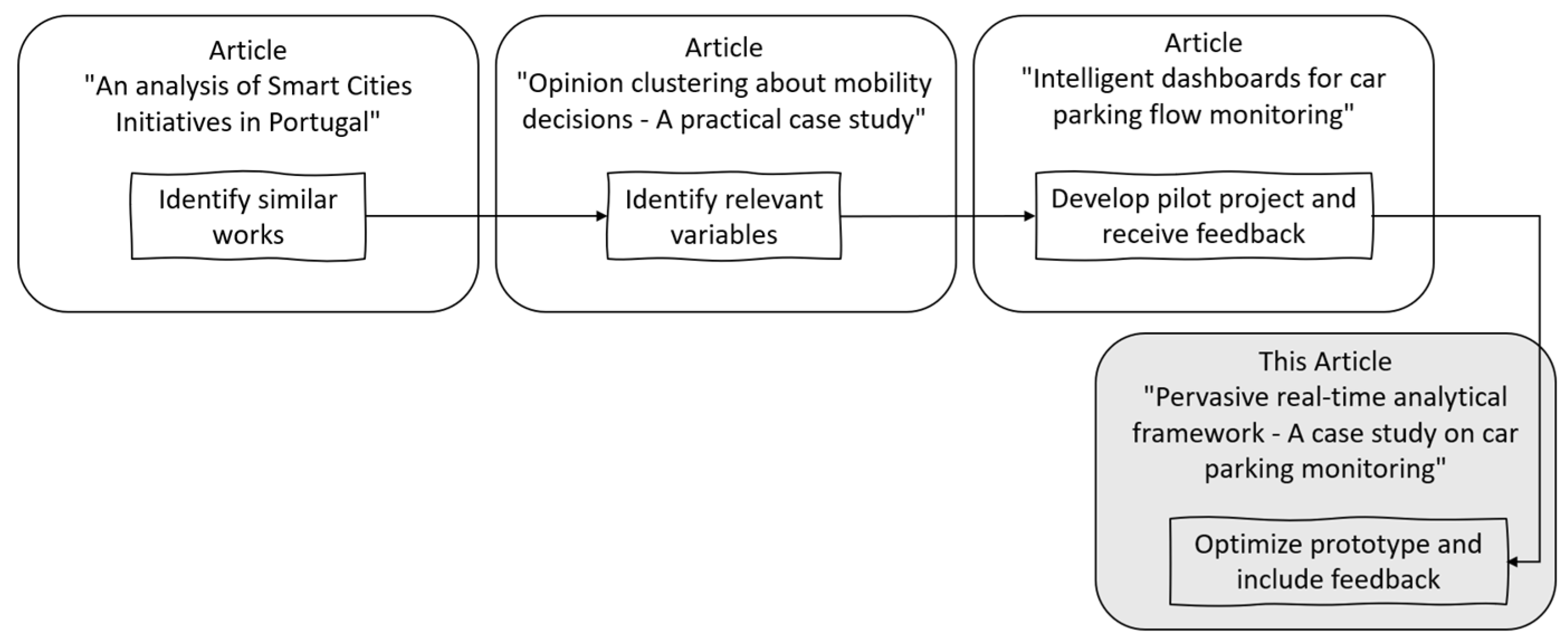
2.8. Related Works
2.9. OLAP Applications
3. Materials and Methods
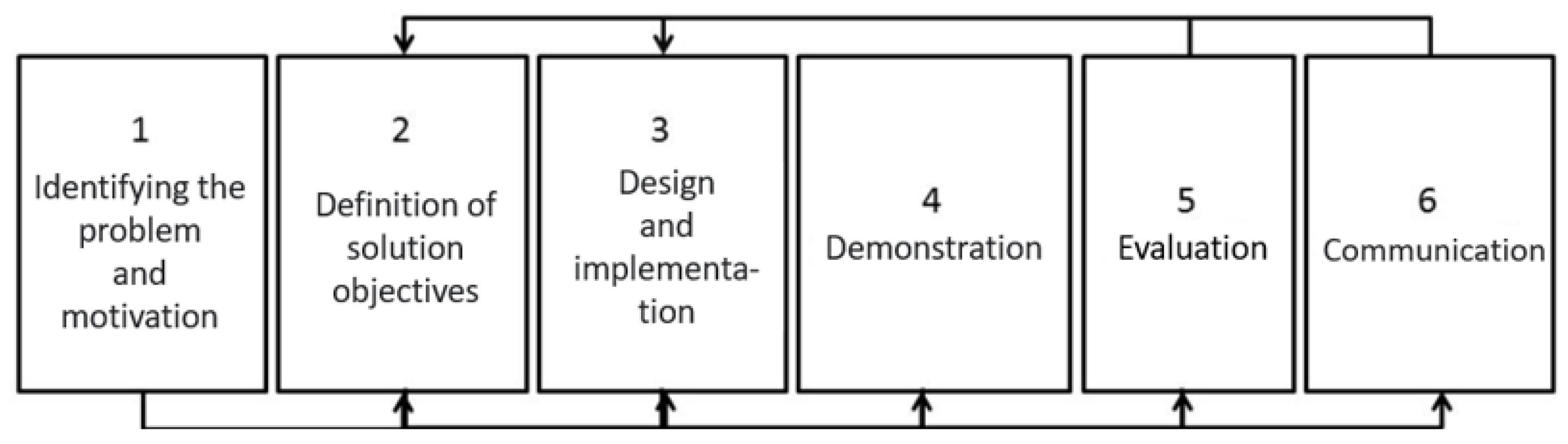
3.1. Design Science Research (DSR)
3.1.1. Identifying the Problem, Motivation, and Definition of Solution Objectives
3.1.2. Design and Implementation
3.1.3. Demonstration
3.1.4. Evaluation
3.2. Tools
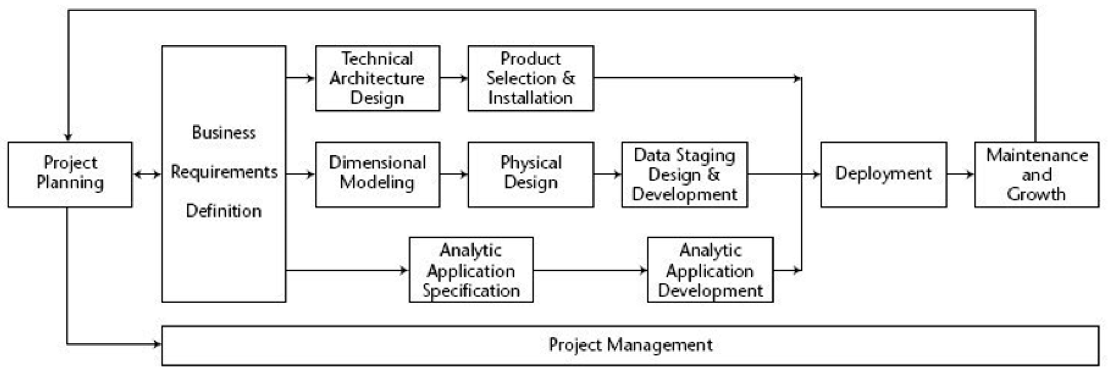
3.3. Kimball Methodology
- Project Planning: Planning phase (defined scope and planned project).
- Project Management: This phase extended throughout the project to manage the team, resources, and expectations.
- Business Requirements Definition: The business requirements compression phase had the fundamental objective of linking activities with the lifecycle.
- Technology Track—This stage contained two milestones:
- -
- Technical Architecture Design: Consists of developing the architecture of the business;
- -
- Product Selection and Installation: Phase in which the architecture is used to complete data warehousing.
- Data Track—This phase contains three milestones:
- -
- Dimensional Modeling: Consists of designing a multidimensional model based on business requirements;
- -
- Physical Design: Proceeds to the design of the database;
- -
- Data Staging, Design, and Development: Extracts, adapts, and provides data and presentation and management of the ETL system.
- Business Intelligence Track—This stage contained two milestones:
- -
- Analytic Application Specification: Phase in which applications are selected to support business requirements;
- -
- Analytic Application Development: Uses design to develop and validate applications that support business requirements.
- Deployment: In the case of data warehousing/business deployment intelligence, data are the primary input. Processing the data in ETL is the most unpredictable task. Unfortunately, even if the data are not fully prepared, implementation proceeds. This phase required pre-deployment testing, documentation, training, and maintenance and support.
- Maintenance and Growth: After deployment, maintenance must be carried out to control the system’s satisfactory performance. If the project needs to grow because of new data or objectives, the lifecycle starts again.
3.4. SCRUM
4. Case Study
4.1. Project Planning
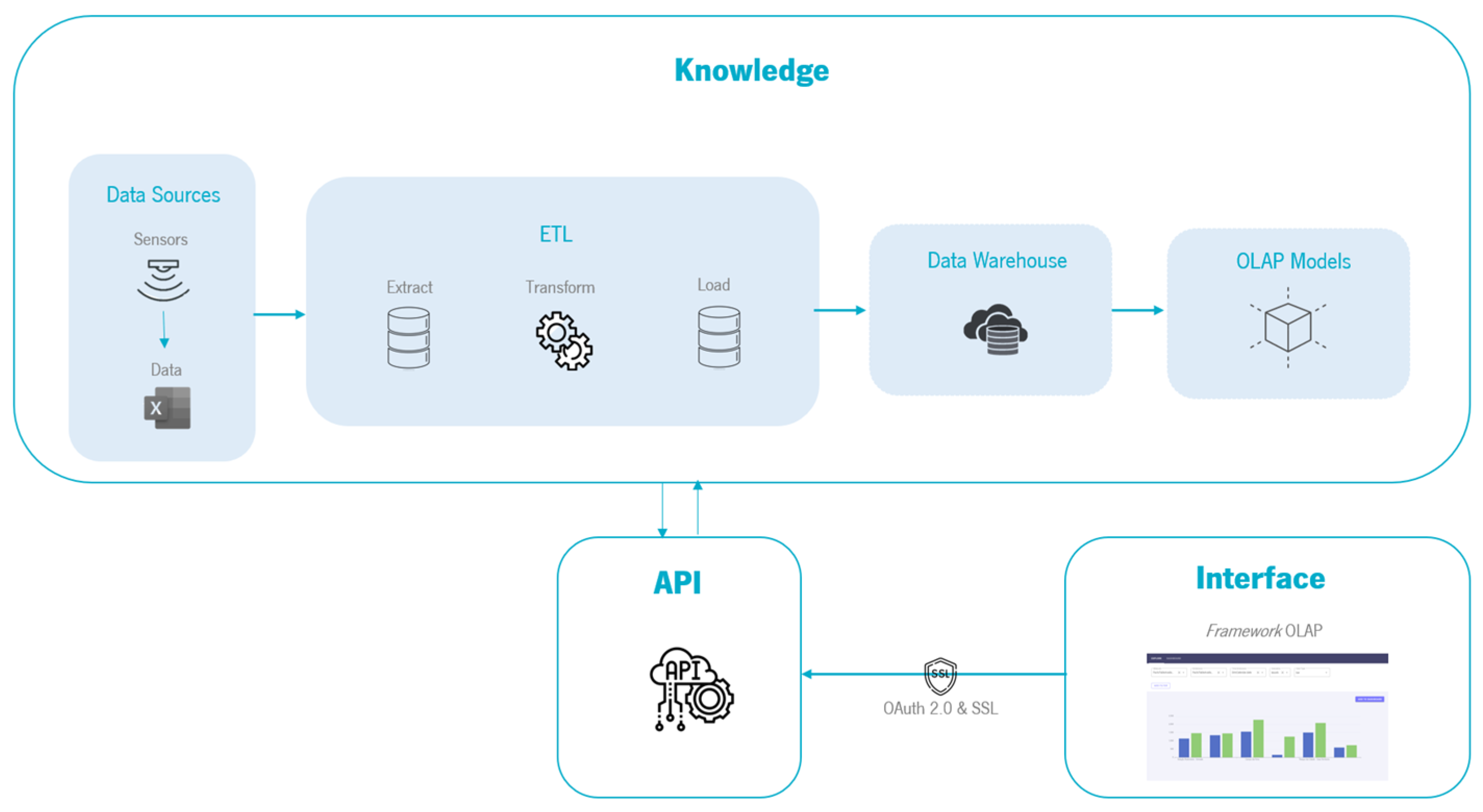
- Database(s) serving as the data source, facilitating the provisioning of data to the system;
- An application programming interface (API) responsible for data processing and information provisioning;
- Data warehouse, where the completed multidimensional model is stored;
- OLAP (online analytical processing) layer for data querying and the presentation of diverse perspectives of it;
- “Cache” memory layer that manages query storage;
- A visualization layer, which renders the data accessible to end-users through a collection of dashboards integrated within an application.
- Interpretation of the problem and reality;
- Extracting, loading, and transforming the data;
- Creation of the DW;
- Development of KPIs;
- Development of the OLAP mechanism;
- Extraction of relevant information from the data (data science).
4.2. Project Management
4.3. Business Requirements Definition
4.4. Technology Track
4.5. Data Track
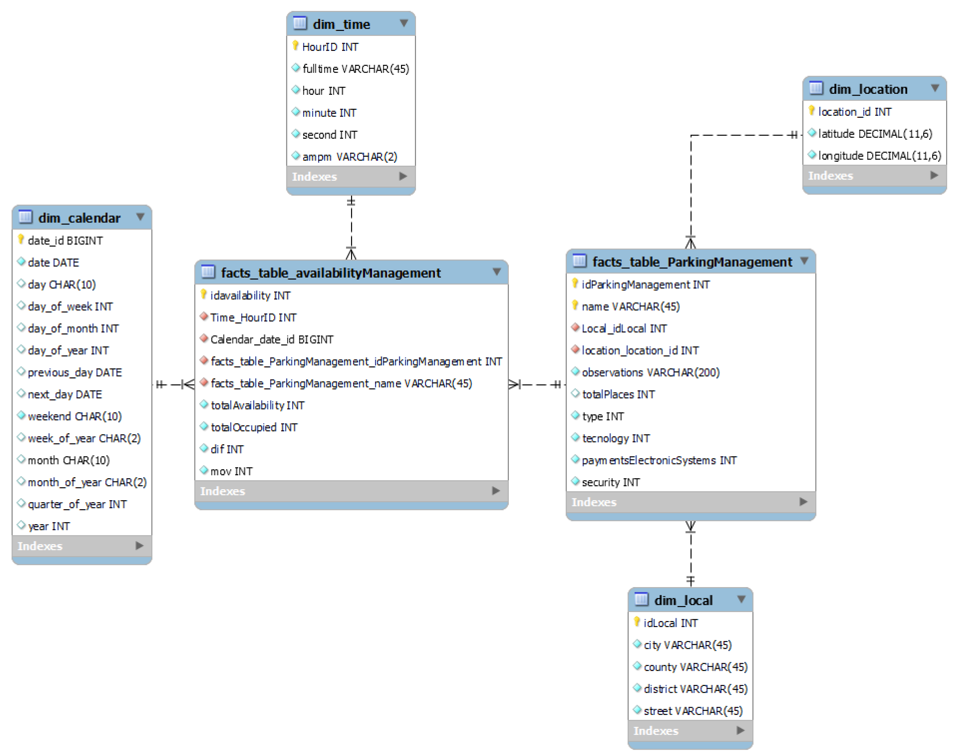
4.5.1. ETL Process
4.5.2. Data Warehouse Development
4.6. Business Intelligence Track
4.7. Deployment
5. OLAP Framework
5.1. Identifying the Problem and Motivation
- The drill-down and roll-up processes;
- Various types of graphs;
- Data suggestion in the filtering process;
- Possibility of saving the charts created;
- Intuitive and short labels;
- A modular, scalable, and adaptable solution to any industry.
5.2. Definition of Solution Objectives
5.3. Design and Implementation
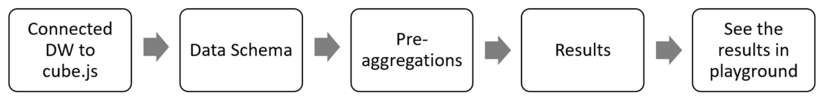
- From the data obtained (data sources), the ETL process was started—extraction, transformation, and loading, where data cleaning was performed. Consequently, the data warehouse was designed to store all the data. The OLAP model was created with the cube.js tool.
- With the cube.js API, an OLAP framework was developed to visualize and create interactive graphs that help decision making. The solution is scalable, and the data indicate what is possible.
5.4. Demonstration
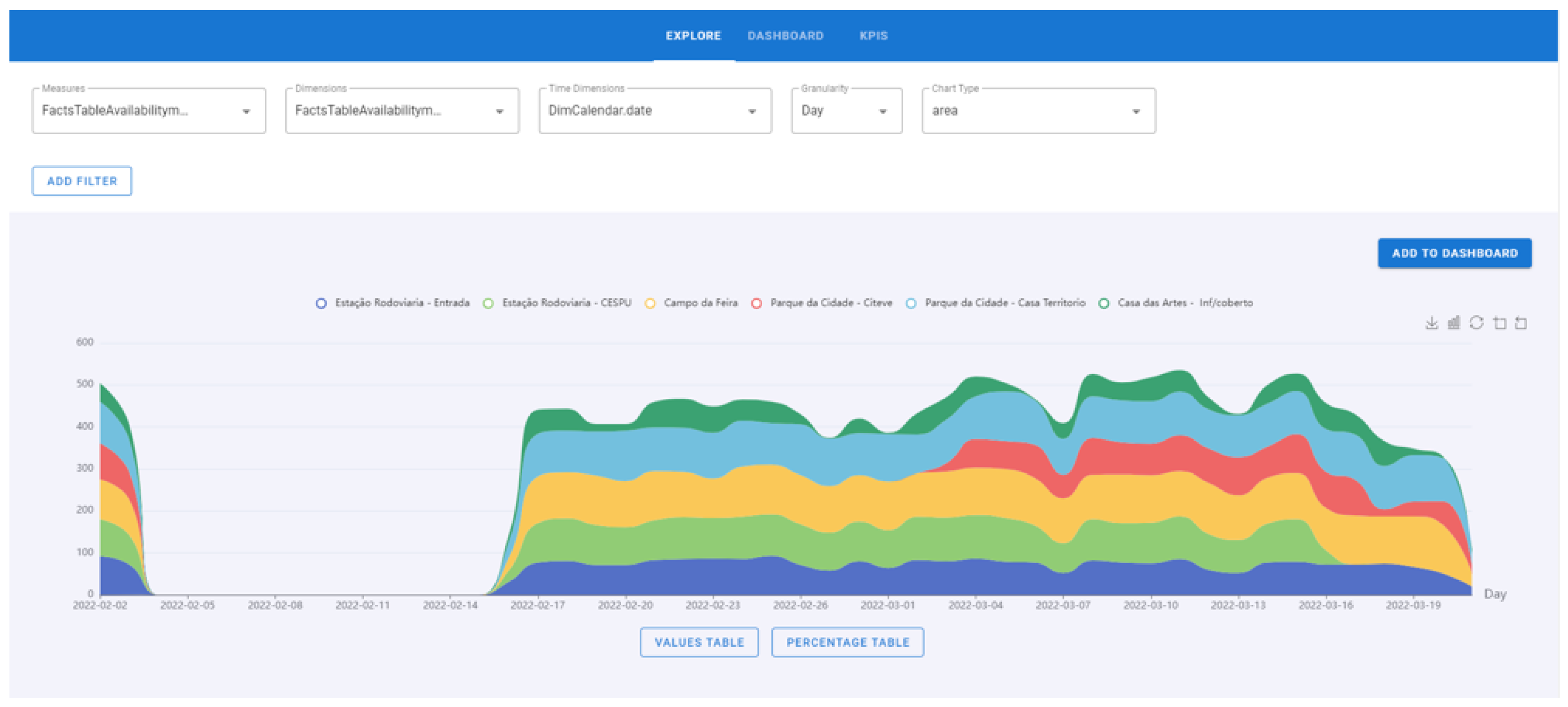
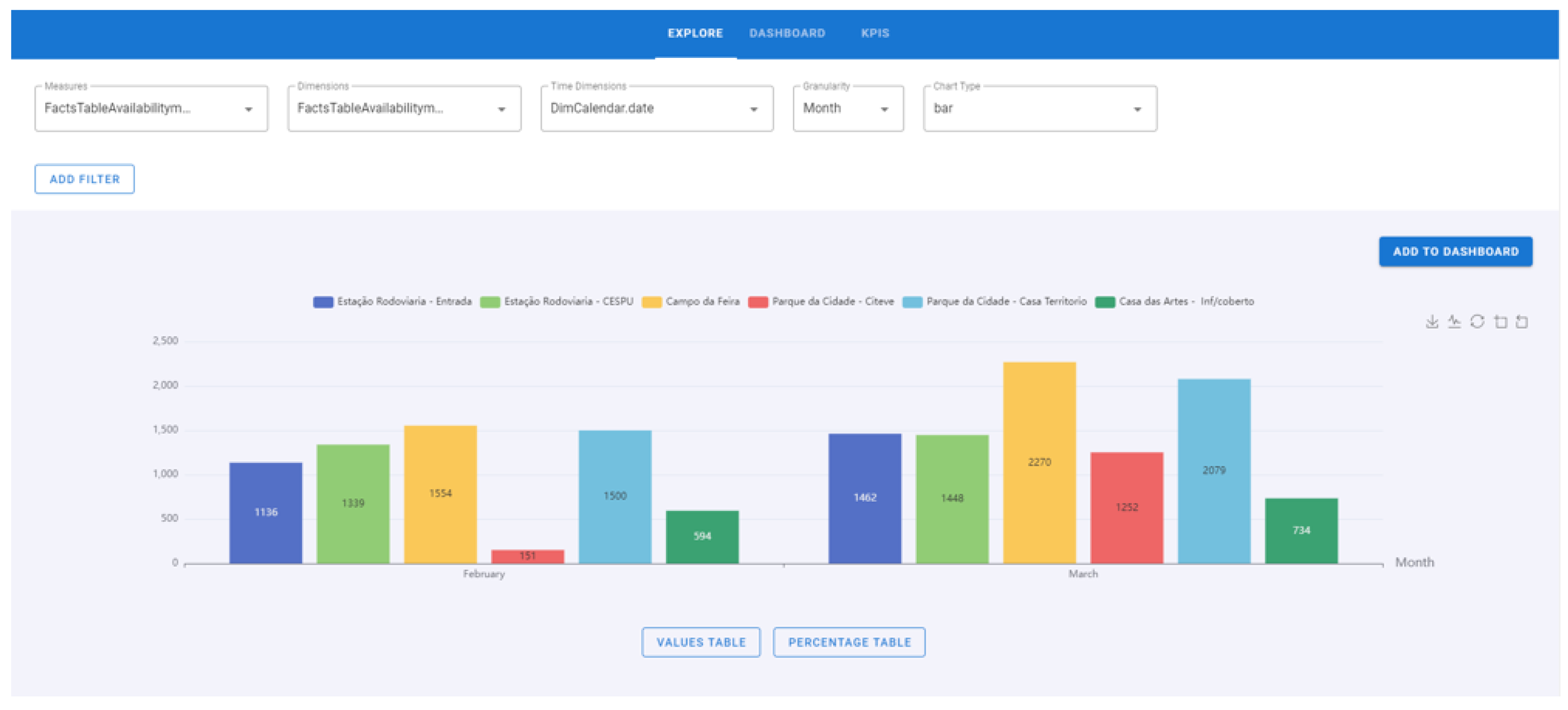
- Explore
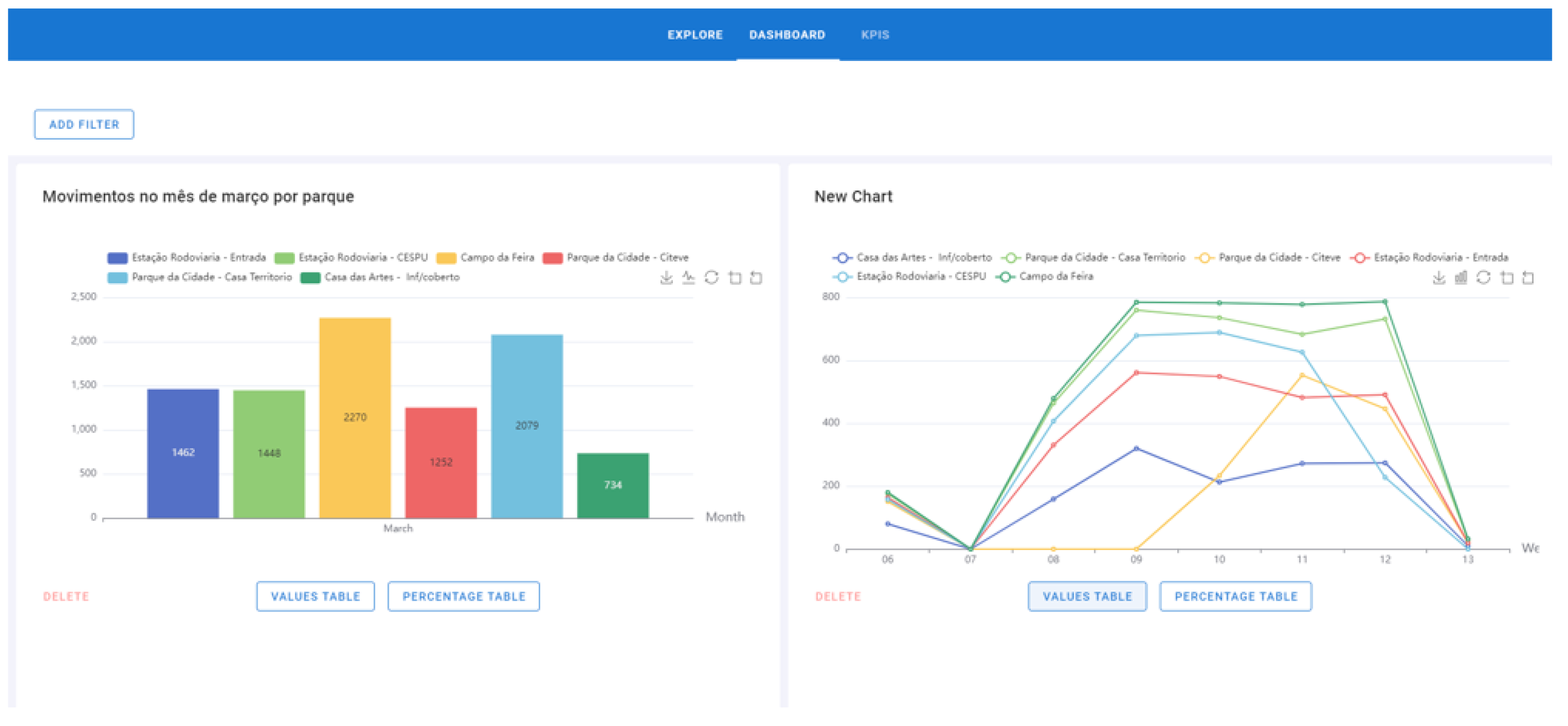
- Dashboard
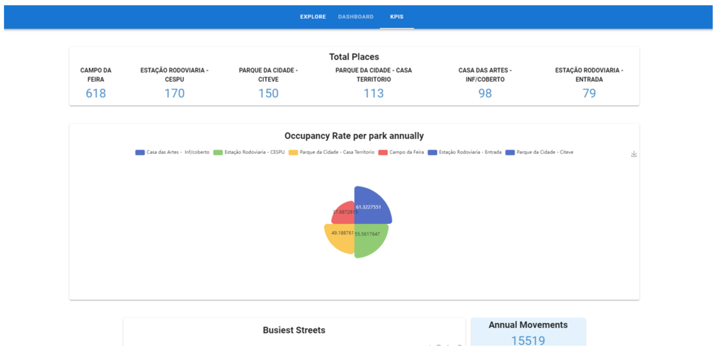
- KPIs
5.5. Evaluation
- Select a fact, dimension, time dimension and chart type (Figure 10).
- 2.
- 3.
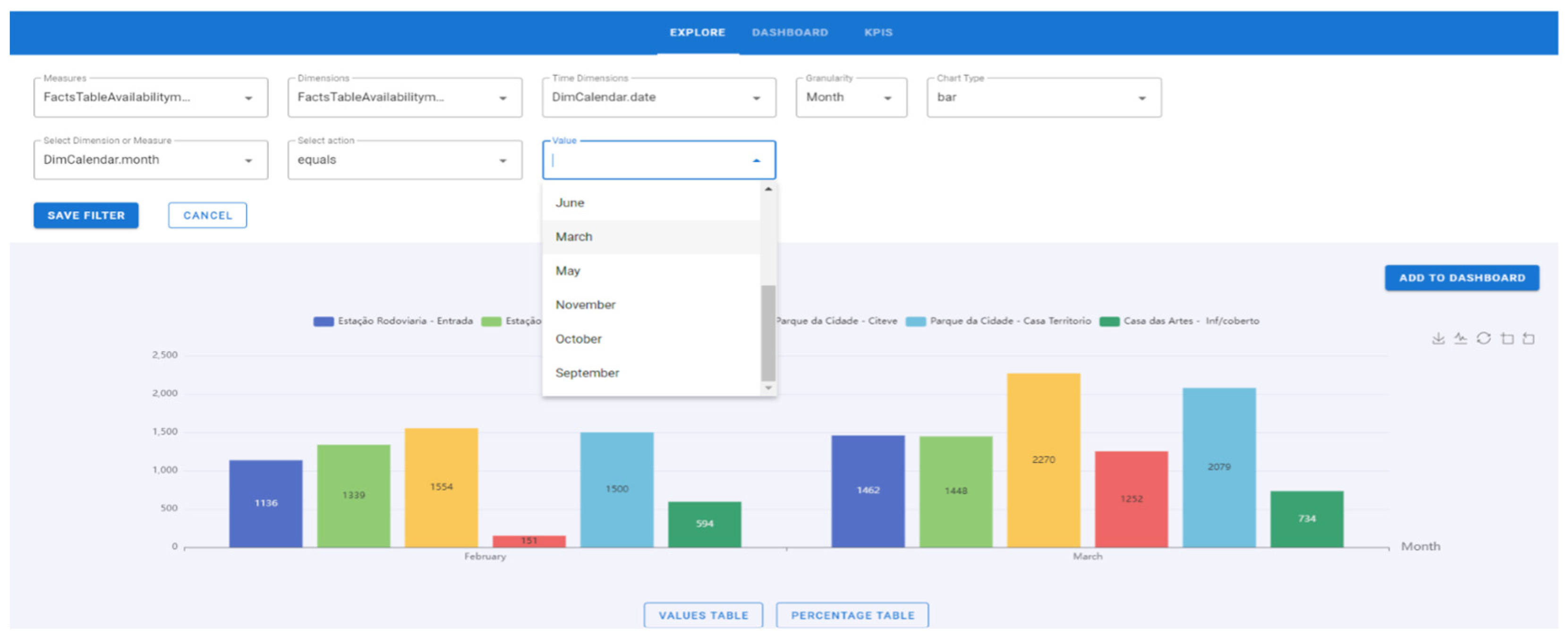
- Click on the “Add filter” button. Select a dimension or fact. Select an operator (equals, does note which, >, <, =, >=, <=). Insert a value if a fact has been selected or select an attribute if a dimension has been established (Figure 13).
- 4.
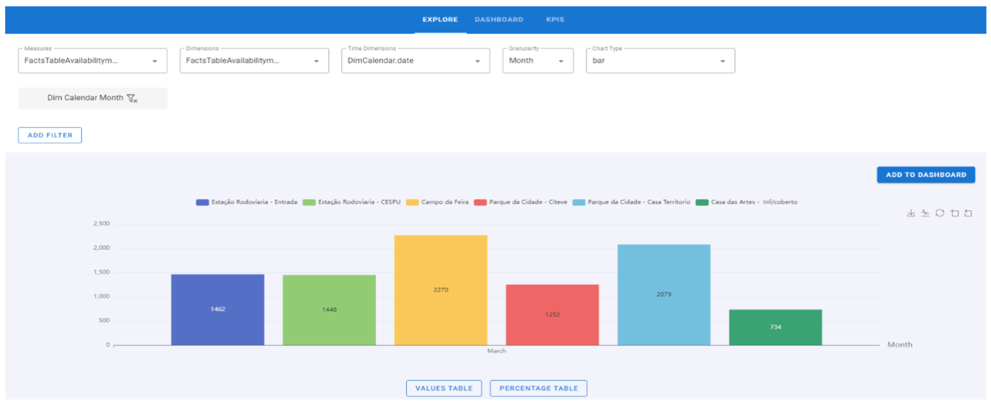
- Click on the “Save Filter” button. Several filters can be inserted and later deleted (Figure 14).
- 5.
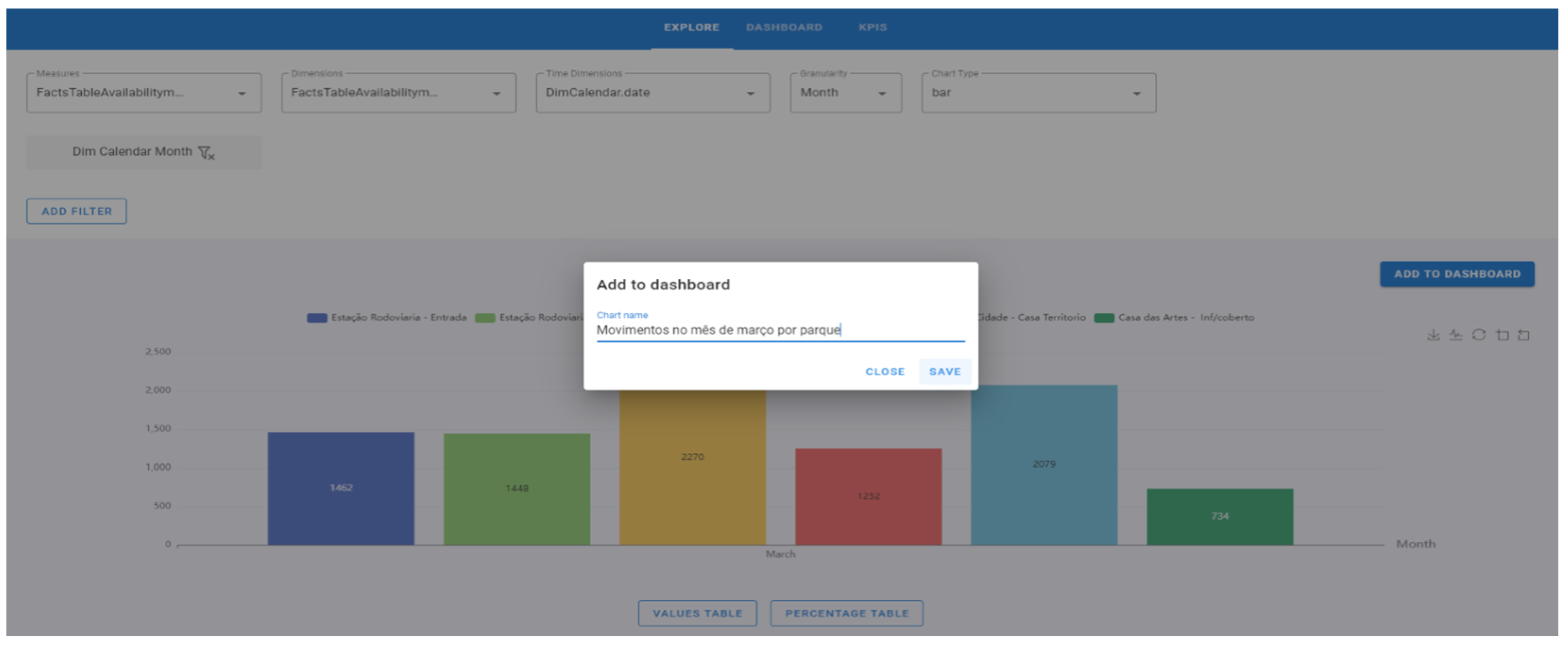
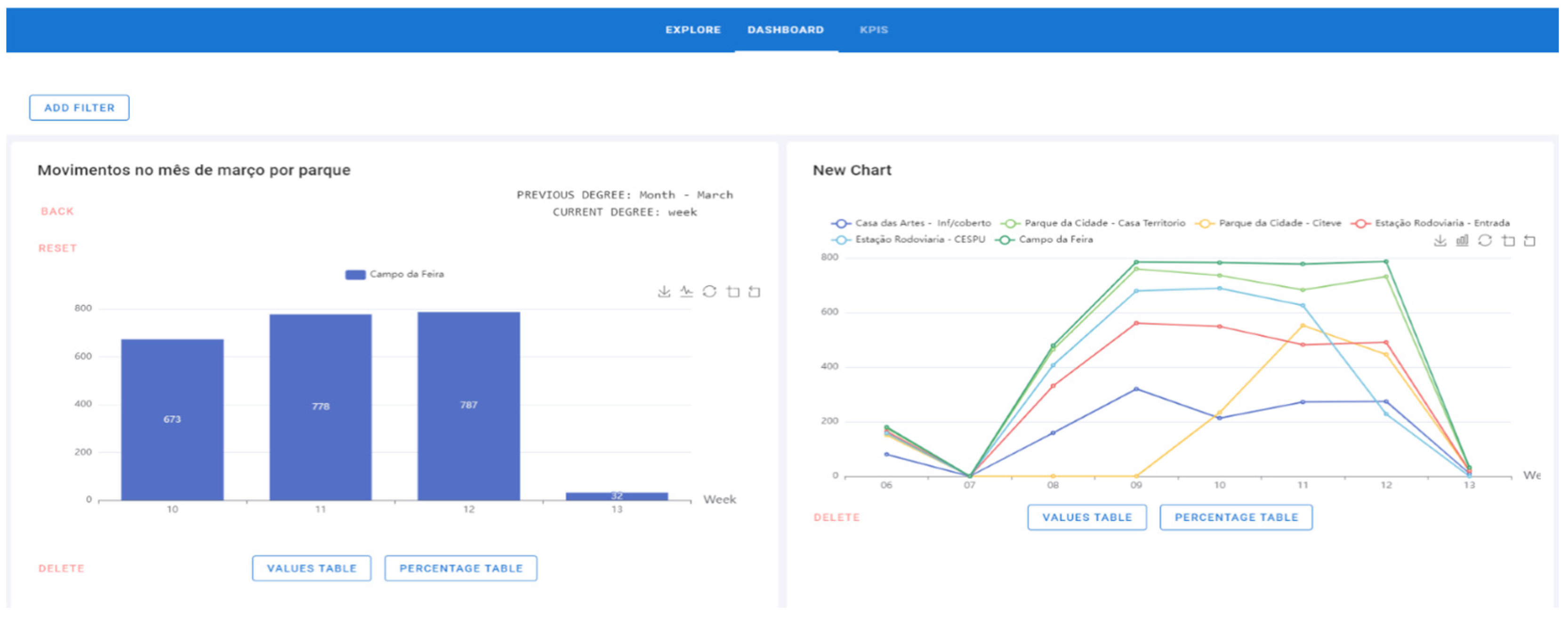
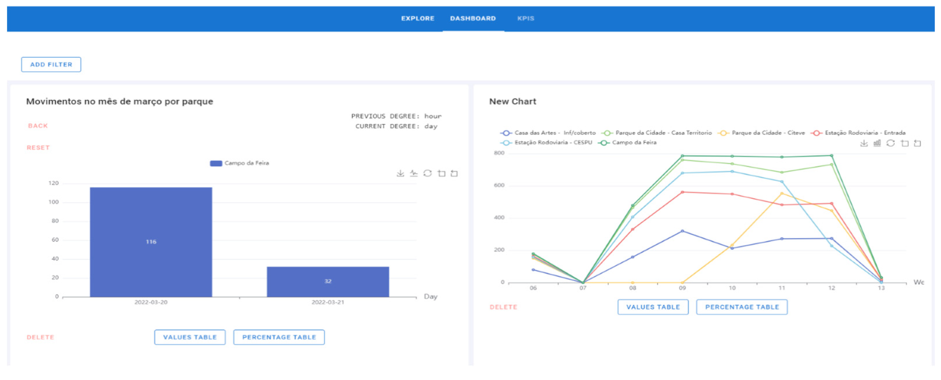
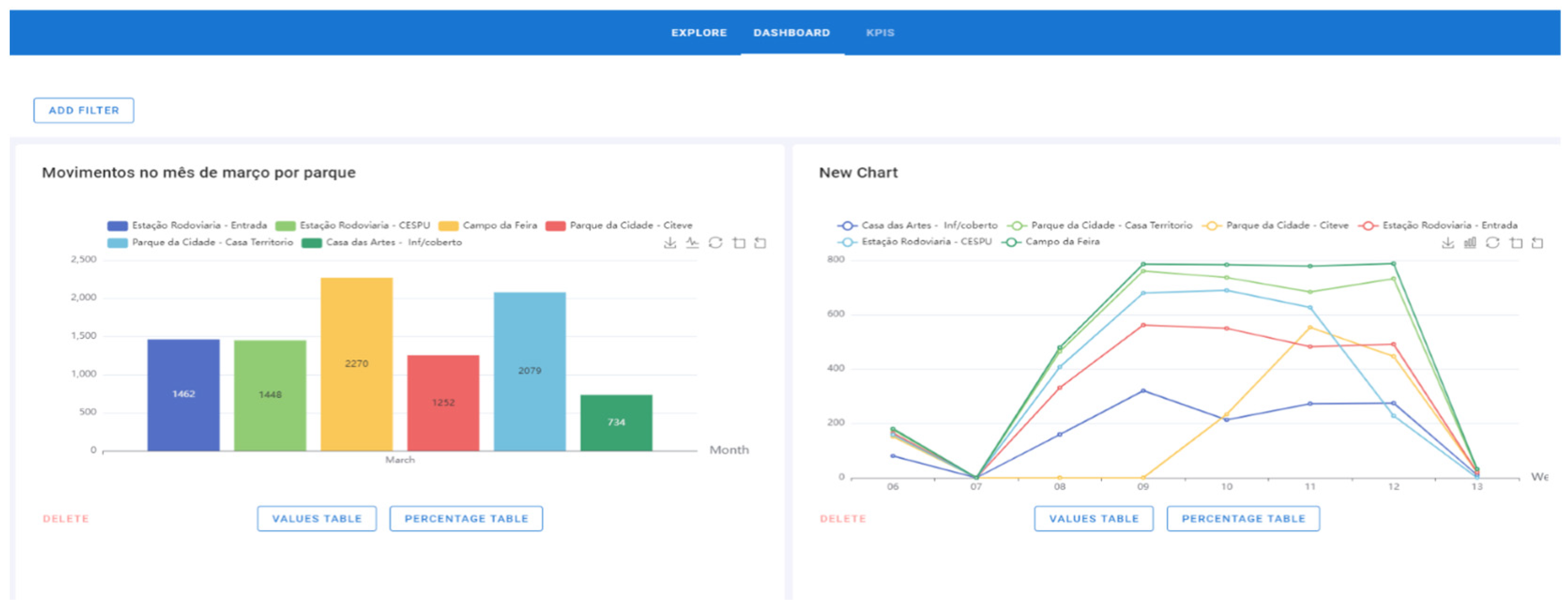
- Click on the “Add to Dashboard” button, give the chart a name and click on “Save” (Figure 15). The name of the graph is “Movements in March by the park” (represented in the figure by “Movimentos no mês de março por parque”).
- 6.
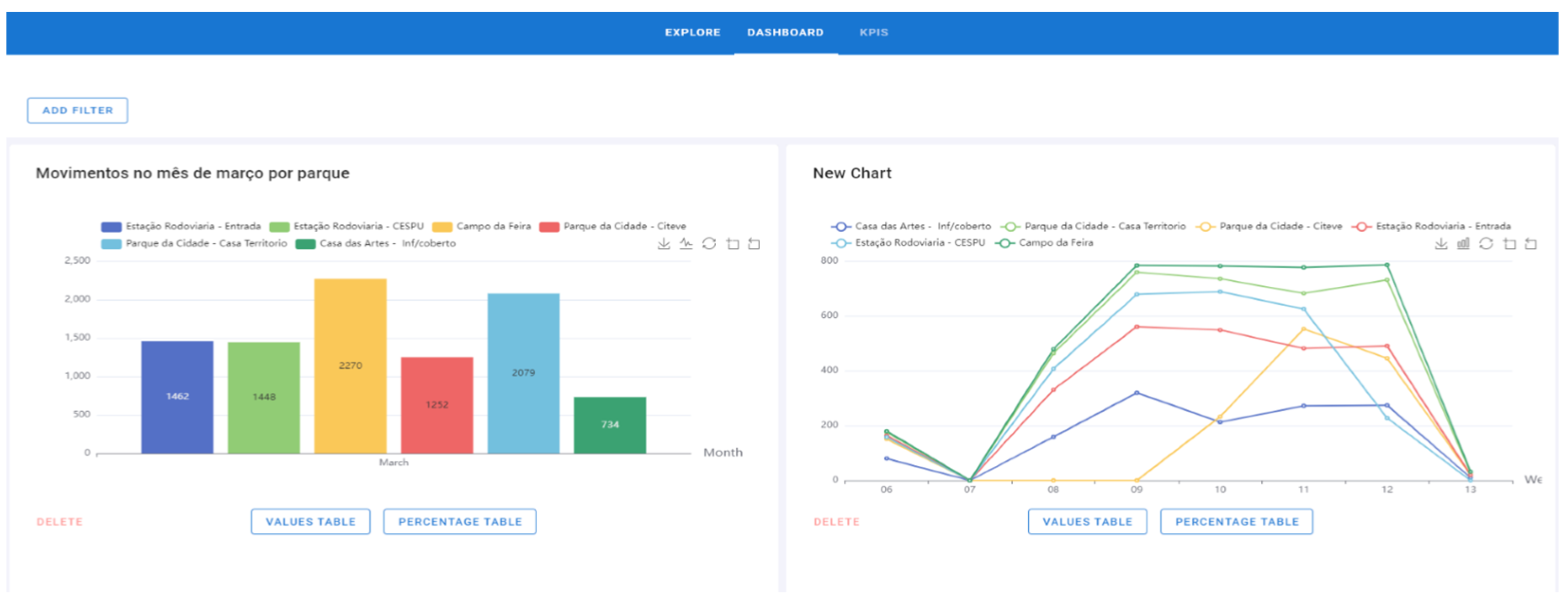
- The chart is already on the Dashboard page and can be deleted (Figure 16). The graphic added at this time is on the left side. On the right side appears a graphic that had previously been added.
- 7.
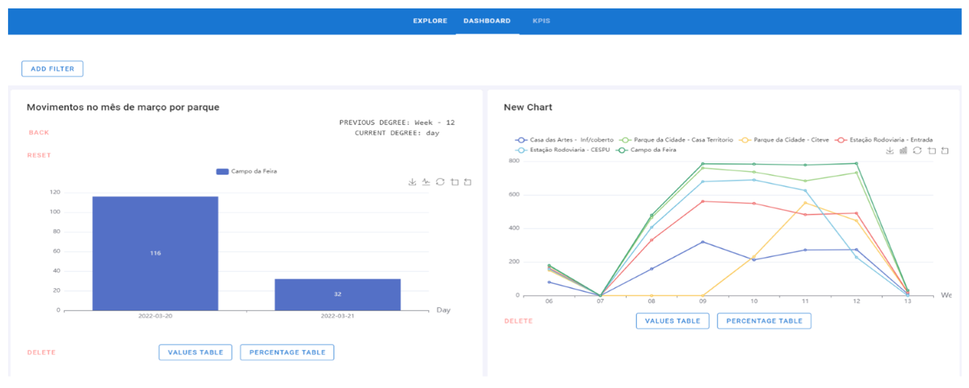
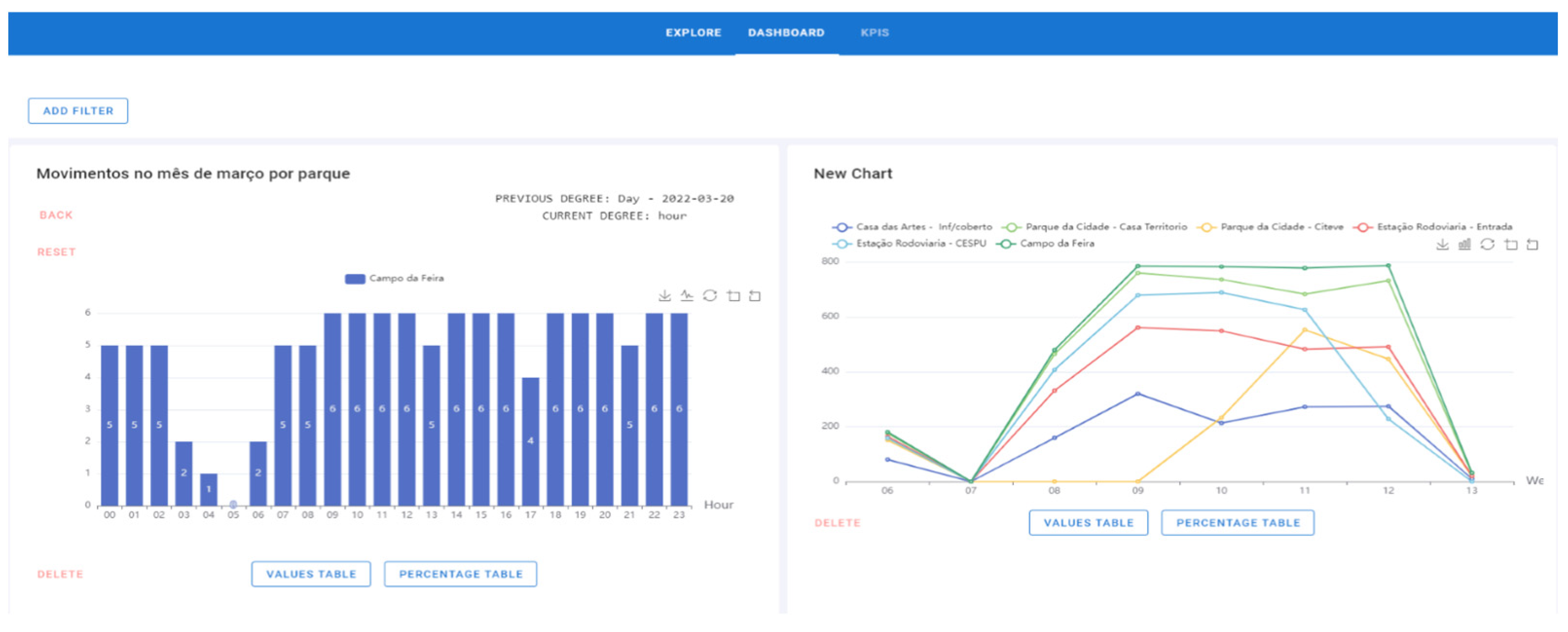
- To perform the drill-down process, step 1 must be strictly followed. In this process, click on the bar/line/area and the graph will go down a level. During the drill-down, the degree where the process is located is displayed, that is, if the chart is per year, quarter, month, weeks, days of the week, or hours, and the attribute previously selected. In this example, the “Campo da Feira” bar with 2270 movements was set (Figure 16).
- a.
- b.
- The hours when there was movement on that day (20 March 2022) are displayed. As hours are the lowest attribute of the drill-down, the process ends (Figure 19).
- 8.
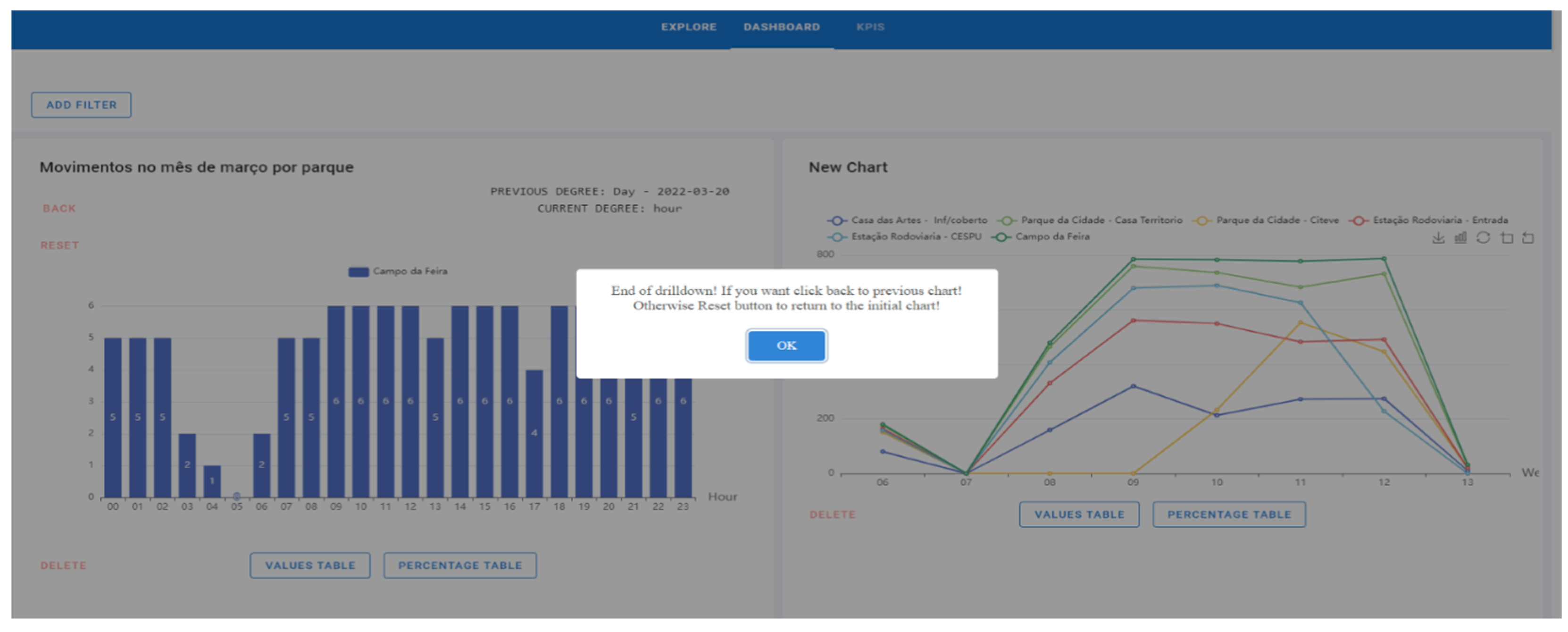
- When the drill-down is finished, an end message is displayed. As soon as the drill-down is performed, a “Reset” button is displayed to return to the initial chart. There is also the possibility of doing a roll-up (opposite of the drill-down process) through the “Back” button. That is, instead of the degree going down (year–quarter–month–weeks–days–hours), it will go up; so in this temporal example, the flow will be hours–days–weeks–month–quarter–year. The year is the highest level of the process (Figure 20).
- 9.
- In this case, if the user wants to go back to the previous graph, it is only necessary to click on the “Back” button and the chart will update to the last degree; in this example, for the days of the week (Figure 21). That is, after pressing the button, the graph is displayed and the labels are updated, showing the previous degree: hours (last degree: hour) and the current degree: days (current degree: day).
- 10.
- Finally, if desired, the original graphic will be displayed by pressing the “Reset” button (Figure 22). The filtering process can also be included if desired.
- 11.
5.6. Communication
6. Discussion
7. Conclusions
Future Work
Author Contributions
Funding
Conflicts of Interest
References
- Onesmus Mbaabu. MOLAP vs ROLAP vs HOLAP in Online Analytical Processing (OLAP). Engineering Education (EngEd) Program|Section 2021. Available online: https://www.section.io/engineering-education/molap-vs-rolap-vs-holap/ (accessed on 7 June 2022).
- Cube Cube—Headless BI for Building Data Applications. CubeDev 2022. Available online: https://cube.dev/ (accessed on 7 June 2022).
- Portela, F.; Fernandes, G.; Alves, P.; Ferreira, J.A. Method to Execute Offline Data Analysis; Portugal PT. ID. 116393, IPC: G06F 16/00 (2019.01); IOTECHPIS-Innovation on Technology, Lda.: Braga, Portugal, 2022. [Google Scholar]
- Fernandes, G.; Portela, F.; Santos, M.F. Towards the Development of a Data Science Modular Solution. In Proceedings of the 2019 7th International Conference on Future Internet of Things and Cloud Workshops (FiCloudW), Istanbul, Turkey, 26–28 August 2019. [Google Scholar] [CrossRef]
- ioCity. Available online: https://iocity.research.iotech.pt/ (accessed on 28 December 2022).
- Francisca, B.; Beatriz, P.; Vasco, P.; José VCarlos, F.; Filipe, P. An analysis of Smart Cities Initiatives in Portugal. Springer EAI—Sustainable, Innovative and Intelligent Societies and Cities; Springer: Berlin/Heidelberg, Germany, 2022. [Google Scholar]
- Mesároš, P.; Behúnová, A.; Mandičák, T.; Behún, M.; Krajníková, K. Impact of enterprise information systems on selected key performance indicators in construction project management: An empirical study. Wirel. Netw. 2021, 27, 1641–1648. [Google Scholar] [CrossRef]
- Batty, M.; Axhausen, K.W.; Giannotti, F.; Pozdnoukhov, A.; Bazzani, A.; Wachowicz, M.; Ouzounis, G.; Portugali, Y. Smart cities of the future. Eur. Phys. J. Spec. Top. 2012, 214, 481–518. [Google Scholar] [CrossRef]
- Wang, Y.; Kung, L.; Byrd, T.A. Big data analytics: Understanding its capabilities and potential benefits for healthcare organizations. Technol. Forecast. Soc. Change 2018, 126, 3–13. [Google Scholar] [CrossRef]
- TOTVS Análise de dados: O que é, Vantagens, Tipos e como Fazer. 2022. Available online: https://www.totvs.com/blog/negocios/analise-de-dados/ (accessed on 14 June 2022).
- Karagiannis, A.; Vassiliadis, P.; Simitsis, A. Scheduling strategies for efficient ETL execution. Inf. Syst. 2013, 38, 927–945. [Google Scholar] [CrossRef]
- IBM Cloud Education What is ETL (Extract, Transform, Load)? 2022. Available online: https://www.ibm.com/cloud/learn/etl (accessed on 14 June 2022).
- Hwang, M.I.; Xu, H. A Structural Model of Data Warehousing Success. J. Comput. Inf. Syst. 2008, 49, 48–56. [Google Scholar] [CrossRef][Green Version]
- Anggrainy, T.D.; Sari, A.R. Implementation of Extract, Transform, Load on Data Warehouse and Business Intelligence Using Pentaho and Tableau to Analyse Sales Performance of Olist Store. Science 2022, 7, 368–374. [Google Scholar]
- What Is Power BI? Definition and Features|Microsoft Power BI. Available online: https://powerbi.microsoft.com/en-us/what-is-power-bi/ (accessed on 23 December 2022).
- MultiTech. What Are the Advantages and Dis Advantages in Power BI. Medium 2020. Available online: https://informationit27.medium.com/what-are-the-advantages-and-dis-advantages-in-power-bi-98b49152daf4 (accessed on 23 December 2022).
- Lu, M. Discovering Microsoft Self-service BI solution: Power BI. 2014. Available online: https://www.theseus.fi/handle/10024/76619 (accessed on 23 December 2022).
- What Is Tableau? Available online: https://www.tableau.com/why-tableau/what-is-tableau (accessed on 23 December 2022).
- Advantages and Disadvantages of Tableau. Available online: https://absentdata.com/advantages-and-disadvantages-of-tableau/ (accessed on 23 December 2022).
- Leite, N.; Pedrosa, I.; Bernardino, J. Open Source Business Intelligence on a SME: A Case Study Using Pentaho. In Proceedings of the 2019 14th Iberian Conference on Information Systems and Technologies (CISTI), Coimbra, Portugal, 19–22 June 2019; pp. 1–7. [Google Scholar]
- de Sá Mussa, M.; de Souza, S.C.; da Silva Freire, E.F.; Cordeiro, R.G.; da Hora, H.R.M. Business intelligence na educação: Uma aplicação do software pentaho. Rev. Produção Desenvolv. 2018, 4, 29–41. [Google Scholar] [CrossRef]
- Barros, F.; Fernandes, C.; Portela, F. Opinion Clustering About Mobility Decisions. In Advanced Research in Technologies, Information, Innovation and Sustainability. ARTIIS 2022. Communications in Computer and Information Science; Guarda, T., Portela, F., Augusto, M.F., Eds.; Springer: Cham, Switzerland, 2022; Volume 1675. [Google Scholar] [CrossRef]
- Hammad, A.; AbouRizk, S.; Mohamed, Y. Application of KDD Techniques to Extract Useful Knowledge from Labor Resources Data in Industrial Construction Projects. J. Manag. Eng. 2014, 30, 05014011. [Google Scholar] [CrossRef]
- Peffers, K.; Tuunanen, T.; Rothenberger, M.A.; Chatterjee, S. A Design Science Research Methodology for Information Systems Research. J. Manag. Inf. Syst. 2007, 24, 45–77. [Google Scholar] [CrossRef]
- Kimball DW/BI Lifecycle Methodology. Available online: https://www.kimballgroup.com/data-warehouse-business-intelligence-resources/kimball-techniques/dw-bi-lifecycle-method/ (accessed on 14 June 2022).
- Builder, P. Entenda a metodologia Scrum e como utilizá-la na empresa. Project Builder 2020. Available online: https://www.projectbuilder.com.br/blog/o-que-e-scrum/ (accessed on 27 April 2022).


| Tool Name | Type | Functionality |
|---|---|---|
| Microsoft Office Excel (2016) | Calculation Sheet | Support operations for data analysis. |
| Python (2.8.2) | Programming language | Development of the data model and prototype. |
| MySQL Workbench (8.0.31) | Database design tool | Creation and maintenance of data model. |
| Pandas Library (2.0.3) | Open-source software | Tool for data analysis and manipulation. |
| Past (4.0.3) | Statistical software | Paleontological Statistics is a software program for statistical data analyses. |
| Jupyter Notebook (8.3.0) | Open-source software | Interactive web-based computing platform where open-source code can be developed. |
| Cube.js (0.31.35) | Open-source software | Interactive platform for building analytical web applications. |
| Visual Studio Code | Open-source software | Source code editor. |
| Vue.js (2.7.7) | Programming language | Frontend JavaScript framework for viewing interface development. |
| Vuetify (2.6.14) | Graphical user interface library | A framework that helps web development, providing helpful design tools for the frontend of the OLAP framework. |
| Apache ECharts (6.5.1) | Open-source JavaScript preview library | Development of intuitive, interactive, and customizable visualization charts. |
| Google Maps (2.0.15) | Web mapping platform | Geolocation system through dynamic maps. |
| Node.js/Express.js (17.9.1) | Backend framework for API development | Backend API to define data routes by MySQL. |
| Requirement Type | Requirements |
|---|---|
| Non-functional requirements | Reliability; |
| Clarity; | |
| Efficiency; | |
| Ease of Use | |
| Functional requirements | Multidimensional analysis; |
| Real-time updates; | |
| Interactive models and dashboards |
| Attributes | Description | Format | Possible Values |
|---|---|---|---|
| Parking lot id | The number corresponding to the lot of the park | Integer | 1, 2, 3, 4, 5 and 7 |
| Latitude | Geographic coordinates | Decimal | For privacy reasons, park latitudes will not be shared. |
| Longitude | Geographic coordinates | Decimal | For privacy reasons, park longitudes will not be shared. |
| Name | Park Name | String | For privacy reasons, park names will not be shared. |
| Location | The street where the park is located | String | For privacy reasons, park locations will not be shared. |
| Displat_id | The number corresponding to the lot from the park | Integer | 1, 2, 3, 4, 5 and 7 |
| Provider_id | The number corresponding to the lot from the park | Integer | 1, 2, 3, 4, 5 and 7 |
| Parking_cluster_id | - | - | Empty |
| Parking_cluster_name | - | - | Empty |
| Parking_cluster_active | - | - | Empty |
| Provider_type | Sensor from the Dice | Integer | 1 |
| Total Capacity | The capacity of places that the park has | Integer | 79, 170, 618, 150, 113 and 98 |
| Observations | Zones and sections that the park has | String | “Zona1, Z1 E6-E|E5-S Z2 E3-E|E4-S” “Zona2 Z2 E3-E|E4-S” “Feira Norte: Zona6 Z6 E5-E|E6-S Feira Sul: Zona6 Z6 E3-E|E4-S” “Zona3 Z3 E3-E|E4-S” “Zona4 Z4 E4-E|E3-S” Zona15—Z15 E5-E|E6-S |
| Last Update | Time and day when data collection started | Date | Hours and days of February and March 2022 |
| Total Available Places | Total available places that the park had at the time the data was collected | Integer | array([52., 160., 633., …, 3215., −97., 3220.]) |
| Total Occupied | Total number of occupied places in the park at the time the data was collected | Integer | array([27., 10., −15., …, −3065., 715., −3070.]) |
| Active | If the park is active | String | Verdadeiro |
| Update date | Time and date that data collection ended | Date | Hours and days of February and March 2022 |
| Total_places | The capacity of places that the park has | Integer | 79, 170, 618, 150, 113 and 98 |
| No_communication_day | If there was a failure in communication in someday | String | False |
| No_communication_hour | If there was a failure in communication in some time | String | False |
| Number | Indicators | KPIs |
|---|---|---|
| 1 | Areas with the most movement | With traffic exceeding two thousand movements per year |
| 2 | Busiest Parks | With traffic exceeding one thousand five hundred movements per month |
| 3 | Busiest days | With traffic exceeding one hundred and fifty movements per day |
| 4 | Parks with the highest capacity | Capacity greater than three hundred places |
| 5 | Stocking rate | Stocking rate greater than fifty percent |
| 6 | Hours with the most affluence | With traffic exceeding two hundred movements per hour |
| Features | Cube.js | OLAP Framework |
|---|---|---|
| Define data structure | X | |
| Data pre-aggregation | X | |
| Possibility of connection to multiple data warehouses | X | |
| Possibility of several dice combinations | X | X |
| Filtering process | X | X |
| Suggestion of data in filtering process | X | |
| Various graphics of visualization and map | X | |
| Auxiliary table for the graphics with numeric values or percentages | X | |
| Drill down | X | |
| Roll-up | X | |
| Page to save graphics useful for taking decision | X | |
| Short chart labels and objective | X | |
| Save graphics for use particle | X | |
| KPI views | X |
| Number | Functionality | Description |
|---|---|---|
| 1 | Combine data | A three-dimensional analysis from multiple perspectives is possible. |
| 2 | Add filter | After creating the graph, the user can apply filters on the chart and analyze and explore the subset of data presented, drawing conclusions that can help the decision-making process. |
| 3 | Suggest data in the filtering process | During the filtering process, choosing a dimension or fact for the filter and a suggestion of operators to use is possible—for example, greater, lesser, or equal. Finally, if the filter has one dimension, a dataset will be suggested to the user. If the filter is for a fact, the user can enter the value he wants (since the facts are measurable, the user can choose the value he wants). |
| 4 | Create many types of charts and a map chart | The developed solution allows the user to create bar, line, area, radar, scatter, doughnut, and circular graphs. Creating a map chart is also possible. |
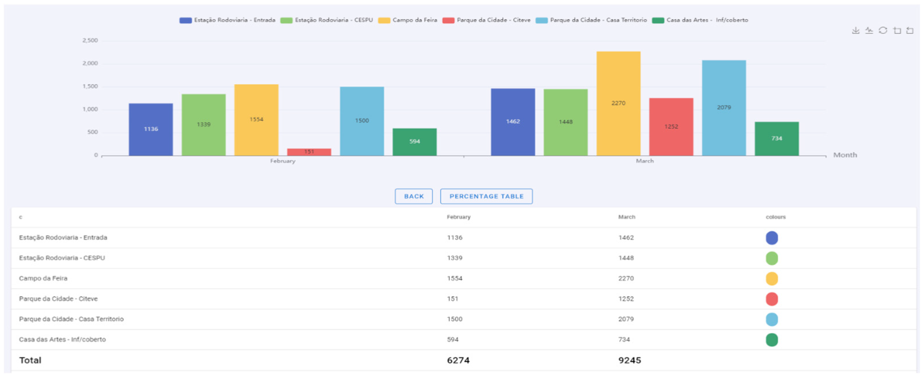
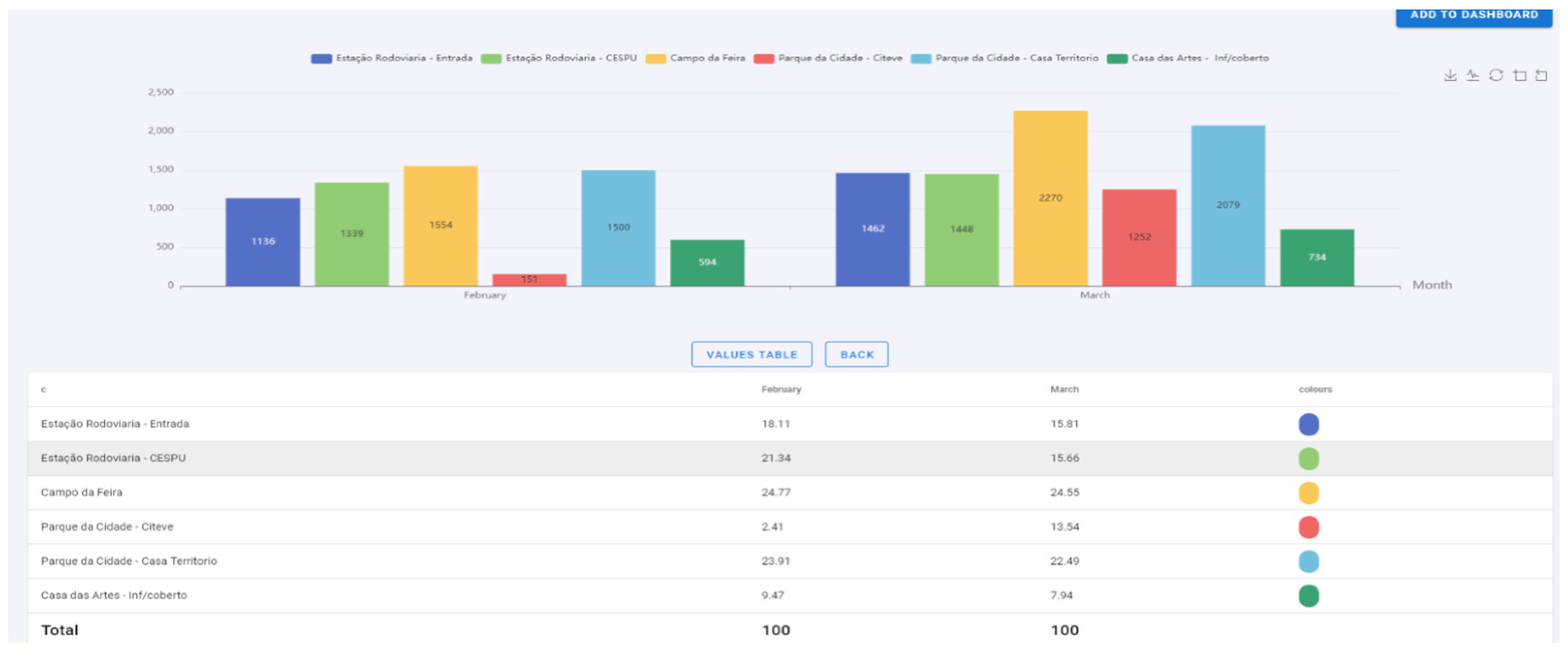
| 5 | View data in two formats (numerical and percentage) | All charts have an auxiliary table for a better reading of the data. The table can be viewed with absolute or percentage values. |
| 6 | Drill-down | The user can, except for pie charts and doughnuts, drill down by clicking on a point on the chart. This process helps the user to view the data in greater detail at various hierarchical levels. The map chart allows the drill-down process via zoom, so the more significant the zoom at a given point, the greater the detail. |
| 7 | Roll-up | The roll-up process is the opposite of the drill-down process and helps the user analyze the data more globally. |
| 8 | Save charts for decision making | All graphs created can be saved on the Dashboard page for further analysis. |
| 9 | Short and objective labels | Through the graphics created, the user can quickly understand the context of each one due to intuitive and quick-to-read captions. |
| 10 | Download charts | Possibility of downloading graphics for the user’s private use. |
Disclaimer/Publisher’s Note: The statements, opinions and data contained in all publications are solely those of the individual author(s) and contributor(s) and not of MDPI and/or the editor(s). MDPI and/or the editor(s) disclaim responsibility for any injury to people or property resulting from any ideas, methods, instructions or products referred to in the content. |
© 2023 by the authors. Licensee MDPI, Basel, Switzerland. This article is an open access article distributed under the terms and conditions of the Creative Commons Attribution (CC BY) license (https://creativecommons.org/licenses/by/4.0/).
Share and Cite
Barros, F.; Rodrigues, B.; Vieira, J.; Portela, F. Pervasive Real-Time Analytical Framework—A Case Study on Car Parking Monitoring. Information 2023, 14, 584. https://doi.org/10.3390/info14110584
Barros F, Rodrigues B, Vieira J, Portela F. Pervasive Real-Time Analytical Framework—A Case Study on Car Parking Monitoring. Information. 2023; 14(11):584. https://doi.org/10.3390/info14110584
Chicago/Turabian StyleBarros, Francisca, Beatriz Rodrigues, José Vieira, and Filipe Portela. 2023. "Pervasive Real-Time Analytical Framework—A Case Study on Car Parking Monitoring" Information 14, no. 11: 584. https://doi.org/10.3390/info14110584
APA StyleBarros, F., Rodrigues, B., Vieira, J., & Portela, F. (2023). Pervasive Real-Time Analytical Framework—A Case Study on Car Parking Monitoring. Information, 14(11), 584. https://doi.org/10.3390/info14110584