Article

UXmood—A Sentiment Analysis and Information Visualization Tool to Support the Evaluation of Usability and User Experience

by
Roberto Yuri da Silva Franco
1,*,
Rodrigo Santos do Amor Divino Lima
1,
Rafael do Monte Paixão
2,
Carlos Gustavo Resque dos Santos
1 and
Bianchi Serique Meiguins
1,*
1
Computer Science Post-Graduate Program, Federal University of Pará, Belém 66075-110, Brazil
2
Information Systems Undergraduate Program, Federal University of Pará, Belém 66075-110, Brazil
*
Authors to whom correspondence should be addressed.
Information 2019, 10(12), 366; https://doi.org/10.3390/info10120366
Submission received: 13 October 2019 / Revised: 14 November 2019 / Accepted: 15 November 2019 / Published: 25 November 2019

Abstract

:
This paper presents UXmood, a tool that provides quantitative and qualitative information to assist researchers and practitioners in the evaluation of user experience and usability. The tool uses and combines data from video, audio, interaction logs and eye trackers, presenting them in a configurable dashboard on the web. The UXmood works analogously to a media player, in which evaluators can review the entire user interaction process, fast-forwarding irrelevant sections and rewinding specific interactions to repeat them if necessary. Besides, sentiment analysis techniques are applied to video, audio and transcribed text content to obtain insights on the user experience of participants. The main motivations to develop UXmood are to support joint analysis of usability and user experience, to use sentiment analysis for supporting qualitative analysis, to synchronize different types of data in the same dashboard and to allow the analysis of user interactions from any device with a web browser. We conducted a user study to assess the data communication efficiency of the visualizations, which provided insights on how to improve the dashboard.

1. Introduction

User acceptance of certain products, services or techniques is vital for their adoption [1], and one way to understand users’ opinions is to conduct tests that measure acceptance with quantitative or qualitative metrics. Quantitative metrics include accuracy and time to perform certain tasks, and they are collected primarily through automated logs or observations. Qualitative metrics include factors such as confidence, efficiency, satisfaction and they can be collected through a variety of methods such as questionnaires, interviews, video recordings, images, body movements (e.g., eye tracking) and psycho-physiological clues [2].
Although usability is an essential concept for evaluating system adoption, an ongoing challenge for some researchers is how to gauge users’ emotional acceptance of systems and products [2]. According to Hartson and Pyla [3], the idea of studying emotional factors in product acceptance is not new (even being included in ISO 9241-11 [4]) and analysts usually measure such factors through qualitative user satisfaction questionnaires. However, a study on the outcome of these questionnaires indicates that the answers are more intellectual than emotional [2], suggesting that automatic and objective methods may collect more reliable information about the user’s feelings. One technique that stands out as a novel method for user experience evaluation is sentiment analysis [5], which associates the reactions of the user using the system with emotions or polarizations [2].
Current technologies allow UX evaluators to collect a large set of data during system tests—such as videos, audios and interaction logs—to find patterns and gain insights on user experience. Given these data, several automatic extraction methods can be used to generate data about users’ emotions [6], classifying them as anger, sadness, happiness, fear, surprise, disgust, contempt, or neutrality [7]. According to Hussain [8] this process of emotion recognition can be—(1) based on physiological factors, seeking to understand the user’s emotional involvement through a joint analysis of data from various sensors, such as Eye-Tracker, Galvanic Skin Response (GSR), or Electromyography (EMG); (2) video-based, which analyzes facial expressions and body language in live or recorded footages; and (3) audio-based, collecting and analyzing vocal parameters and spoken content through a microphone. However, the technical knowledge involved in running those algorithms and in interpreting the results can be a significant deterrent to the adoption of this technology.
Managing complex data and using machine learning algorithms can be a nontrivial task, especially for UX evaluators that do not have a computer science background. The UX specialists can easily get lost in a mountain of user data, making it difficult to extract relevant insights about the system or product under test [3,9,10]. Our point of view is that current research in computational methods, such as sentiment analysis, should be made more accessible to all practitioners and not an exclusivity of analysts with a high-level of data literacy [11]. This democratization of UX computational techniques would not only beneficial for the industry, as the generation of insights upon systems and products would be enhanced but also to research itself, as the increased adoption of such techniques could promote real-world feedback that is vital for novel contributions. In order to achieve this dissemination of computational techniques, researchers need to develop more frameworks, models, tools, and architectures that integrate them into the workflow of UX practitioners while encapsulating the computational knowledge involved.
Thus, this paper presents UXmood—an information visualization tool to assist specialists in the evaluation of user experience and usability of systems. The tool combines and synchronizes data from video, audio, text, eye tracker and interaction logs, presenting them in a configurable dashboard on the web. The UX specialist can use the UXmood from any device with a web browser to review the media footage of participants interacting with the system. The interface of the tool is a dashboard with a set of coordinated visualization techniques that allows the correlation of data from different data scenarios, such as eye-tracking fixations, sentiment analysis of video frames and mouse interaction logs. Additionally, the tool automatically applies sentiment analysis techniques for video, audio and text content to generate extra information on the quality of user experience. The way that UXmood synchronizes and presents the data not only makes the evaluation of user experience and usability more accessible—since no knowledge about sentiment analysis algorithms is needed—but also easier to grasp for UX specialists—since visualizations synthesize the gathered information in a more human-readable form.
We conducted a user study to asses the data communication efficiency of the visualizations in the dashboard in the form of an online questionnaire. The questionnaire data provided relevant insights about the dashboard that can guide a redesign to improve the tool’s overall usability.
This paper is organized as follows: Section 2 presents background information on some fundamental concepts of this research, namely usability, user experience, multimodal sentiment analysis, eye-tracking and information visualization (InfoVis) techniques; Section 3 shows related works, comparing UXmood with existing tools and methods; Section 4 describes the architecture of the tool and explains how the data is uploaded, processed and viewed through various InfoVis techniques and interactions (such as filters and on-demand details); Section 5 presents the methodology of a user study to assess the efficiency of UXmood in communicating information; Section 6 discuss the findings of the user study; and Section 7 concludes the paper by discussing the UXmood features and providing future directions of work.

2. Theoretical Foundation

This section includes some background on usability, user experience, multimodal sentiment analysis and data visualization. These concepts are essential for the full comprehension of the remainder of the paper, as each of them correlates to functionalities of UXmood.

2.1. Usability

Usability is defined in ISO 9241-110 [4], which describes the extent to which a product can be used by a specific user to achieve specific goals with effectiveness, efficiency and satisfaction. According to Sauro [12], the most common efficiency and effectiveness metrics collected in usability tests are task completion rates, errors and task execution time. Satisfaction is related to the perceived ease of use of the system and is commonly measured through questionnaires applied after the test procedures.
According to Sauro and Lewis [13], there are two main types of usability testing—(1) those that find and fix usability problems (formative tests) and (2) those that describe an application’s usability through metrics (summative tests). Summative tests usually present tasks to participants, tracking the completion time and encountered problems, to determine if the task was completed. Summative tests can be further subdivided into two types [13]—Benchmark and Comparative.
The UXmood model supports the structure of summative tests, meaning that the system expects a task-oriented evaluation data. When uploading data to UXmood (e.g., video of the user’s face during the test, audio, eye-tracking), the analyst may choose to slice the data into subsections that correspond to the tasks of the summative test. The length of the slice determines the task execution time and the analyst can also input if the tasks were successful in order to analyze completion rate and errors.

2.2. User Experience

According to ISO 9241-110 [4], user experience (UX) is defined as a person’s perceptions and responses regarding the use or anticipated use of a product, system or service [14]. User experience assessments can reveal aspects of user interaction with the product or system, such as effectiveness (if the user is able to complete the task), efficiency (the amount of effort required to complete the task) or satisfaction (the degree of happiness the user reports regarding their experience of interacting with the product or system). Additionally, UX assessments can also reveal users’ patterns, behaviors and attitudes during the interaction process [15], which is an analytical challenge since people are different and have different adaptive capacities.
To measure user experience, Alves et al. [16] suggest that the main methods used are observation, think aloud, contextual, interviews/inquiries, prototyping, task analysis, cognitive walkthrough and questionnaires. Conventional methods for collecting and subsequently assessing user opinions are post-interaction, as a retrospective verbal or written self-report questionnaires [17,18,19]. However, despite allowing useful analysis, these methods depend on the users’ interpretation and memory, as well as the accuracy and quality of the answers [5]. Open interviewing methods [20] can avoid the confusion generated by the specific questioning process and thus improve the quality of user responses but do not solve the difficulties mentioned above.
To mitigate these problems, many researchers propose the automated collection of participant test data for further analysis—such as videos, audios, and interaction logs—to find patterns that relate the interaction process to users’ satisfaction. In this context, Law et al. [2] proposed expanding the scope of user experience analysis to include, in addition to usability factors, the emotional factor to provide new metrics that may better reflect user sentiment while using the system. Despite the challenges of using this approach [9], there are already several automatic extraction methods that can be used to generate user sentiment data [6,7] using various sensors [8].
The main focus of UXmood is to present data to help analysts assess user experience through these automated methods such as sentiment analysis. However, the model also supports the analysis of traditional qualitative methods, such as observation, interviews and think-aloud, since the analyst can use as input the video and audio collected through these methods. We highlight that UXmood is more effective in analyzing data collected through during-interaction methods as opposed to post-interaction ones, as the qualitative data can be synchronized with interaction logs to enable joint, temporal analysis of usability and user experience. For instance, a UX evaluator might reason upon the tests through a replay of the user interaction and analyze the user speech in a think-aloud protocol through text visualizations in the dashboard at the same time.

2.3. Multimodal Sentiment Analysis

Sentiment analysis is an area that studies the classification of people’s sentiment through data to identify a person’s emotional state at a given time [21]. According to Mohammad and Turney [22], sentiment can be defined as an organic response of varying duration and intensity, which can be analyzed to generate results such as emotions and polarization. Ekman [7] identifies and classifies primary emotions in a discrete and octal model (happy, surprise, neutral, fear, sad, angry, disgust, and contempt). Polarization represents the degree of positivity or negativity, for example, how positive a phrase was (text), or how negative a facial expression was (video). In this case, the result is discrete and ternary (positive, negative, and neutral) [21].
There are several approaches to sentiment analysis. The first ones performed text classification through dictionaries that directly measure valence, alertness, and dominance associated with affective reaction [23]. However, the most modern sentiment analysis approaches focus on the use of automated techniques to extract subjective information [6] from data of different types, such as text, audio and video. When the approach uses more than one type of data, it is called a multimodal approach and they can infer the sentiment through a single classifier or a classifier for each data type.
When inferring sentiment from video data, the main task is the recognition of facial expressions, where classifiers try to identify pre-defined expressions [24]. In audio, the sentiment analysis of spoken statements can be done in two ways—(1) by searching for emotional cues using machine learning strategies to classify sentiments through sound properties such as pitch, volume and timbre; or (2) by analyzing the content of the speech [25], applying emotion recognition techniques on the text transcription using lexical dictionaries [26] or machine learning algorithms trained on semantic analysis and word statistics [27].
The UXmood tool applies sentiment analysis techniques and algorithms to infer emotions and polarizations from video, audio and text data automatically. The model classifies sentiments from slices of video, audio and transcribed speech, presenting them as unified by a multimodal committee of classifiers. In this way, UX analysts can see the sentiment of the user at any given moment, correlating it to the interaction at hand through logs (e.g., eye-tracking or mouse tracking) to reason upon the aspects of the product under test that trigger emotional reactions. Qualitative data is also augmented with sentiment analysis, as the text visualizations in the dashboard also show the sentiment of the user while answering questions or interviews.

2.4. Information Visualization Techniques

Information (or data) visualization is an area that seeks to create, from abstract data, an interactive visual scenario that helps the data analyst to understand the data and its relationships, facilitating search, exploration, analysis and communication tasks such as pattern discovery, outliers, trends and comparison.
According to Shneiderman [28], an InfoVis tool should provide the user with, at least—data overview, filter, zoom, details on-demand, action history and extraction of a subset of the data. One of these data visualization tools is the dashboard. According to Few [29], the dashboard is a panel of visualizations of the most critical data needed to achieve one or more objectives, usually organized on a single screen and which can be analyzed quickly without many interactions or configurations.
The UXmood tool presents a dashboard of coordinated visualizations to depict information about usability and user experience. Filters and selections are shared across the dashboard and all visualizations show the sentiment of the user through a categorical color scale, enabling a correlation of data from multiple views. The position of the visualizations can be configured, even allowing analysis on multiple screens.

3. Related Works

A literature review was performed to identify the state-of-the-art of works that correlate the themes of user experience (UX) evaluation, UX based on multimodal sentiment analysis, information visualization techniques, and UX using sensors (eye tracker, mouse tracker). For this, searches were carried out in the Google Scholar and in the main repositories of scientific articles—Science Direct, IEEExplore and ACM Digital Library, covering the period from 2009 to 2019. We filtered the results based on their accordance with the research theme. For example, articles that dealt only with usability evaluation, physical product evaluation, three-dimensional environments or sentiment analysis applied to areas such as marketing or advertising, were disregarded. The focus was on finding papers that included sentiment analysis and visualizations applied to UX research and practice. Surveys were not included in this review and only the 25 most similar articles regarding methods or tools were chosen, based on title reading, abstract and introduction.
The papers were organized and reviewed according to six groups—Quantitative Data, Qualitative Data, Sentiment Analysis, Evaluation type, Visualization Technique and Others (Table 1). This classification assists in the discovery of patterns and gaps in the literature, as well as comparing the characteristics of UXmood with the selected works.
Among the analyzed works, only a few [8,30,31] use multimodal sentiment analysis techniques to evaluate user experience or usability. The more common type of classification is textual, whether in audio transcription or product reviews on the Internet [1,8,30,31,32,33,34]. References [8,30,31,33,35] record the user’s face for use in sentiment analysis algorithms based on facial expressions. User speech capture is present in six works [8,30,31,32,33,36] but only four works [8,30,31,36] use audio features to perform sentiment analysis.
References [1,8,30,35,36,37,38,39,40] present some data visualization techniques to represent the results, with the most common being wordcloud, heatmap, and histogram. Only two studies [8,36] use sensors, such as eye trackers, to identify the area that the user is observing. Almost half of the studies [1,2,8,32,33,41,42,43,44,45,46] use some form of questionnaire to obtain qualitative information about user experience or usability. The vast majority of studies perform in loco evaluation, with the specialist observing the test in the same location as the participant, except for References [8,30,36], where the specialist remotely observe user interaction.
Of all the studies, the most similar in functionality are References [8] and [30]. However, Reference [30] describes a method for product reviews, and UXmood is a tool for reviewing user tasks. Reference [8] makes use of other sensors such as BCI and electrocardiogram and presents a sentiment analysis based on all data in a multimodal manner. However, the dashboard of their work is simple, using only a few, unconnected visualizations to present user data, and lacking a fine-grained control of the temporal aspect of the test. In comparison, UXmood not only features a variety of new visualizations but also adds a media player metaphor to control the review of the user interaction process.
Table 1 presents the related works and categorizes them by quantitative data, qualitative data, sentiment analysis, type of evaluation, visualization techniques and others. From the table, it is evident that few studies use multimodal sentiment analysis techniques combined with visualization techniques to perform a qualitative assessment of the user experience.
The score column summarizes the number of features present in the tools and methods, using a linear color mapping to help the comparison of scores across different works. The column shows that the majority of studies maintain a narrow focus on specific methods while letting many open gaps, as can be seen by the amount of yellow-coded scores. The score also positions UXmood in the literature, showing how it gathers more functionalities than similar studies.
Thus, the UXmood tool brings a set of four algorithms for sentiment analysis—considering the video, audio, text and multimodal data types—to classify data into emotions or polarizations, suggesting a qualitative evaluation of the user experience through a dashboard composed of six visualization techniques. UXmood supports interaction logs such as eye and mouse trackers, combining the sentiment analysis with those logs in a dashboard of connected visualizations. The tool also combines the quantitative data on time efficiency and accuracy with the sentiment data so that the evaluators can have a better perception of how participants performed the tasks. UXmood makes it possible to interact with data through filters, and to play, pause, fast forward and rewind videos, thus allowing analysts to better understand the user experience in all steps during the interaction process.

4. UXmood

This section introduces the major features associated with the UXmood tool, such as architecture, input and output data, modules, and functionalities. The tool aims to present the participants’ interactions and the associated sentiments, as well as quantitative data such as time and correctness, in performing tasks so that a specialist can evaluate the user experience process. Figure 1 shows an overview of the tool.
Figure 1 presents the UXmood main interface, consisting of project management menus (A), an interaction area that allows experts to reproduce user interactions (B), legends to present the visual coding of data in the visualizations (C), and a visualization area that presents the user interactions, the sentiments associated with them, and quantitative data about that interaction (D). The tool is configurable in the choice of dashboard visualizations, and it is even possible to select a set of visualizations to be arranged on other monitors (Figure 2). The tool is free to use, and is available at the research group’s website (http://labvis.ufpa.br/uxmood/).
The following sections present the main features and functionalities of UXmood in more detail.

4.1. Architecture

This section covers the architecture of the proposed tool and Figure 3 shows its structure and modules. The architecture of the tool subdivides into eight main modules, each of them explained below.
User interface—It is the main interface of the tool, presented in Figure 1. The system sends all user configurations and interactions to the Communication Manager module.
Communication Manager—This module is responsible for receiving all processing requests from both the UI and the other modules. After identifying the request type, the module forwards it to be processed by the responsible module in the application.
Input Data Manager—This module is responsible for accessing and retrieving the audio, video, and interaction logs required for analysis, returning data from a particular user or task. Then, the module forwards this data to the Data Processing Manager, Sentiment Analysis Manager and Data Visualization Manager modules.
Data Processing Manager—This module is responsible for: transcribing audios for later analysis by the Sentiment Analysis Manager module, synchronizing media for dashboard presentation, calculating eye-tracking metrics (e.g., fixations and saccades) and any other processing that transforms or create data.
Sentiment Analysis Manager—This module is responsible for recognizing user sentiment through a multimodal classification of audio, video, and transcribed speech data, classifying their emotion or polarization, and passing this information to the Data Visualization Manager module.
Data Visualization Manager—This module is responsible for presenting the processed data through specific visualization techniques—such as word cloud, heatmap and scatterplots—as well as providing coordinated filter and selection interactions that are applied across all visualizations.
Configuration Manager—This module is responsible for managing the overall parameters of the tool, defining which views are visible on the dashboard, the visual coding of the views, the analyzed sentiment (emotions or polarization), the size of frame jumps video for sentiment analysis, and the minimum threshold time to consider an eye-tracking fixation.
Project Manager—This module is responsible for creating the entire logical structure of user tests, organizing it into projects; each project has the specifications of the tasks that compose it and a list of the users who performed the tasks, along with all the interaction data associated with them.

4.2. Technologies

UXmood builds upon several technologies, including those that perform multimodal sentiment analysis. The sentiment analysis subdivides into four steps—video, audio, transcribed speech and multimodal—that differ in the type of data it uses and, consequently, in the appropriate technique to classify it.
In the video analysis, the data type is a video of the user’s face, from which three (non-sequential) frames per second are extracted for classification by a convolutional neural network described in the work of Arriaga et al. [17]. In the audio analysis, the data type is a record of the user speech during interactions, which is pre-processed to cut silence intervals and then forwarded to an emotion recognition algorithm, such as the one described in the work of Giannakopoulos et al. [51]. In the text analysis, the tool automatically transcripts the speech from the audio analysis, directing the text excerpts to a textual sentiment analysis algorithm, such as that in the work of Jain et al. [52]. Any classifier can be used in UXmood, and those that are implemented in the tool are further described in Section 4.3.4. Finally, in the unified analysis, UXmood aggregates the results of the previous classifiers through a weighted average to perform a multimodal classification, drawing on the weights proposed by the psychologist Mehrabian [53].
Other auxiliary technologies are also present in the tool, such as the D3js visualization kernel [54], which assists in the development of visualizations for the web, and the Django framework [55], which facilitates the construction of interactive web applications. Additionally, the FFMPEG [56] and Pyaudio [57] tools assist in the manipulation and editing of video and audio files, respectively, to synchronize the various files submitted to the tool and to perform pre-processing operations such as silence removal.

4.3. Functionalities

This section introduces the key features of UXmood, including the organization of the data into projects, filters and details on-demand, the visualization dashboard and the sentiment analysis techniques.

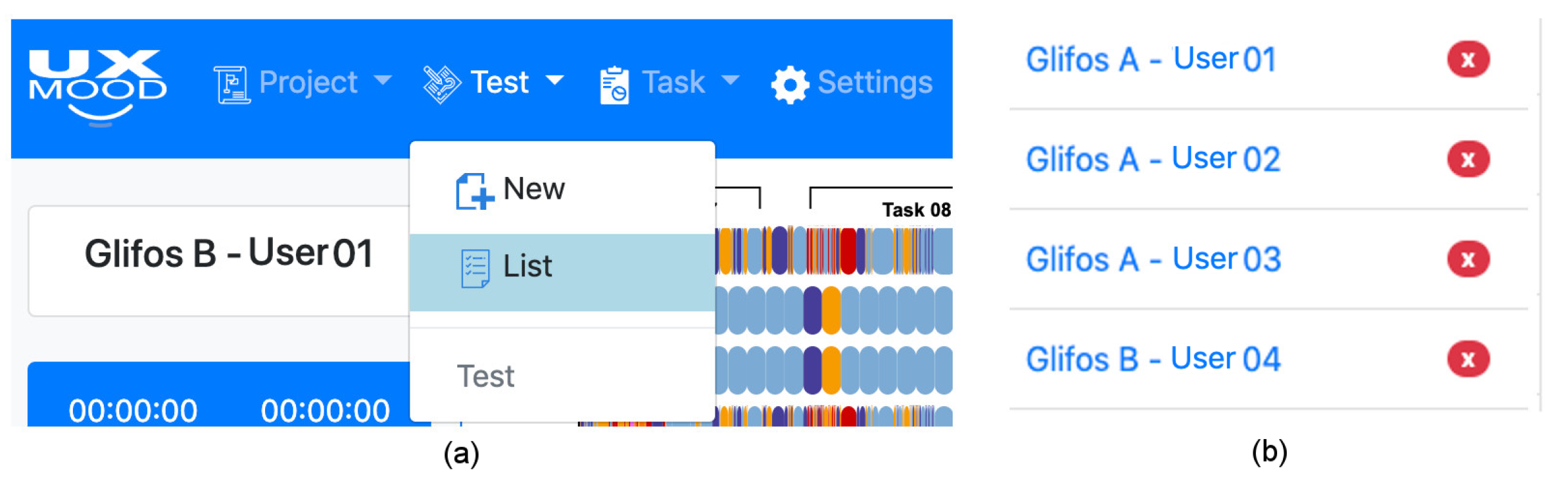
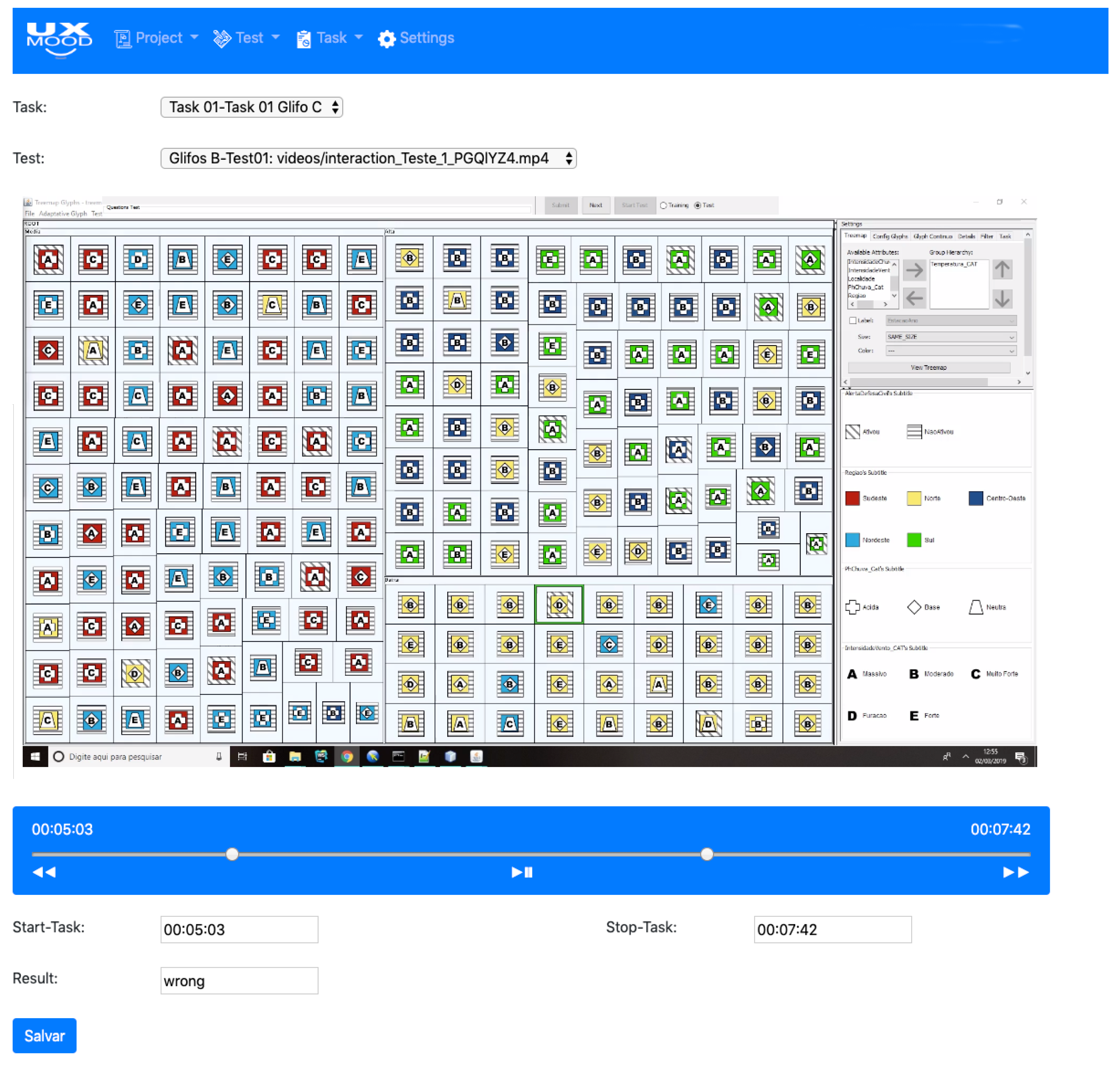
4.3.1. Projects, Test, and Task Organization

The tool organizes all the data involved in a hierarchy of projects, tests and tasks. Each project may contain multiple test sets, which in turn may contain a set of tasks that belongs to a participant. This organization makes it possible to perform visual analysis per participant, consider all or a partial number of tasks and perform a comparative analysis by task type or group of participants. Figure 4 displays the project, test and task menus, and a list of registered tests.
To register a new test to the tool, the specialist must fill in the form shown in Figure 5, providing the project that the test belongs to, the name of the test (usually an identifier of the participant that tested the application), the start and end time of the test, the media files of the user interaction during the test and the respective relative start and end times of the test to synchronize the files.
To register the tasks related to a test, the specialist must fill the form shown in Figure 6, providing the task name, start and end time and task result (e.g., success, incorrect, timeout). The test video is available in this step to assist the specialist in setting the start and end time of the task.
Emotion, polarization and quantitative filters are present in the tool so that the analyst can decrease or increase the complexity of the dashboard visualizations (Section 4.3.2). If only some emotions or polarizations are relevant to the context of the test, the specialist can reduce the types of emotions or polarizations to narrow the focus on the relevant ones (e.g., filtering out neutral polarization). The filters also act as a legend to the color and icons that are used in the visualization. Figure 7 shows the sets of filters available—emotions, polarity, and quantitative.
Since the tool presents videos and animations, the interface also contains a control that follows a media player metaphor (Figure 8) through which the specialist can pause, resume, fast-forward and rewind the footage. This control enables the synchronized control of the presented media, including interaction logs, audio and videos of the test.
Another type of interaction is details on-demand, which presents information that is not visually available in the dashboard or amplifies the displayed information with another level of detail (Section 4.3.2). The details on-demand appears as a tooltip when hovering over a visual element, which also triggers a highlight on the same element in the other visualizations as a brushing interaction. For example, Figure 9 shows the detail when hovering over a sentiment representation, providing details of the task that was being performed (Figure 9a), the video frame of that moment (Figure 9b) or the transcribed speech of the user (Figure 9c), so the specialist can better understand what caused the sentiment.

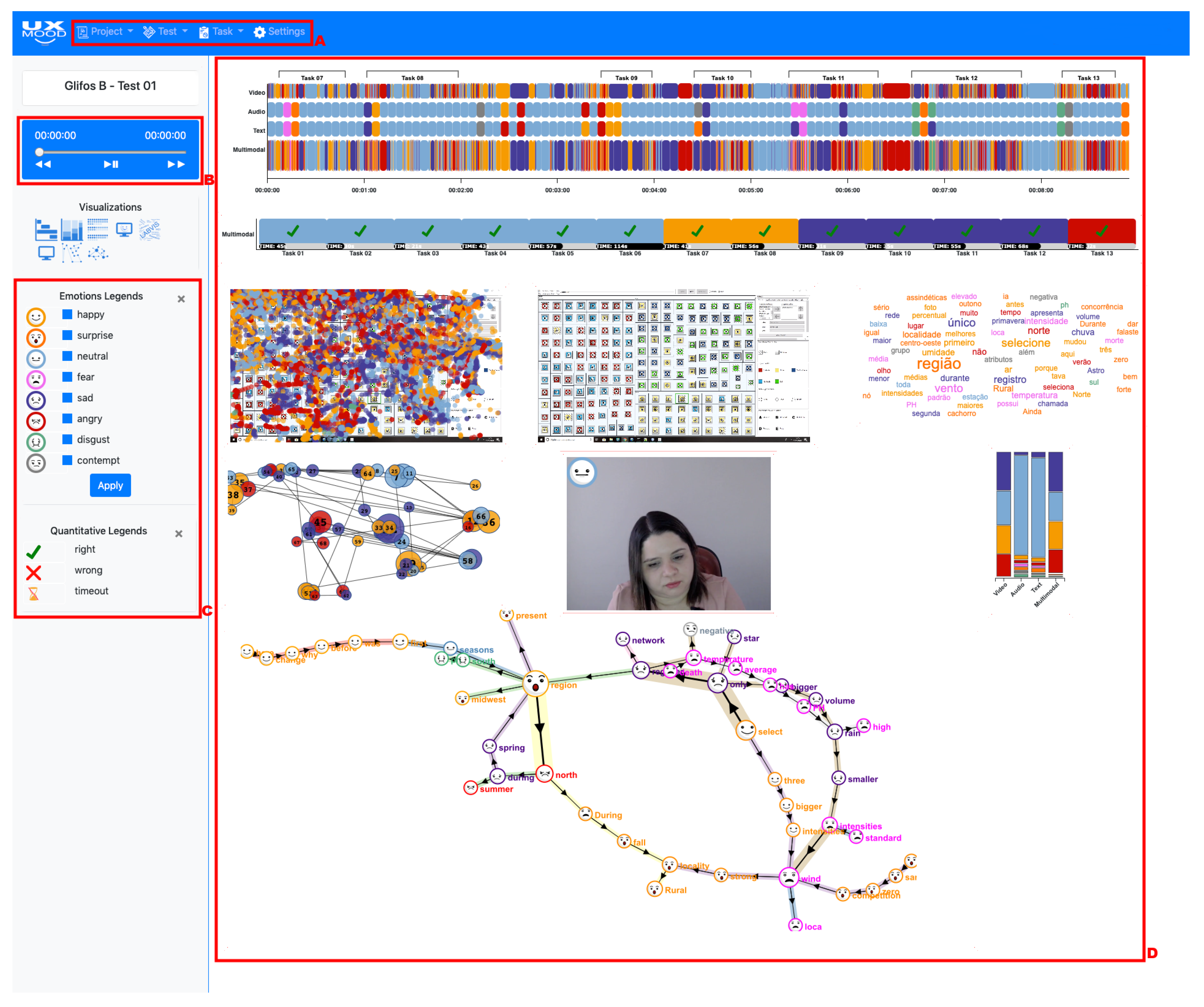
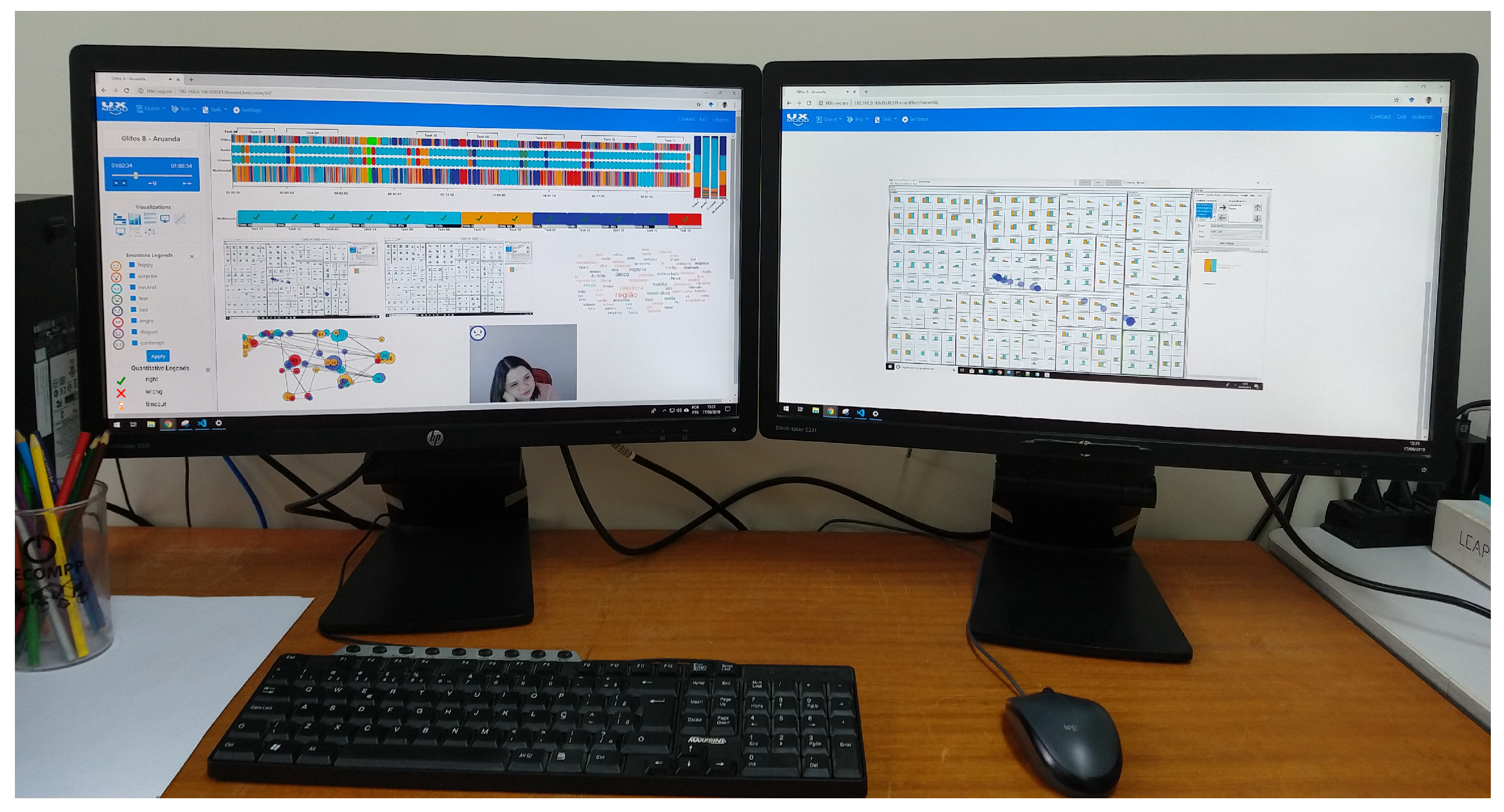
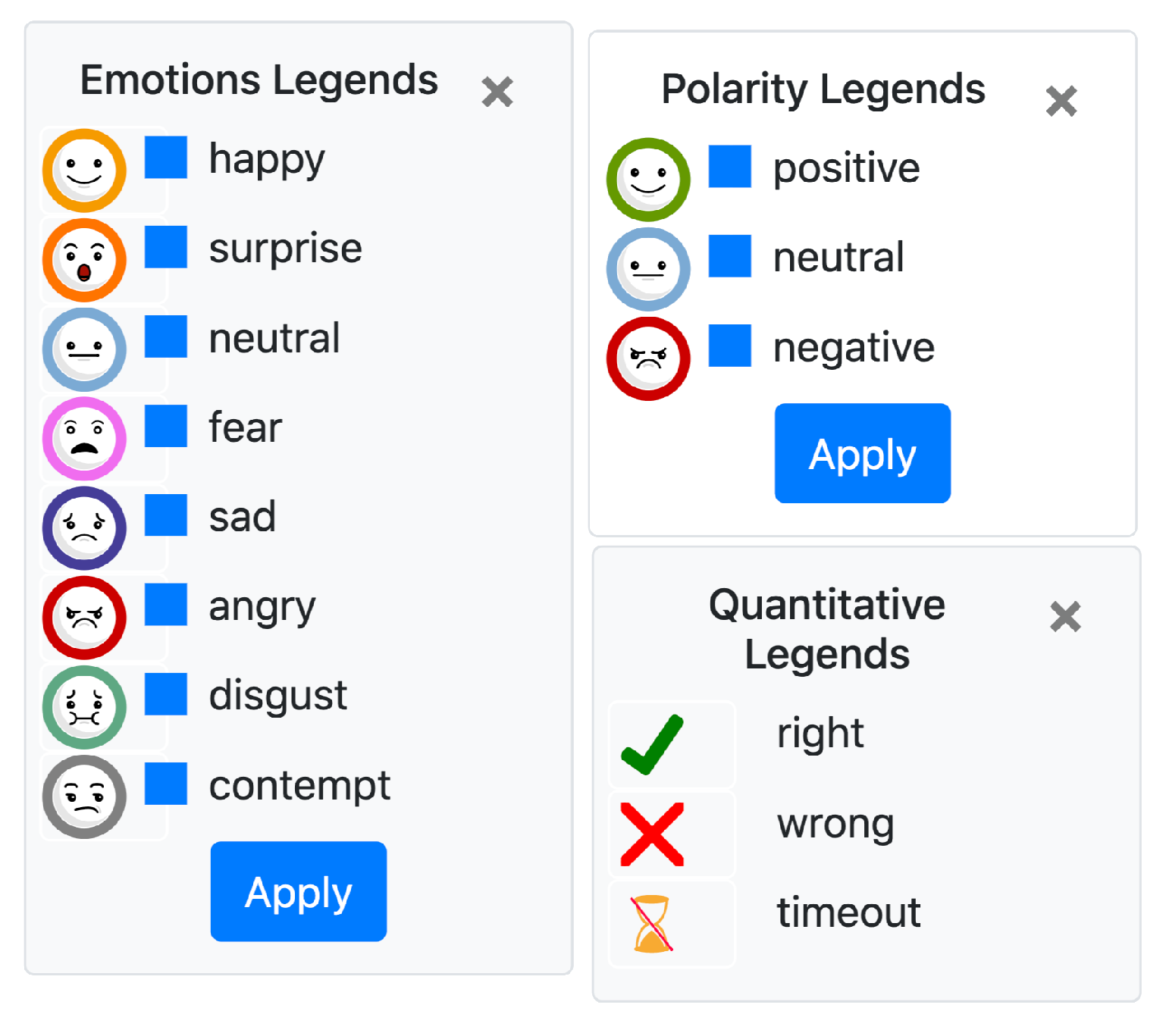
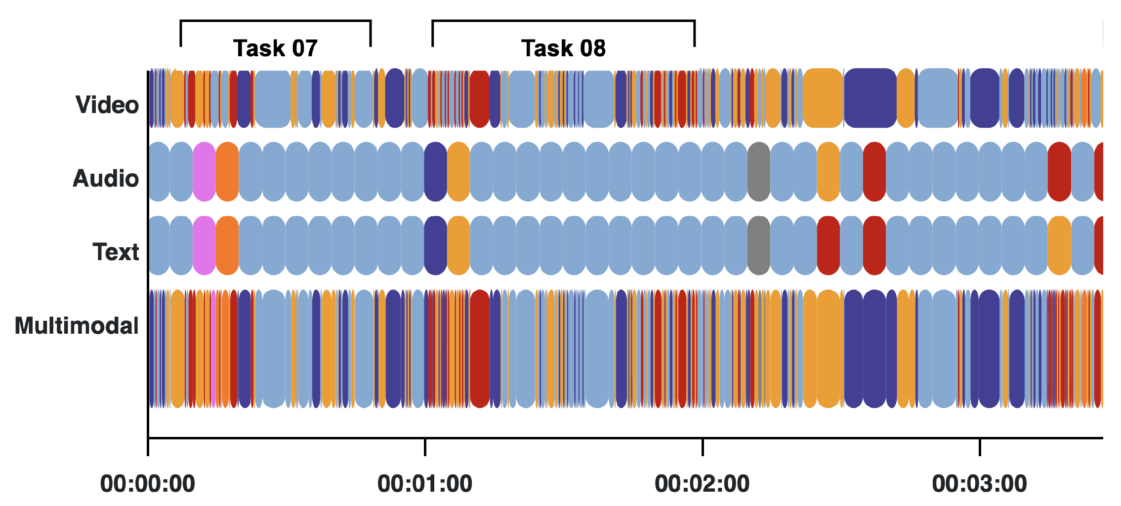
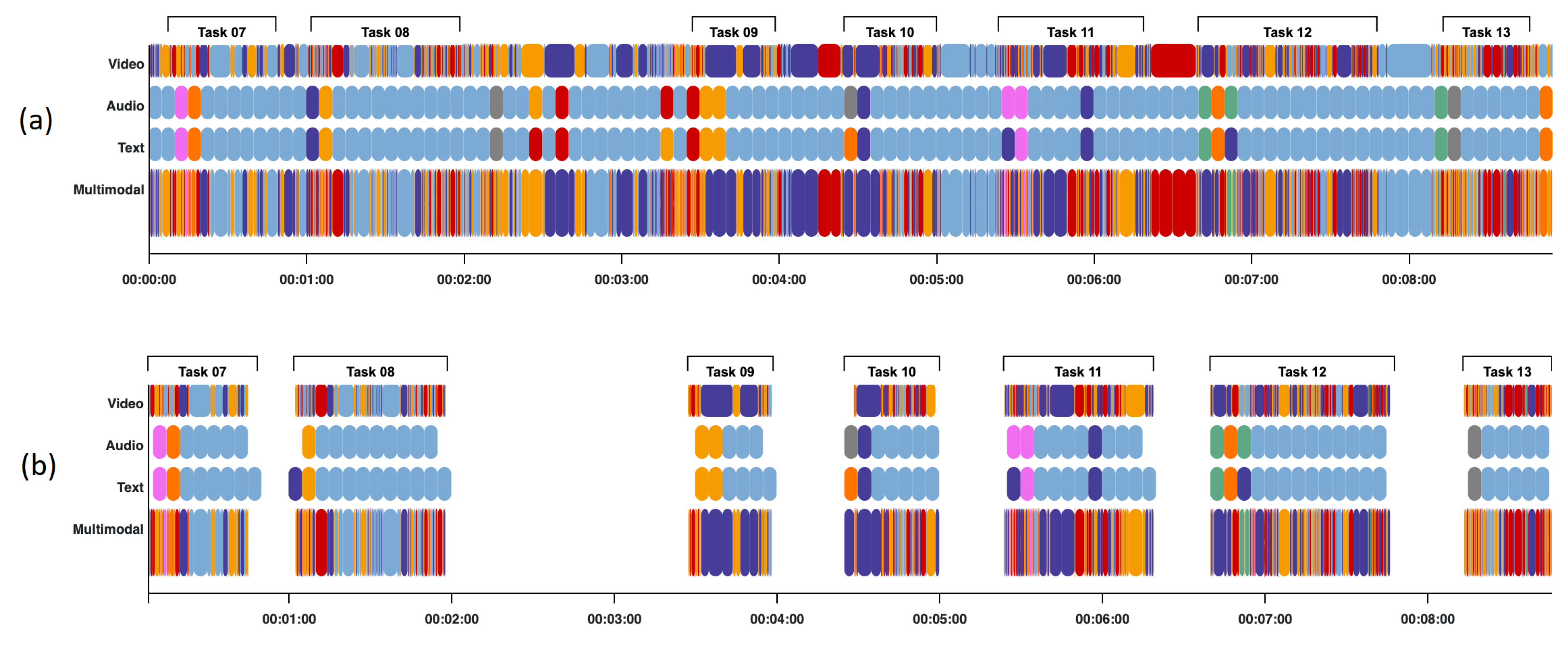
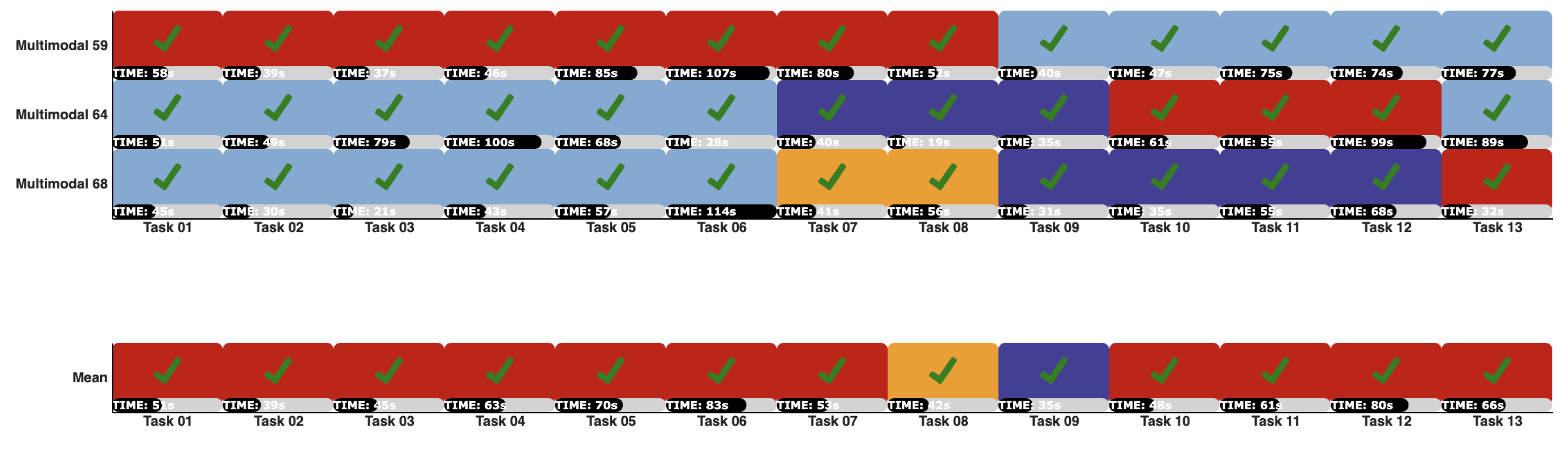
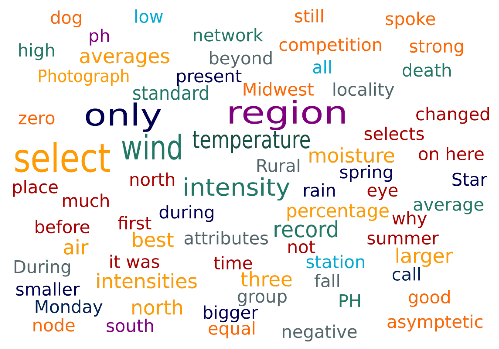
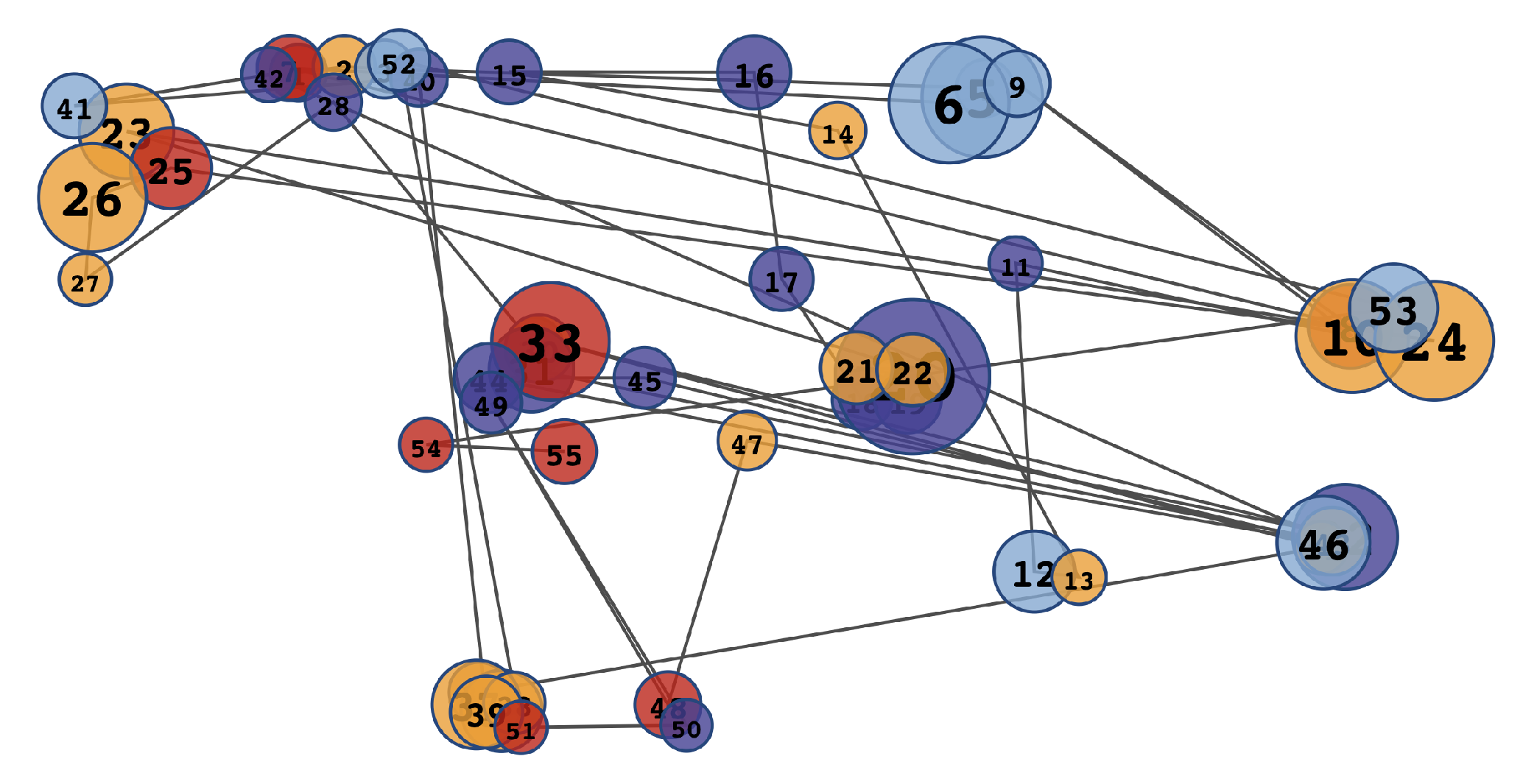
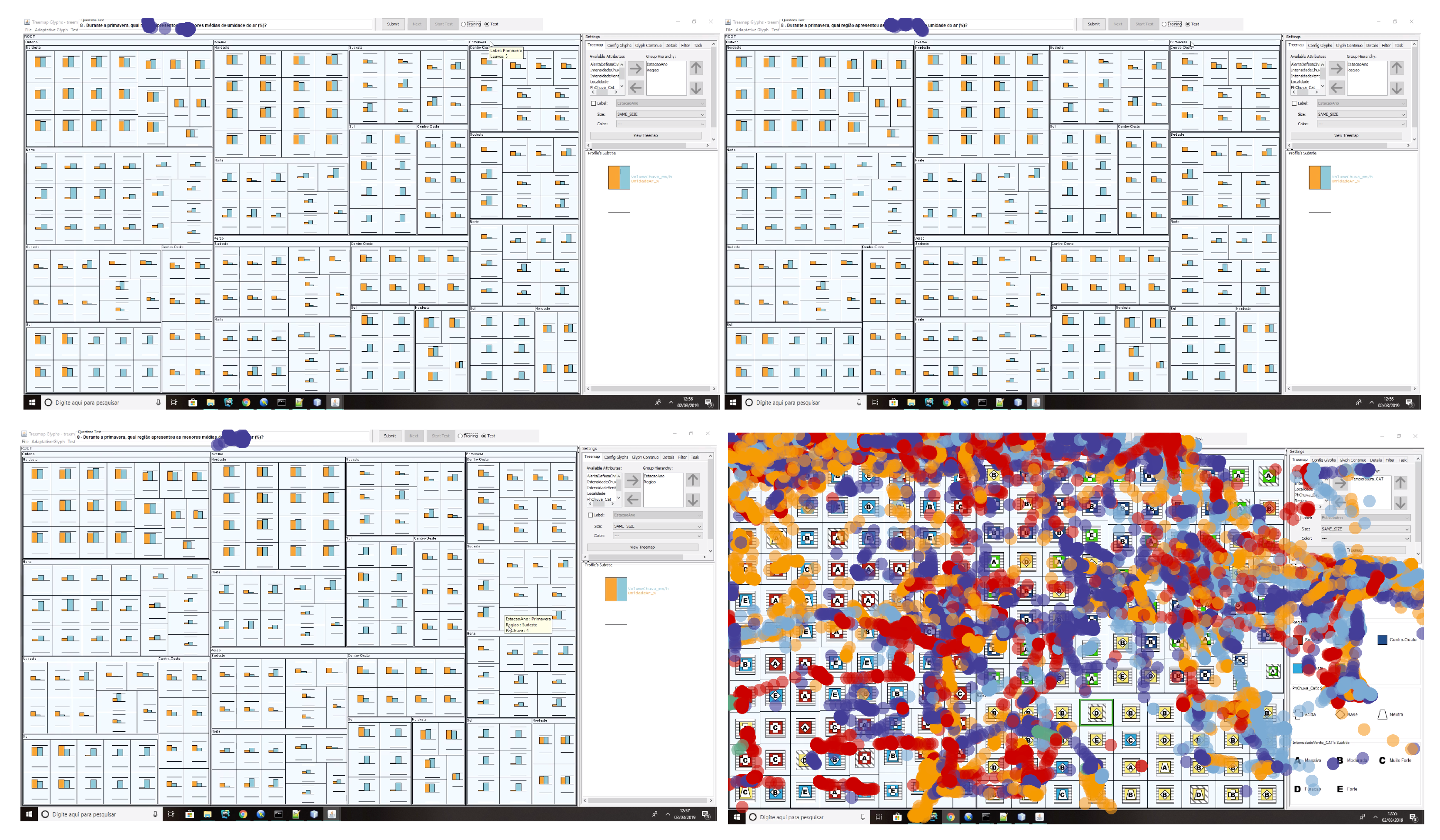
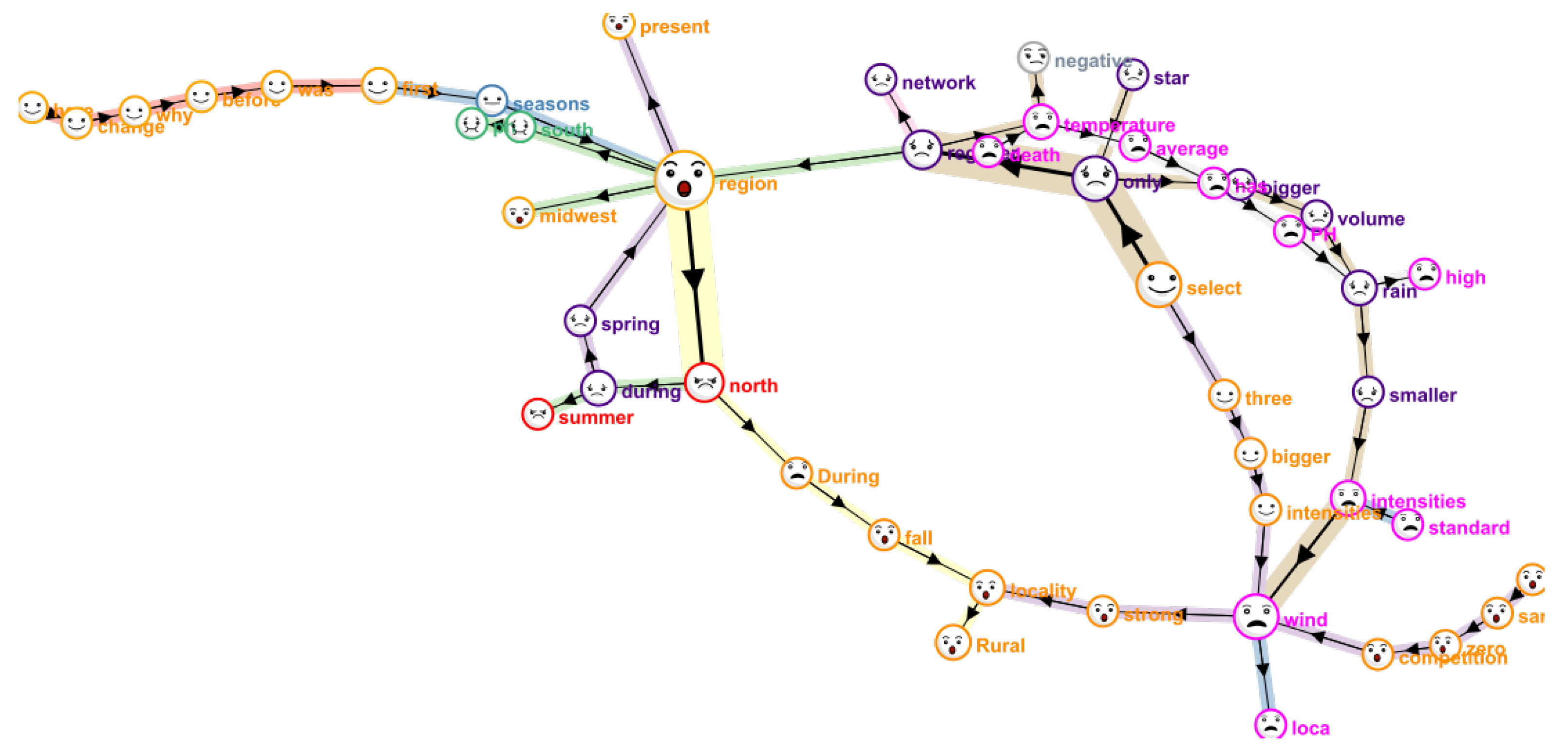
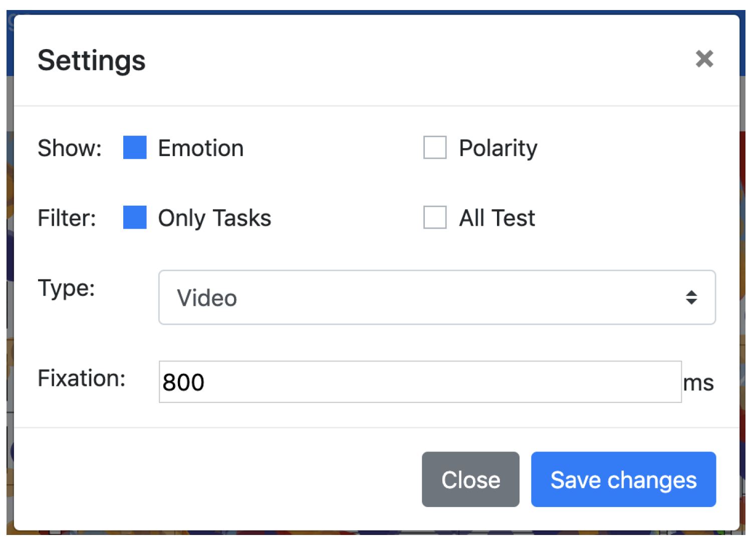
4.3.2. Visualization Dashboard

Figure 1 shows the main interface of UXmood, including its visualization dashboard (Figure 1A). This set of visualizations allows the specialist to see specific moments of a test through different views, each focusing on a different data aspect. The visualizations that compose the dashboard are Gantt chart, stacked bar chart, worldcloud, graph chart, scatterplot, emojis and icons.
The Gantt Chart acts as a sentiment timeline, presenting the time and sentiment of each input type (video, audio and transcribed speech) and a combined analysis (multimodal). Figure 10 presents the sentiments classified into emotions (represented by the color of the segments). The time and duration of each task are also shown at the top of the segments.
The visualization has the option to present the data of the whole test (Figure 11a) or only the parts that correspond to tasks (Figure 11b).
The Gantt Chart can also be configured to group the segments by task and show only the predominant sentiment, as shown in Figure 12. In this configuration, the segments of the Gantt chart are the tasks, with the resolution time and results (correct, incorrect, timeout) of each one also presented through a progress bar and icon, respectively.
Another configuration to the Gantt Chart is the joint analysis of participants between different tests. This configuration allows a direct comparison of tests in terms of duration, result and predominant sentiment. Figure 13 illustrates this configuration; the specialist configured the Gantt chart to compare the predominant sentiment across the multimodal classification of several participants. This configuration also presents a mean chart that represents the average sentiment of the participants in each task.
The stacked bar chart presents the total proportion of each classified sentiment (in emotions or polarization), as shown in Figure 14. This visualization shows an overview of how the participant felt throughout the entire test.
The wordcloud presents the main words spoken by the participant while performing the tasks, as shown in Figure 15. The size of the word represents its frequency and the color takes into account the participant sentiment during the context in which it was cited, which is determined by the text classifier. For example, in Figure 15, the participant cited the word “region” in eight sentences, most of them classified as disgust, so this word is associated with this emotion.
Graphs and scatterplots are used to present participants’ data of interaction logs, such as mouse tracking or eye-tracking. The graph view is a scanpath (Figure 16) and it is well suited for eye-tracking to show the fixations and saccades of the participant during the tests. The scatterplot (Figure 17) shows the points recorded in the log and can be used in both eye or mouse tracking. The scatterplot is drawn in a layer above the screen video with the participant interactions, allowing direct and synchronized correlation of the log coordinates and content on screen. In both visualizations, the colors represent the associated sentiment during that moment, which is determined by the video classifier, so the specialist knows where the participant was interacting and the sentiment associated with the interaction.
Icons. One of the visualizations in the UXmood dashboard is a synchronized user-face video recording during the interaction. In addition to this recording, a sentiment icon is displayed at the upper left corner to indicate the sentiment that the video classifier inferred at that moment, as shown in Figure 18.
EmojiText is a new information visualization technique developed especially for UXmood and it is designed to represent transcribed speech and sentiment analysis data. This visualization (Figure 19) shows the main words of a sentence—that is, only the nouns, pronouns, verbs, and adjectives—representing the emotion or polarization associated with each word while preserving its meaning and context.
EmojiText presents the words in a directional graph that indicates the sequence in which they were spoken. Each node represents a word and the emoji in the center of the node represents the predominant sentiment of all the phrases that the word appeared. This way, if a word appears in more than one sentence, the associated sentiment is the average sentiment across the different contexts.
The size of the nodes and edges represents the frequency that the sequence of words appeared in the text, thus bigger nodes represent repeated words and, consequently, have more phrases connected to it. The color of the edges represent complete phrases, so a change in edge color indicates the end of a phrase and the start of another one.
Dashboard Configuration. A configuration menu (Figure 20) enables the specialist to alter some settings that affect how the tool presents the data and which visualizations are used. These settings are:
  • Choose to output the sentiment analysis by emotion (angry, fear, happy, sad, surprise, disgust, contempt and neutral) or polarization (positive, negative, and neutral).
  • Choose to display only the intervals that are related to tasks, disregarding the interval between them if wanted.
  • Define which types of sentiment analysis to display, choosing between audio, video, text and multimodal.
  • Define the duration of time that characterizes a fixation in eye-tracking.

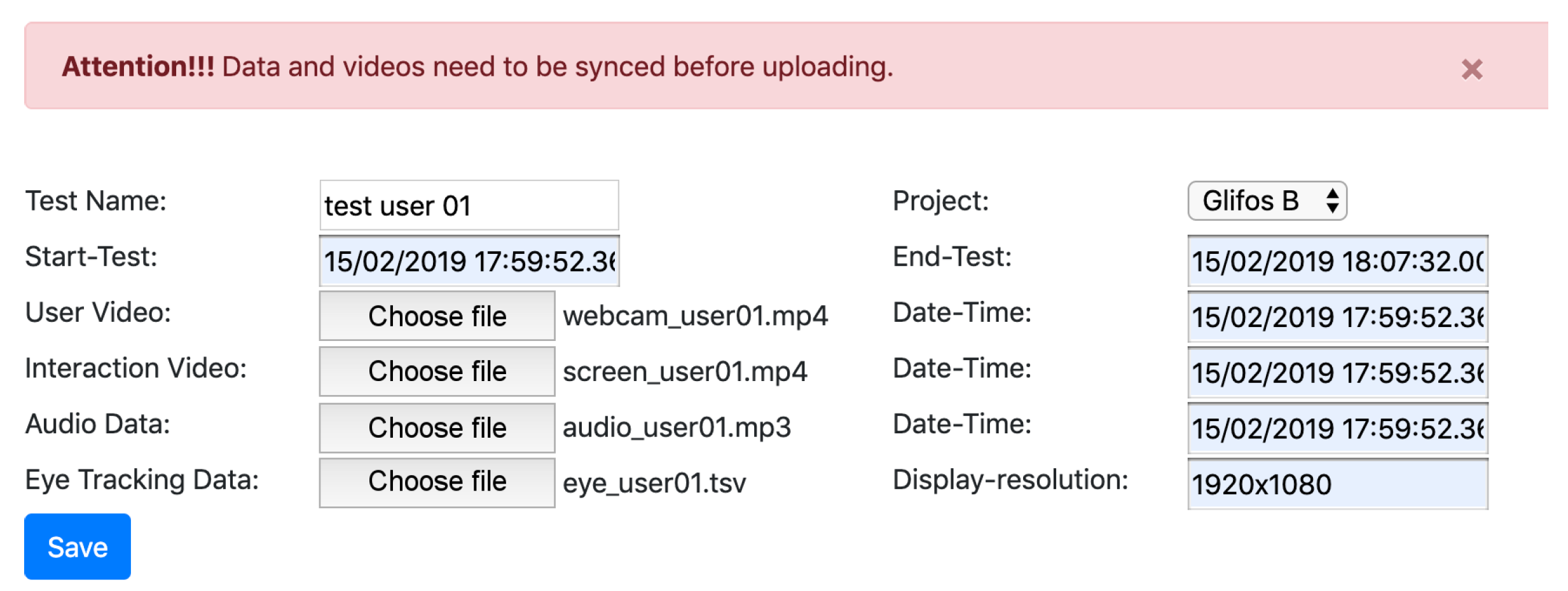
4.3.3. Media and Log Synchronization

During the collection of videos, audios, and logs, they must start recording before the test and end after the test, which ensures that files can be synchronized or, if necessary, edited to be synchronized. The process of validating and synchronizing files is performed immediately after the upload of the files. First, the media files are aligned accordingly to the specified start and end time and then the parts that are not present in all files are cut. The final result is that all files have the same time length, and they start and end at the same time, thus being effectively synchronized.
The interaction logs captured by the mouse or eye trackers are loaded into the tool through a csv file containing the x and y tracked position and timestamp. When loading this data into the tool, two filters are made to ensure its quality—one to filter out points that are outside the visible range of the monitor (to remove errors) and another to know if the captured timestamp is within the test application timestamp in order to maintain synchronization accuracy and integrity.

4.3.4. Sentiment Classification
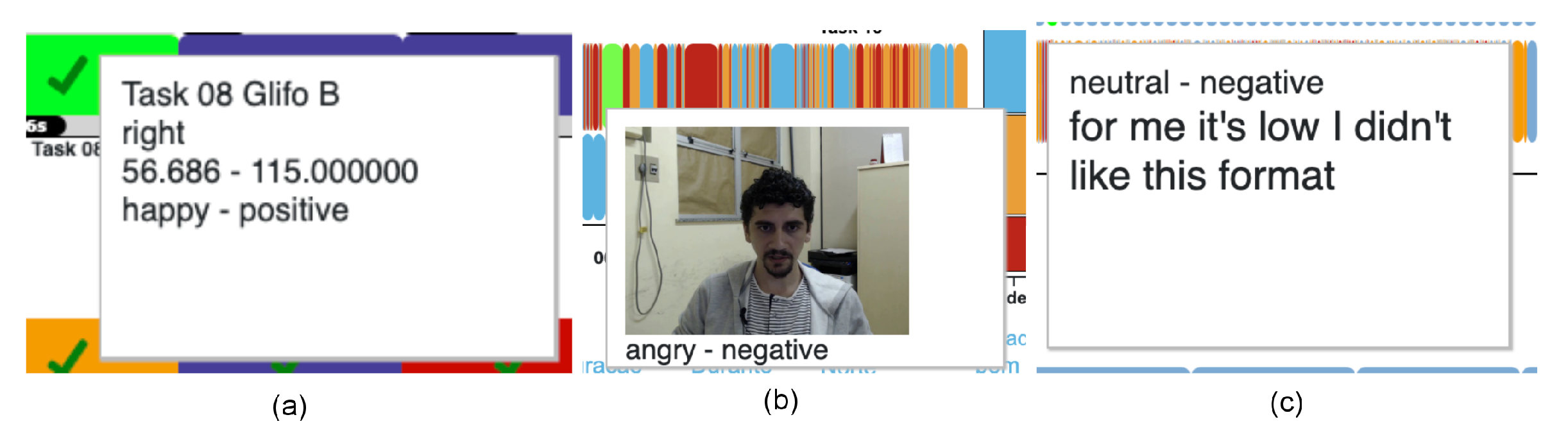
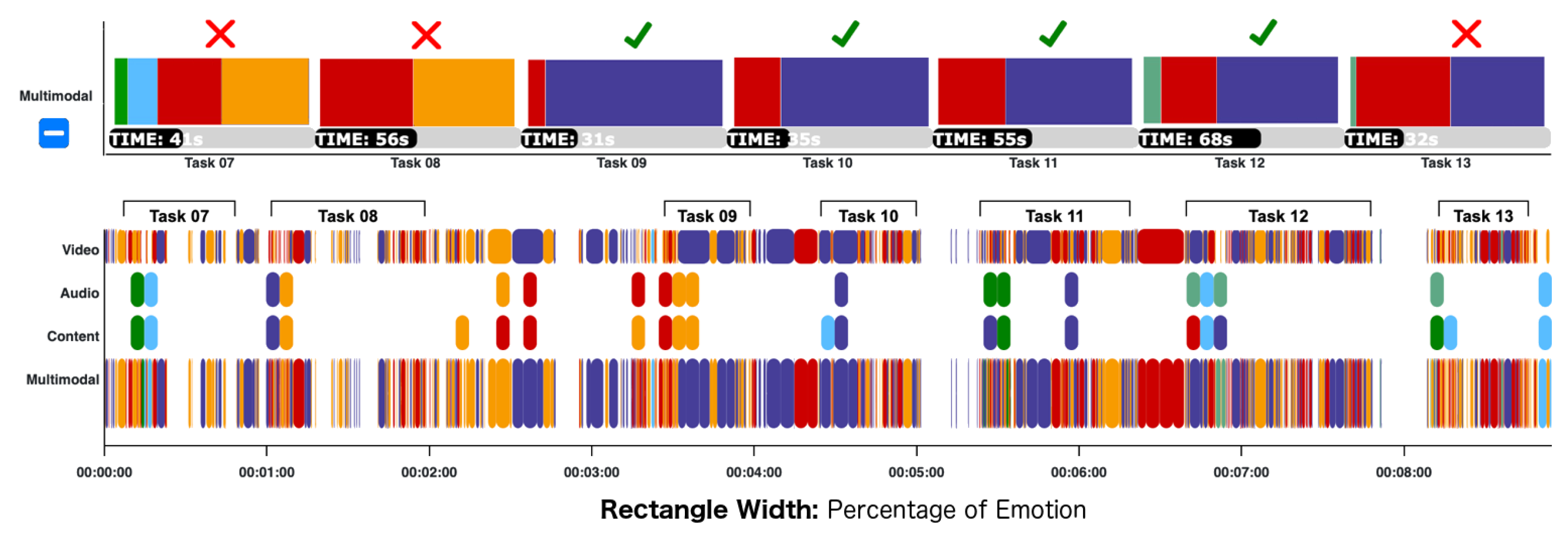
The scale of emotions used in this paper was the set of primary emotions presented by Paul Ekman [7], which is composed of seven basic emotions, namely anger, fear, sadness, happiness, surprise, disgust, contempt. This work also included a neutral emotion for when the classifier cannot identify one of the primary emotions in the user expressions, such as when lightning conditions or obstructions impair capture.
In order for UXmood to infer the participant’s emotional state during the test at any given time or task, sentiment analysis classifiers are used for video, audio, text, or a combination of them (multimodal). The following is a summary of the classifiers in each category.
For the classification of sentiments for the participant’s face video, three frames per second are extracted non-sequentially since Yan et al. [20] states that rapid facial microexpressions lasts from 260 ms to 500 ms. These frames are classified by a convolutional neural network, presented in the article of Arriaga et al. [17], which has a trained implementation with configured parameters available in an online repository (https://github.com/oarriaga/face_classification). The emotions this classifier is capable of classifying are angry, disgust, fear, happy, sad, surprise, contempt and neutral. To evaluate this classifier, we tested its accuracy using the RAVDESS base [58], which is a video base with audios with the seven emotions plus the neutral, and it obtained an accuracy of 63.64%. As more robust classifiers are developed, this choice can be reviewed and updated in later versions of UXmood.
After the emotions of the video frames are classified, the UXmood performs a linear grouping of emotions to identify possibly misclassified sentiments. If two single classifications of a sentiment are surrounded by two or more consecutive classifications of another sentiment, then the sentiment of the single classification is overridden by the other ones. For instance, if a two-second interval initially has a second of emotion A, followed by 330 ms of emotion B, and the rest being emotion A, it is reasonable to assume that every interval should be considered as emotion A, because the emotion B was classified in a much smaller interval in the middle of intervals of emotion A.
To perform the audio analysis, the audio can be uploaded in a separate file, or extracted automatically from the user face video if no audio file is provided. The UXmood divides this audio into five-second chunks and sends them to a sentiment analysis audio classifier. Initially, the audio classifier was an SVM (support vector machine) developed by Giannakopoulos et al. [51], which has an accuracy of 66.34%. However, it was later replaced by another audio classifier, which is a CNN (convolutional neural network) that, although it is not yet published, has the code available in an online repository (https://github.com/MITESHPUTHRANNEU/Speech-Emotion-Analyzer). The classifier underwent an accuracy test by the RAVDESS base [58] and obtained an accuracy of 88.64%.
Audio chunks are also used in a speech recognition algorithm to be transcribed. We used the Google API [59] to transcribe 5-seconds audio segments each into text. The text segments are classified by a neural network proposed by Tripathi and Beigi [60], which has a trained implementation ready to use available in an online repository (https://github.com/Samarth-Tripathi/IEMOCAP-Emotion-Detection). In addition to the classifier, the SentiwordNet lexicon dictionary [61] is used to identify polarization.
The multimodal sentiment analysis combines the results of the previous classifiers using the 7-38-55 rule described by Mehrabian [53], which suggests that only 7% of communication happens on spoken words (speech content), 38% is in how words are spoken (audio features such as pitch and volume) and 55% is in the attitudes and facial expressions. UXmood uses these percentages as weights to compose the text, audio and video classifications into a new, multimodal classification.
The computer used to test the algorithms was a laptop with an Intel i7 7th generation processor, 16 GB of RAM and 1.5 GB of dedicated video memory. The processing time was approximately two times the duration of the test. Thus, if the input data is a 3-min video (with a corresponding 3-min audio), the data would be completely available for analysis after 6 min.

4.4. Usage Example

The figures in this paper show UXmood in action analyzing a user test dataset. The dataset contains video of the user, video of the screen, audio, eye-tracker data and mouse-tracker data, and belongs to a user test performed by Soares et al. [62]. The paper is an information visualization study whose test objective was to assess the efficiency and ease of use of adaptive glyphs in treemaps. They conducted a user test to measure how the proposed technique affects the understanding of the visualization. This section will explain how the UXmood can be used to analyze this data and the insights that it can generate to assist in the evaluation of both user experience and usability.
The video of the user’s face was captured in a 1280 × 720 resolution. The audio was captured in a lapel microphone with sensitivity—−35 ± 2 dB and frequency range: 50–16,000 Hz, and the tests were conducted in a quiet room, so the words in the audio are distinguishable enough for transcription and classification. The eye-tracker used in this test was the Tobii 4c tracker.
Since the language spoken by participants of this test was Portuguese, we retrained the audio and text classifiers before the data processing. For the audio classifier, we used the VERBO dataset [63] and obtained an accuracy of 78.64%. We used the LibROSA library [64] to perform feature extraction, following the same training procedures described by the author of the model. For the text classifier, we used a translated version of the ISEAR dataset [65] available online (https://www.kaggle.com/shrivastava/isears-dataset), and obtained an accuracy of 70.4%. The transcription API automatically detects the language, so no further changes are needed. In this section, the dashboard shows Portuguese data, but in the rest of the paper, the words in visualizations were translated for clarity of presentation.
Their study used a between-subjects design that separated participants into three groups, one for each variation of the proposed technique. In UXmood, the data of each group can be inputted as a different project to distinguish between techniques. A total of 36 participants took the tests, 12 for each group, and each participant performed 13 visual analysis tasks. Thus, each project contains 12 tests and each test encompasses 13 tasks.
The first step to organize this data is to create the three projects, which is done simply by naming it through the Project sub-menu show in Figure 4. Then, using the form in Figure 5, the data of each participant can be entered and synchronized. Immediately after this, the data begins to be processed in the background to generate sentiment information. After inputting the data for a test, the analyst can access the form in Figure 6 to determinate the start and end of the tasks of the participant.
When the data is ready to be analyzed, the analyst can access the dashboard of each test. An example is the one showed in Figure 1. From here, the analyst can replay the interaction and use the dashboard as a guide for evaluating the sentiment of the participant in each task, as well as if the task was correctly performed.
This use case uses the whole range of functionalities of UXmood, which is enabled through the variety of inputted data types. However, not every evaluation methodology collects all these data. For instance, a study designed around the think-aloud protocol might not collect any video at all and neither eye-tracking data.
The flexibility of UXmood allows analysts to use the tool with any combination of the supported data types. In this way, even if, for instance, only audio and mouse-tracking data are available, the analysis would still be possible. Of course, the multimodal sentiment analysis would be limited to only audio and text transcription and some visualizations of the missing data types would not appear in the dashboard. Since no data type is mandatory, any combination of inputs can be used in the tool. Notice, however, that sentiment analysis is only available when video, audio, or text is used, as they are the basis of the classification algorithms.

5. Evaluation Methodology

Since UXmood is mainly a visualization tool, it needs to communicate information efficiently to the user. Although the visualizations we chose (except the proposed EmojiText) are well established in the visualization community, we apply them in the specific case of sentiment analysis. As specified in the literature review and summarized in Table 1, few studies use the same visualizations of the UXmood dashboard and, thus, these visualizations have not yet been tested for the task of sentiment analysis of user experience.
Thus, we conducted a user study to evaluate if each visualization technique that composes the UXmood dashboard can indeed be useful in sentiment analysis scenarios. This section discusses the evaluation design and how the data will be analyzed to generate insights about the UXmood dashboard. The study has the goal of evaluating if the Gantt chart, Wordcloud, Scanpath/Scatterplot and EmojiText, can adequately represent sentiment information in addition to the data that they were designed to show. We want to measure the usability of visualizations and gather positive and negative regards to point where each visualization can improve.
The chosen study design was a crowdsourced visualization evaluation through an online questionnaire [66] to assess the data communication efficiency of visualizations. The questionnaire shows static images of the visualizations and multiple-choice questions that ask the participant to extract information about the visualized data. The questionnaire also includes groups of Likert Scales using the format of System Usability Scale (SUS) [67] to assess the ease of interpretation of each visualization. The System Usability Scale is a group of ten Likert Scales that follows a specific order of questions. The order and content of those questions enable the quantification of usability into a score between 0 and 100. The creator of the SUS stipulates the score 51 as a baseline for a reasonable usability level, and collecting scores for each visualization will clarify if they achieve this threshold.
The link to the questionnaire was shared with undergraduate and graduate students of computer science at local universities. The visualization images follow an explanation of the visual data mappings and datasets, so participants do not need previous experience either in information visualization or in sentiment analysis. A total of 122 participants had partaken the tests.
The questionnaire initially asks the participant about the frequency of use of visualizations in study or work. This question is important because people with a higher level of expertise might find the visualizations easier to interpret, while others might find it difficult. Although this is not a significant issue, given that people can be trained to increase their level of visualization literacy, difficult visualizations might be improved to be easier for lay users.
The questionnaire begins with an explanation of the test procedure and some background information on why the visualizations are being evaluated. Then the questionnaire introduces the Gantt Chart, explaining the data that it shows and how the information is visually codified. Following the explanation is a pilot question, whose data is not considered in the results, to familiarize with how the multiple-choice questions will ask the user to perform an analysis task.
Then, a static image with a Gantt Chart appears. The image accompanies three tasks, each one having four possible answers. Having been introduced to the visualization and the procedure of the task, the participant can analyze the visualization to perform the three tasks. After performing the tasks, the participant answers the SUS Likert Scales about the usability of the visualization in presenting the information that the tasks required. Finally, an open question asks the participant to leave an optional text comment regarding the positive and negative aspects of the visualization. This process repeats for the Wordcloud, Scanpath/Scatterplot and EmojiText. The Scanpath and Scatterplots are tested together, as they show two complementary views of the same data and thus can be used together to answer the tasks.
The data that is represented by the visualizations are real, and were extracted from the usage example described in Section 4.4. The tasks for each visualization were also based on the usage example, being real tasks that the analyst performed covering a range of common visual queries such as search, compare, identify, and locate. An example would be a task for WordCloud—“What is the predominant emotion of the most frequent words.” The participant would compare the size of the words, and identify the emotion color that appears the most between the bigger ones. Another example would be a task for Gantt Chart—“What is the predominant sentiment in the tasks that had wrong answers?”. In this case, the participant had to locate the tasks with wrong answers and compare them to see the emotion color that occurs the most.

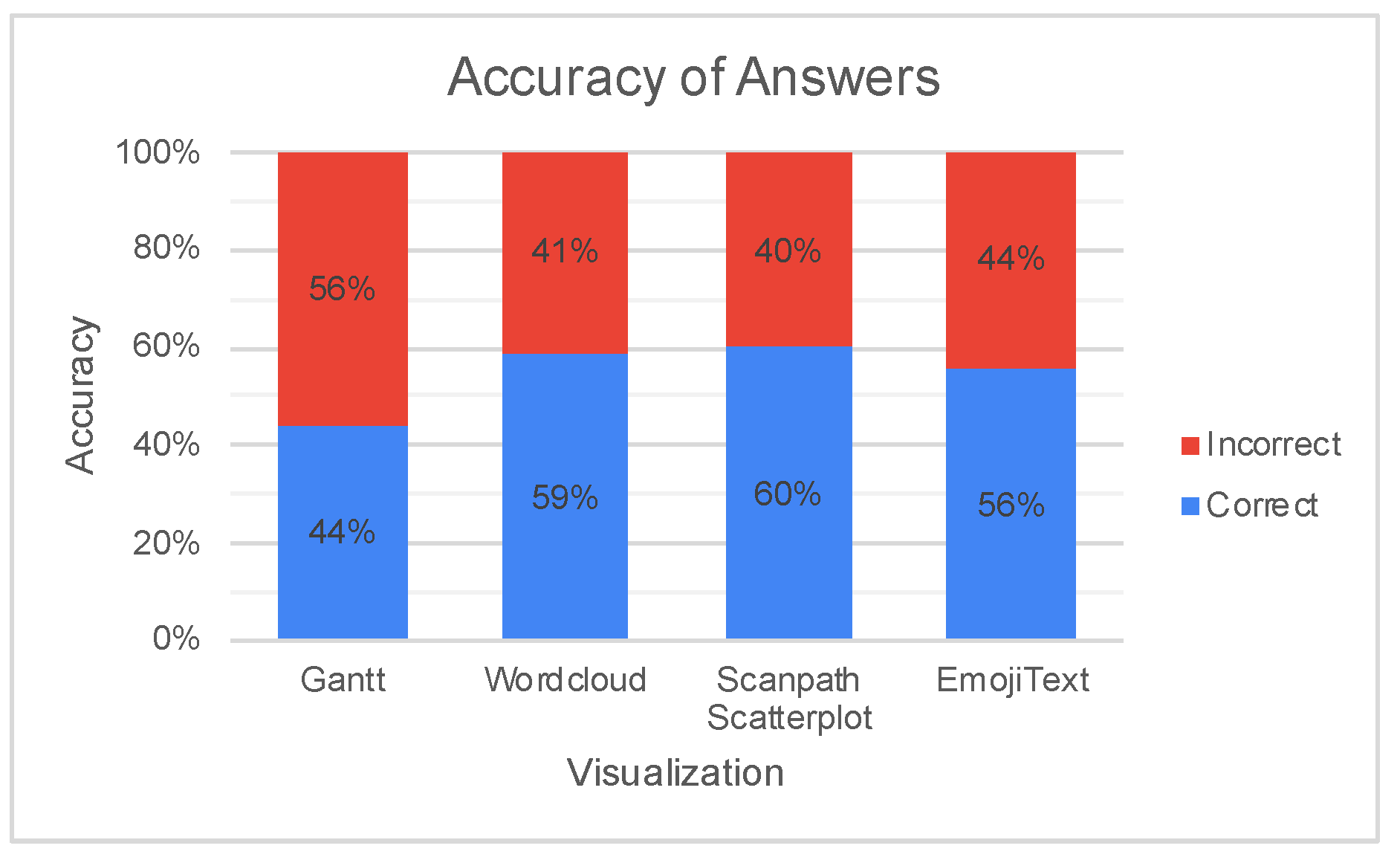
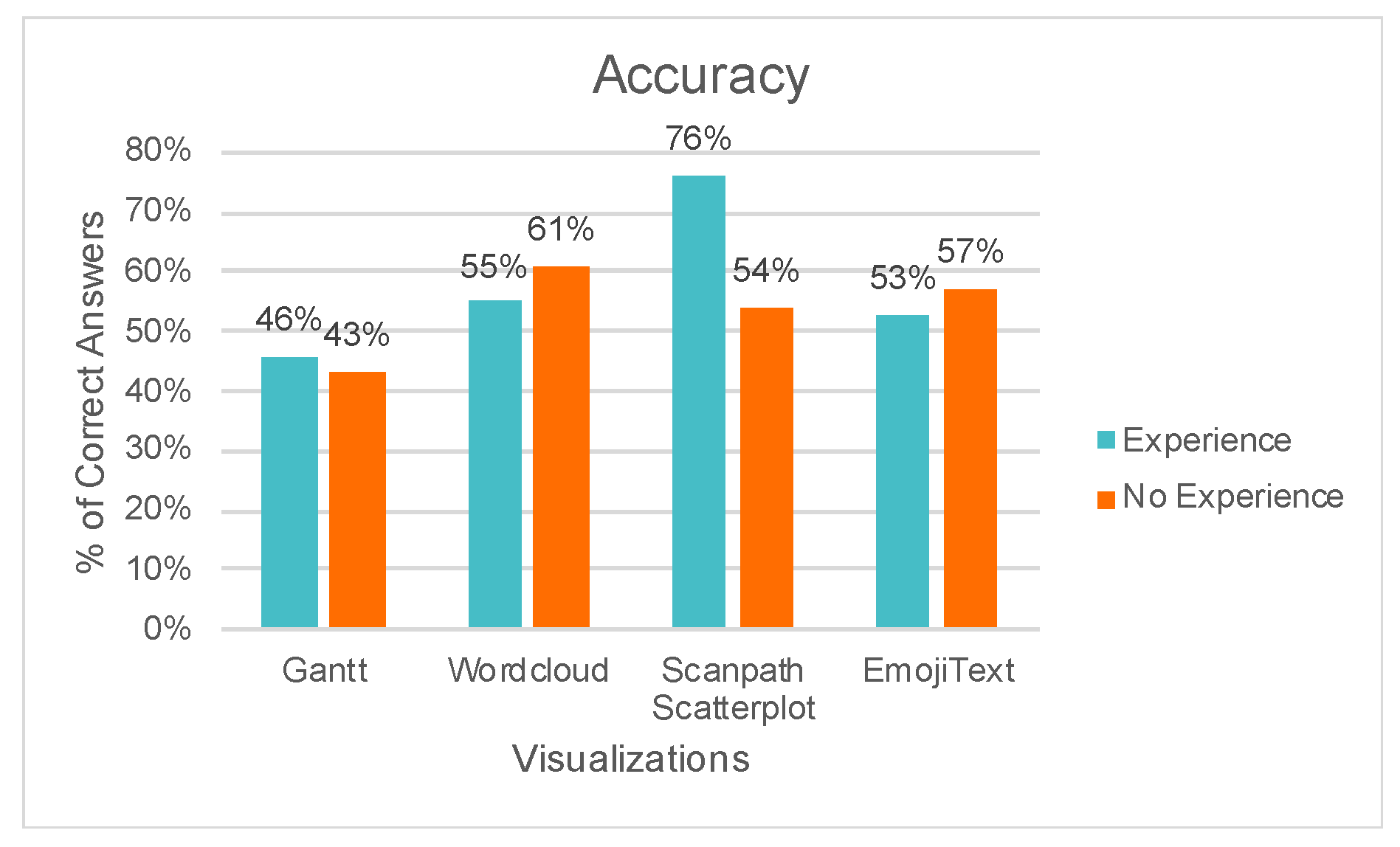
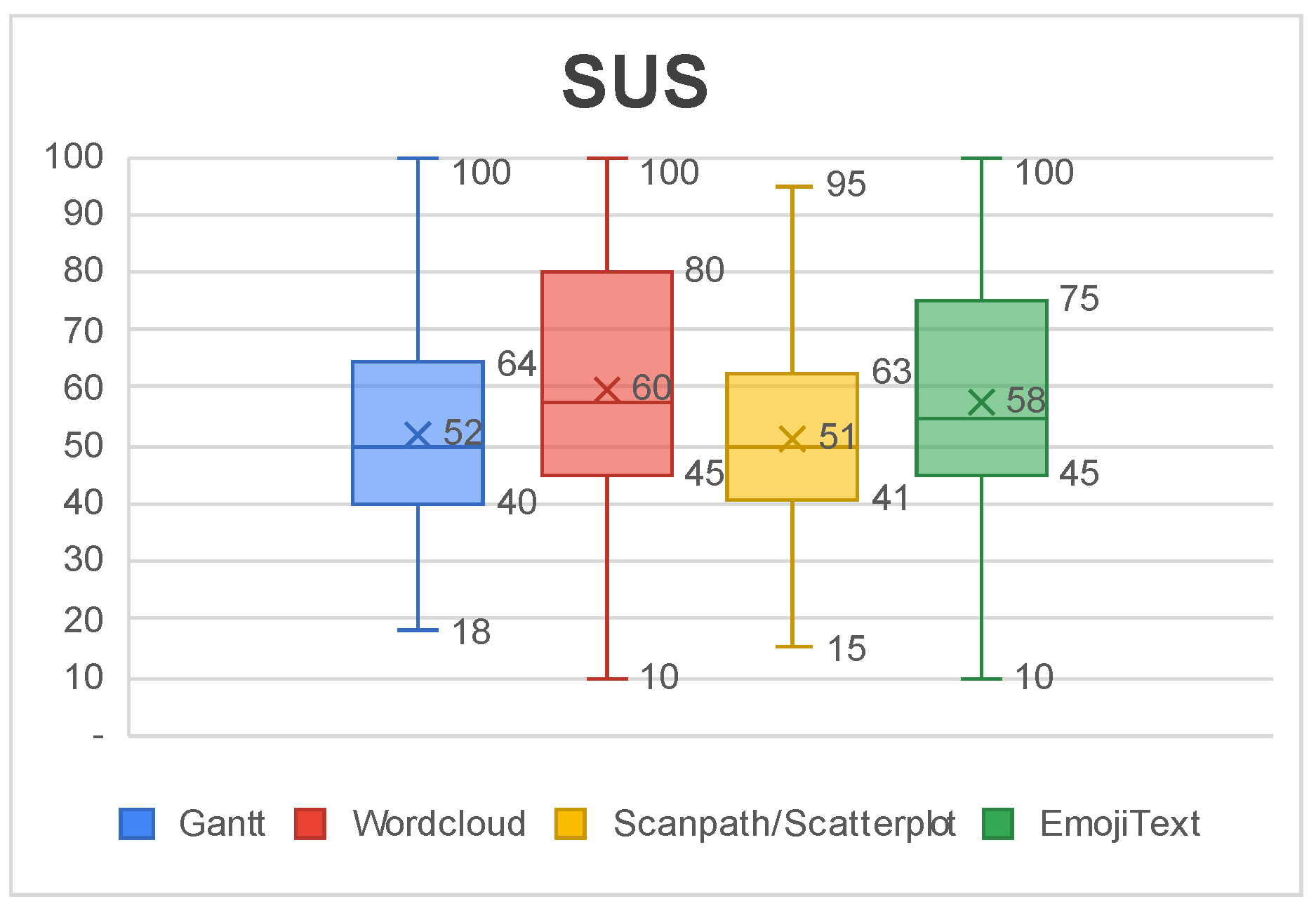
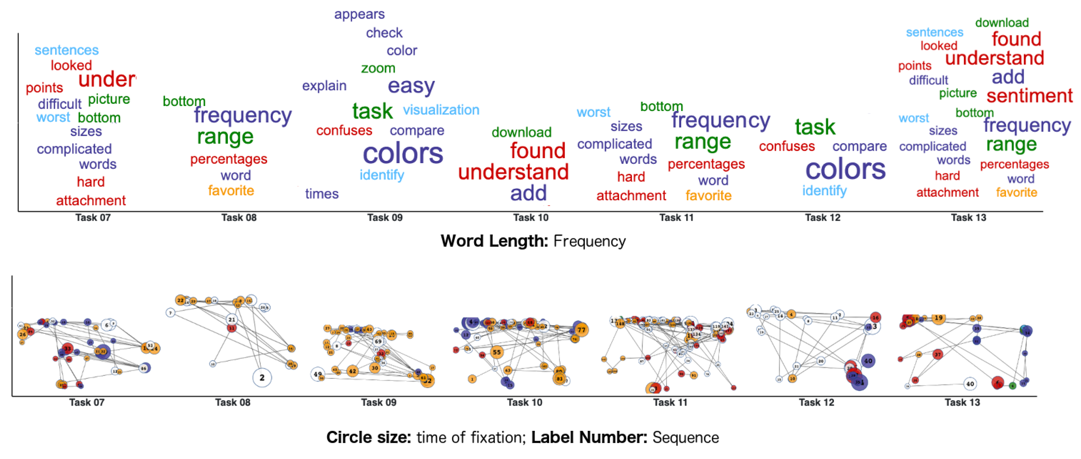
6. Results and Discussion

This section presents the data gathered through the questionnaire and discuss how it can be used to improve the visualizations’ design for future work.
Figure 21 shows the accuracy of answers for the visualizations in each task and Table 2 shows the most cited problems in the open question of the questionnaire. Together they can generate insights on the problems of each visualization.
The Gantt Chart had the worst performance, with most participants answering the questions incorrectly. The primary reason for this low accuracy, according to the analysis of the open question, is that the visualization shows too many sentiments, which makes the colors hard to distinguish. Participants also thought that the bars that compose the Gantt chart were sometimes too thin and thus it was hard to locate the answers.
The Wordcloud had slightly more correct answers than incorrect ones but there were still errors. Participants thought that it was difficult to compare the size of the words and that the visualization does not have any temporal component to see the order of words.
The Scanpath and Scatterplot also had more correct answers. The major downside pointed by participants was the occlusion that happens on both visualizations when many dots occur in nearby points. Some participants pointed out that if the visualization had less colors, it could be less cluttered.
The EmojiText also had an overall good performance but with wrong answers. Participants commented on the tasks that asked how many sentences the visualization shows. Although the comments were positive for the other analysis tasks—for instance, participants approved the emojis as sentiment metaphors—many participants thought that the relationship between sentences was unclear in the visualization. Our design used the color of edges to represent sentences but it was confused with the color of the nodes.
Figure 22 shows the accuracy according to participants’ expertise, considering participants that use visualizations at least once a week as being experienced visualization users. The figure shows that the Scanpath have more accuracy between experienced participants, showing that these visualizations are not easy to learn. In contrast, EmojiText and Wordcloud performed even slightly better between inexperienced participants, suggesting that the chosen text visualizations are more intuitive and easier to grasp regardless of previous experience. The Gantt Chart also had a slight advantage between experienced participants but the accuracy is low for both groups.
Figure 23 shows a box-plot of SUS scores for each visualization. The average SUS score of all visualizations falls in the range 51–68, which is classified as a regular level of usability that has room for improvement. The Gantt Chart and Scanpath/Scatterplot had the worst usability level and they were also the ones with the lowest level of accuracy. The Wordcloud and EmojiText had better usability reports, around 58 and 60 in the score. This score can serve as a guide to prioritize further redesigns.
With the analysis of the data, it is possible to elaborate on redesign strategies to improve the visualizations. The Gantt Chart and Scanpath/Scatterplot received many comments about the excess of different colors in the visualization. Since the number of colors was a cause of confusion in both visualizations, one approach to improve visualization understanding would be to reduce the amount of represented emotions in the dashboard. A more reduced emotion palette could lead to a cleaner dashboard, which might improve the understanding of the visualizations. This redesign would also enable the choice of more distinguishable color schemes that could further improve on emotion differentiation, as more color space is available.
The Gantt Chart also received comments regarding the high amount of information that it shows, which includes video, audio, text and multimodal sentiment tracks. Another option for improvement could be to display only the multimodal track of the chart and add a button that displays the other ones on-demand. Since the majority of participants reported that they paid more attention to the multimodal track, except when the task explicitly asked for sentiment information of a specific media, this design choice would be more aligned with the participants’ expectations.
For the Wordcloud, one approach could be to use alternative layouts such as displaying words with the same emotions in groups, position the words to encode a temporal aspect or split the visualization into small multiples to represent different tasks. A detail on-demand to display the frequency of the word can also ease quantification and, consequently, comparison. An interactive filter to eliminate words with a low frequency of appearance could help in making the visualization cleaner if the analyst wants to focus only on the most cited words.
For EmojiText, the biggest downside is the representation of sentences. One approach could be to explore topological layouts to enable a more temporal positioning of nodes. Interactions can also be added to highlight nodes that belong to the same sentence or even reordering the layout when clicking on nodes to make the sentence more explicit by positioning them from left to right.
A possible redesign to the Gantt Chart would be to give more focus to the multimodal track and display the other tracks only when clicking on an expand button. Figure 24 shows how this can be implemented. The multimodal track could show the proportion of sentiments using horizontally stacked bars. This redesign reduces the amount of colors and aggregates information to simplify visualization. These redesigns also include a brief description of visual mappings to ease the understanding of the visualizations.
For the Wordcloud and Scanpath/Scatterplot, using small multiples could reduce the complexity caused by the amount of elements on screen. Figure 25 shows how this redesign can be implemented. In this approach, each task has its own version of the visualization. During the review of interaction, the current task can be automatically highlighted or zoomed, so the amount of displayed information is reduced at any given time to avoid clutter.

7. Final Remarks and Future Works

The UXmood tool aims to support UX and usability experts in the assessment process of user tests for both quantitative and qualitative dimensions of analysis. For this, it uses an interactive dashboard composed of several visualizations that address one or more aspects of the interaction process or the user experience, such as emotions or polarizations, task execution time, task success and eye-tracking.
The main visualizations that make up the dashboard are—Gantt chart and stacked bar chart for representations of emotions and polarizations, scatterplot for the representation of data on eye-tracking and EmojiText and wordcloud for text representation. All views are permeated with information on emotions or polarization suggested by UXmood based on sentiment classifiers of the literature. What makes an automatic recommendation of sentiment valuable is that not only the participants of tests may have difficulty in expressing their feelings but this expression often takes place at the end of the tests through questionnaires, instead of during the actual interaction. Automatically inferring sentiment from data collected during the interaction helps in finding more precise information about the user experience. UXmood supports eye-tracking data to identify the elements that the participant observes at a particular time and the frequency of observation, which can assist in explaining the user’s behavior or emotions regarding a particular view, component or task.
Other features of UXmood includes: presenting to the specialist synchronized data to tell the history of the interaction and user experience, providing ease of interaction driven by a media player metaphor of data presentation, enabling the specialist to analyze data over the web, and providing flexibility in the visualization dashboard composition. Also worth noting is the design of a new data visualization for text and sentiment; the EmojiText.
The architecture of UXmood allows for UX specialists without a computer science background to appreciate the latest technology in UX computational methods. Although we used sentiment analysis in our tool, the model is flexible enough to enable much more data analysis techniques as it supports a diversity of data types. Expansions in UXmood include not only the addition of novel automated data analysis techniques but also the support of data of more sensors such as Electromyogram (EMG), Electroencephalography (EEG) and Galvanic Skin Response (GSR). In the future, the model can adapt to the available sensors of the specialist, automatically performing sophisticated data analysis techniques and presenting the generated information in a customized dashboard, all without requiring in-depth knowledge of the algorithms involved in the data processing.
We conducted a user study to evaluate the data communication efficiency of the visualizations in the dashboard. The results pointed out how the visualizations can further improve to represent information more accurately and to be easier to use. Future work might include the implementation of the proposed redesigns, evaluating them to see if they mitigate misconceptions that led to errors in tasks and if they improve the overall usability score. Novel tests might also include combinations of visualizations, to discover with ones are the most important for sentiment analysis tasks.
Other future directions might include conducting a UXmood assessment with UX and visualization experts, including new visualization techniques, seeking to automate UX metrics, including data from other sensors—such as electrocardiography (ECG)—for sentiment analysis, evaluating new content classifiers, performing more automated synchronization and pre-processing of media and interaction logs, and expanding language support by providing different idiom configurations for interface, text classifiers and interface, helping to break the language barrier in user experience evaluations.

Author Contributions

Conceptualization, R.Y.d.S.F., and B.S.M.; methodology, R.Y.d.S.F., C.G.R.d.S. and B.S.M.; software, R.Y.d.S.F., C.G.R.d.S. and B.S.M.; validation, R.Y.d.S.F., R.d.M.P., R.S.d.A.D.L., C.G.R.d.S. and B.S.M.; investigation, R.Y.d.S.F., R.d.M.P., R.S.d.A.D.L., C.G.R.d.S. and B.S.M.; Writing—original draft preparation, R.Y.d.S.F., R.S.d.A.D.L., C.G.R.d.S. and B.S.M.; Visualization, R.Y.d.S.F., R.d.M.P., R.S.d.A.D.L., C.G.R.d.S. and B.S.M.; Supervision, C.G.R.d.S. and B.S.M.; project administration, R.Y.d.S.F. and B.S.M.; All authors read and approved the final manuscript.

Funding

This research was financed in part by the Fundação Amazônia de Amparo a Estudos e Pesquisas (Fapespa) and the Coordenação de Aperfeiçoamento de Pessoal de Nível Superior—Brazil (CAPES)—Finance Code 001, and the APC was funded by authors.

Conflicts of Interest

The authors declare no conflict of interest.

References

  1. Voigt, C.; Kieslinger, B.; Schäfer, T. User Experiences Around Sentiment Analyses, Facilitating Workplace Learning. In International Conference on Social Computing and Social Media; Springer: Cham, Switzerland, 2017; pp. 312–324. [Google Scholar]
  2. Law, E.L.C.; Roto, V.; Hassenzahl, M.; Vermeeren, A.P.; Kort, J. Understanding, scoping and defining user experience: A survey approach. In Proceedings of the SIGCHI Conference on Human Factors in Computing Systems, Boston, MA, USA, 4–9 April 2009; pp. 719–728. [Google Scholar]
  3. Hartson, R.; Pyla, P.S. The UX Book: Process and Guidelines for Ensuring a Quality User Experience; Elsevier: Amsterdam, The Netherlands, 2012. [Google Scholar]
  4. Jokela, T.; Iivari, N.; Matero, J.; Karukka, M. The standard of user-centered design and the standard definition of usability: Analyzing ISO 13407 against ISO 9241–11. In Proceedings of the Latin American conference on Human-computer interaction, Rio de Janeiro, Brazil, 17–20 August 2003; pp. 53–60. [Google Scholar]
  5. Lallemand, C.; Gronier, G.; Koenig, V. User experience: A concept without consensus? Exploring practitioners’ perspectives through an international survey. Comput. Hum. Behav. 2015, 43, 35–48. [Google Scholar] [CrossRef]
  6. Liu, B. Sentiment analysis and subjectivity. In Handbook of Natural Language Processing, 2nd ed.; Chapman and Hall/CRC: London, UK, 2010; pp. 627–666. [Google Scholar]
  7. Ekman, P. Basic emotions. Handb. Cogn. Emot. 1999, 98, 16. [Google Scholar]
  8. Hussain, J.; Khan, W.A.; Hur, T.; Bilal, H.S.M.; Bang, J.; Hassan, A.U.; Afzal, M.; Lee, S. A multimodal deep log-based user experience (UX) platform for UX evaluation. Sensors 2018, 18, 1622. [Google Scholar] [CrossRef]
  9. Kwiatkowska, J.; Szóstek, A.; Lamas, D. Design and business gaps: From literature to practice. In Proceedings of the 2014 Mulitmedia, Interaction, Design and Innovation International Conference on Multimedia, Interaction, Design and Innovation, Warsaw, Poland, 24–25 June 2014; pp. 1–7. [Google Scholar]
  10. Matthews, T.; Judge, T.; Whittaker, S. How do designers and user experience professionals actually perceive and use personas? In Proceedings of the SIGCHI Conference on Human Factors in Computing Systems, Austin, TX, USA, 5–10 May 2012; pp. 1219–1228. [Google Scholar]
  11. Shields, M. Information literacy, statistical literacy, data literacy. IASSIST Q. 2005, 28, 6. [Google Scholar] [CrossRef]
  12. Sauro, J. A Practical Guide to Measuring Usability: 72 Answers to the Most Commom Questions about Quantifying the Usability of Websites and Software; Measuring Usability LCC; CreateSpace Independent Publishing Platform: Scotts Valley, CA, USA, 2010. [Google Scholar]
  13. Sauro, J.; Lewis, J.R. Quantifying the User Experience: Practical Statistics for User Research, 1st ed.; Morgan Kaufmann Publishers Inc.: San Francisco, CA, USA, 2012. [Google Scholar]
  14. Law, E.L.C. The measurability and predictability of user experience. In Proceedings of the 3rd ACM SIGCHI Symposium on Engineering Interactive Computing Systems, Pisa, Italy, 13–16 June 2011; pp. 1–10. [Google Scholar]
  15. Albert, W.; Tullis, T. Measuring the User Experience: Collecting, Analyzing, and Presenting Usability Metrics; Newnes: Oxford, UK, 2013. [Google Scholar]
  16. Alves, R.; Valente, P.; Nunes, N.J. The state of user experience evaluation practice. In Proceedings of the 8th Nordic Conference on Human-Computer Interaction: Fun, Fast, Foundational, Helsinki, Finland, 26–30 October 2014; pp. 93–102. [Google Scholar]
  17. Arriaga, O.; Valdenegro-Toro, M.; Plöger, P. Real-time convolutional neural networks for emotion and gender classification. arXiv 2017, arXiv:1710.07557. [Google Scholar]
  18. Barsoum, E.; Zhang, C.; Ferrer, C.C.; Zhang, Z. Training deep networks for facial expression recognition with crowd-sourced label distribution. In Proceedings of the 18th ACM International Conference on Multimodal Interaction, Tokyo, Japan, 12–16 November 2016; pp. 279–283. [Google Scholar]
  19. Ghai, M.; Lal, S.; Duggal, S.; Manik, S. Emotion recognition on speech signals using machine learning. In Proceedings of the 2017 International Conference on Big Data Analytics and Computational Intelligence (ICBDAC), Chirala, India, 23–25 March 2017; pp. 34–39. [Google Scholar] [CrossRef]
  20. Yan, W.J.; Wu, Q.; Liang, J.; Chen, Y.H.; Fu, X. How fast are the leaked facial expressions: The duration of micro-expressions. J. Nonverbal Behav. 2013, 37, 217–230. [Google Scholar] [CrossRef]
  21. Pang, B.; Lee, L. A sentimental education: Sentiment analysis using subjectivity summarization based on minimum cuts. In Proceedings of the 42nd annual meeting on Association for Computational Linguistics, Barcelona, Spain, 21–26 July 2004; p. 271. [Google Scholar]
  22. Mohammad, S.M.; Turney, P.D. Crowdsourcing a word—Emotion association lexicon. Comput. Intell. 2013, 29, 436–465. [Google Scholar] [CrossRef]
  23. Bradley, M.M.; Lang, P.J. Affective norms for English words (ANEW): Instruction Manual and Affective Ratings; Technical Report C-1; University of Florida: Gainesville, FL, USA, 1999. [Google Scholar]
  24. Rudovic, O.; Pavlovic, V.; Pantic, M. Context-sensitive dynamic ordinal regression for intensity estimation of facial action units. IEEE Trans. Pattern Anal. Mach. Intell. 2014, 37, 944–958. [Google Scholar] [CrossRef]
  25. Schuller, B.; Batliner, A.; Steidl, S.; Seppi, D. Recognising realistic emotions and affect in speech: State of the art and lessons learnt from the first challenge. Speech Commun. 2011, 53, 1062–1087. [Google Scholar] [CrossRef]
  26. Liu, B. Sentiment analysis and opinion mining. Synth. Lect. Hum. Lang. Technol. 2012, 5, 1–167. [Google Scholar] [CrossRef]
  27. Medhat, W.; Hassan, A.; Korashy, H. Sentiment analysis algorithms and applications: A survey. Ain Shams Eng. J. 2014, 5, 1093–1113. [Google Scholar] [CrossRef]
  28. Shneiderman, B.; Plaisant, C. Strategies for evaluating information visualization tools: multi-dimensional in-depth long-term case studies. In Proceedings of the 2006 AVI Workshop on BEyond Time and Errors: Novel Evaluation Methods for Information Visualization, Venice, Italy, 23 May 2006; pp. 1–7. [Google Scholar]
  29. Few, S. Information Dashboard Design; O’reilly: Sebastopol, CA, USA, 2006. [Google Scholar]
  30. Vasa, R.; Hoon, L.; Mouzakis, K.; Noguchi, A. A preliminary analysis of mobile app user reviews. In Proceedings of the 24th Australian Computer-Human Interaction Conference, Melbourne, Australia, 26–30 November 2012; pp. 241–244. [Google Scholar]
  31. Yadav, S.K.; Bhushan, M.; Gupta, S. Multimodal sentiment analysis: Sentiment analysis using audiovisual format. In Proceedings of the 2015 2nd International Conference on Computing for Sustainable Global Development (INDIACom), New Delhi, India, 11–13 March 2015; pp. 1415–1419. [Google Scholar]
  32. Setchi, R.; Asikhia, O.K. Exploring User Experience with Image Schemas, Sentiments, and Semantics. IEEE Trans. Affect. Comput. 2017, 10, 182–195. [Google Scholar] [CrossRef]
  33. Porat, T.; Schclar, A.; Shapira, B. MATE: A mobile analysis tool for usability experts. In CHI’13 Extended Abstracts on Human Factors in Computing Systems; ACM: New York, NY, USA, 2013; pp. 265–270. [Google Scholar]
  34. Hedegaard, S.; Simonsen, J.G. Extracting usability and user experience information from online user reviews. In Proceedings of the SIGCHI Conference on Human Factors in Computing Systems, Paris, France, 27 April–2 May 2013; pp. 2089–2098. [Google Scholar]
  35. Munim, K.M.; Islam, I.; Khatun, M.; Karim, M.M.; Islam, M.N. Towards developing a tool for UX evaluation using facial expression. In Proceedings of the 2017 3rd International Conference on Electrical Information and Communication Technology (EICT), Khulna, Bangladesh, 7–9 December 2017; pp. 1–6. [Google Scholar]
  36. Bauman, K.; Liu, B.; Tuzhilin, A. Recommending Items with Conditions Enhancing User Experiences Based on Sentiment Analysis of Reviews. In Proceedings of the CBRecSys@ RecSys, Boston, MA, USA, 16 September 2016; pp. 19–22. [Google Scholar]
  37. Dodd, C.; Athauda, R.; Adam, M. Designing user interfaces for the elderly: A systematic literature review. In Proceedings of the Australasian Conference on Information Systems, Sandy Bay, Australia, 4–6 December 2017; pp. 1–11. [Google Scholar]
  38. Figueiras, A. A review of visualization assessment in terms of user performance and experience. In Proceedings of the 2018 22nd International Conference Information Visualisation (IV), Fisciano, Italy, 10–13 July 2018; pp. 145–152. [Google Scholar]
  39. Bakiu, E.; Guzman, E. Which feature is unusable? Detecting usability and user experience issues from user reviews. In Proceedings of the 2017 IEEE 25th International Requirements Engineering Conference Workshops (REW), Lisbon, Portugal, 4–8 September 2017; pp. 182–187. [Google Scholar]
  40. Kharel, S.; Fernstrom, M. Quantifying User Experience of Mobile Applications Using a Sentimental Analysis Approach. In Proceedings of the 6th NUI GALWAY-UL Alliance Postgraduate Research Day 2016, Galway, Ireland, 29 April 2016; pp. 1–2. [Google Scholar]
  41. Moizer, J.; Lean, J.; Dell’Aquila, E.; Walsh, P.; Keary, A.A.; O’Byrne, D.; Di Ferdinando, A.; Miglino, O.; Friedrich, R.; Asperges, R.; et al. An approach to evaluating the user experience of serious games. Comput. Educ. 2019, 136, 141–151. [Google Scholar] [CrossRef]
  42. Sánchez-Adame, L.M.; Mendoza, S.; González-Beltrán, B.A.; Rodríguez, J.; Viveros, A.M. AUX and UX Evaluation of User Tools in Social Networks. In Proceedings of the 2018 IEEE/WIC/ACM International Conference on Web Intelligence (WI), Santiago, Chile, 3–6 December 2018; pp. 104–111. [Google Scholar]
  43. Yu, M.; Zhou, R.; Wang, H.; Zhao, W. An evaluation for VR glasses system user experience: The influence factors of interactive operation and motion sickness. Appl. Ergon. 2019, 74, 206–213. [Google Scholar] [CrossRef]
  44. Seguin, J.A.; Scharff, A.; Pedersen, K. Triptech: A Method for Evaluating Early Design Concepts. In Proceedings of the 2019 CHI Conference on Human Factors in Computing Systems, Glasgow, UK, 4–9 May 2019; p. CS24. [Google Scholar]
  45. Syahrir, S.; Sfenrianto, S. User experience questioner and heuristics evaluation in online learning environment. J. Theor. Appl. Inf. Technol. 2019, 97, 1071–1081. [Google Scholar]
  46. Basri, N.H.; Adnan, W.A.W.; Baharin, H. E-participation service in malaysian e-government website: The user experience evaluation. In Proceedings of the 10th International Conference on E-Education, E-Business, E-Management and E-Learning, Tokyo, Japan, 10–13 January 2019; pp. 342–346. [Google Scholar]
  47. Dünser, A.; Billinghurst, M. Evaluating augmented reality systems. In Handbook of Augmented Reality; Springer: Cham, Switzerland, 2011; pp. 289–307. [Google Scholar]
  48. Paramitha, A.I.I.; Dantes, G.R.; Indrawan, G. The Evaluation of Web Based Academic Progress Information System Using Heuristic Evaluation and User Experience Questionnaire (UEQ). In Proceedings of the 2018 Third International Conference on Informatics and Computing (ICIC), Palembang, Indonesia, 17–18 October 2018; pp. 1–6. [Google Scholar]
  49. Corrêa, A.G.; Borba, E.Z.; Lopes, R.; Zuffo, M.K.; Araujo, A.; Kopper, R. User experience evaluation with archaeometry interactive tools in Virtual Reality environment. In Proceedings of the 2017 IEEE Symposium on 3D User Interfaces (3DUI), Los Angeles, CA, USA, 18–19 March 2017; pp. 217–218. [Google Scholar]
  50. Souza, K.E.; Seruffo, M.C.; De Mello, H.D.; Souza, D.D.S.; Vellasco, M.M. User Experience Evaluation Using Mouse Tracking and Artificial Intelligence. IEEE Access 2019, 7, 96506–96515. [Google Scholar] [CrossRef]
  51. Giannakopoulos, T.; Pikrakis, A.; Theodoridis, S. A dimensional approach to emotion recognition of speech from movies. In Proceedings of the 2009 IEEE International Conference on Acoustics, Speech and Signal Processing, Taipei, Taiwan, 19–24 April 2009; pp. 65–68. [Google Scholar]
  52. Jain, V.K.; Kumar, S.; Fernandes, S.L. Extraction of emotions from multilingual text using intelligent text processing and computational linguistics. J. Comput. Sci. 2017, 21, 316–326. [Google Scholar] [CrossRef]
  53. Mehrabian, A.; Friar, J.T. Encoding of attitude by a seated communicator via posture and position cues. J. Consult. Clin. Psychol. 1969, 33, 330. [Google Scholar] [CrossRef]
  54. Bostock, M.; Ogievetsky, V.; Heer, J. D3 data-driven documents. IEEE Trans. Vis. Comput. Graph. 2011, 17, 2301–2309. [Google Scholar] [CrossRef]
  55. Holovaty, A.; Kaplan-Moss, J. The Definitive Guide to Django: Web Development Done Right; Apress: New York, NY, USA, 2009. [Google Scholar]
  56. Lei, X.; Jiang, X.; Wang, C. Design and implementation of a real-time video stream analysis system based on FFMPEG. In Proceedings of the 2013 Fourth World Congress on Software Engineering, Hong Kong, China, 3–4 December 2013; pp. 212–216. [Google Scholar]
  57. Pham, H. Pyaudio: Portaudio v19 Python Bindings. 2006. Available online: https://people.csail.mit.edu/hubert/pyaudio (accessed on 22 November 2019).
  58. Livingstone, S.R.; Russo, F.A. The Ryerson Audio-Visual Database of Emotional Speech and Song (RAVDESS): A dynamic, multimodal set of facial and vocal expressions in North American English. PLoS ONE 2018, 13, e0196391. [Google Scholar] [CrossRef]
  59. Schuster, M. Speech recognition for mobile devices at Google. In Pacific Rim International Conference on Artificial Intelligence; Springer: Cham, Switzerland, 2010; pp. 8–10. [Google Scholar]
  60. Tripathi, S.; Beigi, H. Multi-modal emotion recognition on iemocap dataset using deep learning. arXiv 2018, arXiv:1804.05788. [Google Scholar]
  61. Baccianella, S.; Esuli, A.; Sebastiani, F. Sentiwordnet 3.0: An Enhanced Lexical Resource for Sentiment Analysis and Opinion Mining; Lrec: Baton Rouge, LA, USA, 2010; Volume 10, pp. 2200–2204. [Google Scholar]
  62. Soares, A.G.M.; dos Santos, D.H.; Barbosa, C.L.R.; Gonçalves, A.S.; dos Santos, C.G.R.; Meiguins, B.S.; Miranda, E.T.C. Visualizing Multidimensional Data in Treemaps with Adaptive Glyphs. In Proceedings of the 2018 22nd International Conference Information Visualisation (IV), Fisciano, Italy, 10–13 July 2018; pp. 58–63. [Google Scholar]
  63. Torres Neto, J.R.; Geraldo Filho, P.; Mano, L.Y.; Ueyama, J. Verbo: Voice emotion recognition database in Portuguese language. J. Comput. Sci. 2018, 14, 1420–1430. [Google Scholar] [CrossRef] [Green Version]
  64. McFee, B.; Raffel, C.; Liang, D.; Ellis, D.P.; McVicar, M.; Battenberg, E.; Nieto, O. librosa: Audio and music signal analysis in python. In Proceedings of the 14th Python in Science Conference, Austin, TX, USA, 6–12 July 2015; Volume 8. [Google Scholar]
  65. Scherer, K.; Wallbott, H. International Survey on Emotion Antecedents and Reactions (ISEAR). 1990. Available online: http://www.affective-sciences.org/index.php/download_file/view/395/296/ (accessed on 22 November 2019).
  66. Borgo, R.; Micallef, L.; Bach, B.; McGee, F.; Lee, B. Information visualization evaluation using crowdsourcing. In Computer Graphics Forum; Wiley Online Library: Hoboken, NY, USA, 2018; Volume 37, pp. 573–595. [Google Scholar]
  67. Brooke, J. SUS: A quick and dirty usability scale. In Usability Evaluation in Industry; CRC Press: Boca Raton, FL, USA, 1996; pp. 4–7. [Google Scholar]
Figure 1. An overview of the main interface of UXmood.
Information 10 00366 g001
Figure 2. Visualizations configured to be displayed in two monitors.
Information 10 00366 g002
Figure 3. UXmood Architecture.
Information 10 00366 g003
Figure 4. The menus (a) to register tests or tasks in a project, which are displayed as a list (b).
Information 10 00366 g004
Figure 5. Test registration form.
Information 10 00366 g005
Figure 6. Task registration form.
Information 10 00366 g006
Figure 7. Emotion, Polarity and Quantitative legends; the legends act as visualization filters.
Information 10 00366 g007
Figure 8. The control that synchronously manipulates the footage of the test.
Information 10 00366 g008
Figure 9. Details on-demand that provide additional information about the task (a) the video (b) and transcribed speech (c).
Information 10 00366 g009
Figure 10. The Gantt chart shows the classified sentiment of time segments for each input type; tasks time and duration are shown at the top of the chart.
Information 10 00366 g010
Figure 11. The Gantt chart configured to display emotion information of the whole test (a) or only for the task segments (b).
Information 10 00366 g011
Figure 12. Gantt chart configured to represent tasks as segments as tasks: the visualization shows the duration, result and predominant sentiment of the tasks.
Information 10 00366 g012
Figure 13. Gantt Chart configured to compare different tests.
Information 10 00366 g013
Figure 14. A stacked bar chart of classified emotions (left) and polarity (right).
Information 10 00366 g014
Figure 15. Wordcloud of user-spoken words
Information 10 00366 g015
Figure 16. A scanpath graph showing user’s fixation with the associated inferred sentiment. The numbers in the nodes indicate the order of fixations.
Information 10 00366 g016
Figure 17. A scatterplot with the points interacted by the user (mouse or eye tracking), colored by the associated emotion at interaction time.
Information 10 00366 g017
Figure 18. User-face video with sentiment icon.
Information 10 00366 g018
Figure 19. EmojiText, a visualization technique to represent sentiment in texts.
Information 10 00366 g019
Figure 20. UXmood configuration screen.
Information 10 00366 g020
Figure 21. The accuracy of answers in the questionnaire tasks.
Information 10 00366 g021
Figure 22. The accuracy of answers in the questionnaire tasks.
Information 10 00366 g022
Figure 23. The System Usability Scale (SUS) scores of each visualization.
Information 10 00366 g023
Figure 24. Redesign for the Gantt chart. The main track is the multimodal, and the others appear as details on-demand.
Information 10 00366 g024
Figure 25. A proposed redesign for the Wordcloud and Scanpath/Scatterplots. Small multiples can reduce visual clutter and ease interpretation of visualizations.
Information 10 00366 g025
Table 1. Classification and cataloging of related works.
ReferenceSimilarityPaper TypeTimeCorrectnessEye TrackerMouse TrackerQuestionnaireThink AloudUser Face VideoInteraction VideoUser AudioAudio TranscriptionProduct ReviewImage SchemasVideoAudioTextMultimodalUX Expert JudgmentUXUsabilityHeatmapPie ChartStackedbarRadarLine ChartScanpathEmojiTextWordcloudGantt ChartScatterplotRemote Access
22Tool
[8]16Tool
[32]12Method
[30]12Tool
[37]9Method
[33]8Tool
[47]7Tool
[38]7Method
[1]6Tool
[39]6Method
[31]6Method
[35]5Method
[40]5Tool
[48]5Method
[41]5Method
[42]5Method
[34]5Tool
[49]5Method
[43]4Tool
[44]4Method
[45]4Method
[46]3Method
[50]3Tool
[39]3Tool
[36]3Method
Totals11132216466635254948231524524112113
UXmoodQuantitative DataQualitative DataSentiment AnalysisEvaluation TypeData VisualizationOther
Table 2. Most cited issues in the open question of the questionnaire.
Most Cited Problems in Visualizations
Gantt ChartWordcloudScanpath/ScatterplotEmojiText
Too much sentiments and colors.Focus tends to be on the bigger words.Visual clutter.Sentence identification difficulty.
Small visualization.Comparison difficulty.Too much colors.Confusion with node and edge colors.
Interpretation difficulty.Unorganized layout.Complex visualization.Overlap in some labels.

