
The Perceptual Organisation of Visual Elements: Lines


Abstract
:1. Introduction
1.1. Visual Lines
1.2. Phenomenology of Visual Lines
2. Materials and Methods
2.1. The Study
2.2. Participants
2.3. Stimuli and Apparatus
2.4. Tasks and Procedure for the Series of Experiments
2.4.1. Experiment 1
- Stimuli
- Task and Procedure
The experiment consists of the subjective evaluation of line segments that appear on the screen. The line segments will be randomly presented in black and white on black, white, and grey backgrounds respectively. The participant must express her subjective perception whether the line segments are lines or surfaces. There are no wrong answers, the evaluation is subjective. However, please pay close attention to the task. Participants have as much time as desired to perform the assessment task, but must try not to respond based on past experience.
- Statistical Methods
- Results
2.4.2. Experiment 2
- Stimuli
- Task and Procedure
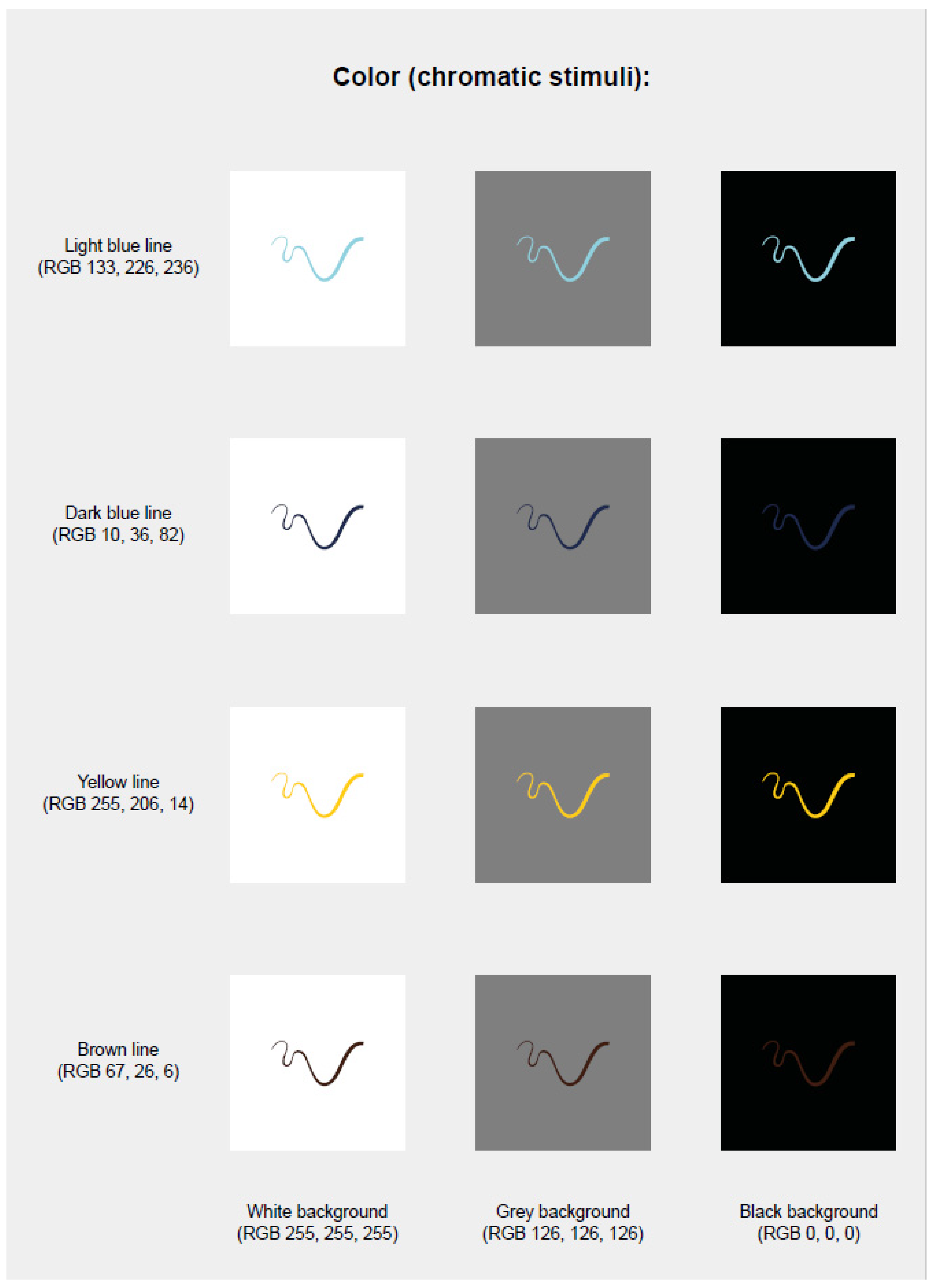
The experiment consists of the subjective evaluation of line segments that appear on the screen. The line segments will be randomly presented in four colours on black, white, and grey backgrounds respectively. The participant must express her subjective perception whether the line segments are lines or surfaces. There are no wrong answers, the evaluation is subjective. However, please pay close attention to the task. Participants have as much time as desired to perform the assessment task, but must try not to respond based on past experience.
- Results
2.4.3. Experiment 3: OD with Achromatic
- Stimuli
- Task and Procedure
The experiment consists of the subjective evaluation of line segments that appear on the screen, according to a series of pairs of contraries. The line segments will be randomly presented in black and white on white, black, and grey backgrounds. There are no wrong answers, the evaluation is subjective. However, please pay close attention to the task. Participants have as much time as desired to perform the assessment task, but must try not to respond based on past experience.
- Statistical Methods
- Results
2.4.4. Experiment 4: OD with Chromatic Stimuli
- Stimuli
- Task and Procedure
The experiment consists of the subjective evaluation of line segments that appear on the screen, according to a series of pairs of contraries. The line segments will be randomly presented in four colours on black and white backgrounds respectively. There are no wrong answers, the evaluation is subjective. However, please pay close attention to the task. Participants have as much time as desired to perform the assessment task, but must try not to respond based on past experience.
- Statistical Methods
- Results
3. Discussion
3.1. Comparison between the Results of Experiments 1 and 2
3.2. Comparison between the Results of Experiments 3 and 4
3.3. General Results
3.4. Conclusions
Supplementary Materials
Author Contributions
Funding
Institutional Review Board Statement
Informed Consent Statement
Data Availability Statement
Acknowledgments
Conflicts of Interest
References
- Albertazzi, L. Spatial elements in visual awareness. Challenges for an intrinsic ‘geometry’ of the visible. Philos. Sci. 2015, 19, 95–125. [Google Scholar] [CrossRef] [Green Version]
- Da Pos, O.; Vishwanath, D.; Albertazzi, L. Color determinants of surface stratification. Color Res. Appl. 2021, 46, 88–102. [Google Scholar] [CrossRef]
- Atteneave, F. Triangles as ambiguous figures. Am. J. Psychol. 1968, 81, 447–453. [Google Scholar] [CrossRef]
- Brentano, F. Philosophical Investigations on Space, Time, and the Continuum; Smith, B., Translator; Routledge & Kegan Paul: London, UK; Sydney, NSW, Australia, 1988. [Google Scholar]
- Rubin, E. Visuell Wahrgenommene Figuren; Gyldendals: Copenhagen, Denmark, 1921. [Google Scholar]
- Dadam, J.; Albertazzi, L.; da Pos, O.; Canal, L.; Micciolo, R. Morphological patterns and their colour. Percept. Mot. Ski. 2012, 114, 363–377. [Google Scholar] [CrossRef]
- Arnheim, R. Art and Visual Perception. The Psychology of the Creative Eye; University of California Press: Berkley, CA, USA, 1954. [Google Scholar]
- Kennedy, J.M. A Psychology of Picture Perception; Jossey-Bass: San Francisco, CA, USA, 1974. [Google Scholar]
- Koenderink, J.J.; van Doorn, A.J.; Wagemans, J. Picasso in the mind’s eye of the beholder: Three-dimensional filling-in of ambiguous line drawings. Cognition 2012, 125, 394–412. [Google Scholar] [CrossRef] [PubMed] [Green Version]
- Massironi, M. The Psychology of Graphic Images; Lawrence Erlbaum Associates Publishers: Mahwah, NJ, USA, 2002. [Google Scholar]
- Metzger, W. Laws of Seeing; Spillmann, L., Translator; MIT Press: Cambridge, MA, USA, 2006; (Original work 1936). [Google Scholar]
- Willats, J. Making Sense of Children Drawings; Laurence Erlbaum Associates Publishers: Mahwah, NJ, USA, 2005. [Google Scholar]
- Koffka, K. Principles of Gestalt Psychology; Harcourt, Brace and Company: New York, NY, USA, 1935. [Google Scholar]
- Hering, E. Beiträge zur Physiologie. I. Zur Lehre vom Ortssinne der Netzhaut; Engelmann: Leipzig, Germany, 1861. (In German) [Google Scholar]
- Grieco, A.; Roncato, S. Lines that induce phenomenal transparency. Perception 2005, 34, 391–407. [Google Scholar] [CrossRef]
- Vicario, G.B. Psicologia della Percezione (Psychology of Perception); Cleup: Padova, Italy, 2003. [Google Scholar]
- Gibson, J.J. The Perception of the Visual World; Houghton Mifflin: New York, NY, USA, 1950. [Google Scholar]
- Albertazzi, L.; Canal, L.; Vescovi, M.; Micciolo, R. Calligraphy and abstract art. A case of categorical ambiguity. In Morphology and Morphogenesis of Shapes, Art Percept; Special Issue; Albertazzi, L., Ed.; BRILL: Leiden, The Netherlands, 2015; Volume 3, pp. 1–25. [Google Scholar] [CrossRef]
- Marković, S. Components of aesthetic experience: Aesthetic fascination, aesthetic appraisal and aesthetic emotion. i-Perception 2012, 3, 1–17. [Google Scholar] [CrossRef] [PubMed]
- Arnheim, R. The Power of the Center; University of California Press: Berkley, CA, USA, 1988. [Google Scholar]
- Ré, P. My drawings and paintings and a system for their classification. Leonardo 1980, 13, 94. [Google Scholar] [CrossRef]
- Huffman, D.A. Impossible objects as nonsense sentences. In Machine Intelligence; Meltzer, B., Mitchie, D., Eds.; Edinburg University Press: Edinburgh, UK, 1970; Volume 56, pp. 295–323. [Google Scholar]
- Ruskin, J. The Elements of Drawing; The Elements of Perspective and The Laws of Fésole; Smith, Elder & Co.: London, UK, 1857. [Google Scholar]
- Kandinsky, W. Punkt und Linie zu Fläche; Benteli: Bern, Switzerland, 1926. (In German) [Google Scholar]
- Klee, P. The Thinking Eye; Lund Humphries: London, UK, 1961. [Google Scholar]
- Katz, D. The World of Colour; Kegan Paul: London, UK, 1935. [Google Scholar]
- Kanizsa, G. Organization in Vision. Essays on Gestalt Perception; Praeger: New York, NY, USA, 1979. [Google Scholar]
- Biederman, I.; Ju, G. Surface versus edge-based determinants of visual recognition. Cogn. Psychol. 1988, 20, 38–64. [Google Scholar] [CrossRef] [Green Version]
- Cole, F.; Sanik, F.; De Carlo, D.; Finkelstein, A.; Funkhouser, T.; Rusinkiewicz, S.; Singh, M. How well do line drawings depict shape? ACM Trans. Graph. 2009, 28, 1–9. [Google Scholar] [CrossRef]
- Koenderink, J.J. What does the occluding contour tell us about solid shape? Perception 1984, 13, 321–330. [Google Scholar] [CrossRef]
- Malik, J. Interpreting line drawings of curved objects. Int. J. Comput. Vis. 1987, 1, 73–103. [Google Scholar] [CrossRef]
- Marr, D. Vision. A Computational Investigation into the Human Representation and Processing of Visual Information; W.H. Freeman and Company: San Francisco, CA, USA, 1982. [Google Scholar]
- Hubel, D.H.; Wiesel, T.N. Receptive fields and functional architecture in the cat’s visual cortex. J. Neurosci. 1962, 160, 106–154. [Google Scholar]
- Hubel, D.H.; Wiesel, T.N. Receptive fields and functional architecture of monkey striate cortex. J. Neurosci. 1968, 195, 215–243. [Google Scholar] [CrossRef]
- Albertazzi, L. (Ed.) Handbook of Experimental Phenomenology: Visual Perception of Shape, Space and Appearance; John Wiley and Sons, Ltd.: Hoboken, NJ, USA, 2013. [Google Scholar] [CrossRef]
- Albertazzi, L. Naturalising phenomenology: A must have? Front. Psychol. 2018, 9, 1933. [Google Scholar] [CrossRef] [PubMed]
- Albertazzi, L. Experimental phenomenology for consciousness. Psychol. Conscious. Theory Res. Pract. 2021, 8, 116–142. [Google Scholar] [CrossRef]
- Vicario, G.B. On experimental phenomenology. In Foundations of Perceptual Theory; Masin, S.C., Ed.; Elsevier Science Publishers: Amsterdam, The Netherlands, 1993; pp. 197–219. [Google Scholar]
- Rubin, E. Visual figures apparently incompatible with geometry. Acta Psychol. 1950, 7, 365–387. [Google Scholar] [CrossRef]
- Boynton, R.; Kaiser, P.K. Vision: The additive law made to work for heterochromatic photometry with bipartite fields. Science 1968, 161, 366–368. [Google Scholar] [CrossRef] [PubMed]
- Albertazzi, L.; Malfatti, M.; Canal, L.; Micciolo, R. The hue of shapes. J. Exp. Psychol. Hum. Percept. Perform. 2012, 39, 37–47. [Google Scholar] [CrossRef]
- Albertazzi, L.; Malfatti, M.; Canal, L.; Micciolo, R. The hue of angles. Was Kandinsky right? Art Percept. 2014, 3, 81–92. [Google Scholar] [CrossRef]
- StataCorp Stata Statistical Software; Release 13; StataCorp LP: College Station, TX, USA, 2013.
- Kandinsky, W. Über das Geistige in der Kunst. Insbesondere in der Malerei; Piper & Co.: Munich, Germany, 1911. [Google Scholar]
- Da Pos, O.; Valenti, V. Warm and cold colours. In Proceedings of the AIC 2007 Midterm Meeting Color Science for Industry, Hangzhou, China, 12–14 July 2007; pp. 41–44. [Google Scholar]
- Helson, H. Studies of anomalous contrast and assimilation. J. Opt. Soc. Am. 1963, 53, 179–184. [Google Scholar] [CrossRef] [PubMed]


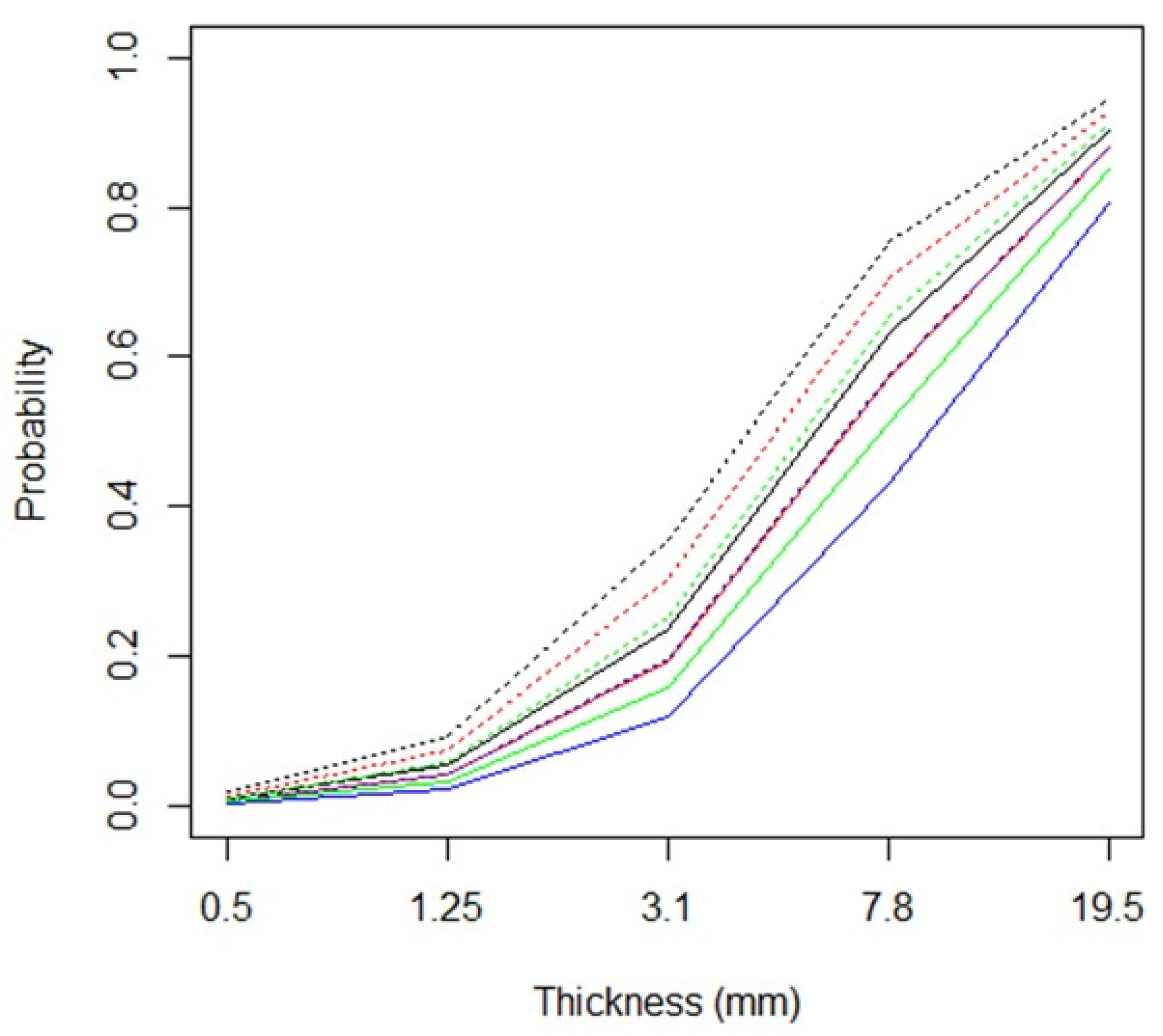
| Variable | Line | Surface | % Surf. | LRT | p |
|---|---|---|---|---|---|
| Thickness (mm) | 984 | <0.001 | |||
| 0.5 | 930 | 30 | 3.1 | ||
| 1.25 | 799 | 161 | 16.8 | ||
| 3.1 | 511 | 449 | 46.8 | ||
| 7.8 | 283 | 677 | 70.5 | ||
| 19.5 | 116 | 844 | 87.9 | ||
| Type | 13.76 | <0.001 | |||
| curved | 1378 | 1022 | 42.6 | ||
| straight | 1261 | 1139 | 47.5 | ||
| Orientation | 0.24 | 0.97 | |||
| horizontal | 657 | 543 | 45.3 | ||
| vertical | 656 | 544 | 45.3 | ||
| harmonic diagonal | 660 | 540 | 45.0 | ||
| disharmonious diagonal | 666 | 534 | 44.5 | ||
| Colour/Background | 14.84 | 0.002 | |||
| white on grey | 621 | 579 | 48.3 | ||
| white on black | 645 | 555 | 46.3 | ||
| black on grey | 670 | 530 | 44.2 | ||
| black on white | 703 | 497 | 41.4 |
| Variable | Line | Surface | % Surf. | LRT | p |
|---|---|---|---|---|---|
| Thickness (mm) | 888 | <0.001 | |||
| 0.5 | 808 | 24 | 2.9 | ||
| 1.25 | 710 | 122 | 14.7 | ||
| 3.1 | 555 | 277 | 33.3 | ||
| 7.8 | 315 | 517 | 62.1 | ||
| 19.5 | 79 | 753 | 90.5 | ||
| Type | 2.62 | 0.11 | |||
| curved | 1257 | 823 | 39.6 | ||
| straight | 1210 | 870 | 41.8 | ||
| Orientation | 0.69 | 0.88 | |||
| horizontal | 611 | 429 | 41.3 | ||
| vertical | 620 | 420 | 40.4 | ||
| harmonic diagonal | 611 | 429 | 41.3 | ||
| disharmonious diagonal | 625 | 415 | 39.9 | ||
| Colour | 0.91 | 0.82 | |||
| light blue | 605 | 435 | 41.8 | ||
| dark blue | 623 | 417 | 40.1 | ||
| yellow | 620 | 420 | 40.4 | ||
| brown | 619 | 421 | 40.5 | ||
| Background | 3.38 | 0.18 | |||
| white | 964 | 476 | 33.1 | ||
| grey | 635 | 645 | 50.4 | ||
| black | 868 | 572 | 39.7 |
| Thickness | Type | Colour/Background | Orientation | |||||||||
|---|---|---|---|---|---|---|---|---|---|---|---|---|
| Pairs of Adjectives | chi2 | OR | chi2 | OR | chi2 | OR | chi2 | OR | ||||
| heavy/lightweight | 538.89 | ** | 522.82 | 30.36 | ** | 1.66 | 14.09 | 1.17 | 14.47 | 1.22 | ||
| strong/weak | 362.09 | ** | 39.56 | 48.89 | ** | 1.98 | 22.04 | 1.36 | 25.15 | * | 1.59 | |
| cold/warm | 67.68 | ** | 3.16 | 289.43 | ** | 9.03 | 26.94 | * | 1.23 | 25.62 | * | 1.10 |
| feminine/masculine | 46.52 | ** | 2.92 | 306.61 | ** | 10.05 | 14.93 | 1.30 | 17.71 | 1.45 | ||
| flat/rounded | 9.07 | 1.57 | 764.03 | ** | 114.47 | 1.86 | 1.04 | 5.36 | 1.35 | |||
| dynamic/static | 42.18 | ** | 1.39 | 481.14 | ** | 25.30 | 40.66 | ** | 1.25 | 41.43 | ** | 1.33 |
| accelerant/decelerant | 2.23 | 1.28 | 1.21 | 1.13 | 3.81 | 1.37 | 129.01 | ** | 7.62 | |||
| centrifugal/centripetal | 35.32 | ** | 1.16 | 47.16 | ** | 1.56 | 36.60 | ** | 1.27 | 90.17 | ** | 3.17 |
| sour/sweet | 0.68 | 1.13 | 432.51 | ** | 18.34 | 2.17 | 1.26 | 1.43 | 1.21 | |||
| blunt/sharp | 28.02 | * | 2.58 | 486.32 | ** | 23.66 | 0.53 | 1.11 | 5.45 | 1.41 | ||
| bound/free | 37.63 | ** | 2.27 | 473.58 | ** | 22.92 | 14.96 | 1.24 | 20.01 | 1.52 | ||
| ascending/descending | 10.27 | 1.38 | 5.72 | 1.07 | 14.27 | 1.50 | 250.84 | ** | 21.43 | |||
| active/passive | 44.11 | ** | 1.42 | 163.69 | ** | 4.24 | 42.11 | ** | 1.23 | 55.36 | ** | 1.86 |
| decreasing/increasing | 0.86 | 1.15 | 0.76 | 1.11 | 9.66 | 1.68 | 227.20 | ** | 18.64 | |||
| geometric/organic | 1.34 | 1.09 | 848.06 | ** | 217.44 | 1.27 | 1.07 | 4.73 | 1.32 | |||
| Thickness | Type | Colour | Background | Orientation | |||||||||||
|---|---|---|---|---|---|---|---|---|---|---|---|---|---|---|---|
| Pairs of Adjectives | chi2 | OR | chi2 | OR | chi2 | OR | chi2 | OR | chi2 | OR | |||||
| heavy/lightweight | 462.74 | ** | 248.83 | 49.64 | ** | 1.30 | 62.00 | ** | 2.13 | 52.60 | ** | 1.53 | 46.17 | ** | 1.11 |
| strong/weak | 234.96 | ** | 27.15 | 44.96 | ** | 2.37 | 12.99 | 1.85 | 1.85 | 1.20 | 2.61 | 1.31 | |||
| cold/warm | 80.62 | ** | 2.27 | 88.23 | ** | 1.95 | 339.76 | ** | 29.18 | 77.73 | ** | 1.75 | 67.35 | ** | 1.35 |
| feminine/masculine | 13.62 | 1.69 | 218.60 | ** | 7.57 | 7.63 | 1.50 | 7.18 | 1.42 | 5.13 | 1.35 | ||||
| flat/rounded | 6.44 | 1.15 | 671.63 | ** | 117.24 | 6.50 | 1.16 | 5.97 | 1.06 | 7.41 | 1.24 | ||||
| dynamic/static | 12.84 | 1.50 | 543.57 | ** | 46.69 | 10.27 | 1.32 | 10.07 | 1.25 | 13.09 | 1.43 | ||||
| accelerant/decelerant | 2.18 | 1.25 | 4.04 | 1.26 | 3.38 | 1.29 | 1.95 | 1.20 | 109.18 | ** | 6.17 | ||||
| centrifugal/centripetal | 9.42 | 1.69 | 20.07 | * | 1.72 | 4.37 | 1.25 | 10.86 | 1.51 | 11.53 | 1.54 | ||||
| sour/sweet | 7.40 | 1.59 | 193.86 | ** | 6.62 | 13.92 | 1.91 | 0.87 | 1.12 | 3.26 | 1.32 | ||||
| silent/sonorous | 102.68 | ** | 7.22 | 69.15 | ** | 2.66 | 85.79 | ** | 4.05 | 18.34 | 1.39 | 17.16 | 1.38 | ||
| consonant/dissonant | 8.92 | 1.59 | 2.32 | 1.14 | 6.88 | 1.49 | 3.70 | 1.26 | 10.95 | 1.64 | |||||
| fluffy/rough | 22.74 | 1.51 | 439.40 | ** | 25.62 | 22.48 | 1.41 | 18.86 | 1.22 | 21.41 | 1.36 | ||||
| frigid/sensual | 23.18 | 1.23 | 378.92 | ** | 18.05 | 48.91 | ** | 2.52 | 22.97 | * | 1.23 | 26.98 | * | 1.52 | |
| hard/soft | 3.10 | 1.15 | 652.14 | ** | 92.76 | 4.46 | 1.25 | 6.45 | 1.37 | 7.94 | 1.37 | ||||
| agitated/calm | 7.48 | 1.62 | 41.26 | ** | 2.70 | 78.87 | ** | 6.27 | 6.26 | 1.36 | 4.43 | 1.29 | |||
Publisher’s Note: MDPI stays neutral with regard to jurisdictional claims in published maps and institutional affiliations. |
© 2021 by the authors. Licensee MDPI, Basel, Switzerland. This article is an open access article distributed under the terms and conditions of the Creative Commons Attribution (CC BY) license (https://creativecommons.org/licenses/by/4.0/).
Share and Cite
Albertazzi, L.; Canal, L.; Micciolo, R.; Hachen, I. The Perceptual Organisation of Visual Elements: Lines. Brain Sci. 2021, 11, 1585. https://doi.org/10.3390/brainsci11121585
Albertazzi L, Canal L, Micciolo R, Hachen I. The Perceptual Organisation of Visual Elements: Lines. Brain Sciences. 2021; 11(12):1585. https://doi.org/10.3390/brainsci11121585
Chicago/Turabian StyleAlbertazzi, Liliana, Luisa Canal, Rocco Micciolo, and Iacopo Hachen. 2021. "The Perceptual Organisation of Visual Elements: Lines" Brain Sciences 11, no. 12: 1585. https://doi.org/10.3390/brainsci11121585
APA StyleAlbertazzi, L., Canal, L., Micciolo, R., & Hachen, I. (2021). The Perceptual Organisation of Visual Elements: Lines. Brain Sciences, 11(12), 1585. https://doi.org/10.3390/brainsci11121585