Article

Ternary vs. Right-Angled Plots in Agricultural Research: An Assessment of Data Representation Efficiency and User Perception

1
The National Institute of Horticultural Research, 96-100 Skierniewice, Poland
2
Centro di Ricerca Viticoltura ed Enologia, Consiglio per la Ricerca in Agricoltura e l’Analisi dell’Economia Agraria (CREA), Via P. Micca 35, 14100 Asti, Italy
3
Department of Media and Social Communication, University of Information Technology and Management, 35-225 Rzeszow, Poland
*
Authors to whom correspondence should be addressed.
Appl. Sci. 2025, 15(18), 9949; https://doi.org/10.3390/app15189949
Submission received: 31 July 2025 / Revised: 4 September 2025 / Accepted: 9 September 2025 / Published: 11 September 2025
(This article belongs to the Section Agricultural Science and Technology)

Abstract

Featured Application

The results presented in the manuscript are meant to open a new avenue for research on the representation of compositional data. One of the conclusions is that a classical ternary plot is difficult to read; hence, an easier-to-read graphical tool might find its place in the practice of applied data visualization, for example, to represent soil features or to illustrate the relationships between various plant characteristics.

Abstract

Visual representation of data can ease their understanding and interpretation, particularly when more variables are considered together. The ternary plot, based on a barycentric coordinate system and commonly used to represent compositional variables, may be difficult to interpret due to its structural complexity—stemming in part from the 60° axis projection and the need for indirect value estimation. This article presents its new alternative, the right-angled triangle plot, and compares the two plot types in the representation of a compositional variable of three components. According to a theoretical comparison, the right-angled plot has several technical advantages (e.g., larger plotting area, direct axis reading), resulting from its construction being based on the Cartesian coordinate system. To verify this hypothesis from an empirical point of view, a survey was conducted involving 441 researchers to assess the effectiveness in correctly interpreting the data presented on both plots. The bias was lower, and the precision was higher on the right-angled plot. Indeed, this study’s results, particularly the higher accuracy (more than 95% when a minimal tolerance was allowed) in determining the values of individual variables (X, Y, and Z), as well as the correctly identification of all three variables simultaneously in the right-angled plot compared with the ternary plot, suggest that the former may hold potential for improving the visualization of compositional data with three components. However, introducing this new type of plot would require familiarizing potential users with it, since the majority of respondents (63.2%) still considered the ternary plot easier to use, likely due to its long use and the novelty of the new plot type.

1. Introduction

The term “compositional data” applies to a situation in which a study variable is the sum of at least two variables. A compositional data model, as described by the Formula (1) below, has neither parameters nor a random component, and so is atypical from a statistical point of view [1,2,3]:
Y j =   i = 1 k X i j ,   j = 1 , , n ,
where Yj is the j-th observation of the composition variable Y in an n-element sample of observation units, and Xij is the j-th observation of the variable Xi, sometimes called the “i-th additive component”.
The components of Equation (1) are dependent on each other because their sum is a constant value. Since the model does not include a random component, it does not include any error term. If we assume there are no errors in measurement, we can assume that the model (1) is error free. In research practice, however, measurement error is common. This error, however, is hidden inside the data, but the underlying model is still error free. We need to remember this when interpreting the data following this model, as well as that presented on graphs. This is particularly important when analyzing graphs of the data following this and other error-free models; as such, a lack of errors in the model can be easily confused with a lack of any error in the data, which is never true.
Such compositional data are frequently met in agricultural studies in which the additive model applies due to the data’s nature, such as the implementation of measures supporting sustainable agriculture related to soil management of field crops [4], also in relation to the impact of long-term fertilization [5], as well as measures for a sustainable use of pesticides [6].
Model (1), however, can also be applied when the analyzed variables are not components of a sum with a specific meaning but together form an integral whole, like in the case of the impact of landscape management at a farm level on pest occurrence [7,8], or seasonal variation of different aphid species in relation to the definition of guidelines for the use of pesticides in line with Integrated Pest Management [9], as required by the European Union Directive 2009/128 on the sustainable use of pesticides [10].
Moreover, such a model can be used to compare production volumes of different categories of plant products at national or regional levels to represent sectoral components of the total production useful for statistics and policy development [11].
This article aimed to discuss ways of analyzing such data in agricultural and horticultural contexts. The main achievement was a proposition of a new type of graph, designed specifically to let users visualize agricultural and horticultural data following model (1). We compared the proposed graph with another one, typically used in the same context: the ternary plot.

Visualizing Compositional Data

Researchers have been working on methods for the analysis and visualization of compositional data since people developed the ability to recognize spatial patterns in pictures and to observe relationships between variables [12,13]. As early as 1827, Möbius [14] proposed to use barycentric coordinates to represent compositional data with three components; the resulting graph is called the ternary plot.
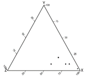
Aitchison [2] proposed a graph that transforms barycentric coordinates into Cartesian coordinates. His method has not become common, despite several applications in the field of multivariate data analysis [15,16,17]. Figure 1a shows an example of a ternary plot based on this coordinate system. The axis label for variable X is on the base of the triangle; for variable Y, it is on the right side of the triangle; and for variable Z, it is on the left side of the triangle. In this example, the variable values are as follows: X = 50, Y = 25, and Z = 25, so the sum of X + Y + Z equals 100.
Ternary plots based on the equilateral triangle are used in many scientific disciplines: for instance, to present chemical composition of different types of water in hydrology and geohydrology [18,19], to analyze, interpret, and classify rocks in petrology and geology [20,21], and to illustrate chemical composition of different liquid mixtures in chemistry [22]. They have also been applied in other domains; for instance, to analyze results of English football league matches [23] or to analyze the structure of gross domestic product (GDP) and its changes [24], and in forensic medicine, to present the frequencies of causes of death [25]. Plots based on the isosceles right-angled triangle are much less frequently used: for example, in chemistry [26,27], seismology [28], molecular biology [29], geology [30,31], and soil science [32].
In the biological, agricultural, and horticultural sciences, classical ternary plots are most commonly used to determine soil texture composition and classification, as in Tamrakar [20], who used a ternary plot, and Gerakis and Baer [33], who used a right-angled plot, but in a different form than the one proposed in this article. In other topics, ternary plots have been used only sporadically. For example, Thomas [34] presented the proportions of N:P2O5:K2O in potato plant leaves from different fertilization treatments (with varying NPK compositions) using a ternary plot. Golba [35] used ternary diagrams to illustrate the relationships between yield, the number of spikes, and the number of grains per spike for different varieties based on multiple regression analysis [35]. Dennis used a ternary plot to depict the proportions of time spent on flight, feeding, and inactivity of 54 males of the Ochlodes venata butterflies observed over three years in forest clearings in Lindow, Cheshire, UK. Ternary plots have also been used to identify plant nutritional conditions that support the development of specific grassland species, to develop innovative approaches for mapping species distribution in highly heterogeneous soils of both undisturbed and degraded meadows, and to present the effects of inoculating pea plants (Pisum sativum) with two endophytic bacterial strains [36]. His method is based on genotype–environment interaction analysis for each genotype, determining how well a genotype performed in a given environment relative to the performance of the entire group of studied genotypes in that environment (using two quantiles).
Because of its complex construction, the barycentric coordinate system that the classical ternary plot uses (Figure 1a) can be challenging to interpret. Even experienced users can be confused when reading such a plot if it is constructed in a different way than the one they are accustomed to. For example, in a ternary plot, values along the axes can be read in two directions—clockwise or counterclockwise (see Figure 2, where arrows indicate the clockwise direction). Misinterpreting this feature may lead to incorrect readings of variable values at a given data point. This is because ternary plots can be constructed in various ways in addition to the classical one [37], which we describe and use in this paper.
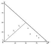
However, a better understandable type of graph could lead to better visual perception, as well as easier and more accurate reading of data [38]. This paper proposes such an alternative graphical method for visualizing compositional data: a ternary plot based on an isosceles right-angled triangle (Figure 1b). The plot is based on the Cartesian coordinate system, with two variables positioned on perpendicular axes and the third entering the plot area. The point value from the three components is determined, similarly to the common ternary plot, at the intersection of the lines originating from the values of the three variables. However, mimicking the Cartesian coordinate system is expected to improve the visual representation of the data.
As mentioned above, such a graph has been used to analyze composite data [33]. It has, however, a significant disadvantage: out of the three component variables in the model, it shows only two. The third one, then, is hidden behind the construction, and it is not a simple task to visually determine its value, which, in practice, boils down to imagining it. Constructed to overcome this issue, the isosceles right-angled plot (thereafter right-angled plot, for simplicity) has as many axes as there are component variables to visualize. This key distinction makes a huge difference from a visual point of view, as this graph shows in the model.
Being based on the Cartesian coordinate system, a right-angled plot should be simpler to construct, read, and interpret than any graph based on the barycentric coordinate system. To check whether this is true, this article compares the two types of plots in question. To this end, we conducted two studies: a theoretical one to compare the pros and cons of the plots and a user survey to compare the accuracy and ease of reading data from them. In designing, conducting, and interpreting the studies, we drew on available knowledge about effective graph design, gathered from guidelines proposed by numerous authors—the most influential being those of Tufte [39], Cleveland [40,41], and Wilkinson [42]. These authors argue, among others, that data visualization should be simple to construct and easy to interpret, and that the plot area should be primarily dedicated to the data itself, containing as few extraneous elements as possible

2. Materials and Methods

2.1. Theoretical Comparative Study

The theoretical study aimed to analyze how the two plot types differ in three aspects: how they are constructed, how they use additional elements in a plotting region (e.g., grid lines and plotting symbols), and how to read values from them. In particular, the comparison addressed the following aspects:
  • Plotting area;
  • Construction of axis;
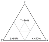
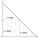
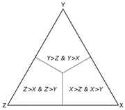
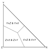
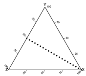
  • Zone indicators, including connections between the middle points of edges, and connections within the middle sections linking the barycenter to the midpoints of the triangle sides;
  • Readability of data point values;
  • Visual determination of dominance of one of the variables;
  • Interpretation of linear and nonlinear relationships between variables.

2.2. Online Survey

A Computer Assisted Web Interview (CAWI) survey was conducted among 37,891 researchers who published at least one scientific article in 2006–2010 in at least one of 95 scientific agricultural journals indexed in the Web of Science (Supplementary Material Table S1). We covered such a wide array of agricultural journals to represent a large segment of potential users. For the survey, we designed a dedicated web page and implemented it in PHP.
The survey was designed in two phases. In the first one, the respondents learned how to interpret the two types of plots with example plots showing one data point. In the second, the respondents completed a questionnaire with six questions. The first two questions required determining the values of three variables (one data point) on both types of plots (one question per plot). The third question asked to evaluate the ease of reading the plot. The other questions served to define the respondents’ experience (1–5 years, 6–10 years, over 10 years), gender, and their primary language (English or other).
The plot interpretation ease was determined by considering the following:
  • The rate of error-free answers for each kind of plot, separately for each coordinate (X, Y, Z), and all together (XYZ);
  • The rate of respondents’ answers in which X + Y + Z = 100 (where X, Y, and Z were the values provided by the respondent) (A) for each plot, defined as “correct-coord” answers; (See Section 2.4 Data Analysis) and (B) for both plots at the same time;
  • The bias of readings, where the bias was represented by the sum of the differences between the values given by the respondents and the correct value of the variable;
  • The precision of readings of the values from the plots represented by the absolute value of the aforementioned differences;
  • The time needed to read the values from the plots;
  • The respondents’ perception of ease in reading the plots.
The responses were analyzed based on the respondents’ gender, experience length, and primary language, measuring also the time needed for them to determine the coordinates of the point on each graph.

2.3. Technical Aspects of the Survey and the Experimental Design

The survey was designed to minimize the risk of bias in answers due to external factors. The website included instructional plots and descriptions on how to interpret the plots, placed side by side to prevent any bias from viewing the last-seen plot (See Supplementary Material Figure S1). To account for the impact of the sequence of the plots displayed in the questionnaire, four survey forms were constructed, differing in the order of the plots in the questionnaire and the point value (Table 1). An algorithm coded in PHP randomly allocated one of these four survey questionnaires to each respondent.
The impact of the following factors on data reading was evaluated for the corresponding pairs of questionnaires, considering the following:
  • The type of plot (ternary vs. right-angled plot) (see Table 1);
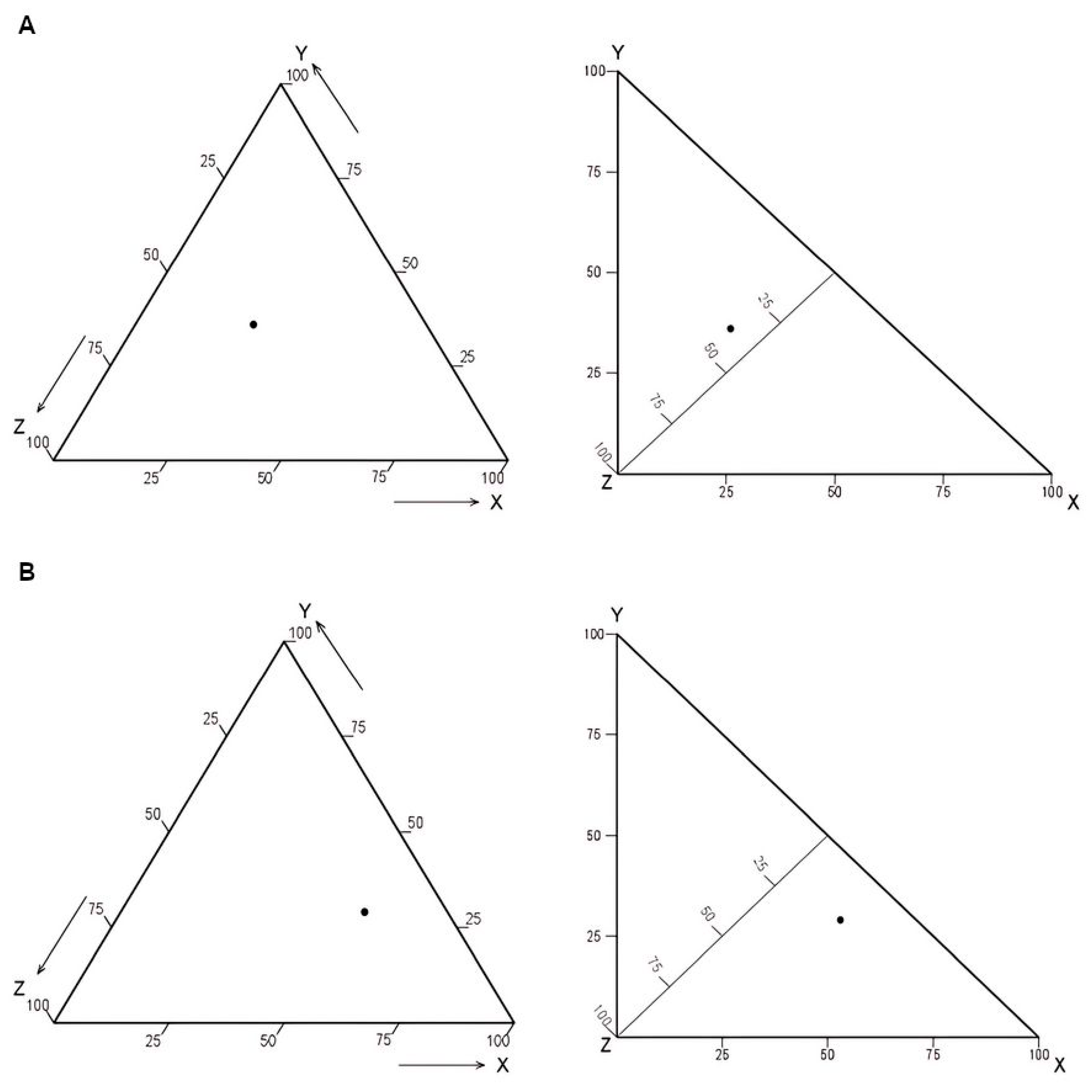
  • The coordinate pairs (see Figure 2 and Table 1);
  • The display order (first vs. second) (see Table 1).
The two coordinate points were chosen based on preliminary evaluations, which showed that these two should pose a greater challenge compared with coordinates in which one of the variables was close to the edge values (0 or 100).
The response time to the various questions was measured. However, to represent the average time, the median was used instead of the mean to handle possible outliers due to external factors that could have affected this parameter occurring while filling in the questionnaire (e.g., a participant could have left the computer for some time when filling in the questionnaire).

2.4. Data Analysis

The numbers of correct-coord and correct-sum answers were determined according to the following formula:
W = Z 0 Z 100 % ,
where W is the percentage ratio of correct-coord/correct-sum answers considering the total correctness of three variables in a given group, Z0 is the number of respondents who gave the correct-coord/correct-sum answers in this group, and Z is the total number of respondents in this group.
To better evaluate the respondents’ answers, an additional level of correctness was also considered. The answers were reassessed using a tolerance of ±5% (i.e., considering a value of 95–105% as a correct sum), assuming that within this tolerance, more frequent responses for one type of plot would likely mean it was easier to read.
To evaluate the precision of the respondents’ readings of the coordinates of a point, the difference between the value given by the respondent and the actual value was determined as follows:
R 1 j = T i j T i 0
and the absolute difference:
R 2 j = T i j T i 0 ,
where Tij is the value of the ith variable (i =X or Y or Z, depending on which variable is analyzed) given by the jth respondent, and Ti0 is the actual value of that variable.
The same was calculated for the analysis of all variables together ( R 1 j X Y Z and R 2 j X Y Z ):
R 1 j X Y Z = X X 0 + Y Y 0 + Z Z 0 ,
R 2 j X Y Z = X X 0 + Y Y 0 + Z Z 0 R_2j,
where X, Y, and Z are the values of the respective variables given by the jth respondent, and X0, Y0, and Z0 are their actual values.
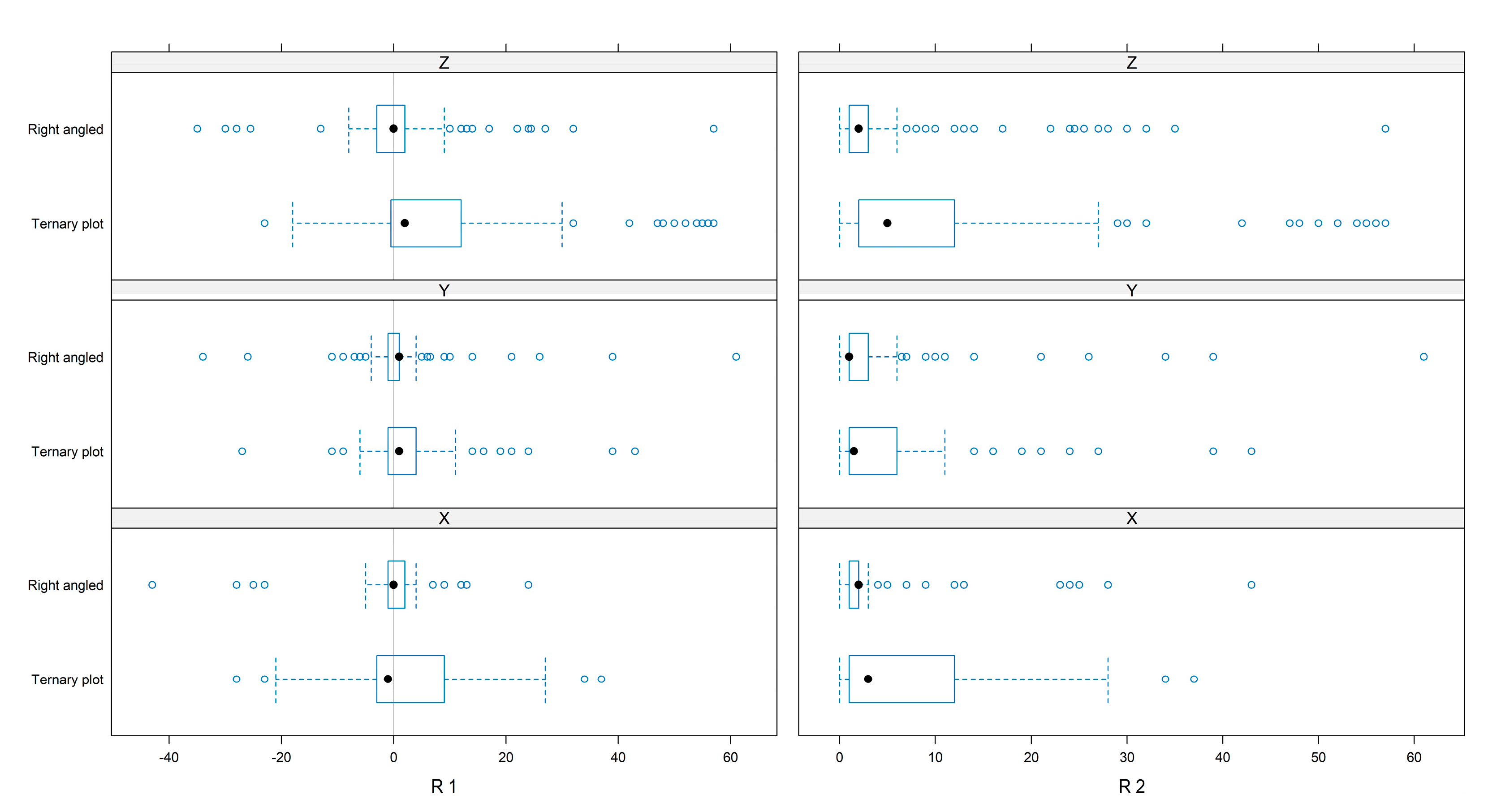
R1 represents the deviation from the actual value for a particular variable. Its mean value, as determined across all respondents, to zero would indicate that the variable value was read without bias. R2 represents absolute deviation from the actual value, with its mean across all respondents representing the overall precision of estimation.
Considering that the sample of the population of researchers was not selected randomly (due to the selection of the corresponding authors of papers published in 2006–2010 in all agricultural journals indexed in the Web of Science), it was not possible to analyze the data statistically. All of the plots were constructed using the R language.

3. Results

3.1. Theoretical Comparison

Table 2 summarizes the theoretical comparison of the two kinds of plots. The coordinate system is the most striking difference between them: the ternary plot uses the barycentric coordinates, while a right-angled plot uses the Cartesian coordinates for two axes, combining them with a third axis at an angle of 45 degrees to both these axes. All the other differences between the plots directly result from the two different coordinate systems.
The greatest advantage of a ternary plot is its symmetry, since all component variables in the compositional model should be considered equally important, and when analyzing them (and their influence on the composition variable), the reader is expected to pay equal attention to each of them. A right-angled plot lacks this symmetry, but the resemblance to the Cartesian axes is expected to ease the reader’s reading and analysis of its data because the two perpendicular sides of the triangle are also the heights of the triangle, making it unnecessary to project the axis of the graph onto the sides of the figure. However, the third axis in this graph is located in the plotting area (in the data area), unlike in the ternary plot.
The use of zone indicators seems to be equally simple on both types of graphs. We can also say this about grid lines, although on the ternary graph, it is more difficult to determine the coordinates of data points based on the grid lines than on the right-angled graph, due to their different intersection angles (Table 2).
The theoretical comparison of the plots pointed out the following differences:
  • The plots have different coordinate systems: an atypical coordinate system exploiting the Cartesian coordinate system for the right-angled plot, and the barycentric coordinate system for the ternary plot;
  • The ternary plot has a greater variation of construction elements (the value axes for the variables may appear along the sides or altitudes of the triangle, and the values can be interpreted either clockwise or counterclockwise along these axes). Therefore, it can be constructed in more ways than a right-angled plot. Because of this variability, ternary plots constructed by different authors can be difficult and confusing to read. The construction of a right-angled plot does not present such variability;
  • The ternary plot has the isometric property for all three scales, so the relation between the physical distance on a plot and the distance in the data scale is the same for the three axes; a right-angled plot has the isometric property only for the two perpendicular axes;
  • Given the triangle base, the right-angled plot has a larger plotting region than does the ternary plot; however, the former has one axis within the plotting region, while the whole plotting region of the latter is devoted to the data.

3.2. CAWI Survey

Out of the 37,891 researchers invited to the survey, 441 (1.1%) completed the questionnaire. Table 3 shows basic data about the respondents.

3.2.1. Rate of Correct Plot Reading

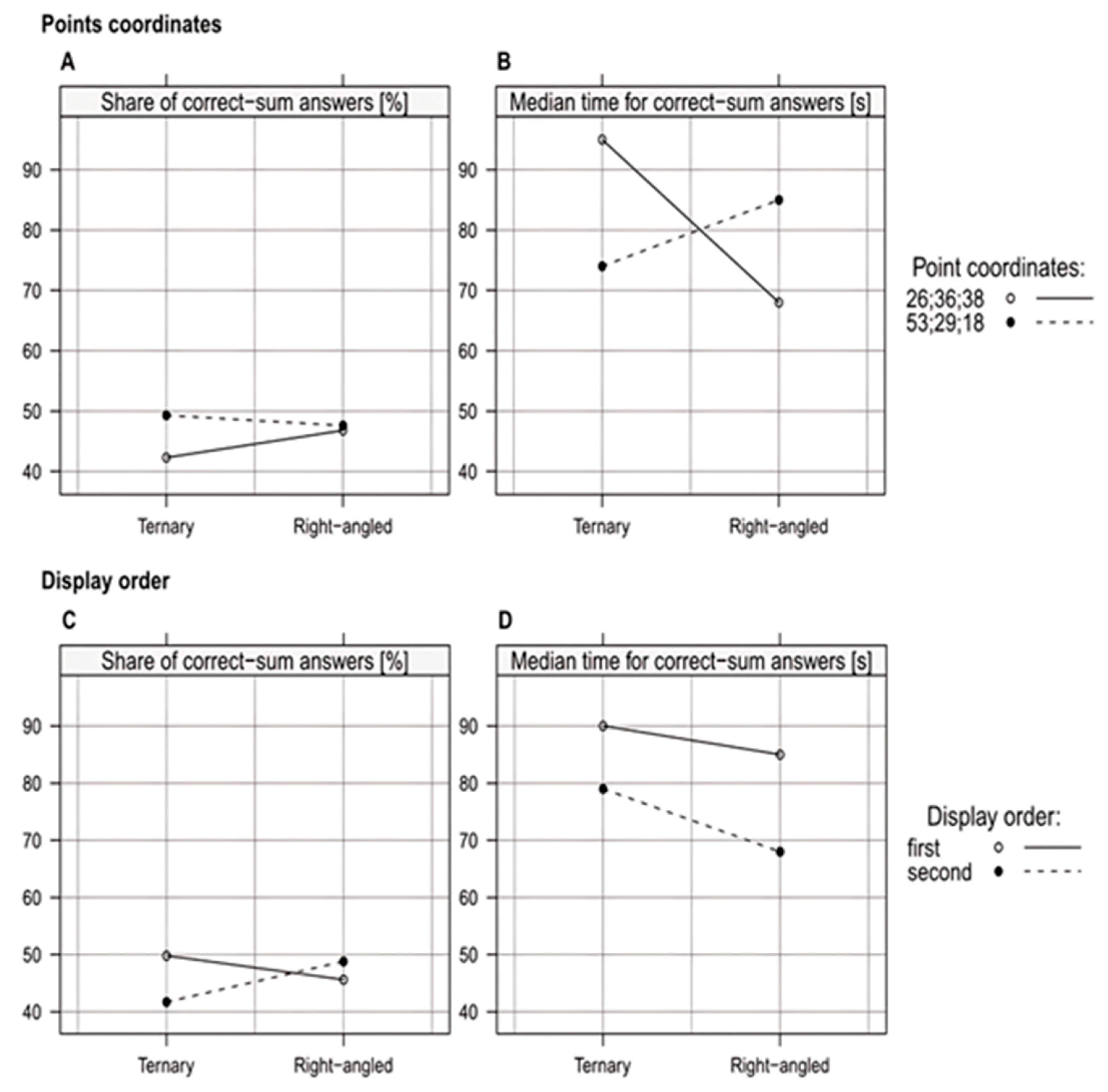
About one-third of the respondents (35.1%) gave correct-sum answers for both plots; 45.8% provided correct-sum answers for the ternary plot, and 47.2% for the right-angled plot. Median response time for the questions in which respondents read the coordinates was 84.5 s for correct-sum responses for the ternary plot and 76.5 s for the right-angled plot (Figure 3).
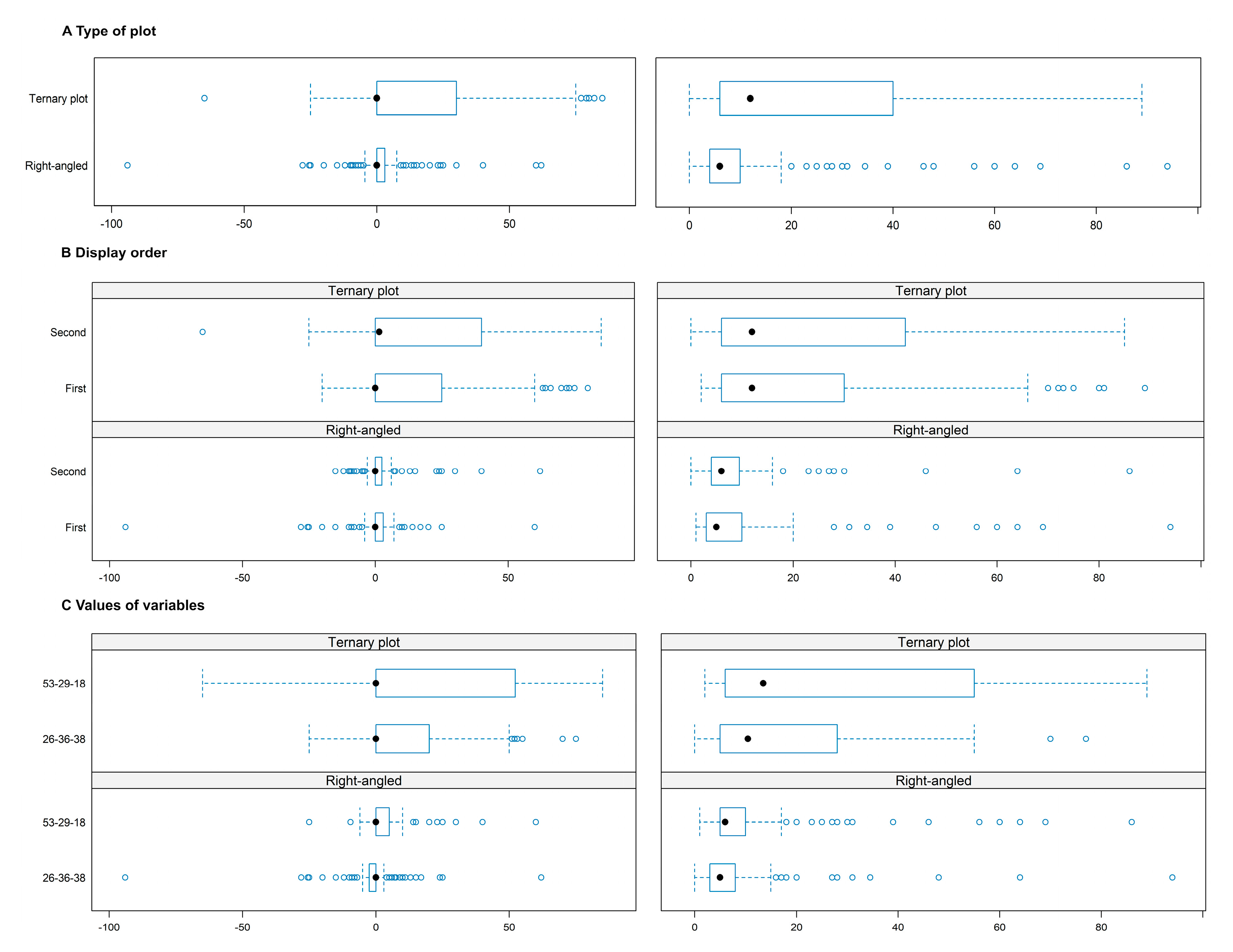
The number of correct-sum answers for the ternary plot slightly differed for the two sets of coordinate values, while this was not observed with the right-angled plot (Figure 3A). The median response time was opposite for the two sets of coordinates in the two kinds of plots (Figure 3B).
When the ternary plot was displayed first in the questionnaire, a slightly greater number of correct-sum answers was obtained than when it was displayed second (Figure 3C). For both plots, the respondents spent a shorter time reading the coordinates from the plot when it was displayed second in the questionnaire than when it was displayed first (Figure 3D). When the plots were displayed first in the questionnaire, the median reading times were similar for both graphs. When the plots were displayed second, however, the median reading time was longer for the ternary plot (Figure 3D).
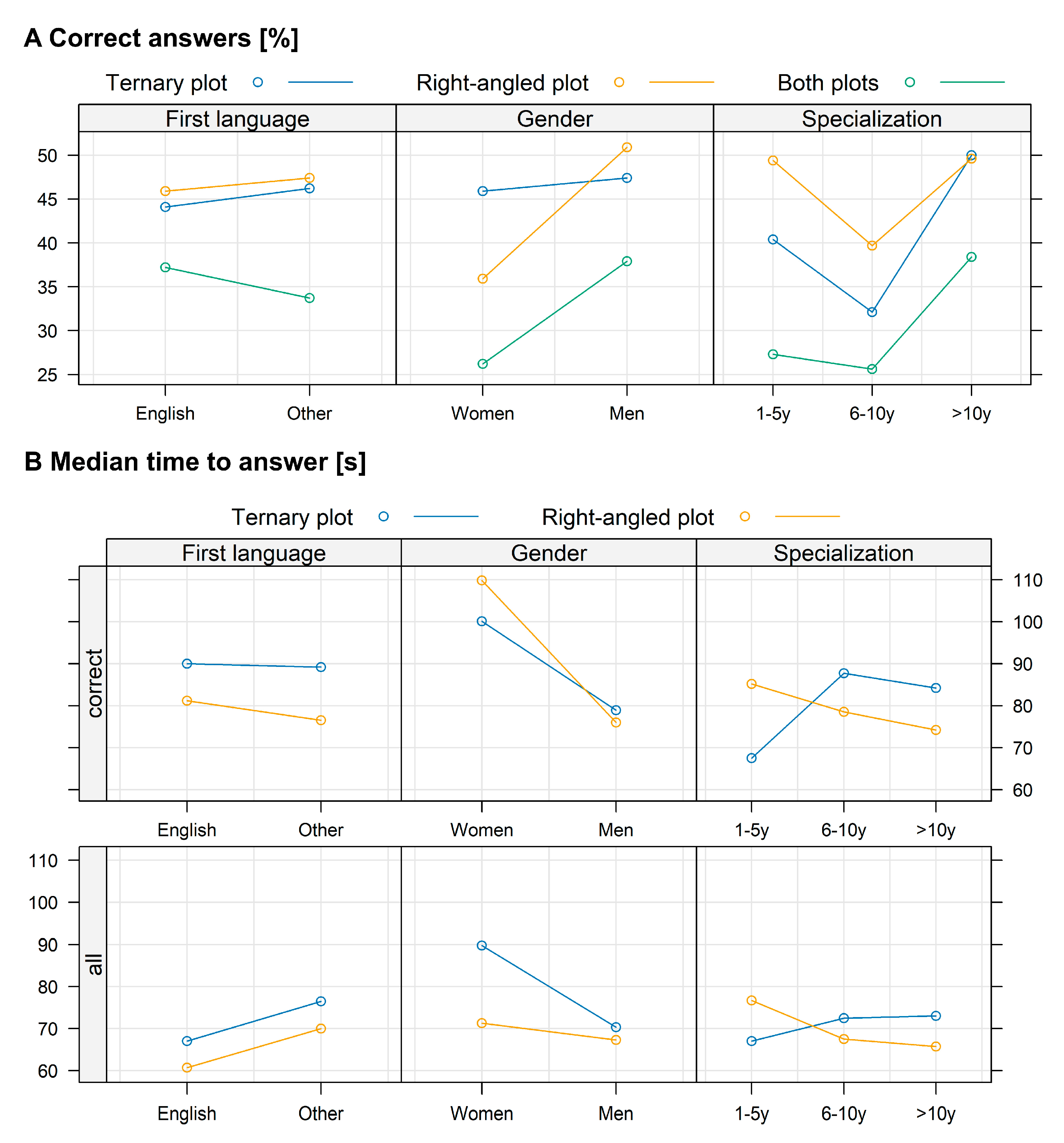
Considering the characteristics of the respondents, no differences in answer correctness or response time were observed between native and non-native English speakers for either plot type (Figure 4). Men gave more correct-sum answers than women for the right-angled plots, while for the ternary plot, the gender difference was negligible. The length of working experience influenced both answer correctness and response time, particularly for the ternary plot. More experienced respondents also answered more quickly when using the right-angled plot.

3.2.2. Analysis of the Bias and Precision in Plot Evaluation

Only a limited number of respondents were able to provide correct answers when identifying the point with respect to a single variable, and very few answered correctly when considering all three variables together. However, in cases (i.e., with variables treated independently and together), the number of correct answers was higher with the right-angled plot than with the ternary plot (Figure 5A). When a 5% tolerance was allowed in defining the point, correctness increased dramatically—up to about 95% for the X and Y variables, about 80% for the Z variable, and about 75% when considering all three variables together (Figure 5B). Notably, the number of correct answers was consistently higher—by about 30%—with the right-angled plot than with the ternary plot for both individual variables and their combination (Figure 5B).
The right-angled plot proved noticeably easier for the respondents to estimate the data with higher accuracy than the ternary plot. Compared with the latter, it reduced error variation—both relative and absolute—particularly for the X and Z variables (Figure 6). As a result, the right-angled plot showed fewer and smaller systematic errors, as well as greater reading precision (Figure 7), indicating that respondents read the data more accurately from this plot type. This advantage held even when considering display order and variable values: the right-angled plot consistently yielded smaller systematic errors and higher estimation precision compared with the ternary plot (Figure 7B,C).
The respondents’ characteristics (i.e., language, experience, and gender) did not affect the bias and the precision of estimation when reading both kinds of plots (Supplementary Materials Figure S2).

3.2.3. Perceived Ease in Using the Two Kinds of Plots

The overall evaluation of ease of use resulted in a preference for the ternary plot by most respondents (63.2%) (Figure 8). Respondents’ opinions were not influenced by the point coordinates or display order, and only to a very limited extent by their individual characteristics, such as language, experience, and gender.

4. Discussion

From the theoretical analysis of the two plot types, we can conclude that the right-angled plot offers more advantages than disadvantages compared with the ternary plot for representing composite variables. However, when comparing graph types that differ significantly, theoretical analysis alone is not sufficient to determine which is superior. A graph that appears optimal in theory may not necessarily perform better in practice, especially since human perception can be misleading [43], as also observed comparing the capacity of image-analyzing models [44]. Therefore, an empirical analysis, which examined the graphs in terms of the ease of data reading and related features, was carried out, and the survey results supported the theoretical analysis conclusions. Indeed, respondents read data more accurately from the right-angled plot—both for individual component variables and for all three considered together. Systematic errors (R1) and value estimates (R2) were also smaller with the right-angled plot across all variables. Additionally, correct-sum values were less overestimated when using the right-angled plot. This advantage may stem, in part, from its visual similarity to bar charts, which—among bar, line, and point graphs—are the most commonly used to present data from agricultural trials [45].
Nevertheless, it was the ternary plot that the majority of respondents perceived as easier to read. Understanding the reason behind this perception is critical for two reasons. First, even if the right-angled plot is theoretically a better alternative, its advantages would become irrelevant if users find it too difficult to interpret; a graph that is technically superior but cognitively demanding may ultimately be impractical and should be avoided—at least in most use cases. Second, our findings reveal a disconnect between perceived and actual performance: while respondents reported that the ternary plot was easier to read—or more precisely, felt easier to read, since their evaluation reflected subjective impressions rather than objective criteria—they in fact achieved significantly higher accuracy with the right-angled plot. This discrepancy points to a well-documented cognitive bias known as processing fluency: the subjective ease with which information is processed can shape judgments independently of actual performance [46].
Although the response rate to the survey was relatively low (slightly above 1%), it can still be regarded as a large-scale experiment for this type of study due to the absolute number of respondents, similar to other CAWI-based surveys [47]. Response rates in CAWI surveys can be influenced by many factors, such as respondents’ interest in the survey topic [48]. Nevertheless, we considered this method to be more reliable in terms of response rates than, for example, a perception-based study. It is also quite likely that those who chose to participate were at least somewhat interested in data visualization, which supports the relevance of the results.
Therefore, the lack of diversity in respondent characteristics may suggest a general bias in the perception of the right-angled plot’s visual representation. It can be hypothesized that some respondents were familiar with the ternary plot, having been selected among authors of agricultural and horticultural papers, and may have used it (e.g., for soil classification). The right-angled plot, on the other hand, was new to all—or nearly all—respondents.
The hypothesis that agricultural scientists consider the ternary plot easier to read simply because many of them have already encountered or used it, unlike the right-angled plot, is further supported when analyzing perception by work-experience category. The group with intermediate experience considered both plots equally easy to read. Those with longer experience, however, found the ternary plot easier to understand and showed some working knowledge of its use—and note that scientists with longer experience are significantly more likely to have seen the ternary plot in practice than those with intermediate experience, let alone those with little experience.
Soni [49] pointed out that the accuracy of data reading depends on the graph layout. We studied the accuracy of data interpretation with both plots. An interesting observation, already mentioned above, is that both the systematic error and the precision of estimation were considerably lower with the right-angled plot. This likely indicates that the right-angled plot is, in practice, easier to read. This conclusion rests on the reasonable simplification that if users produce better results with one format than another, then the first is simpler to use, regardless of which they feel is simpler.
We did not control for prior knowledge among respondents. However, we took measures to mitigate its influence: before participating in the study, each respondent read a detailed instruction on how to use both graphs. This likely helped to some extent in equalizing their knowledge of the two visualization methods.
Furthermore, while some participants may have been familiar with the ternary plot, it is unlikely that any had prior experience with the right-angled plot. Thus, if familiarity bias influenced the results, it would have favored the ternary plot rather than the right-angled plot. Therefore, although we could not isolate this effect from the data, it would have worked against our hypothesis rather than in its favor. As a result, any observed advantage of the right-angled plot cannot be attributed to this confounding factor—if anything, it emerged despite the bias.
Considering that graph perception is a complex process influenced by various external stimuli, we did not expect the results of this study to be unequivocal. In this initial stage of research on the usefulness of the right-angled and ternary plots, we chose to focus primarily on reading accuracy—one of the most important aspects of any graph. A graph that is both easier to read and allows for more accurate interpretation of data has the potential to be more effective in terms of knowledge acquisition and could be applied in agricultural studies [50]. In our case, the survey results showed that the right-angled plot allowed for significantly more accurate data reading, even though respondents perceived it as more difficult to interpret. Some psychological studies report that cognitive performance may be influenced by gender [51], a pattern also observed in our study.

5. Conclusions

This article proposes a new type of graph for visualizing composite data with three component variables—the isosceles right-angled plot. It is based on the standard right-angled plot but adapted to the specific characteristics of composite data. The study was motivated by the observation that the ternary plot, typically used for such data, is often difficult to read and interpret. Unlike the ternary plot, which relies on the barycentric coordinate system, the isosceles right-angled plot uses the Cartesian coordinate system, making it easier to read. Therefore, this research aimed to verify the hypothesis that data can be read more accurately from the isosceles right-angled plot than from the ternary plot. If confirmed, this graph type could serve as a promising alternative to the ternary plot for visualizing composite data.
The study results suggest that the isosceles right-angled plot has potential for visualizing composite data with three additive component variables, which are commonly used in agricultural studies. The findings indicate that this plot type allows for more accurate data reading. Thus, this research serves as a first step in exploring the right-angled plot, demonstrating that it warrants further investigation to deepen our understanding of its application in agricultural sciences. Future studies could examine various aspects of the graph, including its effectiveness in different agricultural contexts where composite data analysis is required. Further development of visualization techniques and digital platforms of agricultural knowledge may enable such plots to be presented in interactive form, which calls for continued research into the boundaries and potential of these types of visualizations.
This research has certain limitations, one of which is the low participation rate, slightly above 1%. In studies as complex as ours, a low response rate is to be expected unless conducted under controlled conditions. While we could have opted for a perception experiment conducted under controlled conditions, we believe it would have been less informative, as it would not have allowed us to reach such a diverse sample of scientists. Although classical statistical methods could be applied to data from such an experiment, the reference population would differ from the one we targeted—namely, agricultural researchers publishing in international journals. In an on-site controlled experiment, we would not be able to take a random sample from a population defined that way, so we would be forced to redefine it, primarily by limiting its scope to Polish scientists. An online controlled experiment would be extremely difficult to conduct—if possible at all—since the very definition of a controlled experiment assumes that the conditions can actually be controlled, which would not be feasible in such a setting. This does not mean that controlled experiments would not be valuable; they certainly could be in future research by expanding the scope of studies that contribute to the understanding of this type of graph.
This study was conducted within the context of agricultural sciences. During our preliminary research on the agricultural literature, we found that despite the frequent use of composite data in this field, such data were rarely visualized. To gain a broader perspective, we extended our literature search to biological and environmental sciences, where we found that the ternary plot is the predominant method for visualizing this type of data, with very few exceptions. Due to its complex construction mechanics, as well as the resulting complexity of the graph in terms of various perception aspects, the ternary plot is difficult to use. It is this difficulty, coupled with the frequent need to analyze agricultural composite data with three components, that led us to propose the new graph type.
Since our questionnaire study was conducted among agricultural researchers, we refrain from extrapolating our conclusions to other scientific fields, not even to biological and environmental sciences, although it could be plausible that our findings may apply to them.
The perceived readability of the isosceles right-angled plot may be influenced by the users’ disciplinary backgrounds, making it worthwhile to test it with researchers from a wide range of fields. Furthermore, a qualitative study involving experts in data visualization could provide deeper insights into its usability and effectiveness. It could also be valuable to examine how well the two types of plots support data interpretation—particularly in terms of perceived relationships between variables and the dominance of individual components. In addition, applied studies in specific agricultural contexts could be beneficial, as data visualization techniques are often adapted differently depending on the use case. From our analysis of the contexts in which compositional data arise, it appears that such data can be effectively represented using the new approach to support the communication of information relevant to rural policy development. Given the diversity of situations in which composite data occur in agricultural sciences, a method that allows for easier and/or more accurate analysis and interpretation should be welcomed, particularly when considering two common scenarios. The first involves a trait that is the sum of its additive components, where the analysis typically aims to identify the strongest determinants, examine their relationships to the whole, and explore inter-component dynamics. The second scenario concerns the comparison of three traits where the total sum is not of primary interest, and the focus lies on their relative proportions.

Supplementary Materials

The following supporting information can be downloaded at https://www.mdpi.com/article/10.3390/app15189949/s1. Table S1: The list of journals from which e-mail addresses for the survey were collected; Figure S1: The starting page of the online questionnaire; Figure S2: Effect of first language, research experience, and gender on bias ( R 1 X Y Z ) and precision ( R 2 X Y Z ) of estimation. Filled circles represent the median values of R 1 X Y Z and R 2 X Y Z .

Author Contributions

Conceptualization, M.T. and M.K.; methodology, M.T. and M.K.; formal analysis, M.T.; investigation, M.T.; data curation, M.T. and D.S.; writing—original draft preparation, M.T. and D.S.; writing—review and editing, E.M., B.B. and M.K.; visualization, B.B., D.S. and M.T. All authors have read and agreed to the published version of the manuscript.

Funding

The work was not financed by any project.

Institutional Review Board Statement

Not applicable. The survey was conducted online and was anonymous, with no possibility of identifying any respondent data.

Informed Consent Statement

Informed consent was obtained from all subjects involved in the study. By deciding to complete the online survey, respondents also agreed to participate.

Data Availability Statement

The original contributions presented in this study are included in the article/Supplementary Material. The raw data supporting the conclusions of this article will be made available by the authors on request. Further inquiries can be directed to the corresponding author(s).

Acknowledgments

The authors would like to thank the 441 people who participated in the survey.

Conflicts of Interest

The authors declare no conflicts of interest.

References

  1. Jolliffe, P.A.; Courtney, W.H. Plant Growth Analysis: Additive and Multiplicative Components of Growth. Ann. Bot. 1984, 54, 243–254. [Google Scholar] [CrossRef]
  2. Aitchison, J. The Statistical Analysis of Compositional Data; Springer: Dordrecht, The Netherlands, 1986. [Google Scholar]
  3. Kozak, M. Note on two methods of additive yield component analysis. Biom. Lett. 2010, 47, 129–132. [Google Scholar]
  4. Kozak, M.; Gozdowski, D.; Wyszyński, Z. An approach to analyzing a response variable as affected by its additive components: Example for spring barley grain yield. Cereal Res. Commun. 2006, 34, 981–988. [Google Scholar] [CrossRef]
  5. Brzezinski, M.; Barszczak, T. Zawartość glinu wymiennego w glebie w świetle trwałych doświadczeń nawozowych w Skierniewicach. Zesz. Probl. Postęp. Nauk Rol. 2009, 541, 67–72. [Google Scholar]
  6. Skorupska, A.; Lacka, A. The response of the two-spotted spider mite (Tetranychus urticae koch) to different cereal crop species. Prog. Plant Prot. 2009, 49, 142–144. [Google Scholar]
  7. Karg, J.; Bałazy, S. Effect of landscape structure on the occurrence of agrophagous pests and their antagonists. Prog. Plant Prot./Postęp. Ochr. Rośl. 2009, 49, 1015–1034. [Google Scholar]
  8. Łabanowska-Bury, D.; Dąbrowski, Z.T.; Eyre, M.D.; Leifert, C.; White, R. The importance of field surrounding flora in protection of vegetable crops against pests. Prog. Plant Prot./Postęp. Ochr. Rośl. 2009, 49, 1066–1073. [Google Scholar]
  9. Złotkowski, J. Seasonal changes in aphid migration dynamics in the surrounding area of Winna Góra (Wielkopolska district) in 2007–2008. Prog. Plant Prot./Postęp. Ochr. Rośl. 2009, 49, 1242–1246. [Google Scholar]
  10. European Commission. Directive 2009/128/EC of the European Parliament and of the Council of 21 October 2009 establishing a framework for Community action to achieve the sustainable use of pesticides. Off. J. Eur. Union 2009, 309, 71–86. [Google Scholar]
  11. GUS. Statistical Yearbook of Poland; Zakład Wydawnictw Statystycznych: Warszawa, Poland, 2010; p. 700. [Google Scholar]
  12. Tufte, E.R.; Graves-Morris, P.R. The Visual Display of Quantitative Information; Graphics Press: Cheshire, CT, USA, 1983. [Google Scholar]
  13. Cleveland, W.S.; McGill, R. Graphical Perception: Theory, Experimentation, and Application to the Development of Graphical Methods. J. Am. Stat. Assoc. 1984, 79, 531–554. [Google Scholar] [CrossRef]
  14. Möbius, A.F. Der Barycentrische Calcul (Der barycentrische Calcul: Ein Neues Hülfsmittel zur Analytischen Behandlung der Geometrie); Barth: Leipzig, Germany, 1827; p. 426. [Google Scholar]
  15. Pawlowsky-Glahn, V.; Egozcue, J.J. Geometric approach to statistical analysis on the simplex. Stoch. Environ. Res. Risk Assess. 2001, 15, 384–398. [Google Scholar] [CrossRef]
  16. Egozcue, J.J.; Pawlowsky-Glahn, V.; Mateu-Figueras, G.; Barcelo-Vidal, C. Isometric logratio transformations for compositional data analysis. Math. Geol. 2003, 35, 279–300. [Google Scholar] [CrossRef]
  17. Egozcue, J.J.; Pawlowsky-Glahn, V. Groups of Parts and Their Balances in Compositional Data Analysis. Math. Geol. 2005, 37, 795–828. [Google Scholar] [CrossRef]
  18. Palmajumder, M.; Chaudhuri, S.; Das, V.K.; Nag, S.K. An appraisal of geohydrological status and assessment of groundwater quality of Indpur Block, Bankura District, West Bengal, India. Appl. Water Sci. 2021, 11, 59. [Google Scholar] [CrossRef]
  19. Chidambaram, S.; Prasanna, M.V.; Venkatramanan, S.; Nepolian, M.; Pradeep, K.; Panda, B.; Thivya, C.; Thilagavathi, R. Groundwater quality assessment for irrigation by adopting new suitability plot and spatial analysis based on fuzzy logic technique. Environ. Res. 2022, 204 Pt A, 111729. [Google Scholar] [CrossRef]
  20. Tamrakar, N.K. Riverbed-material texture and composition of Bishnumati River, Kathmandu, Nepal; implications in provenance analysis. Bull. Dep. Geol. 1970, 12, 55–62. [Google Scholar] [CrossRef]
  21. Flemming, B.W. A revised textural classification of gravel-free muddy sediments on the basis of ternary diagrams. Cont. Shelf Res. 2000, 20, 1125–1137. [Google Scholar] [CrossRef]
  22. Rilo, E.; Ferreira, A.G.M.; Fonseca, I.M.A.; Cabeza, O. Densities and derived thermodynamic properties of ternary mixtures 1-butyl-3-methyl-imidazolium tetrafluoroborate + ethanol + water at seven pressures and two temperatures. Fluid Phase Equilibria 2010, 296, 53–59. [Google Scholar] [CrossRef]
  23. Selkirk, K.E. Triangular Graphs and League Tables. Teach. Stat. 1983, 5, 29–30. [Google Scholar] [CrossRef]
  24. Cox, N.J. Speaking Stata: Graphing Categorical and Compositional Data. Stata J. Promot. Commun. Stat. Stata 2004, 4, 190–215. [Google Scholar] [CrossRef]
  25. Potente, S.; Ramsthaler, F.; Federspiel, J.M. A useful data presentation tool: Ternary plots in forensic medicine. Leg. Med. 2025, 76, 102652. [Google Scholar] [CrossRef]
  26. Lang, P.; Modla, G.; Benadda, B.; Lelkes, Z. Homoazeotropic distillation of maximum azeotropes in a batch rectifier with continuous entrainer feeding I. Feasibility studies. Comput. Chem. Eng. 2000, 24, 1665–1671. [Google Scholar] [CrossRef]
  27. Cho, J.H.; Jeon, J.K. Comparison of three-and two-column configurations in ethanol dehydration using azeotropic distillation. J. Ind. Eng. Chem. 2006, 12, 206–215. [Google Scholar]
  28. Milano, G.; Di Giovambattista, R.; Ventura, G. Seismic activity in the transition zone between Southern and Central Apennines (Italy): Evidences of longitudinal extension inside the Ortona–Roccamonfina tectonic line. Tectonophysics 2008, 457, 102–110. [Google Scholar] [CrossRef]
  29. Yang, Z. Bayes Empirical Bayes Inference of Amino Acid Sites Under Positive Selection. Mol. Biol. Evol. 2005, 22, 1107–1118. [Google Scholar] [CrossRef] [PubMed]
  30. Siemes, H.; Schaeben, H.; Rosière, C.A.; Quade, H. Crystallographic and magnetic preferred orientation of hematite in banded iron ores. J. Struct. Geol. 2000, 22, 1747–1759. [Google Scholar] [CrossRef]
  31. Kruhl, J.H.; Peternell, M. The equilibration of high-angle grain boundaries in dynamically recrystallized quartz: The effect of crystallography and temperature. J. Struct. Geol. 2002, 24, 1125–1137. [Google Scholar] [CrossRef]
  32. Vdović, N.; Obhođaš, J.; Pikelj, K. Revisiting the particle-size distribution of soils: Comparison of different methods and sample pre-treatments. Eur. J. Soil Sci. 2010, 61, 854–864. [Google Scholar] [CrossRef]
  33. Gerakis, A.; Baer, B. A computer program for soil textural classification. Soil Sci. Soc. Am. J. 1999, 63, 807–808. [Google Scholar] [CrossRef]
  34. Thomas, W. Foliar diagnosis: Principles and practice. Plant Physiol. 1937, 12, 571. [Google Scholar] [CrossRef]
  35. Golba, J.; Rozbicki, J.; Gozdowski, D.; Sas, D.; Mądry, W.; Piechociński, M.; Kurzyńska, L.; Studnicki, M.; Derejko, A. Adjusting yield components under different levels of N applications in winter wheat. Int. J. Plant Prod. 2013, 7, 139–150. [Google Scholar]
  36. Dennis, R.L.H. Mate location behavior of the large skipper butterfly Ochlodes venata: Flexible strategies and spatial components. J. Lepid. Soc. 1987, 41, 45–64. [Google Scholar]
  37. Hadian, S.; Smith, D.L.; Supronienė, S. Modulating the Plant Microbiome: Effects of Seed Inoculation with Endophytic Bacteria on Microbial Diversity and Growth Enhancement in Pea Plants. Microorganisms 2025, 13, 570. [Google Scholar] [CrossRef]
  38. Herman, I.; Melancon, G.; Marshall, M.S. Graph visualization and navigation in information visualization: A survey. IEEE Trans. Vis. Comput. Graph. 2000, 6, 24–43. [Google Scholar] [CrossRef]
  39. Tufte, E.R. Envisioning Information; Graphics Press: Cheshire, CT, USA, 1990. [Google Scholar]
  40. Cleveland, W.S. Visualizing Data; AT&T Bell Laboratories: Murray Hill, NJ, USA, 1993. [Google Scholar]
  41. Cleveland, W.S. The Elements of Graphing Data, rev. ed.; AT&T Bell Laboratories: Murray Hill, NJ, USA, 1994. [Google Scholar]
  42. Wilkinson, L. The grammar of graphics. In Handbook of Computational Statistics: Concepts and Methods; Springer: Berlin/Heidelberg, Germany, 2011; pp. 375–414. [Google Scholar]
  43. Kahneman, D. Thinking, Fast and Slow; Doubleday: Toronto, ON, Canada, 2011; p. 512. [Google Scholar]
  44. Wang, C.; Han, Q.; Li, J.; Li, C.; Zou, X. YOLO-BLBE: A Novel Model for Identifying Blueberry Fruits with Different Maturities Using the I-MSRCR Method. Agronomy 2024, 14, 658. [Google Scholar] [CrossRef]
  45. Tartanus, M.; Wnuk, A.; Kozak, M.; Hartley, J. Graphs and prestige in agricultural journals. J. Am. Soc. Inf. Sci. Technol. 2013, 64, 1946–1950. [Google Scholar] [CrossRef]
  46. Alter, A.L.; Oppenheimer, D.M. Uniting the tribes of fluency to form a metacognitive nation. Personal. Soc. Psychol. Rev. 2009, 13, 219–235. [Google Scholar] [CrossRef] [PubMed]
  47. Kozak, M.; Hartley, J. Presenting numerical values within sentences and text tables. J. Am. Soc. Inf. Sci. Technol. 2012, 63, 108–113. [Google Scholar] [CrossRef]
  48. Connelly, N.A.; Brown, T.L.; Decker, D.J. Factors Affecting Response Rates to Natural Resource—Focused Mail Surveys: Empirical Evidence of Declining Rates Over Time. Soc. Nat. Resour. 2003, 16, 541–549. [Google Scholar] [CrossRef]
  49. Soni, U.; Lu, Y.; Hansen, B.; Purchase, H.C.; Kobourov, S.; Maciejewski, R. The Perception of Graph Properties in Graph Layouts. Comput. Graph. Forum 2018, 37, 169–181. [Google Scholar] [CrossRef]
  50. Tartanus, M.; Kozak, M.; Sas, D. The use of ternary and right-angled plots in data visualization in agricultural applications. Zesz. Probl. Postęp. Nauk Rol. 2017, 589, 93–107. [Google Scholar] [CrossRef]
  51. Keith, T.Z.; Reynolds, M.R.; Patel, P.G.; Ridley, K.P. Sex differences in latent cognitive abilities ages 6 to 59: Evidence from the Woodcock–Johnson III tests of cognitive abilities. Intelligence 2008, 36, 502–525. [Google Scholar] [CrossRef]
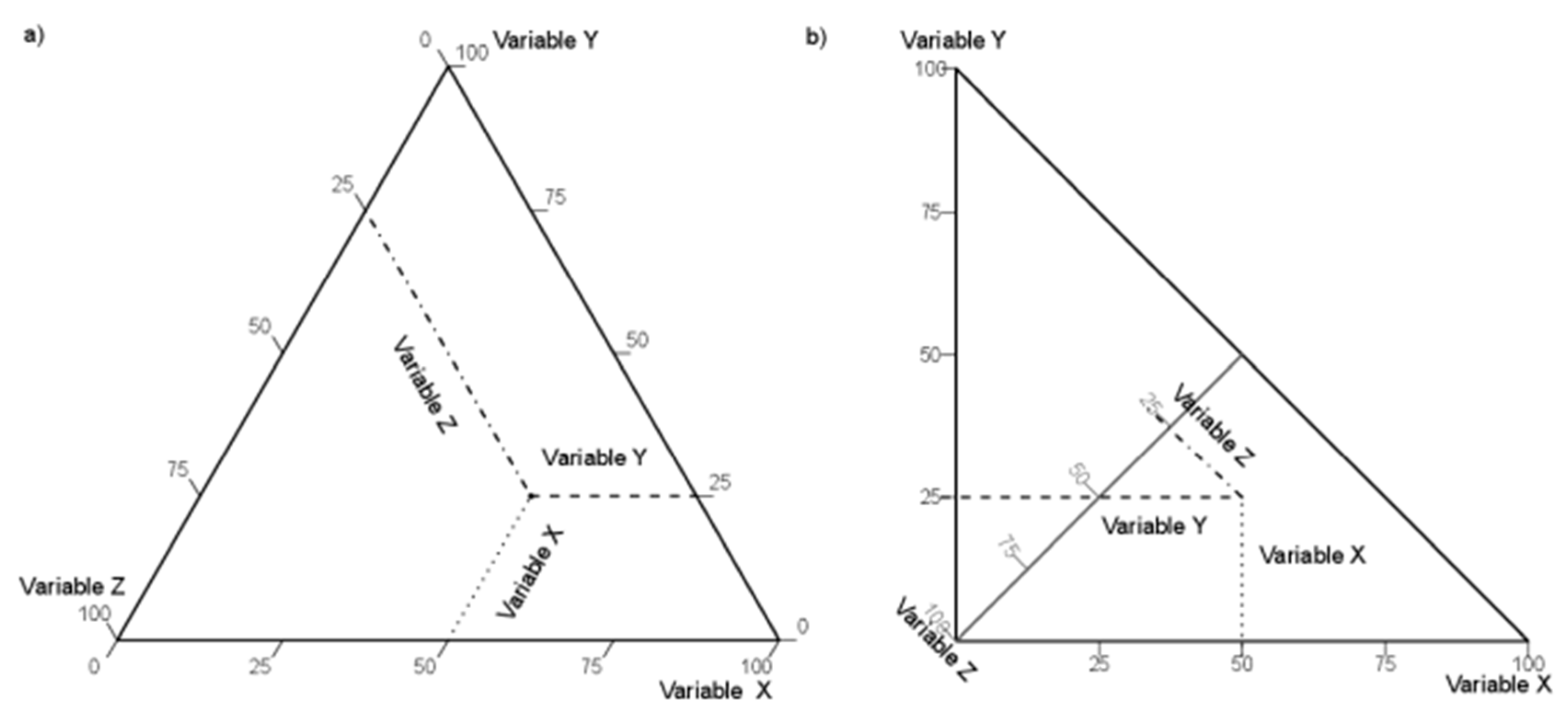
Figure 1. Comparison between the construction of reading values of a single observation on the (a) ternary plot and (b) right-angled plot. The point with the same variable values (X = 50, Y = 25, and Z = 25) is represented. The proposed right-angled plot includes the variable X on the base of the triangle, and variable Y on the left side of the triangle, while variable Z is entering the plot area from the left corner of the triangle. The point value is determined, similarly to the ternary plot, at the intersection of the lines originating from the three variable values; mimicking the Cartesian coordinate system, it is expected to improve the visual representation of the data.
Applsci 15 09949 g001
Figure 2. Two points used in the questionnaire study, with the following coordinates: (A) X = 26, Y = 36, Z = 38; (B) X = 53, Y = 29, Z = 18. In the ternary plot, arrows indicate the direction for reading variable values.
Applsci 15 09949 g002
Figure 3. The effect of the sequence of coordinates (A,B) and the display order in the questionnaire (C,D) on the number of correct-sum answers (A,C) and time to deliver the answer (B,D). The correct-sum answers are shown with the tolerance of ±5% (i.e., accepting a value from 95 to 105%).
Applsci 15 09949 g003
Figure 4. The impact of language, gender, and research experience of the respondents on the number of correct answers (A) and median time (B) for the correct answer (above) or all answers (below).
Applsci 15 09949 g004
Figure 5. Proportion of correct answers: without tolerance (A), where responses had to match the true values exactly, and with a ±5% tolerance (B). Results are shown for the two types of plots, separately for each variable (X, Y, and Z), and for all variables combined (XYZ). ALL Q: all questionnaires; Q: questionnaire number.
Applsci 15 09949 g005
Figure 6. Effect of the plot type (ternary vs. right-angled) on the accuracy of respondents interpreting the data: deviations (i.e., error variation) from the actual value (R1), and absolute deviation (i.e., total system error) from the actual value (R2) for each variable (xyz) are presented. Filled circles represent the median values.
Applsci 15 09949 g006
Figure 7. Effect of the plot type (A), order of display (B), and coordinates of point (C) on the respondents’ capacity for correct estimation of the plot data. ( R 1 X Y Z ) shows the estimation bias expressed as the sum of deviations from the actual value of the (xyz) variables; ( R 2 X Y Z ) shows the estimation precision, expressed as the sum of absolute deviations from the actual value of the three variables. Filled circles represent the median values.
Applsci 15 09949 g007
Figure 8. Effect of respondents’ or data characteristics on perceived ease of plot reading.
Applsci 15 09949 g008
Table 1. The setup of the four questionnaires with the values of the variables (the coordinates of the plotted point) on the plots.
Questionnaire NumberPlotPosition in the QuestionnaireValues of Variables
XYZ
1TernaryFirst263638
Right-angledSecond532918
2TernaryFirst532918
Right-angledSecond263638
3Right-angledFirst532918
TernarySecond263638
4Right-angledFirst263638
TernarySecond532918
Table 2. Conceptual comparison of a ternary plot versus a right-angled plot.
Ternary PlotRight-Angled
Construction of the plots
Kind of triangle Equilateral triangle
(which uses the barycentric coordinates)
Isosceles right triangle
(which uses the Cartesian coordinate system for two axes)
Plotting areaSurface area
S T = 3 2 S R A
ST-surface area of the ternary plot; SRA-surface area of the right-angled plot
Surface area
S R A = 1 2 a 2
SRA-surface area of the right-angled plot; a-length of the side of the triangle
The axes are located on the corresponding altitudes. The axes can be further projected onto the sides of the triangle, so that the plotting area is used only for drawing data points.The axes are located on the corresponding altitudes, but one of the axes is within the plotting area. Two heights are the sides of the triangle. The three axes are directly shown and thus do not have to be projected.
Location of axes All at the altitudes of the triangle.Two at the heights and one at the angle bisecting line.
Typically, they require projection on the edges of the triangle.They do not require projection on the edges of the triangle; one axis is within the plotting region.
Length of axesThe same for all the variables.One is longer than the other two.
Distance between tick marks on axesThe same for all the scales.Shorter on the inside axis than on the other two.
Use of zone indicators
Connections between the middle points of edgesApplsci 15 09949 i001Applsci 15 09949 i002
Connections of the middle sections that join the barycenter to the midpoints of the sides of the triangleApplsci 15 09949 i003Applsci 15 09949 i004
Grid lines
On both graphs, grid lines can be used.
Grid lines intersect at an angle of 60°.Two grid lines form a right angle, and the third one intersects this point at an angle of 45°.
Reading values of variables in data points
InterpretationSee Figure 1.
To read values of data points, a user should know how these plots are constructed. On the right-angled plot, values of two variables are read on the sides perpendicular to each other, which resembles common graph layouts. On the ternary plot, every 2 axes create angles of 60 degrees with each other
Visual determination of the dominance of one of the variables
Dominance of one of the variablesApplsci 15 09949 i005Applsci 15 09949 i006
If points are located closer to one of the vertices, the variable located in this vertex is dominant.
Location of points on the graph when two variables have the same values at a point (this phenomenon can be observed for all pairs of variables; here for variables Y and Z)Applsci 15 09949 i007Applsci 15 09949 i008
Distribution of data points on a plot when one variable has the same value at several points of observation (this phenomenon can be observed for any variable; here for three example values of variable X)Applsci 15 09949 i009Applsci 15 09949 i010
Relationships between variables
Linear correlation between variables (data generated artificially)Correlation of 0.77:
Applsci 15 09949 i011
X vs. Y      X vs. Z      Y vs. Z
Correlation of 0.77:
Applsci 15 09949 i012
X vs. Y      X vs. Z      Y vs. Z
Nonlinear relationship between variables (data generated artificially)Nonlinear relationship:
Applsci 15 09949 i013
X vs. Y      X vs. Z      Y vs. Z
Nonlinear relationship:
Applsci 15 09949 i014
X vs. Y      X vs. Z      Y vs. Z
Table 3. Basic data about the respondents.
QuestionnaireNo. of RespondentsYears of Experience [%]First Language of Respondent [%]Gender [%]
1–56–10>10EnglishOtherWomanMan
11128.921.469.641.158.920.579.5
21096.423.869.729.370.628.471.5
31053.820.076.228.671.417.182.8
41159.621.768.739.160.926.973.0
Total4417.221.771.034.565.423.276.7
Disclaimer/Publisher’s Note: The statements, opinions and data contained in all publications are solely those of the individual author(s) and contributor(s) and not of MDPI and/or the editor(s). MDPI and/or the editor(s) disclaim responsibility for any injury to people or property resulting from any ideas, methods, instructions or products referred to in the content.