Article

Designing an Interactive Visual Analytics System for Precipitation Data Analysis

by
Dong Hyun Jeong
1,*,
Pradeep Behera
2,
Bong Keun Jeong
3,
Carlos David Luna Sangama
1,
Bryan Higgs
2 and
Soo-Yeon Ji
4,*
1
Department of Computer Science and Information Technology, University of the District of Columbia, Washington, DC 20008, USA
2
Department of Civil Engineering, University of the District of Columbia, Washington, DC 20008, USA
3
Department of Management and Decision Sciences, Coastal Carolina University, Conway, SC 29528, USA
4
Department of Computer Science, Bowie State University, Bowie, MD 20715, USA
*
Authors to whom correspondence should be addressed.
Appl. Sci. 2025, 15(10), 5467; https://doi.org/10.3390/app15105467
Submission received: 28 March 2025 / Revised: 27 April 2025 / Accepted: 9 May 2025 / Published: 13 May 2025
(This article belongs to the Section Computing and Artificial Intelligence)

Abstract

:
As precipitation analysis reveals critical statistical characteristics, temporal patterns, and spatial distributions of rainfall and snowfall events, it plays an important role in planning urban drainage systems, flood forecasting, hydrological modeling, and climate studies. It helps engineers design climate-resilient infrastructure capable of withstanding extreme weather events, which is becoming increasingly important as precipitation patterns change over time. With precipitation analysis, multiple valuable information can be determined, such as storm intensity, duration, and frequency. To enhance understanding of precipitation data and analysis results, researchers often use graphical representation methods to show the data in visual formats. Although existing precipitation analysis and basic visual representations are helpful, it is critical to have a comprehensive analysis and visualization system to detect significant patterns and anomalies in high-resolution temporal precipitation data more effectively. This study presents a visual analytics system enabling interactive analysis of hourly precipitation data across all U.S. states. Multiple coordinated visualizations are designed to support both single and multiple-station analysis. These visualizations allow users to examine temporal patterns, spatial distributions, and statistical characteristics of precipitation events directly within visualizations. Case studies demonstrate the usefulness of the designed system by evaluating various historical storm events.

1. Introduction

Urban development transforms natural surfaces into impermeable ones, which can lead to multiple negative consequences such as increased runoff volume and peak flow, flooding, stream bank erosion, and diminished water quality [1,2]. To protect both society and the environment from these stormwater impacts, engineers and water resource professionals deploy urban stormwater management infrastructure systems [3]. The planning and design of these systems require determining the appropriate sizes, configurations, and operations of engineered elements [4]. Precipitation, including rainfall and snow, serves as the fundamental input parameter for all hydrologic and hydraulic analyses and stormwater management models [5]. Precipitation occurs as a sequence of random meteorological events characterized by varying amounts of rainfall, duration, intensity, and inter-event time [6]. Thus, the analysis their distribution over time and understanding of these rainfall characteristics are crucial for developing effective stormwater management systems [7,8].
Across the United States, many regions are experiencing significant alterations in rainfall frequency and intensity, necessitating more sophisticated analytical approaches [9,10]. In this paper, we present an innovative interactive visual analytics system to address the critical challenge of analyzing shifting precipitation patterns in a changing climate. The National Oceanic and Atmospheric Administration (NOAA) provides collected hourly precipitation data that serve as a critical resource for scientists, hydrologists, and climate researchers [11]. This comprehensive dataset is broadly used to analyze precipitation patterns and evidence-based decision making for water resource management. However, as no single data source has existed to provide continuous hourly precipitation records for over a century, we propose a new way to build a comprehensive dataset by integrating various data sources, addressing missing values, and resolving duplicate records.
With this dataset, we designed a precipitation analysis system to enable comprehensive storm event characterization based on inter-event time definition (IETD) methodology. It provides multiple coordinated visualizations that support revealing temporal patterns, spatial distributions, and statistical characteristics of precipitation events. This approach is often referred to as coordinated multiple views (CMVs) [12] and is effective in climate data analysis [13]. The multiple coordinated visualizations enable users to make comparisons, identify correlations, and gain a more comprehensive understanding of precipitation data.
This designed interactive visual analytics system is particularly valuable because it supports detailed analysis for identifying storm intensity, duration, and frequency. In addition, it can detect precipitation trends and possible anomalous precipitation events. Because of these multiple features, the system may provide critical information for designing efficient drainage systems, supporting flood forecasting, and informing hydrologic modeling through detailed precipitation analysis. It also allows users to download precipitation data for further analysis. To determine the usefulness of the system, we conducted case studies demonstrating its effectiveness in supporting interactive precipitation data analysis, enabling precise characterization of precipitation patterns, and supporting evidence-based decision making for infrastructure design, emergency management, and climate adaptation strategies. Overall, this study has the following contributions:
  • It creates a comprehensive hourly precipitation dataset by building a composite weather station list and integrating multiple data sources.
  • It designs an innovative visual analytics system for hourly precipitation data analysis.
  • It integrates multiple statistical analysis methods into visualizations to address limitations of analyzing precipitation data,
  • It provides multiple user interaction techniques to help users conduct interactive visual analysis on single, as well as multiple, weather station data.
This paper is organized and consists of seven sections. In Section 2, existing studies conducting rainfall event analysis are reviewed. Section 3 provides a detailed explanation of how the comprehensive hourly precipitation dataset is created. After providing a short explanation of the definition of IETD analysis in Section 4, a detailed explanation of the designed system is introduced in Section 5. Performed case studies and findings are included in Section 6, with conclusion and future works given in Section 7.

2. Previous Work

Analyzing precipitation data is essential in water systems and climate research to understand trends, patterns, and extremes of climate change. Many studies have been proposed to investigate different methodologies and applications of precipitation data analysis in different contexts. Precipitation studies encompass a wide range of topics, such as climate change, hydrometeorology, agricultural resource planning, urban flooding, and stormwater management. In this paper, we focus on three of the key areas of research in precipitation: predictive modeling, long-term pattern analysis, and event-specific analysis.
The first stream of research focuses on developing models to predict future precipitation by applying machine learning and statistical methods. Researchers have attempted to generate various precipitation forecasts based on various environmental and meteorological factors. For example, Soe [14] introduced a rainfall forecasting system by applying softmax regression. They analyzed historical weather data with the system to predict the probability of class membership by categorizing them into one of five classes—light, moderate, heavy, violet, or no rainfall—based on the maximum likelihood. The proposed method was tested using weather data collected from 11 cities in Myanmar for 2018 and 2022. The result showed that the system can predict an 83% accuracy rate in rainfall prediction. Young et al. [15] integrated a high-resolution weather research and forecasting (WRF) model to support pluvial flood forecasting. Various spatial resolution, cumulus parameterization schemes, and forecast lead times were evaluated and then used as input in a rainfall threshold and 1D MIKE urban drainage model for the accuracy of flood forecasts. They found that rainfall estimate and flood severity classification results differ depending on the choice of configurations, such as neighborhood size, forecast horizon, and cumulus parameter. However, in general, increasing the resolution of WRF did not improve flood forecast accuracy. This finding suggests that trade-offs should be made regarding resolution, computational demands, and forecast accuracy to improve early warning systems. Hiraga et al. [16] introduced an innovative approach to estimating probable maximum precipitation (PMP) in the context of climate change. This methodology integrates storm transposition techniques and the pseudo-global warming method in the weather research and forecasting (WRF) model framework. Storm transposition techniques simulate how a storm might behave if it occurred in a different geographic context to assess potential impacts. The pseudo-global warming method applies projected climate change perturbations to historical atmospheric conditions so that the system can assess how storms might behave under warming scenarios. By integrating these two methods, this study aims to dynamically simulate extreme precipitation events under various climate change scenarios. Based on two case studies, the authors demonstrate that the proposed WRF-based methodology, combined with storm transposition and the pseudo-global warming method, provides a consistent framework for estimating PMP under climate change and provides actionable insights.
Traditional statistical methods often struggle to capture complex, nonlinear characteristics from precipitation data. To address this challenge, Kumar et al. [17] investigated the application of advanced sequential deep learning models, such as recurrent neural networks (RNNs) and long short-term memory (LSTM) networks, in monthly precipitation prediction using all-India monthly average precipitation for the period 1871–2016. They found that both RNN and LSTM models captured temporal patterns effectively. They also determined that the RNN model required more computational resources and had higher training complexity. As a result, the LSTM model was recommended for more efficient and accurate precipitation forecasting across various regions in India. Manandhar et al. [18] developed a data-driven machine learning approach for rainfall prediction. Different ground-based weather features were identified, including temperature, relative humidity, dew point, solar radiation, PWV, and seasonal and diurnal variables, as they may affect precipitation. Although all features contribute to rainfall classification, only a subset, such as precipitable water vapor, solar radiation, and seasonal/diurnal features, are particularly significant for rainfall prediction. They used these key factors to develop the best feature set for the machine learning algorithm. Experimental results demonstrated a true detection rate of 80.4%, a false alarm rate of 20.3%, and an overall accuracy of 79.6%. They found that the proposed method significantly reduces the false alarm rates compared to previous studies, which reported false alarm rates between 60% and 70%. Bartwal et al. [19] examined the effectiveness of machine learning algorithms in predicting rainfall using the dataset that includes meteorological data such as temperature, humidity, wind direction and speed, atmospheric pressure, and cloud coverage. To improve data quality, they applied various data preprocessing techniques to handle missing values, re-sampling to address data imbalance, encoding categorical features, and detecting outliers. They also performed a feature engineering process to remove irrelevant or redundant attributes. Among the different ML algorithms they evaluated, the results showed that ensemble learning methods, particularly LightGBM, random forest, and XGBoost, demonstrated high accuracy and predictive power on both validation and testing sets.
The second research stream focuses on the long-term analysis of precipitation patterns and trends. These studies examine variation in precipitation over time by examining seasonal and annual fluctuations. Partal and Kahya [20] examined significant changes in annual and monthly precipitation patterns across different regions of Turkey. They used two nonparametric statistical techniques, the Mann–Kendall and Sen’s slope trend test, to analyze a dataset from 96 precipitation stations between 1929 and 1993. The Mann–Kendall test was used to identify significant trends. The Sen’s slope estimator was used to determine the trend magnitude. As both techniques do not hold any assumptions about the underlying distribution of data, they are suitable for time series precipitation data analysis. They found significant shifts in monthly trends in January, February, and September, indicating possible seasonal changes in rainfall patterns. Additionally, there was a considerable decline in the annual mean precipitation in western and southern Turkey and along the Black Sea coast. Zerouali et al. [21] introduced three hybrid methods that combine the innovative trend methodology (ITM) and two extensions—Double ITM (D-ITM) and Triple ITM (T-ITM)—with the Hilbert Huang Transform (HHT) for analyzing and visualizing rainfall trends. This integrated framework isolates long-term trends by minimizing the influence of short-term variability or noise. They collected and examined annual precipitation data of three different hydrological basins in Northern Algeria from 1920 to 2011. They found that the hybrid approaches yielded important insights and revealed hidden trends. They also determined significant wet periods from 1950 to 1975, followed by a long-term drought in the western region of Northern Algeria. Their comparative results demonstrated that the hybrid methods performed better than conventional methods using discrete wavelet transform (DWT) in identifying hidden trends and providing better visualizations. Panda and Sahu [22] examined long-term trends, variability, and seasonal changes in rainfall and temperature in Odisha, India. Monthly rainfall records and average maximum and minimum temperatures between 1980 and 2017 were analyzed. They found an overall upward annual rainfall trend, with a notable increase during the monsoon season (June to September). In addition, an overall increasing trend in annual temperature was observed, although the maximum and minimum temperatures during the monsoon season showed a decline. Mallakpour and Villarini [23] examined evolving flooding patterns. They employed a block maximum approach to extract the largest daily values within each block. Regression analysis in conjunction with the Mann–Kendall test was employed to identify patterns in the frequency and magnitude of floods over time. They investigated seasonal patterns and the impact of temperature and precipitation as possible causes of the pattern changes. They found little evidence of significant changes in flood peak magnitudes but discovered strong evidence that the frequency of flood events rises. In particular, the central and eastern parts of the region experienced more frequent and severe consecutive wet days and heavy precipitation events. A higher flood frequency was due to seasonal rainfall patterns and temperature changes.
The last stream of research focuses on analyzing specific precipitation events that address severity, frequency, and spatial variation. These studies attempt to improve the knowledge of extreme weather events and their impact on flood risk management and urban development. For example, Zhou et al. [24] examined spatial heterogeneity and frequency of extreme rainfall events in the Baltimore Metropolitan region. They created a comprehensive storm catalog that includes significant storm properties like rainfall intensity, duration, and spatial coverage using a 16-year high-resolution radar rainfall dataset. Spatial distribution and frequency of extreme rainstorm events were then assessed using the stochastic storm transposition (SST) method [25]. From examining two extreme storm events, they demonstrated that the storm catalog with SST effectively captures rainfall spatial and temporal variability. This combined approach provides an effective framework for rainfall intensity–duration–frequency (IDF) estimation in urban planning and flood risk management. Pawar et al. [26] analyzed rainfall intensity and duration data from 1996 to 2019 for the northeastern region of the Nagpur district, India. They applied three statistical distribution methods to develop IDF curves—Log-Normal, Gumbel, and Log-Pearson Type III. The Gumbel distribution was identified as the most suitable model through goodness-of-fit tests and the least sum of squares model identification criterion (LSSMIC). Hael et al. [27] used a statistical functional data analysis (FDA) approach with visualization techniques to analyze daily rainfall data collected in the Taiz Region between 1998 and 2018. As a statistical approach, FDA is good for analyzing time series data as it displays data as smooth curves or functions. Discrete rainfall measurements were converted into continuous functional forms using Fourier basis functions. These functional data were then smoothed through penalized smoothing based on a generalized cross-validation (GCV) criterion to reduce noise and errors and estimate the curves. Subsequently, functional statistical measures—including the mean, standard deviation, covariance, and correlation—were computed to illustrate rainfall variation over time. In particular, singular value decomposition (SVD) [28] was applied to visualize patterns of the functional data. The study showed that the FDA and visualization methods can provide meaningful insights into rainfall patterns and future trends.
Understanding rainfall event patterns is crucial for generating precipitation analysis models and designing urban drainage systems. However, it is difficult to identify independent rainfall events from continuous rainfall records, which consist of sequential pulse (rain periods). Inter-event time definition (IETD) is commonly used to isolate distinct events, which is the minimum dry period between two consecutive rainfall pulses (see Section 4 for details about the IETD analysis). Because they only consider rainfall event characteristics, traditional IETD estimation techniques like the autocorrelation coefficient, variation in average events, and coefficient of variation may produce inappropriate IETD values. Joo et al. [29] presented a novel solution to this problem by defining IETD as the time between the end of rainfall and the end of direct runoff, considering drainage basin and rainfall characteristics. The proposed method was applied to the Joong–Rang drainage system to establish an area–IETD relationship curve, which was then used to estimate IETD for other urban drainage systems. Simulation results revealed that the new IETD values showed peak flow rates 11% to 15% higher than those estimated using the traditional Huff’s method, which assumed a six-hour IETD. These findings highlight the importance of considering rainfall and basin characteristics in IETD determination. Dey and Hazra [30] introduced a semiparametric Bayesian generalized exponential (GE) regression model by integrating parametric and nonparametric components. They also included a principled distance-based prior for the shape parameter. This prior is intended to shrink the GE distribution towards the exponential distribution to preserve the advantages of the exponential family and the adaptability of the GE model. Extensive simulation experiments were conducted to assess long-term rainfall patterns of 1901–2022 during the monsoon season across the Northern, Middle, and Southern Western Ghats regions in India. They demonstrated that the penalized complexity (PC) prior outperformed the traditional gamma prior in terms of coverage probability. Furthermore, there was a significant decrease in absolute fitting error and estimation bias. These results show the precision and reliability of the proposed model over conventional parametric models.
In precipitation data analysis, researchers have broadly used visualization techniques to represent data, patterns, extremes, and trends through basic time series plots, contour maps, and isohyet analysis [31,32,33]. Maidment [34] established standardized approaches for rainfall visualization in hydrologic modeling that emphasize spatial distribution representation within GIS. Gerst et al. [35] performed a study on understanding and improving climate outlook visualizations from NOAA’s Climate Prediction Center. By testing various visualization design versions through interviews and visualization diagnostic guidelines, they emphasized the value of visualization diagnostics in improving complex climate data visualization. Gimesi [36] developed a visualization technique to display changes in various weather parameters over time, demonstrating climate change impacts. They used artificial neural networks (ANNs) and a surface joint method using least squares modeling to identify precipitation patterns. Tanaka et al. [37] designed a novel visualization approach to representing precipitation and river water level relationships by incorporating scatter plots. Instead of utilizing a traditional map-based visualization, they designed a graph structure mimicking river tributary systems’ natural connectivities to illustrate rainfall and river level relationships at the same station across multiple time periods.
Although numerous studies have applied visualization techniques to improve precipitation data analysis, their primary consideration is to address specific problems rather than develop a comprehensive visualization framework for high-resolution temporal precipitation analysis. Thus, this study introduces a new interactive visual analytics system for addressing this need. With the system, users can perform interactive exploration to identify precipitation extremes, compare storm events across various timeframes and locations, and identify critical threshold exceedances. As an analytical tool, it allows the selection of meteorological stations of interest, manipulates parameters, and conducts scenario analyses for extreme storm events and their flooding potential. Specifically, it provides both station-specific analysis and multi-site analysis interfaces. The station-specific analysis supports precipitation analysis on individual weather station data. It enables the identification of precipitation frequency and trend analysis. It also helps in conducting monthly and seasonal analyses of precipitation data. The multi-site analysis interface enables comparative precipitation analysis across multiple stations, supporting annual and monthly precipitation comparisons. The integration of multi-source hourly precipitation data with visual analytics improves complex hydrological analysis by applying multiple statistical methods for identifying precipitation events and characterizing their properties so that insights derived from the system are statistically sound.

3. Comprehensive Hourly Precipitation Dataset

3.1. Data Collection

As existing HPD records frequently contain gaps (missing measurements, inconsistent recording periods, or no data due to temporary station outages), we created a comprehensive long-term HPD by integrating multiple data sources to construct a complete dataset. Cooperative Observer Program (COOP) Hourly Precipitation [38] is used as the primary data source because it provides well-organized hourly precipitation measurements. The COOP HPD contains quality-controlled precipitation amounts (hourly accumulation for rain and snow) [32] from approximately 2000 observing stations across the United States and several U.S. territories in the Caribbean and Pacific, collected through the National Weather Service (NWS) Fischer-Porter Network [39]. As the COOP program was phased out in 2013, we incorporated Local Climatological Data (LCD) [40] as our secondary source. LCD is an active, reliable repository of weather and climate data summarizing conditions from airports and prominent weather stations managed by the NWS, Federal Aviation Administration (FAA), and Department of Defense (DOD). While LCD primarily provides monthly summaries of daily temperature extremes and averages, it also includes hourly precipitation data from approximately 1000 U.S. stations.
Although the two datasets contain substantial hourly precipitation records, no common unique identifiers exist for direct alignment. Therefore, we implemented a semiautomatic mapping process by creating a unified weather station list and cross-referencing attributes between the datasets with the list to ensure accurate unification into our comprehensive HPD repository. A detailed explanation of how the unified weather station list is included in Appendix A.

3.2. Managing HPD Data

We implemented a multi-table database structure to efficiently handle a large number of HPD (approximately 163,779,579 hourly precipitation records and continuously growing) and to enhance data access performance and maintainability. Specifically, a per-state structure was adopted to store and handle HPD for each U.S. state. This approach enhances query performance because state-wide data retrieval operations and precipitation data analyses occur within isolated tables. The structure ensures faster data fetching and more efficient index utilization. It also provides significant advantages when inserting new HPD records while addressing unexpected data format issues or missing values. As each table’s indices handle only the HPD recorded in a U.S. state, their size remains relatively small compared to managing all HPD in one table.
However, this approach has the limitation of increasing query complexity when analyzing precipitation data across multiple states. To support multi-station analysis, accessing cross-state data in different tables requires additional logic and more sophisticated application codes. It may also increase storage overhead and memory usage for table metadata because separate table structures and indexes are used to handle each state’s precipitation data. Despite these limitations, we adopted the multi-table database structure because it is particularly beneficial for designing an interactive visual analytics system where quick response time is crucial for real-time data analysis. Additionally, the per-state structure enables faster updates or corrections of HPD records because of utilizing isolated operations on specific tables.

4. IETD Analysis

Storm events can be characterized by both directly observable parameters and derived properties that require modeling [6]. The directly observable parameters include total precipitation volume, storm duration, average intensity, antecedent dry period, peak intensities, and temporal distribution. The derived properties are determined through analysis that integrates different stormwater models to identify moisture distribution, storm structure, energy dynamics, and circulation patterns. Analyzing both observable and derived characteristics is important for understanding the complete dynamics and impacts of storm events. Although supporting both types of characteristics is important, our system currently focuses on providing multiple visualizations to examine different observable characteristics.
For precipitation analysis, we applied IETD analysis [6,29] to determine observable characteristics of storm events. It identifies clear boundaries between independent storm events by evaluating minimum dry periods, separating consecutive precipitation occurrences into distinct events. Specifically, it uses a predefined threshold value θ to classify consecutive precipitation events as single or separate events. Figure 1 demonstrates how IETD determines storm boundaries using a threshold of θ = 2 h. Two distinct storm events are identified, indicating that event A ( E A θ ) has multiple small amounts of rainfall of less than 1 inch and event B ( E B θ ) has a burst of rainfall in 2 h. In event A, several minor precipitation occurrences at the beginning and end are considered part of the same event, as they fall within the IETD threshold ( θ ).
As it identifies clear boundaries between independent storm events, it helps determine significant precipitation characteristics through statistical analysis. If each event (E) consists of a sequence of precipitation measurements ( p i , t i ) where p i is the precipitation intensity amount (inch per hour) at time t i , it can be represented as follows:
E = { ( p i , t i ) t i + 1 t i θ , p i > 0 } , i = 1 , , n
where n represents the total number of observations. Each event’s characteristics are defined as total event duration ( Δ t = t n t 1 ), total precipitation ( S = i = 1 n p i ), and average precipitation intensity ( p E ¯ new = i = 1 n p i n ). The average precipitation computation method we used in this study differs from the traditional approach ( p E ¯ old = i = 1 n p i Δ t ). Specifically, our method computes average precipitation by dividing the total precipitation ( S ) by the number of nonzero precipitation occurrences. In IETD analysis, events often include time steps with zero precipitation between precipitation occurrences, depending on the user-defined IETD threshold value. Thus, excluding precipitation periods that have zero intensities is important when computing average precipitation intensity. For example, 28 nonzero precipitations were observed in event A ( E A ). As the total precipitation ( S ) is 6.24 , the computed average precipitation becomes 6.24 / 30 = 0.208 with the traditional method. However, our approach generates 6.24 / 28 = 0.222 , excluding two zero hours. It shows a slightly higher precipitation intensity value. The proposed method represents a precise average intensity during actual precipitation periods because it excludes the two zero precipitation periods. Since precipitation patterns often consist of intermittent rainfall with varying intensities and durations, accurate temporal separation is critical for classifying precipitation periods as single, independent events rather than multiple, disconnected occurrences.
The IETD threshold is typically determined by analyzing the time of concentration of the watershed, the characteristics of the drainage system, and local climate patterns [41,42,43]. Using an appropriately determined IETD threshold is critical for accurate precipitation event analysis. If a small IETD threshold is used, a single event may be incorrectly identified as multiple separate events. Conversely, distinct events may be combined to represent a single event in case a high threshold is used. Using an improper IETD threshold may result in incorrect estimation of event frequencies and magnitudes, which could lead to problems in designing an effective drainage system and ultimately result in failure to properly manage actual storm events. For this reason, in typical urban watersheds, IETD values typically range from 3 to 24 h, depending on catchment characteristics [6,29].

5. Interactive Precipitation Data Analysis System

An interactive visual analytics system is designed to support IETD analysis on visualizations, providing seamless access to hourly precipitation data through a web-based interface. As discussed above, the system manages all hourly precipitation data into a unified database structured with multiple tables to enable efficient data retrieval and analysis. As each table handles hourly precipitation data for dedicated stations within the state, it provides fast access to each weather station’s hourly precipitation data. Once the data is fetched from the database, JSON-formatted precipitation data is created to build interactive time series and multiple visualizations on a web browser.
We designed two distinct interfaces, a station-specific analysis interface and a multi-site analysis interface, to support interactive data analysis within the system. These two interfaces follow distinctive approaches to allow various precipitation pattern analyses. The station-specific analysis interface enables an in-depth examination of individual weather station data. It supports temporal pattern analysis (e.g., seasonal variations and storm durations) and local characteristics assessment (e.g., precipitation intensity and event frequencies) on the selected stations HPD. The multiple-site analysis interface supports the analysis of weather patterns across different regions or areas by enabling simultaneous analysis of multiple stations. It helps in understanding spatial distribution (e.g., precipitation gradients between stations, localized heavy precipitation areas) and storm movement patterns. The following subsections provide detailed explanations of both approaches and the system supporting them.

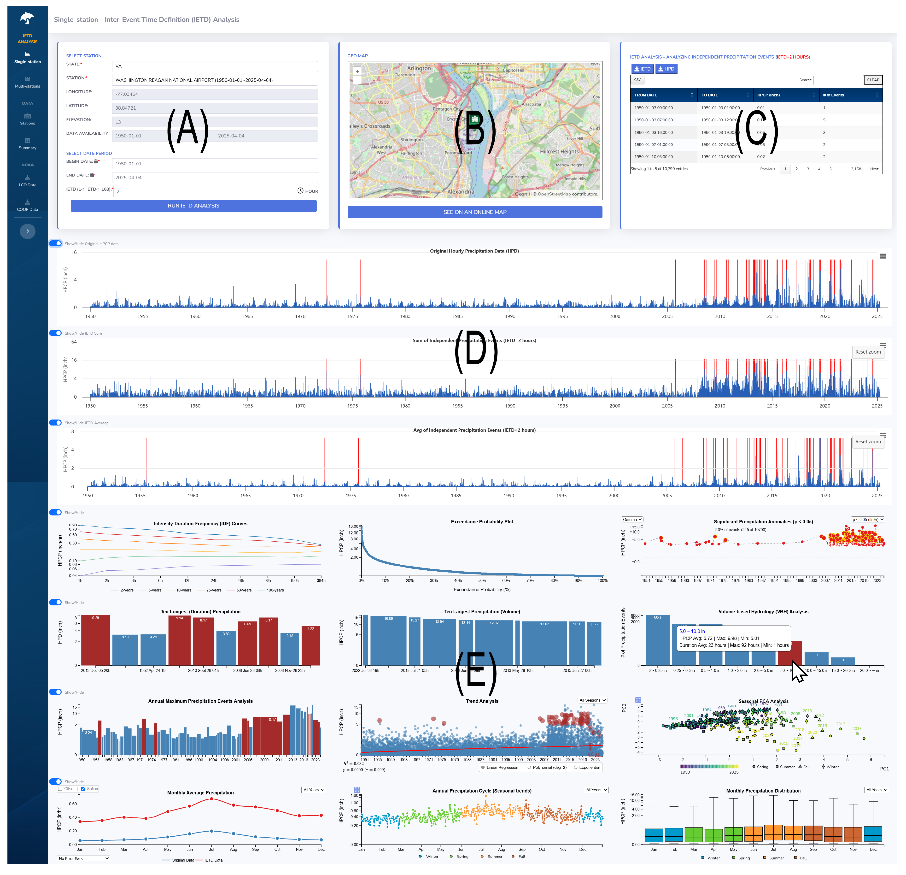
5.1. Station-Specific Analysis Interface

The station-specific analysis interface allows the examination of precipitation patterns on a selected individual weather station data to find temporal trends, seasonality, and anomalies. Figure 2 shows an example of analyzing the precipitation data from a weather station located at Washington Reagan National Airport. Users can select a specific weather station and specify an IETD threshold in the control panel (A). The figure shows that a user set the IETD threshold value of 2 h and selected the period from 1950 to 2025. The map view (B) displays the geographical location of the selected station, aiding the user in understanding its physical location through navigation features (i.e., zooming and panning). Performed IETD analysis results are displayed in a data table (C) and visualized through line graphs (D). The user can perform a data search in the data table and download all the data for further evaluation. The three visualizations (D) represent hourly precipitation data. Specifically, the first visualization shows the measured hourly precipitation at a weather station. The following two visualizations represent estimated precipitation volumes—the sum of hourly precipitation ( S = i = 1 n p i ) and the average hourly precipitation ( p E ¯ new = i = 1 n p i n ) per event. These visualizations utilize SVG (scalable vector graphics), CSS (cascading style sheets), and D3 [44] to display detailed visual and textual information. The interface also includes multiple graphical representations (E) to show quantitative analysis results. As numerous visual representations are managed, hiding each visual representation is supported for effective data analysis. Because of its multiple features, the interface supports a comprehensive understanding of precipitation patterns and their relationships across multiple analytical perspectives.
Zooming and panning user interaction techniques are added to support interactive IETD data analysis within visualizations (Figure 2D). As the visualizations are internally connected, user interactions in one visualization are seamlessly reflected and synchronized across other visualizations. With these interactions, users can navigate and explore the hourly precipitation data by initiating continuous user interactions at any point in the visualizations. For example, suppose a user zooms in to examine the detailed characteristics of the measured average IETD precipitation data. In this situation, the other two visualizations automatically adjust their visual representations by maintaining temporal alignment with the zoomed visualizations. This synchronized representation is helpful because it enables users to analyze precipitation data across different date ranges while maintaining context across other visualizations.
Several statistical methods are added to support analyzing the precipitation data and presenting results through various visualizations (Figure 2E). They are designed as a comprehensive suite of statistical evaluation tools for precipitation events. It includes basic statistical analysis capabilities such as identifying annual maximum, largest (volume), and longest (duration) events. Additionally, the interface provides specialized analyses, including intensity–duration frequency (IDF) analysis, exceedance probability analysis, and volume-based hydrology analysis. Multiple visualizations are added to help understand precipitation trends and annual, seasonal, and monthly statistical analyses. These multi-temporal analyses enable users to examine precipitation patterns at different time scales, from detailed monthly distributions to broader annual cycles. These visualizations are linked to the precipitation data visualizations (Figure 2D). Thus, based on the users’ zooming interactions in the precipitation data visualizations, all visualizations are updated to reflect the changes in the statistical analyses.
Within these multiple visualizations, selection user interaction is added to enable users to highlight and track corresponding hourly precipitation data across different visualizations. Figure 2 demonstrates this interactive capability, where selecting a glyph in the volume-based hydrology analysis visualization triggers the highlighting of related visual elements across other visualizations. As the glyph indicates that there are 53 precipitation events (as indicated in the label), the actual events can be observed in other visualizations. In detail, red-colored vertical lines in the precipitation visualizations (Figure 2D) appear to indicate the specific precipitation events that contributed to the highlighted bar in the volume-based hydrology analysis visualization. At the same time, the events are also highlighted in other visualizations if they are related. This coordinated highlighting is effective because it helps users understand the relationships among different analytical results through visual representations. As the designed interface provides multiple temporal and statistical representations, this coordinated highlighting maintains visual coherence for users to identify patterns and correlations in the precipitation data more effectively. With the multiple visualizations, multiple precipitation analyses are supported, such as identifying long-term trends (e.g., increasing or decreasing rainfall), recurring seasonal patterns (e.g., wet or dry seasons), and unusual weather events or anomalies (e.g., record-breaking precipitation or unexpected droughts).

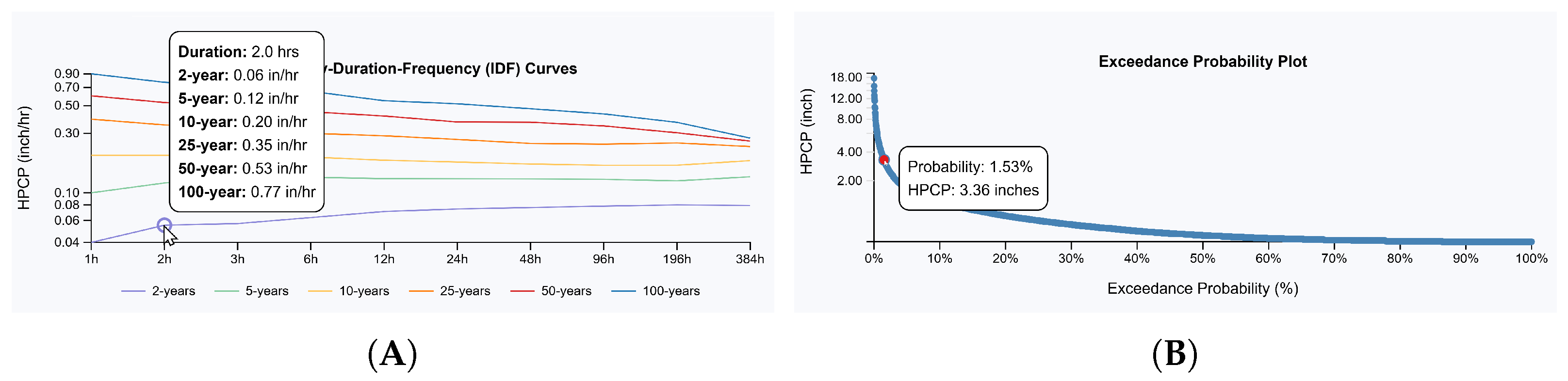
5.1.1. Precipitation Frequency Analysis

Two visualizations are added to support precipitation frequency analysis to show IDF curves and exceedance probability. IDF curve visualization (Figure 3A) shows the frequency of extreme rainfall events based on their intensity and duration. It provides probability estimates of extreme rainfall events. For evaluating return periods expressed in years, different probabilities are applied with 2 years (50%), 5 years (20%), 10 years (10%), 25 years (4%), 50 years (2%), and 100 years (1%). The return periods characterize events ranging from 2-year (frequent but minor storms) and 5-year (common storms) to 100-year (extreme events). In the visualization, periods are represented with different color attributes. The x-axis shows the duration of the rainfall event, and the y-axis indicates precipitation intensity (inch/hr). Each curve demonstrates an inverse relationship between intensity and duration, where rainfall intensity typically decreases as the duration increases for any given return period. The IDF curve evaluates flood risks to help plan climate change adaptation in flood control systems in urban areas [45]. Users can hover over the curves to view specific rainfall intensity values.
Exceedance probability visualization (Figure 3B) represents the probability of precipitation intensities. It uses intensity–exceedance frequency (IEF) curves that assess the risks of extreme rainfall events by evaluating historical data. The Weibull distribution is used because precipitation values are often positively skewed, with many small and few extreme values. Exceedance probability is computed by sorting and ranking precipitation events using P ( X x ) = i n + 1 . This provides an empirical estimate of the survival function ( P ( X x ) = 1 F ( x ) ), where F ( x ; λ , κ ) = 1 exp ( ( x / λ ) κ ) is the cumulative distribution function (CDF). Here, λ indicates the scale parameter and κ represents the shape parameter, using the Weibull estimator ( F ( i , n ) = i n + 1 ) [46]. As precipitation values are always positive, this approach to computing exceedance probability is broadly used in evaluating precipitation data [8,47]. The visualization presents hourly precipitation on the y-axis and the computed exceedance probability on the x-axis. An asymmetric logarithmic scale is applied to show hourly precipitation intensities because of their predominantly small magnitudes.

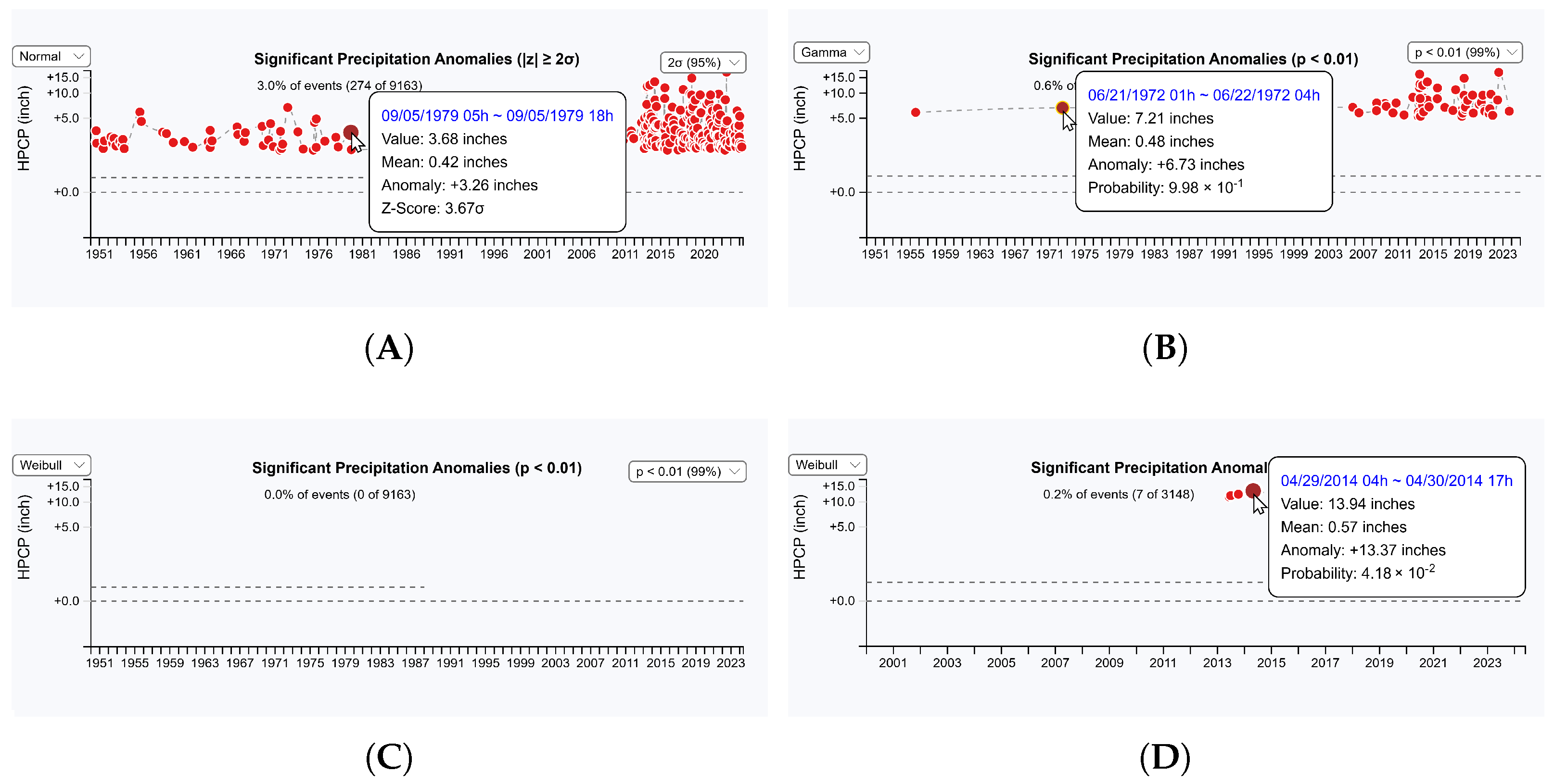
5.1.2. Precipitation Anomaly Detection

A precipitation anomaly visualization (Figure 4) supports detecting precipitation anomalies by applying anomaly detection using three different distributions—normal, gamma, and Weibull. Red-colored glyphs indicate identified anomalies. It displays detailed measurements when highlighted. The visualization allows switching between distributions to detect potential anomalies under different statistical assumptions. The normal distribution uses z-scores to detect anomalies, with mean precipitation volume serving as the central reference point and standard deviation measuring variation from this average. The z-scores ( z = x μ σ ) are calculated for each precipitation event to identify anomalous precipitation events. Possible anomalies are determined by evaluating how much they deviate from the mean. Specifically, it evaluates each precipitation event’s z-score and identifies it as an “anomalous” event if it exceeds a predetermined threshold (typically 2 or 3 standard deviations). The gamma distribution is commonly used in rainfall data analysis because precipitation is nonnegative and often has skewed patterns (many small and fewer large events). It has been found that daily precipitation follows the gamma distribution [48]. It uses the gamma cumulative distribution function (CDF), F ( x ; k , θ ) = γ ( k , x / θ ) Γ ( k ) , to compute the probability of a given rainfall value as P ( X x ) = 1 F ( x ) , where k and θ indicate shape and scale parameters, respectively. They are used to control the shape and scale of the distribution. The shape parameter is a useful metric and is broadly used to track changes in extremes in precipitation [48,49]. It is computed as k = E [ X ] 2 Var ( X ) , where E [ X ] represents the mean of precipitation E [ X ] = 1 n i = 1 n x i and Var ( X ) denotes the variance of the precipitation Var ( X ) = 1 n i = 1 n ( x i E [ X ] ) 2 . Anomalies are determined by identifying values whose probability of occurrence is less than a specified threshold (0.05 or 0.01). Figure 4B presents an example of detecting possible precipitation anomalies ( p < 0.01 ) with the gamma distribution. It has detected numerous precipitation events as possible anomalies since 2013. This might be closely connected to climate change impacts observed in the U.S. [50]. We also found similar trends in precipitation when analyzing multiple stations’ precipitation data with our designed system (see Section 6 for details).
In the visualization, the Weibull distribution is also supported to detect precipitation anomalies [51]. The gamma distribution is well suited for evaluating long accumulation periods. However, the Weibull distribution is recommended for analyzing precipitation in short accumulation periods [52]. The Weibull distribution uses Weibull CDF, F ( x ; k , λ ) = 1 e ( x / λ ) k , where k and λ indicate shape and scale parameters, respectively. The shape parameter k has effects similar to those in the gamma distribution. It controls skewness and tail behavior. However, it uses a different scale parameter λ to determine the distribution of precipitation data. For estimating k, the Newton–Raphson iteration method [53] is used. Once k is estimated, λ is computed using λ = 1 n i = 1 n x i k 1 k . After measuring the mean of the Weibull distribution using the gamma function, E [ X ] = λ · Γ ( 1 + 1 k ) , anomalies are determined by evaluating the probability of observing precipitation and comparing it to the threshold (0.05 or 0.01). Figure 4C shows that no precipitation anomaly is detected with the Weibull distribution ( p < 0.01 ). However, when evaluating the data with the statistical significance p < 0.05 , we found seven precipitation anomalies (see Figure 4D).

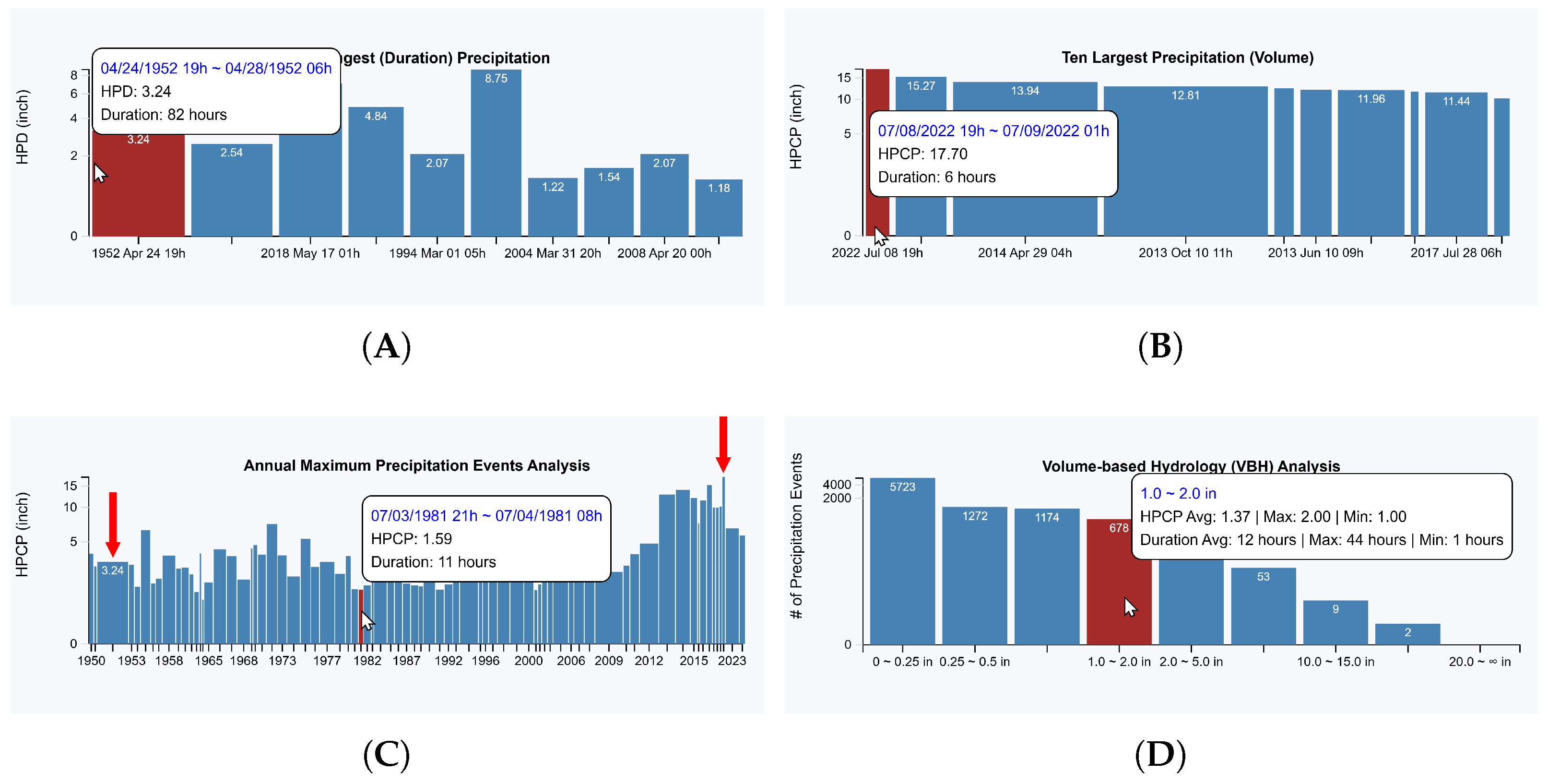
5.1.3. Analysis of Precipitation Duration and Intensity Patterns

The interface also provides visualizations to support the analysis of annual precipitation volume and duration. Evaluating the changes in annual precipitation volumes is critical because it helps understand significant deviations from typical probability distributions. Analyzing precipitation durations is also important because it provides valuable insights into how long major precipitation events last. Precipitation duration analysis is often considered a significant method in flood forecasting and water resource management because longer-duration precipitation events can have substantial impacts on hydrological systems [54].
Figure 5 presents visualization results of precipitation data at the Reagan National Airport. In all visualizations (Figure 5A–D), precipitation intensity amount and event duration are used to build each display. Figure 5A,B show the top ten longest (duration) and largest (intensity volume) precipitation events, respectively. The height and width of each bar denote the amount and duration of precipitation. Thus, a wider bar indicates that the precipitation event lasted longer, and a narrow bar represents a high-intensity rainfall event. Figure 5A shows that rain continued for 82 h in 1952, with a total precipitation of 3.24 inches. Figure 5B indicates that an intense rainfall occurred in 2022 with a total precipitation of 17.70 inches in six hours. Figure 5C shows the annual maximum precipitation events in chronological order for the user-selected time period. Each bar graph represents the highest recorded precipitation amount for its respective year. Figure 5D shows the hydrology analysis results by evaluating precipitation amounts. It primarily focuses on measuring, analyzing, and managing the volume of water, emphasizing how much water might move through drainage systems over time [55]. The volume-based hydrology analysis categorizes the IETD precipitation events by classifying them into nine precipitation intensity ranges: ≤0.25 inches, 0.25∼0.5 inches, 0.5∼1.0 inches, 1.0∼2.0 inches, 2.0∼5.0 inches, 5.0∼10.0 inches, 10.0∼15.0 inches, 15.0∼20.0 inches, and >20.0 inches. Each bar represents the total number of events observed within the corresponding intensity range.
To show detailed information, including average, maximum, and minimum precipitation intensities and event durations, mouse hovering user interaction is supported on individual bars. When a bar graph is highlighted, its corresponding precipitation event is highlighted in other graphs if matched precipitation events are available. For instance, the two red-colored arrows in Figure 5C indicate the longest-duration event (left) and the largest-intensity-volume event (right) in the years 1952 and 1922, respectively. This interactive analysis feature allows users to track and analyze precipitation events across different visualizations.

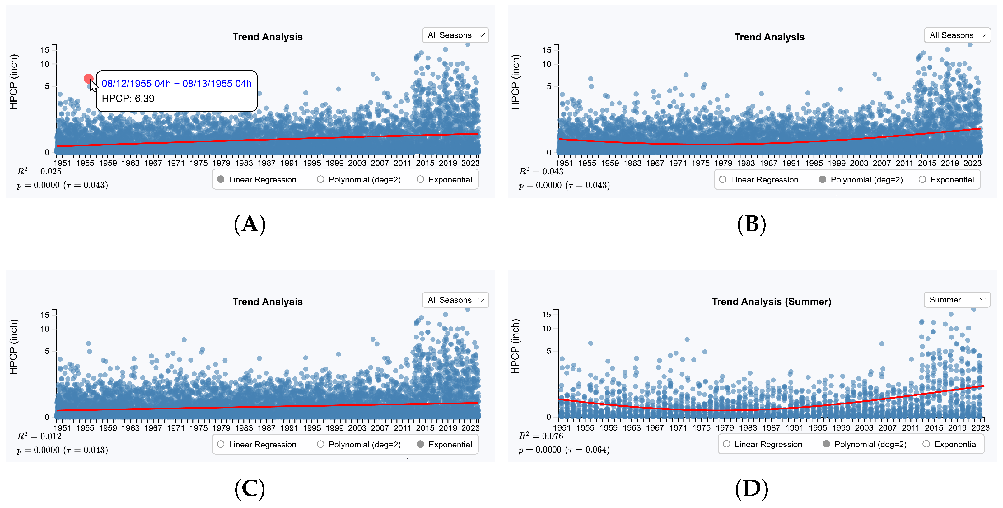
5.1.4. Precipitation Trend Analysis

Trend analysis visualization supports identifying precipitation patterns over time using statistical regression methods such as linear, polynomial, and exponential regression. Both long-term and seasonal trend analyses can be performed using these regression methods. Users can switch between different regression methods and long-term and seasonal trend analyses directly within the visualization. Long-term trend analysis evaluates all precipitation data that appeared within the user-selected period. For seasonal trend analysis, only selected seasonal data are utilized to identify seasonal variations in precipitation intensity. Linear regression is a commonly used method for identifying steady, consistent changes in various types of data [56]. It determines the relationship between time and precipitation intensity by fitting a straight line to the precipitation data. The measured R-squared value indicates how well the regression line fits the data. The Mann–Kendall test [57] is also applied to measure whether the determined regression trend is statistically significant or not. Figure 6A shows a linear trend in the precipitation data at the Reagan National Airport from 1950 to 2024. The linear model has a low explanatory power, as indicated by a low value of R 2 = 0.025 . Despite this low fit, the Mann–Kendall test indicates that the trend is statistically significant, representing a minor increasing trend ( p < 0.01 , τ = 0.043 ). This suggests a gradual yet observable increase in precipitation over seventy years, though the linear model explains only a small portion of the variation in the data.
Polynomial regression generalizes linear regression by including higher-degree terms. In our visualization, a quadratic model (degree = 2) is used. It is effective for identifying more complex patterns that cannot be captured by linear regression with a simple straight line. Figure 6B shows a deceleration pattern around the 1950s and changes back to an acceleration pattern after 2000. Polynomial regression is useful for analyzing seasonal precipitation variations that may show a U-shaped pattern clearly (see Figure 6D). This polynomial regression of summer data shows a statistically significant trend representing a precipitation pattern shift ( p < 0.01 , τ = 0.064 ), characterized by higher summer rainfall after 2010. This visualization shows the pattern shift but does not explain its underlying causes. However, from the analysis of the pattern with the annual maximum precipitation visualization (Figure 5C), we found that the 1950s were characterized by prolonged periods of low-intensity rainfall, in contrast to the recent trend of having high-intensity burst rainfall events in that region [58]. Exponential regression is useful when data change exponentially over time. Thus, it is valuable for analyzing extreme precipitation events, where the rate of change increases or decreases exponentially. Exponential regression is often used in climate change studies where precipitation patterns might show accelerating changes rather than linear trends [59,60]. Figure 6C shows a similar accelerated pattern compared to the linear regression result. It also represents a very low R-squared value ( R 2 = 0.012 ) because precipitation data typically do not show continuous exponential growth.

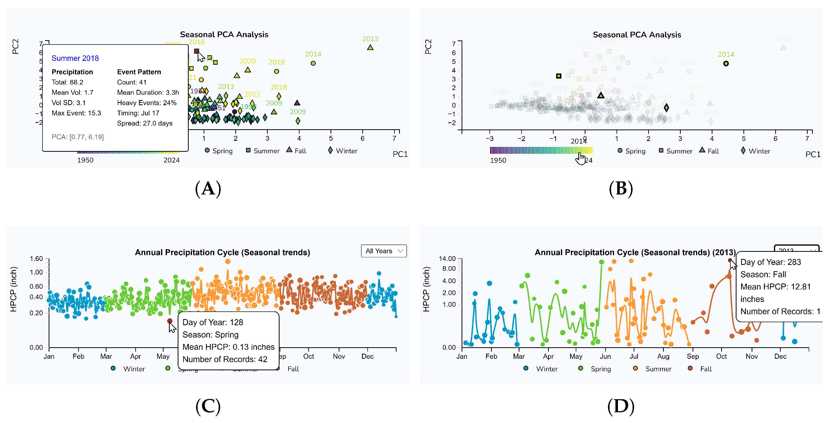
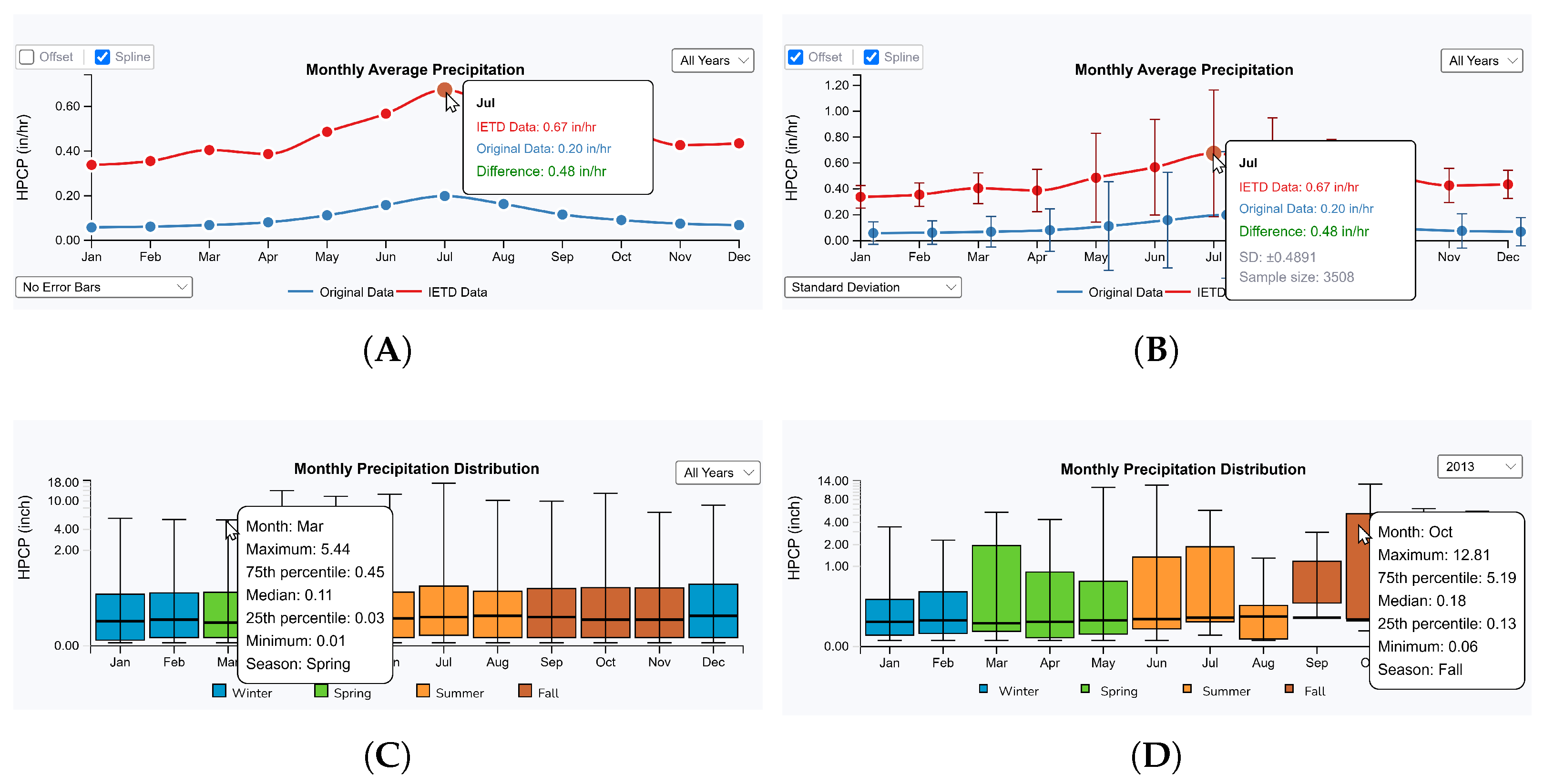
5.1.5. Seasonal and Monthly Precipitation Analysis

Precipitation patterns often vary significantly by month or season. As supporting seasonal and monthly precipitation analyses are important for identifying unique precipitation patterns, we added four visualizations: seasonal PCA analysis, monthly precipitation average analysis, annual precipitation cycle analysis, and monthly precipitation distribution analysis (Figure 7).
The seasonal PCA analysis visualization (Figure 7A,B) utilizes principal component analysis (PCA) to identify underlying patterns in the precipitation data. PCA captures the main variations in the dataset by determining principal components that represent the directions of maximum variance. This technique is valuable for projecting high-dimensional data into a lower-dimensional space while preserving key relationships. For this analysis, we extract seven features from the precipitation data: mean precipitation volume, standard deviation of precipitation volumes, mean event duration, standard deviation of durations, temporal spread of events (standard deviation of days of the year), proportion of heavy precipitation events (using the 75th percentile threshold), and proportion of wet days. These features characterize each season’s precipitation by its volume ( S ), event durations ( Δ t ), and intensities ( S / Δ t ).
In the visualization, the first and second principal components are used for the axes of the scatterplot, with distinct shapes representing different seasons (circle: spring, rectangle: summer, triangle: fall, and diamond: winter) and colors indicating years. An interactive color legend is designed as a gradient color bar from dark purple (earlier years) to bright yellow (recent years), allowing users to highlight specific years of interest. Figure 7B shows an example where the user has highlighted seasonal precipitation averages for 2014. PCA visualization reveals that numerous precipitation events create a cluster that appears on the left bottom of the scatterplot, with several potential outliers positioned far from this cluster. Notably, spring 2014 and fall 2013 precipitation data deviate significantly from the typical pattern, indicating anomalous behavior. This finding aligns with the result in the annual maximum precipitation analysis (see Figure 5C), denoting unusually high-intensity precipitation events during 2013 and 2014.
Figure 7C,D present annual precipitation cycle visualization designed to reveal distinct seasonal patterns in the daily precipitation data. As seasonal precipitation cycle analysis is crucial for understanding flooding distribution [61], this visualization depicts mean precipitation values throughout the year, with data points scaled by sample size to indicate observation density. By default, it shows the measured daily cumulative average precipitation for all precipitation data in a selected weather station. It allows users to select data for specific years using a drop-down menu. Different color attributes are used to display seasonal precipitation data to support seasonal trend analysis. Winter precipitation patterns are analyzed in two segments (early winter: January and February, and late winter: December) to represent the cyclic nature of the annual pattern more clearly. To highlight gradual changes in precipitation throughout the year, smooth transition lines between seasons are added using cubic basis spline interpolation. Specifically, Figure 7C represents the annual cycle of 75 years of precipitation data. It shows that the precipitation intensity ranges from 0.13 to 1.46 inches, with the lowest average precipitation intensities occurring in spring and the highest in summer. It also reveals relatively stable precipitation amounts over the past 75 years. However, when evaluating the precipitation data yearly, we found a significant precipitation intensity fluctuation in 2013 (see Figure 7D). This finding indicates a substantial deviation from historical precipitation patterns in the region compared to those observed before 2000.
Monthly precipitation analysis is also supported in the interface. It provides insights into precipitation patterns at a monthly temporal scale. Figure 8A,B show monthly precipitation analysis visualization without and with error bars, respectively. It creates cumulative monthly averages. Figure 8A shows the overall monthly average across the entire precipitation data in the selected weather station. As we applied the IETD analysis, monthly average precipitation was computed on both the original hourly and IETD precipitation events data. The visualization displays the measured monthly average precipitation as a connected polyline. This representation supports a comparative understanding between raw precipitation measurements and IETD-derived precipitation events and helps users determine how the IETD analysis affects the precipitation patterns. When raw and IETD-processed precipitation patterns show substantial differences, it suggests periods of persistent rainfall characterized by short intervals between events, which the IETD analysis combines into unified precipitation events. This visualization incorporates interactive features that enable users to toggle between different temporal views, from the comprehensive multi-year average to specific yearly patterns. Measuring errors and representing them with error bars is supported by three error measures such as standard deviation (SD), standard error (SE), and confidence interval (CI). As SD shows the spread of all values, it is good for identifying how much precipitation is spread. SE shows uncertainty in the mean estimate. CI represents the range where the true mean likely falls under a confidence range (95% confidence). Figure 8B shows an example of showing SD on the selected year of 2013. The measured SD and sample size information are presented. This flexibility of controlling and changing the visualization options helps identify both long-term precipitation trends and anomalous years.
Boxplots are widely used for analyzing precipitation data because they effectively reveal temporal patterns [62,63,64]. Thus, a boxplot visualization is added to present monthly precipitation data distributions, following the traditional boxplot design of having a box and two whiskers. All precipitation data are broken up into three quartiles (Q1, Q2, and Q3) in the box. Q1 and Q3 indicate lower and upper quartiles representing 25% and 75% of data falls below this value, respectively. Q2 represents the median value, denoting the 50th percentile of data. It shows the interquartile range (IQR) by measuring the difference between Q3 and Q1, depicting the spread of the data. With IQR, the upper and lower whiskers are determined to represent the extension of the largest value within 1.5 × IQR above Q3 and the smallest value within 1.5 × IQR below Q1. The upper and lower whiskers extend to the largest and smallest values within 1.5 × IQR from Q3 and Q1, respectively. Figure 8C shows monthly precipitation distributions at Reagan National Airport through boxplots. By default, monthly boxplots are generated by analyzing all available precipitation data. Users are allowed to change the distribution to a specific year. Figure 8D presents monthly boxplots for 2013. As discussed above, a possible weather pattern shift was observed in that weather station around 2013. The boxplot distributions reveal significantly higher precipitation volumes in March, July, and October, denoting a distinct difference from historical patterns.
With the station-specific analysis interface, several precipitation data analyses can be performed, including temporal pattern analysis, trend examination, seasonality studies, and anomaly detection at a specific location. As explained above, this interface focuses on allowing in-depth analysis of a single weather station, identifying the changes in precipitation patterns through daily, monthly, and yearly analysis to provide insights into local precipitation characteristics. While understanding rainfall patterns and identifying anomalous precipitation events are crucial, analyzing data from a single weather station is ineffective in finding regional or global trends. Therefore, conducting comparative analysis across multiple weather stations is critical for supporting comprehensive precipitation data analysis. Thus, we designed a multi-station analysis interface to address this need.

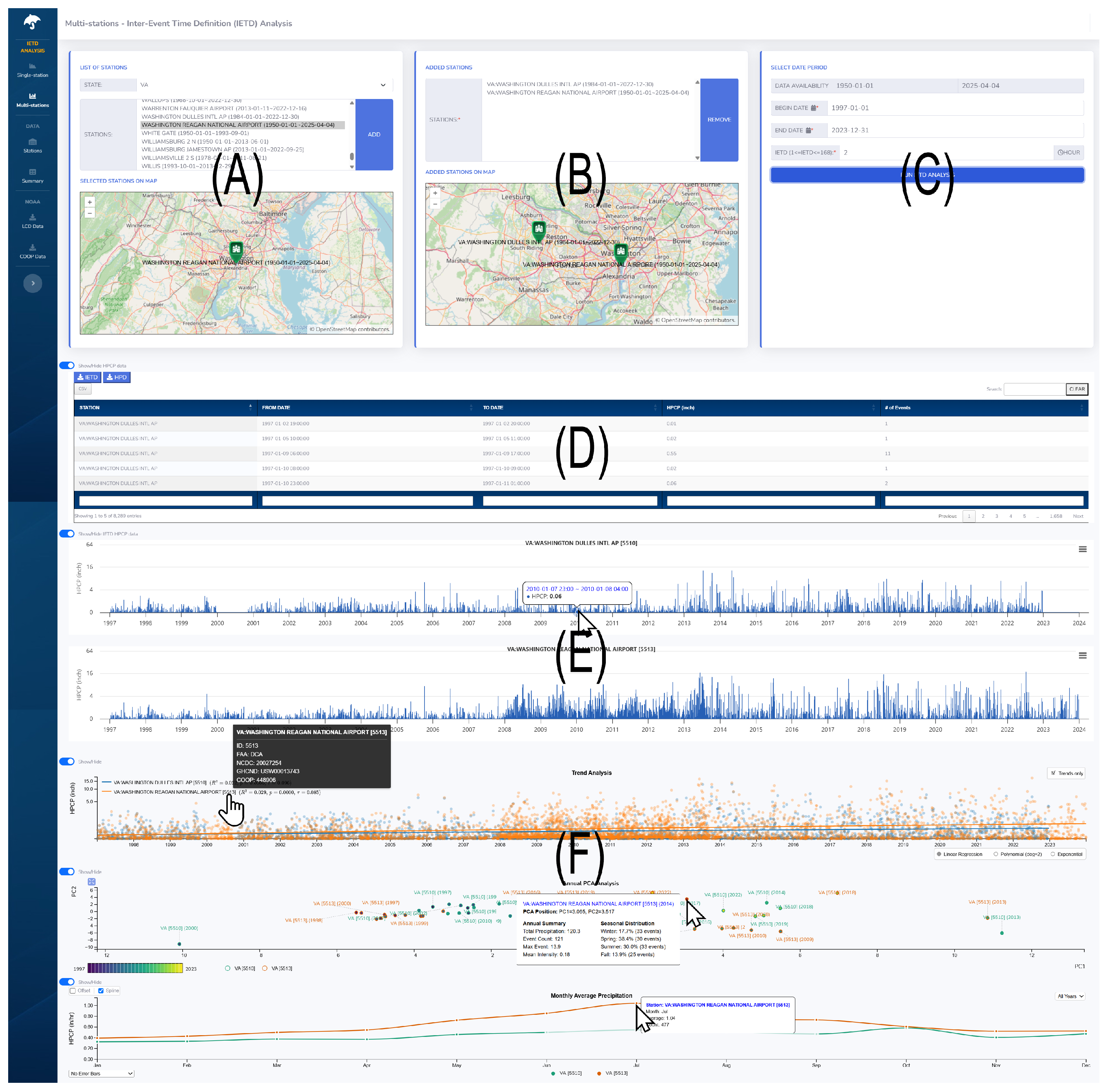
5.2. Multi-Site Analysis Interface

The multi-site analysis interface enables the analysis of precipitation data across multiple locations. More specifically, performing regional and cross-regional precipitation analysis is supported to help understand spatial patterns and variability of precipitation data on multiple weather stations. The regional analysis evaluates data from proximate weather stations to identify localized precipitation patterns and trends within a specific geographical area. In contrast, the cross-regional analysis evaluates precipitation patterns between geographically separated weather stations. As this approach allows a side-by-side comparison, it helps reveal variations, similarities, and anomalies between different locations. Eventually, broader precipitation patterns can be identified through the analysis.
Figure 9 shows an example of performing a multi-site analysis by selecting two geographically nearby weather stations (i.e., Washington Dulles International Airport (IAD) and Washington Reagan International Airport (DCA)). The interface is designed with multiple control panels and visualizations. Panel (A) helps users choose weather stations by displaying their geographical locations on a map. Whenever users select a weather station from a station list, the map view automatically centers on each newly selected station. Panel (B) supports managing all selected stations, displaying their relative positions on a single map view. In this panel, removing stations from a selected station list is allowed. After selecting stations, users can perform an IETD analysis on the selected stations by entering an IETD threshold and a specific date range. Then, it generates IETD line graphs (E) representing selected stations as temporal precipitation visualizations. As shown in the visualizations, they represent similar precipitation patterns because of their close proximity (approximately 22 miles apart). These graphs also support interactive zooming and panning like those in the station-specific analysis interface (Figure 2). As they are internally connected, user interactions with one graph automatically update all others. Additionally, the system conducts multiple statistical analyses and presents the results through three distinct visualizations (F).

5.2.1. Precipitation Trend Analysis

Precipitation trend analysis on multiple weather stations is important for identifying statistical trend differences between stations. Figure 10 shows the performed trend analysis on the two weather stations (i.e., IAD and DCA) from the period of 1997 to 2023. All precipitation events are represented as colored circles. Three statistical methods, linear, polynomial, and exponential regression, are supported to find trend lines on the per-station precipitation data. The Mann–Kendall test is also performed to determine the significance of the trend. The measured statistics are displayed next to each station name. Figure 10A shows the trend analysis with linear regression. It reveals a gradual increasing trend (IAD: R 2 = 0.022 ,   p < 0.01 ,   τ = 0.099 and D C A : R 2 = 0.040 ,   p < 0.01 ,   τ = 0.094 ). Figure 10B displays the trend analysis results using polynomial regression while hiding all precipitation events (IAD: R 2 = 0.023 ,   p < 0.01 ,   τ = 0.099 and D C A : R 2 = 0.042 ,   p < 0.01 , τ = 0.094 ). The option to hide precipitation events enhances the visibility of trend lines. The y-axis scale automatically adjusts by evaluating all visible data in the visualization. Thus, when precipitation events are hidden, the y-axis scale is adjusted to the range of trend line values, resulting in the change of the y-axis scale from 0 15.0 to 0 1.2 . Currently, trend analysis visualization only supports the analysis of up to six stations due to possible causes of visual cluttering and computational overhead of identifying trends for all stations.

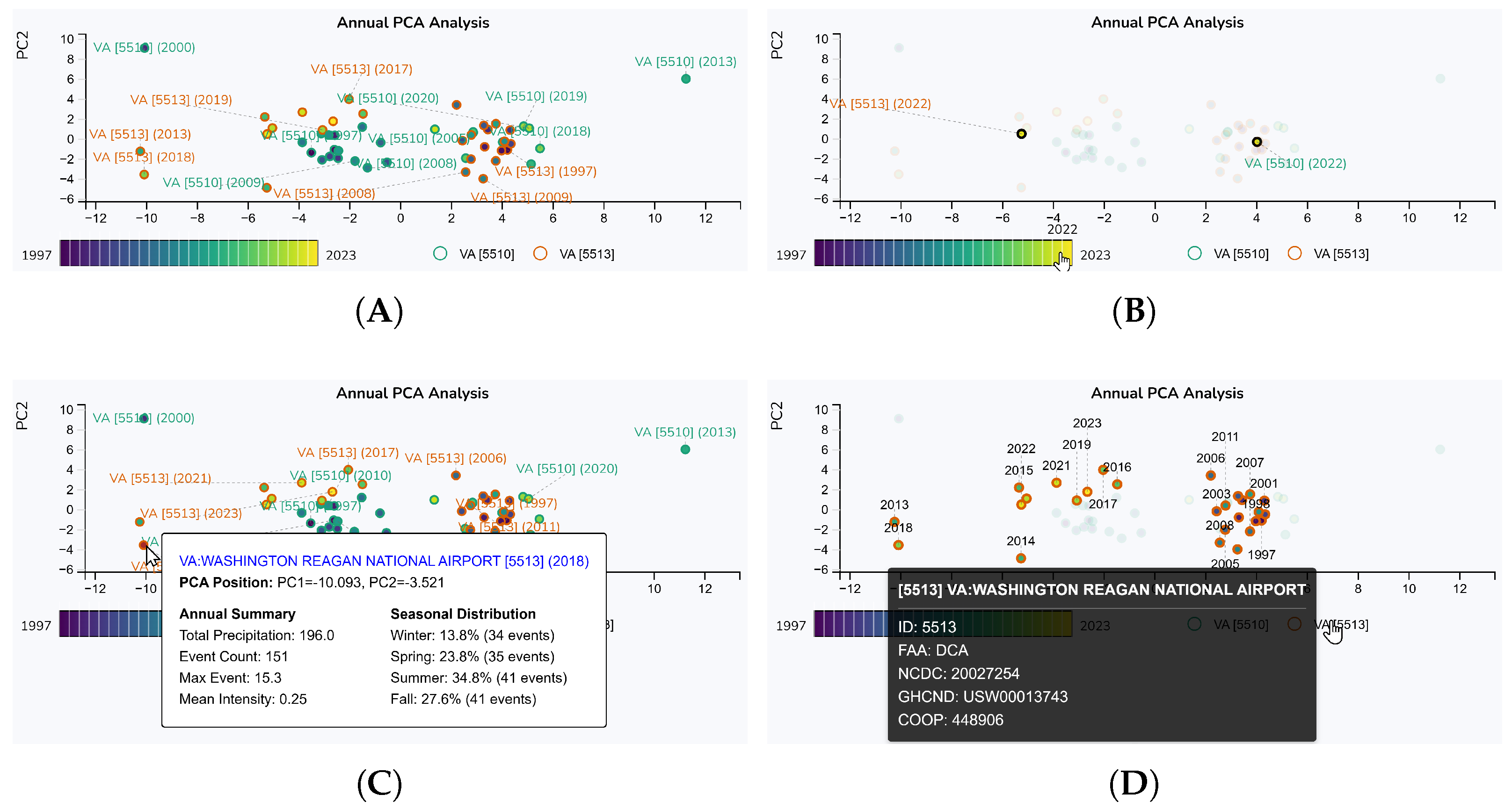
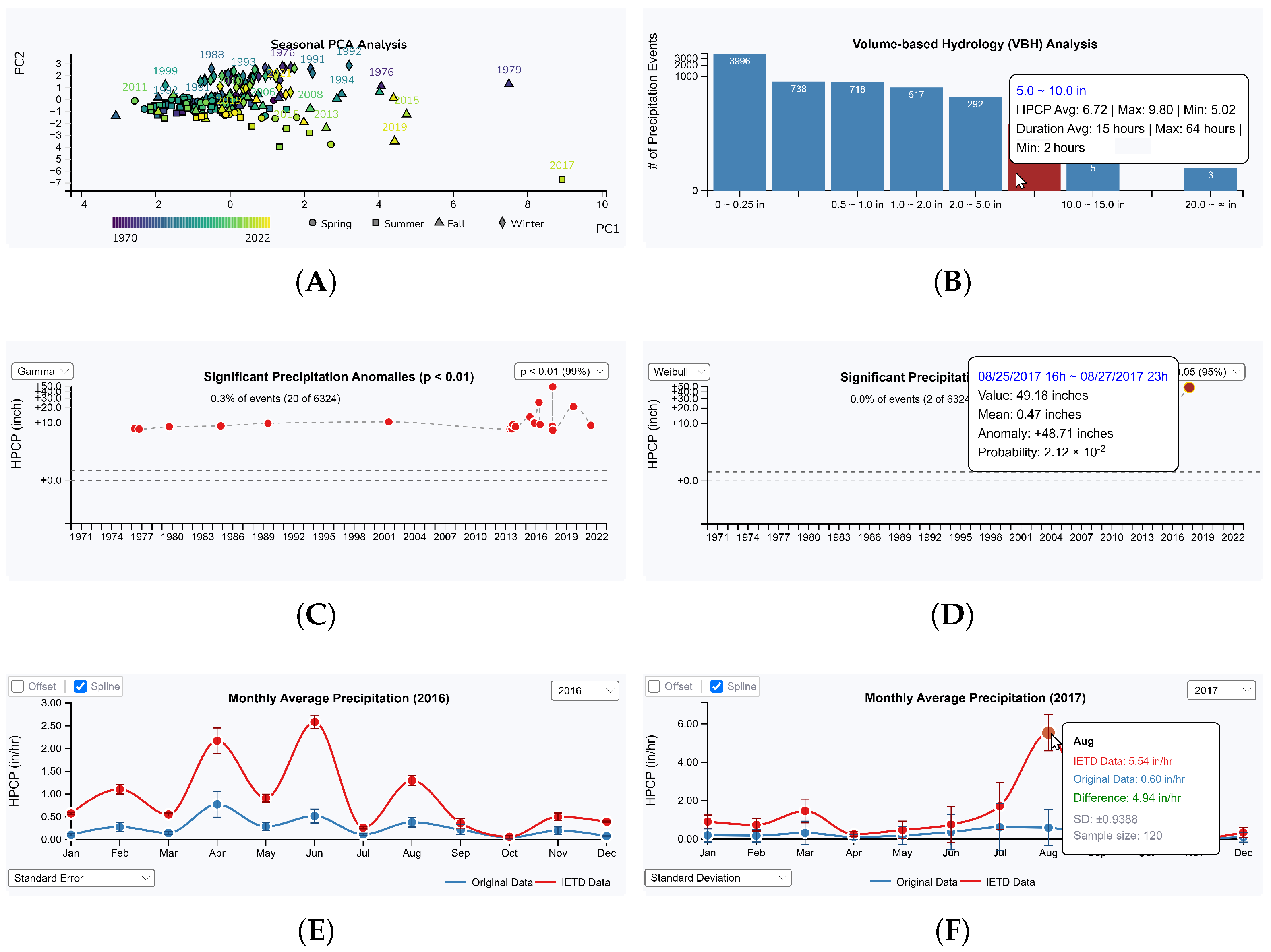
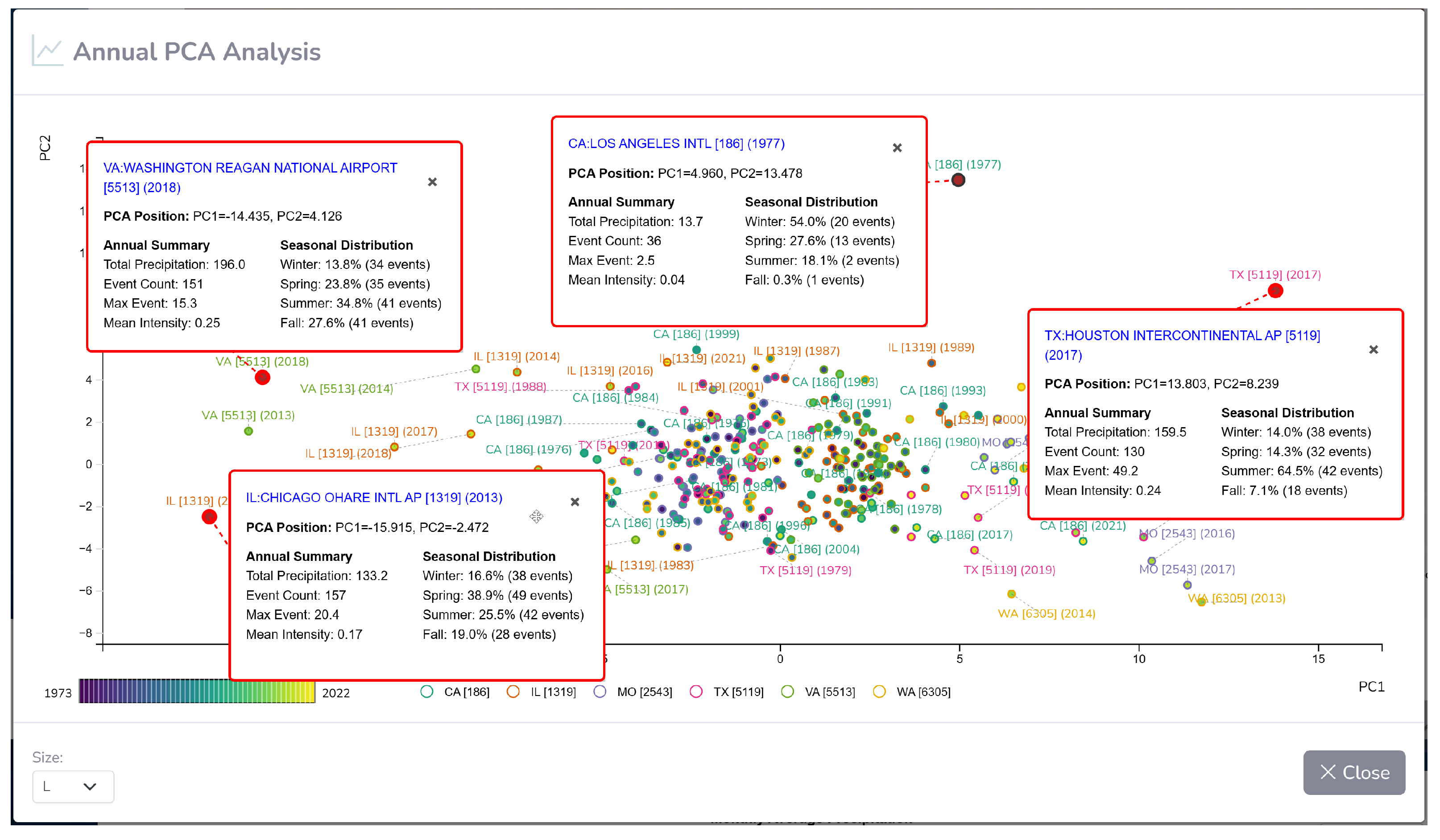
5.2.2. Annual PCA Analysis

Annual PCA analysis visualization supports understanding the patterns on multiple weather stations. Figure 11 shows the analyzed PCA projections of the annual precipitation data in IDA and DCA. To perform this analysis, several comprehensive precipitation features are extracted for each station and year. To find annual and seasonal characteristics, the data are evaluated annually and seasonally. The annual analysis measures annual average precipitation volumes, durations, and their standard deviations. Additionally, the total count of distinct precipitation events, cumulative annual precipitation volume, maximum single event volume, and mean precipitation intensity (volume/duration) are also determined. For the seasonal analysis, the data are analyzed based on seasonal information. For each season, eight features are extracted as the average volume of precipitation events, variability of precipitation volumes, the average duration of precipitation events, variability in event durations, average rate of precipitation (volume per hour), largest single precipitation volume observed, total number of precipitation events, and cumulative precipitation volume.
Figure 11 shows PCA visualizations of precipitation data from two weather stations spanning from 1997 to 2023. Each circle represents annual precipitation data with corresponding year labels positioned nearby and connected to it. To address visual clutter caused by overlapping labels, an adaptive label placement algorithm is applied to evaluate eight directional positions around each circle to find optimal placement, increasing distance when necessary (Figure 11A). Due to space limitations, all weather stations are represented with abbreviated notation combining state initials and system-assigned station ID numbers. Detailed information about each station appears when highlighted on the station legend located at the bottom (as shown in Figure 11D). The visualization supports a basic user interaction technique, highlighting, to help users understand the represented information more clearly. Figure 11B highlights the visual glyphs of the year 2022 in the visualization. Detailed information of each visual glyph is displayed when highlighted (Figure 11C). To help users conduct comparative analysis on yearly patterns, a colored year panel allows users to highlight glyphs only for a selected year. To help users understand the overall annual trends of each station, highlighting only each station’s data is also supported. Figure 11D shows all precipitation data related to the DCA airport are highlighted with year information displayed. When analyzing multiple stations, the default visualization is not large enough to display detailed results effectively, and it also makes interactive data analysis difficult. Therefore, a floating window feature was added to support multi-station analysis. This allows users to launch a floating window for an in-depth analysis of precipitation data within an expanded view. Within the floating window, selection user interaction is supported to help users select multiple precipitation events and compare them simultaneously. An example of using this feature for multi-station analysis is included in the case studies (Section 6.2.2).

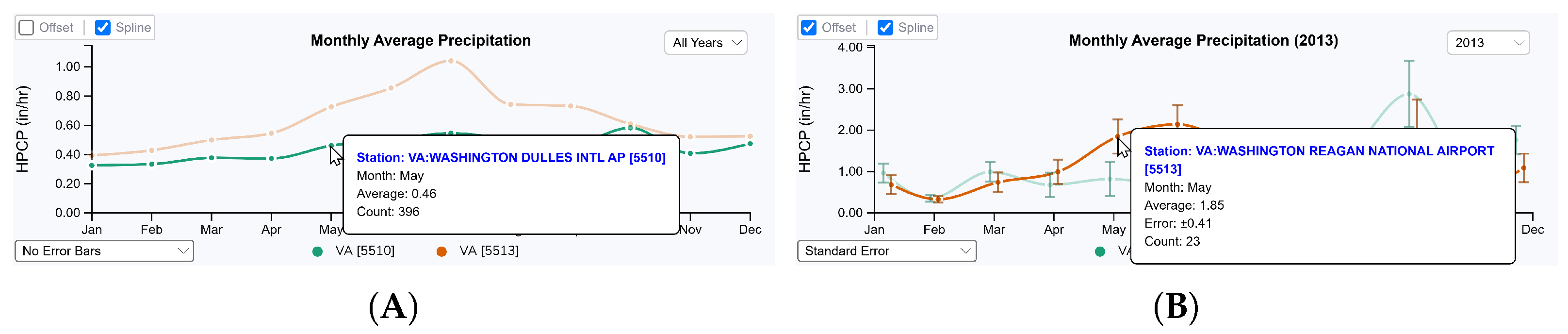
5.2.3. Monthly Precipitation Analysis

Figure 12 shows visualizations of the measured monthly average precipitation of the two weather stations. Evaluating monthly average precipitation is important for identifying the distinctiveness or similarities in precipitation patterns between stations [65]. The visualization displays multiple lines representing monthly average precipitation values. By default, it shows monthly average precipitation by evaluating all recorded precipitation data (Figure 12A). When representing monthly precipitation data, bar graphs are commonly utilized. However, they have limitations when comparing multiple weather stations simultaneously, as overlapping or side-by-side bars can become visually cluttered and make pattern identification difficult. Thus, we used smooth curve lines because they can increase readability. However, they can sometimes misrepresent the actual monthly precipitation data by implying continuous transitions between discrete monthly values. To address this, an option is added to display them as straight lines. Analyzing a specific year’s monthly average precipitation is also supported. A bubble window appears when users hover over each monthly average precipitation, in which the calculated average monthly precipitation and the number of precipitation events observed each month are displayed. In the visualization, error metrics are calculated using SD, SE, and CI to be used for evaluating statistical uncertainty in the measured monthly averages. For CI, a 95% confidence interval is applied. Visually representing these errors is supported by choosing an option from the error bar options list. Figure 12B shows a user performing an analysis by selecting the year 2013 and displaying SE. The figure indicates that 17 precipitation events were observed in May at DCA, with an average of 1.85 ± 0.41 inches. When analyzing multiple stations or representing error bars, visual clutter often occurs when multiple data glyphs overlap. To address this problem, an offset alignment option is added. When enabled, the visualization slightly adjusts the position of each monthly precipitation to prevent overlapping.

6. Case Studies

To understand the effectiveness of our designed system, we performed two case studies that considered extreme precipitation variability analysis and comparative analysis on multiple regions. For the extreme precipitation variability analysis, we chose Houston, Texas, because the area has numerous extraordinary events that have happened in the past. For the comparative analysis, we selected six geographically distributed long-term weather stations across the U.S. to evaluate their similarities and differences in precipitation patterns.

6.1. Case Study: Analyzing Extreme Precipitation Variability

Multiple regions across the United States experience extreme precipitation variability. For example, the Southern California region alternates between severe drought and atmospheric river flooding [66]; Texas (particularly the Houston area) has experienced several catastrophic flood events amid drought periods [67,68]; the Colorado Front Range shows extreme precipitation gradients from mountains to plains [69,70]; and Oklahoma/Kansas experiences dramatic seasonal shifts and tornado-related precipitation [71,72]. Many other regions across the country also show substantial precipitation variability due to diverse climatic and geographic influences [73].
We conducted a case study analysis of the Houston area in Texas. Historically, the region has experienced numerous significant flooding events. Spring and early summer events include the Memorial Day Flood (May 2015), the Tax Day Flood (April 2016), the 1994 Flood (November 1994), and the 1935 Flood (December 1935). Also, various flooding happened during the hurricane season as Hurricane Harvey (August 2017), Tropical Storm Imelda (September 2019), Hurricane Ike (September 2008), Tropical Storm Allison (June 2001), and the 1979 Flood from Tropical Storm Claudette (July 1979), among others [67,74,75]. Our designed system successfully identified most historical events by analyzing that region’s precipitation. We also found that the system can detect such flooding events as possible anomalies.
Figure 13 shows example analyses conducted with the system using an IETD threshold of ( θ = 2 h). With the seasonal PCA analysis (Figure 13A), we found an interesting pattern where many precipitation events form a cluster positioned in the left center. As discussed previously, several features are extracted and used to create a PCA analysis visualization by projecting all events on a scatterplot. The visualization shows a clear pattern forming a cluster and identifying several possible anomalies that appear outside of the cluster. Among the anomalies, we found two flooding events in 1979 and 2017, which appeared as extreme anomalies outside of the cluster. In 1979, Tropical Storm Henri moved inland near Corpus Christi and tracked northeast across Texas [76]. At that time, parts of the Houston area received 10–15 inches of rain over four days (17–21 September), which was significant enough to cause flooding problems. Although this was significant enough to cause flooding, this flooding received less historical attention than the July Claudette event in the same year due to its comparatively smaller impact [77]. In 2017, Hurricane Harvey impacted the Houston metropolitan area and southeast Texas by pouring over 60 inches for approximately 4–5 days (25–30 August 2017) [78].
In detail, we identified approximately 63 events (55 events in 5.0 10.0 inches, 5 events in 10.0 15.0 inches, and 3 events in 20.0 inches) in the volume-based hydrology analysis visualization that likely caused flooding problems (Figure 13B). Through anomaly analysis (Figure 13C), we found that most of these events appeared as possible anomalies using the gamma distribution. Specifically, using p < 0.01 and p < 0.05 , 20 and 93 events were determined as possible anomalies, respectively. Using the normal distribution, about 176 events are identified as possible anomalies with z > 2.0 . The Weibull distribution identified two possible extreme anomalies: Hurricane Harvey (August 2017) and the Tax Day Flood (April 2016) (Figure 13D). The Tax Day Flood was considered a significant flooding event that occurred 17–18 April 2016, during which approximately 12–20 inches of rain fell within a 24 h period [79].
We found interesting results with the monthly average precipitation visualization, showing two high peaks in 2016 (Figure 13E). The first peak appeared in April, indicating the Tax Day Flood. The second peak represents another flooding event in June 2016, the Brazos River Flooding, which occurred in early to mid-June 2016. The overall rainfall was 5 to 12 inches, but it caused flooding due to approximately two weeks of continuous rainfall. This flooding event was not detected as a possible anomaly in the precipitation anomaly detection because it does not consider event duration when detecting anomalies. However, it was recognized as a possible flooding event in the monthly average precipitation visualization, which considers overall rainfall amount and duration information when performing monthly average precipitation analysis.
By evaluating these two flooding events, we found clear distinctions between them. The measured errors are displayed when the user highlights each glyph (see Figure 13D). We found a higher SD ( ± 1.8907 ) for the Tax Day Flood, indicating more significant variability in rainfall amounts across the study area during the April event. In contrast, the Brazos River Flooding showed a lower SD ( ± 1.0727 ), representing a more uniform rainfall distribution during the June event. This aligns with characterizing the June event as a persistent, widespread rainfall pattern rather than intense localized downpours [80]. Because more consistent rainfall occurred across the region, it contributed to riverine flooding. For SE measurements, we found greater uncertainty in estimating the true mean precipitation for the Tax Day Flood due to highly variable rainfall patterns ( ± 0.2818 ). However, the June event showed a lower SE ( ± 0.1517 ), indicating more reliable patterns because of consistent spatial rainfall distribution. The CI showed wider and narrower confidence intervals for the Tax Day Flood ( ± 0.5524 ) and the Brazos River Flooding ( ± 0.2973 ), respectively. These results show that the June event had a more consistent, persistent rainfall pattern than the more variable April event.
We also performed monthly average precipitation analysis on 2017 data (Figure 13F). As Hurricane Harvey is considered one of the most catastrophic and well-documented rainfall events in U.S. history [81], evaluating these data helped determine the usefulness of our designed system. With the system, the average monthly precipitation for the Hurricane Harvey event was found to be 5.54 inches. Historically, it is known that some regions had 40–60 inches [78,82]. It is important to note that the 5.54 inch value represents the average monthly precipitation measured at the Texas Houston International Airport based on IETD precipitation data. Although Hurricane Harvey caused significant flooding through heavy rainfall, it showed a relatively low SD ( ± 0.9388 ) compared to the 2016 events, representing a more uniform spatial distribution of precipitation. This reflects the hurricane’s unique meteorological characteristics as a stalled tropical system [81] rather than a concentrated band of extreme precipitation like the Tax Day Flood ( ± 1.8907 ). We found a very low SE value ( ± 0.0857 ), indicating high precision in estimating the true mean precipitation across the region. The CI ( ± 0.1680 ) indicates high statistical confidence in the mean rainfall estimate and is much narrower than both the 2016 flooding events ( ± 0.5524 and ± 0.2973 ), suggesting greater statistical certainty in the precipitation events caused by the hurricane.

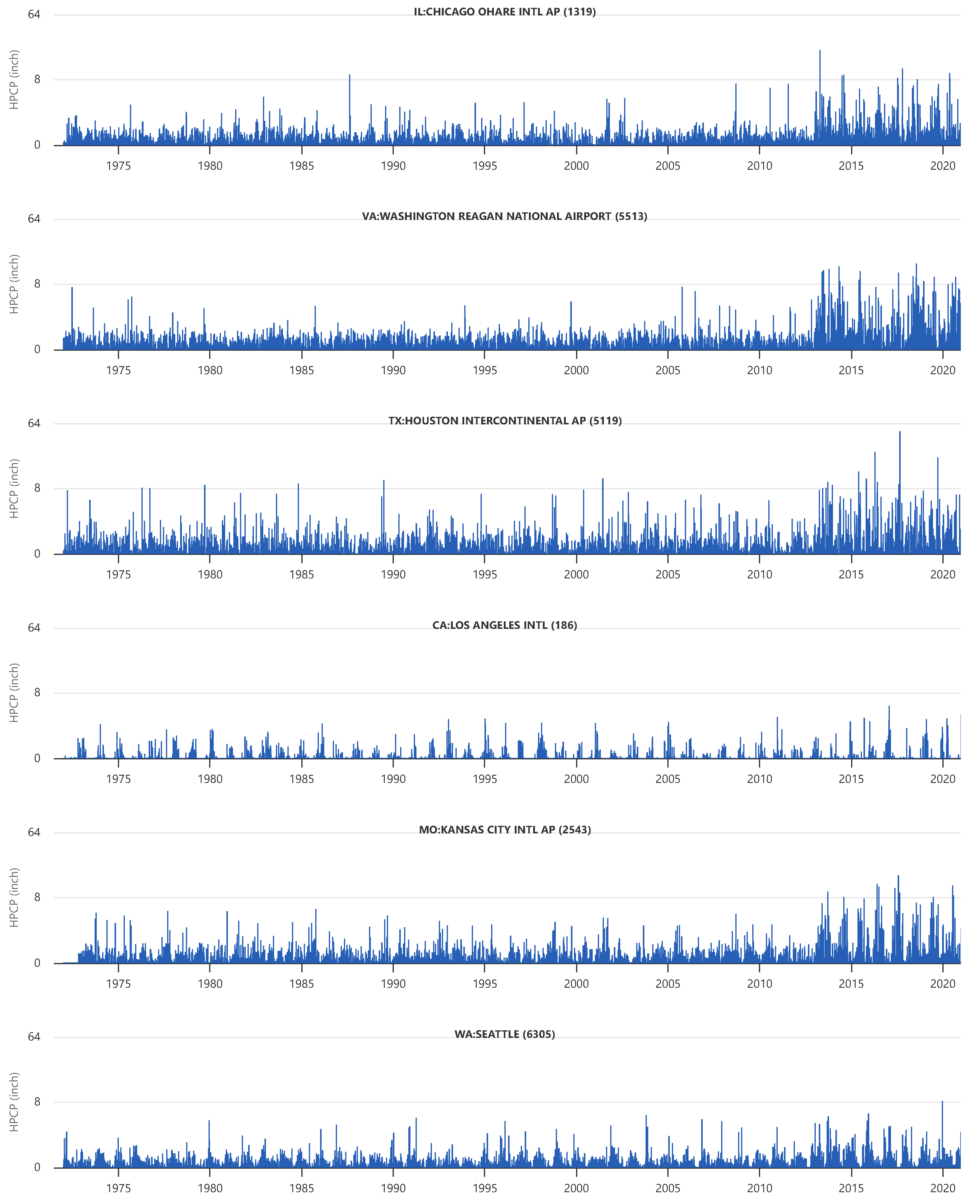
6.2. Case Study: Performing a Comparative Analysis on Multiple Regions

For the second case study, we conducted a comparative analysis using the designed system across multiple geographically distributed regions in the United States. Six locations were selected based on the availability of long-term, high-resolution hourly precipitation data: Los Angeles International Airport (LAX, CA), Chicago Ohare International Airport (ORD, IL), Kansas City International Airport (MCI, MO), Houston Intercontinental Airport (IAH, TX), Washington Reagan National Airport (DCA, VA), and Seattle (WA). These stations were selected because each provides more than 50 years of hourly precipitation records. Figure 14 shows the performed IETD analysis ( θ = 2 ) of all six stations over 50 years from 1972 to 2022.
Among them, Los Angeles (LA) showed distinctive precipitation patterns because it follows a Mediterranean climate pattern, characterized by hot, dry summers and cool, wet winters. The visualization revealed that LA had extremely low rainfall amounts compared to other stations. This pattern is consistent with Southern California’s semiarid climate, where precipitation predominantly occurs between November and March [83]. In contrast, Seattle recorded substantially more precipitation than LA, but still less precipitation than the other stations. As winter is the wettest season, and July is the driest month in Seattle, high spikes were observed in winter. Seattle’s precipitation pattern is broadly known as it follows the classic Pacific Northwest maritime climate [84], with persistent light to moderate rainfall rather than the high-intensity events characteristic of other regions.
Kansas City and Chicago showed similar precipitation patterns, although Chicago typically sees more snowfall than Kansas City. However, rainfall amounts are slightly higher in Kansas City than in Chicago. Both cities represent continental climate patterns with distinct seasonal precipitation cycles [85,86]. The similarity in the pattern but the difference in intensity highlights the importance of considering geographical transitions from the humid subtropical climate of the southern plains to the continental climate of the Great Lakes region [87,88,89]. Similar precipitation patterns were observed when comparing the three weather stations in ORD, DCA, and IAH airports. Chicago (ORD) often showed more precipitation patterns than others. As tropical systems notably influence Houston’s (IAH) precipitation regime, significant late summer and early fall maxima corresponding to hurricane season were observed in the visualization. Washington D.C. DCA displays a more uniform precipitation pattern throughout the year, with slight increases during the summer months due to convective activity and occasional tropical system impacts [90].
By comparing the visualizations of all stations, we immediately observed a precipitation increase in all weather stations since 2013. This observation aligns with climate change projections that suggest increased precipitation intensity in many parts of the United States [9,50]. The visualizations indicate that it is a robust signal of consistently increasing patterns affecting diverse areas rather than regional variability. For more detailed analysis, we also performed trend analysis, extreme event analysis, and baseline climatology comparison analysis with the designed multi-site analysis interface. A detailed explanation of the performed analysis is included below.

6.2.1. Trend Analysis

Annual precipitation trend analysis was performed to identify trends across the six weather stations’ precipitation data. Figure 15 shows performed trend analyses. We conducted a comparative analysis with three regression methods (linear, polynomial, and exponential) to examine their similarities and differences. Figure 15A shows the performed analysis with linear regression. We identified increasing precipitation patterns in most regions except Los Angeles ( R 2 = 0.004 ,   p = 0.9309 ,   τ = 0.001 ) and Seattle ( R 2 = 0.006 ,   p = 0.1808 ,   τ = 0.009 ). The trends in Chicago, Kansas City, and Houston showed statistically significant increases ( p 0.0001 ). With the polynomial regression method (degree = 2), we found similar results with slightly increased trends (Figure 15B). Interestingly, all weather stations showed curved patterns, indicating that precipitation trends decreased around the 1980s before increasing again in the 1990s. Exponential regression produced results similar to linear regression. These statistically validated increasing patterns align with our initial observations in the temporal precipitation visualization (Figure 14). Easterling et al. [9] emphasized the presence of heavy precipitation events in most parts of the U.S. in 2017. Our trend analysis visualization confirms a similar phenomenon (an increase in precipitation) occurring throughout the U.S.

6.2.2. Extreme Event Analysis

Annual PCA analysis visualization applies PCA computation to evaluate all extracted features of annual precipitation data and project them in a 2-D scatterplot. As described in Section 5.2.1, a comprehensive set of 41 features was extracted from the precipitation data by analyzing them annually and seasonally. Especially when analyzing the data seasonally, we computed seasonal distribution metrics, including the proportion of annual precipitation occurring in each season and a seasonal variability coefficient that quantifies precipitation fluctuations across seasons. Utilizing the multi-dimensional extracted features is effective in identifying complex patterns from the precipitation data.
Figure 16 shows a PCA projection of all six stations’ annual precipitation events. In the visualization, a dense cluster visibly appeared in the center. It shows that numerous annual precipitations maintain similar patterns. Instead, several precipitations outside the cluster can be considered possible outliers, indicating they do not follow and maintain similar precipitation trends. To understand the projected precipitation data effectively, selection user interaction was applied to emphasize only the data of interest. The figure shows that the user selected possible outliers in a floating window. The selected events are highlighted in red and connected to bubble windows, representing the summary of the performed annual precipitation analysis. We found four annual precipitation events as possible outliers. They are LA 1997, Chicago 2013, Washington D.C. (DCA Airport) 2013, and Houston 2017. In 1997, LA experienced severe drought conditions in 1976–1977, followed by sudden heavy rainfall events. This dramatic shift from extreme drought to heavy precipitation was unusual and would appear as an anomaly in precipitation patterns [91,92]. From the historical records, we found that there was significant flooding with a record-breaking rainfall amount of over 7 inches of rain in 24 h in Chicago 2013 [93]. In 2013, Washington, D.C., experienced unusual precipitation patterns, including several intense rainfall events. July 2013 was particularly notable, with nearly twice the normal monthly rainfall recorded [94]. From the PCA analysis, we found that DCA 2013 and DCA 2018 annual precipitation events appeared as possible outliers positioned next to each other. By evaluating historical records, we found that 2018 was Washington D.C.’s wettest year on record, with over 66 inches of rain recorded at DCA [95]. The normal annual precipitation is around 40 inches. We also found that several extreme rainfall events occurred, including major flooding in July and September. As we found in our previous case study, Texas experienced Hurricane Harvey in August 2017, one of the most devastating hurricanes in US history. When comparing multiple stations’ precipitation data, this event was determined as an unusual precipitation event. Each of these events represents significant deviations from normal precipitation patterns that appear as outliers in our PCA analysis.

6.2.3. Baseline Climatology Comparison

Baseline climatology comparison supports identifying precipitation patterns for each location by performing historical monthly precipitation averages across multiple years. We performed a monthly precipitation analysis to conduct an analysis on the findings from the PCA analysis results (see Section 6.2.2) to identify precipitation patterns that significantly deviate from expected seasonal norms.
Figure 17A shows visualizations of monthly average precipitation from 1972 to 2022. By evaluating over 50 years of precipitation data in the five stations, we found that the most noticeable precipitation events mainly occurred in Houston. Figure 17B shows the monthly average precipitation in 1977. In that year, none of the stations recorded noticeable precipitation events. However, Los Angeles showed the highest precipitation peak. Although the average precipitation amount was not high, a tropical cyclone, Hurricane Doreen, impacted Southern California, including Los Angeles, in 1977 [96]. It was recognized as an unusual event in Southern California during the normally dry summer months. In 2013, two anomalous precipitation events were observed in Houston and Washington, DC. Houston showed the highest average precipitation in June. Although no major catastrophic event happened in Houston in 2013, an unusually persistent upper-level low-pressure system stalled over the area and produced heavy rainfall from thunderstorms in June. Heavy rainfall happens in the case of conditions of atmospheric instability, abundant moisture, and slow storm movement [97]. Using this unique event, scientists conducted a simulation study to investigate thunderstorm formation mechanisms by modeling the June 2013 conditions [98]. In October 2013, Washington, D.C. experienced a similar anomaly when a slow-moving frontal system produced several days of heavy rainfall. By evaluating the actual precipitation data with the station-specific analysis interface, we found that it ranged from 0.02 to 3.45 inches and averaged 0.34 ± 0.65 inches from 9 to 13 October. Notable intense precipitation occurred on 7 October (3.45 inches in a single hour), 10 October (over 3 inches during the morning hours), and 11 October (peak intensity of 3.4 inches between 7 and 8 p.m.). Due to these heavy rainfall events during that period, Washington, DC, appeared as the location with the second-highest monthly average precipitation in 2013 [94].

7. Conclusions and Future Work

In this paper, we presented an interactive visual analytics system for analyzing hourly precipitation data and identifying the complexities of precipitation patterns in a changing climate. The system provides comprehensive precipitation data across the United States and integrates sophisticated statistical analysis techniques to support advanced analysis capabilities of precipitation data analysis.
In the system, station-specific and multi-site analysis interfaces provide a powerful framework for understanding both local precipitation characteristics and broader regional patterns. Multiple statistical methods, including PCA, regression analyses, and probability distributions for anomaly detection, are integrated to enable comprehensive precipitation analysis. As an interactive visual analytics system, it allows users to conduct interactive data analysis by examining visually represented precipitation events and cross-verifying them, leading to a more accurate understanding of precipitation events. We performed case studies to demonstrate the effectiveness of the system in analyzing extreme precipitation variability and performing comparative analyses across multiple regions. In the case study of analyzing extreme precipitation variability, the system successfully identified historical flood events such as Hurricane Harvey and the Tax Day Flood as statistical anomalies, confirming its ability to detect significant precipitation events. The multi-regional comparison case study revealed distinct precipitation patterns across different climate regions.
For future works, we plan to incorporate additional meteorological variables (temperature, humidity, wind) that may provide contextual information for precipitation events. We also consider integrating sub-hourly precipitation data for a more detailed analysis of high-intensity, short-duration events. Additional statistical distributions and machine learning approaches will be considered, as they can characterize extreme events under diverse climate conditions more effectively and improve the accuracy of anomaly detection. As conducting precipitation analysis in diverse areas requires tremendous time and effort for analysts, it is important to design automated or semiautomated pattern recognition techniques to highlight potential anomalies or significant changes in precipitation patterns.

Author Contributions

Conceptualization, D.H.J. and P.B.; methodology, D.H.J. and P.B.; software, D.H.J. and S.-Y.J.; validation, D.H.J., S.-Y.J., and P.B.; formal analysis, D.H.J. and S.-Y.J.; investigation, writing—original draft preparation, D.H.J., P.B., C.D.L.S., B.K.J., and S.-Y.J.; writing—review and editing, D.H.J., P.B., C.D.L.S., B.K.J., B.H., and S.-Y.J.; visualization; funding acquisition, D.H.J., P.B., B.H., and S.-Y.J. All authors have read and agreed to the published version of the manuscript.

Funding

This material is based upon work supported by the National Science Foundation under grant nos. 2107451 and 2219532. Research was sponsored by the Army Research Office and was accomplished under grant number W911NF-23-1-0217. The views and conclusions contained in this document are those of the authors and should not be interpreted as representing the official policies, either expressed or implied, of the Army Research Office or the U.S. Government. The U.S. Government is authorized to reproduce and distribute reprints for Government purposes notwithstanding any copyright notation herein.

Institutional Review Board Statement

Not applicable.

Informed Consent Statement

Not applicable.

Data Availability Statement

The original data presented in the study are openly available in Zenodo at https://doi.org/10.5281/zenodo.15114251.

Conflicts of Interest

The authors declare no conflicts of interest. The funder had no role in the design of the study; in the collection, analyses, or interpretation of data; in the writing of the manuscript; or in the decision to publish the results.

Abbreviations

The following abbreviations are used in this manuscript:
ANNArtificial Neural Networks
CIConfidence Interval
CDFCumulative Distribution Function
COOPCooperative Observer Program
CSSCascading Style Sheets
CSVComma-Separated Values
CMVsCoordinated Multiple Views
DCAFAA ID of Washington Reagan National Airport
DODDepartment of Defense
DWTDiscrete Wavelet Transform
FAAFederal Aviation Administration
HPDHourly Precipitation Data
HOMRHistorical Observing Metadata Repository
IADFAA ID of Washington Dulles International Airport
IAHFAA ID of Houston Intercontinental Airport
ICAOInternational Civil Aviation Organization
IDFIntensity–Duration–Frequency
IETDInter-Event Time Difference
ILIllinois, U.S. State
IQRInterquartile Range
JSONJavaScript Object Notation
LALos Angeles, California
LCDLocal Climatological Data
LSTMLong Short-Term Memory
MLMachine Learning
NCDCNational Climatic Data Center
NCEINational Centers for Environmental Information
NOAANational Oceanic and Atmospheric Administration
NWSNational Weather Service
RNNRecurrent Neural Networks
SDStandard Deviation
SEStandard Error
SIDSystem Identification Number
SSTStochastic Storm Transposition
SVDSingular Value Decomposition
SVGScalable Vector Graphics
TXTexas, U.S. State
VAVirginia, U.S. State
WAWashington, U.S. State
WMOWorld Meteorological Organization

Appendix A. Creating a Composite Weather Station Dataset

A unified station list is created to track the geographical locations of weather stations effectively. Various organizations and agencies operate and manage their weather stations and collect data, including the National Centers for Environmental Information (NCEI), NWS, FAA, the World Meteorological Organization (WMO), the International Civil Aviation Organization (ICAO), and more. Each organization uses unique identifiers to handle its stations. Thus, we created a unified station list by cross-referencing attributes from multiple data sources. Each station on the list has 46 attributes, including longitude, latitude, elevation, station name, physical address, and the dates marking the beginning and end of data collection. The list includes 85,003 stations, averaging about 1700 stations per U.S. state. Delaware has the fewest stations, numbering 181, whereas Texas has the most, with 6794 stations.
The two datasets (LCD and COOP HPD) are used in this study. They use distinct station identifiers—NCDC ID for the LCD and COOP ID for the COOP HPD datasets. To combine the datasets, the Historical Observing Metadata Repository (HOMR) [99] is used as the primary weather station referencing data. HOMR is NCEI’s integrated station history database. It provides detailed information for various weather stations throughout their lifespans, including identifiers, names, locations, observation times, reporting methods, photos, equipment modifications, and siting. However, HOMR does not include information on unique weather station identifiers. Therefore, we performed data filtration and merged multiple duplicate entries by cross-referencing other additional station datasets, including the primary sources of the International Civil Aviation Organization (ICAO), the FAA, Transport Canada, the NWS, and the WMO. It is important to note that this study only considers weather stations in the U.S. Thus, all international weather station identifiers are excluded.
For example, Table A1 shows records about the station “NEWPORT MUNICIPAL AP” in Oregon, which has been operational since 1949. We found the COOP ID missing for specific periods. We also discovered that the station dataset contained duplicate entries. Thus, we reduced records by combining identical geographical information into a single station entry to address the duplicate entries and avoid missing or redundant data. Because of the scale of the data, which included numerous weather station records, we handled all inconsistently formatted data entries by evaluating the records referencing their original data specifications. As many data entries were inconsistently formatted, we performed repeated manual reviews to ensure the accuracy of the final corrected station dataset.
Table A1. An example of having multiple records in Oregon (station name is NEWPORT MUNICIPAL AP).
NCDCBEG_DTEND_DTCOOPWBANSTLAT_DMSLON_DMS
10000001194907131950111535603224285OR44,35,00,N124,03,00,W
100000011959070119621001 24285OR44,35,00,N124,03,00,W
100000011962100119630129 24285OR44,35,00,N124,03,00,W
10000001196301291967012535603224285OR44,35,00,N124,03,00,W
100000011967012519800205 24285OR44,35,00,N124,03,00,W
10000001198002051986051635603224285OR44,35,00,N124,03,00,W
10000001198605161988020335603224285OR44,35,00,N124,03,00,W
100000011988020319880501 24285OR44,35,00,N124,03,00,W
100000011988050199991231 24285OR44,35,00,N124,03,00,W
A composite station dataset is created by incorporating multiple attributes to track each weather station. As no universal unique identifier exists to manage all weather stations, a unique identifier number is assigned to handle each station in the dataset. This number is also used to support per-station data analysis with the designed visual analytics system. As various organizations use different identifiers to handle collected weather data in weather stations, the dataset includes ten identifiers (nine IDs and one call sign) for future reference and connectivity to the original data source. For example, the NCEI uses NCDC IDs (National Climatic Data Center IDs) to manage weather station records. The World Meteorological Organization (WMO) assigns WMO station numbers to weather stations worldwide. These identifiers are used to standardize weather station data internationally.
When referencing multiple weather station datasets, we identified nine unique identifiers managed by different organizations. All station identifiers are saved in the composite station dataset for future reference. Unlike other organizations, the Federal Aviation Administration (FAA) uses a call sign to identify an aviation-related weather station because many FAA-managed weather stations are located at airports. It provides hourly meteorological data such as temperature, wind speed, visibility, and precipitation. As FAA call signs are used alongside other identifiers like System Identification Numbers (SID) (assigned by the National Weather Service) and WMO station numbers (used internationally), the call sign information is also included when creating the station dataset.
Table A2 shows examples in the generated composite station dataset. Multiple identifiers are assigned to indicate the same weather station. For instance, in the COOP HPD dataset, COOP_ID (503475) is used to identify the weather station in Alaska (AK). However, we discovered multiple NCDC identifiers (10000158 and 10500011) assigned to the weather station in the LCD dataset. This occurs because new identifiers are typically assigned when a weather station is relocated within the same geographical region. Through our analysis of the station data, we determined that this particular station has been relocated multiple times (i.e., 1.5 MI NE, 1.5 MI E, 1.25 MI SW, 1 MI NE, 2.7 MI SW, 1.25 MI NE, 2 MI W, and 2.7 MI SE). Approximately 11,926 stations have such relocation information. We included a comprehensive record of all stations’ historical identifiers and relocation details for future reference.
Table A2. Seven attributes of five weather stations in AK and AL in the newly generated station dataset.
COOP_IDNCDC_IDWBAN_IDNAMESTLATLON
50347510000158|1050001125322GUSTAVUSAK58.4111−135.7089
5060891000023926489|46403MCKINLEY NATIONAL PARK APAK63.73333−148.91667
506093|50577810000240|1010001626429MAK63.7175−148.9692
101161000048553864ALABASTER SHELBY CO AP ASOSAL33.17835−86.78178
157491000057213896MUSCLE SHOALS APAL34.74388−87.59971
Table A3 shows that the newly generated composite station dataset contains 47 distinct attributes for weather station identification and characterization. It incorporates ten different identifier systems (including nine IDs and one call sign) from various meteorological and aviation organizations to provide robust cross-referencing capabilities. It also provides each weather station’s geographical information, elevation data in multiple formats, operational parameters, and participation flags for major climate data products.
Table A3. A generated composite station dataset that includes forty-seven attributes.
NOVAR_NAMEExplanation
1IDXIndex
2COOP_IDNWS Cooperative network ID, assigned by NCEI.
3GHCND_IDPopulated if the station is included in GHCN-Daily product by NCEI
4NCDC_IDA unique identifier used by NCEI.
5NWSLI_IDNWS location identifier
6FAA_IDManaged by USDT Federal Aviation Administration.
7WBAN_IDWBAN identifier (Weather-Bureau-Army-Navy), assigned by NCEI
8WMO_IDID assigned by World Meteorological Organization
9ICAO_IDManaged by the International Civil Aviation Organization.
10TRANSMITTAL_IDThe official ICAO identifier managed by the International Civil Aviation Organization.
11TRANSMITTAL_ID_TYPEICAO or TRANSMITTAL
12NAMEStation name
13ALT_NAMEAlternate name or alias.
14CITYCity listed on the LCD publication.
15STUSPS abbreviation for each state
16COUNTYName of county
17COUNTRYFIPS country name
18COUNTRY_CODEFIPS country code
19LOCATIONStation location
20LOCATION_AREALocation area
21NWS_REGIONNWS region
22ELEVStation elevation in feet
23ELEV_GROUNDGround elevation.
24ELEV_AWind anemometer height in feet.
25ELEV_PPressure sensor elevation in feet.
26LATDecimal latitude
27LONDecimal longitude
28STNTYPEType of observing programs associated with the station.
29UTCTime zone
30CALLFederal Aviation Administration ID number
31CALL_SIGNOfficial FAA identifier for LCD stations
32BEG_DTBeginning date of record
33ENG_DTEnding date of record
34CDClimate division as determined by master divisional reference maps. assigned by NCEI.
35LOC_PRECIndicates precision of source lat and lon
36LAT_DMSLatitude degree, minute, etc format based on LOC_PREC precision
37LON_DMSLongitude degree, minute, etc format based on LOC_PREC precision
38EL_GR_FTGround elevation in Feet.
39EL_GR_MGround elevation in Meters.
40EL_AP_FTAirport: Field, Aerodrome, or Runway elevation - in Feet.
41EL_AP_MAirport: Field, Aerodrome, or Runway elevation - in Meters.
42TYPEStation type and/or platforms station participates
43RELOCATIONDistance and direction of station relocation
44GHCNMLTPopulated if the station is included in GHCN-Monthly Land Temperature product
45IGRAPopulated if station is included in IGRA2 product
46HPDPopulated if the station is included in Hourly Precipitation Data (HPD) product
47GHCNHPopulated if the station is included in GHCN-Hourly product

References

  1. Leopold, L.B. Hydrology for Urban Land Planning: A Guidebook on the Hydrologic Effects of Urban Land Use. U.S. Geol. Surv. Circ. 1968, 554. Available online: https://pubs.usgs.gov/publication/cir554 (accessed on 28 March 2025).
  2. Paul, M.J.; Meyer, J.L. Streams in the Urban Landscape. Annu. Rev. Ecol. Syst. 2001, 32, 333–365. [Google Scholar] [CrossRef]
  3. U.S. Environmental Protection Agency. Technical Guidance on Implementing the Stormwater Runoff Requirements for Federal Projects under Section 438 of the Energy Independence and Security Act. Technical Report EPA 841-B-09-001, U.S. Environmental Protection Agency, 2009. Available online: https://www.epa.gov/sites/default/files/2015-08/documents/epa_swm_guidance.pdf (accessed on 28 March 2025).
  4. Akan, A.O.; Houghtalen, R.J. Urban Hydrology, Hydraulics, and Stormwater Quality: Engineering Applications and Computer Modeling; John Wiley & Sons: Hoboken, NJ, USA, 2003. [Google Scholar]
  5. Bedient, P.B.; Huber, W.C.; Vieux, B.E. Hydrology and Floodplain Analysis, 6th ed.; Pearson: New York, NY, USA, 2018. [Google Scholar]
  6. Adams, B.J.; Papa, F. Urban Stormwater Management Planning with Analytical Probabilistic Models; John Wiley & Sons: New York, NY, USA, 2000. [Google Scholar]
  7. Guo, Y.; Adams, B.J. Hydrologic analysis of urban catchments with event-based probabilistic models: 1. Runoff volume. Water Resour. Res. 1998, 34, 3421–3431. [Google Scholar] [CrossRef]
  8. Chow, V.T.; Maidment, D.R.; Mays, L.W. Applied Hydrology; McGraw-Hill: New York, NY, USA, 1988. [Google Scholar]
  9. Easterling, D.R.; Kunkel, K.E.; Arnold, J.R.; Knutson, T.; LeGrande, A.N.; Leung, L.R.; Vose, R.S.; Waliser, D.E.; Wehner, M.F. Precipitation change in the United States. In Climate Science Special Report: Fourth National Climate Assessment, Volume I; Wuebbles, D., Fahey, D., Hibbard, K., Dokken, D., Stewart, B., Maycock, T., Eds.; U.S. Global Change Research Program: Washington, DC, USA, 2017; pp. 207–230. [Google Scholar] [CrossRef]
  10. Kunkel, K.E.; Karl, T.R.; Squires, M.F.; Yin, X.; Stegall, S.T.; Easterling, D.R. Precipitation Extremes: Trends and Relationships with Average Precipitation and Precipitable Water in the Contiguous United States. J. Appl. Meteorol. Climatol. 2020, 59, 125–142. [Google Scholar] [CrossRef]
  11. Menne, M.J.; Durre, I.; Vose, R.S.; Gleason, B.E.; Houston, T.G. An Overview of the Global Historical Climatology Network-Daily Database. J. Atmos. Ocean. Technol. 2012, 29, 897–910. [Google Scholar] [CrossRef]
  12. Roberts, J.C. State of the Art: Coordinated & Multiple Views in Exploratory Visualization. In Proceedings of the Fifth International Conference on Coordinated and Multiple Views in Exploratory Visualization (CMV 2007), Zurich, Switzerland, 2 July 2007; pp. 61–71. [Google Scholar] [CrossRef]
  13. Tominski, C.; Donges, J.F.; Nocke, T. Information Visualization in Climate Research. In Proceedings of the 2011 15th International Conference on Information Visualisation, London, UK, 13–15 July 2011; pp. 298–305. [Google Scholar] [CrossRef]
  14. Soe, M.M. Rainfall Prediction using Regression Model. In Proceedings of the 2023 IEEE Conference on Computer Applications (ICCA), Yangon, Myanmar, 27–28 February 2023; pp. 113–117. [Google Scholar] [CrossRef]
  15. Young, A.; Bhattacharya, B.; Daniëls, E.; Zevenbergen, C. Integrating WRF forecasts at different scales for pluvial flood forecasting using a rainfall threshold approach and a real-time flood model. J. Hydrol. 2025, 656, 132891. [Google Scholar] [CrossRef]
  16. Hiraga, Y.; Tahara, R.; Meza, J. A methodology to estimate Probable Maximum Precipitation (PMP) under climate change using a numerical weather model. J. Hydrol. 2025, 652, 132659. [Google Scholar] [CrossRef]
  17. Kumar, D.; Singh, A.; Samui, P.; Jha, R.K. Forecasting monthly precipitation using sequential modelling. Hydrol. Sci. J. 2019, 64, 690–700. [Google Scholar] [CrossRef]
  18. Manandhar, S.; Dev, S.; Lee, Y.H.; Meng, Y.S.; Winkler, S. A Data-Driven Approach for Accurate Rainfall Prediction. IEEE Trans. Geosci. Remote Sens. 2019, 57, 9323–9331. [Google Scholar] [CrossRef]
  19. Bartwal, K.; Pathak, N.; Alexander, J.; Aeri, M.; Dhondiyal, S.A.; Awasthi, S. Rainfall Prediction Using Machine Learning. In Proceedings of the 2024 2nd International Conference on Disruptive Technologies (ICDT), Greater Noida, India, 15–16 March 2024; pp. 582–588. [Google Scholar] [CrossRef]
  20. Partal, T.; Kahya, E. Trend analysis in Turkish precipitation data. Hydrol. Process. 2006, 20, 2011–2026. [Google Scholar] [CrossRef]
  21. Zerouali, B.; Elbeltagi, A.; Al-Ansari, N.; Abda, Z.; Chettih, M.; Santos, C.A.G.; Boukhari, S.; Araibia, A.S. Improving the visualization of rainfall trends using various innovative trend methodologies with time–frequency-based methods. Appl. Water Sci. 2022, 12, 207. [Google Scholar] [CrossRef]
  22. Panda, A.; Sahu, N. Trend analysis of seasonal rainfall and temperature pattern in Kalahandi, Bolangir and Koraput districts of Odisha, India. Atmos. Sci. Lett. 2019, 20, e932. [Google Scholar] [CrossRef]
  23. Mallakpour, I.; Villarini, G. The changing nature of flooding across the central United States. Nat. Clim. Change 2015, 5, 250–254. [Google Scholar] [CrossRef]
  24. Zhou, Z.; Smith, J.A.; Wright, D.B.; Baeck, M.L.; Yang, L.; Liu, S. Storm Catalog-Based Analysis of Rainfall Heterogeneity and Frequency in a Complex Terrain. Water Resour. Res. 2019, 55, 1871–1889. [Google Scholar] [CrossRef]
  25. Wright, D.B.; Yu, G.; England, J.F. Six decades of rainfall and flood frequency analysis using stochastic storm transposition: Review, progress, and prospects. J. Hydrol. 2020, 585, 124816. [Google Scholar] [CrossRef]
  26. Pawar, N.; Dhamge, N.R.; Kharkar, O.; Yeole, V.; Siddham, U.; Meshram, N. Frequency Analysis of Rainfall Data. Int. J. Res. Appl. Sci. Eng. Technol. 2023, 11, 2181–2186. [Google Scholar] [CrossRef]
  27. Hael, M.A.; Yongsheng, Y.; Saleh, B.I. Visualization of rainfall data using functional data analysis. SN Appl. Sci. 2020, 2, 461. [Google Scholar] [CrossRef]
  28. Hu, Q. On the Uniqueness of the Singular Value Decomposition in Meteorological Applications. J. Clim. 1997, 10, 1762–1766. [Google Scholar] [CrossRef]
  29. Joo, J.; Lee, J.; Kim, J.H.; Jun, H.; Jo, D. Inter-Event Time Definition Setting Procedure for Urban Drainage Systems. Water 2014, 6, 45–58. [Google Scholar] [CrossRef]
  30. Dey, A.; Hazra, A. A Semiparametric Generalized Exponential Regression Model with a Principled Distance-based Prior for Analyzing Trends in Rainfall. arXiv 2023, arXiv:2309.03165. [Google Scholar] [CrossRef]
  31. Zhang, J.; Xu, J.; Dai, X.; Ruan, H.; Liu, X.; Jing, W. Multi-Source Precipitation Data Merging for Heavy Rainfall Events Based on Cokriging and Machine Learning Methods. Remote Sens. 2022, 14, 1750. [Google Scholar] [CrossRef]
  32. Lawrimore, J.H.; Wuertz, D.; Wilson, A.; Stevens, S.; Menne, M.; Korzeniewski, B.; Palecki, M.A.; Leeper, R.D.; Trunk, T. Quality Control and Processing of Cooperative Observer Program Hourly Precipitation Data. J. Hydrometeorol. 2020, 21, 1811–1825. [Google Scholar] [CrossRef]
  33. DeGaetano, A.T.; Mooers, G.; Favata, T. Temporal Changes in the Areal Coverage of Daily Extreme Precipitation in the Northeastern United States Using High-Resolution Gridded Data. J. Appl. Meteorol. Climatol. 2020, 59, 551–565. [Google Scholar] [CrossRef]
  34. Maidment, D.R. Arc Hydro: GIS for Water Resources; ESRI Press: Redlands, CA, USA, 2002. [Google Scholar]
  35. Gerst, M.D.; Kenney, M.A.; Baer, A.E.; Speciale, A.; Wolfinger, J.F.; Gottschalck, J.; Handel, S.; Rosencrans, M.; Dewitt, D. Using Visualization Science to Improve Expert and Public Understanding of Probabilistic Temperature and Precipitation Outlooks. Weather. Clim. Soc. 2020, 12, 117–133. [Google Scholar] [CrossRef]
  36. Gimesi, L. Development of a visualization method suitable to present tendencies of changes in precipitation. J. Hydrol. 2009, 377, 185–190. [Google Scholar] [CrossRef]
  37. Tanaka, Y.; Angeliki, G.; Henry, E.; Raidou, R.; Gröller, E.; Itoh, T. Visualization of Relationships between Precipitation and River Water Levels. In Proceedings of the 2024 28th International Conference Information Visualisation (IV), Coimbra, Portugal, 22–26 July 2024; pp. 1–6. [Google Scholar] [CrossRef]
  38. National Oceanic and Atmospheric Administration. NOAA’s Cooperative Observer Program: The Nation’s Oldest and Largest Weather Network. Technical Report, National Weather Service, 2014. Available online: https://www.weather.gov/coop/ (accessed on 28 March 2025).
  39. Demaria, E.M.C.; Goodrich, D.C.; Kunkel, K.E. Evaluating the Reliability of the U.S. Cooperative Observer Program Precipitation Observations for Extreme Events Analysis Using the LTAR Network. J. Atmos. Ocean. Technol. 2019, 36, 317–332. [Google Scholar] [CrossRef]
  40. National Centers for Environmental Information. Local Climatological Data (LCD). Technical Report, NOAA, 2020. Available online: https://www.ncdc.noaa.gov/cdo-web/datatools/lcd (accessed on 28 March 2025).
  41. Balistrocchi, M.; Bacchi, B. Modelling the statistical dependence of rainfall event variables through copula functions. Hydrol. Earth Syst. Sci. 2011, 15, 1959–1977. [Google Scholar] [CrossRef]
  42. Palynchuk, B.A.; Guo, Y. Threshold analysis of rainstorm depth and duration statistics at Toronto, Canada. J. Hydrol. 2008, 348, 335–345. [Google Scholar] [CrossRef]
  43. Restrepo-Posada, P.J.; Eagleson, P.S. Identification of independent rainstorms. J. Hydrol. 1982, 55, 303–319. [Google Scholar] [CrossRef]
  44. Bostock, M.; Ogievetsky, V.; Heer, J. D3 Data-Driven Documents. IEEE Trans. Vis. Comput. Graph. 2011, 17, 2301–2309. [Google Scholar] [CrossRef]
  45. Zhao, W.; Abhishek; Kinouchi, T. Uncertainty quantification in intensity-duration-frequency curves under climate change: Implications for flood-prone tropical cities. Atmos. Res. 2022, 270, 106070. [Google Scholar] [CrossRef]
  46. Olivera, M.; Heard, C. Increases in the extreme rainfall events: Using the Weibull distribution. Environmetrics 2018, 30, e2532. [Google Scholar] [CrossRef]
  47. Maidment, D.R. Handbook of Hydrology; McGraw-Hill: New York, NY, USA, 1993. [Google Scholar]
  48. Martinez-Villalobos, C.; Neelin, J.D. Why Do Precipitation Intensities Tend to Follow Gamma Distributions? J. Atmos. Sci. 2019, 76, 3611–3631. [Google Scholar] [CrossRef]
  49. Martinez-Villalobos, C.; Neelin, J.D. Shifts in Precipitation Accumulation Extremes During the Warm Season Over the United States. Geophys. Res. Lett. 2018, 45, 8586–8595. [Google Scholar] [CrossRef]
  50. USGCRP. Impacts, Risks, and Adaptation in the United States: Fourth National Climate Assessment, Volume II; Reidmiller, D.R., Avery, C.W., Easterling, D.R., Kunkel, K.E., Lewis, K.L.M., Maycock, T.K., Stewart, B.C., Eds.; U.S. Global Change Research Program: Washington, DC, USA, 2018; p. 1515. [CrossRef]
  51. Marra, F.; Amponsah, W.; Papalexiou, S.M. Non-asymptotic Weibull tails explain the statistics of extreme daily precipitation. Adv. Water Resour. 2023, 173, 104388. [Google Scholar] [CrossRef]
  52. Pieper, P.; Düsterhus, A.; Baehr, J. A universal Standardized Precipitation Index candidate distribution function for observations and simulations. Hydrol. Earth Syst. Sci. 2020, 24, 4541–4565. [Google Scholar] [CrossRef]
  53. Burden, R.L.; Faires, J.D. Numerical Analysis, 9th ed.; Cengage Learning: Boston, MA, USA, 2011. [Google Scholar]
  54. Qiu, J.; Shen, Z.; Leng, G.; Wei, G. Synergistic effect of drought and rainfall events of different patterns on watershed systems. Sci. Rep. 2021, 11, 18957. [Google Scholar] [CrossRef] [PubMed]
  55. Day, S.J. Managing Water Locally: An Inquiry Into Community-Based Water Resources Management in Fragile States. Ph.D. Thesis, Cranfield University, Cranfield, UK, 2016. Available online: https://core.ac.uk/download/42144249.pdf (accessed on 28 March 2025).
  56. Weisberg, S. Applied Linear Regression; Wiley Series in Probability and Statistics; Wiley: Hoboken, NJ, USA, 2005. [Google Scholar]
  57. Hu, Z.; Liu, S.; Zhong, G.; Lin, H.; Zhou, Z. Modified Mann-Kendall trend test for hydrological time series under the scaling hypothesis and its application. Hydrol. Sci. J. 2020, 65, 2419–2438. [Google Scholar] [CrossRef]
  58. Guilbert, J.; Betts, A.K.; Rizzo, D.M.; Beckage, B.; Bomblies, A. Characterization of increased persistence and intensity of precipitation in the northeastern United States. Geophys. Res. Lett. 2015, 42, 1888–1893. [Google Scholar] [CrossRef]
  59. Hatsuzuka, D.; Sato, T.; Higuchi, Y. Sharp rises in large-scale, long-duration precipitation extremes with higher temperatures over Japan. Npj Clim. Atmos. Sci. 2021, 4, 29. [Google Scholar] [CrossRef]
  60. Şan, M.; Nacar, S.; Kankal, M.; Bayram, A. Daily precipitation performances of regression-based statistical downscaling models in a basin with mountain and semi-arid climates. Stoch. Environ. Res. Risk Assess. 2023, 37, 1431–1455. [Google Scholar] [CrossRef]
  61. Villarini, G. On the seasonality of flooding across the continental United States. Adv. Water Resour. 2016, 87, 80–91. [Google Scholar] [CrossRef]
  62. Shi, W.; Hu, Y. A study on the forecast model of winter precipitation type in Liaocheng based on physical parameters. Meteorol. Appl. 2023, 30, e2126. [Google Scholar] [CrossRef]
  63. Clark, A.J. Generation of Ensemble Mean Precipitation Forecasts from Convection-Allowing Ensembles. Weather Forecast. 2017, 32, 1569–1583. [Google Scholar] [CrossRef]
  64. Xie, B.; Guo, H.; Meng, F.; Sa, C.; Luo, M. Historical Evolution and Future Trends of Precipitation Based on Integrated Datasets and Model Simulations of Arid Central Asia. Remote Sens. 2023, 15, 5460. [Google Scholar] [CrossRef]
  65. Xie, P.; Arkin, P.A. Global Precipitation: A 17-Year Monthly Analysis Based on Gauge Observations, Satellite Estimates, and Numerical Model Outputs. Bull. Am. Meteorol. Soc. 1997, 78, 2539–2558. [Google Scholar] [CrossRef]
  66. Swain, D.L.; Langenbrunner, B.; Neelin, J.D.; Hall, A. Increasing precipitation volatility in twenty-first-century California. Nat. Clim. Chang. 2018, 8, 427–433. [Google Scholar] [CrossRef]
  67. Zhang, W.; Villarini, G.; Vecchi, G.A.; Smith, J.A. Urbanization exacerbated the rainfall and flooding caused by hurricane Harvey in Houston. Nature 2018, 563, 384–388. [Google Scholar] [CrossRef]
  68. Nielsen-Gammon, J.W.; Zhang, F.; Odins, A.M.; Myoung, B. Extreme rainfall in Texas: Patterns and predictability. Phys. Geogr. 2012, 33, 133–156. [Google Scholar] [CrossRef]
  69. Mahoney, K.; Ralph, F.M.; Wolter, K.; Doesken, N.; Dettinger, M.; Gottas, D.; Coleman, T.; White, A. Climatology of extreme daily precipitation in Colorado and its diverse spatial and seasonal variability. J. Hydrometeorol. 2018, 19, 69–91. [Google Scholar] [CrossRef]
  70. Friedrich, K.; Kalina, E.A.; Aikins, J.; Steiner, M.; Gochis, D.; Kucera, P.A.; Ikeda, K.; Sun, J. Raindrop Size Distribution and Rain Characteristics during the 2013 Great Colorado Flood. J. Hydrometeorol. 2016, 17, 53–72. [Google Scholar] [CrossRef]
  71. Christian, J.; Christian, K.; Basara, J.B. Drought and pluvial dipole events within the Great Plains of the United States. J. Appl. Meteorol. Climatol. 2015, 54, 1886–1898. [Google Scholar] [CrossRef]
  72. Brooks, H.E.; Doswell, C.A.; Kay, M.P. Climatological Estimates of Local Daily Tornado Probability for the United States. Weather Forecast. 2003, 18, 626–640. [Google Scholar] [CrossRef]
  73. Kunkel, K.E.; Karl, T.R.; Brooks, H.; Kossin, J.; Lawrimore, J.H.; Arndt, D.; Bosart, L.; Changnon, D.; Cutter, S.L.; Doesken, N.; et al. Monitoring and understanding trends in extreme storms: State of knowledge. Bull. Am. Meteorol. Soc. 2013, 94, 499–514. [Google Scholar] [CrossRef]
  74. Huang, X.; Wang, C. Estimates of exposure to the 100-year floods in the conterminous United States using national building footprints. Int. J. Disaster Risk Reduct. 2020, 50, 101731. [Google Scholar] [CrossRef]
  75. Watson, K.M.; Harwell, G.R.; Wallace, D.S.; Welborn, T.L.; Stengel, V.G.; McDowell, J.S. Characterization of Peak Streamflows and Flood Inundation at Selected Areas in Texas Following the 2016 Spring Floods; Technical Report Scientific Investigations Report 2018-5062; U.S. Geological Survey: Reston, VA, USA, 2018. [CrossRef]
  76. Herbert, P.J. Atlantic Hurricane Season of 1979. Monthly Weather Review, National Hurricane Center, 1980. Available online: http://www.aoml.noaa.gov/general/lib/lib1/nhclib/mwreviews/1979.pdf (accessed on 28 March 2025).
  77. Liscum, F.; Weigel, J.F.; Johnson, S.L. Hydrologic Data for Urban Studies in the Houston, Texas Metropolitan Area, 1979. Open-File Report 81-264, U.S. Geological Survey, Austin, Texas, 1980. Available online: https://pubs.usgs.gov/of/1981/0264/report.pdf (accessed on 28 March 2025).
  78. Blake, E.S.; Zelinsky, D.A. National Hurricane Center Tropical Cyclone Report: Hurricane Harvey. Tropical Cyclone Report AL092017, National Hurricane Center, NOAA, 2018. Available online: https://www.nhc.noaa.gov/data/tcr/AL092017_Harvey.pdf (accessed on 28 March 2025).
  79. Nielsen, E.R.; Schumacher, R.S. Dynamical Mechanisms Supporting Extreme Rainfall Accumulations in the Houston “Tax Day” 2016 Flood. Mon. Weather Rev. 2020, 148, 83–109. [Google Scholar] [CrossRef]
  80. Lower Brazos Regional Flood Planning Group. 2023 Lower Brazos Amended Regional Flood Plan; Technical Report, Texas Water Development Board, 2023; Halff Associates, Inc.: Fort Worth, TX, USA, 2023. [Google Scholar]
  81. Kunkel, K.E.; Champion, S.M. An Assessment of Rainfall from Hurricanes Harvey and Florence Relative to Other Extremely Wet Storms in the United States. Geophys. Res. Lett. 2019, 46, 13500–13506. [Google Scholar] [CrossRef]
  82. Emanuel, K. Assessing the present and future probability of Hurricane Harvey’s rainfall. Proc. Natl. Acad. Sci. USA 2017, 114, 12681–12684. [Google Scholar] [CrossRef] [PubMed]
  83. Dettinger, M. Climate change, atmospheric rivers, and floods in California–a multimodel analysis of storm frequency and magnitude changes. JAWRA J. Am. Water Resour. Assoc. 2011, 47, 514–523. [Google Scholar] [CrossRef]
  84. Overland, J.E.; Walter, B.A. Marine Weather of the Inland Waters of Western Washington. Noaa Technical Memorandum erl pmel-44, NOAA Pacific Marine Environmental Laboratory, 1983. Available online: https://www.pmel.noaa.gov/pubs/PDF/over595/over595.pdf (accessed on 28 March 2025).
  85. Feng, Z.; Leung, L.R.; Hagos, S.; Houze, R.A.; Burleyson, C.D.; Balaguru, K. More frequent intense and long-lived storms dominate the springtime trend in central US rainfall. Nat. Commun. 2016, 7, 13429. [Google Scholar] [CrossRef]
  86. Hayhoe, K.; VanDorn, J.; Croley, T.; Schlegal, N.; Wuebbles, D. Regional climate change projections for Chicago and the US Great Lakes. J. Great Lakes Res. 2010, 36, 7–21. [Google Scholar] [CrossRef]
  87. Smith, E.N.; Gebauer, J.G.; Klein, P.M.; Fedorovich, E.; Gibbs, J.A. The Great Plains Low-Level Jet during PECAN: Observed and Simulated Characteristics. Mon. Weather Rev. 2019, 147, 1845–1869. [Google Scholar] [CrossRef]
  88. Angel, J.; Markus, M. Frequency Distributions of Heavy Precipitation in Illinois: Updated Bulletin 70; Number CR-2019-05 in ISWS Contract Report, Illinois State Water Survey, 2019. Available online: https://experts.illinois.edu/en/publications/frequency-distributions-of-heavy-precipitation-in-illinois-update (accessed on 28 March 2025).
  89. Andresen, J.; Hilberg, S.; Kunkel, K. Historical Climate and Climate Trends in the Midwestern USA. In U.S. National Climate Assessment Midwest Technical Input Report; Great Lakes Integrated Sciences and Assessments Center: Ann Arbor, MI, USA, 2012; pp. 1–18. Available online: https://glisa.umich.edu/media/files/NCA/MTIT_Historical.pdf (accessed on 28 March 2025).
  90. Dong, L.; Leung, L.R. Roles of External Forcing and Internal Variability in Precipitation Changes of a Sub-Region of the U.S. Mid-Atlantic During 1979–2019. J. Geophys. Res. Atmos. 2022, 127, e2022JD037493. [Google Scholar] [CrossRef]
  91. California Department of Water Resources. The 1976–1977 California Drought–A Review. Technical Report 165, California Department of Water Resources, Sacramento, California, 1978. Available online: https://cawaterlibrary.net/wp-content/uploads/2017/05/Drought-1976-77.pdf (accessed on 28 March 2025).
  92. U.S. General Accounting Office. CED-77-137 California Drought of 1976 and 1977–Extent, Damage, and Governmental Response. Report to the Congress CED-77-137, U.S. General Accounting Office, Washington, D.C, 1977. Available online: https://www.gao.gov/assets/ced-77-137.pdf (accessed on 28 March 2025).
  93. Campos, E.; Wang, J. Numerical simulation and analysis of the April 2013 Chicago floods. J. Hydrol. 2015, 531, 454–474. [Google Scholar] [CrossRef]
  94. Rogers, M. July 2013: 13th Warmest on Record (tie), Slightly Wetter Than Average in D.C. The Washington Post, 1 August 2013. Available online: https://www.washingtonpost.com/news/capital-weather-gang/wp/2013/08/01/july-2013-13th-warmest-on-record-tie-slightly-wetter-than-average-in-d-c/ (accessed on 28 March 2025).
  95. Lin, Y.; Pan, L.; Ostrenga, D.; Tan, Z.; Wei, J.; Hearty, T.; Vollmer, B.; Savtchenko, A.K. July 2018 Mid-Atlantic Atmospheric River and Extreme Precipitation Event Captured by MERRA-2. J. Hydrometeorol. 2018, 19, 1881–1897. [Google Scholar] [CrossRef]
  96. Gunther, E.B.; Cross, R.L. Eastern North Pacific Tropical Cyclones of 1977. Mon. Weather Rev. 1977, 105, 1583–1589. [Google Scholar] [CrossRef]
  97. Doswell III, C.A.; Brooks, H.E.; Maddox, R.A. Flash Flood Forecasting: An Ingredients-Based Methodology. Weather Forecast. 1996, 11, 560–581. [Google Scholar] [CrossRef]
  98. Marinescu, P.J.; van den Heever, S.C.; Heikenfeld, M.; Barrett, A.I.; Barthlott, C.; Hoose, C.; Fan, J.; Fridlind, A.M.; Matsui, T.; Miltenberger, A.K.; et al. Impacts of cloud microphysics parameterizations on simulated aerosol–cloud interactions for deep convective clouds over Houston. Atmos. Chem. Phys. 2021, 21, 4979–4999. [Google Scholar] [CrossRef]
  99. National Centers for Environmental Information (NCEI). Historical Observing Metadata Repository, Year of Data Release. Available online: https://www.ncei.noaa.gov/access/homr/ (accessed on 28 March 2025).
Figure 1. Illustration of IETD analysis with threshold θ = 2 h. Each vertical bar represents measured hourly precipitation. When dry periods between precipitation measurements are less than the threshold, they are grouped into a single event. This example shows two distinct precipitation events (A and B) separated by a dry period exceeding the IETD threshold.
Applsci 15 05467 g001
Figure 2. Station -specific analysis interface with hourly precipitation data at the Washington Reagan National Airport for the period 1950–2025, using an IETD threshold of θ = 2 h. The interface consists of multiple components: (A) station selection panel with IETD date range and threshold control, (B) geographical context of the selected station, (C) tabular IETD precipitation data, (D) three synchronized line graphs representing the data visually, and (E) eleven graphical representations showing quantitative analyses of the precipitation data. The figure demonstrates a user performing a volume-based hydrology analysis, where a specific bar within a bar graph is highlighted (see the mouse cursor). This user interaction simultaneously highlights corresponding data across all visualizations where applicable (highlighted in red).
Applsci 15 05467 g002
Figure 3. Visualizations of precipitation data analysis with (A) intensity–duration frequency (IDF) curve showing the relationship between rainfall intensity, duration, and return periods; and (B) hourly precipitation intensity distribution with exceedance probability analysis using Weibull distribution.
Applsci 15 05467 g003
Figure 4. Visualizations of precipitation anomaly detection using different statistical distributions: (A) the normal distribution, (B) the gamma distribution, and (C,D) the Weibull distribution. Visualizations (AC) are based on precipitation data from 1950 to 2024, while (D) represents precipitation data from 2000 to 2024. (C,D) applied the Weibull distribution with statistical significance of p < 0.01 and p < 0.05 , respectively. Red-colored glyphs indicate detected anomalies based on distribution-specific thresholds.
Applsci 15 05467 g004
Figure 5. Visualizations of (A) ten longest (duration), (B) ten largest (volume), (C) annual maximum, and (D) volume-based hydrology precipitation events. (AC) show the identified precipitation events in chronological order. (D) represents results sorted by intensity ranges.
Applsci 15 05467 g005
Figure 6. Visualizations of trend analysis with (A) linear regression, (B) polynomial regression, and (C) exponential regression using all available precipitation data at Reagan National Airport. (D) A trend analysis using only summer precipitation data with polynomial regression. Blue-colored glyphs represent individual precipitation events, while red-colored lines indicate the determined trend line for each regression method. The R-squared value of each regression method and statistical significance from the Mann–Kendall test are presented at the bottom left of each visualization.
Applsci 15 05467 g006
Figure 7. Visualizations of seasonal analysis with principal component analysis (PCA) plots (A,B) and annual precipitation cycle analyses (C,D).
Applsci 15 05467 g007
Figure 8. Visualizations of monthly precipitation analysis. Monthly average precipitation across the period of record without (A) and with (B) error bars. Monthly precipitation distribution analysis using boxplots for (C) all recorded years combined and (D) only data from 2013.
Applsci 15 05467 g008
Figure 9. Multi-site analysis interface for comparing precipitation data between two weather stations in Virginia, U.S. The interface integrates multiple control panels and virtualizations. (A,B) station selection panels with geographic context maps, (C) interactive IETD parameter controls for precise precipitation event definition through date range and threshold adjustments, (D) comprehensive tabular representation of IETD precipitation events, (E) synchronized line graphs visualizing temporal precipitation intensity at each station, and (F) quantitative visualizations of annual and monthly precipitation trends.
Applsci 15 05467 g009
Figure 10. Precipitation trend analysis for IAD and DCA weather stations (1997–2023). (A) Visualization with precipitation events (colored circles) and fitted trend lines. (B) Trend lines without precipitation events for enhanced trend visibility, resulting in a rescaled y-axis from 0 15.0 to 0 1.2 .
Applsci 15 05467 g010
Figure 11. Multi-station precipitation pattern analysis through PCA visualization. (A) Global view of annual precipitation patterns across two weather stations and years, revealing regional climate clustering. (B) Temporal filtered view highlighting precipitation data specifically on 2022, demonstrating annual variation between stations. (C) Detailed glyph interpretation guide showing how dimensional attributes map to visual elements. (D) Spatial filtered view isolates specific station data, enabling comparison of site-specific precipitation characteristics against the broader regional context.
Applsci 15 05467 g011
Figure 12. Monthly average precipitation visualization comparing two weather stations. (A) Default view showing monthly average precipitation calculated from all recorded years. (B) Analysis of precipitation data from a specific year (2013) with standard error (SE) bars displayed.
Applsci 15 05467 g012
Figure 13. Comprehensive analysis of precipitation events in Houston using IETD threshold of ( θ = 2 h). (A) Seasonal PCA analysis showing event clustering and identification of significant anomalies, including flooding events from 1979 and 2017. (B) Volume-based hydrology analysis highlighting 63 potential flooding events across different intensity levels. (C) Anomaly detection using gamma distribution identifying multiple possible anomalies at different probability thresholds. (D) Weibull distribution analysis emphasizing extreme anomalies like Hurricane Harvey (2017) and the Tax Day Flood (2016). (E) Monthly average precipitation visualization for 2016 showing peaks corresponding to the Tax Day Flood (April) and Brazos River Flooding (June) with their respective statistical measures. (F) Monthly average precipitation analysis for 2017 highlighting Hurricane Harvey with its distinctive statistical characteristics (lower SD, very low SE, narrow CI) despite causing catastrophic flooding.
Applsci 15 05467 g013
Figure 14. A comparative precipitation analysis across multiple U.S. regions using temporal precipitation visualizations. Six long-term weather stations from geographically distinct locations (1972–2022) are analyzed with the multi-site analysis interface, which allows users to navigate through precipitation data via zooming and panning functions while displaying precise precipitation values for direct regional comparison.
Applsci 15 05467 g014
Figure 15. Precipitation trend analysis across six weather stations’ precipitation data using multiple regression methods. (A) Visualization of all observed precipitation events ( n = 141,973 ), overlaid with fitted linear regression trend lines. (B) Comparative trend analysis using polynomial regression (degree = 2) models, highlighting increasing patterns with hiding precipitation events for enhanced visual clarity.
Applsci 15 05467 g015
Figure 16. Extreme event analysis with the annual PCA analysis visualization. It shows all annual precipitation events plotted with PC1 and PC2 on a floating window, where several selected annual precipitation events represent details of measured precipitation features.
Applsci 15 05467 g016
Figure 17. Monthly precipitation analysis. (A) Visualization of monthly average precipitation events from 1972 to 2022. Monthly average precipitation events in 1977 (B), 2013 (C), and 2017 (D). Standard error bars become visible by enabling offset alignment to enhance visibility (C,D). The arrows represent the most noticeable precipitation peaks within the selected year.
Applsci 15 05467 g017
Disclaimer/Publisher’s Note: The statements, opinions and data contained in all publications are solely those of the individual author(s) and contributor(s) and not of MDPI and/or the editor(s). MDPI and/or the editor(s) disclaim responsibility for any injury to people or property resulting from any ideas, methods, instructions or products referred to in the content.

