1. Introduction
In recent years, the applications of augmented reality (AR) technologies have been rapidly developed to make our lives more intelligent. The head-up display (HUD) had faster response times to urgent events compared to the head-down display (HDD) [
1]. Thus, the HUD is considered one of the most representative interaction devices applied in the vehicle to assist the driver [
2]. It was beneficial to display visual information (i.e., speed, navigation cues, safety warnings, environment, traffic, travel conditions) on the windshield with a projector when the driver simultaneously views the driving environment. However, there were still some issues that should be further studied to evaluate its practicality and safety [
3]. Due to the intensive variance of the environmental illumination when driving, which has a high dynamic range for human vision, ensuring appropriate visual clarity was the primary purpose of optimizing the HUD. Furthermore, the user experience of the HUD was discussed in lots of research to achieve a better HUD design.
The HUD was a type of see-through display in which the ambient lighting would significantly influence the visual perception of the displayed content. When projecting the information with a lower contrast against the background, it might lead to a higher driving risk. Hence, some studies contributed to enhancing the visibility of the HUD for easier recognition. Previous research suggested that the background transparency levels should be adjusted adaptively based on the illuminance of the outside environment [
4]. With a higher illuminance condition, the visibility of the text could be increased when the transparency of the background was lower, whereas becoming more transparent is applied to the dark or shadow area. Additionally, Moffitt et al. investigated the visibility of color symbology in high ambient environments. Their results recommended using white, yellow, green, and cyan text [
5]. A robust gamut mapping algorithm, including lightness mapping (LM) and chroma reproduction, was proposed by Lee et al. to reduce color distortion for bright ambient light [
6]. Moreover, two approaches, the changes of the color symbols and the addition of color outline to symbols for HUD information, were adopted for visibility enhancement determined by the similarity between HUD information and background colors [
7].
Li et al. discussed the influence of three types of HUDs, including a flag, perspective, and flag and perspective, on experienced and inexperienced drivers with subjective and objective measurements. The results showed that both types of drivers were HUD-dependent, and the flag and perspective display performed better in helping drivers execute simple tasks and complex tasks [
8]. Park et al. studied the impacts of visual enhancements for HUDs on the driver’s performance and workload. The observers had to track information about driving in an automotive simulation. They found that visual enhancements and task difficulties affect tracking errors and subjective workloads, which provided suggestions for interface designers to take visual enhancement into account for HUDs [
9]. Li et al. investigated if the interface complexity of HUDs would influence drivers’ driving performance and self-perception. Their results indicated that too complex and too simple a design of the HUD interface would not provide the best perceived effectiveness and satisfaction for a driver [
10]. Charissis et al. compared three prototypes of HUD interfaces to improve driver safety. The results presented indicate that familiarity with the interface design is a desirable factor [
11]. Wan et al. explored the proper presentation format, including font size and luminance contrast of the text on the dual-plane HUD, to increase the driver’s comfort. The results found that the best legibility could be achieved at a luminance contrast of 7:1 [
12].
Beck et al. conducted a user survey on the usage contexts and design improvement points of the existing automotive HUD systems. In the aspect of visibility, the observers suggested that various colors or large-sized images could provide good visibility of HUD images. Their study also revealed a trade-off between visibility and visual clutter [
13]. Cai et al. discussed the key factors and methods of ergonomic design for HUDs. Their research recommended that visual comfort, information color, character font, font size, brightness, and contrast should be well considered to improve the visual effect of the display and ensure safe driving [
14]. Juch found that the human-technology interaction of HUDs can be optimized by applying the correct enhancement-contrast ratios to minimize visual distraction from visual saliency [
15]. Liu et al. indicated that the projected information on the HUD might interfere with the colors in the background, such as in a lower contrast condition. Therefore, they proposed a saliency method to evaluate the mutual effect of HUDs on various backgrounds. Additionally, it is better to avoid assigning a red color to emergency information on HUDs in vehicles due to the reduction of saliency [
16]. Ohtsuka analyzed the effects of HUD on the human visual system, including color vision deficiency and background illumination. His opinion pointed out that light colors and highly saturated colors might become confused with the translucent driving data and affect data perception [
17]. Currano et al. utilized an AR HUD to investigate the influence of HUD visualizations on drivers’ situation awareness and perceptions. The results showed that situation awareness would reduce with increasing driving context complexity [
18].
Erickson et al. measured two kinds of optical see-through head-mounted displays under various lighting conditions ranging from 0 to 20,000 lx and calculated the contrast ratios between rendered black (transparent) and white imagery to investigate the influence of environmental lighting on the user. Their results suggested that the optical see-through head-mounted displays needed further improvement for contrast when used in environments with higher illuminance levels [
19]. Ryu et al. proposed a gamma-curve-based virtual image-boosting method with a measurement model to solve background color blending. Their model could determine the appropriate gamma value for virtual image boosting to improve image quality [
20]. Zhang et al. carried out a color-matching experiment with background-correlated color temperature (CCT), luminance levels, and two stimulus types to investigate the impact of background CCT on AR color appearance. They found that the matched colors in AR would shift towards the background when the background color was inconsistent with the stimulus. In addition, the study recommended that perceptual weighting on the foreground and background in the additive function be modified to accurately predict the appearance [
21]. Hassani et al. explored the color appearance in a color-matching experiment with combinations of mixed foreground and background colors and tested the applicability of the CAM16 color appearance model in an AR environment. From their results, the prediction of CAM16 was not ideal, and they suggested it should be improved by modifying it with the addition of chromatic simultaneous contrast to produce a better result [
22]. Chien and Sun investigate the preferred tone curves and background lighting geometries of a see-through head-mounted LCD with five psychophysical experiments. They suggested both brightness and contrast should be heightened accordingly to increase the image quality of a see-through head-mounted LCD [
23].
Although some related works focused on improving visibility [
24], studying the characteristics [
25], and finding the preferences of the tone reproduction curve [
26] for transparent LCD and OLED under various ambient lighting conditions, there were still a few studies that aimed for a HUD, whose display theory and application were slightly different from those devices. In our previous study, a psychophysical experiment was conducted to investigate the visual clarity of a HUD with different text-background lightness combinations under dark and 15,000 lx lighting levels. The results suggested the white text with a black background and the black text with a white background could approach the best visual clarity for the two conditions, respectively. To establish a comprehensive study associated with this topic and an evaluation model, more illuminance levels and different age groups needed further investigation [
27]. Based on the above reason, a psychophysical experiment was conducted in this study to investigate the visual clarity of a HUD with the various text-background lightness combinations under daylight and dark conditions for better enhancing its visual perception.
2. Methods
A psychophysical experiment is conducted to investigate the visual clarity of a head-up display. When driving on the road, observers from different age groups are asked to read an article displayed on a head-up display with a simulated car windshield and evaluate the visual clarity under a wide range of ambient illuminance levels.
2.1. Experimental Setup
The experiment is carried out using a windshield and set up on a tripod. The viewing angle between the windshield and the horizontal is 45° at the observer’s position. A 9.7-inch iPad (6th generation) with a black border is placed on a horizontal table, and the windshield is supported by a floor stand, as shown in
Figure 1a. The dimensions of the viewing booth are 60 cm (length) × 60 cm (width) × 60 cm (height), and the interiors are covered with Munsell N7 spectrally neutral paint.
Figure 1b shows the experimental setup captured from the observer’s eye position, in which the viewing distance is about 65 cm between the eye and the windshield. The white point of the iPad reaches a peak luminance of approximately 560.8 cd/m
2 with chromaticities of ((x, y) = (0.3152, 0.3323)) after a 30-min stabilization period. Additionally, the viewing booth contains the illumination of a four-channel color-adjustable LED device (SkyPanel S60-C, ARRI, Munich, Germany) to produce uniform light sources. The four-channel color-adjustable LED device is adopted to strictly provide a light source by adjusting the illuminance level to 300, 1500, and 9000 lx with an identical CCT of 6500 K. This was measured by the Konica Minolta Chroma Meter CL-200A at the intersection point directly beneath the light source and eye level. The relative spectral power distributions (SPDs) are shown in
Figure 2.
Table 1 lists the colorimetric characteristics of the lighting conditions measured by a calibrated spectroradiometer (Specbos 1211TM, JETI Technische Instrumente GmbH, Jena, Germany). In addition, the reflection and the transmission for the windshield (with insulation paper) are around 3% and 31.7%, respectively. The luminance of the booth wall as viewed through the windshield under 300 lx, 1500 lx, and 9000 lx is 5.97 cd/m
2, 29.8 cd/m
2, and 178.3 cd/m
2, respectively. For comparing the colorimetric characteristics of the light directly going to the spectroradiometer (i.e., (x, y) = (0.3085, 0.3228)) and the light going through the windshield (i.e., (x, y) = (0.3037, 0.3183)), it indicates that the color bias for the windshield is close to zero.
A total of 61 observers participates in this study, including 20 young adults aged from 18 to 40 years old (mean = 22.9, std. dev. = 4.8), 20 middle-aged adults aged from 40 to 60 years old (mean = 47.3 years, std. dev. = 5.9), and 21 older adults aged 60 years or above (mean = 66.6, std. dev. = 3.9). All of them hold a driving license. Because one older observer does not pass Ishihara’s test, his data are excluded from the analysis. Therefore, valid data from 60 observers with normal color vision are analyzed.
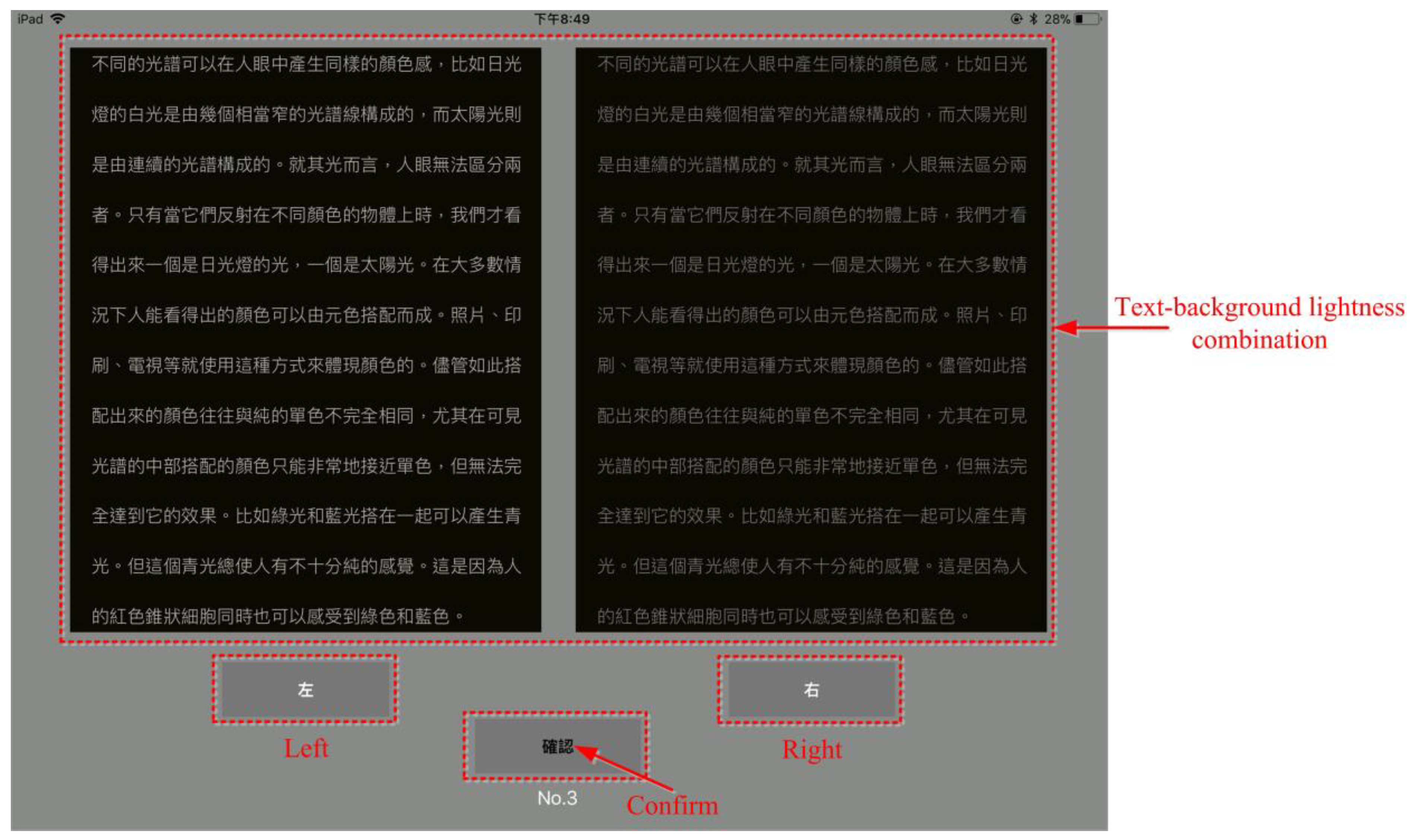
The RGB values of the iPad are adjusted to produce five achromatic colors for different background lightness. Totally 20 text-background lightness combinations are acquired from these five colors, using one for the text and one of the others for the background. These 20 combinations are presented to observers as paired comparisons for estimation, as shown in
Figure 3, for a total of 190 pairs. Each observer assesses 20 of the 190 pairs twice for verification. Thus, each observer evaluated the 210 pairs on the head-up display (projected from the iPad) under four illuminance levels. For obtaining accurate colorimetric characteristics under each illuminance level, a calibrated spectroradiometer is placed at the observer’s eye position to measure the five achromatic colors displayed on the head-up display. The colorimetric information for the four illuminance levels and five achromatic colors is listed in
Table 2 and
Table 3 for dark, 300, 1500, and 9000 lx surround conditions at 6500 K, respectively.
2.2. Experimental Procedures
The experiment requires two minutes of dark adaptation before starting. During this time, the observer must fix their viewing distance at 65 cm using a chin rest to ensure a similar viewing geometry for all 60 observers. Once the dark adaptation period is complete, the experimental assistant implements an iOS app on a head-up display for paired comparison, and then the observers are asked to choose the combination that provides better visual clarity. To prevent the effect of a visual afterimage, a neutral gray image is displayed for one second before each new pattern appears. To avoid light/dark adaptation problems, the observers always completed their evaluations under the dark illuminance level first, 300 lx second, 1500 lx third, and then 9000 lx. Each observer compares all 210 combinations in random order under each ambient condition, and the entire experiment takes approximately one hour for each observer.
4. Discussion
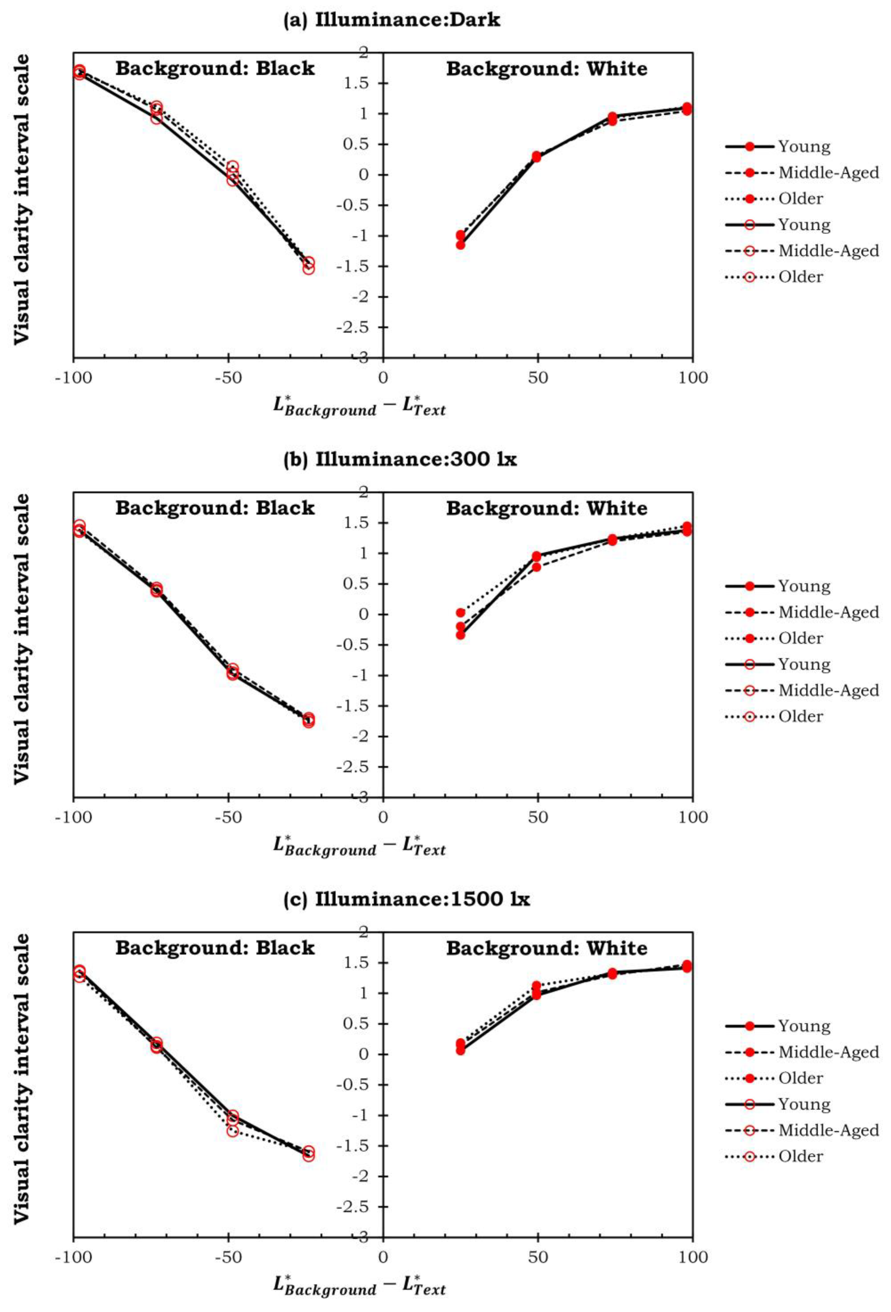
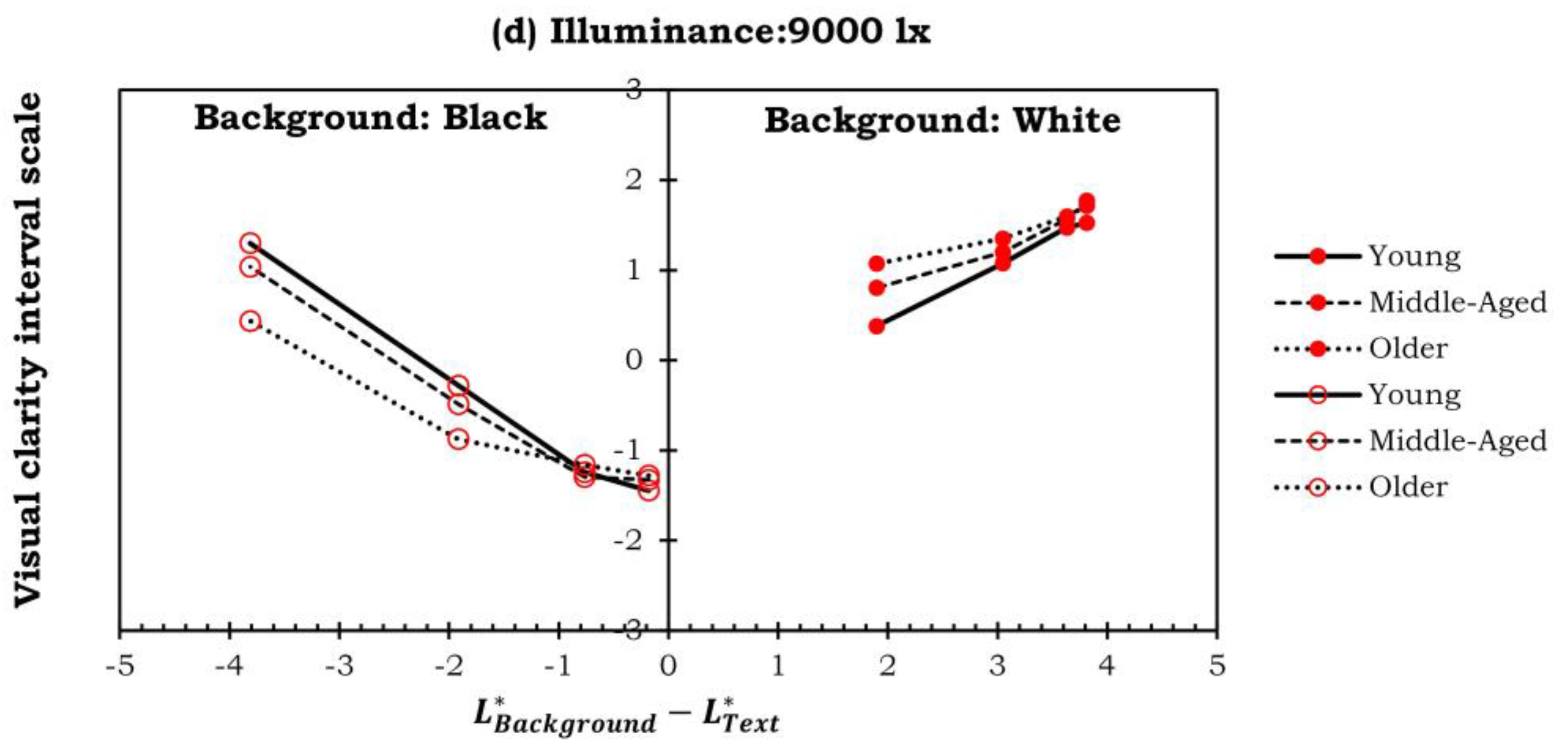
The influence of positive and negative contrast on the observers’ response to the visibility is discussed. The results are shown in
Figure 5. Due to the high correlation and the similar trend of the experimental results between the different age groups, the data with the lowest correlation, in which the illuminance level is 9000 lx, is discussed for the older observers. According to
Figure 5a, a higher positive contrast (i.e., the text is darker than the background) is better to improve the visual clarity for the white and light gray backgrounds under the dark surround condition. However, a negative contrast (i.e., the text is brighter than the background) is beneficial to the increase in visual clarity for the rest of the three backgrounds.
From
Figure 5b, a higher positive contrast can approach the highest scale value of visual clarity with the white background under the 9000 lx lighting condition. This finding is much more significant compared to the dark surround condition. Furthermore, it can be found that the positive contrasts are appropriate for backgrounds with higher luminance, such as the white and light gray backgrounds. In comparison, the backgrounds with relatively lower luminance, such as black, dark gray, and medium gray, need apparent negative contrast to increase the legibility of the text under these two ambient lighting conditions.
Figure 4a and
Figure 5a illustrate that the visual clarity of the combinations with white backgrounds is slightly worse than that of those with black backgrounds in the dark environment. In contrast to the dark surround, the text with a white background contributes to a much higher visual clarity scale under 9000 lx, as shown in
Figure 5b. From
Figure 5, it is beneficial to improve the visual clarity with a white background over a black background with an increment of ambient lighting levels. Therefore, the use of a higher background luminance is recommended to enhance visual clarity in an extremely bright environment.
According to
Figure 6, a white background can provide better visual clarity for older observers at an illuminance level of 9000 lx. However, no notable differences in visual clarity are observed among this age group under the other surrounding conditions. The reason for this phenomenon is the effect of age on the transmittance of the crystalline lens. Compared with young observers, older observers have a lower transmittance of the crystalline lens. Thus, the perceived brightness of retinal illuminance may decrease for older observers. It can explain why the older observers tended to feel clearer on the white background than the others when reading on the HUD. Additionally, in a dark environment where the lightness contrast between the text and background is the same, a black background is clearer than a white background. Furthermore, text with a white background is more readable than text with a black background when the contrast decreases.
5. Modeling
In the study, a nonlinear analysis method is utilized to describe the relationship between the input parameters and the visual clarity scale. A third-order polynomial regression model is applied, which can be formulated as Equation (1), where
s is the illuminance of the surrounds and
b,
t, and
CA represent the luminance of the backgrounds and text and absolute lightness contrast (abs(
t-b)) between the backgrounds and text, respectively. They are selected as the inputs for the training procedure. The number of parameters is 20 for the polynomials. The psychophysical experiment for visual clarity collects 240 datasets. A feature scaling method, Min-Max Normalization, is applied to the input data to improve accuracy and faster convergence.
Three evaluation metrics, including the coefficient of determination (r
2), mean absolute error (MAE), and root mean square error (RMSE), are commonly used to evaluate a machine learning model’s performance for a regression problem.
Figure 7 shows the scatter plot of the predicted values against the ground truth. According to the results, the visual clarity scale obtained from the observers can be well predicted with a high R-squared and low RMSE and MAE, where the values are 0.99, 0.11, and 0.08, respectively. The testing results are listed in
Table 5. Additionally, the model shows a high correlation coefficient, and Pearson’s r value is 0.99. The models can be further applied to the AR industry and its manufacturer for developing an advanced HUD with real-time enhancements corresponding to the changes in luminance caused by driving conditions.
6. Conclusions
In conclusion, a psychophysical experiment is conducted to investigate the visual clarity of different text-background lightness combinations by using a head-up display under a dark surround condition and a bright environment in the study. A total of 190 pairs were tested to find the best visual clarity of different text-background lightness combinations among 13 observers.
From the experimental results, the combination of the white text with a black background (i.e., L*background = 1.88; L*text = 100) presents the clearest under the dark surround. On the other hand, the black text with white background (L*background = 100; L*text = 96.19) is the clearest text-background combination under the bright environment (9000 lx). Furthermore, the judgments of visual clarity under the dark surround show that the combinations of text with a white background provide less visual clarity than those with a black background. Additionally, the observers generally consider that combining with a white background is distinct from those with other backgrounds luminance for 9000 lx. Furthermore, a third-order polynomial regression model is developed based on the visual data, with a high correlation of determination.
When using a head-up display, appropriate lightness combinations for the text and background can improve visual clarity and reduce the time it takes for drivers to accommodate and identify content information. It can ultimately enhance driving safety. The findings of this work can be regarded as guidelines for the head-up display design to enhance drivers’ visual perception and safety, depending on the ambient illuminance level.


