1. Introduction
Since the beginning of 2020, we have witnessed the pandemic caused by coronavirus-19 (CoV-19 or SARS-CoV-2), a virus structurally related to the SARS (severe acute respiratory syndrome) virus. The coronavirus can cause acute respiratory diseases (COVID-19) and it has been reported that its spreads 0.8%–3.0% more than normal influenza [
1]. When the virus infects the respiratory tract, it induces the release of pro-inflammatory cytokines. The binding of CoV-19 to the TLR (Toll-like receptor) causes release of such pro-inflammatory components, and therefore one of the therapies to suppress lung inflammation is to suppress the pro-inflammatory species [
2]. Conti et al. recently published several papers in which a large number of factors, including mechanisms, prohibitive actions, and specific sensitivity (e.g., gender and pre-vaccination) are summarized [
1,
2,
3]. Regarding the origin of this type of viruses, there seems to be a common understanding that they originate from zoonic transfer [
2]. SARS-CoV-2 is the seventh coronavirus known to infect humans [
4]. From a comparative analysis of genomic data, Anderson et al. [
4] reported an analysis claiming clear evidence that SARS-CoV-2 is not a laboratory construct or a purposefully manipulated virus, and that wild animals such are bats are the more likely origin. Coronaviruses similar to SARS-CoV-2 have been identified in such wild animals.
In addition to papers on the mechanism of the action of viruses including CoV-2-SARS, the recent CoV-2-SARS pandemic has obviously led to a large number of publications by public health organizations, including the WHO, and magazines and newspapers reporting the number of people who tested positive for the COVID-19 virus, the number of people deceased, and, for many (but not all) countries, the number of people who have recovered. Both the press and official institutions in different countries have issued daily statements on the situation regarding the spread of the coronavirus CoV-19. Some of these statements erroneously suggested the situation in a country was stabilizing or improving, and often had to be corrected several days later when infections were reported to have increased. The same holds for the daily number of deaths. From a forward-looking perspective, it is therefore more useful to look at the development over time. This is the objective of various scientific publications, e.g., Ref. [
5], in which the cumulative number of infected people, in different countries, is used to describe the evolution of the spread of the infection from the outset. When the behavior of the virus, from its initial spread until the point at which transmission has fallen to practically nil (such as the case of China), is known fully, the data can be fitted to models, such as those referred to in [
5] or to the generalized Richards model [
6], which is an extension of the original Richards model [
7].
In the present work, we take a somewhat different approach. Because the situation in Europe remains one characterized by further spreading, we will not fit models describing the full behavior, as too many parameters need to be fitted that would lead to arguable predictions. Therefore, we look at the time-evolution of real data reported thus far, using the number of deaths, which, as we will argue, constitutes the more reliable data set.
2. Data Selection and Approach
One of the potential problems with analyzing the time evolution of the spread of the CoV-19 virus is that the number of new infections is often taken as the basis for such statements, but it is questionable whether this is the best way to monitor what is happening and what may eventuate. In the present work, which spans the timeframe 10 March until 24 April 2020, we present a discussion starting from what should be considered the more reliable data (to be discussed below), even though uncertainties always remain. We focus on a number of West European countries, including those that are heavily suffering from COVID-19. Although Italy had the misfortune to be first in line when CoV-19 reached Europe, it could have served as an early warning for other nations. However, next to Italy, multiple countries have had a relatively large number of deceased compared to their population size, including Spain, France, the United Kingdom and the Netherlands. Based on the number of deceased per inhabitant over the course of time (or mortality), the outbreak in Spain, France, and the Netherlands, to name a few, was in essence as heavy as in Italy. On the contrary, Germany had, relatively speaking, significantly fewer deaths from CoV-19. This is also true of Austria. We will not discuss the possible reasons for these differences; this stage of the disease does not permit detailed comparative analyses since the available data consist of the number of infected patients in different geographic areas with different social, political, and economic structures [
5].
Statements on whether the effects of the virus slow down can only be made on sufficient and proper data. All of the data used in this paper were taken from the publications on the website of the Berliner Morgenpost [
8], with the data on that site originating from John Hopkins University [
9], the German Robert Koch Institute (RKI) [
10], and the various health organizations in the different regions of Germany (see the RKI reference [
10]). The collected data can also be found on the WHO site [
11] or that of the ECDC (European Center for Disease Prevention and Control) [
12]. The data published comprise (i) number of confirmed infections, (ii) number of people reported healed, and (iii) number of people deceased.
The
number of confirmed cases, i.e., the number of people
tested positive, is highly dependent on the number of tests performed in each individual country, and this varies largely. Several news agencies reported on the low number of tests in the Netherlands, e.g., the live-blog coronavirus of the Dutch newspaper Het Parool at 13:45, 1 April 2020, reported: ‘Germany carries out 70,000 tests per day, whereas in the Netherlands this number was as low as about 1000 tests per day.’ On 1 April, there were less than 13,000 persons who had tested positive in the Netherlands, whereas more than a thousand had died, implying that the mortality resulting from corona infections was about the same as in Italy and Spain [
13]. A mortality rate of 2%–3% has recently been reported [
2], suggesting that for European countries this was also a clear indication that testing was, thus far, inadequate. John P.A. Ioannidis, a professor of epidemiology at Stanford University, has branded the data we have about the epidemic “utterly unreliable”. “We don’t know if we are failing to capture infections by a factor of three or 300,” he wrote recently [
14]. A recent study on data from Iceland support this view [
15]. Data from Iceland, a relatively isolated country, are ideal for specific studies and revealed that, whereas there was much more testing than elsewhere (5% of the population was tested, whereas for other countries this was 0.1% or often less), around 50% of those tested positive had no symptoms at all. Moreover, Iceland’s strategy does not include a lock-down but extensive testing and contact tracing, enhanced by a very aggressive policy of quarantine for individuals that are or might be infected.
There is another reason not to undertake discussions on the basis of the daily growth of infected people, as it seems inconsistent with policies followed in several countries (e.g., Sweden, as well as the first stage in the Netherlands, where the policy was changed later), namely, aiming at mass immunity. It has been reported in multiple countries that eventually 60%–70% of the population will be infected, but this must be achieved in a controlled way in order not to overload the medical sector. Nonetheless, the aim would be mass immunity, which implies the majority of people are infected and requires, in turn, an increase, rather than a decrease, in the number of infected people.
Finally, a genuine fall in the true number of infections (a number we do not know), inevitably implies a decrease in the number of deaths. There will be a time-lag of several weeks between these events, comprising the weeks during which a person is tested, subsequently taken to hospital, and eventually dying. Relaxing safety measures too early, based on highly unreliable infection rates and disregarding the possibility of a new local outbreak, is therefore a serious risk.
The second set of data available regards the number of people healed. As it is generally not compulsory to report when a person recovers from the coronavirus, the spread between countries can be extremely large: the collected data set we consulted reports almost no official recoveries for the Netherlands, whereas in other countries this is up to 25%–50% of those infected. Consequently, these numbers are the least useful to be used for analysis.
Infectious diseases are present year-round globally, with the flu one of the more deadly examples, infecting numerous people on any given day. However, the stand-out characteristic of COVID-19 is the associated high number of deaths that have occurred in a relatively short period of time. Thus, at the present time, in the absence of extensive testing of the populations of all countries, the most reliable and most relevant analysis needs to be made using the number of people that have died (measurement errors and individual cases where people have died from, for example, a heart-attack, while also being infected with coronavirus, are often not counted as a coronavirus-related death; however, such deviations are likely to be considered as systematic deviations and therefore do not modify the overall trends). With an increasing number infections, the number of deaths will also increase; thus, the mortality will, in a first-order approximation, reflect true infection levels. Consequently, to avoid statements that would more likely involve some kind of speculation, we believe the focus should be placed on the number of deaths.
As mentioned earlier, models aiming at describing the entire cycle from beginning to end require a series of parameters to be fitted [
6,
16]. When the outbreak of the infection is still in the exponential growth state, this fitting of the overall curve may lead to different predictions for when the spread will flatten, depending on parameter choice (as in many kinds of modelling of experimental data, purely mathematical fitting and selecting the best fit as the best solution does not necessarily reflect reality). Therefore, for the European data we discuss in the present work, we only apply exponential fitting (in this work we use an exponential form for the mathematical function N
p, where p is the exponent; a quadratic function is defined when p = 2 and a cubic function when p = 3) for the initial period when the infection rate is still high, as this is appropriate for the circumstances in Western Europe until 24 April (the last date for which we show collected data), although for some countries we see the onset of a change as we will show below. It is important to note that the fitting of these curves is only to reveal their steepness; in other words, the curves reveal exponential behavior, and the precise function has no concrete physical meaning at this moment. An exception is discussed in
Section 4 (‘More on infection rate’).
The way we have analyzed the data is primarily by critical assessment and visual inspection of the time series. Data visualization can be a very useful and powerful tool, as recognized from practical experience in the process industry. Curvaceous, for example, is such a software tool that has been successfully used for very many years in that area [
17]. The only mathematics applied in the current work are the exponential curves overlaying experimental data to show exponential growth. Often statistics is applied to determine the level of correlation, e.g., by calculating the correlation coefficient R
2. This, however, is not always useful, and depends very much on the problem, as discussed elsewhere on the basis of various real-life practical examples [
18].
3. Results from Time Series of Number of People Deceased
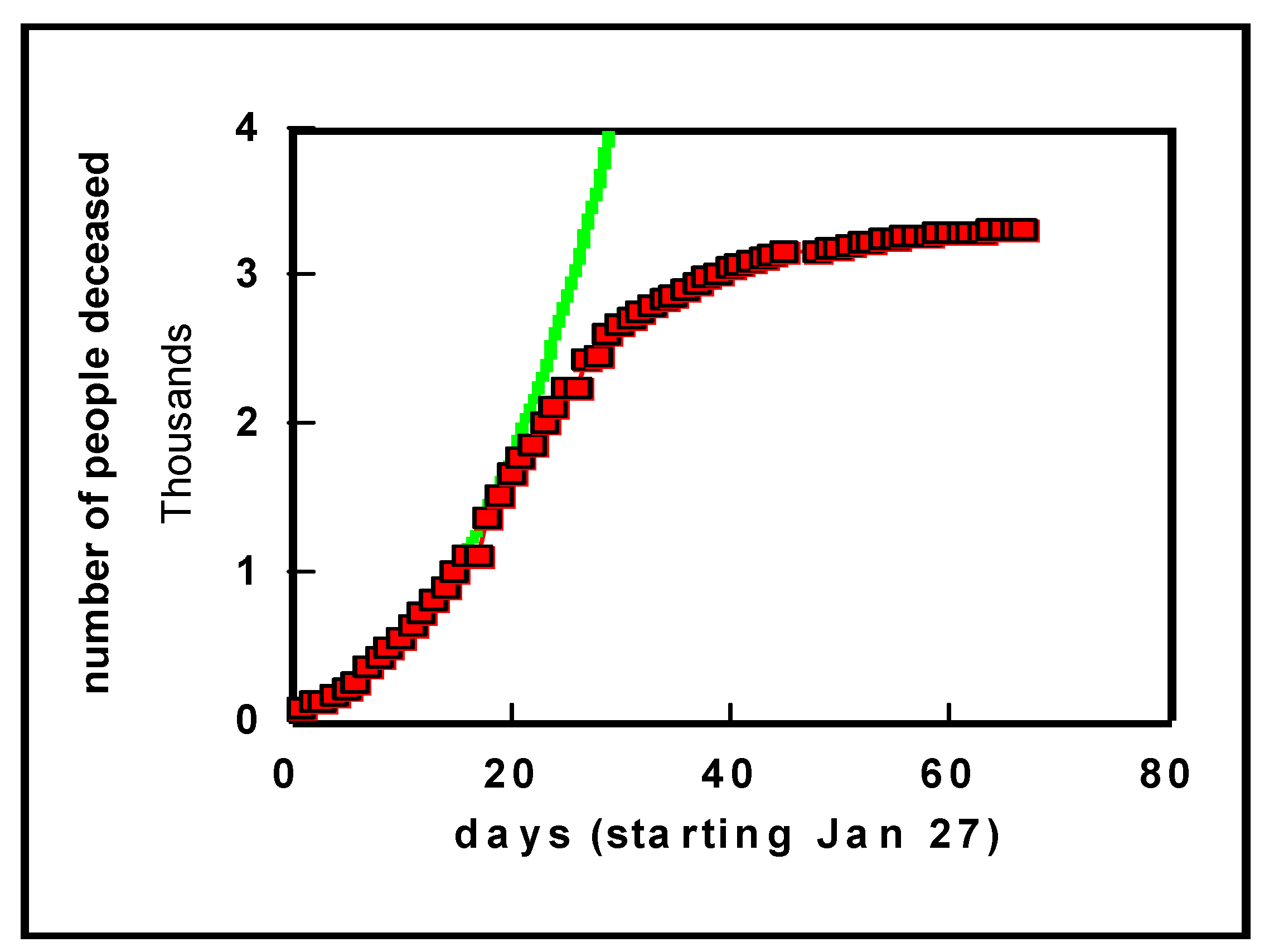
Let us first look at a plot of the data obtained on China (
Figure 1). The generally assumed exponential model for virus outbreaks (see, e.g., [
6,
16]) nicely fits the actual number of deaths. As we know from the press, the Chinese government decided to impose a lock-down for Wuhan and some other cities as of 23 January 2020. From
Figure 1, during the three weeks following the lock-down, the number of deaths increased because they were already infected, and, obviously, people were also infected in other parts of China that were not in lock-down status. Thereafter, however, the number of daily deaths began to drop, as shown by a clear bend in the curve. The number of deaths has remained at around 3300 for a country with more than a billion inhabitants (in the interim, this number has been corrected to 4632 deaths, which remains a low number compared to the number of inhabitants).
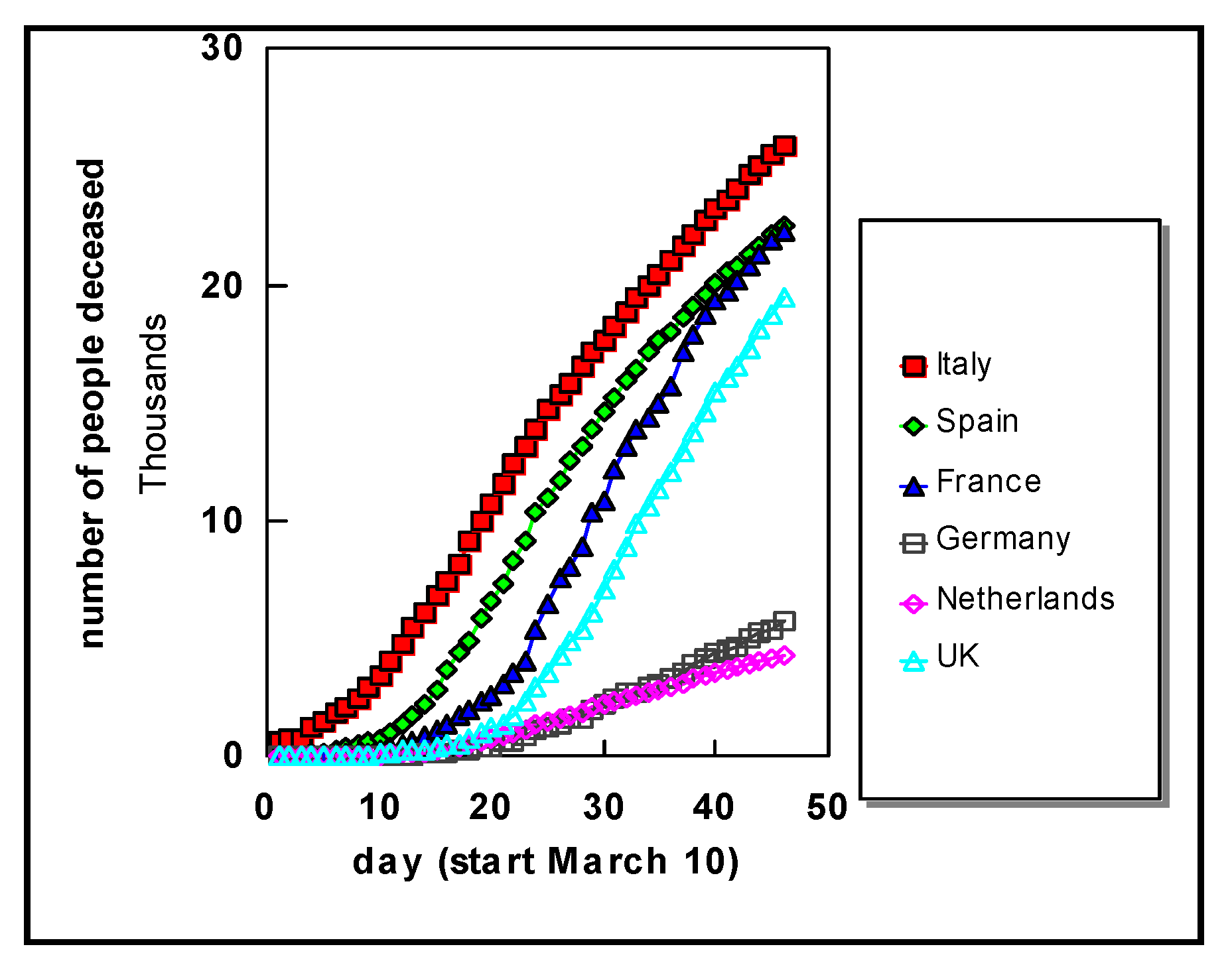
Turning to Western Europe, data for several countries are shown in
Figure 2. It is clearly seen that the number of deaths steadily rises for each country, until the last day of this study i.e., 24 April 2020. In all countries we see a clear exponential increase from the outset.
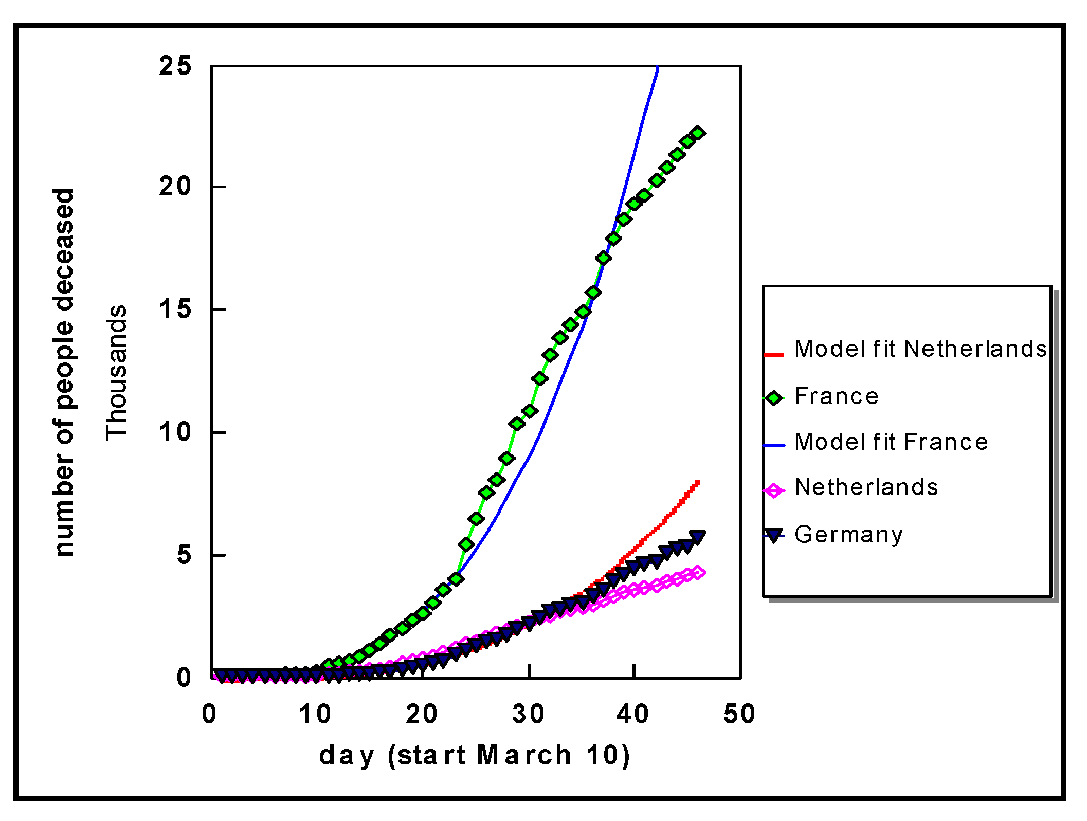
Selected data for a few countries are shown in
Figure 3. The fits shown for France and the Netherlands are cubic functions (N
3), and similar behaviour is observed for the other countries. These curves reveal, when compared to the experimental data (number of deaths), that the death rate indeed shows exponential behaviour as commonly assumed in a virus outbreak situation. What may appear in
Figure 3 as an eventual flattening is often an optical illusion, a well-known phenomenon. Furthermore, the exponential fit to the curve for France for the first 23 days then becomes steeper, whereas around day 35 we see a gradual decrease again. Similar observations can be made for the data on Germany, for example. Nonetheless, in all countries the growth is still exponential (see also specific discussions for Germany further below, viz.
Section 4).
The cubic function for France is N3/3 and for the Netherlands is N3/12, where N the number of days from the start (10 March 2020).
Figure 4 shows in more detail the data for the three most seriously affected German regions to date, in addition to the Netherlands. Independent of the number of people tested positive, the number of deaths in the Netherlands was initially almost 10 times higher
per inhabitant compared to Germany, whereas in the later phase this decreased to a factor of about 5.
Compared to other infectious diseases, the global problem centers on mortality and thus the total number of people that could die from this infection. Therefore, the bottom line is that the number of deaths should stabilize and subsequently decrease over time. From curves like those shown before, namely,
Figure 2,
Figure 3 and
Figure 4, this cannot be observed in an unambiguous way unless the process has reached the current state of China, as shown in
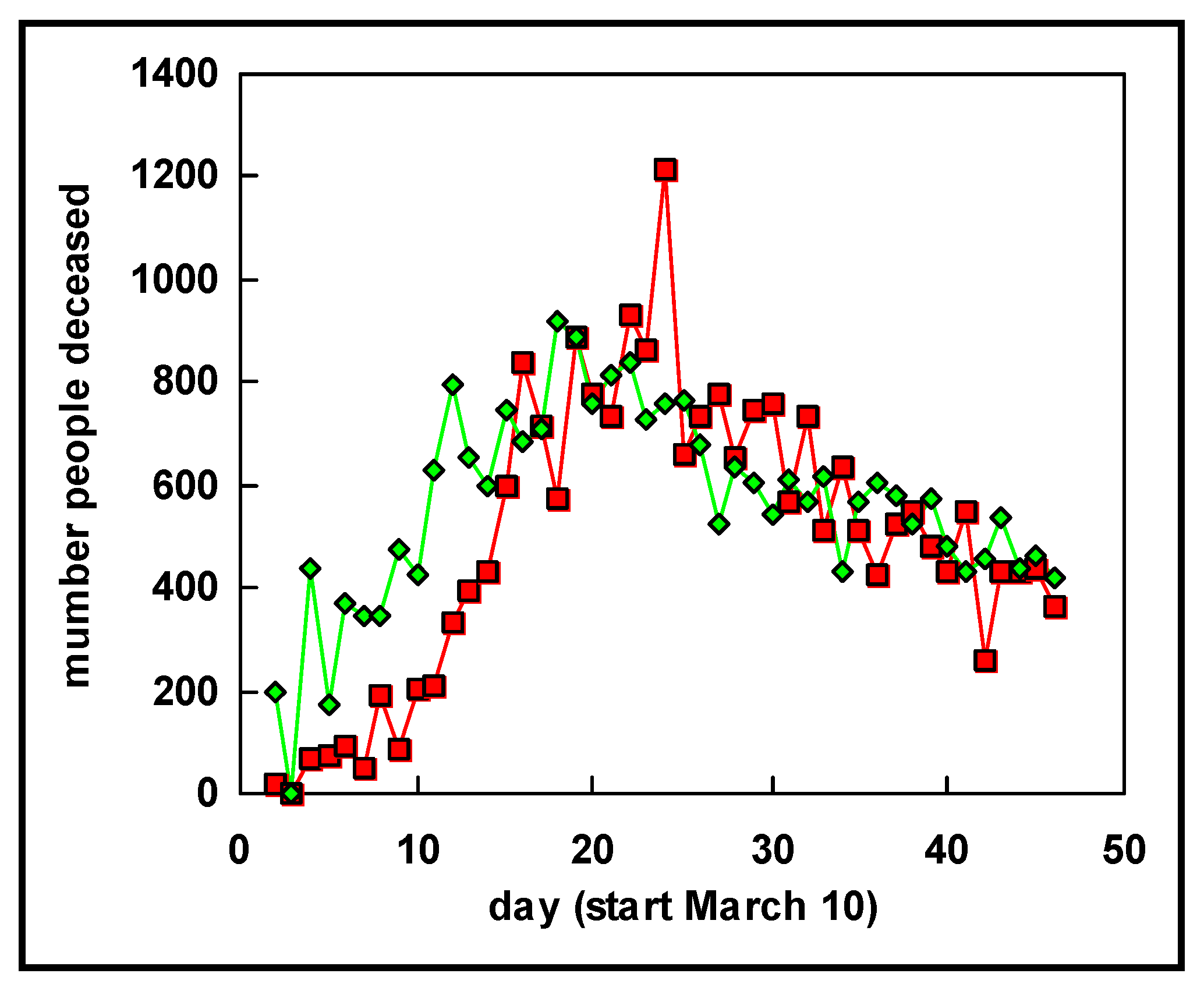
Figure 1. To reveal whether stabilization has begun, we display the daily increments in
Figure 5, i.e., the cumulative number of deaths on a certain day minus the cumulative number of deaths on the previous day. These data show that for the Netherlands and Germany, in total the number continues to rise, although at a slower rate than in the early phases.
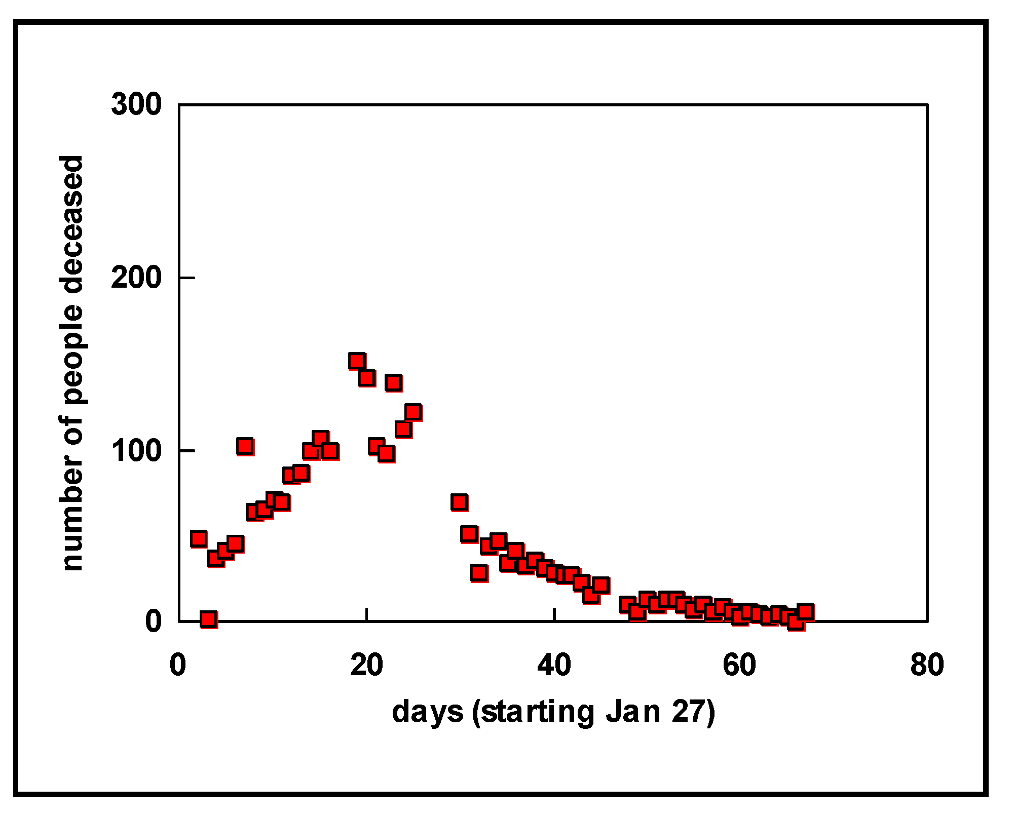
The corresponding increments for Italy and Spain, shown in
Figure 6, look somewhat different as of around 25 March (day 15 in
Figure 6). The lock-down in northern Italy, where people stayed home largely from the end of February, seems to have resulted in a flattening of the curve revealed in the number of deaths about four weeks later. Indeed, in Italy, the country that was affected first in Europe and that imposed restrictions first, the number of daily deaths had begun to stabilize by 25 March (day 15 in
Figure 6) and drop from early April (day 25 in
Figure 6). The same is observed for Spain, where severe restrictions were also imposed (we avoid the word lock-down in the case of Spain, as this word is used for different levels of restrictions in different EU countries).
When a comparison is made between the curves showing the increments in Europe with those from China, namely,
Figure 7, an interesting similarity can be seen. This similarity is not just the exponential growth at the beginning followed by a gradual decrease after the maximum was attained, but also an interesting correspondence in time lines. For the countries where more strict contact restrictions were imposed, after the daily deaths began to accelerate, the maximum is reached after about 21 days, as observed from the plots for China, Italy, and Spain. The overall shape of the curves showing the increments is much the same for these three countries. These data seem to suggest that, for European countries such as Italy and Spain, it can be expected to take another 40–50 days after 25 March to reach a situation similar to that in China where the infection rate has essentially gone down to practically negligible values. Of course, this might only be achieved assuming restrictions on hygiene and human–human distance are maintained in full for that period of time. Furthermore, because of the time lag between infection and death, the number of new infections should have fallen to essentially nil some 2–3 weeks earlier, assuming the same testing rate is maintained for appropriate monitoring.
4. More on Infection Rate
The discussion above relates to the data revealing, by fitting mathematical functions, common exponential behavior. To learn more from the data, we need to look more carefully to understand the cause of curves like those shown in
Figure 1,
Figure 2,
Figure 3 and
Figure 4. The models, as mentioned, reveal exponential behavior; here, we found cubic behavior for all countries examined (N
3). This, however, is still a purely mathematical description. To understand what could be an important underlying mechanism we consider what makes the virus spread. The most important factor is human–human contact, which is underpinned by the observation that when this is forbidden by authorities, the number of infections and, consequently, the number of deaths, falls and eventually reaches zero (the cases of China and South Korea illustrate this well). Let us start by considering a single person infecting, on average,
m other persons per day; the following day, each of these
m persons infects another
m persons, and so on. This can be expressed in mathematical form and, by fitting this expression to the experimental death rate, we can obtain a typical value for
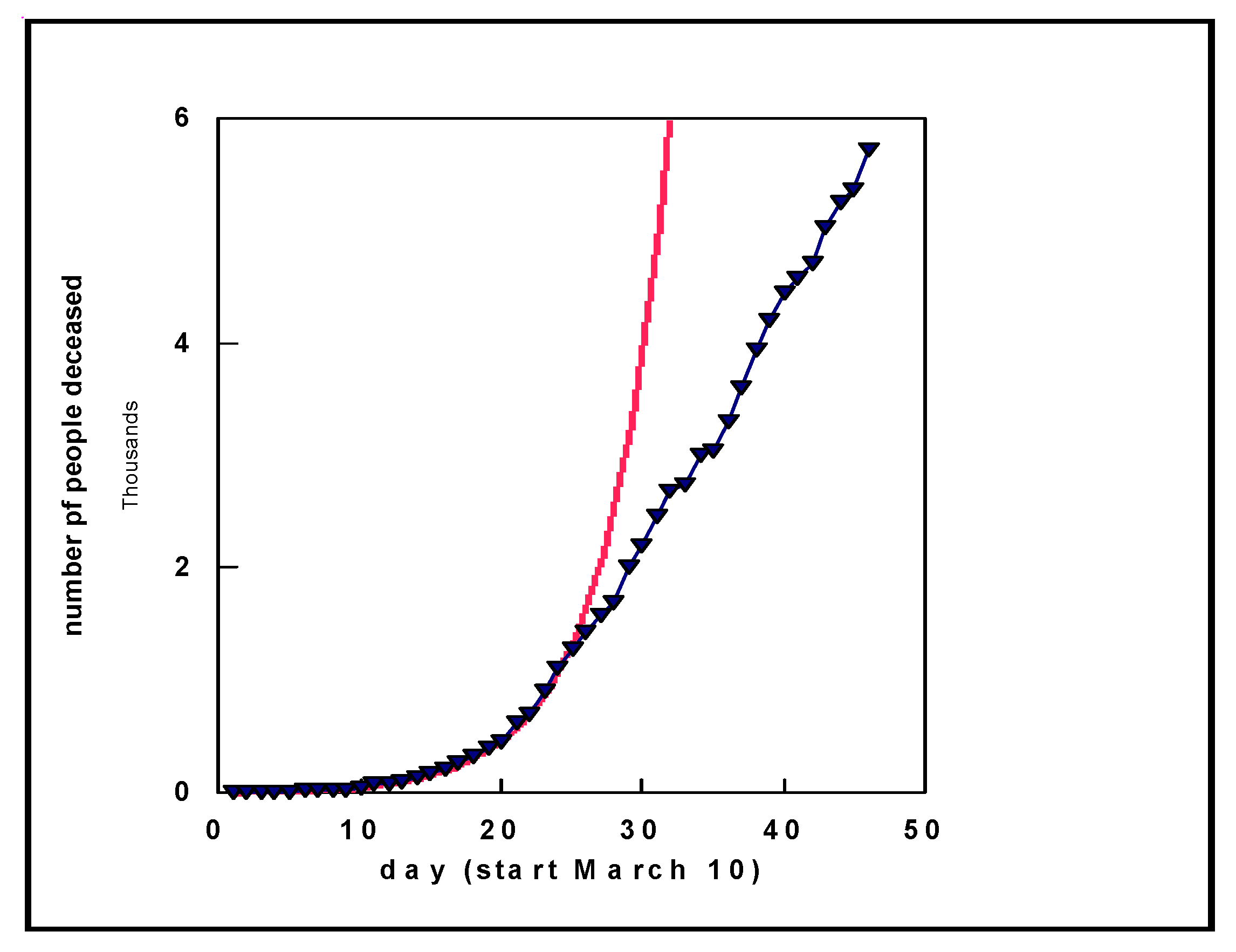
m. When we implement this and fit an experimental curve of the number of deaths in Germany, we obtain a good fit to the data (similar results were obtained for other countries) as shown by the solid red curve in
Figure 8. We obtained
m = 0.24, meaning that one death leads to an additional 0.24 deaths per day. Although it might appear strange that a deceased person leads to another deceased person, this is to be traced back to the number of infections. As there is no fixed percentage for the number of deaths starting from the number of people infected, we reach this conclusion. At a later point in time, around day 25 in
Figure 8, we see that the behavior changes. This is the consequence of countries taking restrictive measures, for example, primarily reducing contact. After some time, one should not assume
m new infections per infected person per day, but a lower number
p.
Based on a mortality rate (derived from the number of infected people and the number of deaths) of 4% (there are a range of sources quoting different mortality rates; for regions where an outbreak began and with a high number of deaths, mortality is in the range of 5% and higher, see Ref. 19 [
19]), an increase of 0.24 deaths per day corresponds to an increase of 25 × 0.24 = 5.5 of additional infected people per day (where actual infection occurred in the weeks before). With an average daily average number of contacts per person of around 22 for the working population [
20], these numbers (5.5 versus 22) reveal that the virus is highly infectious during the period shown in
Figure 8 (Note that some of the numbers used might differ between countries and change over time. However, in such a case where the calculated value is actually, for example, 0.12 or 0.36, rather than 0.24, all conclusions and general observations presented are still valid. Although a different rate applies, transmission is still shown to be exponential, illustrating that the virus is highly infectious. This also applies to the number of daily contacts for the working population; conclusions are unchanged, irrespective of whether the actual number is 15 or 35, or the 25 we used here (based on the literature)). In places where real outbreaks occurred—the market in Wuhan, the area of Heinsberg in Germany, Ischgl in Austria (and, for example, the follow-up in Norway from people that were skiing in Ischgl), and the region in North Italy—the density of people at the beginning of the spread of infection was much higher. Thus, it is possible that the mortality is lower than what has been reported to date. However, in such a case, the number of infected people is higher than currently detected and, therefore, new infections are likely to continue over an extended period of time.
Examining the data more closely for the first 10 days in
Figure 8 (not explicitly shown in detail), the agreement between the experimental number of deaths and the model with an increase of 0.24 per day is not strong. However, the fit is satisfactory when an increase of 0.8 per day is adopted, compared to 0.24 per day after the first 10 days. With an average number of human contacts of 22 per day, the increase of 0.8 implies an increase in infected people of 20 per day. Thus, the experimental data and this analysis explain why the virus spread so rapidly at mass meetings earlier this year with large numbers of deaths several weeks later.
These observations, namely, an increase of 0.8 at the early stages and 0.24 starting after about 10 days, can have different interpretations. One may be that these models reveal that the measures taken by politicians to reduce human–human contact are effective. Nonetheless, and importantly, the spread of the outbreak is exponential, and, therefore, there is no reason to believe that attitudes should be relaxed. The other possibility, however, is that the steeper curve at the outset is the consequence of a sudden outbreak in a dense population (Wuhan Market, Heinsberg carnival, etc.), with many more human–human contacts than average, which is in agreement with the changed behavior of the curve after 10–15 days. The latter could be related to the typical incubation time of the virus [
21]. The more intense contact in such a situation, combined with the change in the curve behavior after about two weeks, suggest this is the more likely reason. The observation that the increase becomes less steep after 25 days seems to suggest that restrictive measures are effective.

