As user–topic modeling is based on the assumption that users with similar latent topics are likely to be engaged in the same article, the proposed method can also be used for clustering purposes. Each user can be represented as a vector of its topic distribution, which means we can use any clustering method based on vector spaces. In this subsection, we conduct two experiments using this approach, one of which is for the purpose of visualization of the user interaction network, while the other is for the assessment of its effectiveness.
5.2.1. Visual Analytics with User Replying Network
The user replying network (or user interaction network) is a graph representing the intensity of user interactions, where each vertex represents a user, and an edge established between two vertices has a weight, indicating how many times two users exchange comments. It is important to visualize the user replying network, so that we can use visual analytics to determine the characteristics of user interactions and the induced community structure.
To visualize this network effectively, we use two graphs: (i) the placement graph, and (ii) the interaction graph.
First, we organize the placement graph, in which edge weights are determined by the similarity of the corresponding user vectors of the two end vertices. We set the vertices, each of which indicates a user, and is associated with its topical distribution. We compute the cosine measure for each pair of users as the similarity. For each user, we establish edges to its 10 nearest users with the computed cosine similarities as the weights. Then we perform the force-based layout method on this graph, in order to place the vertices.
With this vertex placement, we construct the interaction graph for the final visualization. We label the vertices with their dominant topic, to make the relationship between topics visually clear. Then we remove all the edges computed by the topical similarity among users. We reestablish edges using the user replying network, which completes the user interaction graph. The weight of an edge between users is set to the number of articles in which the two users wrote comments to each other. We visualized the constructed graph using Gephi [
38].
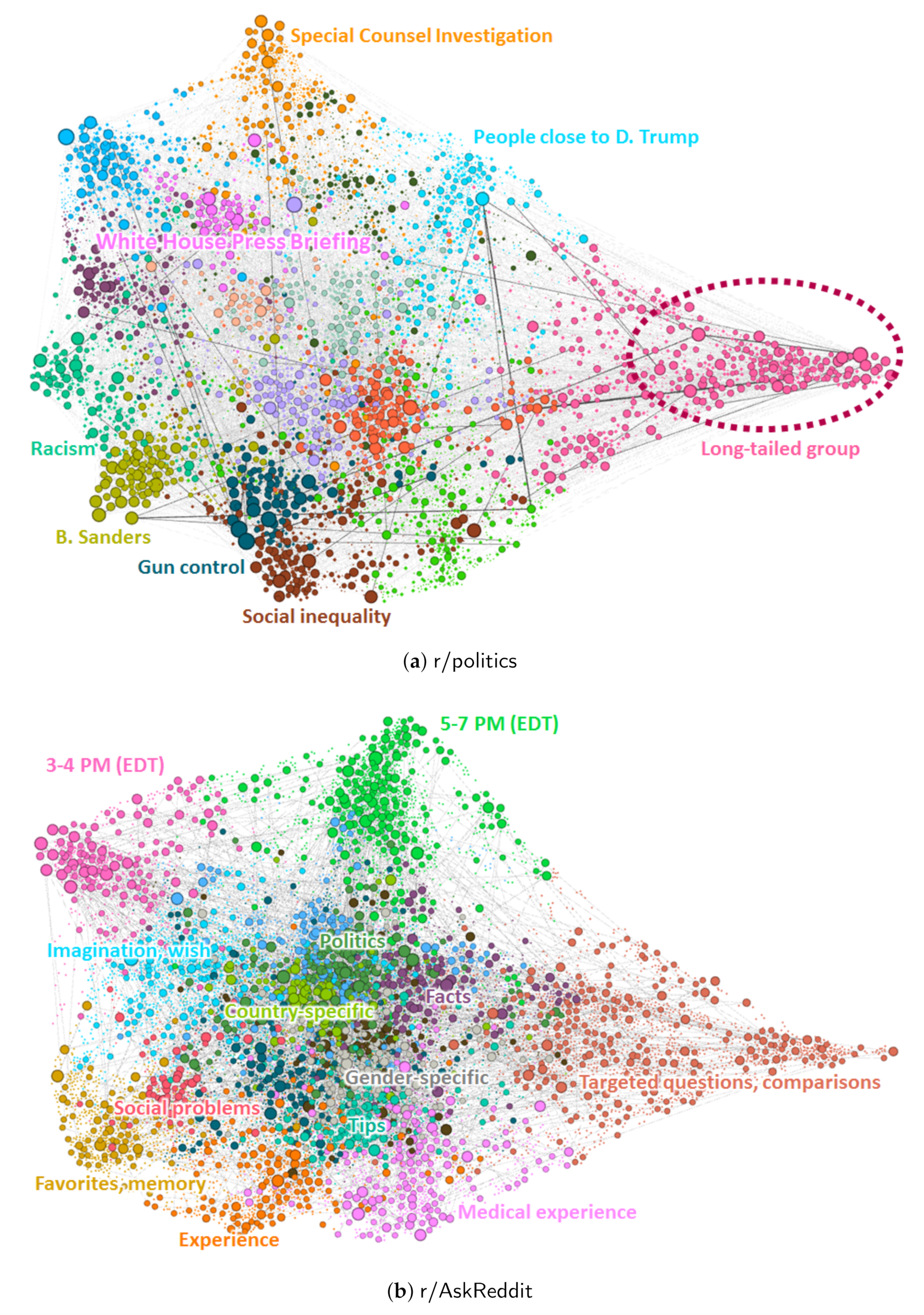
Figure 4 and
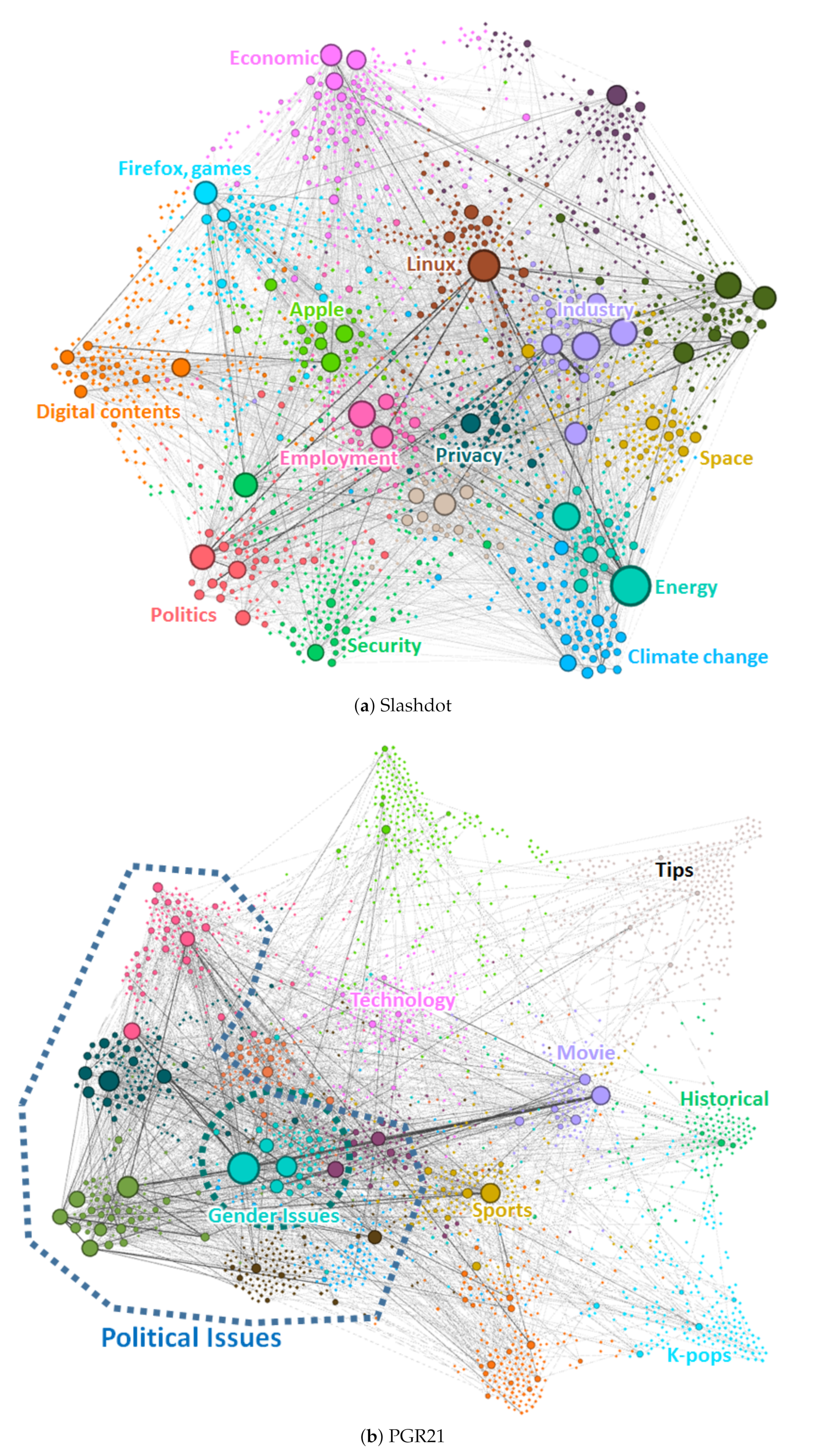
Figure 5 show the visualized user replying networks obtained using the user–topic model. Vertices are placed according to the dominant topic of the corresponding users. The dominant topics of different users are indicated using different colors. As described, the thickness of an edge indicates weight, which measures how many times the two users interacted. We also assigned different sizes to vertices to represent their degrees (the numbers of neighbors in terms of user interaction).
We see individual characteristics in these visualizations. Comparing the two Reddit datasets depicted in
Figure 4, we observe that users with different topics in
r/politics are separated more clearly than those in
r/AskReddit. There are more thick edges observed in
r/politics, which indicates two users meet and debate in many articles, while two users in
r/AskReddit rarely meet each other again. This low probability is due to the excessively large numbers of users and articles.
Long-tailed user groups are observed in both Reddit datasets, on the right sides of the figures. If there are a number of users with the same topic whose nearest neighbors are similar to them, edges are unlikely to be connected outside this topic group. This leads to a protrusion (“long tail”) during the force-based vertex placement, and indicates that some users in this topic have generally participated only in some particular articles. In r/politics, they may be avid supporters or critics of a certain political group, although we should investigate more closely to discover the cause of this phenomenon. In r/AskReddit, articles include questions targeting specific groups of people such as transgender people, girls wearing long claw-like nails, and people with face tattoos. These articles also include questions asking users for their personal tips, experiences or preferences, that others do not have. Perhaps these target-specific questions cause the users who participate in these articles to group together tightly.
We also observe that users with related thematic topics are placed close together. Recall that we place the user vertices according to the similarity of their topical distribution vectors. Thus, users close to each other on the graph are likely to share behavioral characteristics. For example in r/politics, users interested in the special counsel investigation are at the top of the graph. Users who like to discuss people close to the president are located close to them (below and right), and users who frequently reacted to the White House Press Briefing are located below and left. As another example, users who are interested in Bernie Sanders are located at the bottom-left corner of the graph. Close to this group, we find several groups of users who have actively participated in articles with content on racism, gun control, and social inequality, issues closely related to this politician.
In
r/AskReddit, there are also groups of users who are active at specific times. At the top left and center of the graph in
Figure 4b, we find two user groups who usually participated in articles posted around 3–4 p.m. and 5–7 p.m. EDT time, respectively. We also find separate groups of users who leave comments in the articles with their own topics, although the group clusters are not as clear as those in
r/politics. Users with related topics tend to be located nearby. For example, users interested in political questions are located close to those who answer country-specific questions such as “What is better in Europe than America?” There are also questions about serious social problems, such as asking opinions on suicide rates in America. Users who discuss such topics are also located close to the country-specific topics. We believe this is because these questions naturally involve comparisons among different countries.
Compared to the Reddit datasets, we observe different distributions in vertex degrees in the two datasets in
Figure 5, indicated by the vertex sizes. We observe that there are a small number of users who are excessively active, and interact with a large number of other users, especially for controversial topics. We also observe that these users are clustered according to their interests. For example, in Slashdot, users interested in energy issues such as nuclear power are close to users who are concerned about climate change, as we find them close together at the bottom-right corner of the graph. In PGR21, users interested in political issues are located close to one another, and a number of small groups have been formed. Among these small groups, users sensitive to gender issues are in the middle of the other groups, which means they are likely to simultaneously participate in the articles with political topics around them. Users with these political topics tend to have large degrees, meaning they interact with a large number of users across many articles.
5.2.2. Clustering Coefficient
In order to demonstrate that user–topic modeling can be used in clustering users on user replying networks, we evaluate the proposed method, which assigns users to clusters according to their dominant topics, and compare it with other baseline methods. We used two baseline methods: (i) spectral clustering and (ii) random assignment. Spectral clustering is a popular clustering method for graph data. Using the adjacency matrix of the input graph, it decomposes the vertices into several groups to separate them as much as possible. Random assignment is used for comparison, to show how well both the proposed method and spectral clustering performed the clustering task. As evaluation measure we used the modularity on the user interaction graph, where edges having a weight less than
were removed. The modularity of cluster
on graph
G is a measure of the probability of two vertices within the same cluster having an edge between them, compared to random chance, and is defined as follows:
where
is the number of vertex pairs
such that
, and
is the sum of the degrees of vertices
.
Table 6 shows the modularity obtained using the above three methods. For a small number of topics the user–topic method tends to outperform the spectral clustering method. If we choose a higher “threshold”
, which makes the interaction graph more sparse, and each edge likely to represent more intense interaction, the difference in clustering quality becomes clearer, especially for a small number of topics.
Performing better for a small number of topics is an advantage in many qualitative assessments from which human analysts use the results. Clearly, interpreting results for more than 100 topics would be difficult compared to dealing with just 10 topics. We point out that the spectral clustering method is specialized for improving clustering measures, while our method is not dedicated to this particular task. Nevertheless, the user–topic method performs better than spectral clustering under certain conditions.
In addition, spectral clustering is not robust in some cases, while our method performs consistently. Spectral clustering sometimes fails, especially when the user interaction graph has very small clusters that are weakly connected to the remainder of the graph, resulting in a giant component and isolated small vertex groups after clustering.
