Article

Food Labels as Media and Artistic Artifacts—A Case Study of Muszynianka Water Labels

Faculty of Media and Social Communication, University of Information Technology and Management in Rzeszow, ul. Sucharskiego 2, 35-225 Rzeszow, Poland
*
Author to whom correspondence should be addressed.
Arts 2025, 14(5), 122; https://doi.org/10.3390/arts14050122 (registering DOI)
Submission received: 7 May 2025 / Revised: 2 October 2025 / Accepted: 9 October 2025 / Published: 11 October 2025

Abstract

Food labels are common elements of everyday life. However, from the point of view of communication researchers (especially visual communication), they are incredibly interesting cultural artifacts, located at the intersection of communication, design, technology, and regulation. This article analyzes the evolution of the labels of Muszynianka, a leading mineral water brand in Poland, from the perspective of media archaeology. It treats labels as dual artifacts—media (information carriers, regulatory objects) and artistic (elements of applied art, design). This article emphasizes the importance of materiality, the non-linearity of history and the analysis of the technological–regulatory “archive.” It develops concepts of labels as complex, multimodal messages, especially in a historical context. The authors conducted a visual analysis of the evolution of Muszynianka’s labels, placing them within broader design trends. To explore recurring visual and narrative motifs, a topoi analysis method was used to identify three basic topoi: Topos of Nature/Mountain Origin, Topos of Health/Vitality/Purity, and Topos of Modernity/Technology.

1. Introduction

Food product labels are virtually ubiquitous in everyday life. We usually see them as functional carriers of basic information or marketing tools (Bednarz Doiczmanowa n.d.; Klugowska 2023). Their ubiquity and apparent simplicity often obscure their more complex nature if we look at them as communication tools deeply embedded in historical, technological, cultural, and regulatory layers (Parikka 2012; Zielinski [2002] 2010). Labels mediate information; capture the attention of consumers and influence their purchasing choices; and reflect broader cultural, technological, and aesthetic trends. Thus, they can be considered an interesting object of cognitive research (Jasiołek 2021).
Traditional research on labels often focuses on their immediate functions or semiotic analysis of visual signs (e.g., Barthes 2000). These perspectives are valuable, but they do not exhaust the complexity of looking at the label as a medium. They often neglect the material dimension and historical trajectory of label formation (Ernst 2012; Huhtamo and Parikka 2011). This article departs from this approach toward a media archaeology perspective. Such an approach allows us to uncover the deeper temporality, material specificity, and forgotten developmental paths and cultural roles of these seemingly trivial artifacts (Parikka 2012; Zielinski [2002] 2010).
Analyzing labels through the lens of media archaeology reveals them as complex objects. Their material forms, evolving functions and embedded technologies reflect and simultaneously shape broader cultural discourses on food, health, trust, technology, and consumption. Thus, the purpose of this article is to present the concept of the label in the methodological perspective of media archaeology as a double artifact (media and artistic). The steps to achieve the main objective will be first to analyze the communicative complexity of historical labels and then to apply this framework to a case study of the evolution of Muszynianka water labels, including topoi analysis.

2. Theoretical Framework

2.1. Media Archaeology

Media archaeology, which is important to understand, isn’t a single, neatly packaged theory. It’s more accurate to describe it as a diverse grouping of different research methodologies, as noted by Huhtamo and Parikka (2011). Despite this variety, these approaches generally share the aim of investigating media history in a way that goes beyond the standard, linear narratives we often hear about progress (Parikka 2012; Zielinski [2002] 2010). In essence, media archaeology tries to make sense of “new” media by deeply examining “old” media, with a focus on revitalizing forgotten techniques and the material elements of communication (Ernst 2012). So, it’s a perspective that really highlights the complicated and discontinuous nature of how media evolves. Where traditional media history tends to emphasize those linear narratives, looking at key innovators or innovations, analyzing content, and considering socio-cultural effects, media archaeology, conversely, centers on materiality, the technological situations involved, its non-linearity, those paths not taken, and the technical details of the medium (Parikka 2012; Zielinski [2002] 2010). Rather than just looking for that sense of continuity, it really seeks out the ruptures and alternative ways things might have gone. You’ll find figures like Siegfried Zielinski ([2002] 2010), Erkki Huhtamo (Huhtamo and Parikka 2011), Jussi Parikka (2012), Wolfgang Ernst (2012), and Friedrich Kittler (1985) frequently associated with this field.
Media archaeology is based on several fundamental ideas:
  • Materiality. This means that it emphasizes the physical and technical aspects of media—their equipment, infrastructure, materials, and technological processes (Ernst 2012; Parikka 2012). In this view, media are not neutral channels, but material entities whose structure and properties actively shape communication. Wolfgang Ernst (2012) speaks of the “techno-logos” of media, their internal logic resulting from their construction. According to him, the materiality of the medium itself has the capacity to act.
  • Non-linearity/anarcheology. In this approach, media archaeology rejects the idea of simple, linear progress in media history (Parikka 2012; Zielinski [2002] 2010). It explores the “deep past” of media. In doing so, it draws attention to turning points, discontinuities, alternative paths of development, and forgotten possibilities (Zielinski [2002] 2010). Siegfried Zielinski ([2002] 2010) proposes “variantology”—the search for different variants instead of a single line of development—and “an-archeology”—the rejection of the search for a single source (arché). It is about discovering the “new” in the “old.”
  • Ephemerality and forgetting. Media archaeology also draws attention to transient, disposable, rapidly aging, and forgotten media (Huhtamo and Parikka 2011). Of key importance is the study of so-called “losers,” “dead ends,” and the aging of technology (Parikka 2012). Jussi Parikka (2012), in turn, speaks of “zombie media” that return in new contexts.
  • Archive (l’archive). According to Ernst (2012), an archive is not only a collection of documents but, above all, a system of operating principles, technical standards, and algorithms that underlie the functioning of media at a given time. It is the technical and logical foundation of the media system.
  • The influence of Foucault and Kittler: Media archaeology has its roots in the thinking of Michel Foucault (archaeology of knowledge, discursive formations, power/knowledge relations) (Parikka 2012; Zielinski [2002] 2010). Friedrich Kittler (1985) complemented this perspective by emphasizing the decisive role of technology in shaping discourses and subjectivity. According to him, “media determine our situation.”

2.2. Label as a Media Artifact and Art Artifact

The term “media artifact” in media studies refers to any object, text, image, or practice that mediates communication or is a carrier of meaning within a specific media system (Huhtamo and Parikka 2011). This reference can include material devices (equipment), visual and textual content, as well as concepts. Cultural artifacts, including labels, function as media because they shape human perception and cognitive practices. In this way, they become elements of the “media ecology” (Parikka 2012). A product label is a material object and, at the same time, a carrier of content, a communication tool, and a cultural product. Fulfilling these conditions allows it to be treated as a media artifact.
The legal definition contained in Regulation (EU) No. 1169/2011 (The European Parliament 2011) defines a label as a sign, symbol, illustration, or description placed on or attached to packaging (Article 2). “Labeling” covers all information accompanying a product (The European Parliament 2011, Article 2). These legal regulations focus on the informative and regulatory functions. However, a label is also a key marketing and branding tool (Jasiołek 2021; Klugowska 2023). In this article, a label is understood broadly: as a material and visual element that performs informational, marketing, and regulatory functions.
In addition to their media function, labels have an aesthetic dimension. This allows them to be analyzed as deliberately designed visual objects belonging to the field of applied art or graphic design (Klugowska 2023; Myczkowska-Szczerska 2018b). They use visual language (form, color, typography, image) to attract attention, persuade, and convey brand values (Bergstrom 2009). The aesthetics of a label are crucial in the consumer’s purchasing decision-making process. Through their color scheme, composition, and typography, labels often influence the buyer’s emotions (Klugowska 2023). Analyzing a label as an art artifact allows us to understand how its visual aspects build meaning. Visual analysis methods such as semiotics, iconography, composition analysis, typography, and color theory can be used here (Myczkowska-Szczerska 2018a; cf. Rose 2016). It should also be noted that label designs reflect broader trends in graphic design and art, due to the fact that labels, like all other products of human design, are in a sense “children” of their era and the cultural, social, and political trends prevailing at the time, but also of the technical possibilities (e.g., printing) (Rypson 2011).
The perspective of media archaeology allows us to analyze labels as media and artistic artifacts (Parikka 2012). Their materiality is key in this approach. It is this materiality that provides a common ground for informational and artistic communication (Ernst 2012). Technology (printing, materials) is both a driving force and a limitation for both dimensions analyzed (Huhtamo and Parikka 2011). Thus, the history of labels is a multi-layered process of overlapping regulatory, aesthetic, and technological layers (Zielinski [2002] 2010). Media archaeology reveals deep, material, and historical connections between media and artistic functions—a label is not first a medium and then an artifact of art, but is both at the same time.
An excerpt from an article by Anna Klugowska (2023) perfectly captures the complexity of labels as objects of study. Although the article deals directly with labels from the interwar period in Poland, the cited excerpt has a universal dimension:
Labels created in the interwar period constitute a multidimensional record of the everyday reality of those times. They are examples of multimodal communication using two different semiotic systems: text and image. The visual layer with a persuasive function dominates in the communication of labels, affecting the emotional sphere of the recipient. Visuality is communicated through text typography and image composition. The contextual connections in the image, textual, and functional layers of labels are so multifaceted that a crystal structure seems simple in comparison. For this reason, labels have enormous research potential. Their multidimensionality in terms of content, form, and function requires an interdisciplinary approach and perspectives covering linguistics, design, art history (iconography and iconology), marketing, and communication. Some of these disciplines have defined a common research perspective, namely, the relationship of text with other co-occurring semiotic systems, primarily the visual system.
Developing this idea, Klugowska (2023) emphasizes that labels from the interwar period are, for her, a multidimensional record of everyday life. They encode a range of information—not only about products and producers but also about prevailing aesthetic tastes (e.g., references to Art Nouveau, Cubism), social norms (stereotypical images), cultural aspirations (exotic motifs), and economic and legal realities (advertising, trademark protection). Furthermore, labels are a multimodal message. They combine words and images, whose mutual relations are crucial for the interpretation of the message they contain (cf. Kress and van Leeuwen 2006, cited in: Klugowska 2023). Therefore, a multimodal analysis is necessary to fully understand their message (Klugowska 2023; Poprawa 2020).
In addition, labels have a persuasive function. Their visual layer affects the emotions of the recipient through aesthetics and composition. Advertising designers from that period consciously exploited this fact (Homolacs 1927; Zakrzewski 1937; Tilgner 1935). For this reason, labels as a subject of analysis require an interdisciplinary, or perhaps even transdisciplinary, approach. Their complexity (which Klugowska describes as a “crystal structure”) means that a complete analysis of labels requires the use of tools from various fields: linguistics, design, art history, marketing, and communication (Klugowska 2023). This postulate is fully in line with the interdisciplinary nature of media archaeology.

3. Case Study: Visual Evolution of Muszynianka Water Labels

The evolution of Muszynianka labels provides a concrete example of how these artifacts changed under the influence of time, technology, and communication strategies. The brand was selected as a case study as a starting point for further, more comprehensive analyses of this type (e.g., monograph or doctoral dissertation). On the other hand, the motivation for this choice was the desire to share an analysis of archival resources that have not previously functioned in the academic space and are at the disposal of one of the authors.

3.1. History and Present of the “Muszynianka” Brand

The company’s beginnings date back to 23 June 1951, when the Food Industry Labor Cooperative “POSTĘP” was established, associating 21 members, initially focusing on tailoring services (Muszynianka 2025f). In subsequent years, the cooperative dynamically expanded its activities to various craft and service industries (Muszynianka 2025d). In 1959, “POSTĘP” took over the assets of the liquidated “POPRAD” Cooperative in Muszyna, simultaneously abandoning unprofitable service establishments (Muszynianka 2025a). Mineral water production began in the 1970s, but for a long time remained a marginal activity (Muszynianka 2025e).
The breakthrough came in the 1990s. Faced with declining profitability in other production branches and growing consumer demand for mineral water, the cooperative made a strategic decision to focus on large-scale water bottling (Muszynianka 2025c). This decision was a response to clear market trends and allowed the use of the natural resources of the Muszyna region, known for its mineral waters for centuries (Mila Muszyna 2025). On 14 July 2005, another name change occurred—to Muszynianka Labor Cooperative, which better reflected the main business profile (Muszynianka 2025a). Then, in September 2019, a fundamental transformation of the company’s legal form took place—Muszynianka Labor Cooperative became “Muszynianka” Ltd. (Małopolska 2025). The decision to concentrate on mineral water initiated a period of intensive investments in the modernization and expansion of production capacity. Key stages included the launch of production at Plant No. 2 in 2000, where bottling of “MUSZYNIANKA PLUS” water began (Muszynianka 2025a), the installation of a modern Krones bottling line in 2005, capable of filling 18,000 bottles per hour (Muszynianka 2025d), the launch of a second production line in 2017, and the start of production in Krynica-Zdrój in 2019 (Małopolska 2025), finally the introduction of 1 L bottles and glass packaging to the offer (Superbrands 2025a). Muszynianka currently has one of the most modern production lines in Poland and Europe, with a total capacity exceeding 70,000 bottles per hour (Kierunek Spożywczy 2025).
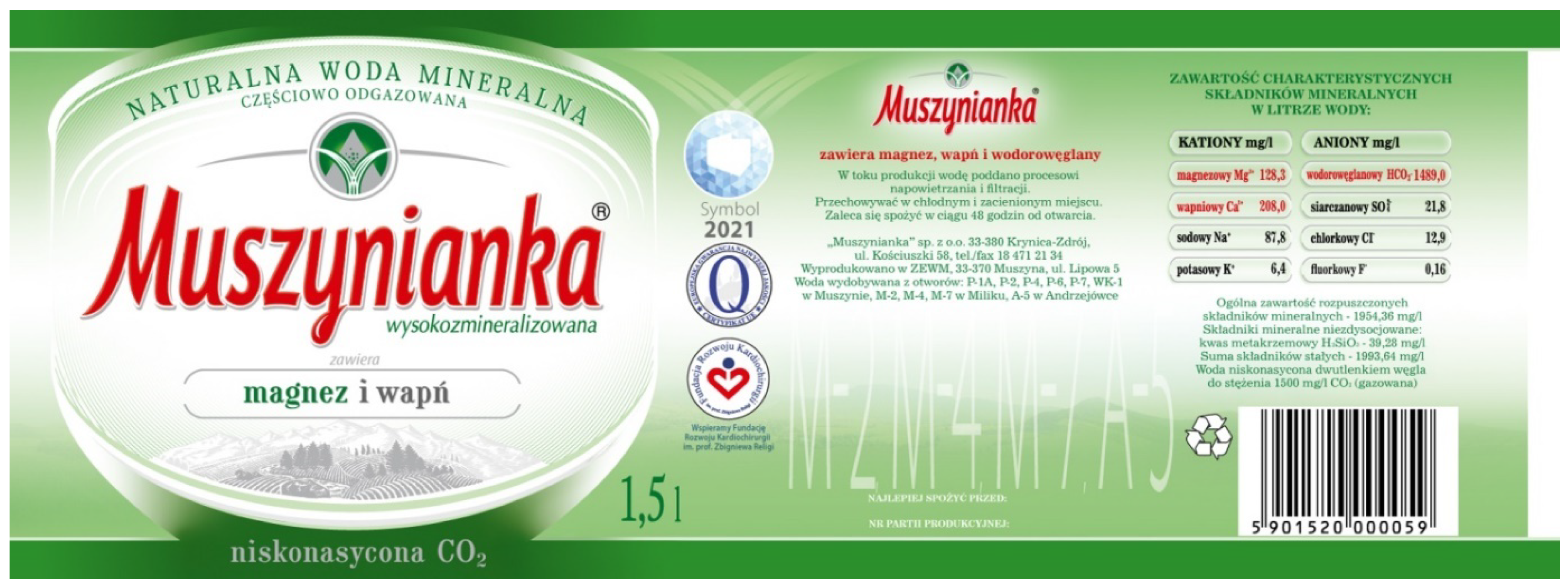
The main product of the Muszynianka brand is mineral water, obtained from boreholes located in the Poprad Landscape Park (Muszynianka 2025e). Muszynianka is classified as highly mineralized, alkaline, magnesium–calcium water (WODA24 2025). Its distinguishing feature is a high content of magnesium and calcium. For example, Muszynianka contains 128.3 mg/L of magnesium and 208.0 mg/L of calcium (Muszynianka 2025b). The company’s product range is diversified, including water with varying degrees of carbon dioxide saturation, in different types of packaging, and several product lines (Muszynianka, Muszynianka PLUS, Muszynianka Zdrój) (Muszynianka 2025g).
According to market research, Muszynianka belongs to the strict forefront of brands in the Polish bottled water market, being at the same time a leader in the segment of highly mineralized waters (Muszynianka 2025d). Market share data indicate a strong position of the company, with an estimated share of about 2% in 2023 (BizRaport 2025). The company exports its products to many countries, including the United States, Canada, Australia, as well as European and Arab markets (Superbrands 2025b). In 2023, the company’s revenues reached 358.5 million PLN, which means an increase of 14.8% compared to the previous year (EMIS 2025). Net profit in the same year amounted to 77.8 million PLN, continuing the positive growth trend (BizRaport 2025). The company is characterized by a very strong capital position—equity at the level of 336 million PLN constituted about 94% of the balance sheet total, with a low debt level of only 6% (BizRaport 2025).

3.2. Analysis of Visual Evolution of Labels

3.2.1. Early Period: Simplified Geometry and Technical Limitations

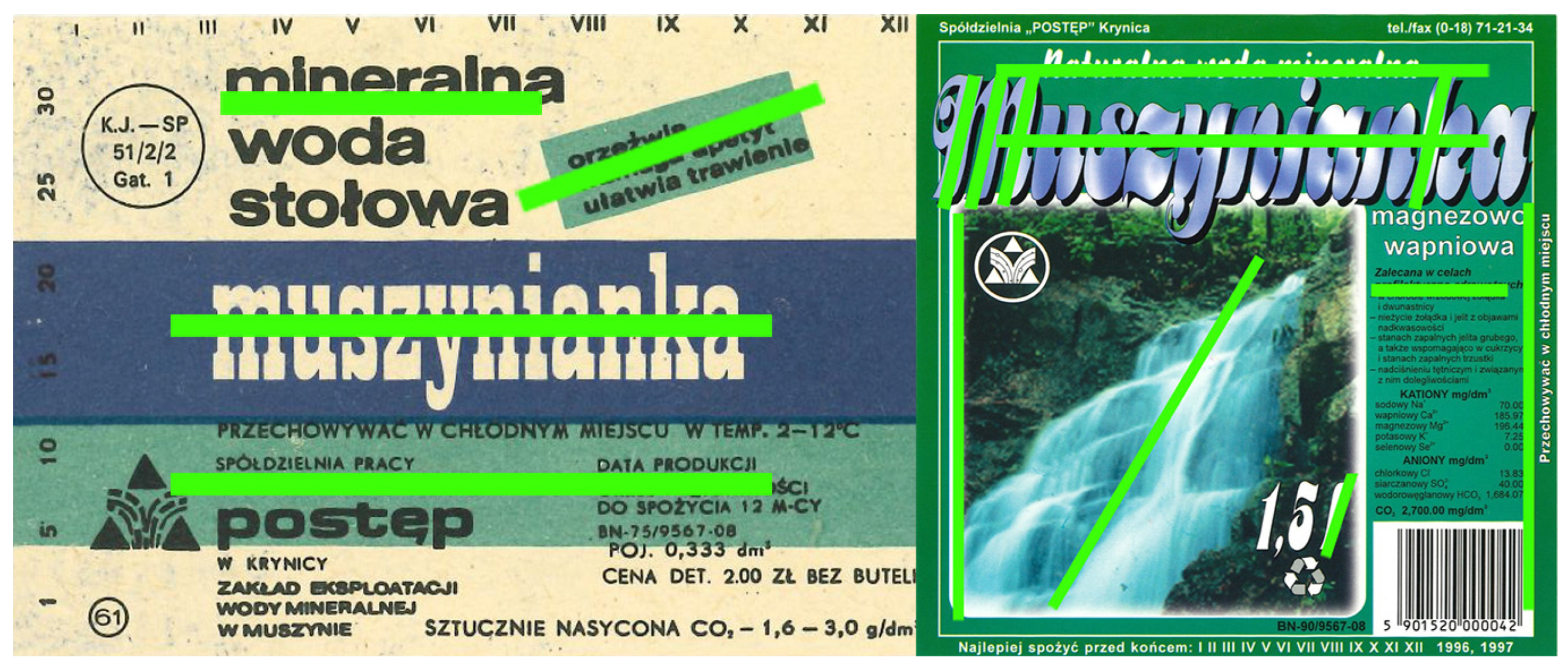
The earliest label (Figure 1—year undetermined) demonstrates typical features of design under technological and material constraints. Simple, geometric composition, flat color areas, and massive typography suggest an emphasis on basic informational function. The ecru color may indicate the quality of available paper. From a media archaeology perspective, this label is material evidence of specific production conditions (Ernst 2012).

3.2.2. 1990s: Market Experiments and Search for Identity

Labels from this period reflect the dynamic changes in transformation and market development.
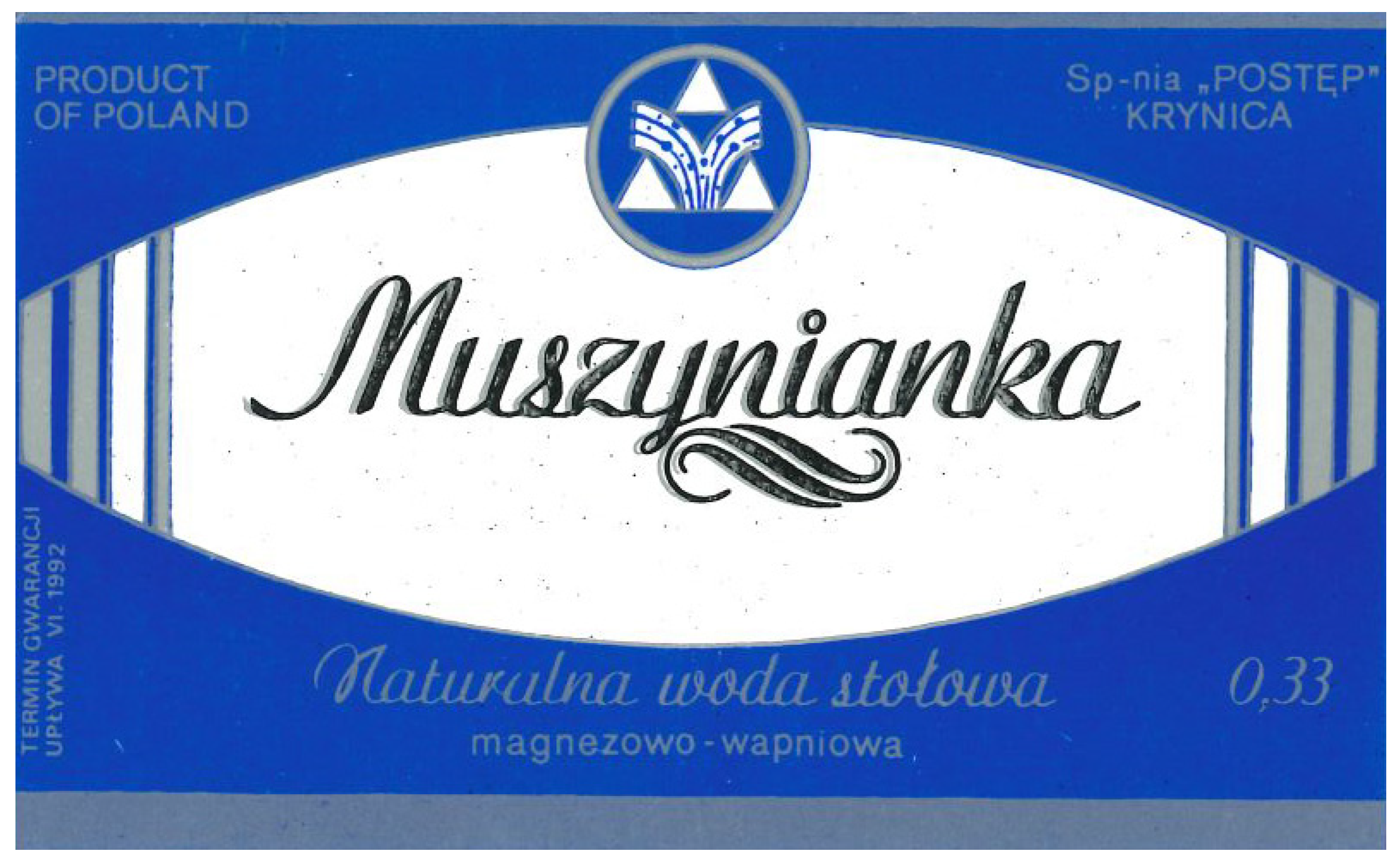
1991–1992 (Figure 2): New shapes (oval) appear, and typography becomes lighter and more individualized (script), suggesting an attempt to build brand identity.
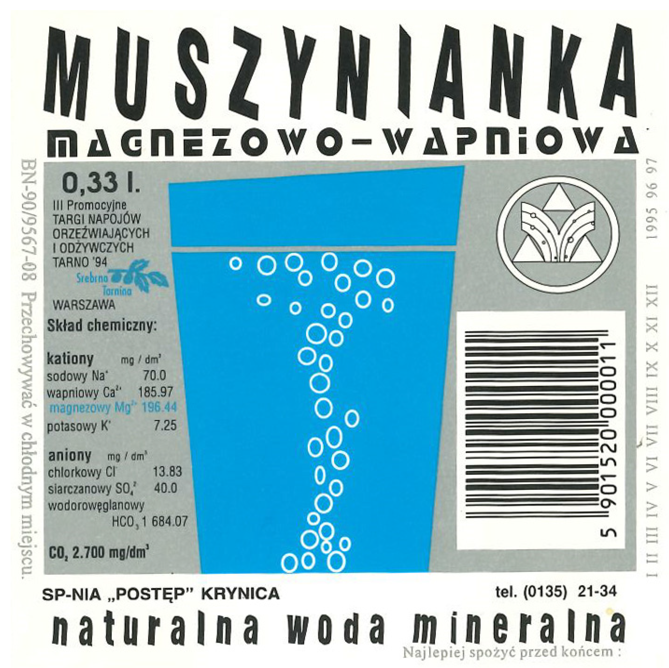
1995 (Figure 3): The first direct visual reference to the product (glass of water) and dynamic typography testify to the growing role of marketing (Bergstrom 2009). The appearance of detailed information about the composition is an example of the influence of the regulatory “archive” (The European Parliament 2011; Ernst 2012).
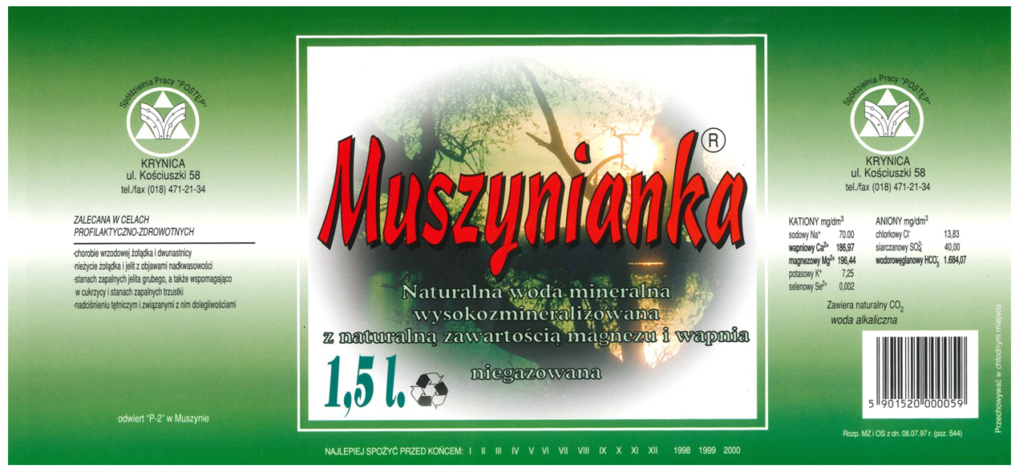
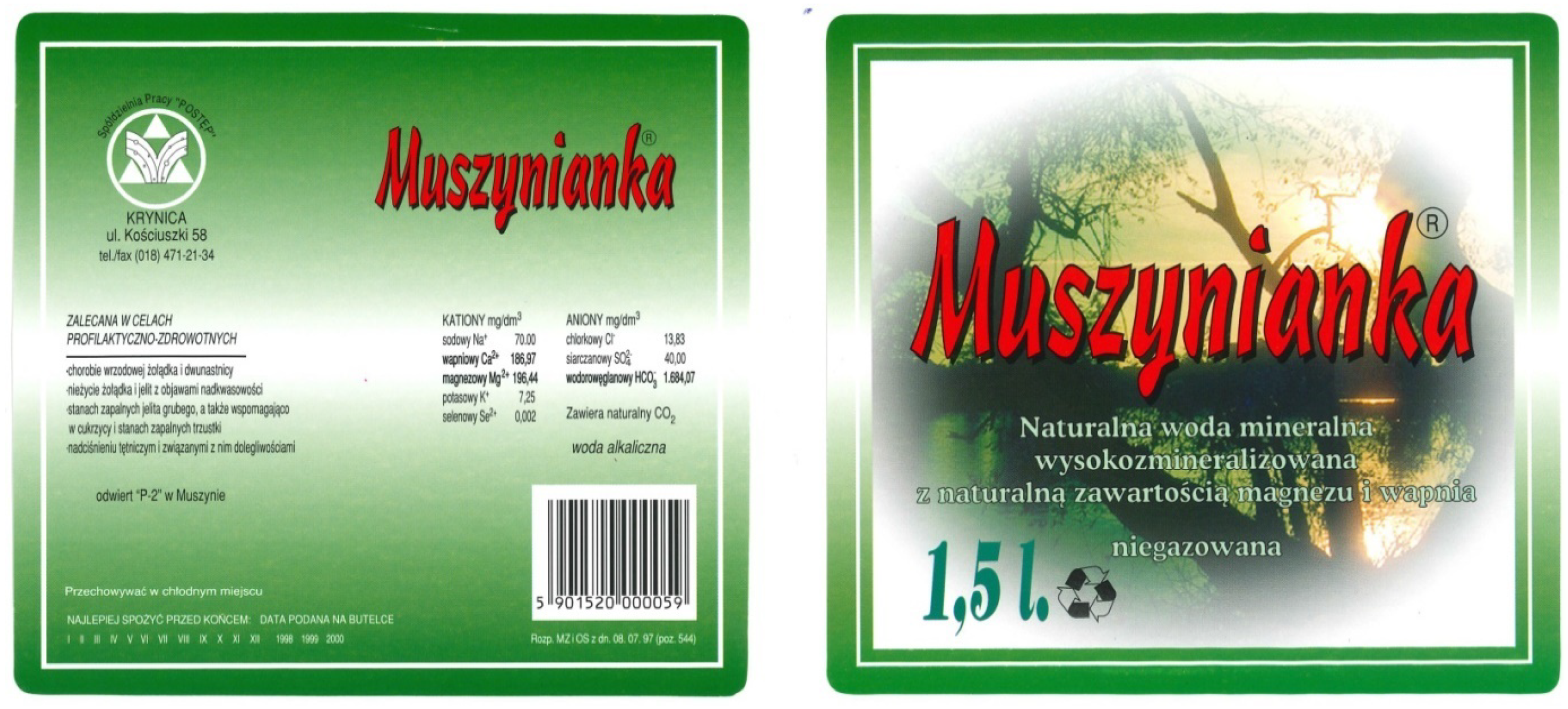
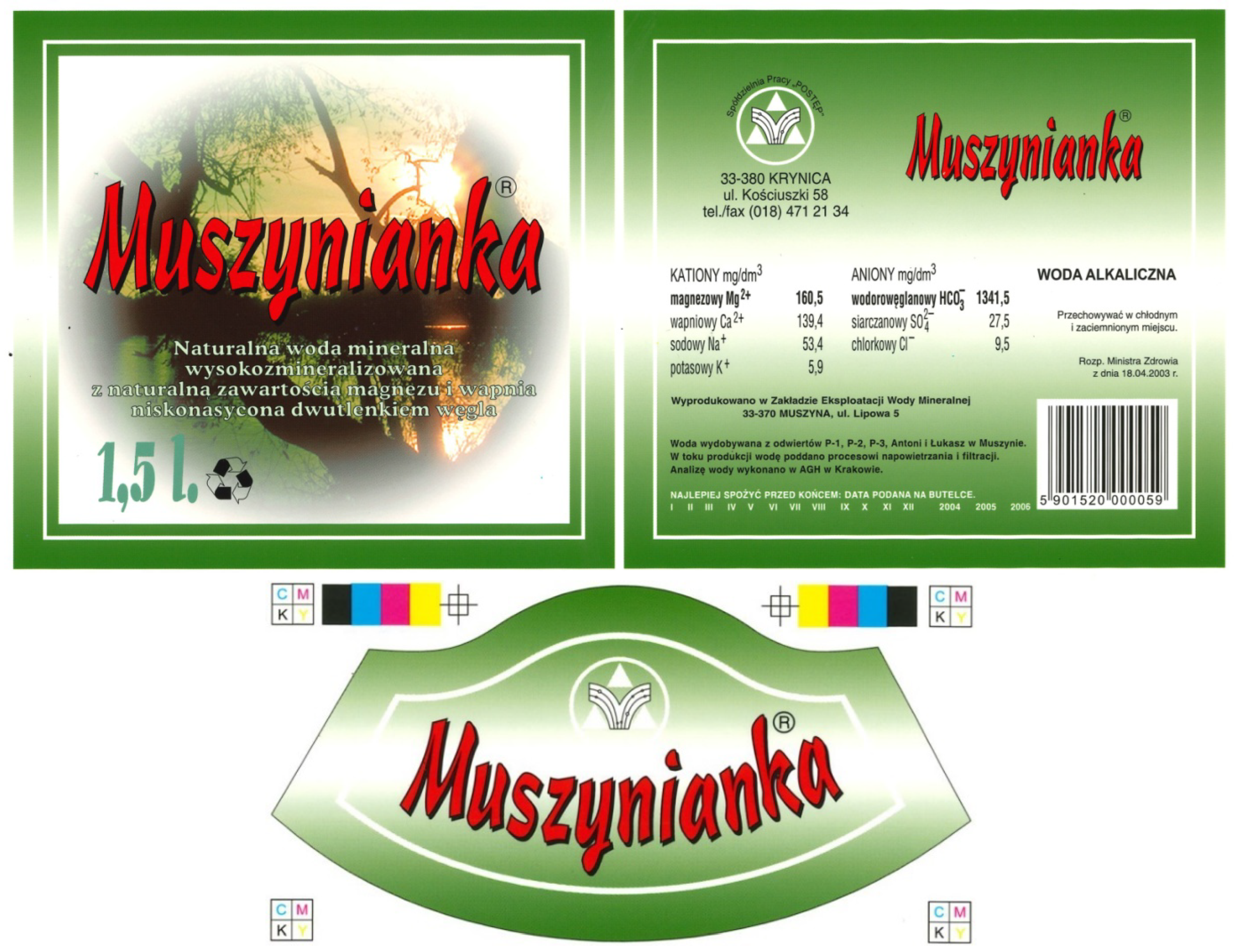
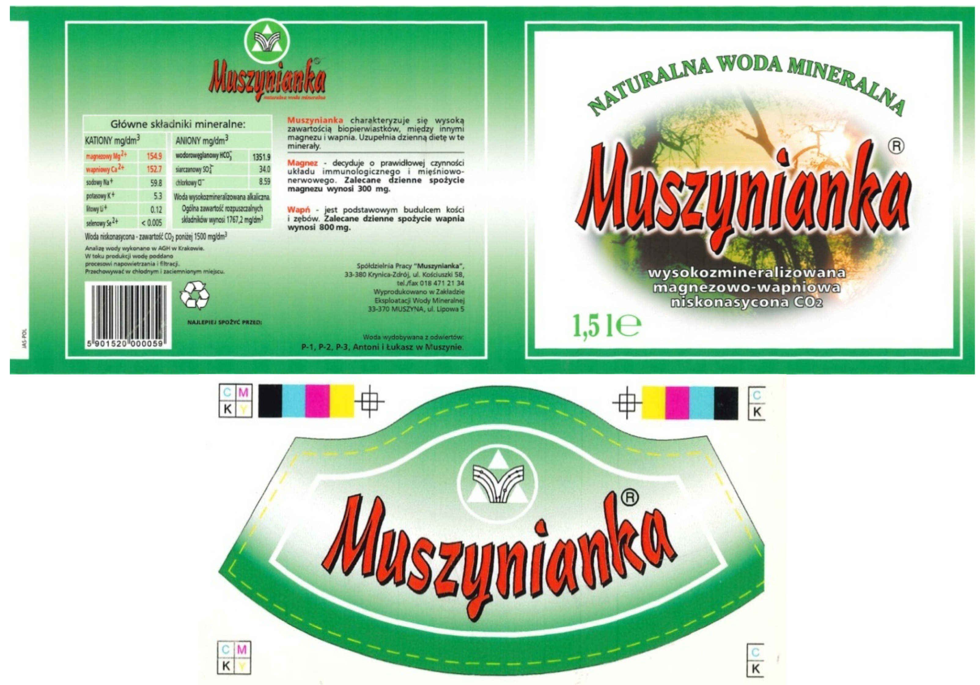
1996–1999 (Figure 4, Figure 5, Figure 6 and Figure 7): A period of intense visual experiments (photography, gradients, blur effects), characteristic of global digital design trends of the 1990s. These techniques, made possible by new technologies, were meant to attract attention. The introduction of a permanent logotype (1998) and a dominant color (green) signals the crystallization of visual identity.
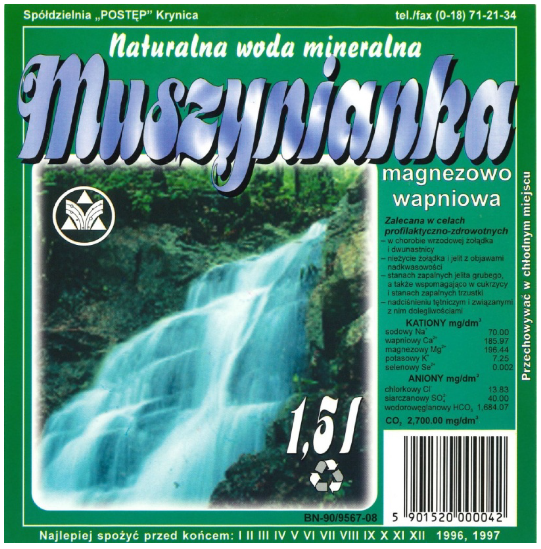
A major visual change took place in 1996 (Figure 4). Typographic, graphic, and compositional modifications were introduced. It is worth emphasizing that photographic elements were used for the first time.
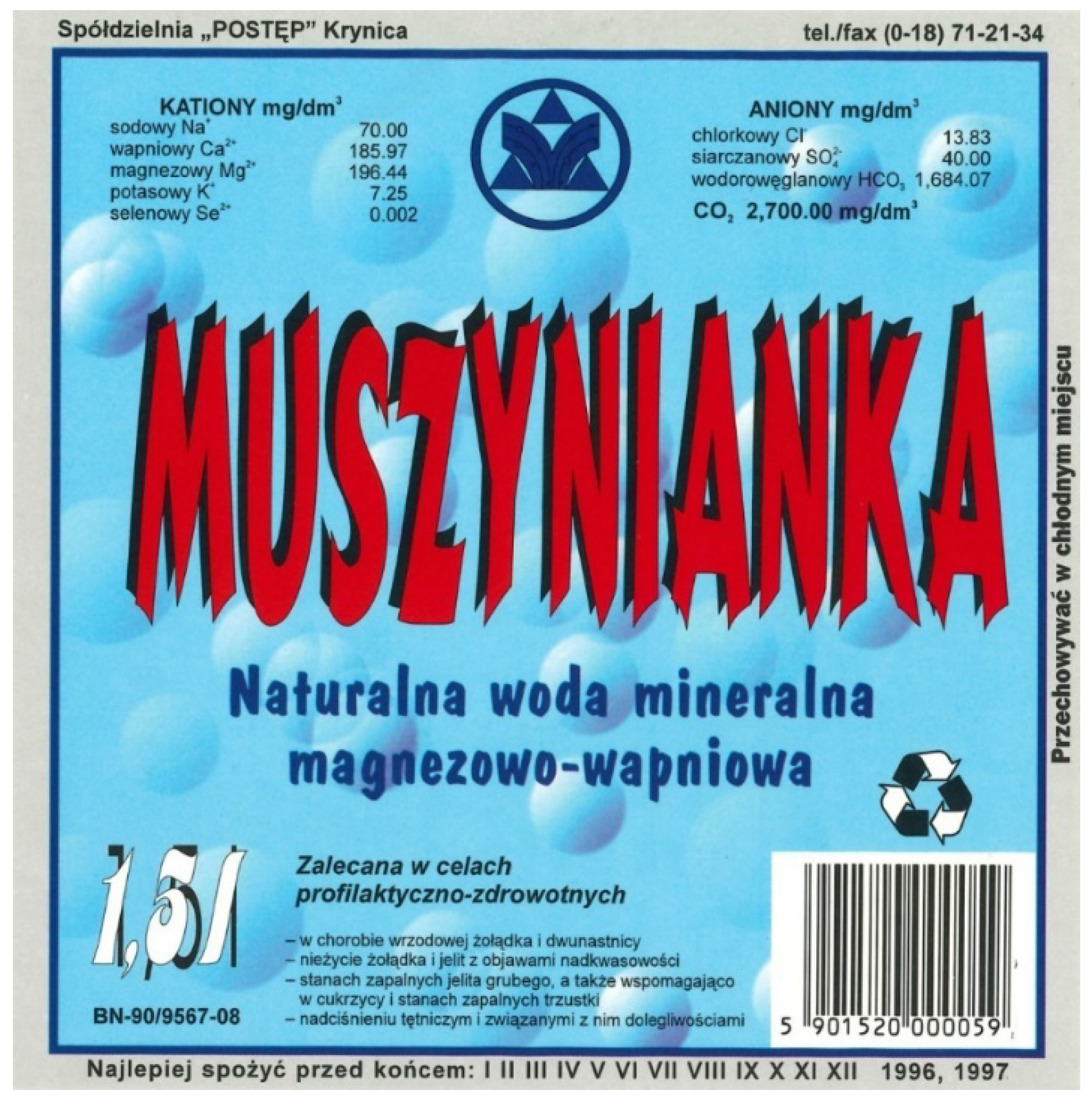
Another important period for the company is 1997. At that time, the plant was expanded and money was invested in an Italian line for bottling mineral water in 1.5 L disposable bottles. The label from that year was changed and appears as follows (Figure 5):
The next stage of changes can be observed at the end of the 1990s. As in previous periods, colors, compositions, typography, label shape, etc. were changed. However, during this period, the product logo appeared for the first time, which was slightly modified over time (Figure 6 and Figure 7). Any subsequent changes to the logo would be cosmetic and would include less significant elements. It was at this time that green coloring appeared on the label, which would accompany the product to the present day. Since the late 1990s, the label has been changed multiple times. However, these were not such dramatic corrections as in previous years.
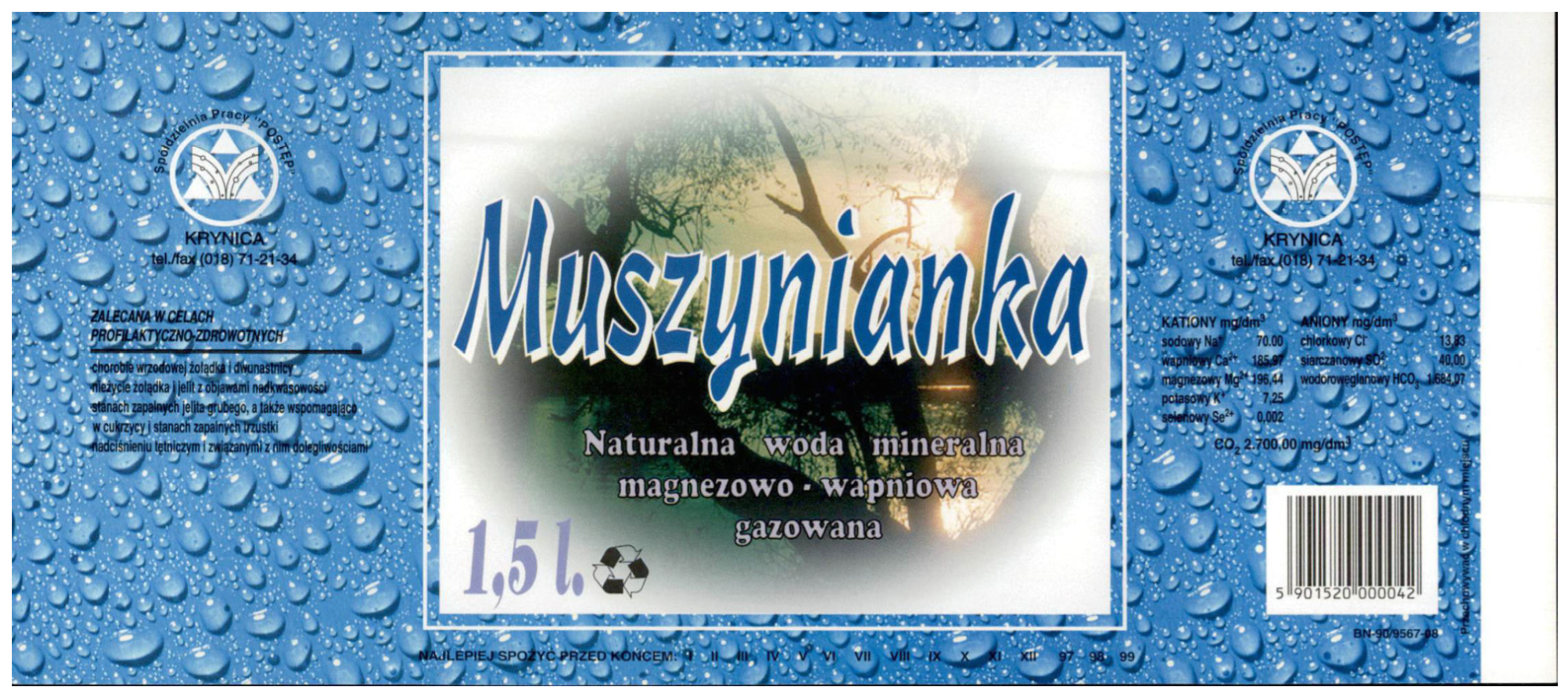
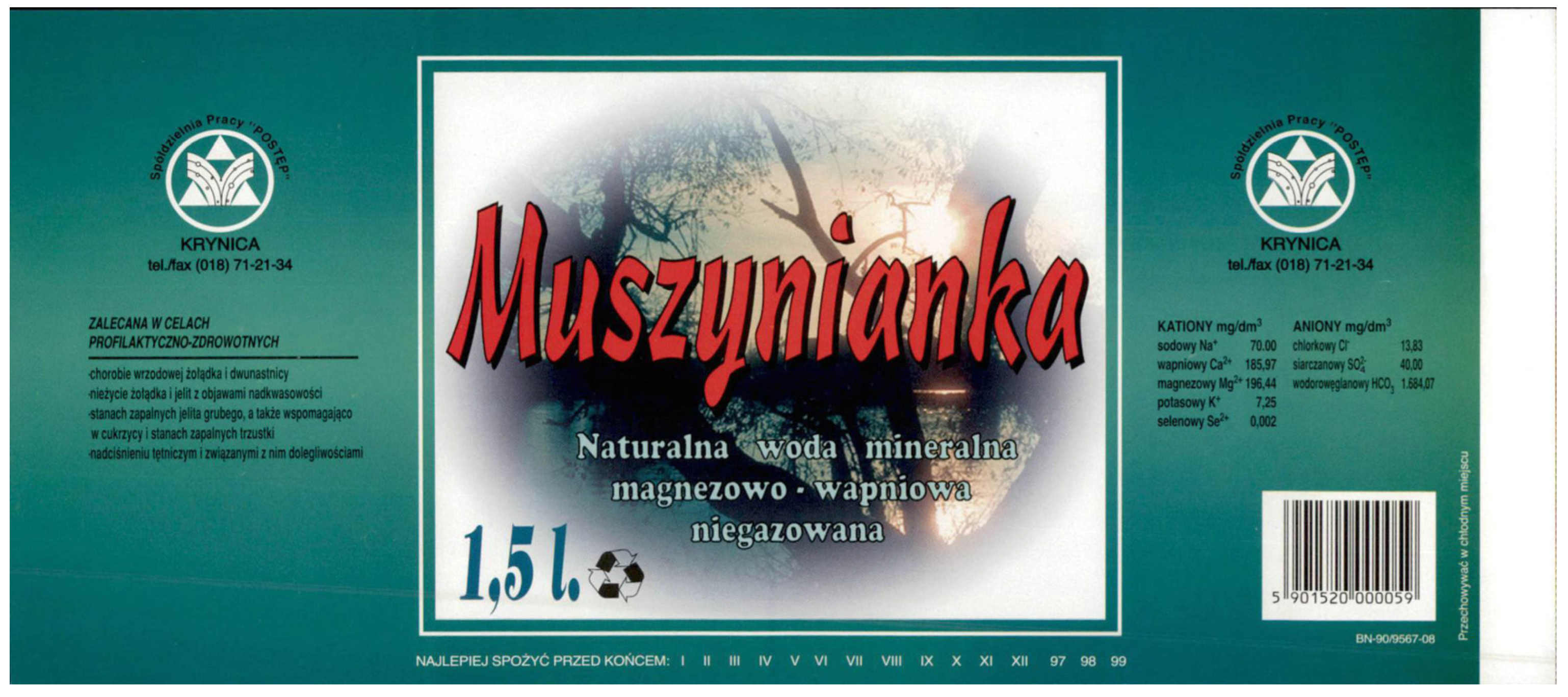
In the late 1990s, Muszynianka released two separate editions of labels (Figure 8 and Figure 9). They featured the same photograph but in two different color variants. These were label versions intended for carbonated and non-carbonated water. In both cases, the stylistic design of the 1998 label was retained. The dimensions, proportions, typography, and compositional layout remained unchanged. Only the background was modified. In the case of carbonated water, the background featured a photograph of a flat surface in blue with water droplets. In the non-carbonated water version, a bottle-green background with a subtle gradient was employed. The carbonated water version departed from the stylistic conventions of that period. It was unique in the manufacturer’s history in having a photographic print of water droplets in the background. Such a motif never appeared either before or after. Additionally, this label employs blue coloring for the logotype.

3.2.3. 2000s: Continuation and Overload

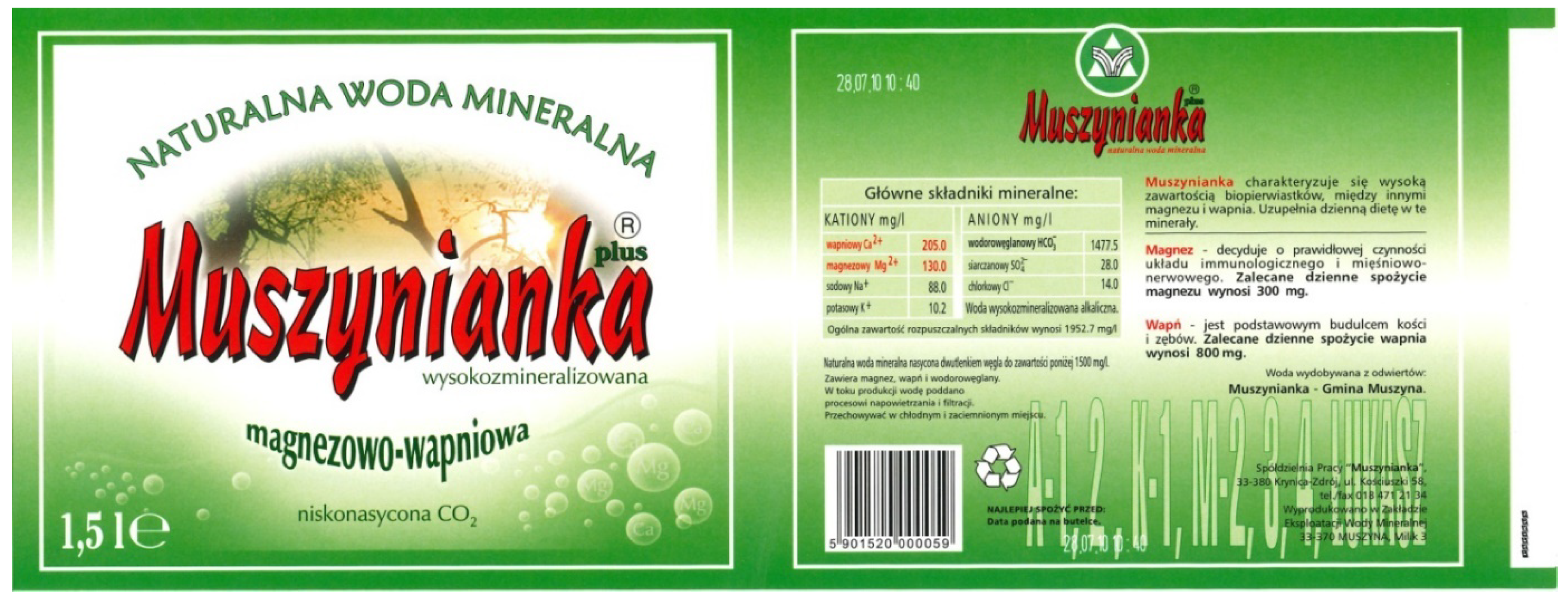
Labels from this period (Figure 10, Figure 11 and Figure 12) continue the style of the 1990s, often leading to visual overload (e.g., Figure 10, 2003). The combination of gradients, landscape photography, and various textual elements can be interpreted as an attempt to maximize the message, but also as a symptom of the aesthetics of those years. The frequency of changes (often not very significant) indicates a continuous search for visual identity but also testifies to the uncertainty of designers.

3.2.4. 2010s: Turn Towards Minimalism

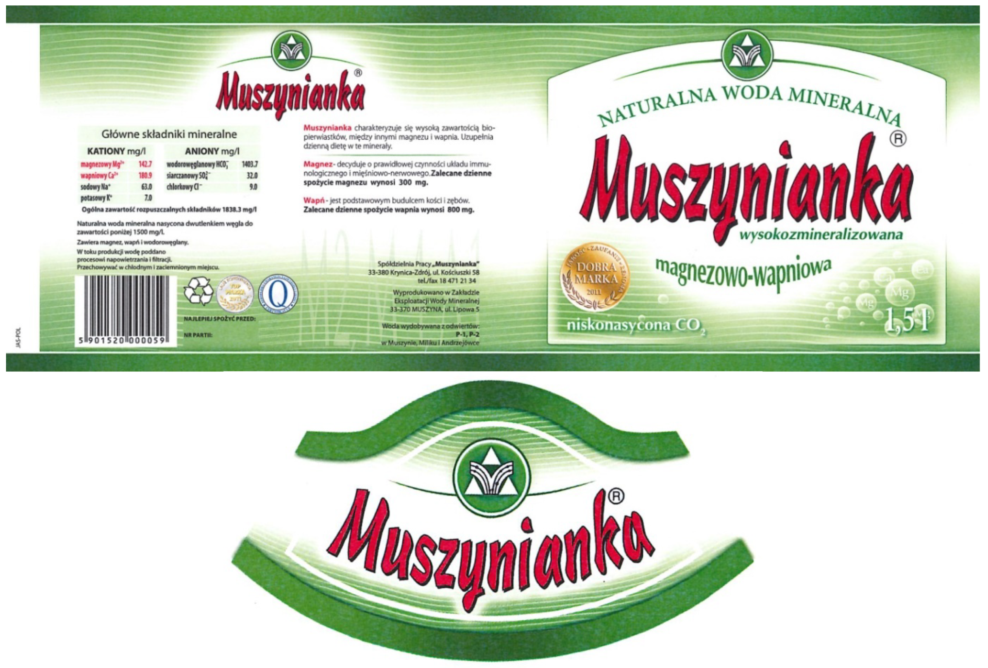
The newest labels (Figure 13 and Figure 14) demonstrate a clear turn towards minimalist aesthetics. There is a reduction in visual elements, simplification of colors, and abandonment of photography in favor of illustration. A large amount of white space and clean typography communicate elegance and quality (Myczkowska-Szczerska 2018a). This global trend in design emphasizes clarity.
The analysis of Muszynianka label evolution shows how this media and artistic artifact is a “record” not only of the brand’s history but also of broader technological, aesthetic, and regulatory changes (Parikka 2012; Zielinski [2002] 2010).

4. Technical Analysis of Visual Communication of Muszynianka Mineral Water Labels

The labels of Muszynianka water constitute an excellent example illustrating how stylistic design evolved alongside the product, and how prevailing trends in design and technological changes influenced the successive transformations of the brand. Nevertheless, certain visual solutions can be identified that allow the visual communication to be categorized according to specific standards. When analyzing Muszynianka labels, their visual constructions should be differentiated into several types, resulting from design trends in particular stages of the brand’s history.
After analyzing common elements, we propose the following stylistic division of labels:
  • Simplified geometric form of label—years xxx, 1995;
  • Lettering forms—year xxx, 1997;
  • Labels with photographic elements—1996, 2006, 2008; labels from the late 1990s depicting natural magnesium–calcium mineral waters;
  • Labels with illustrative elements—xxx and 2016;
  • Gradient forms or blurs—1998–2016.
Labels, like any manifestation of human creativity or artistry, can be analyzed taking into account the following elements: color, form (shape), theme of the work, narrative of the work, composition, rhythm in the work, planes, perspective, chiaroscuro, light, line, texture, typography used in the work, historical context. Each of the above-mentioned elements is a carrier of visual communication, and it is thanks to them that the designer is able to influence the recipient.

4.1. Color Analysis

First, we will focus on color. It is, among other things, through the applied colors that a designer can introduce specific emotions in their work. Properly matched color, through its psychology of impact, influences the viewer, providing soothing or evoking extreme emotions such as fear, anxiety, or anger. The role of color is to support the artist in building a message directed to the recipient. Designing labels is no exception in this case. Muszynianka in its design to date has used essentially several leading colors: blue, ecru, green, white, black, red, and gray.
Labels from the period xxx–1995 were mainly limited to blue, gray, white, green, and ecru colors (the latter resulted from the technical limitations of printing, as in the PRL period, paper for labels was not of the highest quality). Colors on labels from this period are applied flatly, usually on large surfaces. It happens that a specific color—as in the case of labels from 1992 and 1995—constitutes a significant part of the project space. Colors are juxtaposed in a rather contrasting way, which can be seen in specific planes placed in static compositional constructions.
The greatest color contrast during this time characterizes label no. 2 (Figure 2), while the others maintain a fairly similar level of contrast. On the first three labels, the colors were quite limited, but in the case of the first and third versions of the label, it had the largest color range—4 different colors can be distinguished here, while in the 1995 label, only 3 were used. The background in the case of the first label was divided into several colors, while in the second and third labels, we see two-color constructions. Although it may seem to the recipient that the text “Natural table water” was made in a light shade of blue, in reality, it is the same gray color as in the strips on the sides. We are dealing here with the so-called confetti phenomenon, consisting of an optical illusion: we change the perception of individual colors depending on what color surrounds them.
In 1996, we again encounter colors such as white, green, blue, and black. Unlike the coloring from the previous period, during this time we notice that the colors have a wider color range. Blue and green appear in several shades, but they are not very contrasting. Colors ceased to be applied flatly on large spaces, making the label gain more spatiality. This was possible thanks to the use of photography with a gradient in the name. Additionally, at this time, the producer used the effect of color blurring in the name and in the outline of the photograph.
In 1997, the color red was introduced for the first time, which has remained characteristic of the brand to this day. The limited color palette resembles the first “flat” periods in Muszynianka labels. There are several elements building space here: black, flat shadow behind the logo and gradient shaping of spherical elements in the background, probably symbolizing air bubbles.
1998 is a return to the color green. The brand limited itself to shades of green in a fairly wide color scale. Indeed, warm shades of yellow and orange can also be observed, resulting from the selection of photographs depicting a sunset, but they constitute too small a percentage of the entire composition to be considered the basic colors of the brand.
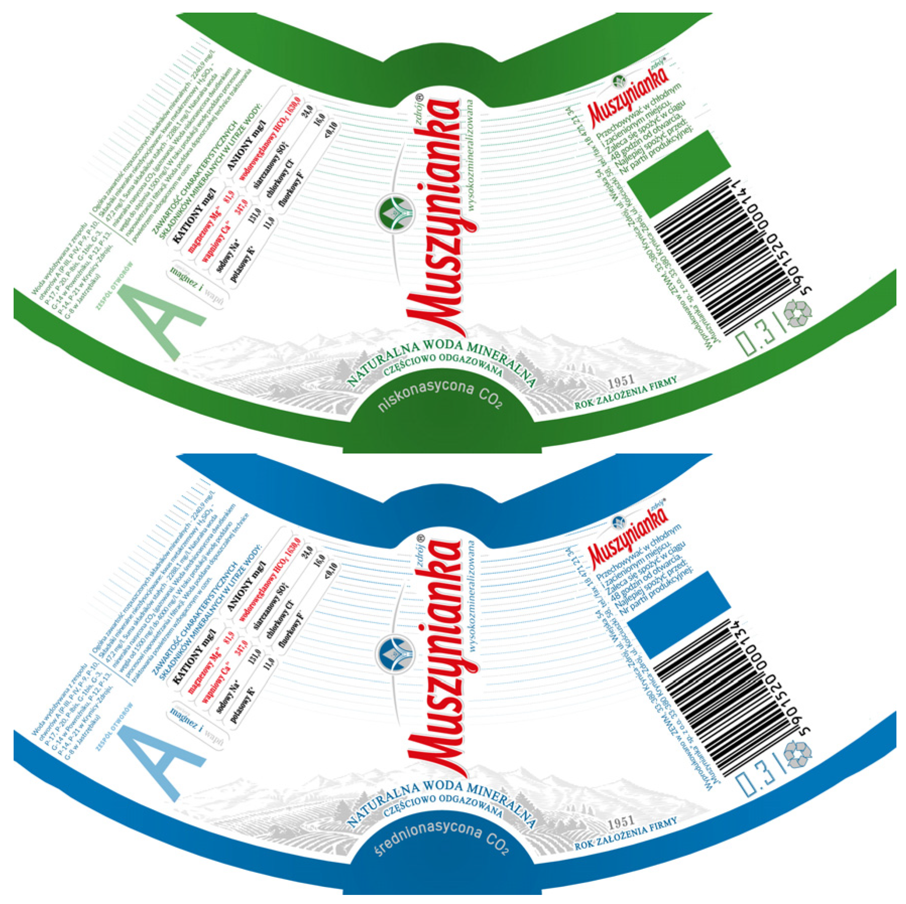
The late 1990s represent one of two periods in the brand’s history in which color-coded product versions were in effect (with as many as three different variants during this period). The brand employed colors such as: warm shades of green, blue, and bottle green. Since 2016, the labels have featured two color versions (green and blue). Contemporary labels differ essentially in nothing except the color itself. Green coloring is assigned to standard carbonation levels, whereas labels in blue are applied to products with higher gas content (Figure 15).
In 2009, two color changes can be observed: first, warming of green shades compared to the previous version, and second, reducing the gradient radius on the photograph, making the photo more visible on a white background. Labels from 2003 and 2005 are characterized by large color diversity. The juxtaposition of the aforementioned sunset photograph with the remaining colors may make the recipient feel overwhelmed by the colors and excessively visually stimulated. The year 2011 is definitely the most color-muted period in the design of this brand’s labels. Colors are limited only to shades of green and white in the background, red in the logo, and black in typography. Such a solution makes the coloring balanced, and the design becomes more legible.

4.2. Shape and Form

The next element requiring discussion is the form (shape) of Muszynianka labels. Originally, it was a rectangle divided into horizontally arranged strips, with one small exception—a green rectangle in the upper right corner containing some information about the product. In the period 1991–1992, we are still dealing with a rectangular label. Shapes such as strips, lines, or circles appear on the label from this period. The novelty was the use of a white oval with slightly sharpened ends.
In 1995, the label took the shape of a rectangle very close to a square. Lines built by compositional division, circles, or strips are still used. This year also saw the use of asymmetrical shapes visible in the graphic representation of a glass of water. The year 1996 brought further changes: elements such as lines or roundings remain present, but during this period, the main shape from which the label is built becomes a square. It is used both as the shape of the label and as an element appearing in other parts of the graphic design.
In 1997, the label remains square, but at this time it is difficult to indicate the main leading shape in the design. The producer used the shape of a circle, presenting air bubbles in the background. Line motifs remain visible in the design. In 1998, the label takes the form of a rectangle whose width is twice its height. Such proportions made the design gain more “breath” through the use of numerous empty spaces. This shape was also applied to natural magnesium–calcium mineral water, both carbonated and non-carbonated. Despite visible color differences, the shape and compositional layout remained unchanged.
In 1999, Muszynianka divided the label into two parts for the first time—these were squares with roundings. In this case, as in previous years, lines and semicircles were used. In 2003, Muszynianka divided the label into three parts: the first two were square and resembled their predecessors, while the novelty was a part of the label with an irregular shape, placed on top of the bottle. In 2005, Muszynianka returned to a rectangular construction, on which elements of lines, ovals, or smaller rectangles were placed. In the same year, the shape of a rectangle was again used, whose width is more than twice its height—and this proportion is maintained to this day.
In 2006, a return to the three-part construction of the label occurred, but this change did not last long, as after three years, a return to a one-element solution took place. In a wide rectangle, two smaller ones were placed once again. In 2011, the label was modified again. The shape used during this period by the producer remains a rectangle. A novelty can be noticed here—lines with a wavy construction, delicately outlined in the background. The main shapes used then were circle, line, rectangle, and semicircle. In 2016, another change in the shape of the label was made, which is still in force today. Although, as with its predecessors, the leading shape of the label remains a rectangle, in this case, the roundings have been definitely smoothed out in the place where the logo was placed. It is worth emphasizing that certain forms accompanied each label—these were lines and shapes that fit into a rectangle.

4.3. Themes and Narratives of Muszynianka Labels

The theme of a work is always connected with its narrative. Through visual messages, a work should build a narrative in a way appropriate to the presented topic. It doesn’t matter whether we’re talking about a social poster addressing the problem of alcohol addiction—what’s important is that the narrative is clear. Media recipients increasingly look for the right context or point of reference. Art provides possibilities for narration and presentation of specific events or content (Bergstrom 2009).
To this day, the narrative of a work resulting from the topic is of great importance. The same is true for professionally designed labels. The narrative and themes of Muszynianka water labels can be divided essentially into two periods. The first concerns designs from the years xxx and 1991. These labels were designed in such a way that without the suggestive logo of the producer and the information placed on the label, it would be difficult to identify the type of product in the bottle. In other words, the producer did not attempt to present the theme and narrative of the work in a way directly referring to water. The only element associated with water in this case could have been the blue coloring, or literally the water droplets photographed on a flat surface and placed in the background of the label for natural magnesium–calcium mineral water, carbonated. Of course, it should be taken into account that in the times of the PRL and at the beginning of the 1990s, it happened that the label design did not clearly indicate the type of product, which is why it was crucial to include information about the nature of the packaging contents.
The year 1995 brought fundamental changes in the narrative and theme of the design. From that time on, the producer consistently made visual references to water. This was achieved through the use of elements such as the image of a glass, bubbles, a landscape with water, or mountains from which river sources flow. The use of such symbolism made both the theme and the narrative of the design clear.

4.4. Composition

Another element affecting the clarity of the visual message is the applied composition. It has always been an important element in art and, depending on the specific historical period, was subject to numerous changes. Initially, humanity used simple compositions, such as row constructions, to eventually improve them and transform them into multi-figure compositions. A professionally designed label with appropriately selected composition makes it easier for the recipient to read the most important content placed on it. This is an extremely difficult task because labels are made in a small format, and any compositional error can negatively affect the perception of the product.
In the case of Muszynianka mineral water labels, we are dealing with a static composition based on vertical and horizontal directions. In a few cases, such as labels from years xxx, 1996, 1998, 1999, 2005, 2006, and 2009, minor elements building slight dynamism were introduced. In the first case, it is a rectangle in the upper right corner, while in the remaining versions of labels, dynamism is built by photographs of a waterfall and a tree over a lake, which break vertical and horizontal constructions, introducing different directions (Figure 16). However, it should be emphasized that these changes are so subtle that they do not change the static character of label compositions.
The compositions used in Muszynianka labels can be divided as follows:
  • Closed compositions—years xxx, 1992, 1995, 1997, 2011, 2013. In each of these cases, graphic and typographic elements are closed in space, and all are presented in their entirety.
  • Closed compositions with elements of open composition—1996, 1998, 1999, 2005, 2006, 2016. The composition structure is essentially closed, but some elements, such as photos or illustrations, suggest that a fragment of the presentation is beyond the frame boundary.
The next division is symmetrical composition and combining symmetrical and asymmetrical elements. Symmetrical composition was used in labels from 1991 (the most symmetrical design of all analyzed); labels from 1995, 1997, and 1998 are symmetrical, although minor inequalities resulting from the placement of the barcode can be observed. Labels with asymmetrical composition include the 1996 design. Composition combining symmetrical and asymmetrical elements occurs in labels from 1999, 2006, 2003, 2005, 2009, 2011, 2013, 2016.

4.5. Typography and Hierarchy Applied in Labels

Typography is mainly associated with graphic design and printing. However, thanks to the dissemination of digital technologies, typography has found application in diverse typographic materials. Typography and script have always occurred in pairs and constitute a visual form conveying the content of the message to the reader, thanks to which visual communication can be even more effective (Newark 2005). When working with texts or on construction grids, graphic designers always make a series of decisions related to the proper placement of texts and determining their size. In other words, it is not possible to place text in a design without deciding on its hierarchy.
It is hierarchy that enables the appropriate assimilation of content by the recipient. In design, projects with a limited amount of typography are easier to assimilate and dominant, which is why designers often have to make decisions about how to design the label so that all the texts placed do not interfere with each other. Hierarchy in typography is used practically everywhere—it can be a newspaper where titles or headlines are differentiated by size or weight of typography (Newark 2005). It is similar in label design, which we can observe in the example of Muszynianka. The producer uses appropriate colors, size, or contrast, always placing the product name in the first place.
The hierarchy in Muszynianka labels is built, among other things, by differentiating the size of typography. This is an example of so-called visible typography, where letters take on an individual style to strengthen the message, similar to newspaper headlines or poster titles. In practically every case, the product name is the largest typographic element on the label. Another way to emphasize the importance of a given element in graphics is to place it at the very top—such a solution was applied in designs from 1995 and 1997. Another way to highlight the product name is to use color contrasts. In projects from years xxx, 1991, and 1995, flat, contrasting backgrounds were used, thanks to which the product name was very well visible. Labels designed from 1997 used red coloring in the name, which, combined with the green and white background, provided excellent visibility of the product name. The only exception to this rule is the 1996 design, where the colors used in typography—specifically blue–white spots—made the product name difficult to read.
At this point, the types of typography used in Muszynianka labels should be described. In the label from year xxx, massive typography was used—these were geometric sans-serif typefaces and a stylized, serif, poster typeface with rather narrow inter-letter spaces, used in the product name. The year 1991 brought significant changes: typography became definitely lighter, less content was placed, and the producer’s name was designed using a slightly tilted script, reminiscent of handwriting.
The year 1995 marks another visual change in typography. We observe here 4 or 5 typefaces, but their precise identification is difficult due to the small size of the label. The product name was designed in an interesting way—the inclination of all letters was changed, resulting in an optical shift. In previous years, designs were set at equal heights relative to the upper writing line and the baseline. Under the name Muszynianka, an original decorative typeface was used. The remaining texts were written probably in grotesques, although this cannot be unequivocally determined.
The year 1996 is another stage of typographic changes in the product name. The producer again reached for a decorative typeface, reminiscent of the stylistics of typography from the 1970s. The remaining content was written in a humanistic style. In 1997, another decorative typeface was used on the label, but in this case, it is very tall, and the arrangement of letters is stylized as a gentle wave. Interestingly, it was in this year that the product name was the largest, constituting about 1 of the label height. Never later in history did Muszynianka use such a large typeface. The remaining content on the label was written in a humanistic style.
The year 1998 marks the beginning of typography evolution towards one that becomes the producer’s logotype. Changes in typography in the years 1998–2016 were not significant. The typographic stylistics from this period have been preserved practically to this day. The inscription Muszynianka became the product’s logotype and changed only to a very small degree.
At this point, it is necessary to describe the types of typography applied in Muszynianka labels. In the label from the year xxx, among others, a stylized, serif, poster typeface with relatively narrow letter spacing was employed in the product name. The typography used in the name is the largest typeface on this label and has the following dimensions:
Width: 5.1 mm
Height:
   x-height: 10 mm
   Ascender: 2 mm
   Descender: 2 mm
   Height between baseline and capline: 14 mm
In addition to the typography applied in the name, several typeface categories can be observed, such as:
  • Xenotypes (mono-stylized styles applied in the product name);
  • Sans-serif typefaces (Grotesques, Neo-Grotesques, Geometric typefaces, Humanist typefaces).
The remaining typefaces are geometric, sans-serif, ranging in height between 5–1 mm. Due to the fact that the label is very small, it is not possible to provide precise dimensions of these letters. Both majuscules and minuscules are employed. Unfortunately, due to the very small dimensions, it is difficult to determine the exact dimensional parameters of these typographies.
The years 1991–1992 brought significant changes: the typography became decidedly lighter, less content was placed, and the manufacturer’s name was designed using a slightly inclined script typeface resembling handwriting. Additionally, an ornament stylized as lines executed with a pen was placed beneath the text.
Dimensions of the typeface employed in the product name:
Width: 6.7 mm
Height:
   x-height: 5.5 mm
   Ascender: 5 mm
   Descender: 3 mm
   Height between baseline and capline: 13.5 mm.
As in the previous case, the remaining typefaces employed typography with heights ranging between 5–1 mm, in both majuscules and minuscules.
Typography used in the label apart from the product name:
Script/calligraphic typeface (applied in the product name and slogan: Naturalna woda stołowa, as well as the 0.33 marking. Due to the inclination, this typeface is classified in the italic category, which is evident, for example, in the number 0.33): Sans-serif typefaces (Humanist typefaces)
The year 1995 marked another visual change in typography. The product name was designed in an interesting manner—the inclination of all letters was altered, resulting in an optical offset.
Dimensions of the typeface employed in the product name:
Width: 80 mm
Height: 12 mm
Due to the form of the letters used in the product name, namely the absence of minuscule application, the height of this typeface is limited only to the height between the baseline and capline. Although the typeface is stylized as slightly inclined, it does not clearly possess lines for descenders, ascenders, or x-height.
Four or five typefaces are observed here; however, their precise identification is difficult due to the lack of exact printing specifications. In the label from this year, the application of both majuscules and minuscules is visible. Several typeface categories can be observed, such as:
  • Xenotypes (mono-stylized styles applied in the product name, in the words naturalna woda mineralna—here we encounter the same typeface. Additionally, in the words magnezowo-wapienna another typeface from this category appears);
  • Sans-serif typefaces (Grotesques, Neo-Grotesques, Geometric typefaces, Humanist typefaces);
  • Serif typefaces (Baroque Antiquas).
In this case as well, due to the lack of printing specifications and the small dimensions of the label, it is difficult to unambiguously dimension the letters and assign them the official name of the applied typography.
The year 1996 represents another stage of typographic changes in the product name. The manufacturer once again employed a decorative typeface reminiscent of the typographic style of the 1970s.
Dimensions of the typeface employed in the product name:
Width: 122 mm
Height:
   x-height: 20 mm
   Ascender: 6 mm
   Descender: 8 mm
   Height between baseline and capline: 34 mm
Several typeface categories can be observed, such as:
  • Xenotype (in the product name, reminiscent of the typographic style of the 1970s);
  • Sans-serif typefaces (Grotesques, Neo-Grotesques, Geometric typefaces, Humanist typefaces);
  • Serif typefaces (Baroque Antiquas);
  • Script/calligraphic typeface (applied in the words Naturalna woda mineralna).
In 1997, another decorative typeface was applied to the label; however, in this case, it is very tall, and the arrangement of letters is stylized as a gentle wave. It is noteworthy that precisely in this year the product name was the largest, constituting approximately 1 of the label’s height. Never later in Muszynianka’s history was such a large typeface employed.
Dimensions of the typeface employed in the product name:
Width: 177 mm
x-height: 20 mm
Height between baseline and capline: 38 mm; including the shadow applied behind the typography, the height of this typeface is 40 mm. As in the case of the label from 1995, due to the application of a typeface written in majuscules, the height of this typeface was limited only to the height between the baseline and capline.
Several categories of typefaces applied apart from the product name are observed:
  • Xenotype (in the product name and in the product capacity marking 1.5 L. Interestingly, in this case we observe duplication of content in two different typefaces, which presumably result from printing errors);
  • Sans-serif typefaces (Grotesques, Neo-Grotesques, Geometric typefaces, Humanist typefaces);
  • Script/calligraphic typeface (applied in the words Naturalna woda mineralna).
In this label, various typefaces were applied, apart from that which was used in the name, ranging in height between 15–1 mm. Both majuscules and minuscules were employed here.
The year 1998 marks the beginning of the evolution of typography toward one that becomes the manufacturer’s logotype.
Dimensions of the typeface employed in the product name/logo:
Width: 117 mm
Height:
   x-height: 22 mm
   Ascender: 17 mm
   Descender: 10 mm
   Height between baseline and capline: 35 mm
In the design, apart from the manufacturer’s name, the following typeface categories were applied:
  • Script/calligraphic font (in the product name);
  • Sans-serif typefaces (Grotesques, Neo-Grotesques);
  • Serif typefaces (Baroque Antiquas).
In this label, various typefaces were applied, apart from that which was used in the name, ranging in height between 11–1 mm. Both majuscules and minuscules were employed here.
In the label from 1999, a two-element label (front and back) was applied for the first time. On the front, the manufacturer’s name was placed, executed in the same typeface as the label from the previous year. Product capacity marking (1.5 l).
Dimensions of the typeface employed in the product name front:
Width: 97 mm
Height:
   x-height: 17 mm
   Ascender: 11 mm
   Descender: 7 mm
   Height between baseline and capline: 35 mm
In the design, the following typeface categories were applied:
  • Script/calligraphic font (in the product name);
  • Serif typefaces (Baroque Antiquas).
Dimensions of the typeface employed in the product name back:
Width: 55 mm
Height:
   x-height: 10 mm
   Ascender: 5 mm
   Descender: 4 mm
   Height between baseline and capline: 19 mm
In the design, apart from the product name, the following typeface categories were applied:
  • Script/calligraphic font (in the product name);
  • Serif typefaces (Baroque Antiquas).
In this label, majuscules and minuscules were employed.
In 2003, the label was divided into 3 parts (front, back, and a section placed in the upper part of the bottle).
Dimensions of the typeface employed in the product name front:
Width: 101 mm
Height:
   x-height: 15.5 mm
   Ascender: 9.5 mm
   Descender: 6 mm
   Height between baseline and capline: 31 mm
In the design, the following typeface categories were applied:
  • Script/calligraphic font (in the product name);
  • Serif typefaces (Baroque Antiquas).
Dimensions of the typeface employed in the product name back:
Width: 53 mm
Height
   x-height: 10 mm
   Ascender: 5 mm
   Descender: 4 mm
   Height between baseline and capline: 19 mm
In the design, the following typeface categories were applied:
  • Script/calligraphic font (in the product name);
  • Serif typefaces (Baroque Antiquas).
Dimensions of the typeface employed in the product name in the upper part of the bottle:
Width: 53 mm
Height
   x-height: 8 mm
   Ascender: 4 mm
   Descender: 3 mm
   Height between baseline and capline: 15 mm
In the design, the following typeface categories were applied: Script/calligraphic font (in the product name)
In the case of the label placed in the upper part of the bottle, the typography constituting the logotype was slightly tilted into the shape of a semi-arc. Typographic changes in the years 1998–2016 were not significant. The typographic stylistics from this period have been preserved practically to this day. The inscription Muszynianka became the product’s logotype and changed only to a very minor extent.

4.6. Rhythm in the Work and Perspective

Rhythm in Muszynianka labels essentially does not occur. Only some of its elements can be discerned in label no. 1 from year xxx, where a repetitive composition structure was used in horizontal strips. It is similar in the label from 1991, with the difference that the strips are arranged vertically. As for perspective, it can be observed only in the label from 2016—it is a row perspective, visible in the illustration shown on the label depicting mountains and fields from a bird’s eye view. However, this element was placed on a very small surface, which means that it does not have significant design importance.

4.7. Chiaroscuro and Light

These elements occur in Muszynianka label designs to a marginal extent. Indeed, in the case of labels using photographs, they can be observed, but they do not constitute the most important graphic element of the label. When designing labels, the graphic designer can completely omit chiaroscuro and lights because in this kind of applied graphics, these elements are not essential. Chiaroscuro is also visible in the bottle from the late 1990s for natural magnesium–calcium mineral water, carbonated. A photograph of water droplets was applied there, which has been described previously.

4.8. Dimensions and Shapes of Labels

Table 1 shows a comprehensive summary of the dimensions and shapes of labels.

4.9. Series of Labels on Glass Bottles

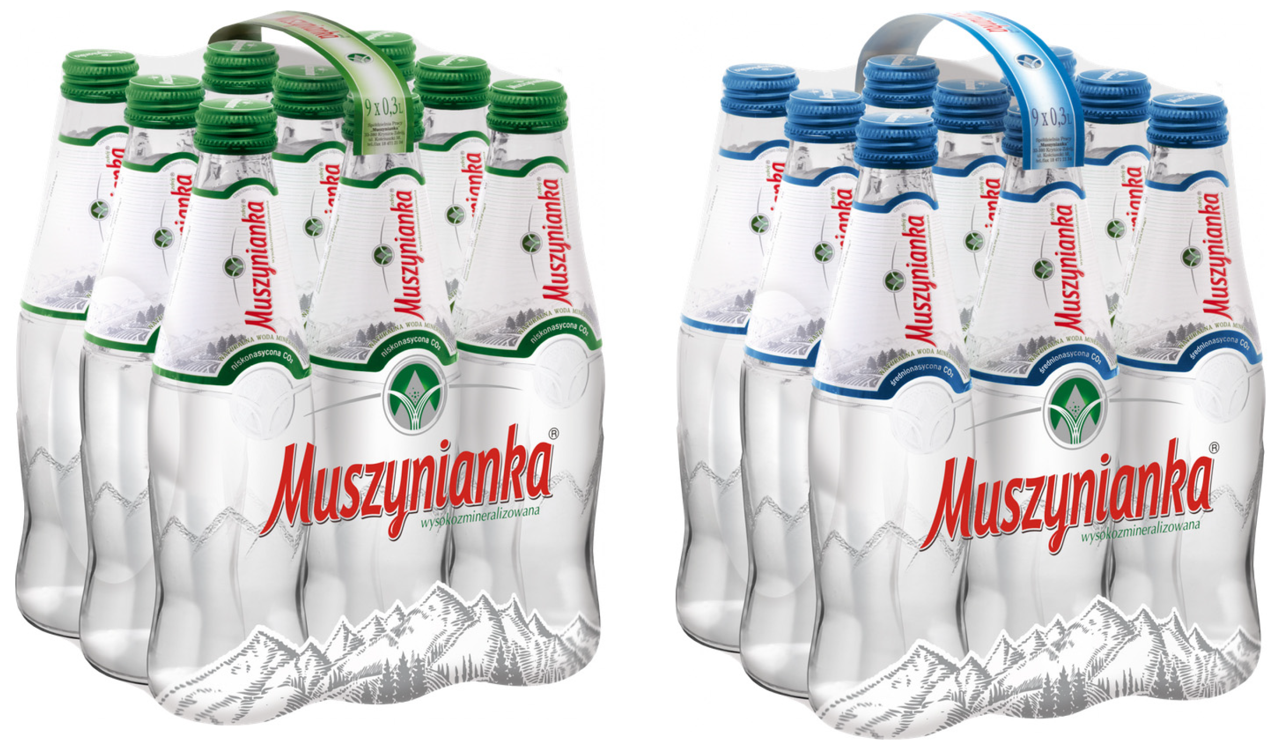
Muszynianka also offers water in glass bottles with a capacity of 0.3 L in medium and low-carbonated CO2 versions. This is a premium version of water available to standard customers in retail chains. It also appears in restaurants and hotels, to which the manufacturer sells water directly. The fact that this is a premium product may also be evidenced by the bottle made of embossed glass, on which an embossed mountain motif and a signet with the logo are visible. The labels of this product are highly minimalist, and the dominant color employed by the manufacturer is white. This solution is intended to emphasize the quality of the premium product. In both cases, the applied green and shades of blue constitute a decided minority, which makes this coloring work excellently on the delicate form of this bottle. These bottles began to be produced in March 2019 (0.3 L water, Figure 17 and Figure 18) and in January 2020 (0.7 L bottle, Figure 19), that is, long after the label of this brand had stabilized. Therefore, these bottles had no influence on the changes but are a result of the refinement of Muszynianka’s final image.

4.10. Visual Changes to the Logo on the Label

Muszynianka water has changed its appearance over the years. It is difficult to determine unequivocally when a conscious decision to unify the brand was made, as such data have not been preserved in the archives. However, by analyzing the labels, certain changes can be observed. Initially, Muszynianka altered the form of its typography until 1997. The name, rendered typographically on each design, appeared together with a separate graphic symbol of the “Muszynianka” cooperative, which was established on 23 June 1951. This symbol consisted of a triangular mountain and two springs flowing evenly from the center to the right and left. This symbol always accompanied Muszynianka, but it is difficult to speak here of an official logo with a signet.
From 1998 onward, the typography applied in the products is very similar to what we currently see on the bottles. It is believed that this period can be classified as the time of the logotype’s creation. Indeed, at the end of the 1990s, the symbol of the “Muszynianka” Cooperative appears on the label; however, its presence in no way conforms to the principles of logo design, as it appeared in various locations on the label until 2009, not always being in close proximity to the logotype. In the labels from 2003 and 2006, the symbol of the “Muszynianka” cooperative appeared above the Muszynianka inscription, but not in all locations. Therefore, it is difficult to speak of conscious brand building here. Although this period may have gradually prepared customers for changes in the brand’s image.
The unification of the logo was brought about in 2011, as the graphic symbol of the Muszynianka Cooperative was always placed in conjunction with the logotype. Although it differed from the contemporary version (the signet was somewhat more geometric and simplified), it can be safely stated that this is the time when this element of visual identification was stabilized. The official rebranding took place in 2013, and the visual changes initiated in 2011 were intended to stabilize the new logo design and accustom customers to it. These changes would result in the merging of the logo of the Muszynianka Cooperative and the logotype of Muszynianka water. The label from 2016 fully embodies this fusion. To the present day, on all labels, the logo appears precisely in this construction, that is, signet + logotype.

5. Analysis of Topoi on Muszynianka Labels

5.1. Methodology of Topoi Analysis

Topoi analysis, inspired by the works of Erkki Huhtamo (Huhtamo and Parikka 2011) within media archaeology, consists of identifying and tracking recurring themes, motifs, clichés, and formulas (topoi) in media culture. Topoi are often unconscious, widely accepted patterns that structure messages. The research conducted for the purposes of this article consisted of the following stages:
  • Identification of potential topoi. Based on visual and contextual analysis (product type), the authors initially identified recurring, significant visual and narrative motifs on Muszynianka labels.
  • Operationalization. For each topos, specific visual and textual indicators were determined, which allow for its recognition (e.g., for the “Nature” topos: images of mountains, green/blue color, keywords such as “spring”).
  • Diachronic analysis. The authors analyzed the occurrence and method of realization (variations) of topoi on labels from different periods (Figure 1, Figure 2, Figure 3, Figure 4, Figure 5, Figure 6, Figure 7, Figure 8, Figure 9, Figure 10, Figure 11, Figure 12, Figure 13, Figure 14, Figure 15, Figure 16, Figure 17, Figure 18 and Figure 19), analyzing changes in form and meaning.
  • Interpretation. The authors attempted to interpret the meaning and function of topoi in brand communication and their relationship with cultural trends.

5.2. Identified Topoi on Muszynianka Labels

5.2.1. Topos of Nature/Mountain Origin

  • Operationalization: Images/illustrations of mountains, landscapes, water; dominance of green and blue colors; keywords related to nature.
  • Analysis: Almost absent at the beginning (Figure 1 and Figure 2), appears clearly from the mid-1990s (Figure 3 and Figure 4) and becomes dominant from the late 1990s (Figure 6, Figure 7, Figure 8, Figure 9, Figure 10, Figure 11, Figure 12, Figure 13, Figure 14, Figure 15, Figure 16, Figure 17, Figure 18 and Figure 19). Realized through visual representations and green coloring. Communicates natural origin, purity, health. Evolves from literal photography to stylized illustration.
  • Interpretation: In Western culture, mountains symbolize purity, primitiveness, majesty, and a source of unpolluted water. The Muszynianka brand seems to consciously position its product in this context. It thus appeals to deeply rooted human desires, related to authenticity and naturalness in a world that is becoming increasingly industrialized and polluted1. The image of mountains becomes a semiotic sign (de Saussure 1991; Barthes 2000) whose significance (signifié) is not only a specific landscape but, above all, connotations of purity, health, and natural mineral wealth. The green color strengthens this connection, symbolizing nature, growth, freshness, and potentially also ecology (Kress and van Leeuwen 2006; Itten 2015). The evolution from literal photography to stylized illustration in later labels may reflect a change in aesthetics towards greater symbolization and minimalism, but the core of the topos—natural, mountain origin as a guarantee of quality—remains unchanged. It is a key element of the marketing strategy, distinguishing mineral water from ordinary drinking water.

5.2.2. Topos of Health/Vitality/Purity

  • Operationalization: White, blue, green colors; information about mineral composition; representations of water as pure (bubbles—Figure 5, glass—Figure 3); minimalist design.
  • Analysis: Elements appear gradually. Coloring (blue, green, white) builds associations with freshness. Information about composition (from Figure 3) provides health arguments. Minimalism in newer labels (Figure 12, Figure 13, Figure 14 and Figure 15) visually strengthens the message of purity.
  • Interpretation: This topos responds to growing social health awareness and the “wellbeing” trend. Mineral water is positioned as a healthy alternative to other beverages. The white background in newer labels (Figure 13 and Figure 14) communicates not only purity in the literal sense (lack of contaminants) but also simplicity, honesty, and transparency of the brand (Sprinkle 2019). The presentation of mineral composition, although legally required, becomes an element of health rhetoric, providing “scientific” evidence for the benefits of drinking Muszynianka. Minimalist design (Figure 13 and Figure 14) strengthens this message, suggesting a product that is uncomplicated, natural, devoid of unnecessary additives. The visual purity of the label becomes a metaphor for the purity of the product itself. It is a response to consumers’ search for products that support a healthy lifestyle and give a sense of control over what they consume.

5.2.3. Topos of Modernity/Technology

  • Operationalization: Modern, sans-serif typefaces; digital techniques (gradients); minimalist design.
  • Analysis: Realized mainly through stylistics. Gradients in the 90s/2000s (Figure 4, Figure 6, Figure 7, Figure 8, Figure 9, Figure 10, Figure 11, Figure 12, Figure 13, Figure 14, Figure 15, Figure 16, Figure 17, Figure 18 and Figure 19) communicated technological modernity. Current minimalism (Figure 14, Figure 15, Figure 16, Figure 17, Figure 18 and Figure 19) fits into the contemporary understanding of modern aesthetics. There is an interesting connection with the Nature topos—modern design communicates a natural product.
  • Interpretation: This topos introduces an interesting tension with the Nature topos. Although the product is natural, its packaging and visual communication use codes of modernity. In the 90s/2000s, this could signal the technological advancement of the company, professionalism, and ability to compete in a modern market. Gradients and photography could also add dynamism. Contemporary minimalism (Figure 14, Figure 15, Figure 16, Figure 17, Figure 18 and Figure 19) communicates a different kind of modernity: elegance, sophistication, clarity of information, and perhaps compliance with digital aesthetics. Modern design becomes here a sign of quality, reliability, and attention to detail, which indirectly strengthens trust in the product. Through this topos, the brand shows that it is up to date with trends and expectations of the contemporary consumer.
The analysis of topoi shows how Muszynianka consistently builds its image around key associations (nature, health, purity), adapting visual forms to changing aesthetic and technological trends (Huhtamo and Parikka 2011). Key to understanding Muszynianka’s visual communication is recognizing how these topoi coexist and mutually reinforce each other on the labels. Modern design (Topos of Modernity) serves as a frame for presenting natural origin (Topos of Nature). It suggests that the product is both authentic and produced with high quality standards. Visual purity (part of the Topos of Health/Purity) harmonizes with natural origin, strengthening the message about the unpolluted quality of the water. Muszynianka labels thus become performative cultural texts2, which not only describe the product but actively construct its meaning in the consciousness of consumers. This happens through references to key cultural values (nature, health, modernity) and the use of repetitive, though evolving in terms of form, visual patterns to build a coherent brand image. Topoi analysis, rooted in the perspective of media archaeology, allows discovering these deeper layers of meaning hidden in seemingly simple artifacts of everyday use.

6. Conclusions

The analysis of food product labels contained in this article, conducted through the prism of media archaeology and treated as a case study of Muszynianka mineral water labels, leads to several conclusions. The authors confirmed that labels are more than just carriers of information. They function as complex media and artistic artifacts in which technological, material, regulatory, aesthetic, and cultural dimensions intertwine (Huhtamo and Parikka 2011; Klugowska 2023). Applying this perspective (media archaeology) allows for a deeper understanding of labels through the analysis of their materiality (Ernst 2012), non-linear history (Zielinski [2002] 2010), forgotten aspects, and the technical and regulatory “archives” (Ernst 2012) that shape them. Product labels are a form of multimodal communication. They combine text and images in a complex and convincing way (Klugowska 2023). Their analysis requires an interdisciplinary, even transdisciplinary approach.
The case study of the Muszynianka brand shows how the visual evolution of labels reflects broader changes in printing technologies, graphic design trends, and brand communication strategies (Bergstrom 2009; Jasiołek 2021). Technical analysis has shown the directions of experiments undertaken by designers in search of a visual brand identity. This was particularly evident in the 1990s in Poland, after the fall of communism, in an era of technical development and expanded possibilities for printing and DTP. Depending on when a given label was designed, the influence of the style dominant at the time can be seen in the graphic design. Muszynianka, like many similar companies, sought to improve its labels, which was possible thanks to technological developments and analysis of prevailing trends. Over time, the labels have been improved in many aspects: color scheme, typography, composition, narrative, theme, shape, form, and style. The current label is very minimalist and aesthetic, which is in line with contemporary design trends and consumer expectations.
On the other hand, the analysis of topoi proved to be a useful tool for identifying and tracking recurring themes (nature, health, modernity) in the brand’s visual communication. Thanks to this, we can see how these themes are used and adapted to strengthen the message (Huhtamo and Parikka 2011). It can be concluded that our article illustrates how the media function (e.g., the requirement to ensure composition) and the artistic function (e.g., the choice of aesthetics) intertwine in a material object such as a label (Parikka 2012).
Thus, an archaeological look at food labels opens up an interesting research perspective. It allows us to appreciate their complexity and significance as ubiquitous, yet often underappreciated, tools of communication; a unique genre of visual media; and consumer culture. A scientific and analytical look at these seemingly mundane objects reveals their hidden power and significance in everyday life.

Author Contributions

Conceptualization, P.L., A.A., and J.W.; methodology, P.L. and A.A.; writing—original draft preparation, P.L., A.A., and J.W.; writing—review and editing, P.L., A.A., and J.W.; visualization, P.L. and J.W.; All authors have read and agreed to the published version of the manuscript.

Funding

This research received no external funding.

Institutional Review Board Statement

Not applicable.

Informed Consent Statement

Not applicable.

Data Availability Statement

No new data were created or analyzed in this study. Data sharing is not applicable to this article.

Conflicts of Interest

The authors declare no conflicts of interest.

Notes

1
Interpretation based on cultural analysis of the meanings of nature, see, e.g., in the context of food packaging (Brucks 2017).
2
The concept of performative texts, which “do” something in culture, rather than just describe it, derives from speech act theory (J. L. Austin) and was developed in cultural and performative studies (e.g., Judith Butler). Here, it is applied to labels as artifacts shaping attitudes and definitions.

References

  1. Barthes, Roland. 2000. Mythologies. Translated by Adam Dziadek. Warsaw: KR Publishing House. [Google Scholar]
  2. Bednarz Doiczmanowa, Ewelina. n.d. Images of Ships on Alcohol Labels. Applied Art as a Tool for Preserving History, Unpublished manuscript.
  3. Bergstrom, Bo. 2009. Visual Communication. Warsaw: PWN Scientific Publishing House. [Google Scholar]
  4. BizRaport. 2025. MUSZYNIANKA SP. Z O.O. KRS: 0000800687. Available online: https://www.bizraport.pl/krs/0000800687/muszynianka-spolka-z-ograniczona-odpowiedzialnoscia (accessed on 2 May 2025).
  5. Brucks, Kerstin. 2017. ‘Nothing added, nothing taken away’—Or laboratory-made naturalness? The semiotics of food product packaging in Germany in the 1990s and today. International Journal of Food Design 2: 203–22. [Google Scholar] [CrossRef]
  6. de Saussure, Ferdinand. 1991. Course in General Linguistics. Translated by Krystyna Kasprzyk. Warsaw: National Scientific Publishing House. [Google Scholar]
  7. EMIS. 2025. “Muszynianka” Sp. z oo (Poland). Available online: https://www.emis.com/php/company-profile/PL/\_Muszynianka\_\_Sp_z_oo_pl_9350938.html (accessed on 2 May 2025).
  8. Ernst, Wolfgang. 2012. Digital Memory and the Archive. Minneapolis: University of Minnesota Press. [Google Scholar]
  9. Homolacs, Karol. 1927. Advertising and art. Beautiful Things 6: 82, (Cited in: Klugowska 2023). [Google Scholar]
  10. Huhtamo, Erkki, and Jussi Parikka, eds. 2011. Media Archaeology: Approaches, Applications, and Implications. Berkeley: University of California Press. [Google Scholar]
  11. Itten, Johannes. 2015. The Art of Color. Translated by Sławomir Figat. Krakow: D2D.PL. [Google Scholar]
  12. Jasiołek, Katarzyna. 2021. Packaging, or Perfuming Herring. About Graphics, Advertising, and Trade in the Polish People’s Republic. Warsaw: Marginesy. [Google Scholar]
  13. Kierunek Spożywczy. 2025. Muszynianka as the First to Enter Deposits! The Company Takes Responsibility for Its PET Packaging. Available online: https://www.kierunekspozywczy.pl/artykul,105513,muszynianka-jako-pierwsza-wchodzi-w-kaucje-firma-bierze-odpowiedzialnosc-za-swoje-opakowania-pet.html (accessed on 2 May 2025).
  14. Kittler, Friedrich A. 1985. Aufschreibesysteme 1800/1900. Munich: Wilhelm Fink Verlag. [Google Scholar]
  15. Klugowska, Anna. 2023. Discreet charm of everyday life. Labels of producers from Toruń and the region in the interwar period (based on the collections of the University Library in Toruń). Faces of Communication 15: 105–31. [Google Scholar] [CrossRef]
  16. Kress, Gunther, and Theo van Leeuwen. 2006. Reading Images: The Grammar of Visual Design, 2nd ed. London: Routledge. [Google Scholar]
  17. Małopolska. 2025. “Visiting Muszynianka…” Marshal’s Office of the Małopolska Voivodeship. Available online: https://www.malopolska.pl/aktualnosci/biznes-i-gospodarka/z-wizyta-w-muszyniance (accessed on 2 May 2025).
  18. Mila Muszyna. 2025. History—Mila Muszyna. Available online: https://milamuszyna.pl/historia-niezwyklego-uzdrowiska/ (accessed on 2 May 2025).
  19. Muszynianka. 2025a. About the Company. Available online: https://muszynianka.pl/o-firmie/ (accessed on 2 May 2025).
  20. Muszynianka. 2025b. Mineral Components. Available online: https://muszynianka.pl/skladniki-mineralne/ (accessed on 2 May 2025).
  21. Muszynianka. 2025c. Muszynianka—Development Is the Basis! Available online: https://muszynianka.pl/muszynianka-rozwoj-to-podstawa/ (accessed on 2 May 2025).
  22. Muszynianka. 2025d. Muszynianka Is Known Not Only in Poland. RP.pl. Available online: https://pro.rp.pl/abc-firmy/art12746601-muszynianka-jest-znana-nie-tylko-w-polsce (accessed on 2 May 2025).
  23. Muszynianka. 2025e. Muszynianka—Modern Enterprise with Traditions. Available online: https://muszynianka.pl/muszynianka-nowoczesne-przedsiebiorstwo-z-tradycjami/ (accessed on 2 May 2025).
  24. Muszynianka. 2025f. Muszynianka—Stronghold of Tradition, Breath of Modernity. Be Healthy Magazine. Available online: https://behealthymagazine.abczdrowie.pl/muszynianka-ostoja-tradycji-powiew-nowoczesnosci,7141384801258336a (accessed on 2 May 2025).
  25. Muszynianka. 2025g. Products. Available online: https://muszynianka.pl/produkty/ (accessed on 2 May 2025).
  26. Myczkowska-Szczerska, Anna. 2018a. Designing Visual Information—Introduction. Krakow: Publishing House of the Academy of Fine Arts in Krakow. [Google Scholar]
  27. Myczkowska-Szczerska, Anna. 2018b. Number and Proportion in Visual Communication. Krakow: Publishing House of the Academy of Fine Arts in Krakow. [Google Scholar]
  28. Newark, Quentin. 2005. The Designer’s Lexicon: The Illustrated Dictionary of Design, Printing, and Computer Terms. San Francisco: Chronicle Books. [Google Scholar]
  29. Parikka, Jussi. 2012. What is Media Archaeology? Cambridge: Polity Press. [Google Scholar]
  30. Poprawa, Marcin. 2020. Word-image spaces in propaganda leaflets of 1918–1939. An attempt at analysis in the light of textual linguistics and theory of visuality. The Art of Editing. Textual and Editorial Studies 1: 203–30, (Cited in: Klugowska 2023). [Google Scholar]
  31. Rose, Gilian. 2016. Visual Methodologies: An Introduction to Researching with Visual Materials, 4th ed. Thousand Oaks: Sage Publications. [Google Scholar]
  32. Rypson, Piotr. 2011. Not Geese. Polish Graphic Design. Warsaw: Karakter, (Cited in: Klugowska 2023). [Google Scholar]
  33. Sprinkle, David. 2019. The ‘Clean Label’ Trend—Has It Peaked? Progressive Grocer. May 16. Available online: https://www.google.com/search?q=https://progressivegrocer.com/clean-label-trend-has-it-peaked (accessed on 2 May 2025).
  34. Superbrands. 2025a. Muszynianka Is a Natural Mineral Water Extracted from Intakes Located in the Poprad Landscape Park in Mu. Available online: https://superbrands.pl/wp-content/uploads/2021/11/052-053_Muszynianka.pdf (accessed on 2 May 2025).
  35. Superbrands. 2025b. Muszynianka Is a Natural Mineral Water Extracted in Muszyna and Surroundings, from Intakes Located in the Poprad P. Available online: https://superbrands.pl/wp-content/uploads/2019/06/Superbrands19-29.pdf (accessed on 2 May 2025).
  36. The European Parliament. 2011. Regulation (EU) No 1169/2011 of the European Parliament and of the Council of 25 October 2011 on the Provision of Food Information to Consumers, Amending Regulations (EC) No 1924/2006 and (EC) No 1925/2006 of the European Parliament and of the Council, and Repealing Commission Directive 87/250/EEC, Council Directive 90/496/EEC, Commission Directive 1999/10/EC, Directive 2000/13/EC of the European Parliament and of the Council, Commission Directives 2002/67/EC and 2008/5/EC and Commission Regulation (EC) No 608/2004. Official Journal of the European Union L 304: 18–63. Available online: https://eur-lex.europa.eu/legal-content/PL/TXT/?uri=celex:32011R1169 (accessed on 3 May 2025).
  37. Tilgner, Damazy Jerzy. 1935. Labels, Design and Evaluation, Warsaw, (Cited in: Klugowska 2023).
  38. WODA24. 2025. Muszynianka—Krakow—WODA24. Available online: https://www.woda24.pl/muszynianka (accessed on 2 May 2025).
  39. Zakrzewski, Stanisław Z. 1937. Guide to the Use of Advertising, Warsaw, (Cited in: Klugowska 2023).
  40. Zielinski, Siegfrid. 2010. Deep Time of the Media: Toward an Archaeology of Hearing and Seeing by Technical Means. Translated by Gloria Custance. Cambridge: MIT Press. First published 2002. [Google Scholar]
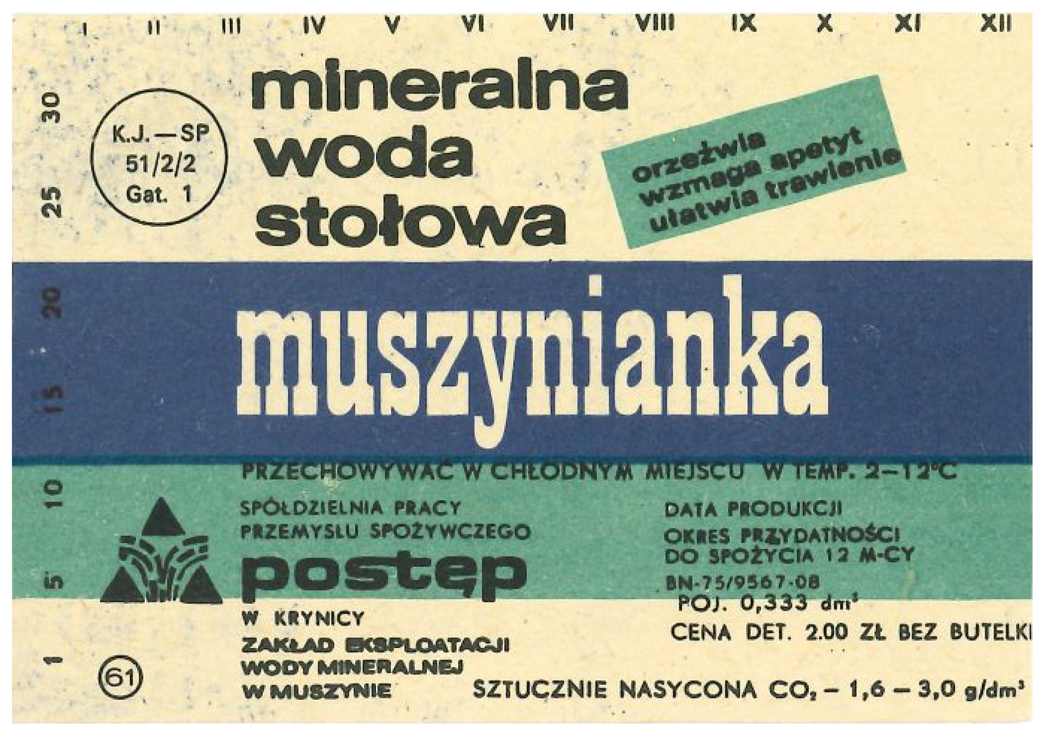
Figure 1. The earliest label from an undetermined year of origin (year xxx).
Arts 14 00122 g001
Figure 2. Label from 1991–1992.
Arts 14 00122 g002
Figure 3. Label from 1995.
Arts 14 00122 g003
Figure 4. Label from 1996.
Arts 14 00122 g004
Figure 5. Label from 1997.
Arts 14 00122 g005
Figure 6. Label from 1998.
Arts 14 00122 g006
Figure 7. Label from 1999.
Arts 14 00122 g007
Figure 8. Label for natural magnesium–calcium mineral water, carbonated, from the late 1990s.
Arts 14 00122 g008
Figure 9. Label for natural magnesium–calcium mineral water, non-carbonated, from the late 1990s.
Arts 14 00122 g009
Figure 10. Set of labels from 2003.
Arts 14 00122 g010
Figure 11. Set of labels from 2006.
Arts 14 00122 g011
Figure 12. Label from 2009.
Arts 14 00122 g012
Figure 13. Set of labels from 2011.
Arts 14 00122 g013
Figure 14. Label from 2016.
Arts 14 00122 g014
Figure 15. Two color versions of labels–current (2025).
Arts 14 00122 g015
Figure 16. Visualization of static composition construction with elements of dynamism.
Arts 14 00122 g016
Figure 17. Labels for Muszynianka water in 0.3 L glass bottle.
Arts 14 00122 g017
Figure 18. Muszynianka in glass bottle, shrink-wrapped in collective packaging made of heat-shrink film.
Arts 14 00122 g018
Figure 19. Labels for Muszynianka water in 0.7 L glass bottle.
Arts 14 00122 g019
Table 1. Dimensions and shapes of labels.
Year of ProductionHeightWidthNumber of Label Parts on the PackagingShape
xxx61 mm87 mmsingle-element labelRectangle
1991–199262 mm102 mmsingle-element labelRectangle
1995 90 mm90 mmsingle-element labelSquare
1996129 mm131 mmsingle-element labelMinor irregularities may result from label trimming during production. Nevertheless, the label should be classified as square in shape.
1997130 mm 130 mm single-element labelSquare
1998127 mm 287 mm single-element labelRectangle
1999130 mm (front and back)120 mm (front and back)two-element labelRectangle
Late 1990s—no precise date in company archives127 mm 287 mm single-element labelRectangle
2003132 mm (front and back)
45 mm (section at the upper part of the bottle)
124 mm (front and back)
85 mm (section at the upper part of the bottle)
three-element labelRectangle approaching square, and upper section of irregular shape
2004124 mm267 mmsingle-element labelRectangle
2005110 mm285 mmsingle-element labelRectangle
2006110 mm
25 mm (strip placed in the six-pack)
39 mm (section at the upper part of the bottle)
229 mm
210 mm (strip placed in the six-pack)
80 mm (section at the upper part of the bottle)
three-element labelTwo rectangles (label on the bottle and strip on the plastic packaging for the six-pack of bottles), upper section of irregular shape
2007110 mm 290 mmsingle-element labelRectangle
2009110 mm 290 mmsingle-element labelRectangle
2011110 mm
25 mm (strip placed in the six-pack)
37.5 mm (section at the upper part of the bottle)
292 mm
210 mm (strip placed in the six-pack)
76,5 mm (section at the upper part of the bottle)
three-element labelTwo rectangles (label on the bottle and strip on the plastic packaging for the six-pack of bottles), upper section of irregular shape
2016
Large bottle, green label
104 mm282 mmsingle-element label Rectangle
2016
Large bottle, blue label
104 mm282 mmsingle-element label Rectangle
2016
Small bottle, green label
56 mm 216 mmsingle-element label Rectangle
2016
Small bottle, blue label
56 mm 216 mmsingle-element label Rectangle
2025
Glass bottle 0.7 L, blue label
94 mm 79.7 mm upper section
170 mm lower section
single-element labelIrregular shape resembling the surface of a truncated cone
2025
Glass bottle 0.7 L, green label
94 mm 79.7 mm upper section
170 mm lower section
single-element labelIrregular shape resembling the surface of a truncated cone
2025
Glass bottle 0.33 L, blue label
78.2 mm94.7 mm upper section
163 mm lower section
single-element labelIrregular shape resembling the surface of a truncated cone
2025
Glass bottle 0.33 L, green label
78.2 mm94.7 mm upper section
163 mm lower section
single-element labelIrregular shape resembling the surface of a truncated cone
Disclaimer/Publisher’s Note: The statements, opinions and data contained in all publications are solely those of the individual author(s) and contributor(s) and not of MDPI and/or the editor(s). MDPI and/or the editor(s) disclaim responsibility for any injury to people or property resulting from any ideas, methods, instructions or products referred to in the content.