1. Introduction
Drought is increasingly impacting the American West, threatening major water supplies such as the Colorado River [
1]. Due to drought’s slow and elusive emergence and sometimes speedy intensification [
2], the phenomenon presents a challenge for stakeholders and society as a whole, in timely responsiveness [
3]. The drought research community has generally agreed that, due to its persistence, drought allows society to plan for mitigation strategies ahead of time as long as citizens are given actionable information about the developing state of affairs [
4]. However, despite state-of-the-art drought monitoring and forecasting systems that are currently in place the drought-prone American West still suffered multi-billion-dollar losses from recent severe drought conditions [
5]. Given the vulnerability of our society to future droughts, recent research has begun to examine not only the physical mechanism of drought, but also how society responds to drought [
6]. Moreover, in the sparsely populated American West, the situation is further hindered by a lack of in situ meteorological and soil observations that underlies adequate drought depiction as well as its prediction.
The use of social media, such as Twitter, has changed the information landscape for citizens’ participation in crisis response and recovery activities [
7,
8]. Social media has been used for information broadcasting during a variety of crisis events of both natural and human origins [
9]. The majority of these social media systems work on the principle of detecting variations from a baseline observation, such as the sudden increase in the use of certain predefined lexicons, as illustrated in [
10,
11,
12,
13]. Given that drought is a slow-moving process that is also spatially extensive [
14], interesting questions arise on how Twitter usage may change during the progress of a major drought, i.e., one that is felt by a population at large, as well as how usage change might aid in the detection of drought. Past reports such as [
15,
16] have revealed heightened peoples’ awareness, in recognizing the sudden threats posed by floods or fires, in Twitter posts; however, questions as to their awareness or information needs concerning droughts remain to be investigated. In the American West, we are also interested in first, learning the feasibility of human perception of drought through Twitter and second, can such observations can make up for data gaps in the ground station network?
Over the past few years, the computer science research community has made advancements in areas of machine learning and big data, which enables the use of technology towards exploring social responses to drought. The research of drought forecasting using machine learning models has gained prominence in recent years. Models have been developed using time series analysis [
17,
18], neural networks [
19,
20,
21,
22,
23,
24], fuzzy inference systems [
25], support vector regression [
26,
27,
28] and different ensemble techniques [
29,
30]. Although different models techniques have been designed in order to better understand and forecast drought, but various studies over the years have also suggested that a single indicator is not enough to explain the complexity and diversity of drought [
31,
32]. These models mainly use meteorological and hydrological observations as input without considering human-dimension data.
In the meantime, Twitter has made it easier to access past tweets through their Application Programming Interfaces (APIs) that enable two computer applications to access each other’s data. The aforementioned means that social media data affords an investigator a huge source of unstructured big data. The use of deep learning techniques in a variety of applications (including natural language processing) also has further enabled researchers to analyze social media data at an expanded scale and with high accuracy [
33,
34]. Thus, the ability to obtain social media information coupled with the emergence of recent computer science techniques suggests a fresh tactic towards evaluating drought emergence.
Social media postings feature human emotion, and various researchers have analyzed social media data to extract sentiments of peoples’ opinions in various contexts. Such approaches usually start by extracting text data from social media and then using sentiment analysis methods to capture user opinions and attitudes about a wide variety of topics including crisis management [
11,
35,
36,
37,
38,
39,
40]. In the USA, “#drought” and related hashtags on Twitter have been found to increase correspondingly during high–impact drought events [
8,
41]. Researchers also have attempted to use data from Twitter to study climate change perceptions [
42,
43]. The aforesaid studies reflect the potential of using social media platforms like Twitter coupled with sentiment analysis methods for analyzing the progression of a drought. Nonetheless, there are challenges associated with such analysis: First, past studies such as [
8,
42] have found that peoples’ concerns about climate-related matters were greatly influenced by media coverage, especially in the context of climate association with droughts and heat waves. Second, it is particularly difficult to automatically interpret humorous or sarcastic emotions in tweet content; this poses a considerable impediment in sentiment analysis.
It is feasible that a coupled analysis of social media data along with other meteorological sources, can enhance drought detection and capture the evolution of drought, especially in data-sparse regions like those that pervade the Western U.S. The analysis presented here features Twitter drought-related conversations during the most recent (2020–2021) drought in Colorado and how the addition of Twitter data affected drought monitoring.
2. Methodology and Data
The use of Twitter data to mine public opinion usually is structured as a pipeline that starts by collecting data regarding the event from Twitter, followed by processing and cleaning the data, and then finishes by passing the data through a prediction model. We chose to collect Twitter data because it has grown to be popular in the USA, owing to its effective 140-character tweeting capability where people can simply use their smartphones to tweet about different topics. The prediction model is evaluated against the actual outcomes of the event based on the chosen evaluation metrics.
2.1. Data Collection
Researchers developed a number of drought indices based on meteorological or hydrological variables for drought monitoring and forecasting. Examples of drought indices include, but are not limited to, Standardized Precipitation Index (SPI), Standardized Precipitation Evapotranspiration Index (SPEI), Palmer Drought Severity Index (PDSI), Palmer Moisture Anomaly Index (Z-index), and China-Z index (CZI). Among them, the Palmer Drought Severity Index (PDSI, [
44]) is one of the six more common drought indices for North America [
45]. The US Drought monitor
https://droughtmonitor.unl.edu/ (accessed on 2 July 2021), uses the PDSI as one of the many indices subjected to weighting of subjective basis from individual authors. We obtained PDSI data from the gridMET dataset from the
Climatology Lab (
http://www.climatologylab.org/gridmet.html, accessed on 2 July 2021). The data is updated once every 5 days. Besides PDSI, we also analyzed the groundwater and soil moisture conditions derived from NASA’s Gravity Recovery and Climate Experiment (GRACE) project given 94 their ability to measure the terrestrial water storage (i.e., variations in water stored at all 95 levels above and within the land surface). Through their “follow-on” satellites (GRACE-FO) and using data assimilation technique with the Catchment Land Surface Model, the fields of soil moisture and groundwater storage variations are derived from GRACE-FO’s liquid water thickness observation [
46]. The groundwater and soil moisture data used here as complementary indicators to PDSI are obtained from
https://nasagrace.unl.edu/ (accessed on 2 July 2021).
Twitter lets researchers access its data through two different tiered Application Programming Interface (API) services, Standard API and the Premium API. The Premium API is a subscription-based service, whereas the Standard API is free and primarily limited by a certain number of requests within a time frame. The premium tier of service provides access to the past 30 days of Twitter data or to the full history of Twitter data. We started by collecting tweets in real-time using the Standard Twitter API. For this, we searched for keywords which are closely related to drought, such as ‘soil moisture’, ‘streamflow’, ‘drought’, ‘DroughtMonitor’, ‘drought20’, ‘Drought2020’, ‘drought21’, ‘less water’, ‘crops’, ‘farmer’, ‘dry’, ‘dried’ etc. There could be many other terms or combination of terms for use. As shown in
Table 1, we see the top used words in 2019 and 2020 depending upon their usage frequency in the tweets. We wrote a Python script for collecting tweets that had location information of Colorado. However, using the real-time streaming setup has a compromise in that most tweets did not have a geo-location attached to them.
Next, we used Twitter’s Premium API to collect historical tweets along with the current ones. The premium API helped us add another search term to our query in the form of ‘profile_region:colorado’. This helped identify the tweets regarding drought originating from users whose profile location is in Colorado. Based on this method, we collected close to 38,000 tweets originating from Colorado during 2019, 2020 & 2021 (For 2021 the data collection period was January–April). Concerning the role of drought, the period in which our models were trained coincided with a developing drought. Thus, the inclusion of data that would incorporate times during which drought was varying could lead the models to reflect better PDSI variations. However, there is a downside, in that tweets about drought would decrease under “peace or leisure times” conditions (i.e., no drought tweets), in such cases data would be fairly limited and there is not a clear way of fixing this issue.
2.2. Data Cleaning
One of the challenges of Twitter data mining was the data cleaning step. Twitter users refer to the term “drought” in a variety of contexts, from referring to traditional climate drought to “trophy drought” or “playoff drought” in the context of a sporting event, and so on. Along with the above, another challenge we faced in data cleaning concerns the localizing of the data. As previously mentioned, we collected tweets from users whose ‘profile_region’ was set to ‘Colorado’ on Twitter. As a result, we had a number of tweets which, although being generated from Colorado, described the drought status for regions outside of Colorado. There were also instances where the term
‘drought’ was used as a proper noun to refer to a very popular music label. In
Table 2, we show some of the common terms we searched for to clean our data. Although in most cases we were able to completely remove a tweet if it contained one of the search terms, there were still some cases where a tweet containing an above search term could also have some reference to drought condition in Colorado. That made a labor-intense manual work, as we had to be careful while removing tweets so that Colorado drought related tweets did not get removed by mistake. This level of work echoes the saying “designing a good Machine Learning system comes with ample Man Labor!”. We acknowledge that a complex linguistic technique could have been developed for data cleaning but the main goal of this project was not to design a perfect data cleaning algorithm. In
Table 2, we present some of the search terms used to remove tweets not related to meteorological drought.
Tweets usually contain a lot of information apart from the text, like mentions, hashtags, urls, emojis or symbols. Normal language models cannot parse those data, so we needed to clean up the tweet and replace tokens that actually contains meaningful information for the model. The preprocessing steps we took are:
Lower Casing: Each text is converted to lowercase.
Replacing URLs: Links starting with ‘http’ or ‘https’ or ‘www’ are replaced by ‘<url>’.
Replacing Usernames: Replace @Usernames with word ‘<user>’. [e.g., ‘@DroughtTalker’ to ‘<user>’].
Replacing Consecutive letters: 3 or more consecutive letters are replaced by 2 letters. [e.g., ‘Heyyyy’ to ‘Heyy’].
Replacing Emojis: Replace emojis by using a regex expression. [e.g., ‘:)’ to ‘<smile>’]
Replacing Contractions: Replacing contractions with their meanings. [e.g.,“ca not” to ‘can not’]
Removing Non-Alphabets: Replacing characters except Digits, Alphabets and pre-defined Symbols with a space. [e.g., $heat@t> to heat t]
As much as the above preprocessing steps are important, the actual sequence in which the are performed is also important while cleaning up the tweets. For example, removing the punctuation before replacing the urls means the regex expression cannot find the urls. Same with mentions or hashtags. So in our data preprocessing step, we made sure that the logical sequence of cleaning was followed. The final count of the tweets from Colorado for 2019–2021 after the data cleaning was 25,597.
2.3. Sentiment Analysis
The goal of sentiment classification is to predict the general sentiment orientation conveyed by a user in a review, blog post or editorial. Such automated classification is generally conducted by two main approaches, a machine learning approach based on supervised learning of an annotated dataset, and a lexicon (or symbolic) approach which is based on lexicons and rules. Supervised machine learning techniques (such as KNN, Naive Bayes or SVM) use a manually annotated training dataset made up of samples which labelled as positive or negative with respect to the target event (i.e., the problem). Since these systems are trained on in–domain data, they do not scale well across different domains and are not easily generalized. For example, let us consider a supervised dataset consisting of labelled IMDB movie reviews, in which sentiments are labelled against the reviews which were written by expert people in movie industry using different words (dictionary) to explain their expert and lengthy opinions regarding movies. However in our case, the tweets are usually written by non-experts and generally short, usually 1–2 sentences (less descriptive) each. Thus, if we want to use the labelled movie dataset as our training data then it would not generalize well in case of tweets related to drought, which is not in the same domain as the opinions on movies. Another drawback of the above approach was that the training dataset needed to be sufficiently large and representative. To our knowledge, there is no drought related labelled dataset that could be used for our study. Towards that end, efforts have been made to develop techniques that rely less on domain knowledge. Such techniques include discourse analysis and lexicon analysis which takes into consideration several properties of natural language [
47].
To associate sentiment orientation with the context of the words we use Opinion lexicons. The idea is that each word in a sentence is treated in a way such that it holds critical opinion information and therefore provide clues to document sentiment and subjectivity. For that purpose, we used SentiWordNet introduced in [
47,
48], which provides a readily available database of terms and semantic (synonyms, antonyms, preposition) relationships built to assist in the field of opinion mining. Its aim was to provide term level information on opinion polarity that had been built using a semi-automated process to derive the opinion information by using the WordNet database [
49], and no prior training data is required. SentiWordNet is thus a lexical resource where every word on Wordnet is related to three numerical scores, namely Pos(s): a positivity score Neg(s): a negativity score Obj(s): an objectivity (neutrality) score. The scores are very precise, pertaining to the word itself along with its context. For each term in the WordNet database, a corresponding polarity score ranging from 0 to 1 is present in SentiWordNet. Each set of terms sharing the same meaning, a.k.a synsets, is associated with three numerical scores each ranging from 0 to 1, and the corresponding value indicates the synset’s objectiveness, positive and negative bias. In SentiWordNet it is possible for a term to have non-zero values for both positive and negative scores. A higher score carries a heavy opinion bias, or is highly subjective, and a lower score indicates a term is less subjective.
2.4. Machine Learning Methods
We chose 3 different machine learning techniques, generalized linear model, support vector machines and deep learning to analyze the data. Generalized linear models (GLM) are built on top of traditional linear models by maximizing the log-likelihood and also involves parameter regularization. GLMs are particularly useful when the models have a limited number of predictors with non-zero coefficients. The model fitting is comparatively faster than traditional linear models as the computations happen in parallel. A support vector machine (SVM) is defined as a technique that constructs a hyperplane or set of hyperplanes in a high or infinite dimensional space, which can be used for classification, regression, or other tasks. Intuitively, a good separation is achieved by the hyperplane that has the largest distance to the nearest training data points of any class (so-called functional margin), since in general the larger the margin the lower the generalization error. This SVM learning method can be used for both regression and classification and provides a fast algorithm and good results for many learning tasks. Parameters to suit the problem were selected by defining them in terms of a kernel function K(x,y). In short, SVM finds an adequate function that partitions the solution space to separate the training data points according to the class labels being predicted, under the assumption that future prediction follows the same pattern.
Lastly, we adopted the deep learning (DL) model. The selected DL method is based on a multi-layer feed-forward artificial neural network and the training process is optimized using stochastic gradient descent using the back propagation step. The DL network can contain many hidden layers consisting of neurons with tanh, rectifier and maxout activation functions. The operator starts a 1-node local cluster and runs the algorithm on it. It uses the default number of threads for the system with one instance of the cluster as defined in RapidMiner. Details are referred to
https://docs.rapidminer.com/latest/studio/operators/modeling/predictive/neural_nets/deep_learning.html (accessed on 2 July 2022). The selected Deep Learning operator is used to predict the “survived attribute” of the Twitter and GRACE datasets. Since the label is binominal, classification is first performed to check the quality of the model, while the Split Validation operator is used to generate the training and testing datasets. Our Deep Learning operator uses the default parameters in RapidMiner. This means that two hidden layers, each with 50 neurons was constructed. The operator then calculates the Accuracy metric for diagnostics.
2.4.1. Training Data and Control Run
To quantitatively evaluate the impact of social media data on the depiction of drought, we needed a baseline model to compare with. So we first created a regression model that only included meteorological variables gathered from the GRACE satellites as the independent variables, along with PDSI values as the dependent variable. We extracted shallow groundwater, root zone soil moisture and surface soil moisture from GRACE. There are two goals associated with this control run. First is to show what percentage of the observed variation in the PDSI values can be explained by the variation in the meteorological variables based on GRACE observations. Second, the obtained percentage would make the control run the benchmark for our social media-based models to compare against. We should emphasize that evaluating the correspondence between PDSI and GRACE measurements is not the focus of this paper.
We used the weekly GRACE data and PDSI data during the observation period in the training dataset, between 1 January 2019 to 31 December 2020, resulting in 104 data points. During the model training step, we separated out 40% of the data for testing purpose in order to calculate the performance of models, which means that we used 41 of the 63 data points and for testing. We also performed a 10-fold cross validation to remove bias in the models being trained. We applied additional “lags” of these variables from 1 to 3 weeks before the current week’s values in order to capture the progression of drought in terms of the weekly PDSI values. In total we had 12 independent variables as ‘features’ for building the baseline model with weekly PDSI as the dependent variable. The 12 independent variables are as follows: groundwater, groundwater_1_week_before, groundwater_2_week_before, groundwater_3_week_before, root_zone_soil, root_zone_soil_1_week_before, root_zone _soil_2_week_before, surface_soil, root_zone_soil_3_week_before, surface_soil_1_week _before, surface_soil_2_week_before, surface_soil_3_week_before.
Model 1 from
Table 3 shows the baseline control run model, which is the simplest model generated using only the meteorological variables.
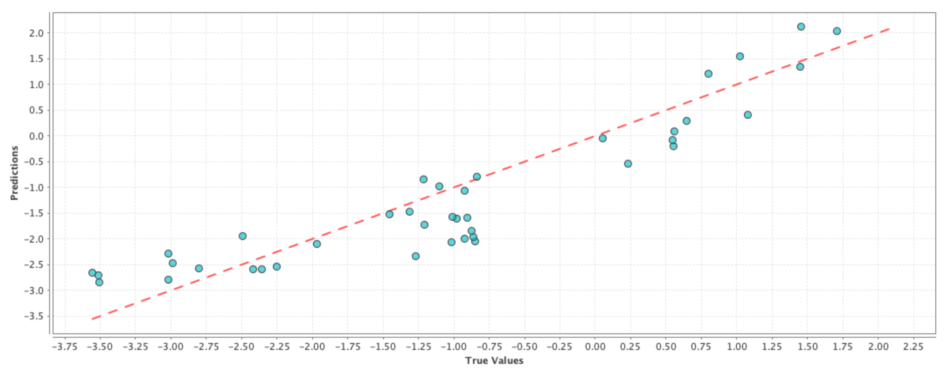
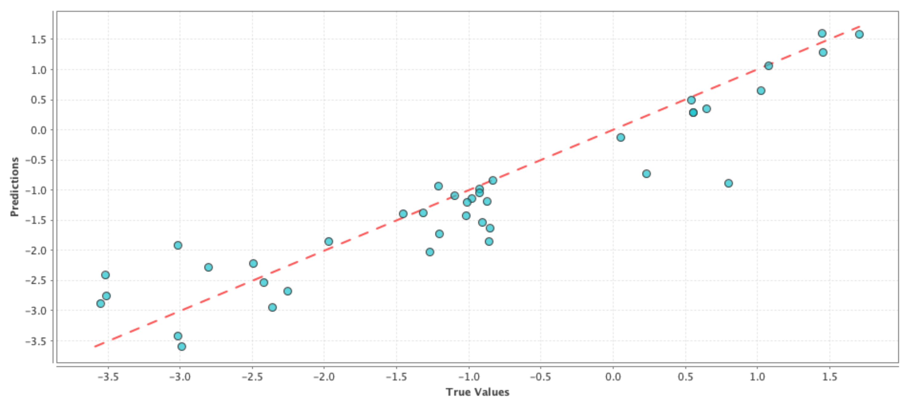
Figure 1,
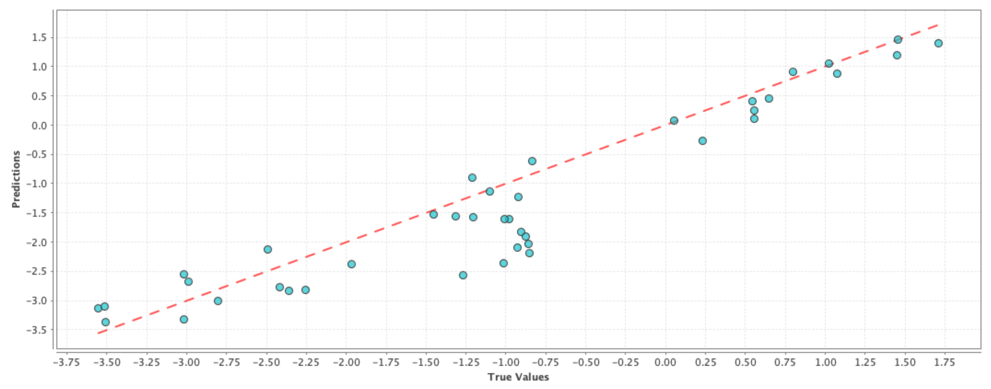
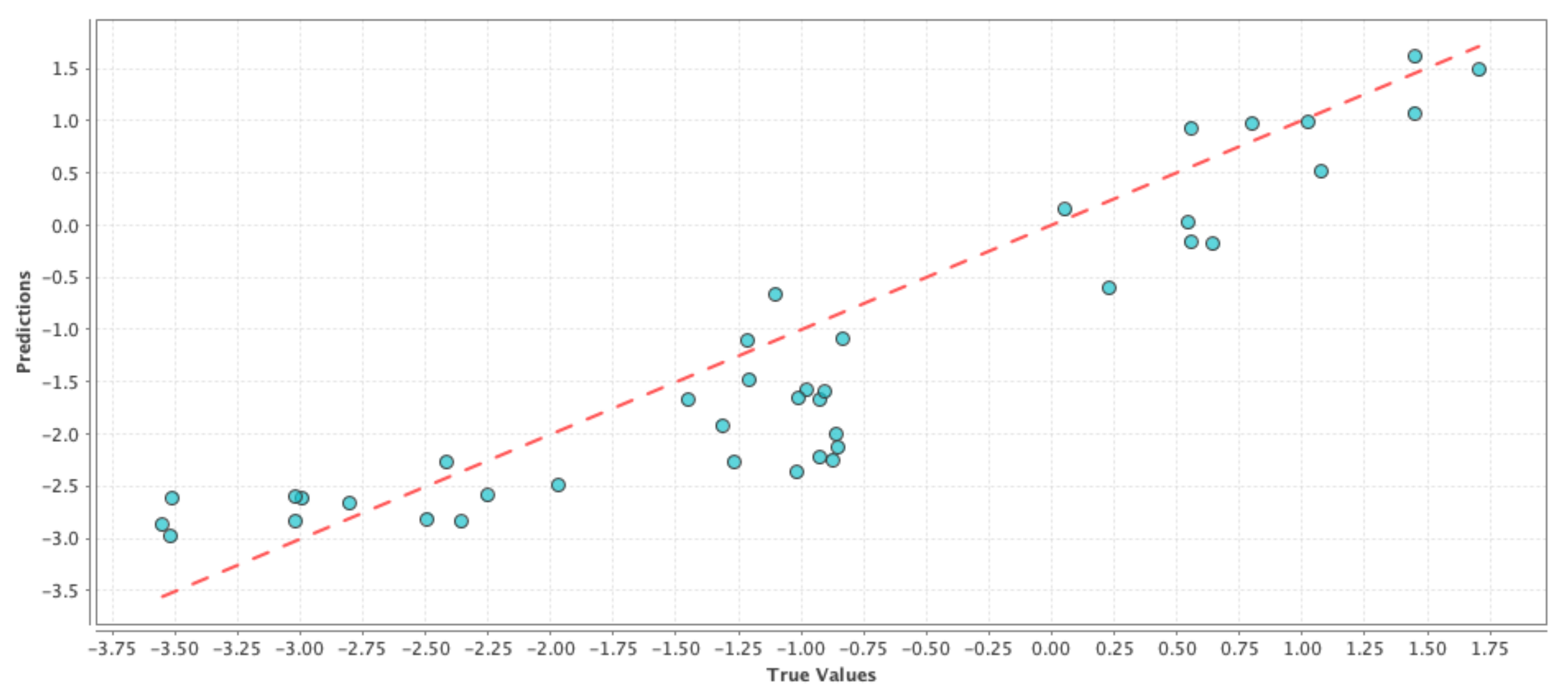
Figure 2 and
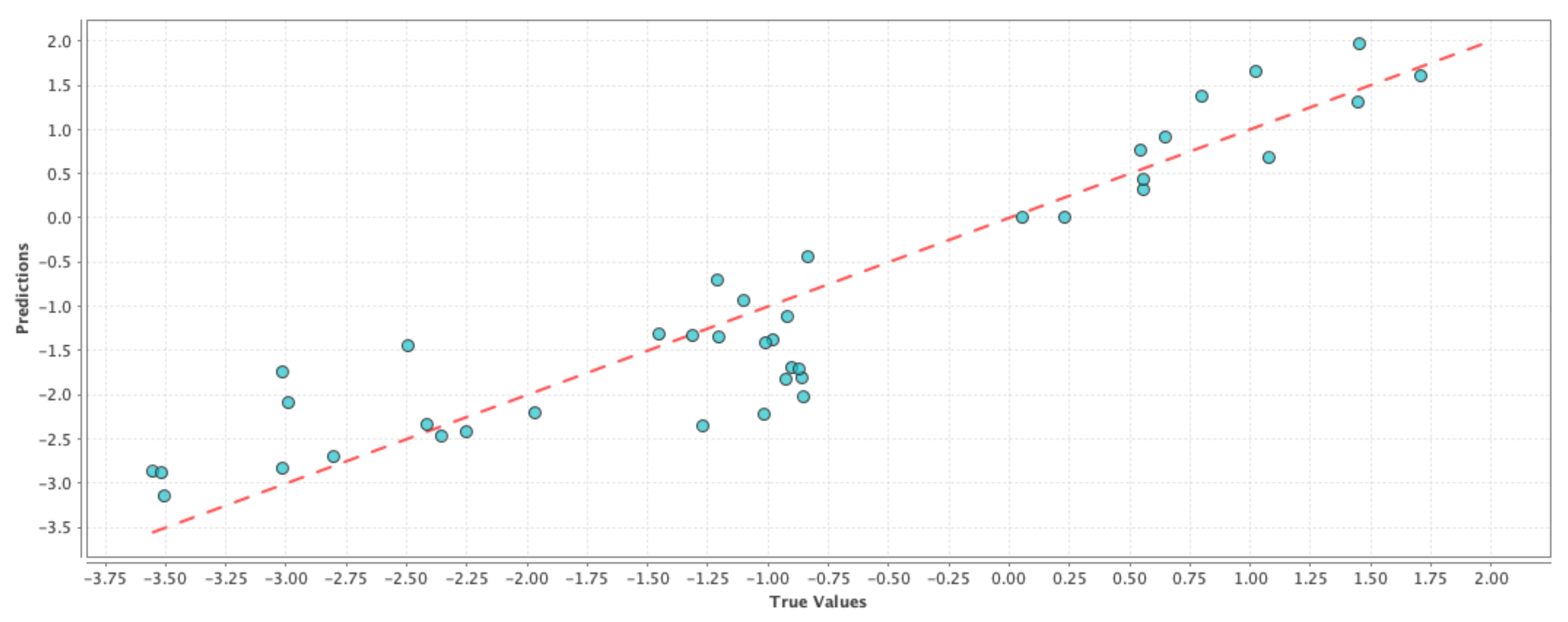
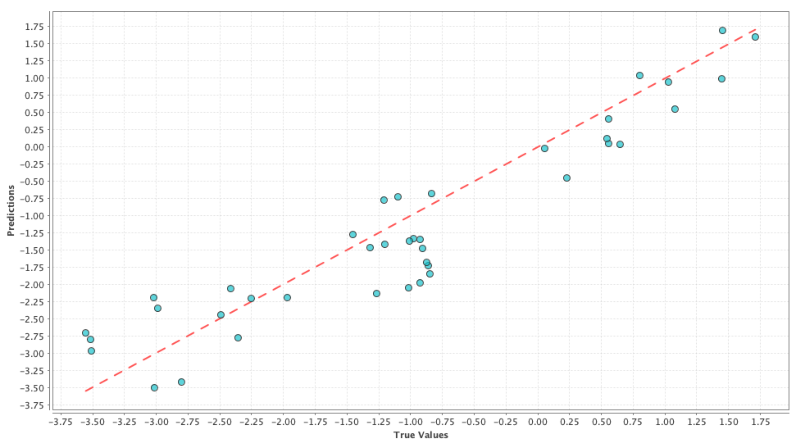
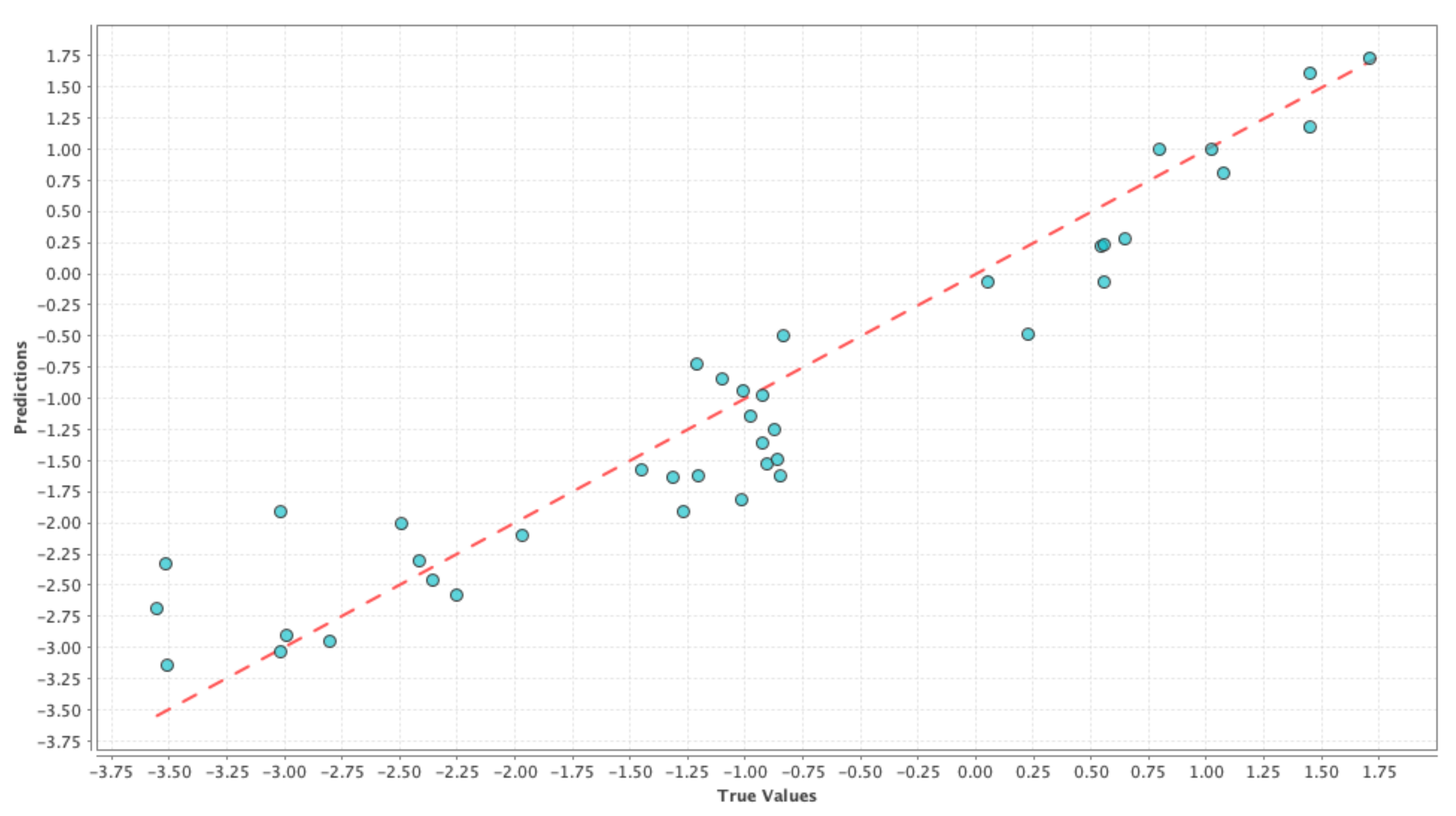
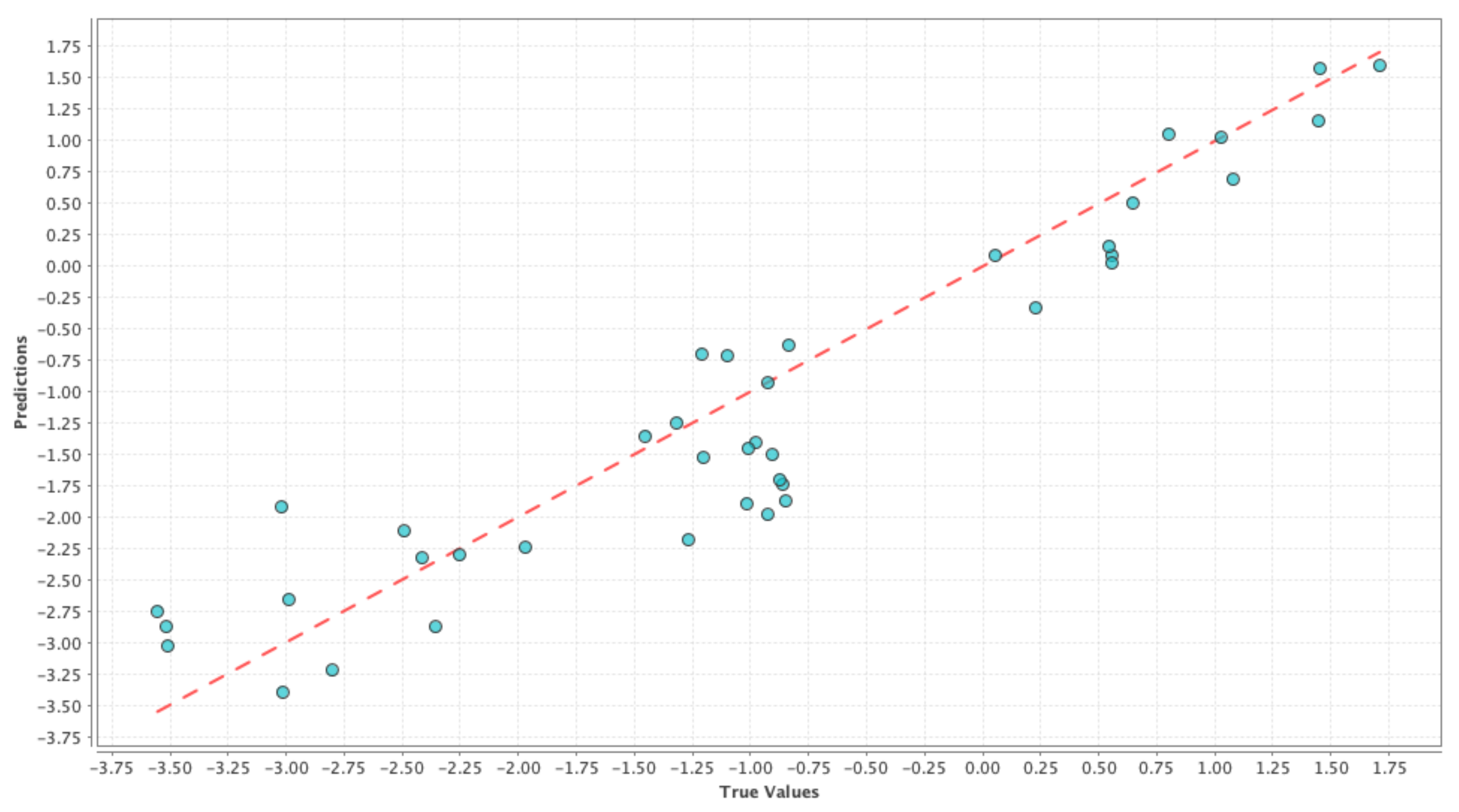
Figure 3 shows the results on test dataset for the generalized linear model, support vector machine and deep learning models, respectively. For each of those figures, the x-axis represents the true or the actual PDSI values and the y-axis represents the predicted PDSI values.
Each small blue circle in the figures is represented by the tuple (
,
), where
are the PDSI values predicted by the individual machine learning models and
are the actual PDSI values. The red dashed line is the reference line to test the model performance and each point on the line is represented as (
,
), thus the closer the blue circles are to the red line the smaller the error, and the better is the model performance. Root Mean Squared Error (RMSE) and correlation coefficient were chosen as the performance metrics and
Table 4 shows the comparison of performance between the different models. From
Table 4, we can see that the RMSE values are almost similar for all the cases and hence it is not possible to decide on a good model just based on RMSE values in this case. On the other hand, the correlation values in
Table 4 indicate that there is a high correlation between predicted values and the actual PDSI values. From the above results, we can say that the simple model generated using only meteorological variables can be used as our baseline control run for our social media-based models to compare against. This ‘drought’ control run henceforth is denoted by ‘D’.
2.4.2. Twitter Models
Before diving deep into building social media-based models, we wanted to examine what words people commonly use in their tweets while referring to drought.
Table 1 refers to the top used words in 2019 and 2020 depending upon their usage frequency in the tweets. Next, we proceeded with the sentiment analysis by using the ‘sentlex’ python library (Available at
https://github.com/bohana/sentlex) to generate the polarity score of the relevant tweets. Upon initiation, the python library reads the SentiWordNet v3.0 language resource into memory and compiles word frequency data based on the frequency distribution of lexicon words in NLTK’s Brown corpus. When we pass a sentence to the library, it first tokenizes or breaks the sentences and tags the relevant part of speech words (adjective, verb, noun and adverb) and assigns a tuple of numeric values (positive, negative) indicating word polarity known to the lexicon. It should be noted that when similar words in a sentence carry multiple meanings, then the opinion of each of those words is averaged out to obtain the output tuple of numeric values (positive, negative). In other words, the ‘sentlex’ library does not perform word sense disambiguation; rather, it just separates the words by part of speech. In the final step, we compare the positive and negative values of the tuple and then assign to a sentence, the label (positive or negative) which has the highest value in the tuple.
Table 5 shows some sample tweets with the corresponding sentiment categories after using the ‘sentlex’ sentiment analysis library. We note that Twitter users may fall into a certain age distribution (e.g., gender, geography, geo-location, and education level), so collecting only Twitter data could bias the result with respect to user groups.
2.4.3. Twitter–Data Model
Next, we added Twitter data to our control run and examined the changes in explanatory power. Our goal was to see whether addition of social media data resulted in a performance improvement over the control run model. The first step was to classify each tweet as positive or negative by using the aforementioned sentiment analysis model. The following step was to generate the counts of positive and negative tweets related to drought per week.
Table 3 shows the different combinations of Twitter data when added as individual features to the control run ‘D’. In
Table 3, ‘P’ represents the count of positive tweets. ‘N’ represents the count of negative tweets. ‘wN’ and ‘wP’ represent the count of negative and positive tweets ‘w’ weeks before, respectively. For example, ‘1P’ represents the count of positive tweets 1 week before and ‘2N’ represents the count of negative tweets 2 weeks before. In the next two sections we will be analyzing the results from two of the Twitter-based models (Model 6 and Model 10 from
Table 3).
We carried out our experiments about building a model able to predict PDSI values, using RapidMiner (
https://rapidminer.com/, accessed on 2 July 2021) which is an integrated environment that enables efficient prototyping for machine learning applications that can be used across various domains. RapidMiner has a wide selection of machine learning models per the needs of the task in hand. Their software automatically optimizes and chooses the best weight values for individual models depending on the dataset.
3. Results
We used the aforementioned machine learning techniques of generalized linear model, support vector machine and deep learning to train all of our Twitter-based models. The results are presented and discussed herein.
Model-6 D + P + N + 1P + 1N: The rationale behind this model was to capture the effect of people’s opinion on Twitter from the current week in observation along with their opinion from the previous week, and how the combined change in user perception regarding drought was reflected on the change in PDSI values. In machine learning terms, our goal was to see if a high percentage of the observed variation in the PDSI values can be explained by the variation in the features. The results comparing the RMSE and correlation coefficient of the test results are shown in
Table 6. If we compare
Table 4 and
Table 6, we can see that the correlation values have improved for the generalized linear model and deep learning techniques, while the RMSE values have improved for the generalized linear model and support vector machine techniques. We can see a similar effect in
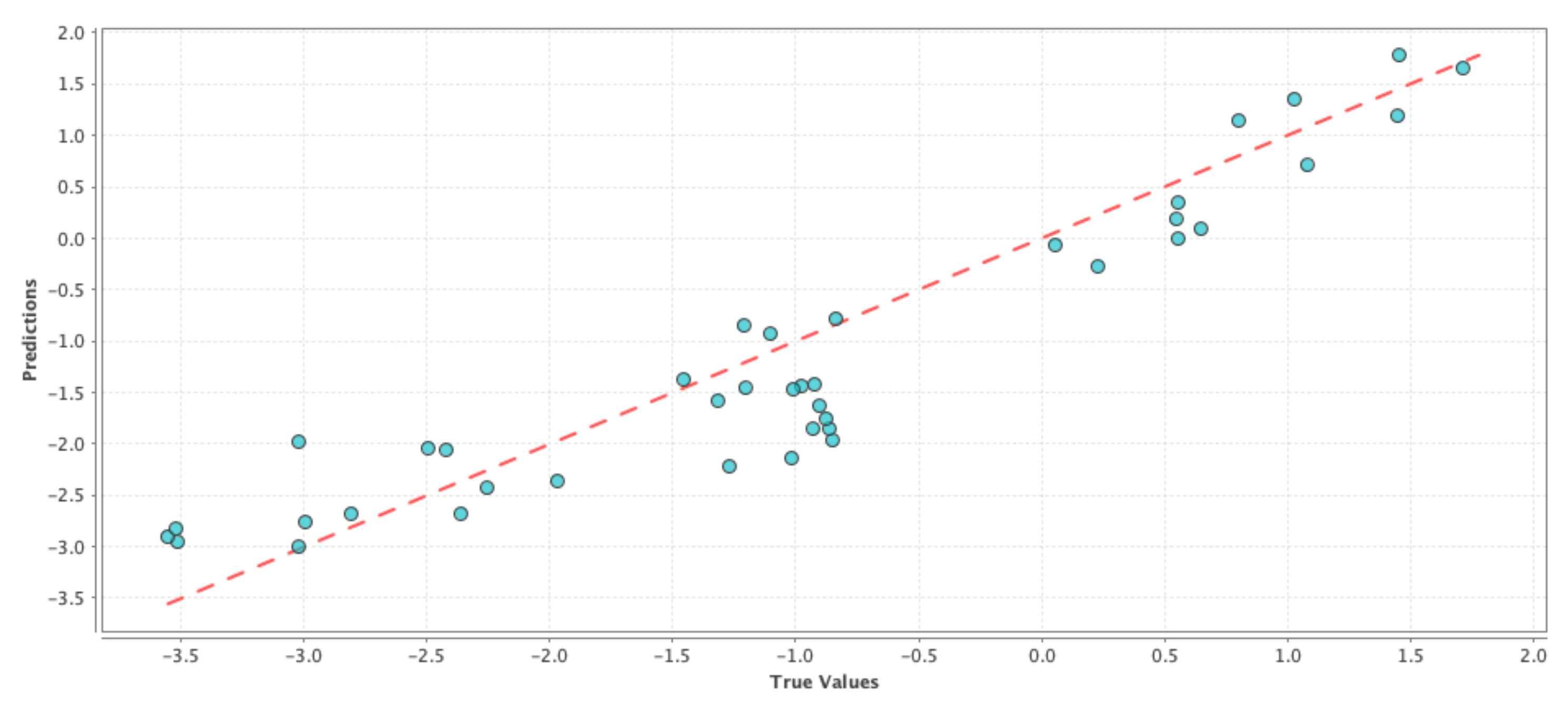
Figure 4,
Figure 5 and
Figure 6 where the blue circles are closer to the reference red line as compared to the ones in the case of the control run model. Although the improvement in performance is not significant, we can see that adding social media data as features gave more prediction power to the control run ‘D’.
Model-10 D + P + N + 1P + 1N + 2P + 2N: Similar to the previous model, the goal was to capture the change in the user perception regarding drought over a “two-week period”. Similar to the previous model, our goal was to see if a high percentage of the observed variation in the PDSI values can be explained by the variation in the features. The results comparing the RMSE and correlation coefficient of the test results are shown in
Table 7. If we compare
Table 4 and
Table 7, we can see that the correlation values with the inclusion of Twitter data have improved for all three cases and correspondingly the RMSE values have also improved for all three machine learning techniques. These effects are shown in
Figure 7,
Figure 8 and
Figure 9 where the blue circles are closer to the reference red line as compared to the control run model. If we compare the results in
Table 6 and
Table 7, we can see that there is a slight improvement in the performance due to the addition of an extra week of user perception from Twitter. Although the above performance improvements are not astonishing, we can still see that adding social media data as features resulted in a better prediction performance than simply using GRACE data alone.
Performance of Other Twitter Based Models: In this section, we will discuss the performance of all the models listed in
Table 3.
Figure 10,
Figure 11 and
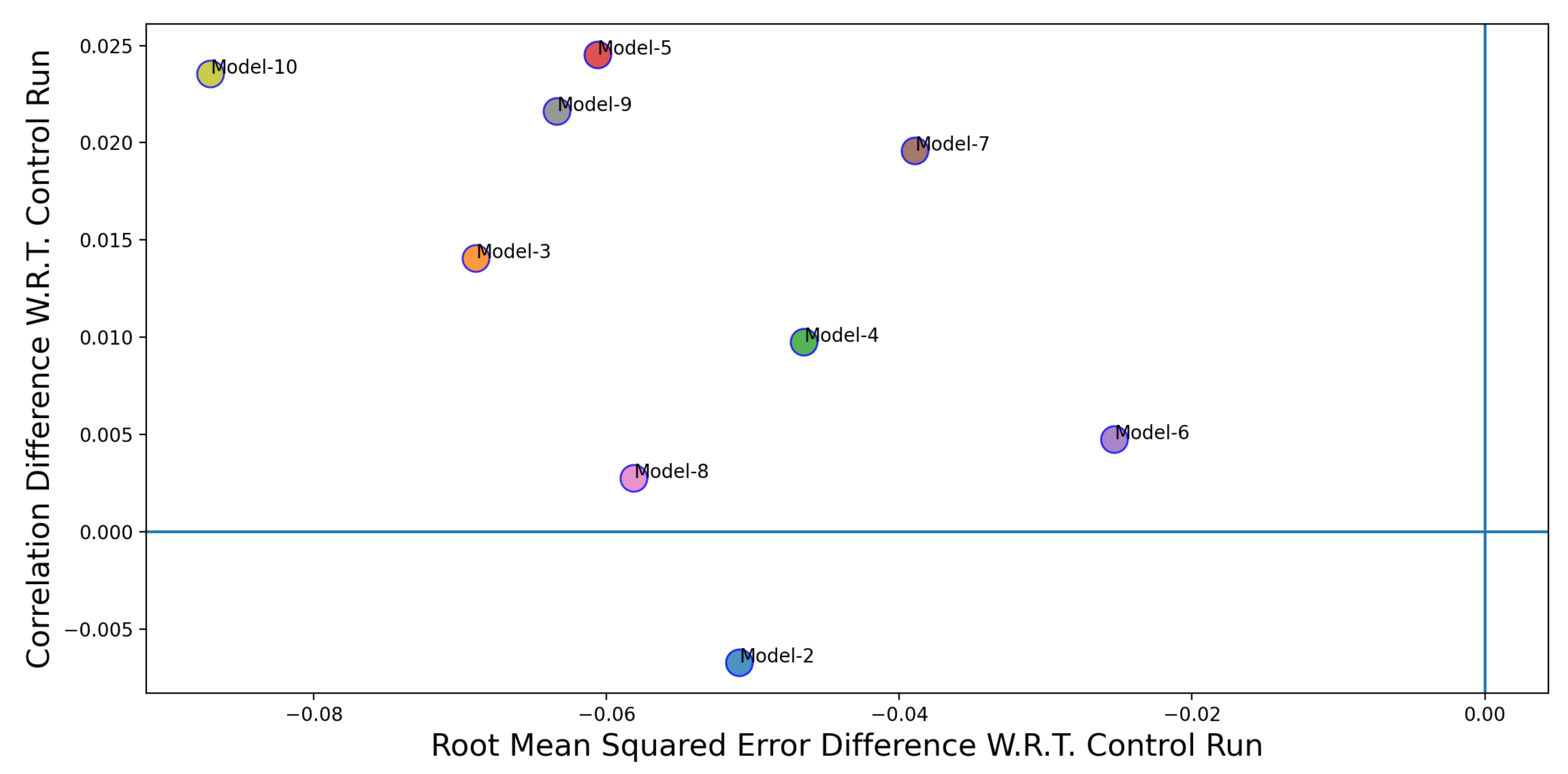
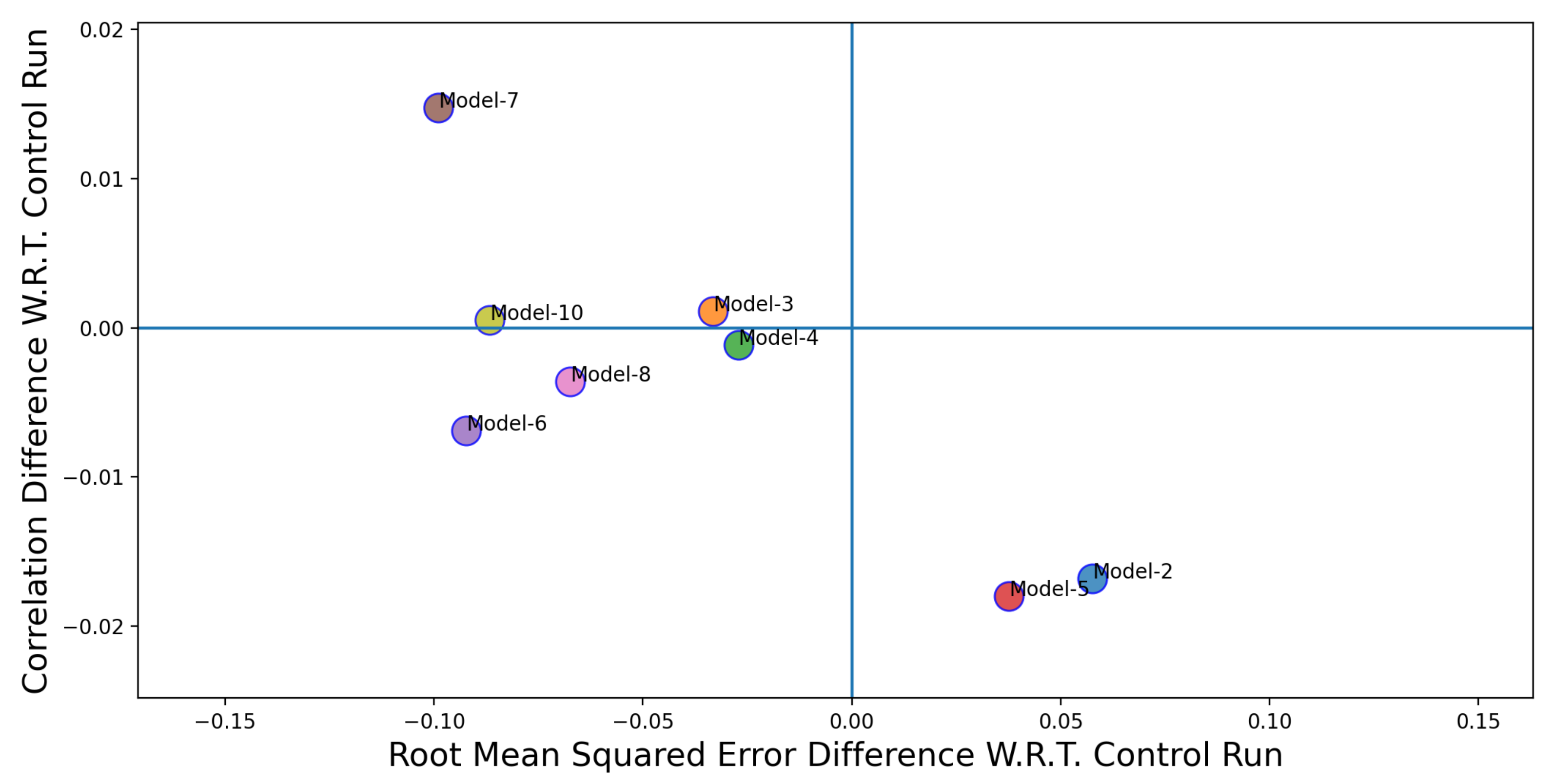
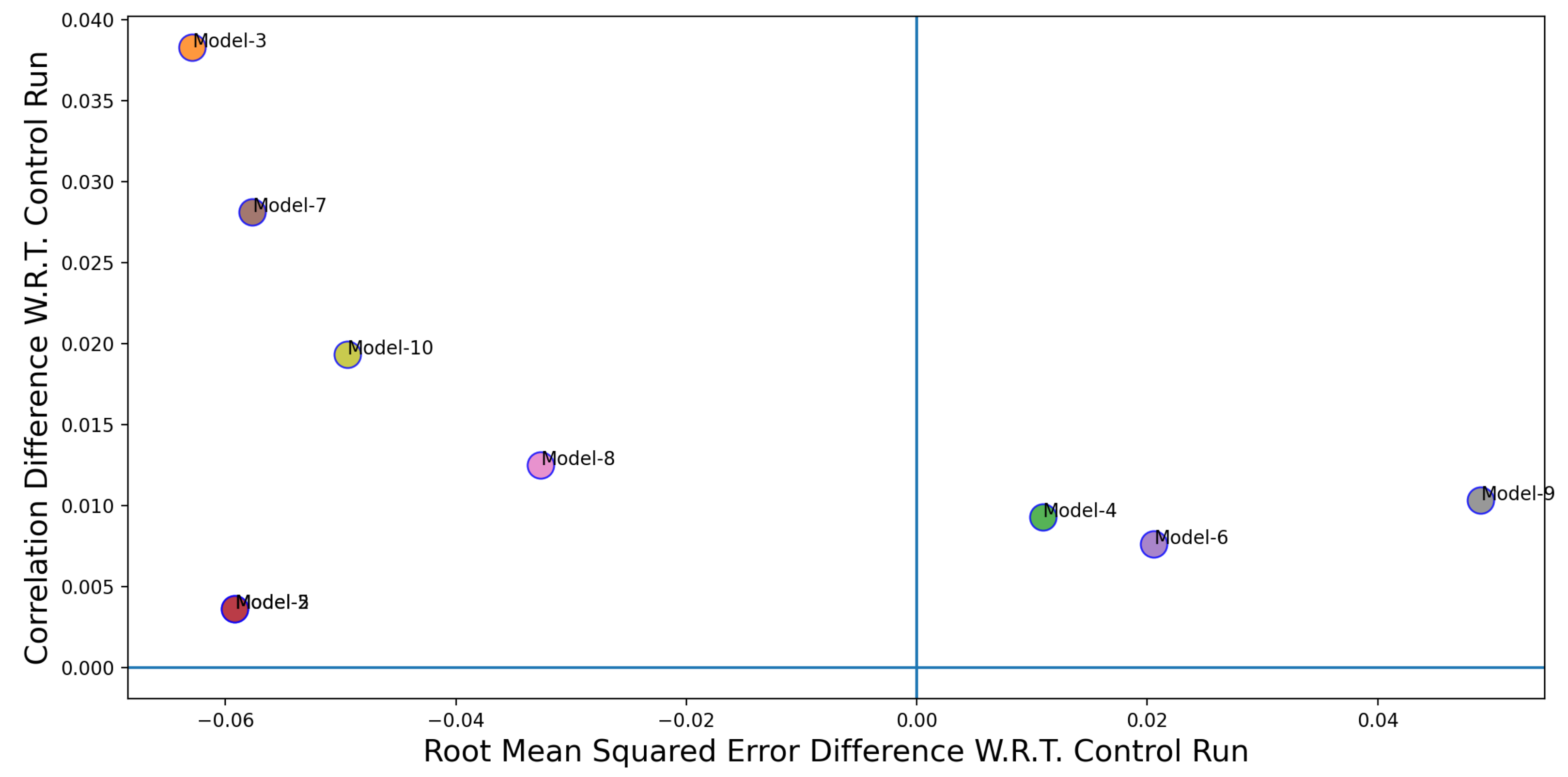
Figure 12 shows the performance comparison of individual Twitter-based models (Models 2–10 in
Table 3) over the control run (Model 1 in
Table 3). The x-axis in
Figure 10,
Figure 11 and
Figure 12 represent the difference between the RMSE values for the control run and the Twitter-based models. The y-axis represents the difference between the correlation coefficient values between the control run and the Twitter-based models. The coordinate position where the blue lines intersect is where the performance (in terms of RMSE and correlation coefficient) of the Twitter-based models and the control run are the same. In order to classify a model to be a better performer in comparison to the control run, its correlation value need to be higher and the corresponding RMSE value needs to be lower. Thus, a better performing model would appear in the top left quadrant in
Figure 10,
Figure 11 and
Figure 12. If models fall in the top right quadrant, then the performance improvement only exists in terms of the correlation coefficient. If the models fall in the bottom left quadrant then the performance improvement is only for RMSE. Finally, if the models fall in the bottom right quadrant then there is no performance improvement. From
Figure 10,
Figure 11 and
Figure 12, we can see that, except for two cases (Model 2 and 5), the Twitter-based models have shown a better performance over the control run model.
We also constructed
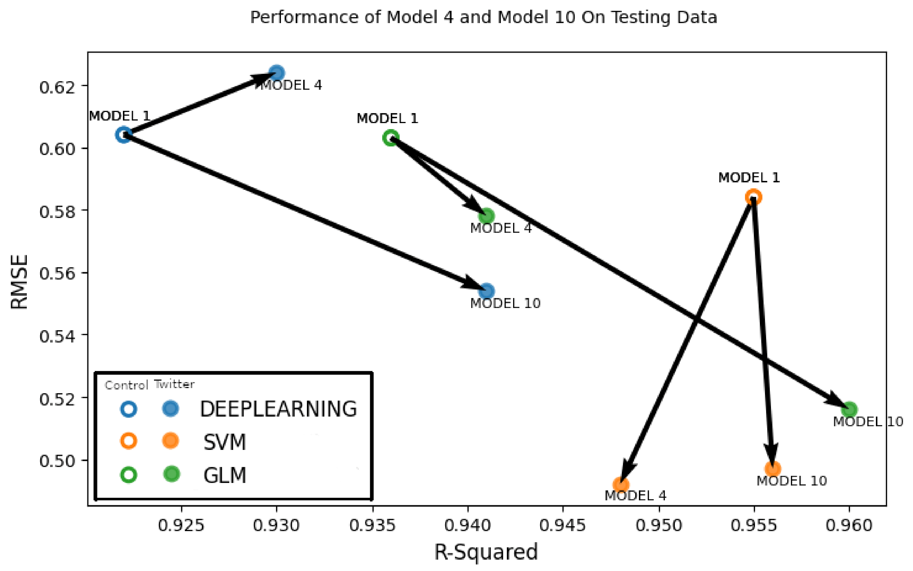
Figure 13, which shows the overall performance improvements of the two best-performing models, Model 6 and Model 10 in comparison to the baseline control run model. Each solid circle in
Figure 13 represent either Model 6 or Model 10, which is a Twitter-based model (
,
), where
model denotes either deep learning, support vector machine or generalized linear model. Each hollow circle in
Figure 13 represents the control run model (
,
) for either deep learning, support vector machine or generalized linear model. Arrows are drawn between the control run and Twitter-based models to visually delineate the performance improvements between the control run and the Twitter-based models (Model 6 and Model 10). A better performing model will have a lower RMSE value and a higher correlation coefficient (
) and the bottom right corner is the area which has the lowest RMSE and highest correlation values. Thus, any model for which the arrow points towards the bottom right means that the particular Twitter-based model has gained improvement over the control run. In
Figure 13, we can see that the generalized linear model of both Model 6 and Model 10 has a marked improvement over Model 1. We can also see that the performance improvement is greater in case of Model 10, which contains user perceptions from the current time period as well as from one and two weeks before. In the case of support vector machine (SVM), we see that there is no significant performance improvement for both models. In terms of the deep learning model, a performance improvement is evident in Model 10 but not in Model 6, which has an increased RMSE value. From these results, we can say that Model 10 was the overall better performer and showed quantifiable improvement over the control run model.
The following section summarizes the performance of our trained models on new and unseen data of 2021. We performed this analysis by first collecting Twitter data from Colorado during January–April 2021 (17 weeks of data). After cleaning the data and removing tweets based on the keywords and search terms in
Table 2, we were able to retain 4960 tweets. In a similar way as described in the previous sections, we applied the sentiment analysis model to the tweets and gathered the count of the number of positive and negative tweets per week for evaluation time period. We also collected the necessary GRACE and PDSI data for the same time period, while we ran this analysis for all the models listed in
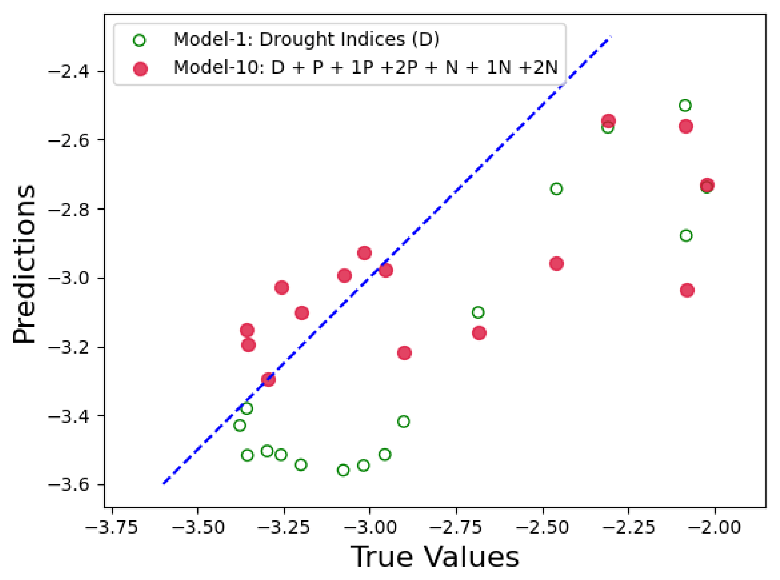
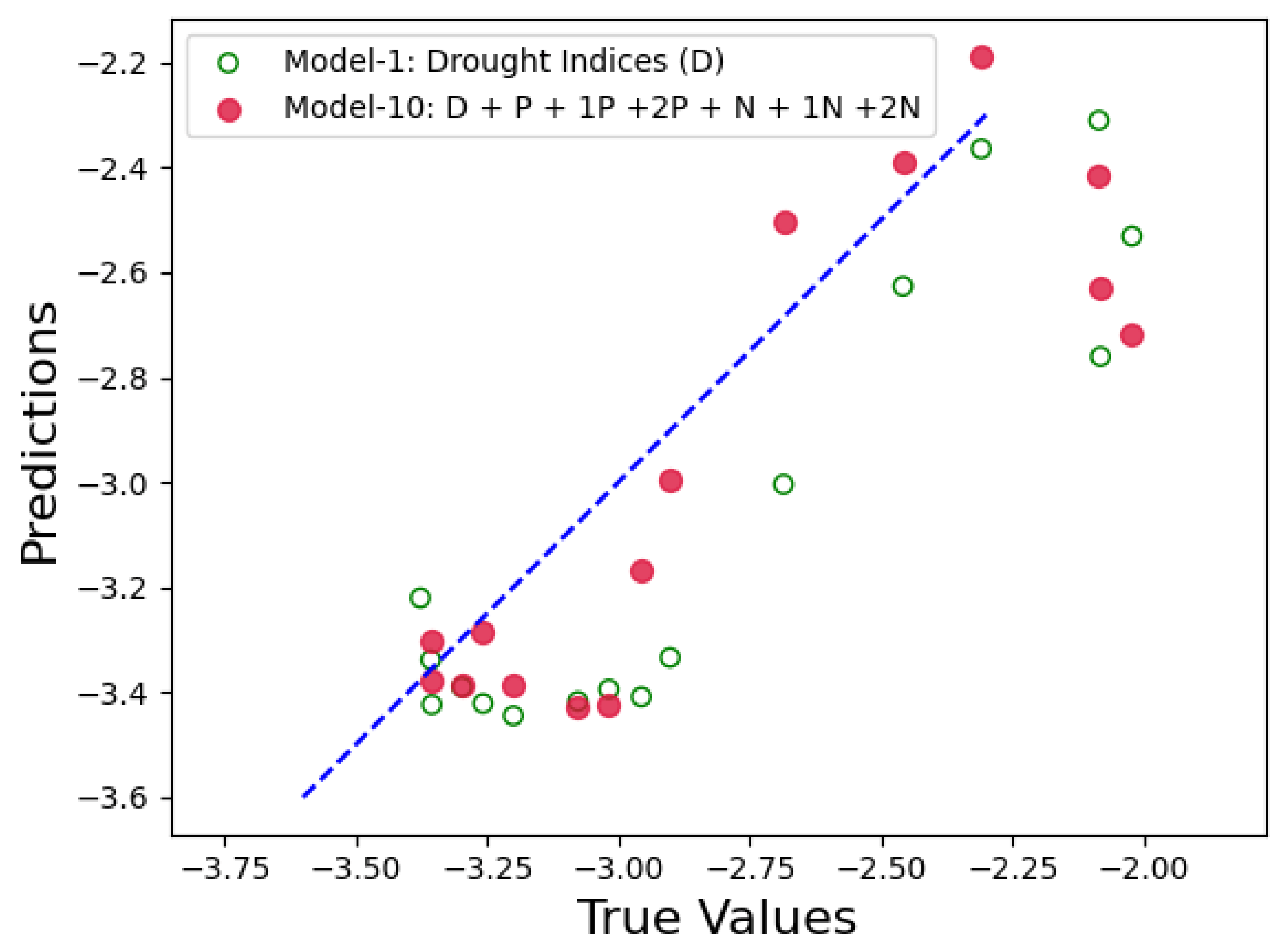
Table 3, for brevity we will only discuss the performance result for the “best performing model”, i.e., Model 10 (D + P + N + 1P + 1N + 2P + 2N).
Figure 14,
Figure 15 and
Figure 16 show the prediction results for Model 10 when compared to the control run model. In each figure, x-axis represents the actual PDSI values and y-axis represents the predicted PDSI. The red circles are the predictions by Model 10 represented by tuple (
,
), where
are the PDSI values predicted by Model 10 and
are the actual PDSI values. Similarly, the green hollow circles in the figures are the predictions by the control run model and is represented by the tuple (
,
). The blue dashed line is the reference line to test the model performance and each point on the line is represented as (
,
), thus the closer the green and red circles are to the blue line, the smaller the error and the better is the model performance. From
Figure 14,
Figure 15 and
Figure 16, we can see that the red circles (Twitter-based model) are much closer to the blue line than the green circles (control run model). From these results we can conclude that the Twitter-based model consistently outperforms the control run in predicting the PDSI.
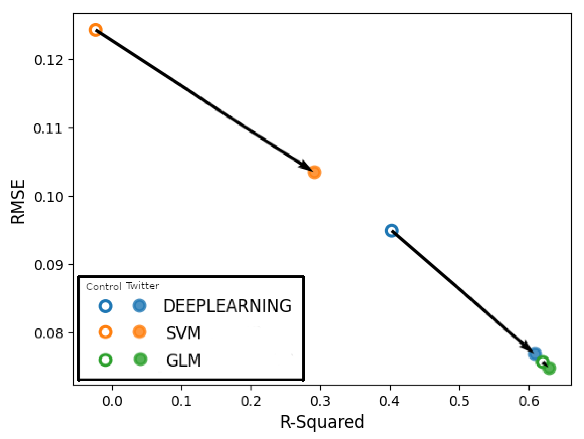
In
Figure 17, the x-axis represents the
values and the y-axis represents RMSE. Arrows are drawn between the circles representing control run and Twitter-based model for the deep learning, support vector machine and generalized linear model techniques, respectively. The arrows determine any performance improvement between the control run and the Twitter-based model (Model 10). The fact that all arrows are pointing to the bottom right, which indicates lower RMSE and higher
, means that Model 10 indeed outperforms the control run model.
Lastly, there could be a point of discussion about the possible effects of the release of the new
drought.gov site released in January 2021. Although there is a possibility that recently initiated drought chatters might affect the tweet volume, it should be noted that we did not use the 2021 data to train our models. Furthermore, our models only tell us if it was a positive or negative tweet, so if people have retweeted the NIDIS tweets then our system was able to capture that engagement.
4. Conclusions
In this study, we tested the feasibility of developing social-media-based models, supplementary to meteorological predictors, to anticipate PDSI and drought in Colorado. The starting point was to build the control run model; this was trained using weekly hydrologic and PDSI data during the observation period (1 January 2019 to 31 December 2020). Shallow groundwater, root zone soil moisture and surface soil moisture was extracted frrom GRACE data and “lags” of 1–3 weeks for each of the variables were applied prior to the current week’s values; this in order to capture the progression of drought. As noted previously 12 variables were utilized to build a regression model where PDSI was the dependent variable. Subsequently, a control run model was constructed by using three different machine learning techniques, i.e., a generalized linear model, support vector machines, and deep learning. The meteorological control run model was treated as the baseline in the evaluation of the impact of including social media data in the machine learning models.
Next, by using Twitter as the social media-based platform, tweets were collected based on keywords which were closely related to drought. It was found that there were user discussions were varied regarding drought during the time period of study. Throughout the analysis of the frequency of different words used, we observed a change in the user perception of drought as it continued to worsen over the 2019–2020 period. Furthermore, noteworthy was that a considerable number of tweets in the period of the analysis included links to government and academic websites serving as sources of information about drought conditions; this observation supports the notion that people used Twitter not only to complain about degrading drought conditions, but also as a source of information with respect to drought. Next, by generating the polarity score of the tweets as either positive or negative, we added the different combinations of scores to the control run model. The different combinations delineated here served as Twitter-based models.
To conclude, the results indicate that Twitter-based machine learning model can improve the forecast of PDSI in times of a developing drought. Of the 10 models tested, eight showed quantifiable improvements in the performance over the control run model in terms of RMSE and correlation coefficient. This is supportive of the hypothesis that including social media data adds value to the PDSI depiction. Such an improvement is further reinforced by testing the control run and Twitter-based models on previously unseen data during January–April 2021. We found that the Twitter-based model consistently outperformed the control run in predicting the PDSI values as the drought worsened.
Machine learning (ML) models have gained prominence in the area of drought forecasting. Researchers have developed models using time series analysis [
17,
18], neural networks [
19,
20,
21,
22,
23,
24], fuzzy inference systems [
25], support vector regression [
26,
27,
28] and different ensemble techniques [
29,
30] to detect and forecast drought. Despite the new insights machine learning can provide, recent studies suggest that any single indicator alone is not enough to explain the complexity and diversity of drought [
31,
32].
ML models also thrive on good quality data. One of the important improvements lies in data collection. Thus, increasing the training dataset in terms of both Twitter and meteorological data can lead to an improvement of ML models. A further improvement would be in the sentiment analysis step, like how to reduce vulnerability to drought through an improved understanding of the interactions between society and physical processes, while there is a growing appreciation that the information landscape for citizens’ participation in crisis response and recovery activities is improving, it is not clear what the role of social media will be in slow developing threats as the case for drought. An improved language model could be deployed that could capture the word(s) embedded in tweets that depict how people tweet with respect to drought over different periods of time.
In this work, we focused on Colorado from where we were able to collect good quality Twitter data regarding drought. Since drought has been worsening over the American West, we believe that our approach could be used to study drought progression across other states such as Utah, Arizona, California and Nevada. Thus, another future goal is to study how well the Twitter-based models perform across different states.
