We build upon the age-stratified SEIR model developed by Britton et al. [
5], which is described in greater detail in the
Supplementary Material of [
34]. In
Appendix A.1–
Appendix A.5, we explain how the model works in its most basic setup, enough to produce the red curve seen in
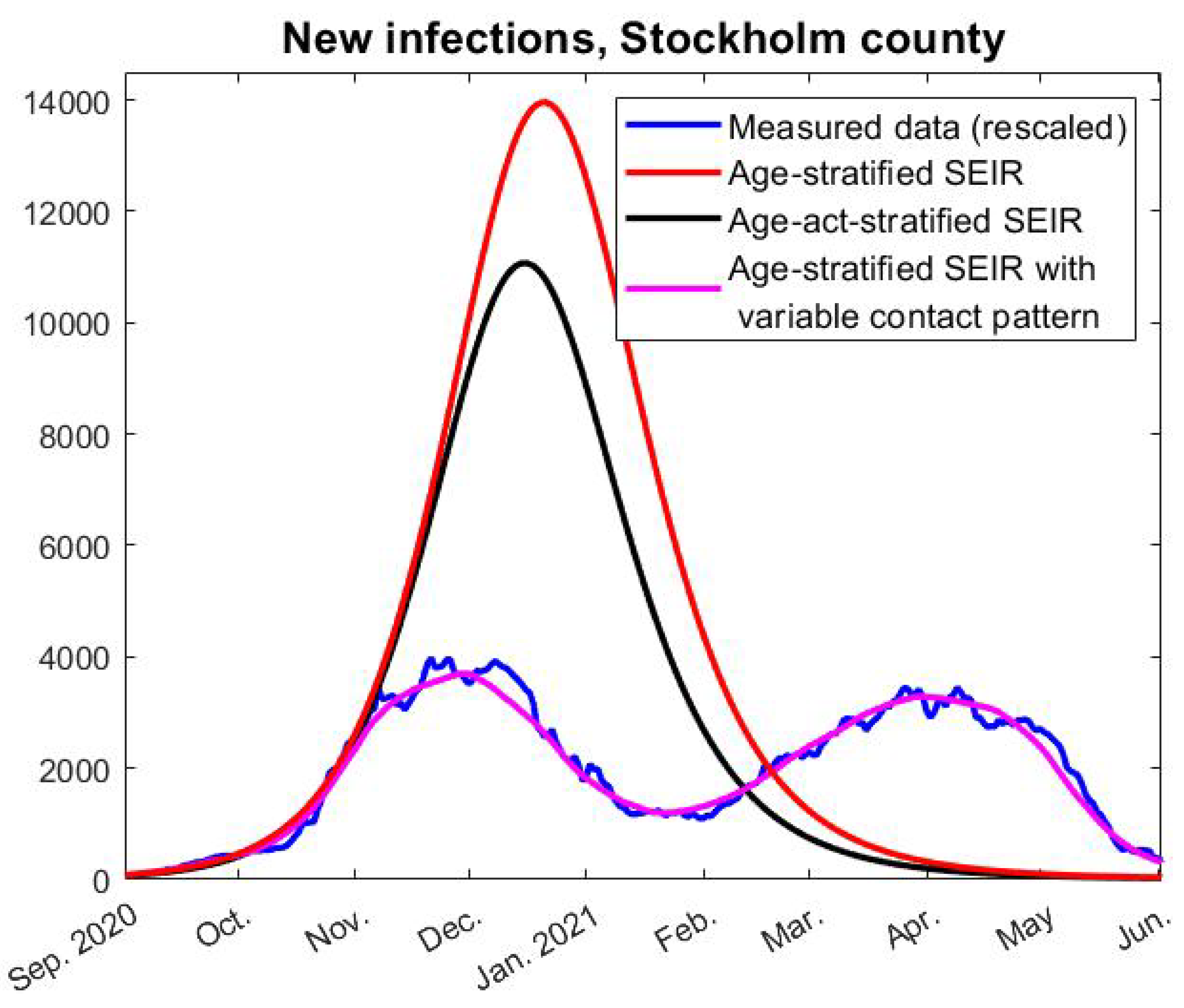
Figure 3. In
Appendix A.6, we then explain how to further update this in order to test Hypothesis 1, i.e., to produce the pink graph seen in
Figure 3. How to model with pre-immunity and multiple strains is then explained in
Appendix A.7, upon which the code for
Figure 6 is built. The final two sections are mainly of mathematical interest and derive formulas for the herd-immunity threshold valid in the presence of (artificial) pre-immunity.
Appendix A.1. Age-Stratified SEIR with Antibody Waning
Following Britton et al. [
5], we divide the population into 6 age-groups and let
and
r represent column-vectors including the fraction of the full population in respective age-group of the classes: Susceptible, Exposed, Infective, and Recovered. A contact matrix
A, which we describe in detail in the coming section, determines the amount of contacts between the groups and a coefficient
the rate of transmission, so the equation corresponding to (
1) becomes
where
is the rate of new cases in each respective group, and
denotes a diagonal matrix with the values in the vector
in the diagonal.
The remaining functions in the model are
and
r, which relate to
s as follows:
A new feature is the term
which takes the waning of antibodies into account. Since we have decided to put half-life to 16 months, we set
. Following [
19], we set
and
. The rationale behind these choices is explained in the
Supplementary Material (
Section 5) of [
34].
Appendix A.2. Calibration of the Contact Matrix
To model how the disease spreads within and between the different groups, we need some sort of measure of how often people in these groups interact. Wallinga et al [
15] divided in 2006 the Dutch population into 6 groups aged 0–5, 6–12, 13–19, 20–39, 40–59, and 60+ and measured the amount of average weekly conversations held between group
j and group
g. To be precise, Wallinga et al. presents a “contact matrix”
M, which is a
matrix whose
:th entry equals the amount of conversations between age group
j and
k on a weekly basis, divided bythe amount of people in group
k. Hence
is the average number of persons in group
j that a person of group
k has contacts with in a week (based on data from the Netherlands in 2006).
Several issues arise when modeling COVID-19 using this matrix: the age distribution in Sweden is clearly different than that of the Netherlands and, furthermore, even the Netherlands has a very different age distribution in 2020 than in 2006. For example, in [
15], it is stated that the age group 60+ is about
, whereas the age group 70+ in Sweden 2020 make up
, due to an aging population. We, thus, need to decide on how to update
M given a new age distribution
w.
The elements of
M represent “the average number of persons in group
j that a person of group
k has contacts with”, in the Netherlands in 2006. If we postulate that these numbers are roughly the same in Stockholm County 2020, then
is roughly the amount of conversations between groups
j and
k, whereas by reciprocity
represents the same number, but these two numbers will no longer be the same. (Here
N denotes the total population
). To remedy this issue, we suggest to define
by taking the average and then divide by the amount of people in group
k, i.e.,
. This leads to the formula
For modeling of COVID-19 in Sweden, it is clearly better to have 70 as a delimiter for the last age group, since special recommendations applied to this group which in particular was encouraged to minimize all social contacts during a large part of the pandemic. Therefore, the w we used for the modeling in this paper was chosen to correspond with the distribution in the age-groups 0–5, 6–12, 13–19, 20–39, 40–69, and 70+.
Based on
, we can now introduce the contact matrix
A by the formula
which, thus, is a symmetric matrix (since
), where the factor 7 is convenient, since it allows us to work with daily contacts instead of weekly. This choice is discussed in greater depth in the
Supplementary Material of [
34].
The above matrix is likely a good contact matrix for the Swedish population in the absence of NPIs. However, one also needs to take into account that the group 70+ were recommended to self-isolate during large parts of the pandemic, and, hence, it is likely that they reduced their contacts much more than the other age groups. We incorporate this by multiplying all numbers in the last row and column of A by a factor , which we set to for reasons to be explained shortly. Our model, thus, assumes that the 70+ group reduced social contacts 4 times more than other age-groups.
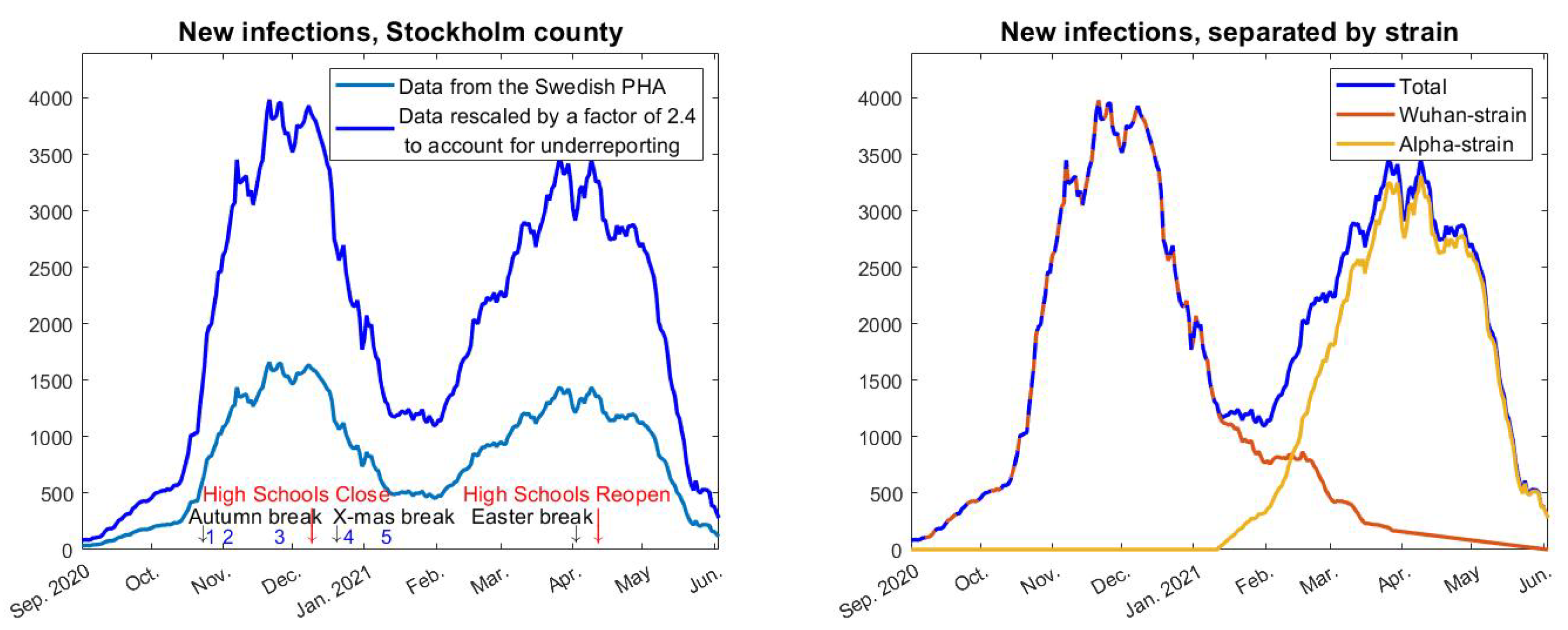
In order to test whether our contact matrix A actually represents social interaction patterns in Sweden during the pandemic, we run our model and compare the fraction of infected in each subgroup with actual data. Relying on data from the Public Health Agency data from February 2 2021 (before the effect of vaccinations became relevant), we inferred that 24% of the total cumulative COVID-19 cases were from the age group 0–19, 31% in the age group 20–39, 37% in the age group 40–69, and 8% of the cases were in the group 70+. Upon running our model, we found that the reduction factor gives values 23%, 32%, 37%, and 8% on the same date. This is sufficiently close to the observed numbers mentioned above, which, thus, gives support for using the contact matrix with the modifications described above.
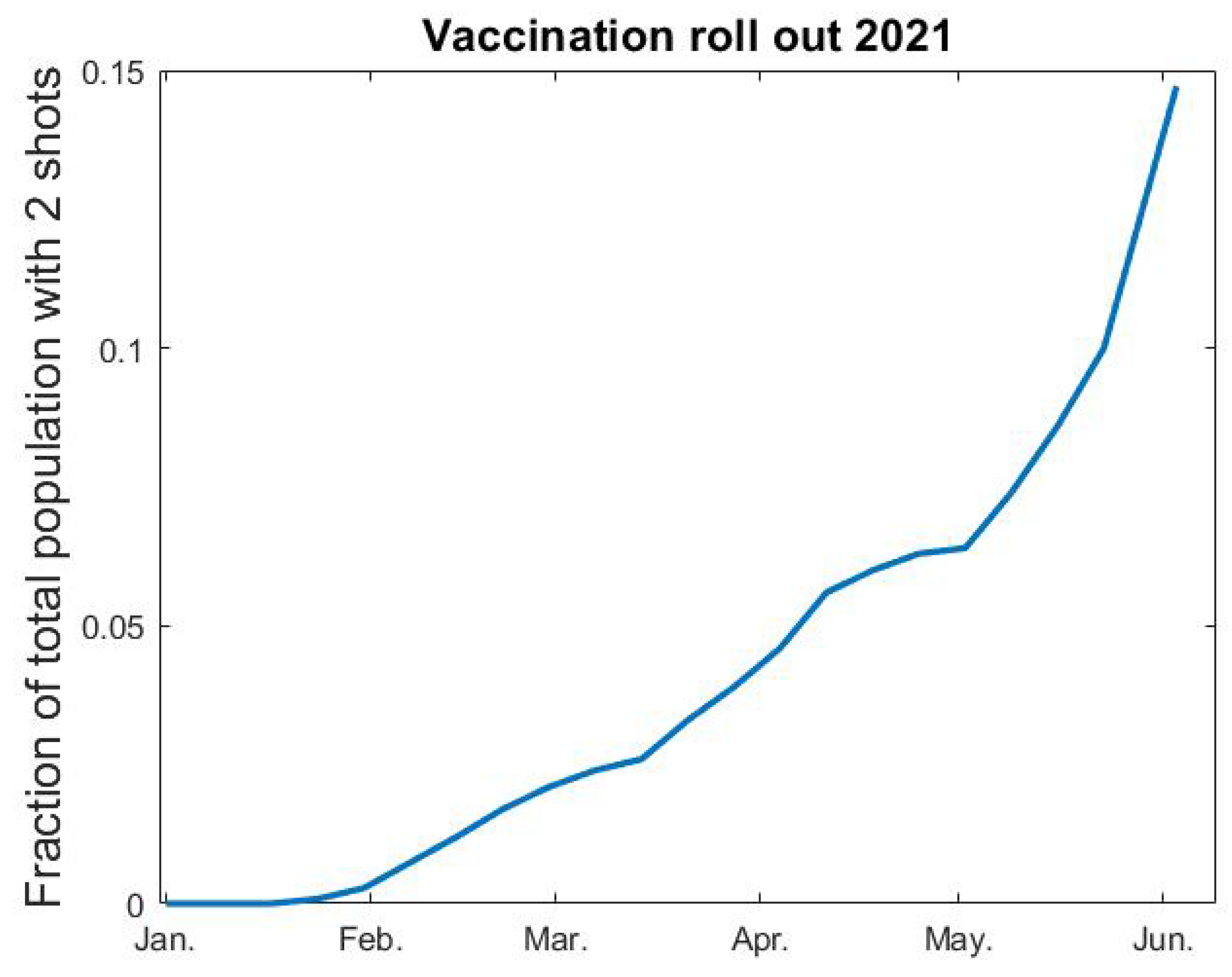
Appendix A.3. Incorporating Vaccinations
We rely on data from the Public Health Agency [
35] for percentages of the population vaccinated each week (see
Figure A1 below). After interpolation, we let
denote fraction of vaccinated as a function of time. Since vaccine efficacy varies between different vaccines and different age groups, it is not entirely straightforward how to include vaccines in a model where immunity is a binary value. The AstraZeneca vaccine was given to elderly people and to health care personnel in the beginning of 2021, whereafter the mRNA vaccines from Pfizer and Moderna became the major vaccines given to all age groups in Sweden, but the second dose of these vaccines were given after June 2021 and, hence, we do not include this in our modeling. The AstraZeneca vaccine was estimated to have a 70% protective effect to the original SARS-CoV-2 strain, and a reduced protection rate is expected against the alpha variant. In our model, the highest age-group
consist of
(this is group number 6), which coincides with the amount of complete vaccinations early June 2021 (see
Figure A1). With this in mind, we postulate that 70% of the vaccinated people become immune, and that the vaccination only affects group 6. In the medRxiv preprint of this paper [
36] we instead assumed a 90% efficacy after the first shot, and, therefore, also included vaccinations in group 5 in our modeling. We updated this since the way we do it here seems more realistic and also much simpler to describe and code. This only has a marginal effect on the curve and does not in any way alter the conclusions of the paper.
Figure A1.
Fraction vaccinated v as function of time t.
Figure A1.
Fraction vaccinated v as function of time t.
In practice, we thus add an “artificial” flow from the 6th group of s to the corresponding group in r, which hence represents both recovered and vaccinated. Another thing to keep in mind is that the vaccination scheme did not separate between people who had had COVID-19 and those who had not. Therefore, some people who were vaccinated were already in the corresponding age-group of the r-compartment. Since is the fraction of elderly that are still susceptible to the virus at time t, and is the vaccination rate, we postulate that is the rate at which the vaccination roll-out provides protective antibodies to individuals in group 6. We, therefore, subtract the term from the last row of the equations for , and simultaneously add it to the last row of the equations.
Appendix A.4. Approximative Solutions to (uid27) and (uid28)
Since
s is changing very slowly, we can linearize the Equation (
A1) around a given time value
. The equations for the disease compartments
e and
i when
then become:
written using standard matrix-vector notation, where
I denotes the identity matrix. For simplicity we shall denote the above matrix by
. As is well known by standard theory of Ordinary Differential Equations, the dominant solution to the above equation system is given by the eigenvector with the largest eigenvalue, given that this is real and unique. We now prove that this is the case.
Theorem A1. The eigenvalues of are real and the largest eigenvalue is positive and has multiplicity 1. The eigenvalues of are given by The eigenvalue with the largest real part, i.e. , has multiplicity one and the corresponding eigenvector can be chosen to have positive entries.
Proof. The eigenvectors
of
also solve the generalized eigenvalue problem
Since
A is symmetric, it follows by standard theory of such equation systems that there exists a basis of 6 real eigenvectors with corresponding real eigenvalues, see, e.g., ref. [
37]. Moreover, the largest eigenvalue is positive, has multiplicity one and
for all
, by the Perron–Frobenius theorem, which also states that the corresponding eigenvector
can be chosen to have positive entries.
We now show that each such pair
gives rise to two eigenvalues/eigenvectors of
. Indeed, if we consider a vector of twice the size given by
, it follows that this is an eigenvector to
if, and only if,
is an eigenvector of
The corresponding eigenvalue of
is then the eigenvalue of the above 2 × 2-matrix. It follows by basic matrix theory that this matrix has the eigenvalues stated in (
A5).
Since
has multiplicity one and is positive, it follows by (
A5) that
also has multiplicity one. Let
be the corresponding eigenvector. It remains to show that also
and
can be chosen positive. By some basic computations that we omit, we can pick
and
, and it is easy to see that
□
To conclude this section, we remark that it follows by standard theory of Ordinary Differential Equations that the solution to (
A4) will be dominated by a multiple of
for
, independent of the initial distributions at time
.
Appendix A.5. Initial Conditions
At the start of our modeling, on 1 September 2020, we know that 10.2% in Stockholm were already recovered and that the rate of new infections was around 80 per day. However, we do not know the distribution of the 10.2% among the different age groups, which we need to pick an initial value for
s, and it is also not clear how to chose initial values of
e and
i to match 80 cases per day. In this section, we describe how this is performed. (Since this becomes rather technical, we want to stress that the way the initial conditions are chosen have no major bearing on the model curves or conclusions of the paper. In the medRxiv preprint version of this paper [
36], we chose initial conditions by simply running the model, and the corresponding graphs are almost identical).
At the onset of the pandemic in February 2020, we have
(at least in the absence of pre-immunity, which we will discuss how to include in a later section). By the results in the previous section, it is therefore reasonable to assume that the distribution of cases in the first wave roughly was distributed as
, where
is the eigenvector corresponding to the largest eigenvalue of
. Hence, we set the initial value for
r to
, where
and we choose
so that its entries sum up to 1. Since the vectors
, and
r must sum up to
w, this means that, when cases start to accumulate again in September of 2020, we should have
(since the amount in
e and
i are negligible). Consequently, again following the logic of the previous section, the distribution of cases in
, in the beginning of September 2020, should be a constant multiple of
where now
is the eigenvector of
with largest eigenvalue
, and
,
are corresponding positive numbers, just as in the proof of Theorem A1. Since
, the constant multiple
c can now be found by setting
and choosing
c so that the vector
(representing the fraction of new cases on day 0, recall (
A1)) sums up to
(where
; the population in Stockholm County). Finally, we pick the initial condition for
s by the requirement that the vectors
, and
r must sum up to
w. (Doing this with the actual numbers gives that there are about 2.4 more people in the exposed group than the infected group, which is almost the same as what one obtains by running the model with one initial case and stopping when reaching around 80, as was done in [
36]).
Appendix A.6. Modeling with Variable Human Contact Patterns
For testing Hypothesis 1 we also need to update (
A1) so that the transmission rate
is allowed to vary over time. We replace the constant
with the product of two functions
and
, where the former describes the variation in transmission rate due to the introduction of alpha and the latter only model changes in behavior/NPI. Concretely, we replace (
A1) with
The function
will be constant until the arrival of alpha in early January, by which time it will start to grow and reach a new level once alpha took over, in early April. Since we know the fraction of alpha over time we can form
easily by setting
where
and
represent the red, yellow, and blue curves in
Figure 2 (right), respectively. The constants
and
, represent the transmission rate of the Wuhan strain and alpha strain, respectively. In
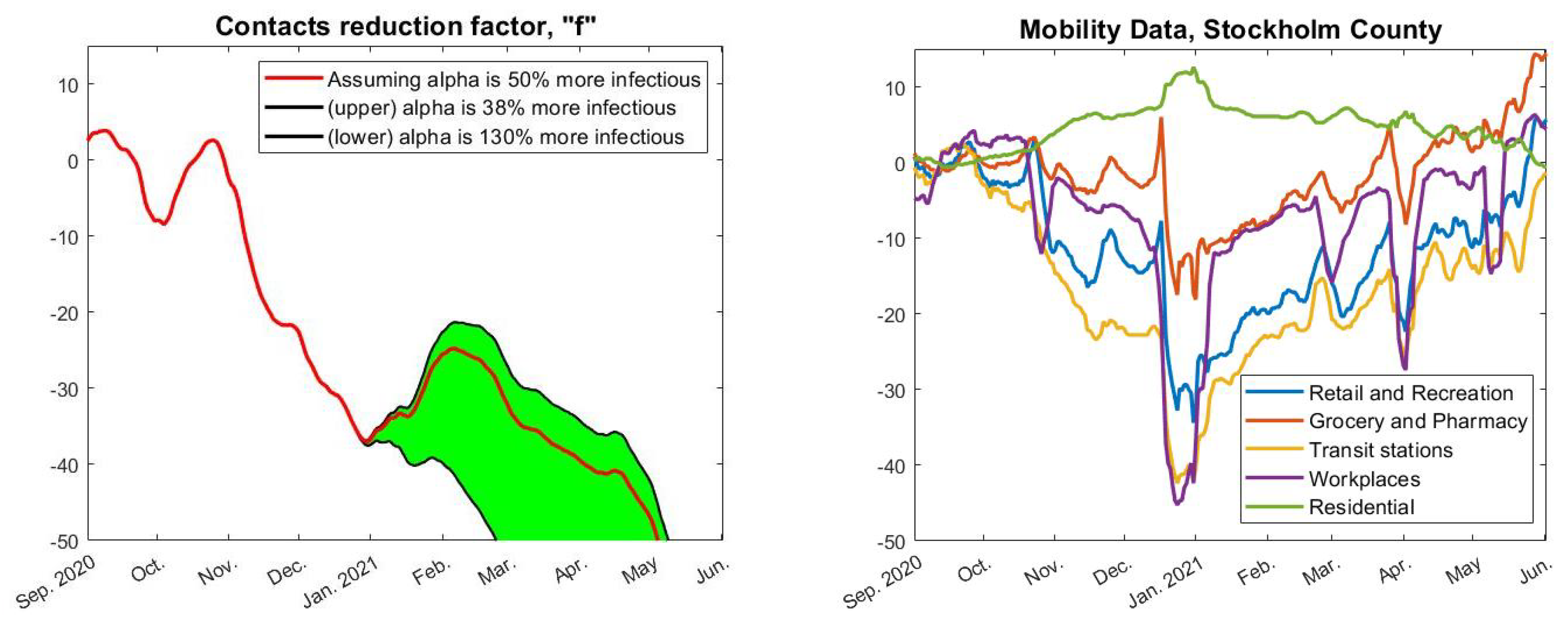
Figure 4, we have used
(upper black),
(red), and
(lower black), which is based on estimates from [
25] about how much more contagious the alpha strain is. Finally, we pick a value of
so that we obtain a good initial fit with real data upon setting
for
t in September.
Now, given a fixed choice of
f we can run our model and compare its outcome with real data. The concrete estimate of
f seen in red in
Figure 4 (left) was obtained by first running the model “backwards” to compute an
f that gave an identical fit (using
). This
f was then averaged over a 30-day window and extrapolated linearly on the edges. Of course, exactly how
f is obtained is not so interesting as long as it gives a good fit with real data, which indeed is the case, as seen in
Figure 3 (pink).
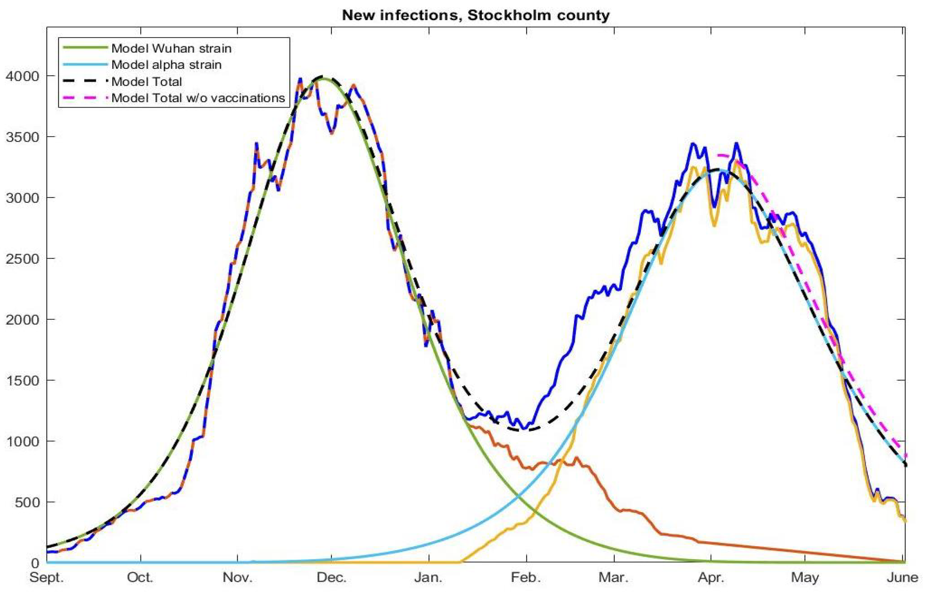
Appendix A.7. Incorporating Artificial Pre-Immunity and Multiple Strains
To deal with pre-immunity and multiple strains, the basic setup (
A1) and (
A2) needs to be modified slightly, as we now explain. Adding pre-immunity is most easily done by initializing
s by
where
is the fraction of pre-immunity and
w the vector with the fraction of the population in the respective age-group (since we have no reason to assume that the pre-immunity is not evenly distributed among different age-groups). However, as explained in [
6], the pre-immunity
(which we have estimated to 0.65 for Stockholm and the Wuhan-strain) is most likely an over-simplification resulting from the phenomenon that susceptibility to the virus is variable between individuals. Upon introducing a variant of concern, we obtain a new value of
but potentially also a new value for
, since the new strain may be better at infecting some individuals that had a good protection against the previous strain (see [
6],
Section 4.2, for a fuller discussion of this topic). Since we can not suddenly change the initial value in the model, the above way of introducing pre-immunity is unsuitable for dealing with multiple strains. Therefore, we instead incorporate the pre-immunity
by replacing the term (
A1) by
As long as the model is only dealing with one strain, this is equivalent to using as initial condition, but this approach allows for multiple ’s related to various strains.
To include the alpha strain, we introduce new parameters
and
, as well as functions,
,
, and
, which describe the incidence, as well as the fraction of exposed and infected in the population that contracted the alpha strain. As before we set
and obtain an equation system where both the Wuhan strain and the alpha strain exist in parallel as follows:
This is the main update needed in order to produce the curves in
Figure 6. For simplicity, we have not included the terms related to the vaccination roll out in the above equation system, which was explained how to do in
Appendix A.3 above. We have also omitted to discuss the rather straightforward modifications to
Appendix A.5 that needs to be made to include 10.2% acquired immunity in the initial conditions. We refer to the code Fig6.m, found on
https://github.com/Marcus-Carlsson/Covid-modeling (accessed on 10 Augsut 2022).
Appendix A.8. Computing R 0
In the coming section we discuss how to estimate when herd-immunity is reached, given the model (
A1) and (
A2) with pre-immunity, i.e., we do not consider the model involving multiple strains, and we include pre-immunity as explained in (
A8). Recall that the classical formula states that the herd-immunity threshold is given by
. To update this we first need to work out how
depends on
,
,
A, following
Section 5.2 [
14], which is done in this section.
The equations for
and
using (
A8) become
(where the term
is added since we now model using (
A8) instead of (
A1) to compute daily new cases). As explained in
Appendix A.4 this system can be approximated by a linear ODE, at any time
, by simply freezing the value of
, giving rise to
valid for
, where the matrix
is defined by the above line. Since
in the beginning of the pandemic we set
and
, so that
equals
, (using the notation in [
14], in particular Example 1,
Section 5.2). The next generation matrix, denoted
, is now defined as
The
value is then defined as the modulus of the largest eigenvalue of this matrix, also known as the spectral radius
. Using the well-known formula
it is easy to see that
and, hence, it follows that
Appendix A.9. The Herd Immunity Threshold
In this section, we discuss how to estimate when herd-immunity is reached. We do not consider the model involving multiple strains because both times herd-immunity seems to have been reached in Stockholm we had only one dominant strain. Even under this simplification, it is not entirely obvious of how to define the herd-immunity threshold, due to the fact that we work with multi-compartment models (various age-groups).
Intuitively, herd-immunity is reached when the amount of susceptibles are few enough that the amount of people who become sick, i.e., the total in
e and
i, start to recede. This is equivalent to demand that if we have no spread and a group of infectives are added to the system, the amount of secondary cases will be a decreasing function. The issue of at what level this happens becomes delicate since this does not only depend on the total amount of remaining susceptibles, but also on their distribution between the various groups. Classical estimates of HIT, (see [
14] Ch. 5), assume a uniform distribution of immunity, whereas during a real outbreak immunity will be higher in groups that are more active in spreading the virus. In practice, this means that the intuitive definition will be fulfilled before the classical estimate is fulfilled.
To take a concrete example, the mathematical (homogenous) HIT is reached on day 191 of our modeling, i.e., 10th of March, but the amount of individuals in all subgroups of both
e and
i start to decrease on day 94, i.e., the second of December, just before the first update in the NPIs that could have had a limiting effect on the spread (closure of high-schools, see
Figure 2). We now describe mathematically how to compute the HIT in two different ways, starting with the more intuitive one corresponding with day 94 in the earlier example.
To locally analyze the progression, we linearize around a given time point
, as in (
A10). As explained in
Appendix A.4, the solution to such an equation system consists of linear combinations of exponential functions whose exponents are the eigenvalues of the corresponding matrix
. Hence, the solutions will be decreasing independent of initial data whenever all eigenvalues have negative real part. The following theorem indicates precisely when this happens.
Theorem A2. Assume that A is a symmetric positive matrix. Given a time and a distribution of susceptibles , we have reached herd immunity if, and only if, Note that the contact matrix
A indeed should be symmetric and positive, as shown in
Appendix A.2. Hence, the theorem basically states that the point at which all compartments in the disease states
e and
i start to decrease, equals the first value of
for which (
A12) is fulfilled.
Proof. By the arguments before the statement, we need to show that the eigenvalues of
all have negative real part if, and only if, (
A12) holds. By Theorem A1 we thus need to show that
if and only if (
A12) holds, where
and
is the largest eigenvalue of
. Rewriting
as
we see that
if, and only if,
. Since
and
equals the spectral radius
(by the Perron–Frobenius theorem), this is equivalent to (
A12), and the proof is complete. □
The above theorem can easily be used in practice given a concrete model fit of real data, as in
Figure 6. Then, all quantities in (
A12) are known and the first date that it is fulfilled is easily computed. This is how we derived that herd immunity against the Wuhan-strain was reached on December 2, 2020, and similarly we find that herd-immunity against alpha occurred on April 9, 2021.
In order to derive the classical herd-immunity threshold we now assume that immunity is homogeneously distributed over the groups. Let
be the fraction of immune needed to have herd-immunity. To derive a formula for
, under the above assumption, we simply replace
in (
A12) with
. This leads to the equation
which, upon recalling (
A11), can be recast in the following more attractive form
Relying on this formula, one sees that the effect of artificial pre-immunity
is to reduce the herd-immunity threshold by the corresponding fraction, which is why this threshold in reality is much lower than traditional models predict (if the pre-immunity hypothesis is correct). For example, given the parameters used in this paper for the second wave of Stockholm, the herd-immunity threshold as given by (
A13) is around
, whereas (
A12) is satisfied when the total immunity level is merely
. This happens on day 94 in our model (i.e. on December 2nd, when all disease compartments de facto start to shrink), whereas a total of
of immunity is reached on day 191 of our model, i.e. long after the second wave was over. In summary, we argue that (
A12) is the more realistic definition of when the herd-immunity threshold is reached in a concrete modeling example, whereas (
A13) is a good first order approximation (upper bound) to the actual figure.


