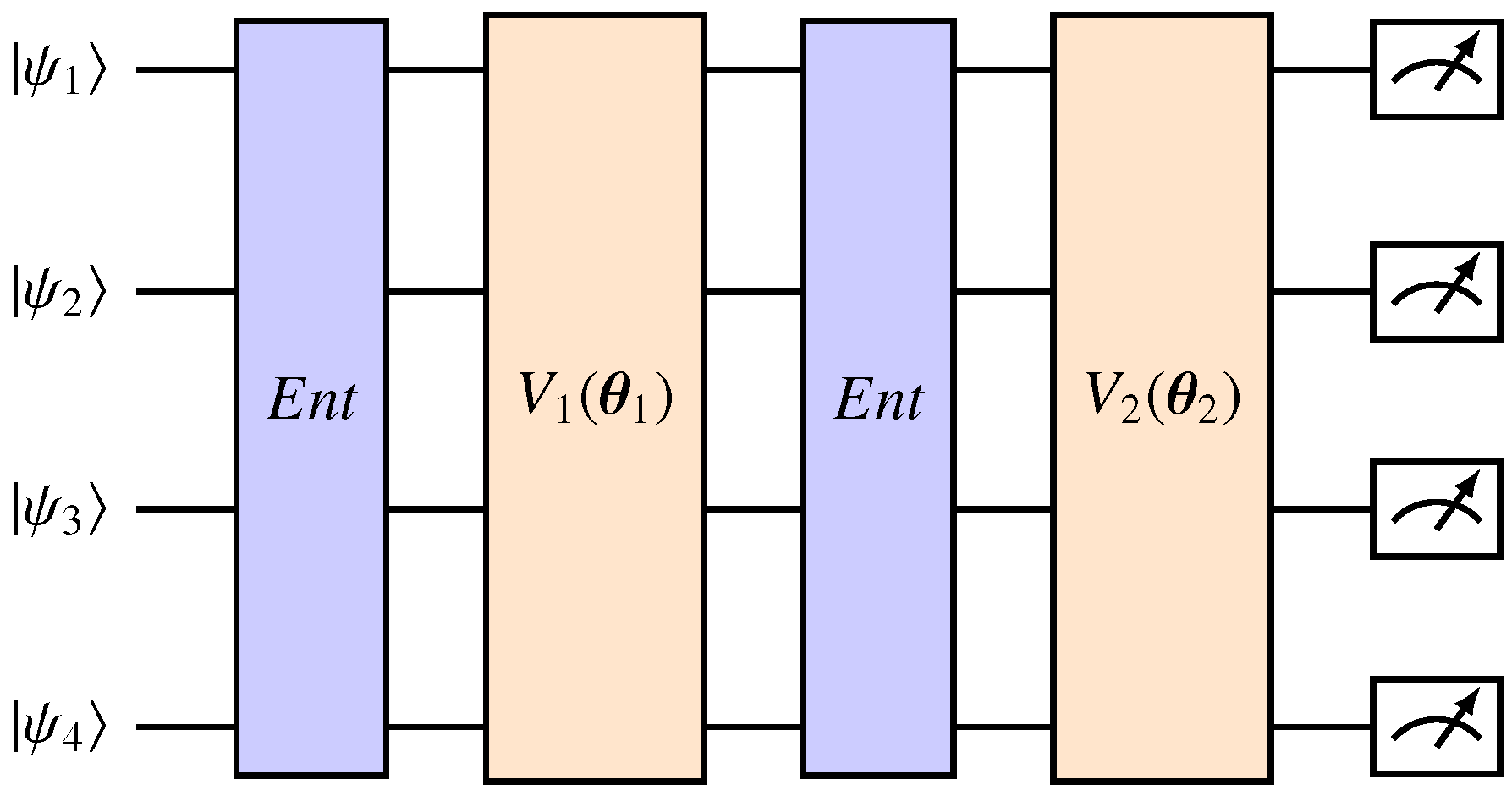
Figure 1.
A two-layered ansatz applied to four qubits. Each layer is defined by a variational circuit dependent on some parameters . The circuits are used to entangle the qubits, and the state denotes the output of the feature map.
Figure 1.
A two-layered ansatz applied to four qubits. Each layer is defined by a variational circuit dependent on some parameters . The circuits are used to entangle the qubits, and the state denotes the output of the feature map.
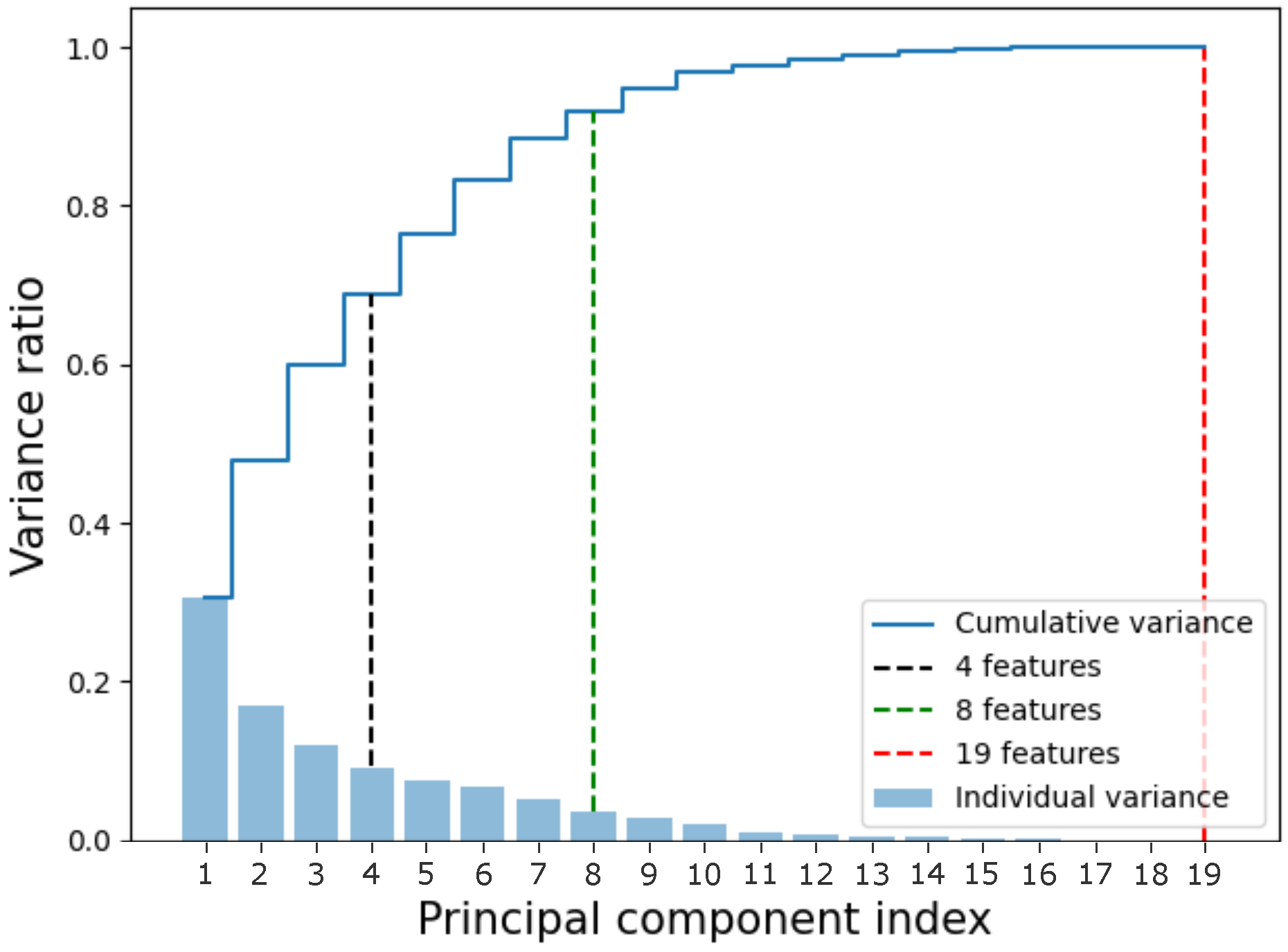
Figure 2.
Cumulative variance of the data. The x-axis represents the component index, while the y-axis represents the variance. The sets used in this article were marked in black (4 features), green (8 features), and red (19 features, the complete dataset). The bars represent the individual variance of each component, while the blue line represents the cumulative variance.
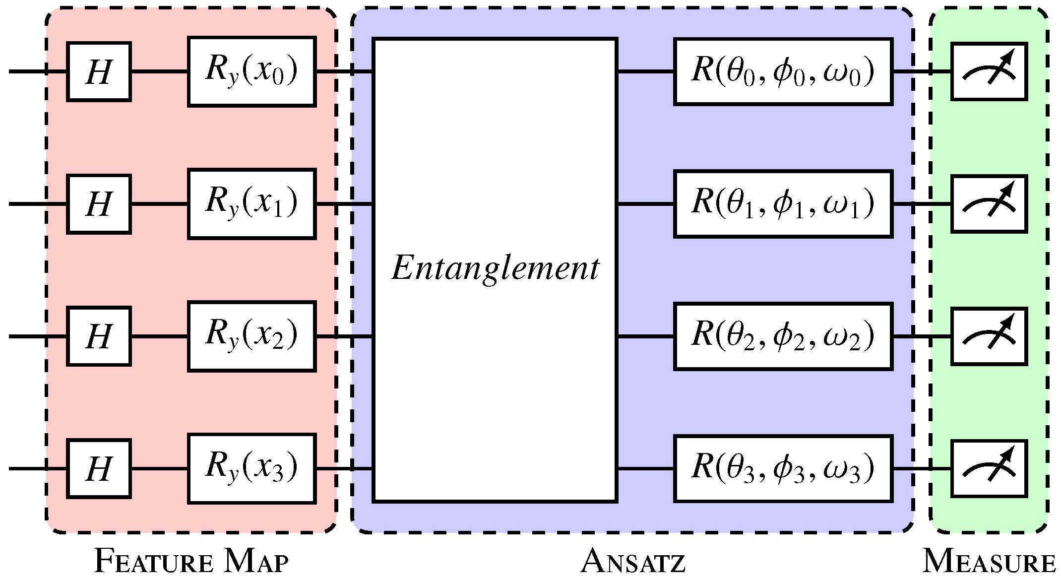
Figure 3.
Variational quantum circuit. The Hadamard gate layer prepares the qubits in uniform superposition; Ry gates (red) encode the data in qubits; and the variational layer or ansatz (blue) entangles the qubits and applies parameterized rotations, where
,
, and
represent, respectively, the rotation angles in the x, y, and z axes in each qubit
i, and are the trainable parameters of the model. The measurement layer (green) collapses the qubits, generating the outputs [
32].
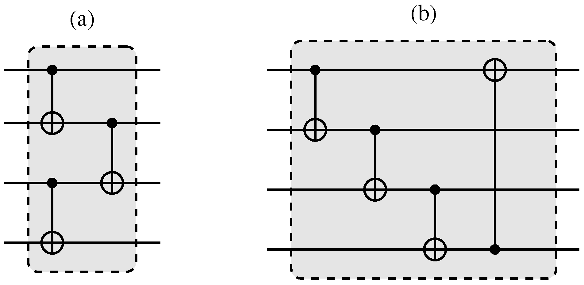
Figure 4.
Entanglement layers used in a variational circuit (
Figure 3). In (
a), here named “entanglement layer 1”, the qubits are entangled in pairs, and these pairs are subsequently tied together. In (
b), here named “entanglement layer 2”, the qubits are entangled in a cascade. Adapted from [
32].
Figure 5.
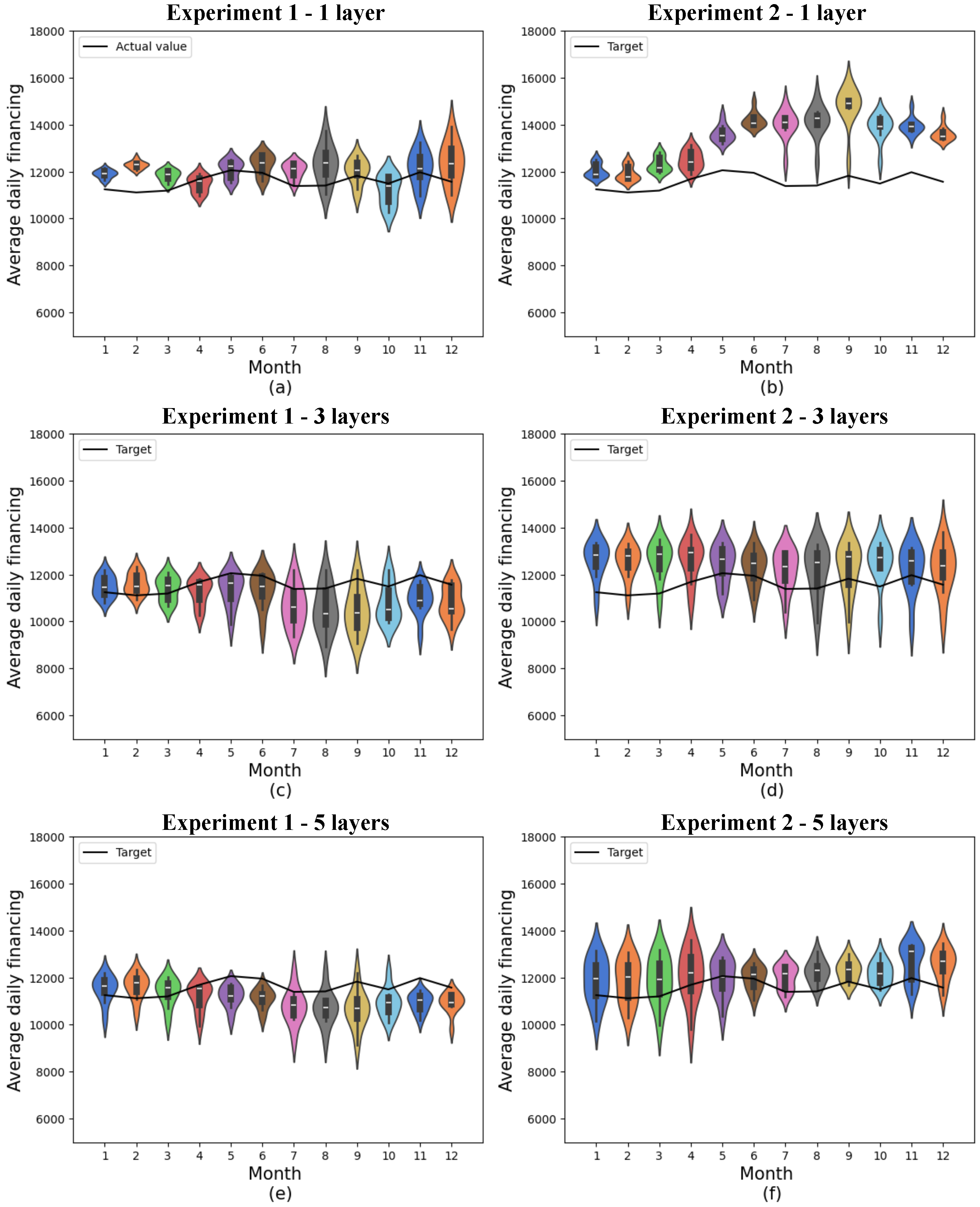
Predictions for quantum models with 4 features. (a) shows quantum experiment 1 with 1 layer, (b) quantum experiment 2 with 1 layer, (c) quantum experiment 1 with 3 layers, (d) quantum experiment 2 with 3 layers, (e) quantum experiment 1 with 5 layers, and (f) quantum experiment 2 with 5 layers. The x-axis shows the model’s training months, while the y-axis represents average daily financing. The distributions obtained from 10 experiments are shown in the colored violin graphs, while the actual values are shown in the black line.
Figure 5.
Predictions for quantum models with 4 features. (a) shows quantum experiment 1 with 1 layer, (b) quantum experiment 2 with 1 layer, (c) quantum experiment 1 with 3 layers, (d) quantum experiment 2 with 3 layers, (e) quantum experiment 1 with 5 layers, and (f) quantum experiment 2 with 5 layers. The x-axis shows the model’s training months, while the y-axis represents average daily financing. The distributions obtained from 10 experiments are shown in the colored violin graphs, while the actual values are shown in the black line.
Figure 6.
Predictions for quantum models with 8 features. (a) shows quantum experiment 1 with 1 layer, (b) quantum experiment 2 with 1 layer, (c) quantum experiment 1 with 3 layers, (d) quantum experiment 2 with 3 layers, (e) quantum experiment 1 with 5 layers, and (f) quantum experiment 2 with 5 layers. The x-axis shows the model’s training months, while the y-axis represents average daily financing. The distributions obtained from 10 experiments are shown in the colored violin graphs, while the actual values are shown in the black line.
Figure 7.
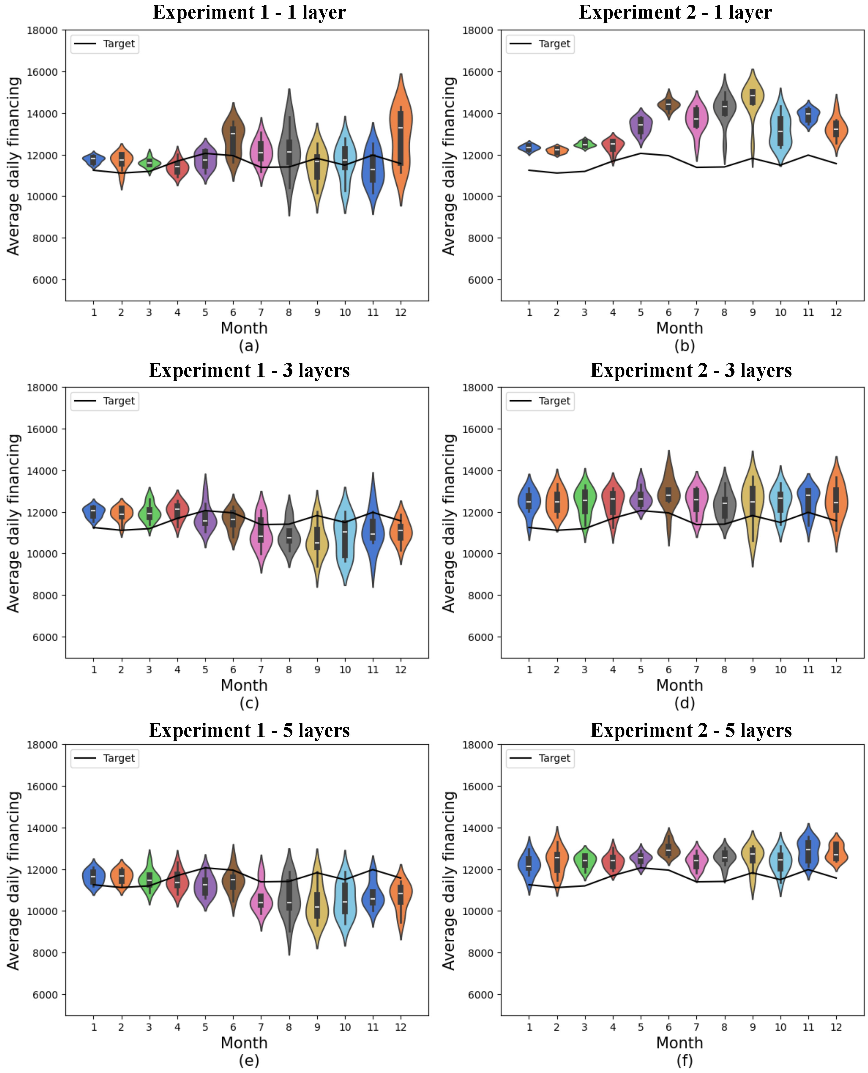
Predictions for quantum models with 19 features. (a) shows quantum experiment 1 with 1 layer, (b) quantum experiment 2 with 1 layer, (c) quantum experiment 1 with 3 layers, (d) quantum experiment 2 with 3 layers, (e) quantum experiment 1 with 5 layers, and (f) quantum experiment 2 with 5 layers. The x-axis shows the model’s training months, while the y-axis represents average daily financing. The distributions obtained from 10 experiments are shown in the colored violin graphs, while the actual values are shown in the black line.
Figure 7.
Predictions for quantum models with 19 features. (a) shows quantum experiment 1 with 1 layer, (b) quantum experiment 2 with 1 layer, (c) quantum experiment 1 with 3 layers, (d) quantum experiment 2 with 3 layers, (e) quantum experiment 1 with 5 layers, and (f) quantum experiment 2 with 5 layers. The x-axis shows the model’s training months, while the y-axis represents average daily financing. The distributions obtained from 10 experiments are shown in the colored violin graphs, while the actual values are shown in the black line.
Figure 8.
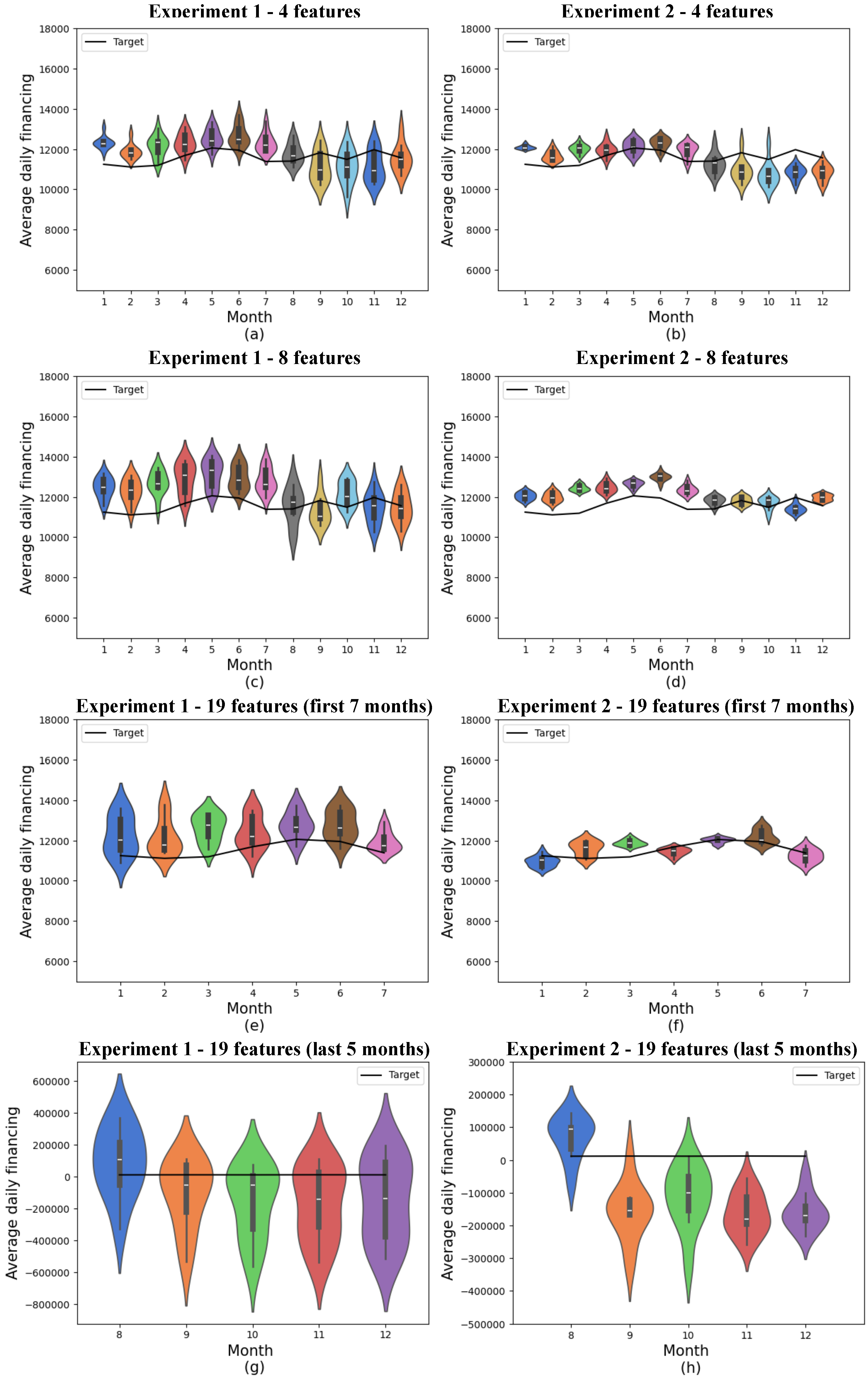
Predictions for classical models. (a) shows classical experiment 1 with 4 features, (b) classical experiment 2 with 4 features, (c) classical experiment 1 with 8 features, (d) classical experiment 2 with 8 features, (e) the first 7 months of classical experiment 1 with 19 features, (f) the first 7 months of classical experiment 2 with 19 features, (g) the last 5 months of classical experiment 1 with 19 features, and (h) the last 5 months of classical experiment 2 with 19 features. The x-axis shows the model’s training months, while the y-axis represents average daily financing. The distributions obtained from 10 experiments are shown in the colored violin graphs, while the actual values are shown in the black line.
Figure 8.
Predictions for classical models. (a) shows classical experiment 1 with 4 features, (b) classical experiment 2 with 4 features, (c) classical experiment 1 with 8 features, (d) classical experiment 2 with 8 features, (e) the first 7 months of classical experiment 1 with 19 features, (f) the first 7 months of classical experiment 2 with 19 features, (g) the last 5 months of classical experiment 1 with 19 features, and (h) the last 5 months of classical experiment 2 with 19 features. The x-axis shows the model’s training months, while the y-axis represents average daily financing. The distributions obtained from 10 experiments are shown in the colored violin graphs, while the actual values are shown in the black line.
Figure 9.
Convergence of the quantum model with the set of 4 features and 1 layer with 1000 epochs. The x-axis shows the training epochs, while the y-axis shows the mean absolute error (standardized values). The black curve shows the test loss, while the magenta curve shows the validation loss.
Figure 9.
Convergence of the quantum model with the set of 4 features and 1 layer with 1000 epochs. The x-axis shows the training epochs, while the y-axis shows the mean absolute error (standardized values). The black curve shows the test loss, while the magenta curve shows the validation loss.
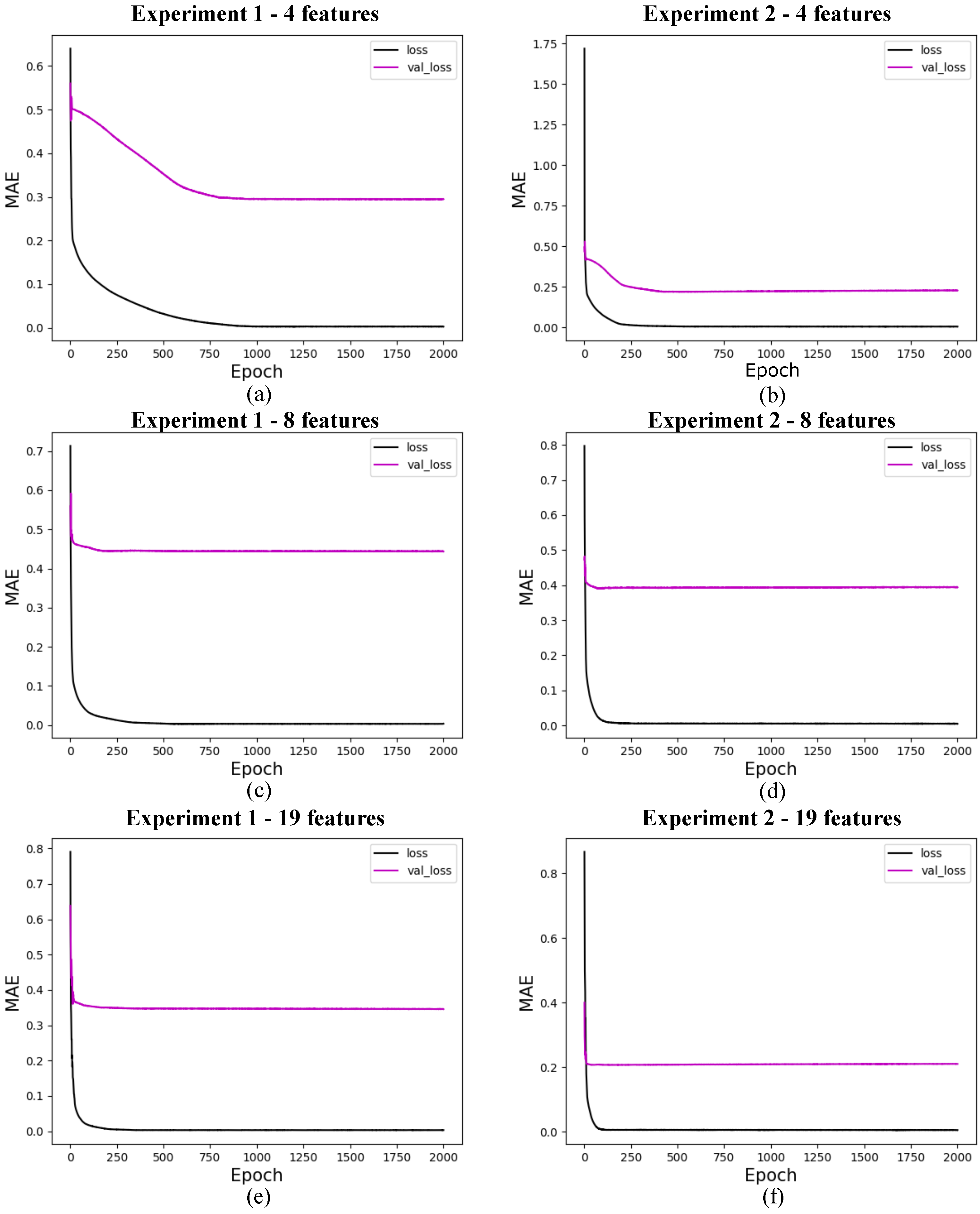
Figure 10.
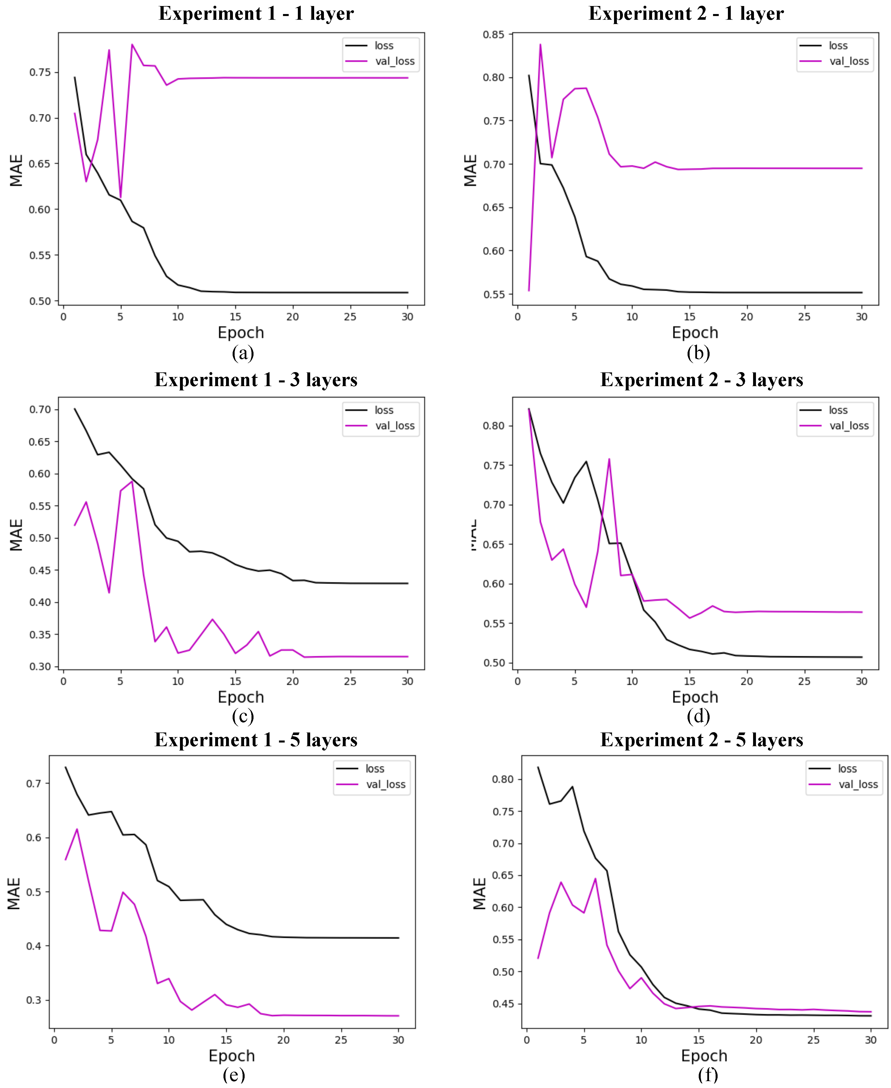
Loss for quantum models with 4 features. (a) shows the loss for quantum experiment 1 with 1 layer, (b) for quantum experiment 2 with 1 layer, (c) for quantum experiment 1 with 3 layers, (d) for quantum experiment 2 with 3 layers, (e) for quantum experiment 1 with 5 layers, and (f) for quantum experiment 2 with 5 layers. The x-axis shows the training epochs, while the y-axis shows the mean absolute error (standardized values). The black curve shows the test loss, while the magenta curve shows the validation loss.
Figure 10.
Loss for quantum models with 4 features. (a) shows the loss for quantum experiment 1 with 1 layer, (b) for quantum experiment 2 with 1 layer, (c) for quantum experiment 1 with 3 layers, (d) for quantum experiment 2 with 3 layers, (e) for quantum experiment 1 with 5 layers, and (f) for quantum experiment 2 with 5 layers. The x-axis shows the training epochs, while the y-axis shows the mean absolute error (standardized values). The black curve shows the test loss, while the magenta curve shows the validation loss.
Figure 11.
Loss for quantum models with 8 features. (a) shows the loss for quantum experiment 1 with 1 layer, (b) for quantum experiment 2 with 1 layer, (c) for quantum experiment 1 with 3 layers, (d) for quantum experiment 2 with 3 layers, (e) for quantum experiment 1 with 5 layers, and (f) for quantum experiment 2 with 5 layers. The x-axis shows the training epochs, while the y-axis shows the mean absolute error (standardized values). The black curve shows the test loss, while the magenta curve shows the validation loss.
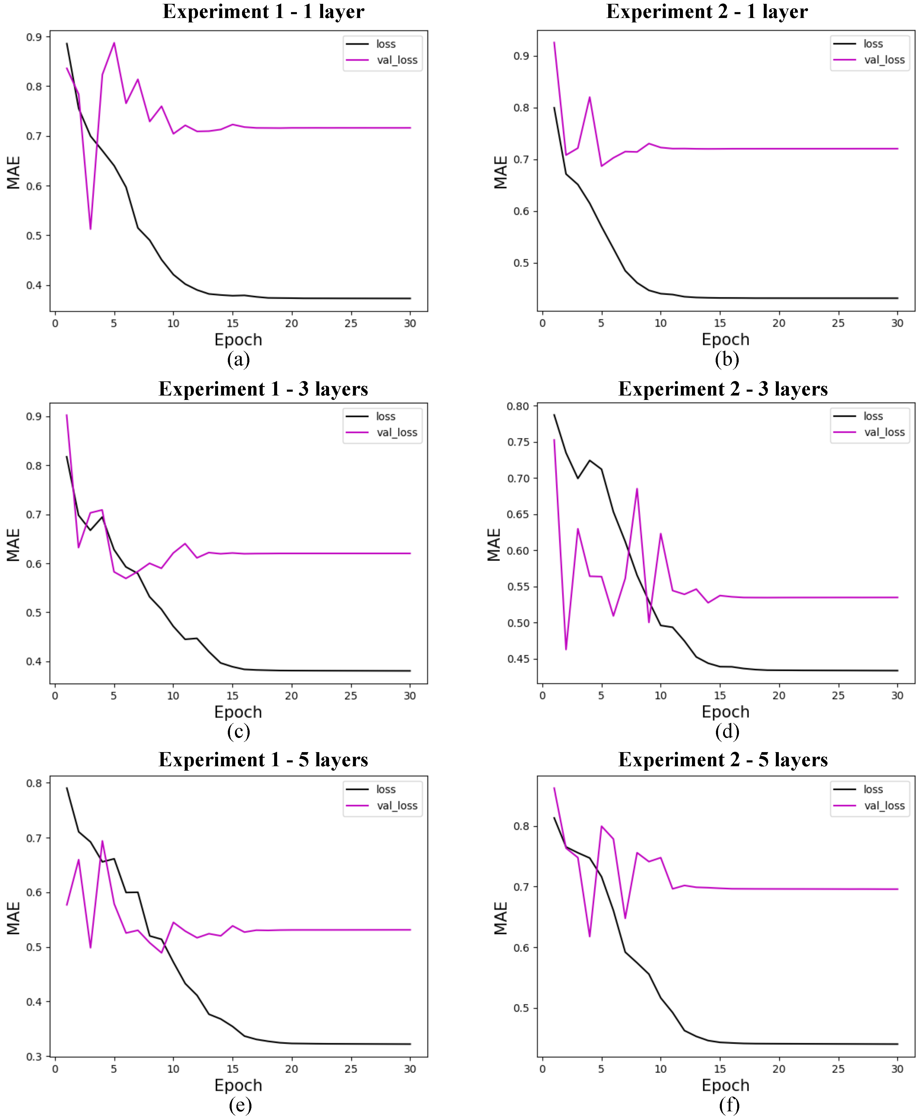
Figure 12.
Loss for quantum models with 19 features. (a) shows the loss for quantum experiment 1 with 1 layer, (b) for quantum experiment 2 with 1 layer, (c) for quantum experiment 1 with 3 layers, (d) for quantum experiment 2 with 3 layers, (e) for quantum experiment 1 with 5 layers, and (f) for quantum experiment 2 with 5 layers. The x-axis shows the training epochs, while the y-axis shows the mean absolute error (standardized values). The black curve shows the test loss, while the magenta curve shows the validation loss.
Figure 13.
Loss for classical models. (a) shows the loss for classical experiment 1 with 4 features, (b) for classical experiment 2 with 4 features, (c) for classical experiment 1 with 8 features, (d) for classical experiment 2 with 8 features, (e) for quantum experiment 1 with 19 features, and (f) for classical experiment 2 with 19 features. The x-axis shows the training epochs, while the y-axis shows the mean absolute error (standardized values). The black curve shows the test loss, while the magenta curve shows the validation loss.
Table 1.
Best results of classical and quantum annual mean MAE.
Table 1.
Best results of classical and quantum annual mean MAE.
| Model | MAE |
|---|
| QNN | Experiment 1 | |
| Experiment 2 | |
| RNN | Experiment 1 | |
| Experiment 2 | |
Table 2.
Quantum model processing times.
Table 2.
Quantum model processing times.
| | | 1 Layer | 3 Layers | 5 Layers |
|---|
| 4 variáveis | Experiment 1 | 1 min 30 | 3 min | 4 min |
| Experiment 2 | 1 min 30 | 4 min | 5 min |
| 8 variáveis | Experiment 1 | 3 min | 6 min | 10 min |
| Experiment 2 | 3 min | 6.5 min | 10 min |
| 19 variáveis | Experiment 1 | 1 h | 1 h 30 | 3 h 30 |
| Experiment 2 | 1 h | 2 h 20 | 3 h 30 |
Table 3.
Classical model processing times.
Table 3.
Classical model processing times.
| | Experiment 1 | Experiment 2 |
|---|
| 4 features | 13 min | 32 min 30 |
| 8 features | 14 min 30 | 36 min |
| 19 features | 14 min 30 | 36 min |


 ,
, 


