Review

Diffusion and Percolation: How COVID-19 Spread Through Populations

by
Jeffrey E. Harris
1,2
1
Department of Economics, Massachusetts Institute of Technology, Cambridge, MA 02139, USA
2
Adult Medicine Department, Eisner Health, Los Angeles, CA 90015, USA
Populations 2025, 1(1), 5; https://doi.org/10.3390/populations1010005
Submission received: 6 January 2025 / Revised: 7 February 2025 / Accepted: 17 February 2025 / Published: 20 February 2025

Abstract

:
I rely on the key concepts of diffusion and percolation to characterize the sequential but overlapping phases of the spread of infection through entire populations during the first year of the COVID-19 pandemic. Data from Los Angeles County demonstrate an extended initial diffusion phase propelled by radial geographic spread, followed by percolation within hotspots fueled by the presence of multigenerational households. Data from New York City, by contrast, reveal rapid initial diffusion along a unique, extensive subway network. Subsequent percolation within multiple hotspots, similarly powered by a high density of multigenerational households, exerted a positive feedback effect that further enhanced diffusion. Data from Florida counties support the generality of the phenomenon of viral transmission from more mobile, younger individuals to less mobile, older individuals. Data from the South Brooklyn hotspot reveal the limitations of some forms of government regulation in controlling mobility patterns that were critical to the continued percolation of the viral infection. Data from a COVID-19 outbreak at the University of Wisconsin—Madison demonstrate the critical role of a cluster of off-campus bars as an attractor for the continued percolation of infection. The evidence also demonstrates the efficacy of quarantine as a control strategy when the hotspot is contained and well identified.

1. Introduction

The COVID-19 pandemic has generated an enormous worldwide body of literature, replete with reviews of the evolution of the SARS-CoV-2 virus and its variants [1,2], reviews of prevention and control strategies [3,4], reviews of the mathematical modeling of epidemic waves [5,6], reviews of vaccination development and efficacy [7,8,9], and even some reviews of reviews [10,11]. Yet, amid this superabundance of data and interpretation, there remains a scarcity of attempts to answer a critical question: once a few affected individuals arrived in a previously naïve population, how did the virus manage to spread through the entire population?
This interpretive review article attempts to shed light on this critical question. I rely on evidence principally from my own research on the first year of the pandemic in the United States. Adopting a geospatial perspective [12,13], I display the evidence mostly in the form of maps. While I cite numerous contributors, my approach is selective rather than comprehensive.

2. Key Concepts: Importation, Diffusion, and Percolation

Once established as a human-to-human infectious agent in Wuhan, China, the virus SARS-CoV-2 spread across populations via a process of importation—that is, the arrival in the target population of one or a few affected individuals originating from another population. Once the virus had been imported into a naïve population, its spread through this population was characterized by two successive but overlapping phenomena: diffusion and percolation [13,14,15,16,17,18,19].
Diffusion entails the initial spread of the infectious agent over an extended geographic area. Once the virus has started to diffuse over such a large area, percolation entails the emergence of multiple smaller areas of high concentration of infection, sometimes referred to as hotspots. Percolation may begin in some populations even as diffusion continues. Continued percolation may result in feedback effects that enhance diffusion.

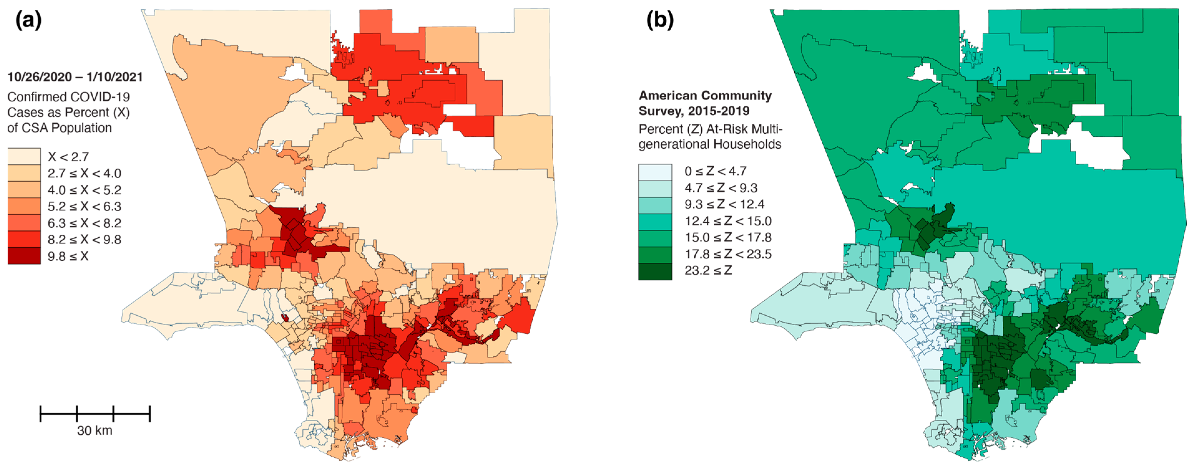
3. Los Angeles County: Radial Diffusion and Percolation Among Multigenerational Households

The COVID-19 epidemic in Los Angeles County—the largest county in the U.S.—began with the importation of SARS-CoV-2 by affected travelers. By 15 March 2020, foci of infection appeared in the relatively affluent communities of Beverly Crest and West Hollywood, where residents were more likely to have the resources to travel [20]. The map sequence in Figure 1 profiles the further evolution of the cumulative case incidence of COVID-19 across multiple communities within the county over a six-week period from 22 March to 26 April 2020. By 29 March, the cumulative incidence had reached 120 cases per 100,000 population in other affluent communities such as Brentwood, Manhattan Beach, and Palos Verdes Estates. The geographic dispersion of these initial foci of infection suggests the possibility of multiple importations by distinct travelers. To borrow from the nomenclature of the HIV epidemic [21], there was likely more than one “Traveler 0”.
Concurrently, the 22 March map shows the beginning of radial diffusion from the initial focus in West Hollywood to geographically contiguous communities, eastward to Hollywood and southward to Hancock Park, progressing to other adjacent counties during the ensuing weeks up to 12 April. Over the course of the entire six-week interval covered by Figure 1, this phenomenon of spatial diffusion was found to be highly local, with the most significant contributing communities having a centroid within one kilometer of the centroid of the target community. Within this radius, diffusion from contiguous communities was responsible, on average, for about one-third of all incident infections in a community, with the remaining two-thirds arising from within-community transmission [20].
By 19 April, about 6 weeks into the diffusion phase, we began to observe evidence of significant percolation with the emergence of hotspots in the South Central and East Los Angeles areas, as well as the San Fernando Valley northwest of the city. The percolation of COVID-19 within communities was highly correlated with the extent of concentration of multigenerational households. This indicator was found to be a more significant determinant of the percolation of cases than the proportion of households under the Supplemental Nutrition Assistance Program, the proportion with a total income below USD 22,000 annually, and the proportion with at least one person engaged in a low-wage occupation that cannot be performed remotely [20]. The striking correlation can be seen in Figure 2, which compares the COVID-19 case incidence during 26 October 2020–10 January 2021, mapped in panel (a), with the prevalence of multigenerational households, mapped in panel (b).

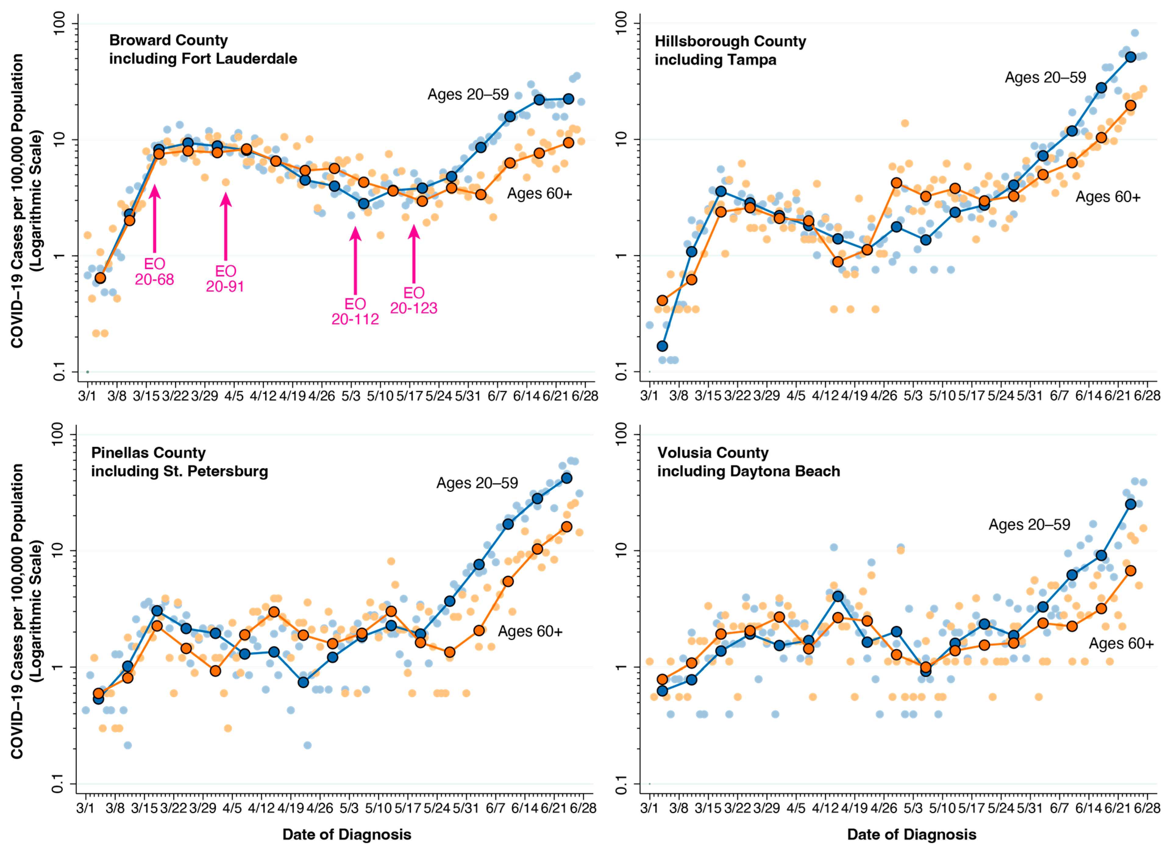
4. Florida Counties: Intergenerational Transmission

The pattern of concentrated hotspots of COVID-19 seen in Figure 2a closely matched the heterogeneous distribution of multigenerational households shown in Figure 2b. In such multigenerational living arrangements, the more mobile, younger members initially contracted COVID-19 outside the household in their communities and then brought the virus back into the household to expose the less mobile, older members. While the intergenerational transmission of COVID-19 was markedly facilitated by multigenerational households, it was in fact a general phenomenon, at least prior to the emergence of vaccines against SARS-CoV-2 in 2021. This point is illustrated in Figure 3, which tracks the age-specific incidence in four counties of Florida during 1 March–28 June 2020.
Figure 3 displays the COVID-19 incidence in two age groups: 20–59 and 60 or more years. The curves in both groups generally coincided during the initial upswing in early March and the subsequent plateau from mid-March to mid-May after the governor issued tight restrictions on mobility [25,26]. With the issuance of new orders “reopening” the state in May [27,28], the incidence curve for the younger group began to rise first. The rise in the curve for the older group was delayed by 2–3 weeks—enough time for the younger, more mobile group to contract new infections and transmit them to the older, less mobile group. An analysis of the daily case counts across the 16 most populous Florida counties confirmed that the COVID-19 incidence in the older group was directly related to the estimated prevalence of infection in the younger group but unrelated to the estimated prevalence in the older group [29]. Without such cross-generational infection, an isolated epidemic among older people in Florida would have been unsustainable.

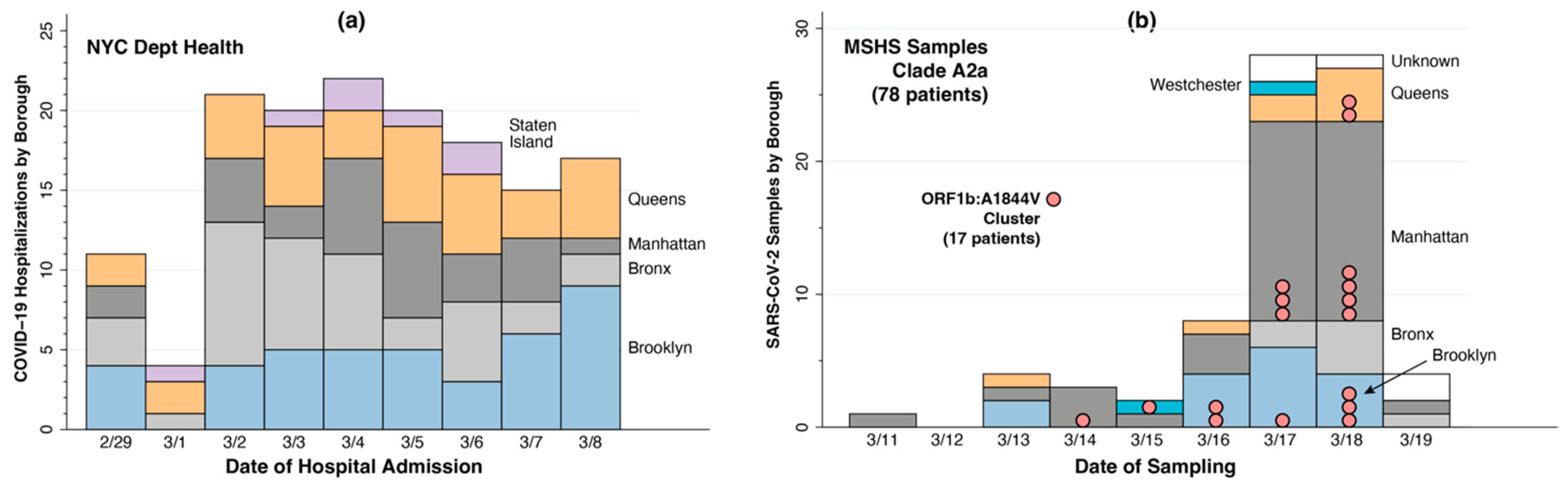
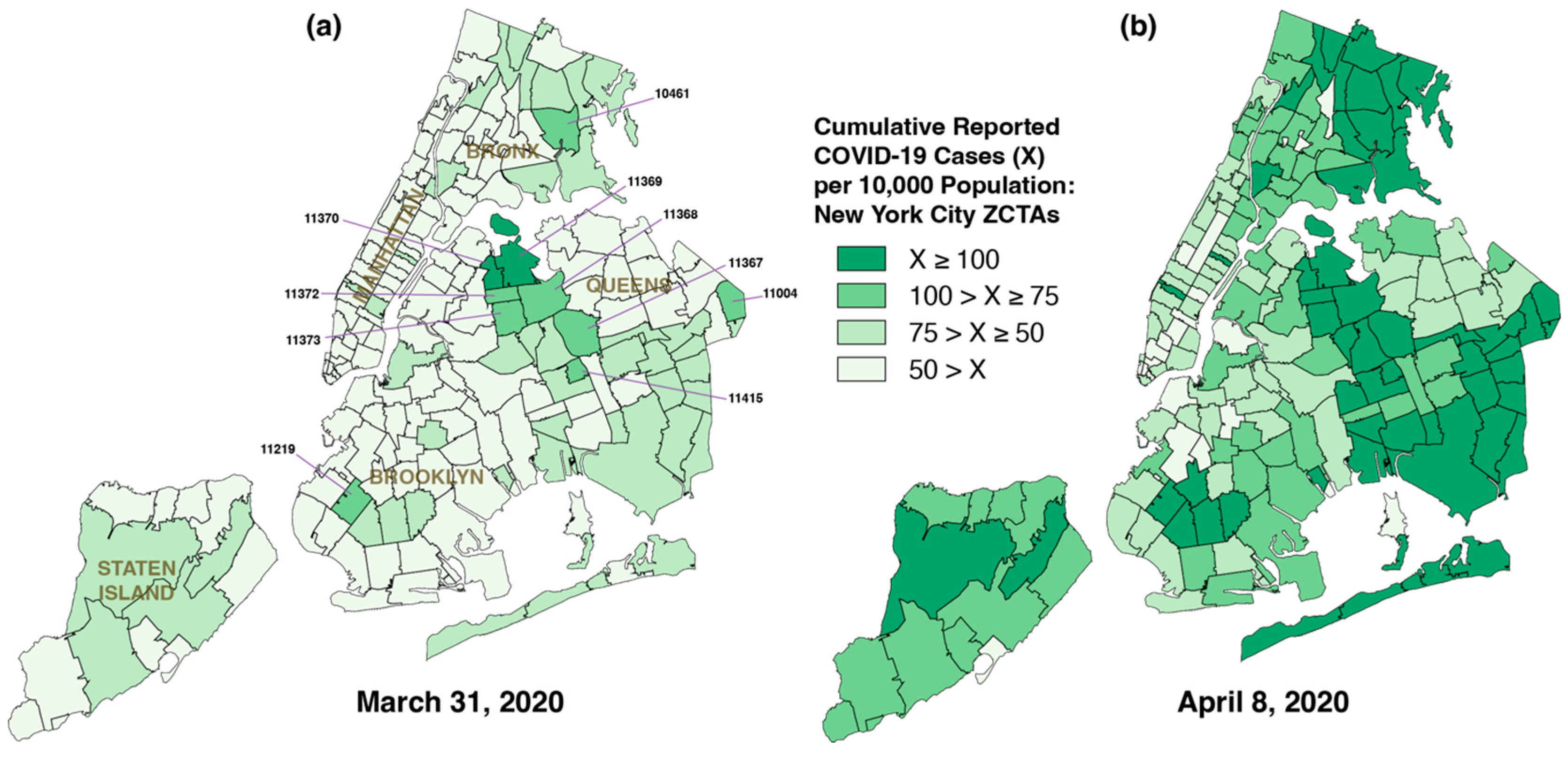
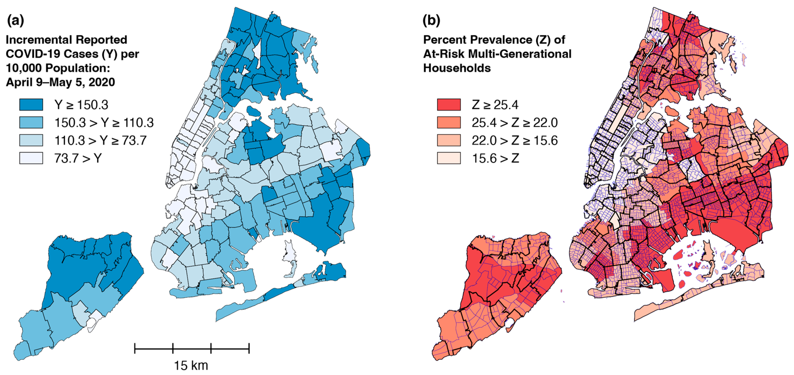
5. New York City: Network Diffusion and Local Percolation

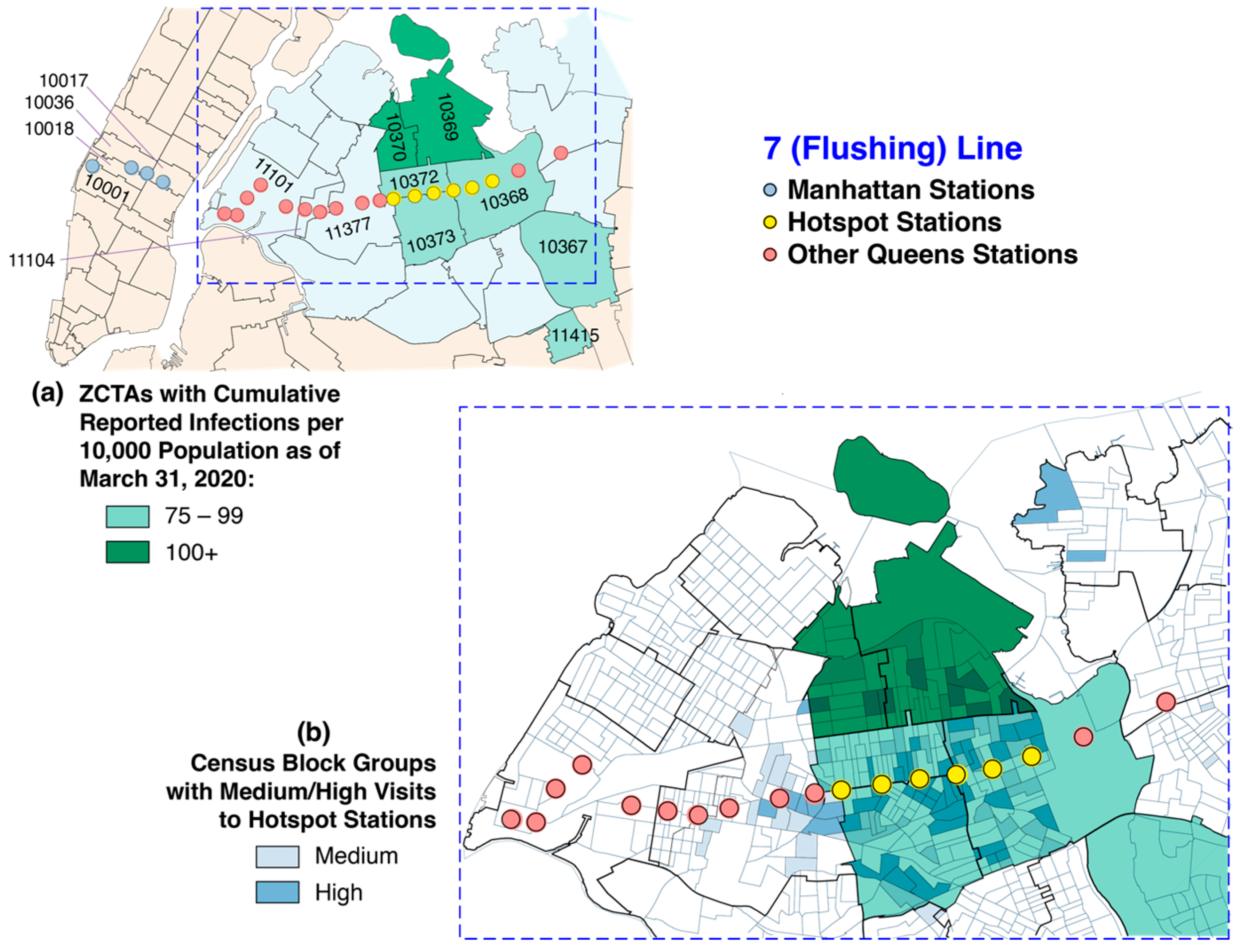
5.1. Widespread Diffusion of Infections Within Days of Importation

In Los Angeles, the countywide diffusion of COVID-19 entailed radial spread across geographically contiguous communities over the course of six weeks, as documented in Figure 1. But this is not what happened in New York City. Shortly after SARS-CoV-2 had been imported by the early-February arrival of affected travelers, the virus diffused rapidly throughout the city’s five boroughs in a matter of days. Figure 4 offers the evidence.
Accurate tracking of SARS-CoV-2 infections in the general population was initially hampered by the narrow testing criteria initially imposed by the Centers for Disease Control [33]. Still, panel (a) of Figure 4 shows infections in hospitalized patients residing in every borough by 1 March. Given the average 5-day incubation of the ancestral Wuhan strain [34] and another week before the onset of symptoms severe enough to require hospitalization, the 29 February admissions would date the first community-acquired infections to mid-February [35].
Panel (b) of Figure 4 shows why these cases could not all have been imported by multiple, distinct “Travelers 0”. Residents of four New York City boroughs (Brooklyn, Bronx, Manhattan, and Queens), as well as Westchester County, were identified among 78 virus-positive patients in the Mount Sinai Hospital System tracked during the second week of March [31,32]. Within this sample, 17 patients originating from diverse locations shared a unique viral signature, a finding consistent with having contracted SARS-CoV-2 from the same affected individual.

5.2. From Diffusion to Percolation

The map in panel (a) of Figure 5 displays the earliest available data on COVID-19 cases by Zip Code Tabulation Area (ZCTA). By 31 March, as seen in panel (a), cases had been diagnosed in residents of all 177 ZCTAs. In 55 ZCTAs, the cumulative incidence exceeded 50 cases per 10,000, and, in ten ZCTAs in Queens, Brooklyn, and the Bronx, it exceeded 75 per 10,000.
Panel (b) of Figure 5 displays the corresponding geographic distribution of the cumulative diagnosed cases through 8 April 2020. By then, a total of 106 ZCTAs in Queens, Staten Island, Brooklyn, and the Bronx had a cumulative incidence exceeding 75 per 10,000. In the eight-day interval between panels (a) and (b), the total reported COVID-19 cases had increased from 38,900 to 71,500 across the city—that is, by 84 percent.
In Figure 2 above, we display the geographic concordance between the density of multigenerational households and the cumulative incidence of COVID-19 in Los Angeles County. Figure 6 provides a comparable illustration for New York City. The map in panel (a) displays the ZCTA distribution of the incremental increase in COVID-19 incidence from 9 April to 5 May 2020—that is, for the 6-week period after the date of the map in Figure 5b. The map in panel (b) of Figure 6 shows the corresponding prevalence of at-risk multigenerational households. The geographic pattern of percolation in panel (a) once again matches the distribution of multigenerational households in panel (b).

5.3. Unique, Extensive Subway System as a Vehicle for Rapid Diffusion

The rapid, widespread geographic dispersion of SARS-CoV-2 during the initial diffusion phase could have been steered by city’s unique, extensive public transportation network, particularly its subway system. While nearly 85 percent of U.S. workers drove to their jobs before the pandemic, 80 percent of rush-hour commuters to New York City’s central business districts used transit [36]. The New York City subway system had a total of 1697.8 million turnstile entries during the calendar year 2019 [37], compared to 157.2 million entries into the Washington DC Metro [38], the next largest subway system in the United States.
At the onset of the COVID-19 pandemic, as shown in Figure 7, nearly 85 percent of the population lived in a ZCTA containing a subway stop or in a ZCTA adjacent to one containing a subway stop. Even the relatively remote ZCTA 11004 in Queens was connected to the Jamaica–179th Street Station at the end of the F Line by the 43 bus route running along Hillside Avenue, while the Staten Island line was connected to the rest of the city by a ferry. In view of its intensive use and its extensive geographic coverage of the city’s population, the New York City subway system could thus have served as an ideal diffusion network.

5.4. A Question of Timing

Timing is critical to testing the network diffusion hypothesis. The subway-riding public reacted rapidly to the exponential rise in reported COVID-19 cases during the first and second weeks of March 2020. By 15 March, subway turnstile entries had already fallen to less than one-quarter of their regular daily volume. Yet the earliest available geographic data on SARS-CoV-2 infections come from Figure 4a, dated 31 March. Still, there was sufficient geographic variation in the extent of the decline in subway volume by mid-March to permit the study of its differential impact on the incidence of COVID-19 cases during the first week of April 2020. This outcome variable could be computed as the difference in cumulative incidence between the two panels of Figure 4.
An analysis of the possible relation between the subway volume and COVID-19 across ZCTAs required data on not only the volume of turnstile entries into each subway station [40], but, even more critically, on the origins of visits to each station. To fill this gap, I relied upon data on smartphone device movements to census block groups that contained subway stations [41].
My approach is illustrated in Figure 8, which focuses on the 7 (or Flushing) subway line, running from Manhattan eastward into Queens. As shown in panel (a), I classified the stations along this subway line into three categories: Manhattan (four stations, colored gray); hotspot Queens (six stations, yellow); and other Queens (12 stations, pink). The hotspot Queens stations were located within a high-incidence cluster of ZCTAs in the Elmhurst area of Queens, as indicated in Figure 4a. By 16 March, the respective declines in turnstile entries were 67.8 percent into the Manhattan stations and 52.3 percent in the other Queens stations, but only 36.8 percent in the hotspot Queens stations. This finding suggested that, at least for certain areas of the city, an attenuated decline in subway visits in mid-March contributed to the subsequent emergence of high-incidence hotspots in these areas by early April.
Panel (b) of Figure 8 displays the main originating census block groups of smartphone movements terminating at hotspot Queens stations. The panel illustrates that trips to these hotspot stations originated from contiguous ZCTAs, especially 10369 and 10370, and not just from the ZCTAs containing these stations. This additional finding suggested that the more appropriate model was to relate the estimated mid-March volume of subway visits by origin ZCTA to the subsequent early-April incidence of COVID-19 in the same ZCTA. In fact, a cross-sectional analysis confirmed a significant bivariate relationship [39].

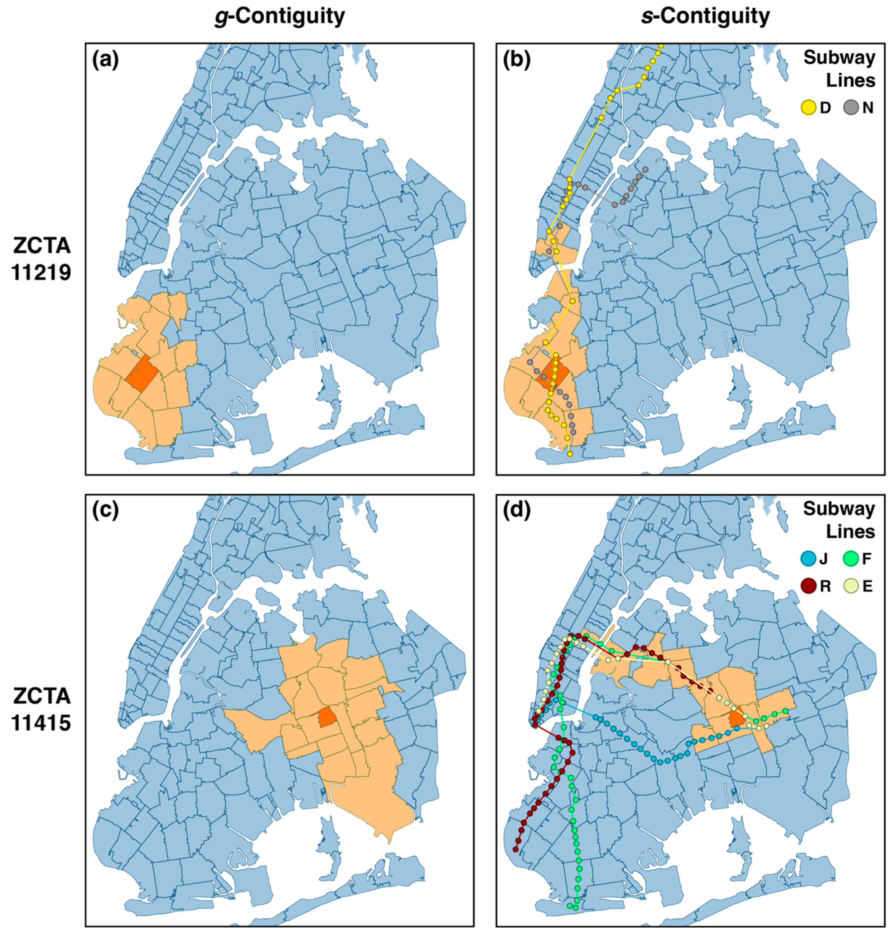
5.5. g- and s-Contiguity

To delve further into the subway-as-diffusion-network hypothesis, I need to introduce some novel terminology. Figure 9 shows two abstract maps of geographic areas with superimposed subway lines. In panel (a), we see three areas, numbered consecutively. Areas 1 and 2 are geographically contiguous, or g-contiguous. Because areas 2 and 3 are separated by a body of water, they are not g-contiguous. However, the subway line connecting areas 2 and 3 renders them subway- or s-contiguous. Panel (a) also illustrates the concept of compound contiguity. Since area 1 is g-contiguous with area 2, and area 2 is in turn s-contiguous with area 3, we say that area 1 is gs-contiguous with area 3.
The map in panel (b) in Figure 6 offers a refinement of the definition of s-contiguity. Areas 2 and 3 are s-contiguous and areas 3 and 4 are likewise s-contiguous, but area 2 is not s2-contiguous with area 4, as one can only travel from 2 to 4 in two subway stops by changing subway lines. Still, areas 1 and 4 would be both g3-contiguous and g2s-contiguous.
This brings us to Figure 10, which draws the distinction between these two forms of contiguity with data from the New York City subway system. For illustrative purposes, I have targeted ZCTAs 11219 in Brooklyn at the top (panels (a) and (b)) and 11415 in Queens at the bottom (panels (c) and (d)). In the column at the left (panels (a) and (c)), I have highlighted those ZCTAs that are (g + g2)-contiguous with the target ZCTA—that is, within a two-ZCTA geographic radius. In the column at the right (panels (b) and (d)), I have highlighted those ZCTAs that are (g + gs + gs2 + gs3 + gs4 + gs5)-contiguous with the target ZCTA—that is, within a radius of 0–5 connected subway stops from an adjacent ZCTA. The figure highlights the marked difference in reach achieved by the subway network connecting 11219 in Brooklyn to Downtown Manhattan and ultimately to the Bronx to the north, while connecting 11415 in Queens to Midtown Manhattan and ultimately to Brooklyn to the south.

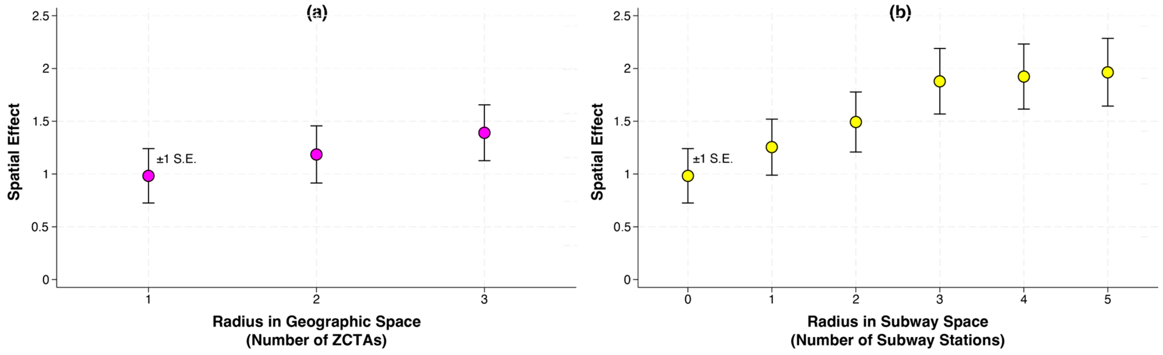
5.6. Modeling Diffusion Through Geographic and Subway Space

I formally modeled the early-April incidence of new infections in each ZCTA as dependent upon three variables: the mid-March subway visit volume originating in that ZCTA; the prevalence of multigenerational households in that ZCTA (as shown in Figure 6b); and the mid-March subway visit volume in other ZCTAs that were contiguous in either geographic or subway space. In such a multivariate model, the coefficient of the third variable would thus measure the spatial effect of either g- or s-contiguous ZCTAs while their own ZCTA characteristics were held constant.
To test the spatial effects in geographic space, I repeatedly ran the multivariate model with a varying contiguity criterion ranging from g- to (g + g2)- and then to (g + g2 + g3)-contiguous—that is, varying the allowable radius from one to three ZCTAs. To test the spatial effects in subway space, I repeatedly ran the same model with a varying contiguity criterion ranging from g- to (g + gs)- to (g + gs + gs2)- and continuing up to (g + gs + gs2 + gs3 + gs4 + gs5)-contiguous—that is, varying the allowable radius from zero to five subway stations.
Figure 11 displays the results of this modeling exercise. While there was an upward trend in the spatial effect with an expanding geographic radius, it was not statistically significant. By contrast, the increasing trend in the spatial effect with an expanding subway radius was statistically significant.
To interpret the results in Figure 11, I stress that there is no inherent reason that the spatial effect necessarily increases with the allowable radius. In fact, in my models of radial diffusion in Los Angeles County, the spatial effect decreased as the radius in geographic space was enlarged. As seen in Figure 1, COVID-19 diffused in Los Angeles County from communities with higher infection concentration to contiguous communities of lower infection concentration. These outlying communities would have had a smaller impact on the incidence of new COVID-19 cases at the nidus of infection in the center.
In the case of diffusion through the New York subway network, we are already seeing the transition from diffusion to percolation by the second or third week of March. The early onset of percolation in turn had a feedback effect on the diffusion process, as riders originating in these percolating hotspots re-entered the subway. As a result, the incidence of new infections in a particular ZCTA by the first week of April 2020 depended on its proximity along subway lines to any one of multiple developing niduses of infection. In this case, we would expect an increasing relation between the estimated spatial effect and a widening radius in subway space. The contrast between the two panels in Figure 11 implies that, even by the first week of April 2020, subway-mediated diffusion was still more quantitatively significant than radial geographic spread.

6. South Brooklyn: Percolation Through Local Social Mobility

In the initial phases of the COVID-19 epidemics in Los Angeles County and New York City, the percolation of new infections in local hotspots was driven at least in part by the nonuniform geographic distribution of multigenerational households. The idea was that younger people, who tended to be the most socially mobile, acquired new SARS-CoV-2 infections, which were then transmitted to their older, less socially mobile relatives. We observed a general version of this younger-to-older transmission phenomenon in the most populous counties of Florida once the then-governor ordered a “reopening” in May 2020. Even more generally, any increase in the persistence of local social mobility may result in the further percolation of new infections [42].
The role of local social mobility is highlighted by the case of South Brooklyn during the fall of 2020, as illustrated in Figure 12. On 6 October 2020, in the face of rising percentages of positive COVID-19 tests in South Brooklyn, the then-governor imposed a series of graded restrictions on local business openings and other venues where many people gathered, with the most severe restrictions prevailing in a central “red zone” [43].
While there was a temporary decline in new COVID-19 cases in the central red zone during 3–24 October 2020, ultimately, the COVID-19 cases rebounded, as shown in panel (a) of Figure 12. Subsequently, during 25 October–28 November 2020, the COVID-19 cases in all regulated zones increased. Even as the regulations continued to prevail, people still moved around, as documented in panel (b) of Figure 12. In fact, those ZCTAs with the highest recorded movements tended to have the largest numbers of new COVID-19 cases [44].
At least in the case of South Brooklyn in the autumn of 2020, the prohibition of mass gatherings, the closure of all but certain designated businesses, the restriction of indoor dining, and the regulation of in-person school instruction did not keep people from moving around. The persistence of relatively high levels of social mobility fostered the further percolation of COVID-19 infections within the local community.

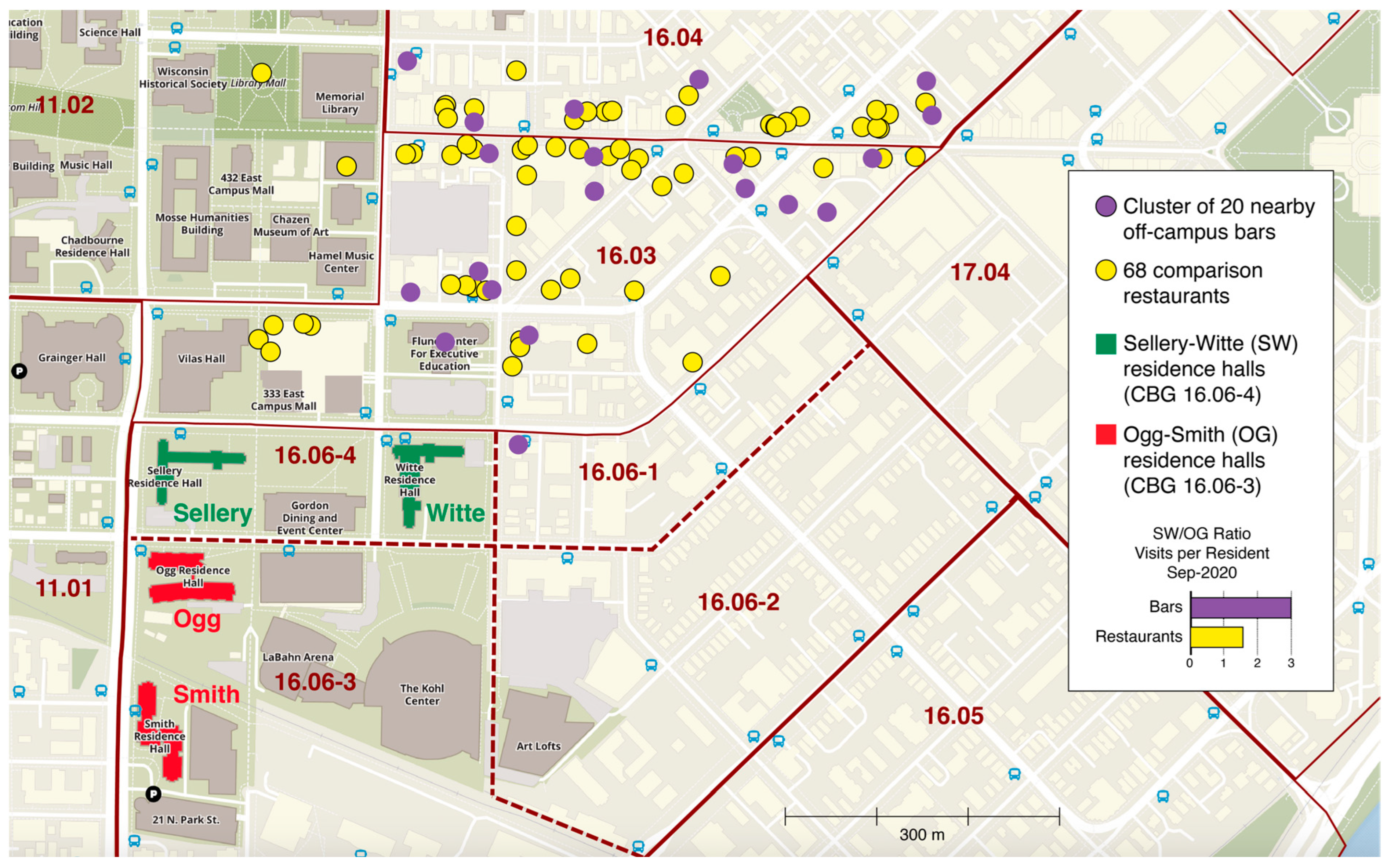
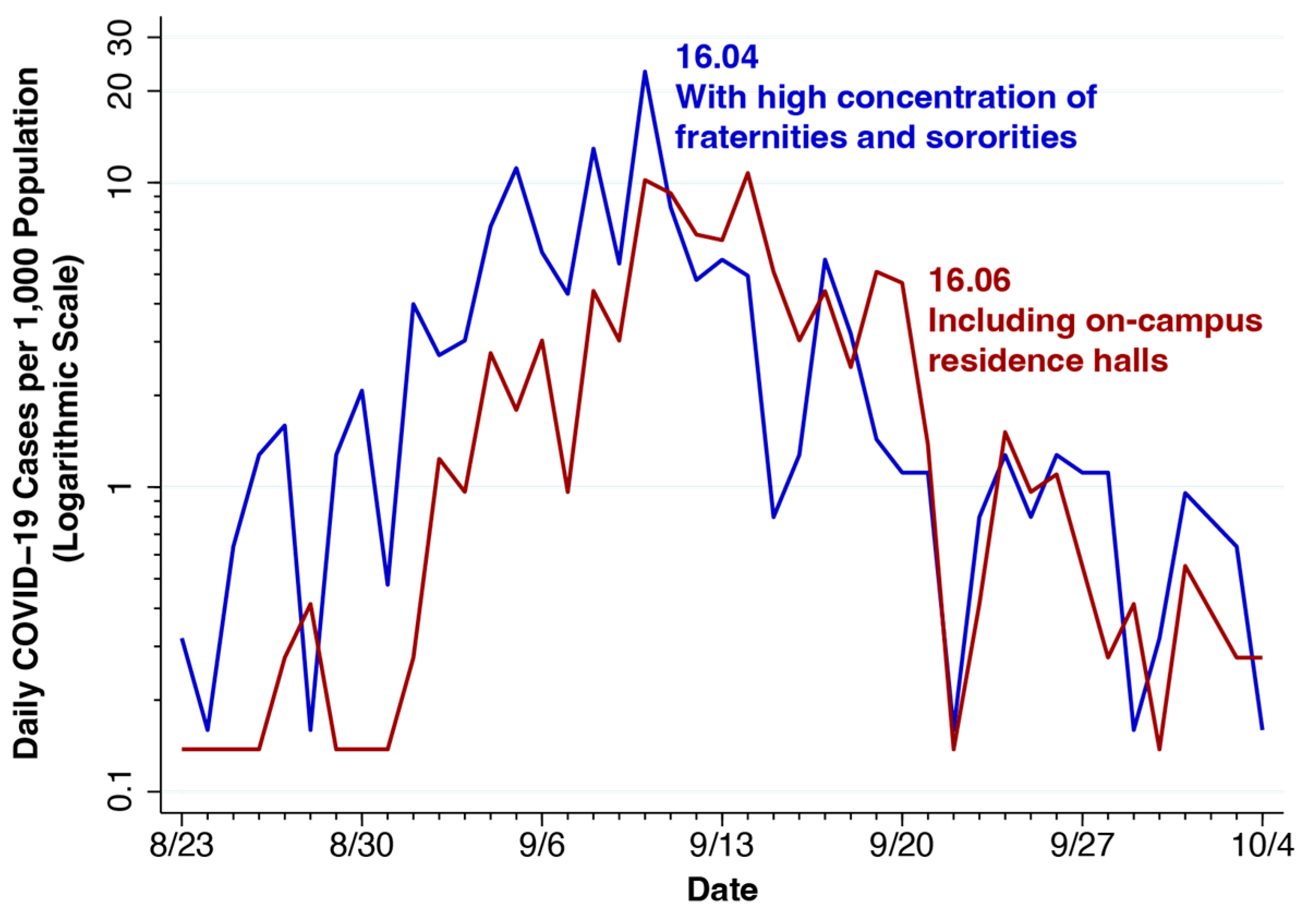
7. University of Wisconsin—Madison: Attractors and Quarantine Policies

On 8 September 2020, the University of Wisconsin—Madison COVID-19 dashboard had tallied over 600 new positive tests among students living in on-campus facilities. Rather than capitulating to a call by the Dane County Executive to close the university’s residence halls and send its 31,000 students back home [45], Chancellor Rebecca Blank [46] immediately imposed a quarantine on all those living in two residence halls, Sellery and Witte, where about 20 percent of the residents had so far tested positive [47,48]. All classes were to be temporarily held online. Off-campus student organizations were monitored for public health violations [49]. By 21 September, the university had performed more than 36,000 tests on its campus population [50]. By 26 September, with the outbreak essentially halted, in-person classes were phased back [51]. In a formal response to the county Board of Supervisors, Chancellor Blank implored local officials to step up their own efforts in epidemic control. Stressing that the university had less authority over off-campus gatherings, Blank added, “There is evidence that bars regulated by the city and county have been linked to the spread of COVID-19” [52].
Figure 13 describes a novel case–control study to test Chancellor Blank’s hypothesis [53]. Shown is a section of the university’s campus map, along with the locations of the affected residence halls (Sellery and White, the cases) and two other unaffected residence halls (Ogg and Smith, the controls), where no outbreak occurred. Also displayed are the locations of a cluster of 20 nearby off-campus bars and 68 comparison restaurants.
Without having to interview any students, I tracked the movements of smartphones originating in census block groups (CBGs) 16.06-4 (containing Sellery–White) and 16.06-3 (containing Ogg–Smith) to the designated bars and restaurants. The case–control ratio of bar visits per resident during September was 2.95, while the corresponding case–control ratio for restaurant visits per resident was 1.55. This gave an estimated odds ratio of 1.91 (95% confidence interval, 1.29–2.85). As Figure 13 shows, the proximity of the Sellery–White pair to bars and restaurants enhanced its overall visit rates. Even when I controlled for proximity by tracking movements to restaurants, the cases still had about twice as many bar visits as the controls.
Figure 14 plots two distinct waves of the outbreak. The first originated in tract 16.04, whose southern edge is seen at the top of Figure 13, where there was a high concentration of fraternities and sororities. The second wave, contained in tract 16.06, followed the first wave by about 4–5 days but grew more rapidly. While 16.06 included some off-campus housing in census block groups 16.06-1 and 16.06-2, the data are consistent with an outbreak dominated by cases in the Sellery–White residence halls within census block group 16.06-4.
The pair of incidence curves in Figure 14 is compatible with two alternative hypotheses concerning importation. First, “Student 0” arrived in an off-campus fraternity or sorority during the third week of August, initiating the diffusion of infections that ultimately reached Sellery–White, followed by the percolation of hundreds of COVID-19 cases among the residents. Second, there were multiple “Students 0”, with at least one arriving in an off-campus fraternity or sorority, while another arrived a few days later in Sellery–White. Without detailed phylogenetic analyses of viral samples [21,54], we cannot distinguish between the two explanations.
No matter which importation hypothesis is correct, the results in Figure 13 point to a potential critical role for the cluster of 20 nearby off-campus bars in the emergence of the Sellery–White outbreak. This inference alone, however, does not give us license to characterize the bar cluster as a diffusion network. It is clear that Downtown Madison was a traditional venue for “bar hopping” [55], and the notion that affected individuals could “hop” from one bar in a network to another was not without precedent. In May 2020, the South Korean authorities reported an outbreak of 34 cases after a 29-year-old SARS-CoV-2-affected patient visited five clubs and bars in Itaewon over the course of one night [56,57]. Unfortunately, my smartphone movement data were not sufficiently detailed to determine bar-to-bar movements by the same individual.
In the face of incomplete data, it would be more conservative to characterize the bar cluster as a singular, identifiable attractor within the immediate vicinity of the residence halls that could have served as a vehicle for the diffusion of SARS-CoV-2 infections. If so, Sellery–White residents who acquired infections in the bar cluster would have returned to the residence halls, where the relatively high-density living arrangements would have promoted the further percolation of COVID-19 cases.
The outbreak in the University of Wisconsin—Madison campus was ultimately brought under control principally by the quarantine of an identifiable population. While the effectiveness of quarantine appears to depend critically on the degree of adherence [58,59], one study based on the experience of Helsinki in the fall of 2020 estimated that, without case isolation and quarantine, the growth rate of new infections would have been at least twice as high [60]. What distinguishes the University of Wisconsin—Madison case is that the isolation step was simply bypassed. Everyone living in the two target residence halls was under quarantine.

8. Discussion and Conclusions

I have introduced the two key concepts of diffusion and percolation to characterize the sequential but overlapping phases of the spread of SARS-CoV-2 infection through entire populations. I relied on the results of multiple studies of populations within the U.S. during the first year of the COVID-19 pandemic to explore these key concepts in detail.
Data from the Los Angeles County epidemic in 2020 demonstrated an extended initial diffusion phase propelled by radial geographic spread, followed by percolation within hotspots fueled by the presence of multigenerational households. Data from the New York City epidemic in 2020, by contrast, pointed to rapid initial diffusion along a unique, extensive subway network. Subsequent percolation within multiple hotspots, similarly powered by a high density of multigenerational households, exerted a positive feedback effect, further enhancing diffusion. To formalize the critical differences in the mechanisms of diffusion between Los Angeles County and New York City, I introduced a pair of additional concepts: geographic (or g-) contiguity and subway (or s-) contiguity.
Data from Florida counties supported the generality of the phenomenon of SARS-CoV-2 transmission from more mobile, younger individuals to less mobile, older individuals. Data from the South Brooklyn hotspot revealed the limitations of some forms of government regulation in controlling mobility patterns that were critical to the continued percolation of the viral infection. Data from a COVID-19 outbreak on the campus of the University of Wisconsin—Madison demonstrated the critical role of a cluster of off-campus bars as an attractor for the diffusion and continued percolation of infection. The evidence also demonstrated the efficacy of quarantine as a control strategy when the hotspot is contained and well identified.

8.1. Limitations of This Review

My starting point for the analysis of viral spread was the arrival of a few affected travelers in a naïve population, which I termed importation. I did not study the international path of SARS-CoV-2 from China to Italy to New York City on the east coast of the United States, or from China to Washington State on the west coast [54]. I did not address whether the virus that was transported into New York City was of the same or a different strain compared to that which initiated the Los Angeles County epidemic [61]. Nor did I address whether travel restrictions had any effect on such importation [62]. My analysis began once the imported virus had arrived and begun to spread.
The evidence that I gathered was based on the experience of the first year of the pandemic in the United States. I did not address the roles of two critical phenomena in the long-run persistence of the virus in these populations—namely, the waning of protection from natural or vaccine-acquired immunity and the recurrent shocks of successive variants arising from viral immune escape through mutation [9]. My analysis ended once the virus had initially spread through the population, but before the arrival of vaccines, which proved extraordinarily effective in reducing hospitalizations and mortality from COVID-19 [8].
In Figure 4a, I provide counts of hospitalizations for COVID-19 in New York City during 29 February–8 March 2020 as a proxy for incomplete data on the case incidence. Otherwise, I do not comment on the extraordinary burden of morbidity and mortality from SARS-CoV-2 during the first pandemic year. Neither do I study the population-level determinants of morbidity and mortality or address how severe illness might have reduced affected individuals’ mobility and thus retarded viral spread.

8.2. Macro, Not Micro

I focused solely on the macro spread of SARS-CoV-2 at distances well beyond a few meters throughout entire populations of hundreds, thousands, and even millions of individuals over the course of days, weeks, and months. I did not address the science underlying the micro transmission of the virus from one affected person to other nearby susceptible individuals.
This is not to dismiss the need to characterize the underlying mechanisms of micro transmission. To this end, there has been extensive discussion about the distinction between droplets and aerosols as two diametrically opposed physical models of short-range viral propagation [63]. The former involve large particulates that remain airborne only over a relatively small radius—perhaps one or two meters—from their origin. The latter entail much smaller particulates that remain airborne over extended times and distances [64]. In the final analysis, however, droplets and aerosols may simply represent the ends of a continuous spectrum involving the particulate size, diffusion distance, and duration of suspension in the air [65,66,67].
Much has also been discussed regarding the micro concept of a superspreader, which arises from the variability in the degree to which affected individuals shed viral particles through each cough or sneeze. The point of this distinction is that superspreaders may be responsible for most of the viral transmission, while a large fraction of affected individuals may not transmit the virus to anyone else. Again, the more plausible scientific interpretation is that there is a wide continuum of viral transmissibility across affected individuals, with superspreaders at one end of the spectrum [68].

8.3. Viral Transmission Among Subway Passengers: The Subway as Attractor

The role of the subway network as a vehicle for the initial rapid diffusion of the virus needs to be distinguished from a second potential mechanism for the subway-mediated spread of viral infection—namely, the direct in situ transmission of the infection among passengers. Indeed, population-based studies of transport systems, along with engineering evaluations of subway cars, platforms, and other public transportation modes, have supported both the diffusion and direct transmission mechanisms [69,70,71,72,73,74,75,76,77,78]. A major outbreak of COVID-19 among front-line workers in the city’s Metropolitan Transport Authority favored the latter [79,80]. Confusion between the two distinct mechanisms contributed in no small part to the controversy over the initial preprint on the New York City subway hypothesis [81], which has, to date, received 237 citations. Still, only the former diffusion mechanism is central to my inquiry here.

8.4. Pandemic Control Policy Evaluation: The Details Matter

In my analysis of data from Florida counties (Figure 3), I noted that the divergence in the incidence curves between younger and older individuals began after the then-governor instituted a “reopening” in May 2020. While before–after inference can indeed be misleading, the data suggested that the “reopening” was a causal factor in the subsequent resurgence of cases. Whatever the cause of the rebound in COVID-19 cases, the subsequent trends did not support targeted policies that selectively relaxed the restrictions on younger persons while somehow seeking to protect more vulnerable older persons [82,83,84,85]. The young-to-old transmission phenomenon was seen even in Florida, where many older persons are sequestered in retirement communities.
In my assessment of the early experience in New York City, I noted that the subway volume had declined by 75 percent by 15 March in response to the exponential rise in reported cases during the previous two weeks. Soon thereafter, the COVID-19 incidence curve in New York City started to level off [39,86]. There appears to be no evidence to contradict the hypothesis that the flattening of the curve was causally related to the massive drop in subway volume. On 17 March, the then-mayor closed entertainment venues and limited restaurants and bars to take-out and delivery [87], but this was after subway ridership had plummeted. No government official restricted or banned riding on the subway. In fact, state and local officials continued to insist that the subways were safe [88]. The public’s decision to stop riding the subways, which likely prevented many cases and deaths, was voluntary.
When hundreds of positive COVID-19 tests were reported at the University of Wisconsin—Madison, the Dane County Executive urged the university to send thousands of on-campus students home and convert all in-person classes to remote learning [45]. The Chancellor’s decision instead to quarantine everyone living in a pair of on-campus residence halls proved effective in suppressing the outbreak in a matter of weeks. The campus outbreak occurred in the aftermath of a decision by the Wisconsin Supreme Court in May 2020 to nullify the carefully crafted, statewide regulatory scheme that had been drawn up by the then-governor. The resulting collection of asynchronous, uncoordinated local reopening plans ultimately facilitated a new COVID-19 wave during the summer [89].
In October 2020, the then-governor of New York State imposed a series of graded restrictions on local business openings and other venues where multiple people gathered, with the most severe restrictions prevailing in a central “red zone” [43]. COVID-19 diagnoses fell transiently in the red zone, but, by early November, the incidence curve had rebounded in the entire regulated area. The restrictions did not work because they failed to keep people from moving around. Such a conclusion accords with other studies documenting an association between a decline in population mobility and a subsequent reduction in the reported case incidence [42,90,91,92,93,94]. Voluntary reductions in social mobility in response to news of the emergence of the Omicron variant were similarly associated with a reduced COVID-19 incidence in the most populous counties in the U.S. during December 2021 through February 2022 [42].
In Los Angeles County, the percolation of COVID-19 cases was critically dependent on the prevalence of multigenerational households in a community. The allocation of additional resources to these most vulnerable communities—especially to local community health centers—has been proven to have a substantial effect in reducing COVID-19 morbidity and mortality [95,96,97].
These case studies, while selective, nonetheless caution us that broad generalizations about the effectiveness of policies to control the diffusion and percolation of infectious agents are likely to be fraught with exceptions due to unique circumstances. Rigorous evaluation needs to be based on the specific facts of individual cases. The details matter.

Funding

This research received no external funding.

Institutional Review Board Statement

All data relied upon in this study were based upon de-identified sources such as tabulations of smartphone movements or on publicly posted summary statistics on infection rates. No IRB statement is necessary.

Informed Consent Statement

Not applicable.

Data Availability Statement

The underlying data and programs for the multiple studies reviewed in detail in this article are available at several sites within the Open Science Framework: South Brooklyn—https://osf.io/rquyx/; New York City Subway—https://osf.io/v7k23/; University of Wisconsin—Madison—https://osf.io/7cvyh/; and Los Angeles County—https://osf.io/cq5uh/.

Acknowledgments

The opinions expressed in this article are the sole responsibility of the author. They do not necessarily represent the opinions of the Massachusetts Institute of Technology, Eisner Health, or any other organization. The comments of two anonymous referees are gratefully acknowledged.

Conflicts of Interest

The author declares no conflicts of interest.

References

  1. Harvey, W.T.; Carabelli, A.M.; Jackson, B.; Gupta, R.K.; Thomson, E.C.; Harrison, E.M.; Ludden, C.; Reeve, R.; Rambaut, A.; Consortium, C.-G.U.; et al. SARS-CoV-2 variants, spike mutations and immune escape. Nat. Rev. Microbiol. 2021, 19, 409–424. [Google Scholar] [CrossRef] [PubMed]
  2. Markov, P.V.; Ghafari, M.; Beer, M.; Lythgoe, K.; Simmonds, P.; Stilianakis, N.I.; Katzourakis, A. The evolution of SARS-CoV-2. Nat. Rev. Microbiol. 2023, 21, 361–379. [Google Scholar] [CrossRef] [PubMed]
  3. Gianino, M.M.; Nurchis, M.C.; Politano, G.; Rousset, S.; Damiani, G. Evaluation of the Strategies to Control COVID-19 Pandemic in Four European Countries. Front. Public. Health 2021, 9, 700811. [Google Scholar] [CrossRef]
  4. Girum, T.; Lentiro, K.; Geremew, M.; Migora, B.; Shewamare, S.; Shimbre, M.S. Optimal strategies for COVID-19 prevention from global evidence achieved through social distancing, stay at home, travel restriction and lockdown: A systematic review. Arch. Public Health 2021, 79, 150. [Google Scholar] [CrossRef]
  5. Riaz, M.; Shah, K.; Abdeljawad, T.; Amacha, I.; Al-Jaser, A.; Alqudah, M. A comprehensive analysis of COVID-19 nonlinear mathematical model by incorporating the environment and social distancing. Sci. Rep. 2024, 14, 12238. [Google Scholar] [CrossRef] [PubMed]
  6. Harris, J.E. A tight fit of the SIR dynamic epidemic model to daily cases of COVID-19 reported during the 2021–2022 Omicron surge in New York City: A novel approach. Stat. Methods Med. Res. 2024, 33, 1877–1898. [Google Scholar] [CrossRef]
  7. Tregoning, J.S.; Flight, K.E.; Higham, S.L.; Wang, Z.; Pierce, B.F. Progress of the COVID-19 vaccine effort: Viruses, vaccines and variants versus efficacy, effectiveness and escape. Nat. Rev. Immunol. 2021, 21, 626–636. [Google Scholar] [CrossRef] [PubMed]
  8. Harris, J.E. COVID-19 Incidence and Hospitalization During the Delta Surge Were Inversely Related to Vaccination Coverage Among the Most Populous U.S. Counties. Health Policy Technol. 2021, 11, 100583. [Google Scholar] [CrossRef] [PubMed]
  9. Harris, J.E. The repeated setbacks of HIV vaccine development laid the groundwork for SARS-CoV-2 vaccines. Health Policy Technol. 2022, 11, 100619. [Google Scholar] [CrossRef] [PubMed]
  10. McDermott, K.T.; Perry, M.; Linden, W.; Croft, R.; Wolff, R.; Kleijnen, J. The quality of COVID-19 systematic reviews during the coronavirus 2019 pandemic: An exploratory comparison. Syst. Rev. 2024, 13, 126. [Google Scholar] [CrossRef]
  11. McDonald, S.; Turner, S.L.; Nguyen, P.Y.; Page, M.J.; Turner, T. Are COVID-19 systematic reviews up to date and can we tell? A cross-sectional study. Syst. Rev. 2023, 12, 85. [Google Scholar] [CrossRef]
  12. Delmelle, E.; Bearman, N.; Yao, X.A. Developing geospatial analytical methods to explore and communicate the spread of COVID19. Cartogr. Geogr. Inf. Sci. 2024, 51, 193–199. [Google Scholar] [CrossRef]
  13. McMahon, T.; Chan, A.; Havlin, S.; Gallos, L.K. Spatial correlations in geographical spreading of COVID-19 in the United States. Sci. Rep. 2022, 12, 699. [Google Scholar] [CrossRef]
  14. Sander, L.M.; Warren, C.P.; Sokolov, I.M.; Simon, C.; Koopman, J. Percolation on heterogeneous networks as a model for epidemics. Math. Biosci. 2002, 180, 293–305. [Google Scholar] [CrossRef] [PubMed]
  15. Keeling, M.J.; Eames, K.T. Networks and epidemic models. J. R. Soc. Interface 2005, 2, 295–307. [Google Scholar] [CrossRef] [PubMed]
  16. Kenah, E.; Miller, J.C. Epidemic percolation networks, epidemic outcomes, and interventions. Interdiscip. Perspect. Infect. Dis. 2011, 2011, 543520. [Google Scholar] [CrossRef]
  17. Stegehuis, C.; van der Hofstad, R.; van Leeuwaarden, J.S. Epidemic spreading on complex networks with community structures. Sci. Rep. 2016, 6, 29748. [Google Scholar] [CrossRef]
  18. Li, R.; Song, Y.; Wang, H.; Jiang, G.P.; Xiao, M. Reactive-diffusion epidemic model on human mobility networks: Analysis and applications to COVID-19 in China. Phys. A 2023, 609, 128337. [Google Scholar] [CrossRef]
  19. Wang, L.; Khan, A.A.; Ullah, S.; Haider, N.; AlQahtani, S.A.; Saqib, A.B. A rigorous theoretical and numerical analysis of a nonlinear reaction-diffusion epidemic model pertaining dynamics of COVID-19. Sci. Rep. 2024, 14, 7902. [Google Scholar] [CrossRef]
  20. Harris, J.E. Los Angeles County SARS-CoV-2 Epidemic: Critical Role of Multi-generational Intra-household Transmission. J. Bioecon. 2021, 23, 55–83. [Google Scholar] [CrossRef]
  21. Worobey, M.; Watts, T.D.; McKay, R.A.; Suchard, M.A.; Granade, T.; Teuwen, D.E.; Koblin, B.A.; Heneine, W.; Lemey, P.; Jaffe, H.W. 1970s and ‘Patient 0’ HIV-1 genomes illuminate early HIV/AIDS history in North America. Nature 2016, 539, 98–101. [Google Scholar] [CrossRef]
  22. Los Angeles County. Countywide Statistical Areas (CSAs). Available online: https://data.lacounty.gov/datasets/lacounty::countywide-statistical-areas-csas/about (accessed on 8 December 2024).
  23. Los Angeles County Department of Public Health. LA County COVID-19 Surveillance Dashboard. Available online: http://dashboard.publichealth.lacounty.gov/covid19_surveillance_dashboard/ (accessed on 8 December 2024).
  24. U.S Census Bureau. Accessing PUMS Data. Available online: https://www.census.gov/programs-surveys/acs/microdata/access.html (accessed on 14 January 2021).
  25. Desantis, R. Executive Order Number 20-68: Emergency Management-COVID-19, Effective March 17, 2020; State of Florida, Office of the Governor, 17 March 2020. Available online: https://www.flgov.com/wp-content/uploads/orders/2020/EO_20-68.pdf (accessed on 6 January 2025).
  26. Desantis, R. Executive Order Number 20-91: Essential Services and Activities During COVID-19 Emergency, Effective April 3, 2020; State of Florida, Office of the Governor, 1 April 2020. Available online: https://www.flgov.com/wp-content/uploads/orders/2020/EO_20-91-compressed.pdf (accessed on 6 January 2025).
  27. Desantis, R. Executive Order Number 20-112. Phase 1: Safe. Smart. Step-by-Step. Plan for Florida’s Recovery, Effective May 4, 2020; State of Florida, Office of the Governor, 29 April 2020. Available online: https://www.flgov.com/wp-content/uploads/orders/2020/EO_20-112.pdf (accessed on 6 January 2025).
  28. Desantis, R. Executive Order Number 20-123: Full Phase I: Safe. Smart. Step-by-Step. Plan for Florida’s Recovery, Effective May 18, 2020; State of Florida, Office of the Governor, 14 May 2020. Available online: https://www.flgov.com/wp-content/uploads/orders/2020/EO_20-123.pdf (accessed on 6 January 2025).
  29. Harris, J.E. Data from the COVID-19 epidemic in Florida suggest that younger cohorts have been transmitting their infections to less socially mobile older adults. Rev. Econ. Househ. 2020, 18, 1019–1037. [Google Scholar] [CrossRef] [PubMed]
  30. New York Department of Health and Mental Hygiene. NYC Coronavirus Disease 2019 (COVID-19) Data. Available online: https://github.com/nychealth/coronavirus-data (accessed on 3 July 2022).
  31. Gonzalez-Reiche, A.S.; Hernandez, M.M.; Sullivan, M.J.; Ciferri, B.; Alshammary, H.; Obla, A.; Fabre, S.; Kleiner, G.; Polanco, J.; Khan, Z.; et al. Introductions and early spread of SARS-CoV-2 in the New York City area. Science 2020, 369, 297–301. [Google Scholar] [CrossRef] [PubMed]
  32. Maurano, M.T.; Ramaswami, S.; Zappile, P.; Dimartino, D.; Boytard, L.; Ribeiro-dos-Santos, A.M.; Vulpescu, N.A.; Westby, G.; Shen, G.; Feng, X. Sequencing identifies multiple early introductions of SARS-CoV-2 to the New York City Region. medRxiv 2020. Available online: https://www.medrxiv.org/content/10.1101/2020.04.15.20064931v4 (accessed on 19 August 2020). [CrossRef] [PubMed]
  33. Centers for Disease Control and Prevention. Updated Guidance on Evaluating and Testing Persons for Coronavirus Disease 2019 (COVID-19); Distributed via the CDC Health Alert Network, 08 March 2020, 8:20 PM ET, CDCHAN-00429. 2020. Available online: https://emergency.cdc.gov/han/2020/han00429.asp (accessed on 6 January 2025).
  34. Li, Q.; Guan, X.; Wu, P.; Wang, X.; Zhou, L.; Tong, Y.; Ren, R.; Leung, K.S.M.; Lau, E.H.Y.; Wong, Y. Early Transmission Dynamics in Wuhan, China, of Novel Coronavirus-Infected Pneumonia. N. Engl. J. Med. 2020, 382, 1199–1207. [Google Scholar] [CrossRef]
  35. Stadlbauer, D.; Tan, J.; Jiang, K.; Hernandez, M.M.; Fabre, S.; Amanat, F.; Teo, C.; Arunkumar, G.A.; McMahon, M.; Capuano, C.; et al. Repeated cross-sectional sero-monitoring of SARS-CoV-2 in New York City. Nature 2021, 590, 146–150. [Google Scholar] [CrossRef] [PubMed]
  36. Metropolitan Transportation Authority. About Us. The MTA Network: Public Transportation for the New York Region; Last accessed 27 December 2020. Available online: http://web.mta.info/mta/network.htm (accessed on 6 January 2025).
  37. Metropolitan Transportation Authority. Subway and bus ridership for 2019. Updated 14 April 2020. Available online: https://new.mta.info/agency/new-york-city-transit/subway-bus-ridership-2019 (accessed on 6 January 2025).
  38. Washington Metropolitan Area Transit Authority. Rail Ridership Data Viewer; Last accessed 27 December 2020. Available online: https://www.wmata.com/initiatives/ridership-portal/Rail-Data-Portal.cfm (accessed on 6 January 2025).
  39. Harris, J.E. Critical Role of the Subways in the Initial Spread of SARS-CoV-2 in New York City. Front. Public Health 2021, 9, 754767. [Google Scholar] [CrossRef] [PubMed]
  40. Metropolitan Transportation Authority (MTA). Turnstile Data. Available online: http://web.mta.info/developers/turnstile.html (accessed on 6 January 2025).
  41. SafeGraph Inc. Social Distancing Metrics. Available online: https://docs.safegraph.com/docs/social-distancing-metrics (accessed on 6 January 2025).
  42. Harris, J.E. Mobility was a significant determinant of reported COVID-19 incidence during the Omicron Surge in the most populous U.S. Counties. BMC Infect. Dis. 2022, 22, 691. [Google Scholar] [CrossRef] [PubMed]
  43. New York Governor. Governor Cuomo Announces New Cluster Action Initiative. Press Release, 6 October 2020. Available online: https://www.governor.ny.gov/news/governor-cuomo-announces-new-cluster-action-initiative (accessed on 6 January 2025).
  44. Harris, J.E. Concentric regulatory zones failed to halt surging COVID-19: Brooklyn 2020. Front. Public Health 2022, 10, 970363. [Google Scholar] [CrossRef]
  45. Viviani, N. Parisi Urges UW On-Campus Students Home and Go to Online Classes; 15 WMTV, 9 September 2020. Available online: https://www.wmtv15news.com/2020/09/09/parisi-urges-uw-to-send-all-undergraduates-home-for-the-semester/ (accessed on 6 January 2025).
  46. Traub, A. Rebecca Blank, Who Changed How Poverty Is Measured, Dies at 67; New York Times,9 March (Updated March 11). 2023. Available online: https://www.nytimes.com/2023/03/09/us/rebecca-blank-dead.html (accessed on 8 January 2024).
  47. University of Wisconsin-Madison. University Shifts to Two Weeks of Remote Instruction, Quarantines Two Residence Halls. University of Wisconsin-Madison, Press Release, 9 September 2020. Available online: https://news.wisc.edu/university-shifts-to-two-weeks-remote-instruction/ (accessed on 6 January 2025).
  48. University of Wisconsin-Madison. Sellery & Witte Requirements; 15 September 2020. Available online: https://www.housing.wisc.edu/2020/09/sellery-witte-requirements/ (accessed on 6 January 2025).
  49. Olstad, C. Message to Students: COVID-19 Clarifications and Reminders. University of Wisconsin-Madison, 18 September 2020. Available online: https://news.wisc.edu/message-to-students-covid-19-clarifications-and-reminders/ (accessed on 6 January 2025).
  50. Blank, R. Chancellor Blank to County Executive: Partner with Us in Enforcing Safe Behavior Off-Campus. University of Wisconsin-Madison, 21 September 2020. Available online: https://news.wisc.edu/chancellor-blank-to-county-executive-partner-with-us-in-enforcing-safe-behavior-off-campus/ (accessed on 6 January 2025).
  51. Blank, R. Campus to Resume Some In-Person Activities, Maintain Strict Health Measures; University of Wisconsin-Madison, 26 September 2020. Available online: https://covidresponse.wisc.edu/campus-to-resume-some-in-person-activities-maintain-strict-health-measures/ (accessed on 6 January 2025).
  52. Blank, R. Chancellor Blank Statement on Dane County Board of Supervisors. University of Wisconsin-Madison, 1 October 2020. Available online: https://news.wisc.edu/chancellor-blank-statement-on-dane-county-board-of-supervisors/ (accessed on 6 January 2025).
  53. Harris, J.E. Geospatial Analysis of a COVID-19 Outbreak at the University of Wisconsin-Madison: Potential Role of a Cluster of Local Bars. Epidemiol. Infect. 2022, 150, e76. [Google Scholar] [CrossRef]
  54. Worobey, M.; Pekar, J.; Larsen, B.B.; Nelson, M.I.; Hill, V.; Joy, J.B.; Rambaut, A.; Suchard, M.A.; Wertheim, J.O.; Lemey, P. The emergence of SARS-CoV-2 in Europe and North America. Science 2020, 370, 564–570. [Google Scholar] [CrossRef] [PubMed]
  55. Tripadvosir. State Street & Downtown Madison: Fun Place to Bar Hop…Even as an Adult; 22 January 2018. Available online: https://www.tripadvisor.com/ShowUserReviews-g60859-d281199-r555577961-State_Street_Downtown_Madison-Madison_Wisconsin.html (accessed on 6 January 2025).
  56. Kwang-tae, K.S. Korea Reports 34 New Virus Cases, Biggest Single-Day Jump in One Month. Yonhap News Agency, 10 May 202. Available online: https://en.yna.co.kr/view/AEN20200510001251320 (accessed on 6 January 2025).
  57. Kang, C.R.; Lee, J.Y.; Park, Y.; Huh, I.S.; Ham, H.J.; Han, J.K.; Kim, J.I.; Na, B.J.; Seoul Metropolitan Government, C.-R.R.T. Coronavirus Disease Exposure and Spread from Nightclubs, South Korea. Emerg. Infect. Dis. 2020, 26, 2499–2501. [Google Scholar] [CrossRef]
  58. James, A.; Plank, M.J.; Hendy, S.; Binny, R.; Lustig, A.; Steyn, N.; Nesdale, A.; Verrall, A. Successful contact tracing systems for COVID-19 rely on effective quarantine and isolation. PLoS ONE 2021, 16, e0252499. [Google Scholar] [CrossRef] [PubMed]
  59. Davis, E.L.; Lucas, T.C.D.; Borlase, A.; Pollington, T.M.; Abbott, S.; Ayabina, D.; Crellen, T.; Hellewell, J.; Pi, L.; Group, C.C.-W.; et al. Contact tracing is an imperfect tool for controlling COVID-19 transmission and relies on population adherence. Nat. Commun. 2021, 12, 5412. [Google Scholar] [CrossRef] [PubMed]
  60. Auranen, K.; Shubin, M.; Erra, E.; Isosomppi, S.; Kontto, J.; Leino, T.; Lukkarinen, T. Efficacy and effectiveness of case isolation and quarantine during a growing phase of the COVID-19 epidemic in Finland. Sci. Rep. 2023, 13, 298. [Google Scholar] [CrossRef]
  61. Fauver, J.R.; Petrone, M.E.; Hodcroft, E.B.; Shioda, K.; Ehrlich, H.Y.; Watts, A.G.; Vogels, C.B.F.; Brito, A.F.; Alpert, T.; Muyombwe, A.; et al. Coast-to-Coast Spread of SARS-CoV-2 during the Early Epidemic in the United States. Cell 2020, 181, 990–996.E5. [Google Scholar] [CrossRef]
  62. Gwee, S.X.W.; Chua, P.E.Y.; Wang, M.X.; Pang, J. Impact of travel ban implementation on COVID-19 spread in Singapore, Taiwan, Hong Kong and South Korea during the early phase of the pandemic: A comparative study. BMC Infect. Dis. 2021, 21, 799. [Google Scholar] [CrossRef] [PubMed]
  63. Vuorinen, V.; Aarnio, M.; Alava, M.; Alopaeus, V.; Atanasova, N.; Auvinen, M.; Balasubramanian, N.; Bordbar, H.; Erasto, P.; Grande, R.; et al. Modelling aerosol transport and virus exposure with numerical simulations in relation to SARS-CoV-2 transmission by inhalation indoors. Saf. Sci. 2020, 130, 104866. [Google Scholar] [CrossRef] [PubMed]
  64. Romano-Bertrand, S.; Aho-Glele, L.S.; Grandbastien, B.; Gehanno, J.F.; Lepelletier, D. Sustainabilit of SARS-CoV-2 in aerosols: Should we worry about airborne transmission? J. Hosp. Infect. 2020, 105, 601–603. [Google Scholar] [CrossRef]
  65. Drossinos, Y.; Weber, T.P.; Stilianakis, N.I. Droplets and aerosols: An artificial dichotomy in respiratory virus transmission. Health Sci. Rep. 2021, 4, e275. [Google Scholar] [CrossRef] [PubMed]
  66. Bahl, P.; Doolan, C.; de Silva, C.; Chughtai, A.A.; Bourouiba, L.; MacIntyre, C.R. Airborne or Droplet Precautions for Health Workers Treating Coronavirus Disease 2019? J. Infect. Dis. 2022, 225, 1561–1568. [Google Scholar] [CrossRef] [PubMed]
  67. Mittal, R.; Meneveau, C.; Wu, W. A mathematical framework for estimating risk of airborne transmission of COVID-19 with application to face mask use and social distancing. Phys. Fluids 2020, 32, 101903. [Google Scholar] [CrossRef] [PubMed]
  68. Chen, P.Z.; Bobrovitz, N.; Premji, Z.; Koopmans, M.; Fisman, D.N.; Gu, F.X. Heterogeneity in transmissibility and shedding SARS-CoV-2 via droplets and aerosols. Elife 2021, 10. [Google Scholar] [CrossRef] [PubMed]
  69. Hu, M.; Lin, H.; Wang, J.; Xu, C.; Tatem, A.J.; Meng, B.; Zhang, X.; Liu, Y.; Wang, P.; Wu, G.; et al. The risk of COVID-19 transmission in train passengers: An epidemiological and modelling study. Clin. Infect. Dis. 2020, 72, 604–610. [Google Scholar] [CrossRef]
  70. Du, Z.; Wang, L.; Cauchemez, S.; Xu, X.; Wang, X.; Cowling, B.J.; Meyers, L.A. Risk for Transportation of Coronavirus Disease from Wuhan to Other Cities in China. Emerg. Infect. Dis. 2020, 26, 1049–1052. [Google Scholar] [CrossRef]
  71. Zheng, R.; Xu, Y.; Wang, W.; Ning, G.; Bi, Y. Spatial transmission of COVID-19 via public and private transportation in China. Travel Med. Infect. Dis. 2020, 34, 101626. [Google Scholar] [CrossRef]
  72. Sy, K.T.L.; Martinez, M.E.; Rader, B.; White, L.F. Socioeconomic Disparities in Subway Use and COVID-19 Outcomes in New York City. Am. J. Epidemiol. 2020, 190, 1234–1242. [Google Scholar] [CrossRef]
  73. Glaeser, E.L.; Gorback, C.; Redding, S.J. JUE insight: How much does COVID-19 increase with mobility? Evidence from New York and four other U.S. cities. J. Urban Econ. 2022, 127, 103292. Available online: https://www.sciencedirect.com/science/article/abs/pii/S0094119020300632?via%3Dihub (accessed on 21 October 2020). [CrossRef] [PubMed]
  74. Fathi-Kazerooni, S.; Rojas-Cessa, R.; Dong, Z.; Umpaichitra, V. Correlation of subway turnstile entries and COVID-19 incidence and deaths in New York City. Infect. Dis. Model. 2021, 6, 183–194. [Google Scholar] [CrossRef]
  75. Li, P.; Chen, X.; Ma, C.; Zhu, C.; Lu, W. Risk assessment of COVID-19 infection for subway commuters integrating dynamic changes in passenger numbers. Environ. Sci. Pollut. Res. Int. 2022, 29, 74715–74724. [Google Scholar] [CrossRef]
  76. Edwards, N.J.; Widrick, R.; Wilmes, J.; Breish, B.; Gershefske, M.; Sullivan, J.; Potember, R.; Espinoza-Calvio, A. Reducing COVID-19 airborne transmission risks on public transportation buses: An empirical study on aerosol dispersion and control. Aerosol Sci. Technol. 2021, 55, 1378–1397. [Google Scholar] [CrossRef]
  77. Zhao, S.; Zhuang, Z.; Ran, J.; Lin, J.; Yang, G.; Yang, L.; He, D. The association between domestic train transportation and novel coronavirus (2019-nCoV) outbreak in China from 2019 to 2020: A data-driven correlational report. Travel Med. Infect. Dis. 2020, 33, 101568. [Google Scholar] [CrossRef] [PubMed]
  78. SAGE—Environmental and Modelling Group 18052020. Evidence for Transmission of SARS-CoV-2 on Ground Public Transport and Potential Effectiveness of Mitigation Measures. United Kingdom. Available online: https://assets.publishing.service.gov.uk/media/5f215948e90e071a603d33c0/S0441_EMG_-_Evidence_for_transmission_of_SARS-COV-2_on_ground_public_transport.pdf (accessed on 1 April 2020).
  79. Metropolitan Transportation Authority (MTA). Letter from Chairman Patrick J. Foye to Senator Charles E. Schumer and Congresswoman Nita Lowey; 16 April 2020. Available online: https://apps.cio.ny.gov/apps/mediaContact/public/download.cfm?attachment_uuid=24982848-D532-BD18-F4767900C446F08C (accessed on 6 January 2025).
  80. Martinez, J. NYC Subway Crews Hit Hardest by Coronavirus, MTA Numbers Show. The City, 1 June 2020. Available online: https://www.thecity.nyc/2020/6/1/21277407/nyc-subway-crews-hit-hardest-by-coronavirus-pandemic-mta-numbers-show (accessed on 6 January 2025).
  81. Harris, J.E. The Subways Seeded the Massive Coronavirus Epidemic in New York City; National Bureau of Economic Research Working Paper No. 27021, Updated August 2020. Available online: https://www.nber.org/papers/w27021 (accessed on 6 January 2025).
  82. Chikina, M.; Pegden, W. Modeling strict age-targeted mitigation strategies for COVID-19. PLoS ONE 2020, 15, e0236237. [Google Scholar] [CrossRef] [PubMed]
  83. Iverson, T.; Karp, L.S.; Peri, A. Protecting the Vulnerable during a Pandemic with Uncertain Vaccine Arrival and Reinfection. Soc. Sci. Res. Netw. 2020. Available online: https://papers.ssrn.com/sol3/papers.cfm?abstract_id=3648714 (accessed on 6 January 2025). [CrossRef]
  84. Gollier, C. Cost-benefit analysis of age-specific deconfinement strategies. Toulouse Sch. Econ 2020. Available online: https://www.institutlouisbachelier.org/wp-content/uploads/2020/05/cost-benefit-analysis-of-age-specific-deconfinement-strategies-christian-gollier-tse.pdf (accessed on 6 January 2025). [CrossRef]
  85. Acemoglu, D.; Chernozhukov, V.; Werning, I.; Whinston, M.D. Optimal Targeted Lockdowns in a Multigroup SIR Model. Am. Econ. Rev. Insights 2021, 3, 487–502. [Google Scholar] [CrossRef]
  86. Harris, J.E. The Coronavirus Epidemic Curve is Already Flattening in New York City; National Bureau of Economic Research, Working Paper 26917, Posted April 2020. Available online: https://www.nber.org/papers/w26917 (accessed on 6 January 2025).
  87. Office of the Mayor. Statement From Mayor de Blasio on Bars, Restaurants, and Entertainment Venues; City of New York, 15 March 2020. Available online: https://www1.nyc.gov/office-of-the-mayor/news/152-20/statement-mayor-de-blasio-bars-restaurants-entertainment-venues (accessed on 6 January 2025).
  88. Vielkind, J.; Grayce, M. Amid Coronavirus Fears, Officials Say New York City Subway Is Safe. Wall Str. J. 2020. Available online: https://www.wsj.com/amp/articles/amid-coronavirus-fears-officials-say-new-york-city-subway-is-safe-11583272664 (accessed on 6 January 2025).
  89. Harris, J.E. COVID-19, bar crowding, and the Wisconsin Supreme Court: A non-linear tale of two counties. Res. Int. Bus. Financ. 2020, 54, 101310. [Google Scholar] [CrossRef]
  90. Kephart, J.L.; Delclos-Alio, X.; Rodriguez, D.A.; Sarmiento, O.L.; Barrientos-Gutierrez, T.; Ramirez-Zea, M.; Quistberg, D.A.; Bilal, U.; Diez Roux, A.V. The effect of population mobility on COVID-19 incidence in 314 Latin American cities: A longitudinal ecological study with mobile phone location data. Lancet Digit. Health 2021, 3, e716–e722. [Google Scholar] [CrossRef]
  91. Oh, J.; Lee, H.Y.; Khuong, Q.L.; Markuns, J.F.; Bullen, C.; Barrios, O.E.A.; Hwang, S.S.; Suh, Y.S.; McCool, J.; Kachur, S.P.; et al. Mobility restrictions were associated with reductions in COVID-19 incidence early in the pandemic: Evidence from a real-time evaluation in 34 countries. Sci. Rep. 2021, 11, 13717. [Google Scholar] [CrossRef] [PubMed]
  92. Nouvellet, P.; Bhatia, S.; Cori, A.; Ainslie, K.E.C.; Baguelin, M.; Bhatt, S.; Boonyasiri, A.; Brazeau, N.F.; Cattarino, L.; Cooper, L.V.; et al. Reduction in mobility and COVID-19 transmission. Nat. Commun. 2021, 12, 1090. [Google Scholar] [CrossRef] [PubMed]
  93. He, S.; Lee, J.; Langworthy, B.; Xin, J.; James, P.; Yang, Y.; Wang, M. Delay in the Effect of Restricting Community Mobility on the Spread of COVID-19 During the First Wave in the United States. Open Forum Infect. Dis. 2022, 9, ofab586. [Google Scholar] [CrossRef] [PubMed]
  94. Manzira, C.K.; Charly, A.; Caulfield, B. Assessing the impact of mobility on the incidence of COVID-19 in Dublin City. Sustain. Cities Soc. 2022, 80, 103770. [Google Scholar] [CrossRef] [PubMed]
  95. Harris, J.E. Community Health Centers Can Help Stamp out COVID-19. STAT News, 3 February 2021. Available online: https://www.statnews.com/2021/02/03/community-health-centers-can-help-stamp-out-covid-19/ (accessed on 6 January 2025).
  96. Romero, L.; Pao, L.Z.; Clark, H.; Riley, C.; Merali, S.; Park, M.; Eggers, C.; Campbell, S.; Bui, C.; Bolton, J.; et al. Health Center Testing for SARS-CoV-2 During the COVID-19 Pandemic-United States, 5 June–2 October 2020. MMWR Morb. Mortal. Wkly. Rep. 2020, 69, 1895–1901. [Google Scholar] [CrossRef] [PubMed]
  97. Demeke, H.B.; Pao, L.Z.; Clark, H.; Romero, L.; Neri, A.; Shah, R.; McDow, K.B.; Tindall, E.; Iqbal, N.J.; Hatfield-Timajchy, K.; et al. Telehealth Practice Among Health Centers During the COVID-19 Pandemic-United States, 11–17 July 2020. MMWR Morb. Mortal. Wkly. Rep. 2020, 69, 1902–1905. [Google Scholar] [CrossRef] [PubMed]
Figure 1. Weekly cumulative incidence of confirmed COVID-19 cases among County Statistical Areas (CSAs) within Los Angeles County from 22 March through 26 April 2020. The lighter-shaded CSAs correspond to a cumulative incidence between 120 and 360 per 100,000, while the darker-shaded CSAs correspond to a cumulative incidence of at least 360 per 100,000. For CSA definitions and boundaries, see [22]. For data on COVID-19 case incidence, see [23]. For further details of the data analysis, see [20].
Populations 01 00005 g001
Figure 2. (a) CSA-specific incidence of confirmed COVID-19 cases diagnosed in Los Angeles County during 26 October 2020–10 January 2021. (b) CSA-specific prevalence of at-risk multigenerational households. An at-risk multigenerational household was defined as having at least four persons, of whom at least one person was 18–34 years of age and at least one other person was at least 45 years of age. For data on COVID-19 incidence in panel (a), see [23]. Outcome variables in both panels are classified in septiles. For data from the American Community Survey 2015-2019 in panel (b), see [24].
Populations 01 00005 g002
Figure 3. Daily COVID-19 incidence (smaller datapoints) and weekly incidence (larger datapoints) during 1 March–28 June 2020 in four Florida counties, for age groups 20–59 and 60 or more years. The plateau starting in mid-March followed the governor’s executive order (EO) 20-68 (17 March), imposing restrictions on bars, nightclubs, and restaurants [25], and EO 20-91 (3 April), limiting movement outside the home to essential activities and confining business activities to essential services [26]. The renewed upswing starting in May followed EO 20-112 (4 May) [27], reopening most activities to 25 percent capacity, and EO 20-123 (18 May) [28], to 50 percent activity. Data reported from a study of the 16 most populous counties [29].
Populations 01 00005 g003
Figure 4. (a) COVID-19 hospital admissions by borough of residence, New York City, 29 February–8 March 2020. (b) Timing and location of 78 viral isolates with dominant clade A2a collected from patients in the Mount Sinai Health System, New York City, 11–19 March 2020. Pink bubbles in panel (b) denote a cluster of 17 samples sharing a common point mutation, A1844V, in open reading frame (ORF) 1b. Sources: (a) [30], (b) [31,32].
Populations 01 00005 g004
Figure 5. Cumulative reported COVID-19 cases per 10,000 population (a) by 31 March 2020 and (b) by 8 April 2020 in New York City’s 177 Zip Code Tabulation Areas (ZCTAs). Source: [30].
Populations 01 00005 g005
Figure 6. (a) ZCTA-specific incidence of COVID-19 cases diagnosed in New York City during 8 April–5 May 2020. (b) ZCTA-specific prevalence of at-risk multigenerational households. An at-risk multigenerational household was defined as having at least four persons, of whom at least one person was 18–34 years of age and at least one other person was at least 45 years of age. ZCTA-specific estimates were aggregated over census block groups, shown in the right-hand map. Outcome measures in both panels are classified in quartiles. For data on COVID-19 incidence, see [30]. For data from the American Community Survey 2015–2019, see [24].
Populations 01 00005 g006
Figure 7. Subway lines in New York City. At the start of the pandemic, 80.8% of residents lived in a Zip Code Tabulation Area (ZCTA) containing a subway station, while another 13.9% lived in a geographically (or g-) contiguous ZCTA. Source: [39].
Populations 01 00005 g007
Figure 8. The 7 (Flushing) subway line connecting Manhattan to Queens. (a) Classification of stations into three categories: Manhattan (4 stations, colored gray); hotspot Queens (6 stations, yellow); and other Queens (12 stations, pink). The hotspot stations were situated in the cluster of ZCTAs in the Elmhurst area of Queens, which experienced a cumulative COVID-19 incidence exceeding 75 per 10,000 by 31 March 2020. (b) Principal origins of smartphone movements to the census block groups of the hotspot Queens stations. Source: [39].
Populations 01 00005 g008
Figure 9. Schematic illustrations of g-continuity, s-contiguity, and compound contiguity. Numbered squares are geographic areas. Connected circles are stations on subway lines. (a) Areas 1 and 2 are g-contiguous. Areas 2 and 3 are s-contiguous but they are not g-contiguous, as 2 and 3 are separated by a body of water. Areas 1 and 3 are gs-contiguous. (b) Areas 1 and 3 are g2-contiguous. Areas 2 and 3 are s-contiguous, while areas 3 and 4 are also s-contiguous, but areas 2 and 4 are not s2-contiguous. Note that an area cannot be g- or s-contiguous with itself.
Populations 01 00005 g009
Figure 10. Geographic versus subway-contiguous areas surrounding ZCTA 11219 in Brooklyn and ZCTA 11415 in Queens. The left column (panels (a,c)) highlights neighboring ZCTAs that are (g + g2)-contiguous with the focus ZCTA—that is, within a two-ZCTA geographic radius. The right column (panels (b,d)) highlights ZCTAs that are (g + gs + gs2 + gs3 + gs4 + gs5)-contiguous with the focus ZCTA—that is, within a radius of 0–5 connected subway stops from an adjacent ZCTA.
Populations 01 00005 g010
Figure 11. Dependence of estimated spatial effect on allowable radius of influence, New York City. (a) Radius in geographic space. (b) Radius in subway space. In geographic space, the apparent upward trend was not statistically significant (in variance-weighted linear regression, p = 0.269). In subway space, by contrast, a statically significant trend was noted (in variance-weighted linear regression, p = 0.002).
Populations 01 00005 g011
Figure 12. (a) Confirmed COVID-19 cases per 100,000 population per week: regulated area in South Brooklyn, week ending 5 September through week ending 28 November 2020. (b) Smartphone movements between ZCTAs in the regulated area of South Brooklyn during 25 October–28 November 2020. The then-governor’s regulations, which took effect on 9 October 2020, were stricter in the central red zone. In panel (b), the central red zone is superimposed on a map of all affected ZCTAs. The width of each arrow is proportional to the number of device movements. The longer, dashed arrows represent movements between non-contiguous ZCTAs. Transits between ZCTAs with less than 5000 movements are not shown. The largest numbers of device movements (totaling 21,139) were recorded originating in ZCTA 11229 (Homecrest) to 11235 (Sheepshead Bay). Source: [44].
Populations 01 00005 g012
Figure 13. Section of University of Wisconsin—Madison campus map, with census tract and census block group (CBG) boundaries. Indicated are the locations of 20 nearby off-campus bars and 68 comparison restaurants, as well as the high-COVID-19-incidence Sellery–Witte (SW) residence halls located in census block group (CBG) 16.06-4 and low-COVID-19-incidence Ogg–Smith (OG) residence halls located in CBG 16.06-3. Source: [53].
Populations 01 00005 g013
Figure 14. Daily positive COVID-19 cases per 1000 population in two key census tracts in Madison, Wisconsin, 23 August–4 October 2020. During the first wave within census tract 16.04, an outbreak had been detected on September 2 in nine off-campus fraternities. Source: [53].
Populations 01 00005 g014
Disclaimer/Publisher’s Note: The statements, opinions and data contained in all publications are solely those of the individual author(s) and contributor(s) and not of MDPI and/or the editor(s). MDPI and/or the editor(s) disclaim responsibility for any injury to people or property resulting from any ideas, methods, instructions or products referred to in the content.

