Article

The Disappearance of COVID-19 Data Dashboards: The Case of Ephemeral Data

by
Melinda Laituri
1,*,
Yogya Kalra
2,3 and
Chaowei Yang
4
1
Department of Ecosystem Science and Sustainability, Colorado State University, Fort Collins, CO 80523, USA
2
Department of Science, University of Western Ontario, London, ON N6A 5B7, Canada
3
Center for Geographic Analysis, Harvard University, Cambridge, MA 02138, USA
4
NSF Spatiotemporal Innovation Center, George Mason University, Fairfax, VA 22030, USA
*
Author to whom correspondence should be addressed.
COVID 2025, 5(1), 12; https://doi.org/10.3390/covid5010012
Submission received: 19 October 2024 / Revised: 4 January 2025 / Accepted: 14 January 2025 / Published: 17 January 2025
(This article belongs to the Section COVID Public Health and Epidemiology)

Abstract

:
Data dashboards provide a means for sharing multiple data products at a glance and were ubiquitous during the COVID-19 pandemic. Data dashboards tracked global and country-specific statistics and provided cartographic visualizations of cases, deaths, vaccination rates and other metrics. We examined the role of geospatial data on COVID-19 dashboards in the form of maps, charts, and graphs. We organize our review of 193 COVID-19 dashboards by region and compare the accessibility and operationality of dashboards over time and the use of web maps and geospatial visualizations. We found that of the dashboards reviewed, only 17% included geospatial visualizations. We observe that many of the COVID-19 dashboards from our analysis are no longer accessible (66%) and consider the ephemeral nature of data and dashboards. We conclude that coordinated efforts and a call to action to ensure the standardization, storage, and maintenance of geospatial data for use on data dashboards and web maps are needed for long-term use, analyses, and monitoring to address current and future public health and other challenging issues.

1. Introduction

On 30 January 2020, the World Health Organization (WHO) declared COVID-19 an international crisis and pronounced a global pandemic on 11 March 2020. The COVID-19 pandemic, the first caused by a coronavirus, was a unique event that rapidly spread to all regions of the world and became the most documented pandemic in world history [1,2]. On 5 May 2023, WHO downgraded COVID-19 to a global health threat, stating it was no longer a global health emergency [3]. During that week there was a COVID-19 death every three minutes [4]. According to the World Health Organization (WHO) COVID-19 data dashboard, the cumulative global total of deaths on 15 December 2024 was 777,074,803. However, in 2024, seasonal spikes during the summer and winter continue to kill thousands globally despite increased immunity due to repeated vaccinations and infections. Tracking the continued impact of the COVID-19 virus is uncertain as many countries have discontinued recording and reporting cases and deaths [5].
The pandemic is a geographic story about the global spread of the virus, the disproportionate impact on vulnerable communities, and the multiple efforts to manage and respond to the health crisis. This phenomenon connected scientists, technologists, decision makers, and citizens to collaborate in data generation and sharing to track the spread and distribution of the virus and inform data-driven and evidence-based insights for pandemic management and response [1]. An extraordinary amount of data—a data deluge—was created that frames the telling of this story [2] through the use of data dashboards that include geo-dashboards [6], COVID-19 dashboards [7], corona dashboards [8], and web-based COVID-19 dashboards [9].
Data dashboards became an important method to manage, share, and update information and were ubiquitous during the COVID-19 pandemic. Data dashboards originated as tools for business analytics to simplify complex data through visualizations using graphs, charts, and maps [10]. Crisan (2022) identifies the characteristics of data dashboards for public health organizations: “glanceable” data displays that provide both an overview of the data and enable further exploration [2]. Using out-of-the box tools such as PowerBI and Tableau Public, geographical, graphical, and statistical representations communicate indicators of COVID-19 (e.g., cases, deaths, vaccination rates). Many data dashboards included web maps. Web maps enable dynamic access to data in near real time for visualization, interactive querying, and analysis. Demonstrating the utility of Web GIS, web maps function as information hubs (links to other resources and multimedia), combine distributed data from multiple databases, enable collaborative mapping (volunteered geographic information from citizens), and can be displayed on mobile devices such as smart phones using location-based services [11].
We focus on COVID-19 data dashboards and examine the role of geography with a specific emphasis on geospatial tools, data, and visualizations (i.e., web maps). A brief literature review of the COVID-19 data dashboards provides an overview of web maps and an assessment of geospatial applications. This context provides the basis for our analysis of the state of COVID-19 data dashboards from around the world. Our analysis is twofold: (1) to assess a sample of COVID-19 data dashboards (i.e., their accessibility and operability over time) and (2) to examine how geospatial data were used (web maps vs. graphs or tables). We observe that many of the COVID-19 dashboards are no longer functioning (i.e., the links are broken) and most countries have stopped the routine reporting of cases [5]. We consider the ephemeral nature of dashboards and their data and suggest that coordinated efforts are needed to ensure the standardization, storage, and maintenance of geospatial data to enable web maps for long-term use, analyses, and monitoring for public health and other challenging issues.

1.1. Pandemic Maps to Web Maps on Data Dashboards

Maps are a critical tool for communicating spatial information about diseases. The historical record traces the relationships between place and disease, which include quarantine stations to manage the plague in Italy (1694), the yellow fever outbreak and spread in New York (1798), cholera cases related to contaminated wells in London (1854), and the spread of Spanish influenza (H1N1) linked to the movement of troops in WWI (1918–1919) [6,12]. Over time, the mapping of disease provided “geographical notice”, highlighting the connectivity between human mobility, diverse geographies, and global disease.
Diseases start as local phenomena that can scale up to regional epidemics and global pandemics where the transmission and diffusion are mapped across diverse geographies. The terms epidemic and pandemic are inherently geographic referring to place, people, and time, where the distinction between the two terms is one of scale. According to the Centers for Disease Control and Prevention (CDC), an epidemic is “the occurrence of more cases than expected in a given area or among a specific group of people over a particular period of time” [13]. The World Health Organization (WHO) defines pandemics as crossing international boundaries to encompass several countries and continents creating “conditions of social disruption and economic loss” [14].
Tracking and monitoring epidemics and pandemics of the 20th century and 21st century have benefited from advances in geospatial science to transform maps from static products to digital, interactive web maps and infographics using multiple data sources to enrich the visualization of places. Two examples demonstrating the use of geospatial tools and maps are (1) the HIV/AIDS (human immunodeficiency virus infection and acquired immune deficiency syndrome) pandemic and (2) the Ebola outbreak of 2015.
HIV/AIDS has been termed the “slow plague” [15] and the “enduring pandemic” [16]. Since 1981, approximately 40 million people have died according to WHO’s HIV dashboard. The HIV/AIDS pandemic parallels the advances in disease mapping and the evolution of web-mapping. Several atlases reveal the progression of maps to trace the origin of the virus: A Colour Atlas of AIDS, (1986), the complex social networks of AIDS geographic diffusion in the London International Atlas of AIDS, (1992), and HIV prevalence from country to country of the International Atlas of AIDS, (2007). The establishment of the WHO Global Program on AIDS (1986), UNAIDS (1996), and the U.S. President’s Emergency Plan for AIDS Relief (PEPFAR, 2003) facilitated the collection of HIV/AIDS data to inform policy, tracking of indicators, facilitate research, and communicate health information.
Several data dashboards demonstrate the value of HIV/AIDS data over time. These dashboards host an array of data due to the length of the pandemic and efforts to collect indicators. The WHO Global Health Programme hosts HIV data and statistics as well as a Global Health Observatory that includes an HIV theme with country profiles. The UNAIDS AIDSInfo platform provides global data on HIV epidemiology and response indicators at the country and subnational scale from 1990 to 2022. PEPFAR’s Panorama Spotlight provides a data dashboard library to navigate geographical analysis by country and province (or state) for multiple HIV/AIDS indictors. In 2014, Our World in Data created the HIV/AIDS webpage posting data from 1990 to present providing interactive maps and graphs to track HIV/AIDS indicators from multiple data sources (i.e., UNAIDS, WHO, Institute for Health Metrics and Evaluation).
The Ebola outbreak (2014–2015) threatened a global pandemic due to the mobility patterns of seasonal employment in West Africa and the lack of adequate health care facilities across Sierra Leone, Guinea, and Senegal [17]. Multiple mapping efforts were rapidly employed to include mobile data collection platforms that work in both real-time and offline; data dashboards of transmission mapping and contact tracing enabling and locating needed mobile labs throughout the countryside [18]. Genetic maps documented the spread of Ebola linked to fruit-eating bat migration and patterns of the virus diffusion [19]. Transportation maps of international travel traced the potential of airline travel as an avenue of transmission [20]. In addition, the Ebola outbreak highlighted the need for cultural data for situational awareness of virus transmission patterns related to traditional funeral ceremonies, burial practices, and bush meat markets [21]. Ebola data dashboards are limited to West and Central Africa and managed by national health services that are periodically activated when there is a spike in Ebola cases [18].
Both HIV/AIDS and Ebola are examples of the importance of the “geographical notice” that includes both the spatial coordinates of space and also the context and characteristics of place. They provided valuable lessons for the COVID-19 dashboards in demonstrating the uses of web mapping, mobile tools for data collection, and data access and sharing. However, they also reveal the limitations of dashboards that require on-going maintenance and support to ensure the sites are up-to-date, accessible, comprehensible, and easy to navigate. HIV/AIDS data dashboards remain active due to the sustained support from U.S. PEPFAR funding and the continual search for a cure. Ebola (which is only one example among other infectious diseases such as Zika or mpox) dashboards are dependent on national public health services in lower- and middle-income countries (LMICs) that do not have funding for long term maintenance [18]; however, where vaccines do exist to treat these viruses, the health threat can be normalized and vaccinated against [22].

1.2. COVID-19 Data Dashboards and Web Maps

The pandemic revealed the centrality of dashboards to share and improve access to information, provide rapid updating in near real-time, create data visualization in the form of interactive tables, graphs, and maps often on a single screen to explore multiple key performance indicators about the COVID-19 pandemic. Created in the first months after the outbreak, many web-based data dashboards were constructed by international organizations, national and state governments, health offices, media outlets, and non-governmental organizations using public data for detection, prediction, and management [23,24]. Multiple data dashboards—a veritable “dashboard pandemic”—tracked global and country-specific statistics using cartographic visualizations of cases, deaths, vaccination rates, and other metrics [25]. For example, Praharaj, et al., (2022) conducted a Scopus database search and found 321 documents with the keywords “COVID-19 dashboard” [26].
We review a sampling of the COVID-19 data dashboard articles published from 2020 to 2024 and summarize their findings with an emphasis on geospatial data, web maps, and long-term availability of the dashboards. We organize the results in the following categories: overviews of data dashboards and visualizations (Table 1), place-specific dashboards (Table 2), and dashboards using geospatial data and web maps (Table 3).
Table 1 highlights articles that describe the general characteristics of data dashboards. Crisan provides an overview of how data are organized on a dashboard and discusses effective strategies for dashboard creation. However, she does not address interactive maps but provides an example of a dashboard that includes near real-time data for the display of virus dissemination [2]. Samany et al. (2022) and Dangermond et al. (2020) discuss the tools of GIS to inform analysis and provide analytical outcomes in the form of maps for websites, but they do not specifically address the design and criteria of web maps [27,28]. Everts (2020) and Rosenkrantz et al. (2021) describe the need to conduct analyses aligned with social justice issues such as equity and vulnerability [25,29]. They express the need for the integration of different datasets, citizen or bottom-up approaches to data collection and dissemination, and the consideration of the limitations of national and administration boundaries that can obscure inequity. Dixon et al. (2022) provide specific geospatial training needs for technology applications to ensure sustainability of development and use of dashboards for public health [30]. All articles provide recommendations for future geospatial data dashboards but do not discuss the state of the existing dashboards or how best to archive and store these critical datasets.
Table 2 provides a list of selected articles that focus on place-based data dashboards. These articles provide explicit examples of COVID-19 data dashboards using web maps and infographics. Data dashboards from Canada [31], Ireland [32], South Korea, China, and Japan [7] present data primarily in the form of infographics with graphic data presented on COVID-19 cases and deaths. Nikjamp and Kourtit (2022) and Clarkson (2023) track the use of geospatial analysis when comprehensive datasets are available. For example, Nikjamp and Kourtit (2022) describe the use of mobility data captured at the local scale (the municipality) to track visits to parks during the pandemic [8]. Clarkson (2023) evaluates data visualizations and trackers in the U.S. but does not directly address web maps [9]. Khodaveisi et al. (2024) describe 26 different dashboards, their level of data granularity (i.e., global, national, state, county) but do not discuss whether web maps were used to visualize the data [33]. None of these articles discuss the long-term availability of these data and products created from the pandemic.
Table 3 include articles that reviewed and compared multiple COVID-19 data dashboards. These reviews identify several common characteristics to visualize data on dashboards: generally, a single screen view or the option to scroll through a series of views of interactive maps, graphs, and tables; key performance indicators (e.g., # of cases; mortality rates; vaccination rates); the ability to track indicators over time; and near real-time monitoring with date and time of latest update.
The first dashboard to provide a global overview of the spreading pandemic was the Johns Hopkins University Center for Systems Science and Engineering (CSSE) COVID-19 Dashboard [37]. As data availability changed with new data, other indicators were added such as access to hospital beds, vaccination rates, prediction of the virus spread, and contact tracing using mobile apps [23,34]. National data dashboards included province- and state-level data generated by national health agencies where maps were either interactive, static infographic-style maps updated daily or weekly, or tables and graphs of COVID-19 metrics by geographic area [35]. Like the HIV/AIDS dashboards, the geographic coverage and level of spatial detail of data dashboards were predominantly international, enabling rapid comparisons between countries and the ability to drill down to province and state levels [36]. The reviews highlight the functionality of the dashboard as a communication tool with an emphasis on the technical parameters of visualization using map technologies such as easy-to-use software (R Shiny; Microsoft Power BI) and pre-built platforms (ArcGIS, OpenStreetMap) with interactivity and visualization features (Tableau) [9,26,33,35].
However, the review articles do not discuss the specific requirements of web maps in terms of geospatial data and information. Maps require baseline data of boundaries (e.g., national, state/province) and attribute information to enable geocoding (e.g., International Standardization Organization (ISO) country codes) [6,35]. Administrative boundaries provide a common geography at different administrative levels (Admin 0—country; Admin 1—state/province; Admin 2—districts, regions) [38]. The availability of boundary maps is essential to web maps, yet these data are not easily accessible where some countries have not published or released these data [39]. ISO codes are three-letter codes for names of countries, dependent territories, and special areas of geographic interest. However, not all countries have an ISO code, which can limit the ability to geocode data; however, place names were often used to construct tabular and graphical information of COVID-19 metrics.
These articles include critiques of the COVID-19 dashboards and identify common shortcomings. Dashboards were focused on national to state-level scales with limited data at the sub-state level [26]. Local data (i.e., city and neighborhoods) were needed to map the variety of COVID-19 indicators such as mobility, access to health services, and school closures [26,36,40,41] but were not available. This was due to three reasons: (1) the need to aggregate data to ensure privacy and data protection; (2) limited data collection in specific areas such as informal settlements or territories that are frequently under-mapped; and (3) the variety of granularity of available data. A consistent observation was the lack of adequate reporting on second-order social and economic impacts of the pandemic [25,26,35,42]. Some examples include the COVID-19 Pandemic Vulnerability Index (PVI) dashboard [43] and the Economic Resilience Dashboard [26]. As demonstrated by the Ebola outbreak, dashboards needed to be culturally sensitive by using the appropriate language, and identifying relevant, cultural, place-based indicators tracking the pandemic [7,8,41,44].
Notwithstanding these limitations, the COVID-19 dashboards were important outlets to share and post data about the pandemic. Despite the lack of standardization between dashboards and the general lack of subnational data, tracking of COVID-19 occurred around the world, bolstered by international agencies’ monitoring of global COVID-19 incidences. These data provide important insights into where, when, and who the virus impacted from a national, regional, and global perspective. We examined the availability and operability of selected COVID-19 data dashboards that specifically used web maps and geospatial visualizations.

2. Methods: Ephemeral Data—Status of COVID-19 Data Dashboards

Since the pandemic was downgraded to a health emergency, many of the dashboards are no longer functioning and few are updated with new information about COVID-19. For example, the Johns Hopkins CSSE COVID-19 dashboard stopped collecting data in March 2023. However, global data dashboards such as Our World Data (207 countries updated daily) and WHO continue to update COVID-19 cases, deaths, and vaccination rates at the national scale.
Our analysis was based upon the data collected by the COVID-19 Spatiotemporal Rapid Response team that created a spreadsheet of data dashboards from around the world and created the COVID-19 Rapid Response Gateway [45] to track COVID-19 metrics. These data included countries (total: 195), by region and ISO3 code derived from the WHO [39,46], and included data dashboards from government and public health organizations. This spreadsheet was routinely updated from 22 January 2020 to 22 February 2021, and included COVID-19 dashboards, pages, and statistics sheets for each country [47].
Using this source data, we extracted dashboards that had interactive maps and geovisualizations (Supplementary Materials). We analyzed the following metrics from September 2023 to June 2024: (1) historic data (the dashboard/page included past data as well as current data to track change over time); (2) accessibility (the dashboard/page was active); (3) operationality (the dashboard/page was updated within the past 30 days); and (4) the use of geospatial visualizations (dashboards with graphs and tables of COVID-19 metrics defined by province and state, but without maps were not categorized as geospatial) (inclusive of both interactive and static maps) of COVID-19 metrics (Supplementary Materials). For dashboards that were not accessible (i.e., the link did not work), we sought alternative platforms, links, and pages (such as from the countries’ respective government health agencies) through internet searches and data queries using the key words (COVID-19 dashboard [country], COVID-19 statistics [country], and COVID-19 dashboard [country]). For the countries where no alternative links or pages were found, these dashboards were identified as inaccessible and therefore not operating.
Table 4 and Table 5 are summary tables of the COVID-19 data dashboards for September 2023 and June 2024, respectively. Table 4 includes all metrics (historic, accessible, operating, geospatial). Since historic and geospatial metrics are embedded characteristics of the data dashboard, the count and percentage are the same for both time periods of evaluation. Table 5 includes two functional metrics of the dashboards: accessible and operating metrics. Accessible indicates that when clicked on, the URL to the dashboard and associated web pages opened. Operating refers to the functionality of the dashboard—whether the site was still being updated.

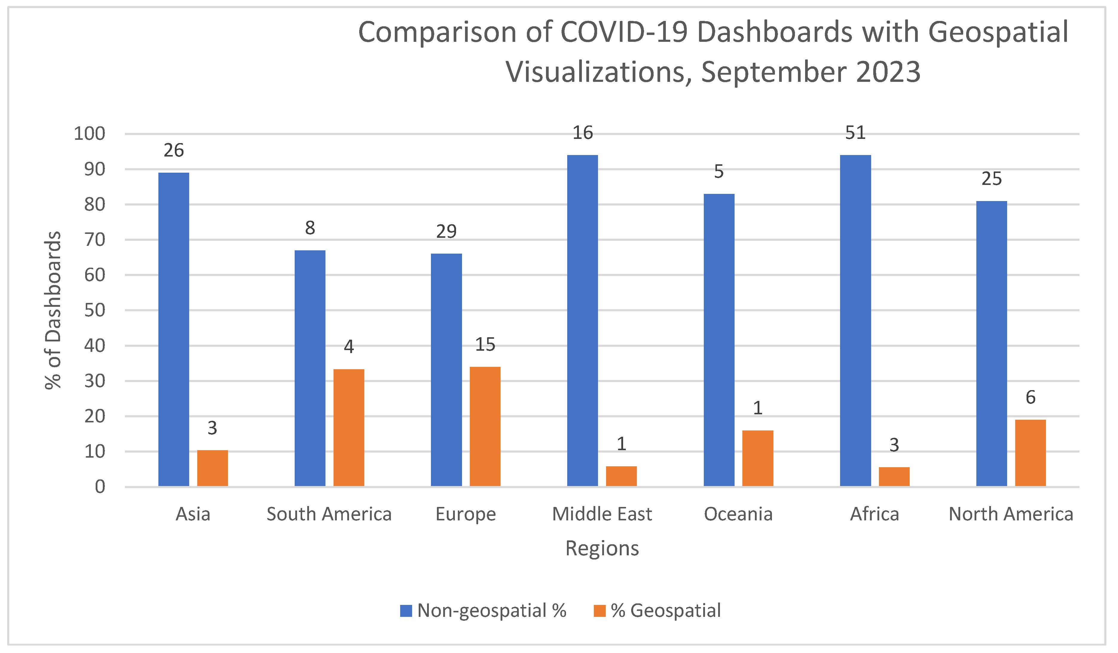
3. Results—Geospatial COVID-19 Data Dashboards

The data included for each data dashboard included deaths, cases, hospitalizations, and vaccination rates. Figure 1 compares the COVID-19 data dashboards by region for historic, accessibility, operationality, and geospatial visualizations in September 2023.
Table 6 and Figure 2 track the changing accessibility of COVD-19 data dashboards from September 2023 to June 2024. Notably, fewer data dashboards are accessible from September 2023 to June 2024, and even fewer were operating. Accessible dashboards refer to an active link to the functioning webpage with interactive capabilities. However, the webpage could still be operating (updating information) or had a statement that the page was no longer being updated. Alternatively, URL links to data dashboards were broken, users were redirected to another site, usually the national or regional health website, or URL links to data dashboards were broken, not loading, or were removed. These sites provided no statement or notice of where COVID-19 data were archived or stored.
While data dashboards were ubiquitous during the pandemic, the use of maps were not; only 17% (33) of data dashboards used geospatial visualizations. Of the 195 data dashboards, all had national boundaries (Admin 0) and ISO codes. However, only 25% (48) had state/province (Admin 1)- and municipal/city (Admin 2)-level boundaries. Several countries, 42% (80), had subnational boundaries that were not yet released by their governments and were not available to download. The status of 33% (67) of countries’ administrative boundaries at the subnational scale were unknown (Figure 3).
The dashboards with geospatial visualizations had ISO codes and administrative boundaries defined at the national (Admin 0) and subnational levels (Admin 01, Admin 02), enabling web maps (both interactive and static) (Figure 4). However, three of these dashboards included maps only at the national scale (Admin 0—Lithuania, Trinidad and Tobago, and Suriname). The remaining dashboards (30) had maps at both the municipality and state (Admin 1 and Admin 2) scales. Notably, US dashboards had multiple dashboards in different states and collected data at the county level. US data dashboards were not collected individually for the states; the Centers for Disease Control (CDC) hosted data at the national scale, as did a number of other organizations (e.g., Johns Hopkins, the Kaiser Family Foundation) (the examination of these dashboards was beyond the scope of this analysis). As of September 2024, all these sites were accessible (the link was active or redirected to a government health agency); however, most of them were not operational (not updating) (Figure 4).
The valuable contribution of the STC Rapid Response team was the development of a comprehensive data production workflow [39] to include ISO codes and administrative boundaries to enable geospatial visualizations and analysis of COVID-19 metrics (e.g., daily COVID-19 cases). This project created a framework for spatiotemporal data collection to be used beyond the pandemic and enables the construction of data dashboards inclusive of geospatial data and interactive web maps. Sha et al., 2021, describe the challenges of this effort where administrative boundaries are not available or not published for all countries at the different administration levels nor are standard keys (i.e., ISO3 country codes ISO 3166-1 alpha-3 codes are three-letter country codes defined in ISO 3166-1, part of the ISO 3166 standard published by the International Organization for Standardization (ISO)) included in available datasets [39]. Hence, most of the data dashboards used tables and graphs of selected COVID-19 metrics linked to country and state/province names.
Several repositories were used by researchers and government agencies to host archives of the data collected and linked to data dashboards (i.e., HDX and GitHub) (Table 7). Alternatively, national and state health departments host data that are selectively shared and archived. However, these data can be difficult to find and often need to be updated as boundary data are dynamic, and updated datasets are an essential part of the process when creating web maps.

4. Discussion: Lessons Learned

Maps are practical instruments for deriving new medical and geographical understanding through the integration of multiple datasets linked to geospatial coordinates. Using maps as data visualizations to address the pandemic became a central tool to present complex data to multiple audiences of scientists, decision makers, and citizens. Web mapping for data dashboards requires an understanding geospatial data, technologies that enable interactive mapping, and methods for characterizing data across both space and time [48]. Yang et al., 2022, describe the specific needs to implement a spatiotemporal approach to the pandemic, highlighting data, cyberinfrastructure, and computing research networks [45]. Recognizing that COVID-19 data were scattered across a variety of sources, multi-scale spatiotemporal data were collected from COVID-19 data dashboards and posted on the STC NSF COVID-19 Gateway to demonstrate how a public repository platform could be constructed to host pandemic data, such as diverse contents in varying formats and socio-economic and environmental factors—elements that could serve as the backbone of data management, interoperability, and geospatial visualization needed for the next pandemic [39,45,46].
Web maps on the COVID-19 data dashboards have several strengths and weaknesses that can be categorized into four groups: (1) scale and resolution, (2) boundaries, (3) metrics, and (4) data management.

4.1. Scale and Resolution

The scale of the maps on data dashboards were generally country, state/province, and, where available, municipalities. Finer resolution data were not included on country data dashboards, although there were numerous sites—not dashboards—that included data on mobility, virus testing, contact tracing, and social distancing [49]. Data-driven insights informed by finer resolution data emphasize the value of local data to identify patterns of local/regional spread and emerging hot spots [40]. However, finer resolution data raise issues with personal data security where governmental surveillance clashes with the fundamentals of civil liberties and privacy concerns [50].
In the United States, several data dashboards were launched by state health agencies and health research foundations (e.g., the Kaiser Family Foundation) collecting data at the county scale. However, these dashboards were not standardized, were difficult to find on health agency websites, and were inconsistent in reporting on COVID-19 impacts on race and ethnicity—a critical gap in the data record [51]. Globally, there were fewer data dashboards for major cities. For example, Nijkamp and Kourtit (2022) describe the COVID-19 Dutchboard to include sub-regional and local data on corona disease cases, deaths, and hospital admissions in the Netherlands [8]. Carballada and Balsa-Barreiro (2021) demonstrate mapping fine-grain spatial data in the major cities of the region of Galicia, Spain, emphasizing the need for data security and privacy when mapping detailed health data at the city and sub-city scale [41].

4.2. Boundaries

A critical aspect of these data were the inclusion of geospatial data (ISO codes, national and provincial boundaries) as part of the database design essential to preserve geographic information and create interactive web maps. However, some areas do not have an ISO; for example, the European Union—a regional configuration of multiple countries where aggregated data could provide valuable insights. Another option is to use the administrative boundaries that are a collection of country administrative areas. The Database of Global Administrative Areas (GADM) is a public database of spatial data provided by national governments and other authoritative sources and is one of several sites that collect administrative boundaries. In 2001, the United Nations launched the Second Administrative Level Boundaries (SALBs) to make available a global repository of common geography of administrative units of countries to the subnational level. However, not all administrative boundaries are available. There are multiple postings of boundaries on different websites (GADM, DIVA-GIS, SALB, World Food Program), where each posting needs to be regularly updated and released by the countries’ authoritative agency due to the dynamic nature of country and sub-country boundaries.
Another challenge for geospatial mapping is contested areas, such as informal settlements, refugee camps, and conflict zones which are areas of fuzzy boundaries. For example, Palestine’s COVID-19 data were originally mapped as a separate entry on Johns Hopkins CSSE dashboard using the code “oPT” (occupied Palestinian territory) but was later removed and merged with entries for Israel, using Israel’s ISO code [52].

4.3. Metrics

Common to all data dashboards is the emphasis on quantifiable aspects of the pandemic such as numbers of cases, vaccination rates, deaths, hospital rates, etc. The representation of these data on dashboards needs guidance and standards in terms of thematic mapping (i.e., symbology, legends, color) and description of both the source data (i.e., metadata) and methods of analysis when mapping the geographic disparities of a pandemic [53]. Contextualizing maps and normalizing demographic data enhance understanding of the local and regional impacts of the virus. However, an absolute count can be misleading as it is related to the total number of people in an area. Normalizing the data (i.e., dividing the number of cases by population) paints quite a different picture and ensures the proper use of choropleth maps for thematic representations. Most medical-related statistics on disease report in total cases per 100,000 people or provide graphs using logarithmic scales to visualize the growth of the COVID-19 virus around the world, allowing for a comparable assessment across different locations and places (see Our World in Data). For example, early in the pandemic, Italy experienced slightly over half the number of deaths due to the virus compared to the US, but Italy has a considerably smaller population than the US, the proportion of the infected individuals dying from the disease was approximately three times as high. Further exploring other aspects of the data reveals that Italy has the oldest population in Europe, with 23% of the population being 65 or older—an age bracket highly susceptible to the virus [54]. Understanding the demographic make-up of different countries provides a more nuanced understanding of viral spread and transmission.

4.4. Data Quality

The data quality is always a challenge for pandemic and public health due to the different reporting processes, different standards of confirmation, and different sources. It is challenging to verify and validate some datasets. Most dashboards have been using the authoritative resources from governance bodies. Efforts were also made to integrate data available on different platforms and integrate after automatic and manual verification to fill data gaps (Sha et al., 2021 [39]).

4.5. Data Maintenance

The deluge of data dashboards during the pandemic created a parallel deluge of data. As data dashboards have begun to disappear or become dysfunctional, these data have also disappeared, becoming ephemeral data. In some instances, users are redirected to sites where data are posted and may be available for download (e.g., national public health services). The most common sites to check for COVID-19 data, inclusive of geographic attributes, are in data repositories such as GitHub, the Harvard Dataverse, HDX, WHO, and various health agencies around the world. However, these sites do not capture all the data that were created, and chances are, these data are sequestered on agency computers in files that may be lost or deleted over time. These are data that can and have informed geospatial models tracing the outbreak using environmental, socio-demographic, and infrastructure characteristics [27].

5. Conclusions

Web maps on data dashboards demonstrate the convergence of several innovations: advances in technology due to sharing and dissemination; the establishment of health-related metrics to address public health issues by collecting relevant health data; and the emergence of standard methods to represent data (i.e., symbolization and color) [55]. Previous health emergencies, such as HIV/AIDS and the Ebola outbreak, laid critical groundwork for data collection, sharing, and visualization. In parallel to these events is the development of place-based solutions—social distancing, quarantine and isolation, and vaccination programs—all of which were spatially tracked but seldom on a single dashboard.
The legacy of the pandemic provides us with the tools to improve on public health messaging and forecasting methods through tracking variants and vaccination rates. However, the results of our study indicate that the COVID-19 data posted on dashboards are disappearing due to several reasons: reporting fatigue, distrust in COVID-19 policies, misinformation, and doubts about the science of understanding the pandemic and its origins. Further, the lack of variety in granularity and codes that enable geocoding obscures local conditions. Data dashboards flatten the distinctions between countries due to the focus on quantitative metrics of COVID-19 (i.e., deaths, cases, hospitalization) at the national and province/state scale. Geospatial data (boundaries and codes) enable web maps, and such data are unevenly available around the world. Constructing data dashboards that identify differing country conditions, where access to public health services are embedded in structured inequality, is needed. Methods to harmonize data from multiple sources to tell this complex story can elevate the explicit context—the consequential geography of various places [30,56]. Examples include the ACLED’s COVID-19 Disorder Tracker and the World Justice Project’s Rule of Law Index. However, methods to improve data dashboards and web maps need to include protection of sensitive data and respect privacy, particularly for vulnerable and marginal populations [29,30].
Data dashboards provide an avenue to integrate and aggregate diverse datasets to share information rapidly. However, the limitations of these platforms, as evidenced by their ephemeral nature, need to be addressed to ensure that data are not lost and that lessons for data sharing are implemented. Efforts to collect data at the appropriate granularity are necessary to clearly identify vulnerable populations in towns, villages, and cities as well as informal settlements, refugee camps, and remote populations. Efforts to map relationships between inequality, access to health services, and pandemic trajectories are essential for comprehensive treatment and solutions. Conflict zones are increasingly exposed to both violence and unhealthy conditions that exacerbate baseline public health services in such areas as Gaza and Ukraine. All these conditions require collective action, stakeholder involvement, negotiation, and integrated solutions for human, animal, and environmental health (i.e., One Health) [57]. Complex, aggregated datasets are the backbone for monitoring and tracking solutions and conditions needing clear standards and approaches.
Praharaj et al. (2022), Sha et al. (2021), and Ivankovic et al. (2021) identify recommendations for common features of highly actionable dashboards [26,35,39]. We build upon these recommendations to identify the best practices for data dashboards with a specific emphasis on web mapping:
  • Know the audience: dashboards need functionality to meet the user needs and requirements of multilanguage settings of users.
  • Data: Explanation of what and how data are collected from authoritative sources. If data are collected, collection methods are clearly described. The purpose and limitations of the data are described.
  • Concise # of indicators: Targeted number of indicators are selected to enable viewing information at a glance. The rationale and purpose of specific indicators are defined.
  • Data accessibility for downloading, analysis, archiving, and storage are described.
  • Analysis: methods and instructions to analyze data and track trends with demonstrations are provided.
  • Visualizations: Description of metadata that includes geographic scale/resolution. Use of intuitive color scheme, icons, and symbology.
  • Time: description of updating schedule of data.
  • Story telling: provide narratives that highlight key findings.
  • Construction: dashboard construction that is easy to use with limited coding and low cost.
Most communities lack data analysis capability and there is a need to build data skills in places where they are most needed such as public health agencies. Access to technology, licenses, and high-performance computers for analysis are all requirements along with a knowledgeable workforce. Preparing for the next pandemic—continued variants of COVID-19 and mpox—is imperative and programs for technology transfer enabled through international health treaties and collaborations for data sharing and training [58] are required. The power of scientific partnering should not be overlooked in recognizing the importance of evidence-based data, the fluidity of scientific knowledge, and equity [59].

Supplementary Materials

The following are available online at https://www.mdpi.com/article/10.3390/covid5010012/s1.

Author Contributions

Conceptualization, M.L., Y.K. and C.Y.; methodology, M.L. and Y.K.; analysis, M.L. and Y.K.; writing—original draft preparation, M.L.; writing—review and editing, Y.K. and C.Y.; visualization, M.L.; supervision, M.L. All authors have read and agreed to the published version of the manuscript.

Funding

This research received no external funding. Publication support provided by NASA-AIST-QRS-23-02.

Institutional Review Board Statement

Not applicable.

Informed Consent Statement

Not applicable.

Data Availability Statement

Data are available in Supplementary Materials. Source data for dashboards are available: https://github.com/stccenter/COVID-19-Data (accessed on 13 January 2025) and https://dataverse.harvard.edu/dataverse/covid19 (accessed on 13 January 2025).

Acknowledgments

We thank the COVID-19 Spatiotemporal Rapid Response team for their generosity in sharing the COVID-19 data dashboard spreadsheet which was the basis for this research.

Conflicts of Interest

The authors declare no conflicts of interest.

References

  1. Interlandi, J. The Pandemic Weather Service: Inside the C.D.C.’s Ambitious New Plan to Predict Future Outbreaks. The New York Times Magazine, 18 November 2021; 38–39, 62–63. [Google Scholar]
  2. Crisan, A. The importance of data visualization in combating a pandemic. Am. J. Public Health 2022, 112, 893–895. [Google Scholar] [CrossRef] [PubMed]
  3. World Health Organization (WHO). Statement on the 15th Meeting of International Health Regulations. 5 May 2023. Available online: https://www.who.int/news/item/05-05-2023-statement-on-the-fifteenth-meeting-of-the-international-health-regulations-(2005)-emergency-committee-regarding-the-coronavirus-disease-(covid-19)-pandemic#:~:text=The%20WHO%20Director%2DGeneral%20concurs,of%20international%20concern%20(PHEIC) (accessed on 18 September 2024).
  4. PBS. WHO Downgrades COVID-19 Pandemic. 5 May 2023. Available online: https://www.pbs.org/newshour/health/who-downgrades-covid-19-pandemic-says-its-no-longer-global-emergency (accessed on 13 January 2025).
  5. Cohen, J. COVID-19 is surging again—With far fewer serious cases. Science 2024, 385, 814–815. [Google Scholar] [CrossRef] [PubMed]
  6. Lyseen, A.; Nohr, C.; Sorensen, E.; Gudes, O.; Geraghty, E.; Shaw, N.; Bivona-Tellez, C. A review and framework for categorizing current research and development in health related geographical information systems (GIS) studies. IMIA Yearb. Med. Inform. 2014, 23, 110–124. [Google Scholar] [CrossRef]
  7. Zhao, B.; Kim, M.; Nam, E. Information disclosure contents of the COVID-19 data dashboards websites for South Korea, China, and Japan: A comparative study. Healthcare 2021, 9, 1487. [Google Scholar] [CrossRef]
  8. Nijkamp, P.; Kourtit, K. Place-specific Corona dashboards for health policy: Design and application of a ‘Dutchboard’. Sustainability 2022, 14, 836. [Google Scholar] [CrossRef]
  9. Clarkson, M. Web-based COVID-19 dashboards and trackers in the United States: Survey study. JMIR Hum. Factors 2023, 10, e43819. [Google Scholar] [CrossRef]
  10. Few, S. Dashboard Confusion. Perceptual Edge. 2004. Available online: https://www.perceptualedge.com/articles/ie/dashboard_confusion.pdf (accessed on 13 January 2025).
  11. Neumann, A. Web mapping and web cartography. In Encyclopedia of GIS; Shekhar, S., Xiong, H., Eds.; Springer: Boston, MA, USA, 2008. [Google Scholar] [CrossRef]
  12. Snowden, F. Epidemics and Society: From the Black Death to the Present; Yale University Press: New Haven, CT, USA, 2020. [Google Scholar]
  13. Centers for Disease Control (CDC). Definitions. 15 May 2024. Available online: https://www.cdc.gov/reproductive-health/glossary/?CDC_AAref_Val=https://www.cdc.gov/reproductivehealth/data_stats/glossary.html#cdc_generic_section_4-e (accessed on 6 September 2024).
  14. World Health Organization (WHO). Definitions. 19 February 2021. Available online: https://www.publichealth.columbia.edu/news/epidemic-endemic-pandemic-what-are-differences#:~:text=It's%20important%20to%20note%20that,international%20and%20out%20of%20control (accessed on 6 September 2024).
  15. Gould, P. The Slow Plague: A Geography of the AIDS Pandemic; Blackwell Press: Oxford, UK, 1993. [Google Scholar]
  16. Engelmann, L. Mapping AIDS: Visual Histories of an Enduring Epidemic (Global Health Histories), 1st ed.; Cambridge University Press: Cambridge, UK, 2018. [Google Scholar]
  17. Centers for Disease Control (CDC). Ebola—Outbreak History. 6 May 2024. Available online: https://www.cdc.gov/ebola/outbreaks/index.html (accessed on 28 September 2024).
  18. Saurabh, S.; Prateek, S. Role of contact tracing in containing the 2014 Ebola outbreak: A review. Afr. Health Sci. 2017, 17, 225–236. [Google Scholar] [CrossRef]
  19. Pigott, D.; Golding, N.; Mylne, A.; Huang, Z.; Henry, A.; Weiss, D.; Brady, O.; Kraemer, M.; Smith, D.; Moyes, C.; et al. Mapping the zoonotic niche of Ebola virus disease in Africa. eLife 2014, 3, e04395. [Google Scholar] [CrossRef]
  20. Sills, J. Ebola: Mobility data. Science 2014, 346, 433. [Google Scholar]
  21. Victory, K.; Coronado, F.; Ifono, S.; Soropogui, T.; Dahl, B. Ebola Transmission Linked to a Single Traditional Funeral Ceremony—Kissdougou, Guinea, December 2014–January 2015. In Morbidity and Mortality Weekly Report (MMWR); Centers for Disease Control and Prevention: Atlanta, GA, USA, 2015. [Google Scholar]
  22. Cohen, J.; Tsanni, A. Pulling back the curtain. Science 2024, 385, 818–823. [Google Scholar] [CrossRef]
  23. Vahedi, A.; Moghaddasi, H.; Asadi, F.; Hosseini, A.; Nazemi, E. Applications, features, and key indicators for the development of COVID-19 dashboards: A systematic review study. Inform. Med. Unlocked 2022, 30, 100910. [Google Scholar] [CrossRef] [PubMed]
  24. Schulze, A.; Brand, F.; Geppert, J.; Bol, G. Digital dashboards visualizing public health data: A systematic review. Front. Public Health 2023, 11, 999958. [Google Scholar] [CrossRef] [PubMed]
  25. Everts, J. The dashboard pandemic. Dialogues Hum. Geogr. 2020, 10, 260–264. [Google Scholar] [CrossRef]
  26. Praharaj, S.; Solis, P.; Wentz, E. Deploying geospatial visualization dashboards to combat the socioeconomic impacts of COVID-19. Urban Anal. City Sci. 2022, 50, 1262–1279. [Google Scholar] [CrossRef]
  27. Samany, N.; Liu, H.; Aghataher, R.; Bayat, M. Ten GIS-based solutions for managing and controlling COVID-19 pandemic outbreak. SN Comput. Sci. 2022, 3, 269. [Google Scholar] [CrossRef]
  28. Dangermond, J.; De Vito, C.; Pesaresi, C. Using GIS in the time of COVID-19 crisis, casting a glance at the future. A joint discussion. J. Res. Didat. Geogr. 2020, 1, 195–205. [Google Scholar]
  29. Rosenkrantz, L.; Schuurman, N.; Bell, N.; Amram, O. The need for GIScience in mapping COVID-19. Health Place 2021, 67, 102389. [Google Scholar] [CrossRef]
  30. Dixon, B.; Dearth, S.; Duszynski, T.; Grannis, S. Dashboards are trendy, visible components of data management in public health: Sustaining their use after the pandemic requires a broader view. Am. J. Public Health 2022, 112, 900903. [Google Scholar] [CrossRef]
  31. Berry, I.; Soucy, J.; Tuite, A.; Fisman, D. Open access epidemiological data and an interactive dashboard to monitor the COVID-19 outbreak in Canada. CMAJ 2020, 192, 15. [Google Scholar] [CrossRef]
  32. Gleeson, J.; Kitchin, R.; McCarthy, E. Dashboards and public health: The development, impacts, and lessons from the Irish Government COVID-19 dashboards. Am. J. Public Health 2022, 112, 809–944. [Google Scholar] [CrossRef]
  33. Khodaveisi, T.; Dhedarirad, H.; Bouraghi, H.; Mohammadpout, A.; Sajadi, F.; Hosseiniravandi, M. Characteristics and specifications of dashboards developed for the COVID-19 pandemic: A scoping review. J. Public Health 2024, 35, 553–574. [Google Scholar] [CrossRef] [PubMed]
  34. Boulos, M.; Geraghty, E. Geographical tracking and mapping of coronavirus disease COVID-19/severe respiratory syndrome coronavirus 2 (SARS-CoV-2) epidemic and associated events around the world: How 21st century GIS technologies are supporting the global fight against outbreaks and epidemics. Int. J. Health Geogr. 2020, 19, 8. [Google Scholar] [CrossRef]
  35. Ivankovic, D.; Barbazza, E.; Box, V.; Fernandes, O.; Gilmore, K.; Jansen, T.; Kara, P.; Larrain, N.; Lu, S.; Meza-Torres, B.; et al. Features Constituting Actionable COVID-19 Dashboards: Descriptive Assessment and Expert Appraisal of 158 Public Web-Based COVID-19 Dashboards. J. Med. Internal. Res. 2021, 23, e25682. [Google Scholar] [CrossRef] [PubMed]
  36. Bernasconi, A.; Grandi, S. A conceptual model for geo-online exploratory data visualization: The case of the COVID-19 pandemic. Information 2021, 12, 69. [Google Scholar] [CrossRef]
  37. Dong, E.; Ratcliff, J.; Goyea, T.; Katz, A.; Lau, R.; Ng, T.; Garcia, B.; Bolt, E.; Prata, S.; Zhang, D.; et al. The Johns Hopkins University center for systems science and engineering COVID-19 dashboard: Data collection process, challenges faced, and lessons learned. Personal View. Lancet 2022, 22, e360–e376. [Google Scholar] [CrossRef]
  38. UN-SALB (United Nations Second Administrative Level Boundaries). Available online: https://salb.un.org/en (accessed on 13 January 2025).
  39. Sha, D.; Liu, Y.; Liu, Q.; Li, Y.; Tian, Y.; Beaini, F.; Zhong, C.; Hu, T.; Wang, Z.; Lan, H.; et al. A spatial temporal data collection of viral cases for COVID-19 rapid response. Big Earth Data 2021, 5, 90–111. [Google Scholar] [CrossRef]
  40. Bakari, O.; Zando, M.; Blaser, M. Opinion: COVID-19 Lesson—Local Data Skills Matter. DevEx News. 14 January 2021. Available online: https://www.devex.com/news/sponsored/opinion-covid-19-lesson-local-data-skills-matter-98910 (accessed on 13 January 2025).
  41. Carballada, A.; Balsa-Barreiro, J. Geospatial analysis and mapping strategies for fine-grained and detailed COVID-19 data with GIS. Int. J. Geo-Inf. 2021, 10, 602. [Google Scholar] [CrossRef]
  42. Laituri, M.; Richardson, R.; Kim, J. (Eds.) The Geographies of COVID-19: Geospatial Stories of a Global Pandemic; Springer Nature: Cham, Switzerland, 2022. [Google Scholar]
  43. Marvel, S.; House, J.; Wheeler, M.; Song, K.; Zhou, Y.; Wright, F.; Chiu, W.; Rusyn, I.; Motsinger-Reif, A.; Reif, D. The COVID-19 pandemic vulnerability index (PVI) dashboard: Monitoring county-level vulnerability using visualization, statistical modeling, and machine learning. Environ. Health Perspect. 2021, 129, 17701. [Google Scholar] [CrossRef]
  44. Mbonglou, G.; John, R. Data and Dashboards for Measuring the social impact of COVID-19 in African Cities. In The Geographies of COVID-19: Geospatial Stories of a Global Pandemic; Laituri, M., Richardson, R., Kim, J., Eds.; Springer Nature: Cham, Switzerland, 2022. [Google Scholar]
  45. Yang, C.P.; Bao, S.; Guan, W.; Howell, K.; Hu, T.; Lan, H.; Li, Y.; Liu, Q.; Smith, J.; Srirenganathan, A.; et al. Challenges and Opportunities of the spatiotemporal responses to the global pandemic of COVID-19. Ann. GIS 2022, 28, 425–434. [Google Scholar] [CrossRef]
  46. Hu, T.; Guan, W.; Zhu, X.; Shao, Y.; Liu, L.; Du, J.; Liu, H.; Zhou, H.; Wang, J.; Sha, B.; et al. Building an open resources repository for COVID-19 research. Data Inf. Manag. 2020, 4, 130–147. [Google Scholar] [CrossRef]
  47. Yang, C.; Sha, D.; Liu, Q.; Li, Y.; Lan, H.; Guan, W.; Hu, T.; Li, Z.; Zhang, Z.; Thompson, J.; et al. Taking the pulse of COVID-19: A spatiotemporal perspective. Int. J. Digit. Earth 2020, 13, 1186–1211. [Google Scholar] [CrossRef]
  48. Agafonkin, V. Reimaging Projections for the Interactive Maps Era. MapBox Blog. 9 December 2021. Available online: https://www.mapbox.com/blog/adaptive-projections (accessed on 28 September 2024).
  49. Yusni, A. Coronovirus: Why Testing and Contact Tracing Isn’t a Simple Solution. The Conversation. 2020. Available online: https://theconversation.com/coronavirus-why-testing-and-contact-tracing-isnt-a-simple-solution-137214 (accessed on 13 January 2025).
  50. Farr, C. The COVID-19 Response Must Balance Civil Liberties and Public Health—Experts Explain How. CNBC–Tech. 2020. Available online: https://www.cnbc.com/2020/04/18/covid-19-response-vs-civil-liberties-striking-the-right-balance.html (accessed on 13 January 2025).
  51. Tsai, J.; Khazanchi, R.; Laflamme, E. Death by Missing Data: Uncollected Racial and Ethnic Pandemic Data Will Drive Inequities for Decades to Come. STAT News. 30 January 2023. Available online: https://www.statnews.com/2023/01/30/covid-19-missing-data-race-ethnicity-drive-inequities-decades-to-come/#:~:text=In%20a%20national%20dataset%20of,That's%2034%25%20of%20cases (accessed on 13 January 2025).
  52. Muhareb, R.; Giacaman, R. Tracking COVID-19 Responsibly. In Lancet; 26 May 2020. Available online: https://www.ncbi.nlm.nih.gov/pmc/articles/PMC7194718/ (accessed on 13 January 2025).
  53. Kennedy, H. Impact of Social Sciences Blog: Simple Data Visualisations Have Become Key to Communicating About the COVID-19 Pandemic, but We Know Little About Their Impact. Impact of Social Sciences Blog. 4 May 2020. Available online: https://blogs.lse.ac.uk/impactofsocialsciences/ (accessed on 13 January 2025).
  54. Rettner, R. Why Are Deaths from Coronavirus So High in Italy? LiveScience. 27 March 2020. Available online: https://www.livescience.com/why-italy-coronavirus-deaths-so-high.html (accessed on 13 January 2025).
  55. Koch, T. 1831: The map that launched the idea of global health. Int. J. Epidemiol. 2014, 43, 1014–1020. [Google Scholar] [CrossRef] [PubMed]
  56. Ahmed, N.; Marriott, A.; Dabi, N.; Lowthers, M.; Lawson, M.; Mugehera, L. Inequity Kills; Oxfam International: Oxford, UK, 2022. [Google Scholar]
  57. Gawande, A. The aftermath of a pandemic requires as much focus as the start. NY Times, 16 March 2023. [Google Scholar]
  58. Phelan, A.; Carlson, C. A treaty to break the pandemic cycle. Science 2022, 377, 475–477. [Google Scholar] [CrossRef] [PubMed]
  59. Offit, P. For the Next Pandemic; National Geographic: Washington, DC, USA, 2024; pp. 17–20. [Google Scholar]
Figure 1. Comparison by region of COVID-19 data dashboards for Historic, Accessible, Operating, and Geospatial, September 2023. Historic refers to dashboards that update and track COVID-19 metrics over time; Accessible are those webpages where the URL link works; Operating are sites that are updated and interactive; and Geospatial includes interactive and static maps.
Covid 05 00012 g001
Figure 2. Accessibility of COVID-19 data dashboards—January 2021–September 2023–June 2024. Operating dashboards—indicates dashboards that are functional (interactive) and updating.
Covid 05 00012 g002
Figure 3. Availability of common geographic boundaries with number of countries (September 2023) of Admin 0 (national); Admin 1 (sub national—state/province/regions); Admin 2 (County/Municipalities); Not released Admin 1/2 boundaries by authoritative government agencies; and Unknown boundary data status. Refer to Supplementary Materials.
Covid 05 00012 g003
Figure 4. COVID-19 data dashboards with geospatial visualizations (September 2023). Geospatial visualizations include interactive and static maps. Numbers refer to the count of dashboards.
Covid 05 00012 g004
Table 1. Article reviews of overviews of data dashboards and visualizations.
AuthorsTopic
Crisan (2022) [2]General discussion of visualization, use of real time data, no specifics on maps
Everts (2020) [25]Scale limitations of pandemic data; lack of mapping and representation of risk groups such vulnerable populations (i.e., poor, ethnic groups)
Samany et al. (2022) [27]GIS-based tools and services to track and monitor COVID-19 pandemic; discussion of web map but does address issues related to spatial scale (i.e., local data)
Dangermond et al. (2020) [28]GIS dashboards for data dissemination; cloud-based services to deliver GIS products; issues of privacy and spatial data scale/granularity
Rosenkrantz et al. (2021) [29]Need for more granular-scale data and complex databases to address multiple social, economic, and health care issues
Dixon et al. (2022) [30]Long-term sustainability of data dashboards for public health; need for technically trained workforce to utilize GIS technology
Table 2. Articles of place-based data dashboards.
AuthorsLocationTopic
Zhao et al. (2021) [7]Republic of Korea, China, JapanComparative study of data dashboards; only Japan dashboard included maps
Nikjamp and Kourtit (2022) [8]The NetherlandsDiscussion of regional and local-level data; local data are defined as the municipality
Clarkson (2023) [9]USAU.S. COVID-19 web-based dashboards and trackers
Berry et al. (2020) [31]CanadaMonitoring of COVID-19 outbreak by province/territory
Gleeson et al. (2022) [32]IrelandDevelopment and impacts of COVID-19 dashboards; Ireland map with counties
Khodaveisi et al. (2024) [33]Multiple countries (26)Granularity of COVID-19 data for dashboards; no specific discussion of maps on dashboards
Table 3. Article reviews on COVID-19 data dashboards.
Authors# ReviewedTimeframeTopic
Boulos and Geraghty (2020) [34]6 dashboards2020Geographical tracking and mapping of COVID-19; GIS technologies
Ivankovic et al. (2021) [35]158 dashboardsJuly 2020Actionable COVID-19 dashboards
Bernasconi and Grandi (2021) [36]121 dashboards20 February–3 May 2020COVID-19 geo-dashboards
Praharaj et al. (2022) [26]68 dashboards2020–2021Public web-based dashboards of COVID-19
Vahedi et al. (2022) [23]19 articles2020–2021Interactive dashboard articles on key performance indicators for COVID-19
Schultze et al. (2023) [24]65 articles (35 articles on COVID-19)2010–2020Literature review on public health issues addressed by dashboards
Clarkson (2023) [9]
Khodaveisi et al. (2024) [33]
128 dashboards
26 articles (place-specific
data dashboards)
August 2020–June 2022
August 2021
COVID-19 web-based dashboards and trackers in the U.S.
Granularity of data and data processing of COVID-19 indicators
Table 4. Summary table of COVID-19 data dashboards, September 2023.
Count and Percentage of Data Dashboards by Region—Historic, Accessible, Operating, and Geospatial (September 2023)
RegionTotal Countries Historic a
(Count/%)
Accessible b
(Count/%)
Operating c
(Count/%)
Geospatial d
(Count/%)
Asia291241.381862.07931.03310.34
South America14857.14857.14428.57535.71
Europe442454.552863.641636.361534.09
Middle East17741.18741.18211.76211.76
Oceania661006100233.33116.67
Africa541833.332138.80916.67712.96
North/Central
America
311341.941651.61619.35619.35
Total1958845.1310453.34824.623920
a Data collected over time to track changes in COVID-19 cases, deaths, hospitalizations, vaccinations, etc. b Dashboards are accessible via a URL on the Internet. c Dashboards are updated and interactive functioning enabled. d Dashboards have interactive or static maps of COVID-19 metrics.
Table 5. Summary table of COVID-19 data dashboards, June 2024.
Count and Percentage of Data Dashboards by Region—Accessible and Operating (June 2024)
RegionTotal Countries Accessible *
(Count/%)
Operating *
(Count/%)
Asia29931.03310.34
South America1475017.14
Europe442650.09818.18
Middle East17635.2915.88
Oceania6583.33233.33
Africa541033.3347.41
North/Central America311445.16411.79
Total19577−13.8523−12.82
NOTE: Count and percentage for historic and geospatial are the same for both June 2024 and September 2023. These are embedded characteristics of the data dashboard. * Accessible and Operating refer to the functionality of the data dashboard.
Table 6. Summary table of functionality of data dashboards by region, June 2024.
Count By Region—Type (June 2024)
RegionTotal Countries Functioning a
(Count/%)
Functioning, NLU b
(Count/%)
Broken Link c
(Count/%)
Redirect d
(Count/%)
Page Deleted e
(Count/%)
Not Loading f
(Count/%)
Asia29310.34620.691137.93724.1426.900
South America1417.14642.86535.7117.1417.1400
Europe44818.181840.91818.1849.09613.6400
Middle East1715.88529.41529.41529.4115.8800
Oceania6233.333500000116.6700
Africa5447.41611.11916.672546.3712.9635.56
North/Central America31516.13929.0339.68825.81619.3500
Total1952412.315327.184121.35025.642412.3131.54
a Data dashboard link was still functioning. b Data dashboard functioning with interactive capabilities but no longer updating. c URL link to data dashboard is broken. d Redirect to another site—generally the national or regional health website. e Webpage hosting data dashboard is deleted. f Webpage hosting data dashboard is not loading.
Table 7. Data repositories.
RepositoryDescriptionInternet AddressTopic
GitHubSha et al. (2021) [39]https://github.com/stccenter/COVID-19-Data (accessed 13 January 2025)Spatiotemporal data collection of viral cases for COVID-19 rapid response.
Harvard DataverseHu et al. (2020) [46]https://dataverse.harvard.edu/dataverse/covid19 (accessed 13 January 2025)Open resource repository for COVID-19 research.
HDXCOVID-19 pandemic datasets (81) from organizations and government health agencies; 7 archived datasets.
Link to data dashboard if available; ArcGIS online interactive maps if dashboard is still accessible.
https://data.humdata.org/dataset (accessed 13 January 2025)Repository of COVID-19 datasets that include subnational data of COVID-19 cases and deaths. Access to health services with an option to view interactive maps using ArcGIS online if available.
Disclaimer/Publisher’s Note: The statements, opinions and data contained in all publications are solely those of the individual author(s) and contributor(s) and not of MDPI and/or the editor(s). MDPI and/or the editor(s) disclaim responsibility for any injury to people or property resulting from any ideas, methods, instructions or products referred to in the content.

