1. Introduction
Rapid urbanization and climate change have intensified the need for intelligent systems that enhance disaster preparedness and urban resilience. Within smart city frameworks, digital technologies play a crucial role in risk management by supporting evidence-based decision-making. Among natural hazards, floods remain a primary threat to urban safety [
1,
2,
3]. However, public risk perception is often low due to the lack of visible cues in daily life [
4,
5,
6] and the difficulty of interpreting low-probability events [
7]. Consequently, interactive flood hazard maps have become essential tools for bridging the gap between expert data and public understanding [
8,
9,
10,
11].
The previous literature has examined various aspects of map design to improve this understanding. For example, regarding map content, Houston [
12] demonstrated that displaying “flood depth” helps users evaluate hazards spatially. Similarly, research on visual variables suggests that color scales significantly influence perception; continuous blue scales facilitate the interpretation of severity [
13], while red, yellow, and green scales effectively communicate warning states [
14]. Empirical studies support the effectiveness of these tools; for instance, a study conducted in Sarasota, Florida, found that interactive hazard maps significantly increased risk perception, particularly among students initially skeptical of climate risks [
15].
Despite these advancements, challenges remain in how risk perception is measured and optimized. Most studies assess perception using multiple dimensions, including cognitive aspects (knowledge) and affective aspects (feelings), due to their complex interactions [
16]. However, questions are often asked with low geographical specificity [
17]. Furthermore, while existing research clarifies what information is necessary (highlighting personalization [
11] and historical context [
18]), it often overlooks how users cognitively process this information.
Current visualization methods frequently result in “information silos,” where technically accurate data is presented without sufficient consideration of the user’s cognitive load [
19]. Consequently, despite the availability of comprehensive data, the public often struggles to interpret it effectively due to complex interfaces and professional jargon. To address these limitations, this study integrates Cognitive Load Theory, specifically examining the balance between cognitive fluency and cognitive disfluency [
20]. We propose that while simplified interactions (e.g., sliders) enhance usability, introducing specific visual friction (e.g., multicolor legends) may actually improve risk perception by forcing deeper cognitive processing. This study compares these variables to establish evidence-based design standards for smart city disaster communication.
Building on this, the present study takes flood hazard map interface design as its starting point to more fully investigate how hazard map design features (e.g., colors, symbology), map interface functions, and the level of user interaction with maps (e.g., panning, zooming) influence subsequent improvements in flood risk perception [
21].
According to Nielsen’s research, the usability of user interface design includes factors such as “ease of learning, enjoyable use, flexibility and efficiency, error prevention, consistency and standardization, and ease of recall.” When designing user interfaces, it is essential to provide a user-friendly and pleasant operating experience that results in a satisfying product for users [
22,
23]. User-centered design (UCD) principles have increasingly been applied to interactive maps [
24,
25,
26,
27]. In geographic information science, UCD has been used to design and evaluate desktop GIS tools [
28,
29,
30], mobile map applications, spatial decision-support tools [
31], virtual environments [
32,
33], and web cartography applications [
34,
35,
36]. A user-centered approach often saves project resources rather than wastes them, since making fundamental changes after the deployment of interactive maps is far more costly than introducing adjustments during the early conceptual design and prototyping stages [
37]. Within smart city systems, user-centered methods ensure that innovation remains inclusive, improving the social effectiveness of smart governance platforms.
Therefore, this study aims to improve the usability and user experience of flood hazard maps by comparing different visual interface design alternatives and by examining the effectiveness of maps in enhancing risk perception and information communication. Specifically, this study (a) investigates how different color schemes affect the visualization of flood hazard information, (b) compares two interactive methods, drop-down menus and sliders, for representing rainfall levels, and (c) integrates user feedback from semi-structured interviews to develop design guidelines for improving map usability and communication effectiveness. Ultimately, this research contributes to the development of evidence-based design principles for smart city disaster communication systems that foster urban resilience and sustainability.
2. Materials and Methods
2.1. Pilot Study
Before the start of the formal study, an online questionnaire was distributed via the internet (N = 776). While the pilot survey was distributed online, specific geographical distribution was not controlled for at this stage. The questionnaire included a disaster literacy survey and a precipitation numerical risk perception survey, designed to provide a comprehensive understanding of participants’ cognitive comprehension of disasters and precipitation figures. After collecting the questionnaires, the average score of the disaster literacy survey was used as a standard to divide participants into high- and low-literacy groups. From each group, 15 participants were selected to take part in a usability investigation of the flood hazard map developed by the National Science and Technology Center for Disaster Reduction (NCDR) in Taiwan. This survey sought to compare differences between the two groups in terms of map information comprehension, usability scale (SUS), workload scale (NASA-TLX), user experience questionnaire (UEQ), risk perception scale (SASS), and decision attitude scale (DAS). In addition to quantitative questionnaire results, participants were also invited to engage in semi-structured user interviews to provide design references for subsequent interface development.
The preliminary survey revealed that the current flood hazard map of Taiwan received an SUS score of “F” in both groups, failing to meet usability standards; participants also reported poor UEQ experience ratings and negative DAS decision satisfaction. However, despite the usability issues of the existing flood hazard map, participants’ risk perception regarding short-term heavy rainfall increased after reading the map. Participants from both high- and low-literacy groups agreed that “clear marking of potential inundation areas,” “more comprehensible precipitation classification,” and “preparedness recommendations for risk-related decisions” were the most critical map design elements. These elements, together with user issues identified in the semi-structured interviews, were summarized and used as the basis for designing the formal experiment.
2.2. Formal Experiment Materials
The flood simulation data utilized in this study was derived from the 3D Disaster Potential Map developed by the National Science and Technology Center for Disaster Reduction (NCDR) in Taiwan. This platform integrates multi-source geospatial data models, including topography, rainfall patterns, and soil characteristics, to visualize potential flood risks across different regions. For the experimental scenarios, specific inundation models for the Tamsui and Beitou districts were selected, simulating high-risk conditions such as a 24-h rainfall accumulation of 500 mm. These datasets ensured that participants interacted with realistic hazard scenarios based on valid hydrological modeling rather than hypothetical sketches.
In the preliminary survey, the existing flood hazard map adopted a drop-down menu to present information. Users could select inundation depth data under different rainfall conditions ranging from 1 to 24 h. However, 83% of participants reported difficulty in making selections due to the large number of options. Regarding information comprehension, 83% of participants did not clearly understand the severity of precipitation represented by the options. Furthermore, in the online questionnaire (N = 775), as many as 269 textual responses indicated that participants found precipitation terminology and its classification concept unclear or difficult to understand.
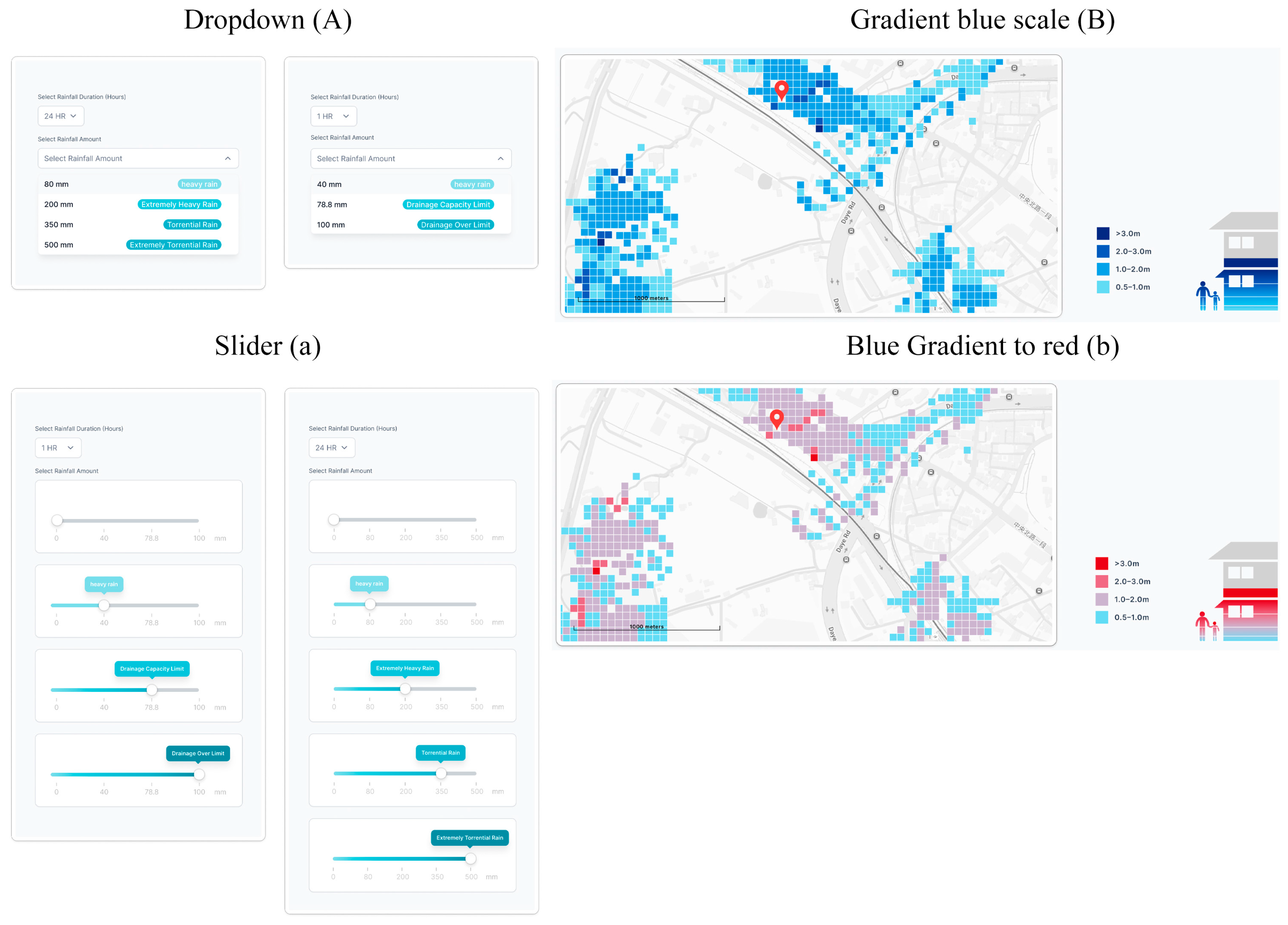
Since “rainfall amount,” which directly determines inundation depth, is a necessary interactive element in flood hazard maps, this study set the drop-down menu (A) and the slider (a) as experimental variables to explore better usability and user experience. In addition, the study sought to identify the optimal method for presenting inundation information. Based on feedback from the preliminary survey, 53% of participants emphasized that consistency between the map’s color blocks and the legend was very important. About half of the participants preferred gradient blue scales, while the other half preferred warning-related colors to represent inundation depth. To further examine how different color design variables affect usability, workload, user experience, risk perception, and decision support in flood hazard maps, this study developed two types of color variables: a gradient blue legend (B) and a blue-to-red gradient scheme, which will be labeled as multicolor legend (b). These were used to explore users’ map-reading behavior and quantitative performance, as illustrated in
Figure 1.
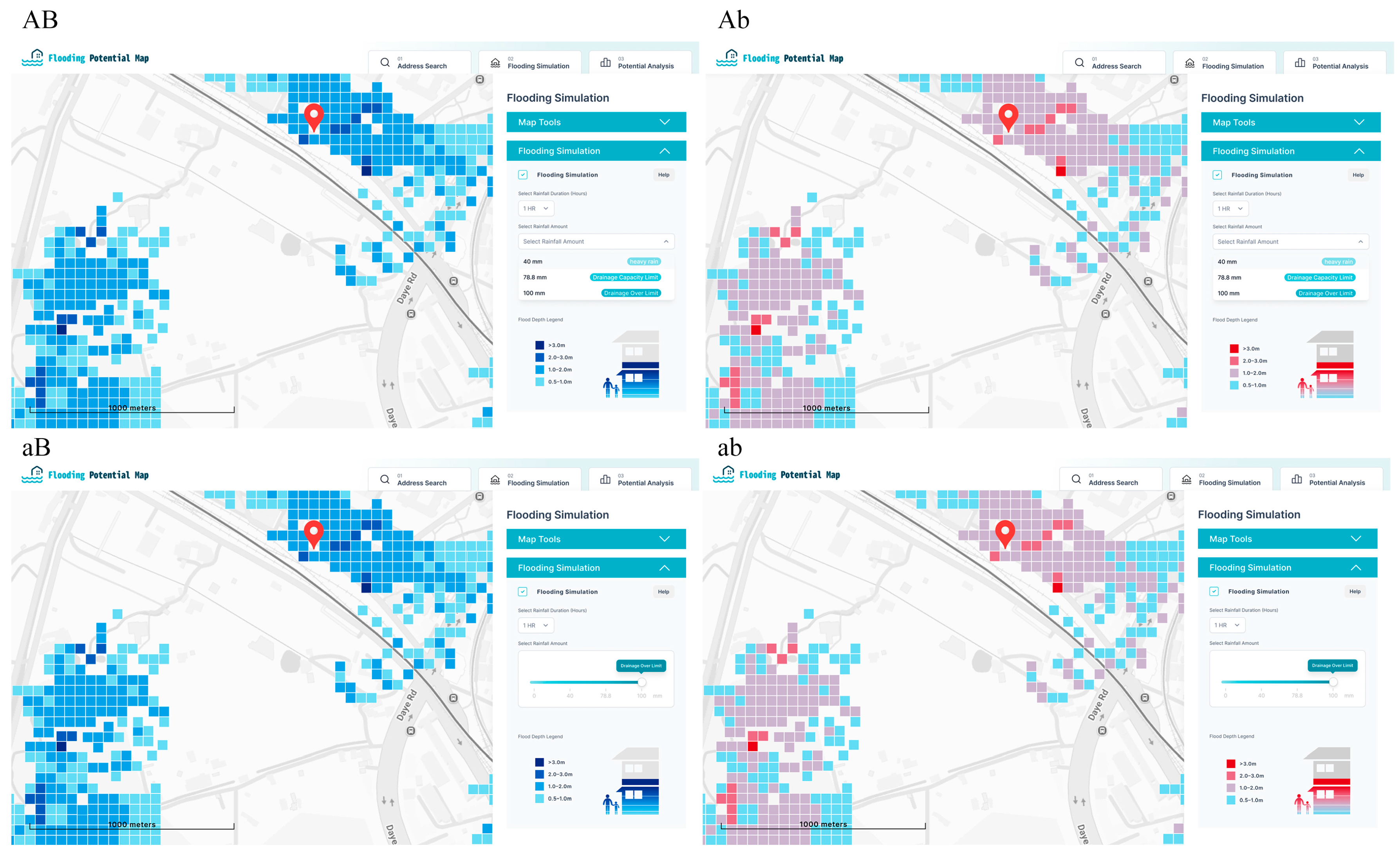
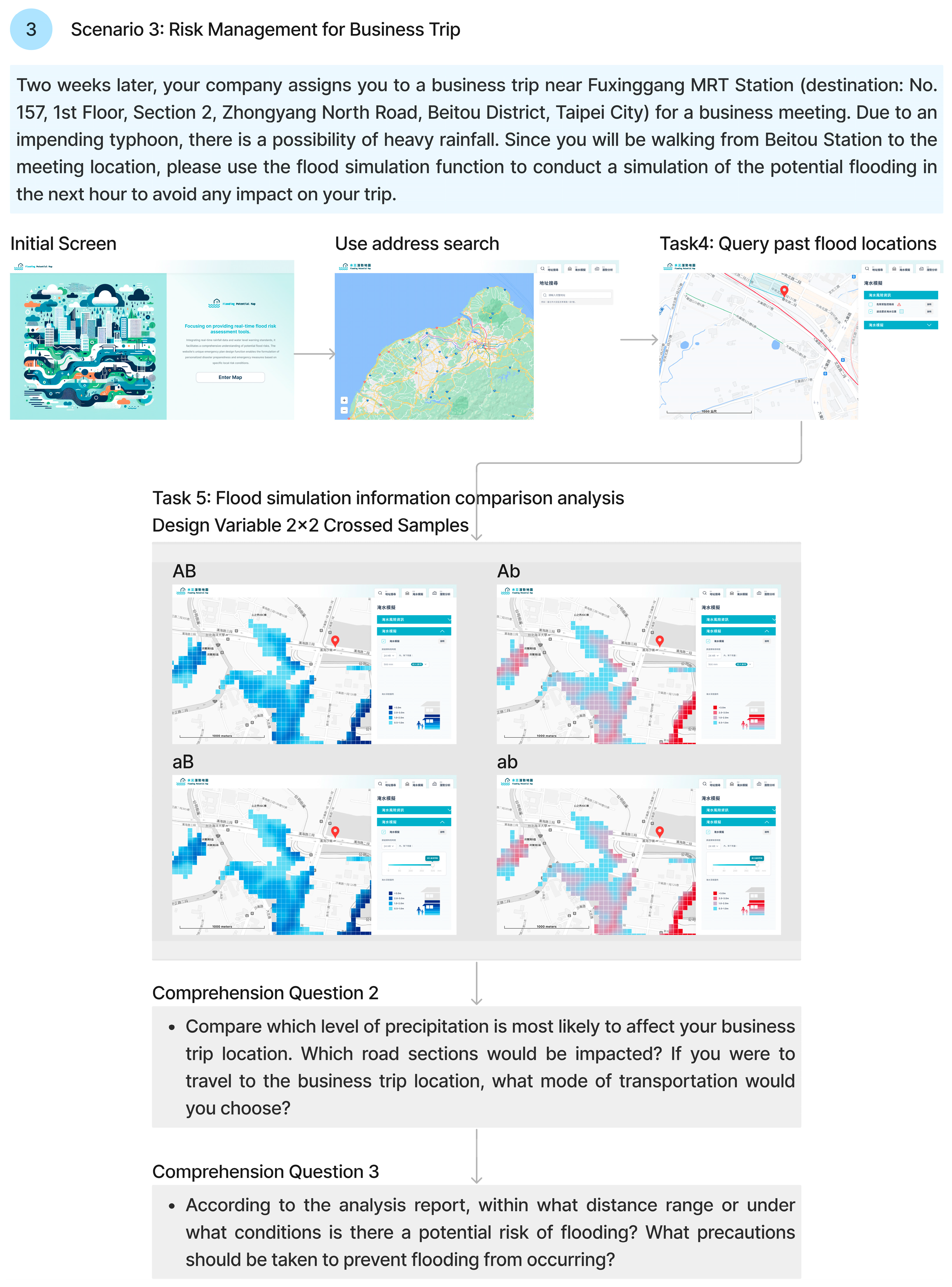
This study arranged the two versions of the design into a 2 × 2 cross-combination for analysis, resulting in four experimental samples as shown in
Figure 2. To systematically evaluate the impact of interaction mode and visual feedback, the four experimental conditions were defined based on the 2 × 2 design matrix. Group AB (Drop-down + Blue) utilized a traditional drop-down menu for selecting rainfall duration paired with a monochromatic blue-gradient legend. Group Ab (Drop-down + Multicolor) combined the drop-down menu with a multicolor (blue-to-red) warning legend to introduce visual disfluency. Group aB (Slider + Blue) featured a slider bar for selecting rainfall duration alongside the monochromatic blue-gradient legend. Finally, Group ab (Slider + Multicolor) integrated the slider bar with the multicolor warning legend. In addition, based on the design suggestions for flood hazard maps provided by participants in the preliminary survey and the problems they encountered while using the maps, this study summarized and refined these insights to optimize the interface design of the interactive map, including the function bar, layer arrangement, inundation simulation, and hazard potential analysis functions.
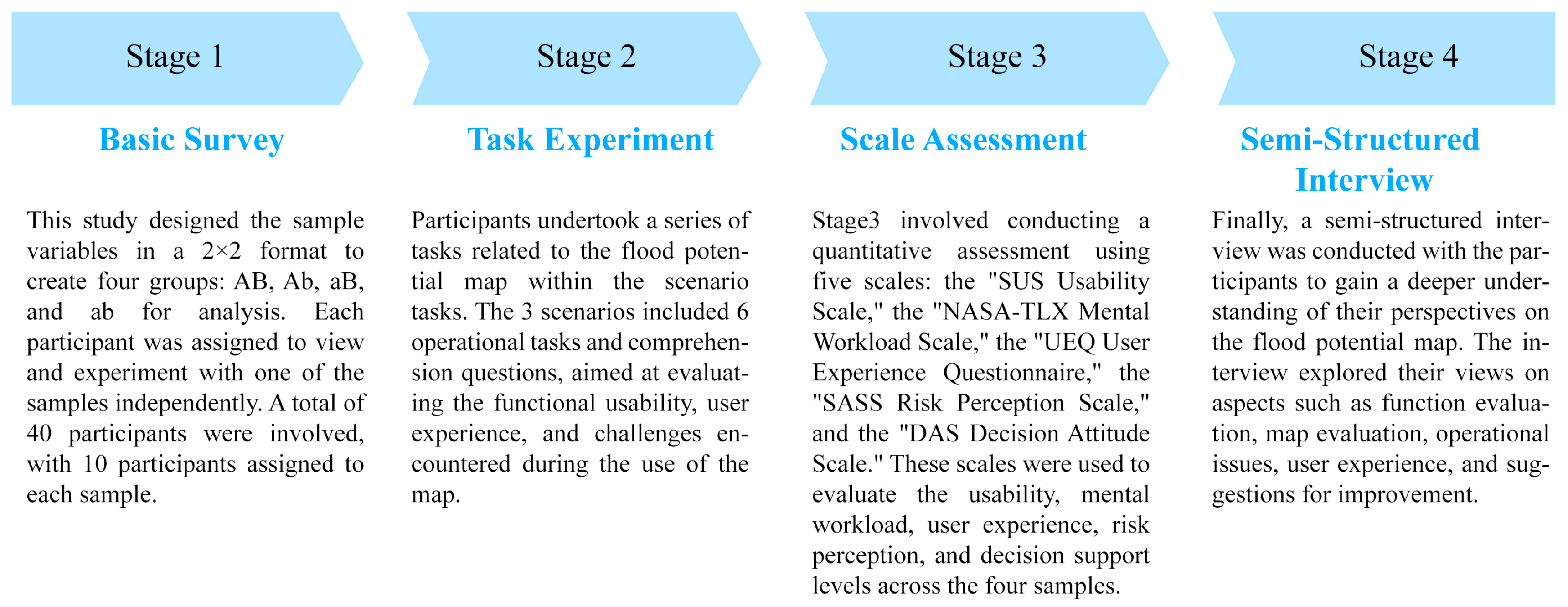
The experimental design of this study consisted of 2 × 2 variables, with the two versions A–a and B–b cross-combined to form four groups: AB, Ab, aB, and ab for analysis. The experiment was organized into four stages. In Stage 1, participants completed a basic questionnaire survey. In Stage 2, they performed a series of scenario-based tasks using the flood hazard map, which allowed the study to evaluate usability, user experience, and difficulties encountered during the interaction process. After completing the map operations, Stage 3 involved quantitative evaluation with five standardized scales: the System Usability Scale (SUS), NASA Task Load Index (NASA-TLX), User Experience Questionnaire (UEQ), Six Americas Short Survey (SASS), and Decision Attitude Scale (DAS). These were used to assess usability, cognitive load, user experience, risk perception, and decision support across the four experimental samples, in order to understand participants’ perceptions, workload, and experiences during use. Finally, Stage 4 consisted of semi-structured interviews to gain deeper insights into participants’ views, user experiences, and suggestions for improving the flood hazard map. The complete flow of all stages is illustrated in
Figure 3.
2.3. Participants
To ensure a controlled experimental environment minimizing the confounding variable of prior expert knowledge, this study adopted a purposive sampling strategy. Participants were recruited based on strict screening criteria: (1) they must not have used a flood hazard map previously; and (2) they must have normal color vision to ensure the validity of the color perception variables. A total of 40 valid participants were recruited. While a larger sample is ideal for broad surveys, this sample size (
N = 40, with 10 participants per experimental cell) aligns with standard usability testing guidelines which suggest that 5 to 10 participants per subgroup are sufficient to detect approximately 85% of usability issues [
22]. The sample consisted of 20 biological males and 20 biological females to ensure gender balance. Participants first completed an online demographic questionnaire, followed by an online scenario-based map task experiment, standardized scale questionnaires, and a semi-structured interview. Each participant received a USD 3 cash voucher as an incentive for participation. To minimize operational errors, the experiment was conducted in a physical setting. Furthermore, all participants had no prior experience with hazard maps to avoid potential data bias. To enhance the reliability of the results, participants in the formal experiment and those in the preliminary survey were independent and non-overlapping groups. This study did not collect detailed information on participants’ geographic location or prior personal experiences with flood events. The experimental design focused on isolating the effects of interface design variables on usability, cognitive workload, and risk perception during map interaction. Factors related to prior flood exposure were therefore not included as formal experimental variables and are acknowledged as a limitation of the study.
2.4. Scenario Task Design
The scenario task design in this study aimed to evaluate participants’ risk perception and decision-making ability when using the interactive flood hazard map. To achieve this goal, we developed a 2 × 2 experimental tool that included four different map presentation samples. Participants operated the web-based hazard map through scenario simulations and completed a series of tasks. The tasks consisted of three scenarios with a total of six operational tasks, as described in
Table 1, designed to assess participants’ comprehension and effective use of map information.
2.4.1. Scenario 1: Flood Risk Assessment near Residence
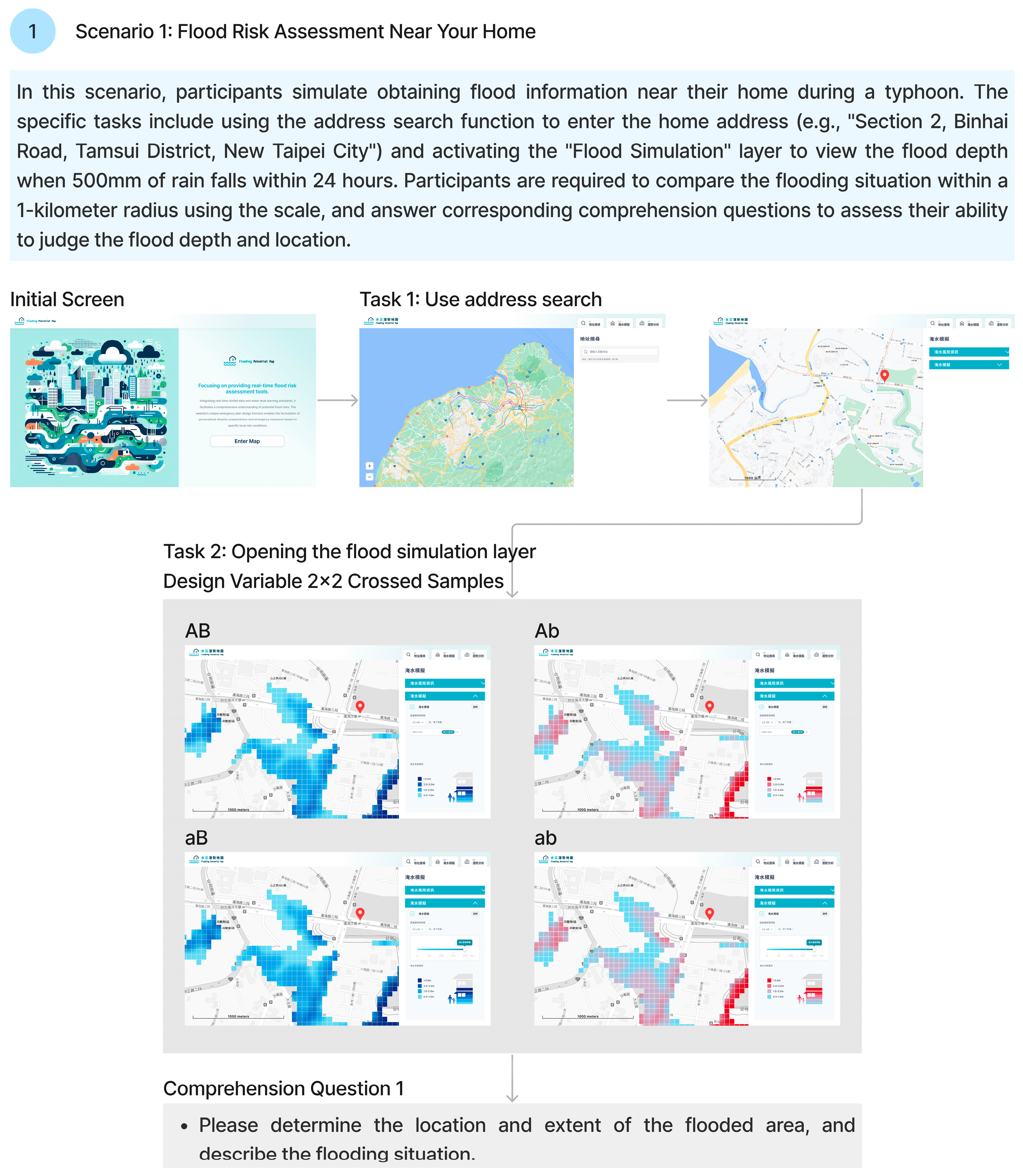
In this scenario, participants simulated obtaining flood information near their residence during a typhoon. Specific tasks included using the address search function to input a home address (e.g., “
Section 2, Binhai Road, Tamsui District, New Taipei City”), enabling the “Inundation Simulation” layer, and viewing the inundation depth under a 24-h rainfall of 500 mm. Participants were required to compare flood conditions within a 1-km radius using the scale bar and answer comprehension questions to evaluate their ability to judge inundation depth and direction as shown in
Figure 4.
2.4.2. Scenario 2: Safety Assessment of Travel Routes
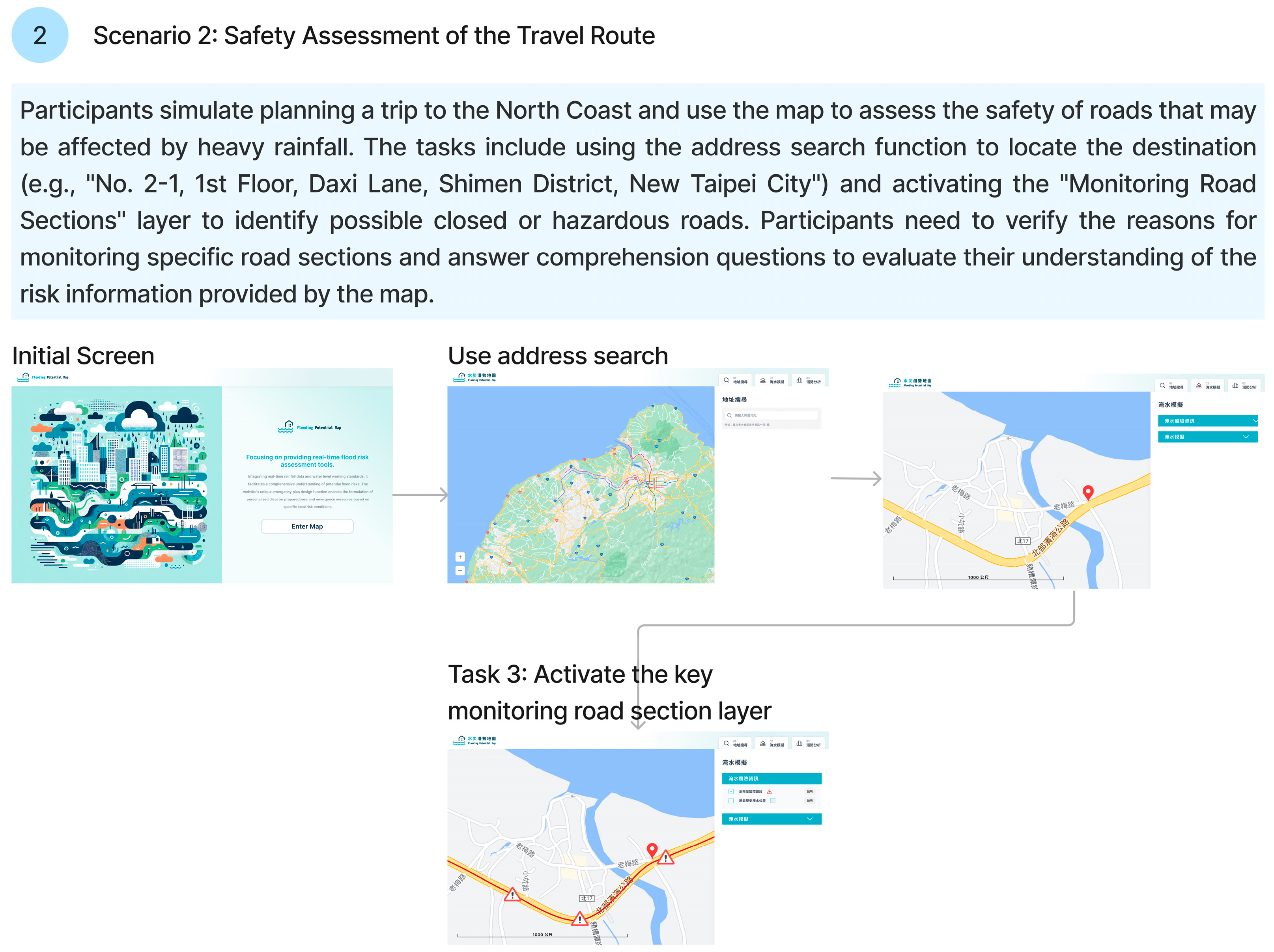
Participants simulated planning a trip to the North Coast and used the map to assess the safety of roads potentially affected by heavy rainfall. Tasks included using the address search function to locate the destination (e.g., “No. 2-1, 1st Floor, Daxiqian, Shimen District, New Taipei City”), enabling the “Monitored Road Sections” layer, and checking for potentially closed or hazardous sections. Participants needed to confirm the reason for monitoring a specific road segment and answer comprehension questions to evaluate their understanding of the risk information provided by the map as shown in
Figure 5.
2.4.3. Scenario 3: Flood Risk Management for a Business Trip
In this scenario, participants simulated traveling to Beitou District, Taipei City, for business purposes during a typhoon. Tasks included locating historical flood records from the past five years and using the inundation simulation function to predict flooding conditions within the next hour. Participants were asked to analyze the impact of different precipitation levels on the travel area and select an appropriate mode of transportation. Finally, participants used the hazard potential analysis function to generate a flood analysis report and answered comprehension questions to assess their decision-making ability in flood risk management as shown in
Figure 6.
2.5. Experimental Equipment
This study required participants to use a 27-inch high-resolution monitor with a resolution of 1920 × 1080 pixels to ensure clear and accurate visual effects when viewing the interactive interface of the flood hazard map. After completing the operational tasks and reading the maps, participants filled out standardized questionnaires on the online survey platform SurveyCake, which was used to collect their response data.
2.6. Quantitative Questionnaires
This study employed five different scales to comprehensively evaluate the usability and user experience of existing flood hazard maps. These included the System Usability Scale (SUS), NASA Task Load Index (NASA-TLX), User Experience Questionnaire (UEQ), Six Americas Short Survey (SASS) for risk perception, and the Decision Attitude Scale (DAS).
To assess usability, this study used the System Usability Scale (SUS). Originally developed by Brooke in 1986, SUS is a quick tool for measuring user satisfaction with a product [
38]. Due to its simplicity and high reliability and validity, SUS has been widely applied to usability evaluations of various products and systems [
39,
40]. The scale consists of ten items covering aspects of usability and learnability.
To measure participants’ workload when using the flood hazard map, this study employed the NASA Task Load Index (NASA-TLX). Developed by Hart and Staveland in 1988, the NASA-TLX is designed to measure cognitive workload and psychological stress during task performance [
41]. It evaluates workload across multiple dimensions such as mental demand, effort, time pressure, and task performance. The NASA-TLX has been widely used in human–computer interaction research and is considered one of the standard tools for workload assessment [
42].
To further examine user experience, the User Experience Questionnaire (UEQ) was used. Developed by Schrepp et al. (2017), the UEQ aims to rapidly and comprehensively evaluate user experience [
43]. It covers multiple dimensions, including attractiveness, perspicuity, efficiency, dependability, stimulation, and novelty, thereby capturing both emotional and cognitive aspects of user interaction [
44]. The reliability and validity of the UEQ have been verified across multiple domains, making it particularly suitable for evaluating interactive systems.
For risk perception assessment, this study adopted a modified version of the Six Americas Short Survey (SASS). Originally developed by Chryst et al. (2018) to measure global warming risk perception, the scale was adapted in this study to focus on “short-term heavy rainfall” as a way to evaluate participants’ perception of extreme weather events [
45]. The SASS has been widely applied in climate risk perception studies and is valued for its concise and effective categorization of respondents’ risk perception types. In this study, it was used to measure the extent to which the flood hazard map enhanced participants’ risk perception.
Finally, the Decision Attitude Scale (DAS) was used to assess decision-making. This scale evaluates participants’ satisfaction and perceived usability of information in situations where no clear “correct” answer exists. It measures decision quality based on the adequacy and clarity of information available during the decision-making process. In this study, the DAS was combined with the SUS to provide a comprehensive evaluation of how flood hazard maps support decision-making in risk management.
2.7. Ethical Considerations and Data Availability
This study was reviewed, and the requirement for ethical approval was waived by the Institutional Review Board of National Taipei University of Technology (NTUT). The waiver was granted because the user interface and interaction study did not involve any procedures that could affect participants, and all collected data were fully anonymized with no identifiable personal information.
- 2.
Informed Consent Statement:
Informed consent was obtained from all participants involved in the study prior to participation.
- 3.
Data Availability Statement:
The data presented in this study are available on request from the corresponding author. The data are not publicly available due to privacy or ethical restrictions.
3. Results
A total of 40 participants were recruited for the usability and scenario task experiments. The sample included an equal number of male and female participants, with ages ranging from 23 to 51 years and an average age of 29. None of the participants had prior experience using flood hazard maps. In terms of education, the majority held a university or college degree (45%), followed by those with graduate-level education or above (30%).
3.1. Task Operation Time
When evaluating participants’ performance with the redesigned flood hazard map interface, two key indicators were considered: the time required to complete each scenario task and the number of operation errors. In Task 2 (activating the inundation simulation layer), participants were required to locate and enable the target function within the interface, and the time taken by each participant to find it was recorded. Results of a one-way ANOVA showed that the mean operation time for Task 2 differed significantly across the four samples, F(3,36) = 6.30,
p = 0.002 ** (<0.05), as presented in
Table 2.
The performance results indicated that the AB (drop-down + blue) condition (24.63 s) required significantly more time compared with the aB (slider + blue) condition (13.78 s). A similar pattern was observed in the Ab (drop-down + multicolor) condition (25.50 s) compared with the ab (slider + multicolor) condition (12.13 s). For all four samples, the number of errors was fewer than two, indicating high task accuracy. These results suggest that whenever participants used the drop-down menu, more operation time was required compared to the slider condition. The main reason is that drop-down menus require users to first “open” the menu to view options, and then select the option that fits the scenario. This additional step of opening the menu and considering the appropriate choice typically adds 5–10 s, which explains why the AB and Ab samples had longer operation times.
3.2. Average Map Reading Time
Following Task 2, the map-reading task required participants to compare changes in the flood hazard map under a 24-h rainfall interval. Participants needed to adjust and switch the design variable of “precipitation change” to observe variations in inundation-prone areas and to explain the flood hazard zones presented on the map.
A two-way ANOVA showed a significant main effect of precipitation form on reading time across the four samples in Task 2, F(1, 36) = 9.91,
p = 0.003, as shown in
Table 3. Specifically, the drop-down condition required significantly longer reading times compared with the slider condition when using the blue flood hazard map. The likely reason, as noted in the previous section, is that the drop-down interface inherently requires more time and actions from participants. Each time they needed to interpret different rainfall variations, they had to switch the function again before explaining the map content. This repeated action explains why the drop-down menu in flood hazard maps led to longer reading times, especially when participants were required to compare inundation areas.
Although legend color did not have a statistically significant effect on reading time, feedback from semi-structured interviews revealed that 27.5% of participants found the blue-gradient legend more intuitive for representing inundation, as it more easily conveyed the severity of flooding and thus resulted in shorter reading times. In contrast, 37.5% of participants reported needing to repeatedly check the legend on the right side of the interface when reading the multicolor flood hazard map, to ensure their interpretations were correct. This was due to the color transition scheme, which used a red-to-blue gradient legend. The two intermediate colors appeared purple, making it harder for participants to associate them with inundation severity, leading participants in the Ab condition to spend more time reading and interpreting the map.
After Task 5, the map-reading task required participants not only to compare inundation changes under a 1-h rainfall interval but also to reference the information from Task 4 (historical inundation areas) in order to evaluate the potential road hazards under different rainfall levels in a business-trip scenario. Again, participants had to adjust and switch the “precipitation change” variable to observe changes in inundation areas, and then conduct an integrated evaluation and decision-making process with reference to historical flood records.
A two-way ANOVA showed a significant main effect of precipitation form on reading time across the four samples in Task 5, F(1,36) = 14.24,
p = 0.001, as shown in
Table 4. This result was consistent with the significance observed in Task 2. Across both map-reading tasks, although legend color did not show a significant effect, descriptive statistics of average reading time suggested that the AB sample clearly required more time compared with the aB sample. Therefore, considering practical needs in disaster management and emergency situations, the aB condition should be prioritized in implementation, as it allows users to interpret and communicate disaster management information with greater efficiency and without the extended time demands observed in the drop-down menu condition.
3.3. Comprehension Score Performance
After participants completed the operational tasks, map-reading tasks were conducted. Specifically, comprehension questions were administered after Task 2 (activating the inundation simulation layer), Task 5 (comparative analysis of inundation simulation information), and Task 6 (output of decision analysis).
Table 5 presents detailed statistics of participants’ comprehension scores. Each set of three questions had a maximum score of 3 points, while a score of 0 indicated that none of the questions were answered correctly. Because Tasks 2, 5, and 6 included cases of zero scores and the distribution of scores was highly skewed, homogeneity of variance tests were not met. Therefore, only descriptive statistics are reported.
The results showed that participants in the AB (drop-down + blue) and aB (slider + blue) conditions had lower comprehension scores compared with the other two conditions. Analysis of the errors revealed that, among the nine participants who failed to correctly interpret the flood hazard map, five (55%) misinterpreted the “blue-gradient legend” representing inundation depth as indicating “the amount of rainfall.” Based on the average comprehension results, this study suggests that the blue-gradient legend may reduce users’ attention to legend information, or may confuse those unfamiliar with the relationship between rainfall and inundation. Compared with the multicolor legend, the blue-gradient legend was more likely to lead to misunderstandings of meaning, as the color blue is easily associated with “water,” causing participants to confuse inundation depth with rainfall amount.
3.4. Performance on Number of Interactions with the Flood Hazard Map
For the three operational tasks, the number of interactions violated the assumption of homogeneity of variance; therefore, only descriptive statistics are reported. As shown in
Table 6, participants in the aB (slider + blue) and ab (slider + multicolor) conditions recorded the highest number of interactions, averaging about one more interaction compared with those in the AB (drop-down + blue) and Ab (drop-down + multicolor) conditions. Notably, the aB version showed higher numbers of interactions in Tasks 2 and 5. Insights from the semi-structured interviews indicated that 40% of participants considered the “slider” format to be more convenient, since it required fewer steps than the drop-down menu, which involves opening the menu before making a selection. Because of this ease of operation, participants were more willing to switch between different data repeatedly for comparative analysis.
3.5. SUS System Usability Scale
According to the SUS usability scores of the four design samples, the two-way ANOVA results indicated no significant effects of precipitation form, F(1, 36) = 0.10,
p = 0.759 (>0.05); legend color, F(1, 36) = 0.06,
p = 0.806 (>0.05); or their interaction, F(1, 36) = 0.03,
p = 0.854 (>0.05), as shown in
Table 7.
Descriptive statistics (see
Table 8) revealed that the highest usability score was obtained by the aB (slider + blue) condition (82.01), followed by AB (drop-down + blue) (81.51), ab (slider + multicolor) (81.25), and Ab (drop-down + multicolor) (79.75). Except for the Ab sample, which was graded as B+, the other three samples were all graded as A. Although the statistical analysis did not show any significant differences in usability scores among the four samples, overall, the AB, aB, and ab conditions demonstrated excellent performance according to SUS usability standards.
3.6. NASA-TLX Mental Workload Scale
To examine differences among the four design samples across the NASA-TLX workload dimensions, a two-way ANOVA was conducted. According to the descriptive statistics of the NASA-TLX (see
Table 9), for mental demand, the Ab (drop-down + multicolor) condition recorded the highest score (90.42), whereas the ab (slider + multicolor) condition recorded the lowest (79.20). This indicates that the slider interaction required the least mental effort, suggesting that direct manipulation reduced the cognitive load associated with navigating complex options. Although the Ab condition appeared to impose a higher mental load, ANOVA results indicated that neither precipitation form (F(1, 36) = 0.24,
p = 0.758) nor legend color (F(1, 36) = 0.01,
p = 0.922) reached statistical significance for this specific dimension.
For physical demand, the results likewise indicated no significant main effects for precipitation form (F(1, 36) = 0.98, p = 0.328) or legend color (F(1, 36) = 0.03, p = 0.859). However, the AB (drop-down + blue) and Ab (drop-down + multicolor) conditions yielded relatively higher physical demand scores. Descriptive statistics also indicated that physical demand scores were lower on average than mental demand, suggesting that participants primarily experienced mental rather than physical workload when using the redesigned flood hazard map.
For temporal demand, the ANOVA results again revealed no significant effects of precipitation form (F(1, 36) = 0.00, p = 0.973) or legend color (F(1, 36) = 0.02, p = 0.893). Scores were relatively close across the four samples, with Ab (drop-down + multicolor) reaching the highest (30.69).
For performance demand, no significant differences were found (precipitation form: F(1, 36) = 0.02, p = 0.887; legend color: F(1, 36) = 0.07, p = 0.799), although the ab (slider + multicolor) condition recorded the highest score (60.72).
For effort, the Ab (drop-down + multicolor) condition scored the highest (96.03). However, no significant main effects were observed for precipitation form (F(1, 36) = 0.12, p = 0.727) or legend color (F(1, 36) = 0.00, p = 0.972).
For frustration, the ANOVA results again showed no significant differences (precipitation form: F(1, 36) = 0.02, p = 0.885; legend color: F(1, 36) = 0.14, p = 0.713). The Ab (drop-down + multicolor) and ab (slider + multicolor) conditions, however, yielded relatively higher frustration scores.
Finally, analysis of the overall NASA-TLX workload scores indicated no significant effects of precipitation form (F(1, 36) = 0.30, p = 0.588) or legend color (F(1, 36) = 0.08, p = 0.783). The highest overall scores were observed in the Ab (drop-down + multicolor) condition (58.91) and the AB (drop-down + blue) condition (54.07).
Overall, the Ab (drop-down + multicolor) condition recorded the highest weights for mental and effort demands, whereas the ab (slider + multicolor) condition recorded the lowest. This suggests that while the multicolor legend introduces some cognitive disfluency, the slider interaction significantly mitigates this burden, resulting in the lowest overall workload. In contrast, the combination of the drop-down menu and multicolor legend (Ab) created a compounding effect, making it the most cognitively demanding condition for participants.
3.7. UEQ User Experience Questionnaire
To further investigate participants’ user experience with the redesigned flood hazard map, participants were asked to complete the UEQ after the experiment. According to the interpretation guidelines of the UEQ, scores range from +3 (excellent) to −3 (poor). Values between −0.8 and 0.8 are considered neutral; values greater than 0.8 indicate a positive evaluation, whereas values lower than −0.8 indicate a negative evaluation.
Statistical analysis showed that all 40 participants gave highly positive evaluations of the redesigned flood hazard map. The mean score for pragmatic quality was 2.07 (SD = 0.90), rated as Excellent; the mean score for hedonic quality was 1.65 (SD = 1.15), also rated as Excellent; and the overall mean score was 1.86 (SD = 0.92), again rated as Excellent. For all individual UEQ items, the mean ratings exceeded 5 points, indicating consistently positive performance in both pragmatic and hedonic qualities. These results suggest that participants held highly favorable impressions of the redesigned flood hazard map in terms of both practical utility and experiential enjoyment.
In terms of pragmatic quality, samples using the blue-gradient legend scored higher than those using the multicolor legend. For hedonic quality, the slider condition achieved higher scores. Participants reported that the “slider” format provided a better user experience compared with the drop-down menu, as the slider allowed a horizontal incremental adjustment that visually conveyed increasing rainfall from left to right. This feature was perceived as more engaging and visually intuitive, making it both more enjoyable and more usable than the drop-down menu as shown in
Table 10.
3.8. SASS Risk Perception Scale
A mixed-design ANOVA was conducted to analyze risk perception performance across the four design samples. Among them, the ab (slider + multicolor) condition showed the greatest increase between pre-test and post-test total scores (+0.97), indicating that this version was most effective in enhancing participants’ awareness of heavy rainfall and flood-related risks.
Overall, the lowest-scoring item across participants was “How worried are you about floods caused by heavy rainfall?” Pre-test scores for this item across the four groups ranged from 2.3 to 2.9, suggesting that most participants were not particularly concerned about the hazards associated with this type of extreme weather. Notably, after using the redesigned flood hazard map, average scores for this item increased by +1.3 to +1.7 points, as shown in
Table 11, demonstrating that the map effectively enhanced participants’ awareness of risks related to heavy rainfall and flooding.
Analysis results revealed a significant main effect of time (pre-test vs. post-test) in the repeated-measures ANOVA, F(1, 36) = 102.30, p < 0.001, and a significant difference was also confirmed by the paired-sample t-test and Wilcoxon signed-rank test, both yielding p < 0.001. These results indicate a significant increase in risk perception from pre-test to post-test.
In addition, there was a significant interaction effect between test time and legend color (pre-test/post-test × legend color), F(1, 36) = 4.67,
p = 0.037, as shown in
Table 12. Descriptive statistics indicated that the Ab (drop-down + multicolor) and ab (slider + multicolor) conditions demonstrated greater improvements in risk perception scores between pre-test and post-test, suggesting that the multicolor legend played an important role in enhancing participants’ risk perception.
3.9. DAS Decision Attitude Scale
The Decision Attitude Scale consists of three dimensions: decision satisfaction, information usability, and information adequacy. For statistical analysis, a two-way ANOVA was conducted to compare significant differences among the four design samples.
According to the descriptive statistics of the three dimensions across the four design samples, information usability received the highest scores. Except for the Ab (drop-down + multicolor) version, the other three samples each achieved a high score of 4.45, consistent with the grade “A” observed in the SUS usability evaluation. In contrast, information adequacy yielded the lowest scores among the three dimensions, with the Ab (drop-down + multicolor) condition recording the lowest score (3.1), as shown in
Table 13.
In the two-way ANOVA, decision satisfaction scores showed no significant main effects of precipitation form, F(1, 36) = 0.40, p = 0.533, legend color, F(1, 36) = 1.24, p = 0.273, or their interaction, F(1, 36) = 0.06, p = 0.810. Similarly, information usability scores showed no significant main effects of precipitation form, F(1, 36) = 0.12, p = 0.734, legend color, F(1, 36) = 0.12, p = 0.734, or their interaction, F(1, 36) = 0.12, p = 0.734. For information adequacy, the results again showed no significant main effects of precipitation form, F(1, 36) = 0.01, p = 0.935, legend color, F(1, 36) = 0.55, p = 0.464, or their interaction, F(1, 36) = 0.17, p = 0.684.
In addition, 20% of participants indicated that they hoped decision analysis data could be linked with real-time data from the Central Weather Administration to display current conditions. Another 12.5% of participants suggested providing more diverse and comprehensive disaster preparedness recommendations.
5. Conclusions
This study examined how interaction modes and legend color schemes in flood hazard maps influence users’ comprehension, task performance, and risk perception. Simplifying technical terminology and incorporating familiar rainfall classifications improved understanding of short-term heavy rainfall risks. The slider-based interaction reduced task completion and reading times compared with the drop-down menu, indicating that direct manipulation enhances usability and operational efficiency.
While blue-gradient legends provided intuitive recognition and higher cognitive fluency, they occasionally led to superficial information processing. In contrast, multicolor legends induced cognitive disfluency that promoted deeper engagement, improved memory, and strengthened risk perception. These findings underscore the importance of balancing intuitive usability and reflective interpretation in hazard communication tools.
Overall, the study contributes to the design of evidence-based, user-centered interfaces for flood hazard communication within smart city systems. By integrating perceptual design principles into digital urban platforms such as digital twins and IoT-based early warning systems, cities can enhance public understanding, participation, and preparedness for extreme weather events. These insights support the development of more resilient, informed, and adaptive urban communities.
