3.1. Protein Consumption in European Countries
First, we normalize the data matrix by subtracting the mean and dividing by the standard deviation for each column. This implies that our analysis is based on correlations. We then apply a factor analysis method; in this case, we used the maximum likelihood solution with a varimax rotation and obtained the individual scores by regression. We have chosen this method because it provides a simple solution, but any other method could have been chosen. The objective is simply to illustrate the construction of a biplot from any factor structure. The variance explained by each factor is shown in
Table 2.
The factor matrix (
Table 3) contains correlations among observed variables and factors. We have highlighted the highest loadings for each variable in order to know what variables are most related to each factor.
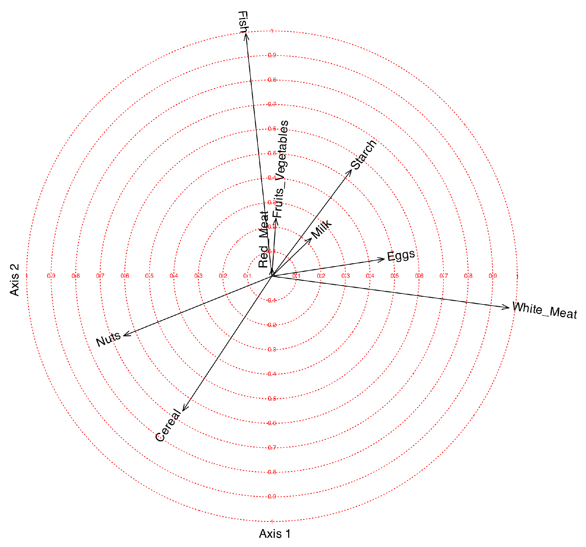
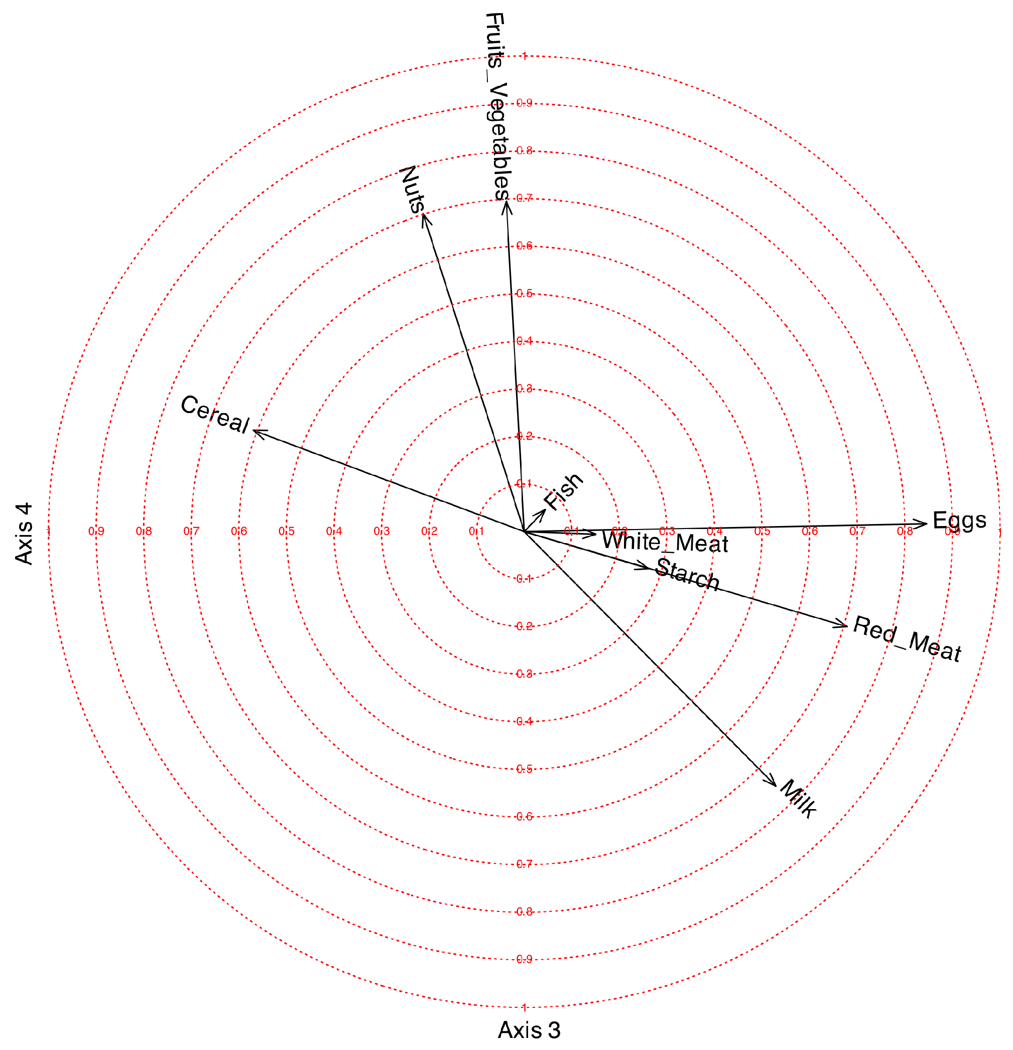
When dealing with PCA, many software packages construct what is known as a correlation plot, which represents the coordinates for variables, in
, inside a circle of radius 1. Instead of ticks on the axes, concentric circles are drawn for different values between 0 and 1. The correlation plot can also be applied to any factorization of the data matrix. A circle of correlations for Factors 1 and 2 is shown in
Figure 4, for Factors 3 and 4 in
Figure 5.
The first factor is mainly related to White_Meat with a positive correlation and to Nuts with a smaller negative correlation. The objective of rotations in factor analysis is to provide a structure as simple as possible, with some of the loadings close to 1 and others close to 0. We observe that the loading for White_Meat is 0.97; therefore, the first factor differentiates very well between countries that consume white meat and those that do not. White_Meat is negatively related to Nuts.
The second factor is positively related to Fish and negatively to Cereal. The loading for Fish is also very high (0.99), so it differentiates quite well among countries consuming fish. The third factor is positively related to Eggs, Red_Meat, and Milk, and negatively to Cereal. The fourth factor is positively related to Nuts and Fruits_Vegetables. The variable Starch is not clearly related to any of the factors.
The coordinates for rows, in
, can be added to the plot to obtain a biplot.
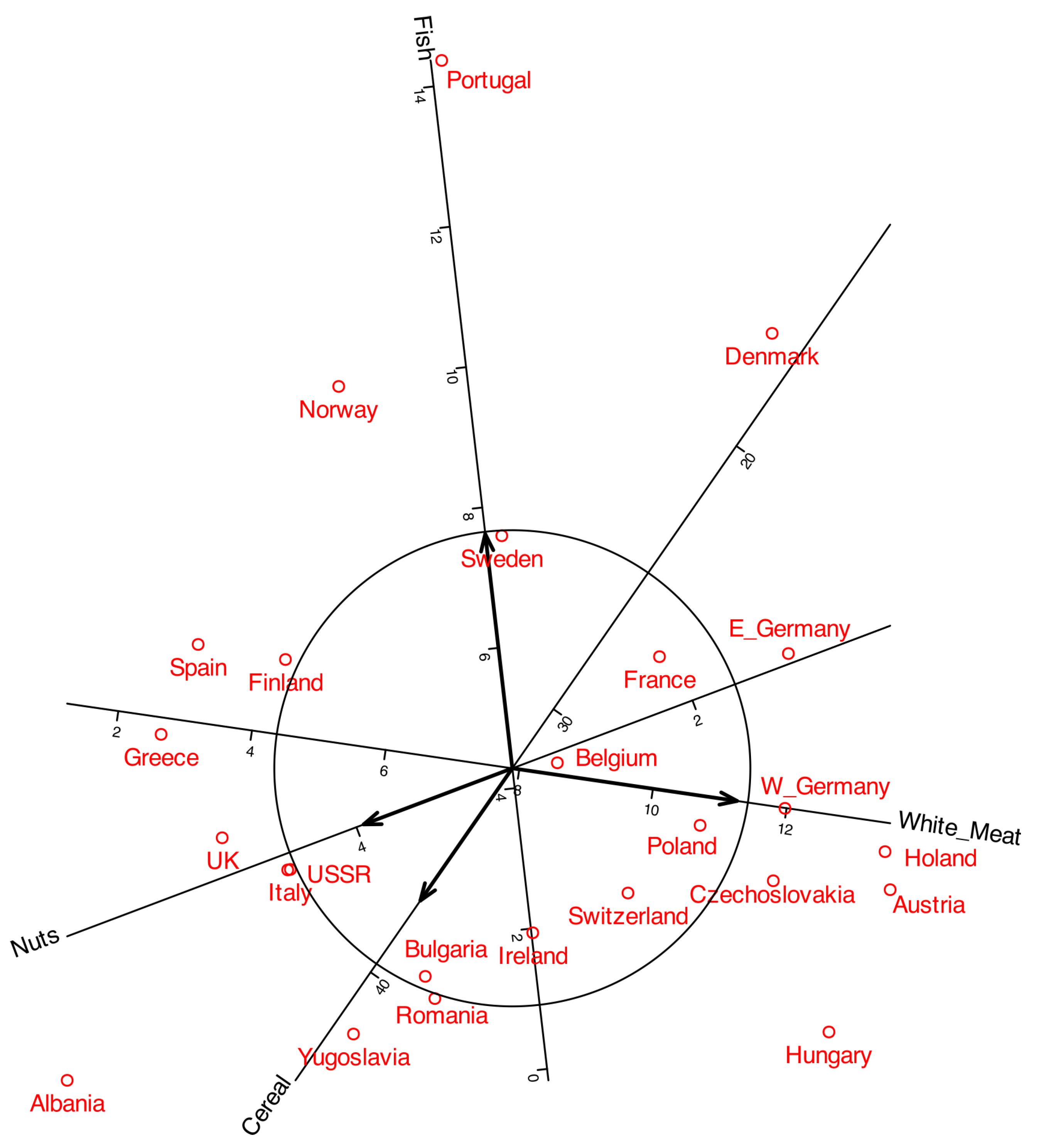
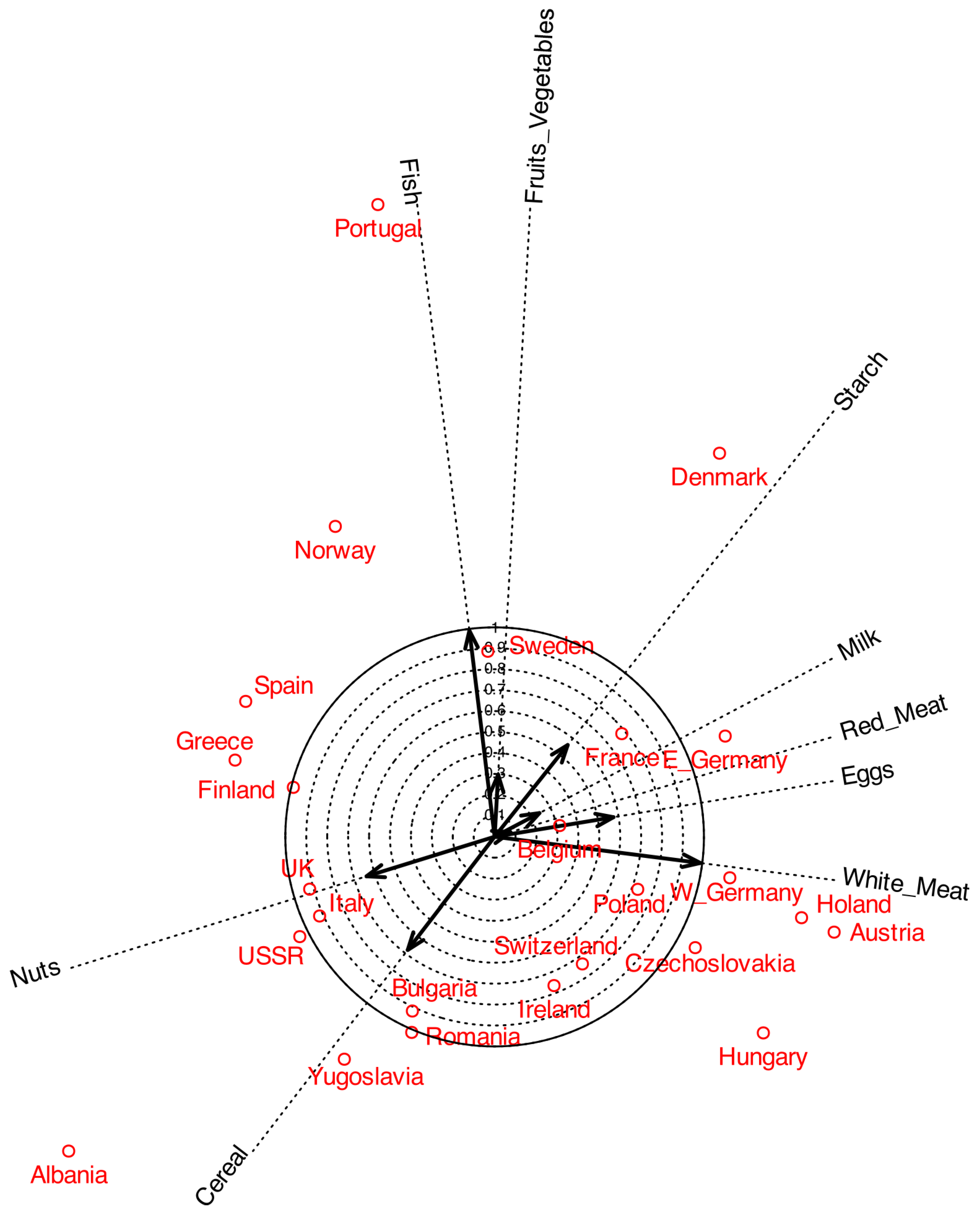
Figure 6 shows a typical biplot together with the correlation circles. To make the plot easier to read, some labels were moved outside the main area. The arrows represent the variables, and by projecting them onto the principal component axes, we can observe how strongly each variable is correlated with the components. For instance,
White_Meat shows a strong correlation with the first component, whereas
Fish is more closely associated with the second. The length of each arrow represents the multiple correlation with both components. The circles shown in the plot serve as a reference for interpreting both the arrow length and its projection onto the axes.
As in standard PCA, only variables represented by longer arrows can be reliably interpreted in the plot, whereas shorter arrows should be treated with caution. For example,
White_Meat and
Fish can be meaningfully interpreted, while variables such as
Milk and
Fruits_Vegetables provide little reliable information in this representation. The latter may instead be better explained by other components. A useful strategy is to remove from the plot those variables with low correlations. For instance, variables with correlations smaller than 0.6 can be excluded to obtain the representation shown in
Figure 2.
3.2. Volunteering and Ideology
All variables, with the exception of
Type, were included in the analysis. The variable
Type was subsequently projected onto the plot to explore potential associations with the other variables. Factor extraction was conducted using the
principal components method, and the resulting factors were subjected to Varimax rotation. The first two factors have been selected.
Table 4 contains the variance explained by each factor.
Both factors together explain 63.33% of the variability, which is adequate in this context. In psychology and other social sciences, a solution explaining around 50–60% of the total variance is generally regarded as acceptable (see [
21] or [
22], for example). The factor matrix is shown in
Table 5.
The first factor loaded positively on Interest in Politics, Organizational Orientation, Organizational Nature, and Political Demands, indicating that these variables are strongly interrelated. The second factor showed positive loadings for Ideology and Autonomy, and a negative loading for State Support of the Organization. This pattern suggests that Ideology and Autonomy are positively associated with each other, while both are negatively associated with State Support.
All communalities were relatively high, except for Different Profiles, which exhibited little association with the first two factors.
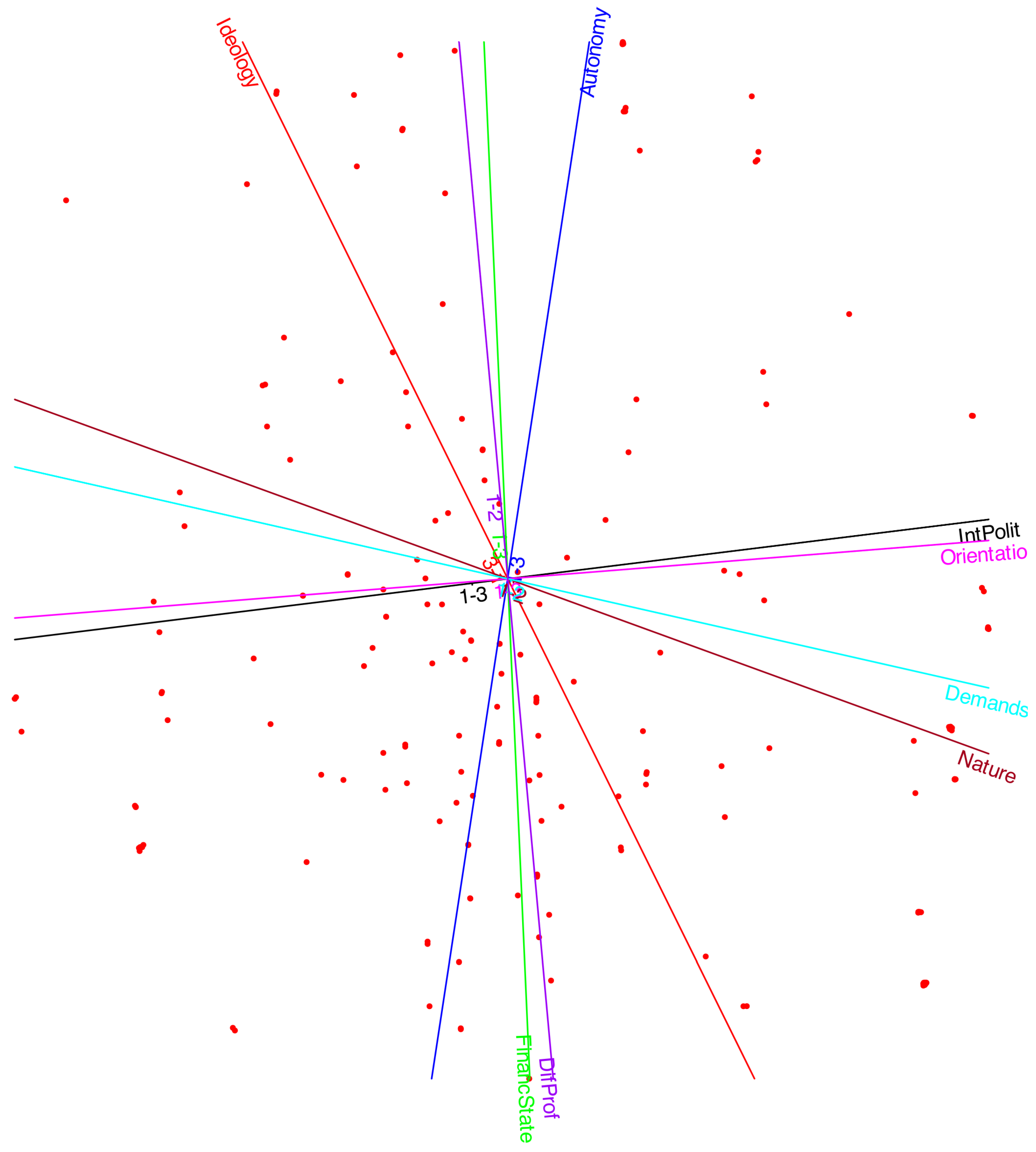
The factor biplot with correlation circles is presented in
Figure 7. As noted earlier,
Interest in Politics,
Organizational Orientation,
Organizational Nature, and
Political Demands are strongly and positively correlated. This cluster of variables shows little association with
Ideology,
Autonomy, or
State Support of the Organization. Thus, the choice of an organization with political demands or a transformative nature appears to be more closely linked to political interest than to ideological orientation.
Conversely, Ideology and Autonomy are positively associated, while both are negatively related to State Support. This indicates that individuals on the left of the political spectrum tend to believe that organizations should be both autonomous and supported by the state, whereas those on the right favor autonomy but oppose state financing.
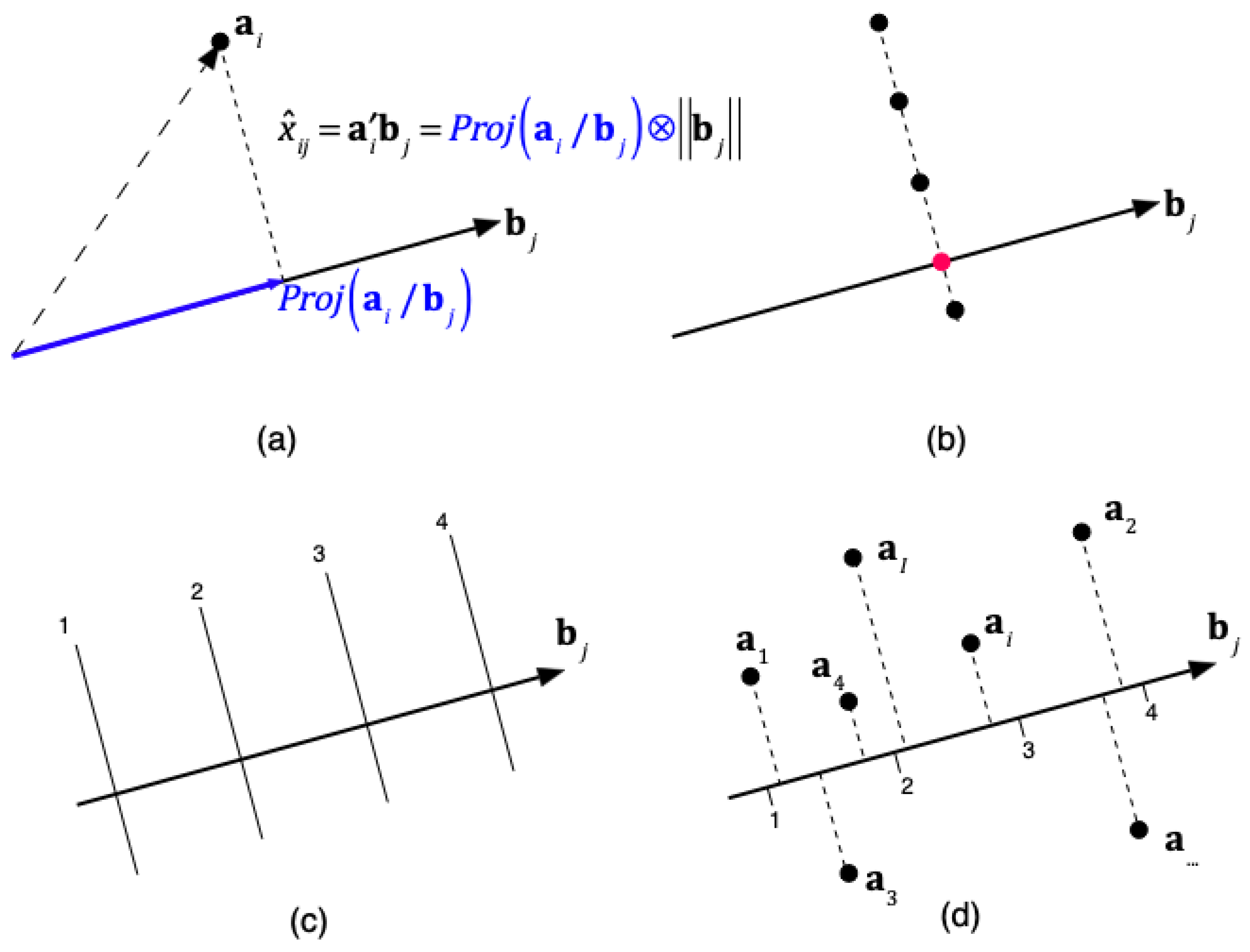
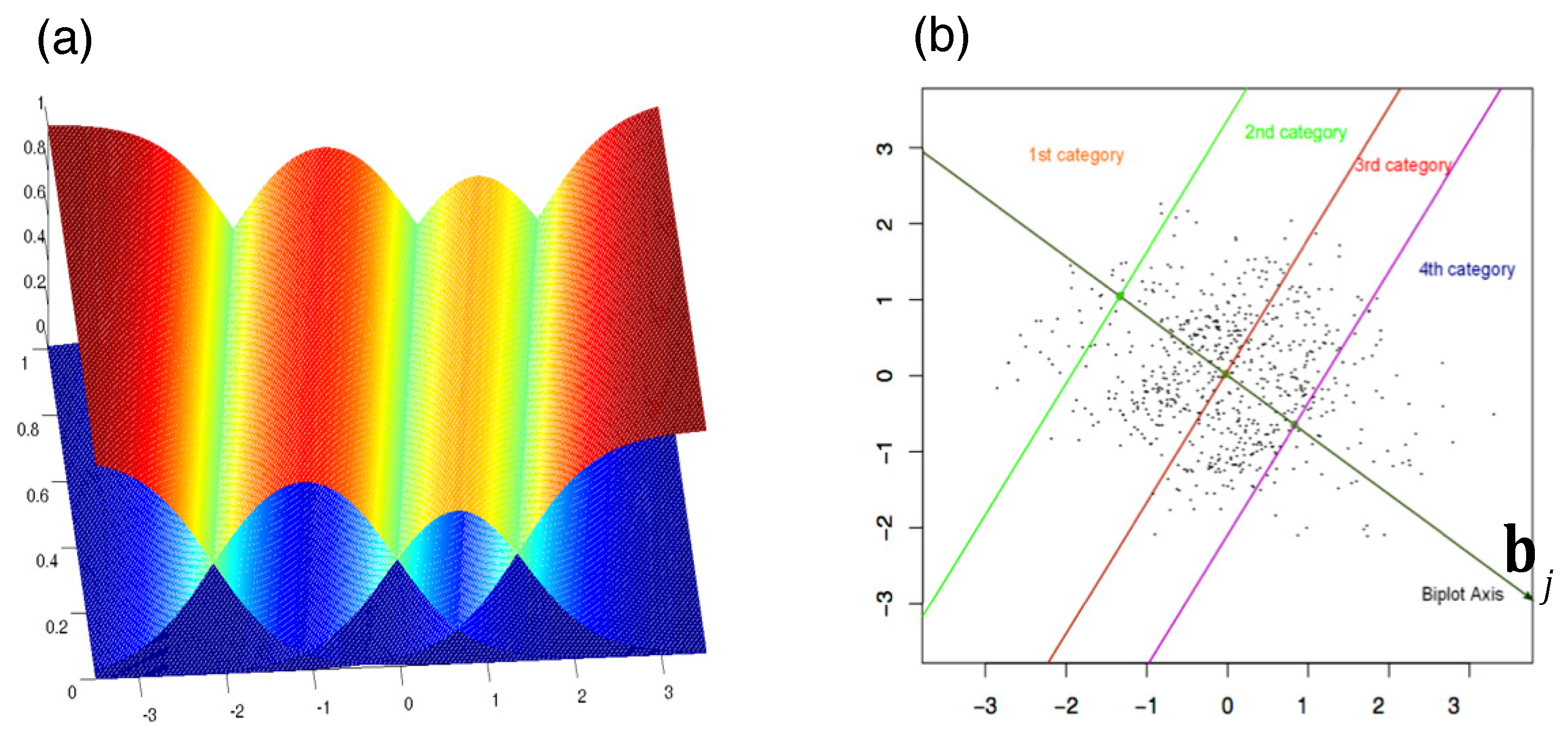
In the biplot, each point represents an individual. By projecting an individual onto the direction of a variable, one could, in principle, estimate the probabilities for each category. However, this is complex, as it would require separate probability scales along the same direction for each category. Our goal is not to predict exact probabilities but rather to predict ordinal categories. For this purpose, it is sufficient to identify the points that separate the different category values.
Together with the correlation biplot, we can define a prediction biplot showing the points that separate each prediction region, as illustrated in
Figure 3. The prediction biplot is shown in
Figure 8. We used different colors to distinguish the variables; however, some overlap remains, making the plot difficult to read. The software allows partial displays of selected variables to facilitate interpretation.
As previously discussed, the projection of individual points onto the variable axes allows for the prediction of the original categories by identifying the prediction region in which the projection falls.
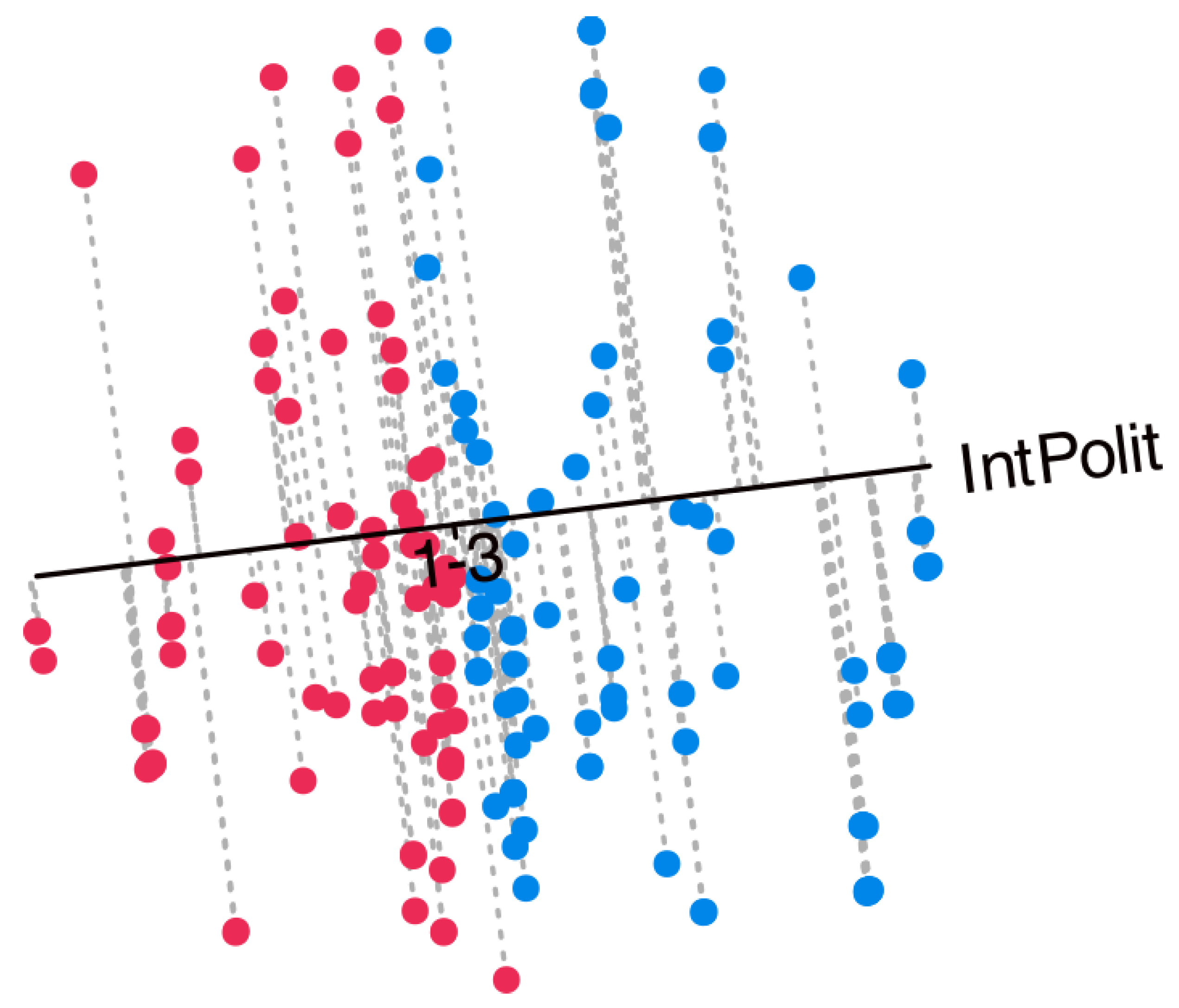
Figure 9 presents the projections onto the variable
Interest in Politics, serving as an example of how to interpret the biplot. Along the axis, cut-off points separating the prediction regions are indicated. For this variable, which comprises three categories (1 = None, 2 = Some, 3 = A lot), two separation points would be expected: one between categories 1 and 2 (“1–2”) and another between categories 2 and 3 (“2–3”). However, only a single point labeled “1–3” is observed. This indicates that the separation occurs exclusively between categories 1 and 3, with the intermediate category (2) remaining unrepresented and, therefore, never predicted. A similar pattern emerges for all variables with three categories, whereby the intermediate level is consistently absent from the predictions. Furthermore, the separation points across variables are located near the center of the plot and tend to overlap, leading to a mixed configuration. This is probably due to the fact that intermediate categories were not clearly understood by the respondents.
Figure 9 also displays the individuals together with their projections onto the selected variable. This is merely an illustration of how to interpret the biplot. To assess the quality of the predictions, you should refer to the goodness-of-fit indices presented in the article. Points in red correspond to predictions of category 1 (None), whereas points in blue correspond to predictions of category 3 (A lot). The intermediate category 2 (Some) is not represented and is therefore never predicted. When considering all variables jointly, the resulting biplot provides a comprehensive view that facilitates the interpretation of the main structural features of the data.
Along with the correlations, we can also display the contributions or qualities of representation, which indicate how much of the variance of each observed variable is explained by the factors. These contributions are usually computed as squared correlations, and they can also be understood geometrically as the squared cosines of the angles between the original variables and the latent factors. In addition, they may be interpreted as measures of the discriminant power of each variable. The sum of the contributions across two factors corresponds to the contribution of the plane defined by those factors.
Although the information may be somewhat redundant given the previous representations, we include it for comparison with other techniques, such as Multiple Correspondence Analysis. The user can choose the way the results are presented: correlation circle plots, tables, or contribution plots.
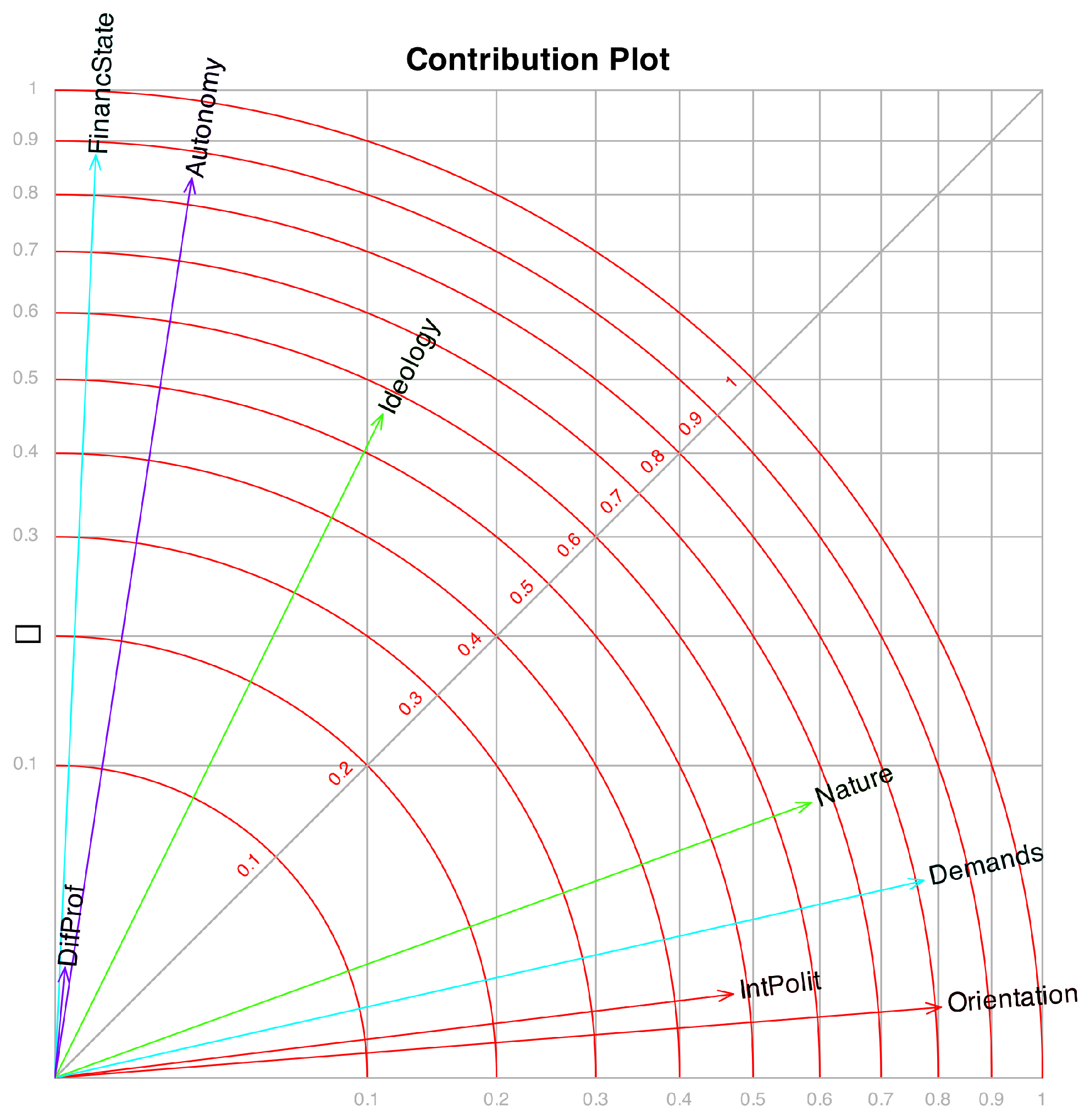
Figure 10 displays the contributions associated with the first two factors, where each variable is represented by a vector. The plot is scaled so that the projection of a vector onto an axis corresponds to its contribution to the respective factor, while the concentric circles indicate the contribution of the plane formed by the two factors.
Beyond correlations and contributions, additional measures associated with the prediction biplot may be employed. Given that Equations (
24) and (
25) define an ordinal logistic regression model, any conventional measure of model fit within this framework can be used as an indicator of goodness of fit for each variable. In particular, pseudo-
indices (such as those proposed by Cox–Snell, McFadden, or Nagelkerke), the proportion of correct classifications, and the Kappa coefficient assessing the agreement between observed and predicted values may be considered.
Table 6 presents these measures.
We observe that the pseudo-
measures are reasonably high, except for the variable
DifProf. A review of the interpretation of these coefficients can be found in [
23].
Although pseudo- statistics are conceptually similar to the coefficient of determination in ordinary least squares regression, they do not represent the proportion of variance explained. Instead, they quantify the relative improvement in model fit achieved by the fitted model compared to a null (intercept-only) model. Higher values of pseudo- imply better model fit relative to the null model.
For instance, typical rough guidelines for interpreting McFadden’s state that a value higher than 0.26 indicates a strong fit.
These thresholds should be viewed as heuristic rather than absolute, and pseudo- values are best interpreted comparatively across models fitted to the same data.
The percentages of correct classification are reasonably high. We have to consider that we are dealing with measurements in the behavioral sciences, which are often less precise. The percentages are also lower because the intermediate category is never predicted.
Ordinarily, the points representing individual subjects are not directly examined, except perhaps when the focus is on specific characteristics of a given subject and their corresponding behavior. More commonly, the analysis is directed toward understanding how groups of individuals perform in relation to the variables.
An effective strategy is to distinguish individuals from different groups or clusters by using color coding, enclosing them within convex hulls, or representing them through their group centroids. For instance,
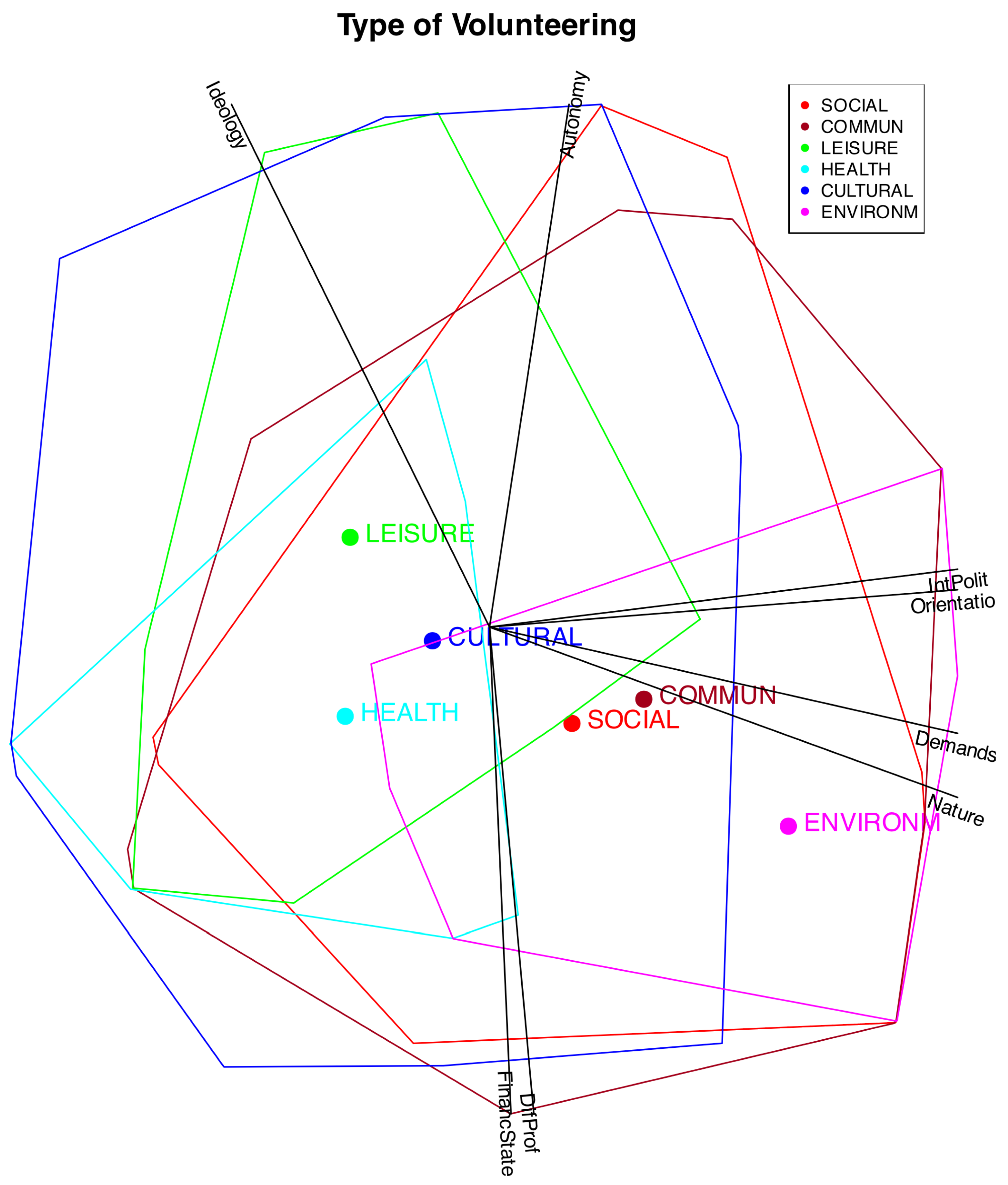
Figure 11 illustrates convex hulls and centroids corresponding to various types of volunteering.
It can be observed that the different types are distributed along a gradient associated, on the one hand, with Ideology, and on the other, with Interest in Politics, Political Demands, Orientation of the Volunteering, and Nature of the Organization. In particular, the types Leisure, Health, and Cultural are linked to lower levels of political interest among volunteers, weaker political demands and orientations within organizations, and a stronger emphasis on welfare-oriented activities. They are also somewhat associated with a Right Ideology.
The other types—Social, Community, and Environmental—are associated with individuals who have a stronger interest in volunteer-related politics and with organizations that exhibit higher political demands, greater political orientation, and a transformative nature. Volunteers in these organizations, particularly in the environmental category, tend to align with left-leaning ideologies.
To check the performance of the method, we can also include clusters based on the observed variables. For instance,
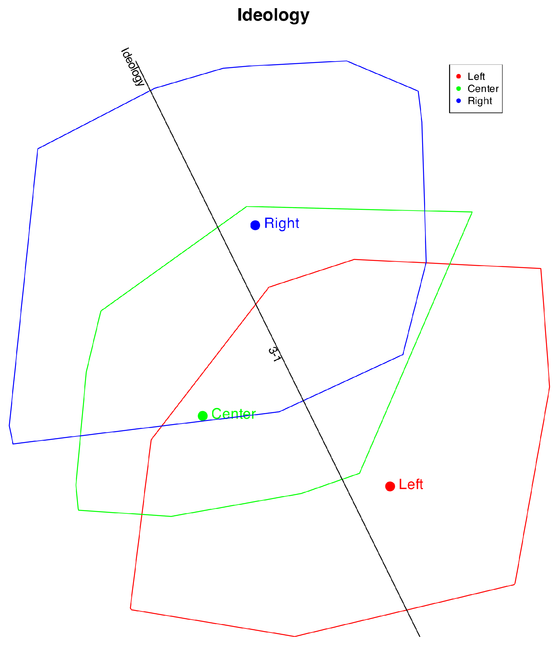
Figure 12 shows the clusters formed by ideology.
We observe that the ideological direction closely reflects the original data. The Left and Right positions are well distinguished, whereas the Center is not—likely because individuals identifying as Center sometimes hold opinions aligned with the Left and at other times with the Right. A similar pattern is observed for the middle categories in the other items.
In the prediction, category 2 is never identified; only categories 1 and 3 are predicted, as indicated by the “1–3” mark. Individuals with Right or Left ideologies are mostly classified correctly, while those in the Center are split between the two extremes. Consequently, the overall classification accuracy is slightly lower. Overall, the respondents’ ideologies are well represented in the plot.
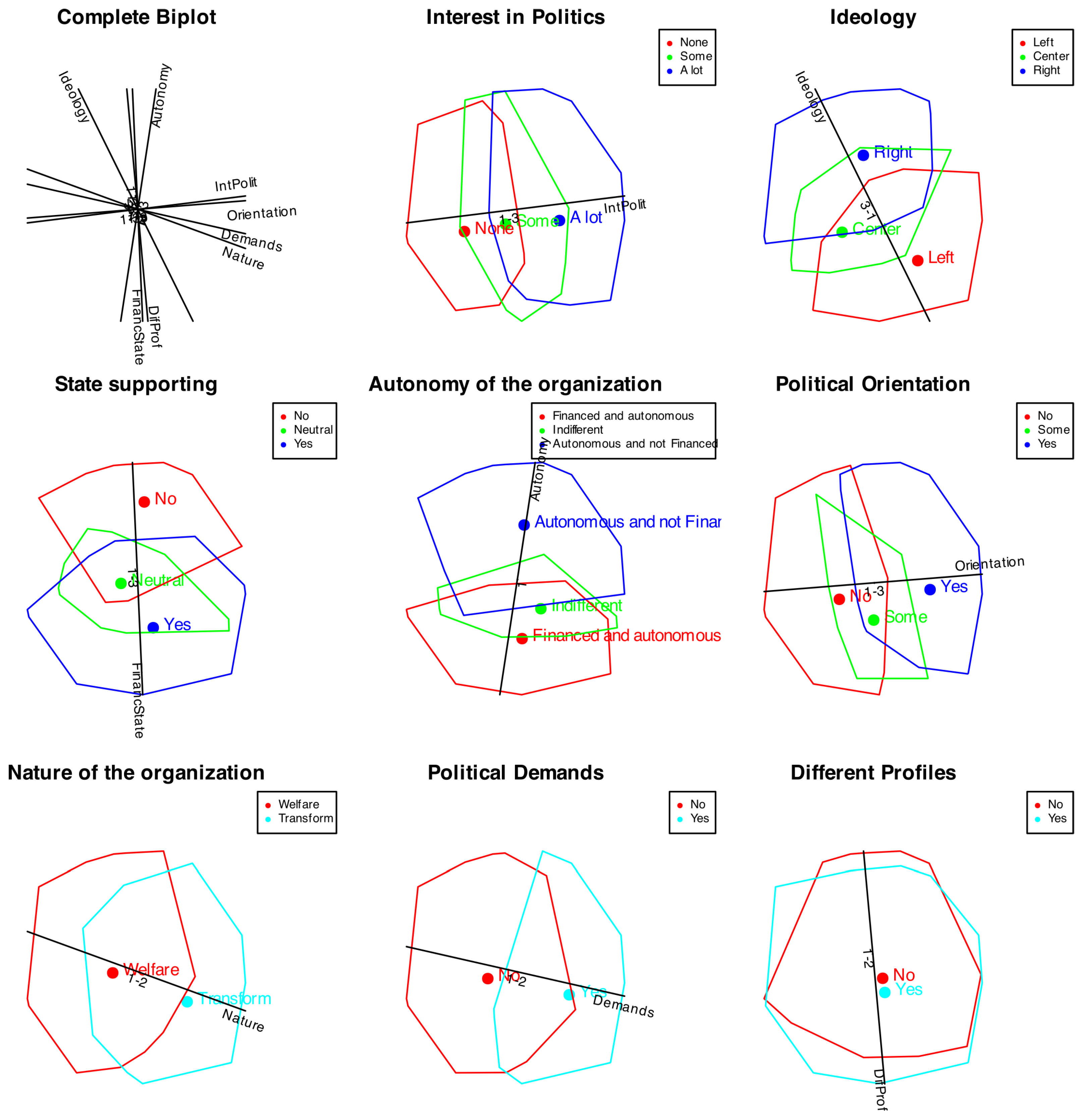
Figure 13 shows the clusters including all variables.
We can see that all variables, except Profiles, are well represented in the plot. For all cases with three categories, the middle value is not well represented. For the variable Profiles, both groups appear mixed together, indicating that the factors do not discriminate between profiles.
