1. Introduction
The research topic, proposed within the experimental course of the B Design Laboratory of the Degree Course in Industrial Product Design at the University of Ferrara intends to define an operating key not strictly related to the aforementioned works but which can be declined to all those primary subjects who after a more accurate observation prove to be fragile, narcissistic, obsolete, and unsuitable. In this category fall all those subjects that are suspended between the narrow utility of man’s needs and abandonment or bound to a culturally non-contemporary past. Among the possible subjects that we can identify as primary subjects, three main macro categories can be identified: subjects that demonstrate extensive functional fruition, subjects with a single primary function and subjects whose function declines according to social trends. Specifically, there are subjects that can be characterized by potentially infinite functional life (a sitting made from a marble block); others that, on the other hand, see their primary function extinguished over a certain period of time, their useful life naturally extends to their enjoyment after satisfying a need (i.e., a can of Campbell soup after consuming the contents).
Other subjects, on the other hand, are characterized by a particularly wide range of uses, but they are beginning to lose their appetites with the emergence of socio-cultural evolution (for example, a Formica chair in the 1960’s keeps its functionality unchanged, but not its aesthetic appeal). These elements may be these primary subjects, even if in functional crisis, can receive a new life through a metamorphosis process.
In order to relate to the process, it is necessary for the student to initiate an inactivation phase of the primary subject, destructing it in order to deepen the knowledge, focusing on the analysis of aspects related to construction materials and structural aspects. By extending the relationships between matter and structure, it is possible to extract the most significant features, that is, those characteristics without which the subject would be ineffective. In the specific case Rietveldt merges matter and structure, materializing the concept in the Rietveldt Joint.
If it is true that “Everyone sees what he knows” [
1], meaning he feeds on images and suggestions that, by sedimenting into the unconscious, progressively enlarge the contacts of reality, it is just as true that it is possible to understand in greater detail by analyzing the physical, aesthetic, functional features, that is, all those characteristics that define the elements around us (
Figure 1).
The secondary or hybridizing subject is inserted between objective systems with the primary subject. The resulting hybridization process is accomplished by using comparison keys. These keys have properties such as to allow a metamorphosis between the two subjects and the system.
The choice of the hybridizing subject is carried out at a later stage with respect to the analysis process, proceeding in the search by drawing on their own space, that is, those “imaginative warehouses” [
1] that refer to the emotional dimension.
2. The Metamorphosis of the Subject and of the Function
To operate this process for teaching purposes, to address users who have to operate the proposed process over a given period of time, you need to intervene on the method. The proposed method should be simplified as much as possible, especially in the identification phase of the hybridization characteristics. Therefore, it was necessary to select subjects that, based on their constituent characteristics, were based on processing materials and technologies that are already compatible with each other, simplifying the process, while maintaining unchanged the reading keys. By doing so you simplify technical arrangements that make the process of transformation less complex in terms of structure. Using comparison keys as a medium tool to correlate related elements (in terms of structure, connection, materials used, superficial material finishes, compositions), is a useful tool for identifying connection elements to be used as reinterpretation keys for hybridization of subjects. The intention is to develop a research process aimed at identifying key words that come from one of the purposes of society: to persist and to survive.
The features thus extracted, properly elaborated, are compared and hybridized to generate a new subject, resulting from the reinterpretation of common keys between hybridized subject and hybridizing subject. So, moved by this process, structural and functional aspects are integrated with each other, material aspects influence each other, guided by a process of RI-functionalization. The proposed process, generating metamorphosis, is paradoxical. It is therefore necessary that those who work the metamorphosis are free from established preconceptions (social, a chair in our imagination has a very specific shape), and lead our imagination in search of new compositional solutions, creating new subjects that will be useful, renewing the primary function of the subjects from which they originate, generating analogical (comparative) and non-analytical (retrospective) interactions. To foster the process, the primary subject must disintegrate. The new interpreter is then faced with a process of choice decreeing the fate of the good: Busting oblivion or reuse. To refocus the element means therefore the need to make changes to modify the intimacy, hybridize it with something else, even by identifying for him a new function that can give it a meaning different from the original. The purpose of the process does not lead to significant loss in the subjects involved but aims to find a way to shaping new ones. The imagination and personal experience allow you to make unique changes. Similar changes can also occur from different inputs. There is therefore no need to make innovations in the process, but it is indispensable to identify possible relationships between subjects that determine new formal solutions (
Figure 2).
The metamorphosis is complete when the product of the fusion between the keys of the two subjects generates a new entity inheriting common features reinterpreted with a new key. The process is therefore unpredictable by its very nature, being deeply linked to subjective aspects. It can lead to the generation of elements not necessarily belonging to the backgrounds of the main subjects.
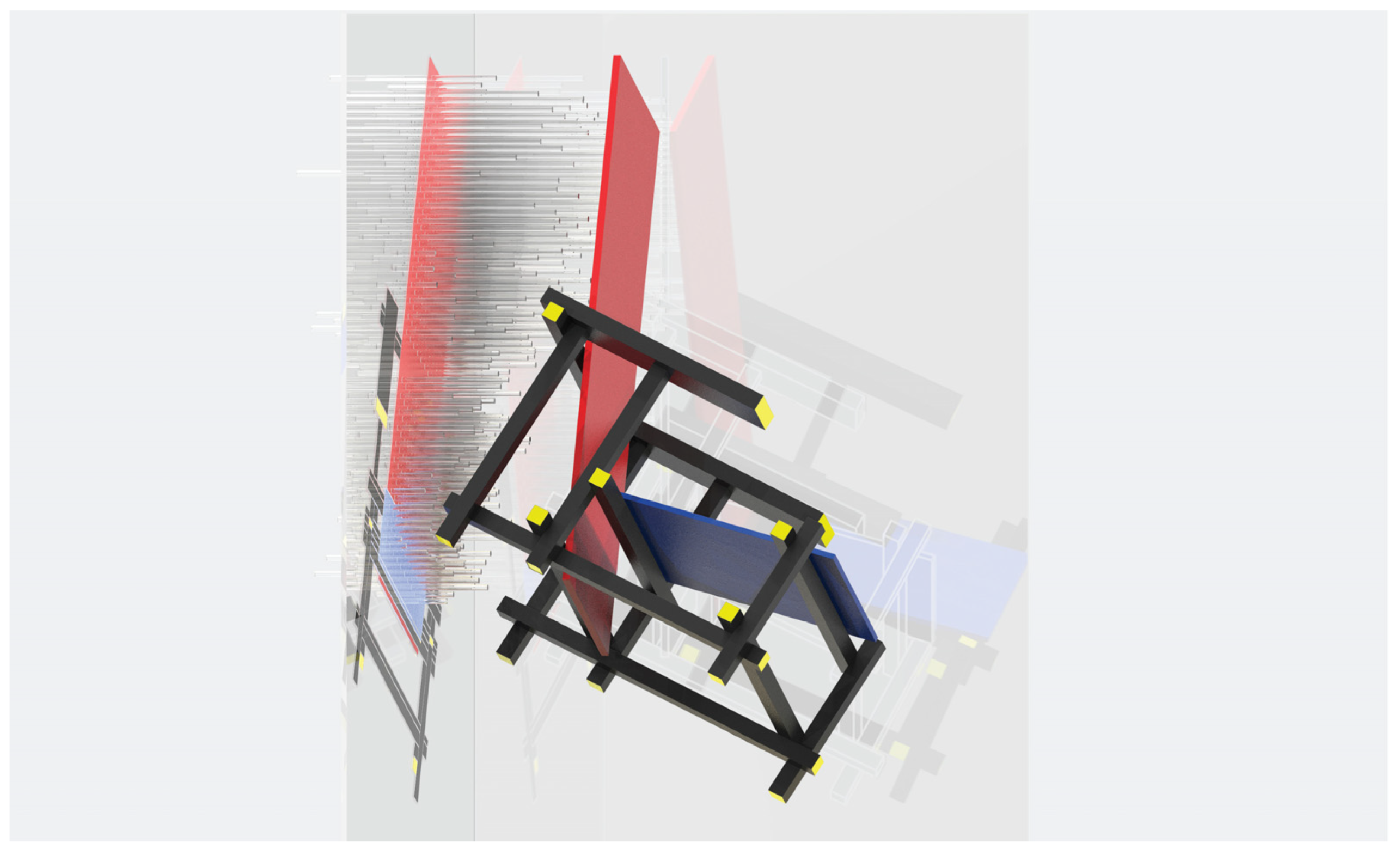
The didactic application of the process required the elaboration of graphical representations duly structured in order to highlight the transformation process carried out. The simplification of method and process, in addition to the limitations imposed as “game rules”, show their utility in the realization phase of a physical, scale model. The implementation of the model allowed the application of the methodological approach to be applied.
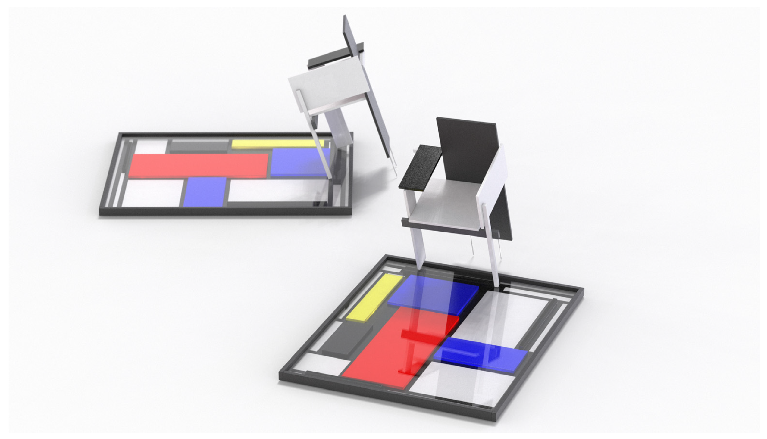
3. Didactic Analysis of “Primary Subjects” “Red and Blue” and “Berlin Chair” by Gerry Rietveld
The course of the B Design Laboratory of the Degree Course in Industrial Product Design at the University of Ferrara analyzed the works of Gerry Rietveld “Red and Blue” and “Berlin chair” (
Figure 3).
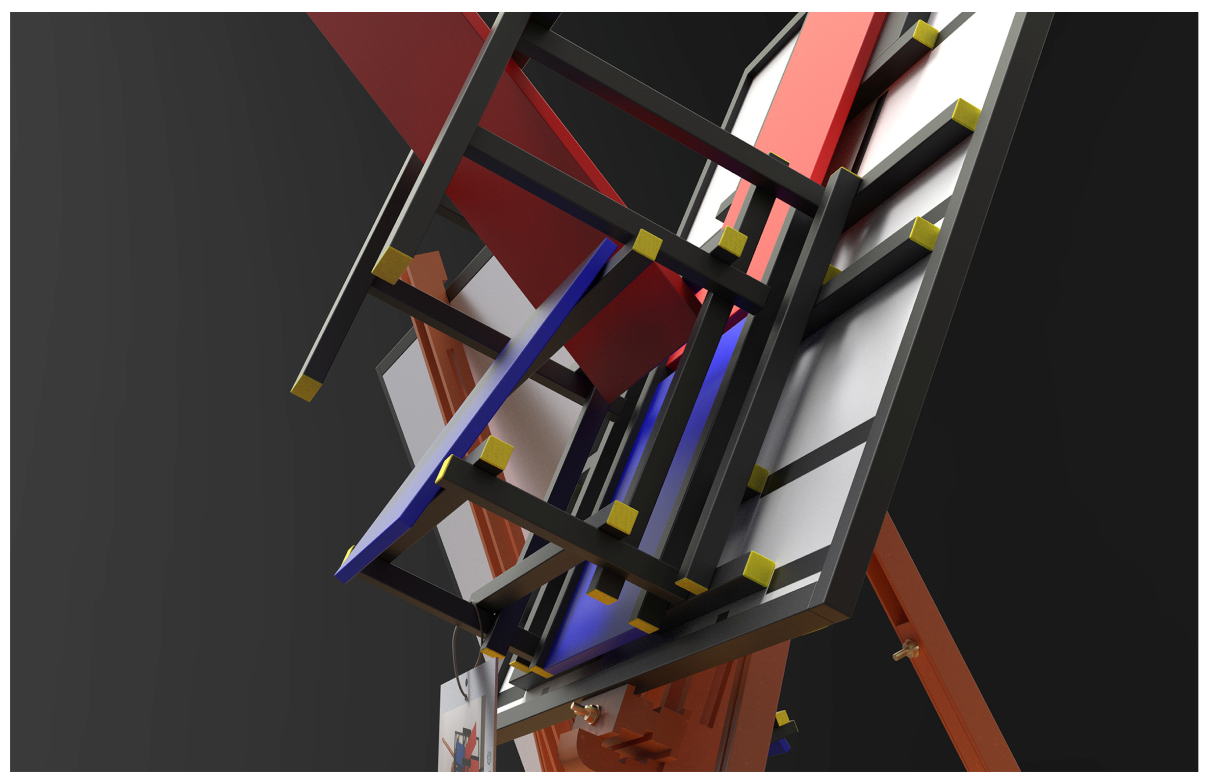
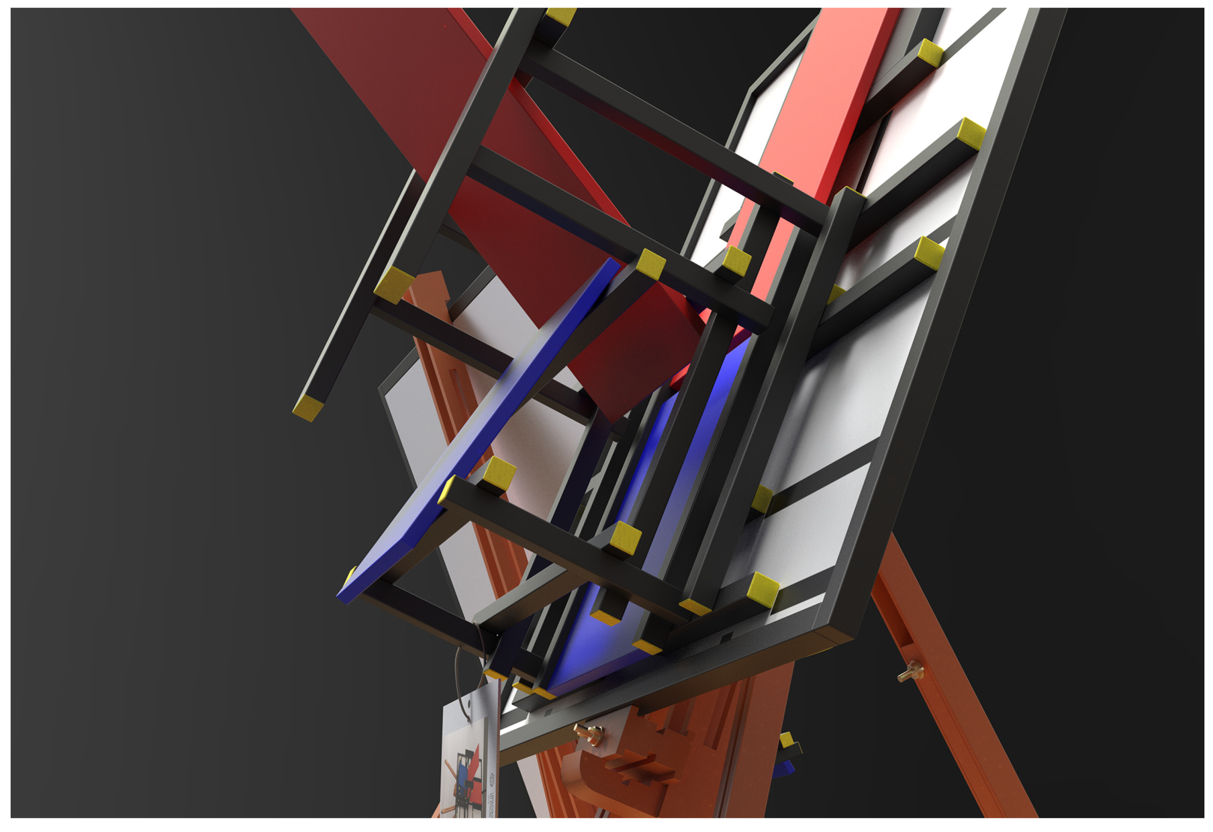
The students carried out a profound study of the ideational and constructive process of the two-works related to the project’s timeframe. Designing with balanced proportions in order to create harmonious and comfortable forms is one of the purposes of the De Stijl movement. Visual language expressed by neoplasticism was governed by rules governing geometric constructions and colors. The project (art, architecture, product), therefore, sought to interpret the mystery that governs the universe and that it is permeated with human existence. Rietveld believed that the furniture designer had a higher purpose than just physical comfort, meaning the welfare and spiritual comfort. The Architect (and his colleagues of the Stijl Art and Architecture Movement) sought to create a utopia based on a harmonious human order that they believed could have renewed Europe after the devastating upheavals of World War I. The new forms, according to neoplasticists, were essential to the change. This led to the uninterrupted research of the product that for the “Red and Blue” armchair ended in 1923, recreating, in space, structures referring to Mondrian’s neoplastic art. Let’s not forget thee the work “Red and Blue” belongs for furnishing of Schroder’s House designed by Rietveld in 1924. The architect employs 15 beech veneer strips lacquered in black and yellow heads that form a linear cartesian and zenithal system. This structure remains in service of plywood boards that form the backrest and the seat respectively lacquered in red and blue. The whole structure is stable thanks to the “Rietveld Joint” system that allows welding of each component to the other with a series of hidden clutches. It follows that the form itself does not suggest chair function but is a clear reference to art. The color scheme adopted by Rietveld for “Red and Blue” is a clear Goethian-Steinerian matrix where color becomes a symbol of contingency: yellow refers to solar rays, blue to the celestial horizon, red to the union of the two as intersection. Color is matter, but it is also material and as such has its own character and own energy that contributes to the genesis of a “total work of art” [
2]. Rietveld claims to be “constantly focused on the extraordinary idea of the awakening of consciousness” [
3] and this feature seems widely inserted into the chair “Red and Blue” to the point that this seems to be created especially for reading and meditation.
The case of the Berlin chair that takes its name from the exhibition in the homonymous city is born with the will to own a double mirror image. It became the first Asymmetric chair produced by Rietveld made of lacquered beech with a gray scale range. Legs, armrests, seat and back were replaced in favor of asymmetrical and balanced interconnected planes. The eight parallelepipeds that compose them never intersect each other.
3.1. Elaboration of Stylistic and Compositional Features of Primary Subjects Aimed at the Inability of a Metamorphic Reinterpretation
The two projects were analyzed by students both in geometric terms and in constructive terms. The first step taken by the course consists in studying the archival sources which proved to be crucial as it allowed the reading of the geometrical proportions of the Rietveld session components. The analysis has taken a strategic role in the teaching methodology: on the one hand, it intended to create awareness of form, on the other hand, introduced the student to the reflection of the creative and creative process desired by the author [
4].
The “metric data survey” phase through archival sources allowed us to know the single form of the components and allowed, through drawing, the semantic comprehension of the primary and secondary elements (
Figure 4). At the end of this study phase it was possible to reproduce the sessions through simplified physical models that have become the synthesis between the project elements and the student’s projected design process. It is known that the sound reproduction is a valid means of comparison not only in representative and mathematical terms but also corporal of a good [
5].
The validity of the cognitive process has been evaluated through the representative phase: the Course has requested the execution of graphic boards related to the reproduction of the product and its presentation. The former attempted to solve geometric problems by identifying all component dimensions and fixing patterns between the parts, also attempting to elaborate on Rietveld’s design choices. The latter, on the other hand, allowed to highlight the morphological genesis of the object through the explosion of all the steps (from the preliminary phase to the definition of the details to the chromatic applications) [
6].
In fact, in this way, the student has been sensitized to understand the reasons for which Rietveld has defined the precise form as a result of the surrounding environment and the possible ways of the end-user use (ergonomics, colors and materiality) [
7,
8].
The Berlin chair and the Red and Blue armchair have been broken and disabled for their specific function. The five case studies listed below have imaginative and utopian interpretations that arise from hybridization with something different drawn into the art, culture, technology and crafts. Such objects have been created that have a different but allusive meaning [
9].
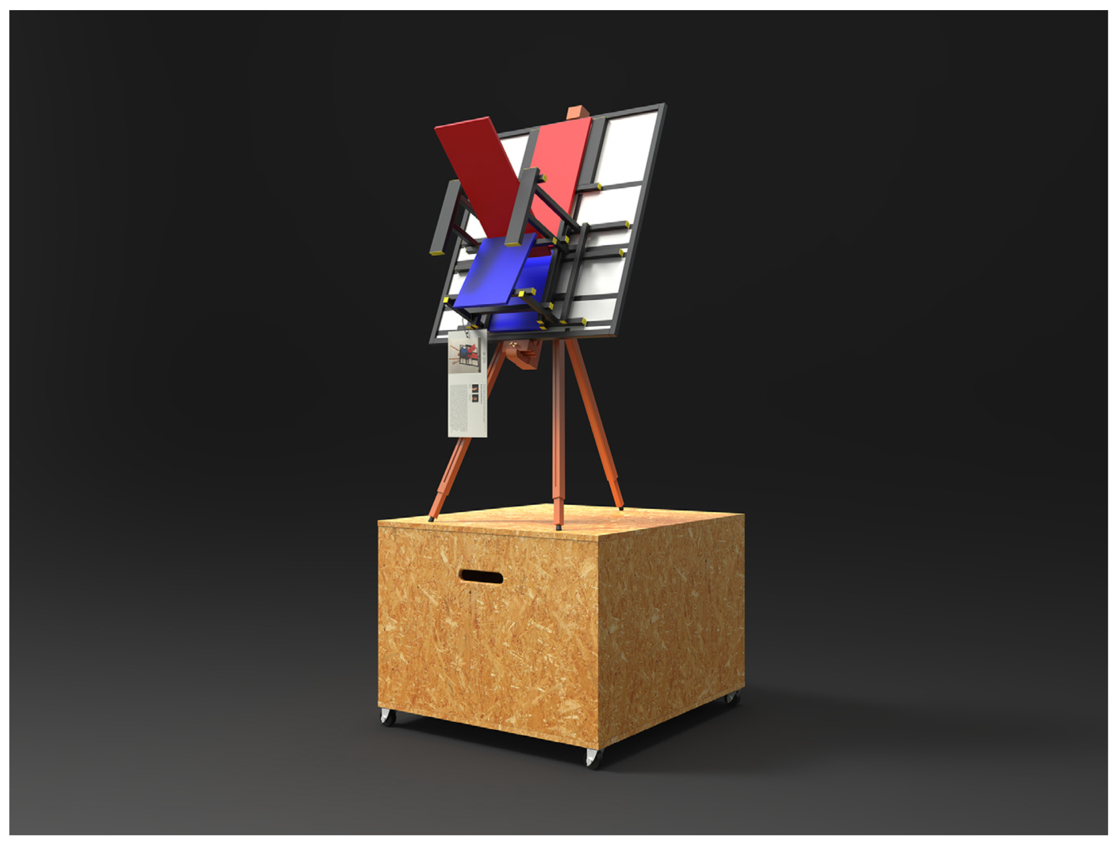
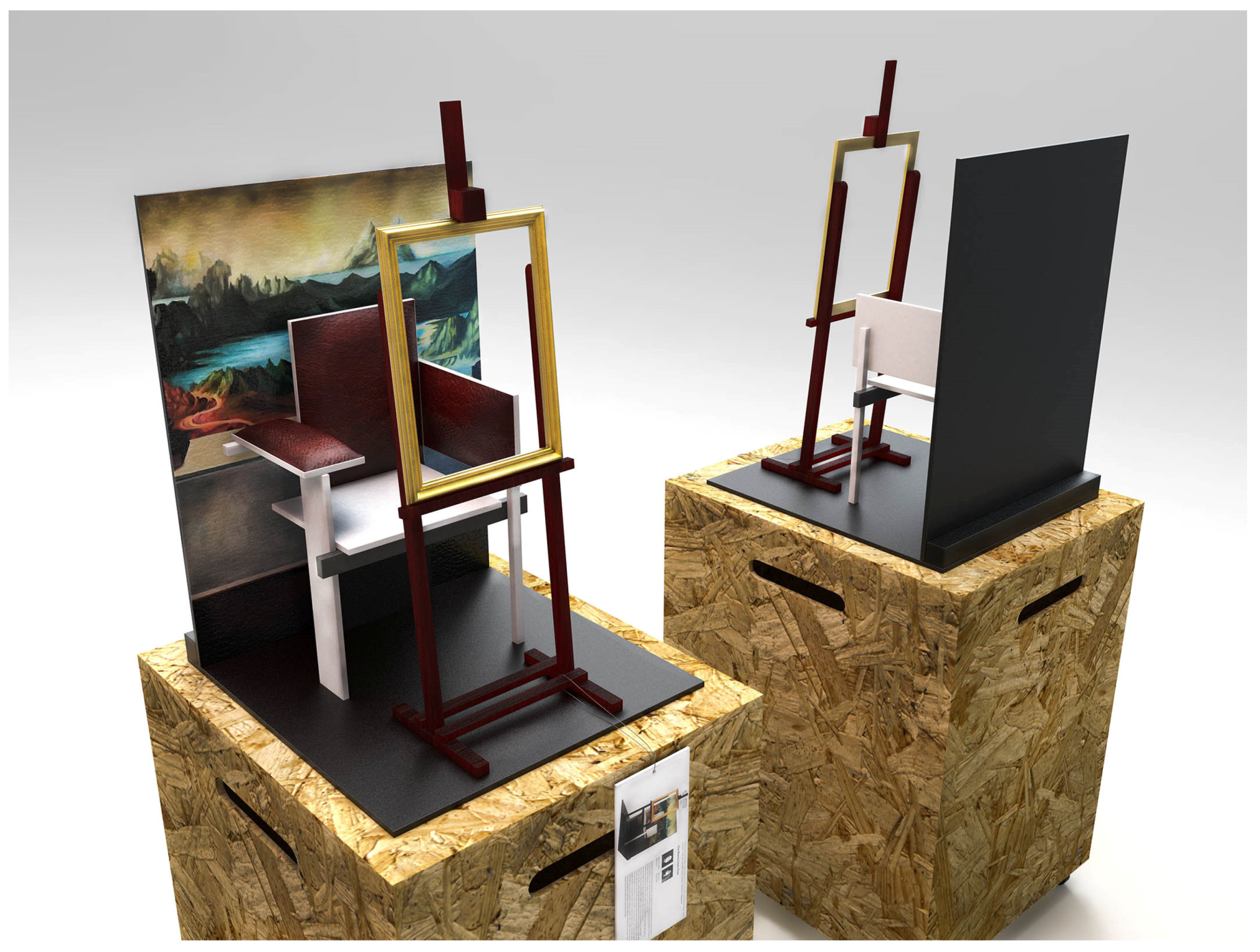
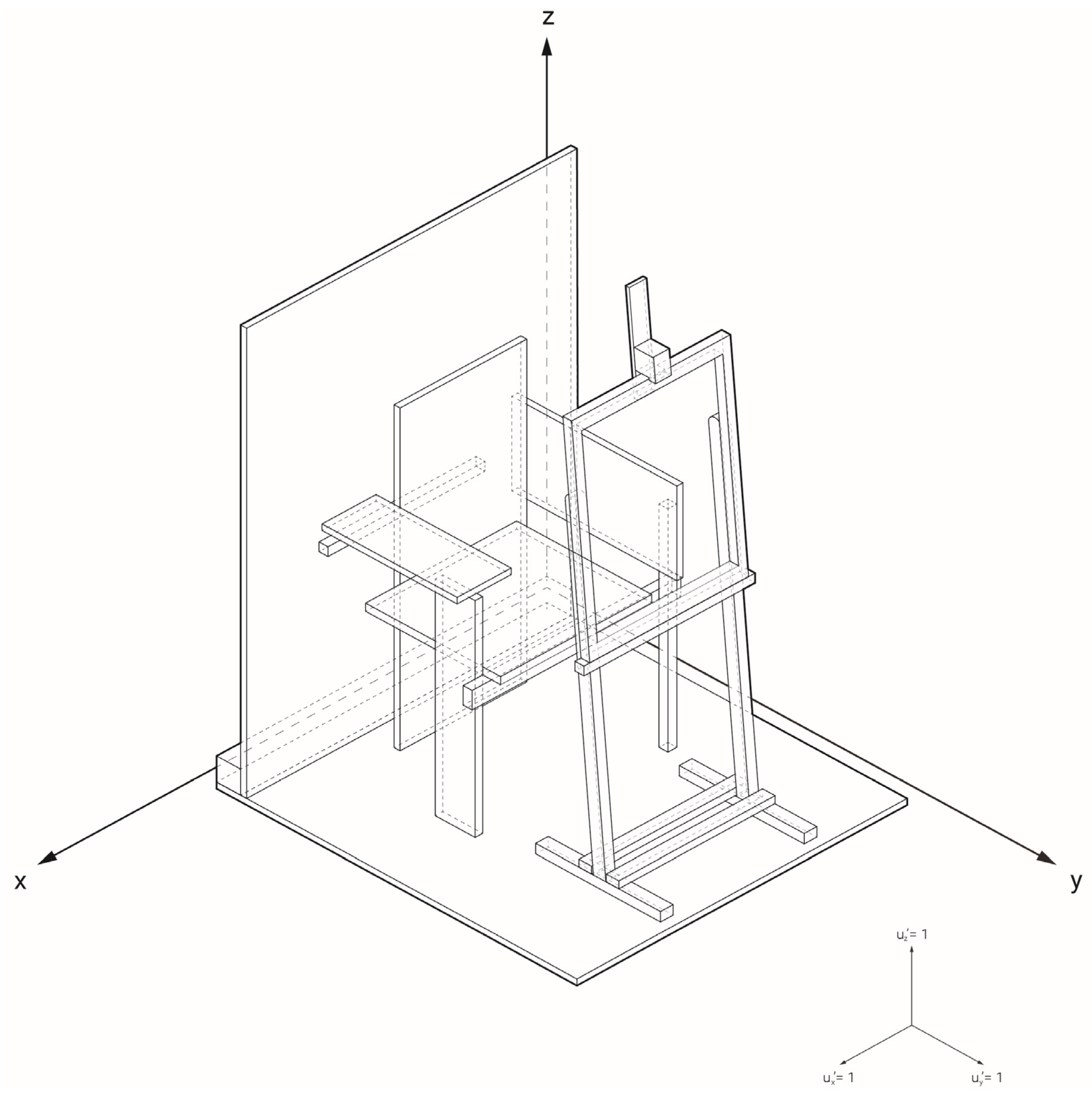
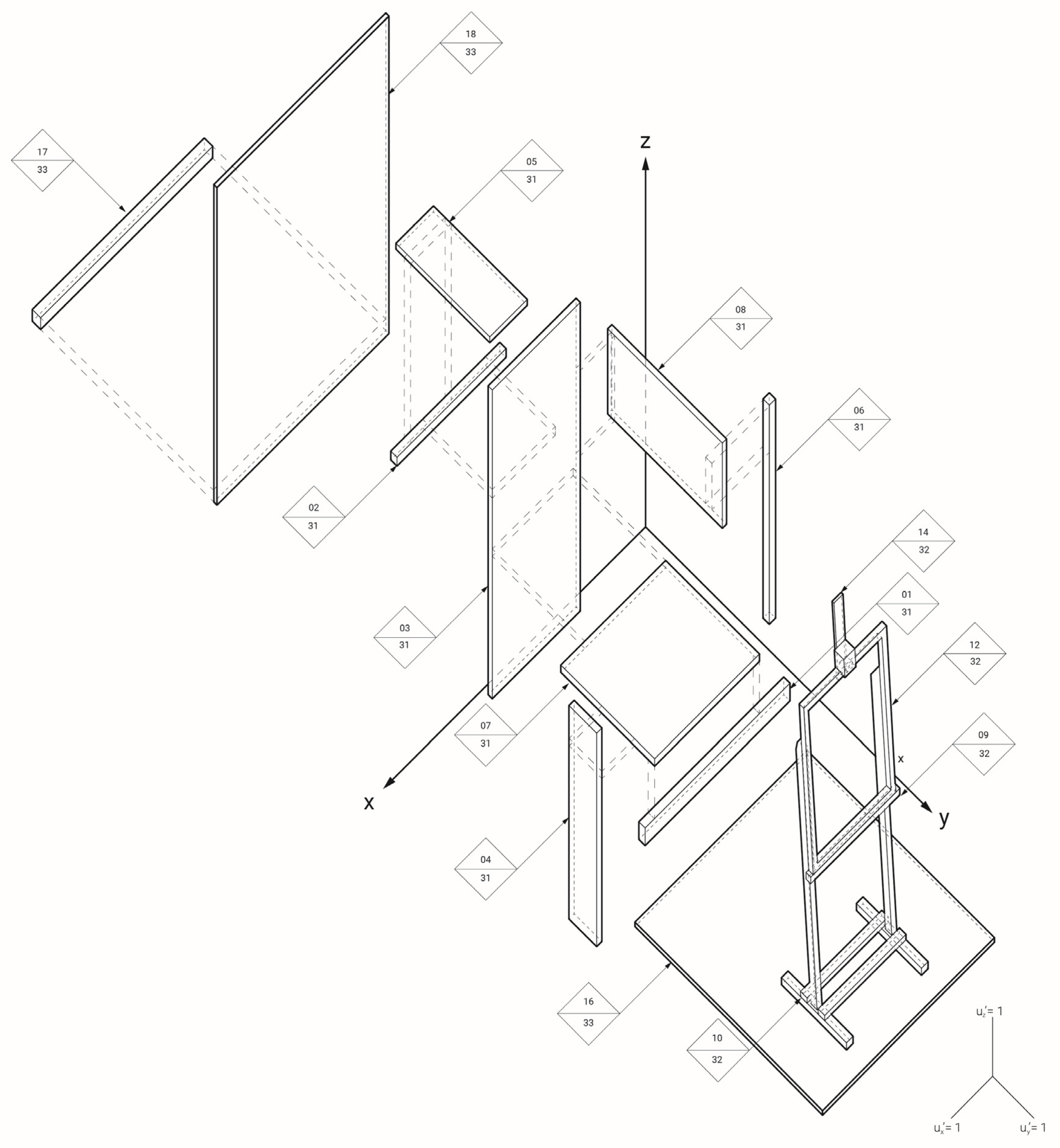
3.1.1. Case Study 1: Hypertime
The study carried out by the students Maria Virgilia Manzoni and Annalisa Marchetti was based on the symbolic and iconic analysis of a precise Renaissance work through a text re-reading. This is the famous work of Leonardo da Vinci “Monna Lisa”, who is portrayed half-bodied, turned to the left and facing the spectator. Her hands are laid in the foreground, one over the other, and she wears a loose garment. A transparent veil keeps her loose hair still, which falls on the shoulder where there is also a light drape that leaves us imagining a sixteenth-century Carrè. In the background a river scenery rich in rocky slopes and spurs. Through the paradoxical reading of the iconic keys of the hybridizing subject, the work done by the students has revealed a surrealistic set of hypertemporalities that Leonardo would have built to portray Monna Lisa (
Figure 5). The students have tried to analyze all the individual elements that identify the work of art: the figure, the background, the seat, the veil, up to the artist’s easel. The students have imagined a set consisting of easel and frame, background and Rietveld’s Berlin chair (
Figure 6). This was treated as if it were a sixteenth-century armchair with leather trim and bronze fasteners on which the Carrè of the Lady lay, almost indicating a temporary abandonment of the canvas [
10,
11].
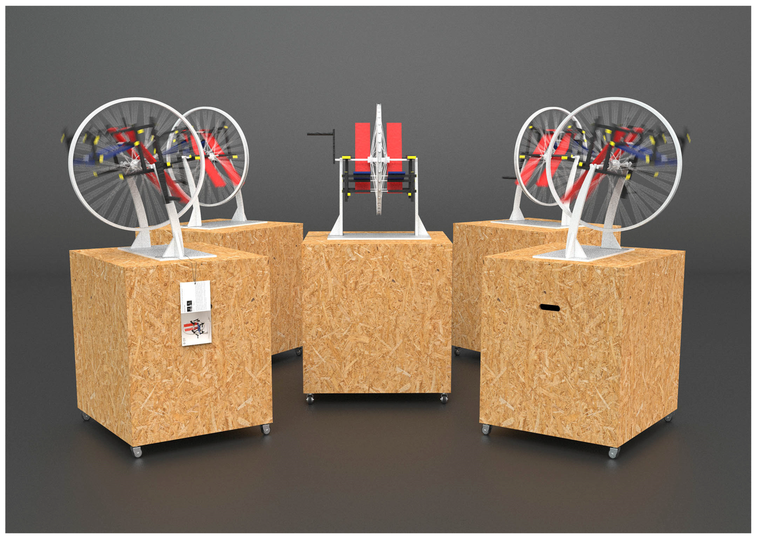
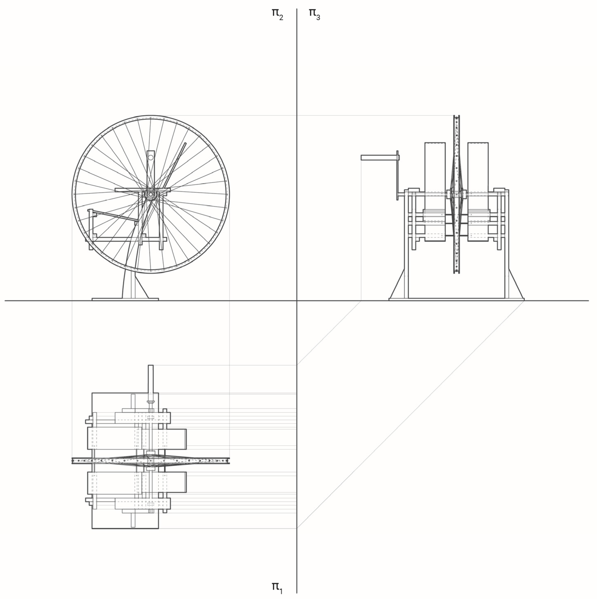
3.1.2. Case Study 2: “Duchampe and Rietveld”
Marcel Duchampe’s ready-made was analyzed by students Martina Lucchin and Piera Macedonio. The pupils were immersed in the deepening of the process of defunction and re-naturalization of objects through the actor’s selective act. The choice fell on “Bicycle Wheel” dated 1913. It represents a logical paradox: the wheel depicts the movement and the innovative capacity of industry while the stool describes the immobility and the craft tradition. The former performs with a round shape, the other a square form. Duchampe offers a combined reading that is recognizable, incomprehensible and allusory whose sole purpose is inherent in art. If the viewer is led to undermine the traditional reference points, the students call upon the incapacitation of the “Bicycle Wheel” by choosing to change the reference points [
12,
13].
The new work consists of a Red and Blue chair rotating vortexing on the static wheel (
Figure 7). This, which first represented movement and dynamism, is now static. The chair, the purpose of which was inherent in the service of man, now becomes incapacitated and delivered to the surreal and paradoxical dimension. The observer is again in crisis and is invited to reflect on the concept of work of art attributing to the latter a conceptual meaning which, in reality, has no external significance [
14].
3.1.3. Case Study 3: “Rietveld and dlevteiR”
A different interpretation was given by students Vittoria Secondini and Daniele Rolli who preferred to work on a literary level. The hybridization key is multiple and linked to the myth of Narcisio.
It is known that the character was enchanted by his reflected image in a source of crystalline water which condemned him to death according to Tiresia’s foretaste. The myth not only refers to a deep love toward himself but it also refers to a self-image that is subrogation (
Figure 8). The common denominator between the real image and the reflected one consists in the creative act of both, that is placed in the transcendental world. The two students, influenced also by Narcisio of Caravaggio, have faced an artistic- reinterpretative journey of the chair [
15]. The result is therefore that a Berlin chair mirrored on a reflective element refers to the image of a decomposed Red and Blue armchair highlighting that there is a creative act that always refers to Rietveld’s imagination [
16,
17].
3.1.4. Case Study 4: “The Mongian Iconic Dihedral”
The iconic abstraction through projected shapes was the goal reached by Gabriele di Virgilio and Ciro de Candia who proposed a concrete vision of the creative act of the Red and Blue armchair (
Figure 9). The students have analyzed the work of Rietveld according to many points of view all inserted into a coded and mathematical space such as Monge’s Diedro [
18]. At the end of their analysis, the students showed that an object, whatever it is, enclosed in a well-defined space exhibits and projects an image of itself, becoming an icon, leaving the planes of projection one of the infinite images of itself [
19].
3.1.5. Case Study 5: “Blob”
A compilation and comparative analysis of the Red and Blue chair with architectural constructive systems was conducted by Michelangelo Lamonaca and Martina Carlini. The two students undertook a reading and interpretation of the contemporary artistic and architectural space by analyzing the complex systems that determine the awareness of today’s living. This allowed the two students to point out that there are totalitarian and hierarchical hypotheses of spatial plans that determine a physical Cartesian system that orients the ever-changing and transitional design choices (
Figure 10). The students have forgotten the vision of space as a systematic adoption of compositional codes, orienting their own interpretation to an evocative composition of semantic components. This has become blob and chaos where it was possible to review, with critical paranoid solutions, new undressed images of process components. The armchair was overturned in space, changing its static orders, exploding in its main dimension [
20].
4. Conclusions
The Rietveld Joint exercise has immersed the student in a utopian application of the process allowing a greater reflection toward the work assigned. The idea underlying this research does not find a dimension in the dogmatic dismantling of the work, but intends to operate an alternative vision of the creative process.
