1. Introduction. How Can You Find Your Way without Baedeker
How can we find our way home without
Baedeker? This is what Lucy asks during her visit to Santa Croce, not only abandoned by Miss Lavish, but also without her
Baedeker [
1] (p. 40). As in other novels by Edward Morgan Forster, this description is illuminating in fully understanding the redressed role of the new “genre” of tour guides in the early 1900s.
The German Baedeker (appearing in 1828, but widespread after the 1830s), like the English Murray (edited from 1836), or the French Hachette (appearing at the end of the 1820s but consolidated in the middle of the 1850s), allowed an increasingly broad public to embark on a trip. They offered a range of practical information: from the safest streets to means of transport, from where to stay to where to eat, from currency exchanges to schedules, etc.
Along with the functional and practical plane, the guides also present another cognitive plane, with detailed lists of what to see and what to concentrate on: places, monuments, architecture, panoramas, museums, collections, artists, personalities, etc. Above all, the new tourist genre of guides promised freedom from the experiences of previous travellers, even illustrious ones, and the ability to take a trip in total freedom without having to follow already beaten paths and already explored itineraries [
2,
3]. This is a new genre that therefore transforms the scope of the trip itself, which is no longer meditative or educational, but which resides in the pleasure of the emotions the guide promises to evoke, without any mediation, from the visit to the “real” places listed [
4].
The new guides promised the ability to move freely in the space, but did they really allow for an individual, self-directed experience? The indignation that assails Lucy, making tears come to her eyes, is in the awareness that without
Baedeker, she could never “find her way about Santa Croce”. She knows that it should be a marvellous building, but to her it just seems like a big cold barn. If she had at least known how to recognize Giotto’s frescoes, or distinguish from among all of the sepulchral slabs the one that was most appreciated by Ruskin, she would have been able to feel the right emotions [
1] (p. 40).
Therefore, on closer inspection, even this new and “modern” genre, like travel literature and stories, arrogantly continues to condition the interpretation of the places, directing the construction of the related imagery and, orienting the view, transmitting social values to be shared.
In fact, the “visit” to the places, even when imagined through the textual descriptions, evokes specific and particular emotions that transmit a process of recollection that guides the interpretation. For this reason, with regard to “modern”, this tourist genre still resorts to a device that has been amply tested historically, as widely demonstrated in the work of the scholar Giorgio Mangani [
4,
5,
6]: the landscape, or rather, the “figures” of the landscape, as a rhetorical mechanism operating as a “topic”.
In this framework, the article proposes a reflection on the system of editorial products through which Touring, reinventing tourism and travel in the early 1900s, offers a new visual of Italy and a new view for Italians. Among these products, the article then looks at the magazine Le Vie d’Italia (The Roads of Italy) due to its rich repertoire of illustrations strongly integrated in the texts. A re-reading is proposed, starting from the covers that, beginning in September 1917 and running through 1935 and coherent with the subtitle of the magazine Turismo nazionale. Movimento dei Forestieri. Prodotto Italiano (National tourism. Movement of foreigners. Italian product), did not publicize a place but rather an Italian product.
2. Towards Le Vie d’Italia. The Landscape According to Touring
Milan, 8 November 1894. Persuaded by the need to develop tourism accessible to everyone, a small group of cyclists founded Touring Club Ciclistico Italiano (Italian Cycling Touring Club). This was truly an original association for Italy for several reasons: the modest membership fee, the organization that allowed active participation, and the constant information guaranteed by Rivista Mensile del Touring Club Italiano (Italian Touring Club Monthly Magazine), which was mailed to members for free.
But what characterizes the Association even more is its editorial dedication, statutorily considered one of the main means of action for the development of tourism [
7] (p. 38). It was certainly one of the keys to its success, as demonstrated by the ever increasing number of members: 784 in 1894, 20,915 in 1900, 137,795 in 1915, 161,969 in 1916, 175,720 in 1917, about 360,000 in 1926, and more than 475,000 in 1935.
This editorial activity, mirroring Touring’s cultural project, immediately presents organization on two levels. The first is aimed at realizing the “material” goal of the Association: favouring the development of tourism by making available the aids necessary for the practice of travel. The second level instead expresses the “moral” goal of Touring: reinterpreting travel not as a tool for pleasure, but as an “excursion for conscious and knowing penetration” [
8] (p. 1) and teaching about travel as a special cognitive, ethical, and civil mode of the country.
In this direction, the most authentic spirit of the Association encourages Italians to make themselves “interpreters of intelligent travel” and discover the soul of Italy—fleeting, fluid, hidden—in the Alps and Apennines, in the plains and marine panoramas, in archaeological remains and medieval basilicas, in the confused noise of the hammers in Milan’s industries [
9] (pp. 197–198). In line with this intention, Touring’s publicist is intentionally situated at the frontier between “travel and tourist literature” [
10] (p. 8), proposed not as simple, practical support for the trip, but as a journey itself.
For Touring, a trip, due to its educational/formative goal, therefore still falls under the tradition of the Grand Tour. But it is reinterpreted in the light of aspirations of Italian unification as a primary means to build a new national identity.
In the framework of these goals, Touring is distinguished for its exceptional commitment to publishing, demonstrated by an organized set of products—maps, guides, series, technical and specialist periodicals, etc.—destined for a broad public of different ages, origins, and education.
In 1895, a “practical” Guida itinerario (Itinerary Guide) was therefore published with indications on the main means of communication and accompanied by other useful travel information. In 1896 it was expanded and reprinted in three volumes with maps of 30,000 km of roads. In the same year, the project for the 11 Guide di itinerari regionali (Guide of regional itineraries) was launched, where the network of streets, with elevations and distances, were accompanied by a large number of specific classifications of localities and practical annotations.
In 1906, the denomination of the Association was changed to Touring Club Italiano when it already numbered 20,915 members. The first part of a program of very vast range was published: the
Carta stradale automobilistica d’Italia 1:250.000 (Automobile street map of Italy, 1:250,000). The proposal was to make cartography useable for the greater public, but the result, which saw Touring and De Agostini together for the first time, was even greater. The quality of graphical treatment and even aesthetic care, with the effective modelled orographics and a harmonic use of colours, rendered a representation that synthesized the forms and the Italian landscape, contributing to consolidating its relative perception [
11]. This is not a simple street map concentrated on the legs of the trip, but a tool that reinforces above all the idea of the trip in itself and, contextually, the idea of an Italian landscape as something
unicum.
In June 1911, the
Rivista Mensile launched a competition among members for ideas to identify another great project that would be a worthy continuation of the
Carta [
12]. Despite some bizarre ideas, the result was anyway unequivocal: a “large number of members from all over Italy and beyond requested the
Italian Baedeker” [
13] (p. 419), a work that would free “Italians to visit their country guided by foreigners, or rather, more often, by a foreigner …
Baedeker” and be an “incentive for the greatest penetration of Touring in every class” [
14] (p. 579).
The editorial project foresaw seven guides, the first six of which were dedicated to Italy and the seventh to Italian colonies, each with about 300 “very dense” pages plus another hundred pages of “topographical maps, city maps, panoramas, particulars for building interiors, museums, and the like” for a run of 150,000 samples [
14] (p. 579). In 1914, therefore, the first “Guida Rossa” (Red Guide),
Piemonte,
Lombardia, Canton Ticino was printed, with about 600 pages of text, one orientation map, 28 special maps, 9 maps of tourist centres, 18 city maps, and some museum interiors and collections. This new editorial adventure was rather more vast than what was imagined, even just for the number of volumes, pages, and copies, and it would contribute significantly to the business of spreading culture, especially tourist/geographical culture, favoured by its free distribution to members (
Figure 1).
Just these works, among the different ones already published in the first twenty years of the Association, already demonstrate particular attention to the graphics in the care and number of illustrations. There is a conscious, directed, and intentional use of images, since the “figures” of the landscape, whether real or virtual, awake emotions and allow Touring to direct one’s view and guide the traveller’s interpretations.
This graphical and iconographic device was intentionally adopted as a means to reinterpret travel in a national key: spreading social and cultural values to be shared, which is necessary in forming a community, and acting as an interface for becoming a part of that community. As widely demonstrated in the works of the scholar Giorgio Mangani, this device has been well-tested historically. It is, in fact, the landscape used as a rhetorical mechanism operating “as a ‘topic’, that is, a repertoire of information capable of transmitting the socially shared values of a territory from generation to generation” [
3] (p. 225). It is a device in which representations of the places are made by experiencing a real or virtual journey, a vehicle for a new imagery that mirrors the individual and national identity.
3. Le Vie d’Italia. A Landscape of Products
At the end of 1916, in the midst of the First World War and a possible solution to the conflict rather a long way off, Touring presented members with a proposal for a renewed program, with commitment to deal with an underdeveloped area of tourism: the “movement of foreigners”.
As with all the Association’s politics, this “movement of foreigners” was also proposed according to a dual interpretational key [
15]. First, the material aspect: a vital opportunity for economic regeneration and production development to be initiated immediately after the war. Then the moral aspect: an undeniable occasion to make the country “well known”, overcoming remaining prejudice and offering a different, that is, modern, visual through which Italy could be “re-seen” and its national identity perceived. Thus, Touring presented its projects by reiterating the centrality of the vast “network of moral values and material interests that gravitate around tourism”, even in the case of the movement of foreigners, [
16] (p. 176). First, there were the guides for foreigners, which were completely different from what was aimed at fellow countrymen with regard to design, structure, and extent. Then a more ambitious project: a new periodical, the expression of “special literature” that could act as the manifestation of the entire complex of actions necessary both for internal tourism and tourism by foreigners [
16] (p. 176).
The
Rivista Mensile, while transformed from an Association bulletin into an organ of Italian tourism [
17] (p. 3), was not deemed suitable for the scope. This was because the numerous rubrics on various themes, which were no longer just technical—descriptions of cities, regions, itineraries, in-depth details about cultures and customs—and the broad supply of illustrations—”increasingly numerous, bigger and more beautiful” [
17] (p. 3)—described the country according to a traditional view, that of the
extraordinariness of “natural beauty” and the “artistic heritage” [
18] (p. 474).
The new periodical would instead be “aimed specifically and pre-eminently at the ‘movement of foreigner’ and be subordinate to the ‘Italian product’, basically placing value on the country from the wide but signature point of view that Touring could have” [
19] (p. 227). From the practical point of view, it would investigate anything that touched on the “foreigner industry”, thereby automatically “becoming the natural defender of … all the industries that have a close or indirect relationship with tourism”: transport—railways, automobile, ships, etc.—or those connected to the means of communication, art in all its forms, hotels, as well as food, clothing, and decoration. In other words, all those industries in some way related to the comforts of life and their relative advantages spread throughout all social strata [
16] (p. 177).
This is a periodical that, with an entirely different nature from the
Rivista Mensile, would present the country according to a new visual, the
ordinary visual, in order to demonstrate the “spectacle of wonderful progress made” [
16] (p. 175). The new visual would reinterpret and update the founding mission of the Association, which was condensed in a passage of a speech made in 1901 by Luigi Vittorio Bertarelli “Give me Italy and the sentiment, and Touring will help, Italy will make Italians” [
9] (p. 199).
Bertarelli—a founding member and head of the road section in 1894, general vice director in 1900, and general director after 1919—who was the true instigator of the editorial business and therefore Touring’s cultural project [
20], knew this new endeavour would be central not only for the Association, but, especially after the war, for Italy.
For the success of the project, he adopted a formula fully experimented with in
La Sorgente, an organ of the Comitato Nazionale del Turismo Scolastico (National Committee of Scholastic Tourism), which had earned a real vote of approval [
16] for the “elegance of the Rivista, the notoriety of the authors, the typographical appearance, the taste of the illustrations” [
21]. The new magazine would therefore “be illustrated” [
16] (p. 177) and based on the close correlation between the articles and rubrics and the set of graphical devices of the editorial container [
19] (p. 230).
A close connection between the graphical/iconographic and textual devices would be capable of interpreting the “right pride” in the national product, the propaganda for its spirit of initiative, culture, and commercial and industrial courage [
16] (p. 177). In line with the culture of the early 1900s, this was declared in a disinvolved use of publicity, and new expressive forms capable of interpreting the values of urban and middle-class life and orienting the perception of the greater public [
22].
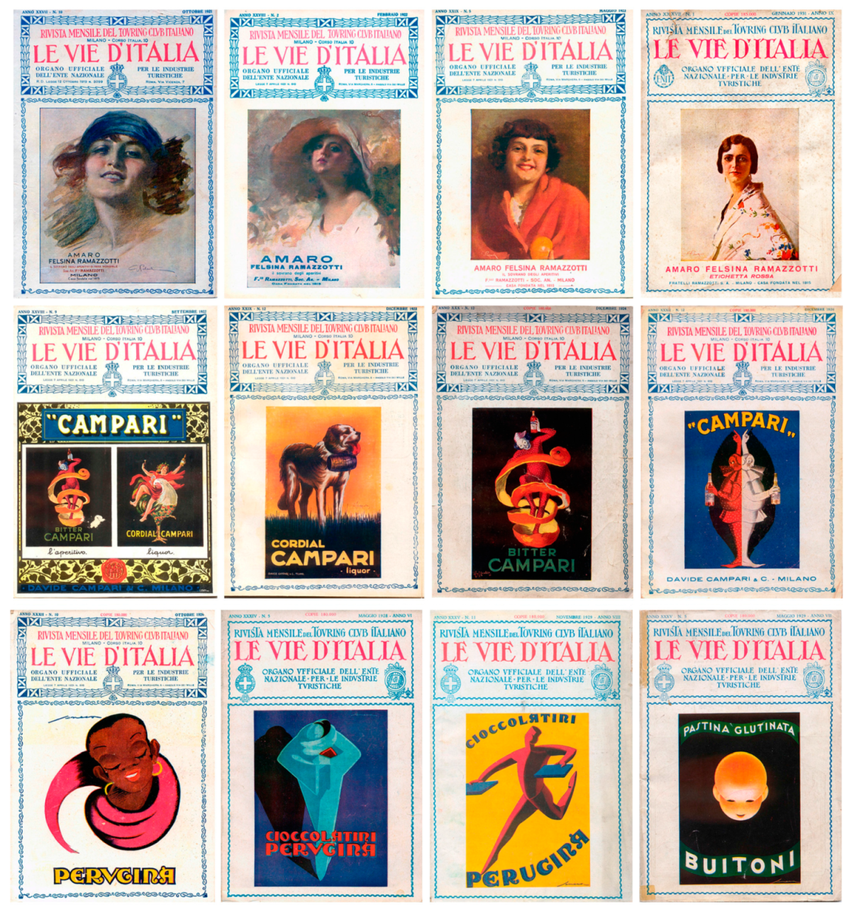
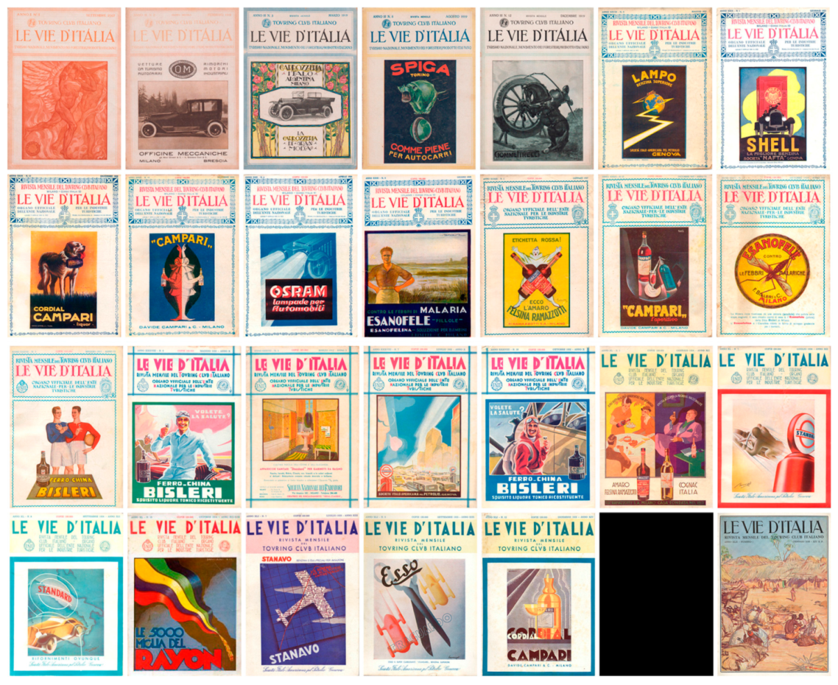
A certain adherence to the explosive language of publicity is even seen on the covers. Here, in harmony with the spirit of the
special magazine, each month a product, or rather, an Italian product brand would be exhibited in place of the traditional beauty of the country (
Figure 2). These covers/manifestos suggest a new visual of the country and a new view of Italy, resorting to the mechanism of landscape/topic already tested by Touring. But this time, the places juxtaposed to compose the mosaic of the Italian landscape would not only be the “extraordinary” ones of natural beauty and artistic heritage, but also the “ordinary” ones that were progressively becoming part of Italians’ everyday lives. This was a landscape made of products, the repertoire of places/images coherent with the new social values to be shared, which would make itself again and in a modern way the vehicle of individual and national identity.
4. Le Vie d’Italia. The Cover Image in Search of Recognizable Graphics
That the fact that the covers/manifestos were an intentional invention is demonstrated by their alteration, which, over the years examined—1917 to 1935—show significant changes in the layout, the style of the characters, the decorations, and the adornments. As if the covers were real shop windows, the continual graphical transformation shows the effort made in the search for an appearance that, in its relation with the public, was at once interpreter and a suggester. In relation to changes in the social and cultural context, it was therefore capable of sometimes intersecting Italy as it was and suggesting Italy as it should be.
There is no record of who really worked on the periodical’s graphical project. It is, however, known that Luigi Vittorio Bertarelli closely followed all the different phases of Touring’s publications, paying particular attention to the care of the iconographic device, convinced of the communicational effectiveness of a close dialectic between text and image.
A truly many-sided personality, Bertarelli is the exemplary prototype of Milan society in those years, which, while being formed in the 1800s, was authentically disposed to welcoming the cultural innovations of the early 1900s, a large part of which crossed the city. His multifaceted curiosity and innate openness to experimentation allowed him to meet the most influential personalities and the most brilliant minds, the most prominent of which was Raffaello Bertieri, who, between April and June of 1918, published a weighty essay in
Le Vie d’Italia [
23].
For the entire first half of the 1900s, Bertieri was in fact an active witness in the area of graphics and Italian typography, especially through the pages of
Il Risorgimento Grafico. This magazine was innovative in the national context, even for the great supply of attachments with which the most advanced techniques were progressively experimented. Convinced that it was no longer sufficient to “produce well”, but also to create an entire work of “recall, suggestion, reminder” [
24] (p. 102), he paid special attention to the most typical expressive form of industry and commerce, i.e., for publicity, which he made explicit in 1916 by adding the subtitle
Rassegna d’arte applicata alla pubblicità e al libro (Review of art applied to advertising and books) to the magazine.
But like Bertarelli, Bertieri was also never fully a man of the 1900s. Firmly convinced of the need for a renewal in graphics and Italian typography, he was likewise persuaded that it should originate in tradition. His motto—Nova ex antiquis—promulgated an aesthetic ideal that aimed to combine industrial expression and artisan knowledge.
This is an ideal that Adolfo De Carolis—painter, engraver, illustrator, xylographer, and photographer—would embrace, albeit to different degrees. In 1915 he was in Milan teaching at the Accademia di Brera and he collaborated with Touring in 1916, signing many of the decorations and frontispieces opening the articles and rubrics in Le Vie d’Italia. In fact, Adolfo De Carolis also interpreted the changes of the early 1900s, reinterpreting tradition, in particular related to the 1400s, in a rustic, popular key to propose the figure of an artist-craftsman along the lines of Morris’s Arts and Crafts movement.
This perspective encompasses some of the graphical and typographical experiences of Bertieri and De Carolis for the particular effects they would have on
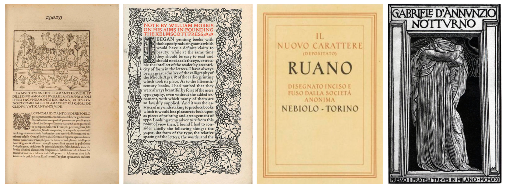
Le Vie d’Italia. For example, Bertieri’s mark on the design of the characters: revisiting tradition, there is the chancery tradition in
Ruano and fifteenth-century calligraphy in
Sinibaldi, printed by Fonderie Nebiolo in 1926 and 1928, respectively. And the unmistakable graphical cipher—the hard, simplified sign, the strong black and white contrast, the design of the characters—expressed by De Carolis in the copious xylographs chosen as a privileged place to base references to tradition, from the rediscovery of the Medieval and Renaissance culture to ancient references to the culture of the first half of the 1800s (
Figure 3).
This milieu contains an authentic intersection of adhesion to the most avant-garde cultural and entrepreneurial examples and classical and ancient, artisan and proto-industrial wanderings, where the editorial project of the periodical is ascribed. The context includes the image that translates the invention of the cover/manifesto that took form in September 1917.
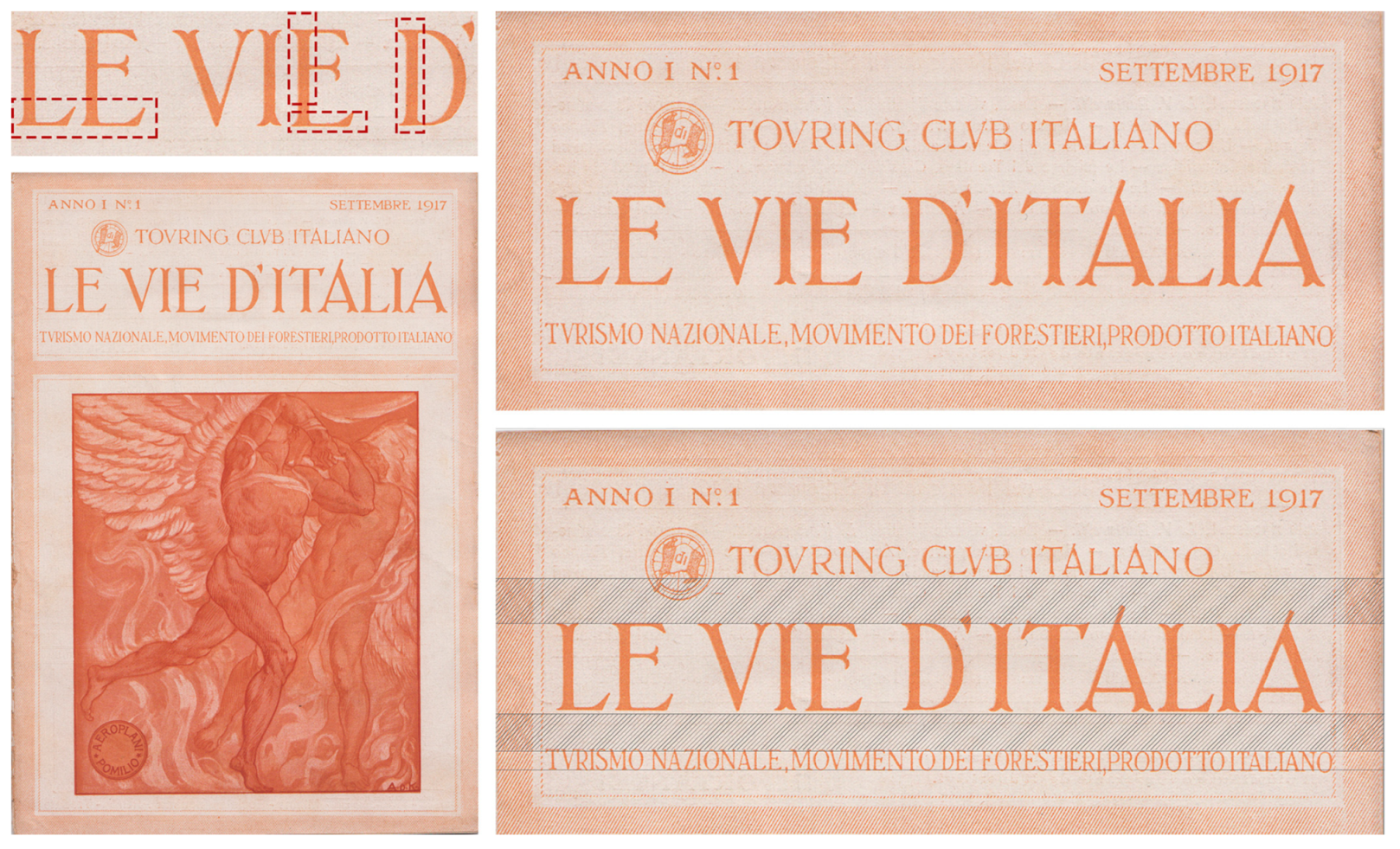
The space of the cover (
Figure 4), defined by a frame in coloured cross-hatching, is divided by a thinner pinstriped band into two parts—the upper part for the header and the lower one for the manifesto. The capline of the title,
Le Vie d’Italia, in centred upper-case letters, is defined by the midline of the upper box. Situated above the title is Touring’s logo followed by the wording Touring Club Italiano. The very long subtitle of the periodical,
Turismo nazionale. Movimento dei Forestieri. Prodotto Italiano, is placed under the title and obviously lacks the necessary harmonic kerning.
So, already in the trace of the frame a reference to the xylographic mark of De Carolis can certainly be read, but it is especially in the font adopted, a reinterpretation of the chancery style, in which ties to the lessons of Bertieri and De Carolis are evident.
This is seen, for example, in the desired imprecision of the character design, which certainly transmits an artisan flavour of the product. Or in the ends of the letters that curl like skis, which are inspired by the documentary modus scribendi of the twelfth century. Or even in reference to the design of the xylographed initial letters of the Hypnerotomachia Poliphili, printed by the proto-typographer Aldo Manuzio in Venice in 1499, and reread in light of the models with natural motifs experimented by William Morris. Finally, in the choice of the first manifesto on the cover, which advertised the wartime aeronautics business of engineer Ottorino Pomilio, which was acquired in 1918 by Ansaldo. It is signed by Adolfo De Carolis and the potent muscular mass of the two winged male nudes, described with soft chiaroscuro traces, is a metaphor for the power of the industrial product. While showing the undoubted mastery of De Carolis, this manifesto is still far from the more proper expressive forms of advertising language necessary for the effectiveness of the message.
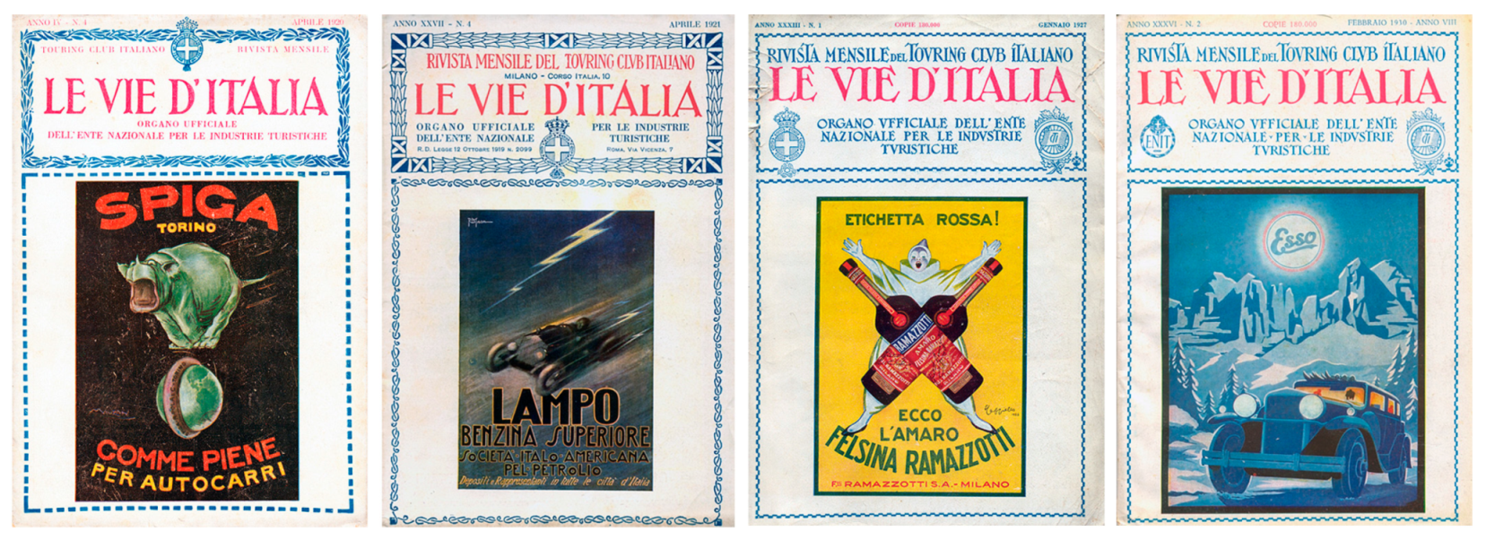
The ENIT, National Body of Tourist Industries, was instituted in 1919, and
Le Vie d’Italia would be its official organ from 1920 to 1935. The institutional role motivated the first change to the cover (
Figure 5) in April 1920: the pinstriped band of the header is substituted by an ornamental motif of intersected laurel branches with the crest of the Kingdom of Italy at top centre. The subtitle is replaced with the wording
Organo Ufficiale dell’Ente Nazionale Industrie Turistiche (Official Organ of the National Body of Tourist Industries); the frame of the manifesto is made with a dashed line.
Another modification was made already in April 1921 (
Figure 5): the floral motif of the upper frame is reinterpreted geometrically, framed at the corners by the fasces, and the crest moved down, while the lower frame continued to change throughout 1922, when a thin weave of curved line segments was settled upon.
Luigi Vittorio Bertarelli died in 1926 and in 1927 a decided regression was made in the graphics on the cover (
Figure 5). First of all, the characters: the slightly angular ski-shaped form—swallowtail—of the ends of the letters is transformed into curves and, contextually, all the horizontal strokes are redesigned according to a heightened wavelike movement. Then the frames: a simple border is adopted made of small tracts alternating about an ideal axis of symmetry. Finally, the crest of the Kingdom and the Touring logo are placed symmetrically to balance the wording
Organo Ufficiale dell’Ente Nazionale Industrie Turistiche.
As a slight modification from the graphical point of view, in February 1930 the crest of the Kingdom was substituted by the emblem of ENIT (
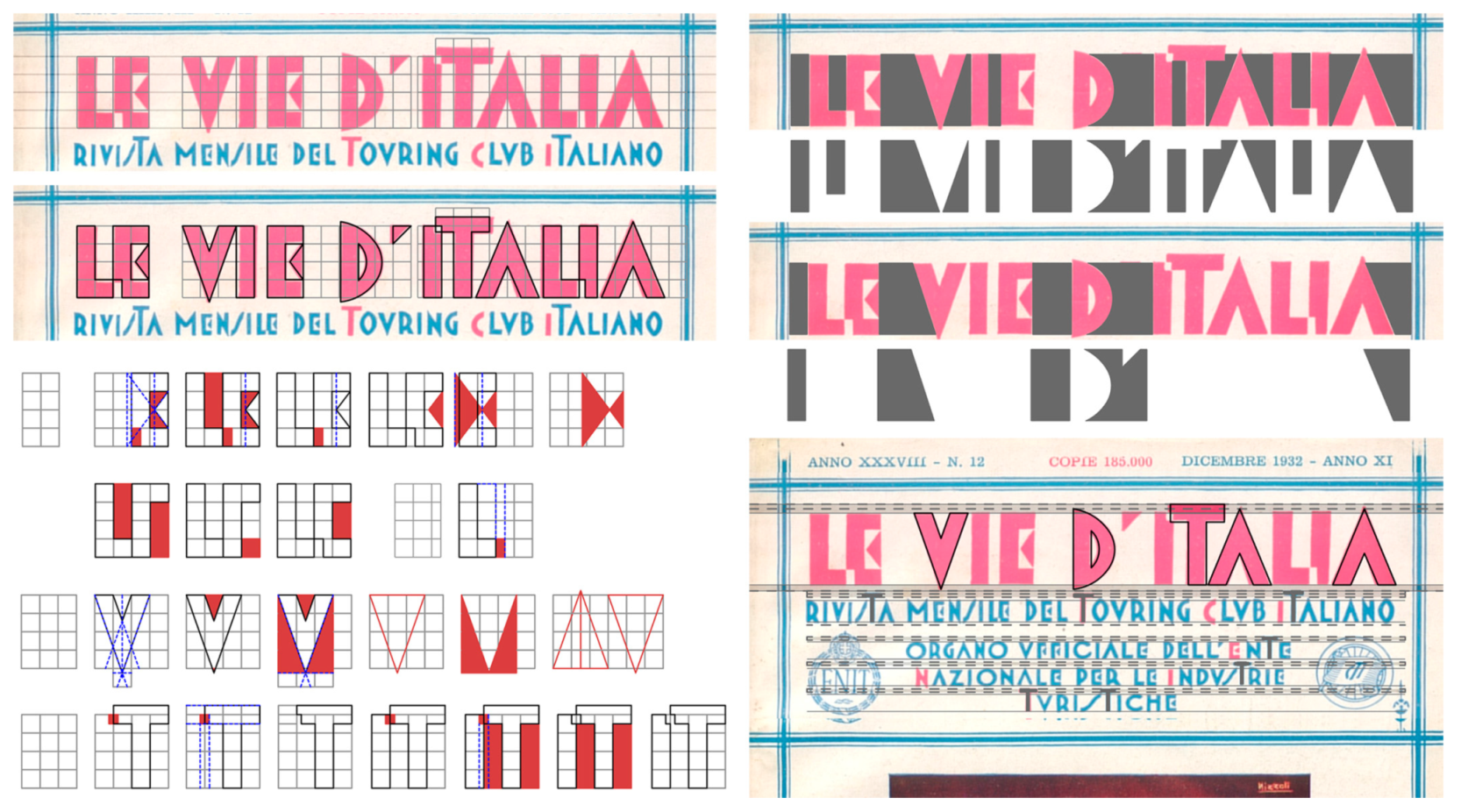
Figure 5). In 1932, a profound change was made in the graphical layout that demonstrates the magazine’s renewed adherence to the most innovative trends expressed in Milan society (
Figure 6).
The proposal is a very original font inspired by the graphical experimentation at the Bauhaus on the exclusive use of elementary geometrical figures. Conceptually similar to Stencil proposed by Josef Albers between 1926 and 1931, the design of the letters is highly geometric: exclusively vertical and horizontal staffs of great width, circular arcs, and triangular elements. The solution proposed is perceptively difficult to read, both due to its adherence to a rigorously geometric project that impedes recourse to correct spacing and due to the desired futuristic accents in the choice of the triangle for the central stroke of the letter “E” and in the partial overlapping between specific pairs of letters (“LE”,”LI”, “TI”). There is a clear lack of restraint in the succession between full and empty areas, between black and white. But the message is certainly clear: to mark a clear distance from the traditions of the past.
To better frame the transformation, it is necessary to recall that after 1916 Guido Modiano directed the Stabilimento Modiano, printer of different publications by Touring, including Le Vie d’Italia. Founding the magazine Tipografia in 1931, he also anticipated the debate on the renewal of graphics and urgency for a graphical/professional figure, then taken up by Campo Grafico, which was edited in Milan starting in January 1933.
The new graphical look of
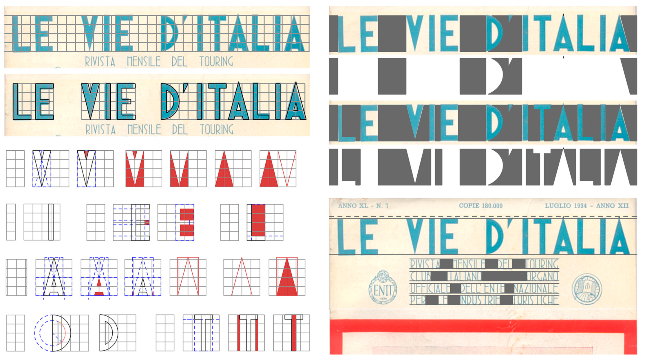
Le Vie d’Italia lasted only one year and a new transformation had already taken place in January 1933 (
Figure 7). First, the relationship between the header and advertising illustration: the former, free of the frame, is distinguished from the rest of the page by a slightly coloured background; the latter is framed with a thick mark coloured only when it is necessary to balance excessive white. But the greatest innovation is in the use of a sans serif character, clear-cut and decisive, with slender letters deriving from geometrical constructions supported by a modular matrix. The title, situated at the top of the page, thereby extends the entire width of the cover, while the subtitle is purposefully a neat package distributed over multiple lines, even if the solution is difficult to read due to the spacing between the words, which is sometimes really excessive, and the interline spacing that is too small.
Finally for the first time, the text and illustration are harmoniously composed in a cover that, overall, becomes the manifesto itself.
But with the need to adhere to a different political and cultural climate, the graphical project would see another profound change shortly thereafter. A much clearer institutional graphical appearance was therefore adopted: characters with serifs inspired by Roman lapidaries. More importantly, however, in place of products and in line with a more traditional interpretation of tourism and travel, the covers host painted works of landscape themes expressly commissioned to comment on the leading article of the month.
Thus, in January 1936, the
Mercato a Belet Uen sull’Uebi Scebeli (Market in Beledweyne on the Shebelle River) by Giorgio Oprandi, an example of the colonial genre of painting, spelt the end of the very original invention of the cover/manifesto in line with the changing cultural climate, which was no longer open to experimentation and innovation (
Figure 8).
5. A Double Invention: Imagining a New Italy to Create Italians
The covers of
Le Vie d’Italia are a true invention. Between 1917 and 1935, they exhibit manifestos in chromolithography, bright, strident colours, because they know how to speak eloquently to the eye whatever the advertised product is [
25] (p. 9).
They are manifestos used by illustrators, poster designers, architects, lithographers, graphic designers, painters, ceramicists, scenographers, etc., becoming interpreters of the new “sensitivity of taste to what is light, practical, ephemeral, and quick”, with the dynamism and emotive power of oblique and elliptical lines, synthetic figures in large letters with saturated, bright colours [
26] (p. 2).
In Le Vie d’Italia, this invention implements a long parade of products reinterpreted by the best known poster designers, including Bassi, Bernazzoli, Bianchi, Cappiello, De Carolis, Di Massa, Diulgheroff, Dudovich, Golia, Grassi, Mauzan, Mazza, Nicoùline, Nizzoli, Palanti, Patitucci, Raimondi, Seneca, and Talman.
It is a theory in which products and brands parade in succession from the industries of metalworking, metallurgy, electricity and electronics, petroleum and its derivatives, rubber, chemistry, chemicals/pharmaceuticals; textiles, manufacturing, food, etc.; airplanes (Pomilio), car batteries, vans and cars for tourism (Diatto, Carrozzeria Italo Argentina, OM—Officine Meccaniche, SPA—Società Ligure Piemontese Automobili, Ansaldo SPA), transformers (San Giorgio), power supplies (Zorzi), meters (CGS measurement tools), carburettors (Feroldi), ploughs (Pavesi), typewriters (Hesperia), fuel and lubricants (Shell, Società Italo-Americana pel Petrolio, Lampo, Esso—il super carburante, Atlantic Oil, Globoil, Standard Motor Oil), tires (Pirelli, Spiga); and drugs (Alpha Bertelli, Esanofele, Magnesia Polli, Acqua Nocera Umbra), restorative distillates (Ferro-China Bisleri), liquors (Campari, Ramazzotti, Cinzano, Campari), wines (Mirafiore, Brolio, Chianti), olive oil (Dante), pasta (Pasta Glutinata Buitoni), chocolates (Perugina), candies (De Giusti, Venchi); and even bathroom fixtures (Ideal Classic, Ideal Standard), radiators (Società Nazionale dei Radiatori), lights (Osram), razor blades (Lama Nova), hats (Borsalino), fabrics and knits (Rayon Herion), etc.
The covers of
Le Vie d’Italia become the walls of the homes “in which hundreds of sheets of painted paper accumulate, blend together, follow each other” [
25] (p. 10). They are walls in a virtual city that, transformed into a permanent exhibition, is tumultuous, agile, dynamic, and which identifies in industrial society and in the form of publicity the legitimacy of the new aesthetic and the new art: the art of advertising [
27].
When related by the same context and the same point of view, this long list of products, different at first glance, acquires sense, order, and form [
28] (p. 131).
Therefore, month after month, the mosaic of that modern, capitalist and consumer-oriented landscape long privileged by the modern era is composed. It is a landscape of aspiration for the new middle class, no longer “men of the cathedrals, palaces, city halls; but of the great hotels, train stations, immense streets, colossal doorways, covered markets, bright galleries, straight roads, healthful purgatives” [
26] (p. 2).
By connecting products and territories, this invention anticipates the
Made in Italy model, where the careful attention to the graphics demonstrates the deliberateness of the Touring project: a trip/pilgrimage among the images of the “landscape of Italian products” that the covers progressively assemble (
Figure 8). It is a new repertoire of images of the country for the construction of a modern imagery of reference to be recognized and shared. The invention is then twofold: being able to imagine a new Italy and thereby reinventing even the Italians.

