1. Introduction
Studying probability distributions is a central task in (visual) data analysis. They are used to model uncertain behaviors present in natural phenomena [
1,
2,
3], to build predictive models [
4], and to describe the behavior/variability present in collections of data, often associated with the processes of sampling and/or aggregation [
5,
6]. However, effectively visualizing probability distributions presents a big challenge for visualization designers. This fact is due to the infinite variety of possible distributions to represent and the fact that an effective visual metaphor needs to help users reason and perform analytical tasks in probabilistic terms. In fact, as presented in the classical Anscombe’s Quartet and in more recent examples by Matejka and Fitzmaurice [
7], most common approaches based on statistical summaries, such as mean and variance, can lead to ambiguities and hide important data patterns. Furthermore, when considering distributions in the data analysis process, performing low-level analytical tasks (e.g., comparisons, finding extremes), essential in interpreting a visualization, turns into performing statistical inference by eye [
8], which is a complex task even for users with statistical training [
9,
10,
11]. These problems are even more prominent for thematic geographical data visualizations, which are our focus in this work. The vast majority (if not all) of these visualizations (e.g., choropleth maps) use the position (and possibly the color) visual channel to represent the geographical context, which considerably constrains the design space.
Most of the popular solutions to the problem of visualizing probability distributions of geographical data include using statistical summaries to show central tendency and dispersion measures (e.g., variance). These summaries are used to convey the idea of uncertainty of a value in a particular location and are visualized using, for example, multivariate glyphs, multiple map views, or animation [
12]. The focus of these designs was mainly to show the presence/absence of variability/uncertainty; however, they do not address quantification questions such as: “
how likely is it that the values in a particular region are larger than a given threshold?” or “
what is the probability of the values in region A being larger than the ones in region B?” [
13,
14]. For this reason, users of these visualizations are only able to answer the question “
can I trust this information or not?” based on the amount of variability, but not to actually
quantify the likelihood of facts they want to investigate. As stated by several prior works [
8,
15], quantifying this probability is of great importance in supporting analysts’ decision-making process.
To approach the aforementioned problem, in this paper we compare three techniques for the visualization of probability distributions of geographical data, as shown in
Figure 1. Concretely, we adapt the frequency-based view from the works of Hullman et al. [
16] and Kay et al. [
17] to propose two new visual representations called
Hypothetical Outcome Maps (HOM) and
Distribution Dot Map (DDM), respectively. Additionally, we adapt the interaction-based approach by Ferreira et al. [
8] to propose
Distribution Interaction Map (DIM). The previous proposals have shown, through user studies, that they can improve users’ accuracy and confidence when performing low-level probability quantification of analytical tasks (e.g., cumulative probabilities, direct comparisons between distributions, and ranking) compared to conventional approaches. We highlight that the proposed visual metaphors are variations of choropleth maps. Cognizant of the fact that data sets published by governments and private entities are generally aggregated into geographic units (e.g., neighborhoods, counties, states) and rarely available in higher resolution. While the shortcomings of choropleth maps have been previously pointed out [
18], they are still popular in several domains, including public health [
19,
20,
21].
We also report the results of a user study that compared these techniques. The results show that automating the calculation of the uncertainty quantification in tasks through visual interactions can give the user better precision results in a relative error, time, and confidence (when the visualization supports the interaction for the desired tasks). Even in the presence of factors such as distance between regions on the map, automatically calculating the data quantification does not negatively impact results, which occurs in techniques that do not support interaction.
This paper is organized as follows:
Section 2 covers related work in visual analysis of probability distributions, considering both non-geographical and geographical cases;
Section 3 introduces the analytical tasks and visual metaphors used in this study;
Section 4 presents our user study;
Section 5 discusses our results; and
Section 6 presents limitations of our study, conclusions and future work.
3. Background and Preliminaries
Analyzing data through its probability distribution is an increasingly common approach in several domains, either because the underlying captured phenomenon is uncertain and modeled as a probability distribution or because operations (such as aggregations) applied to the data result in a distribution. The latter is the scenario we will use here as a running example. We start our discussion with a brief description of the mathematical tools used in modeling this scenario.
A random variable (RV) represents a quantity whose value depends on the outcome of a random phenomenon. We will represent RVs using upper case letters such as
X,
Y, and
Z and constant values that are not random with lower case letters such as
a,
b, and
c. A RV has an underlying distribution that encodes the probability of the associated RV assuming a given value (discrete case) or being inside a given range of values (continuous case). We formally define an aggregation as a derived value (or statistic) that summarizes one aspect of the distribution of a RV. Aggregation is an essential tool to build visual summaries of data and, therefore, for interactive visual analytics systems [
50,
51,
52,
53,
54].
In this paper, we are concerned with the analysis of distributions of numerical geographical attributes. We focus on the scenario in which we have a discrete set of spatial regions and, associated with each one of them, we have a RV modeling a collection of data points belonging to the region. For example,
Figure 2 presents the mean number of monthly taxi trips in Manhattan for a period of one year. While the aggregated map only shows a statistical summary (e.g., mean, sum) (a), there is an underlying monthly distribution of the number of trips over the entire year (b).
3.1. Analytical Tasks
While visual summaries such as
Figure 2a use aggregation to reduce the amount of data that the user has to analyze, it can hide important patterns as well as give the user a false impression of certainty/precision of the presented value. Therefore, when facing such cases, it is important for the analyst to visualize more details of the underlying distributions and perform analytical tasks that extract information from these distributions. We draw upon past literature [
8,
16,
55] to define a set of analytical tasks that will guide the design of the visual metaphors, the formulation of hypotheses about their performance, as well as the design of a user study to compare visualization techniques.
Amar et al. [
56] present a series of analytical tasks that are common in the visual analysis process. Examples of such tasks are: retrieve value, filter, and find the minimum and maximum. Andrienko and Andrienko [
55] studied these tasks and their use for the exploration of geographical data, which we use as the main reference for task selection. Their work, however, did not take into account the use of probability distributions, resulting in a more straightforward translation between task and visual representation. Ferreira et al. [
8] considered the problem of visualizing probability distributions for non-geographical data and translated a subset of the tasks proposed by Amar et al. to a probabilistic setting. This approach consisted in turning the deterministic tasks on inferences that estimate the probability of occurrence of certain facts. For example, a
retrieve value task is translated to the probability of a sample from a given distribution to be smaller than a predefined value (i.e.,
). They also discuss a version for the task that involves estimating the probability of a sample to fall within a given interval (i.e.,
). Similarly, a comparison task, which in a purely deterministic setting is simply comparing two values, is translated to the task of evaluating the probability of a sample in distribution
to be smaller than a sample in distribution
(i.e.,
). A similar approach was used by Hullman et al. [
16] to evaluate visualization of distributions, again for non-geographical data. Given that, we can define the following analytical tasks for the probability distribution of geographical data:
Retrieve value. Given a geographical region
R, estimate the probability of a sample to be in a given interval. The interval can be either bounded
or unbounded, in which case we have either
or
)), where
is the RV describing the distribution of the data associated with
R. Considering the example in
Figure 2, this task estimates the probability of having the number of taxi trips in a given region greater than a certain threshold.
Find extremes. For all geographical regions
, find the one that minimizes (or maximizes) the probability of a sample to be within a given interval. More clearly, given an interval
I (of one of the types described above), find the region that minimizes
). In
Figure 2, this task finds the city region that has the highest probability of having a sample, for example, greater (or lower) than a certain threshold.
Compare distribution. Given a pair of geographical regions,
and
, estimate the probability of a sample in the first region being smaller than one of the second region, i.e,
). In
Figure 2, this task quantifies the probability of having, for example, fewer taxi trips in a given city region compared against another one.
Estimate mean. Given a region R, estimate the mean (i.e., expected value) of the associated distribution of associated RV, .
The previous tasks were selected because they are common in the analysis of spatial data with uncertainty. It is important to notice that while some of the tasks are in some sense local (i.e., depend only on one or two regions of the map), the spatial disposition of the regions on the map will impact how efficiently they can be performed. Put in a different way, these tasks could, in principle, be interpreted as non-spatial, but in reality, they are very important for map interpretation [
55] and to support high-level tasks. In addition, while the estimate mean task could be interpreted as a straightforward task (since one could directly visualize the mean on the map), we believe that an efficient display of distribution should allow the user to estimate common summaries that could be useful during data exploration. Visualizations that try to directly convey multiple summaries can become crowded and hard to interpret. For this reason, similar to the study performed by Hullman et al. [
16], we decided to use the estimate mean task in our evaluation.
3.2. Visual Metaphors
As previously discussed, the most direct approaches to visualize geographical data, such as choropleth maps and their variants (that represent measures of dispersion), do not directly support the tasks described in
Section 3.1. The consensus in different domains is that visualizations need to either depict the entire data (which is generally infeasible) or
give more direct access to the distributions than just mean and variance [
57,
58,
59]. To achieve this in the case of geographical data, we propose to adapt recent ideas used in the context of non-geographical data. Next, we highlight each one of these adaptations, focusing on how they can be applied to the visualization of geographical data. The visualizations are available at
https://vis-probability.github.io/demo/ (accessed on 12 July 2022).
3.2.1. Distribution Dot Map
The first technique is an adaptation of the Racial Dot Maps (RDM) to depict numerical distributions, which we call
distribution dot map (DDM).
Figure 1a shows an example of a
DDM. Similar to RDMs, in order to visually represent the probability distribution
of a geographical region
, this technique draws dots randomly positioned in a grid inside the polygon that defines the region. There are two important observations here. First, we chose to use randomly positioned colored dots to represent the quantitative values of the distribution, since, (1) this is a common approach used in RDMs and different from ordinary (non-spatial) dot plots, and (2) there is no standard way to organize the dots spatially. We believe that the choice of an arbitrary ordering could cause the appearance of undesired geographical features. Second, the grid-based approach used here, similar to the dot placement described by Chua and Moere [
40], avoids overlapping dots that are common in ordinary RDMs. As discussed by Chua and Moere, density estimation is negatively impacted by overlapping dots. Lucchesi et al. [
60] used a similar placement approach to create a region pixelization strategy to display uncertainty.
Each dot in a DDM corresponds to a distribution sample and is colored according to the sampled value. The larger the probability of a given value in the distribution, the more dots will have the color associated with that sample value. We chose the use of color instead of dot size to represent the distribution values to, again, avoid overlapping dots as well as to make dot density estimation easier. In addition, in a DDM, the number of dots within a region is proportional to the area of the geographical region. We notice that, while having the same number of dots in all the regions would be desirable to more easily support comparisons, the diversity of region sizes in geographical visualization can prevent the representation of complex distributions in larger regions due to smaller regions present on the map.
We see DDMs as an extension of the frequency-based approach provided by
dot plots [
17] to the spatial context. For example, notice that this visualization turns the process of performing the analytical tasks previously described into counting/estimating the number of dots inside one (or more) region(s) with a certain color. This task is similar to the dot density estimation task performed in RDMs.
3.2.2. Hypothetical Outcome Maps
The second technique that we propose considering the spatial context is
hypothetical outcome maps (HOM), based on the
hypothetical outcome plots [
16]. This consists of an animation showing a series of choropleth maps displaying samples (hypothetical outcomes) of the distributions associated with the represented regions. The sampling can be achieved in different ways; without apriori correlation/dependency, samples can be drawn independently from the different distributions
. However, when there is an apriori correlation, it is possible to sample the entire map as an outcome of a joint distribution of all
. For instance, in the example of taxi trips in NYC, there is a link between the number of trips and the months of the year. The resulting animation shows random samples of the joint distribution over the twelve months of the year. One important point is that the color map function is fixed throughout the animation, in order to make comparison across frames possible. Hullman et al. [
16] suggested the use of 400 ms as the transition time between frames of the animation; however, in a pilot study, we found that users had some difficulties with fast transitions. We, therefore, set the transition time to 660 ms as a good compromise for analysis.
Figure 1b shows an example of an
HOM.
3.2.3. Distribution Interaction Map
The last technique is based on the proposal by Ferreira et al. [
51]. This technique consists of fixing the (preferably small) set of tasks that will be supported and, for each one of them, designs interactive widgets/annotations that support automatic quantification of the probabilities in the selected tasks. We call this technique
Distribution Interaction Map (DIM). To support the retrieve value and find extreme tasks, the interface shows a slider where the user can define an interval
. The system then uses this interval to quantify the value of
via a sample drawn from the distributions. The resulting probabilities are visualized as a choropleth map, as shown in
Figure 1c. We notice that this approach has been used in practical visual analytics systems [
6,
49]; however, they did not evaluate this technique nor explicitly support other tasks.
For the comparison task, we designed an interaction similar to the one proposed by Ferreira et al. [
8]. In this case, the user double clicks on a region
R, and all the other regions in the map will be colored according to
, where
is the RV associated with the region
R and
is the RV associated with each of the other regions.
To test how well this technique supports the estimate mean task, we decided not to create a specific interaction, unlike for the previous task. In theory, using the previous interaction, it is possible to estimate the mean with . However, we expect that users will report difficulties in doing so.
4. Evaluation
We conducted an in-person user study to evaluate the effectiveness of the three techniques described in
Section 3.2. The methodology of our experiment is similar to the ones used by Ferreira et al. [
8] and Hullman et al. [
16]. In our study, each participant was randomly assigned to one of the three visualization conditions (i.e., each user was only exposed to one of the techniques). The user study was composed of four parts. In the first part, participants were asked to complete a questionnaire with personal information such as age, gender, and educational background. In the second part, we presented the participant with a short tutorial describing the technique they would use in the remainder of the study. At the end of the tutorial, the participants were asked to answer a simple question comparing two distributions in two different regions, in order to evaluate if they understood the basic functionalities of the visualization technique. After successfully answering the tutorial question, participants answered a set of questions on the tasks described in
Section 3.1 facing stimuli that simulated data analysis scenarios, using both synthetic and real-world geographical data sets. For each question, we recorded quantitative information to evaluate each of the visualization techniques.
Experiment apparatus and data collection. The participants performed the experiment using a web-based application containing all the questionnaires and quantitative tasks. We implemented the three visualization techniques using JavaScript and D3, and Leaflet and Turf for mapping and spatial analysis. The three interfaces display a colorscale on the bottom right side of the map. We performed a pilot study before the user study to adjust interface parameters, including HOM animation speed, and number of dots in DDM.
4.1. Study Design
The study consisted of a main questionnaire in which the participant answered a series of 26 questions based on two real-world spatial data sets (13 questions per data set), covering the four analytical tasks presented earlier in the paper (for each data set: 3 questions to retrieve the value, 2 questions to find extremes, 7 questions to compare regions, and 1 question to estimate the mean). The number of questions per task was different due to possible variations of the task and/or independent conditions that we wanted to test. For example, in the retrieve value task, we included variants that asked the user to estimate, for a given region, the probability that samples are in a bounded interval or, also, either above or below a threshold, totaling to 3 possible variants. For the task of comparing distributions, we selected 3 factors for which we wanted to measure their influence on the task, namely, region size, region distance, and distribution variance. We have 2 questions associated with 2 possible values of the factor and 1 extra question that did not consider these factors, totaling to 7. Some of the scenarios that tested the 3 factors mentioned above are shown in
Figure 3: (a) the size of the regions, (b) the distance between regions, and (c) the distribution variance in the regions. All of the examples of questions were manually chosen by the authors to present reasonably challenging problems. In particular, for each comparison question, we selected the regions based on these variables (i.e., small and large regions, nearby and faraway regions, low and high variance regions).
For each question, participants were shown a map with one or more highlighted regions (as in
Figure 2a) and were asked to perform estimations based on these regions. For each question in the tasks (presented in random order), we recorded the user’s answer, time used to respond, and also the self-reported confidence in their answer. The answer was a numerical value that represented the estimated probability (from 0 to 100) typed by the participant. The only exception was find extreme tasks, for which the participants chose a region name from a drop-down menu containing all the regions sorted in alphabetical order. The confidence was measured on a five-point Likert scale from “completely uncertain” to “completely certain”.
Table 1 shows some examples of questions for the tasks in the user study.
Data sets. To generate the actual test scenarios, we used two different real-world data sets. The first data set is composed of rainfall indices collected in the 184 cities located in the Brazilian state of Pernambuco, with measurements for each month between 2016 and 2018 (36 values per city). The second data set is comprised of taxi trips in 29 regions of Midtown Manhattan, a borough of New York City (NYC). The data is composed of 7,991,059 taxi trips and was aggregated by month, resulting in a distribution of 12 values per region. These data sets were chosen to simulate real data analysis scenarios involving geographical distributions.
Participants. We recruited 78 people to participate in the user study, 52 males and 26 females. They were randomly assigned to three groups: DDM, HOM, and DIM, so that each group had 26 participants. All participants had at least a bachelor’s degree, and 46 of them had a graduate degree. Furthermore, all participants attended at least an undergraduate course in statistics. From the total number of participants, 49 of them reported having experience in statistics (12 in the DDM group, 20 in the HOM group, 17 in the DIM group), and 54 of them reported having experience in visualization (16, 17, and 21 for each group, respectively). The participants became familiar with the study regions in the tutorial section. None of them were color blind or had previously used the techniques.
4.2. Hypotheses
Considering the features of tasks discussed in the previous section and the visual metaphors used, we formulated a set of hypotheses that we want to validate using the collected data. We discuss these hypotheses in the following.
Hypothesis 1. DIM is the technique with higher accuracy for the tasks of retrieve value, find extremes and comparison.
We can consider that answering each of the tasks involves two steps. The first one (called the estimation step) extracts some numerical properties from the visualization, for example, a probability quantification involving one or more distributions, or estimating the mean of a given distribution represented in the visualization. The second step (called the consolidation step) uses these properties to form the answer to the questions asked.
While all three techniques, by design, try to make probability quantification more intuitive and easy, they impact these two steps differently. For the tasks of retrieve value, comparison, and find extremes, the interaction strategy makes the extraction step straightforward since the estimated probabilities are directly represented using ordinary choropleth maps. We noticed that the cognitive load involved in this step is much higher since the user will have to rely on memory (in the case of HOM) or to estimate the proportion of a certain collection of dots inside a particular region (in the case of DDM). Therefore, we expect that the DIM technique will better support the tasks above compared to the other techniques. While it may seem strange/unfair to compare it against the other techniques, in this case, we believe that this is important for two reasons. First, it serves as a baseline for us to evaluate how well both the HOM and DDM would perform compared to the ideal case. Second, testing this hypothesis will help us evaluate the usability of this technique. Finally, we expect that HOM and DDM will have similar performances in terms of accuracy for these tasks. We think that the cognitive effort involved in evaluating the animated scenario will be matched by the one involved in estimating the density of points in a region with a certain value.
Hypothesis 2. DIM is the technique with equal or smaller completion time for the tasks of retrieve value, find extremes, and comparison.
Considering the discussion above, we expect that the DIM technique will outperform the other techniques in terms of time spent on answering the questions for the same set of tasks mentioned above. Again, the goal here is to use the DIM approach as a baseline for the effectiveness of the other methods and test its interaction usability.
Hypothesis 3. DDM and HOM have lower confidence than DIM for for the tasks of retrieve value, find extremes and comparison.
We expect that the cognitive load involved in interpreting the animations (HOM) or counting the possibly large number of dots (DDM) and remembering the associated values will be tiring and error-prone. For these reasons, we expect that the users will feel more confident in reading the values directly from the quantified probabilities given in the DIM approach.
Hypothesis 4. HOM will better support (in terms of accuracy and time) the estimation of the mean.
The estimation step is not well supported in the DIM approach. As discussed in
Section 3.2, estimating the mean in this approach is challenging. Furthermore, we expect the estimation step in the DDM approach to be error-prone, given the need to accumulate sums and count the dots. The randomness present in the HOM animations should be a powerful tool for estimation in this case.
Hypothesis 5. Distance between polygons, size of the regions, and magnitude of distribution variance of each region negatively impact accuracy in the comparison task when considering the DDM and HOM techniques.
One of the main aspects of geographical analysis compared to the non-geographical scenario is the spatial dispersion of the visual representations of the distributions. In our scenario, for the tasks that involve the consideration of multiple distributions, say the comparison task, we expect that the distance between the regions will negatively impact both the accuracy and time of the responses for the HOM and DDM techniques.
4.3. Quantitative Results
For the quantitative analysis of the collected result, we first used the Kolmogorov–Smirnov (KS) test to reject the normality of the distribution of the samples in the data for the conditions considered (none of the scenarios tested generated normal distributions according to the test). We then use the non-parametric Kruskal–Wallis (KW) to test if the distributions of all tested groups are equal. If there is a significant difference between groups, we use the Mann–Whitney–Wilcoxon test (MWW) to check if the median ranks of each pair of groups are equal. For all tests, a significance level of 0.01 was used after using Bonferroni correction to control for Type I errors, i.e., we regard results significant if the associated p-value is at most 0.01. To give a more concrete meaning to the accuracy study and make it independent of the data set used, the accuracy is reported as the relative estimation error.
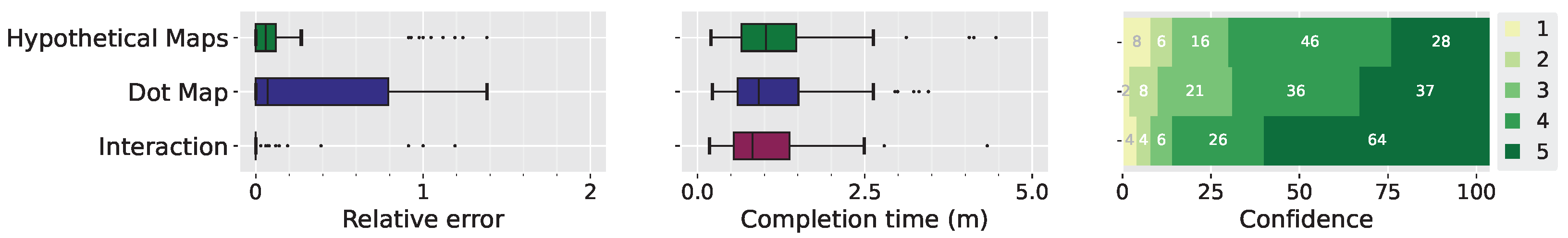
Retrieve Value Task. The participants in the DIM technique registered the smallest relative errors, with a significant difference when compared with the DDM and HOM techniques (
Figure 4 (left)).The results provide sufficient support for Hypothesis 1 (H1) in this task. The completion time of this task was, on the whole, shorter between the participants in the DIM group. Additionally, both DDM and HOM have significantly higher outliers than the DIM group (
Figure 4 (middle)). The results support H2. The DIM technique, since it allows us to precisely quantify the probability, had a significantly higher confidence score (
Figure 4 (right)). More than two-thirds of the participants in the DIM group said they were very confident (5) in their answers, as opposed to less than one-third in the other two groups. This result supports H3.
Find Extremes Task. In the find extremes tasks, users have to report the name of the region identified as having the maximum (or minimum) estimated probability, i.e., we want to find the region X, which maximizes (or minimizes) , for a given constant c. To numerically quantify the errors in this task, we compute the relative error of the probabilities associated with the region chosen by the participant and the one that is the extreme. In other words, if X is the chosen region and R is the extreme region, the relative error is computed as .
The participants in the DIM group again registered the lowest number of errors, a significant difference when compared to HOM and DDM (
Figure 5 (left)). Given that, the results provide sufficient support for H1 in this task. Noteworthy is the difference between the relative error in the two data sets. In the rain data set, participants in the DDM and HOM groups registered similar relative errors. We have a different scenario in the taxi data set, where the HOM group had a smaller relative error than the DDM group. This can be explained by the fact that the geographical regions in Manhattan are mostly rectangular, with a smaller total area compared to the rain data set, resulting in less space to insert the dots that represent the distribution. Additionally, the taxi data set distribution has minimal variation, which can easily confuse participants with the approximation made in representing the dots on the map.
The DIM group were significantly more confident in their answers when compared to the other two groups (
Figure 5 (right)), supporting H3.
Compare Distributions. The relative error was once again significantly lower among the participants in the DIM group (
Figure 6 (left)). This result also supports H1. In terms of completion time, the DIM technique once again showed the lowest values (
Figure 6 (middle)), with a significant difference to the other techniques. This is expected, as the DIM technique provides the quantified probability in an automated way while the other two demand a complex mental estimation. The pairwise differences between the three techniques are also significant, for all pairs except the DDM and HOM. This result supports H2. The confidence results for this task showed that participants were more secure using the DIM technique, with over two-thirds using a rating of 4 or 5 (
Figure 6 (right)). The KW test showed a significant difference between the three groups, and the MWW test showed a significant difference between pairs of groups. This result supports H3.
Estimate Mean. Since the DIM technique does not provide a specific functionality to find the mean value for a region, a larger relative error was expected, confirmed in the user study (
Figure 7 (left)). The KW test showed a significant difference between all techniques, and the MWW test showed a significant difference between all pairs, except between the DIM and DDM groups. This supports H4. In terms of completion time, the DIM technique registered the largest completion time (
Figure 7 (center)). This was already expected, given the need to interact with the slider multiple times to perform the estimation. The KW test showed a significant difference and the MWW test showed a significant difference between all techniques, except between the DDM and HOM. This reflects what was already hypothesized in H2, as the DIM is not the best proposal in terms of completion time.
For the first time among all tasks, the DIM technique had the lowest confidence scores since the adapted visual metaphor does not directly allow one to find the results as in the other tasks (
Figure 7 (right)). The KW test showed that there is a significant difference between the techniques. The MWW test showed a significant difference, except between DDM and HOM.
4.4. Impact of Distance, Size and Variance on the Comparison Task
We now turn to the investigation of the impact of three different variables on the relative error and completion time of the visualization techniques tested: the distance between geographical regions (i.e., near and far), size of regions (i.e., small and large), and data variance in the regions (i.e., small and large), as shown in
Figure 3. In each data set, we manually selected two regions that met the criteria of the variables.
Distance. In the DDM technique, the greater distance between geographical regions increased the relative error; in our user study, the median of the task that uses two distant areas is greater than the upper quartile of the short distance (
Figure 8). This behavior is also similar among participants in the HOM group. In both cases, the difference between the variables was statistically significant according to the MWW test. The distance between areas did not impact the relative error in the DIM technique; both conditions had a small error, with a median of 0. The user study did not show any significant impact in terms of completion time or confidence in all three techniques.
Size. The size of the geographical regions (small and large) did not significantly impact the relative error or completion time of any of the studied techniques when we consider both data sets (
Figure 9). However, size does play a role in the DDM technique when considering only the taxi data set. There were smaller errors when considering large geographical regions, with the median of this case below the lower quartile of the condition with small geographical regions, given that the larger space fits more points and thus better represents the distribution of the region. This result was statistically significant according to the MWW test.
Variance. When considering both data sets together, data variance did not have a significant impact on any of the techniques, when considering relative error or completion time (
Figure 10). However, like the size variable, variance significantly impacted the DDM technique when considering the taxi data. There were smaller errors when considering the large variance case; the median relative error for the large variance condition is below the lower quartile of the small variance case.
4.5. Comments and Feedback from Participants
In this section, we summarize the qualitative comments given by the participants both at the end of the experiment (fourth part of the study) and recorded during the sessions under the think-aloud protocol. These comments shed light on possible interpretation and usability issues that the users had while using the different visualization techniques.
Participants of the DIM technique had, in general, positive impressions. A participant of the DIM group mentioned that “when you learn and understand the tool it becomes easier”. While this was somewhat expected, we highlight that performing the tasks still required a lot of attention for interpreting the question correctly. This was the subject of the feedback given by a different participant: In fact, the impression was that the tool made some of the questions “too simple” to the point that they thought that there could be something tricky on them. This can be seen in the following comment: “I was afraid of trusting the tool entirely. After you learn it, it is very easy to use. However, I still tried to spend time double-checking my answers”. We believe that the fact that the DIM approach did not give the users access to the underlying data might be the reason for this insecurity. Finally, the task of estimating the mean was mentioned by several participants, with one saying “I was just in doubt with the mean”.
Regarding the DDM technique, many participants reported difficulty in performing the tasks and also the need to constantly use zoom and pan interactions. For example, one participant said that “I found it hard to estimate the proportion of dots of the same color in an area, so I started counting. I had to zoom in the area to be able to count”. Another interesting feedback given by the participants was that, as expected by our hypothesis H5, the distance between regions increases the difficulty in comparing the distributions. As stated by one participant: “it (the estimation process) is time-consuming since there are cases where regions are far apart, and others are close together. In some cases, it is necessary to zoom in”. This was also a source of insecurity, as stated in the following comment by a different participant: “I had difficulty in analyzing (these visualizations) due to the counting process: distances make it more difficult, and it seems like an uncertain process. The tool should give us some sort of feedback to enable better analysis of the distribution”. As other comments have shown, this view of an “uncertain process” might result from the fact that participants found it difficult to spot the differences in the color patterns.
The comments on the HOM technique showed the evidence of an intuitive fact: animation might make the estimation process difficult. Furthermore, as shown in previous works that used animation for geographical visualization, the large number of changing objects in the visualization can cause confusion: “there are simply too many things to keep track of (…) I found this wearing”. One important feature noticed while we observed the users was that sudden changes in the color of a (possibly distant) region from the user’s current point of interest could catch the user’s attention and make him or her lose focus on the intended analysis. Participants also reported not being confident using this visualization: “I think this is a pretty nice visualization, but you get insecure, especially for someone like me used to calculations”. Finally, as with the DDM, many subjects found it difficult to perform tasks for which the regions were far apart or with similar distributions: “it was very difficult to compare regions that are very far from each other, or that the colors are similar”. Another participant also mentioned the distance: “for me the closer the distance, the easier to answer”.
5. Discussion
The results of our user study confirm that the DIM technique was the one with higher accuracy and lower completion time for the retrieve value, find extremes, and comparison tasks. Participants also reported a much higher confidence score when compared with the other two techniques. This combination indicates that DIM yields high confidence coupled with good performance. This desirable property was named by Ferreira et al. [
8] as
justified confidence. This can be explained by the fact that the interaction allows for the exact quantification of the probability distribution, while dot map and hypothetical maps rely on counting or memorization of partial results. As pointed out by the participants, this creates a level of insecurity when answering the questions. Both HOM and DDM had large relative errors, especially for the retrieve value task, with medians larger than 0.25. Errors of this size are likely not to be suitable for real applications. The quantitative results support our initial hypotheses H1, H2, and H3.
On the other hand, some users were insecure in using the DIM approach when estimating means. We hypothesize that this is because this technique did not give them access to the underlying data, but only to the quantified probabilities. In this task, HOM had higher accuracy and lower completion time, while DIM presented the highest errors. Past work did not use interaction for this particular task [
6,
49], also indicating that one would need another approach to communicate the mean.
Finally, as expected, when performing comparisons, users were affected by the spatial distance factor in both DDM and HOM, which limits their use in these scenarios. While we did not detect any significant impact of region area and distribution variance, we intend to perform more detailed studies in this scenario in which we could vary different degrees of these factors and check their influence on the participants’ performance.
6. Conclusions, Limitations and Future Work
In the present study, we compared three techniques that support probabilistic analytical tasks and, as a consequence, allow users to make proper use of the probability distributions in the analysis process. As discussed in the previous section, each one of the different techniques has negative and positive aspects.
While HOM and DDM yielded large relative errors, they have some desired features that are not present in DIM. First, we believe that, similar to the original version of (non-spatial) hypothetical outcome plots [
16], HOM presents a natural way of depicting uncertainty in the sense that users naturally interpret this animation as an uncertain display. Furthermore, although not directly tested in our study, we also hypothesize that this is a more suitable metaphor for dealing with non-expert users. On the other hand, we believe that the DIM approach is more useful for an exploration scenario done by expert users that know the exact meaning of the different interactive tools provided.
Concerning DDM, one important particular feature is that, among the techniques presented in this paper, it is the only one that can perform visual spatial aggregation. More clearly, performing one of the analytical tasks for a macro-region corresponding to the union of two or more regions on the map is done by estimating the density of points as if the macro-region was one of the original subdivisions on the map. This feature is important, since geographical visualization often involves analyzing patterns in different scales. However, one negative feature of DDM is that when using it for larger spatial regions, users can be led to interpret the location of individual dots as actual information provided by the map. While we acknowledge that this might be an actual problem, we believe that properly setting the dot size and placement strategy can create layouts that are both regular and non-natural, which indicate to the user that these are not actual locations. In our current paper, we selected the dot size as a good compromise between showing the distribution details and being visible. However, how to automatically set the dot size and dot placement, to optimize users’ accuracy, given the region geometries and the distributions is an interesting direction of future work. While this technique generally attained the worst results in our study, we believe that it has a great deal of potential for future developments. One interesting direction of research is to investigate whether ordering the dots spatially with respect to their sample value can improve the users’ accuracy when performing the tasks discussed.
Finally, one important feature of HOM is that among the three techniques present, it is the only one that can visually represent correlation among the different regions. While we acknowledge that estimating the correlation between two distributions is an important analytical task itself, we chose not to include it in our current study given that only one technique could represent it. A recent study by Peña-Araya et al. [
61] explores the design of static glyph representations with the goal of estimating spatio-temporal correlations. An interesting direction for future work is to compare the glyphs proposed in this related work with HOM for this particular task.
We now discuss some limitations of our study. Even though we used two data sets with very different numbers of regions, the influence of this factor was not clear. We plan to study this influence and also the impact of factors such as the number and shape of geographical regions on the user’s performance. Our user study did not consider different sampling processes for DDM, as well as the impact of dot size. We plan to evaluate this in a future study, taking into account different sorting options (e.g., sorted by value left to right) as well as the relationship between these options and the size of geographical regions. We also recognize the fact that our user study makes use of a limited set of geographical regions. In future work, we plan to study how well the results generalize to a wider range of geographic data sets. We also plan to evaluate other visualization approaches, such as bivariate, cartograms and dasymetric maps.
An important aspect of spatial data is that patterns can occur in different spatial resolutions. Therefore, another interesting direction for future work is to investigate the effectiveness of the discussed visual metaphors in performing visual spatial aggregation [
61]. Finally, previous work presented evidence that better quantification leads to better decision-making. While intuitive, this has not been investigated in geographical data exploration scenarios. We intend to validate this in a future study.


 ,
, 


