1. Introduction
The growth of urban environments brings many benefits to citizens, but also contributes to an increase in pollution levels and, as a consequence, to the degradation of air quality. To monitor air quality in cities, fixed and costly air sampling stations are often planted in key locations. To improve spatiotemporal resolution of the data generated, affordable mobile sensor networks are a promising alternative that is being tested in several cities worldwide [
1,
2,
3,
4,
5]. The data gathered by these sensor networks are typically made available to citizens via traditional visualisation techniques based on colour-coded plots (e.g., [
6,
7]) representing pollutants concentrations and air quality indexes (e.g., [
8]). More recently, several projects started to explore the use of 3D virtual environments to visualise the data produced by sensor networks. Examples of application domains in which the use of 3D virtual worlds for data visualisation has demonstrated benefits include paleontology [
9], health care [
10,
11], biology [
12], astronomy [
13], urban data visualisation [
14], and big data visualisation in general [
15,
16].
While the aforementioned previous work has already shown its applicability to several applications domains, to the best of our knowledge, no previous work has applied 3D virtual environments for scientific data visualisation in the air quality monitoring domain. By filling this gap in this article, we expect to foster the ability of citizens to intuitively access key health-related information when planning their daily routines. For instance, empowered with air quality information, citizens should be able to select health-optimal routes across the city [
17]. Bearing this motivation in mind, we started the ExpoLIS Project [
4,
5] with the goal of developing and deploying a sensor network in Lisbon city buses and provide the generated data to citizens via a set of graphical applications. In addition to the traditional plot-based and colour-coded user interfaces for scientific data visualisation [
5], the project also aims at providing citizens with 3D game-like data visualisation tools, fostering an intuitive and appealing access to the vast amount of generated sensory data.
This paper presents CityOnStats, one of the visualisation tools developed in the context of the ExpoLIS project, targeting mostly adults and young adults. The application provides users with several alternative 3D-based pollution visual cues (e.g., virtual fog) as they navigate in the virtual world via interaction mechanisms borrowed from video games (e.g., sitting on bus as a passenger or by driving it). These game-like interaction mechanisms are familiar to a vast portion of the target audience, thus facilitating the adaptation to the tool. To deepen immersion, the virtual world matches the city on which the data was generated. Inspired by previous work on visualisation [
18] and simulation [
19], this is attained with a tool that enables the extrusion of the buildings and other elements of the city according to publicly available city plans [
18]. This automatic generation of the environment reduces the need for manual modelling and, thus, helps scaling the visualisation tool to large scale sensor networks.
By luring users to explore the generated data via appealing interaction techniques, we expect to contribute towards the raise of citizens’ awareness about air quality and its impact. Moreover, we expect that the visual cues and interaction mechanisms included in the 3D game-like visualisation tools developed for the ExpoLIS project can be integrated in existing navigation tools (e.g., OpenStreetMap). Augmented with intuitive air quality data, these tools are expected to better provide users with the ability to, for instance, perform health-aware path planning and to compare holidays destinations according to their air quality records. The value of the tool to target users was sought during development by means of a systematic application of evaluation heuristics [
20] and informal tests. Then, the developed tool was put to validation via a set of usability tests with human participants from the target audience. Overall, the results provide empirical support to the claim that a 3D game-based visualisation of air quality data is more immersive and intuitive than a traditional plot-based and colour-coded visualisation solution. Moreover, these results also provide empirical support for which pollution visual cues are most adequate for the task at hand.
This article is organised as follows. First,
Section 2 presents the related work. Then, the CityOnStats tool is presented in
Section 3, including its interaction metaphors and implementation details. Then, the results obtained from the user experience evaluation are detailed and discussed in
Section 4. This evaluation was carried out taking into account bottom-line interaction data and answers to a standard game experience questionnaire and to a set of subjective questions. Finally, a set of conclusions and future work directions are provided in
Section 5.
2. Related Work
There is an increasing interest in modelling air quality based on sensor data. For instance, the ERA-PLANET project aimed at estimating the air quality at both city and regional levels, by crossing satellite and in-situ data gathered from fixed reference stations [
3]. As an alternative to fixed stations, projects are now deploying low-cost air quality monitoring sensors in vehicles, such as trams [
17] and buses [
1,
4,
5]. By using a mobile sensor network, the monitoring of air quality can be done with finer spatial resolution, when compared to the one possible with a set of fixed stations. These sensor networks produce vast amounts of data that need to be visualised by experts and general public. The following surveys previous work dealing with this challenge.
Pollution data visualisation is typically done via plots of time series and 2D representations overlaid on satellite imagery. An example is the QualAr project [
21], which presents air quality data gathered by fixed reference stations in Portugal via a website and a mobile app. This kind of visualisation has been studied in other countries as well, such as in China [
22], and has also been the one selected in projects that gather air pollution data from sensors mounted on trams and buses (e.g., [
1,
17]). Usually, with this kind of interface, users can find the location of the fixed stations on the map and visualise the air pollution following a colour code: Red for high concentrations and blue for low concentrations. As shown by Aamer et al. [
2], the use of a proper colour code, ideally linked to an Air Quality Index, is key to properly convey the health-related impact of air pollution to the general public, in comparison to simply displaying pollutant’s numeric values. In traditional air quality visualisation, users are also usually allowed to obtain hourly average data over a 24 h period, for a given pollutant. Instead of simply presenting raw data associated to a given geo-location, interfaces can also organise these large amount data for more efficient visualisation. For example, Wey et al. [
23] proposed a multi-granularity time zooming representation, in which data is presented as a layered set of circles, each layer representing a given time scale. Users move from one layer (e.g., representing months) to another layer (e.g., days) by clicking on a given portion of the former layer.
To better understand atmospheric processes using air quality simulations, José et al. [
24] proposed several tools for representing 3D atmospheric data and geographic data, targeting experts, scientists, stakeholders, and the general public. These tools included the ability to visualise pollution data by changing the colour of the 3D virtual world’s terrain and integration with 3D models from Google Earth. Augmented reality can also be used to raise the level of immersion felt by users when interacting with pollution data. Prophet et al. [
25] studied the use of augmented reality to increase the awareness of the effects of air quality. This was attained by requesting people to choose one location to plant a virtual tree, which would grow better if placed on a healthy location, according to the pollution levels recorded by a set of fixed reference stations. These projects show the value of gamification and immersion in conveying air quality data to the general public. The following describes related work on 3D scientific data visualisation, which, despite being unrelated to air quality monitoring, influenced the design of CityOnStats.
The Unity3D-based CityHeat tool [
26] allows users to visualise heat emission by traffic in a 3D virtual environment. Users are allowed to walk on and fly over the environment in first-person and third person perspectives. Users can also control a time slider to observe how heat disperses over time. Temperature is represented with an adjustable colour code. While similar to CityOnStats, CityHeat is not focused on pollution data and, as a result, is unable to address the problem of determining which visual representations best fit the air pollution monitoring task. An interesting appeal of using 3D virtual worlds for scientific data visualisation is the ease with which one can allows user to perform collaborative data exploration and analysis in virtual reality settings, as an alternative to traditional CAVE environments. The Unity3D-based iViz [
15] is a tool that made this possible for the case of multi-dimensional scientific data. The successful use of Unity3D in both iViz and CityHeat has motivated us to use it as well for CityOnStats.
The 3D visualisation of data produced by social networks has also been explored. Concretely, Moran et al. [
18] developed a project in which users, using a first-person perspective, can navigate in a 3D virtual world (built from LADAR data textured with Google Earth) populated with Twitter publications represented as 3D objects. More recently, the tool Urban Fusion [
14] was developed to merge urban taxis data with Twitter publications. Urban Fusion is based on a 3D density map to represent geo-referenced data on the city map and a 3D histogram based on cubes to represent user trends at the beginning and end of taxi trips. The 3D map depicts the locations where taxis pick up and drop customers. A panel is also used to display, through 2D graphs and histograms, the most detailed information. Moreover, in biology 3D-based scientific data visualisation can be useful. It is also possible to find business solutions for interactive data visualisation in 3D city models. For instance, the Roames Virtual World tool [
27] allows users to visualise information about power lines (e.g., height to ground, proximity to vegetation) and, as a result, mobilise maintenance teams as required. The visualisation of scientific data has gone beyond urban environments, reaching areas like biology. As an example, UnityMol [
12] is an application that allow users to visualise an adjustable representation of molecules and their interactions, targeting research and education purposes.
This survey supports the relevance of 3D scientific data visualisation, that it is is a valid alternative to traditional visualisation approaches, particularly pursued for urban data. It also shows that game-like metaphors (e.g., first-person perspective) can be valuable tools for designing 3D visualisation tools, as well as game-targeted development platforms (e.g., Unity3D). Finally, the survey also shows the absence of previous work on 3D game-like visualisation of air quality data, which requires, for instance, a thorough study on which visual representations are best fit to represent air pollution. CityOnStats aims at filling this gap.
3. The CityOnStats Tool
This section presents the concepts underlying the CityOnStats tool, whose goal is to render more intuitive and enjoyable the access to air quality data gathered by sensor networks deployed in cities. The higher the intuitiveness of the tool the better users are able to focus their cognitive effort on the primary task (e.g., planning the next vacations), rather than on the tool interaction details. Nevertheless, to excel on a given interface, users often need to engage on some exploratory behaviour, whose persistence tends to be higher if the interaction is enjoyable. Exploration is also important as it allows users to obtain a better sense of how air quality changes according to the context, allowing them to better harness expectations when performing the primary task.
The familiarity that many adults and young adults feel towards video games, as well as its associated enjoyability, is exploited by CityOnStats by allowing users to interact with air quality sensor data by means of interaction and navigation strategies akin to those found in typical 3D video games. That is, CityOnStats has been designed to induce a game-like look-and-feel. Concretely, air quality sensor data is presented as volumes planted across a 3D representation of the city, which is automatically generated according to 2D plans of the actual city. The city is populated with avatars of city buses, animated according to the GPS traces of their real counterparts. The city can be explored by the user via third-person control of a city bus or aerial drone using game-like keyboard/mouse interactions. The user can also choose to ride one of the animated city buses, allowing the user to effortlessly move across the city and get a feeling of how much polluted a given bus line can be.
More than an application, CityOnStats is expected to shed some light on which mechanisms (e.g., pollution visual representations) are key to allow an intuitive and enjoyable exploration and exploitation of air quality data in 3D virtual environments. We envision the integration of some of these mechanisms in existing navigation tools (e.g., OpenStreetMaps), which are steadily going 3D. This would be beneficial for the target audience, which is steadily becoming highly sensitive to environmental sustainability questions. It will allow users to learn how pollution is distributed in space and time and how it correlates with spatial context and human activity. Moreover, it will provide users with valuable information to support their planning efforts towards a healthy lifestyle.
CityOnStats was built upon the well-known and widespread game engine Unity3D. The virtual world in which the sensory data is visualised is automatically generated according to publicly available city plans on OpenStreetMaps, given user-provided workspace boundaries. This solution ensures that the application is usable in any urban context without additional manual modelling effort. The fidelity of the generated structures is a function of the accuracy and coverage of the available city plans. These plans are expected to improve as satellite imagery processing progresses, resulting in user experience improvement in CityOnStats without additional coding.
The 3D virtual environment is populated with visual representations of spatiotemporal air quality data. CityOnStats assumes that these data are obtained from available datasets, obtained either from real mobile sensor networks (e.g., dataset collected by OpenSense project [
28]) or simulated mobile sensor networks. Data from real sensor networks allow users to make informed daily choices after exploring the actual pollution distribution in a given city, whereas data from simulated sensor networks can be useful for pedagogical purposes. For instance, it may be useful to synthetically exaggerate pollution amplitudes in certain contexts (e.g., in an urban canyon) so as to speed up the learning of strong context-pollution correlations. The inherent variability of actual air quality sensor data may confuse the learner, reducing learning efficiency. For visualisation purposes, CityOnStats assumes that each node in the mobile sensor network is mounted on a city bus. Alternative embodiments could be considered if shown more adequate for the task at hand, i.e., taking into account the nature of the sensor network and the goal of the visualisation tool.
The following sections present the details of CityOnStats. First,
Section 3.1 describes how the virtual world is generated, which includes linking it to key external data (e.g., OpenStreetMaps), is carried out. Then, the main interaction metaphor, that is, exploring pollution data in the virtual world by riding a virtual bus is described in
Section 3.2. Then,
Section 3.3 presents the set of pollution visual representations that can be depicted by the user when traversing the virtual environment. Users are also allowed to visualise localised air pollution temporal plots, teleport to any place in the map, and to move around by flying on a virtual drone. These additional interaction metaphors help the user to gather information in fast way, at the cost of moving away from the bus-centred interaction metaphor, are summarised in
Section 3.4. To help the user exploring all these features without exiting the visualisation tool, a set of embedded tutorials inspired by in-game tutorials is available. The mechanics behind these tutorials are presented in
Section 3.5.
3.1. Virtual World Generation
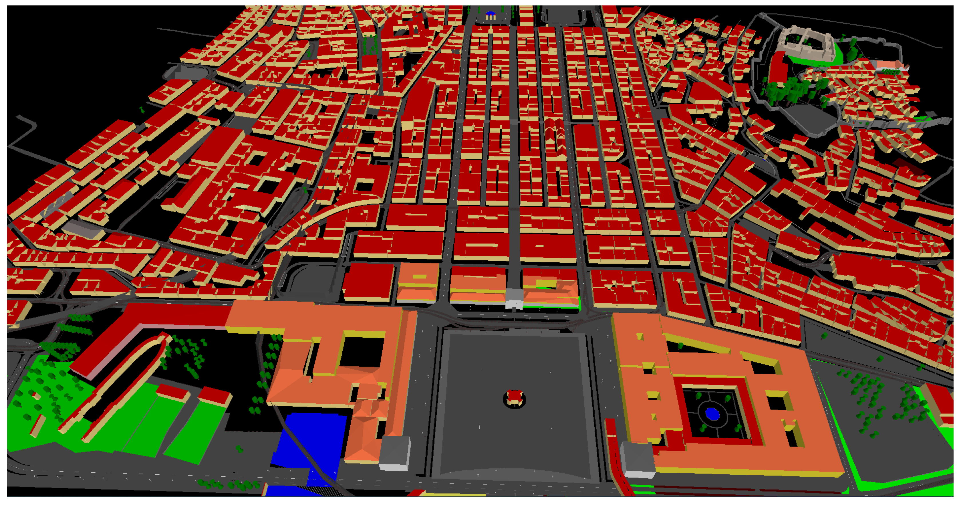
To speed up the application of CityOnStats to new cities, the virtual world is procedurally built from city plans provided by OpenStreetMaps. These city maps include the graph of the streets, as well the location, categories, and names of several key elements, such as streets, buildings, and key places. The city maps provided by OpenStreetMaps are fed into a third-party tool called OSM2World. This tool procedurally generates a polygon mesh corresponding to a 3D representation of the city, given the geographical coordinates of the corners of the area to be represented. These coordinates are entered by the user at configuration time.
Figure 1 depicts an example of a virtual city generated with this procedure.
The air quality sensing data (pollutant measurements) to be showed to the user is assumed to be provided to CityOnStats as text files with a comma separated values (CSV) format. Each line in the CSV files represents a sensing event, which is defined by a timestamp, a geographical location (latitude and longitude), a scalar value per measured pollutant, and the identification of the bus transporting the sensor node that generated the event. As it will be shown, having access to the routes executed by the actual buses is pivotal to CityOnStats. This information is assumed to be provided to the tool as XML files containing the sequence of GPS points visited by each bus, hereafter GPS trace. These CSV and XML files can be automatically generated by scripting a set of queries to a PostGIS database, as often carried out when handling sensor network data.
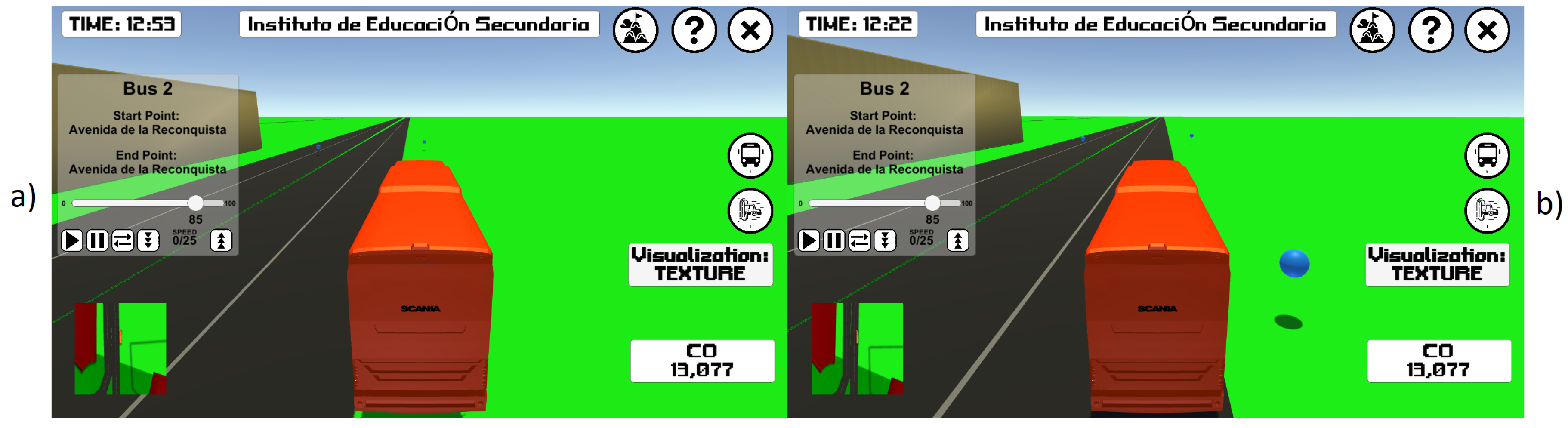
3.2. Exploring the Environment on a Virtual Bus
CityOnStats contains two driving modes for the user to explore the virtual world while riding a virtual bus. The first, available by default, offers the user the possibility to fully control the motion of a virtual bus from a third-person perspective using WASD keys, as is usual in video games. In this mode, hereafter free driving mode, the user has complete freedom to explore the virtual world and, as a consequence, the pollution distribution across the city. The second driving mode allows the user to passively follow with a third-person perspective one of several animated buses that populate the virtual world. These animated buses track the GPS traces of real buses, gathered by the sensor network and thus, in a way, these animated buses are avatars of the actual buses. The user can activate this mode, hereafter guided driving mode, by performing a mouse click on one of the animated buses or by selecting one from a complete list of existing buses. The guided driving mode simulates the situation where the user picks up a real bus and follows its route to a desired destination. When the bus reaches the end of the current route, it reverses its direction and reruns the route in the opposite direction. Users that pick an animated bus are constrained to stop and resume the bus motion, reverse the bus motion direction, and adjust the bus’ maximum speed.
Figure 2 depicts two animated buses traveling a portion of the city and the user’s perspective once one of these buses is selected for guided driving mode.
Due to noise in GPS sensor data and misalignment of the maps underlying the virtual city geometry, the animated buses may move away from the road they are following, potentially colliding against volumetric structures. To cope with this issue, the animated bus is controlled by a driving algorithm that aims at tracking the GPS trace while avoiding obstacles and aligning along the roads. To determine the presence of obstacles and road, the virtual buses are equipped with a set of virtual sensors that perform ray casting. The set of six sensors include two facing forward to detect obstacle, two rotated 45 degrees to the sides also to detect obstacles, and two facing downwards to detect the road underneath the bus. The distances obtained with the obstacle sensors produce repulsive forces to drive the bus away from the obstacles. The road detection sensors operate by checking whether the casted ray intersected a geometry tagged as road. The presence and absence of this tag in the intersected object is used to generate repulsive forces that push the bus away from road boundaries.
Figure 3 compares the behaviour of an animated bus with and without the driving algorithm correcting its motion according to obstacles and road positions.
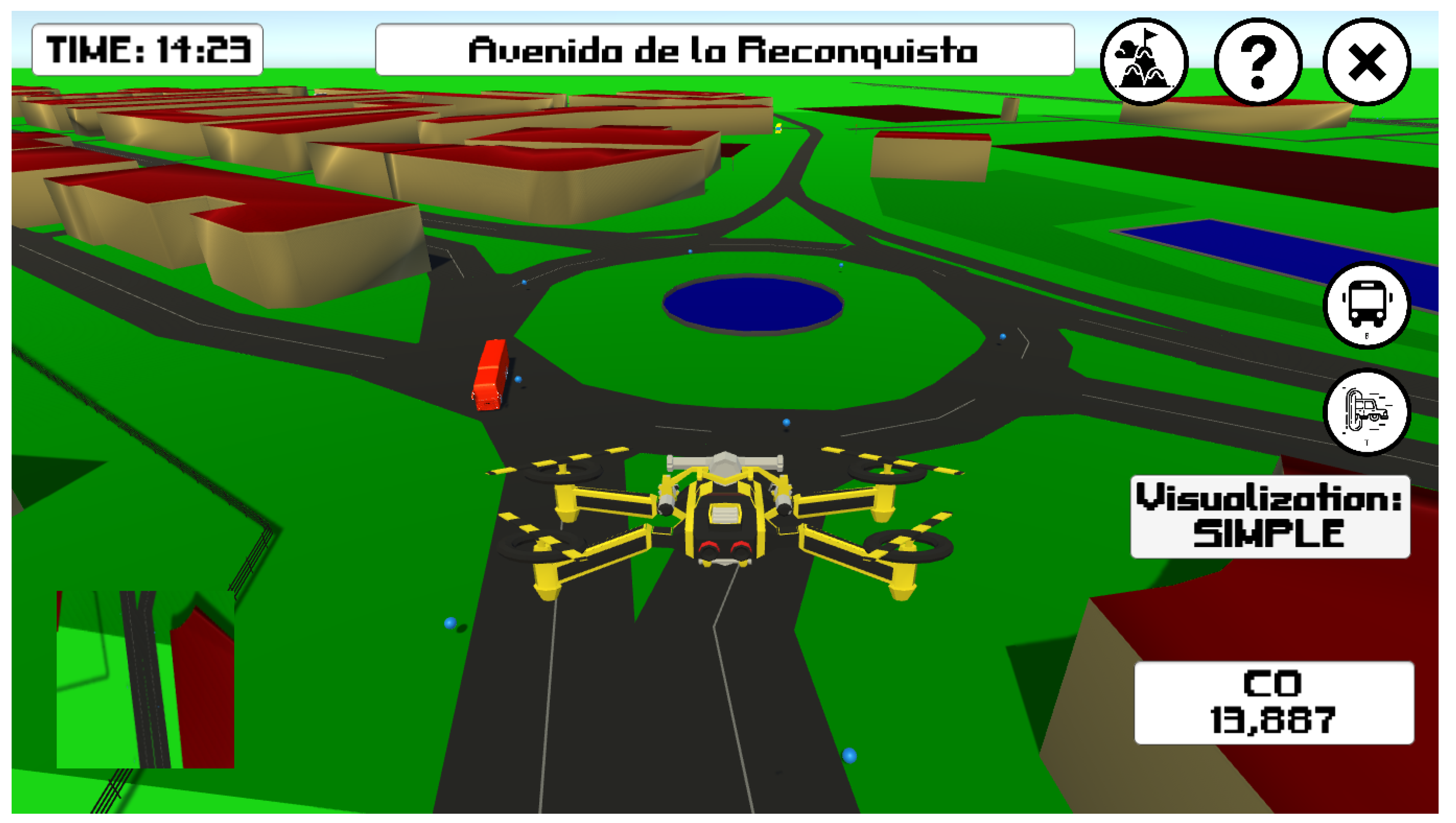
3.3. Pollution Visual Representations
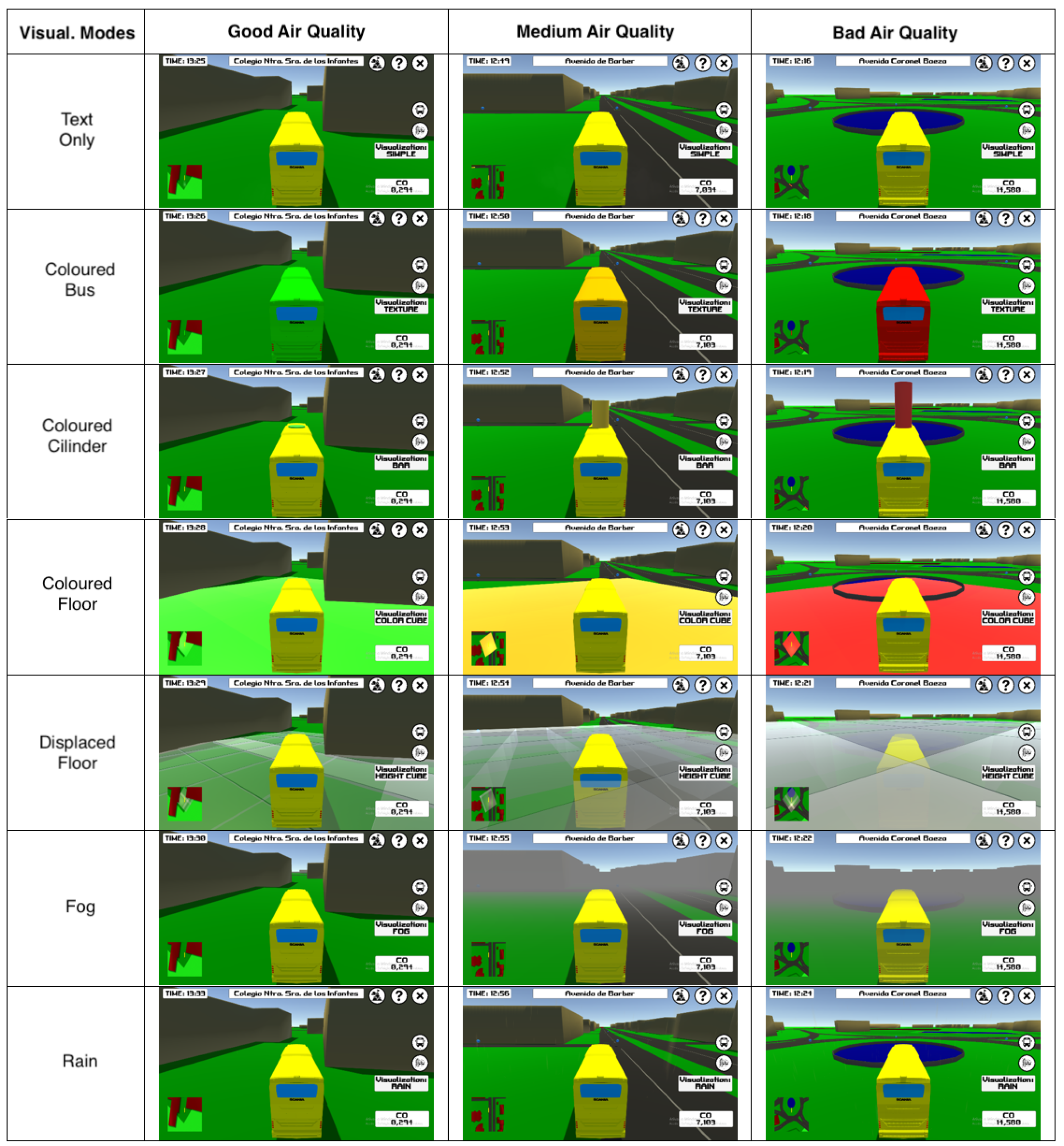
Users are provided with seven different visual representations of air pollution, being able to pick the one that best fits their intents at each moment with a single keystroke (see
Figure 4).
The text-only mode is limited to the presentation of the scalar value of the monitored pollutant in the lower-right corner of the display. This mode is always activated, meaning that the user has continuous access to the quantitive value of the monitored pollutant. In parallel to this mode, the user is allowed to select one of the remaining six modes. The additional modes add non-textual representation of the pollutant’s magnitude. In coloured-bus mode, the bus colour changes according to the pollutant’s magnitude, from green (good air quality) to red (poor air quality). In coloured-cilinder mode, a cylinder is placed on top of the bus with colour and height varying according to the pollutant’s magnitude. While similar to 2.5D air quality representations typically observed in scientific data visualisation, in CityOnStats, the cylinder is attached to the virtual bus. In coloured-floor mode, a set of cubes is placed on the terrain around the virtual bus (the representation follows the bus) with each cube’s colour being a function of the pollutant’s magnitude sensed in the corresponding terrain patch for the former and latter modes, respectively. In displaced-floor mode, the pollutant’s magnitude is used to modulate the height of each cube, instead of its colour. In fog mode, virtual fog is added to the scene, with its density being proportional to the pollutant’s magnitude in each region. In rain mode, virtual rain is introduced through droplets on the screen, accompanied with rain audio, the rain intensity being controlled by the pollutant’s magnitude. These two latter modes aim at providing the user with natural representations and to visually simulate smoke (in fog mode).
The visual representations are refreshed with pollutant’s data every 0.5 s. This refresh rate was the one found to better trade-off visualisation comfort and processing requirements.
3.4. Secondary Interaction Metaphors
To render the interaction experience more enriching and enjoyable, CityOnStats offers interaction metaphors beyond the bus-centred interaction metaphor, with the purpose of helping the user to gather information in a faster way.
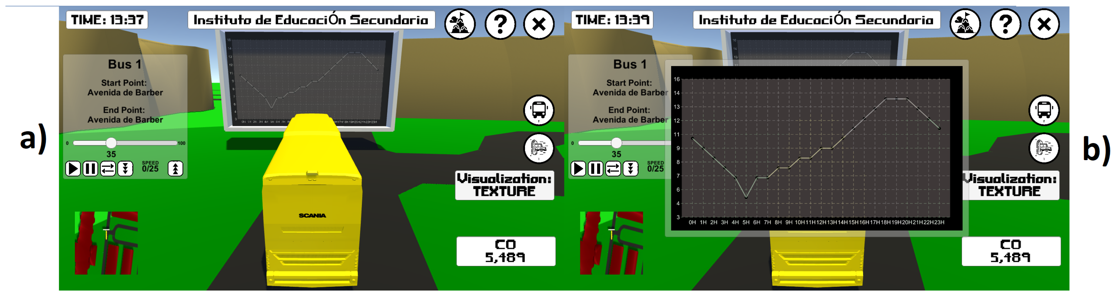
To evaluate the distribution of pollution throughout the day, the user is allowed to visualise plots with pollution evolution throughout the day. These plots are presented in the form of billboards, naturally blending in the scenario (see
Figure 5). To invoke the billboard on a given location, that is, to obtain a plot of the pollution sensed on that location, the user only needs to click the location in the terrain. For convenience, the billboard always faces the user. In the absence of pollution information for a given time of the day, this missing data is obtained by means of interpolation between the nearest available data. The user is able to zoom in the plot by clicking on it.
To speed up navigation to well-defined city locations (streets, key places), of particular use for the experienced user, a teleport function can be invoked. With this feature, the user selects a desired destination to which is immediately teleported, as well as the accompanying guided bus. To avoid landing inside buildings, due to misalignments between GPS data and city plans, the teleport is done to the road closest to the selected destination. For the sake of situation and spatial awareness, the current street/place description is overlaid on the top of the screen.
Sometimes the user may be interested in moving faster that it would be possible with a bus but may not be willing to break the spatiotemporal smoothness imported by teleport. To cope with this need, the user is allowed to fly over the city by piloting a virtual drone with a third-person perspective (see
Figure 6). With the obtained aerial perspective over the city, the user gets to know the city better and gets to find points of interest for later detailed inspection via teleport and bus navigation.
3.5. Tutorials and Help
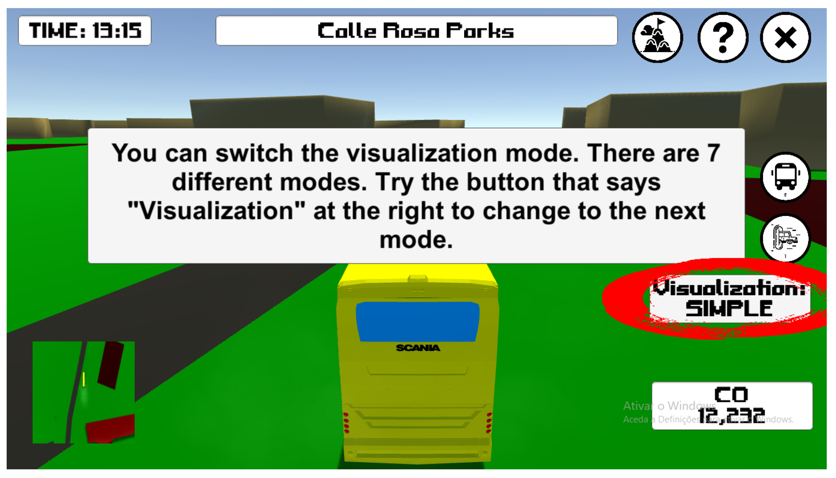
To help the user exploring all available features in CityOnStats without requiring to exit the tool and consult external manuals, a set of embedded tutorials inspired by in-game tutorials is available, as well as a help button. The tool is provided with an initial tutorial, an interactive tutorial, and a command table for later consultation.
The initial tutorial is intended to introduce the main features of CityOnStats. All major features are displayed in a panel with an image area, a text area, and buttons for navigation across the set of tutorial steps. In the image area, print-screens of the described features are displayed, which are accompanied by textual descriptions in the text area. The interactive tutorial takes place during the first two minutes of interaction with the application. This tutorial aims to instruct the user, hands-on, how to access the various features presented in the initial tutorial. Every 30 s a pop-up panel appears in the screen’s central region with information regarding a feature that has not yet been used by the user. In addition, a red circle also appears over the button in the interface that should be pressed by the user to access the feature. While the features in this tutorial appear in a fixed order, if the user has already tried a given feature, the incentive to try that feature no longer appears in the interactive tutorial, jumping immediately to the next one.
Figure 7 depicts a snapshot of CityOnStates’s interactive tutorial.
4. Evaluation
4.1. Tests
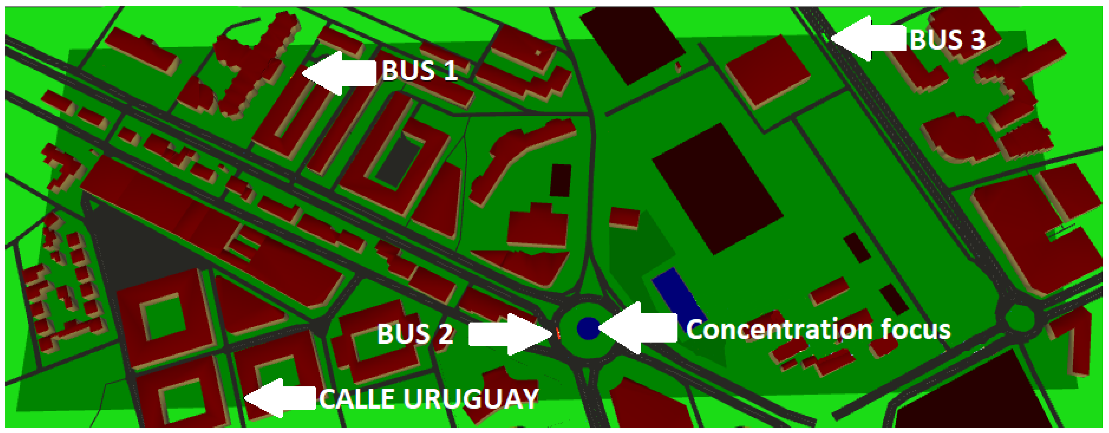
To evaluate CityOnStats a set of tests was conducted with 30 participants, which self-reported as
male and
female, with ages distributed between 17 and 29 years old (average of 21.9 and standard deviation of 2.96). To homogenise participants, i.e., to prevent that participant’s prior geographical knowledge could influence the tests, these were run on a virtual world that has been generated for a geographical location unknown to all participants (all Portuguese): Toledo, in Spain. The existence of a roundabout as source of atmospheric pollution, a housing area, and a green area, were the criteria for choosing the location. These criteria were chosen in order to represent the main areas that are usually found in a city, as well as the typical pollution associated to each of them: Green spaces representing good air quality, housing areas representing intermediate air quality, and roundabouts representing poor air quality due to intensive traffic circulation. This pollution distribution was synthetically generated for the pollutant carbon monoxide. The map of the chosen area has an area of approximately 0.280 km
2 (see
Figure 8).
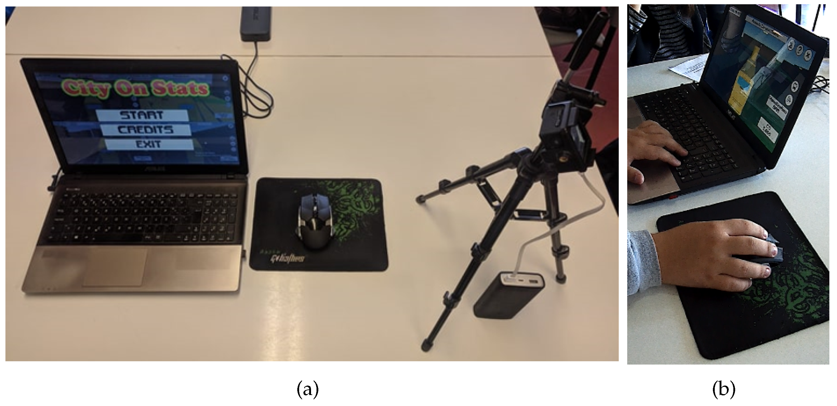
Each test involved asking the participant to follow the same protocol: (1) Collection of basic participant information; (2) presentation of the initial tutorial; (3) interface test; (4) two minutes of free use and exposure to the interactive tutorial; (5) execution of five challenges; (6) answering subjective questions; and (7) answering a standard game experience questionnaire. All sessions were recorded with informed consent. The tests were carried out with CityOnStats running in a laptop with which the participant interacted via keyboard and mouse.
Figure 9 depicts the test setup and a participant performing the test.
Before interacting with CityOnStats, participants’ experience with geo-referenced data, virtual reality, and 3D video games was assessed via a simple questionnaire. These three topics aimed to identify the participant’s experience with the three main components of the project. As
Figure 10 shows, overall, the average participant experience with geo-referenced data was low, with virtual reality it was moderate, and with 3D video games it was high. We consider that the distribution of experience with geo-referenced data was adequate to properly assess the impact of CityOnStats may have on users with disparate levels of experience with this kind of data. In the same line, the distribution of experience with 3D video games was also representative of the target audience, which is expected to be high. Nevertheless, the existence of less experienced participants is key to assess how intuitive the tool is, a key feature to widen its application domain.
4.2. Interface Evaluation
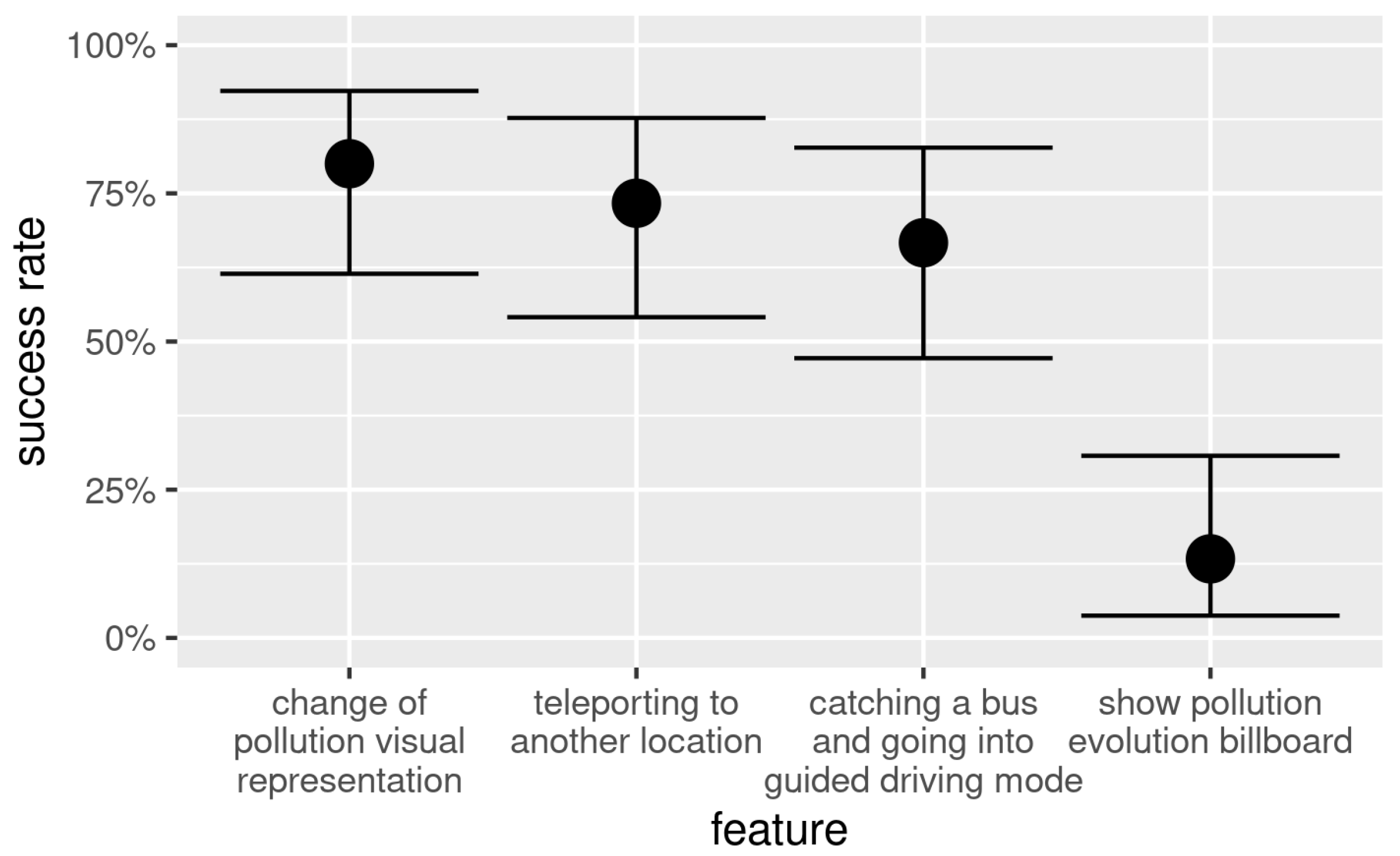
The design of a good, intuitive, and user-friendly interface is an important component of any application. Thus, during the formal evaluation tests, an interface evaluation was performed. This assessment consisted of asking the participant to say, verbally, while looking at CityOnStats, how would proceeded to access the four main features of the tool. Participants had to complete each task without being helped and without time limit, being allowed to take corrective actions whenever they felt it was necessary during the test. The test was ended when all tasks were completed or when the participant gave up. As
Figure 11 shows, the obtained results are globally positive. The features change of pollution visual representation and teleporting to another location were the features with best results, with an average success rate of
(95% CI with binomial test: 61% to 92%) and
(95% CI with binomial test: 54% to 88%), respectively. The feature catching a bus and going into guided driving mode yielded an intermediate success rate of
(95% CI with binomial test: 47% to 83%). This is thought to originate from the way the task was presented to the participant, as the participant was asked to indicate how to access a given bus route, prompting the participant to look for a button with the symbol of a route instead of the symbol of a bus. The feature show pollution evolution billboard exhibited a poor success rate of
(95% CI with binomial test: 4% to 31%). The origin of this result stems from a bad interface decision, which limits the access to this functionality via a right mouse click. While users are instructed about this mechanism in the tutorials, we suspect that the excess of new information in the tutorials may lead the user to not remembering small bits of information. This may be corrected in the future by including a button with an explicit representation of a billboard containing a plot.
4.3. Task Execution Timings
This section describes the time spent by participants while performing a set of five meaningful tasks and how they shared their attention across the different pollution visual representations. One of the tasks was performed with a web-based traditional visualisation tool, i.e., with colour-coded plot-based representations, allowing to compare CityOnStats against a traditional visualisation solution. The website is London Air (
www.londonair.org.uk), which has been developed in the context of the London Air Quality Network project, whose purpose is to coordinate and improve the monitoring of air quality in the city of London, using a network of fixed sensors. From the diverse content regarding the air quality provided by the website, we focused the tests on the annual pollution maps. These maps are colour-coded plot-based representations of nitrogen dioxide, ozone, PM2.5, and PM10 concentrations.
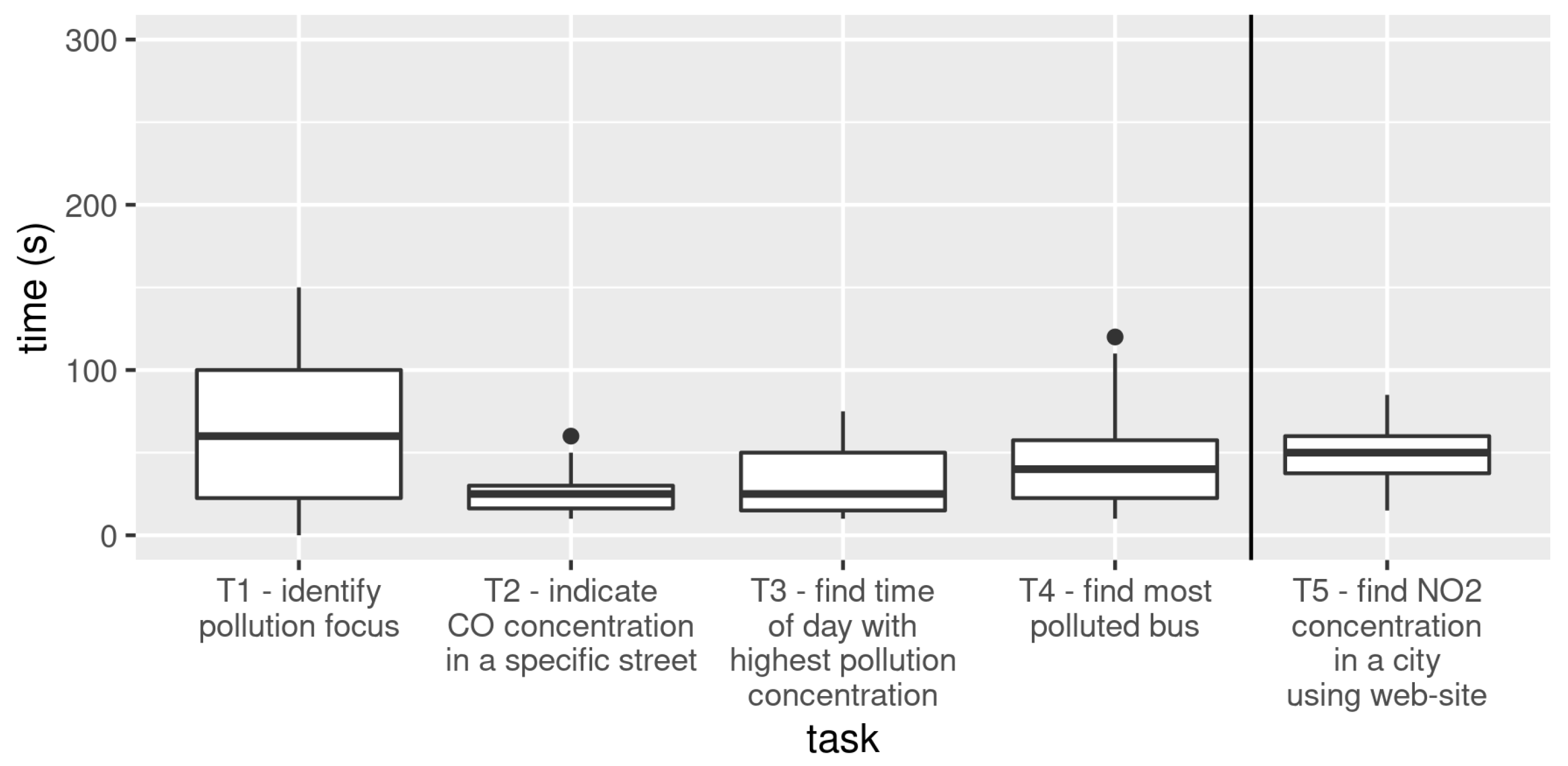
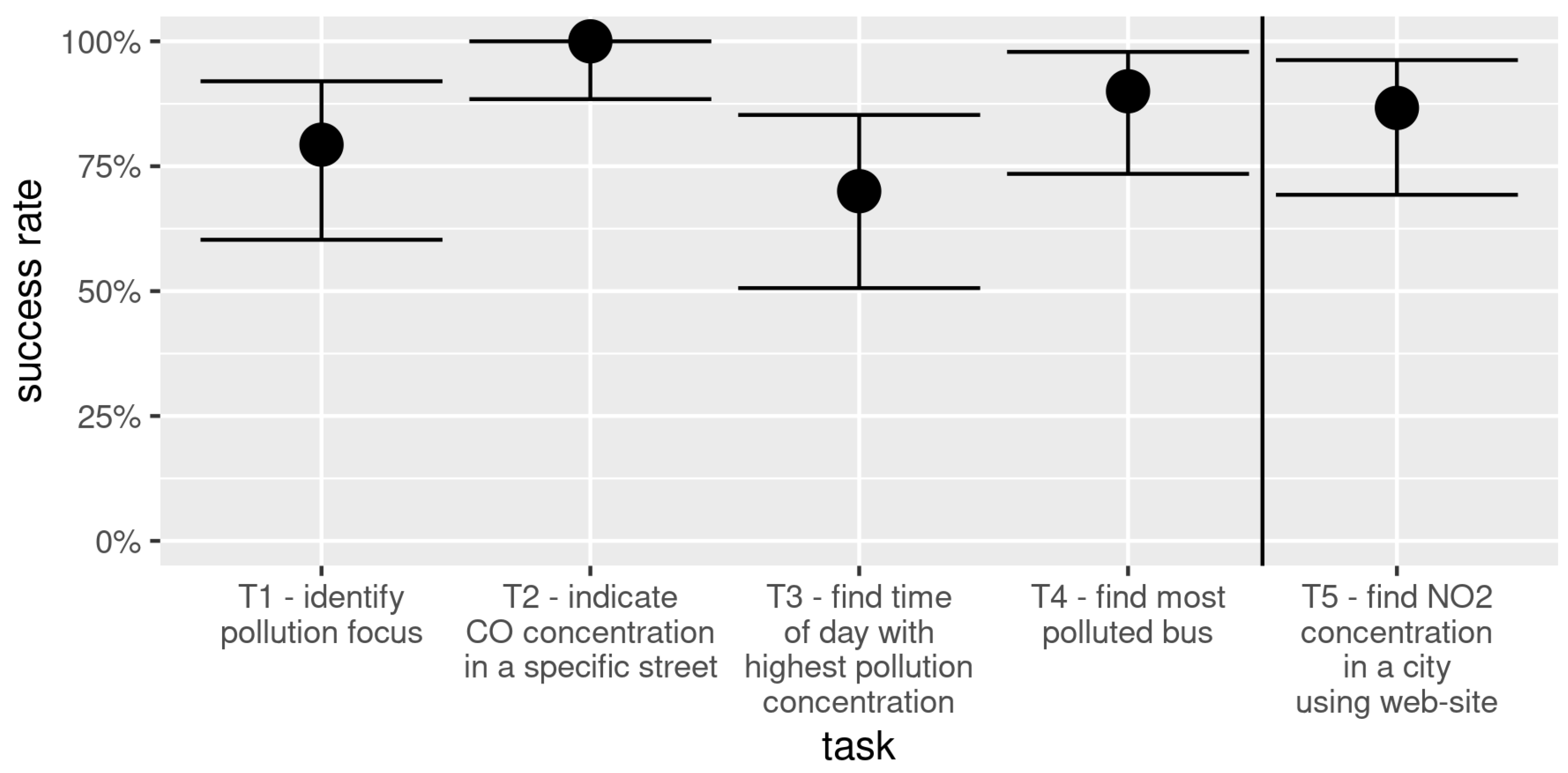
While executing the tasks, participants were allowed to change which pollution visual representation was the active one in each moment. In Task 1 (T1), participants were asked to identify the pollution focus. The goal was to assess how easily participants would find that the roundabout was the pollution source from the pollution gradient. In Task 2 (T2), participants were asked to indicate the CO concentration exact value in a specific street (Calle Uruguay), using the teleport functionality. The exact CO concentration is available to the user via the text-only pollution visual representation. In Task 3 (T3), participants needed to identify the time of the day with the highest pollutant concentration. In Task 4 (T4), participants needed to indicate which of three available buses were going through the most polluted route. This task involved the participant jumping from one bus to another. Finally, in Task 5 (T5), participants were asked to indicate the concentration of NO
2 in a specific city using the web-based traditional visualisation tool. Tasks (T1-T5) completion timings and associated success rates are box plotted in
Figure 12 and
Figure 13, respectively.
Considering the proposed tasks and the expected time to accomplish each task, satisfactory task completion times were obtained with a high success rate. The average task completion times ranged from 25 s on T2 to 65 s on T1, with the lowest average success rate being in T3 and the highest success rate being in T2. T1 was the longer task as it required participants to ride the virtual bus in order to find a pollution gradient they could exploit in order to find the pollution focus. Some participants preferred to find the focus as fast as possible whereas other took the opportunity to explore the environment. This diversity resulted in a considerable dispersion in terms of execution time across the several participants. In T3, participants were asked to show the billboard with the pollution evolution throughout the day and analyse it. As noted earlier, a poor interface design decision was made for this feature, which is believed to have negatively affected the success rate in T3, rendering it the one the minimum success rate.
It is important to compare the results of T2 with T5, as these tasks are equivalent, differing only in that one is performed in CityOnStats and the other with a web-based traditional visualisation tool. In T2, participants were asked to identify the concentration of CO in a specific street with CityOnStats, whereas in T5 participants were asked to identify the concentration of NO2 in a specific region using a webpage. The results seem to indicate that users perform better using CityOnStats than with the webpage. Concretely, 100% (95% CI with binomial test: 88% to 100%) participants successfully completed T2, i.e., using CityOnStats, whereas only (95% CI with binomial test: 69% to 96%) of them successfully completed T5, i.e., using the webpage. Hence, the success rate in T2 is higher than the success rate in T5 (, using a test randomisation method with resampling, ). Moreover, on average, participants who were successful in both tasks (26 out of the 30 participants), managed to complete T2 in 25 s and T5 only in 49 s. Hence, T2 was completed faster than T5 (, using a test randomisation method with combined groups, ). While the results suggest that CityOnStats provides a more intuitive way of accessing pollution data than a traditional solution, we must take into account that these are affected by usability issues that are independent of pros and cons of traditional visual representations of sensor data. Nevertheless, we can conclude that CityOnStats presents, at least, very competitive efficiency results compared to traditional visualisation methods.
As users are allowed to pick at each moment which pollution visual representation is on, it is possible to determine their preferences over pollution visual representations from their interaction history. This information can be useful to prioritise representations in future versions of CityOnStats and to select which representation to choose when adding pollution data in other 3D navigation tools.
Figure 14 depicts a box plot of the time proportions spent by the participants in each visualisation mode when performing the four first tasks (T1–T4). Discarding from the discussion the text-only visual representation mode, the following statistically significant conclusions can be drawn. Participants spent more time in the coloured-bus mode than in any other mode (
for all two-sample paired t-tests,
). The second most preferred mode was the coloured-cylinder mode (
for all all two-sample paired t-tests,
). Coloured-floor mode was preferred over displaced-floor (
for two-sample paired t-test,
). Fog was preferred over rain (
for two-sample paired t-test,
). These results suggest that there is an overall preference of avatar-centred representations (bus and cylinder appearances) over environment-centred representations (fog, rain, and floor).
4.4. Game Experience Questionnaire
To access user experience with CityOnStats, a standardised method used to evaluate experience with video games, called the Game Experience Questionnaire (GEQ) [
29], was run at the end of the testing session. The use of a game-targeted questionnaire is aimed at assessing how the tool contributes to cognitive states related to video-games, such as enjoyability and immersion.
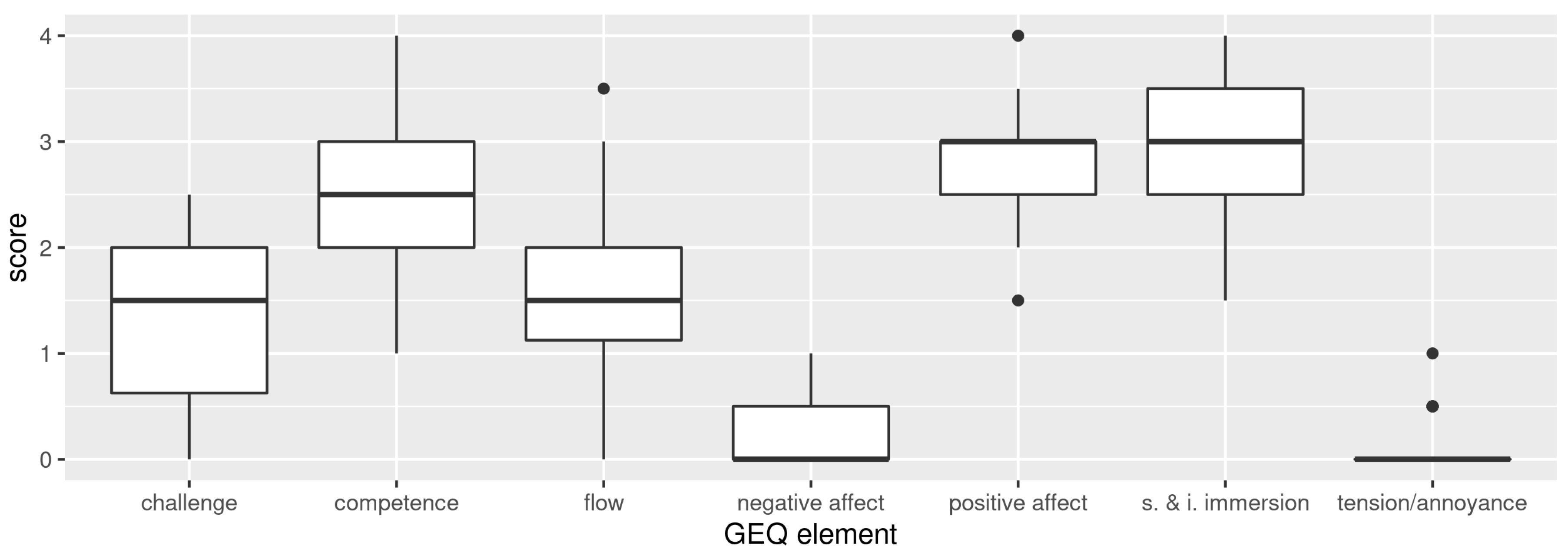
Figure 15 and
Figure 16 present the box plots obtained for the GEQ in-game module (derived from the main module) and the GEQ post-game module, respectively. Each assessed component is scored from 0 (most negative) up to 4 (most positive), being the higher the better.
The obtained results are promising, as better evaluations were obtained in the positive GEQ components (competence, immersion, flow, challenge, and positive affect) than in the negative components (tension/annoyance and negative affect). Concretely, all positive components were rated significantly higher than all negative components (
for all pair-wise Welch t-tests,
). The high score obtained for the immersion GEQ component (an average of 2.95 out of 4) indicates that the graphics are, at least, good enough. The results of the post-game module are also promising. Concretely, the positive experience component scored significantly higher than any other component (
for all pair-wise Welch t-tests,
). Nevertheless, it is possible to observe that the ratings magnitude in the post-game module are lower than in the in-game module. We suspect that this lower rating stems from the fact that, although CityOnStats exhibits similarities to video games, it lacks a rich narrative, which is a key element for a video game. Inevitably, participants compare their experience in CityOnStats with previous (narrative-rich) gaming experiences, influencing their assessment. Nevertheless, these results are similar to those obtained in other narrative-deprived videos games developed for academic purposes (e.g., [
30]), meaning that CityOnStats compares favourably with video games.
As shown, CityOnStats is at least as efficient as a traditional visualisation tool and, simultaneously, it produces an experience comparable to video games. This hybrid nature represents the value of CityOnStats, a tool to engage users to efficiently explore sensor data.
4.5. Subjective Questions
In order to obtain more parameters of comparison between the application and traditional visualisation methods, such as the web-based used in the tests, three subjective comparative questions were asked to all participants.
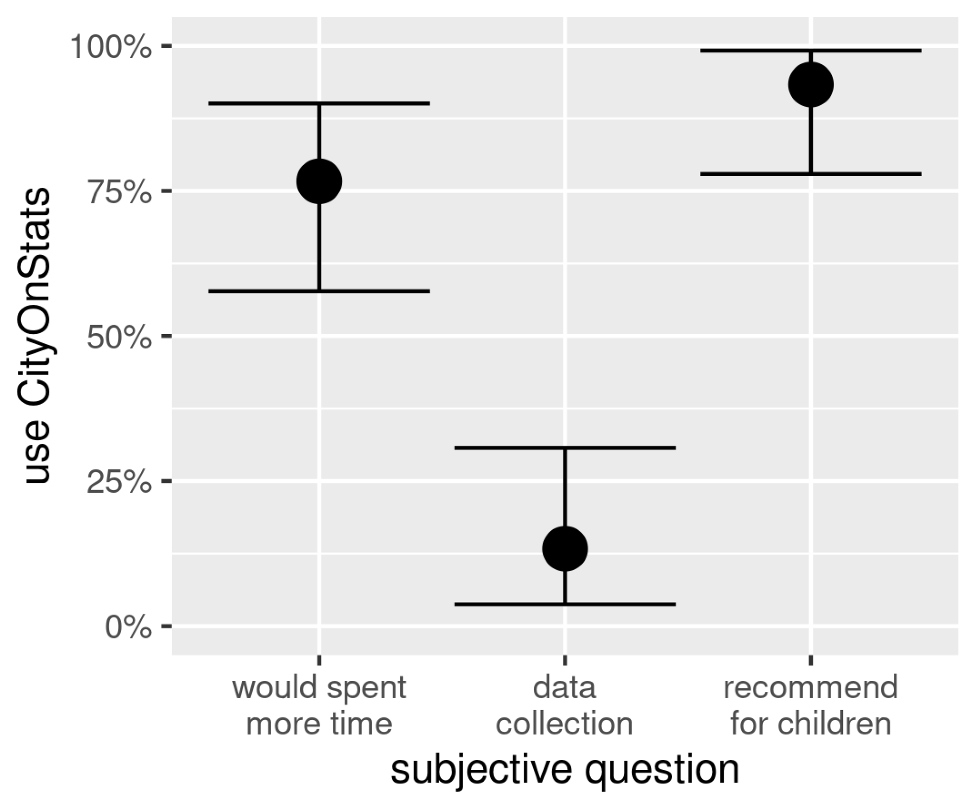
Figure 17 plots the ratio of participants that answered “CityOnStats” on a set of questions. The first question aimed at understanding which tool, CityOnStats or website, was better in engaging the user spending more time exploring it. CityOnStats was the choice of
(95% CI with binomial test: 58% to 90%) of the participants, with the fact that CityOnStats is more fun and more interactive being the most often provided justification.
The second question was intended to identify which tool, CityOnStats or website, would participants prefer to collect data in the future. CityOnStats was the preference of only (95% CI with binomial test: 4% to 31%) of the participants, with the fact that would be faster and more direct to obtain data with the website rather than with CityOnStats the most often provided rationale. This choice was already expected, since it is the method that participants are most used to. Interestingly, although participants feel that accessing data from the website would be faster and more direct, the already presented results indicate that task execution time was faster with CityOnStats than with a standard website. We believe that the overlay of a dense pollution heat map on the virtual world’s terrain would help users feel CityOnStats as efficient as a traditional visualisation tool.
The last question aimed at assessing whether CityOnStats could also serve a different audience, more specifically children. Participants were asked to identify which tool, CityOnStats or website, they would choose to transmit pollution-related knowledge to children. CityOnStats was the choice of (95% CI with binomial test: 78% to 99%) of the participants. The most recurring reason underlying this decision was more interactive and didactic, characteristics that participants consider important to keep children interacting with the tool, which is helped by the fact that children are akin to games with components identical to CityOnStats.
Finally, participants were also asked to globally report whether they felt that they understood CityOnStats. The fact that of the participants have reported that they understood CityOnStats adds up to the overall positive results obtained from the objective and subjective analysis. We can then conclude that CityOnStats is provided with a set of valuable ingredients for conveying air quality information to adults and young adults in an immersive and enjoyable way.
5. Conclusions and Further Work
CityOnStats, a novel tool developed to provide users, mainly adults and young adults, with a game-like 3D environment populated with air quality sensing data was presented, as an alternative to colour-coded plot-based traditional visualisation tools. With a game-like flavour, the tool aims at engaging users in exploring air quality sensor data, raising their awareness about air quality and its impact. Moreover, the visual representations and interaction mechanisms included in CityOnStats are expected to become valuable assets in existing and future 3D navigation tools (e.g., OpenStreetMaps) that aim at augmenting their outputs with air quality data. Usability tests showed that CityOnStats is at least as efficient as a traditional visualisation tool, but, in addition to that, it produces an experience comparable to video games. The resulting blend between visualisation efficiency and interaction enjoyability is a distinct trait of CityOnStats, rendering it a tool useful to engage users to efficiently explore sensor data.
To increase data analysis efficiency in CityOnStats, we intend to study ways of overlaying dense pollution heat maps on the virtual world’s terrain without breaking the game-like immersive ambience. Moreover, to increase the enjoyability of interacting with CityOnStats, we intend to seek for solutions to deepen its gamification, including richer interactive narratives. We also intend to assess the value of CityOnStats with children and its use as an andragogical game. In particular, we intend to prepare more extensive and prolonged usability tests in order to assess the ability of CityOnStats to foster learning of pollution-related concepts and how that would impact on users’ health. We also expect to link CityOnStats with real-time data generated by the sensor network developed under the ExpoLIS project.


