1. Introduction
To what extent do the geographical space of action or analysis (for example, county versus state) impact the size of regional and income inequality measures? What has been happening to regional and income inequalities within the US over the past century? What should the policy programs to tackle income and regional inequalities look like?
In order to provide more recent empirical support to such policy debates around the design of inequality mitigation policies and programs, this exploratory work aims to map and analyze historical patterns of regional and income inequality in the US by using state and regional panel data spanning over a century.
Spatial dimensions are just as important as temporal dimensions in the analysis of global and local inequality. As governments worldwide tackle inequality and devise programs for unequal regions, not only do they struggle with choosing the suitable geographical unit, but they are also challenged with the choice of appropriate geographic scale for action. For instance, should the US government formulate policy based on Census Regions or Census Divisions, since these constitute different geographic locations in the US? Economists have been applying insights from mainstream macroeconomics to the analysis of the region for the past two decades. Following the pioneering work by
Barro and Sala-i-Martin (
1991), regional economics disciplines have witnessed extensive research on the dynamics of intranational income disparities. Another strand of research analyses incorporated spatial dependence and spatial heterogeneity in comprehending regional economic growth processes (
Azam and Bhatt 2018;
Cartone et al. 2021;
Cuadrado-Roura et al. 1999;
De Menezes et al. 2012;
Fan and Casetti 1994;
Fingleton 1999;
Li and Wei 2010;
Rey 2001;
Yu and Wei 2003). Typically, these studies examined whether incomes between regions within a particular country diverged or converged over time while accounting for spatial effects. Some of these and other studies also analyzed income disparities within a region (
Artelaris and Petrakos 2016;
Crane et al. 2018).
The debate about inequality, whether it is decreasing or increasing, between and within regions in a country, parallels the convergence and divergence literature in economics. Convergence literature, which is entrenched in neoclassical economics, suggests that compared to rich economies, economies with lower GDP shares potentially catch up and converge relatively quickly to the level of GDP shares in more prosperous economies (
Haupt et al. 2018). The catchup or convergence is because lower GDP economies have a higher marginal rate of returns than richer economies. Conversely, divergence literature asserts that when it comes to incomes and resources, regions will tend to diverge rather than converge because of differing technological stock and historical precedence (
Bassino et al. 2019). Neoclassical economics steers the debate on regional and income inequality as well.
1 It perceives differentials in labor, land, and capital as contributing to disparities in income distribution. For instance, in regard to labor, income inequality is classically the function of value added by different categories of workers (
Becker 1957;
Lydall 1968).
The above theories are helpful when investigating regional and income inequality in the US states and regions. The sheer size of geography, economy, technology, population, and data availability make the US an excellent example for our analysis. It is of the utmost importance to closely examine interregional and intraregional inequality patterns to gain a holistic understanding of inequality and eventually suggest concrete policy measures to mitigate inequality in unequal regions. This analysis cannot be complete without accounting for geographical scale. A thorough look at the inequality literature suggests that inequality analyses use different geographical scales. In other words, inequality measurement is sensitive to the choice of geographical scale. The geographical scale, in turn, affects government policymaking if they want to tackle or implement programs for unequal regions.
Our work includes regional partitioning (
BEA Regions, Census Regions, and Census Divisions) in line with
Rey’s (
2001) work on regional inequality. However, this work adds on Rey’s analysis using an extended panel dataset spanning over a century. Moreover, it includes income inequality analysis and employs tools such as the geographical information system (GIS). This work focuses on two dimensions of inequality analysis: (1) an investigation of the relationship between inequality and geographical dependence (Moran’s I) and (2) an analysis of the role of geographical partitioning and its effect on inequality. Overall, based on an extensive dataset, our work offers a fresh and holistic perspective in demonstrating a relationship between inequality and geographical scale and establishing how inequality is sensitive to geographical scale choice. Besides, this analysis is more comprehensive because it encompasses both state-level and regional-level (partitions) data.
We specifically address four questions: (1) How do the trends of inequality change over the last century? (2) Is income inequality geographically dependent? (3) Is regional inequality spatially dependent? (4) Of the two regional inequalities—between and within—which one dominates? The questions lend themselves to the following three hypotheses:
Hypothesis 1 (H1). Income inequality is spatially dependent.
Hypothesis 2 (H2). Regional inequality is spatially dependent.
Hypothesis 3 (H3). Inequality (between and within) trends are sensitive to geographical scales.
To test these hypotheses, we conducted state and region-level analyses using our calculated inequality measures (Gini coefficient, Atkinson index, and Theil index for income inequality and Theil index for regional inequality decomposed into between and within Theil). Then, to check for spatial autocorrelation, we supplement our analysis by conducting Moran’s I test.
The paper is structured as follows.
Section 2 presents the summary of existing literature. Then,
Section 3 and
Section 4 discuss data and methods, respectively. Finally,
Section 5 shows the results, and
Section 6 concludes the paper.
2. Literature Review
The spatial approach to analyzing regional inequality is limited, although there is extensive literature discussing inequality using various other methodological approaches. Understanding income inequality, while accounting for geographical scale, is even more limited. Most studies that have used spatial techniques are in the US, while other limited studies are in China, Turkey, Brazil, Argentina, and India. These studies mostly conduct exploratory spatial data analysis (ESDA).
Rey (
2001) investigated most comprehensively the role of spatial dependence and geographic scale in analyzing regional inequality in the US over the 1929–2000 period. Using three geographical partitions (Census Regions, Census Division, and BEA Regions), he showed a positive association between Theil inequality measures and the degree of spatial autocorrelation. He also found that these partitions affect whether between or within regional inequality dominates the total Theil measures of regional inequality. His study offers a formal explanatory framework to supplement descriptive approaches in the existing literature. Earlier,
Conceicao and Ferreira (
2000) analyzed US county income inequality using Census Divisions to demarcate the partitions. They concluded that the within component of inequality was the most crucial share over the 1969–1996 period. Using the same partitioning for state income inequality data,
Fan and Casetti (
1994) also concluded that within region component accounted for the largest share of inequality in the US over the 1950–1989 period. Similarly,
Nissan and Carter (
1999) examined state income inequality over the 1969–1995 period. In addition to employing inequality decomposition for the states, they also used it for a subset of metropolitan and rural states. They found that inequality between regions declined in the early 1970s but increased through the 1980s, followed again by convergence in the 1990s. Meanwhile, they found strong evidence for within region inequality exhibiting a much stronger fall for all states and metropolitan and rural states.
Outside the US, inequality decomposition has been applied in several regional settings.
Gezici and Hewings (
2007) examined regional inequalities in Turkey at the interprovincial and regional levels. They tested the effects of aggregation and scale on identifying regional inequalities and found that overall inequalities across all the partitions are decreasing; however, spatial dependence is becoming more dominant. Their Theil index indicates that interregional inequalities increase while intra-regional inequalities decline for all spatial partitions from 1980 to 1997. Similarly, using a coastal-interior division of 30 provinces,
Fujita and Hu (
2001) explored regional income inequalities in China over the 1984–1994 period. They found that, although overall regional inequality was fairly constant, it showed a slight decline in the 1980s. Moreover, while intraregional inequality was initially larger than interregional inequality, the trend reversed later. More recent analyses were conducted by
Azam and Bhatt (
2018) for India for two data points of 1993 and 2001. However, these papers on Turkey, China, and India did not have long time-series data, limiting the strength of their arguments. Since changes in regional inequality patterns are usually very slow, any analysis with limited time data cannot capture the changes adequately. Our study addresses this gap by including data encompassing over a century.
Contemporary to
Rey (
2001),
Azzoni (
2001) conducted inequality analysis in 20 Brazilian states (by partitioning the states into five groups) over a relatively long period, 1939–1995. Overall regional inequality started to decline in 1965. Like Fujita and Hu, Azzoni asserted that interregional inequality was the most important contributor to widespread regional disparities.
In a similar vein, the geographical decomposition of inequality has been applied on a global scale. For example, analyzing 100 countries over a reasonable time period between 1950 and 1990,
Theil (
1996) found that most global inequalities were because of the differences between countries’ regional groupings instead of within.
All the above studies have illuminated the spatial structure underlying the dynamics of regional inequality in various settings. However, these studies have significant heterogeneities as they relate to the relative importance of the inter versus intra-regional inequality components. The causes of these heterogeneities are not clear whether they are due to differences in economic structures or due to differences in methodological choices.
As for income inequality, although there are details of how and why it is growing, a thorough investigation of how geography may impact income inequality is missing. It is this conception of income inequality that we consider in this manuscript. Here, income inequality means an unbalanced geographic distribution of income groups within a particular area (
Reardon et al. 2018). For example, high- and low-income households may be situated far from one another. Conversely, they may reside near one another in economically similar neighborhoods (
Neuman and Moland 2019;
Reardon et al. 2018). Put differently, lower-income households, in general, will live in neighborhoods with lower average incomes. Earlier research measured overall income inequality but ignored geographic differences in the analysis. Many studies documented income inequality trends (
Jargowsky 2003;
Lens and Monkkonen 2016;
Massey et al. 2003;
Owens 2015;
Owens et al. 2016;
Reardon et al. 2018;
Richards and Stroub 2020;
Watson 2009). The difference in trends is attributed chiefly to the nature of the metropolitan regions and the type of measures employed in the analyses. While varying on the specifics of the timing and the magnitude increase in the trend, such studies find that income inequality has increased within metropolitan areas in general. However, these studies lack any compelling account of how the relative position of a geographical unit, viz another unit, changes over time when it comes to income inequality, another gap this study aims to fill.
We provide a holistic analysis of regional and income inequality using a more comprehensive dataset covering almost a century (1915–2018) compared to the existing literature. We not only conform to standard descriptive approaches as used by
Azzoni (
2001) and
Li and Wei (
2010) in the context of Turkey and China but also exploit a better approach, as employed by
Rey (
2001). We also test the spatial dependence for both regional and income inequality for an extended period together and for a specific year using state-level data. We document the state’s relative position changes in income inequality over time and visualize them in schemes. Overall, we build upon the existing literature’s exploratory practices to better understand regional and income inequality.
3. Data
We compiled the dataset for this study from three different sources: the BEA, the US Census, and
Frank’s (
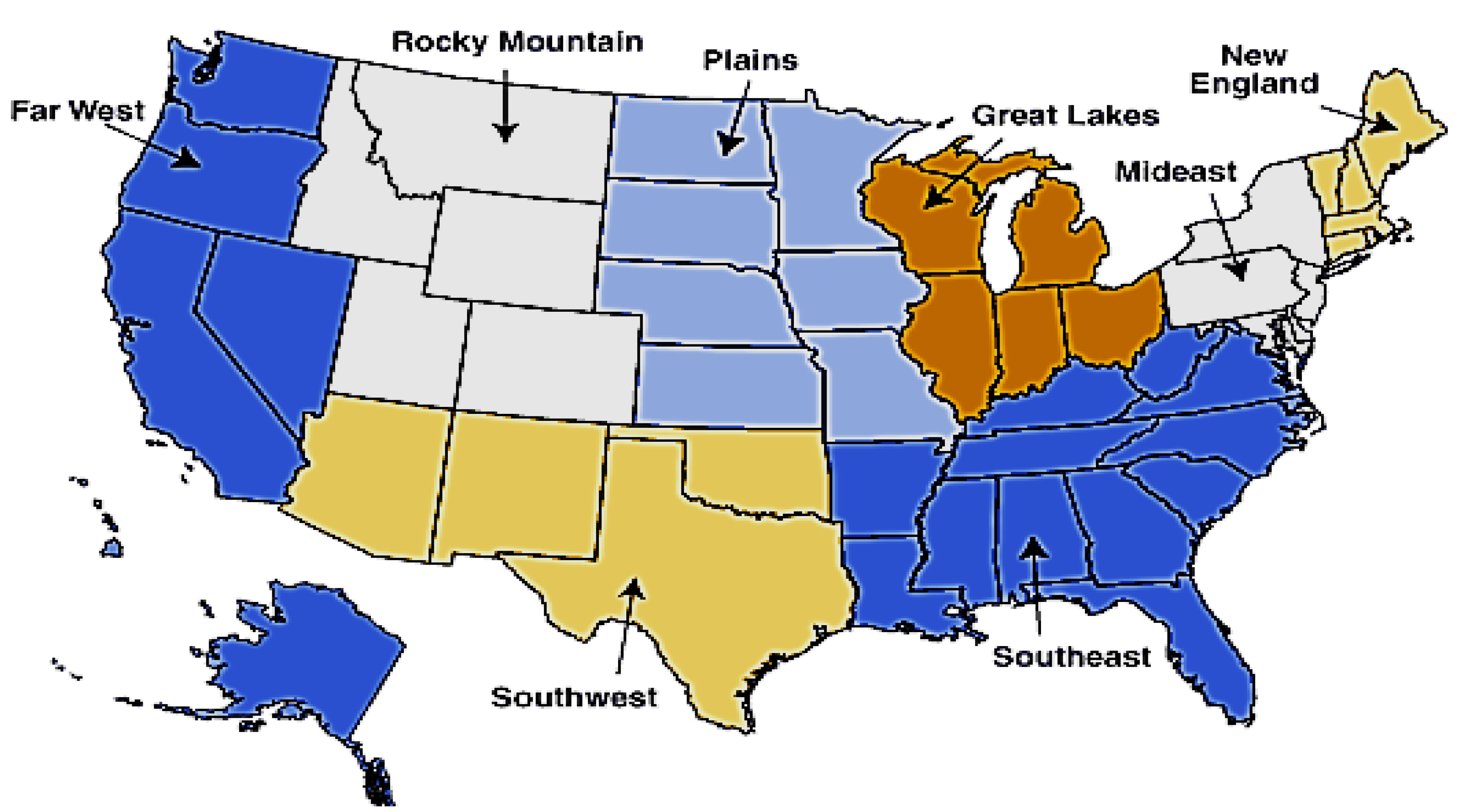
2014) income inequality data. Using BEA data, we calculated data on personal income, resident population, and personal income per capita from 1929 to 2018 at the state-, area-, and division-level. We also collected national-level personal income and population data for the same time period using BEA data. We constructed variables at the BEA regions level with eight regions: New England, Mideast, Great Lakes, Plains, Southeast, Southwest, the Rocky Mountains, and Far West (
Figure 1). We also constructed variables at the Census Region and Census Division levels. Census Regions included four regions: Northeast, Midwest, South, and West. Census Divisions comprised of nine Divisions: Northeast, Middle Atlantic, East North Central, West North Central, South Atlantic, East South Central, West South Central, Mountain, and Pacific (
Figure 2 for Census Regions and Divisions).
We collected income inequality data at the US state-level from 1917 to 2015 from
Frank’s (
2014) calculations. He calculated three different income inequality indices such as the Atkinson index, Gini coefficient, and Theil index (
Frank 2014). These three inequality measures capture different aspects of the income distribution (further discussed in
Section 4.1).
For GIS data, we used US shape boundary files. We excluded Alaska, Hawaii, and the District of Columbia for regional inequality analysis, similar to
Rey’s (
2001) partitioning because Alaska and Hawaii joined the federation only in the 1960s and are also non-contiguous. However, for income inequality analysis, we included the District of Columbia.
4. Methods
We conduct descriptive and exploratory spatial analyses at the state and regional levels of income and regional inequality using ArcGIS and Geoda programs. Using a comprehensive dataset compared to what has been used in the extant literature, several works within and outside the US inform our approach (
Li and Wei 2010;
Rey 2001). We also test the spatial dependence for both regional and income inequality for an extended period together and for a specific year using state-level data. We employed several geographical partitioning methods to see if regional inequality is sensitive to the scale and type of partitions. For income inequality, we conduct state-level analyses. We document changes in the state’s relative position over time and visualize them in schemes. Overall, our study uses standard tools and comprehensive datasets while building upon the current literature’s exploratory practices to better understand regional and income inequality patterns in the US.
The analysis in this paper involves several rounds of work. Firstly, we visualized US states’ income inequality data patterns from 1917 to 2015, as captured by various inequality measures. Secondly, we classified BEA state-level data into three partitions: BEA Regions, Census Regions, and Census Divisions. Thirdly, we calculated Theil total, Theil’s between, and Theil’s within indices for regional inequality. We also calculated Moran’s I for regional and income inequality and plotted them in figures.
2 Finally, we used Moran’s I to determine spatial autocorrelation. Based on a spatial contiguity matrix, this index first creates a weight matrix. It gives a value of 1 if the state shares borders and 0 otherwise. In this paper, we calculate Moran’s I in Geoda and Stata. A value of Moran’s I higher than 1 indicates a positive spatial autocorrelation.
To understand the distribution of incomes and income share of each region for regional inequality, we calculated GDP shares for all the three geographical partitions as shown in
Table 1,
Table 2 and
Table 3 for descriptive purposes. This broad statistic is one way of comparing regions over time and among each other (
Rosés and Wolf 2018).
3 It also shows the extent to which regions in the US have become more or less similar in economic potential over the last century. For Census Regions, we see a declining trend of GDP shares for Northeast and Midwest from 1930 to 2018. However, we observe an increasing trend of GDP shares for South and West in the same period. If we consider within regions, the biggest shareholders, such as Northeast (39.4%) and Midwest (31.3%) in 1930, have shrunk (20.7% and 19.7% respectively) in 2018. On the other hand, small shareholders, such as South (17.1%) and West (11.2%) in 1930, expanded (33.2% and 25.3% respectively) in 2018.
Likewise, for Census Divisions, we see a declining trend of GDP shares for Northeast, Middle Atlantic, East North Central, and West North Central from 1930 to 2018. However, we observe an increasing trend of GDP shares for South Atlantic, East South Central, West South Central, Mountain, and Pacific in the same period. If we consider within regions, the biggest shareholders, such as Middle Atlantic (30.8%) and East North Central (22.4%) in 1930, have shrunk (15.1% & 13.5% respectively) in 2018. On the other hand, small shareholders, such as South Atlantic (7.7%) and Pacific (8%) in 1930, expanded (18.3% and 18.6%, respectively) in 2018.
In a similar vein, for BEA Regions, we see a declining trend of GDP shares for Northeast, Mideast, Great Lakes, and Plains from 1930 to 2018, while an increasing trend of GDP shares for Southeast, Southwest, Rocky Mountains, and Far West. If we see within regions, the biggest shareholders such as Mideast (33.5%) and Great Lakes (22.4%) in 1930 has shrunk (17.9% & 13.5% respectively) in 2018. On the other hand, small shareholders such as Southeast (11.1%), Southwest (4.7%), and Far West (8.8%) in 1930 have expanded (22.5%, 11.3%, and 19.4%, respectively) in 2018.
Overall, we see that bigger shareholders are shrinking, and smaller shareholders expand in terms of GDP size. This indicates that disadvantaged regions are catching up, and overall regional inequality has been declining. The catching up also corroborates the regional convergence hypothesis, which is discussed a lot in the standard economic convergence literature.
4.1. Measurement of Inequality Indices
Measuring inequality can be complicated. However, Theil’s inequality measure (
Theil 1967) is the most extensively used approach for analyzing regional inequality.
4 It is shown as:
where
n denotes the number of regions/areas/states and
Si represents the total personal income of an area/region/state (i.e., the GDP share of the area) divided by US personal income.
T usually ranges between the interval [0; log(
n)], with 0 indicating perfect equality, and the value of log(
n) occurring when all the income is concentrated in one region. Additively decomposable,
T measures systematic or global income inequality across the regional observations at a particular point in time (
Shorrocks 1984). Inequality between and within different partitions of the observational units constitutes global inequality.
T can measure/decompose the extent of both such inequalities in regional groupings.
where
In a spatial context, the between-group part captures interregional inequality. Conversely, the within-group term measures intraregional inequality. Put differently, the interregional term measures the distance between the average incomes of the aggregate areas/divisions/regions. The intraregional part measures distances between the incomes of regions belonging to the same group.
Theil index can also be used to measure income inequality. To measure income inequality, we use three other measures along with the Theil index: the Gini coefficient, Atkinson index, and Coefficient of variation (CV or Relative mean deviation). As a commonly used measure of income inequality, the Gini coefficient is a measure of statistical dispersion representing the income distribution of a nation.
5 While a Gini coefficient of 0 means perfect equality, meaning every individual has the same income, a Gini coefficient of 1 represents perfect inequality where only one person has all the income. So, a higher Gini coefficient indicates higher income inequality. Contrarily, the Atkinson index is a normative measure that imposes a coefficient ε to weight incomes. It is useful in determining which end of the distribution contributes to the income inequality (
Atkinson 1983,
1987;
Atkinson and Stern 2017). The CV, on the other hand, is the ratio of the standard deviation to the mean (
Ospina and Marmolejo-Ramos 2019). It shows the degree of variability with respect to the mean of the population. It is also referred to as Relative mean deviation.
We have used all of the above measures of inequality since they signify various aspects and patterns of income distribution across individuals and regions. While the Gini coefficient is the most commonly used descriptive measure of inequality, it is not perfect and may not be used as an ideal measure of inequality (
De Maio 2007;
Siddique 2021;
Trapeznikova 2019). All these measures, in general, have different strengths and weaknesses. For example, the Atkinson index, which emphasizes the normative aspects of inequality, has several advantages over the descriptive Gini coefficient. As opposed to the Gini coefficient, the Atkinson index has more subgroup consistency, meaning if inequality declines in one subgroup such as a region but remains unchanged in the rest of the regions, the overall inequality index declines. The Atkinson index is also more sensitive to the lower end of the distribution, thus capturing better issues, such as poverty and child mortality, whereas the Gini coefficient puts equal weights on the entire distribution. On the other hand, CV is more sensitive to the right tail of the distribution, which largely represents the rich segment of the population. Moreover, CV is independent of the income level since it captures variability relative to the mean of the distribution (
Trapeznikova 2019). However, both CV and Gini coefficient produce an identical ranking of the level of inequality if Lorenz curves do not cross, but they can produce a non-identical ranking if Lorenz curves cross.
6 Regarding Theil index, it has an added advantage in that it can decompose inequality into within- and between-group inequality, which is not possible in other inequality measures.
5. Results & Analysis
5.1. Income Inequality
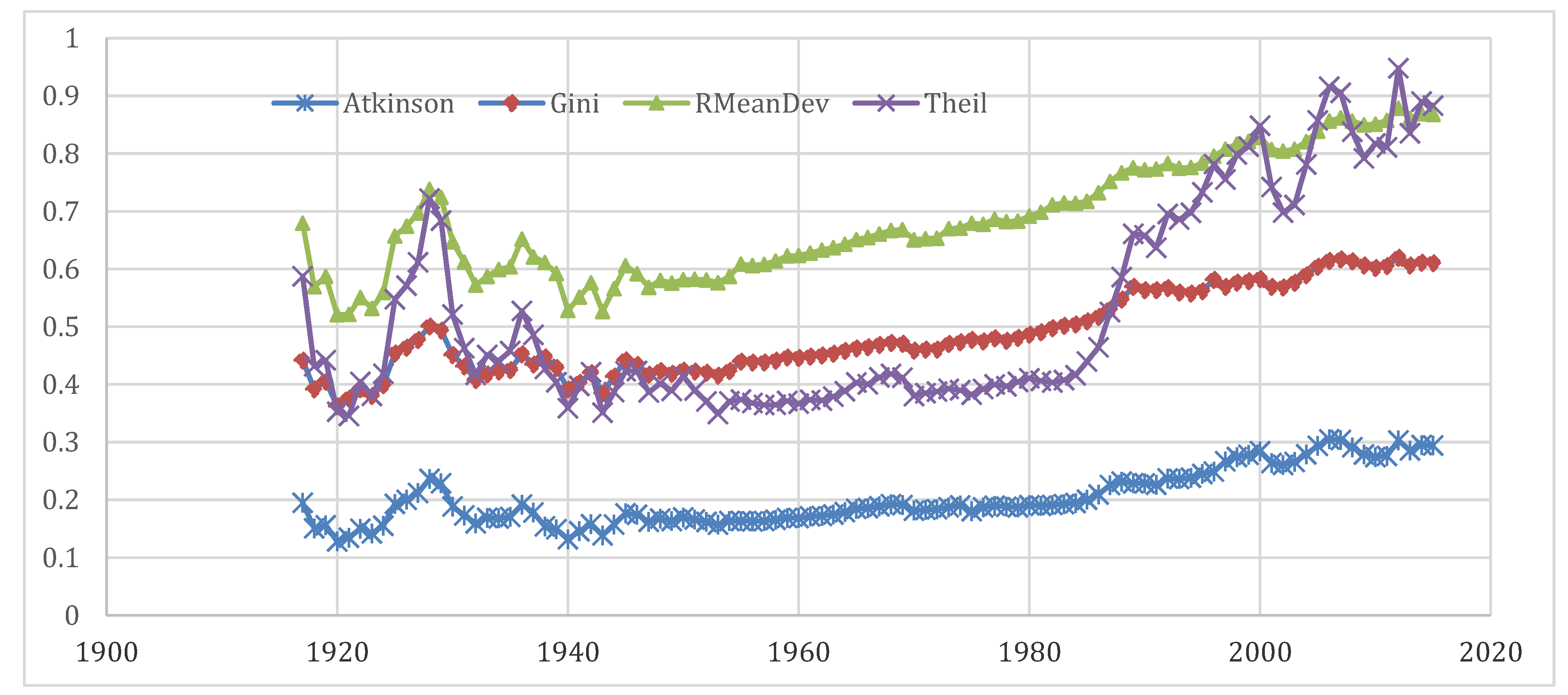
Figure 3 presents the income inequality trends from 1915 to 2015 as measured by the Gini coefficient, Atkinson, Relative mean deviation, and Theil indices. The state-level inequality panel data were averaged by year to map and create the inequality indices for the entire US. The figure reveals that all the income inequality measures were rising in the US except for around the Great Depression and World War II. Only during these two big crises was income inequality declining. Interestingly, this happened not only in the US, but also around the world. Walter
Scheidel (
2018), in his recent book “The Great Leveller,” has recorded the leveling effects of wars and depression. He argues that the “Four Horsemen” of leveling, which include mass-mobilization warfare, transformative revolutions, state collapse, and catastrophic plagues, have frequently damaged the fortunes of the rich. Other than these crises, data points for most other times show that the inequality was worsening in the US.
However, the inequality measures exhibit variation in magnitude, which is understandable as they capture different aspects of income distribution. The Relative mean deviation, which suggests the percentage of the total income needed to be transferred to achieve similar income levels, has the highest magnitude. On the other hand, the Atkinson index, which informs about the level of utility gained from redistribution, is smaller in magnitude. The Atkinson index was fairly stable till the early 1980s and then started rising, which means income distribution at the bottom has deteriorated since the 1980s. The two other conventional measures of income inequality, the Gini coefficient and Theil index, have almost the same magnitude on average, although the Theil index shows a lot more volatility than the Gini coefficient, particularly in recent and initial decades of our study time period.
7However, the above time series trend analysis does not reflect the regional transformation or changes of the relative position of a state compared to another state over time. This required us to disaggregate the income inequality measures data by individual states to see whether the rising trend in income inequality holds for every state in the US or is it only the case in some states.
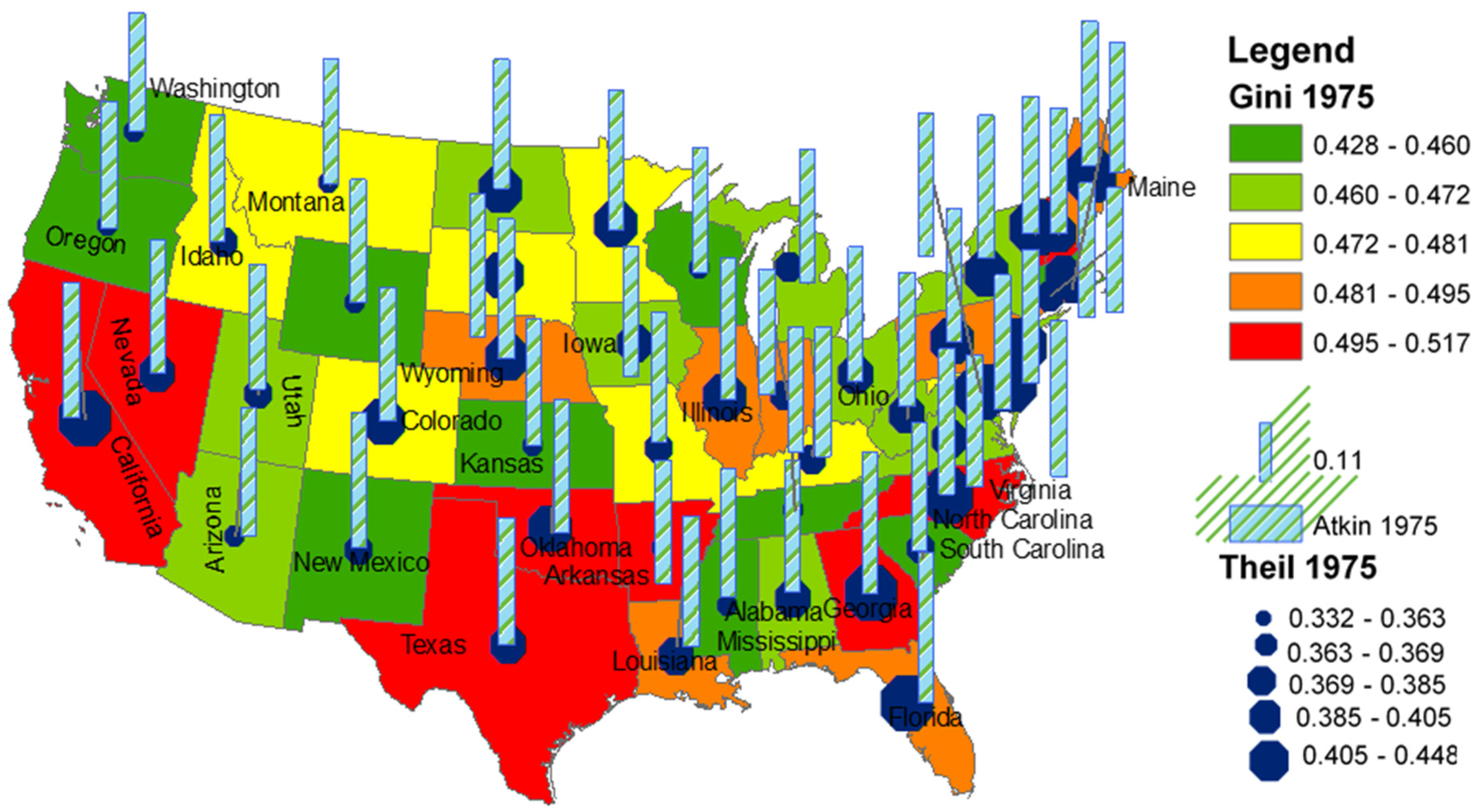
Scheme 1 shows the income inequality variations measured by the Gini coefficient, Theil, and Atkinson indices across the US states for 1917, the first year of our study period. The color-coded state polygons show the Gini coefficient, where red-colored states have relatively higher income inequality, and green-colored states have lower income inequality. The Theil income inequality index is presented by graduated blue colored octagon symbols where bigger octagon states are more unequal than the smaller octagon states. For the Atkinson index, bars with a higher height show high unequal states, and low-height bars show low unequal states. Overall, Map 1 presents a cluster of highly unequal states in the northeastern corner that includes the states of New York, Ohio, Vermont, Massachusetts, New Jersey, and others. The second high category of unequal states, such as Maine, Michigan, Virginia, Illinois, and others, is also located around the highly unequal states. On the other hand, most of the least unequal states are in the middle, some are in the west, except California, and others are in the south, except Louisiana.
However, the distribution pattern of highly unequal states in
Scheme 1 for the year 1917 does not stay the same in
Scheme 2 for the year 1975. In
Scheme 2, we see that the southern states, such as Texas, Oklahoma, Arkansas, Georgia, and North Carolina, among others, are the most unequal. On the other hand, many northeastern states (New York, Ohio, and others), which were highly unequal states in 1917 are not the most unequal states in 1975. In the west, California became one of the highly unequal states, along with Nevada. Interestingly, the overall inequality distribution does not look like any clustered pattern, except in the south, which is significantly different from the distribution pattern of unequal states in 1917. This transformation of states in terms of income inequality provides us with information that the spatial dependency of inequality distribution is not stagnant. This pattern changes again, as we see in
Scheme 3 for the year 2015. In 2015, we did not observe any spatial clusters as found in the last two schemes. Instead, the distribution of unequal states in
Scheme 3 seems more scattered.
Pointing out some interesting facts of
Scheme 3, the State of New York, one of the highest unequal states in 1917, turned into least unequal in 1975, but again became one of the most unequal states in 2015. Maine, a vastly unequal state in 1915, turned into a relatively very equal state. Similarly, Florida, one of the most equal states in 1917, started to be more unequal and recently became one of the vastly unequal states. On the other hand, many states remain in the category of relatively equal states over the entire century, such as New Mexico, Kansas, Arizona, and Alabama. Although there has been a continuous rise in income inequality in the US, as evidenced in the line chart in
Figure 3, the relative inequality status of many individual states has experienced a dramatic transformation. Note that it may be the case that some states were highly unequal in terms of income distribution in the initial year of our study period and recently have turned into more equal states. However, their actual income distribution may not be better in recent years; it is just a relative change in position. A careful look at the ranges of the Gini coefficient in the three schemes lends credence to this claim: 0.24 to 0.73 in
Scheme 1, 0.43 to 0.52 in
Scheme 2, and 0.55 to 0.71 in
Scheme 3. The ranges show that the minimum Gini coefficient of 0.24 in 1917 has increased to 0.55 in recent years. It means a group of least unequal states in recent years may not be better off compared to many low and medium categories of unequal states. This is even more pronounced when it comes to Theil’s measures of income inequality. However, broad ranges from low to high Gini coefficient are declining, which means differences in income inequality between states are falling over time. Another noticeable pattern change relates to the Atkinson index (shown by bars in the schemes). The northeastern states having higher bars that reflected worse income distribution in the early 20th century (
Scheme 1) have changed significantly in the later 20th century and the current century. We see the bars of the Atkinson index in
Scheme 2 and
Scheme 3 are higher and almost the same across all states, which most likely indicates that income distribution at the bottom has worsened in recent decades.
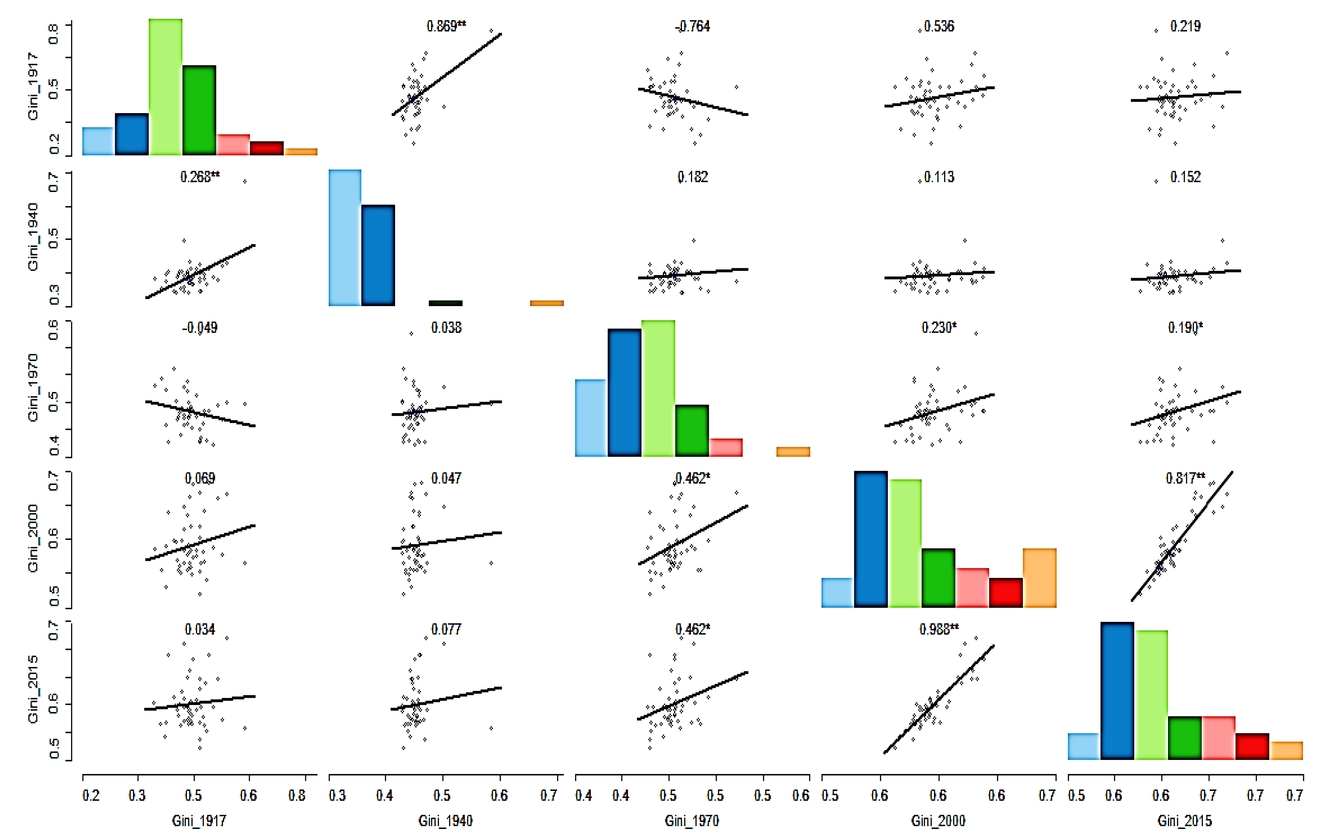
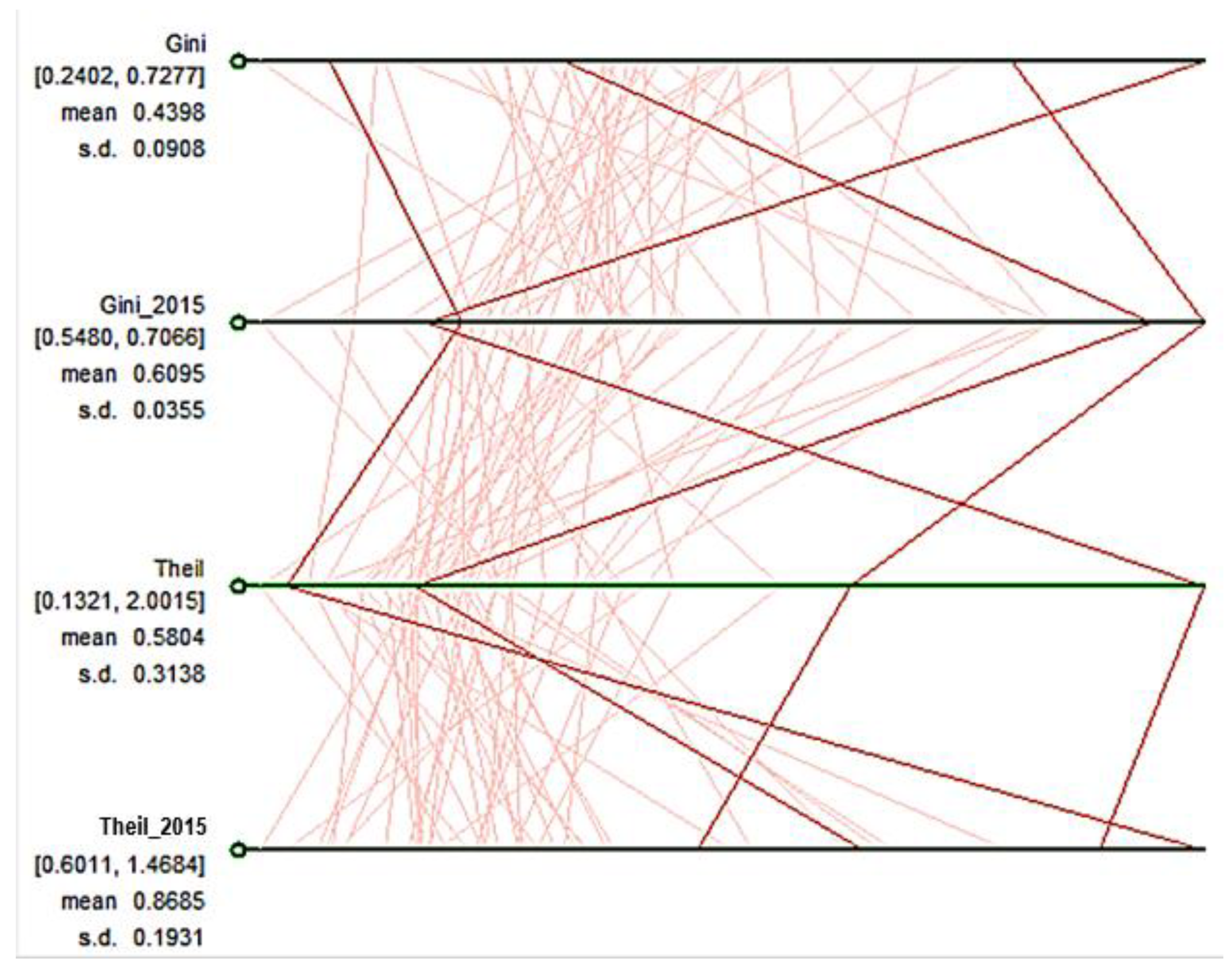
To see the relative changes in the ranking of states in terms of income inequality, we plotted a scatter plot matrix in
Figure 4 and a parallel coordinate plot in
Figure 5. In
Figure 4, we plotted the Gini coefficient for 1917, 1940, 1970, 2000, and 2015 on both horizontal and vertical axes. We notice variations in the pattern of changes by looking at the plot. What we see is that many of them have a positive relationship in the scatter plot matrix, which indicates that some states retained their relative income distribution ranking/position over the last century. In other words, positive trends show stability: a relatively equal or unequal state holds its respective status. Contrarily, we also see that some of them exhibit a negative relationship, as shown in downward sloping lines, suggesting that unequal states have turned into equal states and vice versa. Others do not display any relationship, as evident in flat lines, which means many states remain the same.
The parallel coordinate plot in
Figure 5 shows the changes for each state in terms of the Gini coefficient and Theil from the initial year of the study period (1917) to the latest year (2015). The upper two blue horizontal lines are for the Gini coefficient measure, and the lower two are for the Theil measure. Each vertical red line represents a state. It clearly shows that while some states did not change much in terms of their relative positions, others have moved from the bottom to the top and vice versa. The finding shows that income inequality in the US is neither a stagnant phenomenon nor even the characteristic of a region. It is likely a result of each states’ socioeconomic policies that they pursued.
Our findings on income inequality are broadly in consensus with the existing literature (
Meyer and Sullivan 2017;
Rubin and Segal 2015). For example, the current literature talks about how inequality has been rising in the US, which we demonstrated here through multiple measures of inequality side by side. Similarly, our results align with the current literature, which discusses the changing nature of income inequality status for a state (
Arčabić et al. 2021;
Ryscavage 2015).
5.2. Regional Inequality
This section moves our analysis to regional inequality measured by the Theil index, as explained earlier. We perform these analyses on aggregated units using different regional aggregation scales, such as Census Region, BEA Region, and Census Division. We observe variations in trends and estimates across different geographical scales, which is often referred to in the literature as a modifiable ariel unit problem (MUAP), meaning that when we change the unit of regional aggregation, the inequality level changes (
Lloyd 2014;
Manley 2014;
Openshaw 1984).
8 The key message we can draw for policymakers is that they should not depend on one measure estimated based on one regional aggregation unit.
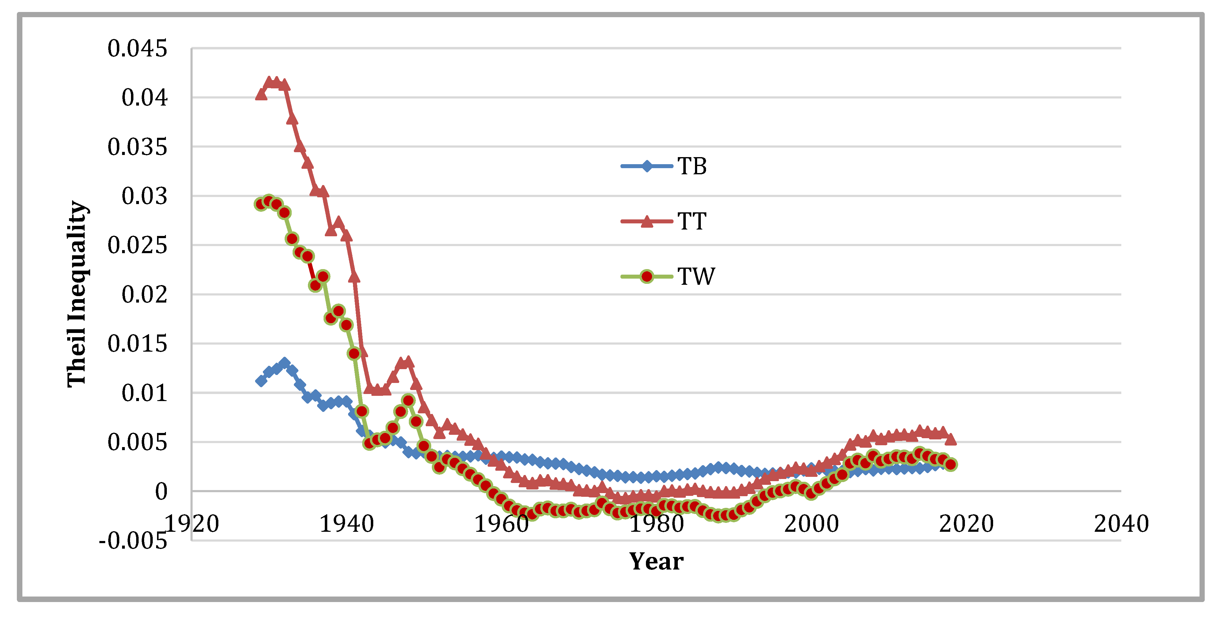
Figure 6 presents the total Theil (TT) and its decomposition into the Theil between (TB) and Theil within (TW) parts.
9 In this figure, the classification of the 48 states is based on the US Census Regions as defined in
Table 1. This is the same classification as
Rey (
2001) used, although our sample covers a larger number of years. In those 98 years, the within component exceeds that of the between share until 1950. After 1950, between share dominates until 2000 when the two components start to converge. For the most part, these results are in line with those reported by
Rey (
2001).
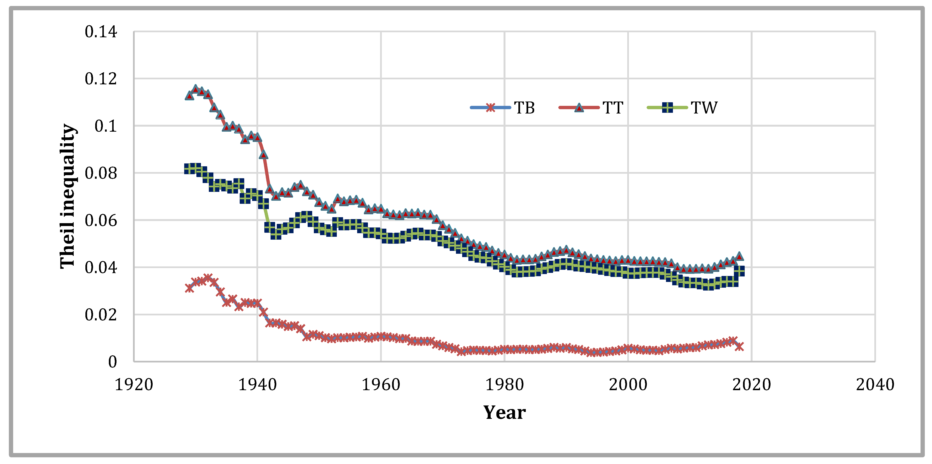
Figure 7 displays the impacts of modifying the classification scheme from the four Census Regions to the nine Census Divisions, as mentioned in
Table 2. In each of those 98 years, the within component was dominating. This finding reflects an increase in the internal heterogeneity of the regions.
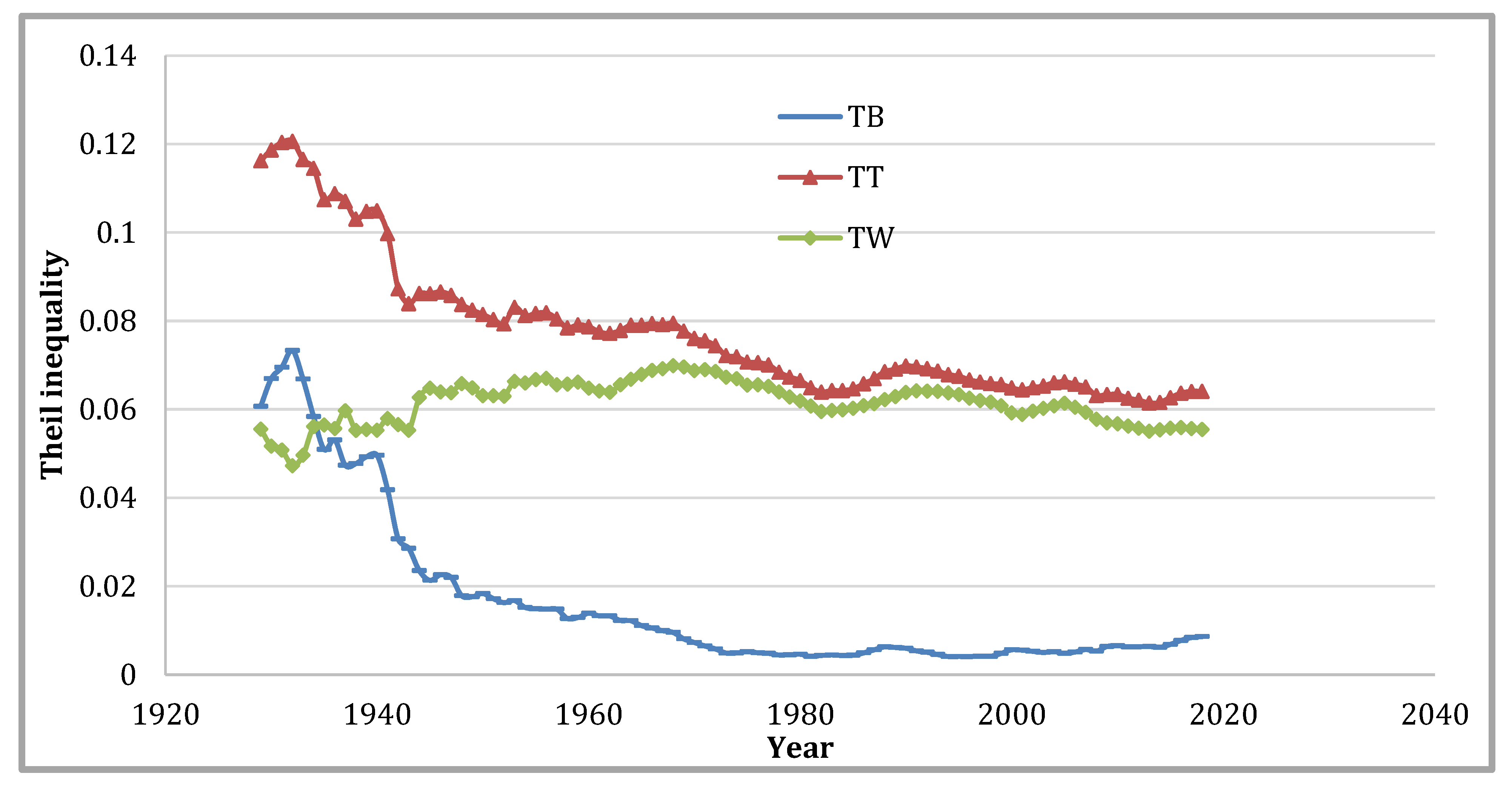
Figure 8 shows altering the classification scheme to the BEA eight regions listed in
Table 3. We see a sudden initial reversal (until 1940) in the relative importance of the two components of inequality. While there is a high similarity between the Census Divisions and the BEA Regions, the between inequality proportion is relatively higher in the BEA classification. Furthermore, the portion attributed to the between part employing the BEA Regions in the first 20 years of the study period is roughly similar to that attributed to the within part during the same period when the Census Divisions are used.
These between parts are isolated in
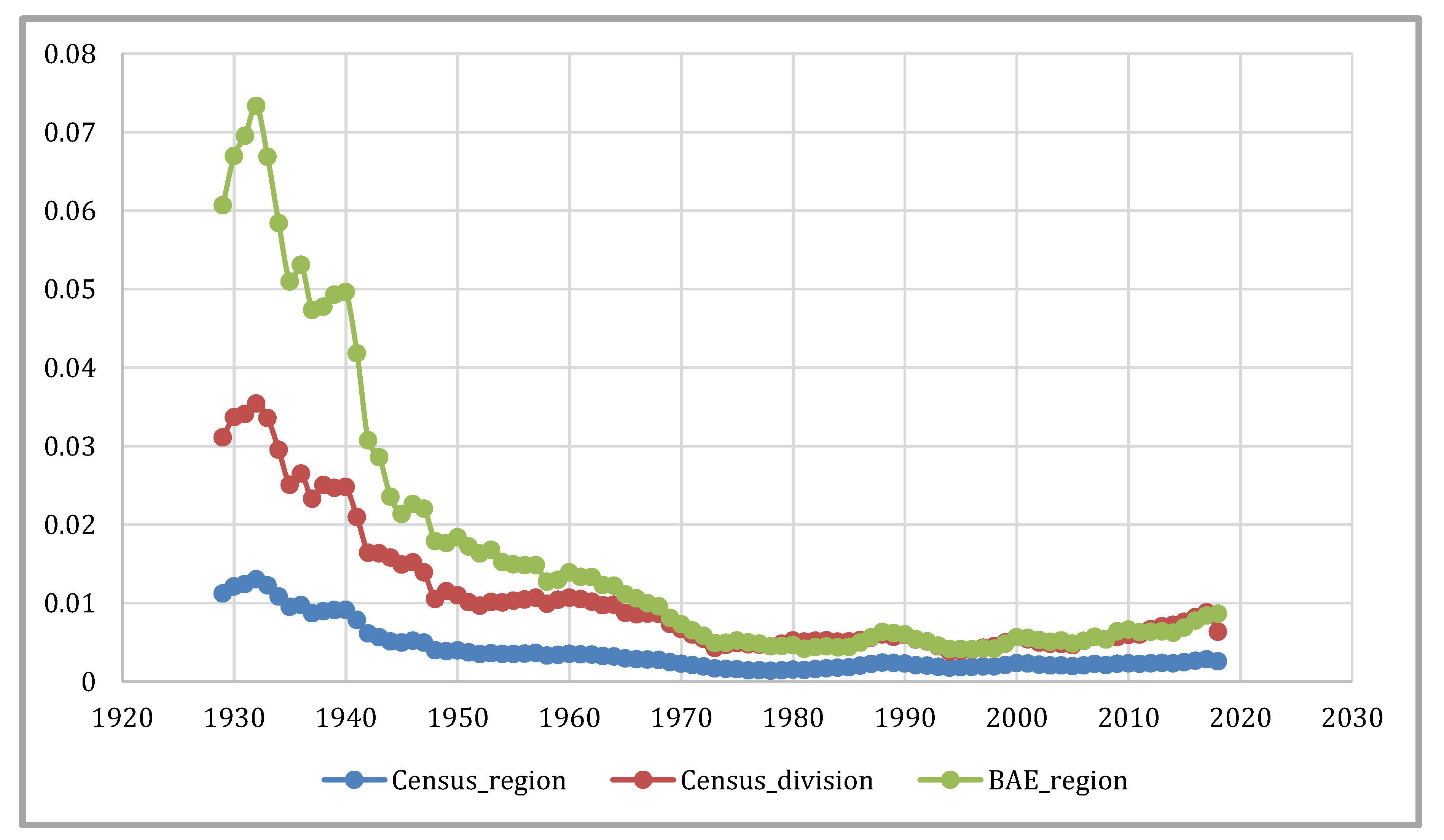
Figure 9 showing the much higher between share each year in the sample when the classification is based on the BEA Regions. The larger number of groups in the BEA Regions and Census Divisions compared to the Census Regions illustrates why the former have larger between parts than the latter. However, the BEA Regions have higher between inequality than the Census Divisions, notwithstanding that the former has a smaller number of groups of states. Therefore, the between inequality is not a simple function of the number of regional groupings used.
Similarly, the within parts are isolated in
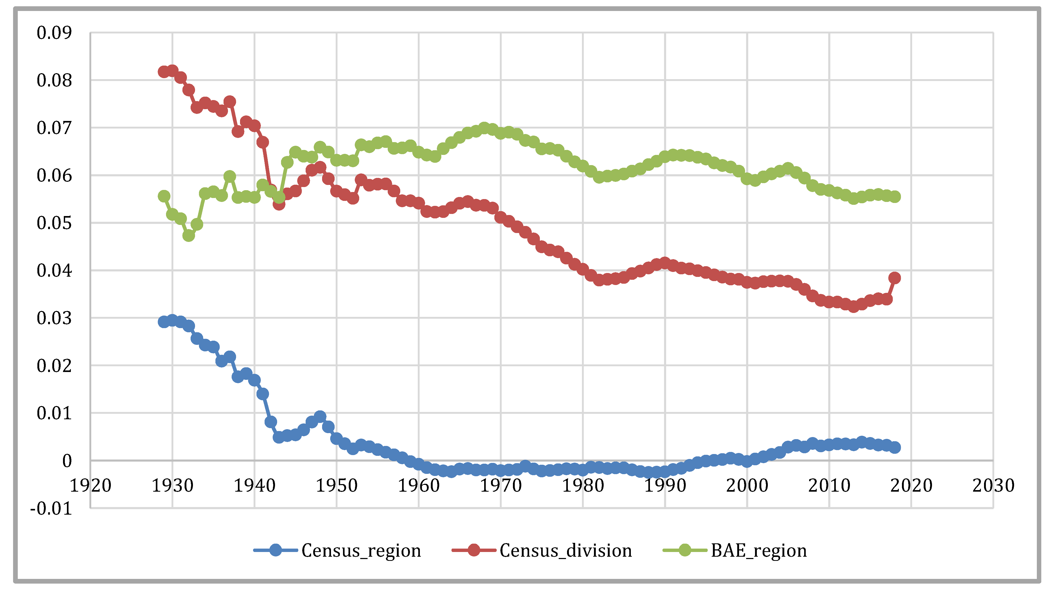
Figure 10, showing the much higher within share in the sample until 1940 when the classification is based on the Census Divisions. After 1942, we see a higher within share in the sample for BEA Regions. For within inequality too, a larger number of groups in the BEA Regions and Census Divisions compared to the Census Regions illustrate why the former have larger within components than the latter.
The rankings of the three partitions with respect to the share of total inequality claimed by the between and within components are consistent across the entire 98-year period, with the Census Division/BEA scheme at the top and the Census Region partition at the bottom. A sharp declining trend for between inequality and a relatively stable within inequality trend for BEA Regions suggests that the BEA Regions have become homogenous quicker than the other two partitions.
Regardless of the differences in magnitudes, all three classifications provide between and within inequality shares declining over time. This general fall was also observed in the total inequality measure (total Theil).
These results align with the extant literature findings. For instance,
Rey’s (
2001) analysis also indicates falling inequality shares over time. Similarly, the predominance of the within share of inequality for Census Divisions and the between share of inequality for BEA regions, as well as the oscillating nature of within and between shares of inequality for Census Regions, perfectly match the existing research (
Conceicao and Ferreira 2000;
Rey 2001).
5.3. Moran’s I Tests of Income and Regional Income Inequality
We applied the popular Moran’s I test to check for spatial dependence of income and regional inequality (
Anselin 1988). Moran’s I provides a reliable indicator for spatial autocorrelation. A positive autocorrelation occurs when similar values for the random variable are clustered together in space and vice versa (
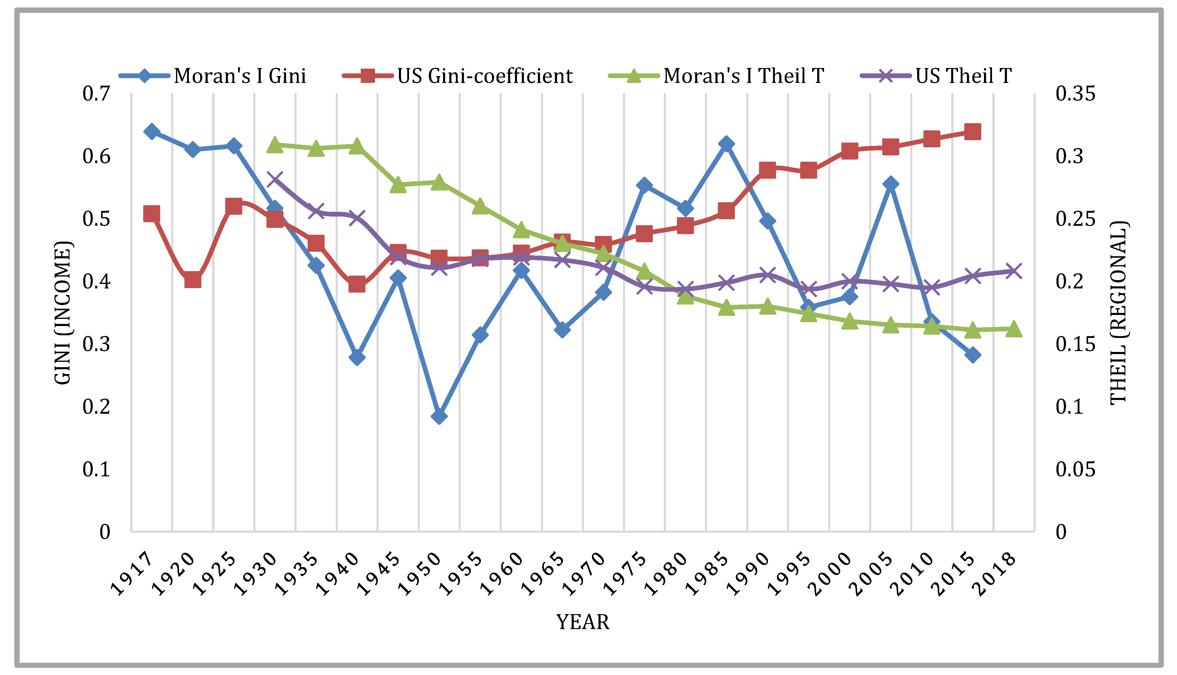
Upton and Fingleton 1985). We conducted Moran’s I test for a specific year as well as for all years together. The results of specific years Moran’s I for Gini coefficient and regional Theil measures are plotted in
Figure 11 to show the trend of spatial dependency. A queen contiguity matrix
10 with Euclidean distance was used to estimate the ’Moran’s I value. We chose 4 K-nearest neighbor in this estimation. A value of Moran’s I statistics close to 1 signifies strong and positive spatial autocorrelation, whereas values around –1 represent negative spatial autocorrelation.
Figure 11 shows the historical inequality trends and their Moran’s I test results. While Theil regional inequality and its spatial dependency are declining over time, the Gini income inequality coefficient is rising, and its spatial dependence is quite oscillating. The results of all years together are presented in
Table 4.
11 The table shows that the Moran’s I test results are statistically significant at a 5% level for both the specific year and all years together. The finding suggests that there is spatial autocorrelation between space and both regional and income inequality measures. The magnitudes of dependency of income and regional inequality measures vary such that regional inequality measures are considerably higher than income inequality measures. In other words, income inequality is relatively less spatially dependent than regional inequality. This finding holds ground in light of our previous results that demonstrated that the distribution of high and low unequal states was quite changeable, suggesting income inequality is less dependent on space.
Our finding concerning the spatial dependence of inequality is in agreement with the extant literature’s findings on inequality and spatial correlation (
Rey 2001). Similarly, the existing literature corroborates our result regarding the relative strength of spatial correlation for income viz-a-viz regional inequality (
Rey 2018).
6. Conclusions
This work examined the role of spatial dependence and spatial partitioning in analyzing income inequality and regional inequality patterns in the US in the periods 1915–2015 and 1929–2018, respectively. We found income inequality to be mainly increasing, whereas regional inequality—both between and within—gradually decreasing in the US for most of the century. Moreover, both within and between components of regional inequality are sensitive to regional partitions. Policymakers working on redistributive policies should know these findings while devising programs to tackle regional disparities.
The partition analysis also revealed that the relative importance of the between and within inequality components is not a mere function of the number of groups used in a partition. As for spatial dependence, we observed a positive relationship between measures of regional inequality and the degree of spatial autocorrelation, which indicates that regional inequality does not unfold in a spatial vacuum. Instead, the geographical attachment must be brought under a microscope to analyze regional inequality (and related regional economic development). Likewise, we found a relationship between measures of income inequality and the degree of spatial autocorrelation as well, in which case both followed the same oscillating trends, again signifying that income inequality is also not a secular phenomenon. Thus, any analysis on income inequality must consider space and geography alongside other significant socioeconomic correlates.
Overall, the study employed GIS and other statistical techniques in showing income inequality trends and decomposition analysis of regional income inequality, among other things, thus enriching the existing literature. This analysis of US regional and income inequality, spanning over a century, provides fresh empirical support to policy debates around the design of inequality mitigation policies and programs. While our work offers intriguing insights, this work’s exploratory and descriptive nature warrants careful use while making causal inferences. Moreover, future work could consider MUAP while looking at estimates for different geographical scales. Finally, we expect that this analysis will generate future research interests that are further grounded by theories. For example, this work can serve as a foundation for performing inequality analysis at the county level.
