Article

Beyond the Gold Standard: Linear Regression and Poisson GLM Yield Identical Mortality Trends and Deaths Counts for COVID-19 in Italy: 2021–2025

by
Marco Roccetti
* and
Giuseppe Cacciapuoti
Department of Computer Science and Engineering, University of Bologna, 40126 Bologna, Italy
*
Author to whom correspondence should be addressed.
Computation 2025, 13(10), 233; https://doi.org/10.3390/computation13100233
Submission received: 12 September 2025 / Revised: 28 September 2025 / Accepted: 30 September 2025 / Published: 3 October 2025
(This article belongs to the Section Computational Biology)

Abstract

While it is undisputed that Poisson GLMs represent the gold standard for counting COVID-19 deaths, recent studies have analyzed the seasonal growth and decline trends of these deaths in Italy using a simple segmented linear regression. They found that, despite an overall decreasing trend throughout the entire period analyzed (2021–2025), rising mortality trends from COVID-19 emerged in all summers and winters of the period, though they were more pronounced in winter. The technical reasons for the general unsuitability of using linear regression for the precise counting of deaths are well-known. Nevertheless, the question remains whether, under certain circumstances, the use of linear regression can provide a valid and useful tool in a specific context, for example, to highlight the slopes of seasonal growth/decline in deaths more quickly and clearly. Given this background, this paper presents a comparison between the use of linear regression and a Poisson GLM with the aforementioned death data, leading to the following conclusions. Appropriate statistical hypothesis testing procedures have demonstrated that the conditions of a normal distribution of residuals, their homoscedasticity, and the lack of autocorrelation were essentially guaranteed in this particular Italian case (weekly COVID-19 deaths in Italy, from 2021 to 2025) with very rare exceptions, thus ensuring the acceptable performance of linear regression. Furthermore, the development of a Poisson GLM definitively confirmed a strong agreement between the two models in identifying COVID-19 mortality trends. This was supported by a Kolmogorov–Smirnov test, which found no statistically significant difference between the slopes calculated by the two models. Both the Poisson and the linear model also demonstrated a comparably high accuracy in counting COVID-19 deaths, with MAE values of 62.76 and a comparable 88.60, respectively. Based on an average of approximately 6300 deaths per period, this translated to a percentage error of just 1.15% for the Poisson and only a slightly higher 1.48% for the linear model.

1. Introduction

In the field of statistical modeling, the fundamental premise of a rigorous analysis is the selection of a regression technique that is consistent with the inherent characteristics of the data [1]. This is particularly critical when dealing with count data, which represent discrete, non-negative numbers, such as the number of events occurring over a fixed period. Unlike continuous variables that can take any value, count data are governed by distinct statistical properties. The widely adopted linear regression model, which operates under the assumption that the response variable is normally distributed, is fundamentally ill-suited for this type of data. The use of a linear model on count data can lead to serious statistical violations, including heteroscedasticity (non-constant variance) and the potential for predicting nonsensical, negative values, which are anathema to the very nature of counting [2].
For these reasons, the statistical community has long embraced Generalized Linear Models (GLMs), with Poisson regression standing as the undisputed gold standard for analyzing count data. Poisson GLMs are meticulously designed to accommodate the unique properties of discrete counts by employing a logarithmic link function that connects the linear predictor to the expected value of the counts [3,4]. This ensures that all predictions remain non-negative, which is a core reason for the model’s reliability. The Poisson model’s foundational assumption of equal dispersion (where the mean and variance are equal) makes it the most theoretically sound and widely accepted approach for count-based analysis in fields ranging from epidemiology to economics [5,6,7].
Despite this established statistical orthodoxy, recent research has explored an unconventional, yet compelling, application of a simpler technique. A recent study broke from convention by applying segmented linear regression to analyze weekly COVID-19 death counts in Italy [8]. While statistically unorthodox, this methodology yielded powerful and highly interpretable results. The study, which investigated nine distinct seasonal periods (three winters, three summers, and three intermediate periods between winter and the subsequent summer), revealed a clear and consistent pattern; all summers and winters within the analyzed period showed rising mortality trends, with the winter surges being consistently more pronounced, while the intermediate periods exhibited strong downward trends.
The true strength of this segmented linear approach lays in its ability to provide a visually impactful and intuitive representation of mortality dynamics. By fitting straight lines to each seasonal segment, the model offered a clear and easily understandable visualization of the growth and decline rates through the slopes of the lines. This visual simplicity is a significant advantage, as it is often more accessible to a broader audience than the abstract logarithmic or exponential curves inherent in Poisson models.
The compelling findings of the initial research prompted a subsequent, confirmatory study to validate the discovered pattern over a (partially) new, extended period [9]. This work specifically extended the analysis to an entire, continuous year from May 2024 to May 2025 and was specifically designed to verify if the observed seasonal rhythm of growth during summer and winter, followed by a decline in the period from late winter to the end of the subsequent spring, would persist over a completely new 12-month span. This additional analysis, which built upon the techniques developed to analyze the original nine seasonal segments of [8], provided a more robust and comprehensive view of the phenomenon, demonstrating the durability of the observed COVID-19 mortality cycle and solidifying the linear model’s potential as a reliable tool for trend identification.
Given this background, a critical question now comes to the fore in all its significance: can the use of linear regression, despite its theoretical limitations and under specific circumstances, be considered an acceptable and even valuable tool in the unique context of seasonal COVID-19 mortality analysis, where its primary goal is to provide a quick and visually impactful representation of seasonal trends? This present paper aims to address this question by presenting a detailed, head-to-head comparison between a linear regression model and a Poisson GLM, using the same comprehensive dataset of Italian COVID-19 deaths from September 2021 to May 2025. The core of our investigation is not to dismiss the statistical rigor of GLMs, but rather to assess whether, under specific empirical conditions, a simpler model can provide comparable predictive power while offering superior interpretability and visual clarity. Our methodology involved two key steps. First, we conducted a series of rigorous statistical hypothesis tests on the linear regression model of [8,9] to ensure its underlying assumptions were met. These tests assessed for the normal distribution of residuals, homoscedasticity (constant variance), and the absence of autocorrelation. Our findings reveal that, with very rare exceptions, these conditions were largely satisfied in this particular dataset, suggesting that the use of linear regression was indeed statistically tenable. Second, we developed a Poisson GLM on the same data to directly compare its performance against the linear model.
The results were very informative. The Poisson model, in fact, showed a striking consistency with the linear regression model in identifying the growth or decline mortality trend across all eleven seasonal periods, a finding supported by a Kolmogorov–Smirnov test which found no statistically significant difference between the slopes calculated by the two models. Furthermore, both models demonstrated a comparably high level of accuracy in predicting COVID-19 death counts. The linear model had a mean absolute error (MAE) of 88.60, while the Poisson model’s MAE was 62.76. Based on an average of approximately 6300 deaths per period, this translates to a relative error of only 1.48% and 1.15%, respectively.
These results have suggested that, in the context of analyzing Italian COVID-19 mortality data over this long period, the two models produced nearly identical outcomes. This finding highlights the practical utility of linear regression for this specific application, particularly for its ability to provide a clear and intuitive visual representation of seasonal trends through the slopes of its fitted lines, which are arguably more effective for communicating the phenomenon than the logarithmic/exponential curves inherent in Poisson models.
Obviously, this research, as specified multiple times in the remainder of the paper, does not detract from the superiority and reliability of Poisson GLMs to analyze these kinds of phenomena. It has only identified a case of near-perfect overlap of results between two models, which, for now, applies only to this specific case and these particular data.
The remainder of this paper details the statistical procedures, models, and comparisons that led to these conclusions. In particular, in Section 2, we describe the source of the data used in this study and provide a comprehensive summary of all that data presented in tabular format. Furthermore, in the same Section, we provide the foundational information needed to discuss linear and Poisson regression, as well as the necessary background to understand the scope of the statistical tests conducted to verify the normality, homoscedasticity, and non-autocorrelation of residuals. In Section 3, we present the results obtained, both from the statistical tests and from the Poisson regression. Section 4 discusses a comparison between the outcomes of the linear and Poisson models, while Section 5 provides the conclusion of the work.

2. Materials and Methods

In this section, we provide all the necessary details on the data and methods used in this study, allowing readers to easily replicate our results. We focused on the time series of Italian COVID-19 death data, which were subjected to various transformations, as described below.

2.1. Sources of COVID-19 Deaths Data

For the study of weekly COVID-19 deaths in Italy, all data were sourced from the two certified and currently available repositories within the country. These official sources are as follows: (i) the repository maintained by the Italian Civil Protection Department under the Italian Presidency of the Council of Ministers (https://github.com/pcm-dpc/COVID-19/blob/master/dati-andamento-nazionale, accessed on 1 September 2025), and (ii) the repository maintained by the Italian Ministry of Health (https://www.salute.gov.it/new/it/tema/covid-19/report-settimanali-covid-19/, accessed on 1 September 2025), both accessed on 1 September 2025. These same data were used in our previous studies [8,9] and cover a number of weeks of weekly COVID-19 deaths spanning from 23 September 2021 to 21 May 2025. While the aforementioned are primary sources, to make this study independently comprehensible, the time series of these weekly deaths, along with other relevant information, is also presented in a tabular format in the following sections.

2.2. Linear Regression Fit to COVID-19 Deaths Data

Here, we summarize the results of fitting a linear regression model to the 210 weeks of COVID-19 death data from September 2021 to May 2025 mentioned above. The detailed findings were previously described in [8,9], nonetheless the general principle behind this fitting procedure was to follow the trends of growth and decline in the historical time series of weekly deaths by dividing the entire period into seasonal segments. For each segment, the linear regression model identified the corresponding growth or decline trend, which is best expressed by the slope of the corresponding segment. This slope is captured by the well-known parameter β1 in the classic linear regression equation [10]:
Y = β0 + β1X + ε.
It is important to note that the definition of these seasonal segments was not strictly based on astronomical seasons. The segments were slightly adjusted, either lengthened or shortened, to better fit the regression lines, with the goal of keeping the goodness-of-fit, measured by the R2 parameter, around a 70% threshold on average. This approach allowed us to more accurately model the specific growth and decline phases of the pandemic throughout the analyzed period, yielding a total of nine seasonal segments.
To briefly summarize the main findings obtained by applying this procedure in [8], it should be recalled that the linear regression model has demonstrated that, throughout the examined three-year period (late 2021 to late 2024) dominated by the Omicron and post-Omicron variants: (i) the overall trend of weekly COVID-19 mortality was in decline, yet (ii) there were notable increases in deaths during all winters and summers. These rising mortality variations were more pronounced in winter than in summer. Conversely, deaths were less frequent in the intermediate periods between winter and summer. This study, therefore, concluded that essentially, although the general downward trend of COVID-19 mortality in Italy was favorable, transient rises in mortality occurred in both winter and summer but were largely offset by the consistent downward drifts during the intermediate seasons.
To further confirm these, in some respects, unexpected results, particularly the increasing mortality trends in summer in addition to winter, a subsequent study was conducted to examine an entire year, from May 2024 to May 2025, using the same segmented linear regression model of [8]. This later study [9] also confirmed the increasing mortality trend, which began in summer, or late spring, and connected with the upward trend of autumn and the following winter. The trend then started to decline substantially from mid-winter all the way through spring. This decreasing period was precisely what had been identified as the intermediate period in the previously mentioned work [8]. Specifically, these two additional seasonal segments began and ended on dates 16 May 2024 and 14 November 2024, and 21 November 2024 and 21 May 2025, respectively, for a total duration of 53 weeks, thus constituting two new seasonal segments for study to be added to the previous 9, for a total of 11.
Table 1 summarizes these 11 periods, showing their duration in weeks, start and end dates, and season type.
The following four tables, Table 2, Table 3, Table 4 and Table 5, provide a concise yet comprehensive overview of the data and results from the two previous studies [8,9] over 210 weeks. The extensive time frame, spanning from September 2021 to May 2025, has been divided into four consecutive macro-periods (macro-periods 1, 2, 3, and 4). Each macro-period 1–3 encompasses an autumn–winter phase (Winter), an intermediate phase (Intermediate), and the subsequent summer (Summer). For each macro-period, in the relative Table, we present the raw weekly COVID-19 death data, along with the corresponding linear regression results, including the type of season, the increasing or decreasing trend identified by the regression, the β1 coefficient, the point-estimate prediction (in terms of weekly deaths) provided by the linear regression model, and the residual, that is the difference between the actual and estimated death values. The residual’s sign is positive for overestimation and negative for underestimation. In summary, macro-period 1 (Table 2): from 23 September 2021 to 18 August 2022, 48 weeks; macro-period 2 (Table 3): from 26 August 2022 to 7 September 2023, 55 weeks; and macro-period 3 (Table 4): from 14 September 2023 to 19 September 2024, 54 weeks.
Table 5 details the one-year period from May 2024 to May 2025, as studied in [9]. This study, also conducted using our linear regression model, aimed to confirm the increasing summer–autumn–winter COVID-19 mortality trend and the subsequent post-winter decline over an annual timeframe. It should be noted that the first 35 weeks of this final macro-period (the fourth) overlap with the third macro-period. For macro-period 4, Table 5 also reports the weekly COVID-19 deaths, along with all the linear regression model results: the season type, the growth or decline trend of mortality, the corresponding β1 values, the prediction values, and the residuals. Hence, macro-period 4 (Table 5) covers from 16 May 2024 to 21 May 2025, for a duration of 53 weeks. Essentially, without considering the 35-week overlap between macro-periods 3 and 4, the total number of weeks on which the linear regression model was fitted is 210. Of these, 157 were studied in [8] and 53 in [9].
In closing this issue, it is worth summarizing that there was no double counting while managing all these four macro-periods. The first three macro-periods (1, 2, and 3) have covered a consecutive, non-overlapping time interval running from 23 September 2021 to 19 September 2024, for a total of 157 weeks, as studied in [8]. The objective of paper [9], instead, was to line up a consecutive summer–winter–spring succession, using the latest available data, to see if the full rhythm of summer–winter growth and spring decline could be observed in its entirety. Thus, macro-period 4 extends from 16 May 2024 to 21 May 2025, for a duration of 53 weeks. Therefore, it is easy to understand that even though 35 weeks are common in both studies [8,9], this did not constitute any double counting or double weighting in any of those studies.

2.3. Statistical Tests for Linear Regression on COVID-19 Mortality Data

With the linear regression model applied to the COVID-19 death data series reported in Table 2, Table 3, Table 4 and Table 5, and the consequent values of the predictions and residuals, we can now perform a series of statistical tests. These tests, primarily applied to the residuals, which is the difference between predicted values and actual observed COVID-19 deaths, are essential for verifying whether the key conditions for a reliable application of a linear regression model have been met. Specifically, these tests check for the normality of the residual distribution, their homoscedasticity and the absence of autocorrelation. The rationale is that we use the following statistical tests to check if the residuals satisfy these conditions, allowing for the safe and valid use of the regression model used in [8,9].
In particular, to test residuals for normality, we used both the Shapiro–Wilk test and the Q-Q plot procedure. The Shapiro–Wilk test is the principal method used to formally assess whether the residuals of a linear regression model are normally distributed [11]. The assumption of normality of residuals is crucial for the validity of hypothesis tests and the construction of confidence intervals for the linear model coefficients. This test calculates the statistic, W, which quantifies how well the sample data aligns with a normal distribution. The null hypothesis of the test is that the residuals are drawn from a normal distribution. A p-value from the test that is greater than a chosen significance level (we have chosen 0.05) indicates that the null hypothesis cannot be rejected, suggesting that the residuals are likely normally distributed.
To strengthen the verification of residual normality, another approach is usually employed, based on the visual inspection of a plot. We are talking about Q-Q plots [12]. A Quantile–Quantile (Q-Q) plot, in fact, provides a visual method for checking the normality of a model’s residuals, serving as an important complement to formal numerical statistical tests. The plot compares the ordered values of the residuals against the theoretical quantiles of a normal distribution. If the residuals are (approximately) normally distributed, the points on the plot will closely follow a straight diagonal line. Any significant deviation from this straight line, or points that fall away from the line, suggest that the residuals are not normally distributed, indicating a violation of the assumption. One common convention when using Q-Q plots is also to include a 95% confidence band around the diagonal line. The idea is that if the residuals are indeed normally distributed, the vast majority of the plot points should fall within this band.
To reiterate that this method, although it offers an immediate visual representation, is absolutely the result of a precise mathematical model and a related procedure, we recall the following. The plot works by comparing the quantiles of sample data to the theoretical quantiles of a reference distribution, which in our case is a normal distribution.
The procedure involves plotting the empirical quantiles of the sorted data against the theoretical quantiles of the reference distribution. To create the plot, first the n empirical data (residuals Rk, in our case) are sorted. Then, the empirical quantiles (Pk) are calculated for the sorted data points (Rk), using a formula like the Blom formula:
Pk = (k − 0.375)/(n + 0.25).
At this point, the corresponding theoretical quantiles (Qk) are found by applying the inverse cumulative distribution function (F−1) of the theoretical distribution (i.e., the normal one):
Qk = F−1 (Pk).
Finally, the pairs (Qk, Pk) are plotted in a Q-Q plot and as already told, a straight line on the plot indicates that the two distributions are a good match [12].
A second fundamental condition for the reliable application of a linear regression model is the homoscedasticity of its residuals. This term refers to the property of when the variance of the residuals is constant and uniform across all values of the independent variables. In other words, the spread of the data points around the regression line remains consistent throughout the entire range of predicted values. The violation of this condition, known as heteroscedasticity, renders the standard errors and significance tests unreliable, compromising the conclusions offered by the model. The Breusch–Pagan test is the specific statistical tool used to verify this condition, detecting whether the variance of the residuals is related to the independent variables [13]. In particular, the test works calculating an LM statistic which measures if the variance of a linear model’s residuals is constant. It is computed by running an auxiliary regression of the squared residuals on the original independent variables. The statistic is derived from the R2 determination coefficient returned by this auxiliary regression and follows a chi-squared distribution. A low p-value (typically < 0.05) for the LM statistic indicates heteroscedasticity, meaning the variance of the residuals is not constant which is exactly the situation we would want to avoid.
In the end, for a proper application of linear regression to counting problems, it is also essential to verify that the residuals are not autocorrelated. This serial correlation, where the error term of one observation is related to the next, is a common issue with time-series data. Its presence violates a core assumption of linear regression, leading to biased standard errors and unreliable hypothesis tests. This can lead to incorrect conclusions that a predictor is significant. Therefore, checking for autocorrelation is a crucial step to ensure the model’s findings are trustworthy. This verification can be performed using ACF and PACF diagrams for autocorrelation. In simple terms, ACF (Autocorrelation Function) and PACF (Partial Autocorrelation Function) correlograms are powerful tools for detecting autocorrelation in the residuals of a regression model, particularly with time-series data, like weekly death counts [14]. Autocorrelation occurs when the residuals are not independent of each other. The ACF plot shows the correlation between a time-series and its lagged values, helping to identify how long a residual’s effect persists. The PACF plot shows the direct correlation between a residual and its lagged values, after accounting for the influence of intermediate lags. Significant spikes on these plots (both ACF and PACF), extending beyond the confidence bands, are clear indicators of autocorrelation, suggesting the need for a different model.
Hoping not to weigh down this treatment, but for the sole purpose of providing the necessary mathematical basics to understand how a correlogram can be constructed and thus better grasp its value and meaning, we conclude this section by detailing how an ACF correlogram is built (similar techniques are used for PACF).
For each lag (i.e., the time difference which in our case corresponds to one week), the autocorrelation coefficient is computed. This coefficient measures the linear relationship between the time series of residuals, R, and a version of itself shifted by a lag of one week. The value of the coefficient is between −1 and +1. The formula for computing the autocorrelation coefficient C1 with a lag of 1 week is as follows:
    C 1 = t = 2 T R t a v g R R t 1 a v g R / t = 1 T ( R t a v g R ) 2 ,
where Rt is the value of the residual in week t, Rt−1 is the value of the residual in the previous week, avg(R) is the total mean of the residuals in the period, and T is the total number of observations (weeks) in the series. In practice, the numerator calculates the covariance between the values of residuals of each week and those of the following week, while the denominator is the total variance of the series. The ratio of the two produces the coefficient (between −1 and +1) that indicates the strength and direction of the relationship.

2.4. Developing a Poisson GLM for COVID-19 Deaths Data

When analyzing weekly COVID-19 death counts, the Poisson Generalized Linear Model (GLM) is often a more suitable choice than linear regression. While linear regression assumes residuals are normally distributed, the Poisson GLM is specifically designed for discrete, non-negative count variables, assuming a Poisson distribution [15,16,17,18,19]. The model uses a link function (the natural logarithm) to transform the nonlinear relationship into a linear form. The model formula, applied to our case with a single time variable, is as follows:
ln(Y) = β0 + β1X.
Here, Y represents the expected (or predicted) count of deaths, while β1 is the regression coefficient. This approach produces an exponential curve that better reflects the natural growth and decline phases of COVID-19 deaths. To compare the two models (Poisson vs. Linear), it is then crucial to understand the meaning of β1 in each. In linear regression, β1 indicates a constant, additive change in the number of deaths for each new week. For example, a β1 of K would mean an increase in K deaths every week. In the Poisson model, instead, β1 represents a change in the logarithm of the expected count. To interpret this in terms of deaths, we need to calculate e β 1   . The result is a multiplicative factor: for instance, an e β 1   of 1.05 indicates a 5% increase in deaths per week. Naturally, this interpretation is in accordance with the exponential growth and decay rates that characterize pandemics.
In closing, to determine which model provides a better seasonal profile, or whether they are ultimately comparable under the specific circumstances of our case, we have taken two approaches.
In the first, we checked for any divergence in the two models in the seasonal predictions of COVID-19 mortality growth or decline, and their respective β1 values (of course, after applying the link function in the case of Poisson). Essentially, we compared the two series of β1 coefficients using a Kolmogorov–Smirnov test to ascertain that there were no statistically significant differences between the two.
Very briefly, a Kolmogorov–Smirnov test is a non-parametric test used to determine if two independent datasets are drawn from the same underlying probability distribution. The test is based on comparing the cumulative distribution functions (CDFs) of the two samples.
In the null hypothesis, two series of data are drawn from the same distribution. The test Statistic (D) calculates the maximum absolute difference between the two empirical CDFs. This value, D, measures the greatest vertical distance between the two curves.
With this test, the p-value is the probability of observing a D-statistic as large as or larger than the one calculated, assuming the null hypothesis is true.
If the p-value is small (typically less than 0.05), the null hypothesis is rejected, concluding that there is a statistically significant difference between the two distributions.
A large p-value, however, means a failure to reject the null hypothesis, supporting the conclusion that the two datasets come very plausibly from the same distribution.
As a second check, we directly compared the predictions of the two models using the mean absolute error (MAE). As is well known, MAE measures a model’s predictive accuracy by calculating the average of the absolute differences between predicted Y and observed Y ^ values with the formula:
MAE   =   ( 1 / n )     i = 1 n Y Y ^ ,
where Y is the actual number of weekly deaths and Y ^ is the predicted count. A lower MAE signifies a more accurate model. By calculating the MAE for both models for each season, we can see which model provides the better fit for the data during that specific seasonal period.
To reinforce this type of control, we also used the RMSE metric, the meaning of which we briefly review here. The Root Mean Square Error (RMSE) is essentially the standard deviation of the prediction errors. It measures the average magnitude of the errors, with larger errors having a disproportionately larger impact on the result. It is calculated using the following formula:
RMSE   =   i = 1 n ( Y Y ^ ) 2 n ,
where all variables assume the same meaning as in the MAE definition above.

3. Results

This Results Section presents two types of achievements from the current study. First, the results related to the application of the various statistical tests mentioned previously, to verify if the linear regression model developed in [8,9] could be conducted with the assurance that the statistical assumptions of residual normality, their homoscedasticity, and the absence of autocorrelation were respected.
Then, the second part of the results, show the product of the Poisson regression, showing, for each of the 11 previously identified seasonal segments, the corresponding curves that identify the trend of COVID-19 mortality, along with the corresponding predictions in terms of COVID-19 deaths.

3.1. Results from the Statistical Validation of the Linear Regression Model for COVID-19 Mortality Data in Italy (2021–2025)

This part is divided into three types of results from corresponding checks that answer to the three subsequent questions: were the residuals of the linear model applied to the data of interest normally distributed across all 11 seasonal segments considered in the period 2021–2025? Were these residuals homoscedastic? Lastly, were they autocorrelated?
First, we provide results of the statical tests conducted to check the residuals’ normality. The following Table 6 provides the results of the Shapiro–Wilk test on the 11 seasonal segments of interest, listing the W statistic (where it is recalled that the closer it is to one, the more the hypothesis of residual normality holds), the p-value, and the outcome of the test.
What is noteworthy about these results is that the test confirms the normality of the residuals (7 out of 11 cases), or the p-value, while below the significance threshold, is very close to it, always with W statistic value very near to one.
Hence, these four cases of failure of the normality test, due to their configuration, convinced us to plot the corresponding Q-Q plots for all 11 seasonal segments to obtain a better visual of this situation.
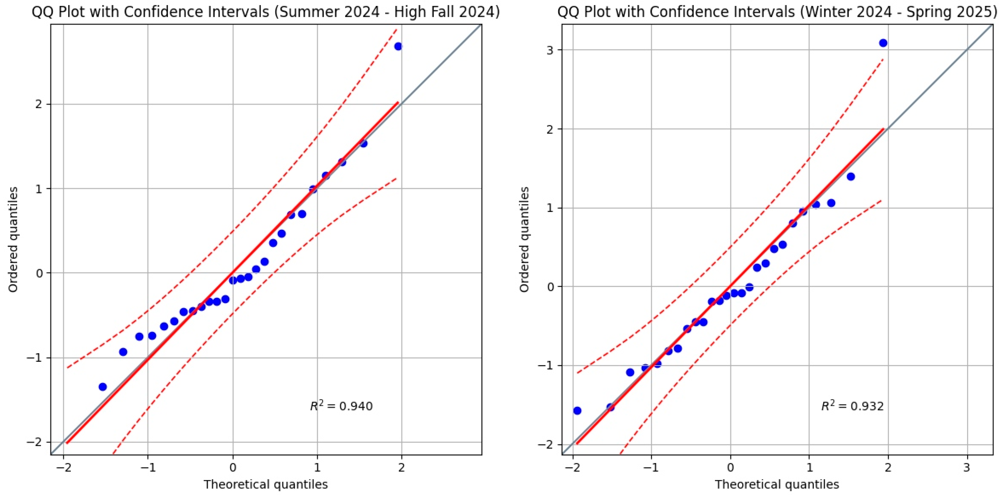
The following are therefore four Figures (Figure 1, Figure 2, Figure 3 and Figure 4) that provide the Q-Q plots for all the winter segments of the investigated period (Figure 1), for all the summer segments (Figure 2), and for all the segments of the intermediate periods (Figure 3). Finally, Figure 4 provides the Q-Q plots for the two seasonal segments related to [9].
As is easy to infer from a visual analysis of all the 11 Q-Q plots, the plot’s line corresponds closely to the graph’s bisector.
Most importantly, apart from three single points, respectively, in the plots for Winter 21, Intermediate 23 and Intermediate 24, the vast majority of points fall within the 95% confidence interval bands.
This demonstrates that, in addition to the decent normality results achieved with the more formal Shapiro–Wilk tests, from a practical numerical standpoint, all 11 seasonal segments exhibit residual behavior that is almost entirely comparable to normality, with rare exceptions that deviate only slightly, and can therefore be defined as quasi-normal.
In conclusion, with 7 cases of normality and 4 very borderline, even if the entire spectrum of the 11 segments cannot be defined as perfectly normal, a situation largely close to normality can be deduced.
Therefore, this certainly does not constitute one of the reasons for the unreliable application of the linear regression model.
Now it is time to check the homoscedasticity of the residuals produced by the linear regression model applied in [8,9]. For this purpose, we show the results of the Breusch–Pagan tests for all 11 seasonal segments in Table 7, remembering that heteroscedasticity is the opposite of homoscedasticity.
A quick look at this Table confirms that in 9 out of 11 cases, the residuals of the seasonal segments do not show heteroscedasticity, thus being homoscedastic.
For the Intermediate 2024 segment, an additional analysis of the residuals vs. fitted values plot (not reported here for the sake of conciseness) suggests the result is more due to a lack of linearity, rather than true heteroscedasticity. Hence, in this case, the outcome is very borderline, almost pointing to quasi-homoscedasticity. The only clear case of heteroscedasticity among the 11 is Winter 2021. Therefore, in the end, one must be very cautious about doubting that the residuals considered constitute a clear situation of heteroscedasticity, rather, the opposite is true.
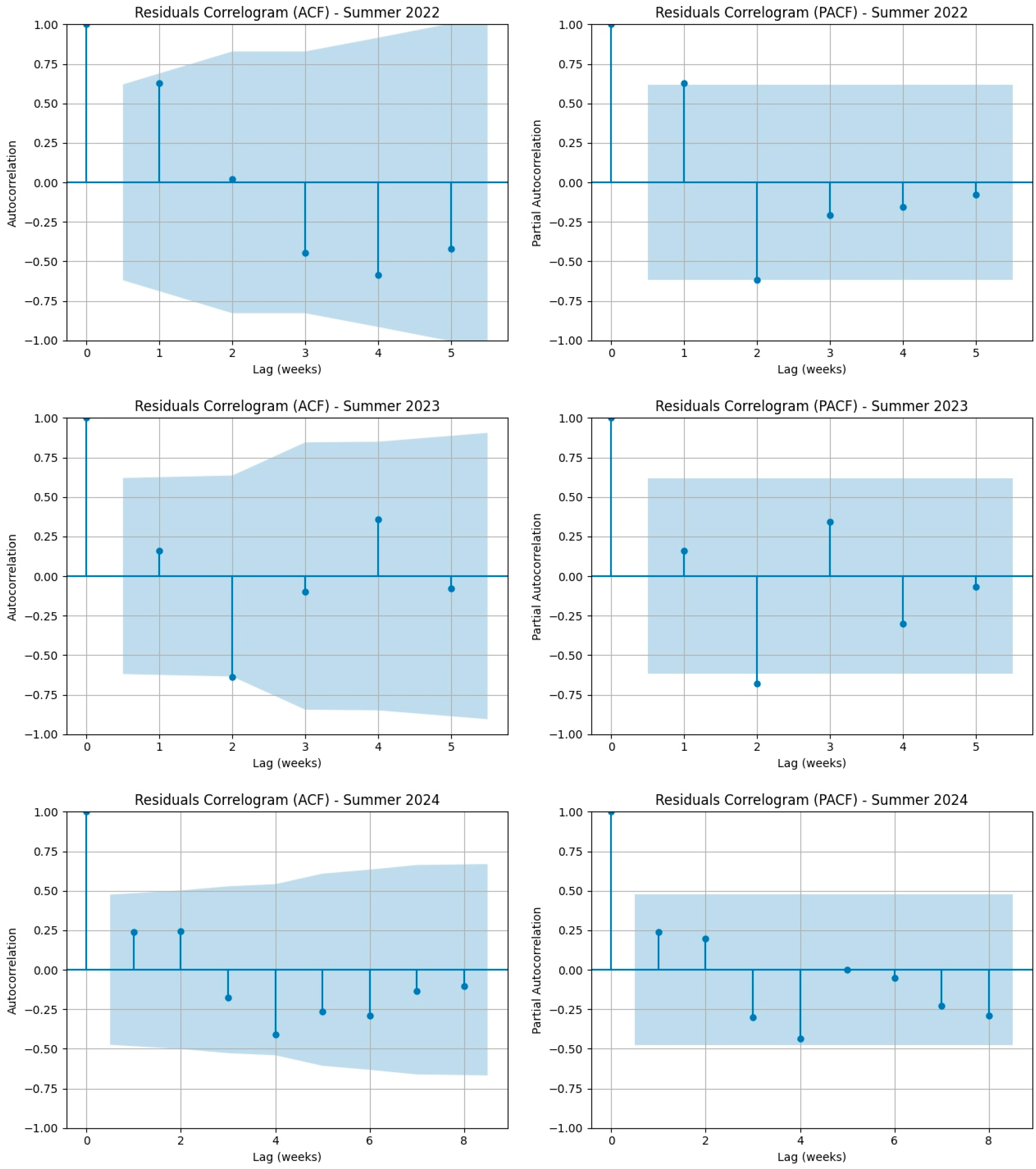
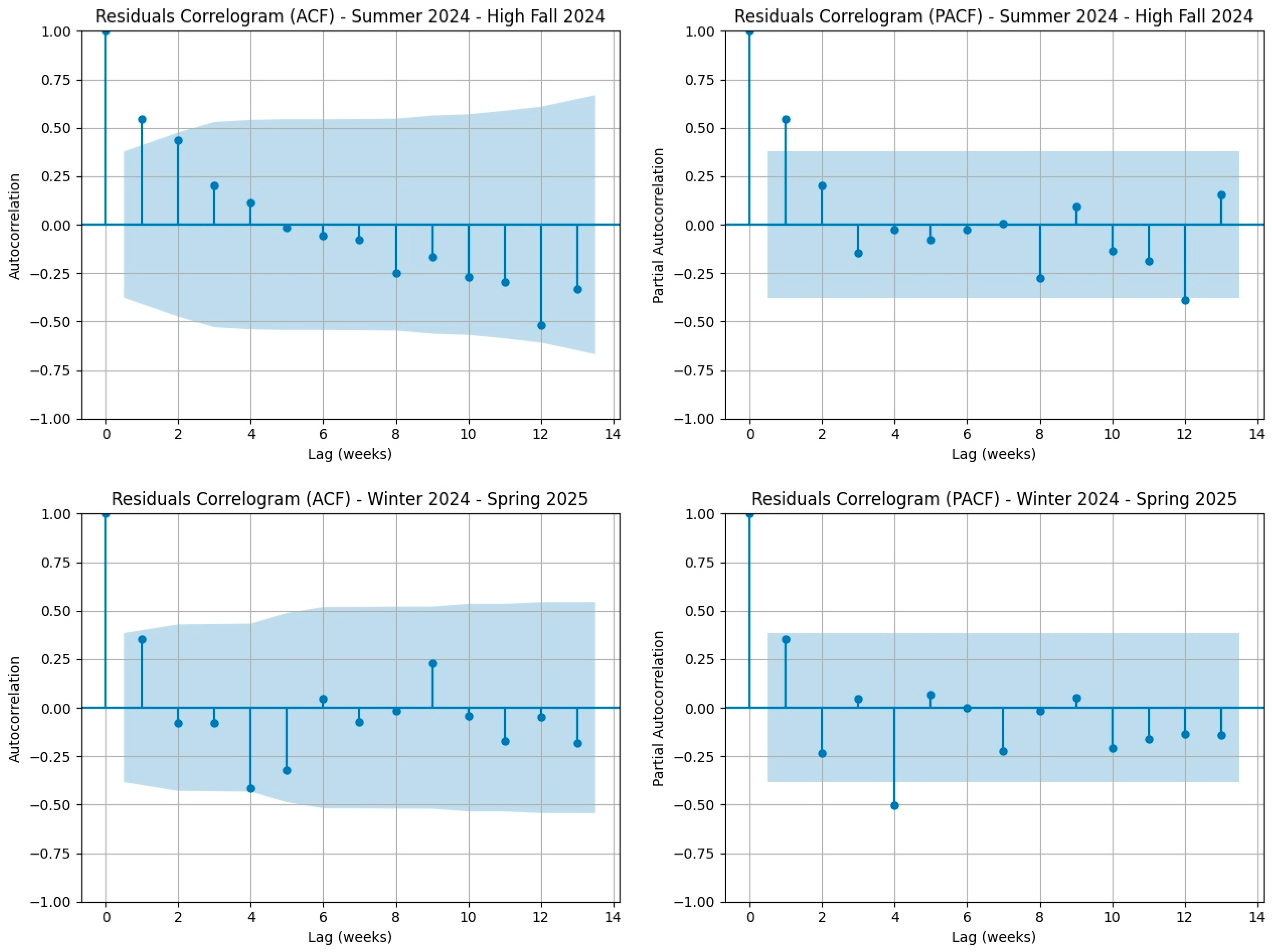
Now let us move on to autocorrelation, Figure 5, Figure 6, Figure 7 and Figure 8 display the ACF and PCF correlograms used to test for autocorrelation. The confidence bands, calculated using the Bartlett formula, are at a 95% confidence level. Significant autocorrelation is indicated when multiple points fall outside these bands. Our results show that in all diagrams, the points remain within the confidence bands, suggesting a general absence of autocorrelation. The few exceptions are usually the first points of each seasonal segment. This is not a sign of a larger issue; it is simply because these initial points serve as the starting point for subsequent trends and are therefore inherently correlated with the following data.
We believe it is helpful to the reader to conclude this section on the results of statistical tests for the correct applicability of a linear regression model for COVID-19 mortality (2021–2025) by providing a summary, Table 8, with the outcomes of the tests for all 11 periods studied with respect to the three dimensions of interest (normality, homoscedasticity, and absence of autocorrelation).

3.2. Results from the Poisson GLM for COVID-19 Mortality Data in Italy (2021–2025)

We here provide the results of the Poisson GLM fit to the weekly COVID-19 mortality data for all 11 seasonal segments identified in Section 2.
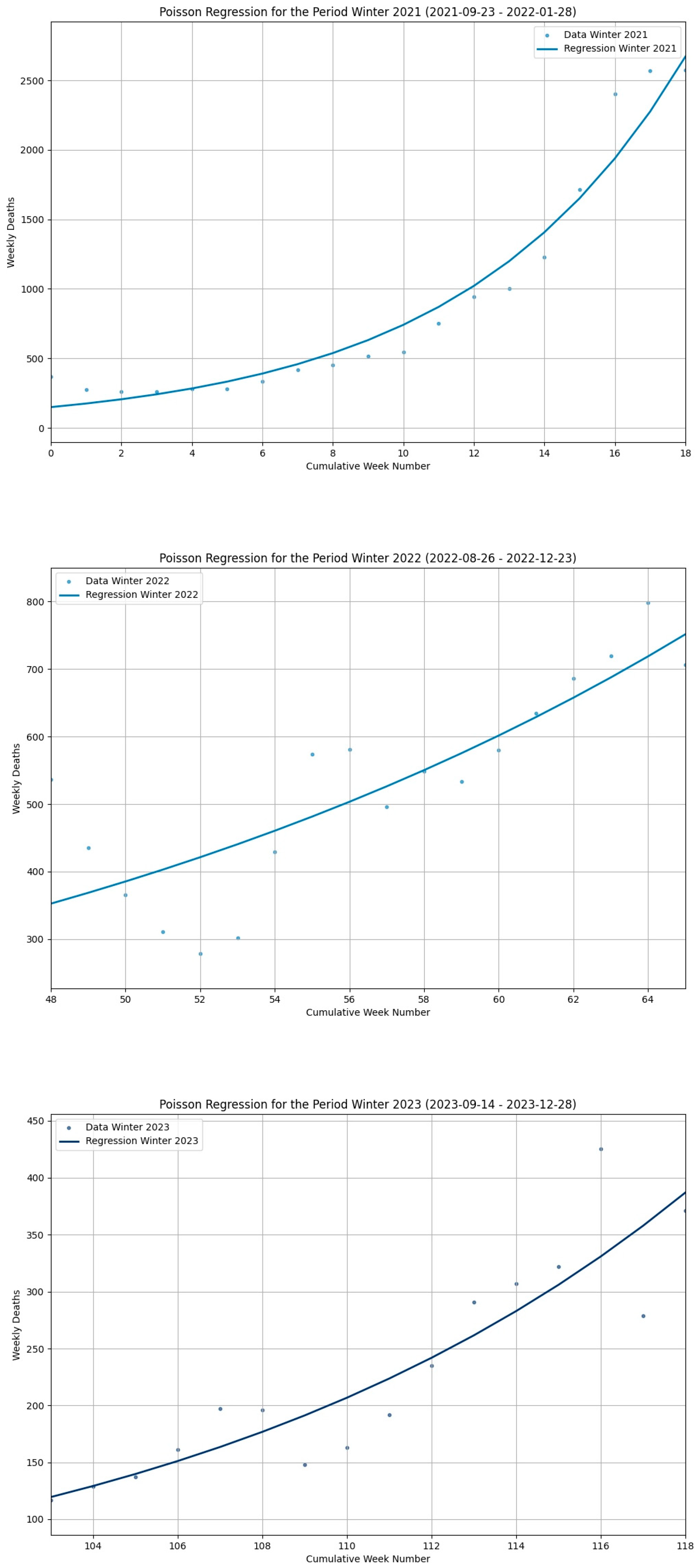
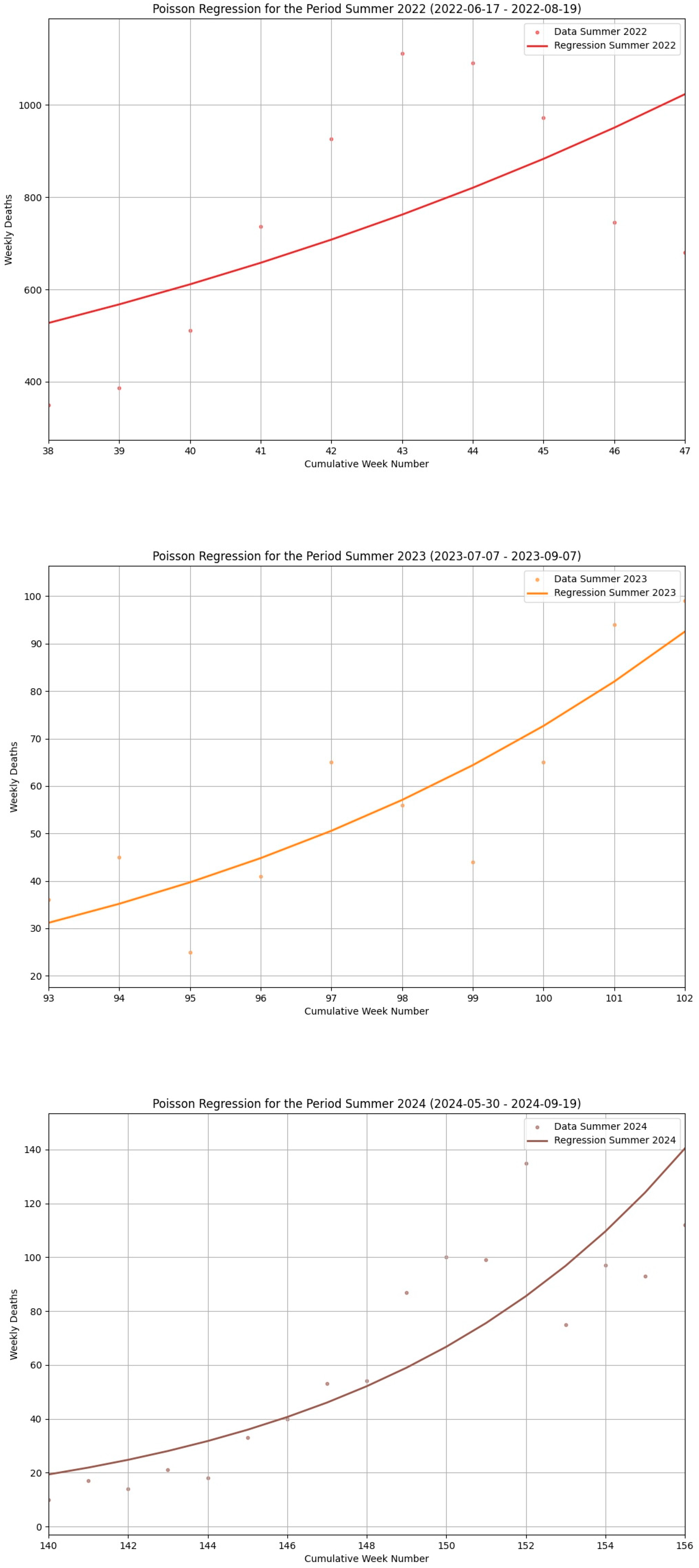
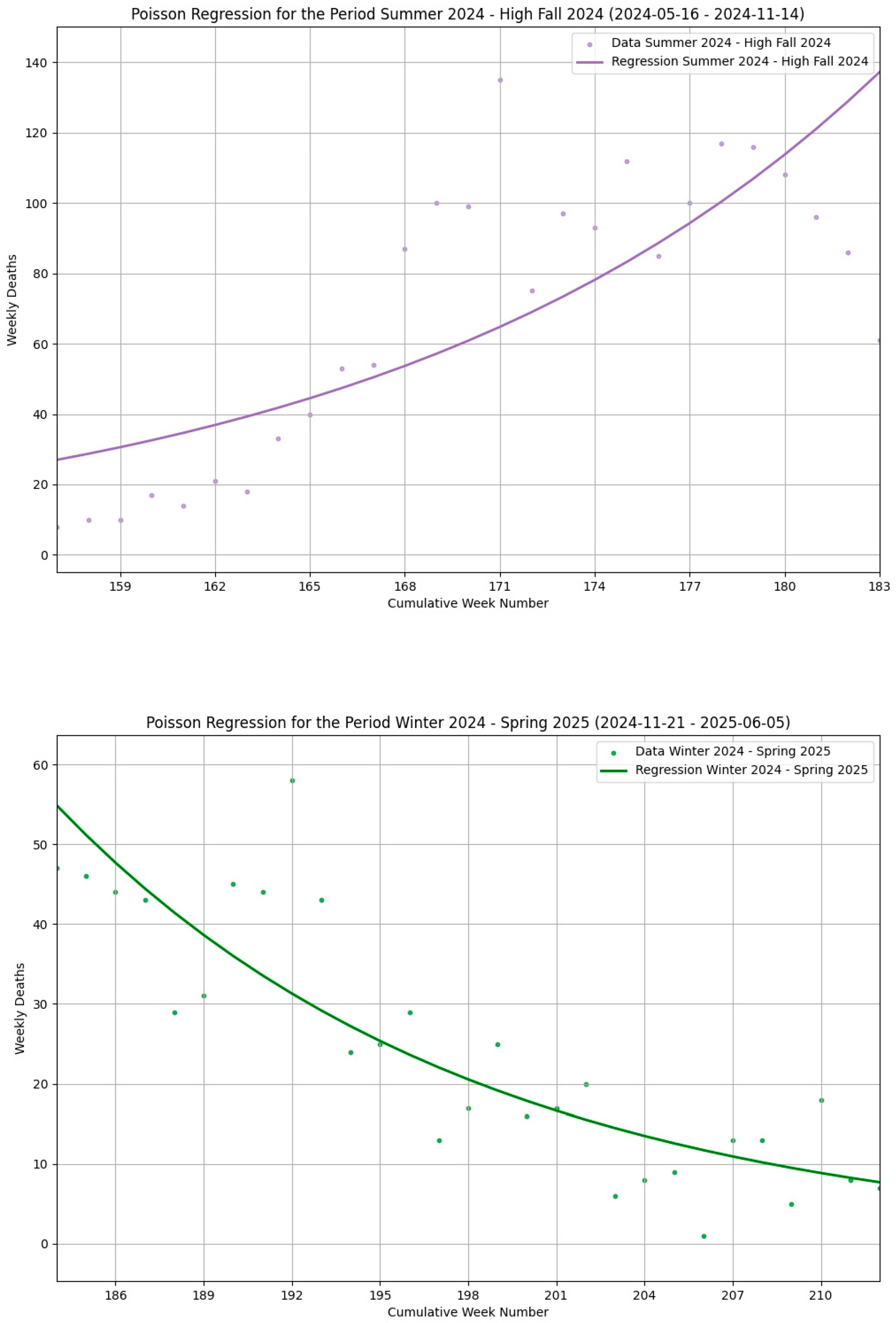
The results are presented in the form of four figures, Figure 9, Figure 10, Figure 11 and Figure 12, where Figure 9 shows the Poisson regression curves for all winter seasonal segments, Figure 10 for all summer seasonal segments, Figure 11 for all intermediate seasonal segments, and finally Figure 12 for the two seasonal segments in the period from May 2024 to May 2025.
Each Poisson regression curve in the Figures is accompanied by its corresponding ( Y ^ ⋅ (exp(β1) − 1)) value which, starting from the β1 value of the Poisson regression, and applying the transformation with the link function and the average number of deaths for that segment, yields a parameter comparable to the β1 produced by the linear regression model.
Also included in the caption of each Figure is the Pseudo R2 value which represents the goodness of fit of the model.
After showing the Poisson regression curves in the aforementioned Figures, we present, in Table 9, the corresponding values of the weekly COVID-19 death forecasts calculated according to the Poisson model.
We defer to the Discussion Section a precise comparison between the results of the linear regression and Poisson models.
This comprehensive analysis will be based on: (a) a comparison of the growth/decline trends of the profiles identified by lines in one model and curves in the other, (b) a comparison based on their respective β1 values, and finally, (c) a numerical comparison of the death forecasts from the two models versus the observed deaths.
Before providing the predicted values of weekly COVID-19 deaths from the Poisson model for all the 11 seasonal segments above, after the 11 Poisson regression curves, it is impossible not to anticipate, at this point in the treatment, that even with the Poisson model, all three winter curves show an increasing mortality trend, as do the summer curves, albeit less pronounced, while the intermediate periods show a decreasing trend. This is exactly the same type of result provided by the linear regression model in [8]. Similarly, the growth and decline segments observed in the two periods that make up the timeframe studied in [9] from May 2024 to May 2025, show the same trends as the Poisson model curves in Figure 12. Identical statements could be made about the β1 values of the linear model and the linearized Poisson ones, which show a high degree of coincidence.
Now, however, we provide in the Table 10 below all the COVID-19 death predictions from the Poisson model for each of the 210 weeks studied.
To close this section, which has first shown the results of the statistical validation tests for the applicability of the linear regression model to COVID-19 mortality data in the extensive time segment from September 2021 to May 2025, and then the results of a similar development exercise on the same mortality data for a Poisson GLM, we reiterate that the first set of results (statistical tests) has substantially confirmed the possibility of applying a linear model to the data without excessive errors. Meanwhile, the results from the Poisson model show an accordance with the analogous results of the linear model presented in [8,9] from every conceivable perspective: in the slopes of the curves for all the 11 seasonal segments, in the corresponding β1 parameters, and in the over 200 forecasts. However, we believe it is useful to dedicate an entire section, the next one, to discussing this comparison, performing it with the precision and accuracy that the topic deserves.

4. Discussion

The true core of this present work was to find a confirmation, peacefully accepted by experts, for the somewhat surprising results published in [8,9]. Those results showed that in Italy, during the period 2021–2025, the seasonal profiles of COVID-19 mortality had a growing trend in both winter and summer, with greater emphasis on winter, and then decreasing profiles in the intermediate period that follows the most central part of winter until late spring. The problem, however, was that those results were obtained by fitting a linear regression model, while it is undeniable that death count problems should be modeled with Poisson (or Negative Binomial) GLMs. Although there was a rationale behind the use of the linear model, namely, to express the growth and decline trends in a visually clear and unmistakable way, as only straight lines and their slopes can do, those results needed a confirmation that could be fully convincing form a statistical viewpoint. This confirmation has been partially obtained with the results of the statistical tests presented in the first part of the previous Section 3, which confirmed that a linear regression model could be applied to that particular time series without committing remarkable errors. However, this was not enough, and we developed a more canonical and commonly accepted Poisson GLM on the same mortality data. The results shown in the second part of Section 3 were confirmatory and surprisingly afresh.
To discuss them better, we first present the summary in Table 9. It takes the 210 observations of COVID-19 deaths in Italy (i.e., data from columns termed Deaths of Table 2, Table 3, Table 4 and Table 5), group them into the 11 seasonal segments subject to our model fitting, and finally numerically compares them with the following: (i) the predictions of the linear regression model (taken from columns termed Predictions of Table 2, Table 3, Table 4 and Table 5) and (ii) with the predictions of the Poisson model (shown in Table 9), calculating the corresponding MAE (and the relative percentage error) plus RMSE, for each comparison.
Table 11 clearly shows that the average MAE of the Poisson regression is only slightly better than that of the linear regression, 62.76 versus 88.60 (the lower the MAE, the more accurate the prediction). If we then look at the percentage errors, we see that the quantity of errors on this huge number of predictions (averaged over the number of deaths per period) is indeed lower with the Poisson model, at exactly 1.15%. However, moving to the linear regression model results in a shift to 1.48%, which is frankly negligible. Further, the calculation of RMSE values, for both the linear and Poisson model, while still favoring Poisson, reflects a proportion which is not significantly altered compared to what was recorded for the MAE and, consequently, does not change the general picture of the results.
It is still important to remember, though, that out of the 210 predictions, the linear regression model provided 7 negative values, which, although very few, are obviously forbidden as they are meaningless.
An even more interesting comparison is to look at the slopes of the Poisson curves versus the lines of the linear regression model. We have already documented that the two trends match across all 11 periods, that is, when the linear model shows an increasing trend, so does the Poisson model, and similarly for decreasing trends.
However, a more compelling comparison is between the slopes of the Poisson curves and of the regression lines for each seasonal segment. To this aim, Table 11 shows the β1 values of the linear model (second column, confidence intervals at 95%) for each period, along with the corresponding linearized β1 values of the Poisson model (fourth column, confidence intervals at 95%).
Although the two series of values indicating the slopes of linear versus Poisson models appear very similar upon a first visual inspection, a rigorous approach requires verifying this impression through a hypothesis test based on the Kolmogorov–Smirnov procedure to check for any statistically significant differences between the two series.
Table 12 provides the results of a Kolmogorov–Smirnov test conducted on the two series of the β1 slopes: Linear (second column of Table 11) versus linearized Poisson (second column of Table 11). What Table 12 says is that the difference between the two series of values is not large enough to be statistically significant. The resulting p-value of 0.9971 is very high, which means that the null hypothesis cannot be rejected. Essentially, the large p-value supports the null hypothesis that there is no statistically significant difference between the two series of β1 coefficients. Furthermore, the D-statistic, which equals 0.1819, is very low, indicating that the magnitude of any potential difference between the two series is negligible.
Ultimately, this is the truly unexpected and, we believe, innovative aspect of this study: it has shown that, at least in the limited, yet temporally extended, circumstances analyzed, a simpler and easier-to-understand linear model provides the same results as a Poisson model, especially concerning the seasonal growth and decline trends of the COVID-19 mortality subject of our interest.
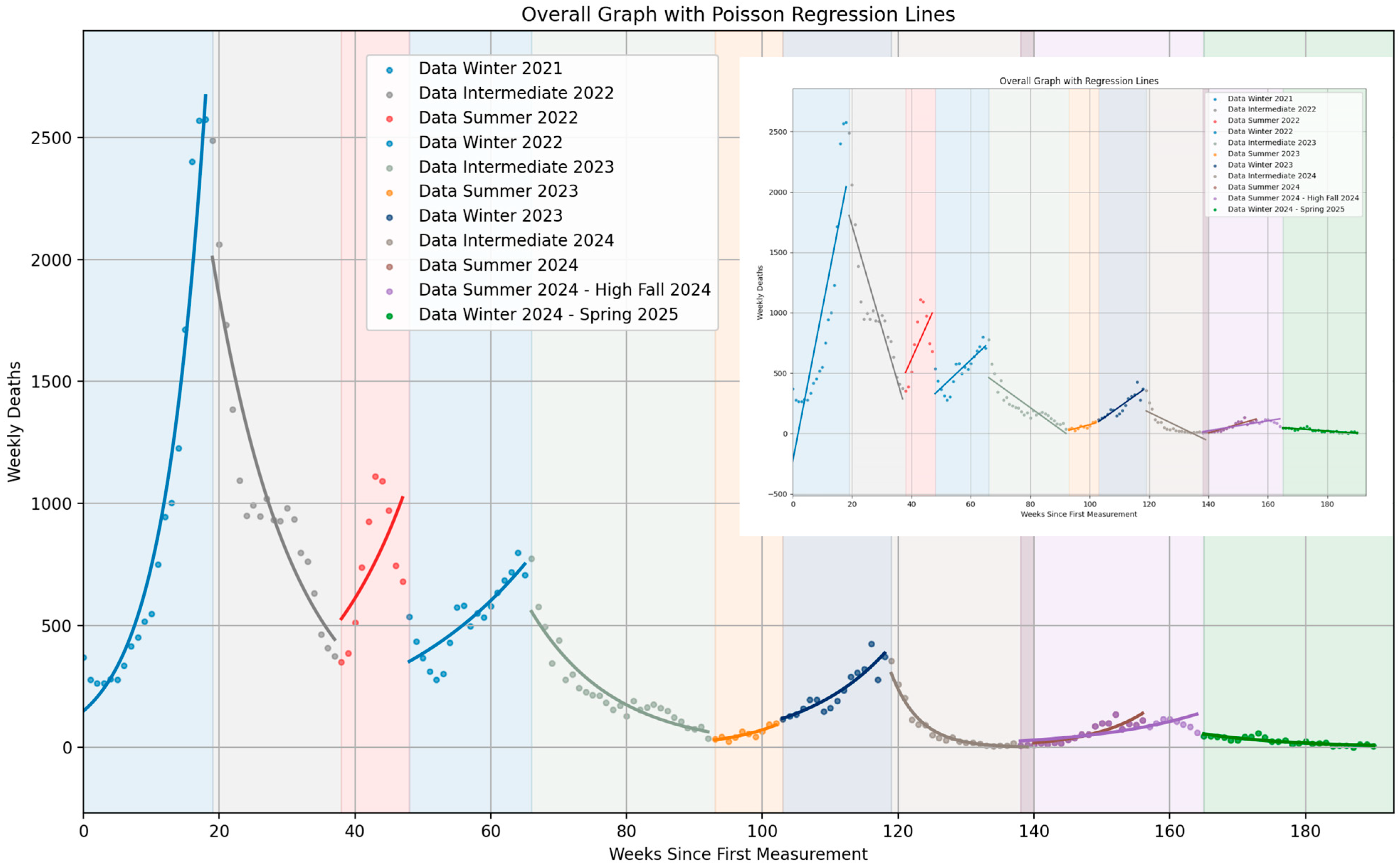
To conclude this head-to-head comparison, we present Figure 13 which displays the COVID-19 mortality data from 2021 to 2025 with superimposed curves from the Poisson model for each seasonal segment (each distinguished by a different color), along with an inset box showing the linear model lines from study [8]. This last Figure perfectly exemplifies the overlap of the two models’ results, effectively summarizing the most significant data that has emerged from our current study.
Of course, we do not forget the limitations of the current study. The first of these, we must remember, is the clear preference for regression models based on Poisson or negative binomial distributions when dealing with death count data, given that the case examined here is only a single event however significant it has been.
Nonetheless, one should also not overlook other more innovative techniques for the analysis of time series (including deaths data) that could lead to interesting results or at least provide confirmation of those obtained in the present study, but with more depth.
For example, techniques inspired by the modeling of Brownian motion could be promising, as they have already been effectively and extensively proven in fields such as financial data analysis [20,21].
We also cannot avoid concisely listing a summary of the limitations that concern not so much the statistical modeling discussions conducted so far but those related to the content, namely the observation of COVID-19 mortality during the period of interest.
First, this study’s findings are limited to the specific epidemiological context of Italy between September 2021 and May 2025, a period dominated by Omicron and post-Omicron SARS-CoV-2 variants. The results might differ in other periods or geographic locations with different circulating lineages [22].
In this regard, for example, a relevant issue, connected to the themes of dates and time, is the decision on how to divide the temporal periods over which to study the presence or absence of COVID-19 mortality seasonal trends. One of the standard methods used in similar contexts is to find changepoints using “context-insensitive” algorithms and then define the timeframes based on those [23]. However, the methodology used in [8,9] was different. Since the objective was to specifically identify seasonal trends, they started with the seasons themselves and searched for trends within those predefined periods. Naturally, and as explained in detail in [8,9] (and reiterated in the present study), the seasons were not interpreted in a perfectly astronomical sense. They were appropriately, though only slightly, shortened and extended to match the trends and, crucially, to maintain the coefficient of determination at acceptable values. This was the approach of studies [8,9], which the present research obviously inherited. Since the primary objective was, in fact, to draw a comparison between the two models (linear and Poisson), it would have bordered on non-sensical to alter the time periods of the Poisson model, as this would risk rendering the comparison impossible.
Another key limitation with this kind of study, already discussed at length in [8], is that they deliberately avoid identifying the causes behind the observed seasonal mortality trends. While these trends could be influenced by various factors like climate, social behaviors, immunity levels, and public health measures, the decision was made to focus purely on observing and quantifying the trends themselves [24,25,26,27,28,29]. This observational approach was chosen due to the unreliability of relevant data during this period, such as vaccination rates and recorded infections. Discussing the causes without reliable data would have been just speculative.
Finally, the use of Italian government data presents its own set of limitations. The data, provided as aggregated measures from two different sources, has been subject to corrections and adjustments over time, only recently achieving relative stability. Nevertheless, public thanks must be given to the Italian institutions, because they have still guaranteed, and continue to do so, a constant flow of data that allows independent researchers to continue studying the phenomenon of COVID-19 spread, even in the current times.

5. Conclusions

In the field of epidemiological modeling, Poisson GLMs are considered the gold standard for analyzing count data, such as deaths, and are extensively used in epidemiology and beyond [30,31,32,33,34,35,36,37,38]. However, our research [8,9] explored the use of a simple linear regression on weekly COVID-19 mortality data in Italy (2021–2025). The results revealed a significant finding: despite a general downward trend, we consistently observed an increase in mortality during both winter and summer.
The question we asked in the present paper was whether linear regression could still be a valid tool for highlighting the slopes of these seasonal trends. Our direct comparison with a Poisson GLM provided convincing answers.
The key findings of this current analysis, in fact, have been as follows: as to statistical validity, hypothesis testing confirmed that linear regression was applicable to this specific time series, as its conditions for normality of residuals, homoscedasticity, and lack of autocorrelation were substantially met. As to trend correspondence, there was a 100% alignment between the two models in identifying growth or decline trends across all 11 seasonal periods subject of investigation. Finally, as to accuracy, both models showed exceptional precision in forecasting deaths. The Poisson model had a slightly lower MAE (62.76) compared to the linear one (88.60). In percentage terms, the Poisson model’s error was 1.15%, while the linear regression’s error was just 1.48%, a negligible difference.
In conclusion, our current study has shown that in this specific context, a simpler and more visually intuitive linear regression model provided the same results and nearly identical accuracy as the more complex Poisson model. This suggests that, under certain circumstances, linear regression can be taken into serious consideration as an effective tool for understanding (COVID-19) mortality trends [39]. We must acknowledge that the episodic nature of this finding, the near-complete overlap between the linear and Poisson models for counting COVID-19 deaths and identifying seasonal mortality profiles during the Omicron and post-Omicron eras in Italy, prompts a crucial inquiry into its underlying causes. It would be highly valuable to investigate whether deeper factors, perhaps rooted in this specific viral variant, the societal response in Italy, or other surrounding elements, contribute to this outcome. However, such an investigation demands substantial time and significant additional analysis, thus constituting an ideal topic for future studies.

Author Contributions

Conceptualization, M.R.; methodology, M.R.; software, G.C.; validation, M.R. and G.C.; formal analysis, G.C.; investigation, M.R.; resources, M.R.; data curation, M.R. and G.C.; writing—original draft preparation, M.R.; writing—review and editing, M.R.; visualization, G.C.; supervision, M.R.; project administration, M.R. All authors have read and agreed to the published version of the manuscript. Both authors have contributed substantially to the work reported.

Funding

This research received no external funding.

Institutional Review Board Statement

This study uses publicly available, aggregated data that contains no private information. Therefore, ethical approval is not required.

Informed Consent Statement

Not applicable: Neither humans, animals, nor personal data are involved in this study.

Data Availability Statement

All the initial COVID-19 deaths data are downloadable from two public, open access repositories, specifically: (i) the repository maintained by the Italian Civil Protection Department, under the Italian Presidency of the Council of Ministers (https://github.com/pcm-dpc/COVID-19/blob/master/dati-andamento-nazionale), and (ii) the repository maintained by the Italian Ministry of Health, (https://www.salute.gov.it/new/it/tema/covid-19/report-settimanali-covid-19/), both accessed on 1 September 2025. Moreover, all the data on which both the statistical hypothesis tests and the Poisson regression model are based have been made fully available in Section 2 under a tabular format. All the results of this study are fully reproducible by using the methods described in this paper and the data made available above. Further reasonable requests relative to data and code can also be addressed to the corresponding author (email: marco.roccetti@unibo.it).

Acknowledgments

The authors are grateful to several colleagues from the University of Bologna who provided comments on a previous preprint version of this paper.

Conflicts of Interest

The authors declare no conflicts of interest.

References

  1. Cameron, A.C.; Trivedi, P.K. Regression Analysis of Count Data; Cambridge University Press: Cambridge, UK, 1998; ISBN 9781139013567. [Google Scholar] [CrossRef]
  2. Hilbe, J.M. Modeling Count Data; Cambridge University Press: Cambridge, UK, 2014; ISBN 9781139236065. [Google Scholar] [CrossRef]
  3. Gardner, W.; Mulvey, E.P.; Shaw, E.C. Regression Analyses of Counts and Rates: Poisson, Overdispersed Poisson, and Negative Binomial Models. Psychol. Bull. 1995, 118, 392–404. [Google Scholar] [CrossRef]
  4. Chan, S.; Chu, J.; Zhang, Y.; Nadarajah, S. Count regression models for COVID-19. Phys. A Stat. Mech. Appl. 2021, 563, 125460. [Google Scholar] [CrossRef] [PubMed]
  5. Schober, P.; Vetter, T.R. Count Data in Medical Research: Poisson Regression and Negative Binomial Regression. Anesth. Analg. 2021, 132, 1378–1379. [Google Scholar] [CrossRef]
  6. Luo, R. Hypothesis testing of Poisson rates in COVID-19 offspring distributions. Infect. Dis. Model. 2023, 8, 980–1001. [Google Scholar] [CrossRef]
  7. Cohn, J.B.; Liu, Z.; Wardlaw, M.I. Count (and count-like) data in finance. J. Financ. Econ. 2022, 146, 529–551. [Google Scholar] [CrossRef]
  8. Roccetti, M.; De Rosa, E.M. A Segmented Linear Regression Study of Seasonal Profiles of COVID-19 Deaths in Italy: September 2021–September 2024. Computation 2025, 13, 165. [Google Scholar] [CrossRef]
  9. Roccetti, M. Seasonal Trends of COVID-19 Deaths in Italy: A Confirmatory Linear Regression Study with Time Series Data from 2024/2025. MedRxiv 2025, MedRxiv:25328619. [Google Scholar] [CrossRef]
  10. Altman, N.; Krzywinski, M. Simple Linear Regression. Nat. Methods 2015, 12, 999–1000. [Google Scholar] [CrossRef]
  11. Shapiro, S.S.; Wilk, M.B. An Analysis of Variance Test for Normality (complete samples). Biometrika 1965, 52, 591–611. [Google Scholar] [CrossRef]
  12. Montgomery, D.C.; Peck, E.A.; Vining, G.G. Introduction to Linear Regression Analysis, 6th ed.; John Wiley & Sons: Hoboken, NJ, USA, 2021; ISBN 978-1-119-57872-7. [Google Scholar]
  13. Breusch, T.S.; Pagan, A.R. A Simple Test for Heteroscedasticity and Random Coefficient Variation. Econometrica 1979, 47, 1287–1294. [Google Scholar] [CrossRef]
  14. Hyndman, R.J.; Athanasopoulos, G. Forecasting: Principles and Practice, 3rd ed.; OTexts: Melbourne, Australia, 2021; ISBN 978-0987507136. [Google Scholar]
  15. Bhaskaran, K.; Gasparrini, A.; Hajat, S.; Smeeth, L.; Armstrong, B. Time Series Regression Studies in Environmental Epidemiology. Int. J. Epidemiol. 2013, 42, 1187–1195. [Google Scholar] [CrossRef] [PubMed]
  16. Di Loro, P.A.; Böhning, D.; Sau, S.K. A Bayesian spatio-temporal Poisson auto-regressive model for the disease infection rate: Application to COVID-19 cases in England. J. R. Stat. Soc. Ser. C Appl. Stat. 2025, 74, 551–575. [Google Scholar] [CrossRef]
  17. Asai, M.; Chu, A.M.Y.; So, M.K.P. Dynamic Network Poisson Autoregression with Application to COVID-19 Count Data. J. Data Sci. 2025, 23, 208–224. [Google Scholar] [CrossRef]
  18. Tosi, D.; Campi, A. How Data Analytics and Big Data Can Help Scientists in Managing COVID-19 Diffusion: Modeling Study to Predict the COVID-19 Diffusion in Italy and the Lombardy Region. J. Med. Internet Res. 2020, 22, e21081. [Google Scholar] [CrossRef]
  19. Agosto, A.; Giudici, P. Poisson Autoregressive Model to Understand COVID-19 Contagion Dynamics. Risks 2020, 8, 77. [Google Scholar] [CrossRef]
  20. Cherstvy, A.G.; Vinod, D.; Aghion, E.; Chechkin, A.V.; Metzler, R. Time averaging, ageing and delay analysis of financial time series. New J. Phys. 2017, 19, 063045. [Google Scholar] [CrossRef]
  21. Vinod, D.; Cherstvy, A.G.; Metzler, R.; Sokolov, I.G. Time-averaging and nonergodicity of reset geometric Brownian motion with drift. Phys. Rev. E 2022, 106, 034137. [Google Scholar] [CrossRef]
  22. D’Amico, F.; Marmiere, M.; Righetti, B.; Scquizzato, T.; Zangrillo, A.; Puglisi, R.; Landoni, G. COVID-19 seasonality in temperate countries. Environ. Res. 2022, 206, 112614. [Google Scholar] [CrossRef]
  23. Truong, C.; Oudre, L.; Vayatis, N. Selective review of offline change point detection methods. Signal Process 2020, 167, 107299. [Google Scholar] [CrossRef]
  24. Venturelli, F.; Mancuso, P.; Vicentini, M.; Ottone, M.; Storchi, C.; Roncaglia, F.; Bisaccia, E.; Ferrarini, C.; Pezzotti, P.; Giorgi Rossi, P. High temperature, COVID-19, and mortality excess in the 2022 summer: A cohort study on data from Italian surveillances. Sci. Total Environ. 2023, 887, 164104. [Google Scholar] [CrossRef] [PubMed]
  25. Chirumbolo, S.; Pandolfi, S.; Valdenassi, L. Seasonality of COVID-19 deaths. Did social restrictions and vaccination actually impact the official reported dynamic of COVID-19 pandemic in Italy? Environ. Res. 2022, 212, 113229. [Google Scholar] [CrossRef]
  26. Fontal, A.; Bouma, M.J.; San-José, A.; Lopez, L.; Pascual, M.; Rodo, X. Climatic signatures in the different COVID-19 pandemic waves across both hemispheres. Nat. Comput. Sci. 2021, 1, 655–665. [Google Scholar] [CrossRef] [PubMed]
  27. Sera, F.; Armstrong, B.; Abbott, S.; Meakin, S.; O’Reilly, K.; von Borries, R.; Schneider, R.; Royé, D.; Hashizume, M.; Pascal, M.; et al. A cross-sectional analysis of meteorological factors and SARS-CoV-2 transmission in 409 cities across 26 countries. Nat. Commun. 2021, 12, 5968. [Google Scholar] [CrossRef] [PubMed]
  28. Wong, C. Why do covid cases rise in summer? New Sci. 2024, 263, 11. [Google Scholar] [CrossRef]
  29. De Meijere, G.; Valdano, G.; Castellano, C.; Debin, M.; Kengne-Kuetche, C.; Turbelin, C.; Noël, H.; Weitz, J.S.; Paolotti, D.; Hermans, L.; et al. Attitudes towards booster, testing and isolation, and their impact on COVID-19 response in winter 2022/2023 in France, Belgium, and Italy: A cross-sectional survey and modelling study. Lancet Reg. Health Eur. 2023, 28, 100614. [Google Scholar] [CrossRef]
  30. Khajanchi, S.; Sarkar, K.; Mondal, J.; Nisar, K.S.; Abdelwahab, S.F. Mathematical modeling of the COVID-19 pandemic with intervention strategies. Results Phys. 2021, 25, 104285. [Google Scholar] [CrossRef]
  31. Corradini, F.; Gorrieri, R.; Roccetti, M. Performance preorder and competitive equivalence. Acta Inform. 1997, 34, 805–835. [Google Scholar] [CrossRef]
  32. Palazzi, C.E.; Ferretti, S.; Cacciaguerra, S.; Roccetti, M. On maintaining interactivity in event delivery synchronization for mirrored game architectures. In Proceedings of the Globecom IEEE Global Telecommunications Conference, Dallas, TX, USA, 29 November–3 December 2004; pp. 157–165. [Google Scholar] [CrossRef]
  33. Morotti, E.; Stacchio, L.; Donatiello, L.; Roccetti, M.; Tarabelli, J.; Marfia, G. Exploiting fashion x-commerce through the empowerment of voice in the fashion virtual reality arena. Virtual Real. 2022, 26, 871–884. [Google Scholar] [CrossRef]
  34. Yang, H.; Lin, X.; Li, J.; Zhai, Y.; Wu, J. A Review of Mathematical Models of COVID-19 Transmission. Contemp. Math. 2023, 4, 75–98. [Google Scholar] [CrossRef]
  35. Hao, B.; Liu, C.; Wang, Y.; Zhu, N.; Ding, Y.; Wu, J.; Wang, Y.; Sun, F.; Chen, L. A mathematical-adapted model to analyze the characteristics for the mortality of COVID-19. Sci. Rep. 2022, 12, 5493. [Google Scholar] [CrossRef]
  36. James, G.; Witten, D.; Hastie, T.; Tibshirani, R. An Introduction to Statistical Learning, with Applications in Python; Springer Nature: Berlin/Heidelberg, Germany, 2023; ISBN 9783031387470. [Google Scholar]
  37. Ozili, P.K. The acceptable R-square in empirical modelling for social science research. Soc. Res. Methodol. Publ. Results 2022, 4128165, 1–9. [Google Scholar] [CrossRef]
  38. Li, M.; Giurcăneanu, C.D.; Liu, J. Automatic method for identification of cycles in Covid-19 time-series data. Data Sci. Manag. 2025, in press. [Google Scholar] [CrossRef]
  39. Taljaard, M.; McKenzie, J.E.; Ramsay, C.R.; Grimshaw, J.M. The use of segmented regression in analysing interrupted time series studies: An example in pre-hospital ambulance care. Implement. Sci. 2014, 9, 77. [Google Scholar] [CrossRef] [PubMed]
Figure 1. Q-Q plots with a confidence interval band of 95% for Winter 2021 (Top), Winter 2022 (Middle), and Winter 2023 (Bottom).
Computation 13 00233 g001
Figure 2. Q-Q plots with a confidence interval band of 95% for Summer 2022 (Top), Summer 2023 (Middle), and Winter 2024 (Bottom).
Computation 13 00233 g002
Figure 3. Q-Q plots with a confidence interval band of 95% for Intermediate 2022 (Top), Intermediate 2023 (Middle), and Intermediate 2024 (Bottom).
Computation 13 00233 g003
Figure 4. Q-Q Plots with a confidence interval band of 95% for Summer–Winter 2024/25 (Left) and Extended Spring 2025 (Right).
Computation 13 00233 g004
Figure 5. Correlograms for autocorrelation: Winter 2021 (top-left ACF–top-right PCF), Winter 2022 (middle-left ACF–middle-right PCF), and Winter 2023 (bottom-left ACF–bottom-right PCF).
Computation 13 00233 g005
Figure 6. Correlograms for autocorrelation: Summer 2022 (top-left ACF–top-right PCF), Summer 2023 (middle-left ACF–middle-right PCF), and Summer 2024 (bottom-left ACF–bottom-right PCF).
Computation 13 00233 g006
Figure 7. Correlograms for autocorrelation: Intermediate 2022 (top-left ACF–top-right PCF), Intermediate 2023 (middle-left ACF–middle-right PCF), and Intermediate 2024 (bottom-left ACF–bottom-right PCF).
Computation 13 00233 g007
Figure 8. Correlograms for autocorrelation: Summer–Winter 2024-25 (top-left ACF–top-right PCF) and Extended Spring 2025 (bottom-left ACF–bottom-right PCF).
Computation 13 00233 g008
Figure 9. GLM Poisson regression curves for the winter segments. Top: Winter 2021, ( Y ^ ⋅ (exp(β1) − 1)) = 157.30, Pseudo R2 = 0.93. Middle: Winter 2022, ( Y ^ ⋅ (exp(β1) − 1)) = 23.79, Pseudo R2 = 0.55. Bottom: Winter 2023, ( Y ^ ⋅ (exp(β1) − 1)) = 18.81, Pseudo R2 = 0.70.
Computation 13 00233 g009
Figure 10. GLM Poisson regression curves for the summer segments. Top: Summer 2022, ( Y ^ ⋅ (exp(β1) − 1)) = 57.38, Pseudo R2 = 0.32. Middle: Summer 2023, ( Y ^ ⋅ (exp(β1) − 1)) = 7.33, Pseudo R2 = 0.45. Bottom: Summer 2024, ( Y ^ ⋅ (exp(β1) − 1)) = 8.21, Pseudo R2 = 064.
Computation 13 00233 g010
Figure 11. GLM Poisson regression curves for the intermediate segments. Top: Intermediate 2022, ( Y ^ ⋅ (exp(β1) − 1)) = −84.23, Pseudo R2 = 0.84. Middle: Intermediate 2023, ( Y ^ ⋅ (exp(β1) − 1)) = −18.42, Pseudo R2 = 0.82. Bottom: Intermediate 2024, ( Y ^ ⋅ (exp(β1) − 1)) = −14.35, Pseudo R2 = 0.90.
Computation 13 00233 g011
Figure 12. GLM Poisson regression curves for the period May 2024–May 2025. Top: Summer–Winter 2024/25, ( Y ^ ⋅ (exp(β1) − 1)) = 4.41, Pseudo R2 = 0.49. Bottom: Extended Spring 2025, ( Y ^ ⋅ (exp(β1) − 1)) = −1.85, Pseudo R2 = 0.45.
Computation 13 00233 g012
Figure 13. In the big picture, the COVID-19 death data for the entire from September 2021 to May 2025 period with the Poisson model curves superimposed, where each distinct seasonal period is represented by a different color. In the small inset, an analogous plot with the linear model lines as inspired by [8].
Computation 13 00233 g013
Table 1. The 11 segments identified in Italy in the period from September 2021 to May 2025 with their seasonal connotation provided by the linear regression model of [8,9].
Seasonal SegmentSeason TypeAbbreviationNumber of
Weeks
Segment
Beginning
Segment
End
Winter 2021Fall-WinterWint21199/23/211/28/22
Intermediate 2022Extended SpringInter22 19 2/4/226/10/22
Summer 2022SummerSumm22106/17/228/19/22
Winter 2022Fall-WinterWint22188/26/2212/23/22
Intermediate 2023Extended SpringInter232712/30/226/30/23
Summer 2023SummerSumm23107/7/239/7/23
Winter 2023Fall-WinterWint23169/14/2312/28/23
Intermediate 2024Extended SpringInter24211/4/245/23/24
Summer 2024SummerSumm24175/30/2411/19/24
Summer–Winter 2024-25 Summer + WinterSum-Wint24-25215/16/2411/14/24
Extended Spring 2025Extended SpringExtd-Spr251711/21/245/21/25
Table 2. Macro-period 1 (23 September 2021 to 18 August 2022). A total of 48 consecutive weeks of COVID-19 deaths in Italy, plus segmented linear regression results, including: season type, identified seasonal trend of growth (>) or decline (<) and segment slope β1, predictions, and residuals.
Week/SeasonTrend/β1Deaths/Predictions/ResidualsWeek/
Season
Trend/β1Deaths/Predictions/Residuals
1/Wint21>/126.45370/−233.70/603.7025/Inter22</−84.38949/1384−435.00
2/Wint21>126.45277/−107.25/384.2526/Inter22</−84.38994/1299.61/−305.61
3/Wint21>126.45263/19.20/243.8027/Inter22</−84.38947/1215.23/−268.23
4/Wint21>/126.45263/145.65/117.3528/Inter22</−84.381019/1130.85/−111.85
5/Wint21>/126.45280/272.10/7.9029/Inter22</−84.38934/1046.47/−112.47
6/Wint21>/126.45279/398.56/−119.5630/Inter22</−84.38928/962.09/−34.09
7/Wint21>/126.45335/525.01/−190.0131/Inter22</−84.38980/877.71/102.29
8/Wint21>/126.45416/651.46/−235.4632/Inter22</−84.38935/793.33/141.67
9/Wint21>/126.45452/777.91/−325.9133/Inter22</−84.38797/708.95/88.05
10/Wint21>/126.45517/904.37/−387.3734/Inter22</−84.38762/624.57/137.43
11/Wint21>/126.45548/1030.82/−482.8235/Inter22</−84.38633/540.19/92.81
12/Wint21>/126.45750/1157.27/−407.2736/Inter22</−84.38464/455.81/8.19
13/Wint21>/126.45944/1283.73/−339.7337/Inter22</−84.38407/371.43/35.57
14/Wint21>/126.451002/1410.18/−408.1838/Inter22</−84.38375/287.05/87.95
15/Wint21>/126.451227/1536.63/−309.6339/Summ22>/54.80350/504.40/−154.40
16/Wint21>/126.451714/1663.08/50.9240/Summ22>/54.80386/559.20/−173.20
17/Wint21>/126.452402/1789.54/612.4641/Summ22>/54.80511/614.00/−103.00
18/Wint21>/126.452569/1915.99/653.0142/Summ22>/54.80737/668.80/68.20
19/Wint21>/126.452575/2042.44/532.5643/Summ22>/54.80926/723.60/202.40
20/Inter22</−84.382487/1805.90/681.1044/Summ22>/54.801111/778.40/332.60
21/Inter22</−84.382061/1721.52/339.4845/Summ22>/54.801091/833.20/257.80
22/Inter22</−84.381731/1637.14/93.8646/Summ22>/54.80972/888.00/84.00
23/Inter22</−84.381386/1552.76/−166.7647/Summ22>/54.80746/942.80/−196.80
24/Inter22</−84.381094/1384.00/−374.3848/Summ22>/54.80680/997.60/−317.60
Table 3. Macro-period 2 (26 August 2022 to 7 September 2023). A total of 55 consecutive weeks of COVID-19 deaths in Italy, plus segmented linear regression results, including: season type, identified seasonal trend of growth (>) or decline (<) and segment slope β1, predictions, and residuals.
Week/SeasonTrend/β1Deaths/Predictions/ResidualsWeek/SeasonTrend/β1Deaths/Predictions/Residuals
49/Wint22>/23.28536/330.72/205.2877/Inter23</−17.76212/285.29/−73.29
50/Wint22>/23.28435/354.00/81.0078/Inter23</−17.76 183/267.52/−84.52
51/Wint22>/23.28366/377.29/−11.2979/Inter23</−17.76156/249.76/−93.76
52/Wint22>/23.28311/400.57/−89.5780/Inter23</−17.76173/232.00/−59.00
53/Wint22>/23.28279/423.85/−144.8581/Inter23</−17.76129/214.24/−85.24
54/Wint22>/23.28302/447.13/−145.1382/Inter23</−17.76191/196.47/−5.47
55/Wint22>/23.28429/470.41/−41.4183/Inter23</−17.76156/178.71/−22.71
56/Wint22>/23.28574/493.69/80.3184/Inter23</−17.76166/160.95/5.05
57/Wint22>/23.28581/516.97/64.0385/Inter23</−17.76176/143.19/32.81
58/Wint22>/23.28496/540.25/−44.2586/Inter23</−17.76162/125.42/36.58
59/Wint22>/23.28549/563.53/−14.5387/Inter23</−17.76150/107.66/42.34
60/Wint22>/23.28533/586.81/−53.8188/Inter23</−17.76125/89.90/35.10
61/Wint22>/23.28580/610.09/−30.0989/Inter23</−17.76108/72.14/35.86
62/Wint22>/23.28635/633.37/1.6390/Inter23</−17.7681/54.37/26.63
63/Wint22>/23.28686/656.65/29.3591/Inter23</−17.7676/36.61/39.39
64/Wint22>/23.28719/679.94/39.0692/Inter23</−17.7686/18.85/67.15
65/Wint22>/23.28798/703.21/94.7993/Inter23</−17.7638/1.09/36.91
66/Wint22>/23.28706/725.50/−20.5094/Summ23>/6.7236/26.73/9.27
67/Inter23</−17.76775/462.91/312.0995/Summ23>/6.7245/33.45/11.55
68/Inter23</−17.76/576/445.15130.8596/Summ23>/6.7225/40.18/−15.18
69/Inter23</−17.76495/427.39/67.6197/Summ23>/6.7241/46.91/−5.91
70/Inter23</−17.76345/409.62/−64.6298/Summ23>/6.7265/53.64/11.48
71/Inter23</−17.76439/391.86/47.1499/Summ23>/6.7256/60.36/−4.36
72/Inter23</−17.76279/374.10/−95.10100/Summ23>/6.7244/67.09/−23.09
73/Inter23</−17.76299/356.34/−57.34101/Summ23>/6.7265/73.82/−8.82
74/Inter23</−17.76244/338.57/−94.57102/Summ23>/6.7294/80.54/13.46
75/Inter23</−17.76228/320.81/−92.81103/Summ23>/6.7299/87.27/11.73
76/Inter23</−17.76216/330.72/−87.805///
Table 4. Macro-period 3 (from 14 September 2023 to 19 September 2024). A total of 54 consecutive weeks of COVID-19 deaths in Italy, plus segmented linear regression results, including: season type, identified seasonal trend of growth (>) or decline (<) and segment slope β1, predictions, residuals.
Week/SeasonTrend/β1Deaths/Predictions/ResidualsWeek/SeasonTrend/β1Deaths/Predictions/Residuals
104/Wint23>/17.52117/97.99/19.01131/Inter24</−11.8920/56.30/−36.30
105/Wint23>/17.52129/115.51/13.49132/Inter24</−11.8921/44.41/−23.41
106/Wint23>/17.52137/133.03/3.97133/Inter24</−11.8915/32.52/−17.52
107/Wint23>/17.52161/150.54/10.46134/Inter24</−11.899/20.63/−11.63
108/Wint23>/17.52197/168.06/28.94135/Inter24</−11.897/8.74/−1.74
109/Wint23>/17.52196/185.58/10.42136/Inter24</−11.899/−3.15/12.15
110/Wint23>/17.52148/203.10/−55.10137/Inter24</−11.899/−15.15/26.05
111/Wint23>/17.52163/220.62/−57.62138/Inter24</−11.8917/−26.94/43.94
112/Wint23>/17.52192/238.13/−46.13139/Inter24</−11.898/−38.83/46.83
113/Wint23>/17.52235/255.65/−20.65140/Inter24</−11.8910/−50.72/60.72
114/Wint23>/17.52291/273.17/17.83141/Summ24>/7.2010/4.67/5.33
115/Wint23>/17.52307/290.69/16.31142/Summ24>/7.2017/11.86/5.14
116/Wint23>/17.52322/308.20/13.80143/Summ24>/7.2014/19.06/−5.06
117/Wint23>/17.52425/325.72/99.28144/Summ24>/7.2021/26.25/−5.25
118/Wint23>/17.52279/343.24/−64.24145/Summ24>/7.2018/33.45/−15.45
119/Wint23>/17.52371/360.76/10.24146/Summ24>/7.2033/40.65/−7.65
120/Inter24</−11.89355/187.10/167.90147/Summ24>/7.2040/47.84/−7.84
121/Inter24</−11.89258/175.21/82.79148/Summ24>/7.2053/55.04/−2.04
122/Inter24</−11.89203/163.32/39.68149/Summ24>/7.2054/62.23/−8.23
123/Inter24</−11.89115/151.43/−36.43150/Summ24>/7.2087/69.43/17.57
124/Inter24</−11.8995/139.54/−44.54151/Summ24>/7.20100/76.63/23.37
125/Inter24</−11.8992/127.64/−35.64152/Summ24>/7.2099/83.82/15.18
126/Inter24</−11.8952/115.75/−63.75153/Summ24>/7.20135/91.02/43.98
127/Inter24</−11.8939/103.86/−64.86154/Summ24>/7.2075/98.22/−23.22
128/Inter24</−11.8931/91.97/−60.97155/Summ24>/7.2097/105.41/−8.41
129/Inter24</−11.8941/80.08/−39.08156/Summ24>/7.2093/112.61/−19.61
130/Inter24</−11.8926/68.19/−42.19157/Summ24>/7.20112/119.80/7.80
Table 5. Macro-period 4 (from 16 May 2024 to 21 May 2025). A full year of COVID-19 deaths in Italy (53 weeks), plus segmented linear regression results, including: season type, identified seasonal trend of growth (>) or decline (<), segment slope β1, predictions, and residuals.
Week/SeasonTrend/β1Deaths/Predictions/ResidualsWeek/SeasonTrend/β1Deaths/Predictions/Residuals
1/Sum-Wint24-25>/4.088/15.25/−7.2528/Extd-Spr25</−1.8147/48.49/−1.49
2/ Sum-Wint24-25>/4.0810/19.33/−9.3329/Extd-Spr25</−1.8146/46.67/−0.67
3/Sum-Wint24-25>/4.0810/23.41/−13.4130/Exdt-Spr25</−1.8144/44.86/−0.86
4/Sum-Wint24-25>/4.0817/27.50/−10. 5031/Extd-Spr25</−1.8143/43.04/−0.04
5/Sum-Wint24-25>/4.0814/31.58/−17.5832/Extd-Spr25</−1.8129/41.23/−12.23
6/Sum-Wint24-25>/4.0821/35.66/−14.6633/Extd-Spr25</−1.8131/39.41/−8.41
7/Sum-Wint24-25>/4.0818/39.75/−21.7534/Extd-Spr25</−1.8145/37.60/7.40
8/Sum-Wint24-25>/4.0833/43.83/−10.8335/Extd-Spr25</−1.8144/35.79/8.21
9/Sum-Wint24-25>/4.0840/47.91/−7.9136/Extd-Spr25</−1.8158/33.97/24.03
10/Sum-Wint24-25>/4.0853/52.00/1.0037/Extd-Spr25</−1.8143/32.16/10.84
11/Sum-Wint24-25>/4.0854/56.08/−2.0838/Extd-Spr25</−1.8124/30.34/−6.34
12/Sum-Wint24-25>/4.0887/60.17/26.8339/Extd-Spr25</−1.8125/28.53/−3.53
13/Sum-Wint24-25>/4.0810064.25//35.7540/Extd-Spr25</−1.8129/26.71/2.29
14/Sum-Wint24-25>/4.0899/68.33/30.6741/Extd-Spr25</−1.8113/24.90/−11.90
15/Sum-Wint24-25>/4.08135/72.42/62.5842/Extd-Spr25</−1.8117/23.09/−6.09
16/Sum-Wint24-25>/4.0875/76.50/−1.5043/Extd-Spr25</−1.8125/21.27/3.73
17/Sum-Wint24-25>/4.0897/80.58/16.4244/Extd-Spr25</−1.8116/19.46/−3.46
18/Sum-Wint24-25>/4.0893/84.67/8.3345/Extd-Spr25</−1.8117/17.64/−0.64
19/Sum-Wint24-25>/4.08112/88.75/23.2546/Extd-Spr25</−1.8120/15.83/4.17
20/Sum-Wint24-25>/4.0885/92.83/−7.8347/Extd-Spr25</−1.816/14.01/−8.01
21/Sum-Wint24-25>/4.08100/96.92/3.0848/Extd-Spr25</−1.818/12.20/−4.20
22/Sum-Wint24-25>/4.08117/101.00/16.0049/Extd-Spr25</−1.819/10.39/−1.39
23/Sum-Wint24-25>/4.08116/105.09/10.9150/Extd-Spr25</−1.811/8.57/−7.57
24/Sum-Wint24-25>/4.08108/109.17/−1.1751/Extd-Spr25</−1.8113/6.76/6.24
25/Sum-Wint24-25>/4.0896/113.25/−17.2552/Extd-Spr25</−1.8113/4.94/8.06
26/Sum-Wint24-25>/4.0886/117.34/−31.3453/Extd-Spr25</−1.815/3.13/1.87
27/Sum-Wint24-25>/4.0861/121.42/−60.42///
Table 6. Shapiro–Wilk test results for the normality of residuals of the linear regression model for the seasonal segments in the period 2021–2025 (α = 0.05).
Seasonal SegmentStatistic Wp-ValueResiduals Normality
Winter 20210.886220.00276NO (but p-value close to α)
Intermediate 20220.935720.22053YES
Summer 20220.941920.57459YES
Winter 20220.965580.71180YES
Intermediate 20230.831980.00051NO
Summer 20230.869210.09788YES
Winter 20230.871670.02885NO (but p-value close to α)
Intermediate 20240.884520.01773NO (but p-value close to α)
Summer 20240.902920.07604YES
Summer–Winter 2024/250.959060.35177YES
Extended Spring 20250.941540.14620YES
Table 7. Breusch–Pagan test results for the heteroscedasticity of residuals of the seasonal segments in the period 2021–2025 (α = 0.05).
Seasonal SegmentStatistics LMp-ValueHeteroscedasticity
Winter 20212.98800.08388No
Intermediate 20227.08230.00778Yes
Summer 20222.32090.12764No
Winter 20225.34950.02020No
Intermediate 20235.40310.02010No
Summer 20230.31380.57535No
Winter 20232.455660.11710No
Intermediate 20244.435870.03519Yes (but p-value close to α)
Summer 20242.420030.11979No
Summer–Winter 2024/252.121750.14522No
Extended Spring 20250.522980.46957No
Table 8. Summary of testing results for normality, homoscedasticity, and absence of autocorrelation of linear regression residuals relative to the 11 seasonal segments of the period 2021–2025.
SegmentNormalityHomoscedasticityNo Correlation
Winter 2021NearlyYesYes
Intermediate 2022YesNoYes
Summer 2022YesYesYes
Winter 2022YesYesYes
Intermediate 2023NoYesYes
Summer 2023YesYesYes
Winter 2023NearlyYesYes
Intermediate 2024NearlyNearlyYes
Summer 2024YesYesYes
Summer–Winter 2024/25YesYesYes
Extended Spring 2025YesYesYes
Table 9. Comparison between COVID-19 deaths and predictions from linear regression and Poisson regression, with corresponding MAE, MAE percentage errors, and RMSE.
Seasonal
Segment
Deaths MAE (Linear)MAE (Poisson) Percentage Error MAE
(Linear)
Percentage Error MAE
(Poisson)
RMSE
(Linear)
RMSE
(Poisson)
Winter2117,183337.47 128.45 1.96% 0.75%384.72167.70
Intermediate2219,883190.36157.550.96%0.79%252.53201.07
Summer227510189.00201.252.52%2.68%208.28221.52
Winter22951566.1662.770.69%0.66%84.6380.01
Intermediate23626467.8145.231.08%0.72%88.2860.78
Summer2357011.479.522.01%1.67%12.5011.04
Winter23367030.4728.260.83%0.77%39.8338.30
Intermediate24143245.5311.723.18%0.82%56.6317.28
Summer24105813.0116.841.23%1.59%16.4721.45
Winter–Sumer2024-25184517.4022.110.94%1.20%23.3528.77
ExtendedSpring25671 5.916.650.88%0.99%7.778.58
Average per period632788.6062.761.48%1.15%106.8284.79
(Standard Deviation)(6447)(100.95)(64.90)(0.78%)(0.59%)(116.94)(76.81)
Table 10. GLM Poisson regression: predicted weekly deaths from COVID-19, 2021–2025 (210 weeks/W).
W PoissonW PoissonW PoissonW Poisson W Poisson
1149.4343707.9185125.6612758.0816953.69
2175.3944762.0186115.6812845.8717057.16
3205.8645820.2387106.5012936.2217160.85
4241.6246882.918898.0413028.6017264.78
5283.5947950.378990.2613122.5917368.96
6332.86481022.999083.0913217.8417473.41
7390.6949352.629176.5013314.0817578.15
8458.5550368.679270.4213411.1217683.19
9538.2151385.45 9364.831358.7817788.56
10631.7152402.999431.171366.9417894.28
11741.4553421.339535.171375.48179100.36
12870.2654440.519639.701384.32180106.84
131021.4455460.569744.801393.41181113.74
141198.8856481.539850.551402.70182121.08
151407.1557503.449957.0514119.32183128.90
161651.6058526.3610064.3814221.87184137.22
171938.5159550.32 10172.6514324.7618556.34
182275.2760575.3710281.9914428.0318652.29
192670.52 61601.5610392.5314531.7218748.53
202009.3162628.94104119.4914635.9118845.04
211847.4163657.57105129.2314740.6518941.80
221698.5664687.50106139.7714846.0219038.80
231561.7065718.79107151.1614952.09 19136.01
241435.8766751.51108163.4815058.9619233.42
251320.1767557.00109176.8115166.7419331.02
261213.8068512.78110191.2215275.5519428.79
271116.0069472.07111206.8115385.5219526.72
281026.0870434.59112223.6615496.8119624.80
29943.4071400.09113241.89155109.5819723.01
30867.3972368.32114261.61156124.04 19821.36
31797.50 73339.08115282.93157140.4119919.82
32733.2474312.16116306.0015826.9820018.40
33674.1675287.38117330.9415928.7320117.08
34619.8476264.56118357.9116030.5820215.85
35569.9077243.56119387.08 16132.5520314.71
36523.9878224.22120303.3116234.6620413.65
37481.7679206.42121239.5216336.8920512.67
38442.94 80190.03122189.1416439.2720611.76
39527.3181174.94123149.3616541.8120710.91
40567.6082161.05124117.9516644.5120810.13
41610.9883148.2712593.1416747.382099.40
42657.6684136.5012673.5516866.742108.72
Table 11. Slopes of the linear model and the Poisson model, with the linearized Poisson β1. Confidence intervals at 95%.
Seasonal
Segment
Linear: β1 (Slope)
CI 95%
Poisson β1
CI 95%
Poisson   ( Y ^ · (exp(β1) − 1)) (Slope)
CI 95%
Winter21126.45
[90.51, 162.39]
0.1602
[0.1568, 0.1635]
157.3
[153.55, 160.67]
Intermediate22−84.38
[−107.973, −60.79]
−0.0840
[−0.0867, −0.0813]
−84.23
[−86.91, −81.72]
Summer2254.80
[20.24, 142.29]
0.0736
[0.0656, 0.0816]
57.38
[50.96, 63.86]
Winter2223.28
[14.64, 31.93]
0.0445
[0.0406, 0.0484]
23.79
[21.89, 26.24]
Intermediate23−17.76
[−22.43, −13.09]
−0.0827
[−0.0863, −0.0791]
−18.42
[−19.18, −17.65]
Summer236.72
[3.18, 10.27]
0.1209
[0.0913, 0.1505]
7.33
[5.45, 9.26]
Winter2317.52
[12.56, 22.47]
0.0784
[0.0711, 0.0856]
18.81
[16.89, 20.51]
Intermediate24−11.89
[−16.38, −7.40]
−0.2361
[−0.2496, −0.2226]
−14.35
[−15.06, −13.60]
Summer247.20
[5.34, 9.04]
0.1240
[0.1103, 0.1376]
8.21
[7.26, 9.18]
Winter–Summer 2024-254.08
[2.85, 5.32]
0.0625
[0.0563, 0.0688]
4.41
[3.95, 4.87]
Extended Spring 2025−1.81
[−2.25, −1.38]
−0.0746
[−0.0856, −0.0636]
−1.85
[−2.12, −1.59]
Table 12. Kolmogorov–Smirnov test to verify the slopes of the linear model and the Poisson model.
Kolmogorov–SmirnovNull HypothesisD Statisticp Value
Significance level = 0.05H0 = there is no statistically significant difference between the two series of slope values0.18190.9971
Disclaimer/Publisher’s Note: The statements, opinions and data contained in all publications are solely those of the individual author(s) and contributor(s) and not of MDPI and/or the editor(s). MDPI and/or the editor(s) disclaim responsibility for any injury to people or property resulting from any ideas, methods, instructions or products referred to in the content.