Abstract
Climate communication is seemingly stuck in a double bind. The problem of global warming requires inherently trans-scalar modes of engagement, encompassing times and spaces that exceed local frames of experience and meaning. Climate media must therefore negotiate representational extremes that risk overwhelming their audience with the immensity of the problem or rendering it falsely manageable at a local scale. The task of visualizing climate is thus often torn between scales germane to the problem and scales germane to individuals. In this paper I examine how this scalar divide has been negotiated visually, focusing in particular on Ed Hawkins’ 2016 viral climate spiral. To many, the graphic represents a promising union of political and scientific communication in the public sphere. However, formal analysis of the gif’s reception suggest that the spiral was also a site of anxiety and negative emotion for many viewers. I take these conflicting interpretations as cause to rethink current assumptions about best practices and desirable outcomes for scalar mediations of climate and their capacities to mobilize a wide range of reactions and interpretations—some more legibly political and some more complicatedly affective, yet all nevertheless integral to the work of building a holistic response to the climate crisis.
1. Introduction
All representations of climate are fundamentally representations of scale (Woods 2017, p. 217). The physics of global warming, and our difficulty in meaningfully responding to it, lie in negotiating the cognitive and political differences between one pound of CO2 and several hundred parts per million, in understanding how small actions accumulate across time and space to create meaningful differences, as well as when small actions don’t scale, or risk obfuscating much larger forms of inaction. These leaps between scales demand structures of mediation to represent and convey information beyond the habitual and phenomenological ways of knowing the world (Edwards 2010, p. 282; Schneider 2012, p. 186).
The mediation of climate change is therefore always the mediation of its scalar dynamics and so also an invitation to imagine unconventional forms of causality and collectivity. This dynamic surfaces in visualizations of climate data, even when they are crafted and presented without any particular conscious political aim (O’Neill and Smith 2014). Images of climatic scales can be surprisingly charismatic, traveling across heterogeneous publics that seek to cultivate modes of sensing and understanding climate across scalar divides (Knox 2015; Pine and Liboiron 2015).
The study of the reception and circulation of the visual culture of climate data is therefore a means to study climate communication in action, in ways that elude careful control on the part of practiced climate communicators and their developing orthodoxies of best practices. Scale remains a necessary challenge and paradox for effective and affecting climate communication, and these dimensions of the problem are often expressed through aesthetics rather than an emphasis on context or solutions.
In this paper I provide a brief overview of the role of scale and data visualization in climate change communications, as well as evolving norms and contradictions that have emerged therein. I do so through a brief history of charismatic climate data graphics, anchored in case studies selected for their significant and unanticipated public reach. I begin with the early movement of global climate data into popular media, narrated through the multiple uses of Michael Mann et al.’s hockey stick graph during the 1990s and 2000s. I then turn to consider how this model of scale has been contested and supplanted by more localized and often affectively-curtailed approaches to climate communication and action in recent years, with both positive and negative affordances. I conclude with a detailed formal analysis of Ed Hawkins’ widely circulated 2016 climate spiral visualization, which represents a turn back to planetary scaled data and a wider range of affective responses and networked structures of feeling. I argue that this example is cause to rethink current assumptions about best practices and desirable outcomes for scalar mediations of climate and their capacities to mobilize a wide range of reactions and interpretations—some more legibly political and some more complicatedly introspective and affective, yet all nevertheless integral to the work of mustering a holistic response to the climate crisis.
2. Charismatic Data
Scientific graphs of global temperatures or atmospheric CO2 have over the past few decades become increasingly charismatic and mediated through diverse platforms and formal strategies. More and more, climate data visualizations are called upon not just to condense datasets and coordinate the interpretation of scientific readers, but to move outside of scientific circles, to stand in for community consensus, and to index the cumulative output of not just laboratory findings, but the physical outcome of entire historical periods at planetary scales. Such images have considerable impact, both in coordinating social and political action, and in constructing new global imaginaries.
Take, for example, Michael Mann, Raymond S. Bradley, and Malcolm K. Hughes’ “Hockey Stick” graph (Figure 1)—one of the most storied cases of climate visualization (Mann et al. 1999). It takes its name from a simple, linear representation of scalar contrast: Like a hockey stick lying prone, its line runs flat for most of the graph’s representation of time, until a sharp and sudden curve at its end. It has long been an iconic image, emblematic of climate science and advocacy during the late 1990s and 2000s. It visually signified an abrupt and sudden change in climatic norms, framing the problem of climate change as a pronounced difference in degree, but also, more qualitatively, of kind. It communicates a scalar shift.
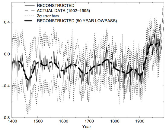
Figure 1.
The ‘hockey stick graph’: a millennial reconstruction of average temperatures in the northern hemisphere from Mann et al. (1999).
In the context of a scientific paper, the image succeeds in communicating a complicated statistical analysis of temperature proxies, averages, and degrees of uncertainty that are the central finding of the study. However, as an image in wider circulation, mediated and remediated, it reached new audiences and was used to enact new strategies of emphasis. It attracted a great deal of press when it was first published in Nature in 1998 (serendipitously for newsmakers, arriving both during an unusually warm year and on Earth Day), providing a condensed visual that could effectively communicate the scale and speed of climate change to non-scientific audiences. It went on to become a key visual in the Intergovernmental Panel on Climate Change’s Third Assessment Report, as well as in the summary of this report for policy makers (Watson et al. 2001). The image was further displayed prominently behind speakers during the press conference organized by the IPCC at its release, providing a conceptual and literal backdrop against which messages of certainty and urgency were framed (BBC News 2001).
The dramatic turn of the hockey stick and its affective message of scalar shifts have been further mediated by a range of contemplative techniques. Most spectacularly, a similar chart was recreated during a key moment in Al Gore’s film An Inconvenient Truth (Guggenheim 2006), this time visualizing millennial spikes in CO2 concentrations. Rather than statically presented for inspection like other figures in the film’s lecture, the graph was dramatized by Gore physically scaling the blade of the hockey stick in a mechanical lift, theatrically emphasizing the irregularity of the spike and its departure from shared norms and conventions—in this case metaphorically writ as the floor on which a sober speaker might stand. More privately, the scientist and environmentalist James Lovelock reportedly keeps a copy of this graph pinned to his wall as a kind of icon of secular concern. Keeping it in the view of his desk at all times apparently serves him as a constant reminder of the stakes and speeds of climate action (Lovelock 2007, p. 52).
Because of its prominence, the hockey stick’s scalar message also became a lightning rod for political disputes, including those levied in good faith and those with a more partisan or ideological motive. Proving or disproving the hockey stick was and, in some very stubborn circles, still continues to be a chief arena in which climate change skeptics and deniers go to war. It took an outsized role in several congressional hearings convened by climate denialist politicians, para-scientific reports issued by fossil fuel and libertarian think tanks, and the skeptic blogosphere and publishing circuits.1 Like Lovelock and Gore, denialists have singled out the hockey stick as more than just a scientific summary, but a message about the character of climate change, posed with considerable urgency. These meditations, mediations, and contestations of the image compose a range of interpretive strategies for negotiating scale’s affective demands: a shift in norms that demands, but does not clarify, defensive reaction.
In Mann’s own account, the graph—not his data, but his data visualization—attracted so much attention, positive and negative, because as an image it is both visually engaging and psychologically alarming (Mann 2012, pp. xiii–xvi). Its public relevance outpaced its useful but by no means pivotal contribution to the scientific consensus around global warming that solidified in the late 1990s (Mann 2012, p. 127). Its legacy is and remains one of scalar pedagogy and affect.
A key reason why Mann et al.’s graph circulated so heavily was that it could effectively communicate the abstraction of “the climate” as a new category of planetary knowledge distinct from that of regional weather patterns, no matter how historicized. Scale, in other words, is definitional to the concept of climate that was framed and argued through the mediated history of the hockey stick. Its millennial-long temporal reach, and sharp vector of discontinuity in recent decades, express climate as a phenomenon analytically and perceptually dissimilar from scales germane to human experience. It hails viewers to contemplate time and phenomena beyond their reach. It requires forms of scalar thinking and action that weigh quantitative and qualitative differences carefully.
Transcalar engagements are hard to think and enact and the graph itself is silent on this subject. Indeed, one of the reasons why Mann et al.’s graph is so alarming and enduringly unimpeachable is that it is a decidedly global abstraction. It records average temperatures across nearly planetary scales,2 which is a convenient optic and a good short hand for the performance of geophysics, but in doing so it constructs a temperature that is never actually experienced—a massively aggregate signal that must be meticulously produced and imagined through the medium of the cartesian grid and the techniques of statistical analysis. It mediates scale; it does not index it.
This framing of climate is, of course, not without ongoing social complications. The scalar leaps implied by framing climate above and beyond human experience place the role and responsibilities of political units of analysis under perceptual strain. This contributes to a framework in which climate is understood as both the provenance of anthropogenic action, yet not scalarly continuous with the corporeal or agential capacities of individuals or publics. This suggests, as the following section argues, that there are emergent models of power implied by all representations of scale and their configuration of more than human forces and different models of human collectivity. There are a range of contradictory ways to address this problem and no clear, universal strategy to overcome it.
3. Scale’s Double Bind
In the 1990s and early 2000s, during which the hockey stick graph was elevated and contested, there was also a shared assumption—and an understandable one at the time—in both environmentalist and scientific circles that the problem of climate inaction was fundamentally a matter of a public knowledge deficit. The way to motivate change, broadly conceived, was thus to simply communicate the science more—to educate, to provide knowledge, in easily understandable terms like iconic data visualizations, that could recruit the public into the scientific consensus.3 An informed public, it was further hoped, would be automatically or at least more easily mobilized to elect and pressure political representatives that would then take the necessary national and international actions to avoid catastrophic global warming. There was, in short, a model of power implied by this kind of science communication: correct errors in judgement at the base so that power can be more effectively mustered at the top. This was the foundational assumption of An Inconvenient Truth and much of the media coverage about the hockey stick’s proof, demands, and possible illegitimacy.
This presumption has largely failed in practice, at least in the American context. Despite continued efforts to disseminate and communicate scientific findings, the number of Americans who believe in climate change today is not dramatically different from the numbers in 2001 (Brenan and Saad 2018). Currently only 3% of Americans rate environmental issues among the essential concerns facing the country (Gallup Inc. 2019). More broadly, international political elites and elected governments have almost universally failed to uphold the treaty obligations and emissions targets that have emerged from the decadal march of international climate diplomacy. Energy demand and carbon emissions continue to rise.
In response to this failure of the deficit model of communication, and in response to a range of culturally and class-specific efforts to articulate climate impacts and concerns, barriers to effectively raising public belief and understanding about climate change are now widely understood to be more than informational. As scholars of science communication stress, these figures represent less an absence of information than a lack of context and social infrastructure through which the data of climate change can be made meaningful—not merely received and deposited by route (Callison 2014; Doyle 2011a). Structural and gendered commitments to the fossil economy further complicate the reception of scientific information and contribute to the polarization of climate science and policy approaches in subcultures and in government (Dunlap et al. 2016; Daggett 2018). As this research emphasizes, the crisis of climate inaction was and is less about uncertainty than about power and social conflict.
Yet scale and its aesthetics tacitly coinhabit questions of identity and political economy. This is because climate communication remains in something of a double bind: Global warming requires inherently trans-scalar modes of engagement, encompassing spatial breadths and time frames that are not easily accommodated in familiar forms of social life. Climate change media must negotiate representational extremes that risk either overwhelming their audience with the immensity of the problem or stripping data of ontological weight and local meaning. As feminist and anticolonial scholars remind, aesthetic and receptive strategies that linger in these scalar disconnections—the sublime, the hyperobject, romanticism, or horror—commonly fail to cultivate a sense of responsibility or engaged, collectivist strategies to “stay with the trouble” of climate (Haraway 2016; Heise 2014; Shotwell 2016).
The task of visualizing climate is thus seemingly torn between scales germane to the problem and scales more appropriate to mobilizing political action. Communicating vast geophysical time and trends—and making them meaningful within the space of daily life—remains an ongoing challenge, especially when local experiences of climate depart from the narrative of global warming or when living fully with the knowledge of climate change proves politically and psychologically trying (Norgaard 2011). It may be hard to reconcile local experiences of weather with the severity of the hockey stick graph, no matter how sincerely one might believe that they represent an accurate account of a scalar thing or a concept called climate. One’s answer would likely differ if considering this question in the Arctic or the Maldives Islands, but this would be no less local a response to this image.
Today, an emphatically global, data-centered view of climate change is increasingly being abandoned within work coming out of and drawing from the sociological study of climate politics and knowledge production. A wave of science and technology studies scholars have called these visualizations to task for the many ways in which abstract, planetary data risks producing an apolitical flattening of global responsibility, overwhelming and rendering powerless its viewers, or otherwise ignoring the many different ways in which climate change comes to matter culturally. Notably, there is a recurring call to attend to the emplacement of climate change within socially-valued local geographies that are uniquely threatened but could also uniquely motivate local actions which might, in aggregate, scale up to the level of the climate (Jasanoff 2010; Callison 2014; Doyle 2011a). For these critics and experts, best practices in climate communication do not consist of the intensified education of a generic public with more and seemingly neutral global scientific data, but the recognition and elevation of situated publics that negotiate warming through place-based calls to action.
Science communication as a field of study and practice within STEM, both in response and in parallel, has begun to make an allied departure from the information deficit model. Recent studies on the psychology of climate change suggest that quickly pivoting from a focus on global-level crises to a focus on individual-level solutions is key to conveying the problem of climate change and getting it to stick (Wolf and Moser 2011). In order to push past psychological defenses and to convince the unmotivated, science communication experts argue that effective communication must reject gloomy projections for the future and contain positive accounts of individual agency within its narrative (Shome and Marx 2009; Mooney et al. 2015; van der Linden et al. 2015). In practice, this can be condensed to a formula: “persuasive communications = shared values + a problem or opportunity + a solution or call to action” (Banse 2013, p. 6). Threats, in other words, must be consistently matched with locally actionable solutions. Regardless of where the conversation about climate begins or develops, it should be narrowed at the end to match the scale and concerns of one’s audience.
This local turn in the debate around best practices in climate communication forwards, tacitly and overtly, contrasting models of power through a downshifting in scale. Strong, positive examples of this strategy have emerged in recent social movement mobilizations and community self-defense strategies such as The People’s Climate March and the #NoDAPL resistance at Standing Rock. Mobilizing coalitionally towards wider climate action, framed through locally determined, intersectional demands, has proven to be a successful strategy in cultivating both new kinds of media attention and grassroots political power (Young 2015; Cohen 2016; Estes 2019). The emergence of these movements further reflects the fact that climate change is now no longer effectively framed as an anticipated threat but can better be understood as a series of disruptions that are currently and differently experienced by frontline communities. Accompanying these protest camps, mass mobilizations, and media campaigns are also turns to reopen questions about definition of the good life, both in terms of individuals and as supported within larger societal structures.
However, these calls to act locally on climate are not always collective in nature. At its worst, and perhaps more frequently, the rejection of the global and a stubborn emphasis on solutions can take the form of sustainability talk run amok, overly emphasizing individual agency and market-palatable but globally insignificant or unaccountable forms of performative action (Alaimo 2012, p. 559; Steinberg 2010; Lovell and MacKenzie 2011). The visualization of carbon footprints, for example, is a popular way in which data comes back into this localized picture. Calls to reduce one’s footprint, often in the context of individual consumer decisions, presume that responsibility for the climate crisis can be quantified and satisfied as a matter of individual accounts. Tellingly, the concept was popularized by British Petroleum during its ill-begotten rebranding phase as an attempt to render individual households and the oil company equivalent in scale and ethical responsibility (Pasek 2019; Doyle 2011b).
The risk, as its been subsequently argued by Timothy Clark, is that this form of climate communication can produce and rely upon “derangements of scale” whereby minute individualizing actions are made falsely equivalent to planetary problems, ignoring the larger economic and infrastructural forces that are much harder to change but that are certainly more causal (Clark 2012, pp. 150–51). This misconstrued sense of scale can risk becoming a form of “soft denial” whereby the phenomena of global warming is acknowledged, but rendered falsely distant or too easily manageable (Hoexter 2016). We might say that scale here becomes an act of aspirational mimesis, where the shape of the macrocosm is imagined in relation to a highly symbolic microcosm, but without a legible analysis of how these two scales do or do not respond to the other. As with any analysis that seems to deliberately elide structural questions, this too implies a model of power: one where the personal governance of presumably homogeneous individual lives is the first and last avenue for the production of politics.
The soundness of this theory of change notwithstanding, in this context it might seem like the time of charismatic planetary data visualizations is coming to an end—that there will be no great hockey stick graphs in the future, and that in the turn to local action the problem of global scales has been to a large degree evacuated from climate politics, for good or for ill. However, there is some evidence that this is not the case. The remainder of this paper turns to focus on a particular recent example of climate data visualization—one that is in many ways a response to these currents and debates and which might illuminate areas of concern that still elude wide notice and discussion.
4. Scalar Affects and Data Visualization
On 9 May 2016 climate scientist Ed Hawkins posted his first spiral climate gif to Twitter. The figure takes data from the University of East Anglia’s CRUTEM4 dataset and runs it through a circular calendar, translating the sharp rise of a hockey stick-styled graph into a widening and quickening gyre of global average temperatures (Figure 2). As the pace and span of temperature changes increase towards the turn of the century, and as the Paris Agreement’s 1.5- and 2-degrees Celsius targets are quickly approached, Hawkins’ spiral dramatizes familiar, and too easily forgotten, scientific findings. There is nothing new to this information; Hawkins is rather taking old knowledge and knowledge forms and remediating them in his spare time, bringing together political targets and global data points into a differently staged image: one that represents scale through change in intensity and speed, and in the abbreviated real time of the gif’s 11 second loop.
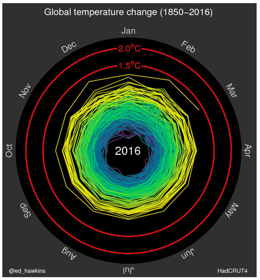
Figure 2.
Ed Hawkins’ original climate spiral gif. An animated version of the gif can be viewed at http://www.climate-lab-book.ac.uk/2016/spiralling-global-temperatures/. Licensed by Ed Hawkins under a Creative Commons Attribution-ShareAlike 4.0 International License.
The responses to the spiral were unanticipated and voluminous. Hawkins’ gif rapidly went viral, circulating beyond “climate Twitter” to reach hundreds of thousands of viewers in the social space of newsfeeds or the public space of conventional news coverage about the spiral in subsequent days. The Washington Post called it “the most compelling global warming visualization ever made” (Mooney 2016). Several other gifs followed, authored by Hawkins and other colleagues engaged by the concept, covering sea ice volume, CO2 concentrations, and forecasted future temperatures.4 Hawkins’ original spiral, meanwhile, began to circulate as a new and urgent index of climate change timescales. The 2016 Rio de Janeiro Olympic Games featured a version of the spiral prominently in its opening ceremonies, further propagating the image to 1 billion-some viewers. Hoesung Lee, then the head of the IPCC, reportedly reevaluated the organization’s media strategies in light of this success (King 2016).
Responses to the animation were wide and intensely felt, though not for reasons that are commonly known or understood. In many ways, the spiral visualizations seem to respond to some of the concerns of earlier climate communication experts and critics; they colorfully bring together political targets and geophysical data, thwarting the inclination of most scientific visualizations to just report the physical phenomena. The gifs are also optimized to circulate in social spaces, reaching everyday people, perhaps caught unaware between memes and passing thoughts, thereby rendering climate change communication a little more ubiquitous and vernacular.
Yet, like the hockey stick graph, the scale of the visualization is determinedly global. The data is a smoothed, semi-empirical mediation of observations (Edwards 2010, p. 188), diffusely modeled out over the whole of the northern hemisphere. It represents numbers that have never been directly felt by any given body, it erases differences between the hemisphere’s poles and middle latitudes, where climate change is progressing with drastically different speeds and socio-cultural impacts (Watt-Cloutier 2018), and, like so many scientific visualizations of climate data, it is silent on questions of historical responsibility, borders, or environmental justice at large (Doyle 2011a, p. 37). Moreover, against science communications orthodoxy, the image is wholly agnostic on the subject of solutions or shared values. It does not specify a ‘we’ to which or from which the data is oriented, nor does it suggest what a proper response to the data might be, besides aesthetic contemplation and affective reaction to the animation of scale and speed.
In short, the success of the gif is a puzzle that current scholarship on the mediation of climate change does not fully explain. A closer examination of the audience reception of these gifs suggests that questions of scale—or the vexed gap between global representations and local capacities for action—are still very much at play. Rather than the straightforward communication of scientific fact, many who engaged with these images sought to share and communicate not just global warming data, but also the affects and scalar dynamics of this data when newly registered by Hawkins’ visual technique. This requires an analysis of scalar representations as an aesthetic project, rather than purely informational or contextual communications.
Climate data visualization, to this end, should be read for its formal structures. In developing this avenue of analysis, firstly, it should be observed that the principle innovation of the spiral gifs was not their optimized shareability or circular orientation—these had been done before—but rather the fact that they move. Hawkins himself acknowledges this (Van Renssen 2017). There is something dynamic, perhaps even visceral, to data rendered as a moving image rather than a static one. Gore’s physical animation of the CO2 hockey stick hints at this fact. Removed from conventional x- and y-axes and their explanatory registers, the viewer of a climate spiral is freed from interpretative work to a significant degree, able simply to watch and respond to the pace and expansions or contractions of data in motion.
This allows for a newly kinetic understanding of climate-scaled phenomena. The viewer is able to register shifts in temperature not only as a crystalized, visual fact, but also and perhaps more profoundly as a durational, qualitative shift in temporal and spatial pattern. Initially one sees only the relatively minute changes of the turn of the 20th century and this makes the accelerated tempo of the subsequent century’s arrival and derivations all the more contrasting. In this way, alarm is generated experientially and repeatedly as the gif loops, emphasizing the traces of past norms and differentiating movements in an ever-widening spiral of color and line. To stop abruptly in the present is to momentarily arrest the image’s momentum, as if in a cinematic freeze frame, hovering ominously before its anticipated collision with the 1.5- and 2-degree targets. This gives a very different perspective on the fragility of these targets than the IPCC’s graphing efforts of mitigation pathways have sought to render legible and feasible beyond, perhaps, what a more realistic assessment of historical and political trends might suggest (Anderson 2015). The moving image provides a subtle, but powerful, corporeal solicitation: to think through data not just via visual summary and synthesis, but as an imagined index of a physical thing, with a palpable acceleration that implies, in turn, the frightening inertia of an object in motion.
The result, for some, is a visualization of the worsening intractability of climate change rather than its political call to order. In responses to the graph there is a pronounced tendency to see the spiraling data first as fact, then as symbol—to move from scientific understanding to metaphor. The graph’s circular shape, to this end, seems to be often taken as an echo of the shape of the planet itself, its enclosing atmosphere, or the growing fracture of geophysical and political norms. The Washington Post, for example, notes that, “the circles are part of one unwinding spiral, which serves as a fitting metaphor for the long-term course of the Earth’s temperature” (Mooney 2016). This resonance is evident in several responses to the original Twitter post (Hawkins 2016) which, in addition to the usual climate denialist contrarianism, include comments such as “It’s a Death Spiral,” “Watch #globalwarming spiral out of control,” and “WE ARE ALL GOING TO DIE.” (In my own viewing of the gif I keep returning to William Butler Yeats’s poem “The Second Coming”: “Turning and turning in the widening gyre/ The falcon cannot hear the falconer/ Things fall apart; the centre cannot hold”). This is all to say that I am not sure that we can extrapolate a clear model of power here, except for the power that lies in soberly assessing its lack.
Rather than dismissing these responses as unproductive nihilism, I am interested in examining this kind of affective phenomena as itself a way of thinking through the dynamics of scale in which climate change is fundamentally embroiled. Rather than paralyzing or off-putting, for the large public that circulated the climate spiral, the image was affecting and demanded to be shared. It was a networked affect—a piece of viral media, but also feeling.
In the context of incredibly inadequate industrial and government responses to climate change, it seems entirely appropriate that people should seek out and respond to representations of climate that feel bad—that express a sense of alarm and impending crisis, and that otherwise subtly communicate the visceral feeling of impending disaster rather than celebrate its potential solutions. The virality of these images—their impactfulness and social success—can in many ways be read as a response to and a refusal of the strained positivity of climate communication today. Data visualization, rendered in motion, represents in kinetic terms the ways in which carbon emissions and global economies move with historical momentum; that it is an urgent, and exceedingly difficult task to slow the progress of geophysically scaled processes; and that the goal of climate action today will be to slow and mitigate—but not avoid, erase, ‘solve’, or wholly undo—global warming as an existential threat to so many species, communities, and lifeways. In this light, Hawkins’ spirals have perhaps succeeded in communicating the scalar realities of climate science more than any footprint analysis or policy document could.
Significantly, I think that Hawkins’ climate visualizations and the story of their reception suggest a new direction in the debate about how to best communicate and organize towards publics in this fight. In the corporeal mode of address that moving data elicits, there is a sense not of local specificity or global abstraction, but of an evocative sense of the planet and the climate as physical entities—of aggregate global temperatures not as a temporal phenomena, but as a weighty thing whose path cannot be trivially shifted. This reading of the gif takes up Ursula (Heise 2008, p. 55) invective to reject an absolutist mandate for local-specificity within environmental politics and to instead seek to cultivate a “sense of the planet,” which might be sought within the globe-spanning affordances of contemporary networks of communication (p. 63). Climate is bigger than individuals and localities; acknowledging this is crucial. It further speaks to what Hannah Knox has described as “thinking like a climate”: a receptive form of engagement observed between several climate scientists and their data in which divides between the observer and the observed collapse into relational urgency (Knox 2015). Reactions of alarm, shared anxieties, and pronouncements of doom show that viewers see themselves in the system encircled by climate data and are moved by its aesthetics into forms of public feeling.
Above all, the climate spiral example stands as a testament that aesthetics and affect matter, that formal design elements and the social life of scientific images are tightly bound within questions of scale, and that these factors should ideally be acknowledged and mobilized rather than preempted and strong-armed in an effort to emphasize solutions. ‘Bad emotional responses,’ a visual attraction to the global, and public faith in data’s capacities for storytelling persist in the mediation of climate change today. Past critiques of the racial, gendered, and social gaps of this framing of the issue remain essential, but such engagements need not necessarily be in conflict with the contextual and situated. The challenge, as every good organizer knows, is to provoke emotion first and put it to work second. In removing scale from climate communication, and by emphasizing only our positive abilities for action, we risk losing a powerful affective tool as well as a sober assessment of what we are facing as a planet.
5. Conclusions
The role of aesthetics in climate communication has been largely confined to the field of ecocriticism and related studies of global warming in art, literature, and film—in short, objects of study that are understood to be interpretive representations of climate within a predominantly humanist tradition (Siperstein et al. 2016; Svoboda 2016; Davis and Turpin 2015). There are few attempts to apply humanist analyses of aesthetics and visual culture to scientific representations of climate and climate data.5 Yet, as evidenced by the climate spirals and, to a degree, the hockey stick graphs that precede it, data visualization is a rich site of aesthetic and affective responses—responses that can best be evaluated through tools of formal analysis and reception germane to the arts.
These examples of charismatic data images suggest that climate change communication continues to be a complicated, unpredictable task, resistant to easy summary in formulas for best practices or optimized psychological reach. This is in large part because of the paradox of scale that endures within the political, scientific, and aesthetic problems of climate: Global warming requires inherently trans-scalar modes of engagement, calling our attention simultaneously towards each other and far beyond the scope of individual or everyday experiences. We must forget neither side of this equation.
I conclude not with an answer that resolves this tension, but instead a call for pluralism in approaches to negotiating scalar contradictions. I find encouraging signs to this end in the continuing experiments with form and visual narrative emerging from communication practitioners, both professional and informal. Animation is fast becoming a more commonly utilized technique, now formally recommended to climate researchers looking to share datasets and summaries with a wider public (Harold et al. 2017). Recent efforts by Antti Lipponen, Kevin Pluck, Robert Rohde, Neil Kaye, and John Nelson are examples of this trend, including gif, video, and scrolling animations that dramatize the speed and size of global temperature anomalies, sea level rise, and fossil fuel consumption on sites including Twitter, Reddit, Flickr, and YouTube. More broadly, during the recent Global Climate Strike Week, millions of youths and their allies marched with signs that mixed climate data and collective demands, as well as humour and despair, local grievances and global imperatives, the personal and the political. Online and offline, in professional contexts and in memes, data and people are on the move, circulating affects.
Ed Hawkins, meanwhile, has sparked another viral success: “warming stripes” that graphically mark the global drift in average temperatures through shifting bands of blue and red colours. The formula has been localized by individuals and groups and transported off the Internet and onto cars, clothes, murals, and mugs, traveling through everyday spaces and sparking new conversations. I was astonished to discover one such visualization in a city council meeting in August. Among the activists and advocates delivering testimony in support of a declaration of climate emergency was a small group holding aloft a scarf, knitted to display stripes of rising temperatures across scales greater than a human lifetime. The declaration passed, not by virtue of the scarf, but through the mixed emotions and collective demands that brought it and so many others into the chamber.
Funding
This research was funded by the Social Sciences and Humanities Research Council of Canada, grant number 767-2014-1557.
Acknowledgments
The author is grateful to the organizers and participants of the 2016 Mediating Climate Change conference in Leeds for all their constructive feedback and comments as well as those offered by her anonymous reviewers.
Conflicts of Interest
The author declares no conflict of interest.
References
- Alaimo, Stacy. 2012. Sustainable This, Sustainable That: New Materialisms, Posthumanism, and Unknown Futures. PMLA 127: 558–64. [Google Scholar] [CrossRef]
- Anderson, Kevin. 2015. Talks in the City of Light Generate More Heat. Nature 528: 437. [Google Scholar] [CrossRef] [PubMed]
- Banse, Lisa. 2013. Seeing Is Believing: A Guide to Visual Storytelling Best Practices. Resource Media. Available online: http://www.resource-media.org/visual-story-lab/report/ (accessed on 19 August 2019).
- BBC News. 2001. Human Effect on Climate ‘beyond Doubt’. BBC News. January 22. Available online: http://news.bbc.co.uk/2/hi/science/nature/1130501.stm (accessed on 19 August 2019).
- Brenan, Megan, and Lydia Saad. 2018. Global Warming Concern Steady Despite Some Partisan Shifts. Gallup Inc. March 28. Available online: https://news.gallup.com/poll/231530/global-warming-concern-steady-despite-partisan-shifts.aspx (accessed on 17 February 2019).
- Callison, Candis. 2014. How Climate Change Comes to Matter: The Communal Life of Facts. Durham: Duke University Press. [Google Scholar]
- Clark, Timothy. 2012. Derangements of Scale. In Telemorphosis: Theory in the Era of Climate Change. Edited by Tom Cohen. Ann Arbor: Open Humanities Press, vol. 1, pp. 148–66. [Google Scholar]
- Cohen, Daniel Aldana. 2016. Petro Gotham, People’s Gotham. In Nonstop Metropolis: A New York Atlas. Berkeley: University of California Press, pp. 47–54. [Google Scholar]
- Daggett, Cara. 2018. Petro-Masculinity: Fossil Fuels and Authoritarian Desire. Millennium 47: 25–44. [Google Scholar] [CrossRef]
- Davis, Heather, and Etienne Turpin. 2015. Art in the Anthropocene: Encounters among Aesthetics, Politics, Environments and Epistemologies. London: Open Humanities Press. [Google Scholar] [CrossRef]
- Doyle, Julie. 2011a. Mediating Climate Change. Farnham and Burlington: Ashgate. [Google Scholar]
- Doyle, Julie. 2011b. Where Has All the Oil Gone? BP Branding and the Discursive Elimination of Climate Change Risk. In Culture, Environment and Ecopolitics. Edited by Nick Heffernan and David A. Wragg. Newcastle upon Tyne: Cambridge Scholars Publishing, pp. 200–25. [Google Scholar]
- Dunlap, Riley E., Aaron M. McCright, and Jerrod H. Yarosh. 2016. The Political Divide on Climate Change: Partisan Polarization Widens in the U.S. Environment: Science and Policy for Sustainable Development 58: 4–23. [Google Scholar] [CrossRef]
- Edwards, Paul N. 2010. A Vast Machine: Computer Models, Climate Data, and the Politics of Global Warming. Cambridge: MIT Press. [Google Scholar]
- Estes, Nick. 2019. Our History Is the Future: Standing Rock Versus the Dakota Access Pipeline, and the Long Tradition of Indigenous Resistance. London and New York: Verso. [Google Scholar]
- Gallup Inc. 2019. Most Important Problem. Gallup.Com. January. Available online: https://news.gallup.com/poll/1675/Most-Important-Problem.aspx (accessed on 17 February 2019).
- Guggenheim, Davis. 2006. An Inconvenient Truth. Hollywood: Paramount Home Entertainment. [Google Scholar]
- Haraway, Donna Jeanne. 2016. Staying with the Trouble: Making Kin in the Chthulucene. Durham: Duke. [Google Scholar]
- Harold, Jordan, Irene Lorenzoni, Kenny R. Coventry, and Asher Minns. 2017. Enhancing the Accessibility of Climate Change Data Visuals: Recommendations to the IPCC and Guidance for Researchers. Norwich: Tyndall Centre for Climate Change Research, Available online: https://tyndall.ac.uk/sites/default/files/Data_Visuals_Guidance_Full_Report_0.pdf (accessed on 25 September 2019).
- Hawkins, Ed. 2016. Spiralling Global Temperatures from 1850-2016 (Full Animation). Twitter. Available online: https://twitter.com/ed_hawkins/status/729753441459945474 (accessed on 16 June 2017).
- Heise, Ursula K. 2008. Sense of Place and Sense of Planet: The Environmental Imagination of the Global. Oxford and New York: Oxford University Press. [Google Scholar]
- Heise, Ursula K. 2014. Ursula K. Heise Reviews Timothy Morton’s Hyperobjects. Critical Inquiry. June. Available online: https://criticalinquiry.uchicago.edu/ursula_k._heise_reviews_timothy_morton (accessed on 10 August 2016).
- Hoexter, Michael. 2016. Living in the Web of Soft Climate Denial. New Economic Perspectives. September 7. Available online: http://neweconomicperspectives.org/2016/09/living-web-soft-climate-denial.html (accessed on 18 May 2017).
- Jasanoff, Sheila. 2010. A New Climate for Society. Theory, Culture & Society 27: 233–53. [Google Scholar]
- King, Ed. 2016. Can a GIF Change the Way We Think about Global Warming? Climate Home. May 10. Available online: http://www.climatechangenews.com/2016/05/10/can-a-gif-change-the-way-we-think-about-global-warming/ (accessed on 16 June 2017).
- Knox, Hannah. 2015. Thinking like a Climate. Distinktion: Journal of Social Theory 16: 91–109. [Google Scholar] [CrossRef]
- Lovell, Heather, and Donald MacKenzie. 2011. Accounting for Carbon: The Role of Accounting Professional Organisations in Governing Climate Change. Antipode 43: 704–30. [Google Scholar] [CrossRef]
- Lovelock, James. 2007. The Revenge of Gaia: Earth’s Climate Crisis & The Fate of Humanity. New York: Basic Books. [Google Scholar]
- Mann, Michael E. 2012. The Hockey Stick and the Climate Wars: Dispatches from the Front Lines. New York: Columbia University Press. [Google Scholar]
- Mann, Michael E., Raymond S. Bradley, and Malcolm K. Hughes. 1999. Northern Hemisphere Temperatures during the Past Millennium: Inferences, Uncertainties, and Limitations. Geophysical Research Letters 26: 759–62. [Google Scholar] [CrossRef]
- McIntyre, Stephen. 2010. Climategate: A Battlefield Perspective. Chicago: Heart Land Institute, Available online: http://www.climateaudit.info/pdf/mcintyre-heartland_2010.pdf (accessed on 15 July 2019).
- Mooney, Chris. 2016. This Scientist Just Changed How We Think about Climate Change with One GIF. Washington Post. May 11. Available online: https://www.washingtonpost.com/news/energy-environment/wp/2016/05/11/this-scientist-just-changed-how-we-think-about-climate-change-with-one-gif/ (accessed on 27 July 2016).
- Mooney, Chris, Drezen Prelec, Judith Layzer, Tom Levenson, Susan Hassol, and Kerry Emanuel. 2015. Getting Through on Global Warming: How to Rewire Climate Change Communication. Cambridge: Massachusetts Institute of Technology, April 1. [Google Scholar]
- Moser, Susanne, and Lisa Dilling. 2011. Communicating Climate Change: Closing the Science-Action Gap. In The Oxford Handbook of Climate Change and Society. Edited by John S. Dryzek, Richard B. Norgaard and David Schlosberg. Oxford: OUP, pp. 161–74. [Google Scholar]
- Nisbet, Matthew C., and Dietram A. Scheufele. 2009. What’s next for Science Communication? Promising Directions and Lingering Distractions. American Journal of Botany 96: 1767–78. [Google Scholar] [CrossRef] [PubMed]
- Norgaard, Kari Marie. 2011. Living in Denial: Climate Change, Emotions, and Everyday Life. Cambridge and London: MIT Press. [Google Scholar]
- O’Neill, Saffron J., and Nicholas Smith. 2014. Climate Change and Visual Imagery. Wiley Interdisciplinary Reviews: Climate Change 5: 73–87. [Google Scholar] [CrossRef]
- Pasek, Anne. 2019. Fixing Carbon: Mediating Matter in a Warming World. Ph.D. thesis, New York University, New York, NY, USA. Available online: http://search.proquest.com/docview/2298169719/abstract/CB814A41FA77467CPQ/1 (accessed on 25 September 2019).
- Pine, Kathleen H., and Max Liboiron. 2015. The Politics of Measurement and Action. In Proceedings of the 33rd Annual ACM Conference on Human Factors in Computing Systems, CHI ’15. New York: ACM, pp. 3147–56. [Google Scholar] [CrossRef]
- Schneider, Birgit. 2012. Climate Model Simulation Visualization from a Visual Studies Perspective. Wiley Interdisciplinary Reviews: Climate Change 3: 185–93. [Google Scholar] [CrossRef]
- Shome, Debika, and Sabine Marx. 2009. The Psychology of Climate Change Communication: A Guide for Scientists, Journalists, Educators, Political Aides, and the Interested Public. Center for Research on Environmental Decisions, Columbia University. Available online: http://guide.cred.columbia.edu/pdfs/CREDguide_full-res.pdf (accessed on 16 June 2017).
- Shotwell, Alexis. 2016. Against Purity: Living Ethically in Compromised Times. Minneapolis: University of Minneapolis Press. [Google Scholar]
- Siperstein, Stephen, Shane Hall, and Stephanie LeMenager, eds. 2016. Teaching Climate Change in the Humanities. London and New York: Routledge. [Google Scholar]
- Steinberg, Ted. 2010. Can Capitalism Save the Planet? On the Origins of Green Liberalism. Radical History Review 2010: 7–24. [Google Scholar] [CrossRef]
- Svoboda, Michael. 2016. Cli-Fi on the Screen(s): Patterns in the Representations of Climate Change in Fictional Films. Wiley Interdisciplinary Reviews: Climate Change 7: 43–64. [Google Scholar] [CrossRef]
- Van der Linden, Sander, Edward Maibach, and Anthony Leiserowitz. 2015. Improving Public Engagement with Climate Change: Five ‘Best Practice’ Insights from Psychological Science. Perspectives on Psychological Science 10: 758–63. [Google Scholar] [CrossRef] [PubMed]
- Van Renssen, Sonja. 2017. The Visceral Climate Experience. Nature Climate Change, 7. [Google Scholar] [CrossRef]
- Watson, Robert T., Daniel L. Albritton, and Intergovernmental Panel on Climate Change. 2001. Climate Change 2001: Synthesis Report. Cambridge and New York: Cambridge University Press. [Google Scholar]
- Watt-Cloutier, Sheila. 2018. The Right to Be Cold: One Woman’s Fight to Protect the Arctic and Save the Planet from Climate Change. Minneapolis: University of Minnesota Press. [Google Scholar]
- Wolf, Johanna, and Susanne C. Moser. 2011. Individual Understandings, Perceptions, and Engagement with Climate Change: Insights from in-Depth Studies across the World. Wiley Interdisciplinary Reviews: Climate Change 2: 547–69. [Google Scholar] [CrossRef]
- Woods, Derek. 2017. Scale Variance and the Concept of Matter. In the New Politics of Materialism: History, Philosophy, Science. Edited by Sarah Ellenzweig and John H. Zammito. New York: Routledge, pp. 200–24. [Google Scholar]
- Young, Lisa. 2015. Building Solidarity and Growing a Movement: The Story behind the People’s Climate March. Master’s thesis, Massachusetts Institute of Technology, Cambridge, MA, USA. Available online: https://dspace.mit.edu/handle/1721.1/99083 (accessed on 21 July 2019).
| 1 | For a summary of these efforts and an excellent primary source that speaks to the worldview of climate denialism, see (McIntyre 2010). |
| 2 | Although the graph has been used as shorthand for global warming, the dataset is specific to the Northern Hemisphere because of the disparity in datapoints available between the North and South. Its findings hold true of the South, but this dynamic is surely an interesting topic for further study. |
| 3 | For a useful survey and formative critique of the knowledge deficit model in science communication, see, respectfully, (Moser and Dilling 2011), (Nisbet and Scheufele 2009). |
| 4 | These visualizations, along with updated versions of the global average temperature spiral, are collected at https://www.climate-lab-book.ac.uk/spirals/. |
| 5 | (Doyle 2011a) and (Schneider 2012) are notable exceptions. |
© 2019 by the author. Licensee MDPI, Basel, Switzerland. This article is an open access article distributed under the terms and conditions of the Creative Commons Attribution (CC BY) license (http://creativecommons.org/licenses/by/4.0/).