Abstract
Given a dataset, we quantify the size of patterns that must always exist in the dataset. This is done formally through the lens of Ramsey theory of graphs, and a quantitative bound known as Goodman’s theorem. By combining statistical tools with Ramsey theory of graphs, we give a nuanced understanding of how far away a dataset is from correlated, and what qualifies as a meaningful pattern. This method is applicable to a wide range of datasets. As examples, we analyze two very different datasets. The first is a dataset of repeated voters () in the 1984 US congress, and we quantify how homogeneous a subset of congressional voters is. We also measure how transitive a subset of voters is. Statistical Ramsey theory is also used with global economic trading data () to provide evidence that global markets are quite transitive. While these datasets are small relative to Big Data, they illustrate the new applications we are proposing. We end with specific calls to strengthen the connections between Ramsey theory and statistical methods.
1. Introduction
In the realm of data science, the conventional wisdom is that “more data is always better”, but is this the case? As a dataset D becomes larger, Ramsey theory describes the mathematical conditions by which disorder becomes impossible. The impossibility of disorder is analogous to the existence of unavoidable and spurious correlations in large datasets. This makes understanding and measuring the extent of these spurious correlations essential in any attempt to glean meaningful information about D. Ramsey theory is a productive area of mathematical research, and there are many types of systems with Ramsey results, as explored in 2016 by Calude and Longo [1]. There, the authors asked the question, how can Ramsey theory be used to understand spurious and unavoidable correlations in data science?
For example, the pigeonhole principle is an extreme, basic version of the Ramsey statement, “if a given person wears 8 different shirts in a given week and only has 7 shirts, then there must have been a single shirt that was worn at least twice”. Here, the dataset is the collection of shirts, with each shirt assigned a day. The unavoidable spurious correlation is that (at least) one shirt is worn twice. It would be incorrect to conclude that the given person has a particular affinity for that repeated shirt. However, in this case, there is no meaningful conclusion we can draw, despite the natural human desire to attribute meaning to a pattern that is observed but forced to exist by the pigeonhole principle.
However, we might try to draw meaningful conclusions if we identify a shirt that the person wore three times in the same week because the pigeonhole principle on its own cannot guarantee these beyond the base requirement that there is a single shirt that must be worn twice in a given week. This leads to our major connection between Ramsey theory and statistical analysis:
Remark 1 (Spurious Correlations through Ramsey theory).
Ramsey theory ensures that patterns and correlations must always exist in a sufficiently large system. Meaningful correlations are measurements in that system that are over and above the minimum amount guaranteed by Ramsey theory.
Goodman’s formula [2] provides a way to calculate the required number of certain relationships in a relational database. We use Goodman’s formula to quantify how many correlations must be observed to ensure that some of the correlations are not spurious. Put another way, we use Goodman’s formula to test the null hypothesis that a graph representing the relationships in a dataset is random.
Our major contributions include:
- (1)
- Making a relevant and usable connection between Ramsey theory of graphs and statistical analysis datasets (Definition 1).
- (2)
- Giving a statistical measurement of deviation from randomness (Definition 4).
- (3)
- Translating the Ramsey theorem Goodman’s theorem to a measurement of transitivity of a system (Theorem 2).
In order for these connections to be further used and explored, we take care to explain the Ramsey theory we use in the language that an untrained data scientist will understand. Conversely, we take care to explain the statistics and data science in a way that is accessible to researchers in Ramsey theory.
In Section 2, we present the relevant definitions and mathematical framework. In Section 3, we introduce the needed Ramsey technology of Goodman’s formula. In Section 4, we apply this to two real-life models: (1) similarity of voting records for the members of the 1984 US congress, and (2) economic trading data between countries. In Section 5, we give an application of Goodman’s formula to measuring the transitivity of a graph. Finally, in Section 6, we discuss further directions for research.
2. Mathematical Framework
Here, we familiarize the reader with the notions related to graphs. If the reader is already familiar with these concepts, they may safely move to Section 3.
Our main model is a graph G, which is a collection of data points V, called the vertices, and a collection of connected (unordered) pairs of vertices E, called the edges, such that . An edge a between vertices and represents that and are related (in an abstract sense). This edge relationship will be intrinsic to each dataset and what it is trying to measure. For example, if the vertices are points in a metric space, we might assign an edge when the distance between two points is ≤1. Another example is when the vertices are people in a room, and we put an edge between two people if they are mutual friends.
We insist that a vertex cannot be related to itself (a so-called loop) and that it can be described as an adjacency matrix by explicitly listing out which vertices have an edge between them:
A matrix is an adjacency matrix if it is symmetric with entries of with 0 s along the diagonal. An adjacency matrix can be thought of as a graph on vertices where there is an edge between i and j iff . This perspective is useful for the following reason:
Lemma 1.
Let A be an adjacency matrix, and . In the matrix (k-times) the entry is the number of paths in A from i to j of length exactly k.
In other words, if the first power of the adjacency matrix A represents an edge (path length = 1) between two vertices and , higher powers of the adjacency matrix give us insight into the number of paths between and of length k. A graph with N vertices where all (pairwise) possible edges are included is called a complete graph, and is denoted by . In the case , we call a triangle.
Corollary 1.
Let A be an adjacency matrix. The -th diagonal entry of is the number of triangles in A containing the vertex i. The number of triangles in A is , the sum of the diagonal entries of , taking into account over-counting.
Example of Corollary 1:
Suppose we have a dataset with size . The number of triangles that exist in the complete graph is
where each triplet is a triplet of edges that create a triangle (). Depending on whether or not each edge has a value of 1 or 0 in the adjacency matrix A will determine if these triangles exist.
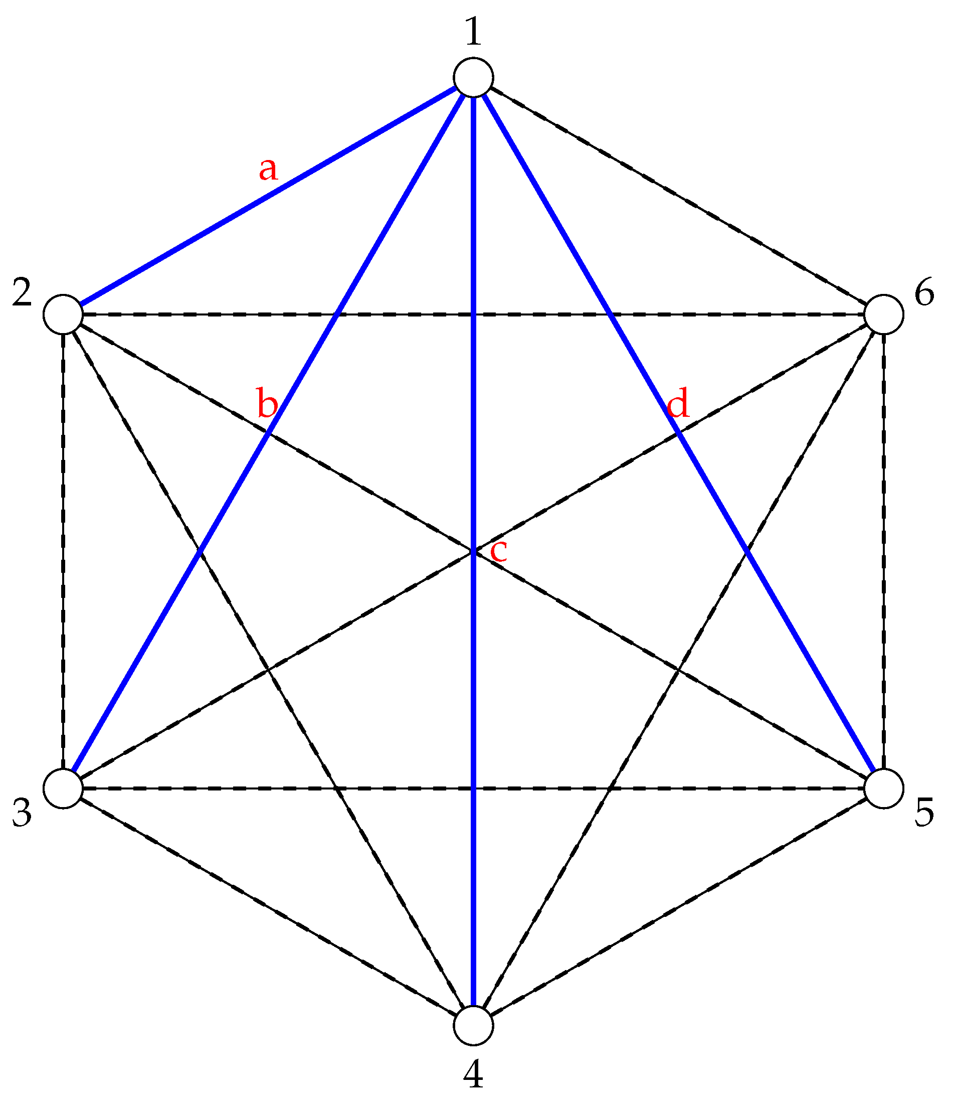
Suppose only the edges and d exist, as in Figure 1. Then, no triangles exist because when we replace the edges and d with 1 and everything else with 0, no triplet of edges is complete:
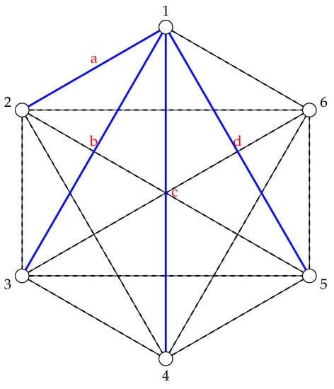
Figure 1.
A graph where only the edges and d exist. The dashed lines are used to indicate a lack of edge.
In this framework, if a triangle exists in the adjacency matrix A, then all three points are connected to each other based on how the predetermined relationship is defined (whether it be geographic distance or some measurement of friendship, for example). In this way, a represents the simplest non-trivial emergent “pattern” that can be observed in a graph connecting data points in D, so it is the natural starting point for asking the question, “Which patterns are forced to exist in D given how we’ve connected its data points in the adjacency matrix A?”.
This framework is good in black-and-white, binary situations where any pair of vertices is either (strongly) related or not related (at all). In non-binary relationships, it can be useful to think about graphs whose edges are classified by multiple colors. This can be represented as a partition of the edge set E into r-many disjoint sets , where represent a total of r-colors or classifications.
In the case of two colors, we will often just refer to red (R) and blue (B) edges. In the framework of adjacency matrices, a complete graph A with an edge-coloring using two colors is represented by an adjacency matrix B indicating a relationship exists or does not R:
Take the edge a between and in R and set it equal to . Since the edge is colored red, it necessarily has to have an entry equal to zero in the blue edge adjacency graph B. In this case, must be the matrix of all ones, except on the diagonal where it has zeros. Counting monochromatic triangles in A is particularly simple:
Corollary 2.
Let A be an adjacency matrix whose edges are colored using two colors. The number of monochromatic triangles in A is .
Therefore, the total number of triangles in the dataset D is equal to the sum of red and blue triangles present in the adjacency matrices R and B. Notably, it only takes polynomial time to compute the number of single-colored (monochromatic) triangles in a graph.
3. The Ramsey Perspective
Classical Ramsey theory asks: “For given nonnegative integers , does every edge coloring of a complete graph with r colors contain a sub-collection , all of whose edges have the same color?” In other words, how big does a multi-colored, complete graph need to be to force the existence of a smaller single-colored, complete graph?
In 1930, Ramsey [3] showed that if the size of the dataset D was , and the number of ways the data points could be related to each other was (either related or unrelated), then unavoidable subgraphs of mutually related or unrelated data points are forced to exist.
In 1959, Goodman quantified how many single-colored (monochromatic) triangles must be present in a two-colored . Because a represents the simplest object that describes how data points relate to each other beyond a simple edge, it will form the basis of our application of Ramsey theory.
Theorem 1
(Goodman 1959, [2]). Let G be a graph with N vertices and edge-colored with red and blue. The quantity of monochromatic triangles in G is at least:
- , if ,
- , if ,
- , if .
Since the total number of triangles in is , Goodman’s formula may be reinterpreted as a percentage.
Corollary 3
(Goodman 1959, [2]). Let G be a graph with N vertices and edge-colored with red and blue. The percentage of triangles in G that are monochromatic is asymptotically at least .
This can be shown directly by dividing the quantities in Theorem 1 by . Alternatively, by applying Schwenk’s reformulation of Goodman’s formula [4], we can easily prove this:
Proof.
For N number of data points, the forced number of monochromatic red (R) and blue (B) triangles is:
and, since the number of triangles present in any complete graph is , the following ratio describes the percentage of triangles in G that are monochromatic:
The Floor Function of is equivalent to the function of with discontinuities at non-integer values x, therefore describing the asymptotic nature of the above ratio can be done without taking the floor functions into consideration:
□
From this, we can establish a threshold for when a two-colored graph can be interpreted to have meaningful correlations.
Definition 1.
Let G be a graph with n vertices and edge-colored with red and blue. Let be the percentage of triangles in G that are monochromatic, among all possible triangles in G. Let be the minimum percentage of monochromatic triangles in G guaranteed by Corollary 3, which has been shown to approach 0.25 as . If then we say that G has potentially meaningful correlations, which we explore further in Section 4.2.
If is much larger than , then we might say that G obeys a triangle dichotomy, which means that we expect a lot of triangles to be either completely one color, or completely the other. This is a relative term, and the larger is the more that this resembles a true dichotomy. If one color is more heavily represented in G than another, then we might say that G has a triangle bias. When triangle bias exists, this is at odds with the expectation, in a randomly colored graph, that the ratio of the number of color R triangles to color B triangles should be 1:1, and is therefore a further indication that the correlations in G are meaningful.
How can this be used in a dataset? In Section 4.2, we discuss a best-fit approach in order to test the null-hypothesis that a dataset is indeed random. In the next section, we show how diverse datasets can be modeled by graphs.
4. Models
Many datasets come naturally as tuples of variables of data, not as a graph. Here, we give a meaningful way to capture information about similarity in the data using a graph. At the most basic level, any measurement of how similar two variables are translates into a measurement of how similar two tuples of variables are (such as by taking an average, or a weighted average).
We will focus our analysis on two datasets: (1) voting records of members of the US congress in 1984, and (2) economic partnership among countries. In the first dataset, we are able to vary our way of combining the information about how the individual variables are similar using what we call threshold graphs. These variations give us a way to very closely compare how far the dataset deviates from truly random. In the second dataset, we do not have complete information, but we are still able to give a more limited measurement of this deviation.
4.1. Similarity in Voting Records
We now look at a set of people that have voted multiple times, specifically the 1984 United States Congressional Voting Records [5]. There is no special motivation for picking this specific dataset, or year, other than it was available to the public. We translate this dataset into a graph with 435 nodes and labeled edges.
Goodman’s formula can quantify how strong the triangle dichotomy and triangle bias are; that is, the percentage of three person cliques (B) and independent triples (R) and their deviation from the expected 1:1 color ratio. We will use the Hamming distance to measure how similar two voting records are for the 435 congress members of the 1984 US congress.
Definition 2.
The Hamming distance of two strings of the same length is the total number of positions where the entries are different.
For example, the Hamming distance between and is 3. These strings differ in the second, fourth and fifth spots.
In this session, there were 16 separate votes, and to each voter we assign the string of length 16 with entries ‘N’ (voted nay), ‘Y’ (voted yea) or ‘A’ (some other action, such as abstaining). The minimum Hamming distance is 0, which indicates two identical voting records, and the maximum distance is 16, meaning the two voters always voted differently. See Table 1 for sample data.

Table 1.
The voting entries of the first six voters in the 1984 US congress dataset.
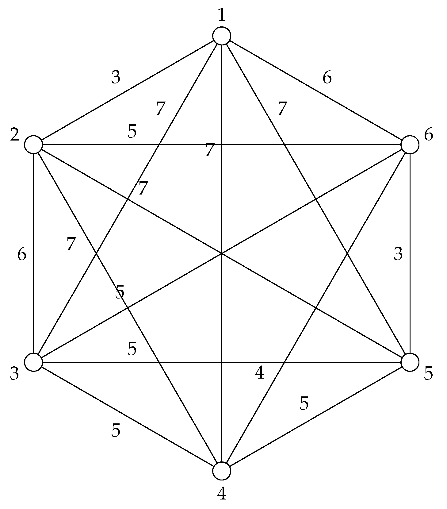
Applying this notion of distance to the data from Table 1 gives the following adjacency matrix and graph (Figure 2):
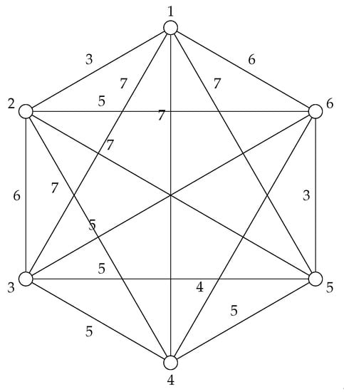
Figure 2.
The graph that corresponds to the first six voting records in the 1984 US Congress dataset.
How do we turn this into a binary adjacency matrix for classification purposes? In other words, how do we decide what constitutes “similar” voting and “dissimilar” voting, and where do we make that cut off?
Definition 3.
Let be a metric space with vertex set M and distance d. Let . Define the two-colored threshold graph in the space by coloring an edge between two vertices blue B iff , and red R iff .
Therefore, when for example , the following graph maps to the binary case:
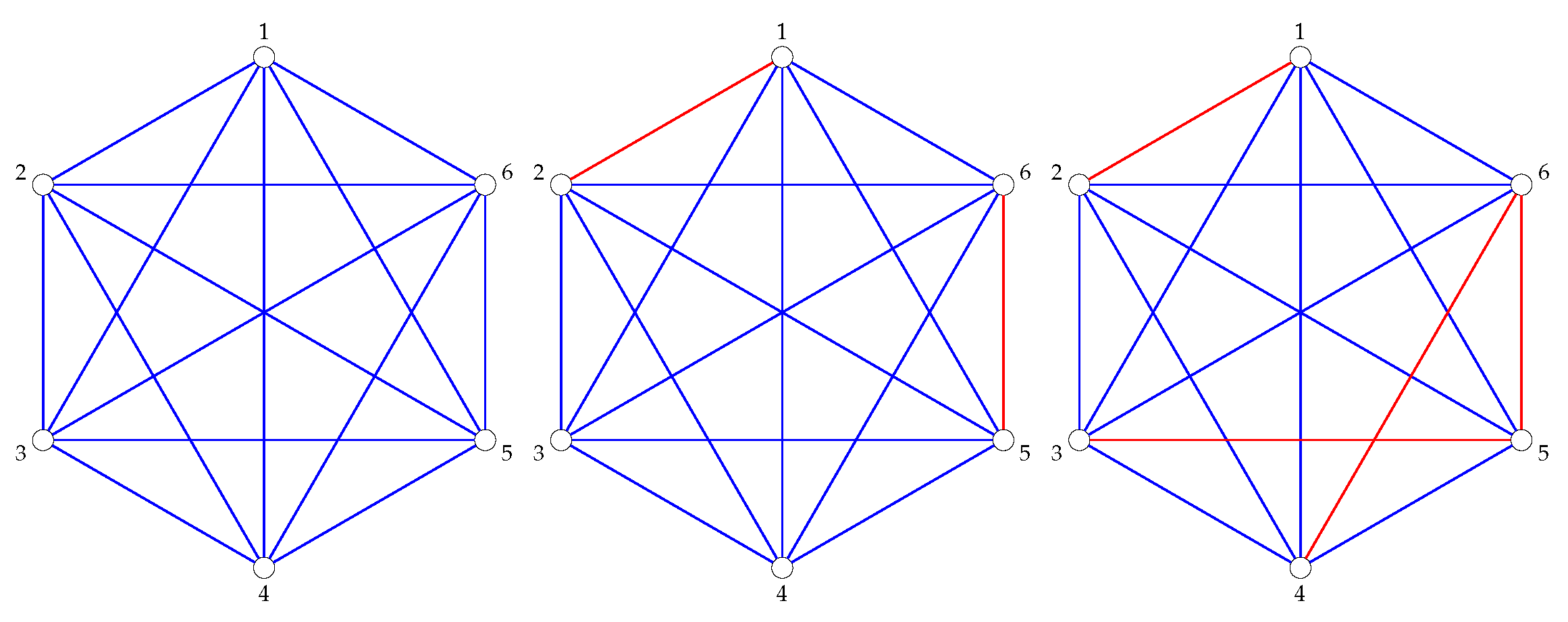
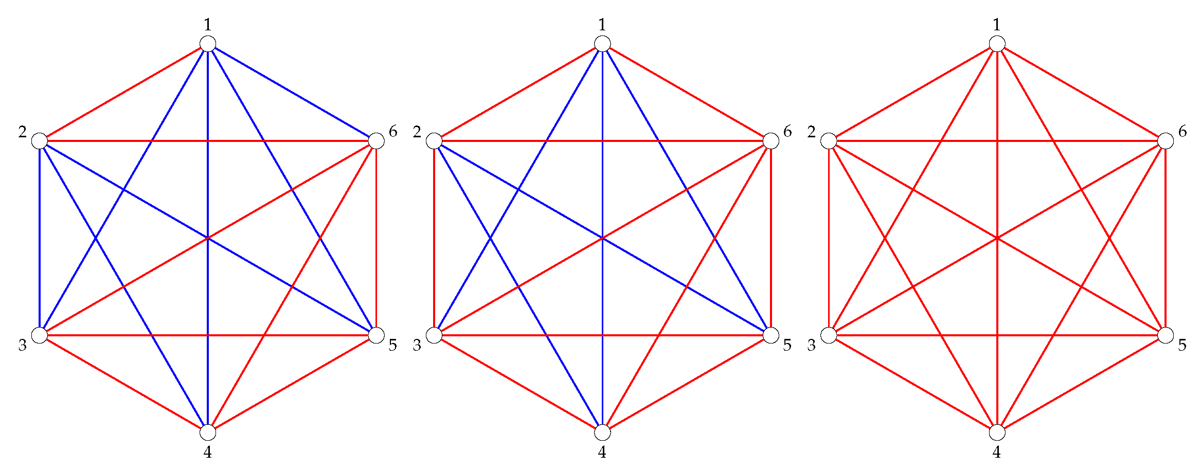
For example, taking the sample Congressional voting data from Table 1, we get the following threshold graphs in Figure 3 and Figure 4.
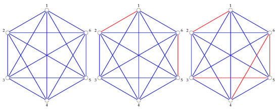
Figure 3.
The graphs (left), (center), and (right).
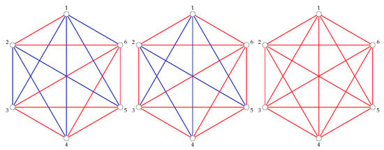
Figure 4.
The graphs and .
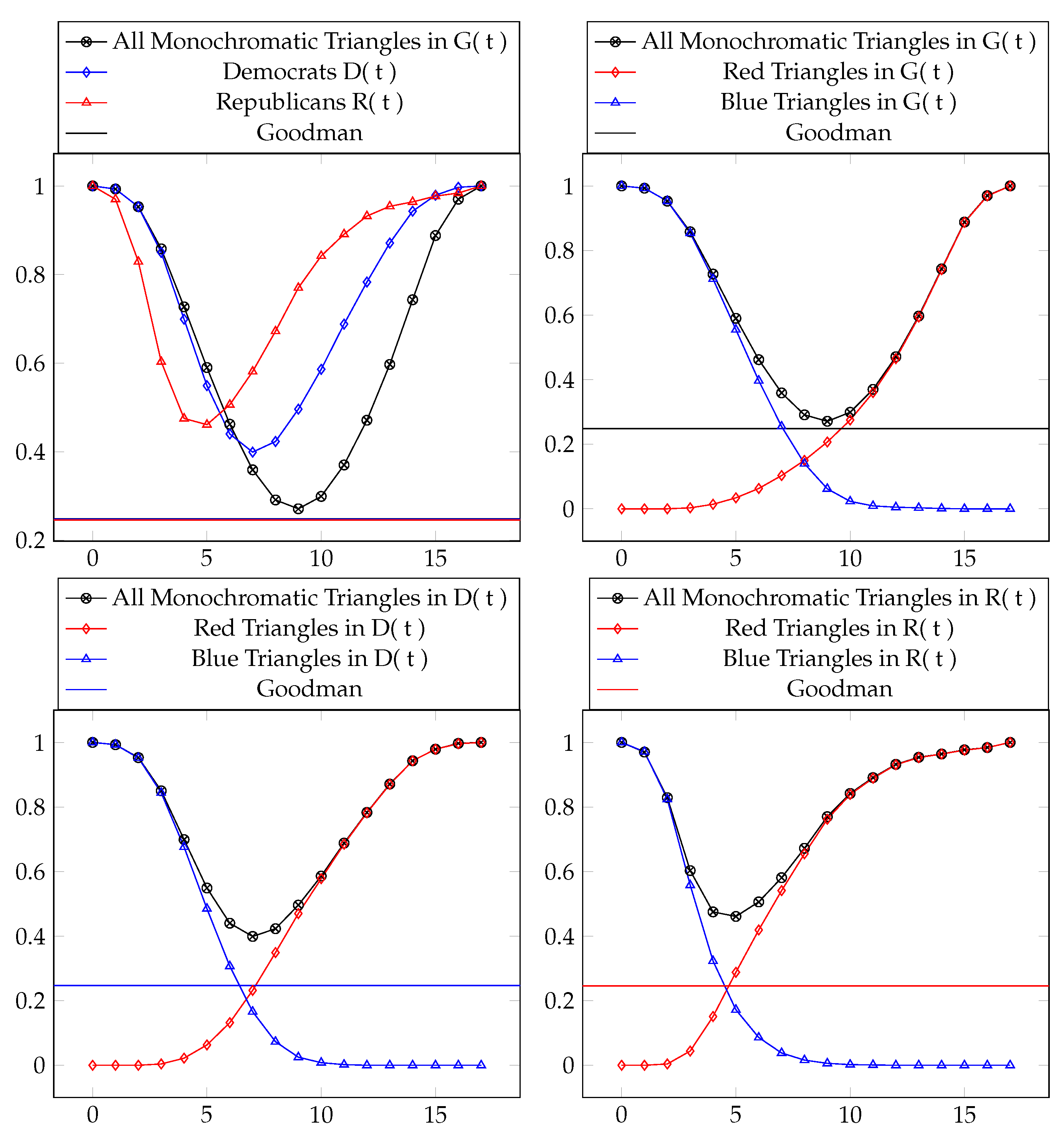
Consider the complete graph , the subgraph composed entirely of Democrat Congress votes , and the subgraph composed entirely of Republican Congress votes . Applied to the total voting records available in the dataset at various thresholds t, the following table (Table 2) and figure (Figure 5) show the ratio of to the total number of triangles :

Table 2.
The percentage of monochromatic triangles for various threshold graphs. The minimum values are boxed.
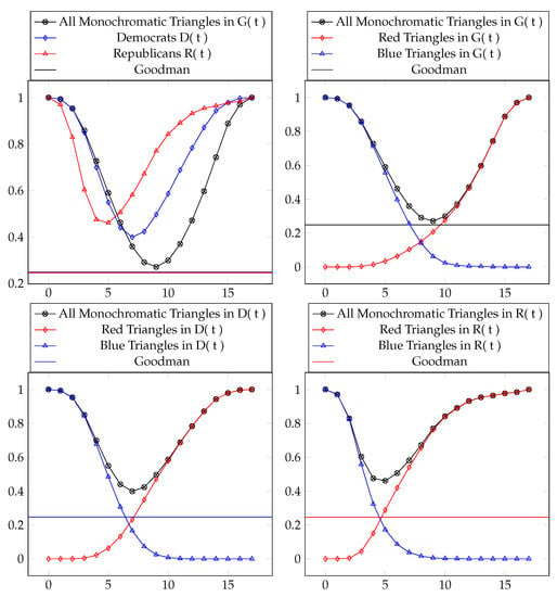
Figure 5.
Data from Table 2 visualized.
In Section 5, we give another natural interpretation of these results by giving a measure of how transitive these graphs are. This is maybe a more intuitive interpretation of the data since it gives us a direct measurement of cooperation and independence.
4.2. How to Measure the Deviation Away from a Random Graph
Goodman’s formula tells us how many monochromatic triangles are forced to exist for a dataset D of size N, but what would the threshold graph of a truly random coloring of look like?
4.2.1. Theoretical Construction
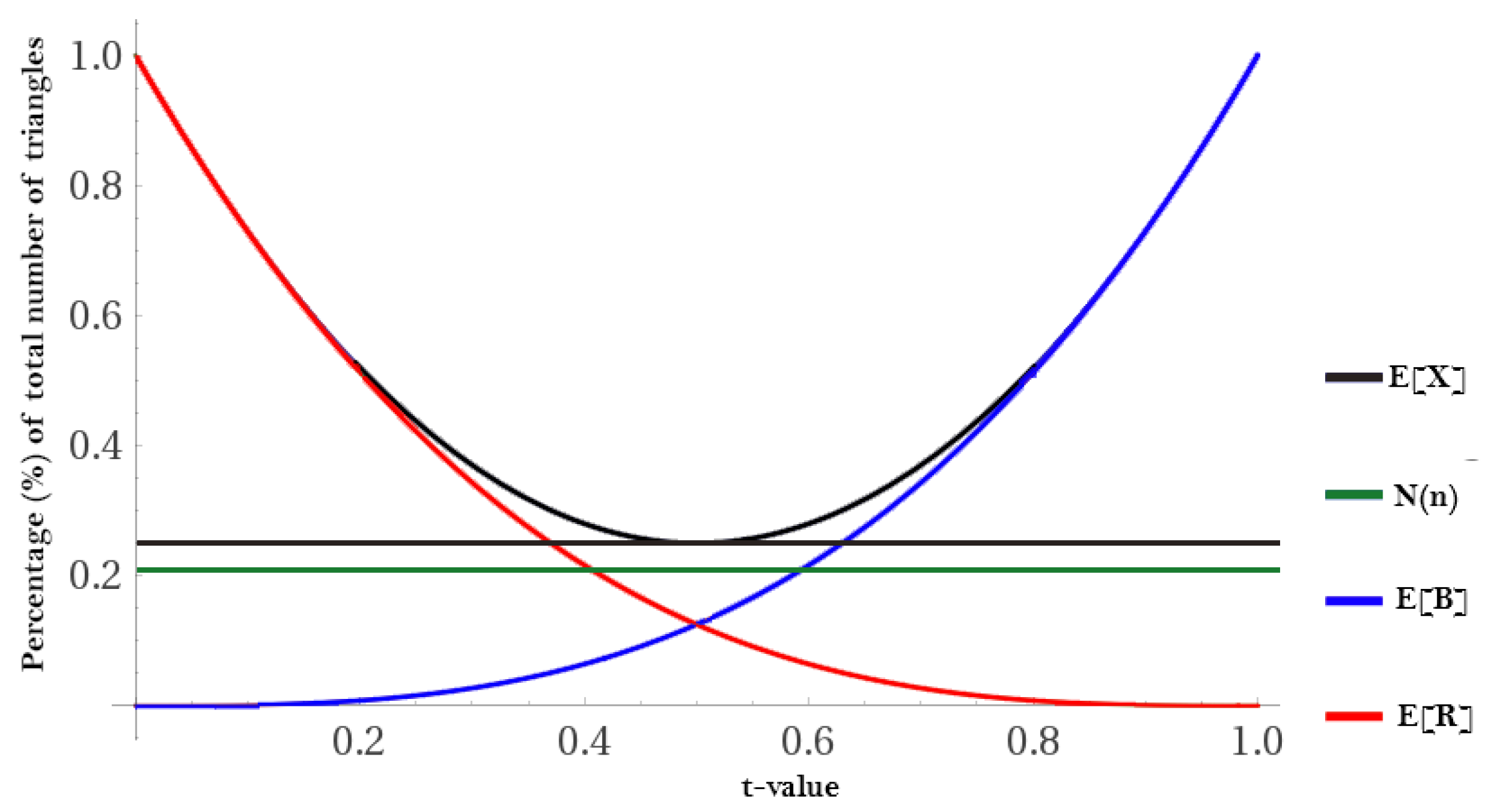
Supposing that we have a random graph of related to N data points in D and probability t that an edge between two vertices exists, the Erdos–Renyi model tells us that the expected number of edges in is . The parameter t can be thought of as the threshold parameter introduced in Section 4.1 as it ranges from (assuming and have been normalized to ). Therefore, the expected number of red (R) and blue (B) triangles T in D is:
where represents the total possible number of triangles, and represents the probability that all three edges are red (R); likewise, represents the probability of all three edges being blue (B). This information can be used to calculate the number of monochromatic triangles.
Corollary 4.
The expected number of monochromatic triangles in is .
Proof.
The probability that three adjacent edges are the same color in a 2-colored graph is , there are number of triangles, and we multiply by 2 to account for the symmetry of how the edges can be colored with equal probability. □
This creates the following threshold plot (Figure 6) for any randomly colored graph .
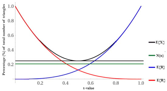
Figure 6.
An example of a using .
4.2.2. Defining Deviation
Definition 4.
Deviation is a combination of the degree of (A): the triangle dichotomy and (B): the triangle bias.
Deviation away from the expected distribution can allow us to determine the likelihood that the null hypothesis (that is actually random) is accepted or rejected. This can be done with a simple test:
The average of and their resulting p-value can be used to determine with some significance level whether to accept or reject .
While the expected value is a good benchmark, it still doesn’t answer the more fundamental question of how many monochromatic triangles are present in versus how many are required by Ramsey theory. This creates a stricter calculation, but one that’s better suited to our needs and is a measurement of the triangle dichotomy and triangle bias:
4.2.3. Applied to Voting Threshold Graphs
We are now faced with applying the method from Section 4.2.2 to the Congressional voting threshold graphs. What is the likelihood that these are random, or, equivalently, what is the likelihood that there is a bias in the congressional voting record? This is answered in Table 3 and Table 4.

Table 3.
The fit for the overall voting record G(t), Democrats D(t), and Republicans R(t). This demonstrates the degree of the triangle dichotomy for each pre-defined classification.

Table 4.
The fit for the overall voting record G(t), Democrats D(t), and Republicans R(t) by color (R,B). This demonstrates the degree of the triangle bias for each pre-defined classification.
These values have p-values that are very, very small. A way to place these in context is to compare them to the expected value’s deviation from what’s required by Ramsey theory. See Table 5, Table 6 and Table 7.

Table 5.
The fit for the overall expected value of forced monochromatic triangles.

Table 6.
The deviation of of G(t), D(t), and R(t) from their respective expected values.

Table 7.
The p-value associated with each of these is based on the cumulative distribution function (CDF), namely . At a significance level of , the non-significant deviations are .
We can say a p-value is significant if it is sufficiently different from how the expectation value differs from what is required from Ramsey theory. At a significance level of 0.01, the non-significant deviations in Table 7 are . (The significance level selected depends on the cost function of the particular model. For instance, the significance level would scale with the cost associated with being wrong.). The furthest deviation can be attributed to the Republican congressional voters and is an indication that a strong bias exists in their voting records.
4.3. Collaboration Model
Suppose we have a collection of people V, working together on a communal project.
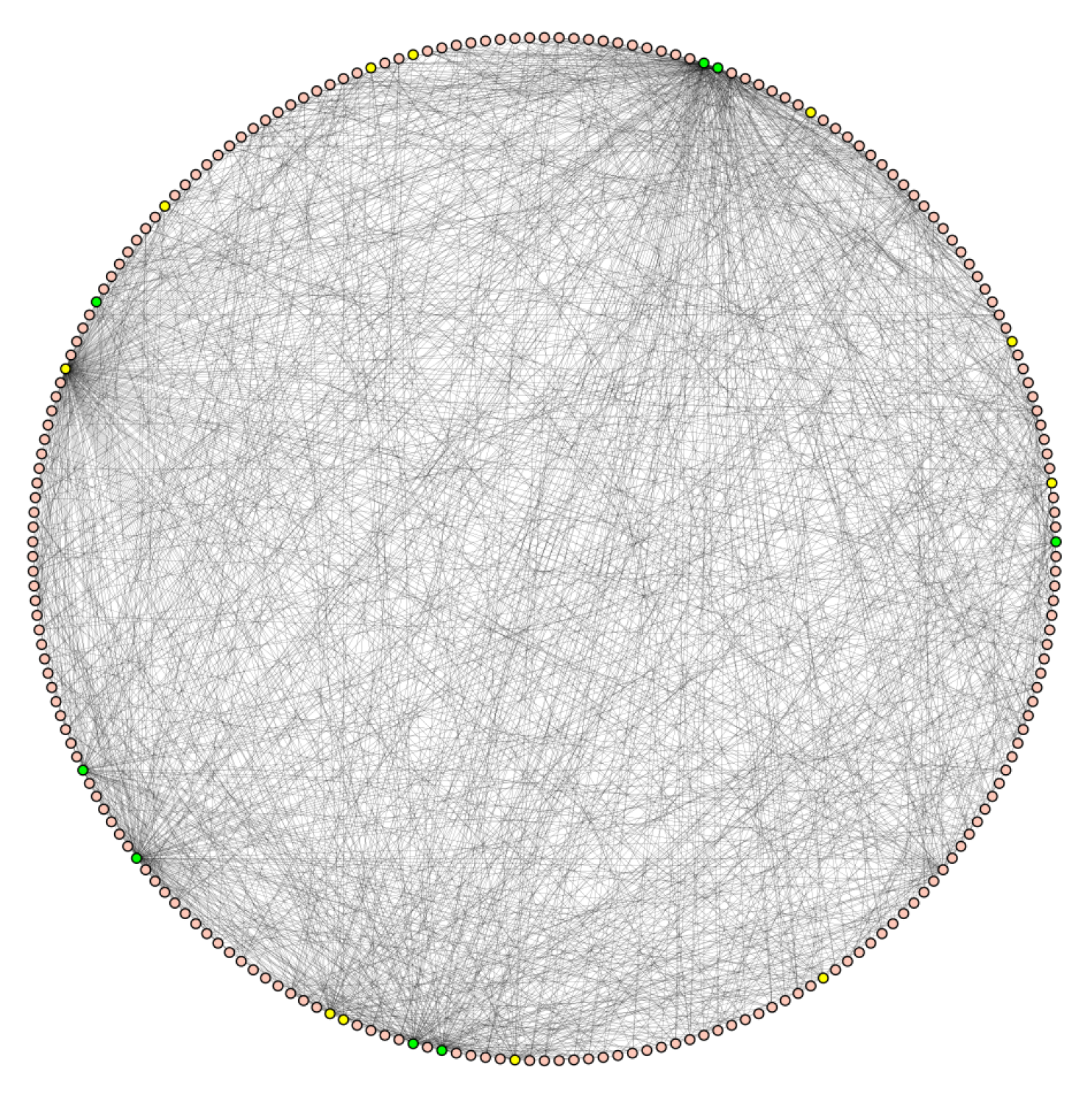
As an example, we look at economic trading data [6,7]. Every country is represented by a node, and we add a blue edge from a country to its five largest importers and exporters by volume. See Figure 7 for a visulaization. In this way, two countries are connected by a blue edge if their countries are historically economically connected and by a red edge if they are smaller trading partners. There is an asymmetry in the way edges are added, as, for example, China only adds at most 10 blue edges to other countries, but many countries add blue edges to China. In this way, it is possible for a country to have a blue degree much higher than 10. This graph is best described as an Interaction Graph similar to the “friends at a party”.
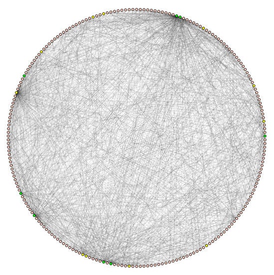
Figure 7.
Countries are arranged alphabetically starting at the top and going counterclockwise. The green nodes are the G7 and G20 countries. The graph has 214 vertices, 1363 blue edges, the average blue degree is 12.7, the five highest blue degrees are 162 (China), 125 (United States), 96 (Germany), 66 (France) and Italy (61). The largest complete subgraph has eight vertices: Algeria, China, France, Germany, Italy, Spain, United Kingdom, and the United States, forming a . The largest independent set has 70 vertices, forming an .
For countries, the number of monochromatic triangles equals of the total number of triangles in a . These monochromatic triangles are almost entirely red, representing a lack of strong trade relations. This is significantly more than the required number of triangles given by Goodman’s formula, which at is 24.7%. See Table 8.

Table 8.
Percentages of monochromatic triangles for the country graph.
Since this graph has a threshold of only the top five trading partners for each country, it can be seen as a discrete sample of the threshold graph that would exist on the scale ( top trading partner to all trading partners). In order to determine if the percentage of monochromatic triangles in this graph can be interpreted as meaningful evidence that the global economy connected with a strong dichotomy, we need to measure its p-value. For countries, a threshold of corresponds to on a normalized scale of . When , the expected deviation for the total number of monochromatic triangles from those required by Ramsey theory has a , whereas the trading graph has a . The difference between these is , which corresponds to a p-value of 0.248983, which is not statistically significant. We can therefore not reject the null-hypothesis that this trade graph is random.
While we cannot reject based on the number of superfluous monochromatic ’s in the trading data, the presence of higher dimensional complete subgraphs might provide sufficient evidence.
We can compute the percentage of monochromatic , and the percentage of monochromatic . This is computationally complex, so we computed these percentages (Table 9) for only small N.

Table 9.
Data for the country graph in Section 4.3.
It is natural to then ask what happens when we consider larger substructures, that is, instead of triangles.
for Higher Dimensions
For higher dimensions, there is no analogue of Goodman’s formula, which we would expect to give us a percentage of for , for , etc. using the same methods described in Corollary 4. See Figure 8. In [8], Thomason has shown that an upper bound for the corresponding percentage of monochromatic is , although it is not known if this is tight. In the same work, he gave an upper bound on the number of monochromatic , as .

Figure 8.
The expected number of monochromatic and s as a function of t. The Goodman-type upper bound for is 0.0295, and 0.00183 for .
For the ’s related to larger substructures, Thomason’s upper bound can be used in the same way that Goodman’s is used for , with the understanding that this will give us an upper bound on a graph’s deviation from what is required by Ramsey theory. Our new is an average of each ’s associated and can include up to N-dimensional substructures:
If instead we increase the number of colors and therefore allow for more than two classifications, a perfect answer for three colors and triangles is given by [9].
4.4. Applications to Other Datasets
We end this section with a more general discussion about using these methods on different datasets.
The relevant part of the voting dataset was that each data point (voter) was a list of variables (votes), and we had a measurement of what it means for two entries of the same variable to be similar. In the case of voting records, our measurement of similarity was very blunt: either they were the same or they were different.
This method of analysis could be applied to datasets where the variables have different measures of similarities, such as comparing the background of two potential clients for an insurance company. In this case, for example, our measurement for similarity in age might be simply a difference of the two ages, but the measurement of similarity of education levels would be more subtle.
The methods presented here give a measurement of how far a dataset deviates from random. If, for example, a company wishes to build a diverse, nearly random roster of clients, this can be used to quantify how close to that goal the company is.
5. Applications to Transitivity
When we have sufficient evidence to reject , we define a non-random graph in terms of its transitivity. Transitivity can be thought of as the likelihood that a relationship in a dataset is meaningful and therefore not spurious. Let’s again consider the model for the party problem: the nodes are people at a party and we assign a blue (B) edge between two people if they are friends (and red (R) if they are not friends).
Definition 5.
A binary relation R on D is transitive if if and then .
In this setting, we first remark that the blue “friend” relation is not by-default transitive, and neither is the red “not friend” relation. For example, I am friends with someone who does not know my brother.
It is easy to see that the only way for the red relation to be transitive is if all edges are red in a particular subgraph. Similarly, the blue relation is transitive only if all edges are blue. Typically, such a graph will not be transitive in both relations.
Transitivity can be described in terms of monochromatic triangles, specifically three vertices are members of a graph that is not transitive when the edges between them are not monochromatic. In this way, the percentage of monochromatic triangles in a graph is a measure of how transitive a graph is. In the context of uncolored graphs, this has been studied as the clustering coefficient. However, by looking at two colored graphs, Goodman’s formula implies that there is a lower limit on how non-transitive a graph can be. We know that least 0.25 of its triangles must be monochromatic in the case of a two colored graph. The higher the observed percentage is than 0.25, the more transitive the graph is, and this can be measured in terms of .
Let’s use this to interpret the results from Section 4.1. Suppose we have three democrats and we know that iff ; that is, the relationship between and is the exact same as the one between and (although we don’t necessarily know if both have an edge or not).
We ask: how likely is it that the relationship between and is the same as the one between and , i.e., that the triangle is transitive?
Theorem 2.
Let G be a complete graph with N vertices whose edges are colored red (R) or blue (B). The percentage of monochromatic paths of length 2 that complete to a monochromatic triangle is measured by
where is the number of monochromatic triangles in G.
Proof.
This quantity comes from the observation that every monochromatic triangle contains three monochromatic paths of length 2, but each non-monochromatic triangle contains precisely one monochromatic path of length 2. For ease of computation, we use that (the number of non-monochromatic triangles) + (the number of monochromatic triangles) is , since is the total number of triangles. Thus, is the total number of monochromatic paths of length 2 in G, since this counts every non-monochromatic triangle once and counts every monochromatic triangle three times. □
By using Goodman’s formula, this observation above translates to the following (completely expected) result:
Proposition 1.
Let G be a graph with N vertices and edge-colored with red and blue. The ratio of monochromatic paths in G that are part of a monochromatic triangle is asymptotically at least .
The observation above provides an efficient way to compute the ratio of monochromatic paths in G that are part of a monochromatic triangle. We, for example, don’t need to count the number of monochromatic paths directly.
5.1. Application to Previous Examples
5.1.1. Application to Voting Records
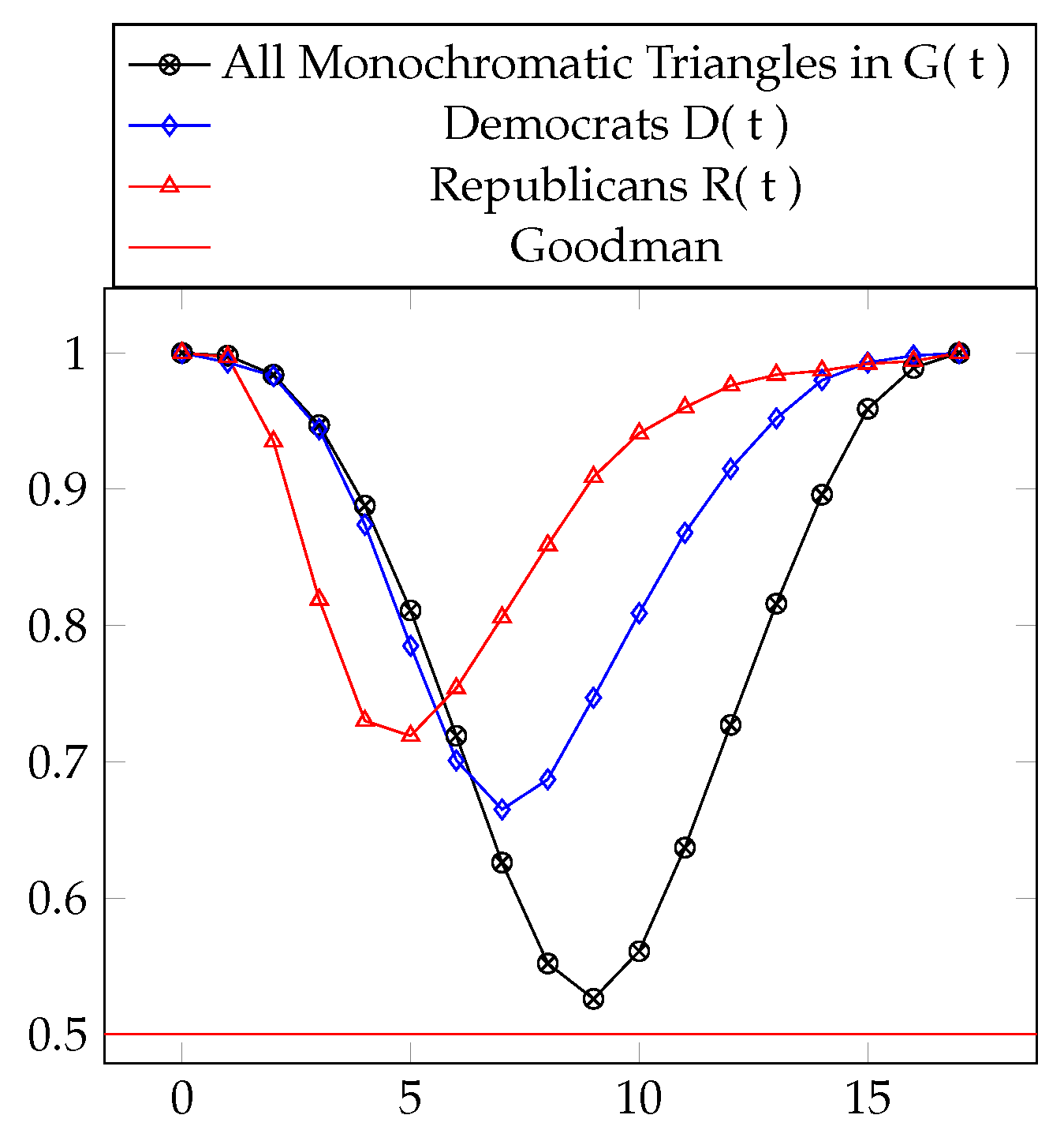
In the case of the threshold graphs from Section 4.1, the threshold graph with the minimum “transitivity percentage” is precisely the threshold graph with the minimum number of monochromatic triangles, namely (). Analogously, for this occurs at () and for this occurs at (). See Table 10 and Figure 9.

Table 10.
Transitivity numbers for the threshold graphs. The minimum values are boxed.
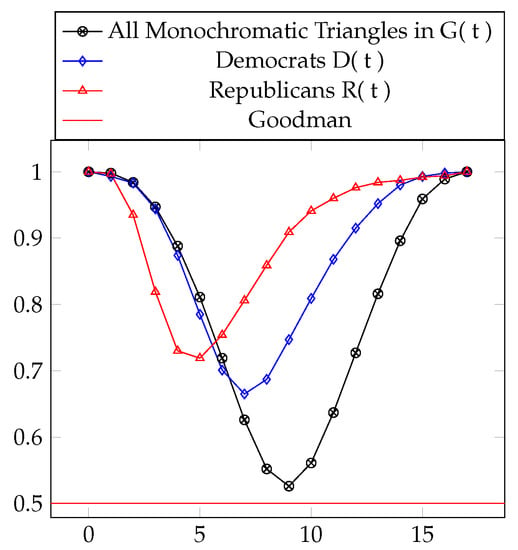
Figure 9.
Transitivity percentages for the graphs and , with .
5.1.2. Application to Global Trading Data
China provides an interesting example of a country that is part of many non-monochromatic triangles because China has an edge to 162 of the 213 other countries, and of those 162 countries only of edges are present among China’s neighbors. Thus, only a small percentage of China’s neighbors are themselves directly connected. This contributes to slightly lowering the percentage of transitivity in the larger graph.
In total, using all countries, of all monochromatic paths complete to an edge of the same color. This is well above the guaranteed by Proposition 1. Again, a complication is introduced by only looking at one threshold level rather than calculating the entire .
6. Conclusions and Questions
We now make two major calls to use these methods: applications and development of related theory.
6.1. Theory Building
This use of Goodman’s formula suggests the need for other quantitative Ramsey statements. For higher dimensional objects, we mention a couple that already exist and some that have yet to be developed.
A recent survey of Ramsey bounds for hypergraphs is a useful place to see the current best known bounds for various Ramsey numbers [10]. This survey also goes through proof sketches, many of which contain a weak Goodman-style lower bound. These bounds typically come from a use of the probabilistic method (see, for example, [11]).
In general, the probabilistic bounds provide a first non-trivial upper bound on the percentage of monochromatic structures, and improving them can be difficult. In order to use Ramsey theory in a generalized way, a closed form analogous to Goodman’s formula needs to be developed for all subgraphs and all -colored graphs.
6.2. Further Applications
The case of triangles is simple, but still captures the quantitative notion of transitivity of a relation. Additionally, counting the number of monochromatic triangles in a graph is computationally efficient.
Further progress could be motivated by finding interpretations for other quantitative Ramsey statements. For example, a quantitative version of Van der Waerden’s theorem for a fixed length. That is, given a 2-coloring of the points it is known that there must be at least one arithmetic progression of length 3 (i.e., ) where all points are the same color. The following question has a reasonable answer in [12], which has serious mathematical content:
Remark 2 (Question).
For N sufficiently large. Give reasonable lower-bounds and upper bounds on the percentage of monochromatic 3-term progressions that must exist for any 2-coloring of .
In [12], it is shown that, asymptotically, at least of all 3-term such arithmetic progressions must be monochromatic. This extended results of [13]. In their setting, arithmetic progressions are allowed to “wrap around”. That is, in the triple is considered a 3-term progression.
For 4-term progressions, see [14] and the strengthening [15]. Both of these are non-trivial results.
The next step is to interpret 3-term progressions (or 4-term progressions) in a data-set in a meaningful, physical way.
6.3. Closing Remarks
We believe that the connections between data science and Ramsey theory are still largely unmade and will prove to be profound. We have shown that Ramsey theory can be used to rigorously define spurious correlations in datasets, and how deviations from the number of required spurious correlations might be meaningful in terms of transitivity.
Author Contributions
The authors contributed equally in all aspects of the article.
Funding
This research received no external funding.
Acknowledgments
This work was completed while the first author was a PIMS post doctoral scholar.
Conflicts of Interest
The authors declare no conflict of interest.
References
- Calude, C.S.; Longo, G. The deluge of spurious correlations in big data. Found. Sci. 2017, 22, 595–612. [Google Scholar] [CrossRef]
- Goodman, A.W. On sets of acquaintances and strangers at any party. Am. Math. Mon. 1959, 66, 778–783. [Google Scholar] [CrossRef]
- Ramsey, F.P. On a Problem of Formal Logic. Proc. Lond. Math. Soc. 1930, s2-30, 264–286. [Google Scholar] [CrossRef]
- Schwenk, A. Acquaintance graph party problem. Am. Math. Mon. 1972, 79, 1113–1117. [Google Scholar] [CrossRef]
- Lichman, M. UCI Machine Learning Repository; School of Information and Computer Science, University of California: Irvine, CA, USA, 2013; Available online: http://archive.ics.uci.edu/ml (accessed on 1 June 2017).
- Congressional Quarterly Almanac, 98th Congress, 2nd session 1984; Congressional Quarterly Inc.: Washington, DC, USA, 1985; Volume XL.
- WITS. WITS Historical Trading Data; World Bank: Washington, DC, USA, 2017. [Google Scholar]
- Thomason, A. A disproof of a conjecture of Erdős in Ramsey theory. J. Lond. Math. Soc. 1989, 2, 246–255. [Google Scholar] [CrossRef]
- Cummings, J.; Král, D.; Pfender, F.; Sperfeld, K.; Treglown, A.; Young, M. Monochromatic triangles in three-coloured graphs. J. Comb. Theory Ser. B 2013, 103, 489–503. [Google Scholar] [CrossRef]
- Mubayi, D.; Suk, A. A survey of quantitative bounds for hypergraph Ramsey problems. arXiv, 2017; arXiv:1707.04229. [Google Scholar]
- Alon, N.; Spencer, J.H. The Probabilistic Method, 4th ed.; Wiley: Hoboken, NJ, USA, 2015. [Google Scholar]
- Sjöland, E. Enumeration of monochromatic three term arithmetic progressions in two-colorings of cyclic groups. arXiv, 2014; arXiv:1408.1058. [Google Scholar]
- Cameron, P.; Cilleruelo, J.; Serra, O. On monochromatic solutions of equations in groups. Rev. Mat. Iberoam. 2007, 23, 385–395. [Google Scholar] [CrossRef]
- Wolf, J. The minimum number of monochromatic 4-term progressions in . J. Comb. 2010, 1, 53–68. [Google Scholar]
- Lu, L.; Peng, X. Monochromatic 4-term arithmetic progressions in 2-colorings of Zn. J. Comb. Theory Ser. A 2012, 119, 1048–1065. [Google Scholar] [CrossRef]
© 2019 by the authors. Licensee MDPI, Basel, Switzerland. This article is an open access article distributed under the terms and conditions of the Creative Commons Attribution (CC BY) license (http://creativecommons.org/licenses/by/4.0/).

