
Water Particles Monitoring in the Atacama Desert: SPC Approach Based on Proportional Data


 ,
, 
Abstract
:1. Introduction
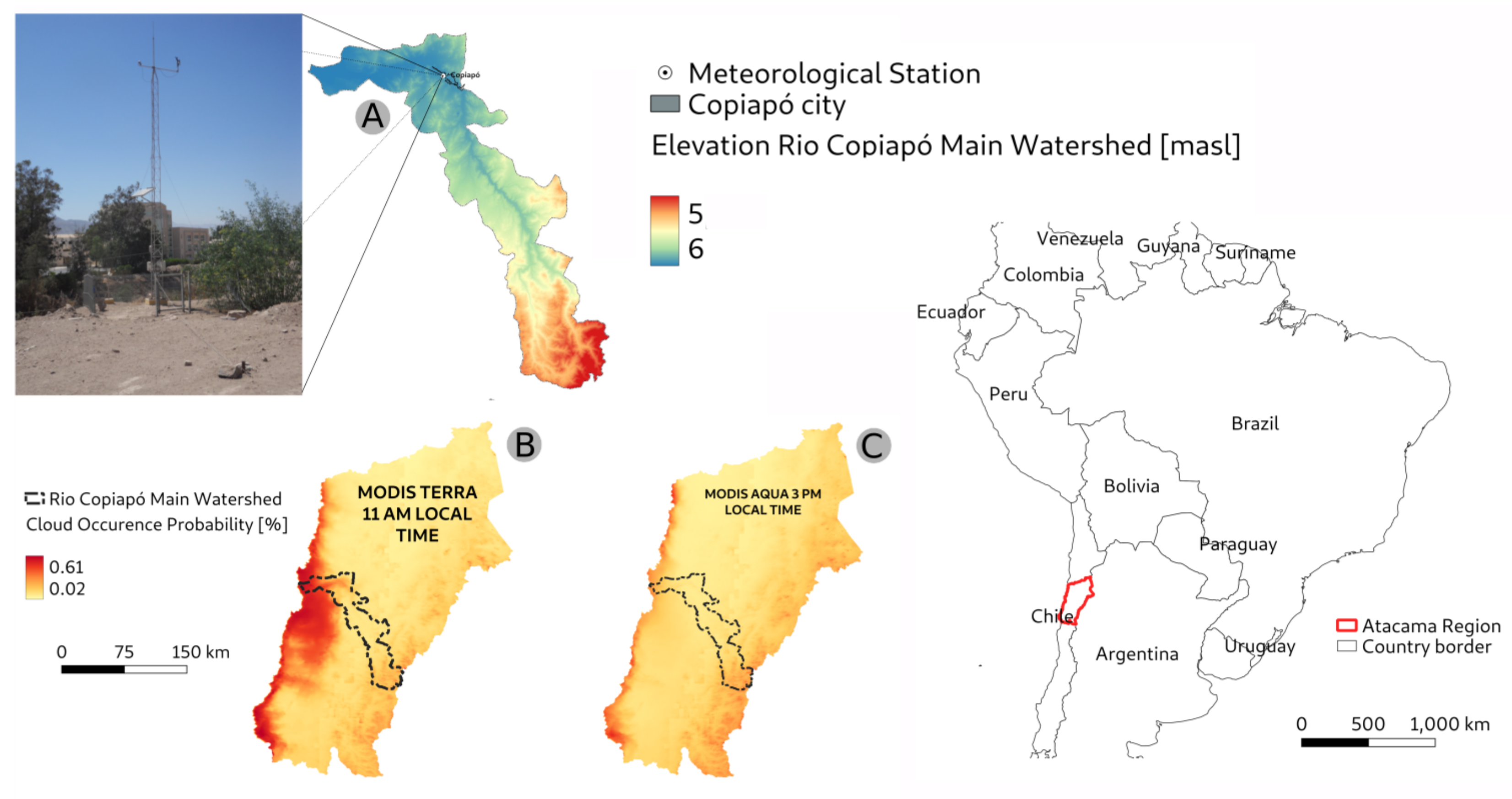
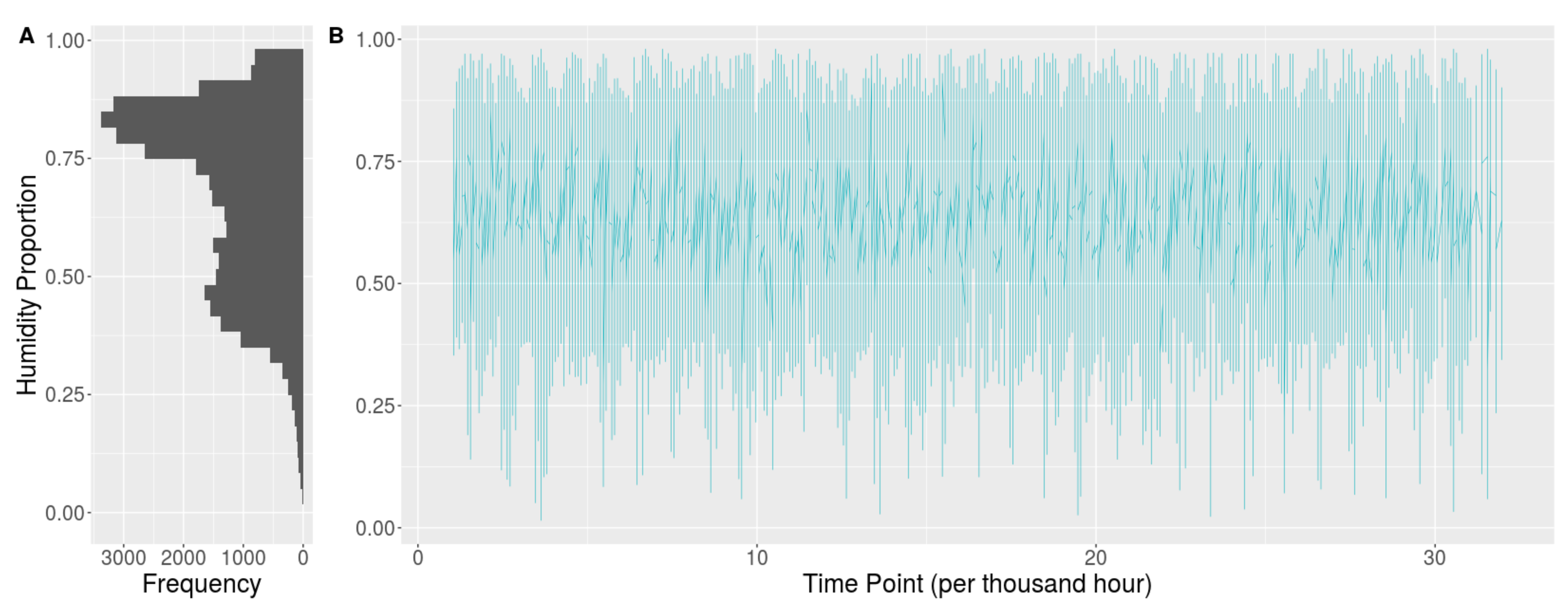
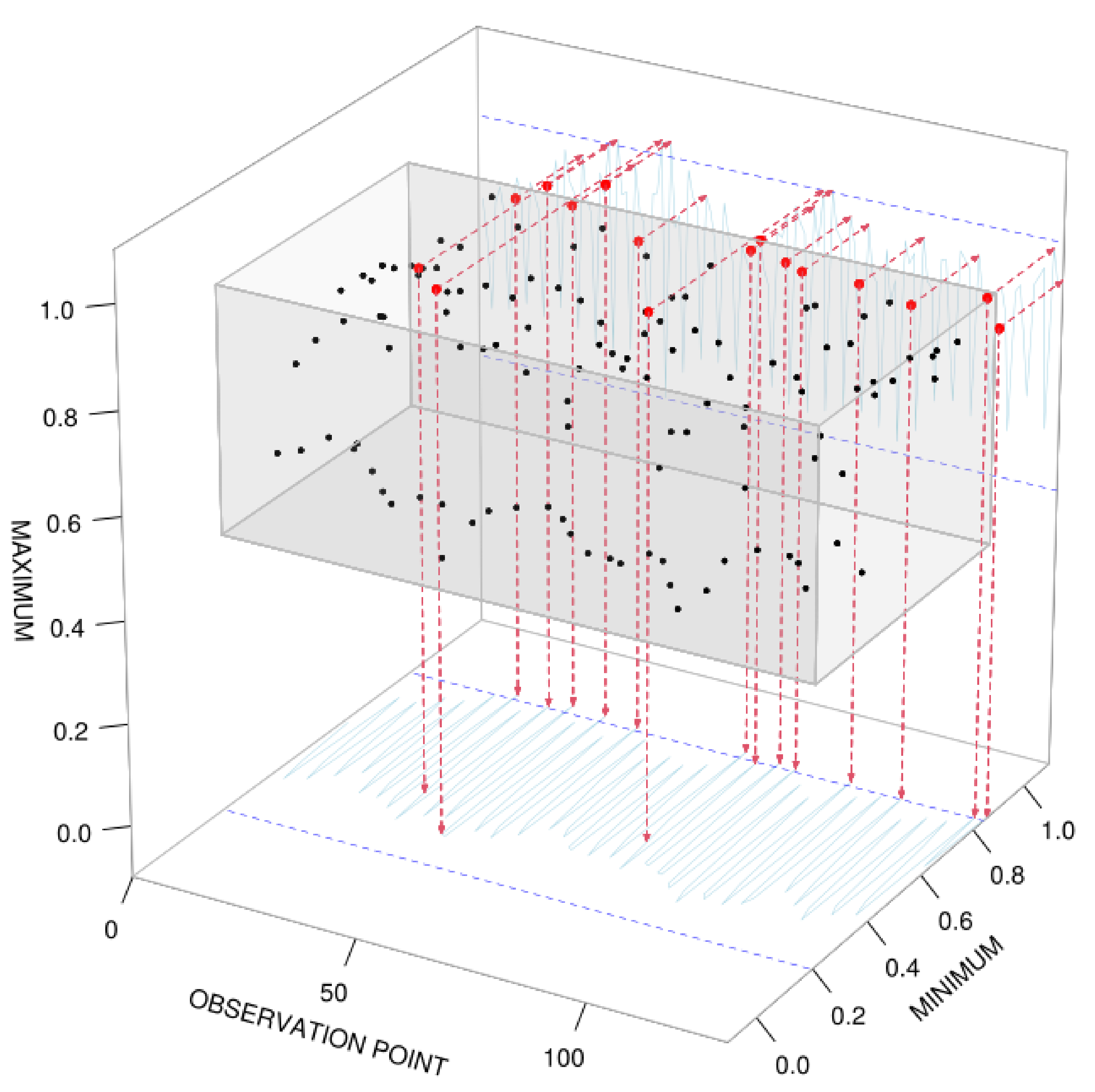
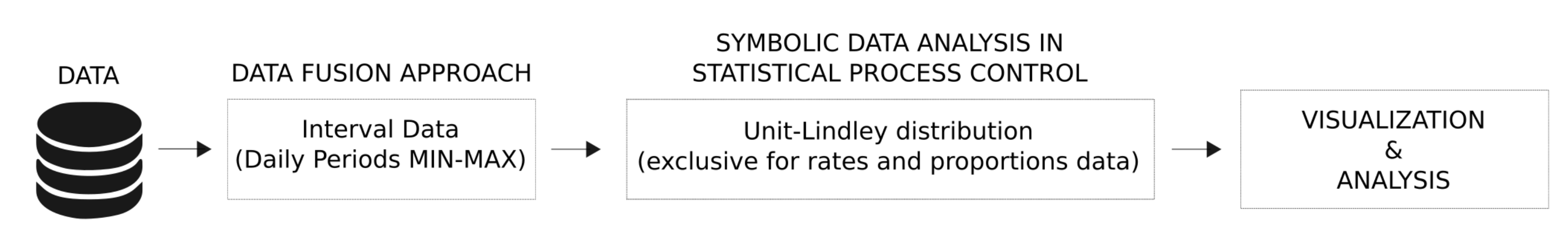
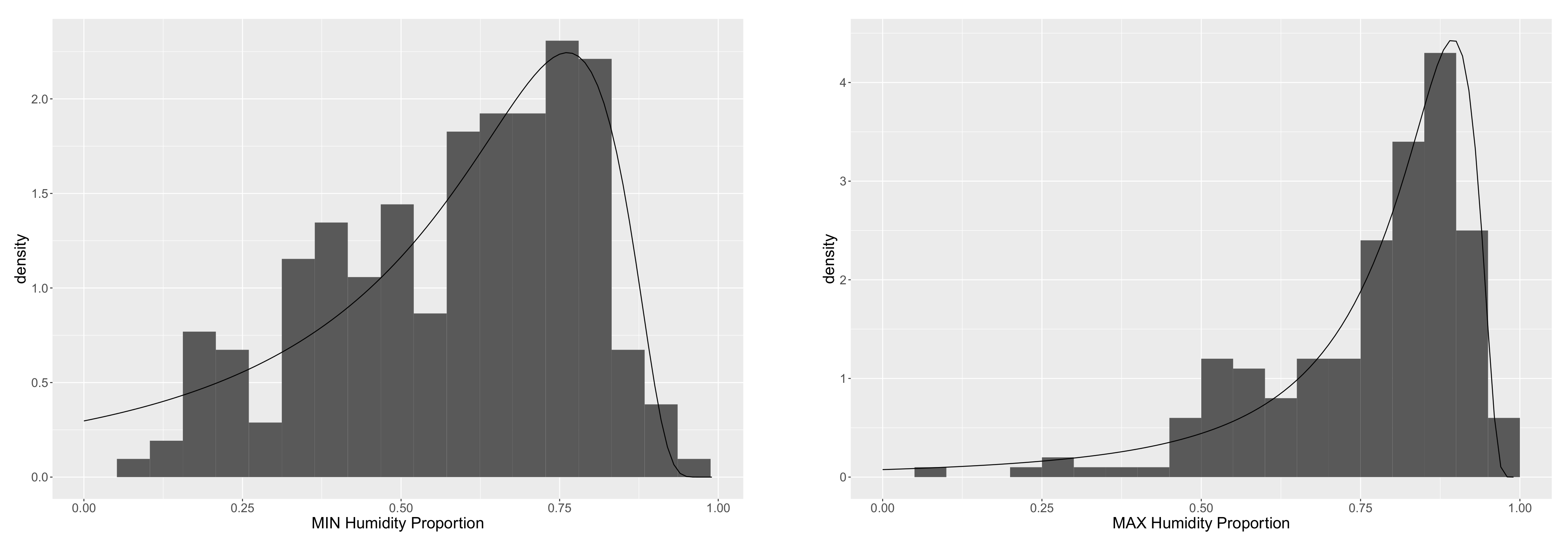
2. The Data
3. Methodology
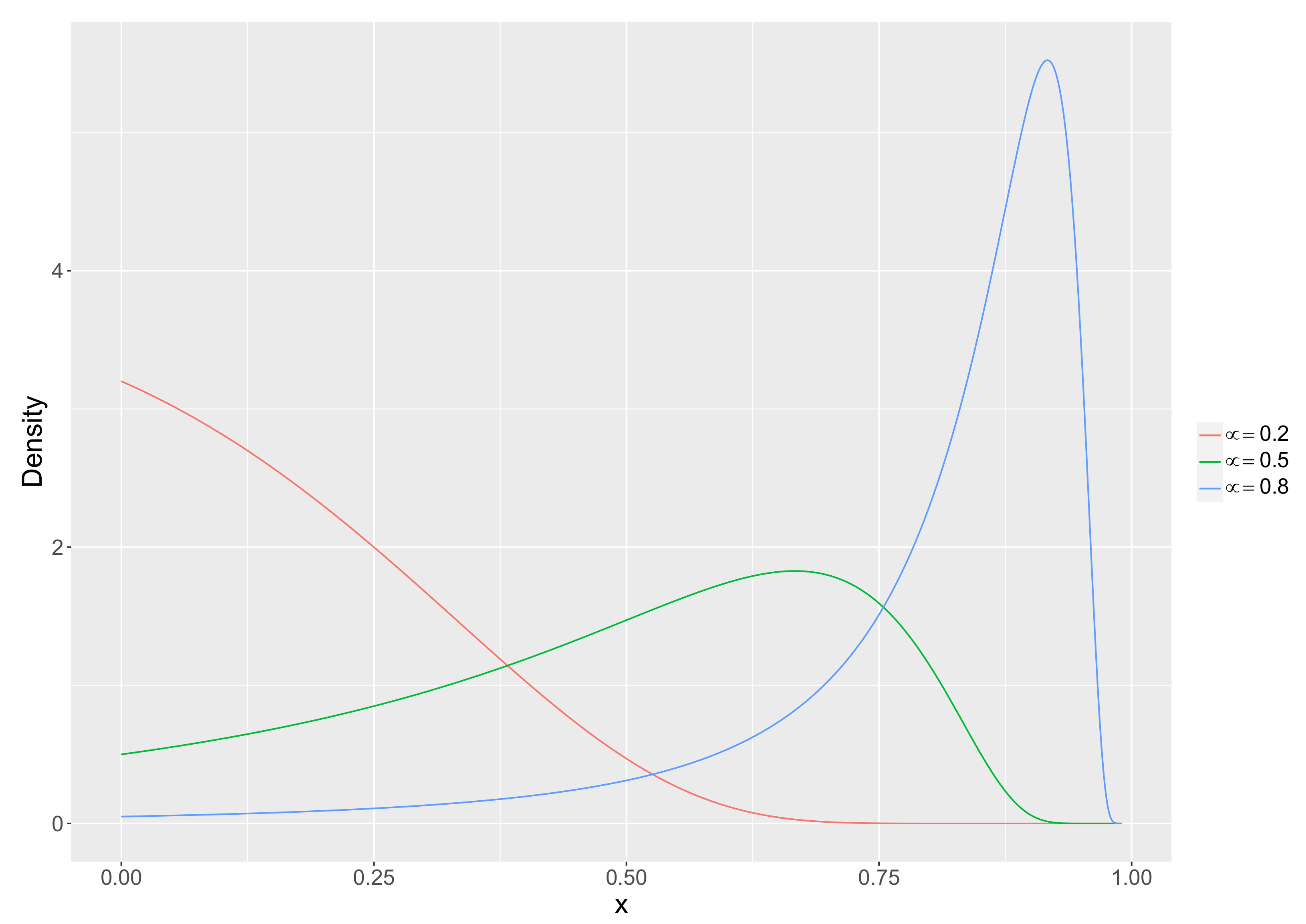
3.1. The Unit-Lindley Distribution
3.2. Proposed Unit-Lindley Chart
4. Statistical Performance
4.1. In-Control Processes
4.2. Out-of-Control Processes
4.3. Comparison with Some Standard Control Charts
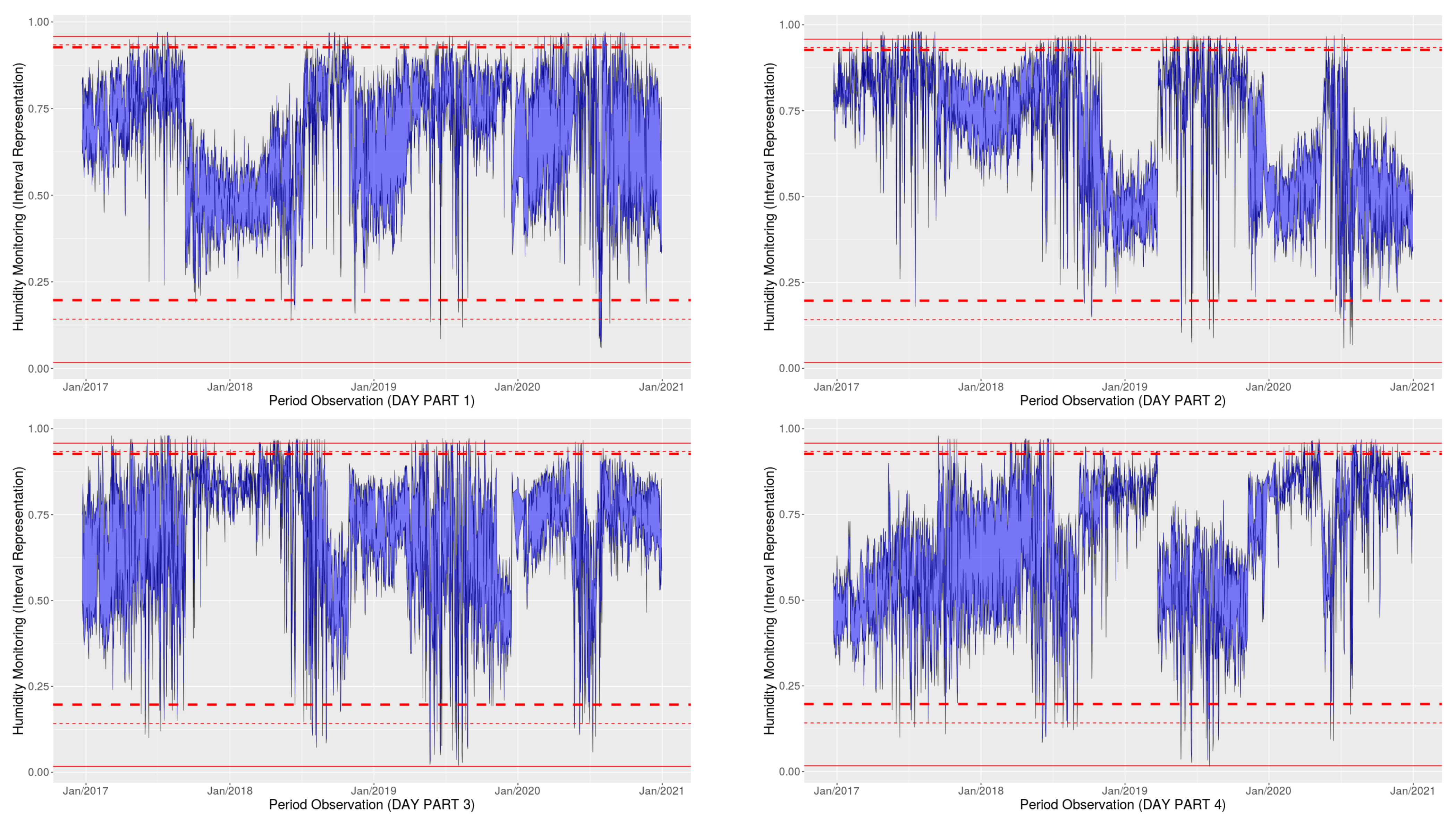
5. Application
6. Concluding Remarks and Future Prospects
Author Contributions
Funding
Institutional Review Board Statement
Data Availability Statement
Acknowledgments
Conflicts of Interest
References
- Petitgas, P. The CUSUM out-of-control table to monitor changes in fish stock status using many indicators. Aquat. Living Resour. 2009, 22, 201–206. [Google Scholar] [CrossRef]
- Hanslik, T.; Boelle, P.Y.; Flahault, A. The control chart: An epidemiological tool for public health monitoring. Public Health 2001, 115, 277–281. [Google Scholar] [CrossRef]
- Khan, Z.; Gulistan, M.; Hashim, R.; Yaqoob, N.; Chammam, W. Design of S-control chart for neutrosophic data: An application to manufacturing industry. J. Intell. Fuzzy Syst. 2020, 38, 4743–4751. [Google Scholar] [CrossRef]
- Sellers, K.F. A generalized statistical control chart for over-or under-dispersed data. Qual. Reliab. Eng. Int. 2012, 28, 59–65. [Google Scholar] [CrossRef]
- Woodall, W.H. Control charts based on attribute data: Bibliography and review. J. Qual. Technol. 1997, 29, 172–183. [Google Scholar] [CrossRef]
- Joekes, S.; Barbosa, E.P. An improved attribute control chart for monitoring non-conforming proportion in high quality processes. Control. Eng. Pract. 2013, 21, 407–412. [Google Scholar] [CrossRef]
- Lima-Filho, L.M.d.A.; Bayer, F.M. Kumaraswamy control chart for monitoring double bounded environmental data. Commun. Stat.-Simul. Comput. 2019, 1–16. [Google Scholar] [CrossRef]
- Abbas, Z.; Nazir, H.Z.; Akhtar, N.; Abid, M.; Riaz, M. On designing an efficient control chart to monitor fraction nonconforming. Qual. Reliab. Eng. Int. 2020, 36, 547–564. [Google Scholar] [CrossRef]
- Montgomery, D.C. Introduction to Statistical Quality Control; John Wiley & Sons: Hoboken, NJ, USA, 2020. [Google Scholar]
- Lee Ho, L.; Fernandes, F.H.; Bourguignon, M. Control charts to monitor rates and proportions. Qual. Reliab. Eng. Int. 2019, 35, 74–83. [Google Scholar] [CrossRef] [Green Version]
- Sant’Anna, Â.M.O.; Ten Caten, C.S. Beta control charts for monitoring fraction data. Expert Syst. Appl. 2012, 39, 10236–10243. [Google Scholar] [CrossRef]
- Korkmaz, M.Ç.; Chesneau, C.; Korkmaz, Z.S. On the arcsecant hyperbolic normal distribution. Properties, quantile regression modeling and applications. Symmetry 2021, 13, 117. [Google Scholar] [CrossRef]
- Bakouch, H.S.; Nik, A.S.; Asgharzadeh, A.; Salinas, H.S. A flexible probability model for proportion data: Unit-half-normal distribution. Commun. Stat. Case Stud. Data Anal. Appl. 2021, 7, 271–288. [Google Scholar]
- Bantan, R.A.R.; Chesneau, C.; Jamal, F.; Elgarhy, M.; Tahir, M.H.; Ali, A.; Zubair, M.; Anam, S. Some new facts about the unit-Rayleigh distribution with applications. Mathematics 2020, 8, 1954. [Google Scholar] [CrossRef]
- Mazucheli, J.; Menezes, A.; Dey, S. The unit-Birnbaum-Saunders distribution with applications. Chil. J. Stat. 2018, 9, 47–57. [Google Scholar]
- Zellner, A.; Keuzenkamp, H.A.; McAleer, M. Simplicity, Inference and Modelling: Keeping It Sophisticatedly Simple; Cambridge University Press: Cambridge, UK, 2001. [Google Scholar]
- Mazucheli, J.; Menezes, A.F.B.; Chakraborty, S. On the one parameter unit-Lindley distribution and its associated regression model for proportion data. J. Appl. Stat. 2019, 46, 700–714. [Google Scholar] [CrossRef] [Green Version]
- Bonnail, E.; Lima, R.C.; Turrieta, G.M. Trapping fresh sea breeze in desert? Health status of Camanchaca, Atacama’s fog. Environ. Sci. Pollut. Res. 2018, 25, 18204–18212. [Google Scholar] [CrossRef]
- Schemenauer, R.S.; Fuenzalida, H.; Cereceda, P. A neglected water resource: The Camanchaca of South America. Bull. Am. Meteorol. Soc. 1988, 69, 138–147. [Google Scholar] [CrossRef] [Green Version]
- Diday, E. Thinking by classes in data science: The symbolic data analysis paradigm. Wiley Interdiscip. Rev. Comput. Stat. 2016, 8, 172–205. [Google Scholar] [CrossRef]
- Nascimento, D.C.; Pimentel, B.; Souza, R.; Leite, J.P.; Edwards, D.J.; Santos, T.E.; Louzada, F. Dynamic time series smoothing for symbolic interval data applied to neuroscience. Inf. Sci. 2020, 517, 415–426. [Google Scholar] [CrossRef]
- Bull, A.T.; Andrews, B.A.; Dorador, C.; Goodfellow, M. Introducing the Atacama Desert; Springer: Berlin/Heidelberg, Germany, 2018. [Google Scholar]
- Grosjean, M.; Veit, H. Water Resources in the Arid Mountains of the Atacama Desert (Northern Chile): Past Climate Changes and Modern Conflicts. In Global Change and Mountain Regions: An Overview of Current Knowledge; Huber, U.M., Bugmann, H.K.M., Reasoner, M.A., Eds.; Springer: Dordrecht, The Netherlands, 2005; pp. 93–104. [Google Scholar] [CrossRef]
- García, A.; Ulloa, C.; Amigo, G.; Milana, J.P.; Medina, C. An inventory of cryospheric landforms in the arid diagonal of South America (high Central Andes, Atacama region, Chile). Quat. Int. 2017, 438, 4–19. [Google Scholar] [CrossRef]
- Donoso, G.; Lictevout, E.; Rinaudo, J.D. Groundwater management lessons from Chile. In Sustainable Groundwater Management; Springer: Berlin/Heidelberg, Germany, 2020; pp. 481–509. [Google Scholar]
- Suárez, F.; Muñoz, J.F.; Fernández, B.; Dorsaz, J.M.; Hunter, C.K.; Karavitis, C.A.; Gironás, J. Integrated water resource management and energy requirements for water supply in the Copiapó river basin, Chile. Water 2014, 6, 2590–2613. [Google Scholar] [CrossRef] [Green Version]
- Abramowitz, M.; Stegun, I.A. Handbook of Mathematical Functions with Formulas, Graphs, and Mathematical Tables; US Government Printing Office: Washington, DC, USA, 1964; Volume 55.
- Goulet, V. Expint: Exponential Integral and Incomplete Gamma Function. R Package. 2016. Available online: https://cran.r-project.org/package=expint (accessed on 26 January 2021).
- Corless, R.M.; Gonnet, G.H.; Hare, D.E.G.; Jeffrey, D.J.; Knuth, D.E. On the LambertW function. Adv. Comput. Math. 1996, 5, 329–359. [Google Scholar] [CrossRef]
- Borchers, H.W. Pracma: Practical Numerical Math Functions. R Package Version 2.2.9. 2019. Available online: https://cran.r-project.org/package=pracma (accessed on 29 January 2021).
- Cox, D.R.; Snell, E.J. A general definition of residuals. J. R. Stat. Soc. Ser. B Methodol. 1968, 30, 248–265. [Google Scholar] [CrossRef]
- Bayer, F.M.; Tondolo, C.M.; Müller, F.M. Beta regression control chart for monitoring fractions and proportions. Comput. Ind. Eng. 2018, 119, 416–426. [Google Scholar] [CrossRef] [Green Version]
- R Core Team. R: A Language and Environment for Statistical Computing; R Foundation for Statistical Computing: Vienna, Austria, 2020. [Google Scholar]
- Saghir, A.; Lin, Z. Control charts for dispersed count data: An overview. Qual. Reliab. Eng. Int. 2015, 31, 725–739. [Google Scholar] [CrossRef]
- Riaz, M.; Ajadi, J.O.; Mahmood, T.; Abbasi, S.A. Multivariate mixed EWMA-CUSUM control chart for monitoring the process variance-covariance matrix. IEEE Access 2019, 7, 100174–100186. [Google Scholar] [CrossRef]
- Jensen, W.A.; Jones-Farmer, L.A.; Champ, C.W.; Woodall, W.H. Effects of parameter estimation on control chart properties: A literature review. J. Qual. Technol. 2006, 38, 349–364. [Google Scholar] [CrossRef]
- Moraes, D.; Oliveira, F.L.P.d.; Quinino, R.d.C.; Duczmal, L.H. Self-oriented control charts for efficient monitoring of mean vectors. Comput. Ind. Eng. 2014, 75, 102–115. [Google Scholar] [CrossRef] [Green Version]
- Paroissin, C.; Penalva, L.; Pétrau, A.; Verdier, G. New control chart for monitoring and classification of environmental data. Environmetrics 2016, 27, 182–193. [Google Scholar] [CrossRef]
- Jorgensen, B. The Theory of Dispersion Models; CRC Press: Boca Raton, FL, USA, 1997. [Google Scholar]
- Kumaraswamy, P. A generalized probability density function for double-bounded random processes. J. Hydrol. 1980, 46, 79–88. [Google Scholar] [CrossRef]
- Wikipedia. Copiapó—Wikipedia, The Free Encyclopedia. 2021. Available online: https://en.wikipedia.org/w/index.php?title=Copiapó&oldid=1013845587 (accessed on 26 April 2021).
- Cleveland, W.S. Robust locally weighted regression and smoothing scatterplots. J. Am. Stat. Assoc. 1979, 74, 829–836. [Google Scholar] [CrossRef]
- Bock, H.H.; Diday, E. Analysis of Symbolic Data, Exploratory Methods for Extracting Statistical Information from Complex Data; Springer: Berlin/Heidelberg, Germany, 2000. [Google Scholar]
- Billard, L.; Diday, E. Symbolic Data Analysis: Conceptual Statistics and Data Mining; John Wiley: Hoboken, NJ, USA, 2006. [Google Scholar]
- Diday, E.; Noirhomme-Fraiture, M. Symbolic Data Analysis and the SODAS Software; John Wiley & Sons: Hoboken, NJ, USA, 2008. [Google Scholar]
- Billard, L.; Diday, E. Clustering Methodology for Symbolic Data; John Wiley & Sons: Hoboken, NJ, USA, 2019. [Google Scholar]
- Diday, E.; Guan, R.; Saporta, G.; Wang, H. Advances in Data Science: Symbolic, Complex, and Network Data; John Wiley & Sons: Hoboken, NJ, USA, 2020. [Google Scholar]
- Conover, W.J. Practical Nonparametric Statistics, 3rd ed.; John Wiley & Sons: Hoboken, NJ, USA, 1999. [Google Scholar]


| LCL | CL | UCL | LCL | CL | UCL | LCL | CL | UCL | |
|---|---|---|---|---|---|---|---|---|---|
| 0.08 | 0.0048 | 0.08 | 0.2190 | 0.0005 | 0.08 | 0.3303 | 0.0001 | 0.08 | 0.3802 |
| 0.12 | 0.0079 | 0.12 | 0.3124 | 0.0008 | 0.12 | 0.4428 | 0.0002 | 0.12 | 0.4965 |
| 0.16 | 0.0115 | 0.16 | 0.3954 | 0.0011 | 0.16 | 0.5320 | 0.0003 | 0.16 | 0.5846 |
| 0.20 | 0.0158 | 0.20 | 0.4688 | 0.0016 | 0.20 | 0.6038 | 0.0004 | 0.20 | 0.6530 |
| 0.24 | 0.0208 | 0.24 | 0.5335 | 0.0021 | 0.24 | 0.6623 | 0.0006 | 0.24 | 0.7072 |
| 0.28 | 0.0269 | 0.28 | 0.5905 | 0.0027 | 0.28 | 0.7107 | 0.0007 | 0.28 | 0.7512 |
| 0.32 | 0.0341 | 0.32 | 0.6407 | 0.0035 | 0.32 | 0.7512 | 0.0009 | 0.32 | 0.7873 |
| 0.36 | 0.0428 | 0.36 | 0.6851 | 0.0044 | 0.36 | 0.7854 | 0.0012 | 0.36 | 0.8174 |
| 0.40 | 0.0534 | 0.40 | 0.7244 | 0.0055 | 0.40 | 0.8146 | 0.0015 | 0.40 | 0.8429 |
| 0.44 | 0.0662 | 0.44 | 0.7592 | 0.0070 | 0.44 | 0.8397 | 0.0019 | 0.44 | 0.8646 |
| 0.48 | 0.0819 | 0.48 | 0.7902 | 0.0088 | 0.48 | 0.8616 | 0.0024 | 0.48 | 0.8834 |
| 0.52 | 0.1012 | 0.52 | 0.8179 | 0.0112 | 0.52 | 0.8807 | 0.0030 | 0.52 | 0.8997 |
| 0.56 | 0.1250 | 0.56 | 0.8426 | 0.0142 | 0.56 | 0.8975 | 0.0039 | 0.56 | 0.9139 |
| 0.60 | 0.1545 | 0.60 | 0.8648 | 0.0183 | 0.60 | 0.9124 | 0.0050 | 0.60 | 0.9265 |
| 0.64 | 0.1912 | 0.64 | 0.8848 | 0.0240 | 0.64 | 0.9256 | 0.0066 | 0.64 | 0.9377 |
| 0.68 | 0.2366 | 0.68 | 0.9029 | 0.0319 | 0.68 | 0.9375 | 0.0089 | 0.68 | 0.9477 |
| 0.72 | 0.2927 | 0.72 | 0.9193 | 0.0433 | 0.72 | 0.9481 | 0.0122 | 0.72 | 0.9566 |
| 0.76 | 0.3612 | 0.76 | 0.9341 | 0.0607 | 0.76 | 0.9578 | 0.0174 | 0.76 | 0.9647 |
| 0.80 | 0.4433 | 0.80 | 0.9477 | 0.0881 | 0.80 | 0.9665 | 0.0260 | 0.80 | 0.9720 |
| 0.84 | 0.5393 | 0.84 | 0.9600 | 0.1339 | 0.84 | 0.9744 | 0.0417 | 0.84 | 0.9786 |
| 0.88 | 0.6475 | 0.88 | 0.9713 | 0.2151 | 0.88 | 0.9817 | 0.0739 | 0.88 | 0.9847 |
| 0.92 | 0.7642 | 0.92 | 0.9817 | 0.3645 | 0.92 | 0.9883 | 0.1522 | 0.92 | 0.9902 |
| Min. | 1st Quartile | Median | Mean | 3rd Quartile | Max. | ||
|---|---|---|---|---|---|---|---|
| Minimum | 2016 | 0.33 | 0.398 | 0.525 | 0.544 | 0.66 | 0.81 |
| 2017 | 0.10 | 0.43 | 0.58 | 0.581 | 0.74 | 0.98 | |
| 2018 | 0.072 | 0.418 | 0.57 | 0.575 | 0.741 | 0.965 | |
| 2019 | 0.015 | 0.408 | 0.557 | 0.563 | 0.722 | 0.963 | |
| 2020 | 0.059 | 0.413 | 0.571 | 0.571 | 0.74 | 0.957 | |
| 2021 | 0.295 | 0.39 | 0.567 | 0.559 | 0.731 | 0.873 | |
| Maximum | 2016 | 0.50 | 0.61 | 0.77 | 0.726 | 0.81 | 0.89 |
| 2017 | 0.24 | 0.69 | 0.81 | 0.774 | 0.87 | 0.98 | |
| 2018 | 0.182 | 0.674 | 0.816 | 0.771 | 0.878 | 0.973 | |
| 2019 | 0.079 | 0.652 | 0.808 | 0.755 | 0.866 | 0.972 | |
| 2020 | 0.216 | 0.668 | 0.815 | 0.77 | 0.873 | 0.973 | |
| 2021 | 0.449 | 0.686 | 0.805 | 0.753 | 0.847 | 0.958 |
| Distribution | Minimum | Maximum |
|---|---|---|
| Unit-Lindley | 0.769 | 0.797 |
| Beta | 0.104 | 0.012 |
| Simplex | 0.089 | 0.038 |
| Kumaraswamy | 0.176 | 0.015 |
| Tolerance | Minimum | Maximum | ||||
|---|---|---|---|---|---|---|
| () | LCL | CL () | UCL | LCL | CL () | UCL |
| 0.15 | 0.197 | 0.584 | 0.840 | 0.447 | 0.760 | 0.927 |
| 0.10 | 0.142 | 0.584 | 0.856 | 0.361 | 0.760 | 0.934 |
| 0.01 | 0.017 | 0.584 | 0.906 | 0.061 | 0.760 | 0.958 |
Publisher’s Note: MDPI stays neutral with regard to jurisdictional claims in published maps and institutional affiliations. |
© 2021 by the authors. Licensee MDPI, Basel, Switzerland. This article is an open access article distributed under the terms and conditions of the Creative Commons Attribution (CC BY) license (https://creativecommons.org/licenses/by/4.0/).
Share and Cite
Fonseca, A.; Ferreira, P.H.; Nascimento, D.C.d.; Fiaccone, R.; Ulloa-Correa, C.; García-Piña, A.; Louzada, F. Water Particles Monitoring in the Atacama Desert: SPC Approach Based on Proportional Data. Axioms 2021, 10, 154. https://doi.org/10.3390/axioms10030154
Fonseca A, Ferreira PH, Nascimento DCd, Fiaccone R, Ulloa-Correa C, García-Piña A, Louzada F. Water Particles Monitoring in the Atacama Desert: SPC Approach Based on Proportional Data. Axioms. 2021; 10(3):154. https://doi.org/10.3390/axioms10030154
Chicago/Turabian StyleFonseca, Anderson, Paulo Henrique Ferreira, Diego Carvalho do Nascimento, Rosemeire Fiaccone, Christopher Ulloa-Correa, Ayón García-Piña, and Francisco Louzada. 2021. "Water Particles Monitoring in the Atacama Desert: SPC Approach Based on Proportional Data" Axioms 10, no. 3: 154. https://doi.org/10.3390/axioms10030154
APA StyleFonseca, A., Ferreira, P. H., Nascimento, D. C. d., Fiaccone, R., Ulloa-Correa, C., García-Piña, A., & Louzada, F. (2021). Water Particles Monitoring in the Atacama Desert: SPC Approach Based on Proportional Data. Axioms, 10(3), 154. https://doi.org/10.3390/axioms10030154