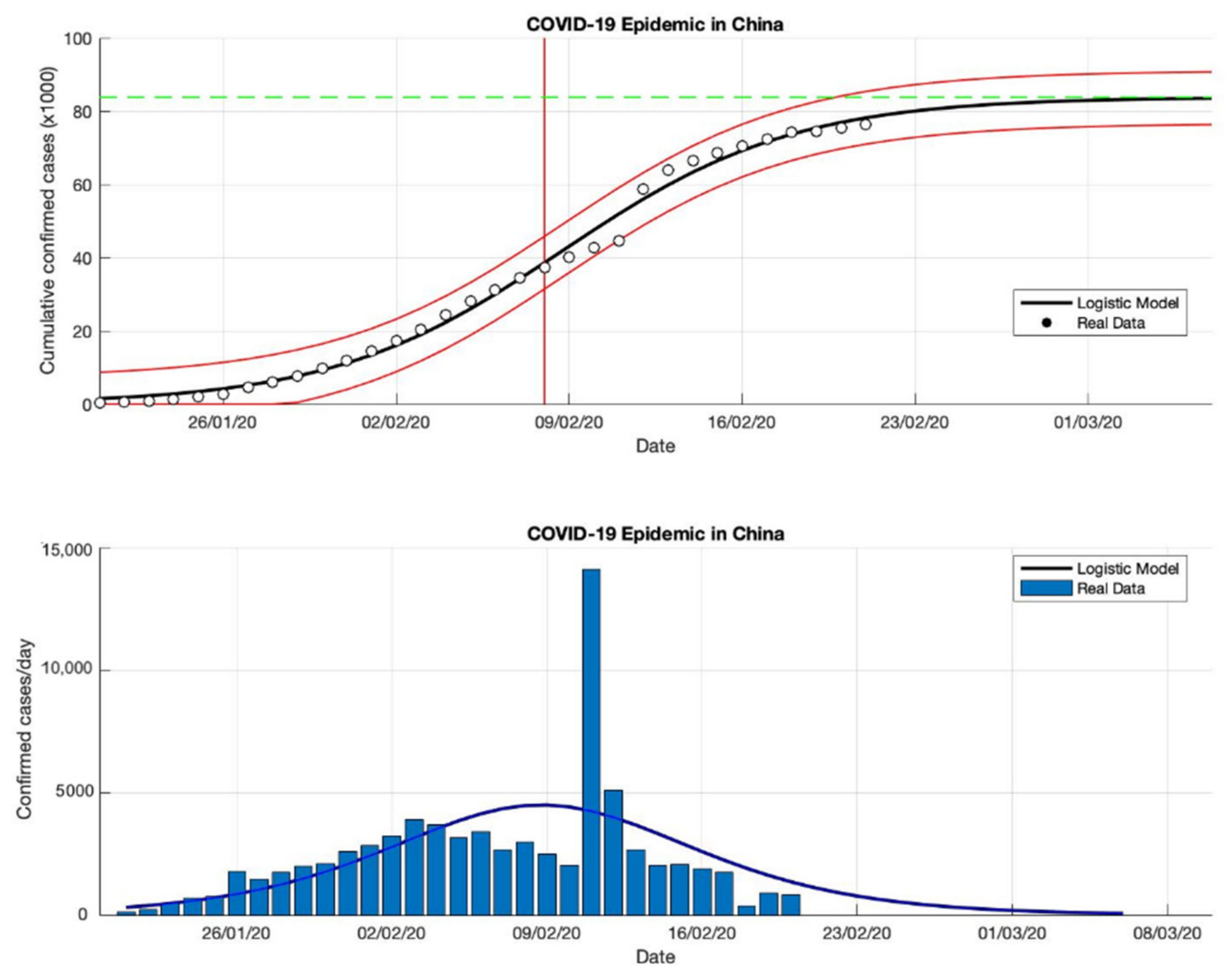
Figure 1.
In the above figure, the prediction results of the logistic growth model for cumulative infected cases are compared with the actual data, while the two red lines between the black lines represent a prediction error limit of about 5%. The dashed green line predicts the total size of infected cases in the final phase of the epidemic. The red line intersects the cumulative case curve to predict the turning point or peak point of the epidemic (this line is parallel to the top of the curve from the below figure). In the below figure, the prediction results of this model for daily infected cases in China in the period 21 January to 21 February 2020.
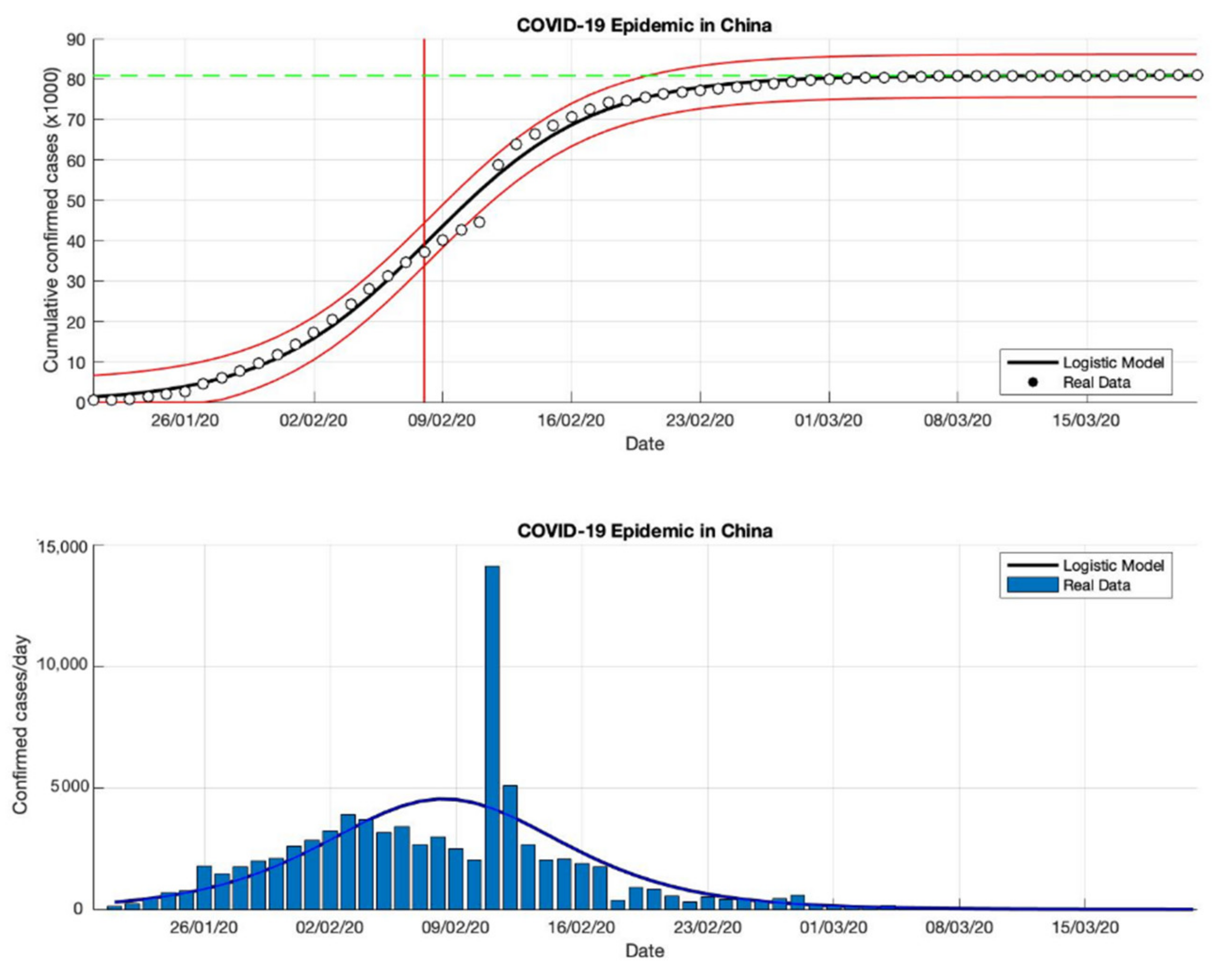
Figure 2.
In the above figure, the prediction results of the logistic growth model for cumulative infected cases are compared with the actual data, while the two red lines between the black lines represent a prediction error limit of about 5%. The dashed green line predicts the total size of infected cases in the final phase of the epidemic. The red line intersects the cumulative case curve to predict the turning point or peak point of the epidemic (this line is parallel to the top of the curve from the below figure). In the below figure, the prediction results of this model for daily infected cases in China in the period 21 January to 21 March 2020.
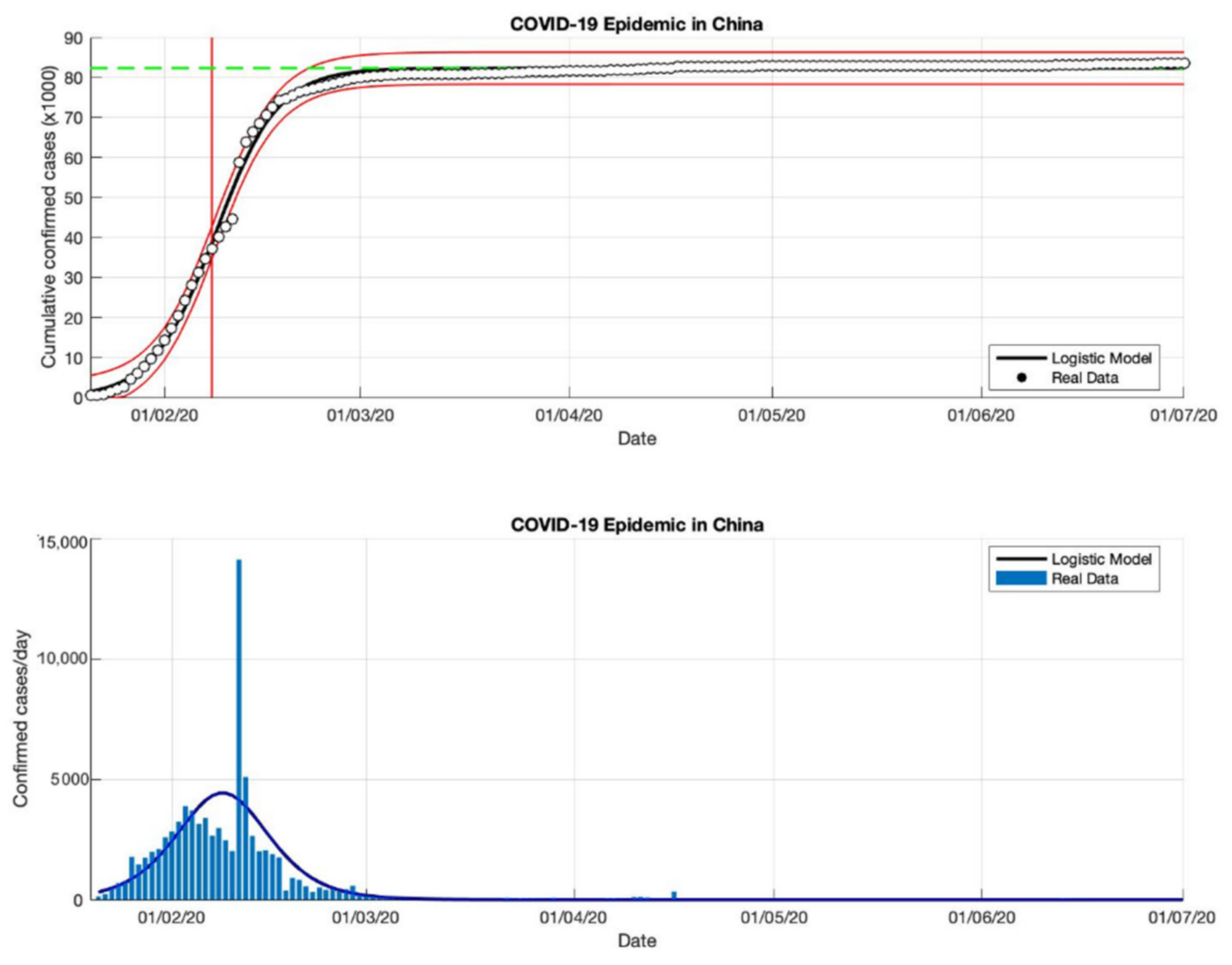
Figure 3.
In the above figure, the prediction results of the logistic growth model for cumulative infected cases are compared with the actual data, while the two red lines between the black lines represent a prediction error limit of about 5%. The dashed green line predicts the total size of infected cases in the final phase of the epidemic. The red line intersects the cumulative case curve to predict the turning point or peak point of the epidemic (this line is parallel to the top of the curve from the below figure). In the below figure, the prediction results of this model for daily infected cases in China in the period 21 January to 1 July 2020.
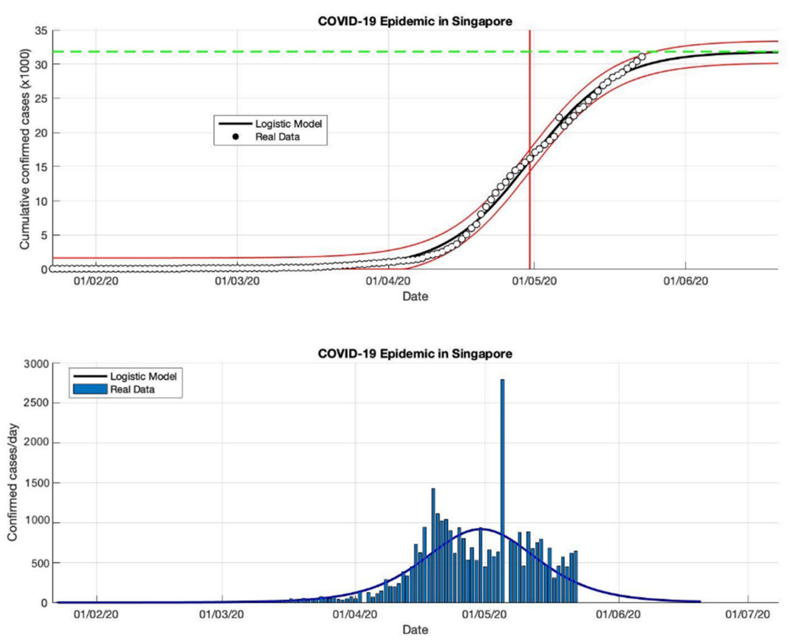
Figure 4.
In the above figure, the prediction results of the logistic growth model for cumulative infected cases are compared with the actual data, while the two red lines between the black lines represent a prediction error limit of about 5%. The dashed green line predicts the total size of infected cases in the final phase of the epidemic. The red line intersects the cumulative case curve to predict the turning point or peak point of the epidemic (this line is parallel to the top of the curve from the below figure). In the below figure, the prediction results of this model for daily infected cases in Singapore in the period 23 January to 23 May 2020.
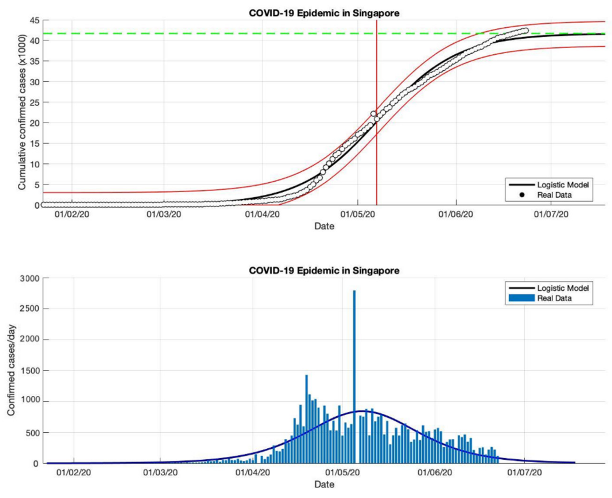
Figure 5.
In the above figure, the prediction results of the logistic growth model for cumulative infected cases are compared with the actual data, while the two red lines between the black lines represent a prediction error limit of about 5%. The dashed green line predicts the total size of infected cases in the final phase of the epidemic. The red line intersects the cumulative case curve to predict the turning point or peak point of the epidemic (this line is parallel to the top of the curve from the below figure). In the below figure, the prediction results of this model for daily infected cases in Singapore in the period 23 January to 23 June 2020.
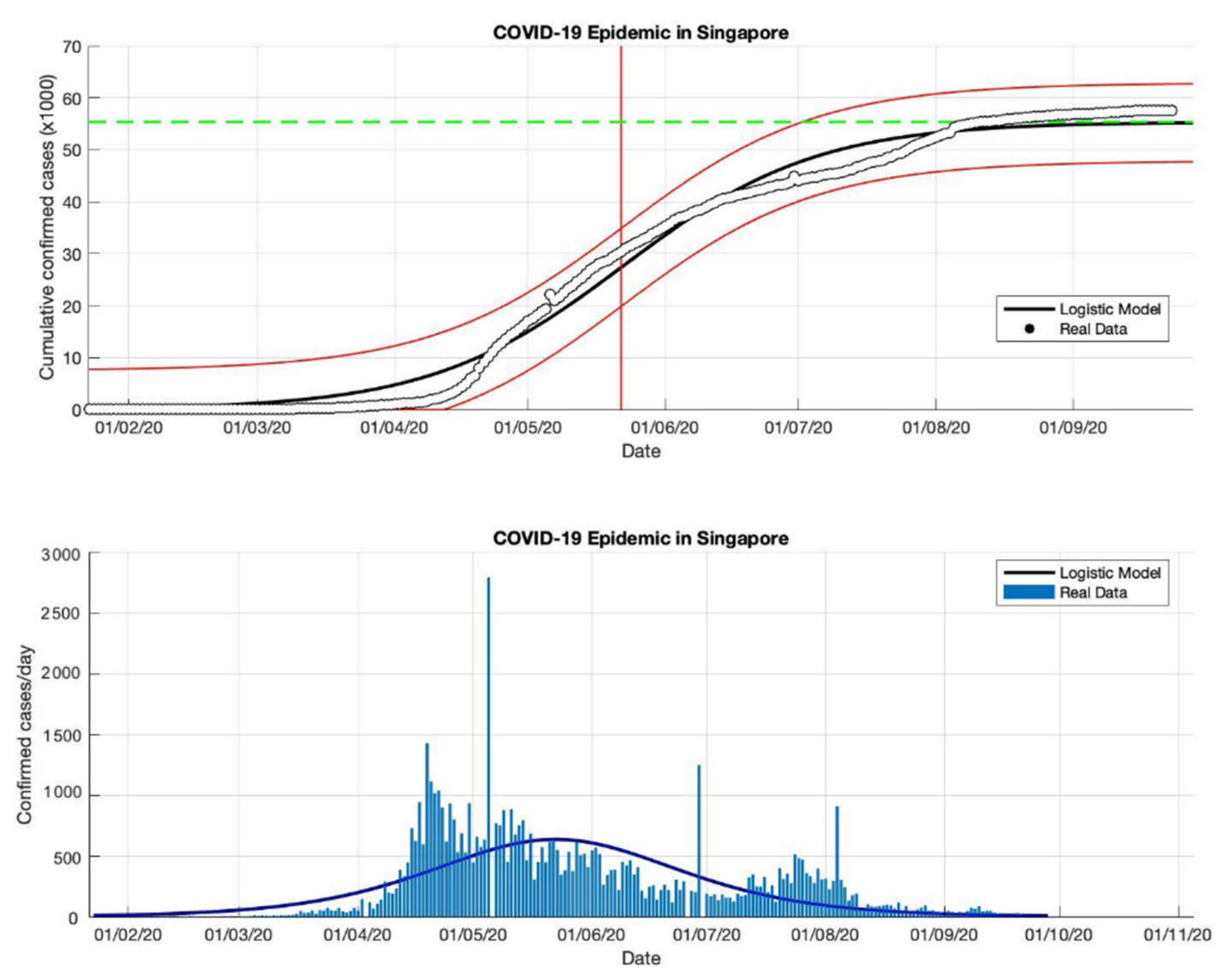
Figure 6.
In the above figure, the prediction results of the logistic growth model for cumulative infected cases are compared with the actual data, while the two red lines between the black lines represent a prediction error limit of about 5%. The dashed green line predicts the total size of infected cases in the final phase of the epidemic. The red line intersects the cumulative case curve to predict the turning point or peak point of the epidemic (this line is parallel to the top of the curve from the below figure). In the below figure, the prediction results of this model for daily infected cases in Singapore in the period 23 January to 23 September 2020.
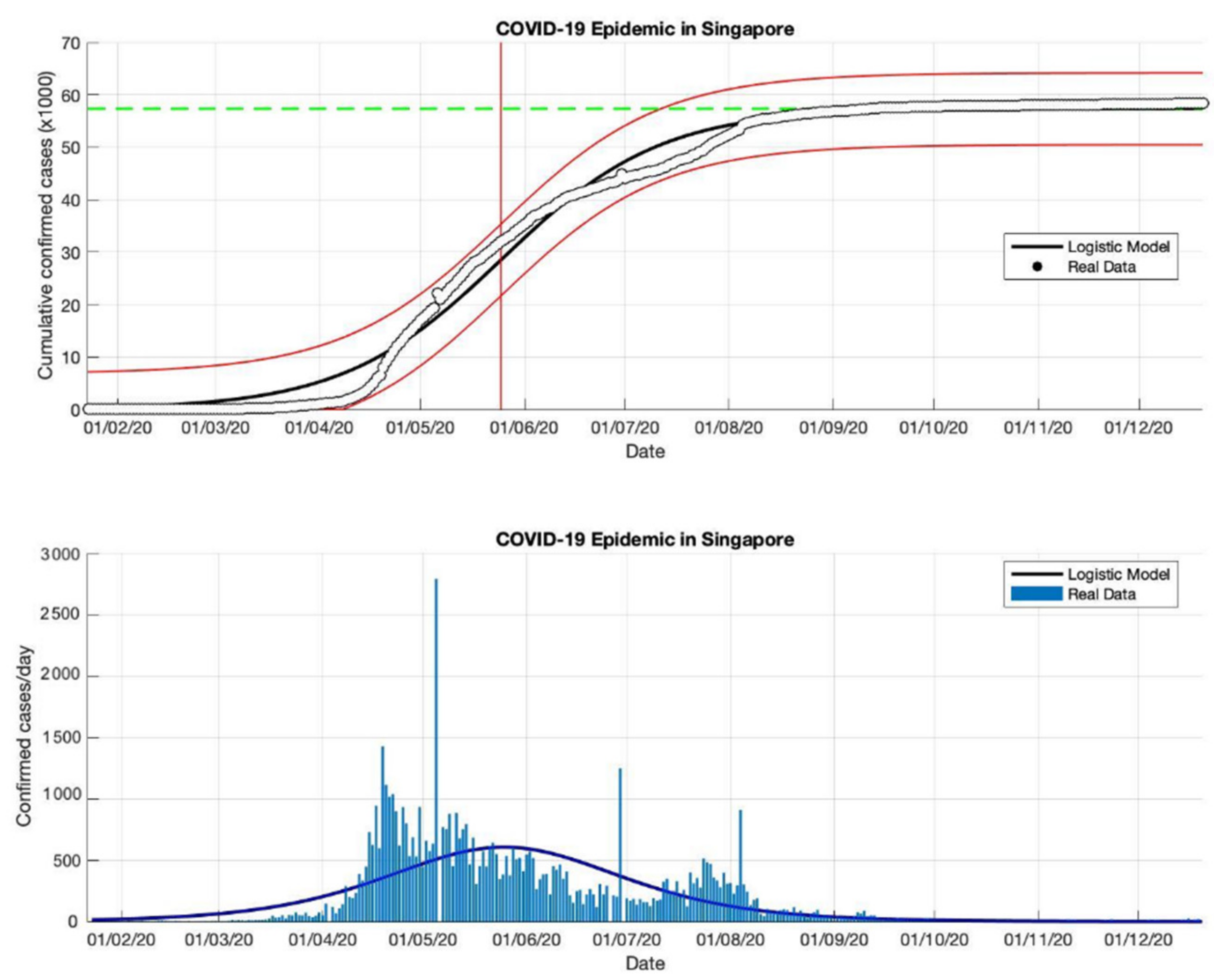
Figure 7.
In the above figure, the prediction results of the logistic growth model for cumulative infected cases are compared with the actual data, while the two red lines between the black lines represent a prediction error limit of about 5%. The dashed green line predicts the total size of infected cases in the final phase of the epidemic. The red line intersects the cumulative case curve to predict the turning point or peak point of the epidemic (this line is parallel to the top of the curve from the below figure). In the below figure, the prediction results of this model for daily infected cases in Singapore in the period 23 January to 23 December 2020.
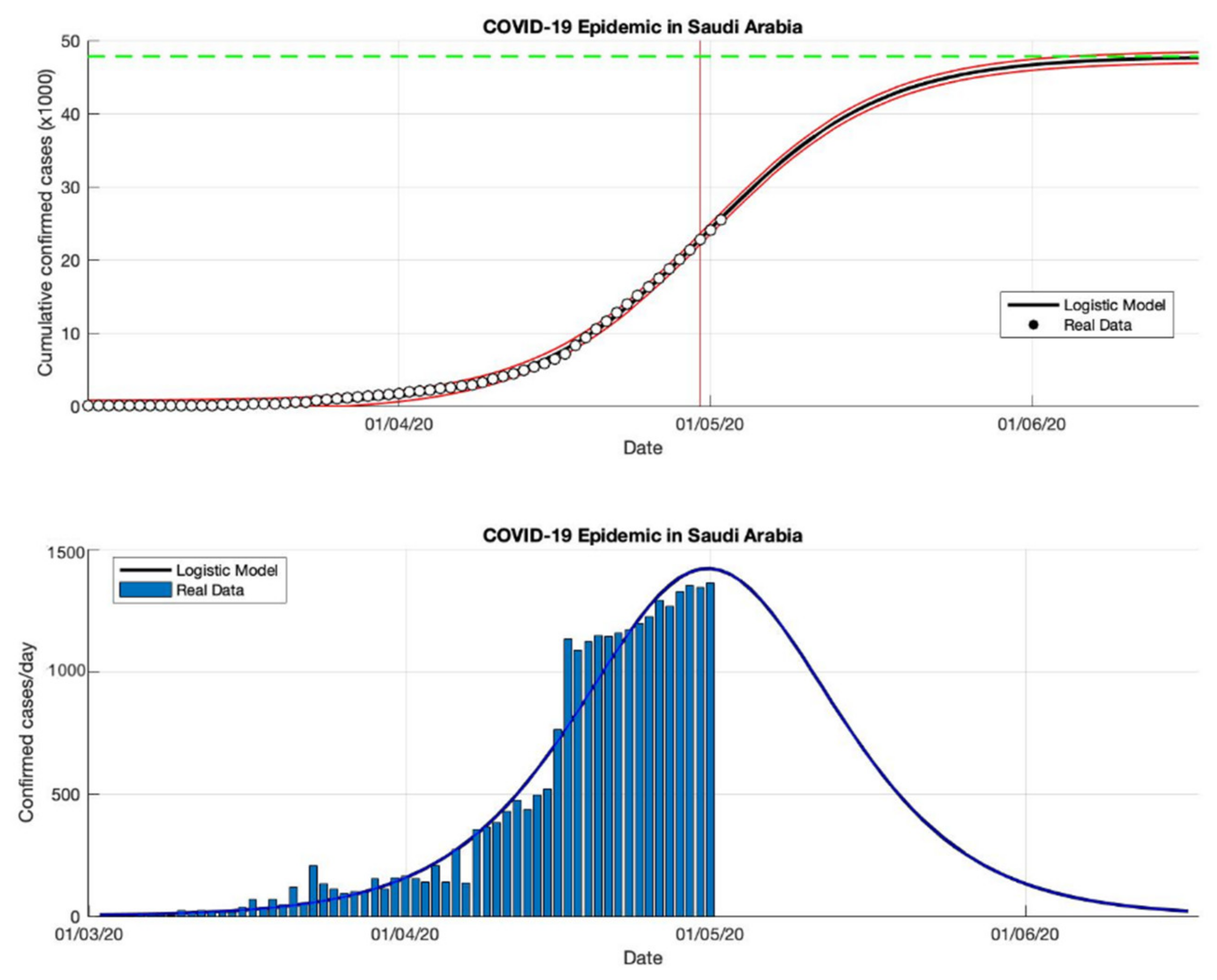
Figure 8.
In the above figure, the prediction results of the logistic growth model for cumulative infected cases are compared with the actual data, while the two red lines between the black lines represent a prediction error limit of about 5%. The dashed green line predicts the total size of infected cases in the final phase of the epidemic. The red line intersects the cumulative case curve to predict the turning point or peak point of the epidemic (this line is parallel to the top of the curve from the below figure). In the below figure, the prediction results of this model for daily infected cases in Saudi Arabia in the period 2 March to 2 May 2020.
Figure 9.
In the above figure, the prediction results of the logistic growth model for cumulative infected cases are compared with the actual data, while the two red lines between the black lines represent a prediction error limit of about 5%. The dashed green line predicts the total size of infected cases in the final phase of the epidemic. The red line intersects the cumulative case curve to predict the turning point or peak point of the epidemic (this line is parallel to the top of the curve from the below figure). In the below figure, the prediction results of this model for daily infected cases in Saudi Arabia in the period 2 March to 2 July 2020.
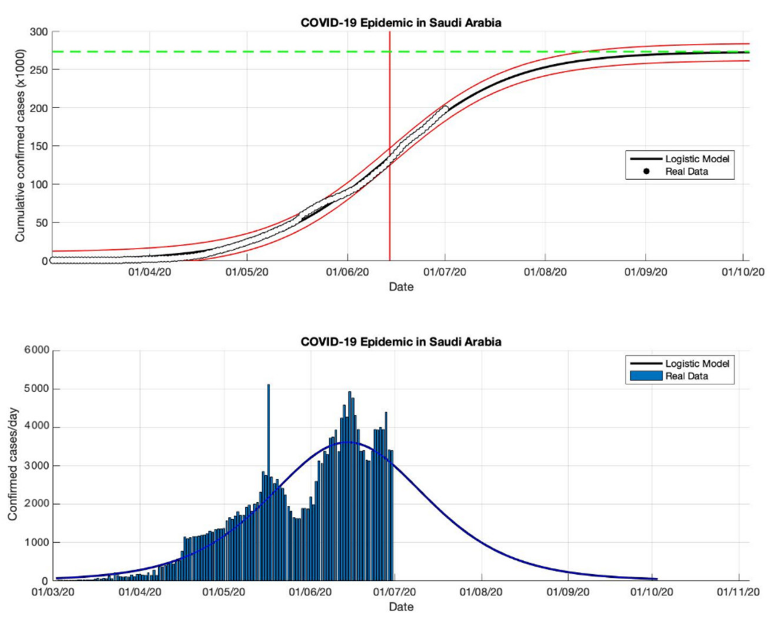
Figure 10.
In the above figure, the prediction results of the logistic growth model for cumulative infected cases are compared with the actual data, while the two red lines between the black lines represent a prediction error limit of about 5%. The dashed green line predicts the total size of infected cases in the final phase of the epidemic. The red line intersects the cumulative case curve to predict the turning point or peak point of the epidemic (this line is parallel to the top of the curve from the below figure). In the below figure, the prediction results of this model for daily infected cases in Saudi Arabia in the period 2 March to 2 September 2020.
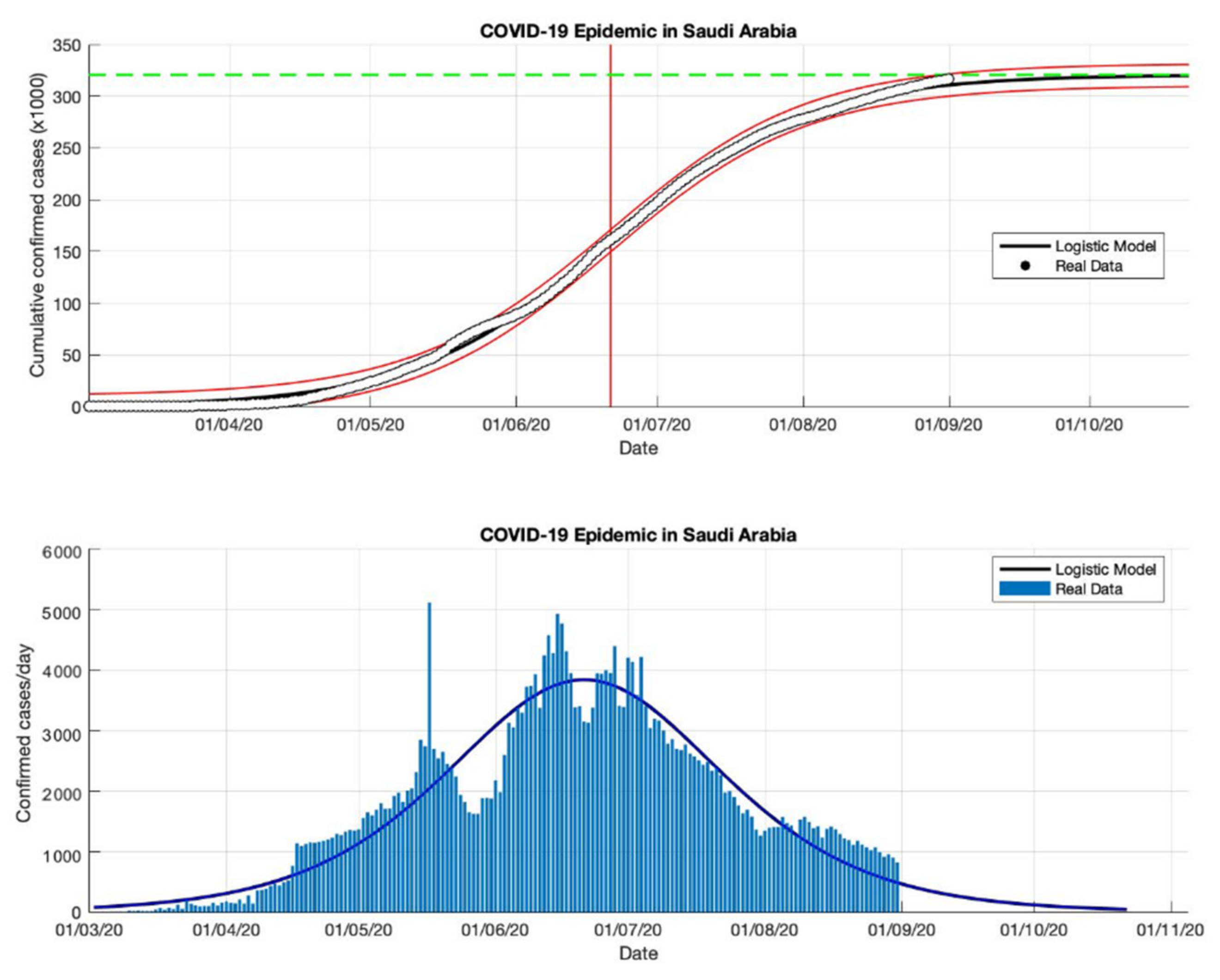
Figure 11.
In the above figure, the prediction results of the logistic growth model for cumulative infected cases are compared with the actual data, while the two red lines between the black lines represent a prediction error limit of about 5%. The dashed green line predicts the total size of infected cases in the final phase of the epidemic. The red line intersects the cumulative case curve to predict the turning point or peak point of the epidemic (this line is parallel to the top of the curve from the below figure). In the below figure, the prediction results of this model for daily infected cases in Saudi Arabia in the period 2 March to 23 December 2020.
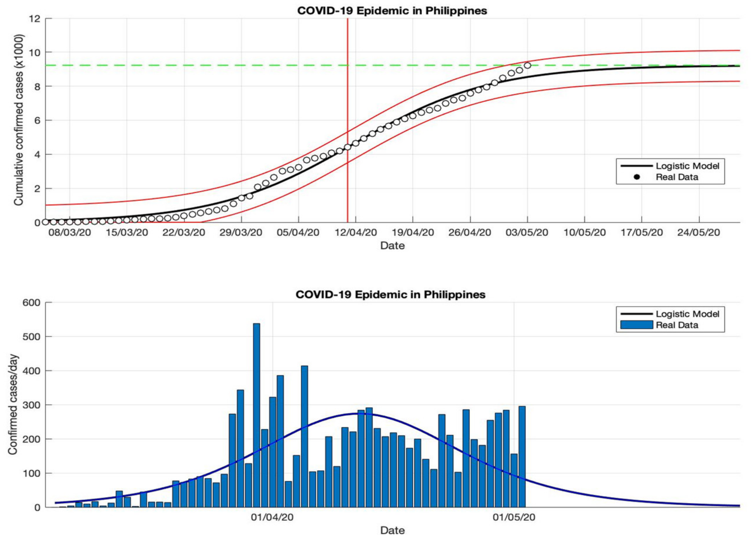
Figure 12.
In the above figure, the prediction results of the logistic growth model for cumulative infected cases are compared with the actual data, while the two red lines between the black lines represent a prediction error limit of about 5%. The dashed green line predicts the total size of infected cases in the final phase of the epidemic. The red line intersects the cumulative case curve to predict the turning point or peak point of the epidemic (this line is parallel to the top of the curve from the below figure). In the below figure, the prediction results of this model for daily infected cases in the Philippines in the period 5 March to 5 May 2020.
Figure 13.
In the above figure, the prediction results of the logistic growth model for cumulative infected cases are compared with the actual data, while the two red lines between the black lines represent a prediction error limit of about 5%. The dashed green line predicts the total size of infected cases in the final phase of the epidemic. The red line intersects the cumulative case curve to predict the turning point or peak point of the epidemic (this line is parallel to the top of the curve from the below figure). In the below figure, the prediction results of this model for daily infected cases in the Philippines in the period 5 March to 5 July 2020.
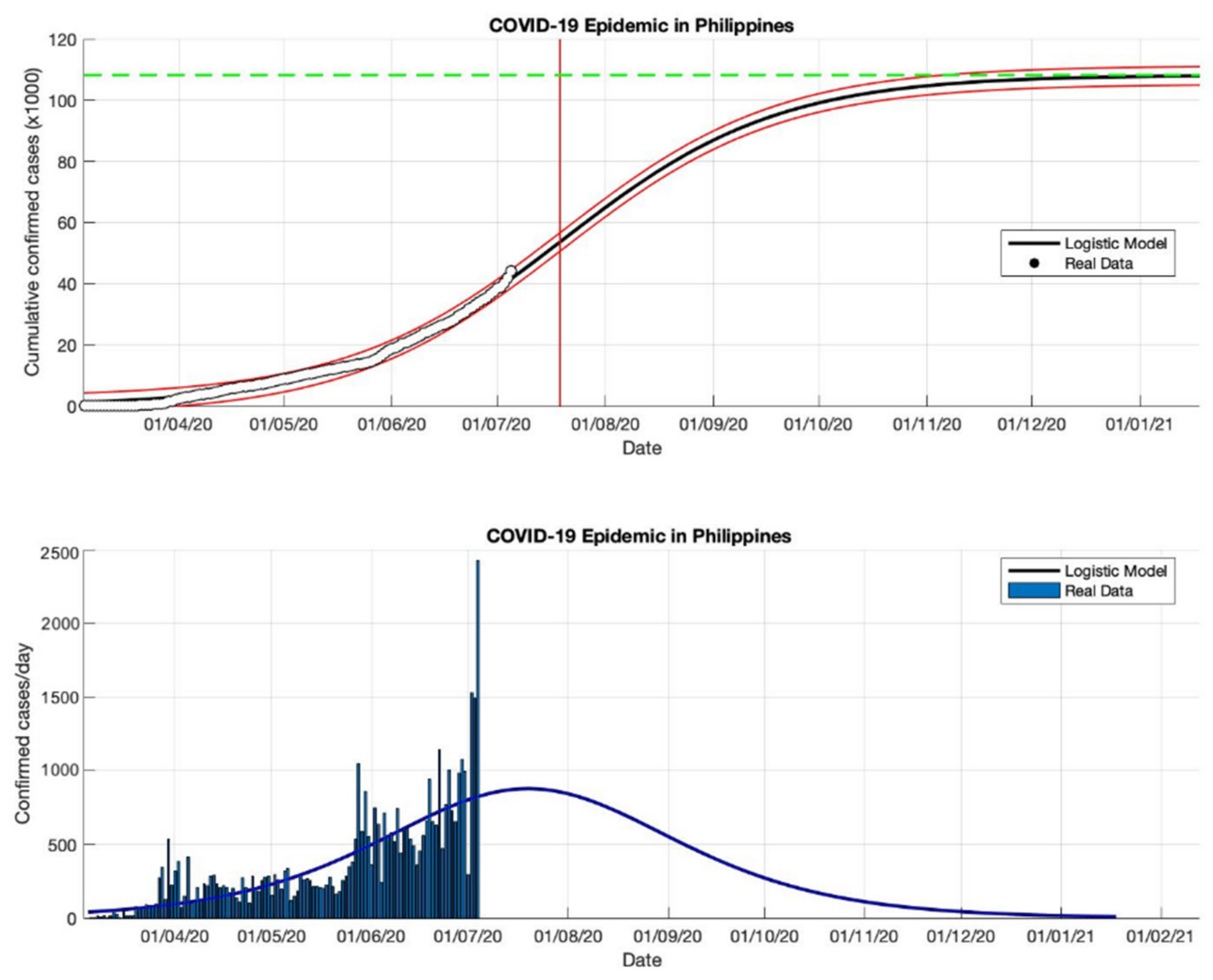
Figure 14.
In the above figure, the prediction results of the logistic growth model for cumulative infected cases are compared with the actual data, while the two red lines between the black lines represent a prediction error limit of about 5%. The dashed green line predicts the total size of infected cases in the final phase of the epidemic. The red line intersects the cumulative case curve to predict the turning point or peak point of the epidemic (this line is parallel to the top of the curve from the below figure). In the below figure, the prediction results of this model for daily infected cases in the Philippines in the period 5 March to 5 October 2020.
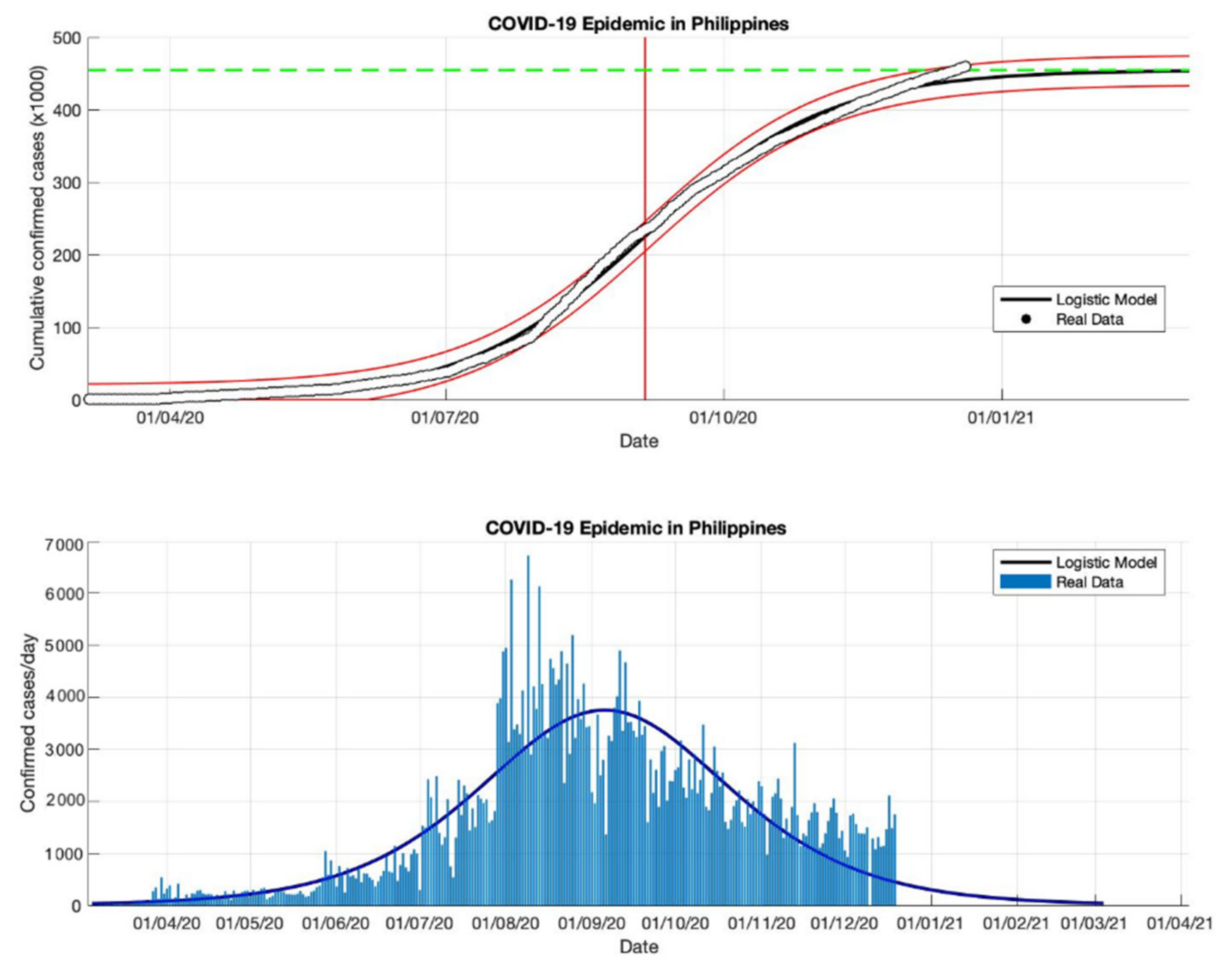
Figure 15.
In the above figure, the prediction results of the logistic growth model for cumulative infected cases are compared with the actual data, while the two red lines between the black lines represent a prediction error limit of about 5%. The dashed green line predicts the total size of infected cases in the final phase of the epidemic. The red line intersects the cumulative case curve to predict the turning point or peak point of the epidemic (this line is parallel to the top of the curve from the below figure). In the below figure, the prediction results of this model for daily infected cases in the Philippines in the period 5 March to 23 December 2020.
Figure 16.
In the above figure, the prediction results of the logistic growth model for cumulative infected cases are compared with the actual data, while the two red lines between the black lines represent a prediction error limit of about 5%. The dashed green line predicts the total size of infected cases in the final phase of the epidemic. The red line intersects the cumulative case curve to predict the turning point or peak point of the epidemic (this line is parallel to the top of the curve from the below figure). In the below figure, the prediction results of this model for daily infected cases in Indonesia in the period 2 March to 2 May 2020.
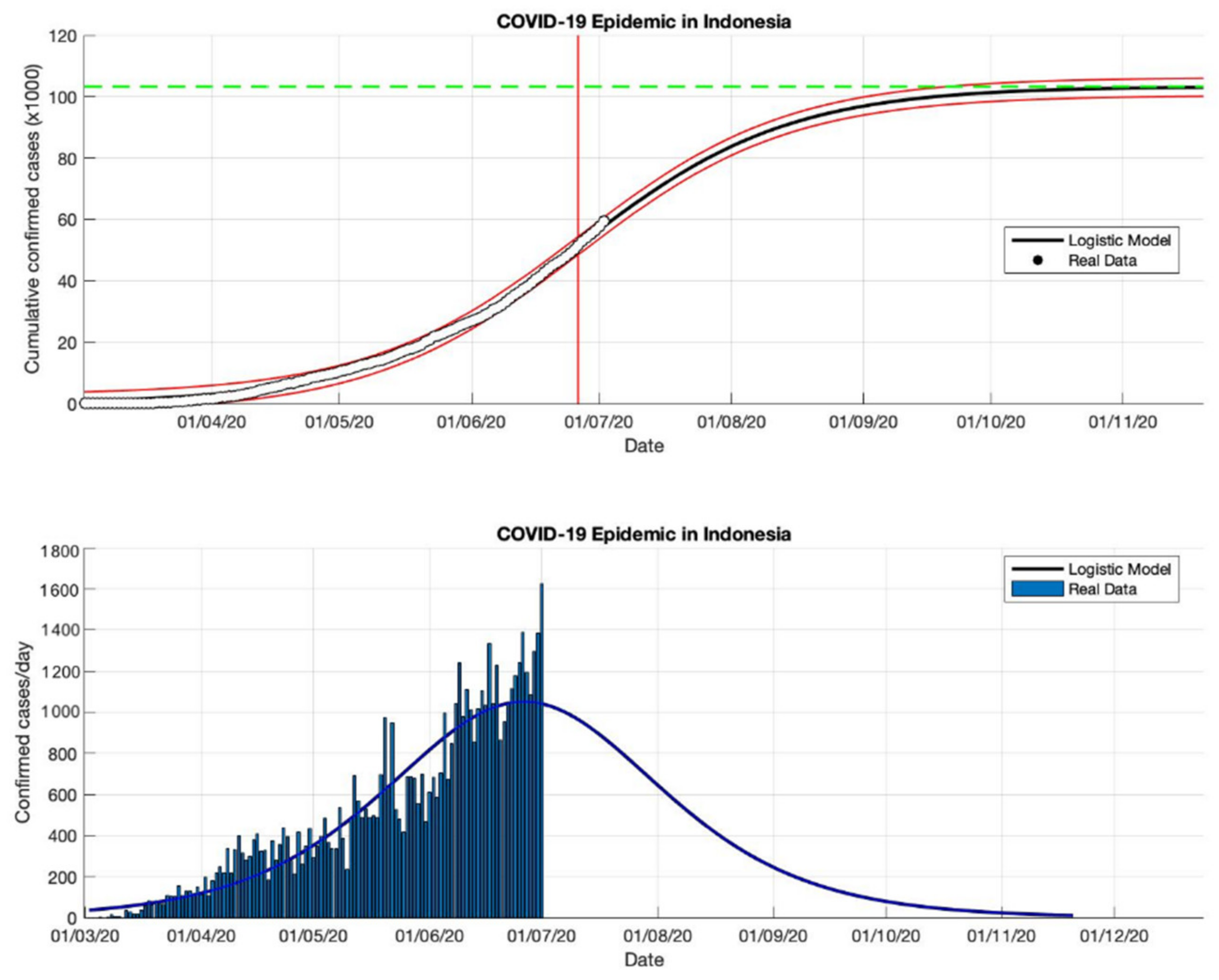
Figure 17.
In the above figure, the prediction results of the logistic growth model for cumulative infected cases are compared with the actual data, while the two red lines between the black lines represent a prediction error limit of about 5%. The dashed green line predicts the total size of infected cases in the final phase of the epidemic. The red line intersects the cumulative case curve to predict the turning point or peak point of the epidemic (this line is parallel to the top of the curve from the below figure). In the below figure, the prediction results of this model for daily infected cases in Indonesia in the period 2 March to 2 July 2020.
Figure 18.
In the above figure, the prediction results of the logistic growth model for cumulative infected cases are compared with the actual data, while the two red lines between the black lines represent a prediction error limit of about 5%. The dashed green line predicts the total size of infected cases in the final phase of the epidemic. The red line intersects the cumulative case curve to predict the turning point or peak point of the epidemic (this line is parallel to the top of the curve from the below figure). In the below figure, the prediction results of this model for daily infected cases in Indonesia in the period 2 March to 2 September 2020.
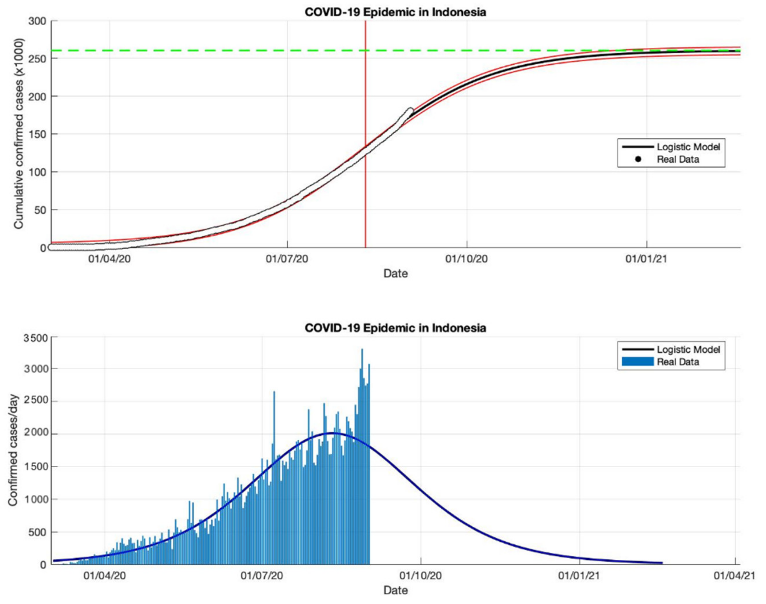
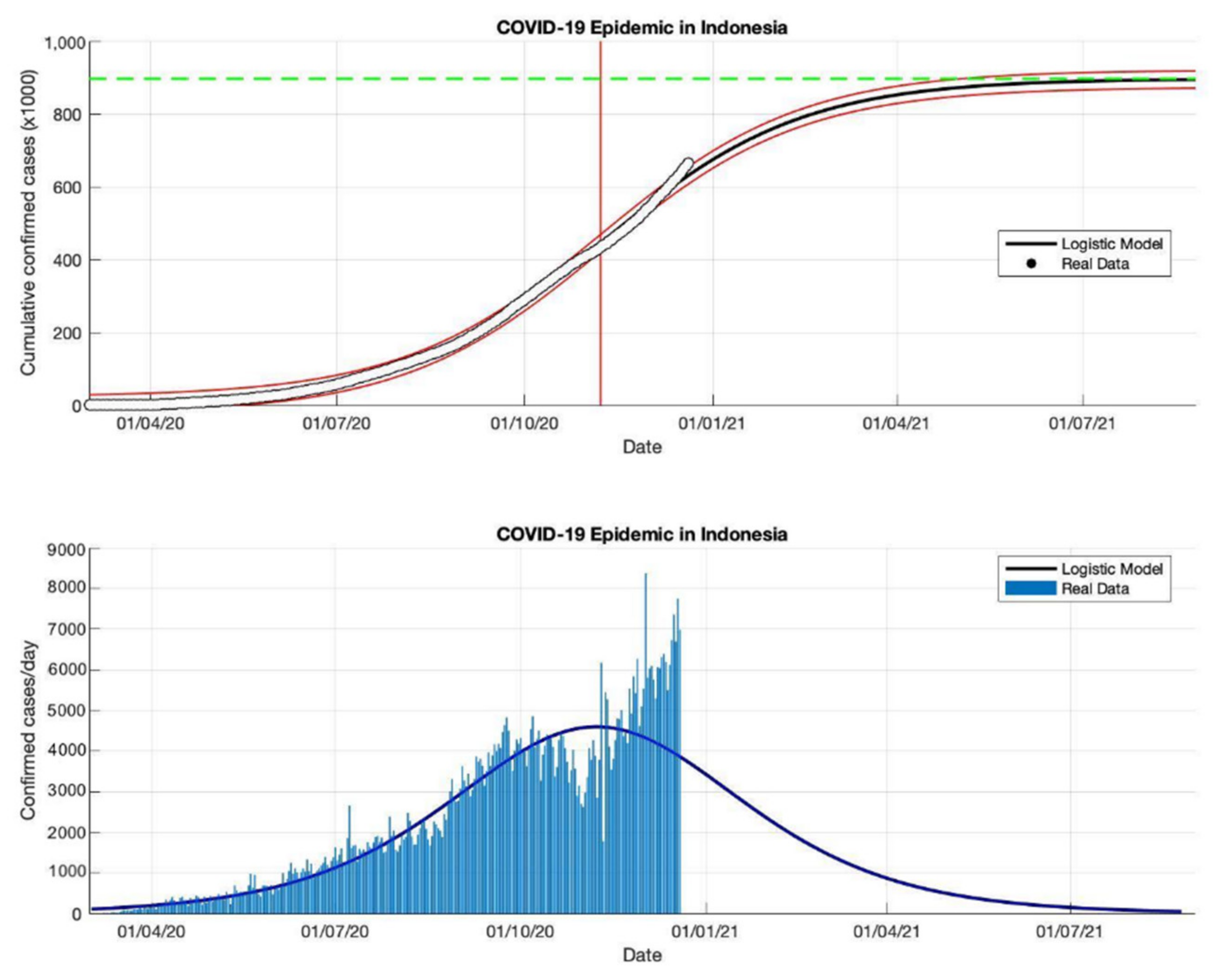
Figure 19.
In the above figure, the prediction results of the logistic growth model for cumulative infected cases are compared with the actual data, while the two red lines between the black lines represent a prediction error limit of about 5%. The dashed green line predicts the total size of infected cases in the final phase of the epidemic. The red line intersects the cumulative case curve to predict the turning point or peak point of the epidemic (this line is parallel to the top of the curve from the below figure). In the below figure, the prediction results of this model for daily infected cases in Indonesia in the period 2 March to 23 December 2020.
Table 1.
The results of estimated parameters in the logistic growth model for various periods that are compared by daily cases data of COVID-19 infected in China based on data compiled by WHO [
18].
Table 1.
The results of estimated parameters in the logistic growth model for various periods that are compared by daily cases data of COVID-19 infected in China based on data compiled by WHO [
18].
Period
2020 | Turning Point
tp | Growth Rate
r | The Estimated Size of Cases K | Parameter
A | Value
R2 |
|---|
| 21 January–21 February | 8 February 2020 | 0.260 | 81,054 | 411,141 | 0.993 |
| 21 January–21 March | 8 February 2020 | 0.217 | 83,802 | 465,153 | 0.993 |
| 21 January–1 July | 8 February 2020 | 0.214 | 83,488 | 267,044 | 0.997 |
Table 2.
The estimation results of parameters in the logistic growth model for various periods from daily cases data of COVID-19 infected in Singapore based on data compiled by WHO [
18].
Table 2.
The estimation results of parameters in the logistic growth model for various periods from daily cases data of COVID-19 infected in Singapore based on data compiled by WHO [
18].
Period
2020 | Turning Point
tp | Growth Rate
r | The Estimated Size of Cases K | Parameter
A | Value
R2 |
|---|
| 23 January–23 May | 30 April 2020 | 0.115 | 31,835 | 47,179 | 0.990 |
| 23 January–23 June | 7 May 2020 | 0.081 | 42,432 | 57,981 | 0.996 |
| 23 January–23 September | 22 May 2020 | 0.046 | 57,639 | 76,005 | 0.988 |
| 23 January–23 December | 25 May 2020 | 0.042 | 58,422 | 72,928 | 0.991 |
Table 3.
The estimation results of parameters in the logistic growth model for various periods from daily cases data of COVID-19 infected in Saudi Arabia based on data compiled by WHO [
18].
Table 3.
The estimation results of parameters in the logistic growth model for various periods from daily cases data of COVID-19 infected in Saudi Arabia based on data compiled by WHO [
18].
Period
2020 | Turning Point
tp | Growth Rate
r | The Estimated Size of Cases K | Parameter
A | Value
R2 |
|---|
| 2 March–2 May | 30 April 2020 | 0.118 | 47,795 | 52,847 | 0.999 |
| 2 March–2 July | 14 June 2020 | 0.053 | 273,139 | 326,863 | 0.996 |
| 2 March–2 September | 21 June 2020 | 0.048 | 320,760 | 467,156 | 0.999 |
| 2 March–23 December | 26 June 2020 | 0.041 | 361,010 | 480,959 | 0.997 |
Table 4.
The estimation results of parameters in the logistic growth model for various periods from daily cases data of COVID-19 infected in the Philippines based on data compiled by WHO [
18].
Table 4.
The estimation results of parameters in the logistic growth model for various periods from daily cases data of COVID-19 infected in the Philippines based on data compiled by WHO [
18].
Period
2020 | Turning Point
tp | Growth Rate
r | The Estimated Size of Cases K | Parameter
A | Value
R2 |
|---|
| 5 March–5 May | 11 April 2020 | 0.118 | 9,230 | 3,711 | 0.991 |
| 5 March–5 July | 19 July 2020 | 0.032 | 108,239 | 13,100 | 0.993 |
| 5 March–5 October | 26 August 2020 | 0.038 | 396,985 | 83,389 | 0.998 |
| 5 March–23 December | 5 September 2020 | 0.033 | 459,784 | 113,105 | 0.999 |
Table 5.
The estimation results of parameters in the logistic growth model for various periods from daily cases data of COVID-19 infected in Indonesia based on data compiled by WHO [
18].
Table 5.
The estimation results of parameters in the logistic growth model for various periods from daily cases data of COVID-19 infected in Indonesia based on data compiled by WHO [
18].
Period
2020 | Turning Point
tp | Growth Rate
r | The Estimated Size of Cases K | Parameter
A | Value
R2 |
|---|
| 2 March–2 May | 19 April 2020 | 0.109 | 13,268 | 10,830 | 0.989 |
| 2 March–2 July | 26 June 2020 | 0.041 | 103,283 | 46,139 | 0.996 |
| 2 March–2 September | 10 August 2020 | 0.047 | 260,316 | 124,384 | 0.997 |
| 2 March–23 December | 7 November 2020 | 0.049 | 896,504 | 412,832 | 0.999 |


