
Harmonization and Visualization of Data from a Transnational Multi-Sensor Personal Exposure Campaign

 ,
, 
 ,
,  , , ,
, , ,  ,
,  ,
, 
 , , ,
, , , 
Abstract
:1. Introduction
- -
- Outputs resulting from multi-sensor and multi-parameter data flows;
- -
- Aggregation and harmonization of data collected;
- -
- Production of tailored visualizations by fusing data from multiple sources, and automated compilation of individualized final reports.
2. Materials and Methods
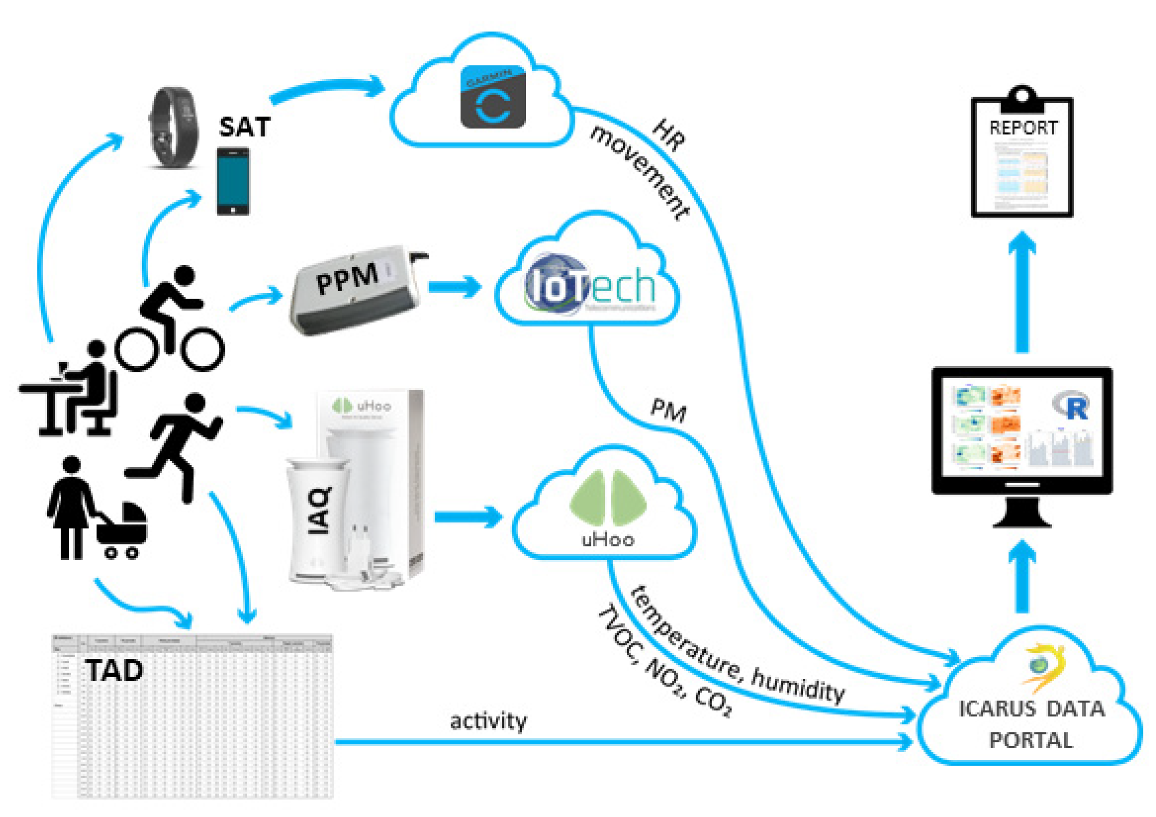
2.1. PPM Data
2.2. SAT Data
2.3. IAQ Data
2.4. ICARUS Data Portal
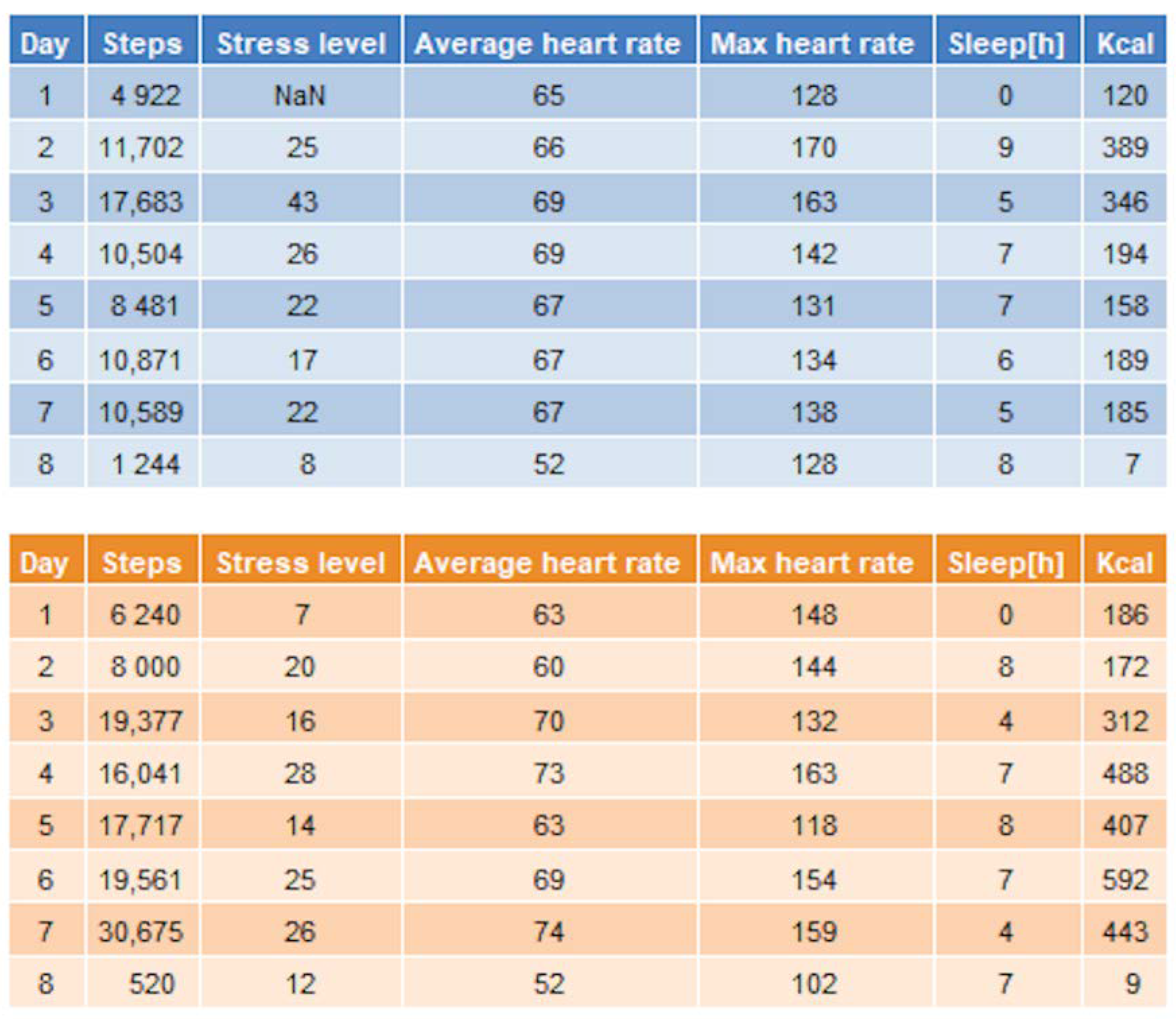
2.5. TAD Data
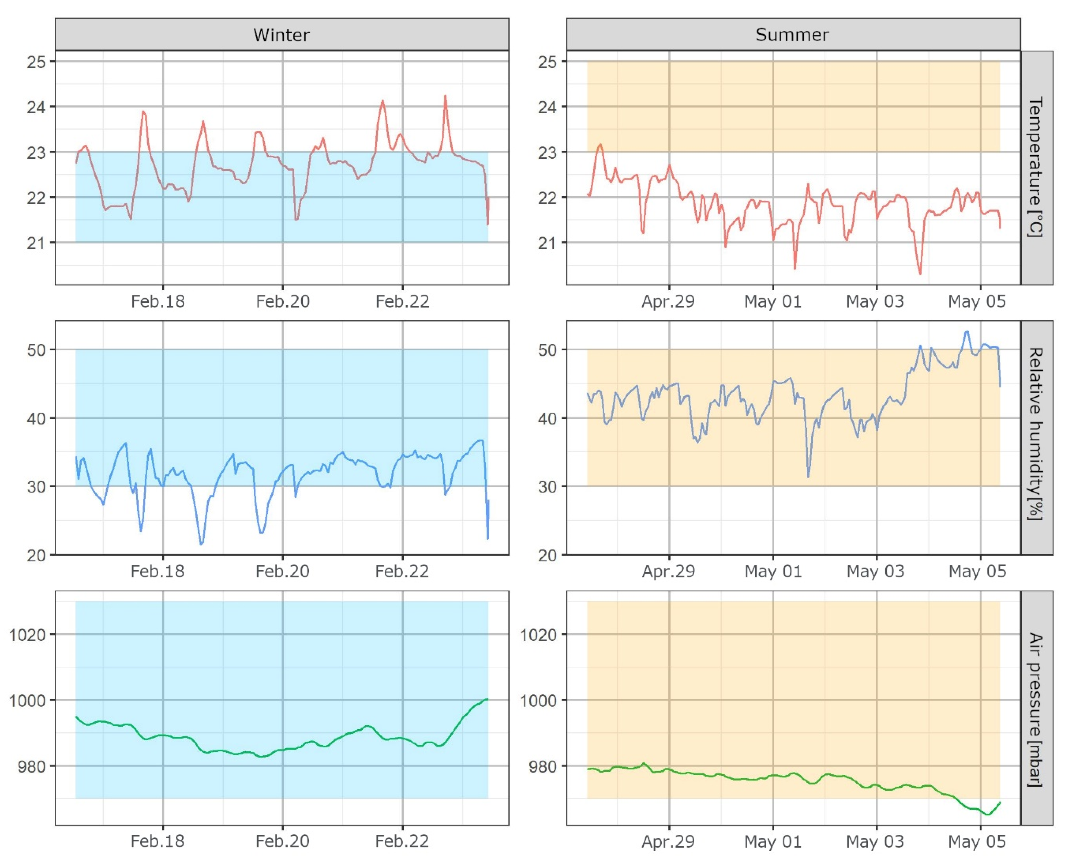
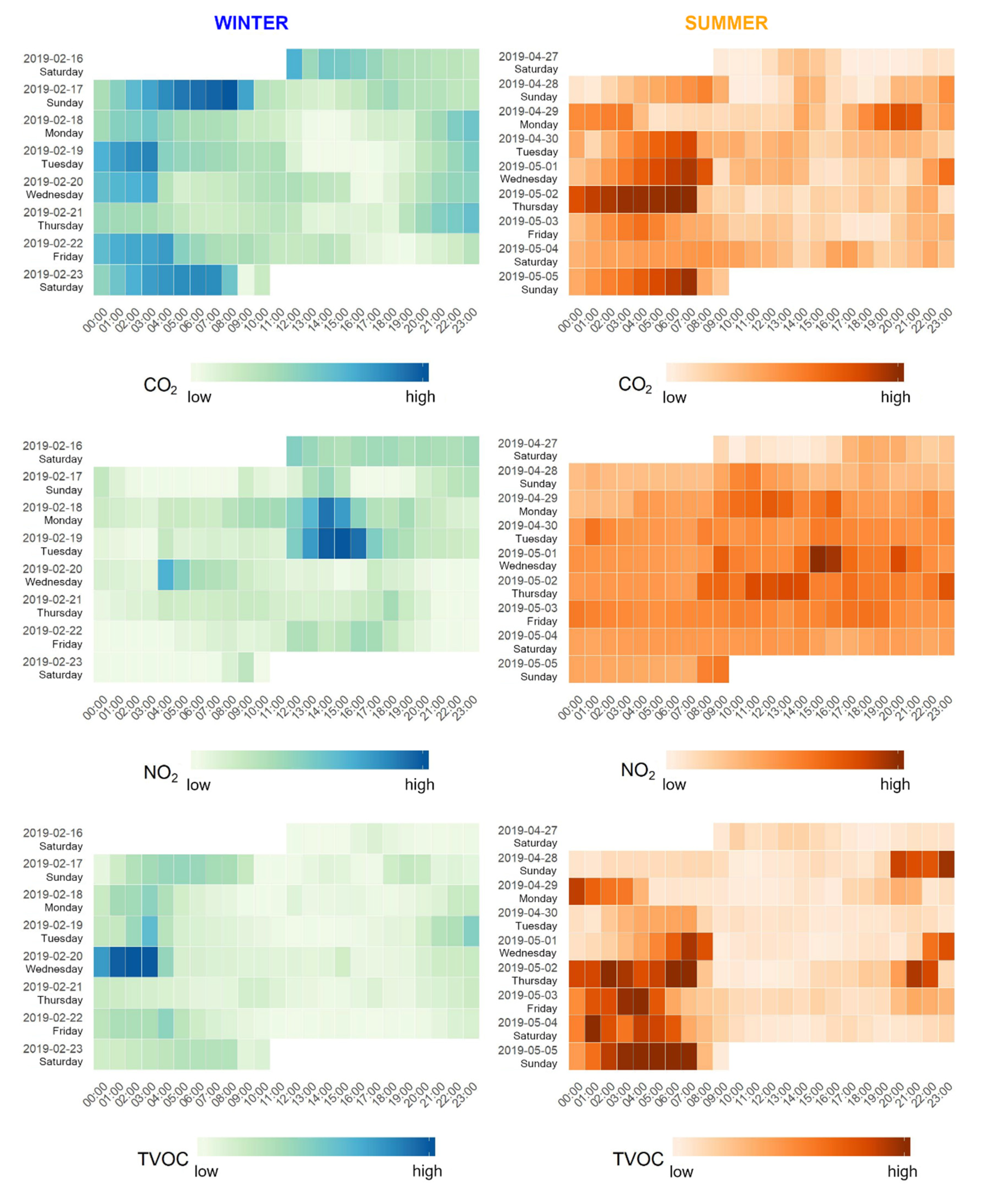
- (a)
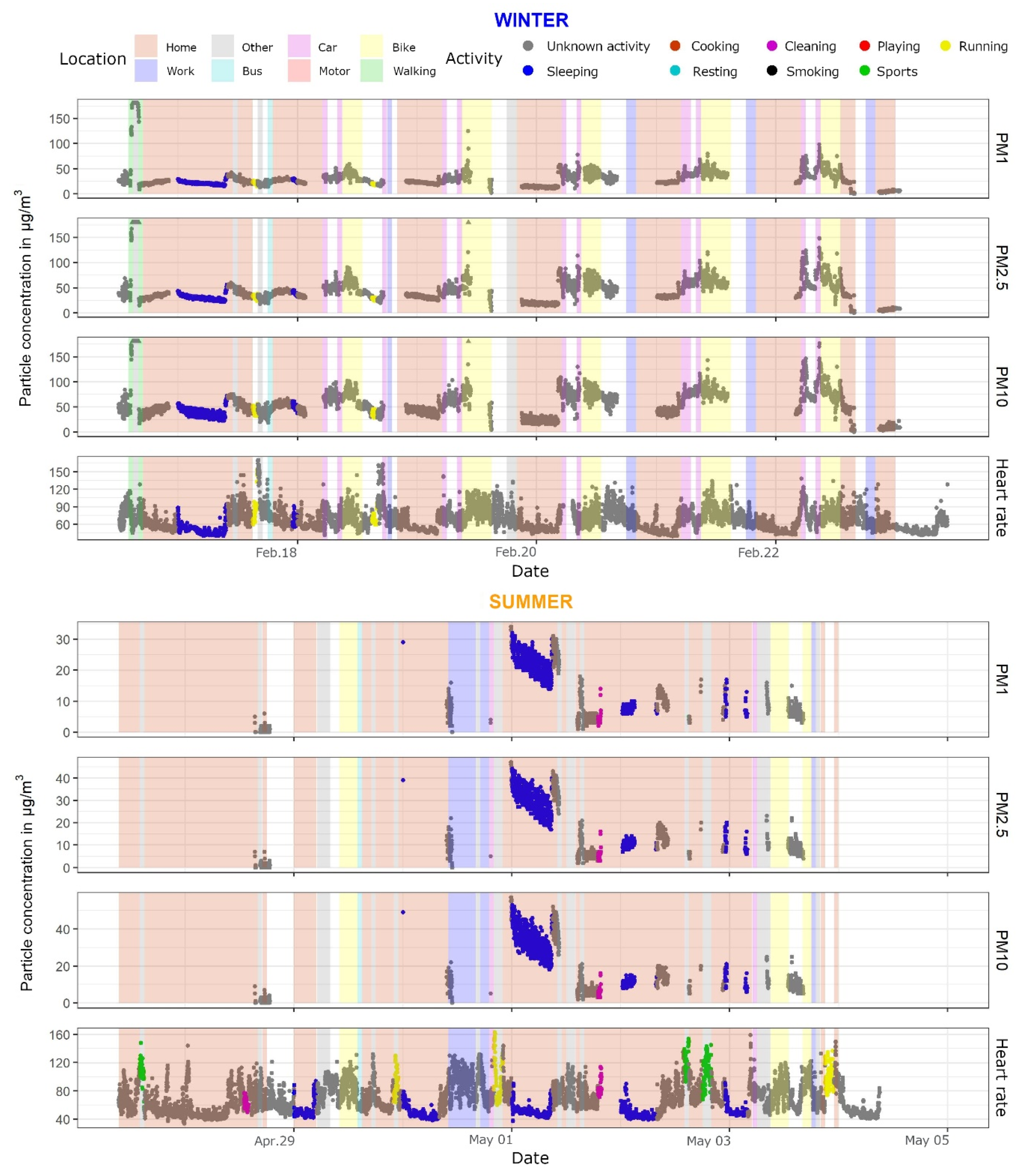
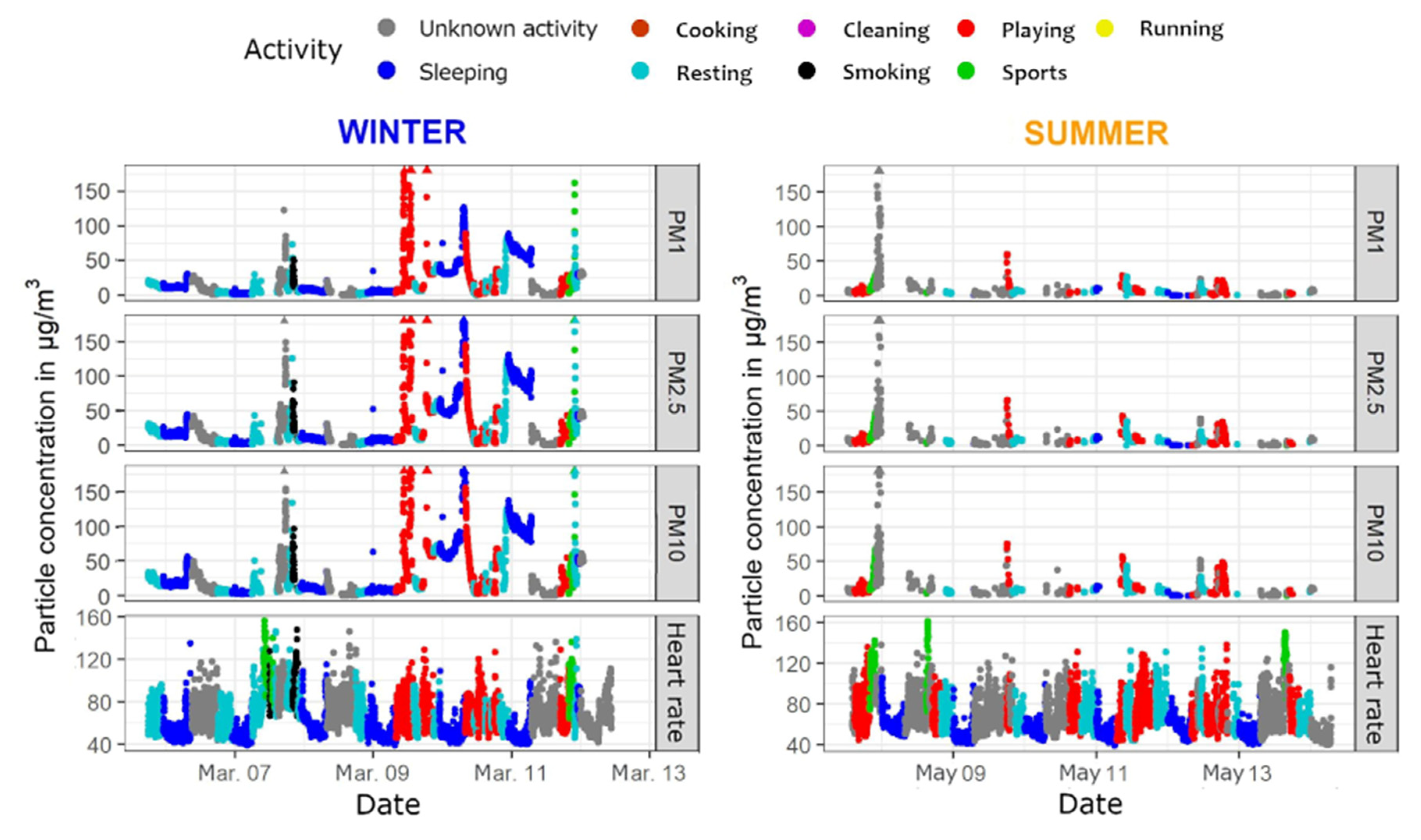
- A scatter plot was made for every PM size class and heart rate for both seasons. Additionally, the points were colored based on the activity at that minute, which allowed the reader to observe what activities took place at, for example, elevated levels of PM or elevated heart rate. Only the activities which the participant filled in were shown in the legend.
- (b)
- A similar scatter plot as in (a) was constructed, with an additional layer which showed vertical bands or ribbons of different colors corresponding with the participant’s location and mode of transport. As this added another layer of complexity to the visualization, the decision was made to provide these plots only to specific individuals who expressed interest. Though activity information was missing in several TADs, the location and transport data were logged for almost the entire period of observation (for most participants). Consequently, participants could associate specific means of transport with elevated levels of PM, and corresponding activities with a higher heart rate.
- (c)
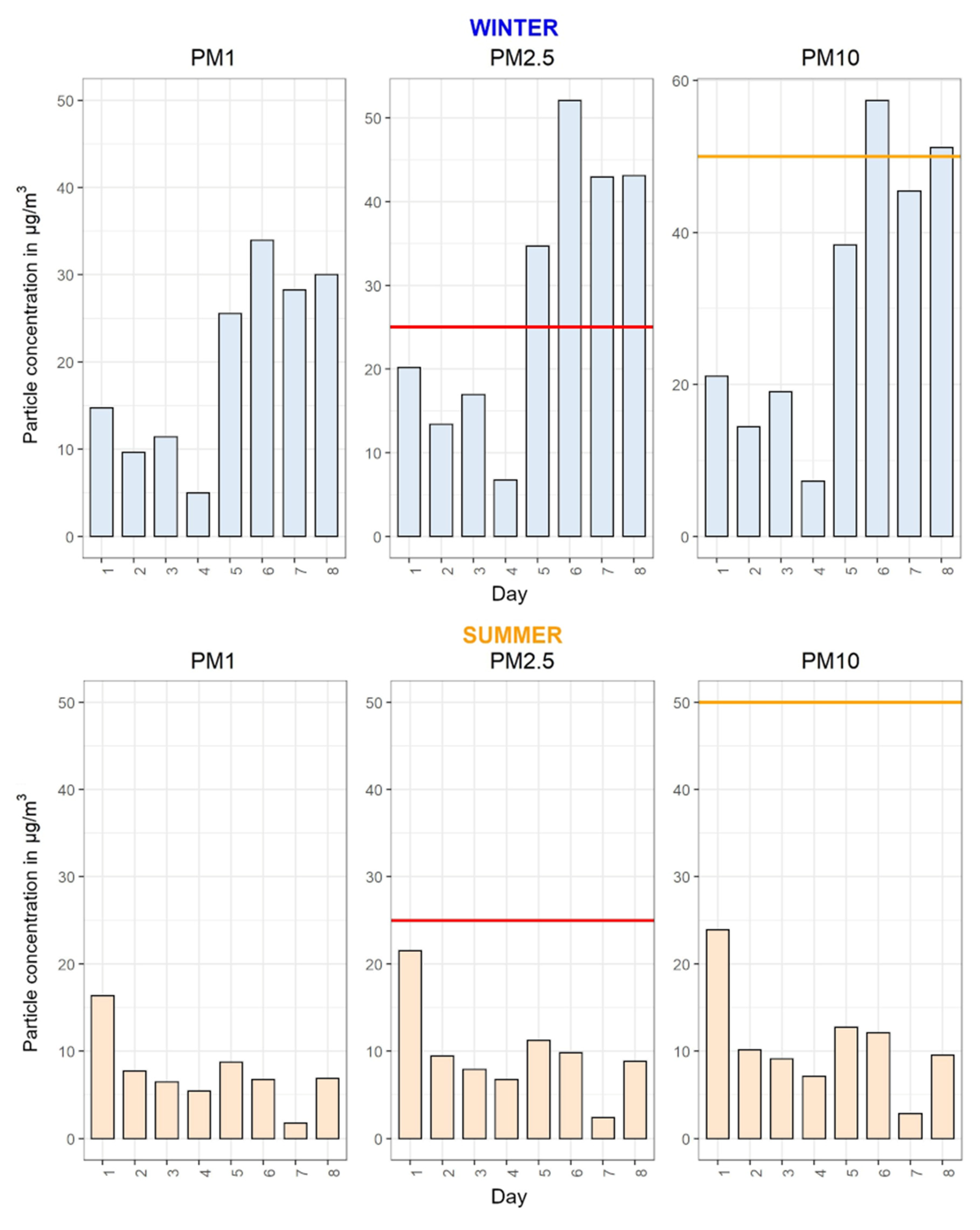
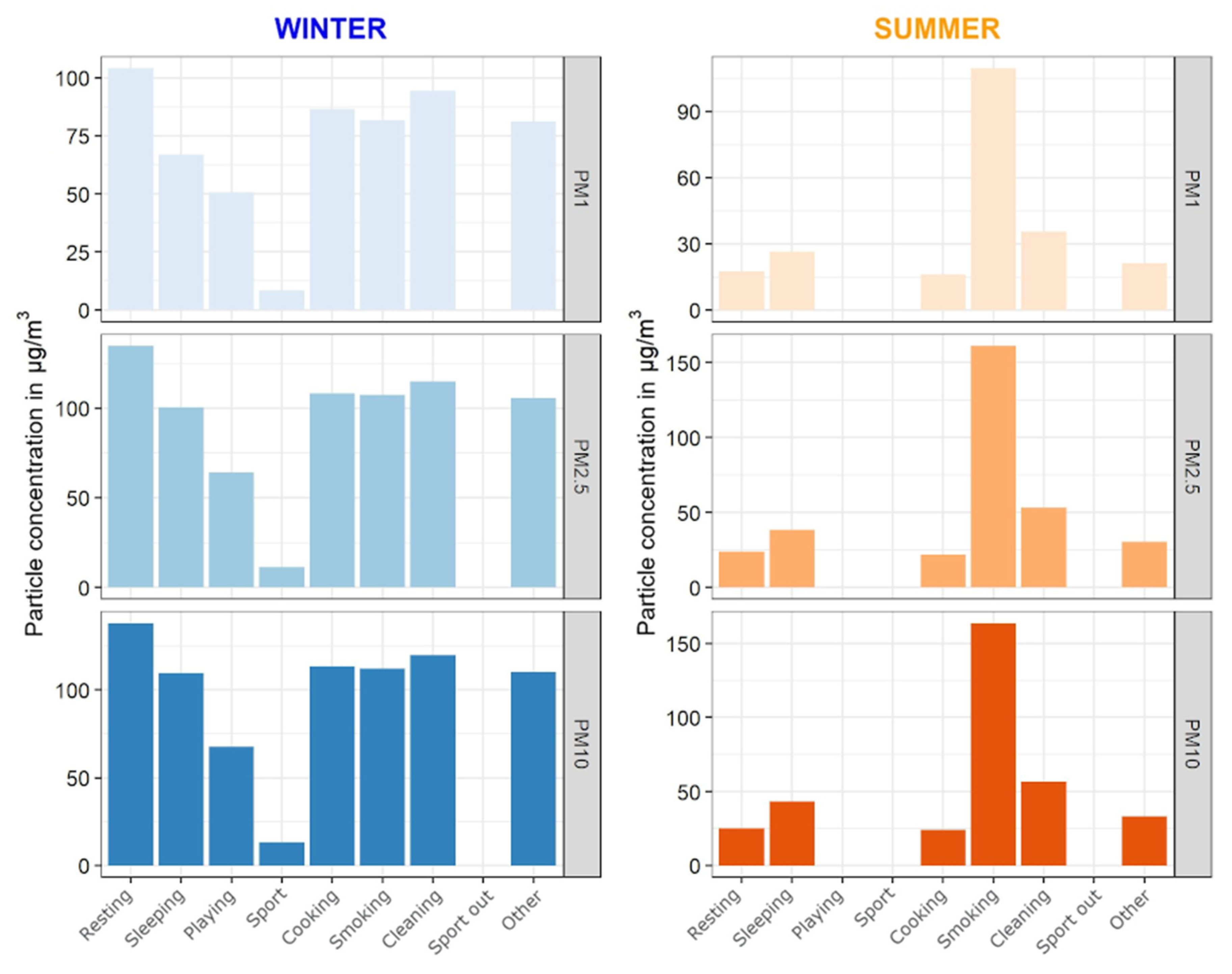
- The third plot showed the average weekly PM values for each activity. Six plots were constructed, three per season, one for each PM size class.
2.6. Final Report Compilation and Production
- (a)
- Generation of plots as described in points 2.1.–2.4., which was followed for all of the participants. These plots were saved locally in a jpeg format and labeled according to each participant ID.
- (b)
- Plots were integrated in a rmarkdown script, with the customization of each report designated in an Excel file. Each participant had a custom greeting with their name and gender-appropriate pronoun. All plots and other graphics were inserted using the include_graphics function in the knitr package.
- (c)
- Finally, the script was iterated over all participants in a separate script to allow some further customizations. Some participants had additional visualizations (see 2.5 point b), while others had some omitted due to missing data. After all the reports were generated in the participants’ local language, they were manually checked for errors by local organizers in each participating city and distributed to all the participants.
2.7. Temporal Resolution and Data Treatment
3. Results and Discussion
3.1. A Merged Dataset
- Specific characteristics for each participant (age and gender);
- PPM data (PM values, temperature, humidity, battery charge level, location coordinates, speed, and altitude);
- SAT data (where several columns proved to be somewhat redundant and were therefore removed);
- IAQ data (which proved to be easiest to handle as they had a correct timestamp for each recorded value, almost no missing values, and a simple interface to download the data);
- TAD data, presented the same way as they were recorded on the physical paper sheets: location of the participant (home, office, indoor, outdoor), transport data (bus, car, foot, etc.), indoor and outdoor activities (cooking, smoking, sports, etc.), and some specific conditions for the indoor space the participant was in (burning candle or fireplace, open windows, and/or AC turned on).
3.2. Visualizing the Data
3.3. The Final Report
3.4. Issues Faced and Recommendations for Future Studies
4. Conclusions
Supplementary Materials
Author Contributions
Funding
Institutional Review Board Statement
Informed Consent Statement
Data Availability Statement
Acknowledgments
Conflicts of Interest
References
- Wellenius, G.A.; Schwartz, J.; Mittleman, M.A. Health and the environment: Addressing the health impact of air pollution: Draft resolution proposed by the delegations of Albania, Chile, Colombia, France, Germany, Monaco, Norway, Panama, Sweden, Switzerland, Ukraine, United States of America, Uruguay and Zambia. Sixty-Eighth World Health Assembly 2015, 14, 68. [Google Scholar]
- Payne-Sturges, D.C.; Marty, M.A.; Perera, F.; Miller, M.D.; Swanson, M.; Ellickson, K.; Cory-Slechta, D.A.; Ritz, B.; Balmes, J.; Anderko, L.; et al. Healthy Air, Healthy Brains: Advancing Air Pollution Policy to Protect Children’s Health. Am. J. Public Health 2019, 109, 550–554. [Google Scholar] [CrossRef]
- Sicard, P.; Agathokleous, E.; De Marco, A.; Paoletti, E.; Calatayud, V. Urban population exposure to air pollution in Europe over the last decades. Environ. Sci. Eur. 2021, 33, 28. [Google Scholar] [CrossRef]
- Jerrett, M.; Donaire-Gonzalez, D.; Popoola, O.; Jones, R.; Cohen, R.C.; Almanza, E.; de Nazelle, A.; Mead, I.; Carrasco-Turigas, G.; Cole-Hunter, T.; et al. Validating novel air pollution sensors to improve exposure estimates for epidemiological analyses and citizen science. Environ. Res. 2017, 158, 286–294. [Google Scholar] [CrossRef] [PubMed]
- Hubbell, B.J.; Kaufman, A.; Rivers, L.; Schulte, K.; Hagler, G.; Clougherty, J.; Cascio, W.; Costa, D. Understanding Social and Behavioral Drivers and Impacts of Air Quality Sensor Use. Sci. Total Environ. 2018, 621, 886–894. [Google Scholar] [CrossRef] [PubMed]
- Miskell, G.; Salmond, J.; Williams, D.E. Low-cost sensors and crowd-sourced data: Observations of siting impacts on a network of air-quality instruments. Sci. Total Environ. 2017, 575, 1119–1129. [Google Scholar] [CrossRef] [PubMed]
- Morawska, L.; Thai, P.K.; Liu, X.; Asumadu-Sakyi, A.; Ayoko, G.; Bartonova, A.; Bedini, A.; Chai, F.; Christensen, B.; Dunbabin, M.; et al. Applications of low-cost sensing technologies for air quality monitoring and exposure assessment: How far have they gone? Environ. Int. 2018, 116, 286–299. [Google Scholar] [CrossRef]
- Rai, A.C.; Kumar, P.; Pilla, F.; Skouloudis, A.N.; Di Sabatino, S.; Ratti, C.; Yasar, A.; Rickerby, D. End-user perspective of low-cost sensors for outdoor air pollution monitoring. Sci. Total Environ. 2017, 607–608, 691–705. [Google Scholar] [CrossRef] [Green Version]
- Robinson, J.A.; Kocman, D.; Horvat, M.; Bartonova, A. End-User Feedback on a Low-Cost Portable Air Quality Sensor System—Are We There Yet? Sensors 2018, 18, 3768. [Google Scholar] [CrossRef] [PubMed] [Green Version]
- Goal 11. Make Cities and Human Settlements Inclusive, Safe, Resilient and Sustainable–Indicators and a Monitoring Framework. Available online: https://indicators.report/goals/goal-11/ (accessed on 2 March 2021).
- Mean Urban Air Pollution of Particulate Matter (PM10 and PM2.5)–Indicators and a Monitoring Framework. Available online: https://indicators.report/indicators/i-69/ (accessed on 2 March 2021).
- Jarvis, D.J.; Adamkiewicz, G.; Heroux, M.-E.; Rapp, R.; Kelly, F.J. Nitrogen Dioxide; World Health Organization: Geneva, Switzerland, 2010. [Google Scholar]
- Nuvolone, D.; Petri, D.; Voller, F. The effects of ozone on human health. Environ. Sci. Pollut. Res. 2018, 25, 8074–8088. [Google Scholar] [CrossRef] [PubMed]
- Shuai, J.; Kim, S.; Ryu, H.; Park, J.; Lee, C.K.; Kim, G.-B.; Ultra, V.U.; Yang, W. Health risk assessment of volatile organic compounds exposure near Daegu dyeing industrial complex in South Korea. BMC Public Health 2018, 18, 528. [Google Scholar] [CrossRef] [PubMed] [Green Version]
- Casset, A.; de Blay, F. Health effects of domestic volatile organic compounds. Rev. Mal. Respir. 2008, 25, 475–485. [Google Scholar] [CrossRef]
- Jacobson, T.A.; Kler, J.S.; Hernke, M.T.; Braun, R.K.; Meyer, K.C.; Funk, W.E. Direct human health risks of increased atmospheric carbon dioxide. Nat. Sustain. 2019, 2, 691–701. [Google Scholar] [CrossRef]
- Castanedo, F. A Review of Data Fusion Techniques. Sci. World J. 2013, 2013, e704504. [Google Scholar] [CrossRef] [PubMed]
- Okafor, N.U.; Alghorani, Y.; Delaney, D.T. Improving Data Quality of Low-cost IoT Sensors in Environmental Monitoring Networks Using Data Fusion and Machine Learning Approach. ICT Express 2020, 6, 220–228. [Google Scholar] [CrossRef]
- Schneider, P.; Castell, N.; Vogt, M.; Dauge, F.R.; Lahoz, W.A.; Bartonova, A. Mapping urban air quality in near real-time using observations from low-cost sensors and model information. Environ. Int. 2017, 106, 234–247. [Google Scholar] [CrossRef] [PubMed]
- Gressent, A.; Malherbe, L.; Colette, A.; Rollin, H.; Scimia, R. Data fusion for air quality mapping using low-cost sensor observations: Feasibility and added-value. Environ. Int. 2020, 143, 105965. [Google Scholar] [CrossRef] [PubMed]
- Senthilkumar, N.; Gilfether, M.; Metcalf, F.; Russell, A.G.; Mulholland, J.A.; Chang, H.H. Application of a Fusion Method for Gas and Particle Air Pollutants between Observational Data and Chemical Transport Model Simulations Over the Contiguous United States for 2005–2014. Int. J. Environ. Res. Public Health 2019, 16, 3314. [Google Scholar] [CrossRef] [PubMed] [Green Version]
- Clements, A.L.; Griswold, W.G.; Rs, A.; Johnston, J.E.; Herting, M.M.; Thorson, J.; Collier-Oxandale, A.; Hannigan, M. Low-Cost Air Quality Monitoring Tools: From Research to Practice (A Workshop Summary). Sensors 2017, 17, 2478. [Google Scholar] [CrossRef] [PubMed] [Green Version]
- Lewis, A.C.; von Schneidermesser, E.; Peltier, R.E. Low-Cost Sensors for the Measurement of Atmospheric Composition: Overview of Topic and Future Applications; World Meteorological Organization (WMO): Geneva, Switzerland, 2018. [Google Scholar]
- Paul, J.D.; Buytaert, W. Chapter One–Citizen Science and Low-Cost Sensors for Integrated Water Resources Management. In Advances in Chemical Pollution, Environmental Management and Protection; Friesen, J., Rodríguez-Sinobas, L., Eds.; Advanced Tools for Integrated Water Resources Management; Elsevier: Amsterdam, The Netherlands, 2018; Volume 3, pp. 1–33. [Google Scholar]
- Wang, Y.; Han, F.; Zhu, L.; Deussen, O.; Chen, B. Line Graph or Scatter Plot? Automatic Selection of Methods for Visualizing Trends in Time Series. IEEE Trans. Vis. Comput. Gr. 2018, 24, 1141–1154. [Google Scholar] [CrossRef]
- Saket, B.; Endert, A.; Demiralp, Ç. Task-Based Effectiveness of Basic Visualizations. IEEE Trans. Vis. Comput. Gr. 2019, 25, 2505–2512. [Google Scholar] [CrossRef] [PubMed] [Green Version]
- Garcia-Retamero, R.; Galesic, M. Who proficts from visual aids: Overcoming challenges in people’s understanding of risks. Soc. Sci. Med. 2010, 70, 1019–1025. [Google Scholar] [CrossRef] [PubMed]
- Saket, B.; Srinivasan, A.; Ragan, E.D.; Endert, A. Evaluating Interactive Graphical Encodings for Data Visualization. IEEE Trans. Vis. Comput. Gr. 2018, 24, 1316–1330. [Google Scholar] [CrossRef]
- ICARUS2020.eu. Available online: https://icarus2020.eu/ (accessed on 12 October 2018).
- Kocman, D.; Kanduč, T.; Novak, R.; Robinson, J.A.; Mikeš, O.; Degrendele, C.; Sáňka, O.; Vinkler, J.; Prokeš, R.; Vienneau, D.; et al. Multi-Sensor Data Collection for Personal Exposure Monitoring: ICARUS Experience. Fresenius Environ. Bull. 2021, 6. (accepted for publication). [Google Scholar]
- Sarigiannis, D.; Chapizanis, D.; Arvanitis, A. D4.1 Report on the Methodology for Estimating Individual Exposure. ICARUS2020 Consortium Publication. Available online: https://icarus2020.eu/wp-content/uploads/2018/03/ICARUS-Deliverable-D4.1_FINAL.pdf (accessed on 10 September 2021).
- Sarigiannis, D.; Karakitsios, S.; Chapizanis, D.; Hiscock, R. D4.2_ICARUS_Methodology for Properly Accounting for SES in Exposure Assessment.pdf. ICARUS2020 consortium publication. Available online: https://icarus2020.eu/wp-content/uploads/2019/02/ICARUS_D4.2.pdf (accessed on 10 September 2021).
- Robinson, J.A.; Novak, R.; Kanduč, T.; Sarigiannis, D.; Kocman, D. Articulating User Experience of a Multi-Sensor Personal Air Quality Exposure Study; Department of Environmental Sciences, Jožef Stefan Institute: Ljubljana, Slovenia, 2021; manuscript in preparation. [Google Scholar]
- R: The R Project for Statistical Computing. Available online: https://www.r-project.org/ (accessed on 5 December 2019).
- Wickham, H. ggplot2: Elegant Graphics for Data Analysis; Springer: New York, NY, USA, 2016; ISBN 978-3-319-24277-4. [Google Scholar]
- Wickham, H.; François, R.; Henry, L.; Müller, K. Dplyr: A Grammar of Data Manipulation. CRAN. 2018. Available online: https://dplyr.tidyverse.org (accessed on 10 September 2021).
- Xie, Y. Knitr: A General-Purpose Package for Dynamic Report Generation in R. CRAN. 2021. Available online: https://yihui.org/knitr/ (accessed on 10 September 2021).
- Allaire, J.J.; Xie, Y.; McPherson, J.; Luraschi, J.; Ushey, K.; Atkins, A.; Wickham, H.; Cheng, J.; Chang, W.; Iannone, R. Rmarkdown: Dynamic Documents for R. CRAN. 2021. Available online: https://pkgs.rstudio.com/rmarkdown/ (accessed on 10 September 2021).
- Novak, R.; Kocman, D.; Robinson, J.A.; Kanduč, T.; Sarigiannis, D.; Horvat, M. Comparing Airborne Particulate Matter Intake Dose Assessment Models Using Low-Cost Portable Sensor Data. Sensors 2020, 20, 1406. [Google Scholar] [CrossRef] [Green Version]
- Industries, A. Adafruit PCF8523 Real Time Clock Assembled Breakout Board. Available online: https://www.adafruit.com/product/3295 (accessed on 30 September 2020).
- Garmin; subsidiaries, G.L. or its Garmin vívosmart® 3 | Fitness Activity Tracker. Available online: https://buy.garmin.com/en-US/US/p/567813 (accessed on 3 September 2019).
- uHoo | Product. Available online: https://uhooair.com/product/ (accessed on 16 November 2018).
- Mahajan, S.; Kumar, P.; Pinto, J.A.; Riccetti, A.; Schaaf, K.; Camprodon, G.; Smári, V.; Passani, A.; Forino, G. A citizen science approach for enhancing public understanding of air pollution. Sustain. Cities Soc. 2020, 52, 101800. [Google Scholar] [CrossRef]
- Nikolakopoulos, T.; Gotti, A.; Tsiros, E.; Siora, E. D7.2: Report on the Design of Technical Framework and System Architecture of the ICARUS DSS. ICARUS2020 Consortium Publication. Available online: https://icarus2020.eu/wp-content/uploads/2017/08/D.7.2_ICARUS_Design_of_%20technical_framework_and_system_architecture_of_the_ICARUS_DSS_FINAL.pdf (accessed on 10 September 2021).
- Novak, R.; Kocman, D.; Robinson, J.A.; Kanduč, T.; Sarigiannis, D.; Džeroski, S.; Horvat, M. Low-Cost Environmental and Motion Sensor Data for Complex Activity Recognition: Proof of Concept. Eng. Proc. 2020, 2, 54. [Google Scholar] [CrossRef]
- Robinson, J.A.; Novak, R.; Kanduč, T.; Maggos, T.; Pardali, D.; Stamatelopoulou, A.; Saraga, D.; Vienneau, D.; Flückiger, B.; Mikeš, O.; et al. User-Centred Design of a Final Results Report for Participants in Multi-Sensor Personal Air Pollution Exposure Monitoring Campaigns. Preprints 2021. [Google Scholar] [CrossRef]
- Air Quality Now–Indices Definition. Available online: http://airqualitynow.eu/about_indices_definition.php (accessed on 20 January 2021).
- Zhang, X.; Zhao, Z.; Nordquist, T.; Norback, D. The prevalence and incidence of sick building syndrome in Chinese pupils in relation to the school environment: A two-year follow-up study. Indoor Air 2011, 21, 462–471. [Google Scholar] [CrossRef]
- AQ-SPEC. Field Evaluation–uHoo PM2.5, Ozone, and CO Sensor; AQ-SPEC: Diamond Bar, CA, USA, 2019. Available online: http://www.aqmd.gov/docs/default-source/aq-spec/field-evaluations/uhoo---field-evaluation.pdf?sfvrsn=12 (accessed on 10 September 2021).
- Baldelli, A. Evaluation of a low-cost multi-channel monitor for indoor air quality through a novel, low-cost, and reproducible platform. Meas. Sens. 2021, 17, 100059. [Google Scholar] [CrossRef]
- Tran, V.V.; Park, D.; Lee, Y.-C. Indoor Air Pollution, Related Human Diseases, and Recent Trends in the Control and Improvement of Indoor Air Quality. Int. J. Environ. Res. Public Health 2020, 17, 2927. [Google Scholar] [CrossRef] [PubMed] [Green Version]
- Wei, Y.; Wang, Y.; Di, Q.; Choirat, C.; Wang, Y.; Koutrakis, P.; Zanobetti, A.; Dominici, F.; Schwartz, J.D. Short term exposure to fine particulate matter and hospital admission risks and costs in the Medicare population: Time stratified, case crossover study. BMJ 2019, 367, l6258. [Google Scholar] [CrossRef] [Green Version]
- Orellano, P.; Reynoso, J.; Quaranta, N.; Bardach, A.; Ciapponi, A. Short-term exposure to particulate matter (PM10 and PM2.5), nitrogen dioxide (NO2), and ozone (O3) and all-cause and cause-specific mortality: Systematic review and meta-analysis. Environ. Int. 2020, 142, 105876. [Google Scholar] [CrossRef] [PubMed]
- WHO Guidelines: Ambient (Outdoor) Air Pollution (Prior to 2021). Available online: https://www.who.int/news-room/fact-sheets/detail/ambient-(outdoor)-air-quality-and-health (accessed on 3 March 2021).
- New WHO Global Air Quality Guidelines Aim to Save Millions of Lives from Air Pollution. Available online: https://www.euro.who.int/en/media-centre/sections/press-releases/2021/new-who-global-air-quality-guidelines-aim-to-save-millions-of-lives-from-air-pollution (accessed on 27 September 2021).
- Park, J.; Kim, S. Machine Learning-Based Activity Pattern Classification Using Personal PM2.5 Exposure Information. Int. J. Environ. Res. Public Health 2020, 17, 6573. [Google Scholar] [CrossRef] [PubMed]


Publisher’s Note: MDPI stays neutral with regard to jurisdictional claims in published maps and institutional affiliations. |
© 2021 by the authors. Licensee MDPI, Basel, Switzerland. This article is an open access article distributed under the terms and conditions of the Creative Commons Attribution (CC BY) license (https://creativecommons.org/licenses/by/4.0/).
Share and Cite
Novak, R.; Petridis, I.; Kocman, D.; Robinson, J.A.; Kanduč, T.; Chapizanis, D.; Karakitsios, S.; Flückiger, B.; Vienneau, D.; Mikeš, O.; et al. Harmonization and Visualization of Data from a Transnational Multi-Sensor Personal Exposure Campaign. Int. J. Environ. Res. Public Health 2021, 18, 11614. https://doi.org/10.3390/ijerph182111614
Novak R, Petridis I, Kocman D, Robinson JA, Kanduč T, Chapizanis D, Karakitsios S, Flückiger B, Vienneau D, Mikeš O, et al. Harmonization and Visualization of Data from a Transnational Multi-Sensor Personal Exposure Campaign. International Journal of Environmental Research and Public Health. 2021; 18(21):11614. https://doi.org/10.3390/ijerph182111614
Chicago/Turabian StyleNovak, Rok, Ioannis Petridis, David Kocman, Johanna Amalia Robinson, Tjaša Kanduč, Dimitris Chapizanis, Spyros Karakitsios, Benjamin Flückiger, Danielle Vienneau, Ondřej Mikeš, and et al. 2021. "Harmonization and Visualization of Data from a Transnational Multi-Sensor Personal Exposure Campaign" International Journal of Environmental Research and Public Health 18, no. 21: 11614. https://doi.org/10.3390/ijerph182111614
APA StyleNovak, R., Petridis, I., Kocman, D., Robinson, J. A., Kanduč, T., Chapizanis, D., Karakitsios, S., Flückiger, B., Vienneau, D., Mikeš, O., Degrendele, C., Sáňka, O., García Dos Santos-Alves, S., Maggos, T., Pardali, D., Stamatelopoulou, A., Saraga, D., Persico, M. G., Visave, J., ... Sarigiannis, D. (2021). Harmonization and Visualization of Data from a Transnational Multi-Sensor Personal Exposure Campaign. International Journal of Environmental Research and Public Health, 18(21), 11614. https://doi.org/10.3390/ijerph182111614