1. The Histogram and Alternatives
A fundamental data analysis result is the visualization of the estimated distribution of a variable as revealed by its measured values. With unknown origins which date back to at least the 19th century and authors such as by Karl Pearson [
1], the histogram has perhaps been the most widely invoked tool for visualization of the distribution of a continuous variable. The histogram groups similar data values into mutually exclusive bins and then places a bar over each bin, with its height relative to the corresponding frequency. To compare to alternatives,
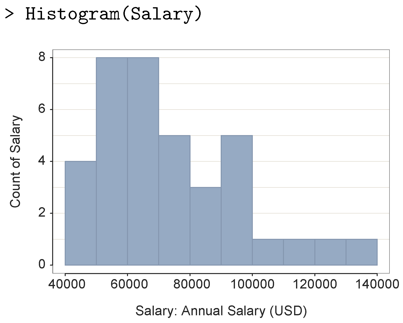
Figure 1 shows a histogram of the salary variable computed from 37 data values and created with the
lessR package [
2], Version 4.3.7, which is discussed in more detail later.
The primary deficiency of the histogram is the incongruity of attempting to represent a continuous distribution with discrete bins. A modern alternative to this discrete visualization is the considerably more computationally intensive density plot [
3,
4], which instead directly estimates continuity with the distribution as a smooth, continuous curve. Unlike the histogram, the computational requirements of the density plot precluded its availability to pre-computer data analysis.
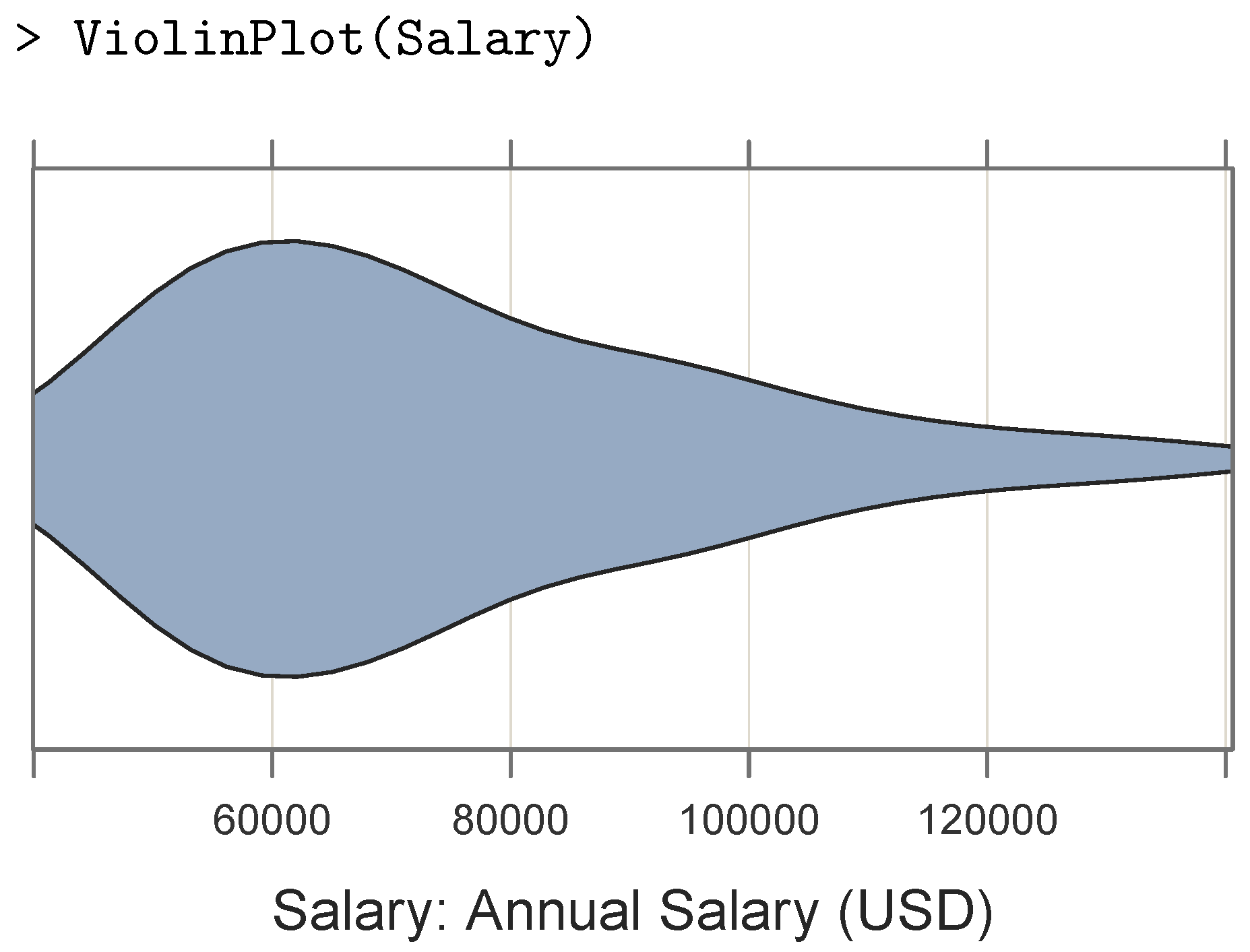
Another issue is that the histogram typically requires a relatively large height relative to its width to express the differences among the bar heights, which works against stacking the histograms on top of each other to compare the distributions of a variable across categorical levels, such as salaries within various departments of a company. One solution to this problem is the violin plot of densities, presented in [
5], which is usually much wider than it is tall (or reversed) with the densities mirrored across its principle axis, such as in
Figure 2 from
lessR.
Because of its relative flatness, a sequence of violin plots may be stacked to facilitate a comparison of the distributions of the continuous variable of interest across the levels of a second categorical variable.
Tukey’s box plot [
6,
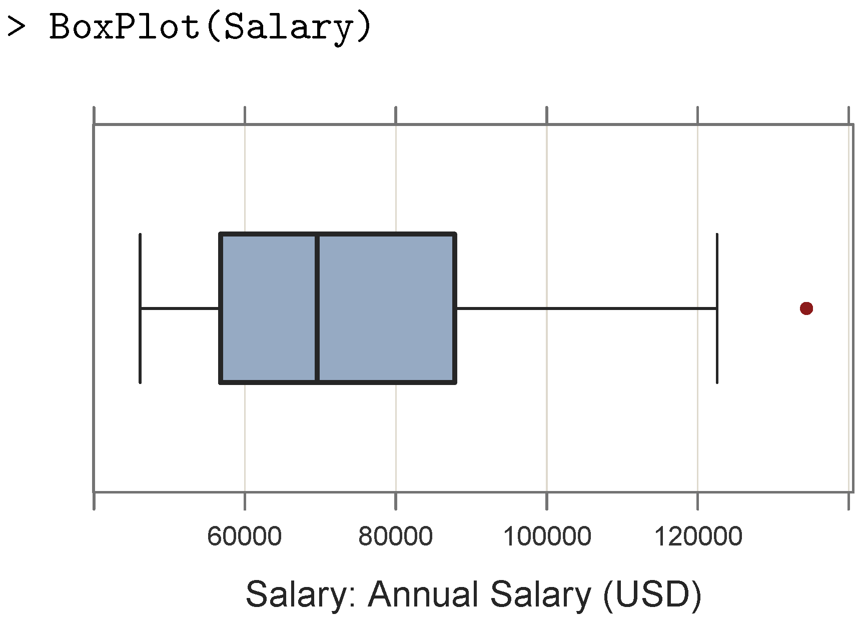
7] also explicitly identifies potential outliers expressed in terms of the interquartile range (IQR), such as those identified by data values which lie beyond 1.5 IQRs and 3 IQRs past the first and third quartiles. As illustrated in
Figure 3 from
lessR, a box is drawn with the (approximate) first and third quartiles as the edges along with a line segment (i.e., a whisker) drawn from each respective edge to the last data value within 1.5 IQRs of the edge. A line segment within the box indicates the second quartile, which is the median. Outliers are typically plotted as individual points.
As with the violin plot, the box plot is usually much wider than tall (or reversed), which facilitates their stacking to display the distribution at each of the levels of a second categorical variable.
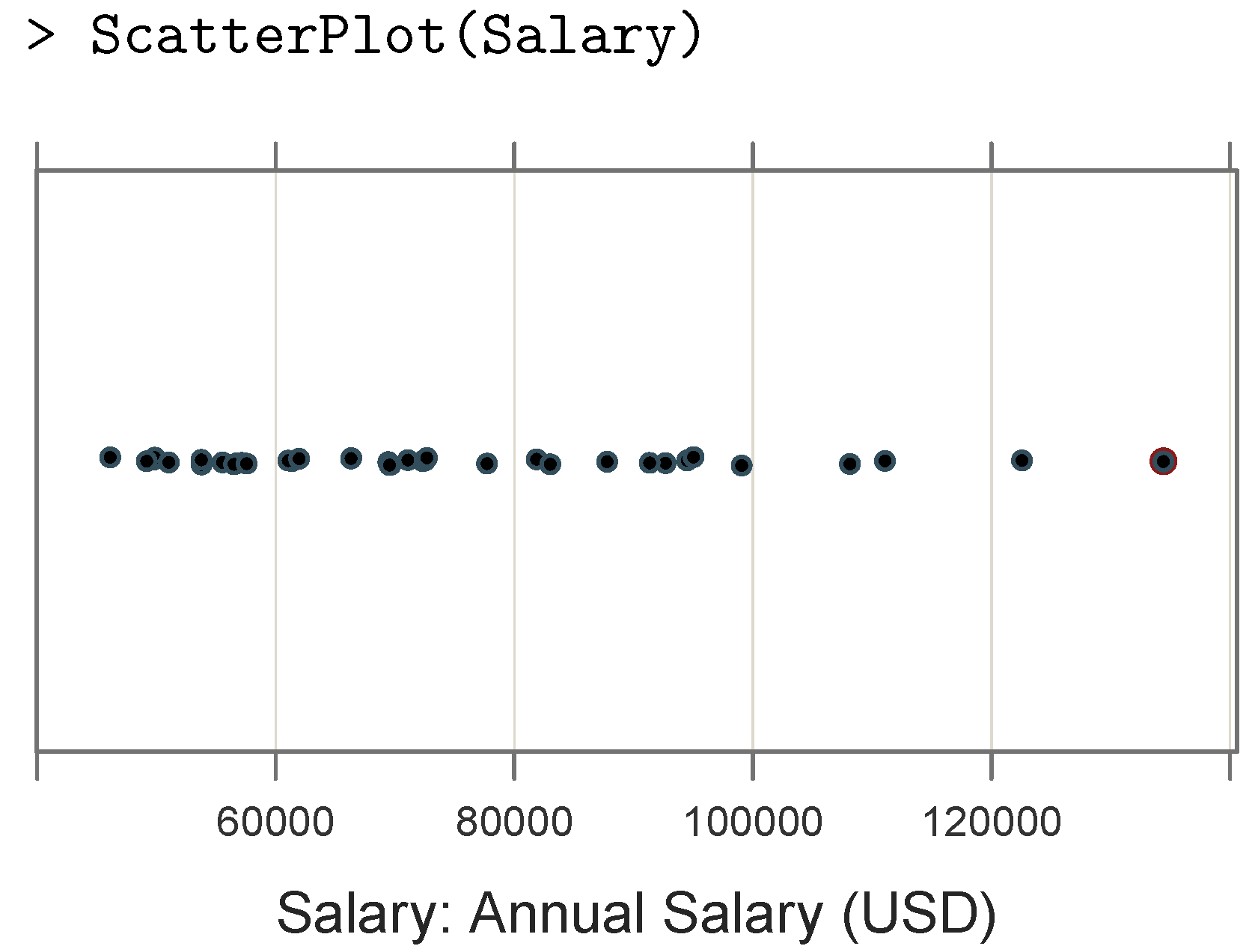
A third alternative to the histogram is the direct display of the data values as a one-dimensional scatter plot. This would represent each data value as a point plotted according to the scaling of the corresponding axis, as illustrated in
Figure 4 from
lessR.
Unfortunately, for repetitions of the same data value, the points tend to obscure each other, as the corresponding plotted point is over-plotted such that one plotted point could represent one data value or many. A common method for addressing over-plotting is jittering the plotted points [
8], which adds random variation to their coordinates to slightly shift their positioning.
2. The VBS Plot
Each visualization—violin plot, box plot, and scatter plot—provides unique information regarding the underlying distribution, and thus a visualization which integrates all three would appear to be more informative than any one or combination of two of these visualizations by themselves. Different integrations of these alternatives to a histogram have been developed and applied previously, such as within the
R system employed here. For example, the help file for the violin plot in Deepayan Sakar’s [
9]
R lattice provides an example which embeds the box plot within the violin plot. The online help files for Hadley Wickham’s [
10]
ggplot2 for both the violin plot and the box plot provides examples of a one-dimensional scatter plot for a small data set superimposed upon the base plot. The authors of [
11] introduced the bean plot, which displays individual data values as small lines in a one-dimensional scatter plot, namely in the form of a rug plot [
12], while not plotting the points directly in the form of a scatter plot because that method only works “if there are very few points per batch” (p. 2).
Expanding upon these examples, the visualization systems ggplot2 and lattice provide for the integration of a violin plot, box plot, and scatter plot into a unified visualization, called the VBS plot here, but only while programming multiple lines of code with multiple function calls. Then, just as the default bin width of a histogram generally requires manual adjustment to obtain a more optimized histogram, so do the characteristics of the VBS plot. Usually, the initial bandwidth for the construction of the densities is adjusted to result in a smoother displayed curve. The point size of the scatter plot must generally be adjusted to account for both the sample size and, when applicable, the discreteness of the corresponding data values. This project builds upon this previous work by integrating these three visualizations automatically tuned by default to the sample size, symmetry, and discreteness of the data of the sample from which the visualization derives.
The
Plot() function, embedded within the
R package
lessR [
2,
13], implements the VBS plot with internal calls to Deepayan Sarkar’s [
9]
lattice package. The underlying theme of
lessR is simplicity, with the intent that most common data visualizations can be accomplished with a single function call, accompanied by the corresponding statistical analysis, with a small number of visualization functions, primarily
BarChart(),
Histogram() (see
Figure 1), and
Plot(). Instead of accessing from several to multiple function calls to create a visualization, such as with ggplot2, only a single function is called and customized with the parameters for that function, all of which are organized in the corresponding help file by their functionality.
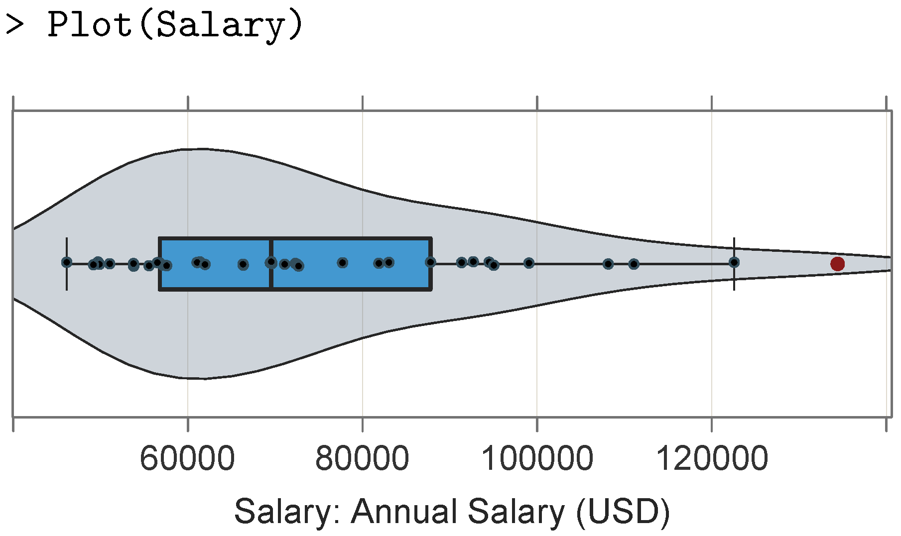
To illustrate this simplicity, consider a VBS plot for the salary variable with the default color theme, shown in
Figure 5, from the same data which underlie the histogram in
Figure 1.
The data parameter for Plot() and other lessR functions defaults to d, and thus only the name of a numerical variable which represents a continuum needs to be specified when this condition is met. Otherwise, one can include the data parameter in the function call to Plot() to specify the name of the data frame.
To read the online data, we use the
lessR function
Read(), which applies the identical syntax to read a standard
R data frame in any one of a dozen file formats. For example, the MS Excel file contains the variable Salary, read here with an implicit call to the
read.xlsx() function from the [
14] package
openxlsx:
This online employee data set referenced above is available locally as part of lessR through Read("Employee"). Also, if browsing for a data file on an accessible file system, in place of a path name or URL, one can specify an empty location using two quotes with nothing in between (Read("")) or access one of several data sets downloaded with lessR with the data set name.
The VBS visualization from a simple function call replaces the jagged, discrete contours of the histogram as an estimate of the underlying continuity with a smoothed density plot, visualizes the quartiles of the distribution, identifies outliers, and displays a scatter plot for even large sample sizes. The VBS plotting function by default evaluates the underlying distributional characteristics of the variable of interest to tune the parameters of the plot, but it also allows for straightforward manual tuning as appropriate. Aesthetically, the lessR package provides a default color theme and sub-theme, with other themes and sub-themes being easily accessible, plus the option to change specific stylistic characteristics of any plot regardless of the chosen theme. Relevant statistical information such as distributional characteristics is provided at the R console to enhance the interpretability of a visualization.
The
lessR package also provides for variable labels which, if available, are appended to the variable name in the text and graphical output, such as for the label of the respective axis, which is also included in
Figure 5. To provide the labels, the
VariableLabels or
vl function can be used to read a CSV or Excel two-column table, with each row having a variable name followed by the corresponding variable label.
The
Plot() function provides statistical analysis as part of the text output to the
R console. The accompanying text output for
Figure 5 includes the sample size, number of missing values, standard summary statistics, and characteristics of the box plot, such as the quartiles and lower and upper whiskers. Also displayed is a listing of any values tagged as outliers, which are highlighted in the plot by color and size and, if requested, presented with an identifier, such as the row name in the text output.
Plot() provides for customization of the standard interquartile range (IQR) multiplier for outlier detection with the parameter
k, which defaults to the standard value of 1.5 [
6] so that values beyond 1.5 IQRs from the first and third quartiles, which define what are called the fences, are identified as potential outliers, again, at 3 IQRs from these quartiles.
The VBS plot in
Figure 5 would appear to be more informative than the corresponding histogram displayed in
Figure 1 and more informative than each component presented separately. The smoothed-density violin component better conveys the shape of the distribution than the discontinuous and jagged display of the histogram bars. The box plot partitions the distribution into four bins of differing widths according to the quartiles of the distribution, and unlike the histogram, it explicitly demarcates the potential outliers. Instead of histogram bins, with no information as to the distribution of data values within each bin or the overall sample size, the scatter plot explicitly visualizes the sample sizes and locations of the individual data values displayed over the continuum.
Information provided by the histogram not directly available from the default VBS plot is the count or proportion of values within each bin. This information can be useful when specific counts are needed, such as to estimate the amount of a clothing product to stock in inventory at various sizes. If a specific set of bins and their associated frequencies are of interest, then the Plot() function provides three parameters to obtain the corresponding bin-based frequency distribution. The primary parameter is bin_width, with bin_start and bin_end also available to specify the starting and ending values of the bins if specified to extend the axis beyond the range of data. The bin parameter is then set to TRUE to obtain the default set of bins:
The text output at the
R console, shown in
Table 1, consists of the frequency distribution, which lists the bins, bin midpoints, frequencies, relative frequencies, cumulative frequencies, and relative cumulative frequencies.
3. VBS Plots across Groups
To compare the distribution of a continuous variable across the levels of a second categorical variable,
Plot() provides for Cleveland’s ([
15]) multi-panel trellis plots, with one plot for each level of the categorical variable, the components of which Wickham ([
10]) referred to as facets. The parameters
facet1 and possibly
facet2 are invoked to specify comparisons across one or two categorical variables, respectively, namely the conditioned variables.
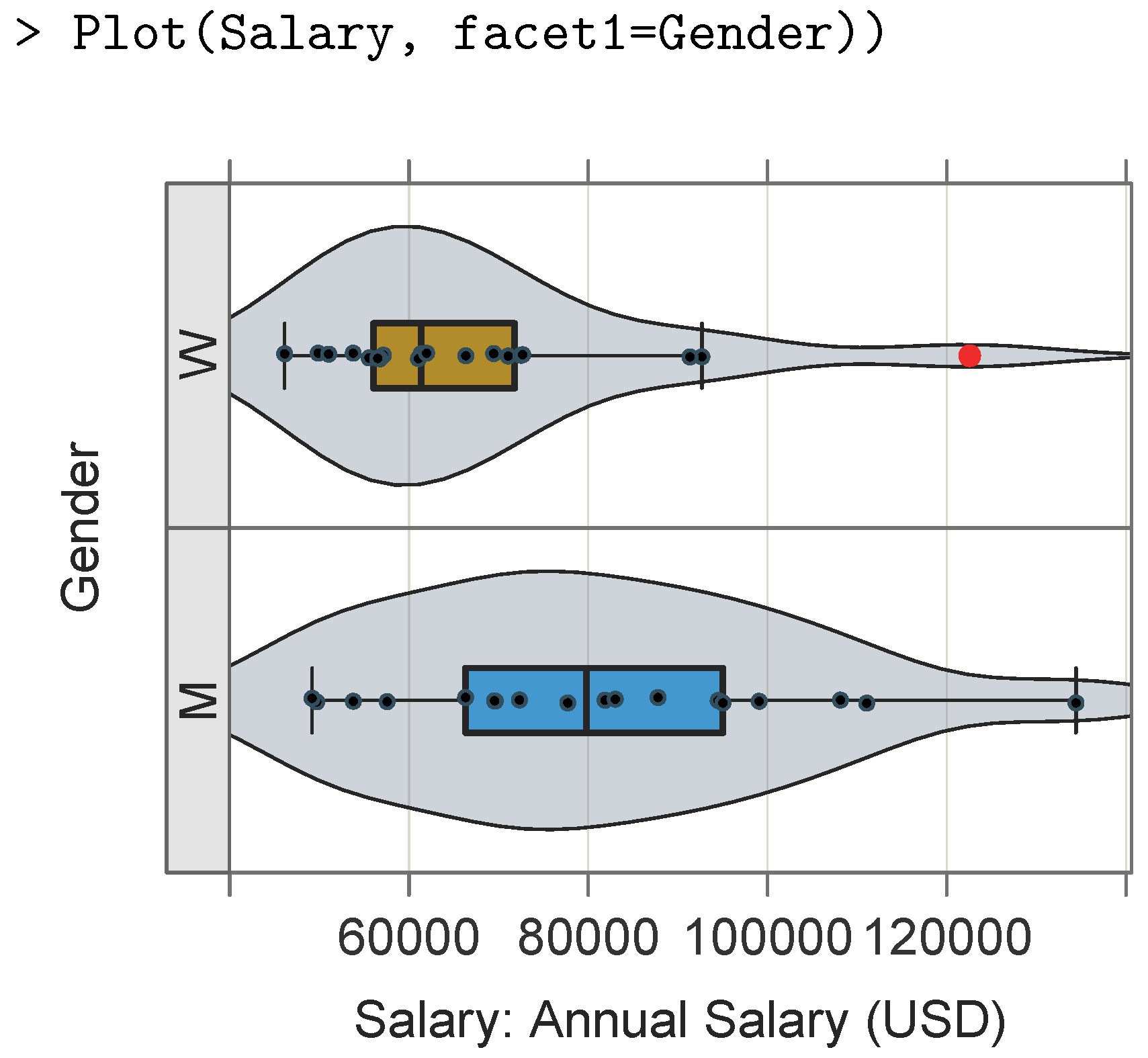
Figure 6 displays the distributions of salaries within the company conditioned upon two levels of gender.
The distribution for females indicates an outlier, displayed in a shade of red by default. Also, the text output for the trellis plot with one conditioned variable includes a list of summary statistics for each level of the conditioned variable.
To facilitate the comparison across groups, the default settings applied to VBS plots with a single conditioned variable are to set n_col to one for up to seven levels and only override them by explicitly setting either n_row or n_col, from which the value of the other is determined. The same conditions apply in the presence of a second conditioned variable, as indicated by a value of facet2, which requires a larger graphics window to accommodate the different combinations of panels from both conditioned variables obtained with the use of the Plot() function width and height parameters when run in R directly or by manipulating the size parameters within the Export menu when R is run within RStudio.
Visual comparisons of the values of a continuous variable across the levels of a second categorical variable can also be accomplished within the
same panel. In
lattice terminology, the categorical variable is referred to as a grouping variable [
9]. To invoke a grouping variable, one can specify the parameter
by.
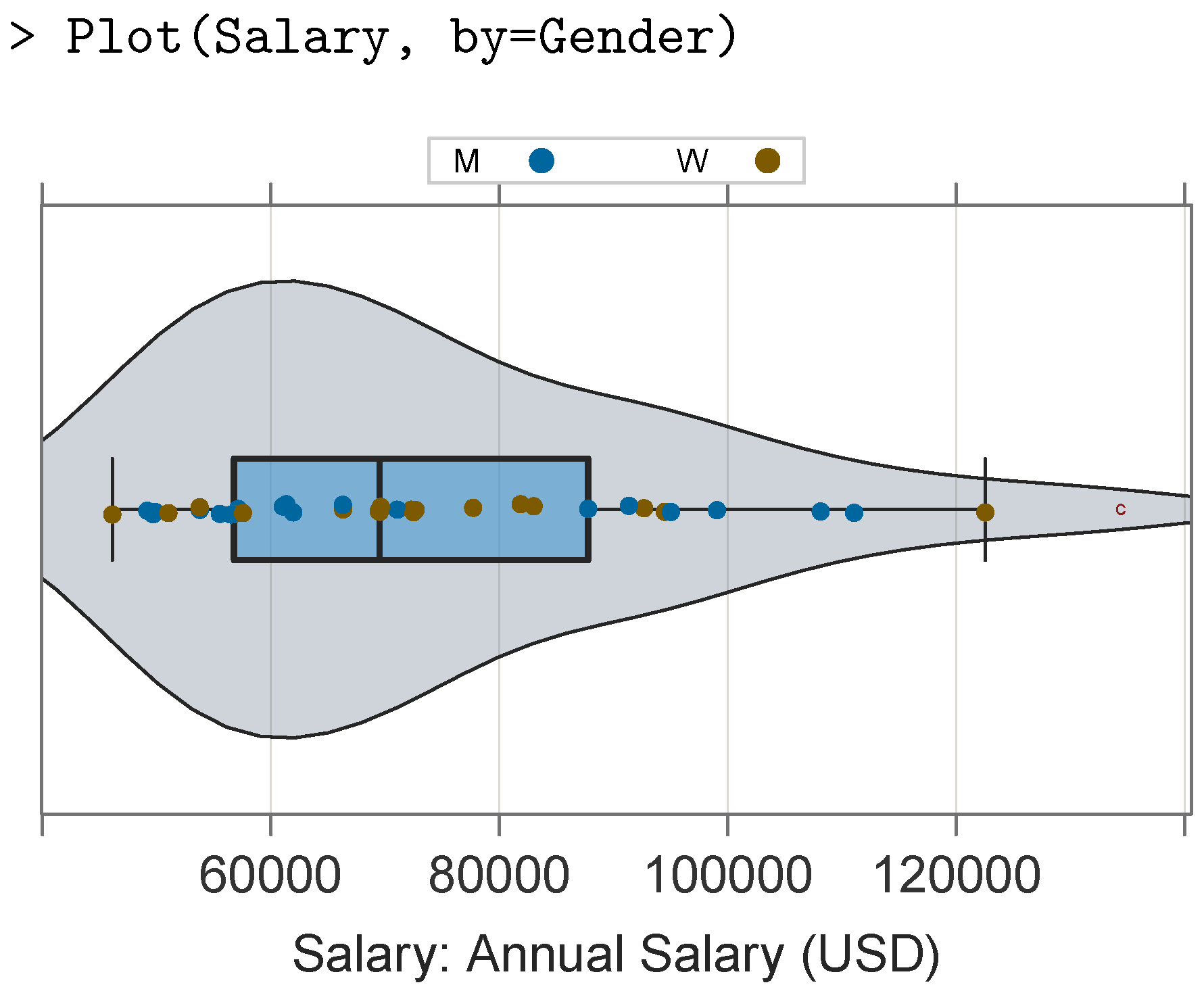
Figure 7 presents the single-panel alternative to the multi-panel plot in
Figure 6.
This more compact single-panel display is particularly applicable to a small number of groups and relatively small sample sizes. For two groups, the Plot() function maintains the color theme by delineating the groups with filled versus transparent interiors for the points. For more than two groups, points from different groups are plotted in different colors according to the default qualitative palette of differing hues, which are displayed with the same level of luminance and saturation.
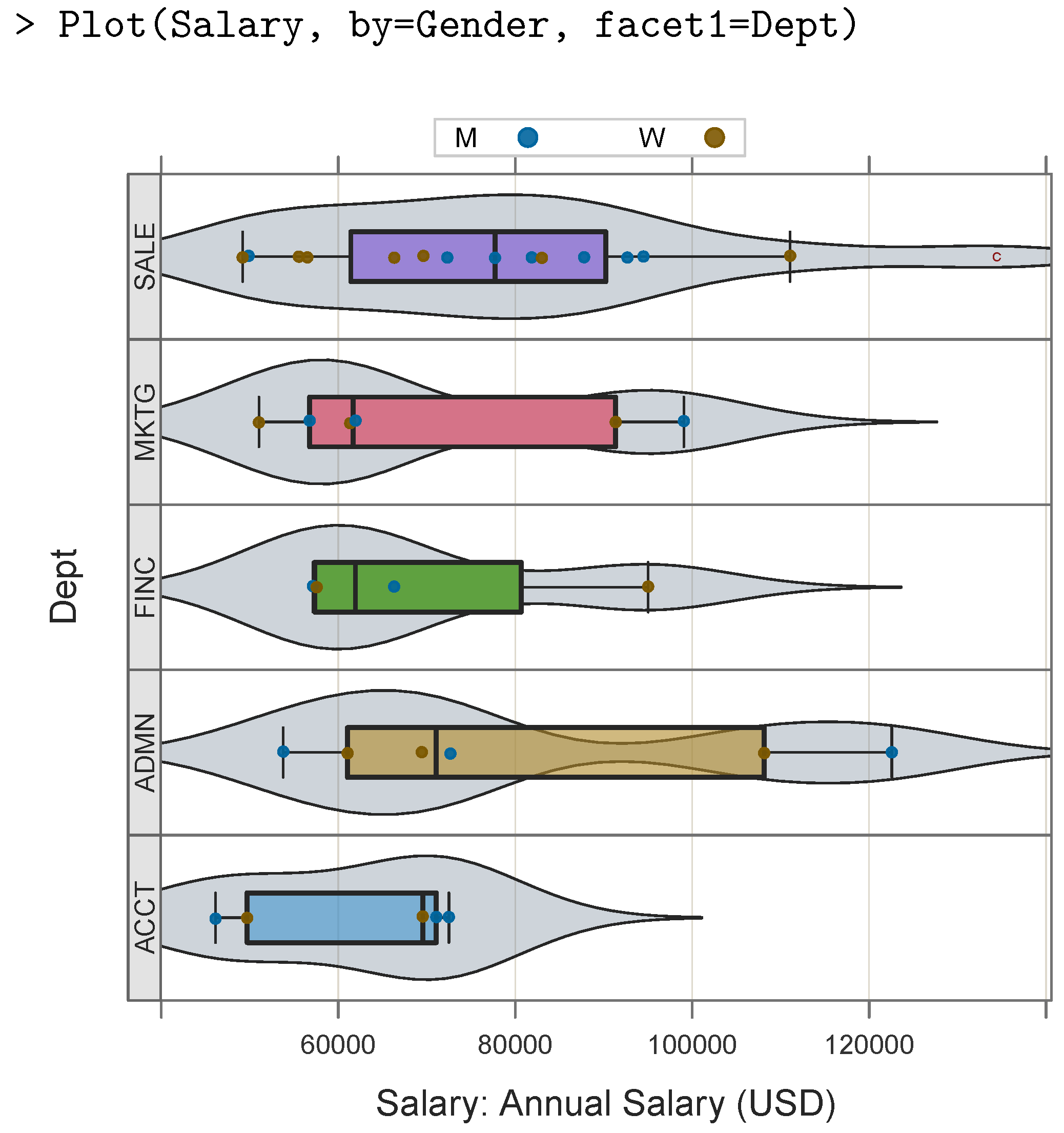
Include multiple categorical variables by combining the
by parameter with the
facet1 and
facet2 parameters in the same function call to
Plot().
Figure 8 provides an example with the
by and
facet1 parameters.
4. Sample Size
To accommodate potentially several thousand data values, the VBS plot displays a one-dimensional scatter plot by automatically adjusting the size of the plotted points downward as the sample size increases and correspondingly increasing the amount of jitter in the non-outlier points, with random fluctuation of the coordinates. There is no one true optimization of these adjustments due to not only personal aesthetics but also differences in the aspect ratio of the display window, as well as differences in the resolutions of a wide variety of output devices, which include not only the computer screen but also the file format in which the visualization may be saved.
As such, the equations developed to accomplish these adjustments are heuristics which represent a first attempt to generate reasonable default values for the corresponding parameters but which can also be explicitly tuned for any specific analysis. The parametrization of an obtained VBS plot is displayed at the
R console for straightforward modification if desired. In addition to a report on duplicate values and statistics which summarize the distribution, the text output for the VBS plot of the salary variable illustrated in
Figure 5 ends with the output in
Table 2.
The call to the
Plot() function which generated
Figure 5, which only specified the variable name, is equivalent to the following function call:
> Plot(Salary, size=0.63, jitter.y=0.57, jitter.x=0, bw=9529.04)
The user may adjust any or all of these four parameters.
To provide these default parameter values, functions were fit which approximated reasonable aesthetic choices for the corresponding characteristics. For example, for the size of the plotted points, the author manually configured the point size for the standard normal distribution for simulations ranging across sample sizes from 10 to 50,000. The point size deemed optimal for each sample size was recorded. The resulting plot of sample size versus optimized point size demonstrated one logarithmic relationship for sample sizes up to approximately and a second logarithmic relationship for larger sample sizes. Regression analyses to formalize these relationships resulted in initial formulas for calculating the point size, where the sample size is n and log refers to the R natural logarithm function. The obtained regression equations were modified somewhat so that the logarithmic transformations jointly remained monotonic across all possible sample sizes. At the value of 2535 for n, both equations were approximately equal:
Both of these equations apply to the plot of a single variable, with at least mostly unique data values. These equations were then embedded in the code for Plot() so that they were implicitly applied to computing the point size whenever relevant. Although these equations are not directly manipulable by the user, the resultant point size is directly accessible to the user as the parameter size, as illustrated above.
Similar equations were developed for multi-panel trellis plots and discrete distributions with a small number of unique values, such as for a Likert response scale. A logarithmic relationship between the vertical jitter and sample size was also observed and developed according to the same procedure.
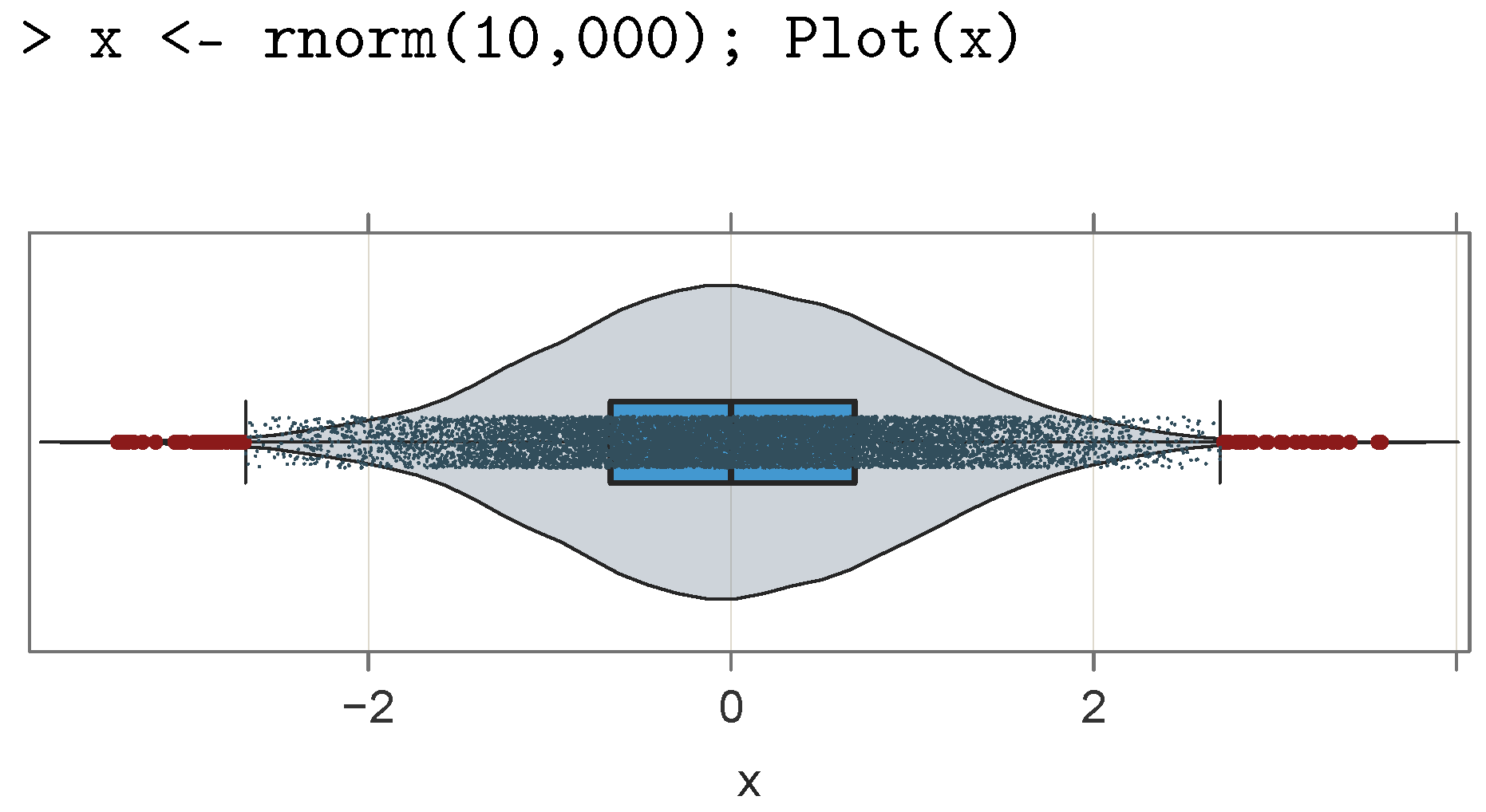
To illustrate the effect of increasing the sample size on the displayed point size, the VBS plot in
Figure 9 plots 10,000 data values from a simulated sampling from the standard normal distribution with the
R function
rnorm(). To accommodate the larger sample size of 10,000,
Plot() shrank the default computed point size, decreasing to 0.01 here, and increased the default vertical jitter to 3.69. Horizontal jitter was not present, given the absence of replicated data values.
The size, shape, and color of the outlier points are presented from a different set of defaults which is amenable to explicit user specifications. The two recognized levels of outliers follow Tukey’s [
6,
7] distinction between outliers beyond 1.5 IQRs (set by the
Plot() parameter
k) of the nearest edge of the box but within 3.0 IQRs and those more than 3.0 IQRs away. Unless in a grayscale color theme, the first level of outliers displays in a dark red circle. The more extreme outliers display in a bright red circle (which do not appear here but are present in
Figure 6). Their default size is one, which is generally larger than the size of the regular points. Outlier size and shape are specified by the
out_size and
out_shape parameters, respectively. The color is set with
out15_fill and
out30_fill as parameters for the two levels of outliers.
5. Bandwidth Smoothing
The default bandwidth calculation for kernel density estimation in the R system scales the weights of the surrounding points in estimation of the density at a specific point according to the normal distribution of the distance of nearby points from the given point. Bandwidth relates to the emphasis assigned to more distant points. As with the choice of bin width for the histogram, there is no one correct answer for the choice of bandwidth for an estimated density. To some extent, the choice of bin width or bandwidth relies upon the opinion of the analyst.
Observation of repeated applications of the R density bandwidth computation indicates that it often under-smooths the underlying distribution, particularly when the number of unique measured values is small, such as for a Likert scale with five response alternatives. This under-smoothing results in a wavy up-and-down estimated curve of an underlying monotonic distribution, at least within specific segments, such as both sides of a normal curve. Accordingly, the computation of the bandwidth provided by Plot() begins with the standard R default and then typically iterates to a smoother result.
Unless the distribution is multi-modal, this heuristic smoothing process appears to be generally applicable. Given the one-lag differences of the ordered densities, the iteration procedure follows from the number of changes in sign of the successive values of these differences. Traversing through the distribution of differences, each change in sign of the succeeding value in the distribution is recorded. If there is more than one flip, then the bandwidth is increased by 10%. The iteration continues until there is no more than one flip or, by default, 10 iterations are reached, a value which can be modified with the bw_iter parameter.
With manual control of the bandwidth and specification of the bw parameter or the maximum number of iterations with bw.iter, the user may explore the effects of various bandwidth settings to ensure that the obtained density plot matches the organization of the data values according to the rendered box plot and scatter plot. Unlike the histogram’s default bin width, analyses of a varied range of distributions with Plot() indicate that the smoothed visualization of the underlying distribution does not usually require manual adjustment from the initial display, though the continued application of this algorithm will likely suggest revisions to accommodate data sets with properties not yet evaluated.
6. Discrete Values of a Continuous Variable
Measurement of a continuous variable necessarily categorizes the data values into a distribution of discrete measurements. Sometimes, the number of discrete categories is relatively small. One example is an attitude of agreement which is considered to continuously vary from strongly disagree to agree but is measured as the response to an item on a Likert scale, often constrained by 4–7 available scale responses. The variable is continuous, but its measurements demonstrate relatively few unique data values, with much repetition of obtained data values. The equations which provide the default values for the point size and horizontal jitter for discrete data with many repetitions require modification from the previously specified values for distributions which have no or much fewer replications. The result of these modifications decreases the size of the plotted points and correspondingly increases the amount of jitter.
For a horizontal scatter plot of a single variable, the preference is to have vertical jitter instead of horizontal jitter to preserve the exact position of the data values along the horizontal axis. However, with many replications of a single data value, horizontal jitter may also be required. The function to calculate the default horizontal jitter relies not upon the overall sample size but upon the frequency of the data value with the maximum number of replications m. An exponential function was chosen which asymptoted at 1.1 such that without many replications, horizontal jitter vanished to the extent that with all unique values , the horizontal jitter became zero. For values of m larger than approximately 250, the computation of horizontal jitter returned values close to the maximum value of 1.1:
As with similar equations, once developed through empirical observation, this equation for horizontal jitter was added to the internals of Plot() to provide a reasonable default value. The provided text output at the console of the obtained value of jitter_x and jitter_y provided guidance to specify a customized parameterization.
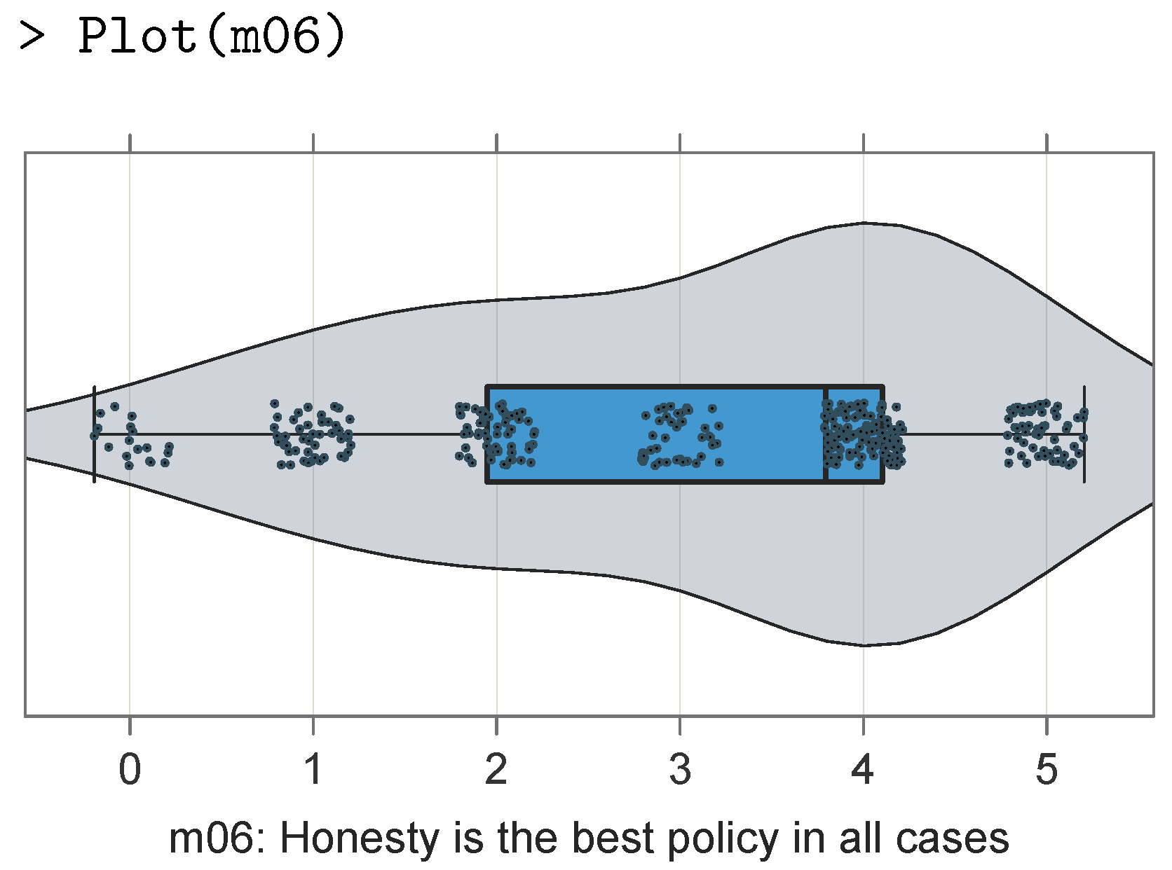
To illustrate this, consider a VBS plot for the sixth item from the 20 item Mach IV scale [
16]. Responses from 351 respondents were measured on a six-point Likert scale, assessed with values ranging from strongly disagree (0) to strongly agree (5). The data are available as part of
lessR, in the data file referenced as
Read("Mach4").
Even with only six scale points, the default VBS plot in
Figure 10 illustrates the primary aspects of the underlying continuous distribution with the mode at
(agree), and the frequency of values for responses different than four gradually diminished in both directions. However, the density plot is not completely smooth, consistent with the observed frequencies reported by
Plot() and copied into
Table 3. If additional smoothing is desired, fine tune with the
bw parameter, increasing its size. In this example, increasing
bw from its default of 0.73 to about 0.92 results in a smoother violin plot.
The mode at the value of four showed by far the largest frequency (121). The frequency for the next lowest response of three was 44. However, the next frequency broke monotonicity by rising up to 63. This somewhat wavy estimated density plot in
Figure 10 reflects this lack of monotonicity in the data. The plot obtained without any additional smoothing beyond the
R default, obtained by adding
bw.iter=0 to the
Plot() function call, demonstrated considerable wavy fluctuations, which in part was an artifact due to the relatively small number of scale values.
7. Modifying the Stylistic Elements of the Plot
In addition to the default theme, the
lessR package provides a variety of color themes and sub-themes specified with the
lessR function
style(). The first argument of
style() is
theme. The themes are pre-selected color combinations, such as the default
“colors” theme or specific color names such as
“darkred” or
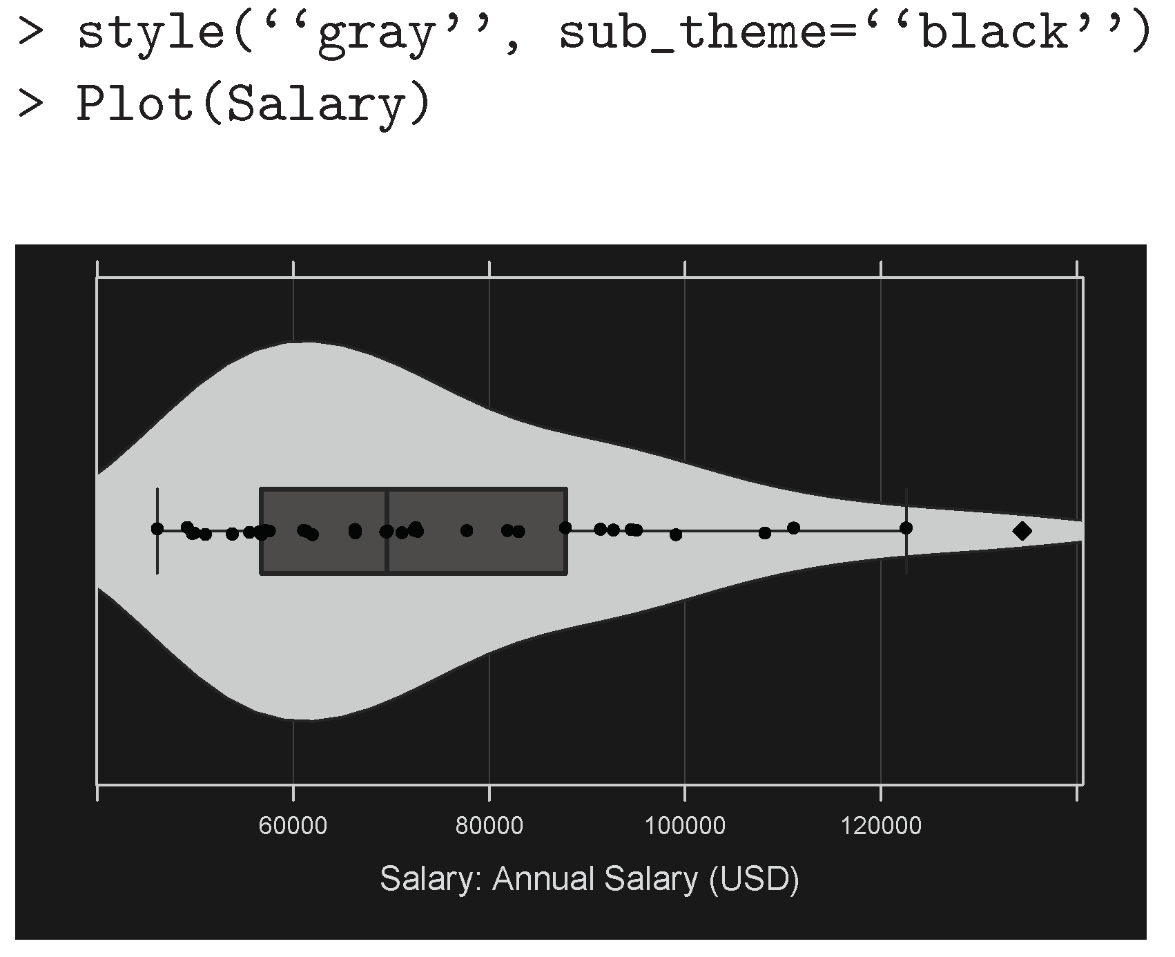
“dodgerblue”. As illustrated in
Figure 11, a grayscale is specify with the
“gray” theme. The black sub-theme provides a black background for the graphics window, with other characteristics of the visualization adjusted accordingly.
Individual characteristics such as the color in the context of any theme and sub-theme setting can be modified. The full list of stylistic options and current settings is available from the style function with the show parameter set to TRUE. For example, to change the properties to persist until specified again, the fill colors of the violin and box can be specified with the violin_fill and box_fill parameters, respectively. To apply these values to a single visualization, these values can be specified as part of the call to Plot(), which also has the parameter vbs_pt_fill for the fill color of the points in the VBS plot. One can then set the edges of these geometric objects with violin_color and box_color for style.
In addition to implementing the function names such as `ViolinPlot()`, any combination of the three components of the VBS plot with the vbs_plot parameter can be displayed. The default value is “vbs” to integrate all three components. Any combination of the three uppercase or lowercase letters v, b, and s produces the corresponding plot according to the specified components. For example, setting vbs_plot to b and invoking a trellis plot with the facet1 parameter yields a set of adjacent box plots, or to generate just a violin plot, box plot, or scatter plot, this can be replaced with a call to Plot() with ViolinPlot() or vp(), BoxPlot() or bx(), or ScatterPlot() or sp(), respectively.
8. Conclusions
What this paper calls a VBS plot of the distribution of values of a continuous variable was integrated into a single visualization, namely a violin plot to display the estimated smoothed density, a box plot to display the quartiles with labeled outliers, and a one-dimensional scatter plot for direct display of the data values as either a one-panel or multi-panel trellis or facet plot, with the parameter values automatically calibrated by default according to the characteristics of the data for different sample sizes and distributional characteristics. The VBS plot leverages modern computer technology to present a more compact, more informative visualization of the distribution than that provided by the arbitrarily sized bins of the histogram which, constrained by the limitations of 19th century technology, initially required the analyst to compute and draw the visualization manually. The parameters for the detection and subsequent identification of potential outliers are amenable to user control, as are the characteristics of the resulting visualization, including the bandwidth smoothing, point size, amount of horizontal and vertical jitter, and stylistic elements such as the fill and border colors. The option for the VBS plot also provides the unique information from a histogram and the accompanying table of a bin-based frequency distribution, with frequencies, cumulative frequencies, relative frequencies, and cumulative relative frequencies.
The VBS plot is available with a simple lessR function call for analysis of a variable within the default d data frame or a specified data frame:
Plot(variable_name) or Plot(variable_name, data=data_frame)
Although the VBS plot can be constructed with other visualization systems, those systems do not provide automatic integration of the three visualizations, tuning of the underlying parameters, or the accompanying statistical output. This simplicity and accessibility permit the user, including non-technical users, to easily generate and modify, if needed, a VBS plot.
