

Forecasting Daily COVID-19 Case Counts Using Aggregate Mobility Statistics


College of Engineering, Koc University, Rumelifeneri Yolu, Istanbul 34450, Turkey
*
Author to whom correspondence should be addressed.
Data 2022, 7(11), 166; https://doi.org/10.3390/data7110166
Submission received: 16 September 2022
/
Revised: 4 November 2022
/
Accepted: 7 November 2022
/
Published: 20 November 2022
(This article belongs to the Special Issue Health Informatics in the Age of COVID-19)
Abstract
:The COVID-19 pandemic has impacted the whole world profoundly. For managing the pandemic, the ability to forecast daily COVID-19 case counts would bring considerable benefit to governments and policymakers. In this paper, we propose to leverage aggregate mobility statistics collected from Google’s Community Mobility Reports (CMRs) toward forecasting future COVID-19 case counts. We utilize features derived from the amount of daily activity in different location categories such as transit stations versus residential areas based on the time series in CMRs, as well as historical COVID-19 daily case and test counts, in forecasting future cases. Our method trains optimized regression models for different countries based on dynamic and data-driven selection of the feature set, regression type, and time period that best fit the country under consideration. The accuracy of our method is evaluated on 13 countries with diverse characteristics. Results show that our method’s forecasts are highly accurate when compared to the real COVID-19 case counts. Furthermore, visual analysis shows that the peaks, plateaus and general trends in case counts are also correctly predicted by our method.
1. Introduction
Severe Acute Respiratory Syndrome Coronavirus 2 (SARS-CoV-2) is a type of coronavirus that infects the respiratory system of humans and causes Coronavirus Disease 2019 (COVID-19). In late 2019, SARS-CoV-2 was first detected in Wuhan, China. In a short time, the contagious virus originating from Wuhan spread to the whole world, and the World Health Organization (WHO) declared the COVID-19 outbreak as a pandemic on 11 March 2020 [1]. The COVID-19 pandemic has enormously impacted the world and profoundly changed life—as of August 2022, over 500 million cases of COVID-19 were observed worldwide, and more than 6 million people have lost their lives [2].
When managing the pandemic, the ability to forecast future COVID-19 case counts based on historical data and current trends would bring indisputable benefits to governments and policymakers. For example, if an increase in COVID-19 case counts can be forecasted for the coming days, then plans can be made to ensure adequate treatment of infected individuals (e.g., planning patient placement in hospitals), or countermeasures such as bans on social gatherings and restaurant and school closures can be planned to prevent further increase. For such plans to be effective, it is imperative that forecasts are accurate and evidence-based.
Considering that SARS-CoV-2 is a contagious virus, we conjecture that the spread of COVID-19 is impacted by human mobility. Consequently, we propose to leverage aggregate mobility statistics toward forecasting COVID-19 case counts. For example, one would expect an increase in population mobility to also increase the spread of SARS-CoV-2 and yield a higher number of COVID-19 cases, e.g., due to infected individuals coming into contact with non-infected individuals. Furthermore, one would also expect the virus to spread in certain location categories faster than others, such as public transport or workplaces, which may be dense, closed-air, and cause close human contact. Thus, if individuals are found to be spending more of their time in such location categories (compared to, e.g., residential areas), we can forecast an increase in future COVID-19 case counts.
Motivated by the relationship between human mobility and the spread of COVID-19, in this paper, we propose a method for forecasting COVID-19 case counts using three data sources: (i) past daily case counts, (ii) past daily test counts, and (iii) aggregate mobility statistics published in Google’s Community Mobility Reports (CMRs) [3]. CMRs are built by collecting data from users who access Google services and have “location history” feature enabled [3,4]. Users’ activity in different location categories such as Transit Stations (), Retail and Recreation (), Workplaces () and Residential () locations are recorded. Then, CMRs provide the percentage change in the amount of human activity in each category compared to the activity levels on baseline days before the COVID-19 pandemic (5-week period between January and February 2020).
Our forecasting method trains a regression model to predict future COVID-19 case counts using features extracted from past daily case counts, test counts and CMRs. Several aspects are considered to maximize forecasting accuracy. First, considering that the same feature set may not be optimal for every country, we introduce an adaptive feature selection step to select the best feature set for each country. Second, our analysis shows that the correlation between mobility and COVID-19 case counts is not immediate, but rather, it contains a time lag. For example, if a stay-at-home order is issued today to reduce mobility, COVID-19 case counts do not decrease in the same day or the next day, but rather, they decrease gradually over time. To account for this fact, we introduce a time period t so that relevant features up to the past t days can be included in the forecasting model. Third, considering that there are many types of regression models, we incorporate 12 different regression types into our method (e.g., Linear, XGBoost, Ridge, Lasso, and RANSAC Regression) and enable the selection of the best model type r among the set of regression types empirically. Finally, we propose an algorithm for determining the best , t and r dynamically and in a data-driven fashion.
We evaluate the accuracy of our forecasts using data from 13 countries with diverse characteristics in terms of COVID-19 case counts, population sizes, and geographic locations. We use 5-fold cross-validation and compute the difference between our forecast COVID-19 case counts and real COVID-19 case counts using popular metrics such as Mean Absolute Error (MAE) and Relative Error (RE). Results show that our forecasts are highly accurate. Peaks and plateaus, as well as general increasing/decreasing trends in COVID-19 case counts can be accurately captured by our forecasts. Denoting by the maximum number of daily cases observed in a country, the ratio is below 3% for 10 out of 13 countries, and it is below 4.2% for 12 out of 13 countries. Similarly, RE values are also typically low. Furthermore, detailed experiments show that RANSAC and Ridge Regression are typically more preferred, with the optimal time period t typically between 12 and 15.
The rest of this paper is organized as follows. Section 2 surveys the existing related work on COVID-19 forecasting and explains the main differences and advantages of our work. Section 3 describes the data sources used in our work and performs preliminary time-lagged cross-correlation analyses which inform the selection of parameter in our forecasting method. The main methodology and algorithms of our predictive forecasting method are given in Section 4. Experiment results are reported and discussed in Section 5. Section 6 concludes the paper.
2. Related Work
COVID-19 pandemic is an extraordinary circumstance that has impacted the whole world and attracted many researchers’ attention. In particular, the relationship between human mobility and the growth of the pandemic has been investigated in several studies [5,6,7,8]. Mobility data used in these studies may contain inter-country mobility or intra-country mobility. Zhang et al. [6] demonstrated a potential correlation between human mobility and the COVID-19 pandemic using inter-country mobility data composed of global commercial flights from 22 countries. On the other hand, Xiong et al. [9] used county-level mobility inflow data, which relies on mobile device locations from 3141 US counties. It is also possible to incorporate intra-country and inter-country mobility simultaneously to model the epidemic dynamics of COVID-19 [7].
Considering the clear link between human mobility and the spread of COVID-19, social distancing and staying at home are crucial countermeasures to reduce the spread of the pandemic [10]. Consequently, governments implemented several policies and restrictions to facilitate social distancing and reduce human mobility. The effectiveness of such policies and restrictions has been measured by several studies [11,12,13,14,15,16,17]. Nevertheless, a certain time lag exists between the enforcement of a new policy/restriction and its impact on reducing COVID-19 case counts. This time lag can be investigated using cross-correlation analyses. For example, Xi et al. [18] analyzed the time lag using mobility data provided by Baidu, whereas Sulyok and Walker [8] used mobility data provided by Google.
Beyond the analysis of historical data and/or showing correlations therein, in order to forecast future COVID-19 case counts, predictive models need to be built. Toward this end, relevant studies in the literature rely on statistical techniques or machine learning (ML) methods. Ilin et al. [19] developed a method that contains ML models for a 10-day forecast using human mobility data from Google, Facebook, Baidu, and SafeGraph. The method developed by Rostami-Tabar et al. [20] included a multiple linear regression model using phone call data to capture human mobility, whereas Liu et al. [21] applied Lasso Regression to the constructed model after using a clustering approach. To forecast COVID-19 case counts in Greece, three ML methods (Random Forest, Artificial Neural Network, and Support Vector Machine) were used in [22]. To leverage the power of deep learning, the Long Short-Term Memory (LSTM) algorithm was used to construct predictive models in [23,24,25]. Another deep learning approach, Graph Neural Networks (GNNs), was used in [23,24,25]. Among statistical techniques, Autoregressive Integrated Moving Average (ARIMA) and Spatial Time-Autoregressive Integrated Moving Average (STARIMA) were used in [26,27] for forecasting. Hawkes processes were used by Schwabe et al. [28] to predict COVID-19 spread using telecommunication data to capture human mobility. Partial differential equations (PDEs) and other mathematical modeling techniques were also used for COVID-19 forecasting [29,30,31,32,33,34,35].
Our work differs from the aforementioned works in several ways. First, some works show the existence of correlations between mobility statistics and COVID-19 case counts using historical data. However, despite showing correlations, they do not build predictive models for forecasting, which is a key aspect of our paper. Second, several works are limited to a single country or few countries [23,36,37,38]. It is not clear whether the methods proposed in these papers will generalize to other countries. In contrast, we show the effectiveness of our forecasting method on 13 countries with diverse case counts, populations, and geographic locations. Third, some works use private datasets such as phone call records, telecommunication records, or cell phone locations [9,16,28]. Since the underlying datasets are private, it is difficult for other researchers to reproduce or advance these methods. In contrast, our work uses Google’s Community Mobility Reports, which are free and publicly available. Finally, several works consider a fixed feature set and fixed ML model for forecasting. In contrast, our method enables selecting the best feature set and regression model dynamically for each different country.
3. Background and Preliminary Analysis
3.1. Data Sources
Our forecasting method utilizes mainly three sources of information: confirmed COVID-19 case counts from the past days, how many COVID-19 tests have been performed daily, and aggregate mobility statistics from Google’s Community Mobility Reports (CMRs). In this section, these data sources are explained in more detail.
Confirmed COVID-19 Daily Case Counts: The World Health Organization (WHO) states that a confirmed COVID-19 case is an individual who received a positive COVID-19 laboratory test [39]. We obtained the daily confirmed COVID-19 case count data for several countries from [40]. In order to show the generalizability of our forecasting approach, multiple countries were considered in our study: Argentina, Austria, Canada, Denmark, India, Italy, Japan, Netherlands, Norway, Poland, Portugal, Turkey, and the United Kingdom. Each country is treated independently from others, and a separate forecasting model is built for each different country. The data in [40] rely on information from Johns Hopkins University, which itself is sourced from governments, national and subnational agencies [41]. We downloaded and used data spanning the period from 25 February 2020 until 18 December 2021. The same time period was used when obtaining COVID-19 test counts and mobility statistics.
In the rest of the paper, we use the abbreviation when referring to the time series containing COVID-19 daily case counts. Furthermore, we use the notation to denote the daily case count on day i.
COVID-19 Daily Test Counts: The number of COVID-19 laboratory tests performed in a country (i.e., COVID-19 test count) is a key factor that impacts the case counts in that country. Typically, more testing will reveal more COVID-19 cases. We obtained the daily COVID-19 test counts per country from [40]. We note that there can be discrepancies in how daily test counts are computed in different countries. For example, in some countries, the reported daily test counts correspond to how many individuals were tested, regardless of which test or how many tests they took on the same day. In other countries, multiple tests from the same individual on the same day may be counted independently. Another discrepancy is with respect to which tests are accepted as “official” tests. Some countries only counted the number of PCR tests, whereas other countries counted other tests such as antigen tests. These discrepancies are one reason why we opted to build different forecasting models instead of aggregating all data and building one model for all countries.
In the rest of the paper, we use the abbreviation when referring to the time series containing COVID-19 daily test counts. We use the notation to denote the daily test count on day i.
Aggregate Mobility Statistics from Google CMRs: Since the early days of the COVID-19 pandemic, Google has been publicly releasing mobility statistics called Community Mobility Reports (CMRs). These reports are built by collecting data from users who access Google services and have “location history” feature enabled [3,4]. Users’ GPS presence and time spent at different location categories are recorded. Then, CMRs are constructed according to six categories: Transit Stations , Retail and Recreation , Parks , Grocery and Pharmacy , Workplaces , and Residential . Each category comprises a range of related and representative places. To exemplify, the Parks category contains time spent in public gardens, castles, national forests, campgrounds, and observation decks. On the other hand, the Transit Stations category contains time spent in subway stations, seaports, taxi stands, highway rest stops, and car rental agencies.
CMRs provide the percentage change in the amount of human activity (i.e., presence) in each location category compared to the activity levels on “baseline days” before the COVID-19 pandemic. The baseline is considered to be a 5-week period between 3 January 2020 and 6 February 2020. Daily activity levels are compared to the corresponding baseline day; e.g., activity on a Monday is compared to the median activity of Mondays within the 5-week baseline. Then, the values in the CMRs represent the relative percentage change of activity in a pandemic day versus the pre-pandemic baseline.
Similar to , we use the notation , , etc. to denote the reading from the corresponding time series on the i’th day. For example, denotes the transit station reading from day i, denotes the workplace reading from day i, and so forth.
3.2. Time-Lagged Cross-Correlation Analysis
COVID-19 is caused by a contagious virus, SARS-CoV-2, which infects human beings who come in contact with it. For SARS-CoV-2 to spread, human mobility is highly important. An increase in population mobility will facilitate the spread of the virus and increase the number of COVID-19 cases, e.g., due to virus carriers (infected individuals) coming into contact with non-infected individuals. We would expect the virus to spread especially in location categories such as transit stations and workplaces, which are typically dense, closed-air, and/or cause close human contact. In contrast, if individuals are found to be spending more of their time at home (i.e., residential location category), then we would expect the virus transmission rate to decrease. Consequently, COVID-19 case counts will drop over time. Hence, overall, a correlation would be expected between certain mobility statistics and daily COVID-19 case counts.
On the other hand, many infectious diseases, including COVID-19, do not develop symptoms instantly when an individual is infected. In case of COVID-19, an incubation period is necessary for SARS-CoV-2 to reproduce and cause the infected individual to develop symptoms such as cough and fever. Therefore, although virus transmission takes place, some time will pass before an individual tests positive for COVID-19 and causes a +1 increase in the number of COVID-19 case counts. As a result, it is natural to expect a time lag between the increase/decrease in human mobility and an increase/decrease in COVID-19 daily case counts. In order to account for this time lag, we use time-lagged cross correlation (TLCC) analysis to establish the correlation between COVID-19 daily case counts and mobility statistics.
TLCC analyzes how a time series is correlated with another time series while taking into account a time lag. One of the time series is shifted with a certain lag while holding the other time series steady, and the Pearson correlation coefficient is computed between them. The Pearson correlation coefficient between two time series X and Y, denoted by , is defined as:
Here, and represent the standard deviation of X and Y. is the covariance between X and Y, which can be computed as: , where and are the mean of X and Y, respectively.
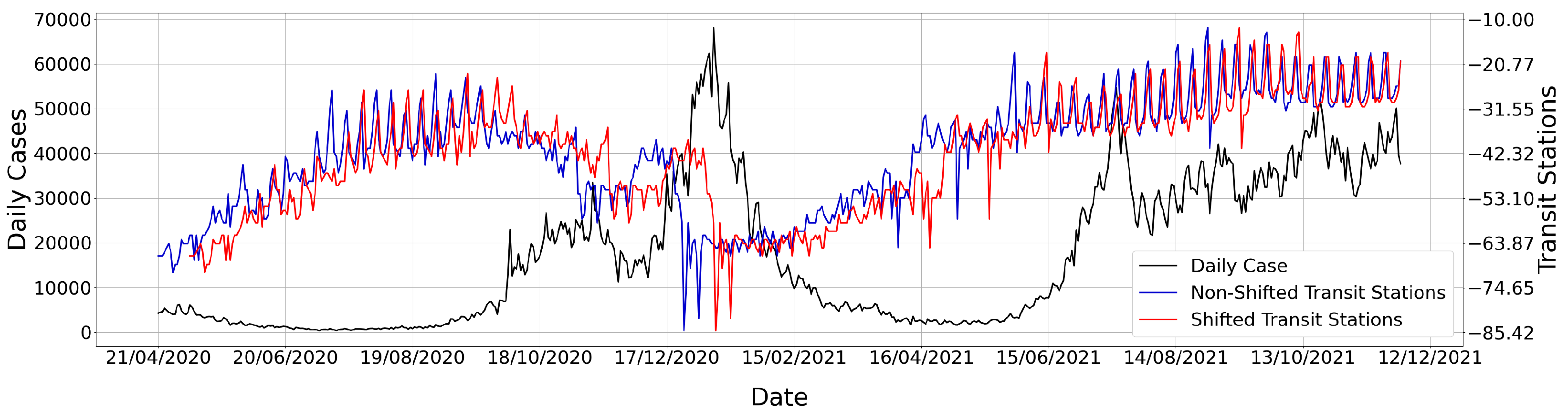
In TLCC, a time lag t is applied to time series X, and the Pearson correlation coefficient is computed using the original version of Y and the lagged version of X. We denote this by . Since virus transmission can only affect future case counts and not past case counts, we keep fixed and shift the mobility time series (e.g., , , ) in the forward direction. Thus, is a positive integer in our setup. As a visual example, in Figure 1, we show the time series for a fixed , the original , and a 15-day shifted version of . Using our TLCC notation, the Pearson correlation coefficient would be given by .
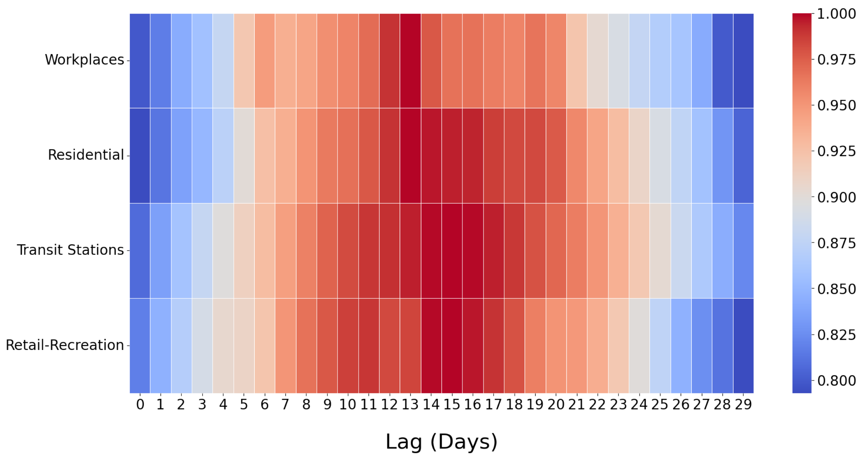
An important question is how to select the optimal time lag, t. We performed heatmap analyses to investigate the answer to this question, an example of which is shown in Figure 2. For each mobility time series (, , , ), we computed with varying t between 0 and 29 days. Since correlation can be positive for some mobility types yet negative for others, and since minimum/maximum correlation strength can vary for different time series, we individually standardized the correlation results obtained under each time series. The standardized correlation numbers are colored according to the scale shown on the right of Figure 2. Lower correlations are shown in blue, whereas higher correlations are shown in red.
As Figure 2 demonstrates, the correlation values are relatively higher between and days, and they reach their peaks around days. Therefore, (which we had used in Figure 1) seems to be a near-optimal choice. It can also be observed that correlations are quite low when t is either excessively small (such as ) or excessively large (such as ). These results are intuitive—for example, high human mobility and density in public transport today will likely not yield many COVID-19 cases within the next 1–2 days, but rather, its effects will start to show in a week or more due to the COVID-19 incubation period. Similarly, mobility today will have little effect on COVID-19 cases 25+ days later. Therefore, the results in Figure 2 corroborate our expectations and show that we can indeed establish correlations between mobility statistics from CMRs and COVID-19 case counts.
4. Forecasting Methodology
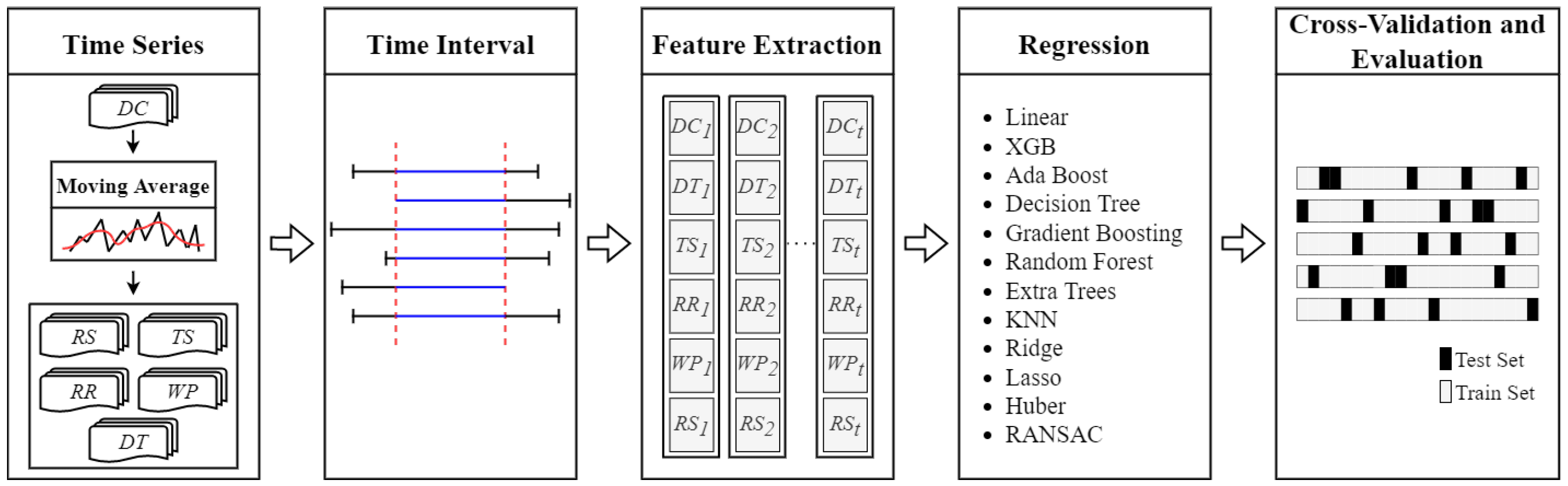
Our methodology for forecasting future COVID-19 case counts is based on regression, which is a type of supervised machine learning. The general overview of our methodology is shown in Figure 3. The methodology consists of several steps; the details of each step will be explained in the next sections.
First, as shown on the leftmost end of Figure 3, data from Section 3.1 are modeled as individual time series. A moving average is applied to time series for smoothing. Second, considering that data are collected from different sources and data availability may differ from one source to another, common time intervals are determined for each country. Third, features are extracted from underlying time series so that they can be used in training regression models. Fourth, using the extracted features, a regression model is trained to predict COVID-19 case counts. To maximize forecasting accuracy, multiple regression model types are implemented and dynamically tested, ranging from linear regression to gradient boosting regression. Our method empirically finds the best performing regression model type (i.e., the type that yields most accurate forecasts) in each setting. Finally, cross-validation is applied with splitting and re-shuffling when evaluating forecasting accuracy, model performance, and the impacts of various parameters in our method.
Difference with ARIMA-Based Methods: It is worthwhile to note that ARIMA-based methods are popular for time-series analysis. They have also been applied to COVID-19 forecasting [26,27], but typically, they have been used when there is only a single time series available (e.g., only ). In contrast, our method fuses features from multiple time series: , , and multiple mobility time series. In order to take advantage of features from multiple time series and to build the most accurate regression model using the best feature set, our method utilizes a custom algorithm for optimized feature extraction, feature selection, and regression-type selection.
4.1. Moving Average for
The raw data may contain strong fluctuations due to a variety of factors such as the number of tests in a given day (e.g., weekday versus weekend), certain countries or hospitals reporting case counts not daily but once every two days, holidays, temporary lockdowns, and so forth. In order to counter the fluctuations caused by these factors, smoothing techniques can be used. In our work, we use moving average as the smoothing technique, which takes one time series as input and produces another time series by averaging consecutive readings according to a window size w.
More formally, recall from Section 3.1 that denotes the i’th reading in time series . Let us denote as the smoothed version of according to a moving average with window size w. is computed as:
By the nature of Equation (2), we use odd window sizes such as . w is positively correlated with how much is smoothed, e.g., a larger w makes Equation (2) take the average of a higher number of consecutive points; therefore, will be smoother. After obtaining in this step, the rest of the forecasting methodology utilizes in place of .
4.2. Time Intervals
Recall from Section 3.1 that , , , , and time series are collected from different resources. Because of this, different countries may have different time intervals in which all time series are simultaneously available. For example, while country X may provide data since March 2020, they may not provide data until the beginning of April 2020. For a different country Y, these dates may also be different. If all time series are not simultaneously available on a particular day, this leads to missing data in the feature extraction and regression steps, which should be avoided. Therefore, we consider each country individually and find the largest time interval for that country in which all time series are simultaneously available.
The time intervals resulting from our analysis are provided in Table 1. For many countries, the time intervals cover around 20–21 months. The start dates are near March 2020 (which is close to when the first major lockdowns started taking place) and the end dates are mostly in December 2021. Due to reasons explained in the previous paragraph, there can be slight differences in the start and end dates for each country. One exception is Turkey, for which the start date is much later than other countries (November 2020). The reason is because the Ministry of Health in Turkey provided daily COVID-19 patient counts before November 2020, which are significantly lower than case counts (i.e., ). The lack of data before November 2020 prompted us to set the start date for Turkey as 25 November 2020.
4.3. Feature Extraction and Selection
In order to build a regression model that is capable of forecasting future COVID-19 case counts, we need to train it with training data which contains features that are good predictors of future case counts. In our method, the feature set consists of two main data sources. First, historical daily case and test counts (i.e., and ) are always included in the feature set, since they are clearly correlated with future daily case counts. Second, a subset of mobility time series (, , , ) is dynamically selected using Algorithm 1, which is our custom search algorithm. It aims to find the best feature set leading to the best regression model by testing different combinations of mobility time series, considering that not all mobility time series may be significant in predicting future daily case counts in all countries. Another important aspect, which is also dynamically selected by Algorithm 1, is: Data from how many past days t should be used as features? When t is too long or too short, the predictive power of the features will be low, as shown in Figure 2. To find the best time period t, Algorithm 1 searches between and , where is an input parameter. Considering the results from Figure 2 which show that TLCC steadily decreases after , we use as the default value.
| Algorithm 1: Custom search algorithm to construct best model |
 |
In addition to the maximum period length , mobility time series (, , , ), and the and time series, Algorithm 1 takes two more inputs. The first one is the set of regression types, . There exist several regression types in the literature, such as Linear Regression, Decision Tree Regression, Ridge Regression, and so forth. The goal of Algorithm 1 is to find and use the regression type that maximizes forecasting accuracy. Thus, we construct a set which consists of 12 different regression types and feed it as an input to Algorithm 1. Then, Algorithm 1 can train a model with each type and eventually select the model which has highest forecasting accuracy. More details regarding which regression types we use will be given in Section 4.4. The other input of Algorithm 1 is the error metric, . Error metrics are necessary to measure forecasting accuracy. When evaluated with metric , the model that yields lowest error is the one which has highest accuracy. Thus, Algorithm 1 builds models and evaluates them using , and it eventually returns the optimal regression model with the lowest error. More details regarding error metrics will be given in Section 4.5.
Algorithm 1 works as follows. On lines 1 and 2, the minimum error and optimal regression model found thus far are initialized via placeholder (dummy) values. On line 3, the four different mobility time series are collected in a set called . On line 4, all 1-element, 2-element, 3-element and 4-element combinations of are constructed. (1-element combinations of are: . 2-element combinations of are: ). This step exhaustively enumerates all possible combinations of . Then, on line 5, the search for the best begins. The outermost for loop considers all possible t values between 1 and . Denoting the feature set by and the current day as i, lines 8 and 9 add the daily case and daily test counts from the previous to days to as features. Then, between lines 10 and 12, for every possible combination of mobility time series, values of the corresponding time series from the previous to days are added to as features. Lines 13–15 ensure that a model with each different regression type is trained and its error with respect to metric is calculated. Between lines 16 and 18, if the current model ’s error is lower than the previously found optimal model , then is replaced by . This ensures that the algorithm keeps track of the best model in the variable denoted by . Finally, after all loops terminate (i.e., all t values, time series combinations, and regression types are explored), the algorithm terminates on line 19 by returning the overall best model, .
4.4. Regression
In this section, we describe how regression is used as part of our methodology for forecasting COVID-19 case counts and which regression types are implemented and used in Algorithm 1.
Regression is an analytical method that facilitates predicting how a dependent variable is related to one or more independent variables (features). More formally, denoting the dependent variable by , the independent variables as , the error term by , and the unknown regression parameters as , a regression problem can be formulated as a mathematical function f:
In our work, we treat COVID-19 case counts as and the feature values (according to feature set constructed by Algorithm 1) as . Thus, we have training data consisting of pairs. The goal is to find the best function f with ideal parameters which closely fits the training data. This problem corresponds to training an optimal regression model to act as f.
In the literature, there exist several possible types of functions to model the relationship between and , ranging from linear f to high-dimensional f. We refer to these different options as regression types. To build the most accurate COVID-19 forecasting model, it is beneficial to try different regression types and select the best-performing one. Thus, we utilize 12 different regression types, which are briefly introduced below. The set of all of these regression types is denoted by , which is given to Algorithm 1 as input. Note that our overall methodology is not limited to the 12 regression types given below; new types can be integrated by adding them to .
Linear Regression: Linear regression is one of the most commonly used regression types. It fits a linear function f to the underlying data. The coefficients of the linear function are chosen to minimize the residual sum of squares between the observed and the values approximated by the output of the regression function.
Decision Tree Regression: Decision trees can be used in both classification and regression problems [42]. They create models which predict outcomes by learning decision rules from the underlying training data. These decision rules are stored and queried in a tree structure (hierarchically), starting from the root and moving toward the leaves in each step. Deeper trees imply a higher number of decision rules.
Random Forest Regression: Random forest regression is an ensemble learning method [43]. It fits multiple decision trees on different subsets of the training data, where each subset is constructed by drawing samples from the training data with replacement. The collection of these decision trees constitute the random forest ensemble. Afterwards, in the prediction (forecasting) phase, each tree is used to make a prediction and then the predictions are combined, e.g., by averaging.
Extra Trees Regression: “Extra trees” stands for “extremely randomized trees”, which is also an ensemble learning method similar to Random Forest Regression. In random forests, when splitting each node during the construction of a decision tree, the best split rule (i.e., the most discriminative threshold) is found either from all features or a random subset of features. Yet, in extremely randomized trees, instead of the most discriminative threshold, thresholds are drawn randomly for each feature and the best of the randomly generated thresholds is selected as the split rule. This adds another level of randomness to the overall regression model, which reduces overfitting.
KNN (K-Nearest Neighbors) Regression: KNN is a popular algorithm for both classification and regression problems [44,45]. In KNN regression, the label assigned to a query point is computed as the mean of its k nearest neighbors in the feature space. That is, given the features of a test sample as , KNN regression predicts as:
where denotes the k closest points to in the training dataset.
AdaBoost Regression: AdaBoost is a popular boosting algorithm introduced by Freund and Schapire [46]. Its main idea is to fit a sequence of models on iteratively modified versions of the training data. Samples in the data are given weights, and in each iteration, weights are updated so that samples which were incorrectly predicted in the previous iteration will have their weights increased in the next iteration. Consequently, models will improve as iterations proceed, since models in the next iterations focus on addressing the weaknesses of the previous iterations [47].
Gradient Boosting Regression: Gradient boosting combines the intuition of boosting with the optimization of a differentiable loss function [48], e.g., the loss function can be squared error for regression. In each step of iterative boosting, a regression tree is fit on the gradient of the loss function. The goal is to arrive at a model which minimizes the loss.
XGB Regression: XGB, also known as XGBoost (stands for Extreme Gradient Boosting), is an efficient and optimized implementation of gradient boosting [49]. Following its inception, it quickly became popular among practitioners due to its speed and accuracy, e.g., it yielded the most accurate results in many Kaggle competitions. Therefore, we incorporated it in our framework in addition to the original gradient boosting algorithm.
Ridge Regression: Ridge regression improves linear regression (with ordinary least squares) in cases with correlated independent variables. It imposes an -norm penalty on the size of the regression coefficients. Ridge regression has been successfully applied in many diverse fields; our empirical results show that it also performs well in our COVID-19 forecasting application.
Lasso Regression: Similar to Ridge regression, Lasso is also a linear regression type. The intuition of Lasso (least absolute shrinkage and selection operator) was discussed in various domains such as geophysics and signal processing [50], but it became popular in regression analysis after its introduction by Tibshirani [51]. The idea of Lasso is to shrink the size of the regression coefficients, which is similar to Ridge regression. However, as opposed to Ridge regression, instead of imposing an -norm penalty, Lasso imposes an -norm penalty on the regression coefficients. As such, Lasso is suitable for datasets which have high collinearity.
Huber Regression: Huber contains a piecewise loss function which combines squared loss (-norm penalty) for non-outliers and absolute value loss (-norm penalty) for outliers [45,52]. It is motivated by the fact that squared loss has the tendency to be dominated by outliers, i.e., samples with error higher than a certain threshold. Thus, -norm penalty is applied to outliers to reduce their effect while not completely ignoring them. In contrast, -norm penalty is applied to non-outliers.
RANSAC (Random Sample Consensus) Regression: The RANSAC algorithm was first published in [53]. It classifies samples in the training dataset into two: inliers which should be taken into account when building a regression model, and outliers which should not be considered when determining the regression coefficients. RANSAC iteratively selects random subsets from the data, fits a model to the random subset, classifies data as inliers vs. outliers, and deems the fitted model more desirable if the number of inliers is maximal.
4.5. Cross-Validation and Evaluation Setup
When evaluating the accuracy of our regression models, we use 5-fold cross-validation with the shuffle split approach. We split the whole available data into training and test sets according to an 80–20% split. The split is repeated for 5 iterations, with random shuffling in between each iteration. The error amount obtained in each of the five iterations is recorded, and the errors are averaged at the end.
To calculate error amounts, we define and use two metrics: Mean Absolute Error (MAE) and Relative Error (RE). Recall that the goal of our regression models is to forecast daily COVID-19 case counts for previously unseen days (i.e., days belonging to the test set). Let denote the test set. Furthermore, for day i, let denote the actual daily COVID-19 case count for that day, and let denote the daily case count forecasted by our regression model. Then, Mean Absolute Error (MAE) can be defined as:
Relative Error (RE) can be defined as:
The key difference between MAE and RE is that MAE calculates the absolute error in forecasts, whereas RE considers error relative to the actual case counts. We believe that both metrics are useful in case of COVID-19 forecasting. For example, if the task is to forecast how many hospital beds will be necessary, MAE is a more direct indicator of error for this task; therefore, a method with low MAE may be preferred. On the other hand, RE is more meaningful when performing comparisons between different countries since their population sizes can be vastly different. The same MAE may translate to a high RE in a low-population country while it translates to a low RE in a high-population country. Therefore, RE should be preferred for this task.
It is possible to seamlessly integrate other error metrics into our methodology, including squared metrics such as Mean Squared Error (MSE) and Root Mean Squared Error (RMSE). We choose to use MAE and RE ahead of MSE and RMSE due to their direct applicability to COVID-19 forecasting, as explained in the previous paragraph. For example, MAE is directly applicable to the determination of absolute value error in forecasting daily COVID-19 cases, which can have a direct impact on the number of hospital beds necessary. RE is directly applicable to performing a comparison of infection rates between countries with varying population sizes. In contrast, squared errors such as MSE and RMSE are not that directly applicable or interpretable in the task of COVID-19 forecasting.
5. Results and Discussion
5.1. Comparison of Actual versus Predicted Case Counts
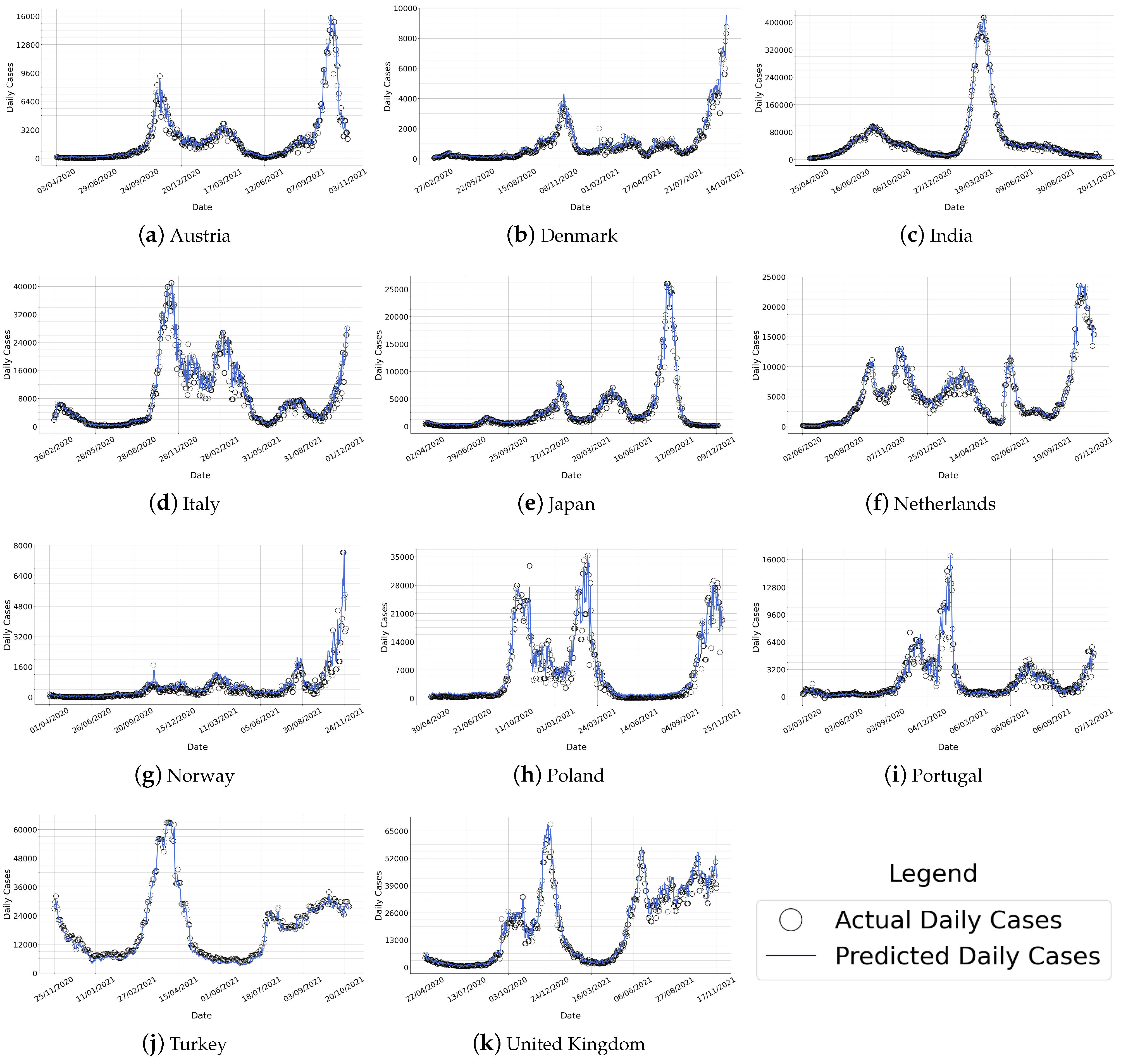
We first provide a visual comparison between the actual COVID-19 case counts () and the case counts predicted using our forecasting methodology (). For this set of results, to minimize data pre-processing, a window size of is assumed in the moving average step, which is equivalent to zero modification of the original time series. Results are given in Figure 4 for various countries with different population sizes, geographic locations, socio-cultural factors, and COVID-19 cases. Plots show that the predictions made by our forecasting methodology are highly accurate and closely resemble actual COVID-19 case counts in each country.
As illustrated in Figure 4, the actual case counts behave differently for each country. For example, consider India, which is the most populous country among those in Figure 4. At the height of the pandemic (March–April 2021), the number of daily COVID-19 cases in India reaches around 420,000 cases in a day. In addition, the daily cases in India seem to have a single, distinctive peak in March–April 2021, whereas the number of cases has remained relatively steady throughout the rest of the time interval. In contrast, if we consider a country such as Italy or the Netherlands, we observe multiple peaks on different dates (e.g., Italy has three peaks, the Netherlands has five peaks). None of these peaks are as pronounced as India’s peak, considering the maximum number of daily cases in Italy does not exceed 44,000 and in the Netherlands, it does not exceed 25,000. Another distinct example is Poland, in which there exist three peaks with similar numbers of daily cases (all in the 28,000–35,000 range), as opposed to having one more pronounced peak which is the case in many countries including India, Japan, Netherlands, and Portugal. Turkey and United Kingdom are two other distinctive examples—while in many countries, the rise of COVID-19 cases is soon met with a drop due to government interventions and preventive measures, the number of cases has remained stable in Turkey and the United Kingdom between July 2021 and November 2021.
As exemplified in the previous paragraph, different countries have remarkably diverse behaviors in terms of how many major and minor peaks are observed, the absolute number of COVID-19 cases observed, and how that relates to the country’s population. Furthermore, countries reported in Figure 4 also differ in terms of their geographic locations, economic factors, and healthcare systems. Despite countries’ diversity, our forecasting method is capable of predicting COVID-19 case counts in all countries with high accuracy. The method is able to forecast major and minor peaks, up-and-down fluctuations, and long periods of steadily low (or high) numbers. These results not only demonstrate the generalizability of our method to diverse countries and scenarios but also indicate that mobility is indeed a common and important factor in determining the spread of COVID-19 in all countries.
5.2. Forecasting Accuracy
In order to measure the absolute error between the predicted daily cases (blue line in Figure 4) and the actual daily cases (black markers in Figure 4), we use the MAE metric. Results are reported in Table 2. Considering that countries may have substantially different population sizes and case counts, to put the MAE values into perspective, we compare them with the maximum number of daily cases observed in each country, i.e., . The ratio of is therefore added as the rightmost column of Table 2.
According to Table 2, for 10 out of 13 countries, the ratio is lower than than 3%. This result supports the fact that the predicted daily case counts closely resemble actual case counts, as indicated also by Figure 4. The country with the highest is Canada, which is followed by Poland and Argentina. The country with the lowest is India, which is followed by Japan and Turkey. For all remaining seven countries, their is 2–3%, which is low. Overall, we can conclude that our methodology produces accurate forecasts with low MAE.
5.3. Impact of Window Size w
In order to investigate the impact of the w parameter on forecasting accuracy, we perform an experiment by varying w and measuring relative error (RE) for each country. The results are reported in Table 3. It can be observed from Table 3 that as w increases, REs decrease. This is because higher w implies smoother time series; thus, forecasting is easier due to fewer fluctuations in the underlying time series. It is worthwhile to note that REs are already low when to begin with, e.g., less than 5% for majority of the countries when . As w increases, REs become even lower, e.g., when , the majority of the countries have less than 3% RE.
Furthermore, one can observe that our forecasting methodology works particularly well for some countries such as India and Turkey. For example, the REs for India are 2.15%, 1.43% and 1.00% for , and , respectively. For Turkey, all REs are below 2% for . On the other hand, higher REs are observed for certain countries such as Denmark and Norway. The reason is because of the relatively low values in these countries, which imply that the denominator in Equation (6) will be small. Therefore, although the absolute value difference between the actual versus predicted counts is not high (i.e., the numerator in Equation (6), dividing it by a small yields relatively high RE. For example, in the case of Norway, the MAE values are 42.81, 34.38 and 25.44 for , and , respectively. In the case of Denmark, the MAE values are 59.59, 43.94 and 33.96 for the same w values. Clearly, these are quite negligible inaccuracies for countries with over 5 million population.
5.4. Comparison of Regression Types
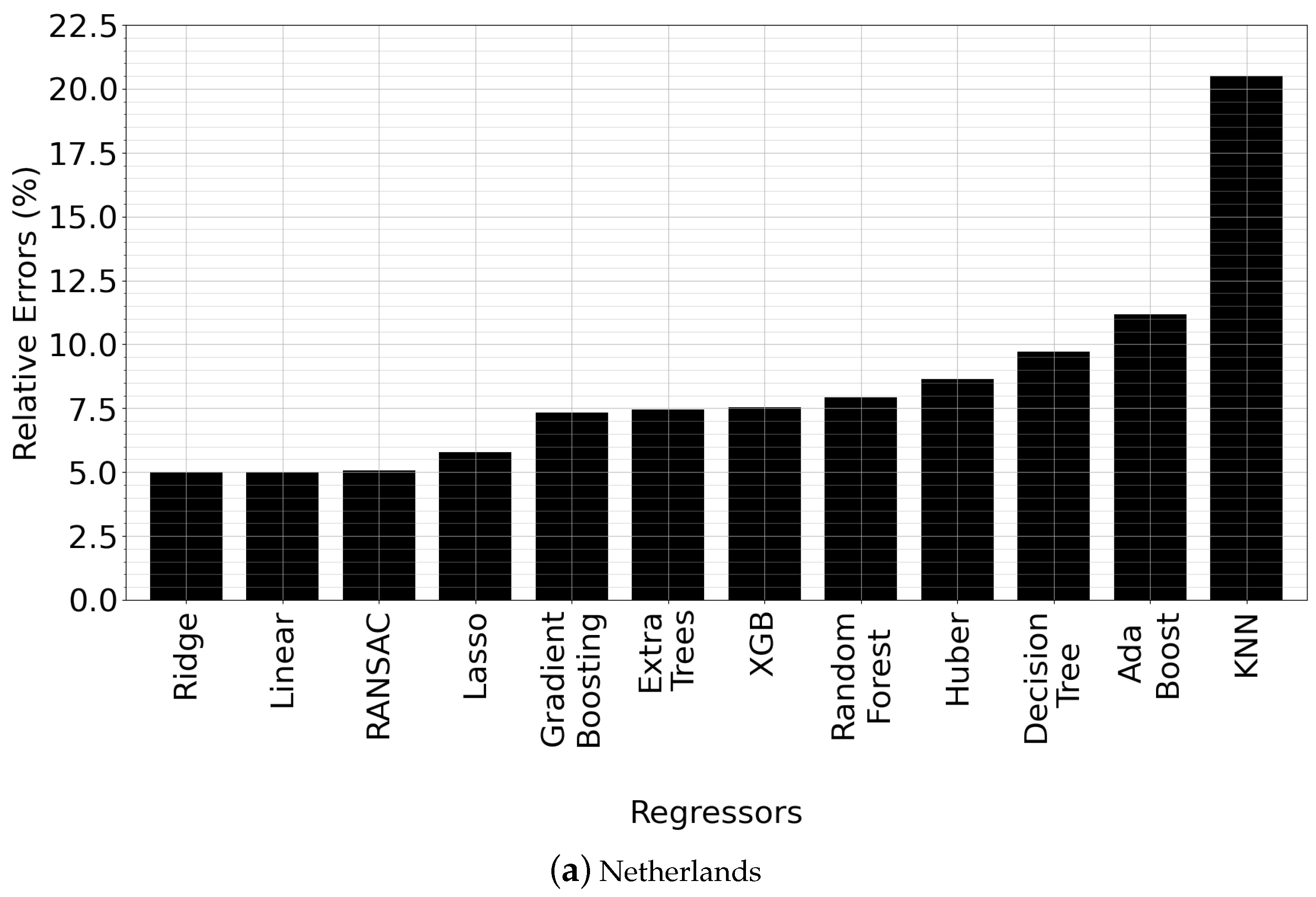
Recall from Section 4.4 and Algorithm 1 that a total of 12 regression types are implemented and tested within our methodology for finding the best model . In this section, we investigate: (i) the accuracy benefit of our approach, (ii) which regression types usually perform better than others, and (iii) provide a comparison among different regression types. To that end, we first perform a side-by-side comparison between different regression models for different countries. Results for two of the countries (Netherlands and India) are reported in Figure 5—the rest are omitted for brevity but show similar trends.
We observed that in general, Ridge Regression, RANSAC Regression and Linear Regression perform better than other model types, as indicated by Figure 5. Ridge Regression is best in Figure 5a, whereas RANSAC Regression is best in Figure 5b. Errors are quite similar among the top-3 regression types; e.g., in Figure 5a, they are all close to 5% and in Figure 5b, they are all close to 2.5%. However, the errors become progressively worse afterwards. Usually, KNN, AdaBoost, Decision Tree, Huber and Random Forest Regression perform the worst. Interestingly, this sequence of worst-performing regression types is observed unexceptionally across all countries, including those that are not reported in the paper for brevity. Upon analyzing the results, we observed that the high errors of these regression types is because of the negative bias in their forecasts. In other words, these regression types consistently underpredict the actual COVID-19 case counts. Among them, AdaBoost, KNN and Decision Tree are the regression types which suffer most from unprediction, which is consistent with the results in Figure 5, considering that these regression types are also the worst three performers in terms of RE.
Overall, we observe that our proposed search for is beneficial compared to using a random regression type, since a random regression type may yield substantially higher error (2–3 fold or more) than choosing the best type. Thus, Algorithm 1 is empirically shown to be beneficial for improving accuracy.
There are also technical explanations as to why Ridge, RANSAC, Lasso and Linear Regression perform similarly. RANSAC improves Linear Regression by excluding outliers in the dataset which should not have any influence on the values of the estimated coefficients. Therefore, obtaining similar accuracy can be expected for RANSAC and Linear Regression. Likewise, Ridge and Lasso Regression share commonalities in placing constraints on regression coefficients by introducing penalty factors; however, they differ in the fact that Lasso uses the -norm of the coefficients, whereas Ridge uses -norm. Accordingly, Ridge and Lasso Regression have similar accuracy.
In Table 4, we summarize which regression type performed best for which country. We observe that across all countries, only RANSAC and Ridge Regression could be the best. RANSAC performed best for nine of the countries, while Ridge Regression performed best for the remaining four countries.
5.5. Analysis of Feature Sets
Recall from Algorithm 1 that the best-performing feature set is searched dynamically when constructing . In this section, we analyze two aspects of this search: (i) finding which time series are included in the best , and (ii) finding the optimal time period t. The results of these analyses are noteworthy since they indicate which mobility type has a significant impact on the daily cases of each country; e.g., if Algorithm 1 found a certain mobility time series to be part of the best feature set, then a substantial correlation must exist between that mobility type and the COVID-19 case counts in that country.
Analysis with respect to : First, we analyze which mobility time series are selected by Algorithm 1 for inclusion in the best . The results of our analysis are provided in Table 5. Each mobility time series is given one column. (We do not include non-mobility time series and in this table, since they are always part of .) A checkmark in a cell indicates that the corresponding mobility time series was selected as part of the best for the corresponding country. As observed from Table 5, Transit Stations () and Residential () are selected by almost all countries in their best , which is intuitive. Since consists of places such as subway stations, seaports, taxi stands, highway rest stops, etc., the mobility of individuals in such places is indeed a strong indicator of the spread of COVID-19. For example, if many people are spending their time in subway stations or taxi stands, then this indicates a large amount of mobility in public or private transport, which can cause the COVID-19 virus to spread faster. In contrast, is for residential locations, e.g., if many people are staying at home, then this will slow down the spread of COVID-19. It is therefore intuitive that both and are typically included in the best of various countries. On the other hand, Workplaces () and Retail and Recreation () are less commonly included in the best . One reason could be that individuals spend their time in recreational locations or by shopping for necessities regardless of the status of the pandemic, which weakens the predictive power of the corresponding mobility time series.
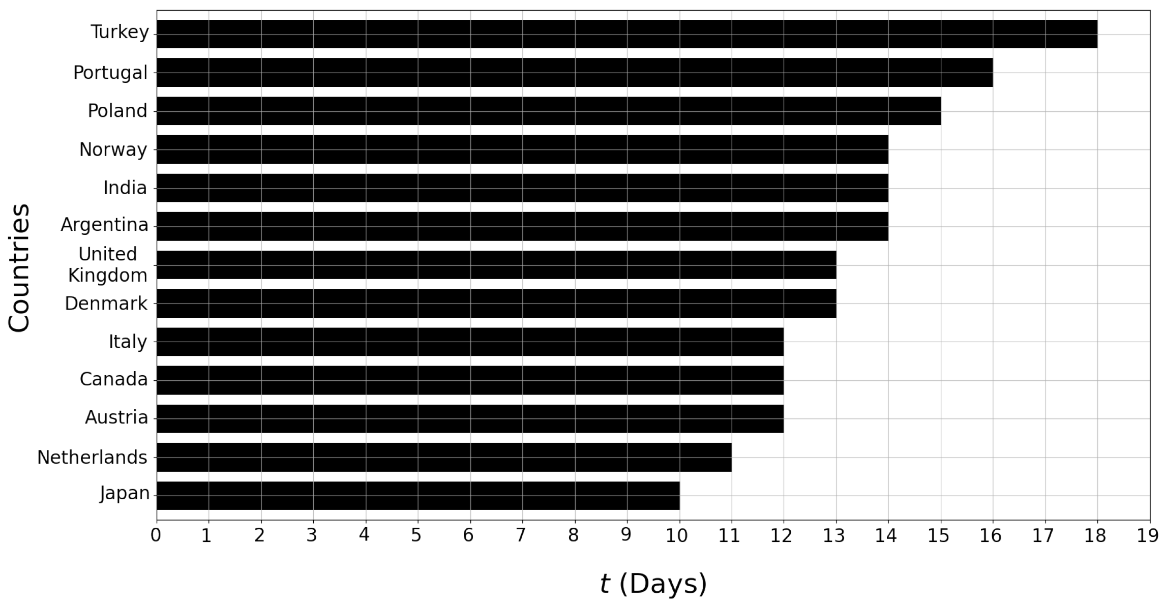
Analysis with respect to t: Recall that Algorithm 1 searches for the optimal time period t, between . Here, we analyze which value of t was selected by Algorithm 1 as the optimal one for each country. The results of our analysis are provided in Figure 6. We had previously found in Section 3.2 that according to TLCC, the highest correlations are reached when the time lag is around 12–15 days. The results in Figure 6 and therefore Algorithm 1 agree with our findings from Section 3.2. For nine out of 13 countries, the optimal t was found to be between 12 and 15 days. In addition, considering that was never found to be optimal for any of the countries, we can conclude that including unnecessarily old readings hurt the accuracy of the regression model rather than improving it.
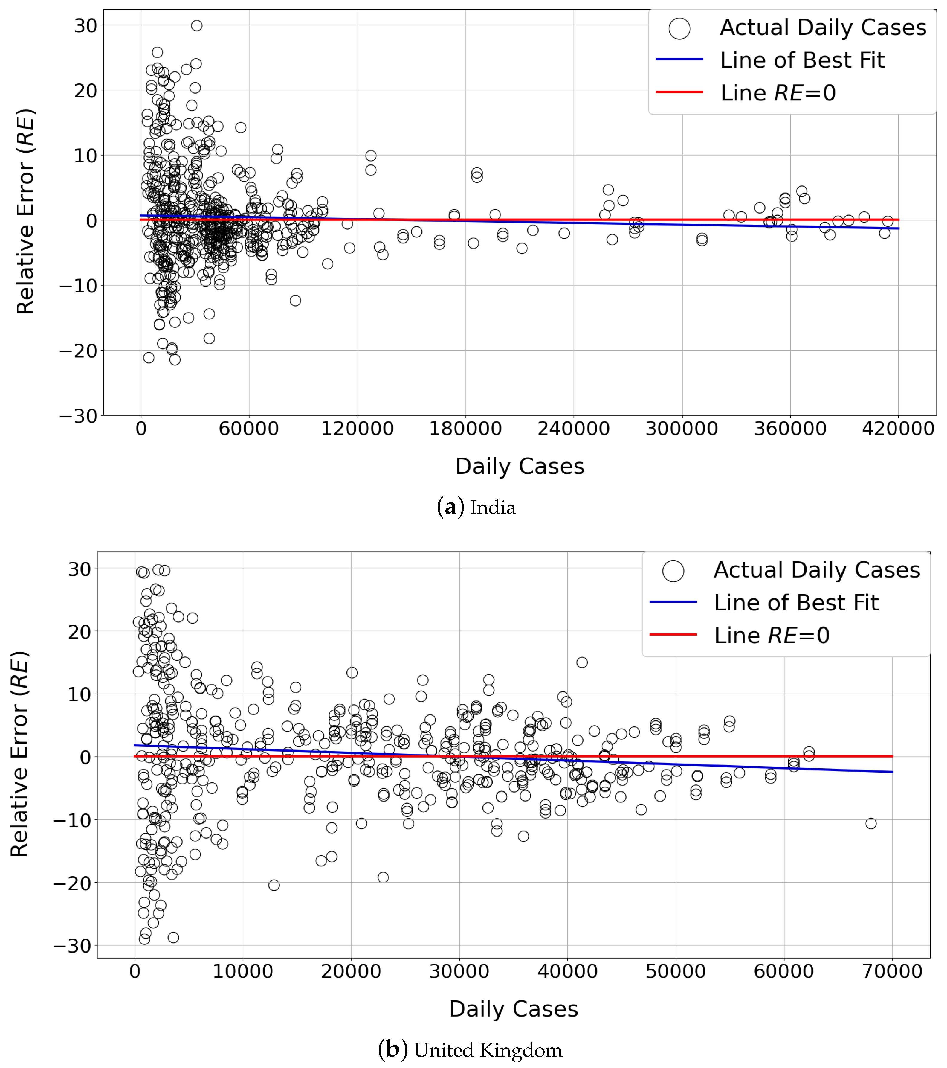
5.6. Analysis of Forecasting Bias
One important aspect in forecasting is bias; e.g., the forecasting method may consistently overpredict () or underpredict () the number of daily cases, which should be avoided. To measure whether bias exists in our models, we perform the following experiment and report its results in Figure 7. Plots for only two countries (India and United Kingdom) are included in the figure, since the results for the rest of the countries show similar trends. India and the United Kingdom were chosen because their distribution of the number of daily cases is substantially different (see the distribution of black circle-shaped markers in Figure 7); hence, they represent two diverse scenarios.
Consider different days with different numbers of daily cases . For each day with a certain number of daily cases (x axis), we use a marker in Figure 7 to denote the Relative Error (RE) measured for that day only. Then, we use least squares optimization to fit a best-fit line on the markers. In Figure 7, the best-fit line is shown in blue. To be able to compare the blue line with a hypothetical perfect estimator, we draw the red line which corresponds to RE = 0 for all values. When we compare the red and blue lines in Figure 7, we observe that the blue line very closely resembles the red line. There is a minor underprediction for the small number of daily cases and minor overprediction for the large number of daily cases; however, black markers are almost equally divided into below and above the red RE = 0 line. Thus, we can conclude that the forecasts produced by our methodology are close to being unbiased.
5.7. Runtime Performance and Overhead
In Table 6, we report the execution times of different regression types for three representative countries: Turkey, the Netherlands and Italy. These countries are chosen so that execution times in diverse scenarios can be studied—as noted in Table 1, Turkey has the smallest interval, Italy has the largest interval, and Netherlands has the median interval among all countries. Values in Table 6 are measured with window size . All values are reported in seconds.
We observe that most of the regression types have low overhead (less than 1–2 s); therefore, they are efficient in practice. In particular, it is worthwhile to underline that regression types which had yielded high accuracy (such as Linear, Ridge, RANSAC, Lasso) are all highly efficient as well. In contrast, regression types which use ensemble models or boosting (such as Gradient Boosting, Random Forest, Extra Trees) have relatively higher execution times, as expected. Finally, we also measure and report the total execution time of Algorithm 1 in Table 6. Note that Algorithm 1 is tasked with testing different time periods t and feature sets in addition to testing regression types. Thus, the total execution time of Algorithm 1 is not a simple summation of all regression types. It can be noted from Table 6 that the execution time of Algorithm 1 is higher than individual regression models because of this custom search. Nevertheless, it is possible for Algorithm 1 to finish in a couple of hours on a commodity laptop. Considering that the execution of Algorithm 1 is a one-time cost and it can be performed on computers with strong computation power, we believe that the total execution times remain feasible in practice.
6. Conclusions and Future Work
In this paper, we proposed a method for forecasting COVID-19 case counts using aggregate mobility statistics from Google Community Mobility Reports (CMRs), along with historical COVID-19 case counts and test counts. All data sources used in our method are free and publicly available, which is beneficial for the adoption and reproducibility of our work. Our method relies on training a regression model using features extracted from the aforementioned data sources. Furthermore, our method utilizes a custom algorithm for selecting the best feature set, time period t, and regression type dynamically from the underlying data. The accuracy of our forecasting method is evaluated on 13 different countries, and the results show that our method can forecast daily COVID-19 case counts with high accuracy.
Overall, there are several take-away messages and avenues for future work. First, the TLCC analysis we performed as well as the high accuracy of our forecasting method demonstrate that aggregate mobility statistics and the spread of COVID-19 are indeed correlated. Yet, COVID-19 is only one example of communicable diseases. We expect that our general approach of using mobility statistics to forecast pandemic case counts would be applicable and relevant to other communicable diseases as well. However, testing this hypothesis is beyond the scope of this paper. It is also difficult to test this hypothesis on other communicable diseases with currently available data, considering: (i) the rareness of global pandemics with high case counts, (ii) lack of mobility statistics (in the form of CMRs, for example) for many previous pandemics or outbreaks of communicable diseases, and (iii) lack of historical government interventions for mobility reduction, such as venue closures or stay-at-home orders. Nevertheless, we believe that our approach can be used as a guideline in future pandemics, and a method similar to ours can be tested on different communicable diseases, outbreaks of contagious viruses, and/or used to model the behavior of a future pandemic.
Second, our models perform forecasting at the country level; however, for large countries (such as the United States), one can study forecasting at lower levels (such as state, county, or city-level). We expect that this would enable finer-granularity forecasting, considering that population density in some states/cities can be significantly different than other states/cities.
Third, the integration of deep learning models into our framework and comparison of their performance against our current models can be performed. This is a non-trivial task, considering that the structure and parameters of deep models need to be tuned carefully. Furthermore, it is not guaranteed that deep models will perform better than our current models. For example, in the literature, Ref. [23] used Long Short-Term Memory (LSTM) networks for COVID-19 prediction. Percentage errors reported in this study are around 1.4% for Russia, 5.8% for Peru, and 3.5% for Iran. In [24], Luo et al. also used LSTM networks for COVID-19 prediction, and they obtained an MAE of 771 for America. In [28], Schwabe et al. compared a neural network model against a non-deep model that was developed by the authors (based on Hawkes processes), and they showed that their model performs better than the neural network in terms of MAE and RMSE. In [22], Athanasios et al. compared an Artificial Neural Network (ANN) with a SVM and Random Forest (RF) model in the task of forecasting COVID-19 in Greece, and their results indicate that the RF model has lower MAE and MSE than the ANN. While these results are not directly comparable to ours (considering that countries, data sources and error metrics are oftentimes different), they indicate that deep models can perform similar, worse or better than our current models. A detailed comparison study and analysis need to be conducted in future work in order to arrive at a conclusive answer.
Finally, our models are currently built using mobility statistics extracted from Google CMRs; however, they are not necessarily tied to CMRs. Our models can be built as long as we have access to individuals’ aggregate amount of presence or mobility in different location categories such as transit stations, retail and recreation, workplaces, etc. It is possible for such information to come from Google CMRs or other resources. For example, certain companies such as Apple and Uber have also been releasing mobility-related statistics during and/or after the pandemic (e.g., Uber Movement 1 and Apple Mobility Trends Reports 2). Information in these resources can be used as a direct or indirect substitute for Google CMRs, e.g., if travel time is high or average speed is low in a neighborhood, then aggregate presence and mobility are high. It is also possible to find statistics regarding the usage of public transportation or recreational areas for some cities. Thus, it is possible to explore the applicability of our approach with other data sources in future work.
Author Contributions
Conceptualization, B.B. and M.E.G.; methodology, B.B. and M.E.G.; software, B.B.; validation, B.B. and M.E.G.; data curation, B.B.; writing—original draft preparation, B.B.; writing—review and editing, B.B. and M.E.G.; visualization, B.B. and M.E.G.; supervision, M.E.G. All authors have read and agreed to the published version of the manuscript.
Funding
This research received no external funding.
Institutional Review Board Statement
Not applicable.
Informed Consent Statement
Not applicable.
Data Availability Statement
The epidemiological data used in this study are available from: https://ourworldindata.org/coronavirus (accessed on 15 September 2022). Google CMR data is available from: https://www.google.com/covid19/mobility/ (accessed on 15 September 2022).
Conflicts of Interest
The authors declare no conflict of interest.
| 1 | https://movement.uber.com/?lang=en-US, accessed on 15 September 2022 |
| 2 | https://covid19.apple.com/mobility, accessed on 15 September 2022 |
References
- WHO. WHO Director-General’s Opening Remarks at the Media Briefing on COVID-19. 2020. Available online: https://www.who.int/director-general/speeches/detail/who-director-general-s-opening-remarks-at-the-media-briefing-on-covid-19—11-march-2020 (accessed on 15 September 2022).
- WHO. WHO Coronavirus (COVID-19) Dashboard 2022. Available online: https://covid19.who.int/ (accessed on 15 September 2022).
- Google. COVID-19 Community Mobility Reports. 2020. Available online: https://www.google.com/covid19/mobility/ (accessed on 15 September 2022).
- Aktay, A.; Bavadekar, S.; Cossoul, G.; Davis, J.; Desfontaines, D.; Fabrikant, A.; Gabrilovich, E.; Gadepalli, K.; Gipson, B.; Guevara, M.; et al. Google COVID-19 community mobility reports: Anonymization process description (version 1.1). arXiv 2020, arXiv:2004.04145. [Google Scholar]
- Alessandretti, L. What human mobility data tell us about COVID-19 spread. Nat. Rev. Phys. 2022, 4, 12–13. [Google Scholar] [CrossRef]
- Zhang, C.; Qian, L.X.; Hu, J.Q. COVID-19 pandemic with human mobility across countries. J. Oper. Res. Soc. China 2021, 9, 229–244. [Google Scholar] [CrossRef]
- Du, B.; Zhao, Z.; Zhao, J.; Yu, L.; Sun, L.; Lv, W. Modelling the epidemic dynamics of COVID-19 with consideration of human mobility. Int. J. Data Sci. Anal. 2021, 12, 369–382. [Google Scholar] [CrossRef]
- Sulyok, M.; Walker, M. Community movement and COVID-19: A global study using Google’s Community Mobility Reports. Epidemiol. Infect. 2020, 148, 1–9. [Google Scholar] [CrossRef]
- Xiong, C.; Hu, S.; Yang, M.; Luo, W.; Zhang, L. Mobile device data reveal the dynamics in a positive relationship between human mobility and COVID-19 infections. Proc. Natl. Acad. Sci. USA 2020, 117, 27087–27089. [Google Scholar] [CrossRef]
- Yilmazkuday, H. Stay-at-home works to fight against COVID-19: International evidence from Google mobility data. J. Hum. Behav. Soc. Environ. 2021, 31, 210–220. [Google Scholar] [CrossRef]
- Tian, H.; Liu, Y.; Li, Y.; Wu, C.H.; Chen, B.; Kraemer, M.U.; Li, B.; Cai, J.; Xu, B.; Yang, Q.; et al. An investigation of transmission control measures during the first 50 days of the COVID-19 epidemic in China. Science 2020, 368, 638–642. [Google Scholar] [CrossRef] [Green Version]
- Kraemer, M.U.; Yang, C.H.; Gutierrez, B.; Wu, C.H.; Klein, B.; Pigott, D.M.; Du Plessis, L.; Faria, N.R.; Li, R.; Hanage, W.P.; et al. The effect of human mobility and control measures on the COVID-19 epidemic in China. Science 2020, 368, 493–497. [Google Scholar] [CrossRef] [Green Version]
- Chang, S.L.; Harding, N.; Zachreson, C.; Cliff, O.M.; Prokopenko, M. Modelling transmission and control of the COVID-19 pandemic in Australia. Nat. Commun. 2020, 11, 5710. [Google Scholar] [CrossRef]
- Li, Y.; Li, M.; Rice, M.; Zhang, H.; Sha, D.; Li, M.; Su, Y.; Yang, C. The impact of policy measures on human mobility, COVID-19 cases, and mortality in the US: A spatiotemporal perspective. Int. J. Environ. Res. Public Health 2021, 18, 996. [Google Scholar] [CrossRef]
- Wellenius, G.A.; Vispute, S.; Espinosa, V.; Fabrikant, A.; Tsai, T.C.; Hennessy, J.; Dai, A.; Williams, B.; Gadepalli, K.; Boulanger, A.; et al. Impacts of social distancing policies on mobility and COVID-19 case growth in the US. Nat. Commun. 2021, 12, 3118. [Google Scholar] [CrossRef]
- Zhou, Y.; Xu, R.; Hu, D.; Yue, Y.; Li, Q.; Xia, J. Effects of human mobility restrictions on the spread of COVID-19 in Shenzhen, China: A modelling study using mobile phone data. Lancet Digit. Health 2020, 2, e417–e424. [Google Scholar] [CrossRef]
- Nouvellet, P.; Bhatia, S.; Cori, A.; Ainslie, K.E.; Baguelin, M.; Bhatt, S.; Boonyasiri, A.; Brazeau, N.F.; Cattarino, L.; Cooper, L.V.; et al. Reduction in mobility and COVID-19 transmission. Nat. Commun. 2021, 12, 1090. [Google Scholar] [CrossRef]
- Xi, W.; Pei, T.; Liu, Q.; Song, C.; Liu, Y.; Chen, X.; Ma, J.; Zhang, Z. Quantifying the time-lag effects of human mobility on the COVID-19 transmission: A multi-city study in China. IEEE Access 2020, 8, 216752–216761. [Google Scholar] [CrossRef]
- Ilin, C.; Annan-Phan, S.; Tai, X.H.; Mehra, S.; Hsiang, S.; Blumenstock, J.E. Public mobility data enables COVID-19 forecasting and management at local and global scales. Sci. Rep. 2021, 11, 13531. [Google Scholar] [CrossRef]
- Rostami-Tabar, B.; Rendon-Sanchez, J.F. Forecasting COVID-19 daily cases using phone call data. Appl. Soft Comput. 2021, 100, 106932. [Google Scholar] [CrossRef]
- Liu, D.; Clemente, L.; Poirier, C.; Ding, X.; Chinazzi, M.; Davis, J.T.; Vespignani, A.; Santillana, M. A machine learning methodology for real-time forecasting of the 2019-2020 COVID-19 outbreak using Internet searches, news alerts, and estimates from mechanistic models. arXiv 2020, arXiv:2004.04019. [Google Scholar]
- Athanasios, A.; Irini, F.; Tasioulis, T.; Konstantinos, K. Prediction of the effective reproduction number of COVID-19 in Greece: A machine learning approach using Google mobility data. medRxiv 2021. [Google Scholar] [CrossRef]
- Wang, P.; Zheng, X.; Ai, G.; Liu, D.; Zhu, B. Time series prediction for the epidemic trends of COVID-19 using the improved LSTM deep learning method: Case studies in Russia, Peru and Iran. Chaos Solitons Fractals 2020, 140, 110214. [Google Scholar] [CrossRef]
- Luo, J.; Zhang, Z.; Fu, Y.; Rao, F. Time series prediction of COVID-19 transmission in America using LSTM and XGBoost algorithms. Results Phys. 2021, 27, 104462. [Google Scholar] [CrossRef]
- Auliya, S.F.; Wulandari, N. The Impact of Mobility Patterns on the Spread of the COVID-19 in Indonesia. J. Inf. Syst. Eng. Bus. Intell. 2021, 7, 31–41. [Google Scholar] [CrossRef]
- Awwad, F.A.; Mohamoud, M.A.; Abonazel, M.R. Estimating COVID-19 cases in Makkah region of Saudi Arabia: Space-time ARIMA modeling. PLoS ONE 2021, 16, e0250149. [Google Scholar] [CrossRef]
- de Araujo Morais, L.R.; da Silva Gomes, G.S. Forecasting daily Covid-19 cases in the world with a hybrid ARIMA and neural network model. Appl. Soft Comput. 2022, 126, 109315. [Google Scholar] [CrossRef]
- Schwabe, A.; Persson, J.; Feuerriegel, S. Predicting COVID-19 spread from large-scale mobility data. In Proceedings of the 27th ACM SIGKDD Conference on Knowledge Discovery & Data Mining, Singapore, 14–18 August 2021; pp. 3531–3539. [Google Scholar]
- Wang, H.; Yamamoto, N. Using a partial differential equation with Google Mobility data to predict COVID-19 in Arizona. arXiv 2020, arXiv:2006.16928. [Google Scholar] [CrossRef]
- Li, R.Q.; Song, Y.R.; Jiang, G.P. Prediction of epidemics dynamics on networks with partial differential equations: A case study for COVID-19 in China. Chin. Phys. B 2021, 30, 120202. [Google Scholar] [CrossRef]
- Sun, D.; Duan, L.; Xiong, J.; Wang, D. Modeling and forecasting the spread tendency of the COVID-19 in China. Adv. Differ. Equ. 2020, 2020, 1–16. [Google Scholar] [CrossRef]
- Sarkar, K.; Khajanchi, S.; Nieto, J.J. Modeling and forecasting the COVID-19 pandemic in India. Chaos Solitons Fractals 2020, 139, 110049. [Google Scholar] [CrossRef]
- Zeng, Y.; Guo, X.; Deng, Q.; Luo, S.; Zhang, H. Forecasting of COVID-19: Spread with dynamic transmission rate. J. Saf. Sci. Resil. 2020, 1, 91–96. [Google Scholar] [CrossRef]
- Harjule, P.; Tiwari, V.; Kumar, A. Mathematical models to predict COVID-19 outbreak: An interim review. J. Interdiscip. Math. 2021, 24, 259–284. [Google Scholar] [CrossRef]
- Kumar, N.; Susan, S. Particle swarm optimization of partitions and fuzzy order for fuzzy time series forecasting of COVID-19. Appl. Soft Comput. 2021, 110, 107611. [Google Scholar] [CrossRef]
- Gomes, D.C.D.S.; Serra, G.L.D.O. Machine learning model for computational tracking and forecasting the COVID-19 dynamic propagation. IEEE J. Biomed. Health Inform. 2021, 25, 615–622. [Google Scholar] [CrossRef]
- Mileu, N.; Costa, N.M.; Costa, E.M.; Alves, A. Mobility and Dissemination of COVID-19 in Portugal: Correlations and Estimates from Google’s Mobility Data. Data 2022, 7, 107. [Google Scholar] [CrossRef]
- Kishore, K.; Jaswal, V.; Verma, M.; Koushal, V. Exploring the utility of Google mobility data during the COVID-19 pandemic in India: Digital epidemiological analysis. JMIR Public Health Surveill. 2021, 7, e29957. [Google Scholar] [CrossRef]
- World Health Organization. Coronavirus Disease 2019 (COVID-19) Situation Report 50. 2020. Available online: https://www.who.int/docs/default-source/coronaviruse/situation-reports/20200310-sitrep-50-covid-19.pdf?sfvrsn=55e904fb_2 (accessed on 15 September 2022).
- Ritchie, H.; Mathieu, E.; Rodes-Guirao, L.; Appel, C.; Giattino, C.; Ortiz-Ospina, E.; Hasell, J.; Macdonald, B.; Beltekian, D.; Roser, M. Coronavirus Pandemic (COVID-19). Our World Data 2020. Available online: https://ourworldindata.org/coronavirus (accessed on 15 September 2022).
- Dong, E.; Du, H.; Gardner, L. An interactive web-based dashboard to track COVID-19 in real time. Lancet Infect. Dis. 2020, 20, 533–534. [Google Scholar] [CrossRef]
- Breiman, L.; Friedman, J.H.; Olshen, R.A.; Stone, C.J. Classification and Regression Trees; Routledge: Abingdon-on-Thames, UK, 2017. [Google Scholar]
- Breiman, L. Random forests. Mach. Learn. 2001, 45, 5–32. [Google Scholar] [CrossRef] [Green Version]
- Cover, T.; Hart, P. Nearest neighbor pattern classification. IEEE Trans. Inf. Theory 1967, 13, 21–27. [Google Scholar] [CrossRef] [Green Version]
- Hastie, T.; Tibshirani, R.; Friedman, J.H. The Elements of Statistical Learning: Data Mining, Inference, and Prediction; Springer: Berlin/Heidelberg, Germany, 2009; Volume 2. [Google Scholar]
- Freund, Y.; Schapire, R.E. A decision-theoretic generalization of on-line learning and an application to boosting. J. Comput. Syst. Sci. 1997, 55, 119–139. [Google Scholar] [CrossRef] [Green Version]
- Drucker, H. Improving Regressors Using Boosting Techniques. In Proceedings of the International Conference on Machine Learning, Nashville, TN, USA, 8–12 July 1997; Volume 97, pp. 107–115. [Google Scholar]
- Friedman, J.H. Greedy function approximation: A gradient boosting machine. Ann. Stat. 2001, 29, 1189–1232. [Google Scholar] [CrossRef]
- Chen, T.; Guestrin, C. Xgboost: A scalable tree boosting system. In Proceedings of the 22nd ACM SIGKDD International Conference on Knowledge Discovery and Data Mining, San Francisco, CA, USA, 13–17 August 2016; pp. 785–794. [Google Scholar]
- Chen, S.S.; Donoho, D.L.; Saunders, M.A. Atomic decomposition by basis pursuit. SIAM Rev. 2001, 43, 129–159. [Google Scholar] [CrossRef] [Green Version]
- Tibshirani, R. Regression shrinkage and selection via the lasso. J. R. Stat. Soc. Ser. B Methodol. 1996, 58, 267–288. [Google Scholar] [CrossRef]
- Huber, P.J. Robust Estimation of a Location Parameter. Ann. Math. Stat. 1964, 35, 73–101. [Google Scholar] [CrossRef]
- Fischler, M.A.; Bolles, R.C. Random sample consensus: A paradigm for model fitting with applications to image analysis and automated cartography. Commun. ACM 1981, 24, 381–395. [Google Scholar] [CrossRef]
Figure 1.
Original time series for daily case counts (), transit station mobility (), and a 15-day shifted version of . All time series are from the United Kingdom. Since the ranges of and are different, two y-axes are constructed. The axis on the left is for (black curve), and the axis on the right is for (blue and red curves).

Figure 2.
TLCC between COVID-19 daily case counts and different mobility time series (workplaces, residential, transit stations, retail and recreation), for varying t between 0 and 29. Higher correlations are shown in red, and lower correlations are shown in blue.
Figure 2.
TLCC between COVID-19 daily case counts and different mobility time series (workplaces, residential, transit stations, retail and recreation), for varying t between 0 and 29. Higher correlations are shown in red, and lower correlations are shown in blue.

Figure 3.
Overview of our forecasting methodology.

Figure 4.
Comparison of actual vs. predicted case counts. Results show that the predictions made by our forecasting methodology are highly accurate and closely resemble actual case counts.
Figure 4.
Comparison of actual vs. predicted case counts. Results show that the predictions made by our forecasting methodology are highly accurate and closely resemble actual case counts.

Figure 5.
Relative errors for each regression type ().


Figure 6.
Results of searching for the best time period t using Algorithm 1—what was the best value of t for each country?
Figure 6.
Results of searching for the best time period t using Algorithm 1—what was the best value of t for each country?

Figure 7.
Measurement of bias for our forecasting methodology.


Table 1.
Final time intervals (start date–end date) for each country. Dates are given in format: dd/mm/yyyy.
Table 1.
Final time intervals (start date–end date) for each country. Dates are given in format: dd/mm/yyyy.
| Country | Time Interval | Country | Time Interval |
|---|---|---|---|
| Argentina | 03/04/2020– 18/12/2021 | Netherlands | 01/06/2020– 17/12/2021 |
| Austria | 03/03/2020– 14/12/2021 | Norway | 01/04/2020– 12/12/2021 |
| Canada | 12/03/2020– 17/12/2021 | Poland | 29/04/2020– 18/12/2021 |
| Denmark | 27/02/2020– 15/12/2021 | Portugal | 02/03/2020– 18/12/2021 |
| India | 24/04/2020– 18/12/2021 | Turkey | 25/11/2020– 08/11/2021 |
| Italy | 25/02/2020– 18/12/2021 | United Kingdom | 21/04/2020– 28/11/2021 |
| Japan | 02/04/2020– 18/12/2021 | - | - |
Table 2.
Mean Absolute Error (MAE) and its ratio to the maximum number of daily cases (max(DC)) per country.
Table 2.
Mean Absolute Error (MAE) and its ratio to the maximum number of daily cases (max(DC)) per country.
| Country | () | ||
|---|---|---|---|
| Argentina | 1401.15 | 41,080 | 3.41% |
| Austria | 389.06 | 15,809 | 2.46% |
| Canada | 719.59 | 11,381 | 6.32% |
| Denmark | 207.02 | 8773 | 2.36% |
| India | 3492.39 | 414,188 | 0.84% |
| Italy | 1108.03 | 40,902 | 2.71% |
| Japan | 270.15 | 25,992 | 1.04% |
| Netherlands | 515.97 | 23,714 | 2.18% |
| Norway | 193.20 | 7631 | 2.53% |
| Poland | 1457.33 | 35,253 | 4.13% |
| Portugal | 378.06 | 16,432 | 2.30% |
| Turkey | 369.41 | 63,082 | 1.99% |
| United Kingdom | 1929.96 | 68,053 | 2.84% |
Table 3.
Relative error (RE) for each country and window size w.
| Country | |||
|---|---|---|---|
| Argentina | 4.18 | 2.99 | 2.09 |
| Austria | 5.09 | 4.12 | 2.53 |
| Canada | 7.13 | 4.49 | 3.51 |
| Denmark | 6.24 | 4.58 | 3.52 |
| India | 2.15 | 1.43 | 1.00 |
| Italy | 3.85 | 2.55 | 2.26 |
| Japan | 4.05 | 2.99 | 1.78 |
| Netherlands | 3.50 | 2.58 | 2.26 |
| Norway | 8.57 | 6.99 | 5.13 |
| Poland | 5.61 | 4.20 | 2.83 |
| Portugal | 6.57 | 4.93 | 3.68 |
| Turkey | 1.94 | 1.44 | 1.39 |
| United Kingdom | 3.72 | 2.58 | 2.21 |
Table 4.
Best regression type for each country.
| Regression Type | Countries |
|---|---|
| RANSAC | Argentina, Austria, Canada, Denmark, India, Italy, Japan, Norway, Poland |
| Ridge | Netherlands, Portugal, Turkey, United Kingdom |
Table 5.
Results of searching for the best feature set using Algorithm 1—which mobility time series were included in the best for each country?
Table 5.
Results of searching for the best feature set using Algorithm 1—which mobility time series were included in the best for each country?
| Country | Workplaces (WP) | Transit Stations (TS) | Residential (RS) | Retail and Recreation (RR) |
|---|---|---|---|---|
| Argentina | ✓ | ✓ | ||
| Austria | ✓ | ✓ | ||
| Canada | ✓ | ✓ | ||
| Denmark | ✓ | ✓ | ||
| India | ✓ | ✓ | ||
| Italy | ✓ | ✓ | ||
| Japan | ✓ | ✓ | ||
| Netherlands | ✓ | ✓ | ||
| Norway | ✓ | ✓ | ||
| Poland | ✓ | ✓ | ||
| Portugal | ✓ | ✓ | ||
| Turkey | ✓ | ✓ | ||
| United Kingdom | ✓ | ✓ |
Table 6.
Execution times of each regression type (individually) and Algorithm 1 in total, for three different countries (Turkey, Netherlands, Italy). All values are reported in seconds.
Table 6.
Execution times of each regression type (individually) and Algorithm 1 in total, for three different countries (Turkey, Netherlands, Italy). All values are reported in seconds.
| Regression Type or Method | Turkey | Netherlands | Italy |
|---|---|---|---|
| Linear | 0.15 | 0.20 | 0.25 |
| XGB | 1.72 | 3.16 | 3.59 |
| AdaBoost | 1.74 | 2.42 | 3.05 |
| Decision Tree | 0.19 | 0.20 | 0.29 |
| Gradient Boosting | 1.63 | 1.69 | 2.18 |
| Random Forest | 4.97 | 7.03 | 9.02 |
| Extra Trees | 4.01 | 5.64 | 7.47 |
| KNN | 0.26 | 0.38 | 0.45 |
| Ridge | 0.15 | 0.19 | 0.23 |
| Lasso | 0.24 | 0.26 | 0.31 |
| Huber | 0.34 | 0.36 | 0.39 |
| RANSAC | 0.51 | 0.63 | 0.71 |
| Algorithm 1 (total) | 2252.95 | 6293.88 | 7949.11 |
Publisher’s Note: MDPI stays neutral with regard to jurisdictional claims in published maps and institutional affiliations. |
© 2022 by the authors. Licensee MDPI, Basel, Switzerland. This article is an open access article distributed under the terms and conditions of the Creative Commons Attribution (CC BY) license (https://creativecommons.org/licenses/by/4.0/).
Share and Cite
MDPI and ACS Style
Boru, B.; Gursoy, M.E. Forecasting Daily COVID-19 Case Counts Using Aggregate Mobility Statistics. Data 2022, 7, 166. https://doi.org/10.3390/data7110166
AMA Style
Boru B, Gursoy ME. Forecasting Daily COVID-19 Case Counts Using Aggregate Mobility Statistics. Data. 2022; 7(11):166. https://doi.org/10.3390/data7110166
Chicago/Turabian StyleBoru, Bulut, and M. Emre Gursoy. 2022. "Forecasting Daily COVID-19 Case Counts Using Aggregate Mobility Statistics" Data 7, no. 11: 166. https://doi.org/10.3390/data7110166