3.1. Lorenz Curves of Bubble Sizes
A rectangular glass vessel
was filled with 20 mL of frothless beer (for this investigation
Haake Beck beer was used) at a temperature of 24 ± 1
C. By ultrasound treatment (
Ultrasonik 28x; NEY) the beer was frothed up. A CV-M10 CCD-camera with a telecentric lens
registered the bubbles at the 22 mL mark of the rectangular glass vessel. For illumination, a cold light source
KL 2500 LC was used. Images were taken in five-second intervals. The size of the recorded image area was
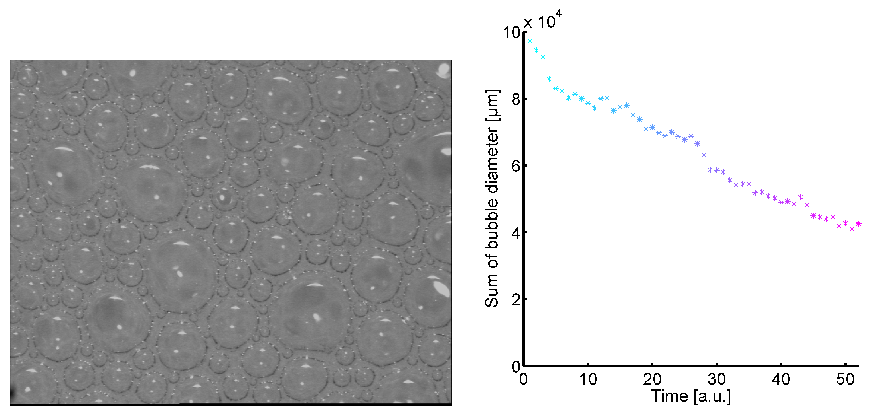
. Such an image is shown on the left in
Figure 2.
Figure 2.
Left: Bubble image. Right: By smoothly varying from cyan to magenta the time development of the sum of the bubble diameters is shown.
Figure 2.
Left: Bubble image. Right: By smoothly varying from cyan to magenta the time development of the sum of the bubble diameters is shown.
Number of bubbles
n and their sizes (diameter)
of 52 images were determined. Then each image is defined by a size vector
. Since the number of bubbles
n decreases in time [
12,
14], the size vectors are defined by
where
n is the maximum number of bubbles given by the first size vector
and subsequent size vectors are are filled with zeros. In other words the number of bubbles is held constant but the loss of bubbles is taken into account by allowing the size zero. Note that the normalization of the individuals introduced by Lorenz (
Section 2.1.) is not applied. Originally, the concept of Lorenz curves were used to compare different populations and their income distributions without dynamics. Hence, the extension of the size vectors with zeros is necessary in order to take into account the loss and the size development of bubbles. Not only the number of bubbles decreases in time but also the sum of diameters
have the tendency to decrease in time. In
Figure 2 (right) the decrease of the sum of the bubble diameters is shown and illustrated by a smooth variation from cyan (
) to magenta (
).
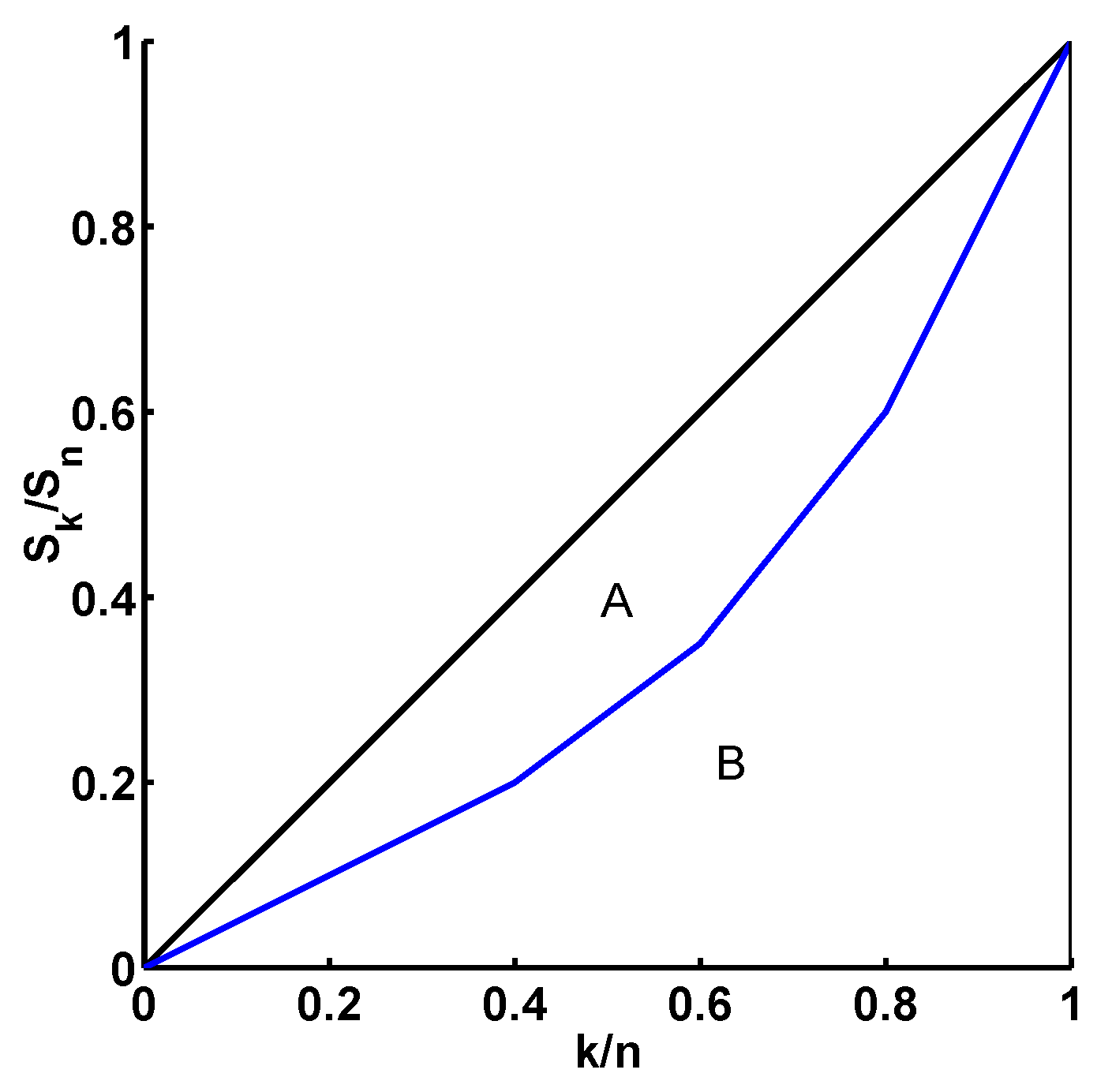
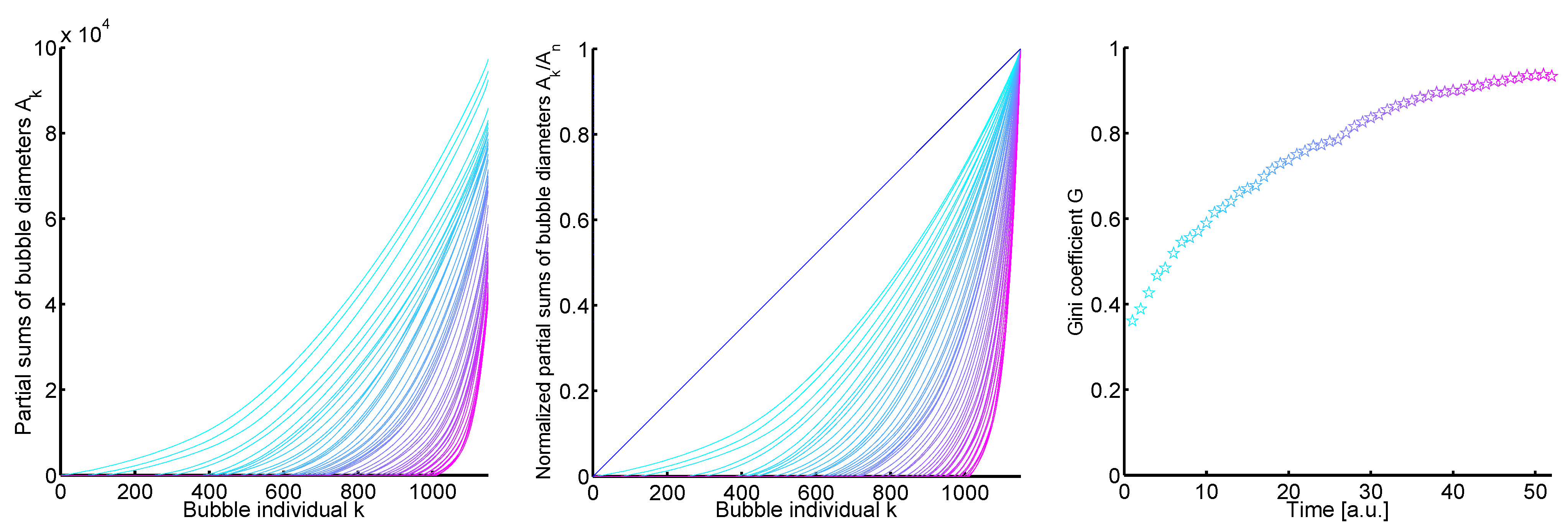
Firstly, the partial sum vectors of the increasingly sorted size vectors
are generated. On the left in
Figure 3 one sees the plot
with
,
, and
. The temporal development of these curves is illustrated again by the smoothly variation from cyan (
) to magenta (
).
By normalizing the partial sum vectors in
Figure 3 (left) the Lorenz curves are obtained. The plot is given by
with
,
, and
, see
Figure 3 (middle). Additionally, a blue line is shown which gives the line of equality.
It seems for both plots in
Figure 3 (left and middle) that each curve at
lies below the curve at
t which would mean that the development of the size vectors corresponds to a process which continuously develops away from equality (demixing process). But there are a few curves which cross. Despite the crossing curves, the temporal development of the Gini coefficient which gives the distance to the line of equality is monotonous, see
Figure 3 (right).
In terms of Lorenz curves and Gini coefficient the temporal development of the bubble sizes can be characterized by a demixing process. It can be expected that the corresponding histograms of the raw data show a similar behaviour. Then the small image size does not enable a process separation to find; in order to prove this a linear scaling concerning the bubble size classes will be introduced in the following. Note that the demixing process of the bubble sizes described by Lorenz curves changes to a mixing process of bubble size histograms where bubble individuals are distributed over size classes.
Figure 3.
Left: The plot of the partial sum vectors of the increasingly sorted size vectors a. The plot is given by where k corresponds to the bubble individuals (), is the partial sum of the bubble diameters, and is set to zero. The temporal development is illustrated by the coloration of the curves from cyan () to magenta (). Middle: The Lorenz curves of the size vectors a. The plot is given by the bubble individuals and the normalized partial sum vectors of the increasingly sorted size vectors a, , with . The coloring gives the temporal development (cyan and magenta ). The line of equality is shown in blue. Right: The temporal development of the Gini coefficient G of the Lorenz curves (plot in the middle). The Gini coefficient increases monotonously in time.
3.2. Linear Scaling
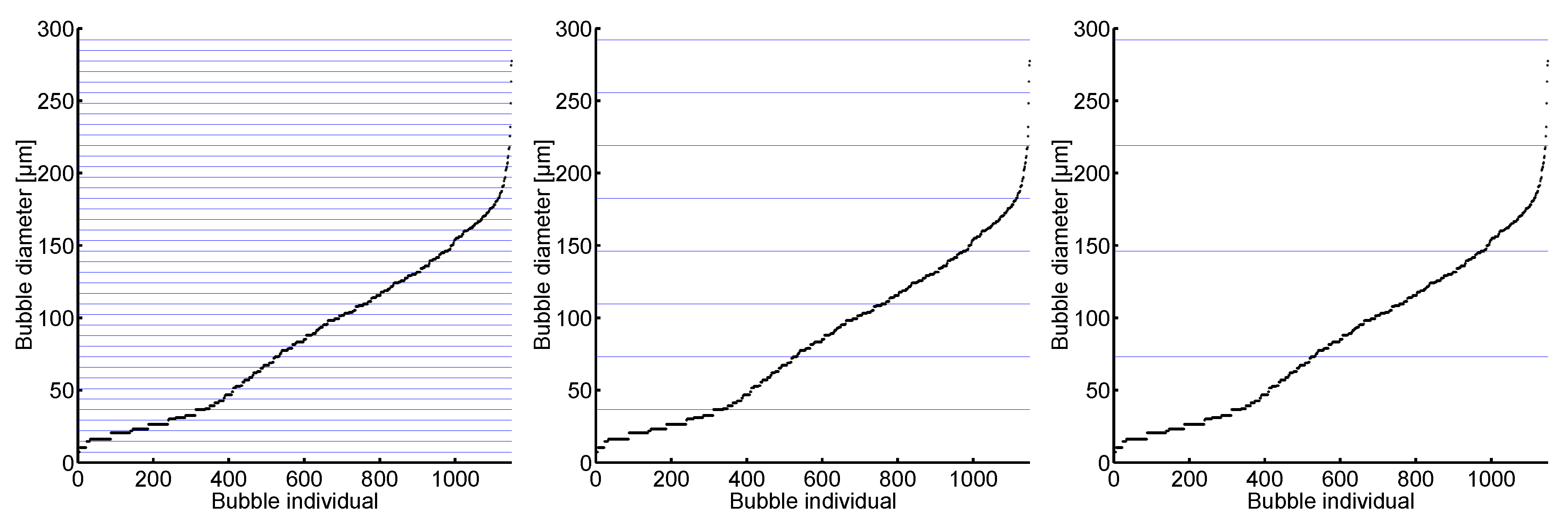
As reference, the initial bubble size vector
with its smallest size,
, is set. Then the classes are defined by the left-open and right-closed intervals
with
, where
j is incremented until all bubble sizes are taken into account. The next step to reduce the number of size classes is to define the classes by multiples of
. Then the classes are defined by the intervals
where
q is the multiplication or scaling factor which is incremented until all bubble sizes are in one class. This procedure can be illustrated by horizontal bars which depend on
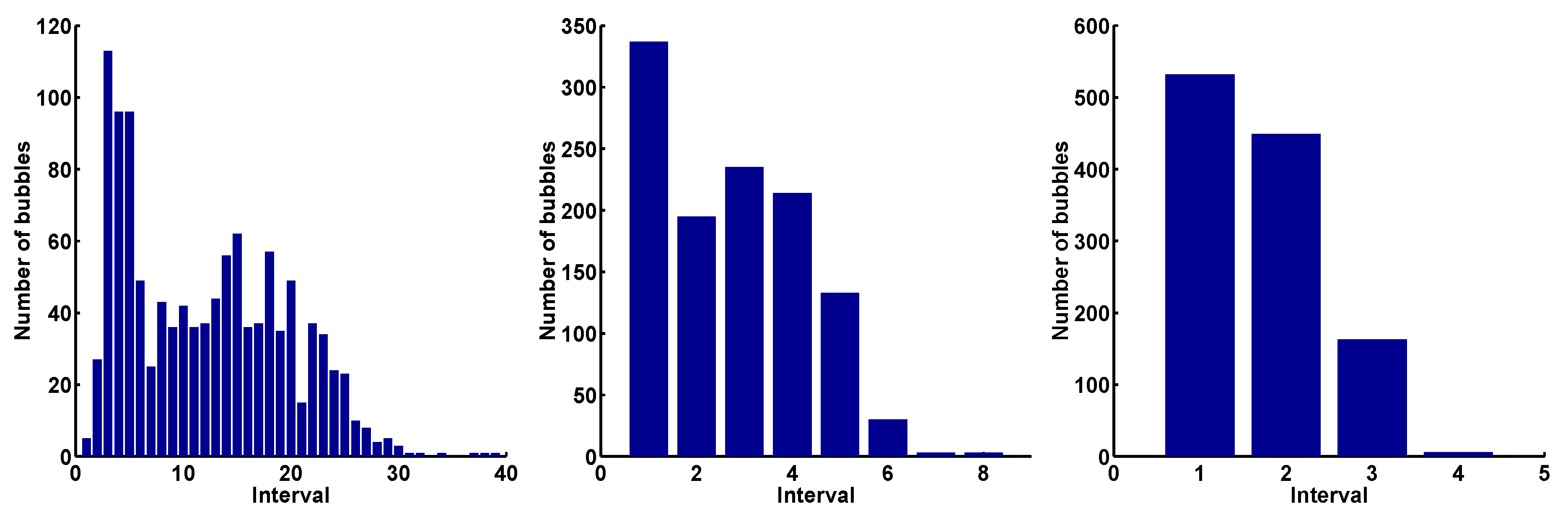
. In
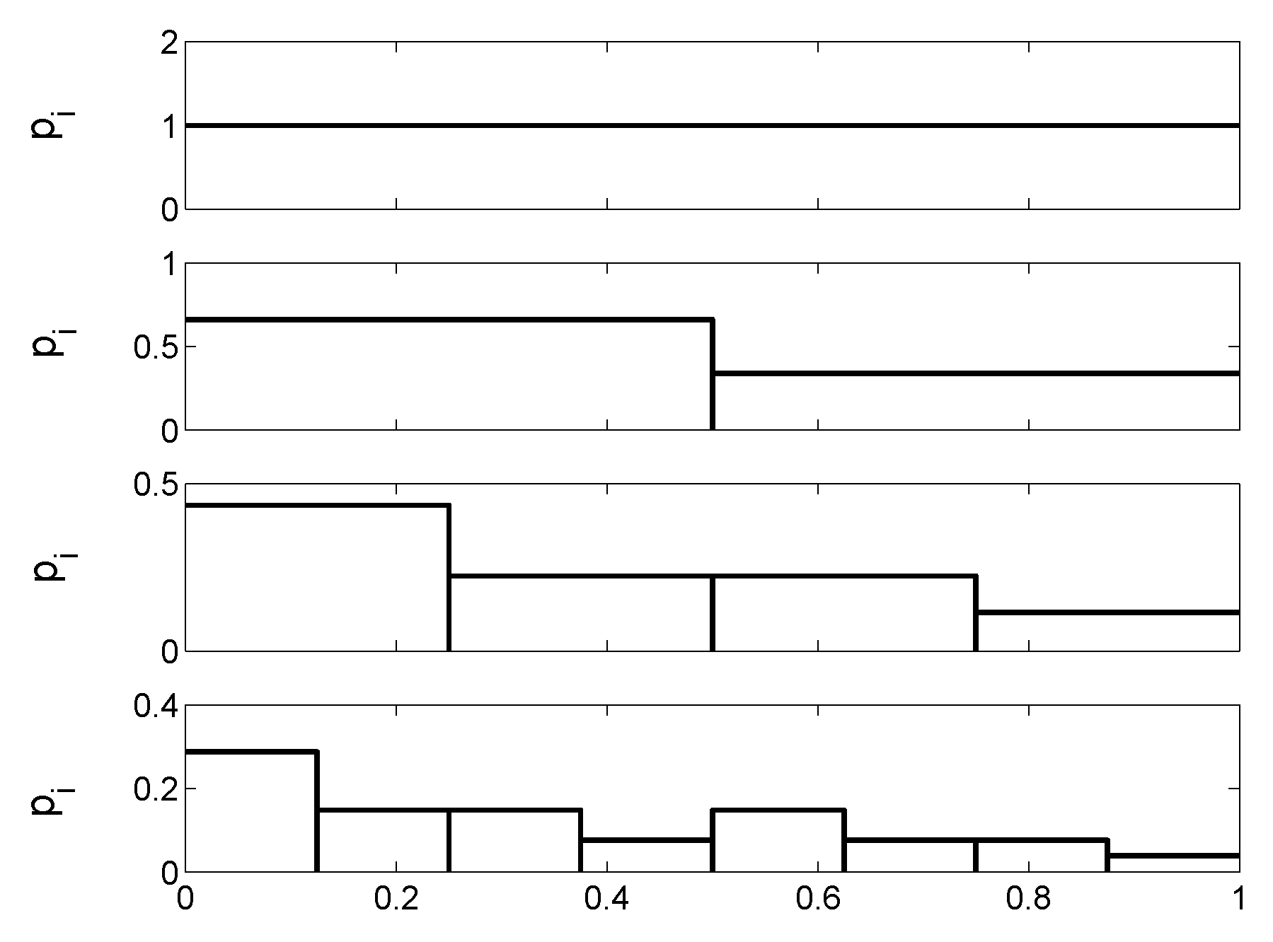
Figure 4 the increasingly sorted bubble sizes of the initial bubble size vector are shown with the size classification
from left to right.
It is easy to see that for
all bubbles of the initial bubble size vector belong to one class. More exactly, the minimum scaling factor of the first distribution in order to assign all sizes to one class is
. The corresponding histograms of the classification in
Figure 4 are given in
Figure 5.
Figure 4.
The increasingly sorted bubble sizes of the initial bubble size vector . On the left the classification is formed by the multiples of with and; in the middle the classification is set by , , and on the right with , .
Figure 4.
The increasingly sorted bubble sizes of the initial bubble size vector . On the left the classification is formed by the multiples of with and; in the middle the classification is set by , , and on the right with , .
Figure 5.
The corresponding histograms of the classification of
Figure 4. Left:
; middle:
; right:
.
Figure 5.
The corresponding histograms of the classification of
Figure 4. Left:
; middle:
; right:
.
The characteristics of the histograms clearly change with increasing q. Particularly, the number of size classes (intervals) and the modality of the distributions are diminished from to . One may expect that there is a great loss of information by reducing the number of size classes which is accompanied by a decreasing modality. Of course, there will be no information, if the size classes are too large such that all sizes of all size vectors fall into one size class. Mapping the normalized histograms onto real values by the Shannon entropy (1) provides information about the underlying process of the temporal development of the histograms depending on q.
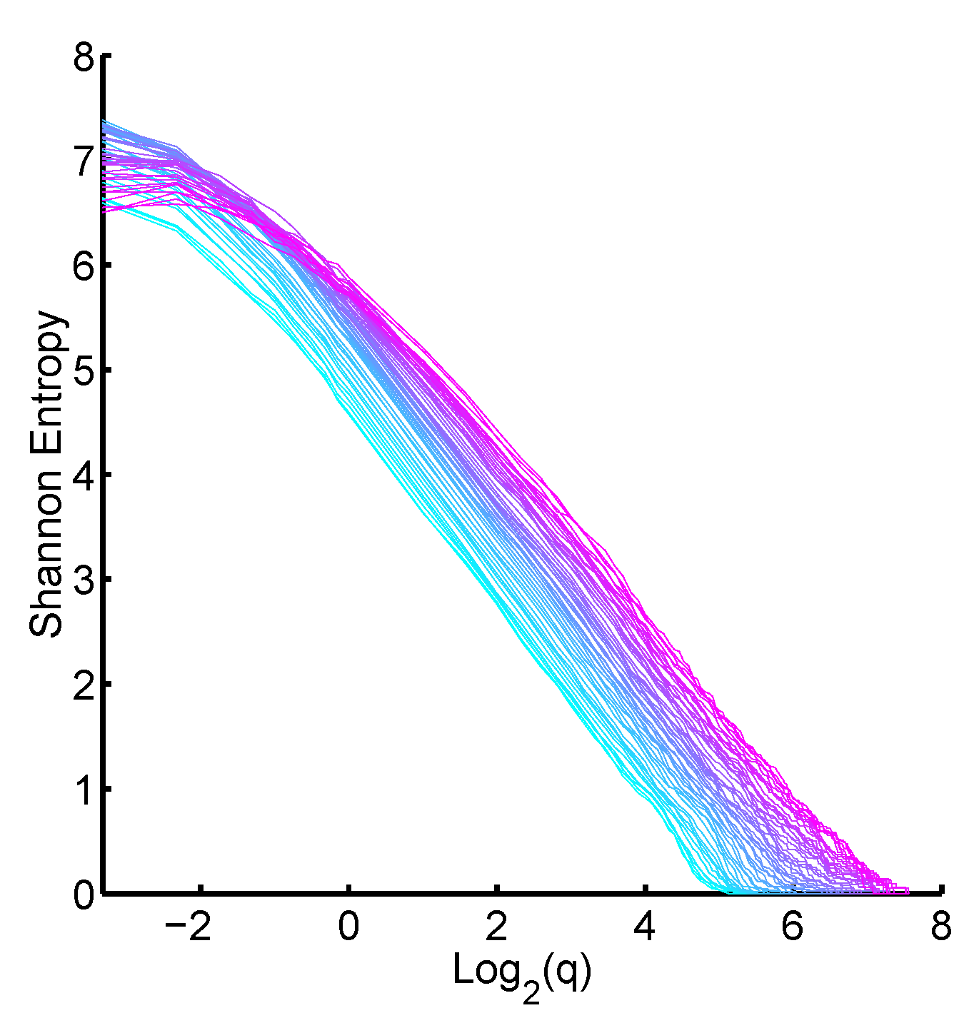
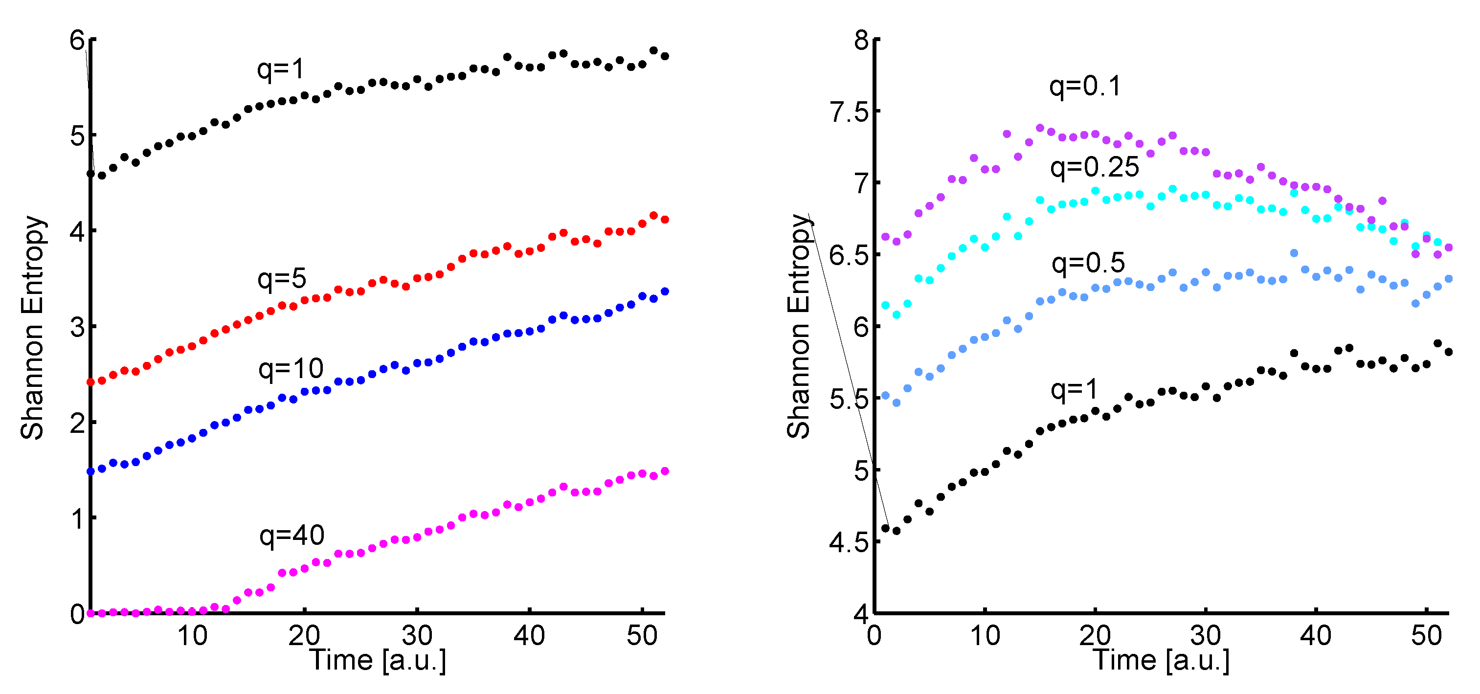
In
Figure 6 (left) the time development of the Shannon entropy values of the histograms for
(black plot),
(red plot),
(blue plot), and
(magenta plot) is shown. The latter is a kind of limit since the size classes become too large and the histograms at the beginning are mapped onto zero by the Shannon entropy (1).
It is very interesting that the basic behaviour is preserved although the histograms are strongly reduced. The Shannon entropy values increase in tendency in time which corresponds to a mixing process. The next step is to use q values which are less than one.
Figure 6.
Left: The temporal development of the Shannon entropy (1) of the histograms for (black plot), (red plot), (blue plot), and (magenta plot). Right: The temporal development of the Shannon entropy (1) of the histograms for (black plot), (light blue plot), (cyan plot), and (mauve plot).
Figure 6.
Left: The temporal development of the Shannon entropy (1) of the histograms for (black plot), (red plot), (blue plot), and (magenta plot). Right: The temporal development of the Shannon entropy (1) of the histograms for (black plot), (light blue plot), (cyan plot), and (mauve plot).
In
Figure 6 (right) the temporal development of the Shannon entropy values of the histograms for
as reference (black plot),
(light blue plot),
(cyan plot), and
(mauve plot) is shown. With decreasing
q the Shannon entropy plot changes considerably. Particularly for
the mixing process becomes a demixing process after 15 time units. But setting
is not recommended, since the corresponding bin width is very small (a tenth of the smallest bubble size of the initial distribution). Hence, there is a further restriction for small
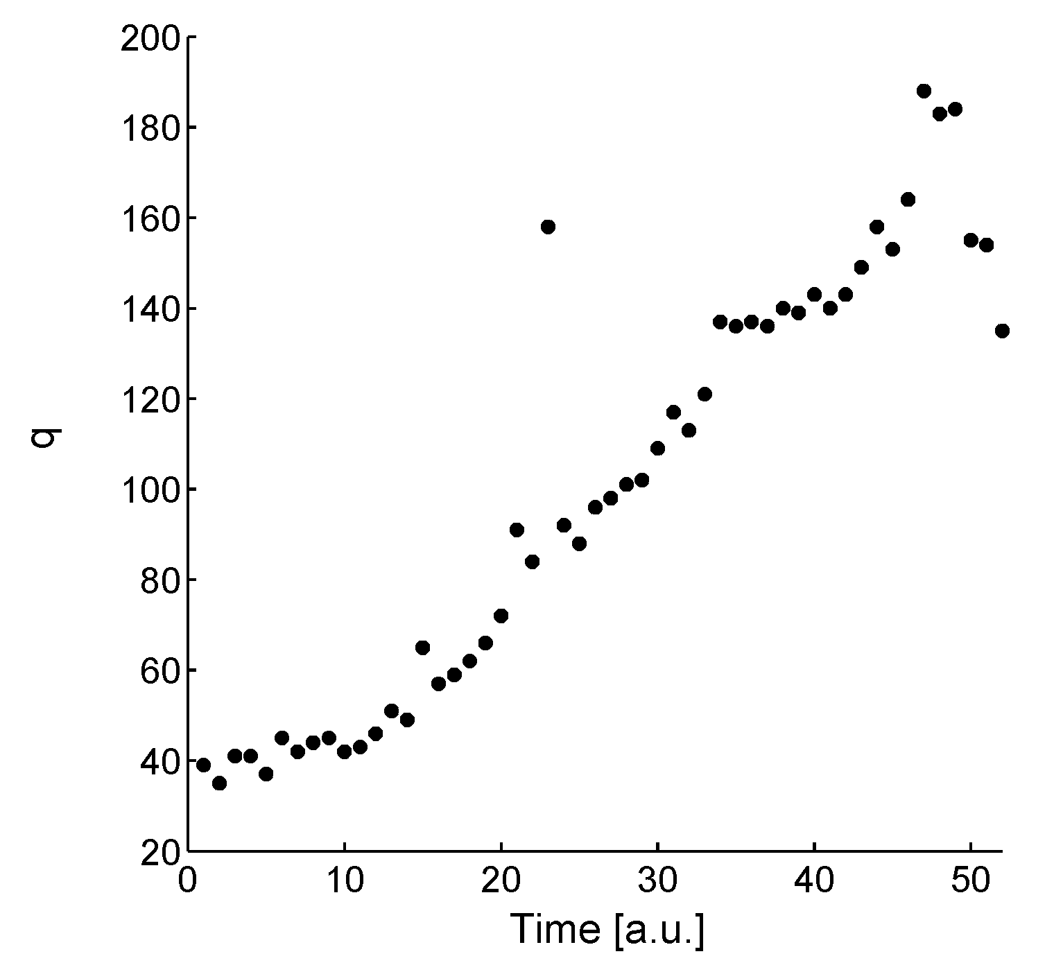
q. The limits of
q can be illustrated by plotting
where
are the relative frequencies of the normalized histograms. The mixing process of the normalized histograms is preserved for a linear behaviour of the plot
or if
, see
Figure 7. The time dependence of the histograms is given by smoothly varying from cyan to magenta.
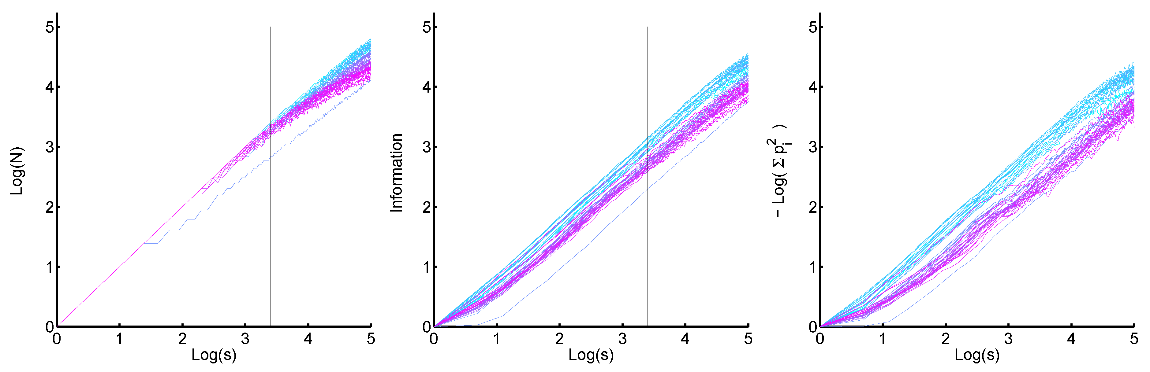
Figure 7.
Development of the Shannon entropy of the histograms depending on the logarithmus dualis of the scaling factor q, . One sees that for a certain section the value of remains constant. The coloration of the plot gives the time dependence as before.
Figure 7.
Development of the Shannon entropy of the histograms depending on the logarithmus dualis of the scaling factor q, . One sees that for a certain section the value of remains constant. The coloration of the plot gives the time dependence as before.
Particularly, for q values between 8 and 16 () the slope for all distributions is approximately the same. These q values are the best selection for the size classification.
As expected the demixing process of Lorenz curves is mapped onto a mixing process of histograms for all size classifications with
. A process separation of drainage and ageing as in [
11] cannot be found, but a region for best size classification is suggested and can be defined by a common slope, see
Figure 7. Consequently, a statistical process separation only occurs for sufficiently large foam images.
