Visual Analysis of a Smart City’s Energy Consumption


1
Electronic Visualization Laboratory, University of Illinois at Chicago, Chicago, IL 60607, USA
2
Complex and Sustainable Urban Networks (CSUN) Laboratory, University of Illinois at Chicago, Chicago, IL 60607, USA
*
Author to whom correspondence should be addressed.
Multimodal Technol. Interact. 2019, 3(2), 30; https://doi.org/10.3390/mti3020030
Submission received: 31 March 2019
/
Revised: 24 April 2019
/
Accepted: 29 April 2019
/
Published: 2 May 2019
(This article belongs to the Special Issue Interactive Visualizations for Sustainability)
Abstract
:Through the use of open data portals, cities, districts and countries are increasingly making available energy consumption data. These data have the potential to inform both policymakers and local communities. At the same time, however, these datasets are large and complicated to analyze. We present the activity-centered-design, from requirements to evaluation, of a web-based visual analysis tool to explore energy consumption in Chicago. The resulting application integrates energy consumption data and census data, making it possible for both amateurs and experts to analyze disaggregated datasets at multiple levels of spatial aggregation and to compare temporal and spatial differences. An evaluation through case studies and qualitative feedback demonstrates that this visual analysis application successfully meets the goals of integrating large, disaggregated urban energy consumption datasets and of supporting analysis by both lay users and experts.
1. Introduction
In the videogame Watch Dogs, one plays a hacktivist who gradually cripples the infrastructure of a futuristic, hyper-connected Chicago [1]. While the game’s fictional world uses sensor and monitoring systems, the real Chicago does not currently run this type of sensing devices. Yet, urban officials and management are keenly interested in collecting, processing, and analyzing relevant data in order to tackle inefficiencies in the city’s energy infrastructure. City officials aside, the local population is equally interested in reducing their carbon footprint: Chicagoans’ use of plastic and paper bags decreased vastly (42% in the first month) after a relatively minor change in the city’s 2017 bag tax policy [2].
At the same time, urban and energy data are becoming freely available through a profusion of open data portals supported by local, regional, and national governments. These datasets have the potential to inform both policymakers and the local communities. What few potential users anticipated, however, is that these datasets are large and complicated to analyze. In particular, the datasets can be highly disaggregated, both spatially and temporally. Traditional statistical techniques fail to capture complex and meaningful patterns present in these datasets [3]. The problem can benefit from visual analysis: using computer graphics techniques to harness the outstanding powers of the human visual system and make possible insights into complex problems. However, while several visual analysis systems exist for specific energy datasets, they generally do not address the challenge of spatial and temporal disaggregation, and they seldom provide explicit data comparison support.
In this article, we describe our joint efforts (visualization researchers and urban energy policy researchers) to provide an easy-to-use platform to visualize urban electricity and gas consumption in a meaningful way. The main contributions of this work are: (1) a description of the current challenges and state of the art in visualizing urban energy; (2) a description of the urban multi-scale data collection and processing for this problem in the city of Chicago; (3) the activity-centered design of a platform for the visual analysis of urban data at multiple spatial scales, in collaboration with domain experts; (4) the implementation of this design in a web-based, scalable-display interactive system (Figure 1); and (5) the evaluation of this approach through several examples and through domain expert and community feedback.
1.1. Electricity and Gas Consumption: Background
In the United States (US) alone, 3.95 million GWh of electricity and 547 million cubic meters of gas (excluding for electricity generation) were consumed in 2018, representing about 50% of the total energy used in the US—the other 50% include coal and petroleum consumption (both for electricity generation and transportation). Moreover, the residential and commercial sectors accounted for 40% of energy use, most of which is being consumed in the form of electricity or gas [4]. Understanding patterns of electricity and gas consumption is therefore paramount.
The data and its potential analysis, however, come with several challenges. Both electricity and gas consumption vary heavily based on land use (i.e., commercial, residential, industrial, etc.) and building occupation and use (i.e., energy use per capita and per unit area). The energy data also spans multiple spatial levels: some urban users will be interested in consumption at the level of a single block, some in census groups, and others in entire neighborhood statistics. Some analyses may involve a temporal dimension, for example seasonal consumption (i.e., summer vs. winter). Many analyses may involve comparing different spatial areas. The analysis environment itself may vary. For example, urban policy users may be interested in discussing and communicating this type of data on large screens in war rooms. Last but not least, the data itself may belong to private companies, and citizens may have their own privacy concerns. This variability of scales and usages makes the collection, processing and analysis of urban energy data particularly difficult.
1.2. Energy Visualization Systems
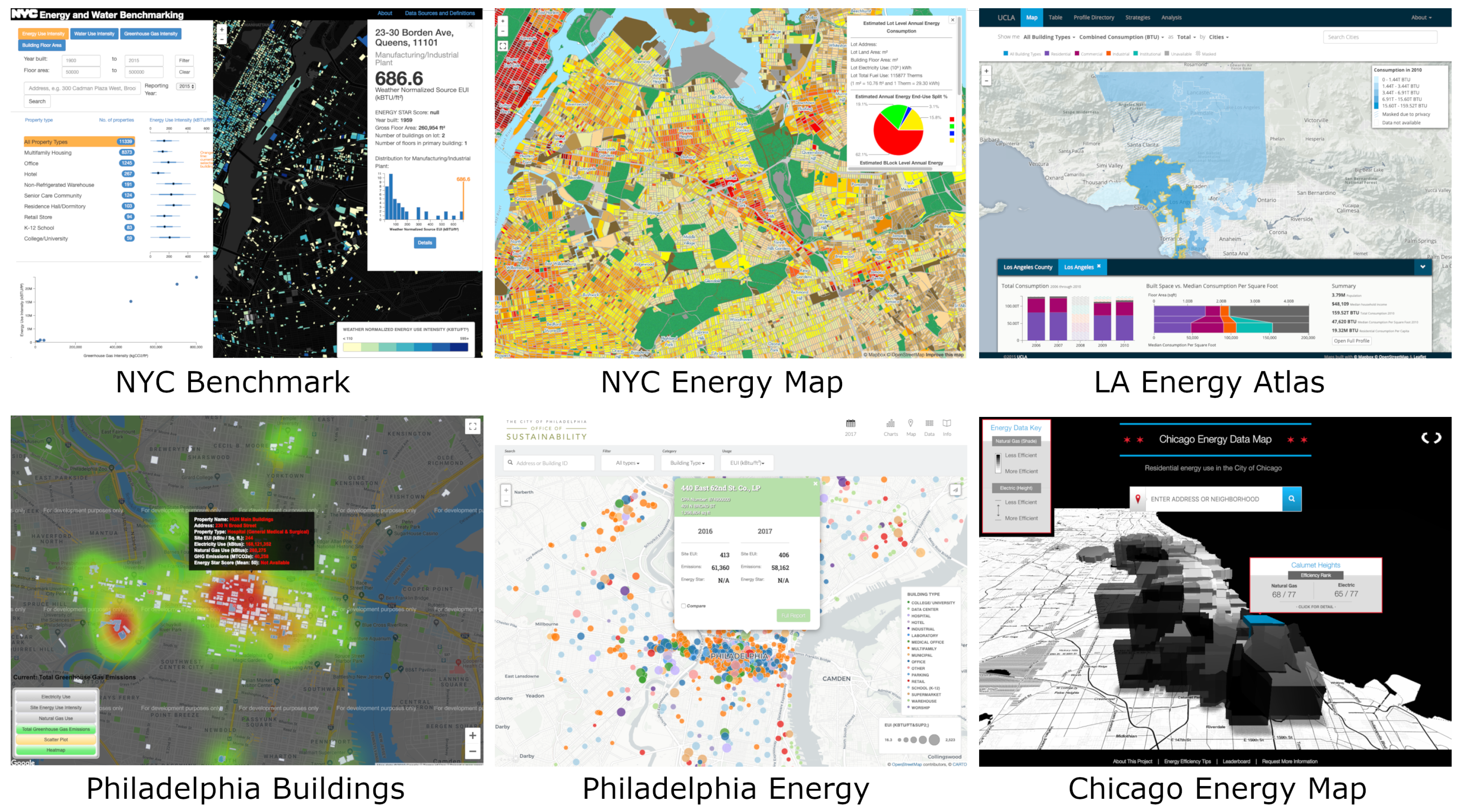
Multiple systems exist for the visual analysis of energy data in the most populated cities in the US (New York City, Los Angeles, Chicago, Philadelphia), and also for countries or states in Europe and Australia. Almost all of these systems encode energy data as spatial overlays over country, city or building maps, and most use additional simple visual encodings such as pie charts and plots (Figure 2); yet there is no combined solution to the multiple challenges outlined earlier, and there is no system that handles the variety and complexity of energy data tackled in this work.
In New York City, the NYC Energy and Water Benchmarking [5] and the NYC Energy and Water Performance Map [6] encode energy-use per-block in the city with color, with additional details on demand, and no support for multiple spatial scales, seasonal analysis or per unit comparison. In Los Angeles, the LA Energy Atlas [7] displays on a map energy consumption across the county by city and neighborhood, as well as by building type, age, type of energy and greenhouse gas emissions. The data can be explored using multiple metrics (total, per sq feet, per capita), and a separate bar chart view supports comparison of multiple areas, although the areas are not user-selected. The system does not support seasonal analysis, outlier detection, or details on demand about user-selected areas. In Chicago, the Energy Data Map [8] is a basic visualization that shows residential gas and electricity consumption, with consumption mapped to the height of each community area in 3D, respectively to 2D grayscale at the block level. While users can view basic consumption details at these two scales, community area and census block, there is no support for comparing different areas, outlier detection, population statistics, seasonal consumption, building type analysis etc. In Philadelphia, the Building Energy Benchmarking [9] encodes energy consumption at the building level through color and size-coded markers over a map, and supports outlier detection through a scatterplot. A second system, the Energy Consumption Map [10] adds comparison capabilities, although in a separate tab, and details on demand. Neither system supports multiple spatial scales, population statistics, building type analysis, or seasonal consumption. All the urban energy visualization systems discussed in this section use recorded snapshots of data, not real-time measurements.
Beyond urban visualization, energy visualization systems exist at higher spatial scales in both Europe and Australia. In Europe, the Electricity Map project [11] encodes on a colored map the CO emitted while producing electricity in different countries. Details on demand show the energy source in each country, and timelines encode the carbon intensity over the last 24 h. In Australia, the Australian Energy Market Operator [12] overlays on a map the electricity infrastructure as color lines, along with consumption data such as demand forecasts and historical information. None of these systems support multiple spatial scales, population statistics, seasonal or building type analysis, or comparison of user-selected units.
Because almost all these energy visualization systems exist only online, with no other documentation, it is difficult to infer the visualization design process and principles that were followed in the development of these tools. For example, one common trait arising from these designs appears to be an assumed low level of visual literacy among their target audience.
The wider visualization literature reports on general exploratory visualization techniques for spatio-temporal data [13]. We use several of these techniques, in particular querying (lookup and filtering), time series graphs, and aggregation of attribute values, in the context of our problem. An overview of urban analytics [14] further surveys the data types and visualization techniques common in urban computing problems, including energy consumption data, although it does not explicitly discuss census data. In terms of energy visualization design, Goodwin et al. [15] describe the user-centered design of an analysis tool that was commissioned by a small set of domain experts; their tool aimed to visualize data from smart meters in several households. In contrast, our project follows an Activity-Centered-Design paradigm, aims to serve a broader audience, and integrates spatial, temporal, and census data.
2. Materials and Methods
Our design process followed an Activity-Centered-Design paradigm for visualization [16], which is an extension of the classic Human Centered Design paradigm in visualization design. The approach places particular emphasis on functional specifications and on user workflows. We adopted this approach because of its documented higher rate of success in interdisciplinary project settings. We implemented this paradigm through an iterative process where the research team met regularly with potential and actual stakeholders to confirm requirements and functional specifications, explore prototypes, refine the design, and verify that evolving requirements were being satisfied.
2.1. Requirements and Workflows
The first stage of design, requirement engineering, started with several face-to-face semi-structured interviews with two energy researchers. Because Activity-Centered-Design [16] focuses on activities, not the individual person, no personal data was collected from the energy researchers. The interviews established: who the potential users of the visualization would be (energy researchers and policymakers; with the clear objective or reaching the broader population); a prioritized list of the main analysis tasks and workflows; the data sources and flow of data through the process; and non-functional requirements such as web-access and support for large displays.
Together with the energy researchers, we identified the background challenges to energy analysis, as highlighted in the earlier sections: (1) data disaggregation; (2) multiple spatial scales; (3) seasonal analysis; (4) explicit support for comparison using multiple metrics; (5) including census-based population statistics; (6) support for outlier detection at multiple scales; (7) details on demand. While some of the resulting requirements have been previously discussed in the literature in the context of urban analytics [14] (e.g., spatiotemporal outlier and trend detection on maps), others have not been previously featured; in particular the explicit support for comparison at multiple scales, and the role of census-based population statistics in the analysis. We further discussed with the domain experts the role of web-based visualization and the low level of visual literacy among both energy analysts and the wider population.
We analyzed the requirements resulting from the interviews along the Activity-Centered-Design components of tasks, usage, data, flow, and nonfunctional requirements [16]. The data requirements are described in detail in the following section. We wrote the resulting functional specifications as scenarios [16]. A first set of scenarios was centered around policymakers and energy researcher characters. To improve engagement with the wider population, a second set of scenarios was centered around a fictional teenager, his friends who lived in other neighborhoods, along with their privacy concerns, and the teenager’s parent.
We had the domain experts and a group of lay colleagues (representatives of the amateur, wider population) repeatedly read, comment and approve the resulting set of scenarios. This process helped us understand the desired functionality of the visual analysis module, formalize it in a written document, and reach agreement with the domain experts regarding what the system will do and also what it will not do (e.g., ‘The system will not run on other browsers than Chrome and Safari’ and ‘The system will not be targeted to smartphone usage’).
As a result of this process, two main analysis workflows emerged. The first workflow corresponds to a city official, manager, or energy researcher persona (the domain expert persona). This workflow (‘Overview and Outlier Detection’) starts by looking at the energy landscape as a whole, identifying outliers at multiple scales, then proceeding to analysis as in the second workflow described below. The second workflow corresponds to a local citizen persona, as well as a local advocate persona (the wider population). This workflow (‘Search’) starts by interactively selecting an area of interest, then proceeding to the analysis of details, comparison against a related unit or against global behavior, and/or seasonal and building analysis, in a process of hypothesis generation and fact-finding. Our subsequent visualization design explicitly supports these two workflows.
2.2. Data Aggregation
This project builds on the open-access Chicago Energy Usage dataset, the result of a collaborative effort between the City of Chicago, the Civic Consulting Alliance, Datascope Analytics and IDEO, with support from Accenture, Elevate Energy, the Citizens Utility Board, ComEd and People’s Gas [17]. This publicly accessible dataset contains information for 88% of the buildings of Chicago; a 68% of the overall electricity consumption and 81% of gas consumption; no data is provided for those buildings whose energy was not supplied by the earlier listed companies. As with all the urban energy visualization systems surveyed earlier, the portal dataset is a pre-recorded dataset, not real-time data; this aspect is due to the lengthy and difficult process of data collection and transfer from the energy companies to the city management.
Each observation in this dataset (i.e., accounts for ComEd and People’s Natural Gas) was collected and tagged at the US Census block level. A census-block spatial scale corresponds to fewer than 4 accounts at a local neighborhood (i.e., ‘Community Area’) larger spatial scale. In addition, each observation includes additional basic details such as population, physical building information, primary building use (i.e., residential, commercial, industrial etc.), and occupancy.
To enable analysis at multiple spatial scales in the context of population statistics, we process and augment this dataset to obtain detailed geographical census identifiers. To this end, we geographically aggregated all the observations in the dataset into Census Tracts and Community Areas (neighborhoods), a process that we mainly performed through ArcGIS software with additional map matching procedures. We obtained the geographical census data in GeoJSON format from the Boundaries—Community Areas dataset, the Boundaries—Census Tracts dataset, and the Boundaries—Census Blocks dataset in the same Chicago Data Portal. We cross-referenced the census data with the energy data timestamp.
The aggregated dataset for energy consumption analysis includes: (1) spatial information of the community areas; (2) census tracts and census blocks provided in GeoJSON format; (3) an id of the aggregation level; (4) an id for the target area; (5) the monthly use of electricity (in kWh) and gas (in thm); (6) the total consumption in a year; (7) consumption per square feet and per capita. Additional census data include (8) the population per area; (9) the number of units; and (10) the number of occupied units. We also augmented the dataset with (11) information about the distribution of buildings per community areas, based on the following taxonomy: residential, commercial, office, recreational, medical, educational, government/public, industrial, green, vacant, water, and utilities. We store the aggregated data (categorical, quantitative, temporal) in a MongoDB database. Handling these spatiotemporal data at multiple scales adds complexity to the visual design.
2.3. Visual Encodings and Interaction Design
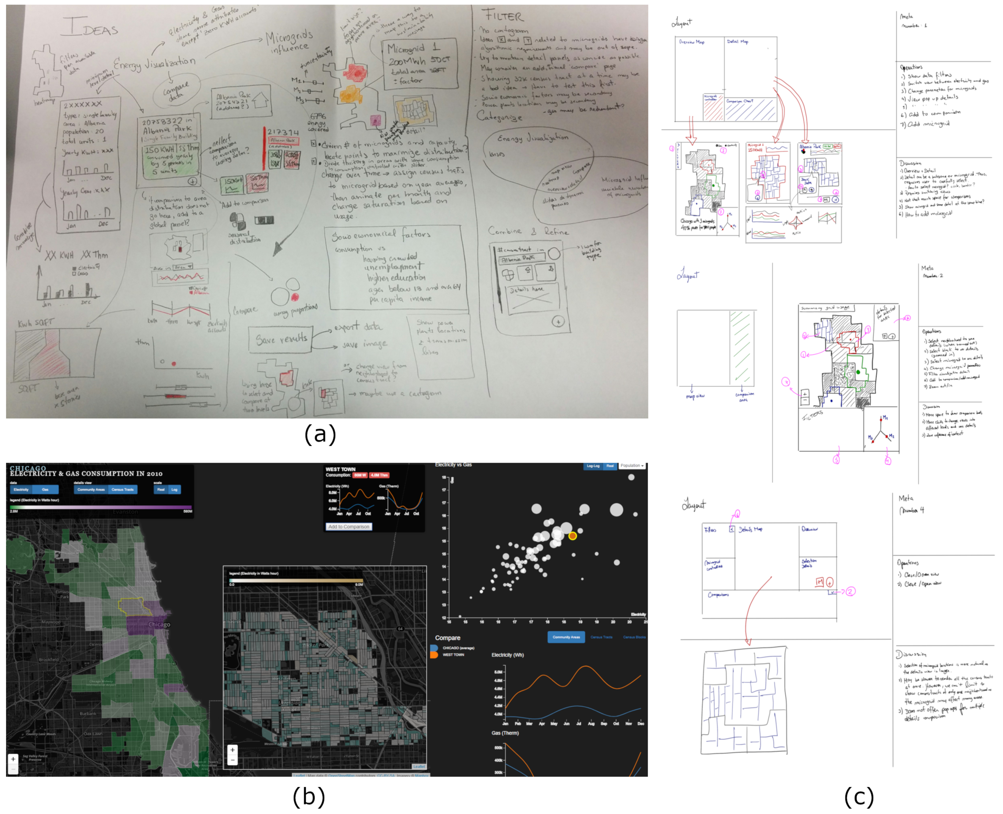
In accordance to the Activity-Centered paradigm, our top-level design builds on the workflows and previously identified requirements. A series of low-fidelity prototypes were sketched on paper and later in software to illustrate how individual features could be incorporated into an overall design, what workflows could be performed and what interactions could be incorporated. We followed a parallel prototyping approach [18], which has been shown to lead to better design results. In this approach, multiple prototypes were presented to the energy researchers and potential lay users. We discussed multiple versions, combinations and permutations of these low-fidelity prototypes with the group, and incorporated their feedback and suggestions in successive iterations (Figure 3).
To better support the different workflow designs identified earlier, our final top-level design comprises multiple linked-views and side-by-side comparisons. A central map-based explorer, a top detail bar, a building-type and yearly statistics side-panel, a scatterplot and a comparison panel (Figure 1) connect the geographical location of a region of interest with an overview of regional performance and outlier and usage-pattern detection. A filter bar further allows users to select the attributes and metrics to visualize for the areas selected. The specific visual encodings were selected from a relatively large design space that included, among others, Kiviat diagrams, parallel coordinate plots, overlays and stacked graphs. The resulting encodings were selected based on their expressive power, balanced against the test users’ visual literacy and feedback. We describe below briefly each main panel.
2.3.1. Map and Community Explorer
The central component of the visualization shows a context + detail map explorer and serves as an entry point for the ‘Search’ workflows. A small map highlights the selected community in the context of the city layout, and the detail map shows smaller spatial scales for the region selected: either census tract or census block data. We use a divergent color scale to encode the energy consumption per region. We allow using both a normal and a log scale for the value range, because some areas consume considerably more energy than others. The range is recomputed each time a new area or spatial scale is selected, in order to allow detection of variation at multiple spatial scales.
A top explorer bar serves as a heading for the visualization and shows the community details for the currently selected neighborhood. Underneath, a word cloud shows the distribution and types of buildings in that community; most frequent types of structures have bigger fonts (Figure 4a). Further below are aggregated consumption and distribution charts for that community. Two line-charts show the temporal/seasonal monthly consumption behavior per energy type; the user can hover over the line to see the amount of energy consumed in each month. Underneath the line charts, a histogram shows the energy consumption per energy type. A red vertical line allows comparing the yearly use of the selected community area against the other 76 communities in the city of Chicago.
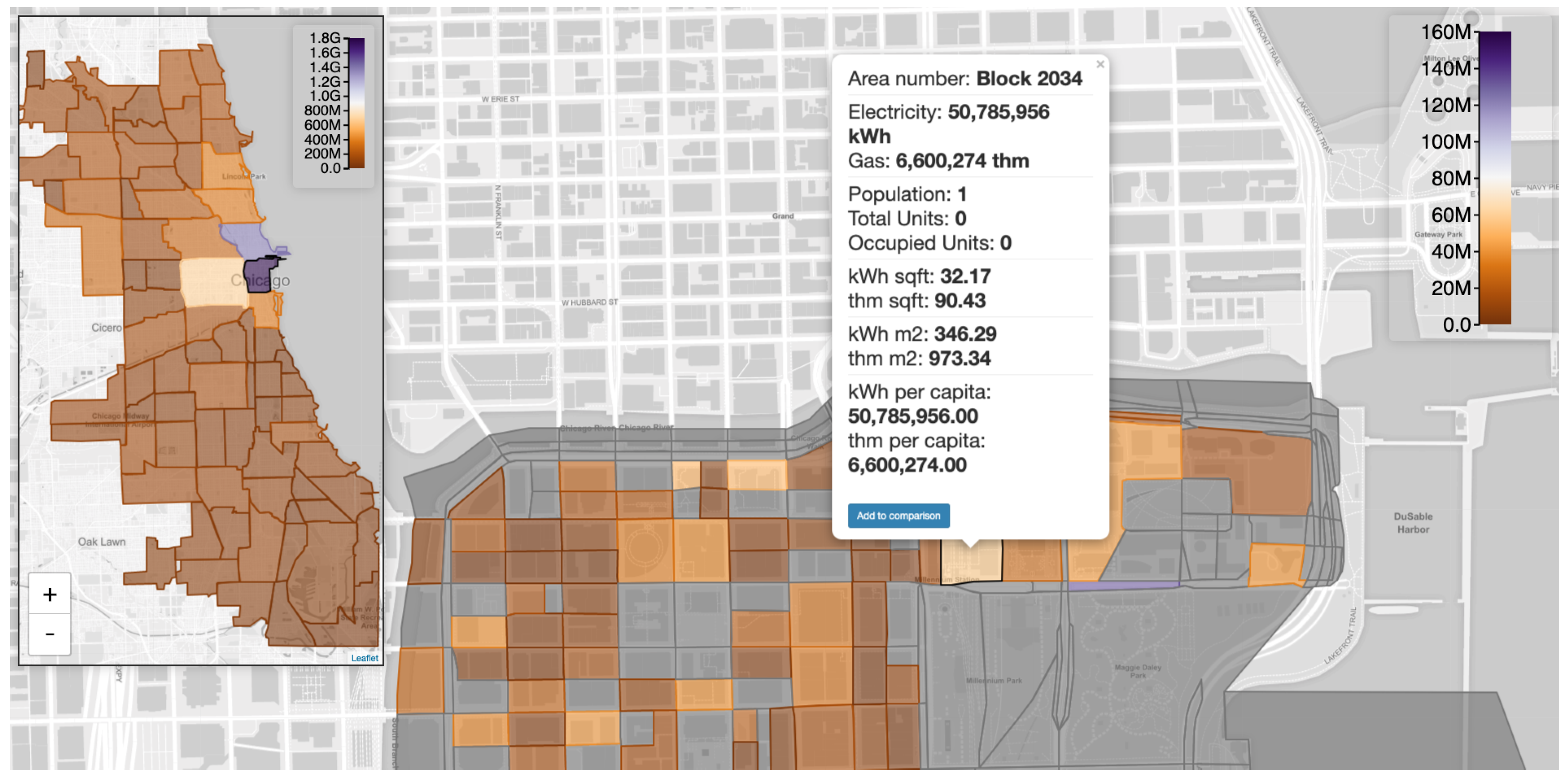
Selecting a specific area in the detail map provides further details on demand (Figure 5), and also allows adding that area to a comparison chart, described below.
2.3.2. Scatterplot and Comparison Chart
The scatterplot panel supports the second type of workflows, which is based on the overall data and not on a specific location. The scatterplot also supports outlier detection and can be explored at different levels of aggregation. The user can select a variable for each axis of the scatterplot, as well as the quantity encoded by the marker size (Figure 4b). As in the spatial map, the user can inspect data in logarithmic or real scale. We use opacity to reduce occlusion between adjacent elements.
To support comparison subworkflows, the panel also shows a list of selected areas and a set of charts (Figure 4c). The list is ordered by level of aggregation of the selected areas. For census tracts and census blocks, we named the item by concatenating the name of the community and the area number; the complete name of the area is shown when hovering over the list item. Selected areas can be removed interactively. The line charts show the comparison for a selected level of aggregation at a time, and the header of that aggregation level is highlighted in the list. The line colors correspond to the color used in the list, and on hovering, we display the consumption details for the month, to better support seasonal analysis. The map panel and the scatterplot panel are interlinked.
We built this open source, web-based project using a MongoDB database and a NodeJS server. We also used the following Javascript libraries: D3, Leaflet, JQuery and Knockout for the front-end. Because the system runs in a browser, it can be effectively used on a variety of displays, from regular laptop and desktop screens to larger-scale tiled displays in war rooms using the SAGE2 middleware [19].
3. Results
Because of the exploratory visualization nature of the project, and in concordance with activity-centered design, which emphasizes “why” and “how” questions over “how much/many” questions, we used a qualitative evaluation methodology to analyze the user activities on a homogeneous sample of participants who share key characteristics [20]. As in this work, qualitative data often are about the function of a tool or system, and they aim for sometimes rich descriptions of complex ideas or processes, albeit typically across a limited number of individuals or settings. This approach stands in contrast to quantitative methods, which explore variables that can be captured or represented in numerical form, often across large samples and/or multiple points in time. In our case, the choice of a qualitative scheme was furthermore strongly supported by two factors [21]: (1) the nature of the energy project, which emphasizes exploring a new area of inquiry and generating hypotheses, without established measurements or known facts; (2) the general goal of generating information about how a lay audience understands, thinks about, and makes sense of the energy data, with no emphasis on the user background beyond an assumption of low visual literacy. Conversely, these are equally strong arguments against a quantitative evaluation.
Sample size in qualitative research is not judged by the same criteria as it is in quantitative research because statistical power is not the goal [21]. Because this project explores a narrow phenomenon in depth (an analyst’s process of making sense of energy data), we evaluated this smart city energy explorer through multiple demonstrations. The demonstrations involved stakeholders with different and sometimes overlapping roles: energy researchers, public policy advocates, state officials, city officials and managers, data analysts, and regular citizens. The demonstrations took various forms, from designer-driven demos to novice-driven exploratory analyses and to expert-driven in-depth sessions. These demonstrations were conducted on a variety of display sizes (Figure 6), and involved more than ten groups, ranging in size from two domain experts to twelve citizens, in sessions ranging from ten minutes to one hour. Along activity-centered principles, we evaluate the system’s novel functionality through activity observation with minimal task guidance (e.g., ‘Do you notice anything unusual?’). We report naive and expert analyst feedback and an in-depth case study performed by energy researchers and policy advocates.
Observation of the system usage showed that the visual analysis tool successfully met the original requirements in terms of user workflows. Without exception, policy advocates and citizens started their exploration by locating the neighborhood they were interested in, then delving into further seasonal exploration and comparison tasks. In contrast, state and city officials and energy researchers started their exploration with the overview analysis and outlier detection; although Chicagoan stakeholders in this category sometimes continued to local analyses of their workplace neighborhood. In one instance, state officials zeroed on a surprising high outlier that turned out to be a federal building downtown Chicago. In another instance, energy researchers noticed an unusual high-consumption block that featured a single person population and zero occupancy (Figure 5). The feedback from this large and diverse number of users has been uniformly enthusiastic (‘Great stuff’, ‘Can I use this for my hometown?’, ‘Where can I get the source code?’, ‘Can I pass this on to my criminology class?’, ‘Great visualization and I am happy to have been part of it’, ‘Clever visualization’, ‘May we use this at the urban planning center?’, ‘May we show this to ComEd?’, ‘May our clients use this in a dispute with their landlord?’ etc.). We report below one of the in-depth analyses conducted by a small group of public policy advocates.
Case Study
This case study involves a group of three advocates for social good and two energy researchers. The group performed an analysis of energy consumption in a particular disadvantaged neighborhood of Chicago, with which the advocates were closely familiar. The group’s analysis started by selecting the neighborhood in the overview map (Figure 7). They noted that the building word cloud confirmed something they had already known—this mostly residential neighborhood featured a high concentration of vacant (abandoned) lots, and there were also recreational areas associated with local parks. The exploratory panel data was also in agreement with other known facts: the overall consumption was relatively low compared to downtown areas in terms of electricity, and similar to other areas in terms of gas; gas consumption was higher in the winter, due to the use of gas heating in homes; electricity consumption spiked in the summer, possibly due to the use of air conditioning. Surprisingly, electricity consumption had been lowest in January, and highest in December. The group did not agree on a single possible explanation for this observation.
The group then switched to the census block spatial aggregate in the detail map. As shown in Figure 7, one block stood out in terms of electricity consumption, when compared to other blocks within that region. The regional outlier was confirmed by the details on demand. The group agreed that the low January consumption could not have contributed to the block’s status as an outlier, and so continued their analysis. The advocates tested several electricity metrics, seeking to find a correlation between either population, occupied units, or square footage and this unusual distribution, but nothing stood out. The scatterplot also confirmed the outlier status of the block, at both logarithmic and real scale, and further indicated the outlier was not due to missing data elsewhere in the neighborhood. One group member did a quick numerical comparison with their own home’s consumption over the previous year, and was shocked by how large this block’s consumption was.
Since the group was familiar with the location of the block and with the buildings located on it, they next selected a similar adjacent block, with similar construction and occupancy, and proceeded to compare the two (Figure 7 right). A group member noted, in the timeline chart, the mid-summer spike in gas consumption for the outlier block; the spike remains unexplained to date. Despite similar statistics (outlier block: Electricity: 7,435,418 kWh; Population: 102; Total Units: 81; Occupied Units: 78; nearby comparison block: Electricity: 193,120 kWh; Population: 207; Total Units: 84; Occupied Units: 78), the seasonal consumption of the two blocks, as captured by the comparison charts, was strikingly different—in terms of both electricity and gas. The group hypothesized that the outlier block may have either had outdated or in-need-of-repair insulation, or unusual energy end-uses. A demonstration several months later to another group of public policy advocates confirmed the atypical energy end-use: a less known local hospital was identified on that block. The group is currently working with the local organizations and the local residents to improve the situation. This case study proves the utility of this energy visualization project and its potential impact on public policy in the city.
4. Discussion and Conclusions
The primary contribution of this work is a visual analysis system that allows experts as well as amateurs to analyze gas and energy consumption in Chicago. The secondary contribution is to provide other designers with a clear process on how to potentially approach similar problems in other smart city applications.
Notably, while many design studies in the literature describe user-centric processes used to create visualizations for one to a few domain experts, this project documents an activity-centered-design process that successfully serves not only the domain experts, but also a broader audience. In particular, following an Activity-Centered approach allowed us focus on and rapidly identify user activities and analysis workflows (e.g., explicit support for comparison tasks, independent of the user backgrounds and personal characteristics). A two-way communication process with the users, through functional specifications, further enabled us to more precisely model the desired functionality of the analysis system. A parallel prototyping approach paved the way to a system that can serve a wide audience: several visual encodings (including parallel coordinate plots and stacked graphs) were attempted and discarded due to the audience’s low visual literacy. The activity focus further determined the final layout and relative size of the multiple views; for example, the emphasis on the ‘Search’ flow lead to a design shift from a large overview map to a miniature overview (Figure 7).
As shown by evaluation with end users, this urban energy visualization project successfully meets its original goals. Our systematic approach to data aggregation at multiple spatial scales created an enriched urban energy dataset. A subsequent design approach centered on the user workflows helped us create a visual analysis tool that can handle the complexities, challenges, and opportunities of this dataset: analysis across multiple spatial scales, support for outlier detection, multiple metrics that can account for population statistics, building-type analysis, direct comparison of user-selected areas, and seasonal consumption analysis.
In terms of assumptions and limitations, our approach does not provide information at the building level, due to privacy concerns; the data is aggregated at the block level. Furthermore, data is not available for every block, reflecting limitations in data collection: not all energy providers provided data for their users. However, the data shown comprises 81% of the city gas consumption and 68% of electrical usage. The data itself was collected in 2010, in an illustration of how difficult it is to coordinate such efforts across energy providers at the city level. Last but not least, while the levels of aggregation demonstrated in this project are typical of US cities, our approach may not readily generalize to cities in other countries. In terms of future work, it would be interesting to integrate population data related to education, income, and other socioeconomic indicators.
The resulting web-based system serves the needs of a diverse set of stakeholders, from city officials to concerned citizens. By documenting the challenges, the design process and the decisions behind this smart city project, we hope to help inform the design and implementation of analysis systems for other cities and for other resource and infrastructure types.
The open-source project resulting from this work is publicly available at: Available online: http://chicagoenergy.evl.uic.edu:3000.
Author Contributions
Conceptualization, J.T.T., S.D. and G.E.M.; Data curation, J.T.T. and D.L.; Formal analysis, J.T.T.; Funding acquisition, G.E.M.; Investigation, J.T.T. and G.E.M.; Methodology, S.D. and G.E.M.; Project administration, G.E.M.; Resources, J.T.T. and D.L.; Software, J.T.T. and D.L.; Supervision, S.D. and G.E.M.; Validation, J.T.T., D.L., S.D. and G.E.M.; Visualization, J.T.T. and G.E.M.; Writing—original draft, J.T.T. and G.E.M.; Writing—review & editing, J.T.T., D.L., S.D. and G.E.M.
Funding
This research was partially funded by the US National Science Foundation award CNS-1625941.
Acknowledgments
We gratefully acknowledge the Electronic Visualization Laboratory faculty, students, staff, collaborators and visitors for their enthusiastic help in testing and evaluating this work. Finally, we acknowledge and are grateful to the developers who authored the open-source components on which this project is built for their contributions to the open source community.
Conflicts of Interest
The authors declare no conflict of interest. The funders had no role in the design of the study; in the collection, analyses, or interpretation of data; in the writing of the manuscript, or in the decision to publish the results.
References
- Thibodeaux, T. Smart Cities Are Going to Be a Security Nightmare. 2017. Available online: https://hbr.org/2017/04/smart-cities-are-going-to-be-a-security-nightmare (accessed on 10 November 2018).
- Cherone, H. Huge Drop In Bag Use Due To Bag Tax Could Cost City Millions, Study Finds. 2017. Available online: http://www.webcitation.org/779I5BBBM (accessed on 25 March 2019).
- Lee, D.; Derrible, S.; Pereira, F.C. Comparison of four types of artificial neural network and a multinomial logit model for travel mode choice modeling. Transp. Res. Rec. 2018. [Google Scholar] [CrossRef]
- U.S. Energy Information Administration. Total Energy. Available online: http://www.webcitation.org/77r6Gaklk (accessed on 23 April 2019).
- Kontokosta, C.; Tull, C.; Marulli, D.; Pingerra, R.; Yaqub, M. Web-Based Visualization and Prediction of Urban Energy Use from Building Benchmarking Data. In Proceedings of the Bloomberg Data for Good Exchange, New York, NY, USA, 28 September 2015. [Google Scholar]
- Howard, B.; Parshall, L.; Thompson, J.; Hammer, S.; Dickinson, J.; Modi, V. Spatial distribution of urban building energy consumption by end use. Energy Build. 2012, 45, 141–151. [Google Scholar] [CrossRef]
- Pincetl, S.; Graham, R.; Murphy, S.; Sivaraman, D. Analysis of High-Resolution Utility Data for Understanding Energy Use in Urban Systems: The Case of Los Angeles, California. J. Ind. Ecol. 2016, 20, 166–178. [Google Scholar] [CrossRef]
- City of Chicago. Chicago Energy City Map. Available online: http://www.webcitation.org/77A8Wn3jZ (accessed on 26 March 2019).
- Kelder, K. Visualizing Energy Consumption in Philadelphia. 2014. Available online: http://www.webcitation.org/77A9pCPWW (accessed on 26 March 2019).
- City of Philadelphia, Office of Sustainability. 2018 Building Energy Benchmarking. 2018. Available online: http://www.webcitation.org/77AA1eaNi (accessed on 26 March 2019).
- Tomorrow. Electricity Map. Available online: http://www.webcitation.org/77AA8rYfi (accessed on 26 March 2019).
- Australian Energy Market Operator. AEMO Map. Available online: http://www.webcitation.org/77AAH9TZF (accessed on 26 March 2019).
- Andrienko, N.; Andrienko, G.; Gatalsky, P. Exploratory spatio-temporal visualization: An analytical review. J. Vis. Lang. Comput. 2003, 14, 503–541. [Google Scholar]
- Zheng, Y.; Wu, W.; Chen, Y.; Qu, H.; Ni, L.M. Visual analytics in urban computing: An overview. IEEE Trans. Big Data 2016, 2, 276–296. [Google Scholar] [CrossRef]
- Goodwin, S.; Dykes, J.; Jones, S.; Dillingham, I.; Dove, G.; Duffy, A.; Kachkaev, A.; Slingsby, A.; Wood, J. Creative user-centered visualization design for energy analysts and modelers. IEEE Trans. Vis. Comput. Graph. 2013, 19, 2516–2525. [Google Scholar] [CrossRef] [PubMed]
- Marai, G.E. Activity-centered domain characterization for problem-driven scientific visualization. IEEE Trans. Vis. Comput. Graph. 2018, 24, 913–922. [Google Scholar] [CrossRef] [PubMed]
- Chicago Data Portal. Energy Usage 2010. 2013. Available online: http://www.webcitation.org/77A8CqMga (accessed on 26 March 2019).
- Dow, S.P.; Glassco, A.; Kass, J.; Schwarz, M.; Schwartz, D.L.; Klemmer, S.R. Parallel prototyping leads to better design results, more divergence, and increased self-efficacy. ACM Trans. Comput. Hum. Interact. (TOCHI) 2010, 17, 18. [Google Scholar] [CrossRef]
- Marrinan, T.; Aurisano, J.; Nishimoto, A.; Bharadwaj, K.; Mateevitsi, V.; Renambot, L.; Long, L.; Johnson, A.; Leigh, J. SAGE2: A new approach for data intensive collaboration using Scalable Resolution Shared Displays. In Proceedings of the 10th IEEE International Conference on Collaborative Computing: Networking, Applications and Worksharing, Miami, FL, USA, 22–25 October 2014; pp. 177–186. [Google Scholar]
- Miles, M.B.; Huberman, A.M.; Huberman, M.A.; Huberman, M. Qualitative Data Analysis: An Expanded Sourcebook; Sage: Thousand Oaks, CA, USA, 1994. [Google Scholar]
- Patton, M. Qualitative Research & Evaluation Methods, 3rd ed.; Sage Publications: Thousand Oaks, CA, USA, 2002. [Google Scholar]
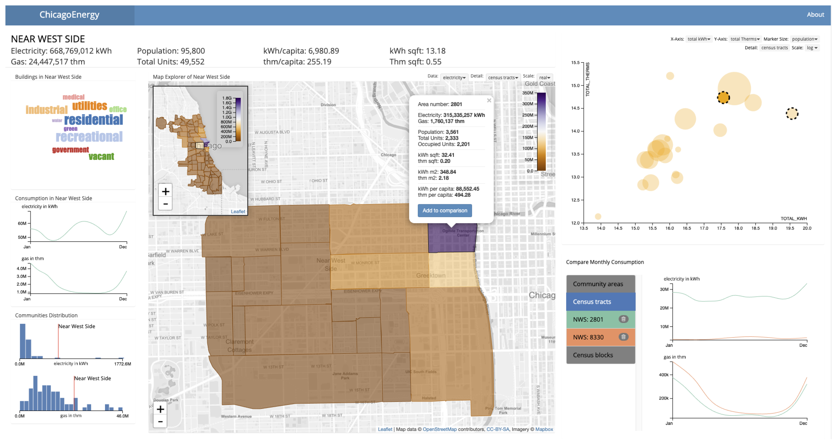
Figure 1.
Interactive, web-based, open-source energy consumption explorer for the city of Chicago. The central overview + detail map supports selection and comparison of areas at multiple spatial scales (entire community areas, census tracks, and census blocks) and multiple gas and electricity metrics that can account for population statistics. Details on demand supply additional area statistics. A word cloud, simple charts and histograms (left) enable building-type analysis, global seasonal consumption analysis, and comparison of a selected area against the overall consumption distribution. A scatterplot view and additional seasonal charts support outlier detection and seasonal consumption analysis at smaller spatial scales, selected by the user.

Figure 2.
Snapshots from the state of the art in urban energy visualization systems.

Figure 3.
Parallel prototyping in the design stage. (a) Prototypes for visual encodings. (b) Early software prototype with reduced functionality, whose look and feel the end-users critiqued as ‘too Unix/computerish’. (c) Workflow and layout prototypes.
Figure 3.
Parallel prototyping in the design stage. (a) Prototypes for visual encodings. (b) Early software prototype with reduced functionality, whose look and feel the end-users critiqued as ‘too Unix/computerish’. (c) Workflow and layout prototypes.

Figure 4.
Visual encodings and interactions for urban energy consumption analysis: (a) a word cloud shows the distribution of buildings in a neighborhood; underneath, charts and histograms show energy consumption across seasons, respectively the relative rank of the selected neighborhood against the 76 neighborhoods in the city. (b) A scatterplot supports outlier detection; bubbles along the two main axes show regions for which either gas or electricity data is not available. (c) A comparison panel supports direct comparison of multiple user selected regions, again across seasons.

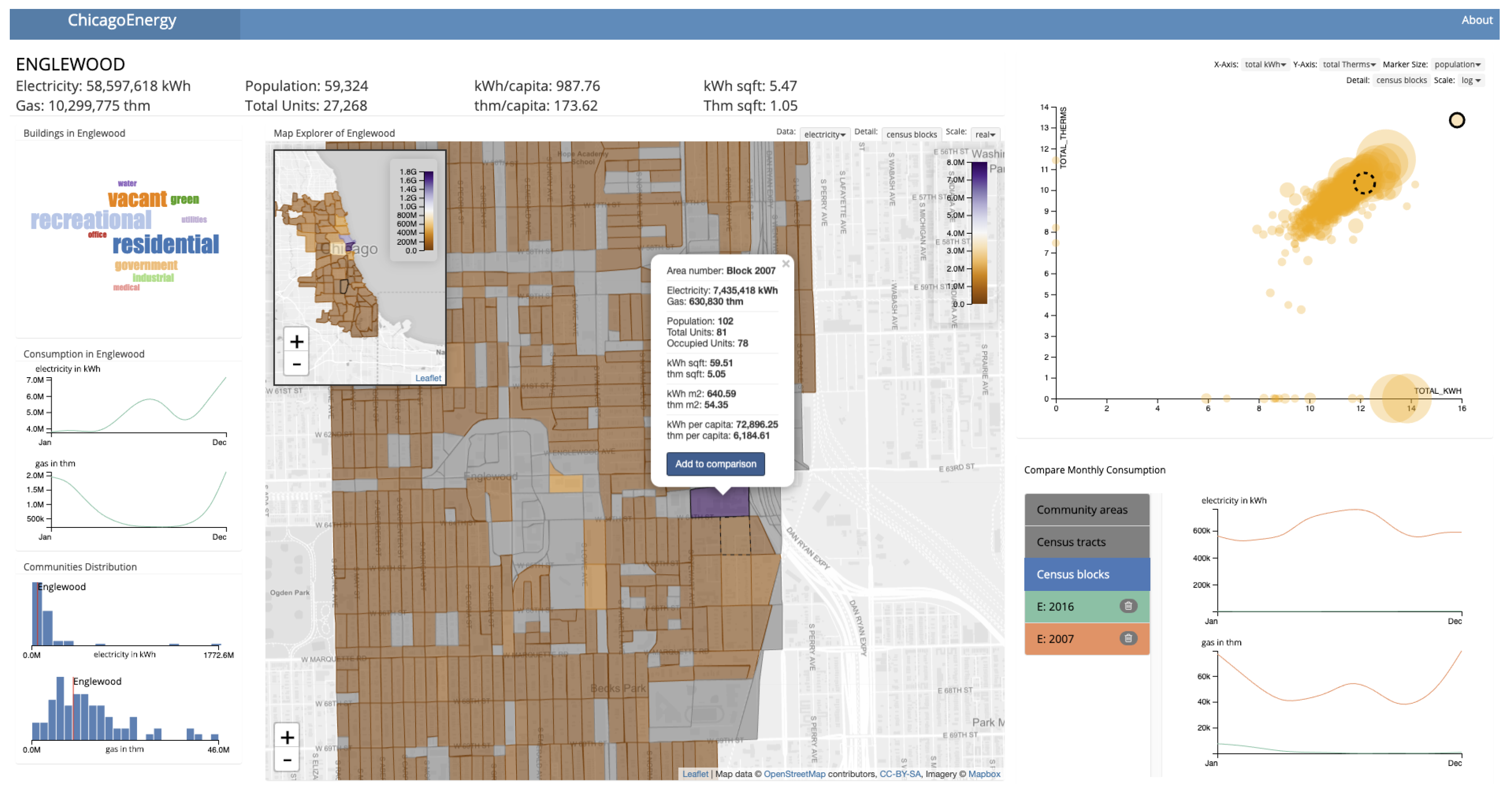
Figure 5.
Details on demand in the detail map, showing the one block in the selected neighborhood that has higher energy consumption. Unusually, this downtown block features a single inhabitant, and no occupied units.
Figure 5.
Details on demand in the detail map, showing the one block in the selected neighborhood that has higher energy consumption. Unusually, this downtown block features a single inhabitant, and no occupied units.

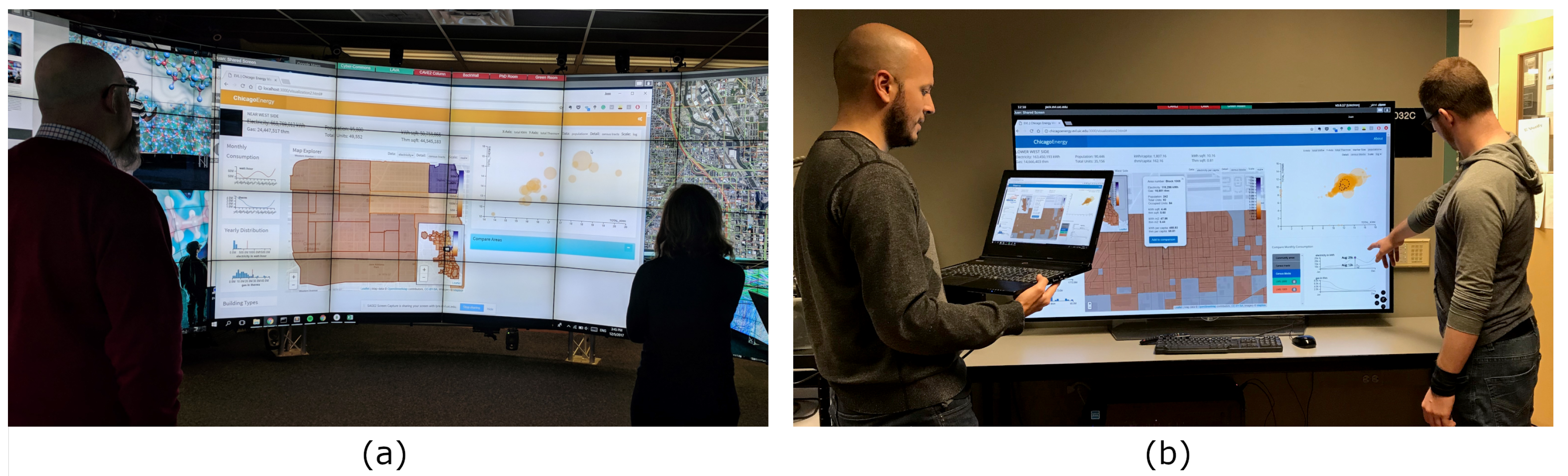
Figure 6.
Energy explorer usage on a variety of displays and with different stakeholders. (a) Data analysts usage in a conference room equipped with a large tiled display. (b) Citizen usage on a laptop and a large display.
Figure 6.
Energy explorer usage on a variety of displays and with different stakeholders. (a) Data analysts usage in a conference room equipped with a large tiled display. (b) Citizen usage on a laptop and a large display.

Figure 7.
Local neighborhood analysis. An investigation of a disadvantaged urban neighborhood at the census block spatial scale is able to identify an outlier block with unusual electricity and gas consumption. The block’s profile is strikingly different when compared to an adjacent block that has similar census and building statistics.

© 2019 by the authors. Licensee MDPI, Basel, Switzerland. This article is an open access article distributed under the terms and conditions of the Creative Commons Attribution (CC BY) license (http://creativecommons.org/licenses/by/4.0/).
Share and Cite
MDPI and ACS Style
Trelles Trabucco, J.; Lee, D.; Derrible, S.; Marai, G.E. Visual Analysis of a Smart City’s Energy Consumption. Multimodal Technol. Interact. 2019, 3, 30. https://doi.org/10.3390/mti3020030
AMA Style
Trelles Trabucco J, Lee D, Derrible S, Marai GE. Visual Analysis of a Smart City’s Energy Consumption. Multimodal Technologies and Interaction. 2019; 3(2):30. https://doi.org/10.3390/mti3020030
Chicago/Turabian StyleTrelles Trabucco, Juan, Dongwoo Lee, Sybil Derrible, and G. Elisabeta Marai. 2019. "Visual Analysis of a Smart City’s Energy Consumption" Multimodal Technologies and Interaction 3, no. 2: 30. https://doi.org/10.3390/mti3020030